
.svg)



Mental health, co-designed
Kooth partners with young people to create Soluna, a mental health resource for California youth.
Increasingly, digital spaces are proving detrimental to youth mental health. By co-designing with youth, Kooth and IDEO set out to flip the script, creating a positive digital space for young people to safely explore their mental wellbeing.
When Kooth, IDEO, and Blackbird, IDEO’s longtime development partner, first started working on the project, the window of opportunity was narrow, and the stakes were high. The group was up against a nine-week deadline to create a working proof of concept app. Also on the line: a $188 million contract with the Department of Health Care Services (DHCS)—one that would open an entirely new line of business for Kooth.
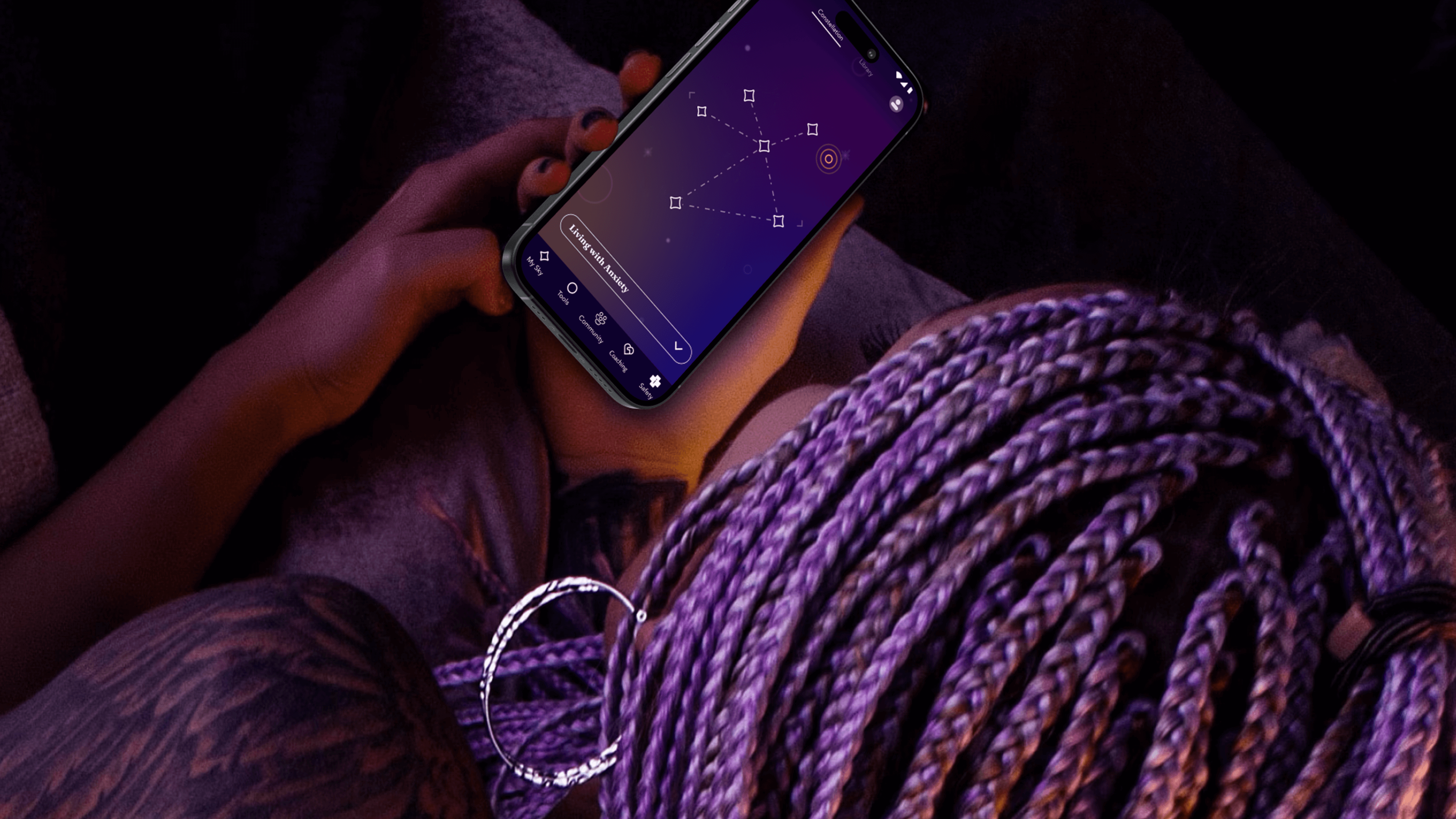
The app needed to do more than demonstrate functionality—it needed to prove its value. To ensure that they were creating an asset that truly fit the needs of young people, the team turned to an initial cohort of 13-25 year-old co-designers who explored early features, created video diaries, and shared their questions about and experiences with mental health. These young people often gravitated toward self-service tools that helped them take action based on their feelings. With their feedback, the team created new expressions of clinically-validated behavioral health tools like journaling, breathwork and white noise—and built novel tools, such as Starboard, an expressive drawing tool and a nod to art therapy.
The team took inspiration from content the co-designers liked to consume, such as story-driven video games that enable freedom of exploration, deepened by a unifying mythology. That led them to a constellation theme, which made the experience more intriguing and playful. The co-designers also recommended a dark color palette, because they preferred exploring the app at night.
With these insights, the team refined the proof of concept, and then conducted a one-week pilot with another 50 young people across California. Their positive feedback gave the State the confidence to invest in a $188 million, four-year contract for Kooth to bring the app to a platform at scale.
Over the next year, the team engaged another 150 young people to help design, shape, and test the app. At the same time, Kooth and IDEO created a clinical oversight group, which included a pediatrician, therapists, and other clinical specialists. This group anchored the platform in the practices of Acceptance and Commitment Therapy (ACT), cultivating psychological flexibility—the mindful acceptance of positive and negative emotions. Young people are invited to complete short reflections and surveys throughout their journey with the app, which includes rigorous, science-backed measurements to assess the therapeutic benefits.
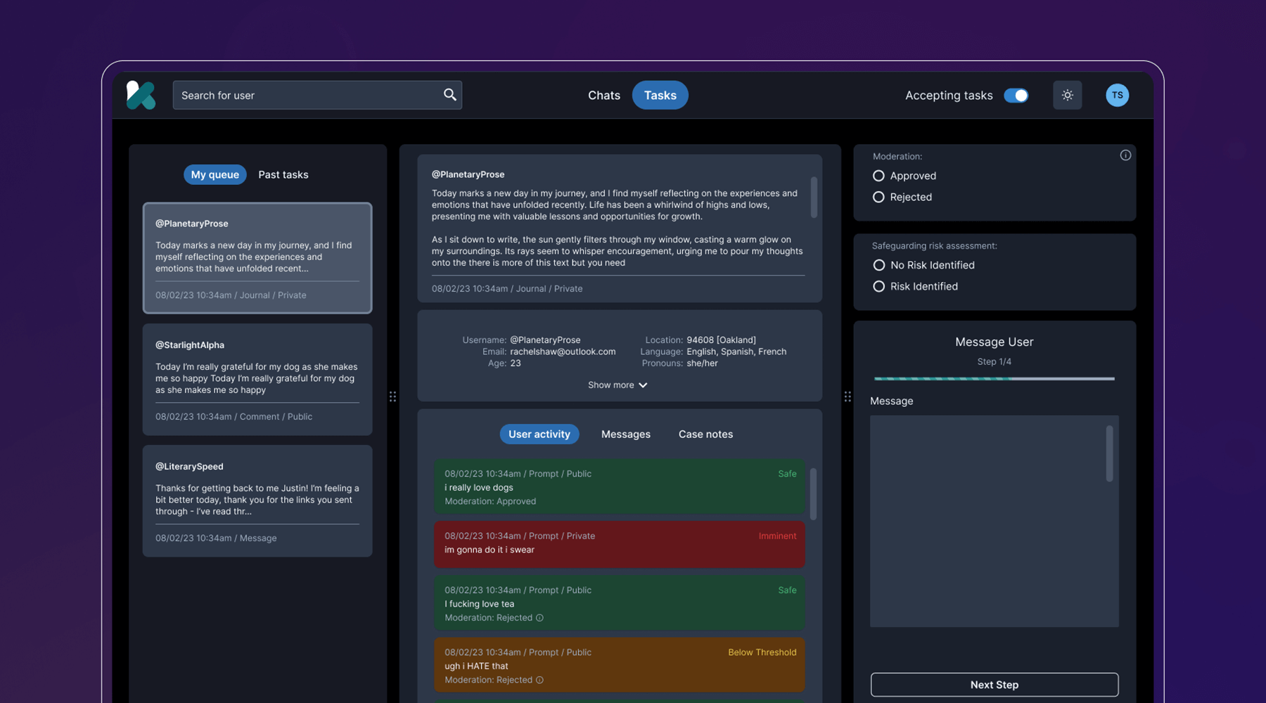
Behind the scenes, the team developed a clinical-facing service and digital platform that empowers Kooth’s peer specialists, social workers, community curators, and clinicians to support the youth experience, all while protecting privacy and confidentiality. They also navigated a complex landscape of state requirements and government legislation, ensuring that the platform could cover topics like substance abuse and gender identity, and that users could access coaching within 24 hours, and choose from a diverse set of experts.
The last step was to select a name that worked across multiple languages, trademarks, and competitor branding, and didn’t come off as a mental health service, something the youth co-designers believed was critical. IDEO and Kooth landed on Soluna, a name that alludes to the app’s presence in both the bright (“sol” for sun) and the dark times (“luna” for moon).
Now, Soluna is available for free to all youth in California, and the state has set ambitious targets for reaching all young people at scale. Soluna is a living platform that will continue to receive product and design updates for years to come, all deeply rooted in youth co-design.
The US Surgeon General named mental health “the defining public health crisis of our time,” and cited social media, online bullying, and the isolation exacerbated by the COVID-19 pandemic as major drivers that have significant negative outcomes for youth.
In California alone, more than 284,000 youth cope with major depression. 66% of kids with depression do not receive treatment. Between 2019-2020, the suicide rate for kids ages 10-18 increased by 20%.
In 2022, California Governor Gavin Newsom’s Master Plan for Kids’ Mental Health set aside $4.6 billion to increase access to mental health and substance abuse support, the largest commitment to youth mental health ever made by a state.
94%
of proof-of-concept app users would recommend the Soluna app to a friend, and believe that engaging with the app would be a positive addition to their daily/weekly routine
6 million
young people in California had access to Soluna at launch in January 2024
A more comfortable Pap smear
Teal Health creates a system for at-home cervical cancer screening.
Creating a better cervical cancer screening experience is an important mission, but also a challenging one. Not only would Teal have to address the regulations that face healthcare device companies, it would also need to build a comprehensive telehealth platform and a physical product—a wand that could easily collect an adequate cell sample, even in the hands of an untrained person.
The first challenge was to create the wand. The device would need to do a lot: It’s impossible for a person to see their own cervix, so the user would have to be able to find the cervix blind, collect the sample themselves, and remove the wand from their bodies without contaminating it on other parts of their anatomy. Because this is something users are likely to do in their bathrooms, where there is no space to lie down, they would need to be able to use the device while standing—and with one hand. From the beginning, the IDEO team set out to design functional, testable prototypes to make sure the idea was viable, and incorporate diverse voices into the research process, including trans, minority, and disabled women.
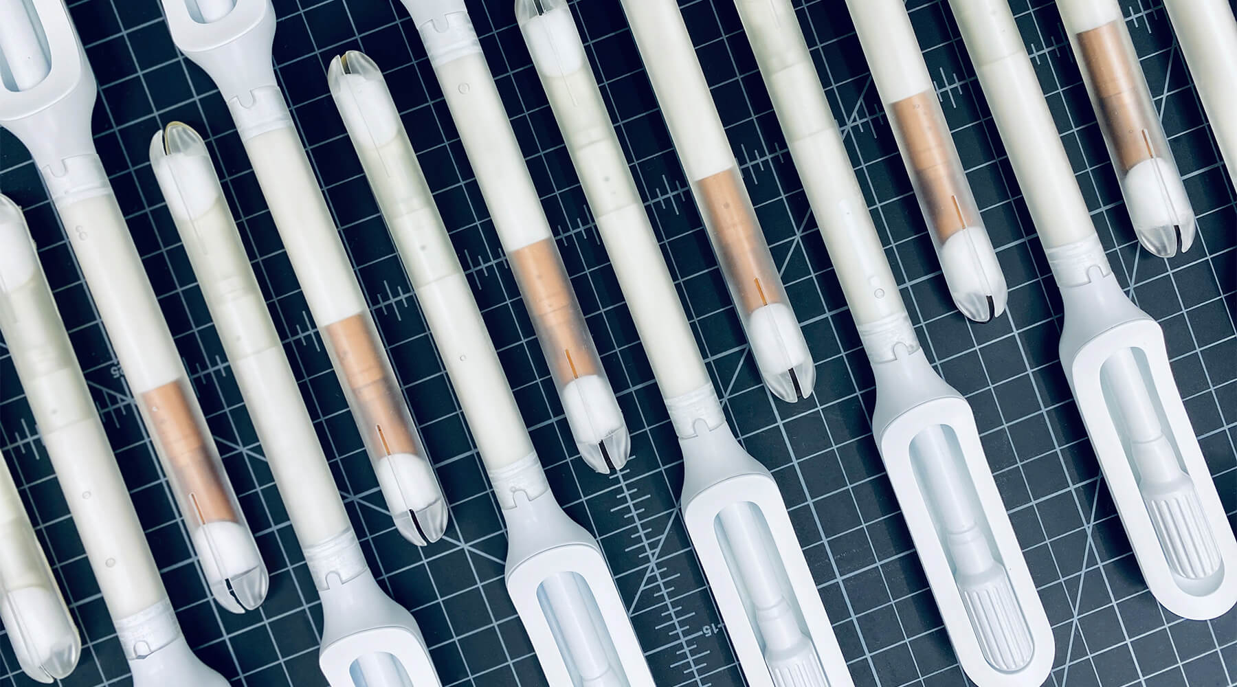
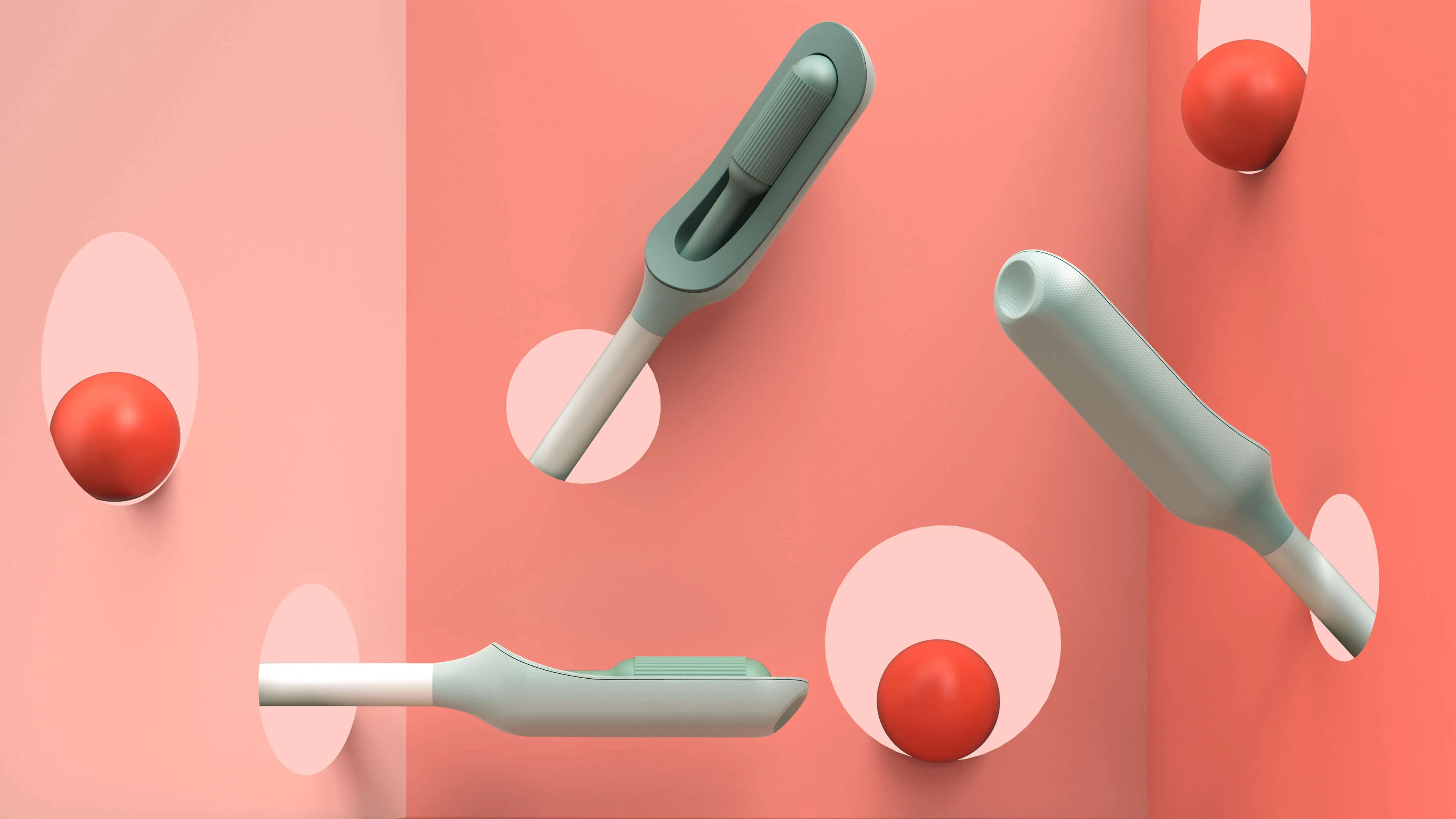
Because the product is meant for people who aren’t medical professionals, the team worked to design something as simple, intuitive, and unintimidating as possible. They used a 3-D printer to create multiples of every prototype, autoclaves to make sure that the designs they were creating were sterile, and leaned into shapes women are already used to, like the cylindrical shape of a tampon. The wand they created has that same basic form, but with a soft sponge that the user can deploy with the turn of a dial to collect the sample, then close to protect it from contamination on the way out of the body.
With working prototypes in hand, Teal set out to test their efficacy. In an initial study with 220 participants varying in age, race, socioeconomic status, and geography, Teal found that not only were participants able to successfully self-collect samples, they also preferred them over the speculum, the device doctors typically use during a screening. Some 92 percent said if they knew the results were equal they would prefer self-collection, while 87 percent reported they would stay current with screening if Teal Wand was an option. Self-collection took the vast majority under two minutes to complete, and 97% of study participants reported it was very easy or easy to use. The Teal Wand recently received a patent for its unique design.
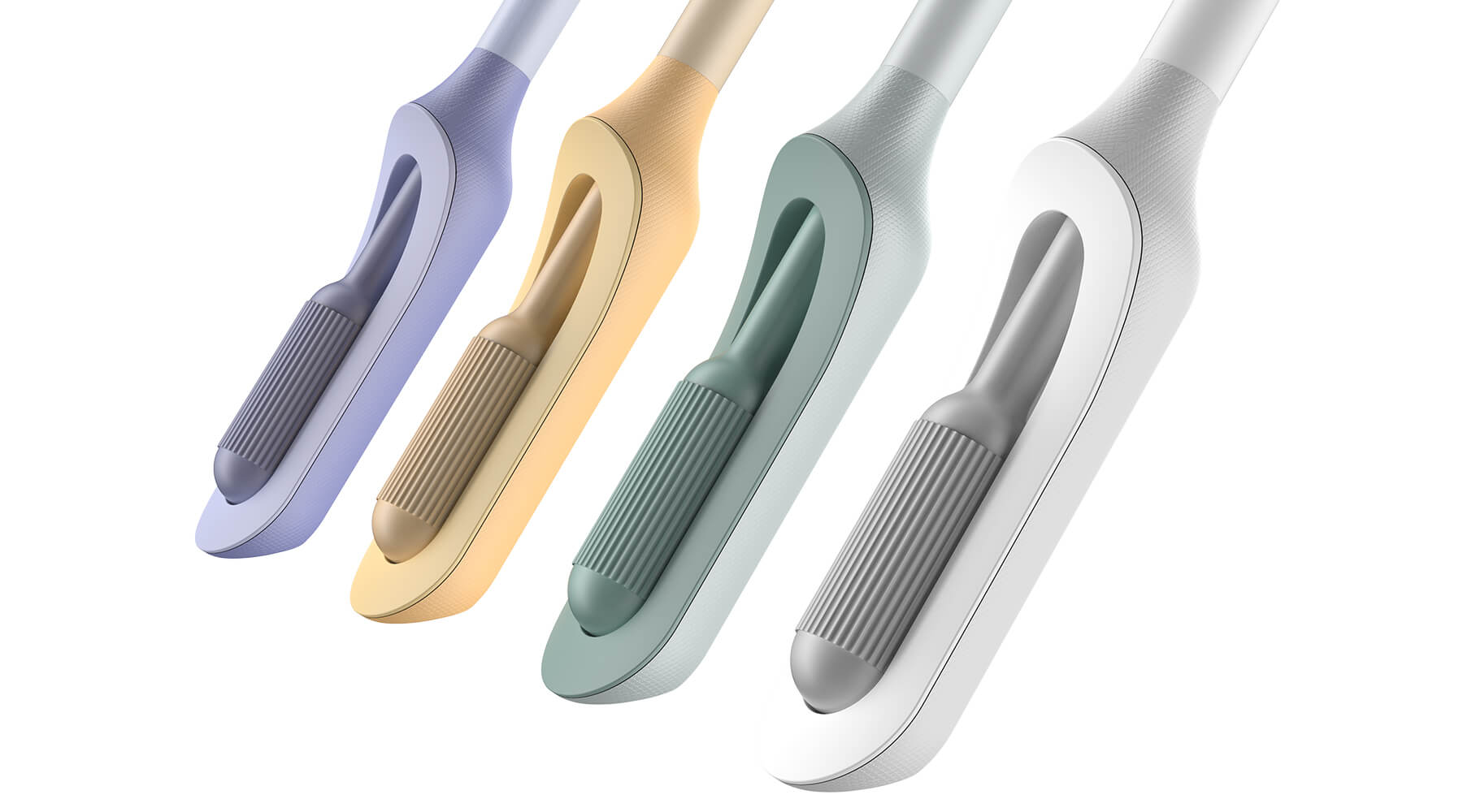
The IDEO team also worked on the packaging and unboxing experience, which plays an important role in supporting the user through the self-screening process. The team built in thoughtful design cues to give users reassurance that they are using the wand correctly, and to provide the same level of confidence they would have in the results of an in-clinic screening.
In January 2023, Teal raised an $8.8 million seed round from Serena Ventures, Emerson Collective, and Metrodora, and later that year, launched a nationwide clinical trial with leading health organizations including Johns Hopkins University, Yale University, the University of Colorado, Washington University, and others. In 2025, The Teal Wand became the first FDA-authorized device for at-home cervical cancer screening, with virtual medical provider support. Today, it's available in all 50 states. i’s an enormous step toward its North Star: catching cervical cancer earlier and saving lives.
Cervical cancer is nearly 100% preventable when it’s caught early, yet one in four women in the US are not up to date on their screenings.
More than 12,000 people in the US are being diagnosed with cervical cancer every year, and more than 4,000 people die of the disease, which disproportionately impacts Black, Asian, and Hispanic women.
More than half of cervical cancer cases are found in women that are not up-to-date on their screenings.
97%
of clinical study participants said the Teal Wand was very easy or easy to use.
87%
of participants said they would be more likely to stay current with screening guidelines if Teal Wand was an option.
94%
of participants said they would choose to collect their own sample from home rather than the current standard of care where a clinician collects it in-office.
2025
The Teal Wand becomes the first FDA authorized device for at-home cervical cancer screening, with virtual medical provider support.
Amplifying a movement
Cities United rebrands to create safe, healthy, hopeful communities for Black men and boys.
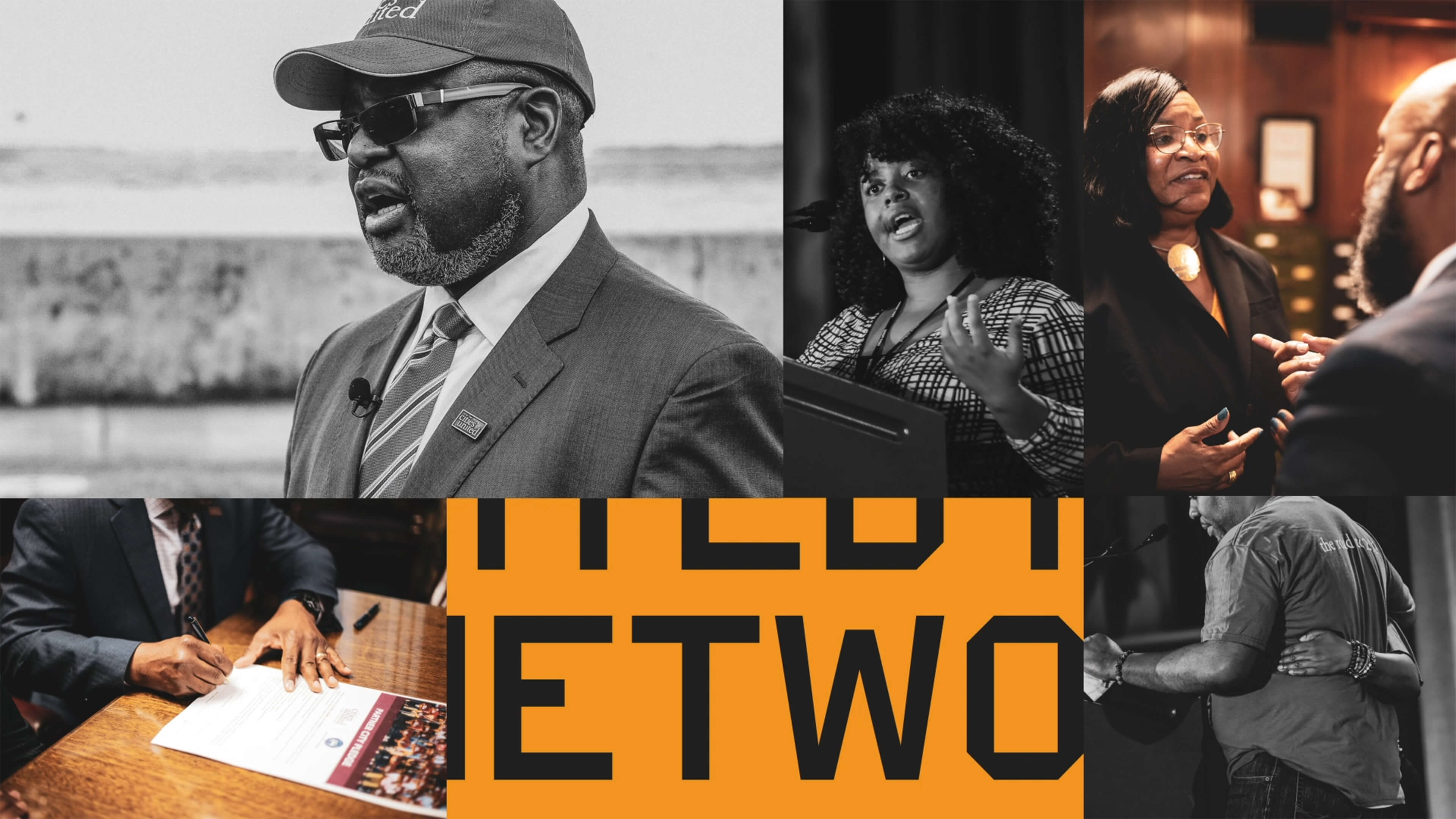
Cities United already had a strong foundation with its stated mission, vision, and values. IDEO brought those to life with a new visual and verbal brand identity system that celebrates Cities United’s inclusive approach to building relationships and reimagining public safety.
To help Cities United with its verbal identity, the IDEO team defined the organization's voice, tone, and key messages, making it easier to tell its story more consistently and clearly, a crucial step toward engaging stakeholders.
To define the new visual identity, the team created a new logo, a letter C composed of interwoven shapes that represent the three tenets of their vision—“safe, happy, and hopeful;” a new design language that references city grids; and a typographic system anchored by the typeface VTC DuBois, inspired by W.E.B. DuBois’s own custom lettering and designed by the Black-owned Vocal Type Co. The team also designed a color palette that embodies the textures of city life with hues reminiscent of asphalt, sunrise, and brick.
To amplify the refreshed branding, the team designed a new responsive website, citiesunited.org. The intuitive site shares the organization’s mission, resources, ongoing projects, and partner network, inviting stakeholders to join in their transformative work. IDEO also created a video to humanize Cities United’s mission and showcase its nationwide impact. It underscores the unity, resilience, and hope embodied by the organization through a chorus of voices.
This comprehensive rebranding widens Cities United’s reach and impact, helping the organization share its goal of creating safe, healthy, hopeful communities for young Black men, boys, and their families, and reintroduces the organization to a national audience.
The Cities United work was supported by IDEO’s Racial Justice Impact Fund, part of a commitment IDEO made in 2020 to address systemic racism and advance equity within our own organization, our client work, and beyond.
Cities United is committed to reducing the epidemic of homicides and shootings among young Black men and boys ages 14-to-24 by 50%.
Between 2009 and 2019, the number of Black children who “did not go to school at least one day in the past month because they felt unsafe at school or on their way to or from school” increased by 84%, according to Cities United.
Homicide is the leading cause of death for Black men and boys from birth to age 44, according to the Centers for Disease Control and Prevention.
2023 SF Design Week Award
In recognition of IDEO’s brand work with Citizens United

Balancing work and sleep
Somni’s personalized sleep program helps workers maintain their health.
Sleep is a critical resource for shift workers—and their employers, too. Together, IDEO and Somni worked directly with people with acute and chronic sleep challenges to create concepts that could support their sleep goals, and provide employers with the means to improve employee health.
When IDEO and Somni first partnered, the startup was an early-stage company, so the team started small, with focused sprints and workshops to redesign the core aspects of the company and product offerings. The team interviewed shift workers about their sleep patterns, which can vary quite a bit. Even when people keep to a specific schedule on work days, they often have to change their patterns on days off to spend time with family and friends, leading to a very disruptive sleep cycle. Research revealed that many third shift workers were dealing with sleep and health issues, but also a pervasive “machismo” culture, pressure to “tough it out,” and a reliance on energy drinks to deal with lack of sleep.
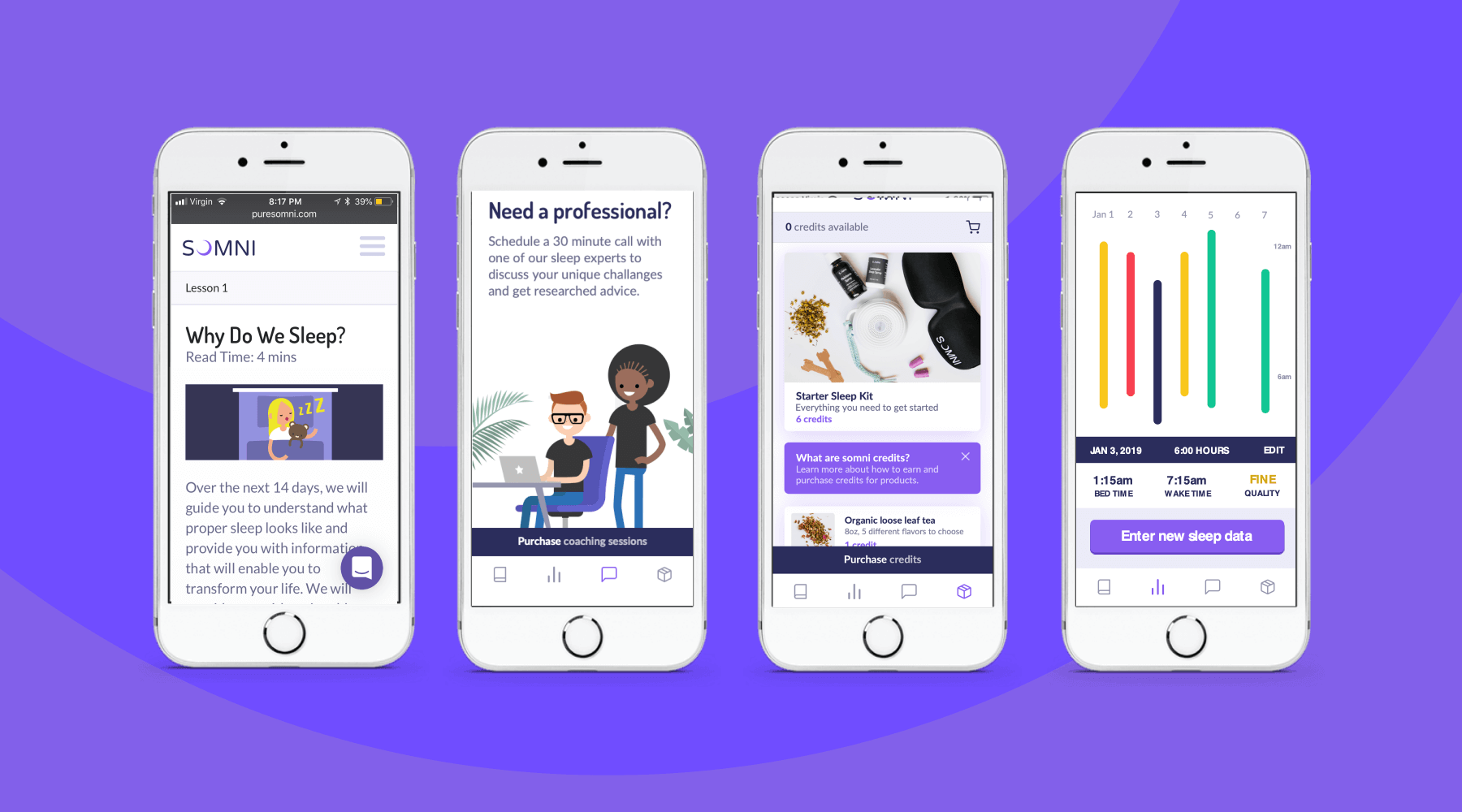
To address those issues, the team designed a digital experience for sleep cohorts, support groups where members could share their experiences and sleep strategies, and work with a coach and sponsor who already had been through the program. The platform analyzed workers’ data, and provided AI-enabled recommendations for improving their sleep. The big takeaway? Data by itself wasn’t necessarily helpful, and could be confusing for folks who were less digitally-fluent. Providing context, like a calendar that displayed sleep experiments at a glance, was crucial.
The IDEO team also created a new user experience for a genetic testing program that could uncover factors associated with sleep issues. Somni aims to use a saliva-based genetic test to monitor for DNA damage caused by circadian disruption, then leverage its sleep improvement program to prevent further damage. Because biomarker testing is a differentiating offer for Somni, it was extremely important that the team get it right, both to make sure that users could understand its utility, and for Somni to provide real value. The design challenge was unique—and not just because of data privacy concerns. Presenting data about DNA damage in a non-human-centered way could increase the anxiety workers had around their sleep.
At the end of the project, Somni leveraged the insights the IDEO team surfaced to improve products like its sleep coaching service, and to refine its biomarker testing offering. Based on this work, Somni has also created a pilot with a Fortune 100 company, which is currently in progress, as it works to mitigate the ill effects of disrupted sleep for employees and the companies they work for.
In the short-term, circadian rhythm disruption leads to an array of jet-lag-like symptoms, and in the long-run, it may contribute to weight gain, obesity, metabolic syndrome, type 2 diabetes, and cardiovascular disease.
It also impairs people’s ability to work, affecting productivity, creativity, and the overall work environment. Productivity loss can lead to employer baseline healthcare costs that are 26% higher, and over time, insomnia can result in an average cost of $4,267 more per employee per year.
In June 2019, the International Agency for Research on Cancer classified shift work as a probable carcinogen.
75%
user retention in Somni's sleep program
$2,450
savings per year per employee for users who complete the program
33%
improvement in sleep quality, and 41 more minutes per night

Design Concepts to Help New Yorkers Fall Back in Love With Their City
What does it mean to design for inconvenience?
New York is a city that invites (or demands) personal reinvention and grit, a home where you choose your own adventure and meet your true self.
While everyone comes to New York for different reasons, chances are each person is drawn to the seemingly endless opportunities, rich culture, and potential for discovery. The city is a blank slate for bucket lists that keep on growing. But New York is also notoriously difficult for many to navigate and discover. In the midst of everything going on, it’s hard to stop and see the magic that brought us here in the first place.
In the true spirit of design provocation, a handful of us at IDEO New York asked ourselves: How might we help New Yorkers get lost in the city, and by doing so, allow them to discover something new and surprising along the way?
In between projects, we gave ourselves a job—design some speculative concepts to bring these two complex, potentially oppositional ideas to life.
Lost
The first design concept, Lost, explores how we can lose ourselves in the city by going off the grid. As we asked people how they disconnect in the Big Apple, we heard about different rituals to reclaim time and attention: from turning on Do Not Disturb mode to giving an iPhone to the local bodega for safekeeping.
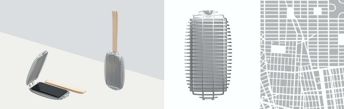
Intrigued by the implications these tactics had on a person’s digital footprint, we took this idea even further. Instead of simply flipping a switch or hanging our phones off to a confidant at the corner store, we explored sealing off our entire digital footprint with a 3D-printed aluminum Faraday cage. By blocking all wireless emissions, a Faraday cage is one of the only surefire ways to ensure your phone is safe from transmittance.
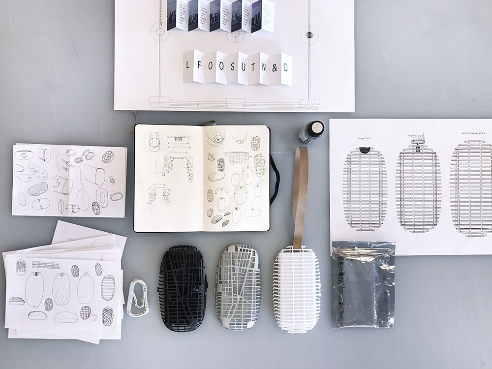
We added a touch of personalization to the design—the grids of the 3D printed file mirror the New York City map. By going off the grid before setting out to explore New York, you reclaim your anonymity, commit yourself to living in the moment, and immerse yourself in the serendipity of the city.
Found
You can find virtually any tidbit of information with a few taps: movie times, breaking news, the exact Pantone shade of a celebrity’s jacket. Our second design concept, Found, explores how we might reintroduce discovery and spontaneity into our daily lives.
As a nod to the legacy of open-world gaming maps, the app—affectionately named Streetheart—begins with the map of New York City shrouded in darkness. As the user moves, the app reveals the paths of the city that you explore, block by block, avenue by avenue.
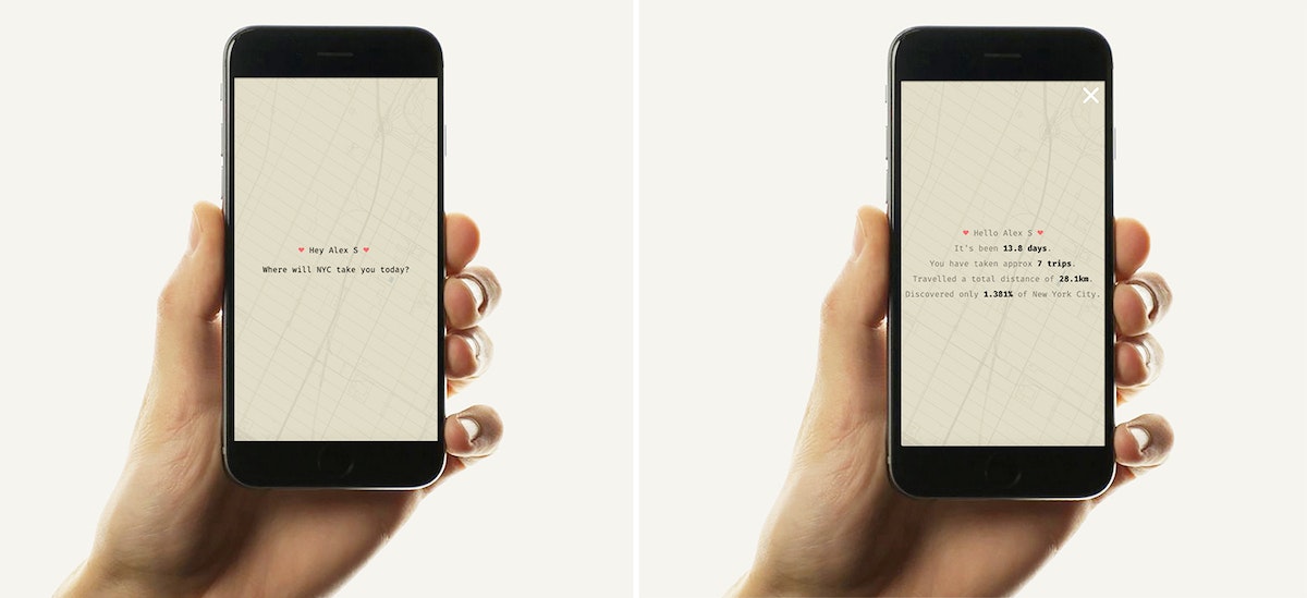
By illustrating how much of New York City is (always) left to uncover, Streetheart encourages you to leave your comfort zone and embrace the curiosity and spontaneity that made the city magic in the first place. The percentage discovered feature reminds you of the scale of New York City and humbles even the most high-handed New Yorkers.
We pushed things a little further and coded a web prototype to test our concept out in the Big Apple. In just an hour and fifteen minutes, we discovered beautiful brownstones in Boerum Hill, a bustling downtown Brooklyn, an unusual park hidden near the Manhattan Bridge, and so much more. Yet a quick peek at the app revealed we only discovered 0.6225% of New York City.
In a city fueled by efficiency and hustle, we’re fascinated by choices that help us slow down, even if it means intentionally designing not for convenience, but inconvenience. We hope that Lost and Found allow you to lose yourself in New York City—and by doing so, rediscover the city and each other.
Taking the subway in the wrong direction for many stops; getting blindsided by the unimaginable smells emerging from the MTA; living among 8.6 million people but feeling completely anonymous, even isolated. These are some of the experiences IDEO’s New York community described when asked what living in the Big Apple is like.
From Startup to Grown-up: Helping Digitally-Native Companies Come of Age
Three principles to help startup founders become company leaders
Like a gawky teen who acts like a kid but resembles an adult, many Internet-born organizations find, a few years in, that their mode of operation no longer matches their growing size. The acceptable norms of a small startup—like decision-making around a shared kitchen table—actually prevent these companies from continuing to innovate once they’ve scaled. As a result, they begin to plateau and become susceptible to disruption and competition.
Often, companies in this teen stage seek guidance in areas they've neglected during their initial growth spurt. As one CEO recently shared, she needed help “jumping the S-curve.” The following three principles can enable digitally-native companies to keep thriving and achieve sustainability—in other words, help the skinny kid fill out and establish the traits needed to become a grown-up.

Rethink team structures and incentives
When startups consist of just a few people in a room, there’s no separation between disciplines: An engineer sits next to the head of sales, who sits across from a project manager and shares a file cabinet with a designer. But as the company scales, teams often become siloed into discrete functions. When disparate groups are responsible for specific parts of the customer experience, it becomes fragmented.
In a project IDEO led with an online retail startup that had fallen into this trap, we noticed that the front-end engineers and UX designers—who were responsible for the website search interface—rarely communicated with the back-end engineers and data analysts. Because of this, the front-end team designed user search experiences that weren’t even feasible from a back-end point of view. In addition to this being a massive waste of time and effort, it represented a misalignment between teams working at the same company, on the same product, and serving the same customer. If internal teams are disconnected, the customer experience will inevitably be disconnected as well.
For organizations struggling with this, there’s an opportunity to reorganize teams around moments along the customer journey (account creation, browse or search, checkout, and so on), rather than function. Eventually, that misaligned company created an interdisciplinary search team that included designers, data analysts, account managers, customer success associates, and others. This resulted in a more consistent and functional search experience for users, which in turn led to more people finding, and ultimately buying, products on their site.
The customer experience needs to guide not only team organization, but also incentives. In early start-ups, individuals and teams are rewarded for speed and execution: The quicker features are released, the better. But this mindset only reinforces the tendency for teams to evolve into myopic silos, unable to grasp the holistic experience beyond their discrete function.
When reorganizing their teams around the customer journey, that online retail startup established new incentives and shared success metrics that encouraged the newly-formed groups to work together and focus on the customer experience, rather than speed and quantity. The new interdisciplinary search team’s incentives were tied to a customers’ success in finding the item they were looking for on the website or app.

Dig deeper into data
Internet-born startups tend to have an abundance of engineers who are experts at collecting and leveraging data. They relentlessly A/B test the product and often immediately take action based on the results: If button A is generating more clicks than button B, it’s best to go with the former.
This is where teenage companies take a wrong turn. Engineering teams rely on their same tried-and-true data and analysis methods used when they were chasing the next round of funding. But now that the company has matured and needs to become profitable, it must change its habits to match this new stage of growth. Continuing to blindly A/B test without considering the implications leads to over-optimizing their current product features. This results in feature bloat and prevents innovation beyond a hallmark product or technology.
Instead of reinforcing old habits, it’s useful for startups to ask why something is occuring—why is this button outperforming the other? Many teams skip this question. As a comparison, during qualitative research, we ask target customers open-ended questions to learn why they think, feel, or behave in a certain way. For example, a shopper may share that they prefer organic produce. But learning why—perhaps due to climate concern or wanting the best for their kids—unlocks the potential to understand how an online grocery delivery startup could innovate.
Rather than merely pushing organic strawberries on the homepage or building an “organic” product filter, the company can use this valuable knowledge to grow beyond their primary offering. They can consider questions like: Do environmental activists or health-conscious parents represent new or existing customer segments? How might we meaningfully shift our product or create a new one to serve them? The key is to follow data collection and A/B testing with qualitative research aimed at understanding why. Engineers will need to push beyond their comfort zone to ask these questions. Companies may also consider bringing qualitative research specialists onto engineering teams to help build this capacity.
For Internet-born startups, data can’t be only an optimization tool. It’s also a catalyst for deeper qualitative understanding and continuous innovation.

Embrace a new mode of leadership
When founders are used to working alongside engineers and designers, they often hesitate or struggle to step into the level of leadership required to run a company with hundreds of employees. The skills that enable someone to build a company are not always the same as those required to lead a mature and rapidly growing organization.
During a meeting with a digitally-native healthcare startup, the founder asked for a pause so he could weigh in on new illustration icons. By this point, the company had 200 employees and the founder had hired over a dozen senior leaders with deep experience managing teams and scaling mid-sized startups. But because of this CEO’s tendency to do the work (which he embraced when the startup was 10 people) rather than delegate the work, he wasn’t empowering this new talent do their jobs. Letting go, trusting others, and delegating can be particularly difficult and humbling for founders of companies in this adolescent period. But it’s essential to make these shifts for the startup to flourish.
This same founder also shared that communicating the company’s vision and big decisions to employees felt like more of a challenge than it used to. When an organization can fit inside a conference room, leaders have a simpler time with this: Small startup teams are often made up of generalists with an “all hands on deck” mindset. But with hundreds of specialists on board, CEOs must translate their strategy to multiple teams with differing expertise.
Each quarter, the founder began holding meetings with each team in addition to town halls with the entire company. Rethinking one’s communication strategy at this adolescent stage can create more of an opportunity for understanding, connection, and inspiration. This transition also reflects a new level of maturity for a leader.
Digitally-native startups initially grow and succeed due to a certain set of conditions: They’re technologically innovative, data-driven, and have leaders who can inspire early hires and investors and build from the ground up. But when these startups scale, those core conditions no longer do the trick. Evolving from a rambunctious, scrappy teen to a promising adult requires a new willingness to centralize around the customer experience, think before acting, and reach a higher level of leadership.
Special thanks to Mike Stringer, Jill Levinsohn, and Deb de Vries for their contribution to this article.
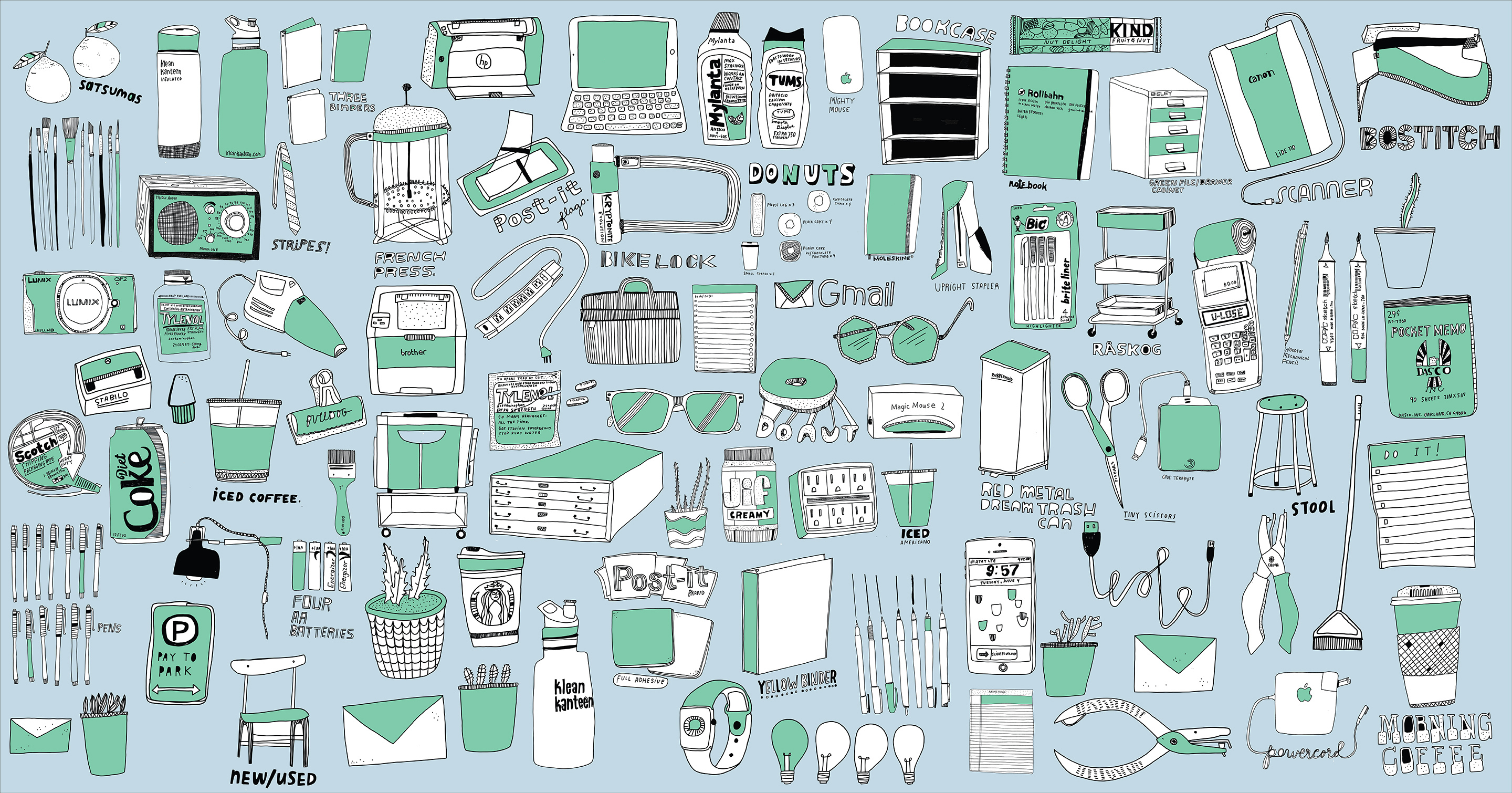
Visuals by Kate Bingaman-Burt
Startups enjoy a reputation as the bright young things of the business world. They’re digitally fluent, small enough to be nimble, and new enough to be free of legacy baggage. Yet many successful startups face a rude awakening if they make it past infancy and scale to hundreds of employees. While success is exciting, puberty is awkward. These principles can help.

How four people live (happily) in 400 square feet
One designer's values-based system for life in a small space
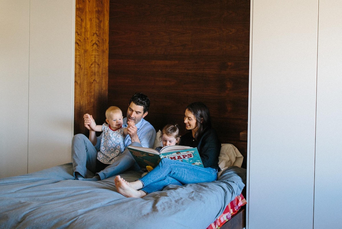
Now, almost seven years and two babies later, all four of us are still in the same space. I accidentally gave birth to our second child on the apartment floor—a life-changing moment that only took up about twelve square feet. Eric calmly delivered her, while speaking to the paramedics, and our two-year-old stood in the corner.
So, our apartment has served many different purposes. With each additional human, black shirt, pair of boots, friendship, painting, plant, and piece of furniture we have had to really evaluate what stays in the apartment and what must go.
I’ve devoured all the decluttering blogs, books, documentaries, and conversations. I’ve tried a lot of the methodologies, and written “get rid of everything” on my weekend to-do list for more than seven years—and failed. But over the years, I’ve built a framework for making decisions about what to bring into my life—and our space—based on what matters most to me and to us.
I’m not sure that this is the final version of my criteria for what stays and goes, but I’m trying it out—a true IDEO prototype. I would like to think that these five principles could apply to whatever life you have—whether you have a huge space with three closets, a tiny room with no closet, or you actually live in a closet, like my daughters do.
1. Relationships
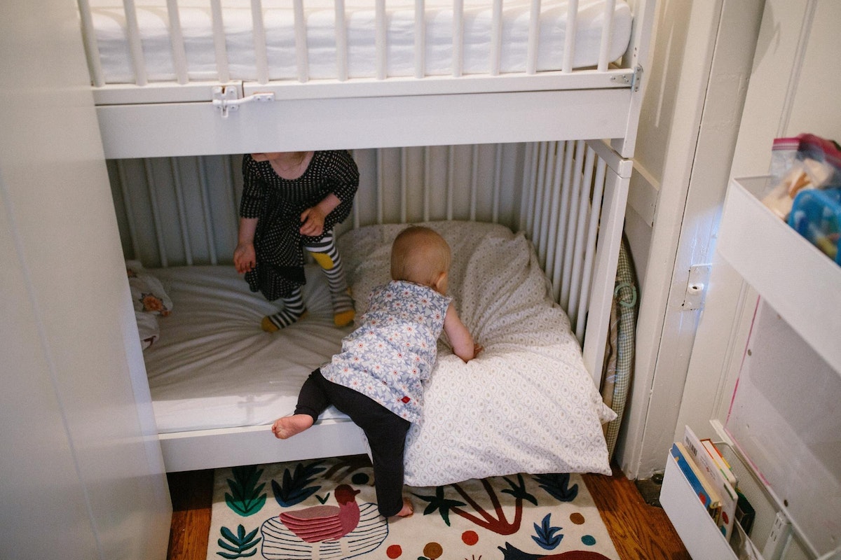
Relationships are what matter most to me. I value people. I love having them over to celebrate, I love feeding them, letting them stay overnight, hearing their stories, letting them shower, and taking meals to them. We built a Murphy bed for my husband and me to give us more space, but, mostly, so that we can have people over to talk and eat together, and develop those relationships that mean so much to us. We also built bunk bed cribs in the closet (bedroom) so that the girls would learn to share. Instead of being a constraint, I think of our tiny space as a way to share happiness, motivate us to resolve conflict more quickly, and cry and be sad—together.
2. Cleanliness
Cleanliness isn’t just about Pine-Sol and bleach—it’s also about reducing visual clutter. White walls, curated with colorful artwork and flooded with natural light, feel clean and visually calm. With a human baby for a Swiffer, I am also particularly aware of accumulating dust. And although it would be more convenient, I find it difficult to give up my duties to a cleaning person because of my high standards and weird obsession with fresh grout and shiny floors. And so, cleaning and reducing visual clutter are a family affair filled with songs, dance breaks, snacks, and high fives.
3. Long-term vs. short-term
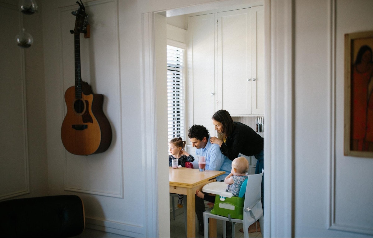
For me, investing in things that will be with me for the long term is a balance between using my money better and producing less waste. In the short term, I will reuse something that I already have, like a hand me down click-on kid booster seat, even though I don’t like the way it looks or the exact function of it. (My kids will eventually be able to sit in a regular chair unassisted, right?) To help manage the amount of waste we produce, we also have the super luxury of curbside compost, recycling, and garbage and we have communities that will happily use things that we no longer can.
4. Aesthetics
When one thing is out of place in a small space, everything looks like chaos. To create order and balance, you need a bit of white space to breathe, and nice things to look at. To give us more storage we installed cabinets high up on the wall, out of our line of sight. We hang our laundry bags on a dowel in our front closet, hiding dirty laundry and freeing up the floor space that a laundry hamper would take up. We often rotate the refrigerator artwork to keep things interesting and curated. We make our home a place filled with things that we’re proud to talk about, look at, and live with.
5. Health and wellness
We all need space to be together and to be apart, space to retreat to and be quiet, space to move around and dance, or space to exercise or meditate. The place where you live can’t always serve all of those purposes. Creating cozy, soft places to read, moving furniture to the perimeter to make room to dance and run in circles, and hanging out in the shower just one minute longer to clear your thoughts have all helped us be a healthier family. And when it feels like everything is breaking down, we buckle the girls in the stroller and go outside. The outdoors have become our extended living room, allowing us to spread out our arms a little wider and play.
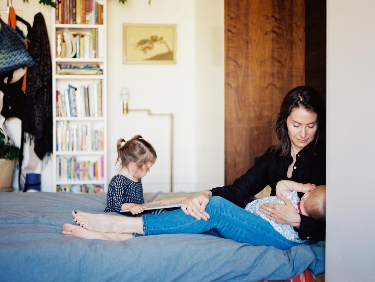
We won’t be in our tiny home forever; two growing children mean that one day our apartment will actually be too small. But we—and you—can take this methodology we’ve created wherever we go.
When you think about your own space, remember to consider the things that matter most to you, and the things that work for you. Take pride in your home and make it your own sanctuary. Learn to see the possibility in your space and in your life.
In the meantime, we’ll be thriving in our 400 square feet. If you’d like to drop by, we’d love to feed you.
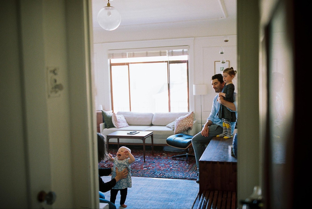
It all started in 2011, with eight weeks of apartment searching, a lot of flirting with landlords, a couple of rejections (because “couples always break up in studio spaces”), and an eventual win—four hundred square feet for my husband Eric and me.
5 principles for making digital healthcare more human-centered
A more humane healthcare system starts with understanding human needs
As more of our interactions with healthcare become mediated by screens, the need to design human-centric systems only increases. Digital interfaces can empower people to take control of their own health, but these systems can also amplify the sterile interactions for which the industry is all too well known.
In order for “making healthcare more human” to be more than a marketing slogan, it’s important for designers, entrepreneurs, and business leaders to keep in mind the humans they serve—especially when designing digital products. Below are five principles we use at IDEO to keep human needs at the center of everything we do.
1. Meet users where they are
Human-centered design means designing for a user’s whole life context: income, employment, food preferences, and emotions. We must also consider the expectations, learned behaviors, and technological capabilities each user brings to the table when thinking about his or her health.
At IDEO, we always try to map out the full user journey. And because that user is human, they might not always be consistent in the way they interact with the digital product or tool. For example, in the course of designing a connected blood glucose meter, we observed that many people with diabetes don’t test their glucose levels on a regimented schedule. Why? Life gets in the way.
But because certified diabetes educators (CDEs) need as accurate information as possible, they ask patients to test as regularly as possible for the two weeks leading up to an appointment. This is where designers can play a role: Because digital tools live in people’s pockets and homes, we can tailor solutions to the individual to a greater degree than is possible in the in-person clinical care environment. By observing how patients use workarounds to integrate products into their routines, we can design solutions that work within the context of their lives. It’s only by meeting users where they are that we can inspire meaningful behavior change over time.
2. Create “give-get” loops
Imagine you’re introduced to a digital product or service by a healthcare provider during a routine clinical visit. You may choose to search for the accompanying app and download it from the App Store. You’d then go through an onboarding process, create a username and password, and decide whether to accept push notifications. You may also be asked to share sensitive health information or consent for the application to access it.
All of these steps have happened before you gained any tangible value from the product or service. In the absence of clear benefit to users, it’s not uncommon to lose many at this early stage.
One way we address early user drop-off is with a “give-get” loop. This could be as simple as asking a user to enter their dietary restrictions in exchange for tailored suggestions about nutrition, or asking for an address to provide hyper-local recommendations. Ultimately, good user experience design incorporates that data to complete a cycle of action that benefits the user. When we’re able to create conditions for purposeful data gathering, we can then recognize patterns and help users discover insights that they could act upon by introducing and initiating new behaviors.
At the same time, we need to be mindful of the role we might be creating for ourselves as recipients and holders of sensitive information. That’s why we’re careful to only collect the “minimally viable data” required to create the intended user experience.
3. Design for relationships
User experience design for managing chronic disease needs to rely on more than software and technology. The relationship between the primary user and their network of care providers and community members has significant bearing on the success of the product. The user experience is part of a larger service ecosystem and must consider how the nodes in that system interact.
Today, pharmaceutical companies often use digital tools to drive adherence—to make sure that patients take their medication at the right times and in the right ways. But digital solutions can go beyond adherence: they can—and should—support holistic care beyond acute or immediate medical needs.
When digital experiences and interactions can help patients live healthier lives, they become tools for delivering better health outcomes overall, beyond any specific condition. Further, the burgeoning field of digital therapeutics is turning out digital health products that themselves stand as effective, proven interventions to treat physical, mental, and behavioral conditions.
4. Don’t be limited by the boundaries of “the device”
When IDEO began working with Bayer Diabetes (now Ascensia Diabetes Care) in 2006, people with diabetes were able to access their own blood glucose data either by logging it themselves or by showing the meter to their doctor. The Contour USB opened up new opportunities for design, enabling people to plug the meter into a personal computer and transfer all readings to a single document. Once the Contour USB launched, the next design challenge was to make it simpler and less expensive. We honed in on a feature: the color screen.

While a color screen might seem like a great new opportunity to present rich information, it was only used for displaying simple data, like meal markers, dates, and times. From a human-centered design perspective, it made more sense to eliminate the color screen and use users’ smartphones or computers instead. The meter’s color screen was adding unnecessary cost without contributing enough benefit in return.
By focusing on the outcome rather than the solution, we were able to spot our own blindspot. Just because an intervention can be solved with technology doesn’t mean it always has to be.
5. Inspire the organization to evolve
As a rule, creating digital products and services will create the need for new capabilities and processes inside the organizations that deliver them. Digital user experiences are living systems, and they require organizational investment and structures ready to support near-constant change. As soon as we’re “done” designing a digital experience, a software operating system might change, a new data privacy law might pass, or a content partner could change their rules of engagement, any of which would require additional refinement.
Today, many companies that deliver global offerings at scale work in silos that are each oriented around different targets and metrics. There are several examples where organizations are directly addressing this challenge through new experimental ways of working. Whether through a corporate innovation lab, internal incubator, or entirely separate venture, carving out a portion of the business enables efficient experimentation without detracting from core business objectives. Then, once proof-of-concepts have been successful, learnings can be incorporated into the rest of the organization.
Even within the most nimble and flexible organizations, any digital product or service will need to continue to evolve and improve from day one. It’s like that old adage about buying a car: once you drive it off the lot, it immediately goes down in value. Once a digital solution is launched, it’s essential to start planning immediately for its next update. By listening to the needs of end users, it should be clear where to begin.
From stepping into a doctor’s office to taking a daily vitamin, each interaction with the healthcare system was designed for and by a human—and yet the industry can often feel soulless.

Lindsey Turner
I’m passionate about building brands, products, and experiences that help organizations show up with meaning and momentum.
I help organizations cut through complexity by shaping how they show up, through brand strategy, identity, and storytelling.
Working at the intersection of brand and business, I bring an editorial eye and a bias toward making—turning ideas into tangible experiences that people can understand, trust, and believe in.
My work spans government, healthcare, financial services, media, and consumer goods, from launching Gen Z-focused ventures to building innovation labs and reimagining legacy brands. I relish moments of ambiguity and enjoy translating across teams, perspectives, and priorities to move ideas forward.
I started my career in editorial and digital design, shaping cross-platform experiences and identity systems in publishing and agency environments. That foundation still shapes how I work today: I’m detail-oriented, collaborative, and overreliant on the Oxford comma. I hold a BFA in Visual Communication from the School of the Art Institute of Chicago.

Rachel Young
My work helps organizations see who their products aren't working for—and build the will and the tools to do something about it
For 25 years, I've asked the same question: Who does this design exclude—and what are we going to do about it?
My work spans human-centered strategy, inclusive design, and qualitative research, with clients ranging from Microsoft, Google, and Verizon to the National Science Foundation, and San Francisco Unified School District.
Before IDEO, I taught elementary school in East Palo Alto and spent a decade doing design work with social service organizations—where I learned firsthand what it costs people when systems are built without them in mind.
I am currently writing User Error, a nonfiction book about digital access and the design decisions behind it. I live in Oakland, California.

Brian Pelsoh
I lead with craft, ensuring our work is creatively excellent: rooted in deep human insight and imagination, while also grounded in the realities of business and technology.
My expertise spans brand, communication, and product design across tech, education, the arts, and social impact.
I believe great work demands both high-level vision and obsessive attention to detail, and only happens through collaboration.
I bring an inclusive, hands-on approach and a deep understanding of business, which enables me to consistently deliver excellence while always asking why.
Before joining IDEO, I worked at the brand firms Pentagram and VSA Partners. I began my career as a designer, leading teams at the School of the Art Institute of Chicago and the Milwaukee Art Museum. I hold an MFA in graphic design from Maryland Institute College of Art and a BFA in communication design from the Milwaukee Institute of Art & Design, and have taught at some of the best design schools in the US.

Tony Wong
I am responsible for IDEO’s long-term success in China and working with clients to use design as a tool to enable growth.
I am responsible for IDEO’s long-term success in China and working with clients to use design as a tool to enable growth. Specifically, I have helped Chinese companies design holistic brand solutions through the development of their products, communication, services, and innovation teams, and I have helped multinationals expand their presence and influence in China.
I advise global leaders on developing China-led innovation and capabilities.
In over 15 years in IDEO Shanghai, I have worked on projects that use design to elevate the quality of the experience of healthcare products and services, streamline processes that increase productivity, create spaces and programs that promote and enable inclusive communities, and build next generation mobility solutions that are planet-positive.
Before joining IDEO, I worked at Philips Electronics and the Electrolux Group in Italy, the Netherlands, and Singapore on a number of breakthrough commercial products. I am a member of the Young President Organization in Shanghai.

How to use AI as an editor, not a writer
Ed White shares how he uses AI as an editor—not a writer—to sharpen storytelling, rehearse ideas, and preserve the productive friction that makes creative work better.
Ed White has a rule he's tested on his own writing: hold yourself as the writer, and let AI be your editor. Ed is a Senior Design Director at IDEO's London studio, where he co-leads the firm's AI portfolio across Europe. Before IDEO, he spent 12 years as a writer and editor at the Financial Times, Wired, and Contagious. So when he talks about when to use AI for storytelling and when not to, it comes from two decades of crafting his storytelling skills.
In this episode, Mina Seetharaman talks with Ed about two specific tools he uses to keep AI in an editor's seat: a "roasting agent" prompted to critique his drafts without any sugarcoating, and a simulated audience he rehearses pitches on before the real thing. They also get into what Ed is hearing from design leaders at Anthropic, Lovable, Shopify, and Google Creative Lab about how creative work is changing, and why he thinks the friction of writing something yourself is worth protecting rather than automating away.

Building a personal AI for the messiness of life: Sida Li
Becca Carroll talks with Cue co-founder Sida Li about designing a personal AI for the messiness of everyday life—not just work. They explore how Sida stays anchored to human needs while navigating fast-changing technology, product tradeoffs, business-model experimentation, and the realities of building an AI company today.
Most AI products today are built for work—a space with clear problems and established systems. One founder noticed a gap: personal life is messier, harder to systematize, and mostly left behind by the AI boom. So she built Cue, a personal AI that lives inside iMessage and group chats, to go where the other tools haven't.
In this episode, Becca Carroll, IDEO's Chief Strategy Officer, talks with Sida Li, co-founder and CEO of Shared Context Lab, about staying anchored to a human need while the technology around her keeps changing shape, why she treats her business model with the same rigor she'd bring to a product, and what it feels like to build a company at this particular, disorienting moment in AI.
The conversation also gets into how Sida makes design decisions: the language Cue uses to describe itself, the tradeoffs behind building inside iMessage instead of a new app, and a real story about a business idea that didn’t pan out.
This is the second in a two-part series profiling founders from IDEO's Startups-in-Residence program. The first conversation is with Johannes Seemann, founder of Sooner, on designing GenAI for the emotional side of money.

Designing GenAI for the emotional side of money: Johannes Seemann
Designing financial tools around the feelings that shape money decisions.
Most personal financial tools are built to run the numbers and optimize towards a budget. While that works for some, most people experience money as a lived relationship that does not neatly fit into a spreadsheet. Johannes Seemann and Becca Carroll discuss why money is emotional before it is mathematical, and what a human-centered approach to building a generative AI financial product looks like in practice.

The curious leader's edge in uncertainty: Scott Shigeoka
How genuine curiosity helps leaders navigate uncertainty with greater confidence.
Mina Seetharaman talks with Scott Shigeoka, author of Seek and Head of Curiosity Cultivation at the Eames Institute, about what distinguishes genuinely curious leadership from performative curiosity, how power dynamics shape curiosity, and why practicing curiosity can restore energy rather than drain it.
Looks like you might be in search of something very specific?
Or reset the filters above and try another angle.
Here’s some random inspiration

Podcasts about creative leadership

Articles about the power of prototyping













.webp)