
.svg)


Boston's new citizen-centered site
Designing a welcoming, intuitive platform for Bostonians.
More than 7 million people each year came to the Boston.gov site to tap into all sorts of city services: reporting a pothole, learning the assessed value of their property, paying a parking ticket, checking recycling schedules.
Boston wanted to create a beautiful platform that would make the process of finding and navigating information easy and intuitive, one that prioritized the needs of its people.
The Boston.gov site had outgrown its existing structure and needed an overhaul. The user experience was mired by the fact that Boston City Hall has nearly 50 different departments, each with its own microsite, navigation and content standards that feed into a centralized site.
So the City of Boston hired IDEO to design its new digital home, Boston.gov. IDEO designers worked with the major stakeholders—department heads, employees, and Boston residents, with a focus on those in underserved communities and those with varying levels of technical proficiency—to gather insights into what users needed.
The objective was to design something that would simplify how people navigate the site, to make it easier for residents to find answers to common questions, and, in the process, serve as a community facilitator—an up-to-date, reliable resource that makes life in the city more manageable.
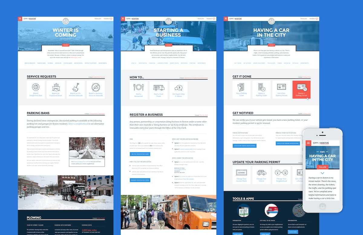
Rather than organize the site by the city’s departments, the design solution was rooted in illuminating relevant content by topics—people’s life moments—many of which overlapped through different branches of government. Owning a car in the city, for example, is closely related to preparing for winter, so bridging those common threads allowed for a more intuitive organizing principle.
In the process of the site redesign, IDEO also helped to create a visual identity system that underscores Boston’s strengths: the city’s confidence, humility, personality, and optimism.
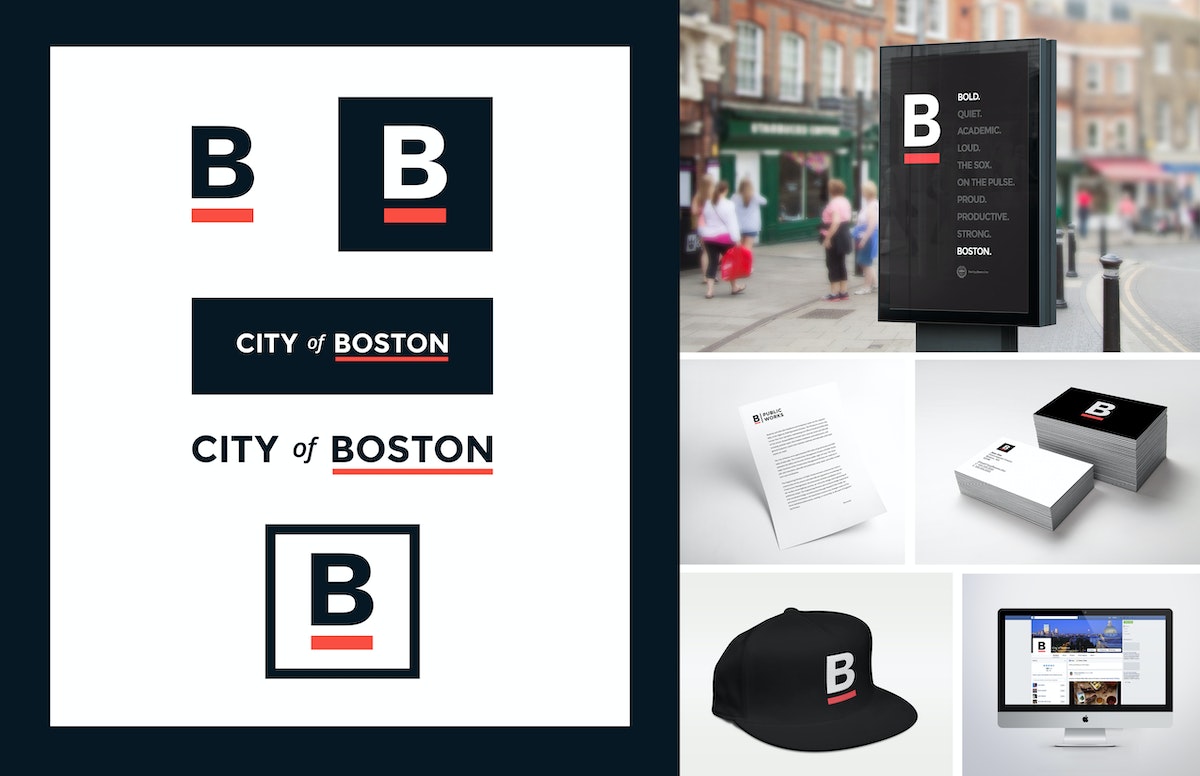
In addition to the web architecture and redesign, IDEO also produced a comprehensive style guide to help maintain design consistency, so departments can add content without compromising the overall integrity of the site, as well as a brand look that the city has decided to adopt across nearly all of its consumer-facing media. Now you’ll see the famous underlined B on T-shirts, banners, and even snow shovels.
Holding true to its mission to include Boston residents and all site users in its design process, the new Boston.gov site was piloted for six months, and the process document on the city’s blog (including the IDEO designed brand guide), before a full launch was rolled out in July 2016.
“The website should act like a helpful human. This is one of the big differences between the old site and the new site,” said Jascha Franklin-Hodge, the city’s chief of information technology in a Boston Globe article. “Oftentimes, when you looked at something on the old site, it would feel like you were interacting with some sort of lawyer-robot that was speaking to you in government-speak, using very formal language. We are trying to move away from that so your experience is akin to a person.”
The City of Boston was in need of a new digital home—one that emphasized a shift to a more welcoming tone and commitment to its citizens.
Growing an American brand in China
How an outdoor retail company found a new audience through digital and physical shops.
In the Western Hemisphere, The North Face brand has long represented an active, sporty lifestyle that’s filled with challenges and adventures. But appreciating “the great outdoors” in China is less about extreme sports and more about connecting with nature in a communal, spiritual way. This research-based insight led the team to identify new opportunities for The North Face to better target its messaging.
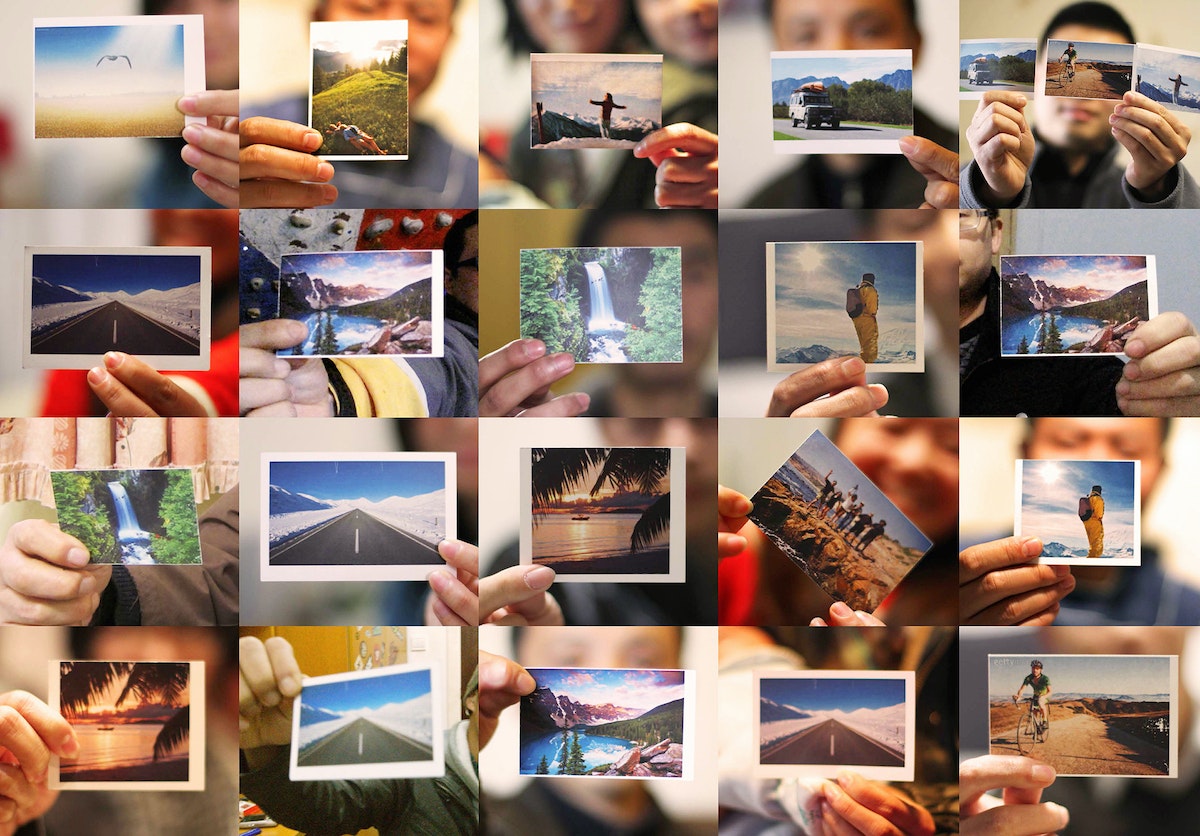
Designers found a key opportunity: Encourage Chinese consumers to escape the pressures of hectic city life by enjoying the freedom and renewal that comes with spending time outdoors.
Today, as people find less time to enjoy the benefits that lie just beyond China’s large cities, there’s a tangible desire to return to the outdoors to refresh, reassess, and renew oneself. The North Face aims to help consumers do exactly that.
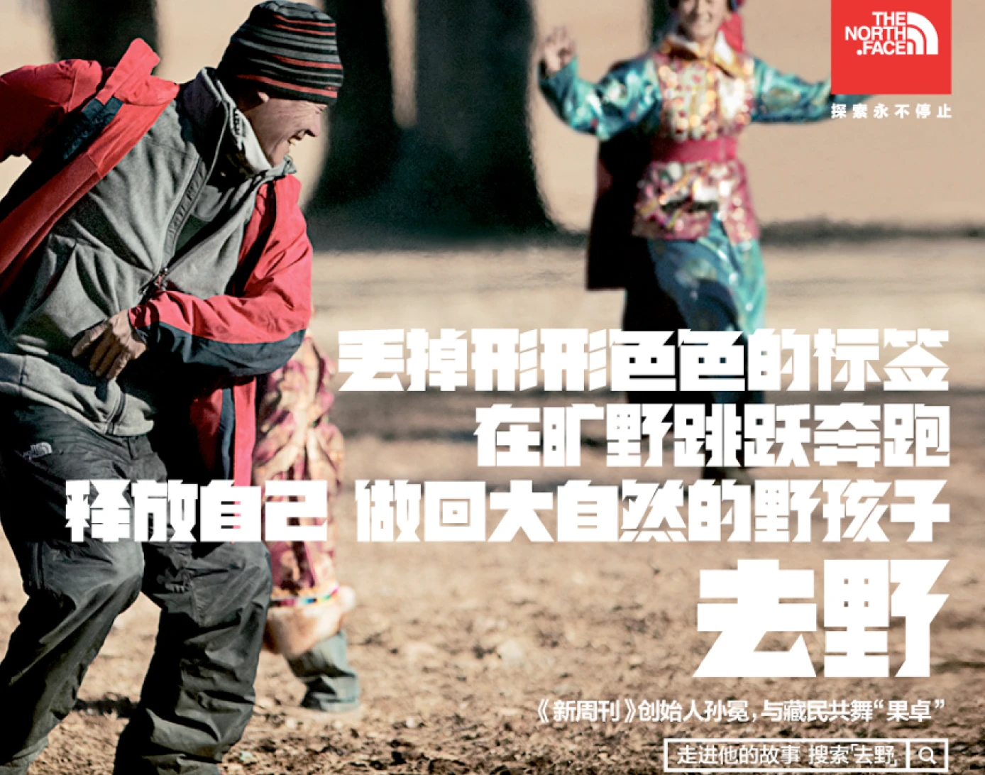
To create a compelling new brand vision for The North Face in China, the team’s design research tapped into Chinese ways of spending time outdoors. IDEO’s insights and creative brief provided the essential brand story for The North Face in China and informed the tagline of the company’s current marketing campaign, “Go Wild” (去野). The North Face brand’s new messaging links “old nature” and “new outdoors” through a combination of digital, retail, and interactive community channels.
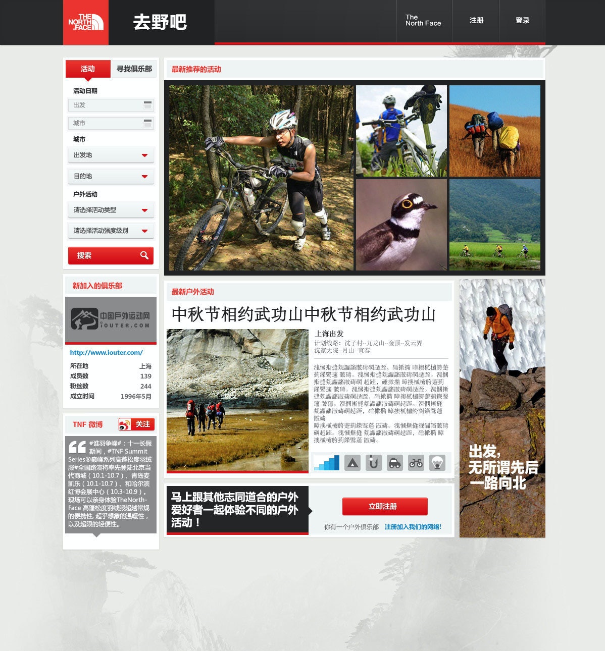
IDEO also collaborated with the company on designs and prototypes for a new digital platform and an updated store-within-a-store merchandising display. The digital community aims to attract newcomers and connect them with more experienced outdoors enthusiasts and clubs. As the platform evolves, it will help aspiring adventurers plan trips, learn skills, and share their experiences through photos.
The retail community space aims to integrate this digital community with in-store shoppers and an effort to turn the “buy-a-product moment” into a “join-the-outdoors moment.” Both will be integrated to provide a holistic brand experience in China centered on nature and community.
In the West, The North Face, with its decades-long history, has long symbolized an adventurous, active lifestyle. In China, however, the outdoor market only began accelerating in the early 21st century.
Success in this growing market depends on building strong and deep connections with Chinese consumers.
20% sales growth in China
from 2012 to 2013—the year the project was completed—propelling the brand from sixth place to a market-leading position
Nearly 40 years of designing pharmaceutical excellence
How a decades-long collaboration with Eli Lilly has transformed patients' lives and health outcomes.
Over the last 36 years, IDEO and Lilly, along with the pharmaceutical giant’s other design, development, and manufacturing partners, have collaborated on more than 250 projects. During this time, Lilly has not only honed its engineering-focused internal device-development team but also transformed into a human-centered organization with extensive, robust in-house innovation capabilities.
Early in the relationship, a team of IDEO designers and Eli Lilly leaders traveled the world to understand how people with diabetes live with the disease. Their findings led to the design of a series of award-winning insulin injection pens like SAVVIO. Portable, aesthetically pleasing, and discreet, the pens are suitable for use in both medical and personal settings. Combined with Lilly’s technical design prowess, this human-centered focus allows the devices to seamlessly integrate into patients’ lives and routines, making a challenging disease like diabetes feel more manageable.
Fast forward to today, Lilly’s innovative, easy-to-use auto-injectors are not only continuing to provide life-saving treatments to people with diabetes but also enabling the adoption of the popular GLP-1 weight-loss drugs Mounjaro and Zepbound, which together accounted for the majority of the company’s annual revenue in 2025. Perhaps most importantly, patients consistently rate the experience of using Lilly’s auto-injectors as relatively pain-free, easy to use, and preferable to competitors’ brands, improving adherence, satisfaction, and health outcomes.
This unwavering focus on driving innovation through a patient-first mindset is evident in some of the most impactful projects Lilly and IDEO collaborated on over the years:
GLP Auto-injectors
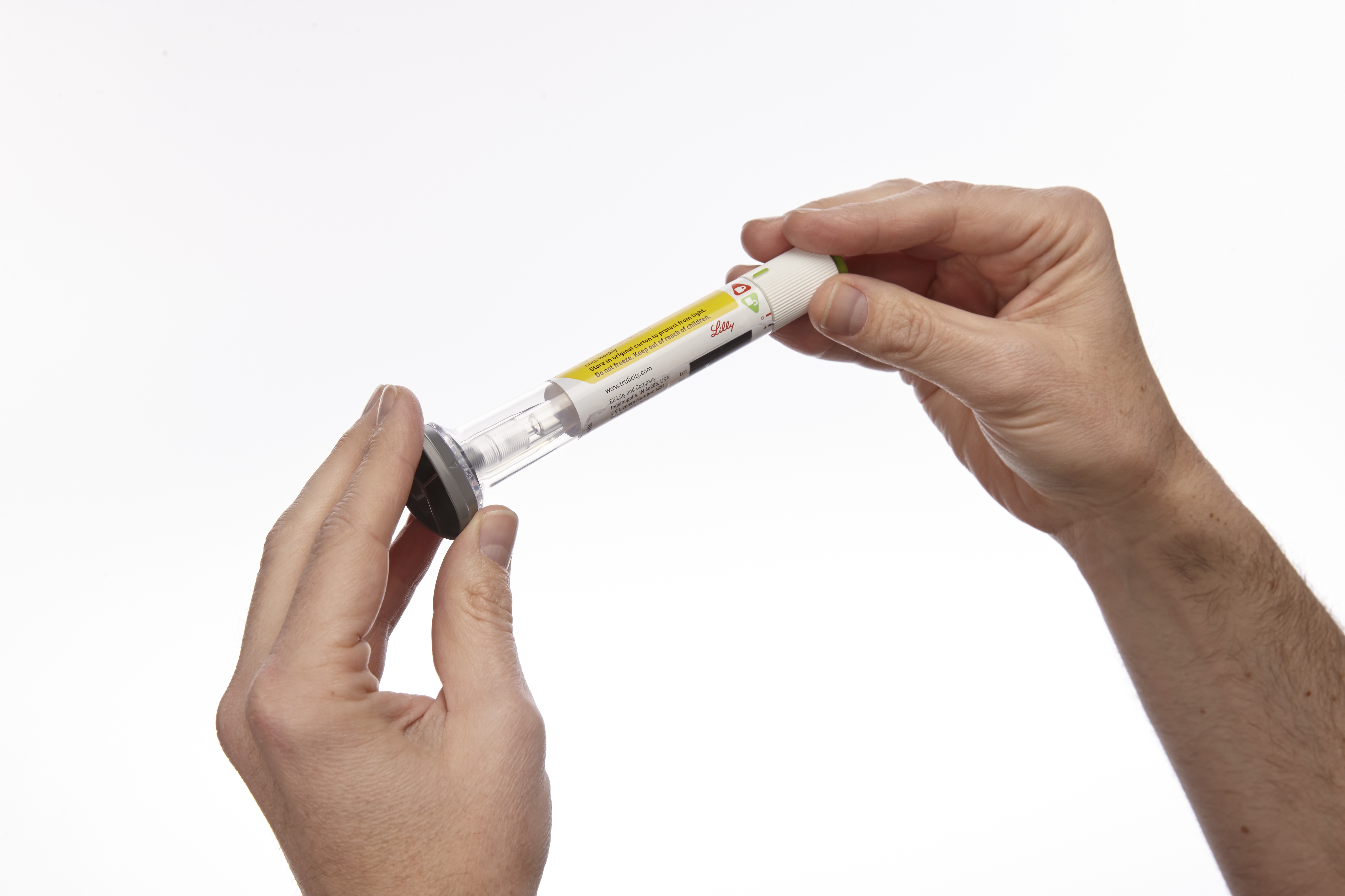
Convenient and cutting-edge, the first Trulicity injection device was originally designed to deliver the GLP-1 drug to treat type 2 diabetes. Today, it has been adapted for use with other GLP-1s, Mounjaro and Zepbound, which are increasingly popular weight-loss drugs and are also administered once weekly via fixed-dose injections. A wide base enables the pen to be held securely against the injection site, and the device automatically regulates the dose and needle depth.
Taltz Injectors
For most patients, living with severe plaque psoriasis means being your own medical technician—metering your drug dosage each time, and attaching and removing needles by hand. Taltz provides patients with clear visual and auditory feedback throughout the injection process through simple icons, bright colors, a translucent material, and clicking sounds. The devices are available in both autoinjector and prefilled-syringe formats and are adapted for Emgality, a preventive monthly migraine treatment, and Ebglyss, which helps treat eczema or atopic dermatitis.
HumaPen SAVVIO Injection Pen
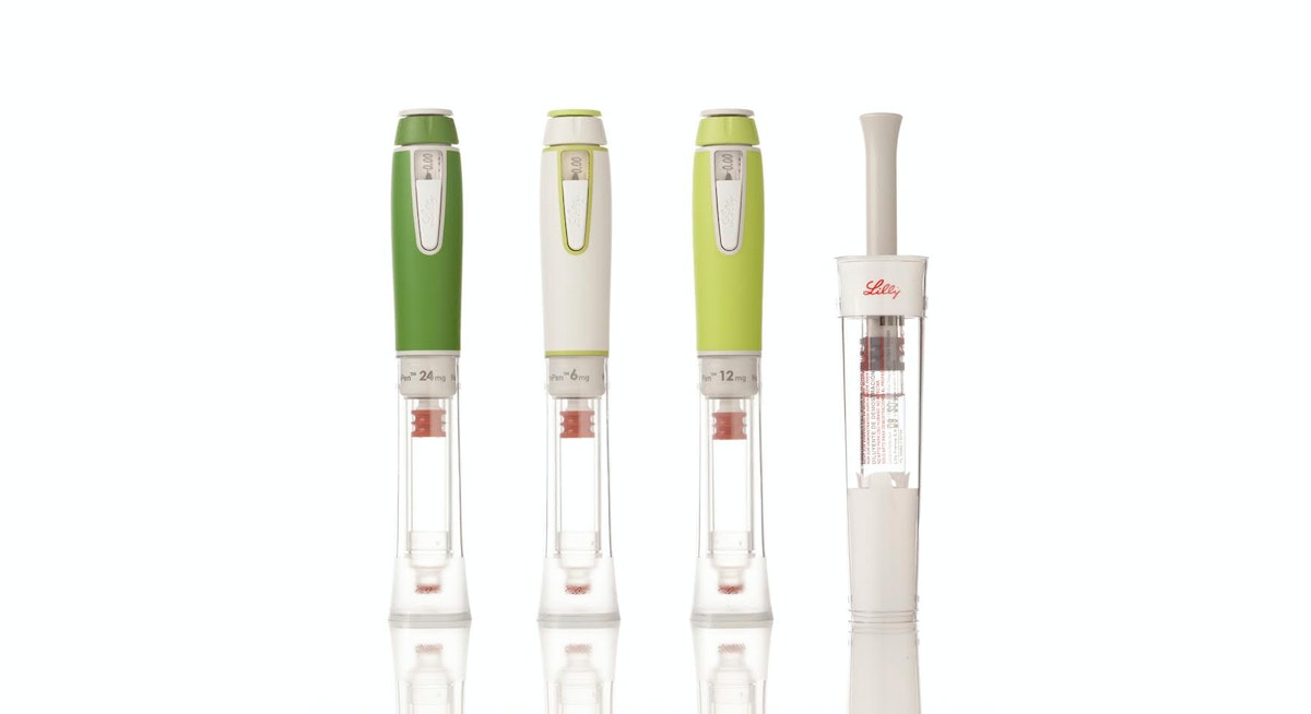
Key insights informed the design of SAVVIO, including patients’ preference for insulin pens that look less like medical devices and more like everyday objects you’d find in a backpack or purse. The sleek, colorful device was created to help patients feel comfortable and confident about fitting mealtime injections into their everyday lives.
Refillable Human Growth Hormone (HGH) Injector and Reconstitution Device
Designed to be kid-friendly, the Refillable HGH Injector leverages insights into pediatric treatment adherence to create a more integrated, systematic approach to treatment, while the Reconstitution Device makes mixing Lilly’s powder-and-liquid drug easier and less intimidating for parents and healthcare professionals alike.
KwikPen Insulin Pen
KwikPen is a next-generation, prefilled insulin injection pen that builds on the success of two previous designs, reducing its size to 5.7 inches and enhancing ease of use for patients.
HumaPen(R) Luxura™ Insulin Pen
HumaPen Luxura combines several innovations into a robust yet elegant pen that can be carried and used anywhere—an insulin pen solution that improves dosing accuracy, dose setting, and injection force.
In addition to designing products to meet the needs of people with diabetes, IDEO and Lilly have developed innovations in areas of oncology, autoimmunity, and men’s health. The results of this collaboration and expansion have won numerous design awards and produced one of the longest and most fruitful innovation relationships in IDEO’s history.
In the 1990s and early 2000s, Eli Lilly had a number of new, life-changing medications and two big challenges: Most of its drugs were self-injectables, not pills, so patients were hesitant to take them. And its drug-delivery device platform lagged behind its drug pipeline.
99%
of Trulicity users reported the auto-injector was “easy” to “very easy” to use in a JDST study
$36.5B
of Lilly’s $65.2B 2025 revenue came from sales of its auto-injectable GLP-1s, Mounjaro and Zepbound, a 45% increase from 2024

Reimagining San Quentin
Bringing together many voices for a report for the Governor of California.
“…the Advisory Council will recommend transformational programmatic, cultural, and physical change to San Quentin that can serve as a practical model that can be replicated and scaled to other institutions.”
Source: Office of Governor Gavin Newsom: Governor Newsom Names Leading Criminal Justice and Public Safety Experts to San Quentin Transformation Advisory Council, May 05, 2023 https://www.gov.ca.gov/2023/05/05/san-quentin-transformation-advisory-council/
The Advisory Council included the expertise of established criminal justice, public safety, healthcare, academic, reentry, and rehabilitation professionals, along with system-impacted/formerly incarcerated community leaders, and representatives of crime victims/survivors. The premise of IDEO’s involvement is to augment the Advisory Council Co-Chairs’ and members’ expertise in evidence-based best practices and lived experience living and working in prisons, with expertise in collaborative design, synthesis, visualization, storytelling and bringing visions to life.
Specifically, IDEO was brought in to facilitate input-gathering, and assist with incorporating the many viewpoints into a single, cohesive report of recommendations to the Governor. This included meeting the challenge of bringing together the viewpoints of 21 people on the Council (17 members, three Co-Chairs and an advisor to the Governor); incorporating the views of people who are most impacted (those incarcerated at San Quentin, San Quentin staff, community-based organizations, victim/survivor groups, among others); and formatting and designing the final report.

IDEO’s facilitation included workshops with the full Advisory Council, individual interviews and check-ins with Council members to gather their input to inform the recommendations. Each Advisory Council member was asked to speak with, and record feedback from, no fewer than five people at San Quentin or in affected communities and to share this feedback with IDEO. IDEO integrated this information and feedback into this report.
Research activities included visits to San Quentin to speak with and facilitate conversations with:
- San Quentin residents (100+) including the Citizens/Inmate Advisory Council, focus groups with Spanish-speaking residents, former gang members, ACT (LGBTQIA+), Voices Heal, People in Blue, San Quentin Citizens Advisory Council.
- San Quentin staff (100+) including interviews with numerous officers.
- San Quentin staff and residents together.
- Current participants and staff at Amistad (MCRP) and Beacon (former lifer) campuses (many who were previously incarcerated at San Quentin).
IDEO also organized listening, information sharing and feedback sessions, both at San Quentin and in the community, between Co-Chair representatives and various stakeholder groups, including victim/survivor groups, labor unions, and advocacy organizations. These perspectives were also brought into the report.
A Day in the Life of a Design Researcher
Follow a design researcher through her day conducting field research in Tokyo
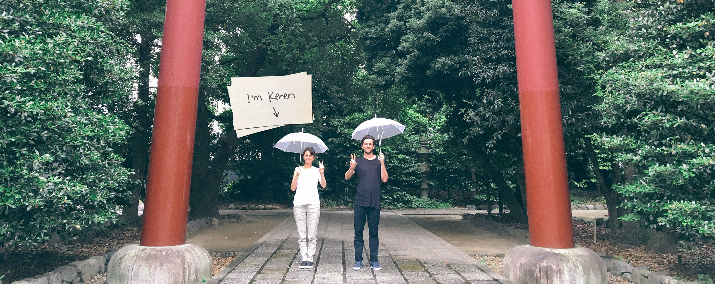
For my latest project, I worked with a Japanese insurance company to explore the mindset of "digital natives." Who are they, and what do they care about? After doing ethnographic research, we made a film to communicate what we learned. Juggling the roles of producer, creative director, and design researcher, I worked alongside Sean, a videographer, to bring the story to life. We looped back with one of our research participants in Tokyo and tagged along with her for a day, asking some targeted questions.
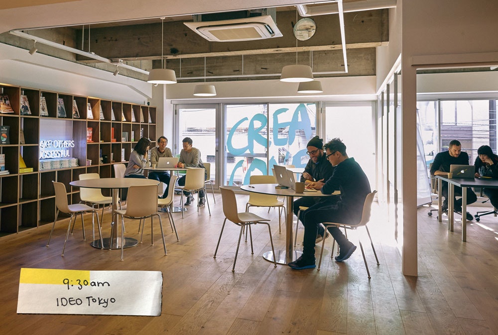
9:30 AM: Arriving at IDEO's Tokyo studio to start the day.
10:30 AM: From the studio we set out to meet our subject, Yoko*, and begin filming.
The purpose of the film was to bring the client closer to the people they want to serve, to help them understand the texture of their lives and what matters to them. We chose film as a medium because of its intimacy—allowing the viewer to feel as if they are hanging out in Yoko’s world for a day.
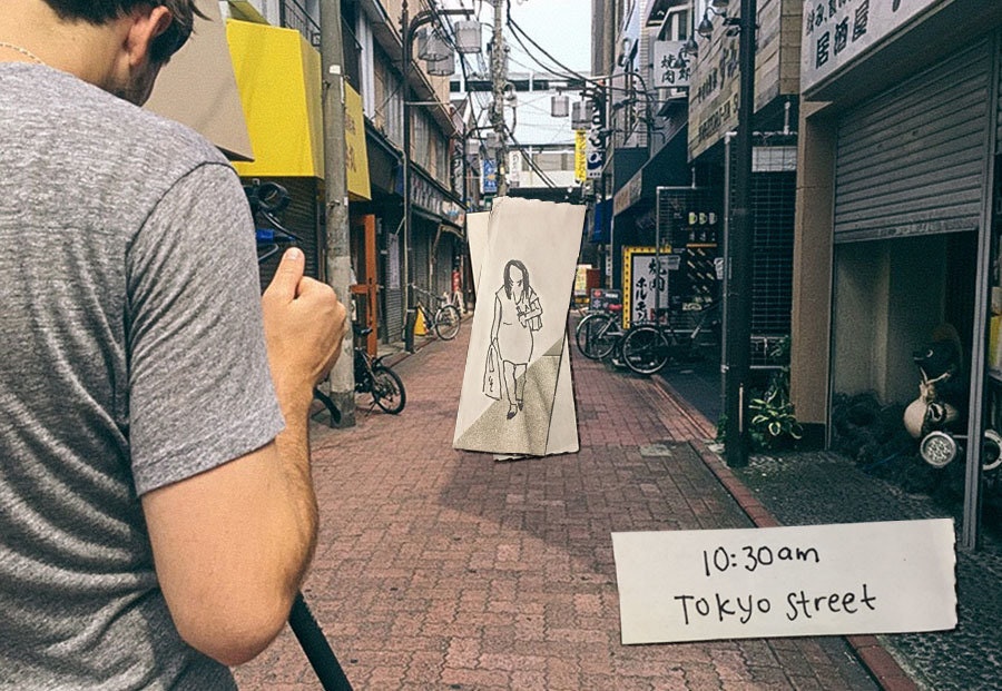
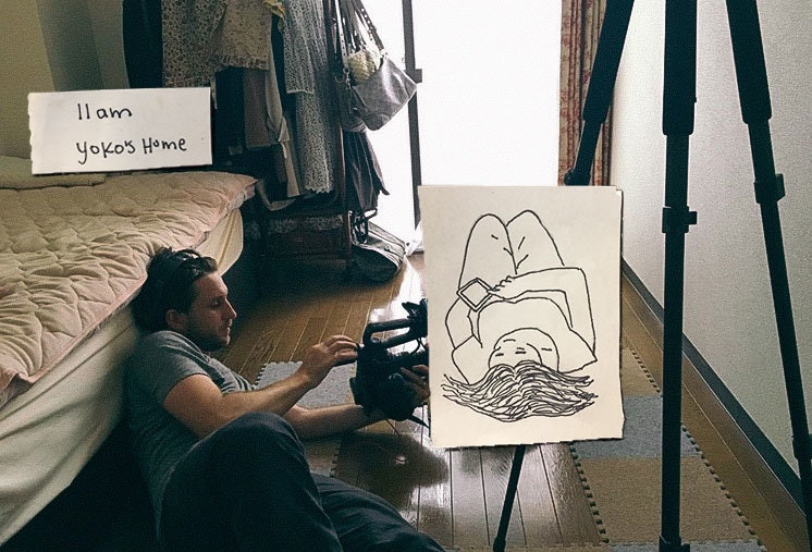
We had a translator with us to be sure we understood the nuance and intent of what Yoko told us. We tried to get to the heart of things. When people truly feel as though you're listening, they start to reveal themselves. That’s the magic that happens in design research. You are there to listen, not to respond.
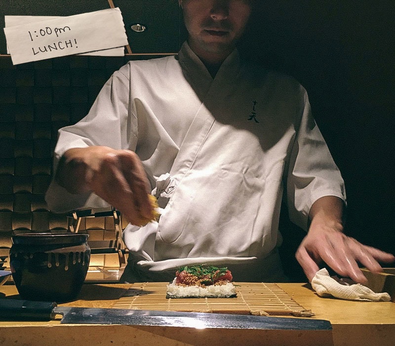
1:00 PM: Taking a break to enjoy some authentic local cuisine.
You can learn a lot about a culture's rituals and values through food!
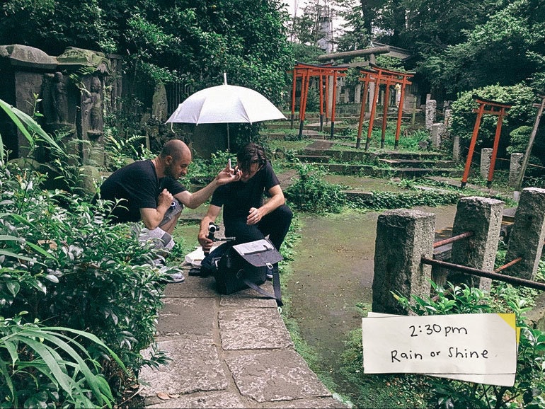
2:30 PM: Capturing B-roll to round out the story.
Doing the research is one thing, but how do we capture and share it in a way that incites action? If we’ve created nothing more than an esoteric emotional piece, we’ve failed. We set out to inspire change in our client organizations.
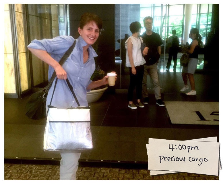
4:00 PM: Precious cargo.
As a nursing mother, I have to juggle a whole new set of responsibilities on business trips. The ice cooler is the new messenger bag.
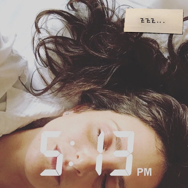
5:13 PM: Jet lag is no joke! Catching a pre-dinner cat nap.
Traveling to cool places around the world can sometimes seem more glamorous than it is. But still, I always find myself filled with so much inspiration. I run on adrenaline, and then at some point I crash.
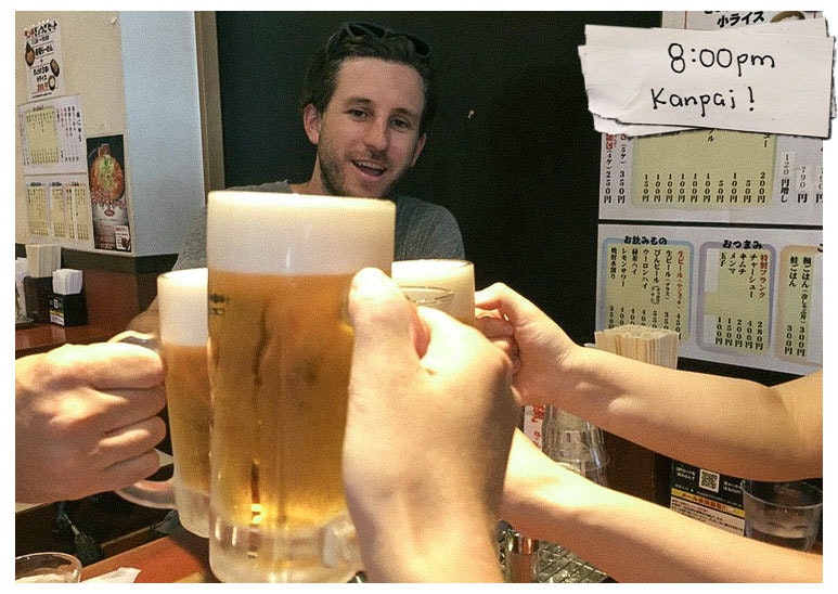
8:00 PM: A happy team moment at the end of a long day.
Want to get to know your team quickly? Travel together! The shared experience of exploring new places while working hard is a great way to bond.
Learning about different cultures and customs is one of my favorite parts of design research. We get to understand so much about people by looking in on the day to day of their lives, their habits and routines. Cultures can vary, but regardless of where we are in the world, human needs are so similar. Uncovering these needs and helping to design for them can feel incredibly fulfilling.
*We've changed the name of our interview subject out of respect for her privacy.
When people ask me what I do for a living, I say, “I try to understand why people do the things they do.” What inspires them to act? What motivates them to make certain decisions? What really makes them tick, or what makes them feel understood? Design research is like being a reporter or anthropologist or therapist—you’re given access to people’s lives that feels like a great privilege, and with that privilege comes great responsibility.
7 Tips and Tricks for Eye-Catching Window Design
When the IDEO San Francisco studio moved its office to Pier 28, we landed a whole new design challenge: a massive, floor-to-ceiling front window along the Embarcadero. For the first time, we had a public display case to highlight our events and projects, and we had to figure out how to best activate it, while sticking to some pretty strict rules.
Since we moved in, Andy Deakin and I have teamed up to build out our displays. As industrial designers, we’re not trained in the art of window displays, but we’ve developed our own principles, drawing on our work creating physical exhibits or immersive experiences—and the rules set by the Port Authority.
Unlike traditional window fronts, ours comes with an elaborate set of constraints. The building is owned by the Port Authority of San Francisco, which has strict guidelines for what can be put on display. No direct advertising, no big logos, and nothing that looks too much like retail. The location also presents its own challenges: We have to create something strong enough to compete with the towering Bay Bridge above, and the bright sunlight along the Embarcadero. And every design has to do double duty—it needs to have meaning for people walking by on the street, as well as our coworkers and clients inside the building.
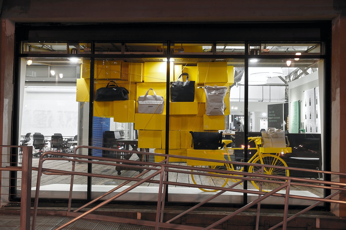
Our latest window design centers on a new line of cycling bags IDEO created with Brooks England. This time, the biggest challenge was showing off the gear without making the window feel too much like a store. We pulled inspiration from displays and exhibitions we admired, then brainstormed and sketched different iterations as a team before landing on the final concept: a bright yellow bike strapped with a mountain of boxes, which act as shelves for the bags to perch on.

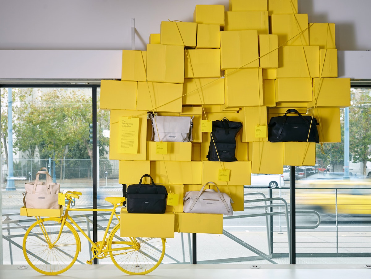
Here are our seven rules for window design.
1. Set the Focus
What is the central focal point of the visual story you’re telling? Distinguish between primary elements and stage-setters. Try using only one material throughout, or in the case of the Brooks window, dip everything in one color to simplify the backdrop and create a neutral stage for the centerpiece—the bags.
2. Exaggerate Scale
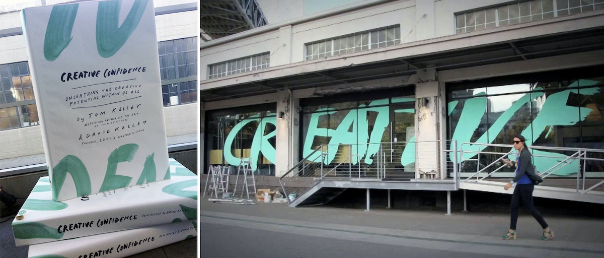
Playing with scale helps create a big impact—especially if you want to amplify small objects to fill an entire window. We loved the Selfridges window display of giant flowers for the Apple watch, and employed this trick when we built a display for the launch the launch of Tom and David Kelley’s Creative Confidence. For that project, we created a six-foot-tall stack of books to fill the window.
3. Repeat a Theme
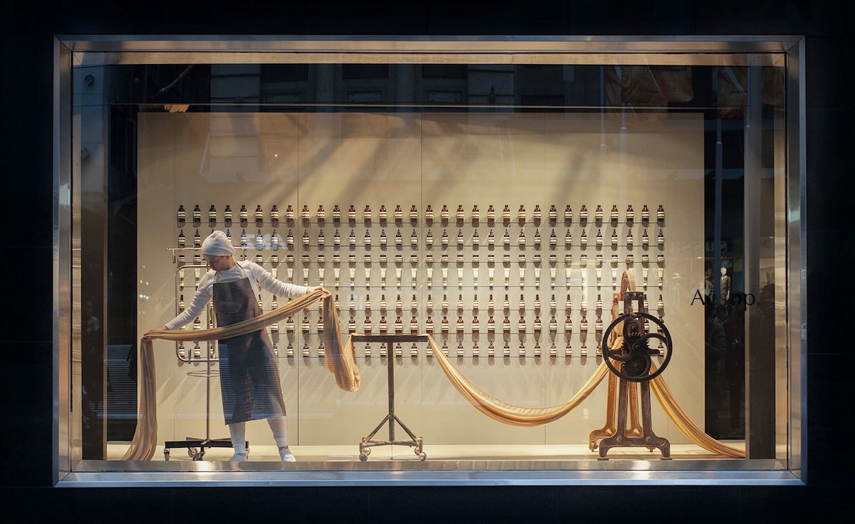
Whether it’s boxes, sticks, chairs, or lightbulbs, selecting one item and repeating it to completely fill the space is a simple trick to create an impressive sense of complexity. Aesop is a master of this and we’ve borrowed the technique for numerous exhibits.
4. Create Depth
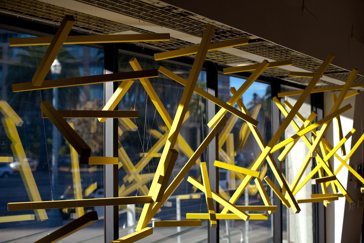
Many windows create the illusion of depth when they’re actually quite two-dimensional. Using layers and forced perspective—similar to the tricks of theatrical set design—helps to draw the viewer in. Thomas Brisebras’ MAKE installation was a great example. Seemingly random floating sticks transformed into the word MAKE as you walked past the window. His was certainly the most Instagrammed window we’ve created so far.
5. Add Momentum
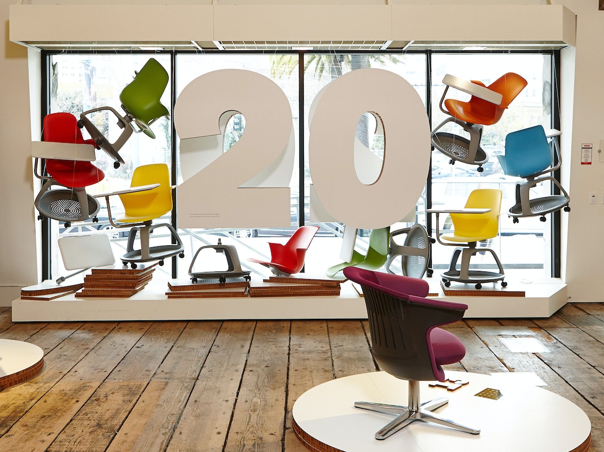
When they're composed in a particular way, static compositions can feel almost like they are in motion. Objects can be suspended in midair or positioned to make it seem like they're flying through the scene. When we created our 2020 event window, we installed multiple Steelcase Node chairs to give the impression they were jumping in the air.
6. Design for Duration
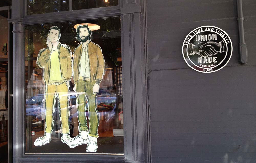
Our window budget often limits the types of materials and construction methods we can use. But keeping the duration of the display in mind can help guide the choice of materials. If it is only intended to last for a few weeks, exploring what you can do with cardstock might make the most sense. Unionmade, a San Francisco store, does a nice job of repurposing everyday objects and designing with lo-fi materials to suit their quick refresh rate.
7. Above All, Entertain
And don’t forget inject some play and humor into the mix. Watching people on the street look up and get the joke is half the fun.
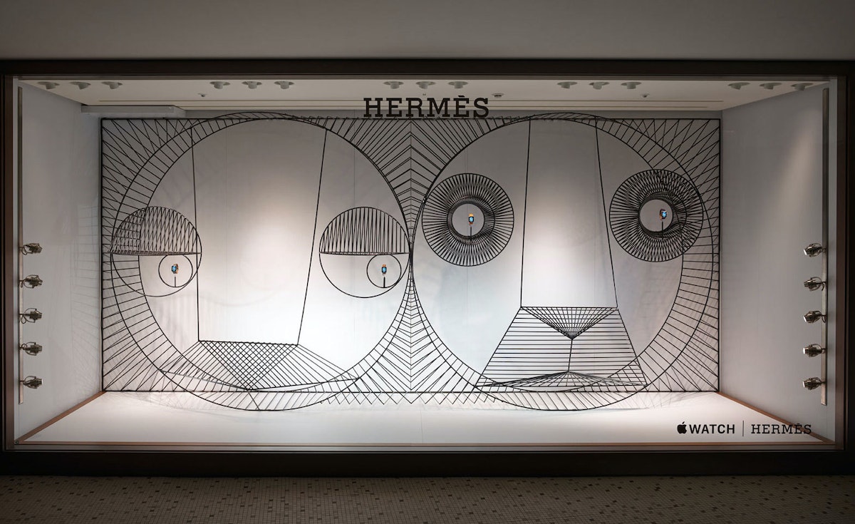
When the IDEO San Francisco studio moved its office to Pier 28, we landed a whole new design challenge: a massive, floor-to-ceiling front window along the Embarcadero. For the first time, we had a public display case to highlight our events and projects, and we had to figure out how to best activate it, while sticking to some pretty strict rules.
Designing for DEF CON
How to trick out your very own Bender Badge
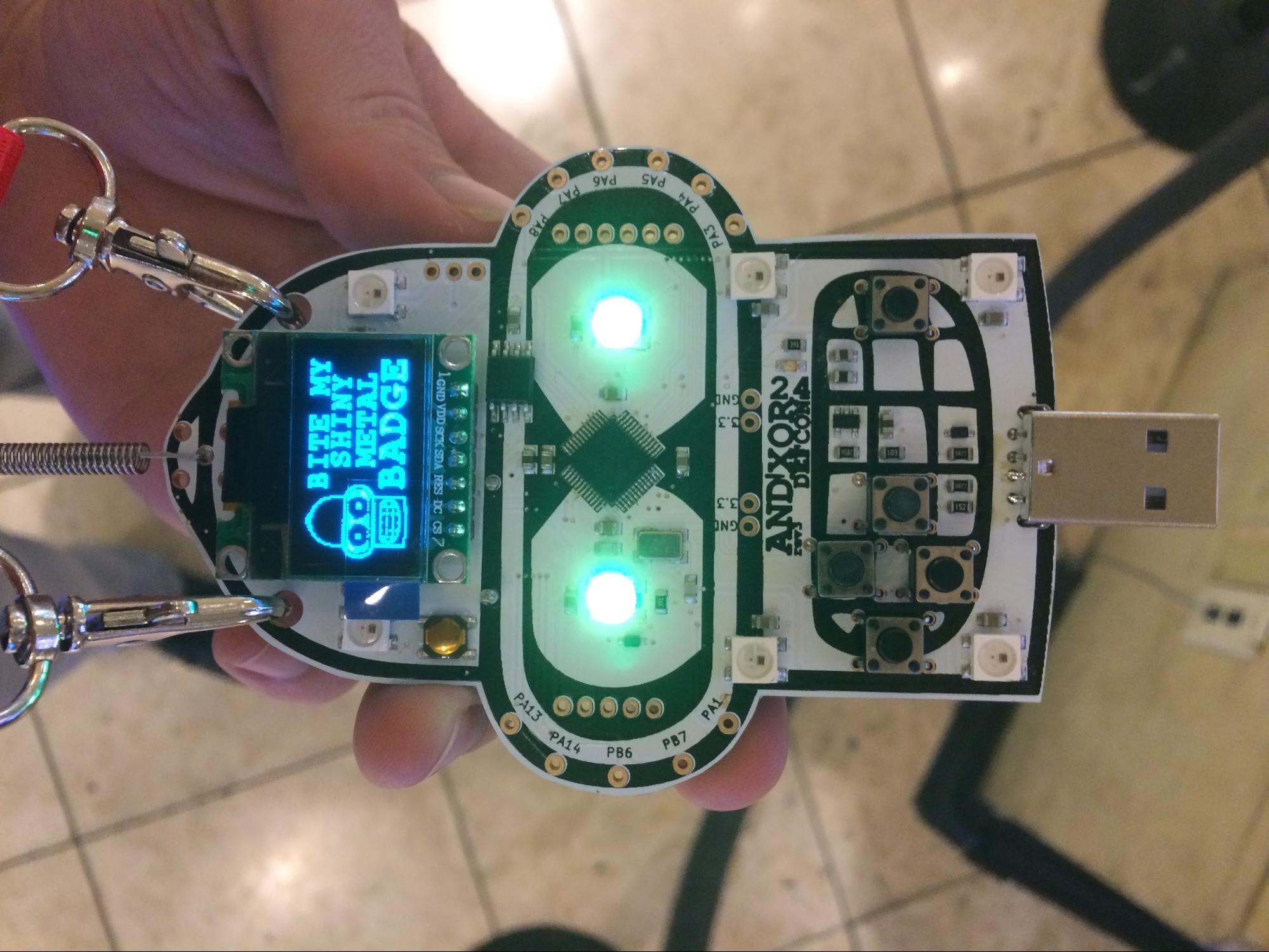
Last year, about a month before the con, I came across a Bender Badge project by AND!XOR—a group of hackers from California—on Hackaday. The Bender Badge is a nod to the robot character from Futurama and it comes packaged with games and flashy lights in the shape of his head. It’s also designed to be hacked (the barrier to entry is low—it can be programmed using the Arduino IDE). It seemed like a good place to focus my excitement.
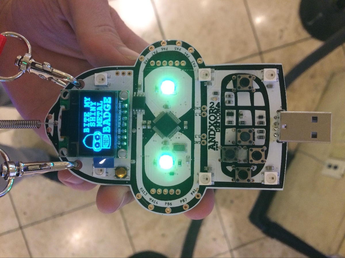
For years, I have been looking for an opportunity to design something for DEF CON that interacts with sound. Networking and parties are a big part of the con, and often these events feature live DJs and music. I also wanted to create a design that relates to Bender's personality—he's often drinking and smoking, so a cigar seemed appropriate. Optimal choice: a cigar-shaped microphone.
The Bender Badge comes equipped with a standard set of hardware components (buttons, LEDs, and a display). Since the project was still in development, and I didn’t know which parts would be in the final version, I decided to build an add-on. The badge kit features an STM32F103 microcontroller, which includes an analog-to-digital converter (ADC). This allows the microcontroller to receive analog audio data by sampling it at high speeds and converting it into digital values. My goal was to use a microphone to capture the surrounding audio data and then convert that data into frequency components via Fourier analysis—specifically, using the discrete Fourier transform (DFT). The results of the Fourier analysis can be displayed as a bar graph. This is commonly referred to as a spectral analysis, and in this case, it would focus on frequencies between 20 and 20,000 Hz (the range for human hearing).
Proof of Concept
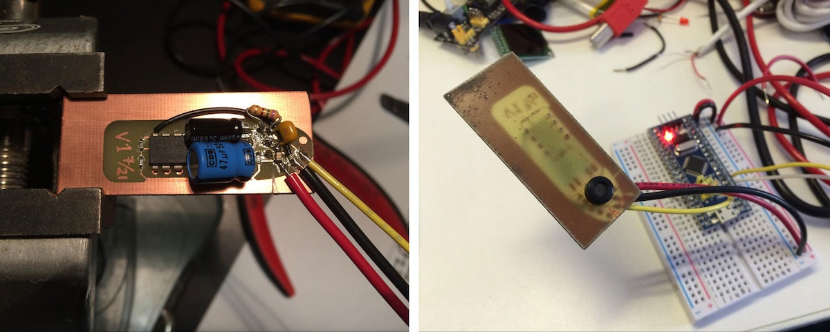
I built the microphone circuit to make sure it was configured properly before creating the printed circuit board (PCB). The circuit starts with the microphone to capture surrounding audio. Next, the signal from the microphone is amplified so that the microcontroller can receive a wider range of data from the ADC, which results in better definition from the Fourier transform. Lastly, the amplified signal goes through a low-pass filter to suppress any frequencies above 20,000 Hz that could interfere with the analysis.
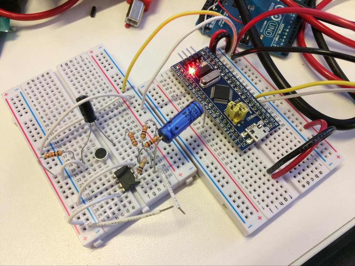
The greatest challenge during this stage was implementing the DFT on the STM32 microcontroller. Thankfully, there is an algorithm called the fast Fourier transform (FFT) that speeds up the computation for the DFT, but it's still a complex and time consuming calculation. Performing the FFT and then updating the display is a time-sensitive task. If the display is updated too slowly, it will look choppy and less responsive. Luckily, I came across a library developed by STMicroelectronics that was already optimized to work with my specific microcontroller.
Circuit Board Design
One of my biggest hurdles in designing the PCB was board size. I didn’t know the exact size of the Bender Badge, but I attempted to scale everything based on the buttons and the screen. From there, I figured out what size I wanted the circuit board to be so that it looked proportional to the badge. I was able to make the badge look like a cigar by adding silkscreen to the top layer (the label, paper edges, and ash at the end), and by cutting the PCB into a cigar shape.
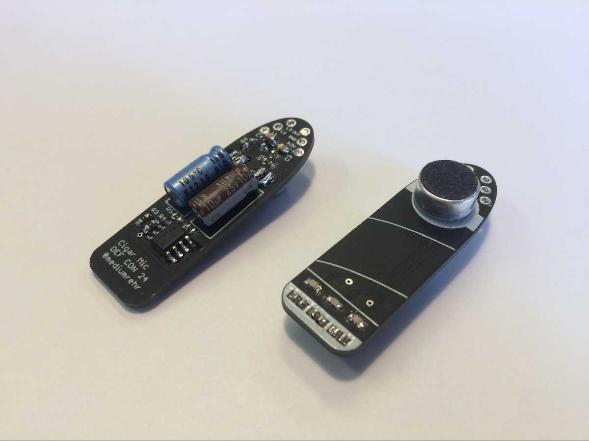
I placed most of the surface mount parts on the bottom of the circuit board to keep them hidden. The microphone stayed on the top layer to efficiently capture surrounding audio. (It also fit nicely as part of the cigar label.) I also added orange LED "ash" to the end of the top layer to make it look like the cigar was lit. These LEDs were meant to be triggered by acoustic activity, so that they would flicker and look more like embers than a solid light.
Firmware Finalizing
Two weeks before DEF CON was set to start, I submitted the PCB design for fabrication, and I created a prototype of the board. The majority of the leftover work involved converting the FFT output into something that could be shown on the display. The FFT outputs an array of frequency groupings, known as bins, where the size of a bin (or frequency grouping) is based on the audio sampling rate and size of the FFT. The bin size can be thought of as the output resolution of the FFT, and for the cigar mic the bins are about 39 Hz (40,000 Hz/1024) wide. Bins are important because they contain information on the amplitude of frequencies within each group. If the cigar mic does not pick up any surrounding audio between 1-39 Hz (the first bin), the value for that bin will be close to zero; but if there is activity within that frequency range, there will be a value greater than zero relative to how loud that frequency source is.
The FFT bins are grouped to create a bar graph that displays frequency data logarithmically (fewer bins grouped together at lower frequencies, and more bins grouped together at higher frequencies) in an effort to resemble human hearing. The display consists of 32 individual bars that are 4 pixels wide.
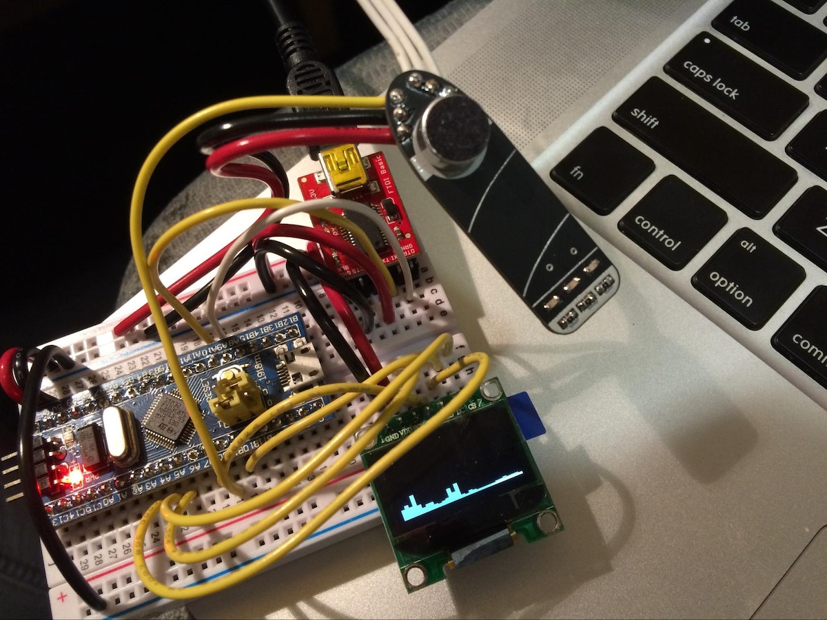
Assembly and Debugging
Once the circuit boards came back from fabrication, the first step was to assemble and test one. I connected the output of the PCB (the connection that sends the captured audio data to the microcontroller’s ADC) to an oscilloscope to see if the microphone was capturing audio and if the preamplifier was increasing the amplitude. I encountered two errors in my design. First, the microphone was incorrectly oriented, and second, I had flipped two pins on the preamplifier, which resulted in significant distortion. Both were easy fixes, but added extra time to the assembly process. As a result, I was working up until I got to DEF CON, and then some.
Shortly after I arrived in Vegas, I met up with the AND!XOR guys and showed them my addition. They loved it, and within a few hours, I had my cigar wired up, and my code running on their Bender Badge. It was awesome (and relieving) to see it all come together. Now I just have to figure out what to do for DEF CON 25.
If you want to learn more, check out my GitHub page for the project, which includes PCB files and badge firmware.
Every year, it's hard for me to contain my excitement as DEF CON approaches, so I try to focus that enthusiasm into various projects. (For the uninitiated, DEF CON is one of the world’s largest hacking conventions. The days are long, the sleeping is limited, and it’s Vegas in the middle of summer.) In the past five-plus years, designing and programming custom badges to share at DEF CON has become increasingly popular.

Thoughtless Acts: Showing Off Shades
Thoughtless Acts: Showing Off Shades. The intuitive ways we adapt and react to things in our environments
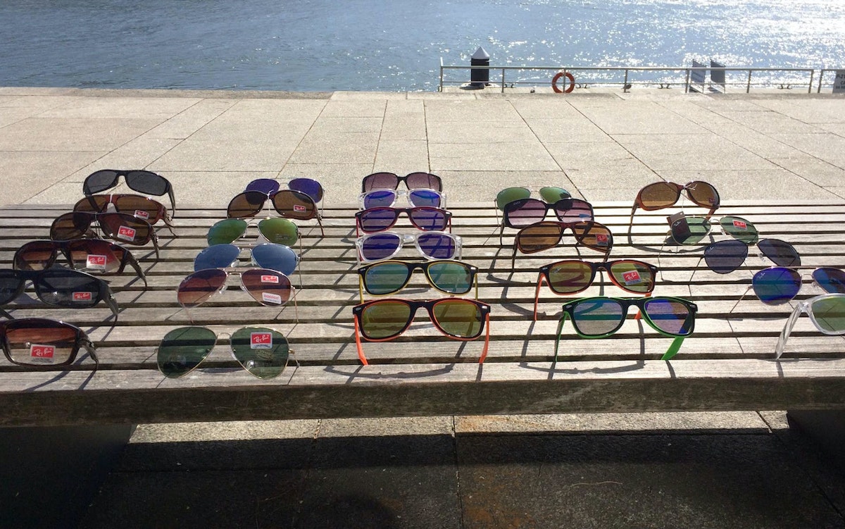
Strolling down the Porto’s Rio Douro in the bright, spring sun, a Thoughtless Act caught my eye. A man selling knock-off sunglasses had thoughtfully—or instinctively—used the bench he'd been sitting on to display his wares.
It was the perfect display stand: the slats provided a neat grid format to lodge the glasses into so they could be fully admired from all angles, while the greyed wood gave a neutral backdrop to assess the color and design.
From a design research perspective, observing the way people exploit the objects and environments around them can provide fruitful and culturally-relevant inspiration. Taking ownership of public space and repurposing it for a transient commercial opportunity was natural to this street seller. We see other examples of nomadic, 'pop-up commerce' with things like food trucks and busking musicians.
It wasn't quite enough to persuade me to part with my euros, but it was a lovely example of Thoughtless Acts in action, nonetheless!
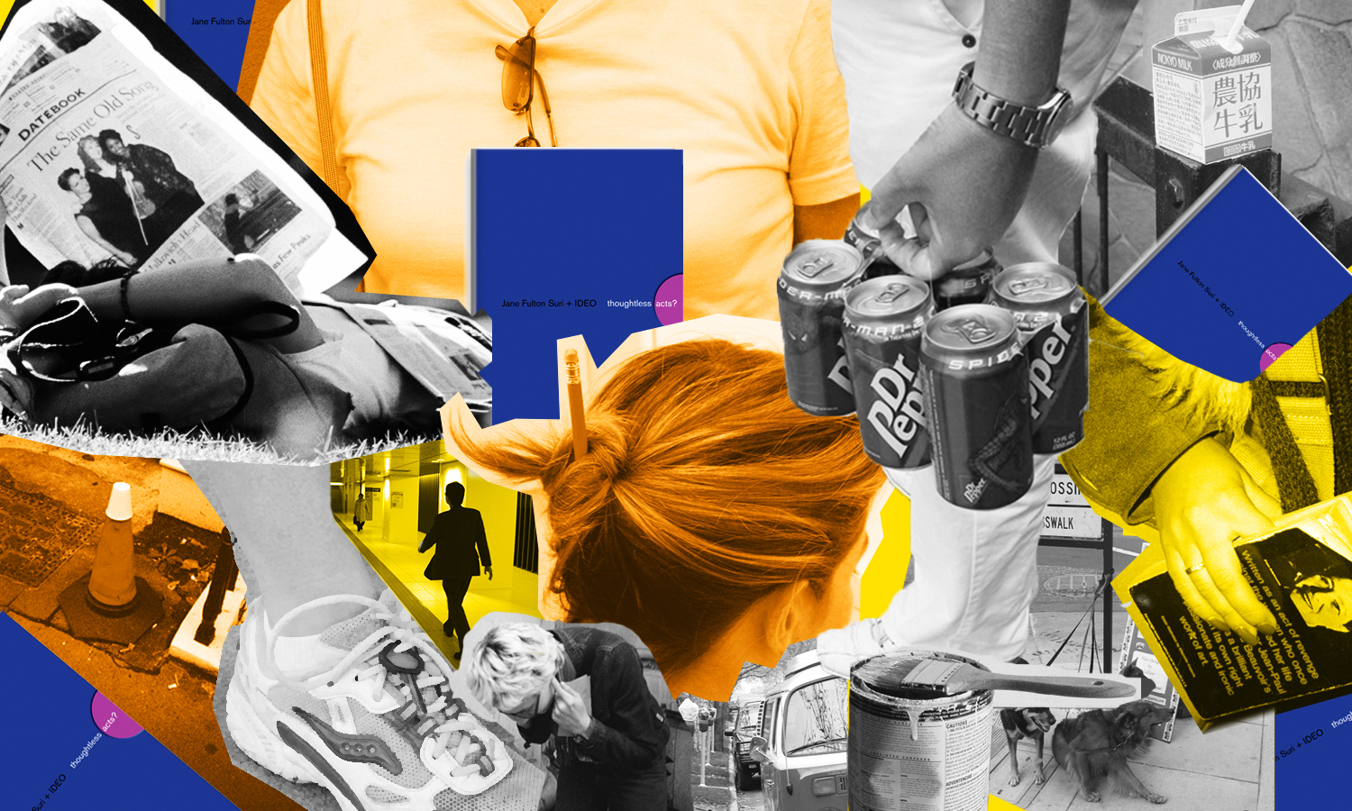
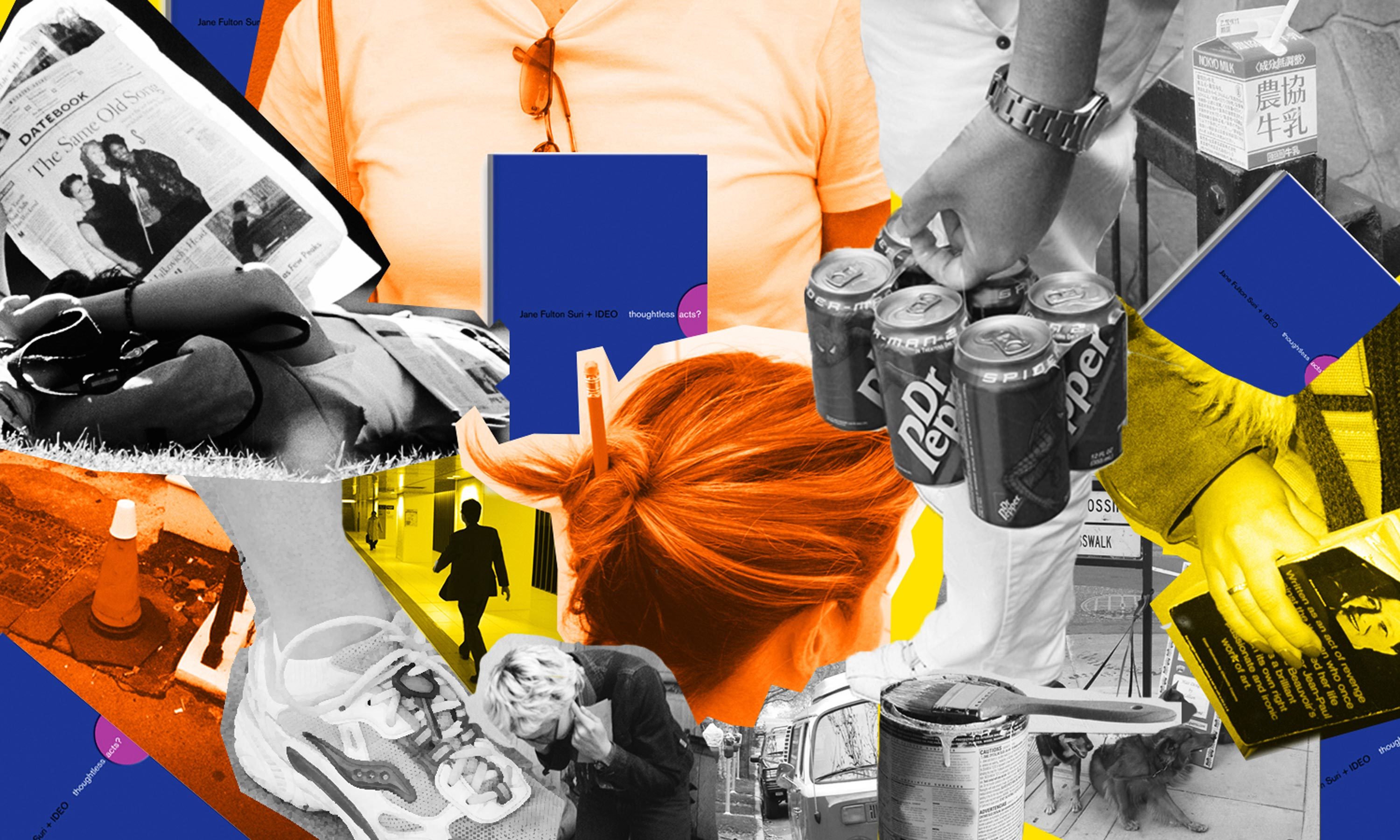
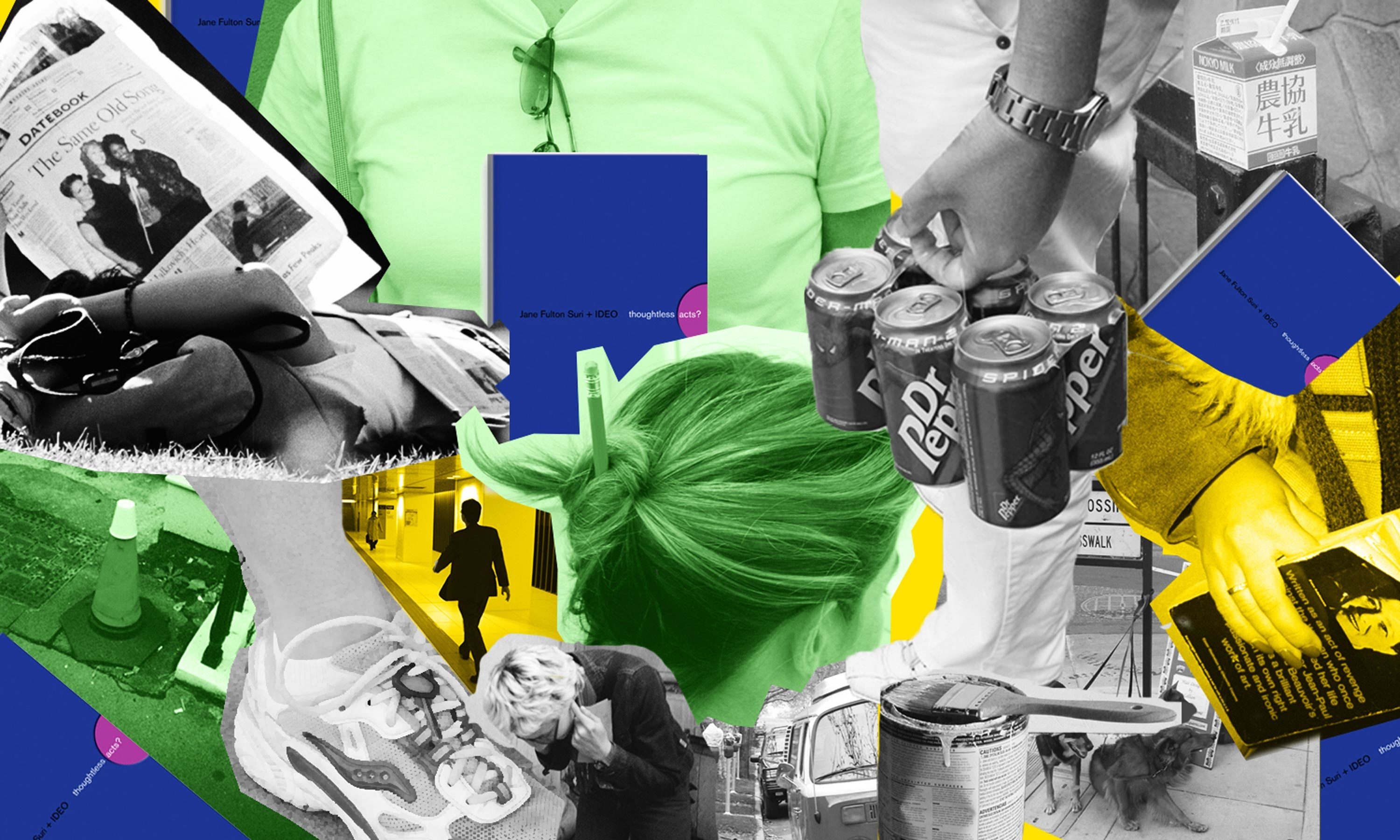
Human-centered design requires us to observe human behavior with beginner's eyes, so that we can spot the innate ways people interact with the world around them. We call these intuitive and unconscious reactions thoughtless acts, and IDEO designers collect photos of them to inspire the invention of new products, services, and experiences.

Lindsey Turner
I’m passionate about building brands, products, and experiences that help organizations show up with meaning and momentum.
I help organizations cut through complexity by shaping how they show up, through brand strategy, identity, and storytelling.
Working at the intersection of brand and business, I bring an editorial eye and a bias toward making—turning ideas into tangible experiences that people can understand, trust, and believe in.
My work spans government, healthcare, financial services, media, and consumer goods, from launching Gen Z-focused ventures to building innovation labs and reimagining legacy brands. I relish moments of ambiguity and enjoy translating across teams, perspectives, and priorities to move ideas forward.
I started my career in editorial and digital design, shaping cross-platform experiences and identity systems in publishing and agency environments. That foundation still shapes how I work today: I’m detail-oriented, collaborative, and overreliant on the Oxford comma. I hold a BFA in Visual Communication from the School of the Art Institute of Chicago.

Rachel Young
My work helps organizations see who their products aren't working for—and build the will and the tools to do something about it
For 25 years, I've asked the same question: Who does this design exclude—and what are we going to do about it?
My work spans human-centered strategy, inclusive design, and qualitative research, with clients ranging from Microsoft, Google, and Verizon to the National Science Foundation, and San Francisco Unified School District.
Before IDEO, I taught elementary school in East Palo Alto and spent a decade doing design work with social service organizations—where I learned firsthand what it costs people when systems are built without them in mind.
I am currently writing User Error, a nonfiction book about digital access and the design decisions behind it. I live in Oakland, California.

Brian Pelsoh
I lead with craft, ensuring our work is creatively excellent: rooted in deep human insight and imagination, while also grounded in the realities of business and technology.
My expertise spans brand, communication, and product design across tech, education, the arts, and social impact.
I believe great work demands both high-level vision and obsessive attention to detail, and only happens through collaboration.
I bring an inclusive, hands-on approach and a deep understanding of business, which enables me to consistently deliver excellence while always asking why.
Before joining IDEO, I worked at the brand firms Pentagram and VSA Partners. I began my career as a designer, leading teams at the School of the Art Institute of Chicago and the Milwaukee Art Museum. I hold an MFA in graphic design from Maryland Institute College of Art and a BFA in communication design from the Milwaukee Institute of Art & Design, and have taught at some of the best design schools in the US.

Tony Wong
I am responsible for IDEO’s long-term success in China and working with clients to use design as a tool to enable growth.
I am responsible for IDEO’s long-term success in China and working with clients to use design as a tool to enable growth. Specifically, I have helped Chinese companies design holistic brand solutions through the development of their products, communication, services, and innovation teams, and I have helped multinationals expand their presence and influence in China.
I advise global leaders on developing China-led innovation and capabilities.
In over 15 years in IDEO Shanghai, I have worked on projects that use design to elevate the quality of the experience of healthcare products and services, streamline processes that increase productivity, create spaces and programs that promote and enable inclusive communities, and build next generation mobility solutions that are planet-positive.
Before joining IDEO, I worked at Philips Electronics and the Electrolux Group in Italy, the Netherlands, and Singapore on a number of breakthrough commercial products. I am a member of the Young President Organization in Shanghai.

How to use AI as an editor, not a writer
Ed White shares how he uses AI as an editor—not a writer—to sharpen storytelling, rehearse ideas, and preserve the productive friction that makes creative work better.
Ed White has a rule he's tested on his own writing: hold yourself as the writer, and let AI be your editor. Ed is a Senior Design Director at IDEO's London studio, where he co-leads the firm's AI portfolio across Europe. Before IDEO, he spent 12 years as a writer and editor at the Financial Times, Wired, and Contagious. So when he talks about when to use AI for storytelling and when not to, it comes from two decades of crafting his storytelling skills.
In this episode, Mina Seetharaman talks with Ed about two specific tools he uses to keep AI in an editor's seat: a "roasting agent" prompted to critique his drafts without any sugarcoating, and a simulated audience he rehearses pitches on before the real thing. They also get into what Ed is hearing from design leaders at Anthropic, Lovable, Shopify, and Google Creative Lab about how creative work is changing, and why he thinks the friction of writing something yourself is worth protecting rather than automating away.

Building a personal AI for the messiness of life: Sida Li
Becca Carroll talks with Cue co-founder Sida Li about designing a personal AI for the messiness of everyday life—not just work. They explore how Sida stays anchored to human needs while navigating fast-changing technology, product tradeoffs, business-model experimentation, and the realities of building an AI company today.
Most AI products today are built for work—a space with clear problems and established systems. One founder noticed a gap: personal life is messier, harder to systematize, and mostly left behind by the AI boom. So she built Cue, a personal AI that lives inside iMessage and group chats, to go where the other tools haven't.
In this episode, Becca Carroll, IDEO's Chief Strategy Officer, talks with Sida Li, co-founder and CEO of Shared Context Lab, about staying anchored to a human need while the technology around her keeps changing shape, why she treats her business model with the same rigor she'd bring to a product, and what it feels like to build a company at this particular, disorienting moment in AI.
The conversation also gets into how Sida makes design decisions: the language Cue uses to describe itself, the tradeoffs behind building inside iMessage instead of a new app, and a real story about a business idea that didn’t pan out.
This is the second in a two-part series profiling founders from IDEO's Startups-in-Residence program. The first conversation is with Johannes Seemann, founder of Sooner, on designing GenAI for the emotional side of money.

Designing GenAI for the emotional side of money: Johannes Seemann
Designing financial tools around the feelings that shape money decisions.
Most personal financial tools are built to run the numbers and optimize towards a budget. While that works for some, most people experience money as a lived relationship that does not neatly fit into a spreadsheet. Johannes Seemann and Becca Carroll discuss why money is emotional before it is mathematical, and what a human-centered approach to building a generative AI financial product looks like in practice.

The curious leader's edge in uncertainty: Scott Shigeoka
How genuine curiosity helps leaders navigate uncertainty with greater confidence.
Mina Seetharaman talks with Scott Shigeoka, author of Seek and Head of Curiosity Cultivation at the Eames Institute, about what distinguishes genuinely curious leadership from performative curiosity, how power dynamics shape curiosity, and why practicing curiosity can restore energy rather than drain it.
Looks like you might be in search of something very specific?
Or reset the filters above and try another angle.
Here’s some random inspiration

Podcasts about creative leadership

Articles about the power of prototyping










.webp)