
.svg)


Boston's new citizen-centered site
Designing a welcoming, intuitive platform for Bostonians.
More than 7 million people each year came to the Boston.gov site to tap into all sorts of city services: reporting a pothole, learning the assessed value of their property, paying a parking ticket, checking recycling schedules.
Boston wanted to create a beautiful platform that would make the process of finding and navigating information easy and intuitive, one that prioritized the needs of its people.
The Boston.gov site had outgrown its existing structure and needed an overhaul. The user experience was mired by the fact that Boston City Hall has nearly 50 different departments, each with its own microsite, navigation and content standards that feed into a centralized site.
So the City of Boston hired IDEO to design its new digital home, Boston.gov. IDEO designers worked with the major stakeholders—department heads, employees, and Boston residents, with a focus on those in underserved communities and those with varying levels of technical proficiency—to gather insights into what users needed.
The objective was to design something that would simplify how people navigate the site, to make it easier for residents to find answers to common questions, and, in the process, serve as a community facilitator—an up-to-date, reliable resource that makes life in the city more manageable.
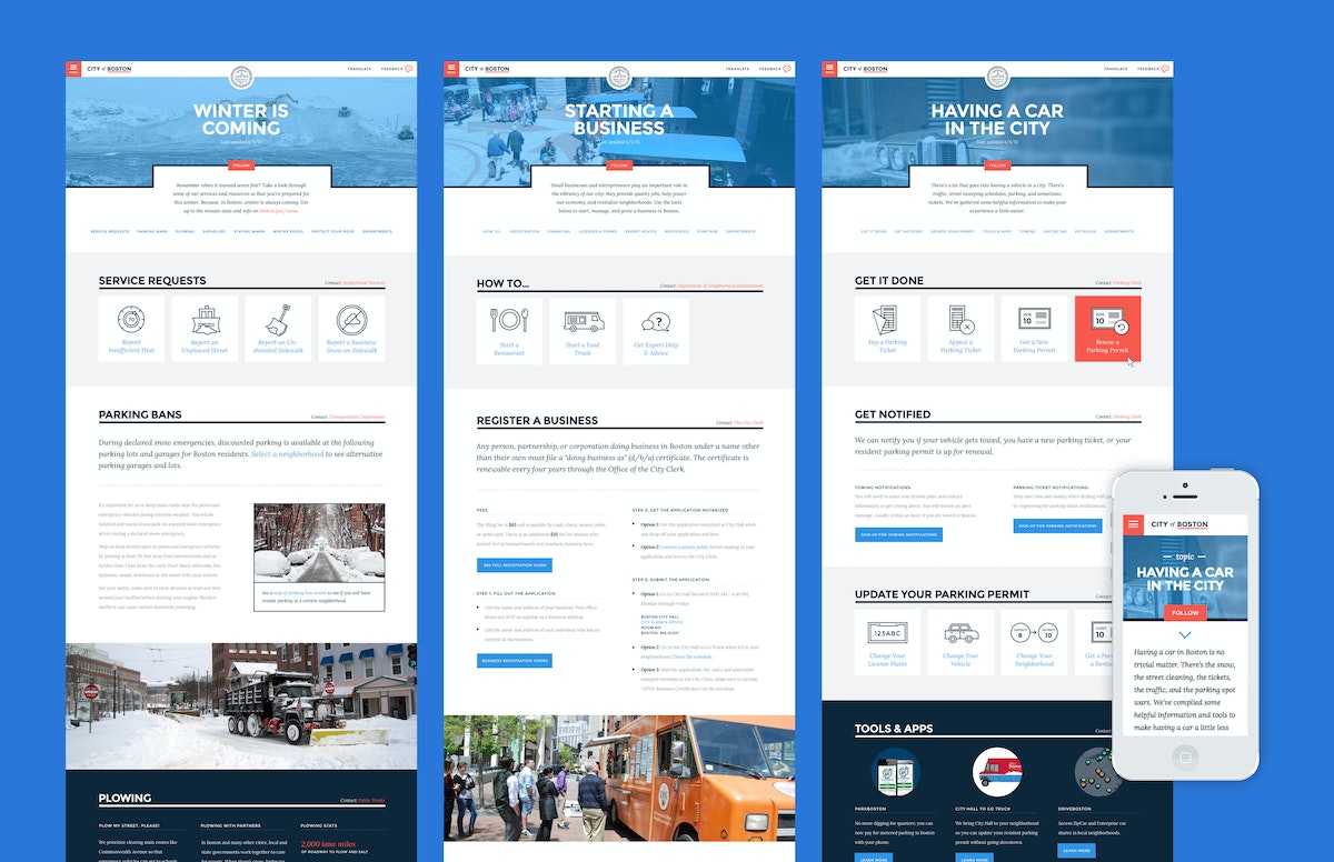
Rather than organize the site by the city’s departments, the design solution was rooted in illuminating relevant content by topics—people’s life moments—many of which overlapped through different branches of government. Owning a car in the city, for example, is closely related to preparing for winter, so bridging those common threads allowed for a more intuitive organizing principle.
In the process of the site redesign, IDEO also helped to create a visual identity system that underscores Boston’s strengths: the city’s confidence, humility, personality, and optimism.
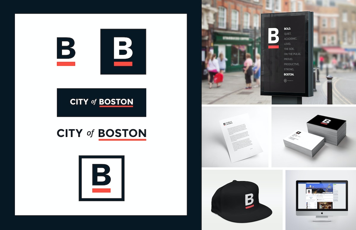
In addition to the web architecture and redesign, IDEO also produced a comprehensive style guide to help maintain design consistency, so departments can add content without compromising the overall integrity of the site, as well as a brand look that the city has decided to adopt across nearly all of its consumer-facing media. Now you’ll see the famous underlined B on T-shirts, banners, and even snow shovels.
Holding true to its mission to include Boston residents and all site users in its design process, the new Boston.gov site was piloted for six months, and the process document on the city’s blog (including the IDEO designed brand guide), before a full launch was rolled out in July 2016.
“The website should act like a helpful human. This is one of the big differences between the old site and the new site,” said Jascha Franklin-Hodge, the city’s chief of information technology in a Boston Globe article. “Oftentimes, when you looked at something on the old site, it would feel like you were interacting with some sort of lawyer-robot that was speaking to you in government-speak, using very formal language. We are trying to move away from that so your experience is akin to a person.”
The City of Boston was in need of a new digital home—one that emphasized a shift to a more welcoming tone and commitment to its citizens.
Growing an American brand in China
How an outdoor retail company found a new audience through digital and physical shops.
In the Western Hemisphere, The North Face brand has long represented an active, sporty lifestyle that’s filled with challenges and adventures. But appreciating “the great outdoors” in China is less about extreme sports and more about connecting with nature in a communal, spiritual way. This research-based insight led the team to identify new opportunities for The North Face to better target its messaging.
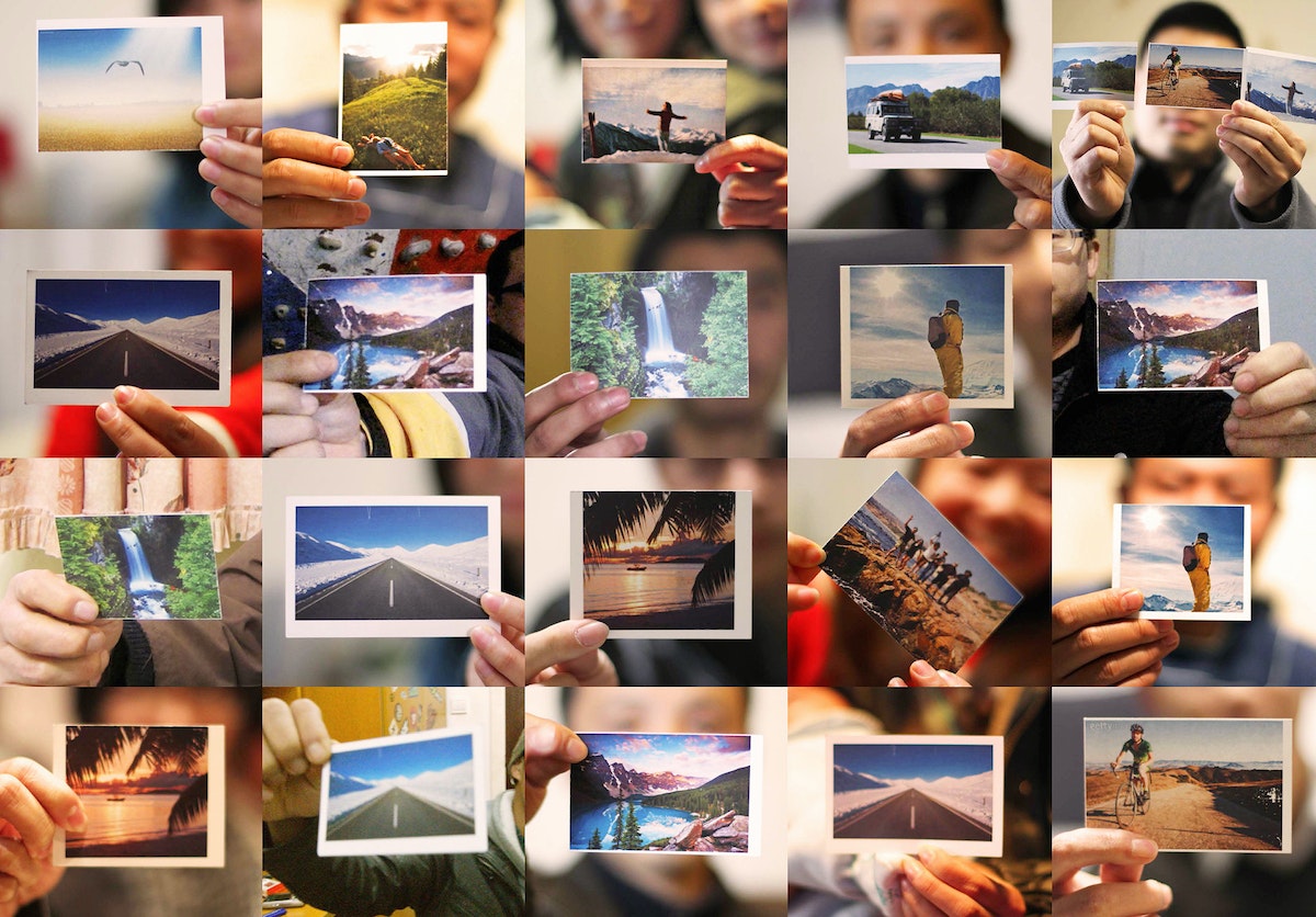
Designers found a key opportunity: Encourage Chinese consumers to escape the pressures of hectic city life by enjoying the freedom and renewal that comes with spending time outdoors.
Today, as people find less time to enjoy the benefits that lie just beyond China’s large cities, there’s a tangible desire to return to the outdoors to refresh, reassess, and renew oneself. The North Face aims to help consumers do exactly that.
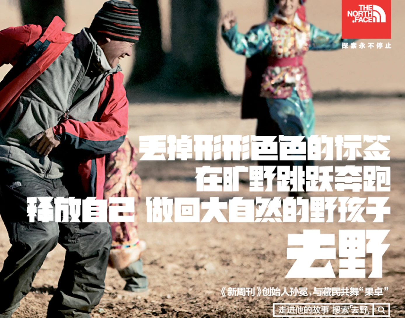
To create a compelling new brand vision for The North Face in China, the team’s design research tapped into Chinese ways of spending time outdoors. IDEO’s insights and creative brief provided the essential brand story for The North Face in China and informed the tagline of the company’s current marketing campaign, “Go Wild” (去野). The North Face brand’s new messaging links “old nature” and “new outdoors” through a combination of digital, retail, and interactive community channels.
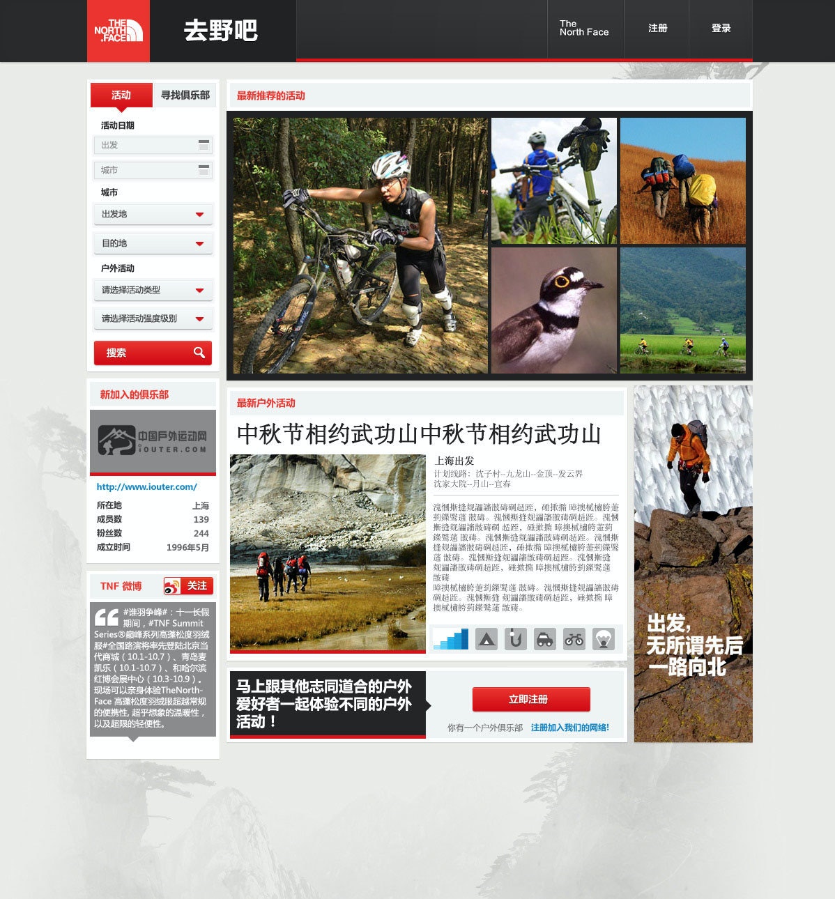
IDEO also collaborated with the company on designs and prototypes for a new digital platform and an updated store-within-a-store merchandising display. The digital community aims to attract newcomers and connect them with more experienced outdoors enthusiasts and clubs. As the platform evolves, it will help aspiring adventurers plan trips, learn skills, and share their experiences through photos.
The retail community space aims to integrate this digital community with in-store shoppers and an effort to turn the “buy-a-product moment” into a “join-the-outdoors moment.” Both will be integrated to provide a holistic brand experience in China centered on nature and community.
In the West, The North Face, with its decades-long history, has long symbolized an adventurous, active lifestyle. In China, however, the outdoor market only began accelerating in the early 21st century.
Success in this growing market depends on building strong and deep connections with Chinese consumers.
20% sales growth in China
from 2012 to 2013—the year the project was completed—propelling the brand from sixth place to a market-leading position
Nearly 40 years of designing pharmaceutical excellence
How a decades-long collaboration with Eli Lilly has transformed patients' lives and health outcomes.
Over the last 36 years, IDEO and Lilly, along with the pharmaceutical giant’s other design, development, and manufacturing partners, have collaborated on more than 250 projects. During this time, Lilly has not only honed its engineering-focused internal device-development team but also transformed into a human-centered organization with extensive, robust in-house innovation capabilities.
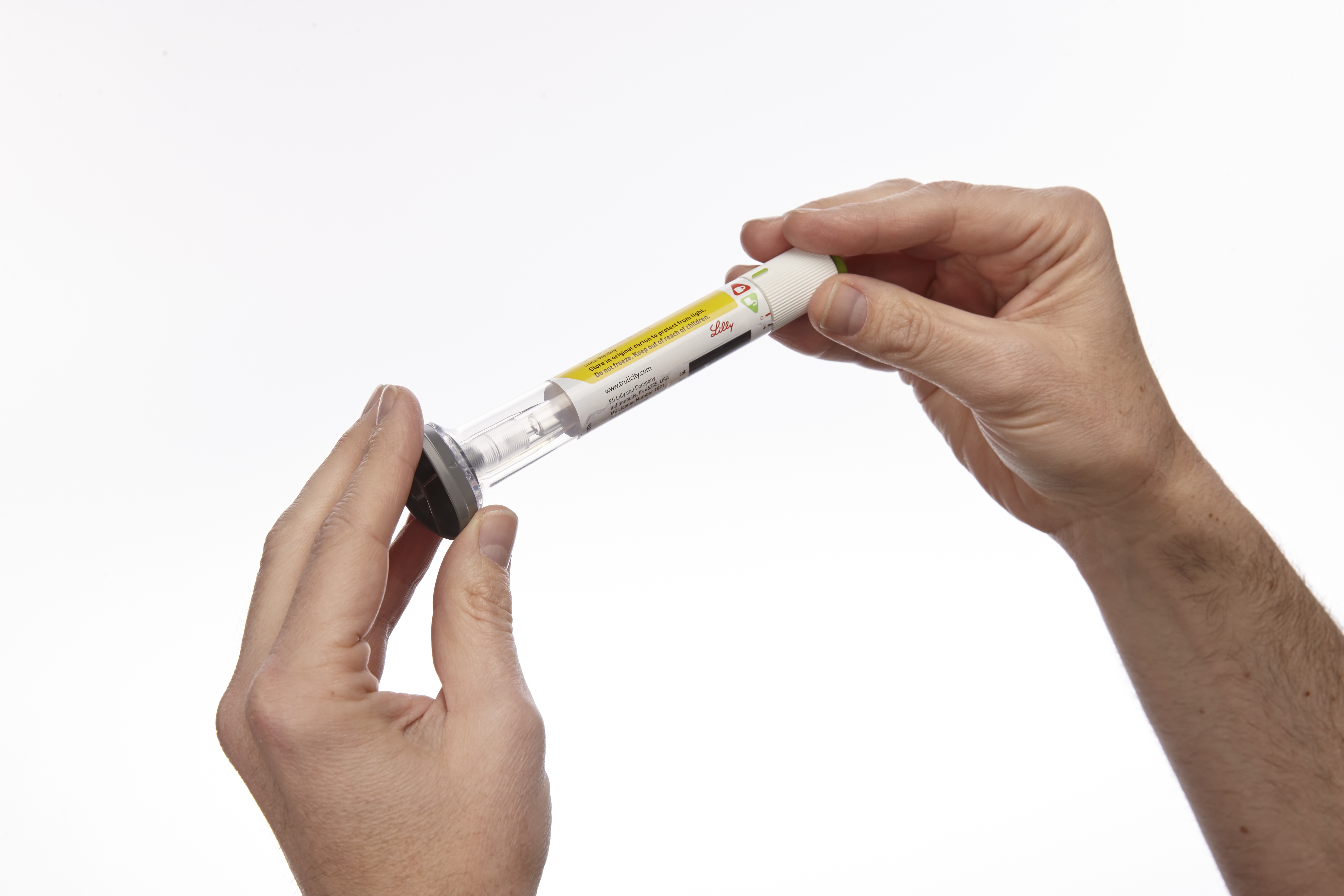
Early in the relationship, a team of IDEO designers and Eli Lilly leaders traveled the world to understand how people with diabetes live with the disease. Their findings led to the design of a series of award-winning insulin injection pens like SAVVIO. Portable, aesthetically pleasing, and discreet, the pens are suitable for use in both medical and personal settings. Combined with Lilly’s technical design prowess, this human-centered focus allows the devices to seamlessly integrate into patients’ lives and routines, making a challenging disease like diabetes feel more manageable.
Fast forward to today, Lilly’s innovative, easy-to-use auto-injectors are not only continuing to provide life-saving treatments to people with diabetes but also enabling the adoption of the popular GLP-1 weight-loss drugs Mounjaro and Zepbound, which together accounted for the majority of the company’s annual revenue in 2025. Perhaps most importantly, patients consistently rate the experience of using Lilly’s auto-injectors as relatively pain-free, easy to use, and preferable to competitors’ brands, improving adherence, satisfaction, and health outcomes.
This unwavering focus on driving innovation through a patient-first mindset is evident in some of the most impactful projects Lilly and IDEO collaborated on over the years:
GLP Auto-injectors
Convenient and cutting-edge, the first Trulicity injection device was originally designed to deliver the GLP-1 drug to treat type 2 diabetes. Today, it has been adapted for use with other GLP-1s, Mounjaro and Zepbound, which are increasingly popular weight-loss drugs and are also administered once weekly via fixed-dose injections. A wide base enables the pen to be held securely against the injection site, and the device automatically regulates the dose and needle depth.
Taltz Injectors
For most patients, living with severe plaque psoriasis means being your own medical technician—metering your drug dosage each time, and attaching and removing needles by hand. Taltz provides patients with clear visual and auditory feedback throughout the injection process through simple icons, bright colors, a translucent material, and clicking sounds. The devices are available in both autoinjector and prefilled-syringe formats and are adapted for Emgality, a preventive monthly migraine treatment, and Ebglyss, which helps treat eczema or atopic dermatitis.
HumaPen SAVVIO Injection Pen
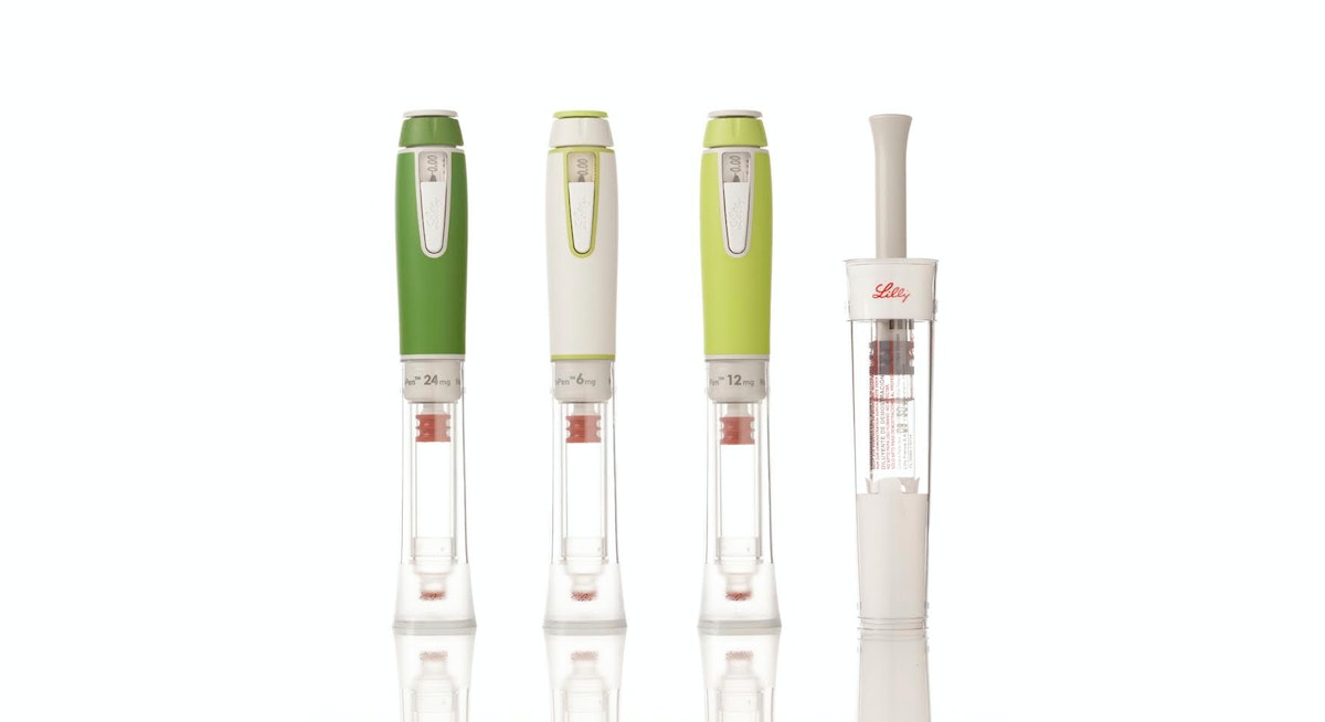
Key insights informed the design of SAVVIO, including patients’ preference for insulin pens that look less like medical devices and more like everyday objects you’d find in a backpack or purse. The sleek, colorful device was created to help patients feel comfortable and confident about fitting mealtime injections into their everyday lives.
Refillable Human Growth Hormone (HGH) Injector and Reconstitution Device
Designed to be kid-friendly, the Refillable HGH Injector leverages insights into pediatric treatment adherence to create a more integrated, systematic approach to treatment, while the Reconstitution Device makes mixing Lilly’s powder-and-liquid drug easier and less intimidating for parents and healthcare professionals alike.
KwikPen Insulin Pen
KwikPen is a next-generation, prefilled insulin injection pen that builds on the success of two previous designs, reducing its size to 5.7 inches and enhancing ease of use for patients.
HumaPen(R) Luxura™ Insulin Pen
HumaPen Luxura combines several innovations into a robust yet elegant pen that can be carried and used anywhere—an insulin pen solution that improves dosing accuracy, dose setting, and injection force.
In addition to designing products to meet the needs of people with diabetes, IDEO and Lilly have developed innovations in areas of oncology, autoimmunity, and men’s health. The results of this collaboration and expansion have won numerous design awards and produced one of the longest and most fruitful innovation relationships in IDEO’s history.
In the 1990s and early 2000s, Eli Lilly had a number of new, life-changing medications and two big challenges: Most of its drugs were self-injectables, not pills, so patients were hesitant to take them. And its drug-delivery device platform lagged behind its drug pipeline.
99%
of Trulicity users reported the auto-injector was “easy” to “very easy” to use in a JDST study
$36.5B
of Lilly’s $65.2B 2025 revenue came from sales of its auto-injectable GLP-1s, Mounjaro and Zepbound, a 45% increase from 2024

Reimagining San Quentin
Bringing together many voices for a report for the Governor of California.
“…the Advisory Council will recommend transformational programmatic, cultural, and physical change to San Quentin that can serve as a practical model that can be replicated and scaled to other institutions.”
Source: Office of Governor Gavin Newsom: Governor Newsom Names Leading Criminal Justice and Public Safety Experts to San Quentin Transformation Advisory Council, May 05, 2023 https://www.gov.ca.gov/2023/05/05/san-quentin-transformation-advisory-council/
The Advisory Council included the expertise of established criminal justice, public safety, healthcare, academic, reentry, and rehabilitation professionals, along with system-impacted/formerly incarcerated community leaders, and representatives of crime victims/survivors. The premise of IDEO’s involvement is to augment the Advisory Council Co-Chairs’ and members’ expertise in evidence-based best practices and lived experience living and working in prisons, with expertise in collaborative design, synthesis, visualization, storytelling and bringing visions to life.
Specifically, IDEO was brought in to facilitate input-gathering, and assist with incorporating the many viewpoints into a single, cohesive report of recommendations to the Governor. This included meeting the challenge of bringing together the viewpoints of 21 people on the Council (17 members, three Co-Chairs and an advisor to the Governor); incorporating the views of people who are most impacted (those incarcerated at San Quentin, San Quentin staff, community-based organizations, victim/survivor groups, among others); and formatting and designing the final report.

IDEO’s facilitation included workshops with the full Advisory Council, individual interviews and check-ins with Council members to gather their input to inform the recommendations. Each Advisory Council member was asked to speak with, and record feedback from, no fewer than five people at San Quentin or in affected communities and to share this feedback with IDEO. IDEO integrated this information and feedback into this report.
Research activities included visits to San Quentin to speak with and facilitate conversations with:
- San Quentin residents (100+) including the Citizens/Inmate Advisory Council, focus groups with Spanish-speaking residents, former gang members, ACT (LGBTQIA+), Voices Heal, People in Blue, San Quentin Citizens Advisory Council.
- San Quentin staff (100+) including interviews with numerous officers.
- San Quentin staff and residents together.
- Current participants and staff at Amistad (MCRP) and Beacon (former lifer) campuses (many who were previously incarcerated at San Quentin).
IDEO also organized listening, information sharing and feedback sessions, both at San Quentin and in the community, between Co-Chair representatives and various stakeholder groups, including victim/survivor groups, labor unions, and advocacy organizations. These perspectives were also brought into the report.
9 Travel Hassles We’re Dying to Redesign
Some suggested improvements to trains, planes, and automobiles
Here are nine travel experiences we’d love to redesign:
GETTING THROUGH AIRPORT SECURITY
Taking our shoes off to go through security? Gross. But the most stressful moment for me is when my stuff comes out the other end of the scanner and I have to grab it in a rush because someone else's stuff is right behind and my toddler is running in the other direction. Then we waddle over to a corner with all our belongings splayed out and try to make sense of our luggage again. There has to be a better way!
Then there’s all the time wasted. Could there be a way to check wait times for security lines—similar to a traffic report—so I know how far in advance I need to arrive at the airport? IDEO designers are already working with the staff of a major Canadian airport to make their screening process smoother, faster, and less unpleasant. Let’s keep the good ideas rolling!
—Sally Sosa, IDEO San Francisco
THE PLANE BOARDING SHUFFLE
I’ve noticed a weird social phenomenon: Everyone gets up when the first people start boarding a plane, even if they have three boarding zones ahead of them. The zones are arbitrarily assigned based on when passengers checked in and how much extra money they wanted to pay—a legacy system based on someone's obscure definition of loyalty and status, plus assertiveness. That means that if someone in Zone 2 gets into an aisle seat, but I'm in Zone 4 and have the window, everyone has to get up, get out, shuffle down the aisle, let me in, and then sit down again. It's entirely inefficient. Also, if I have no overhead carry on and can breeze off the plane, facilitate that. I've never met anyone who actually likes this system. Airlines are leaving money on the runway—literally.
—Denise Burchell, IDEO San Francisco; Shuya Gong, IDEO Cambridge
Airbus' modular plane concept. Source: The Verge
FLYING ECONOMY CLASS
I used to work for Emirates, Singapore Airlines, and Qantas, so I have a vision for the ideal plane cabin. In economy class, you get shoved into an uncomfortable seat next to a guy who hogs the armrest. This is painful for people like me who usually take long-haul flights. (I fly 15 hours from Dubai to Sydney twice a year to see family.)
Why not reconfigure economy class with bunks for passengers on flights longer than four hours, so that people can actually relax or sleep? Do away with the overhead lockers, increase the checked baggage allowance, and allow passengers only one small carry-on unless they’re traveling with kids or a baby. Designate time slots for people to get meals, which they can order beforehand or through the in-flight entertainment system, letting flight attendants better organize their work. You could also automate the system of delivering meals to passengers instead of pushing a trolley down the aisle, which blocks me from getting to the bathroom while an indecisive passenger is trying to figure out if he wants a Sprite or a Coke.
While we’re at it, have a kids' section where they can play without annoying everyone else, and include something like the in-flight nanny service Emirates already offers. Have a nursing area where mums can feed their babies without people bumping past them, or change their babies without having to juggle the kid, a dirty diaper, a fold-down table, and a diaper bag in a bathroom without enough room to swing a hamster, let alone a cat.
Check out this image of a crew rest area on an airplane; the stewards have room to lie down and snooze, while not being dear on space. With just a little imagination, you could make these into seats that fold flat and include easy-to-clean access, since cleaning the airplane between flights takes longer than anything else. The specs of an Airbus A380 would make this setup totally possible!
—Asja Simunovic, IDEO Munich
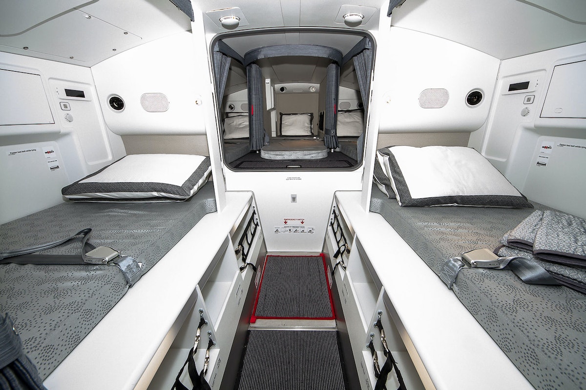
Qatar Airways Airbus A350 crew rest area.
RIDING THE CROSS-COUNTRY RAILS
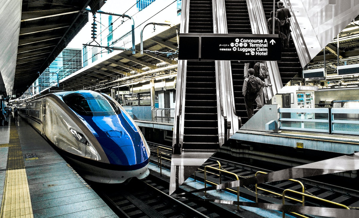
Two years ago, I took a long train trip from Chicago to New Orleans with my wife. She’s Danish. I’m Turkish. We have a lot of experience with train travel in Europe. It was shocking to see how sad train conditions are in the U.S. How might we redesign the experience of the Great American Railroad? We can utilize all our design chops—from data to spatial to UX—to do so. I’d love to take the lessons I’ve learned from IDEO’s relationship with Ford and apply them to train travel to make an impact on a more economically and geographically diverse community.
—Dogan Sekercioglu, IDEO Chicago
TRAVELING WITH A KID (AND A CAR SEAT)
It’s so annoying to travel with a car seat. I avoid it at all costs, and then end up trying to rent or borrow one, which is never convenient. It's also a pain when I want to do something like take the train into the city and then take a taxi to a part of town that’s too far to walk to with a toddler.
How about a packable, maybe inflatable, car seat? Can you imagine how great it would be if you had a small, portable car seat you could just throw in your bag?
—Kim Powers, IDEO San Francisco
BOOKING A NATURE GETAWAY
I want to redesign the way we book campsites. The current system is really challenging to navigate, particularly for outdoors neophytes. It's opaque and cumbersome, and there's no way to release sites for last-minute booking. I'd love to design ways to make the process simple, intuitive, and experiential.
Shouldn't a booking site feel welcoming and fun? Couldn't it show you what kind of hike to expect on the way to your campsite and what the views are like? If it’s a car camping site, how noisy is it? How about real-time weather so you know what to pack, or a map showing how close your site is to amenities like bathrooms or a store? What if it included ratings from other campers? Let's make our parks and forests more accessible, especially to those who aren't experienced outdoors people.
—Kate Lydon, IDEO San Francisco

DODGING TOURISTS IN THE BIG APPLE
New York City sees more than 60 million visitors a year, and locals know that with tourists come clogged sidewalks, long lines, and dozens of confused subway riders. As a New Yorker, I’m also struck by how seldom visitors tend to go outside the typical destinations—a.k.a. Midtown and the usual suspects. I love how distinctive each neighborhood of New York City is, and the unique culture, food, and experience each offers.
I know we can do a better job of moving people around the city so that visitors have a better experience. I’m inspired by this initiative the city of Amsterdam is using to distribute, rather than limit, the flows of tourists. Amsterdam encourages tourists to visit outlying areas and see popular attractions at off-peak times. Why can’t we? IDEO worked with the TODAY show to design a seamless experience for the street audience at Rockefeller Center; we can put some of those same techniques to work at a larger scale.
—David Boardman, IDEO New York
NAVIGATING THE URBAN LANDSCAPE
I would love to see a well-designed urban infrastructure that allows for driverless mobility, makes cycling and walking safe alternatives, and accounts for a broad span of ages and physical limitations.
Right now, multimodal transportation is not synced. Urban dwellers need various types of transit to get around, from trains to buses, but none of them talk to one another. There's so much focus on driverless cars, which is great, but we also need to seize the opportunity to encourage more active mobility by creating more car-free zones for safer walking and biking, for example. Both protected bike lanes and central bikeways would encourage more safe cycling in cities.
In general, street signage is not all that helpful or appealing. Might there be a way to not just wayfind, but also add delight? Signs could provide more than just basic information, such as interesting historical tidbits about the city, the number of steps between signs, or digital messages on sidewalks or in other unexpected places. People could also track their city journeys via an app on their phones to show where they've been, and get recommendations for where to go next; their urban journeys would become living maps.
—Margaret Kessler, IDEO San Francisco
PAYING FOR PARKING DOWNTOWN
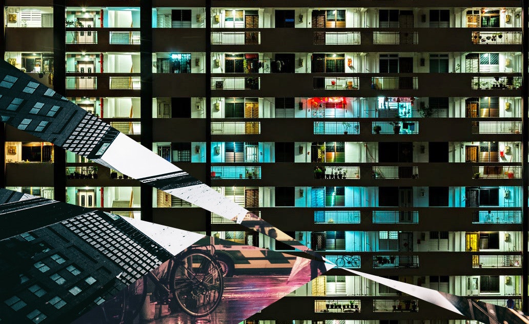
Parking lot pay machines are poorly designed. They’re often covered with lists of instructions and homemade signs taped on by the operators and owners trying to show customers what to do and in what sequence. The machines need to accept credit cards—with a stripe in one exact orientation—bills, coins, and of course parking tickets with a magnetic stripe in one orientation, too.
I like how the parking garage at San Francisco International Airport allows you to use FasTrak to avoid a paper ticket. Maybe ticket machines could use Apple Pay or another pay-by-phone service to avoid credit cards and cash, or better yet, use pay-by-phone services in your car on the way in and out of the lot so you can avoid the ticket machines entirely.
—Dennis Boyle, IDEO Palo Alto
Want to reimagine transit with us? Contact Madison Mount (madison@ideo.com) at IDEO’s San Francisco studio.
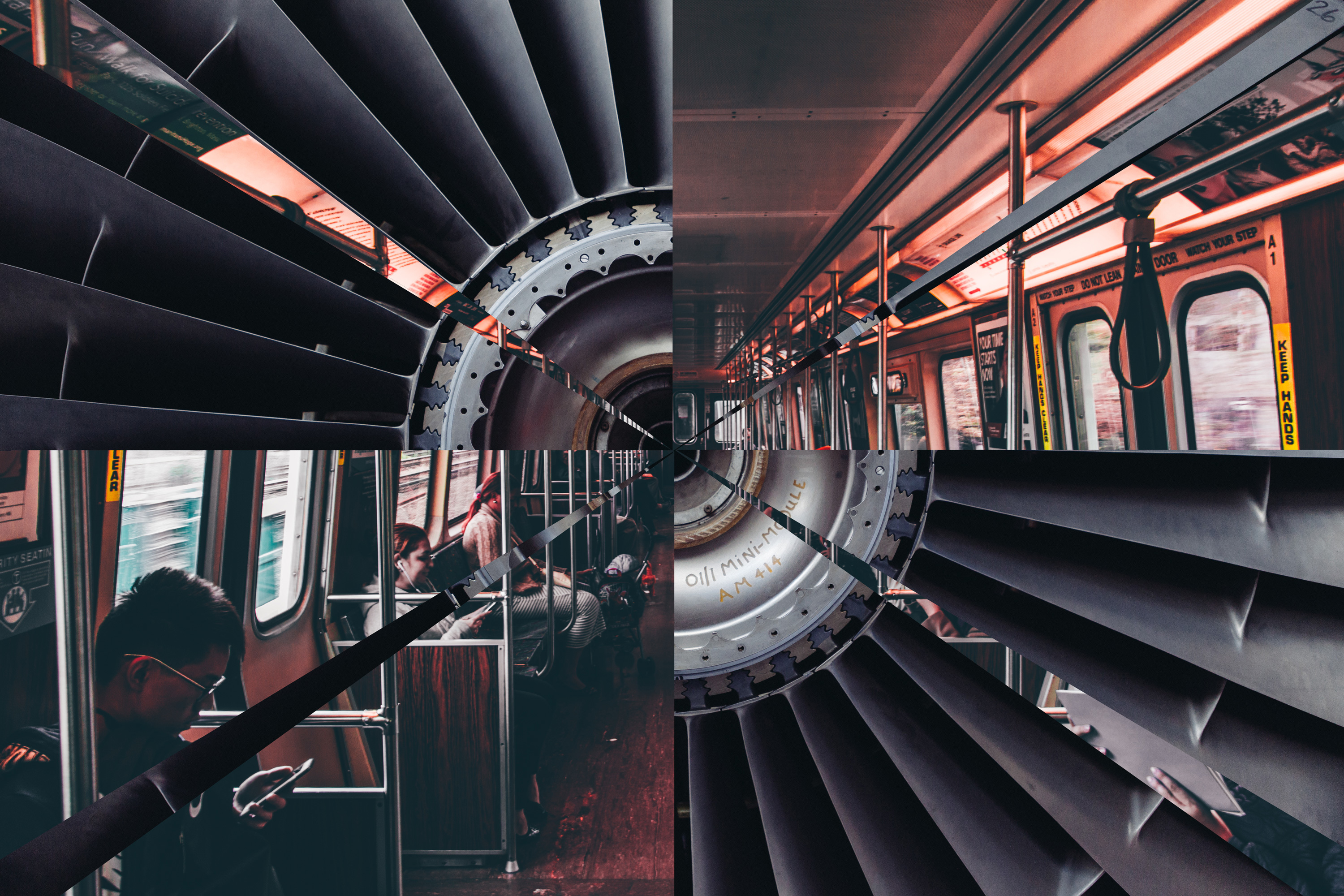
Just in time for the busiest days of American travel, our designers put their heads together to imagine a future of seamless transit, complete with inflatable car seats and airplane sleeping pods. IDEO already does forward-thinking transportation design with partners like Ford, Lincoln, Lufthansa, and major airports. But transportation is a sprawling industry, and there’s always plenty more to do.
Why Joy is the Best Protest
Inspiration came from an unlikely place. A defiant nun.
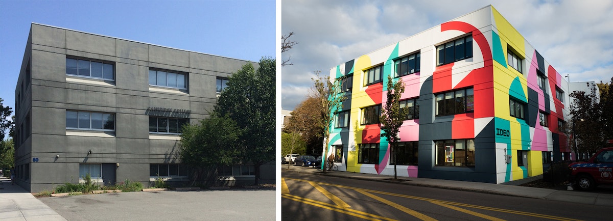
Eltono coincidently was on our inspiration mood board so we knew we must connect. At the same time our studio was revisiting work by an artist-nun named Corita Kent. We found her work and process deeply inspiring to our culture.
There's a backstory worthy of telling here: In 1971, Boston Gas Company commissioned Kent to paint a mural on a gas tank in her new hometown of Boston.
The work, known as Rainbow Swash, is a simple commentary on the nature of painting and minimalist joy, a six-color combover on the bald head of a stout roadside tank.
Kent was an unlikely candidate. For nearly two decades, as a nun in the Sisters of the Immaculate Heart in Los Angeles, she had pushed the edges of acceptability as an artist, teacher, and activist.
Her work, now recognized in the Pop canon alongside Andy Warhol and Roy Lichtenstein, challenged cultural norms by reappropriating common packaging and advertising slogans and setting them alongside passages from the Bible, pop music, and classic literature.
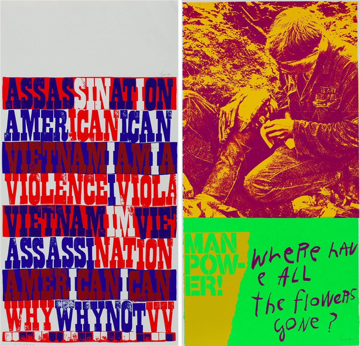
As counterculture gained momentum, and Kent used her art to advocate for justice and peace, her profile grew and her messages sharpened. Eventually her protest was too much for the Church to handle, and they mutually separated, leading Kent to make a move to Boston and continue her art.
But something changed in 1970. While her activism persisted, a new body of work arrived, with simple brushstrokes and appeals to love each other.
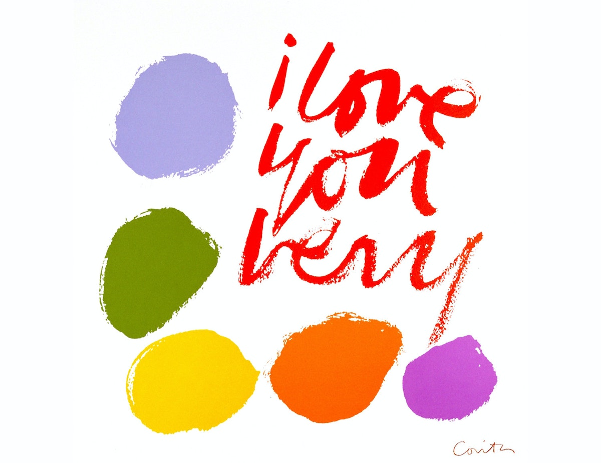
It was this moment that, 15 years later, culminated in her iconic USPS Love stamp, and also led to the commission from the Boston Gas Company.
Today’s headlines are a 1960s deja vu: culture wars, social injustice, sexual harassment, mass shootings, covert ops, media corruption, political failure. It’s easy to draw parallels to Kent’s day, and to find artistic expressions in response (Shepard Fairey comes to mind). But I’ve personally wondered how Kent made the shift to rainbows and love, and I mean that with no irony.
Maybe it comes down to this simple truth: Love wins. While Kent was popular in her time at Immaculate Heart, even landng on the cover of Newsweek, she didn’t achieve true household status until her 1980s USPS Love stamp. It’s the message we all needed, and it’s still the message we want today.
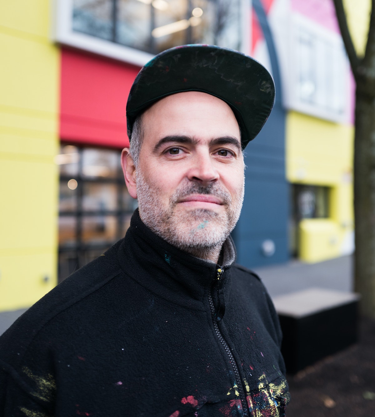
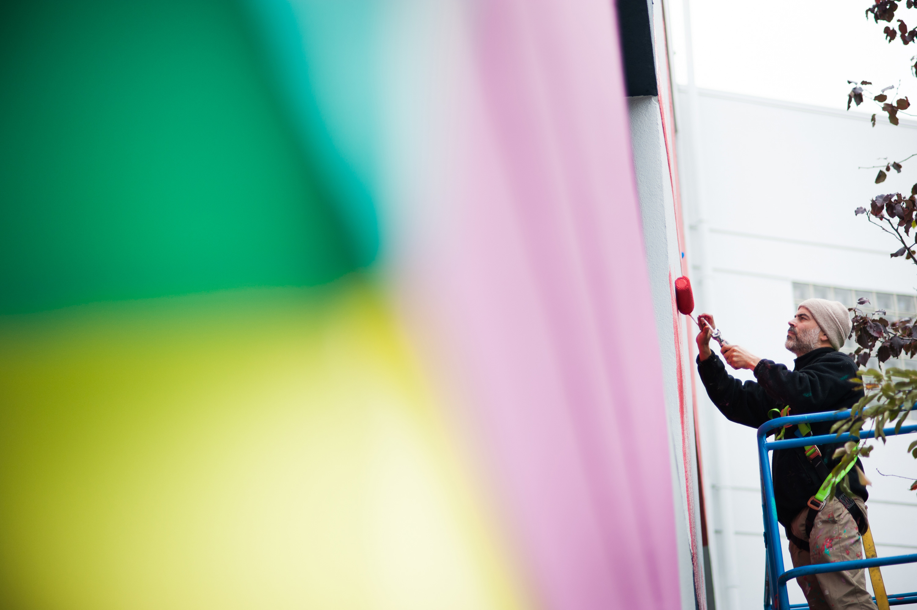
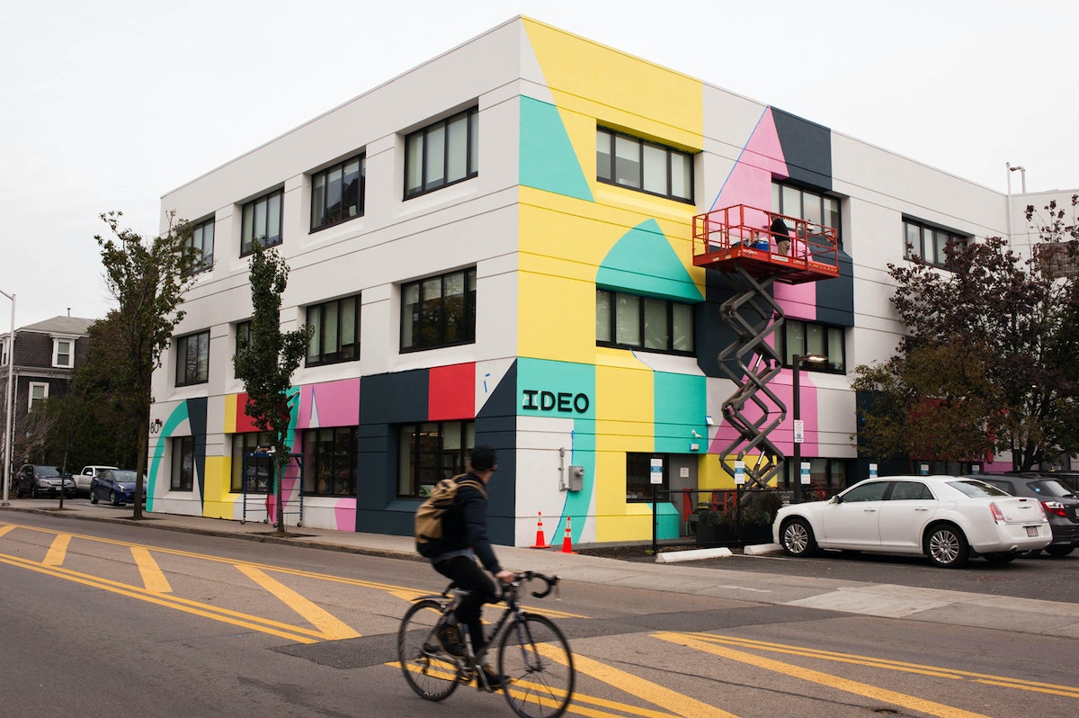
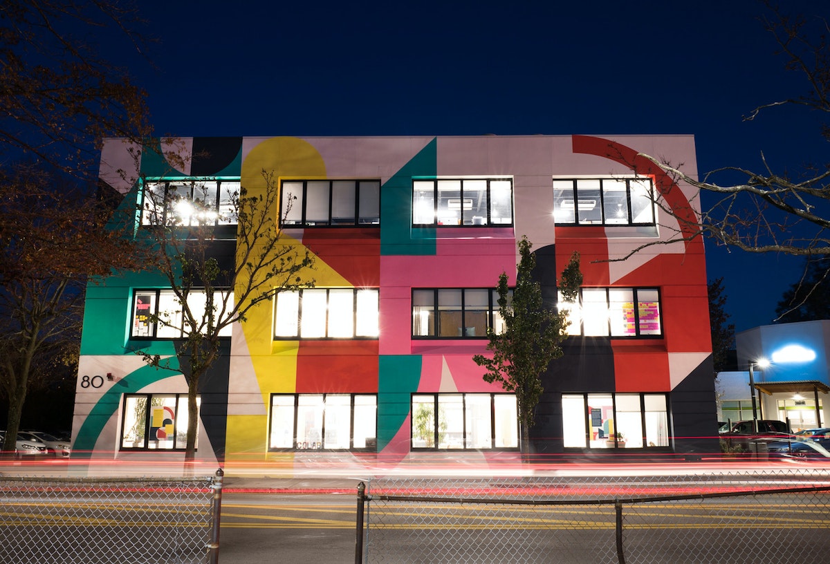
Eltono has done installations in more than 90 cities around the globe; each unique, but connected by a calculated joy. His work is made from randomly placed forms inspired by the architectural elements of the site. Though we had yet to meet, his work felt right—a cosmic alignment of our values. And once we did share ideas, we were stoked, except about one thing—color.
Eltono’s choices were exuberant and bright. Colors inspired by Mediterranean sun, French countrysides, and European sensibilities. They are radical for hidebound New England, an area known for its pilgrim stoicism, and not native to a region that is white and gray for five months of the year. We quietly fretted about what to do, how to discuss the issue with him. Then I was reminded of Kent. Of her joy in the face of adversity—love and rainbows. We didn’t change a thing.
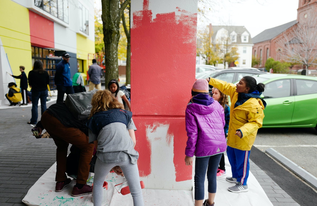
In fact, we wore the colors—in the form of paint splatters on our faces—with pride! Eltono invited help not only from other muralists, but also from IDEO families and neighborhood kids. His colors greet each passerby’s smile with their own. Each defies the gray sky of the coming winter and the equally gray social climate.
When Boston Gas sold to Keyspan in 1992, the original tank was torn down. But, due to its popularity, Kent’s mural was immediately repainted on a accompanying tank.
Eltono’s art continues making the case for defiant joy, standing in solidarity just a few miles from Kent’s Rainbow Swash. In this season of anxiety and division, there is no greater protest than to stand proud and bright with joy and love.
*Deepest gratitude to the many that helped us make this possible: Geoff Hargadon and Gary Strack at Central Walls; Michael Monestine from the Central Square Business Association; Amanda Hill, Pedro Soto and Al Wilson from Beyond Walls; Jason Weeks from the City of Cambridge; our artist assistants Lena McCarthy, Brian Denahy, Laura Menucci, Meghana Srinivasan, and Julia Roth; the many at IDEO that helped coordinate, paint and photograph, especially Christina Abele, Tiffany Knight, and Dirk Ahlgrim; and the architecture and interiors teams at Hacin + Associates.
Earlier this year, we moved our Cambridge-based studio into a building in Central Square. We wanted to personalize our new home with some public art, but were uncertain about what final expression it should take, so we got started by slapping on a new coat of paint—transforming it from an oppressive gray brutalism to a welcoming white canvas. Then, a local connection, who shared our desire for more street art in Cambridge, suggested we look up Eltono.
A Day in the Life of an Interaction Designer
No biggie, just creating the experiences of tomorrow
So, in addition to designing the thing, I spend 50 percent of my time crafting the story of the thing—showing people how the interaction will influence new behaviors, new futures, new ways to live. The story has to be good enough for the user to picture the experience for themselves. Here’s a sneak peek at a typical day:
6:00 AM: Warming up at SoulCycle
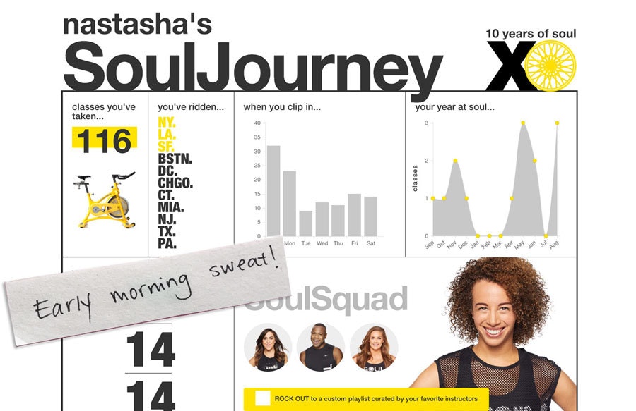
It's not always easy rolling out of bed this early, but sweating my heart out on a stationary bike is my favorite way to start the day. To me, design is like a sport—you have to be intentional about the routines that you do everyday to help you be at your best mentally and physically. Spinning gets my brain revved up for the eight hours of creativity that lie ahead.
9:00 AM: 👋 Project Space!
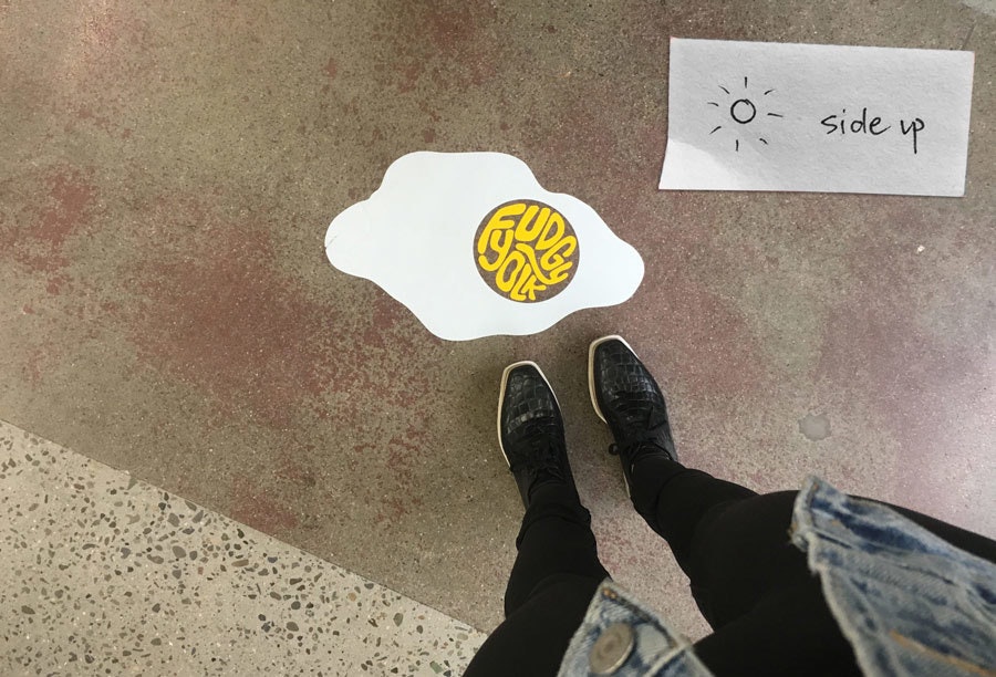
“Fudgyolk” is my project team's code name (we always keep the client confidential), but it is also a fun identity. The name was inspired by a blended sous vide soft poached egg sauce we had at our first team dinner (here)—yum! Shoutout to my talented teammate Brooke Thyng who designed our team identity!
10:00 AM: Post-Synthesis Cleanup
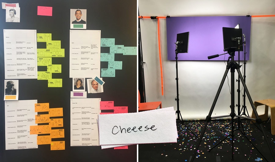
Our project just completed the "synthesis" phase. What does that mean? About a week ago, we were in a room full of Post-Its with 10 more of these boards, moving ideas around, interpreting what they meant, and sharing our initial hypotheses as a team.
Synthesis helps us discover important themes and patterns that point to opportunities for design, and a story to share with our clients about the needs we uncovered. This process typically takes about a week and it's mind-bending work as you try to make sense of lots of data!
To celebrate a successful completion of this phase (and finally clean up our project space) we challenge each other to a race for who can strip their board the fastest. We try to design some fun into everything, even our chores! We're especially excited because post-synthesis we move into pixels—the interaction designers dream world.
11:00 AM: Analogous Inspiration
My team rocks out to our "Hair" after we've all had an indulgent blowout. Though seemingly unrelated to our health and wellness project, Dry Bar's ability to make people feel confident and at their best inspired us to integrate some of that experience into our own project's design solution.
Analogous inspiration is one of my favorite moments in a project. It allows you to design in a less cognitive, more intuitive and experiential way.
12:00 PM: Interaction Design Kraftwerks
Every Friday, the interaction design community gathers over lunch to build on our craft, and inspire one another. We call it Kraftwerks. Today, led by our Design Director, Tobias Toft, we're geeking out on making autonomous toothbrush-headed robots.
Interaction design is a very diverse community made up of visual designers, systems designers, motion designers, and software designers and these craft sessions give us a chance to teach each other new skills and evolve our digital fluency as a community.
1:00 PM: Gathering Inspiration for the Final Experience
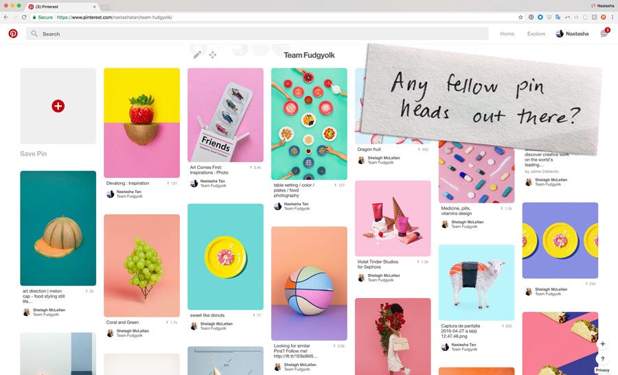
Collaboration is so important across every phase of the design process. I like using Pinterest to engage everyone on the team to collectively gather inspiration and create alignment on a visual direction before we start making.
Here, we're collecting images for an exhibit we plan to build to display the key moments of our final app.
2:00 PM: Designing the Final App and Story
When it's time to design, I use two screens: One running Sketch to design the screens of our app, and one showing a Google Doc that provides a work-in-progress narrative. (Use your imagination—this work is confidential!)
We write user narratives that act as a framework for us to share the signature moments of the app. This produces a to-do list of screens we need to design. When we present the final app to the client, the story makes it feel less like a screen walkthrough and more like a compelling story that portrays how the app benefits the user's life.
3:00 PM: Photoshoot
When we're designing new experiences, stock image/video sites don't cut it, so we create them from scratch. Here's our B-roll where we're planning who will be playing the role of the user in our narrative, and sketches of what the scene will look like. We included confetti in one of our photos ;)
6:00 PM: Caltrain
I catch up on my jamz on my ride home from Palo Alto to San Francisco. Currently streaming SZA's Love Galore.
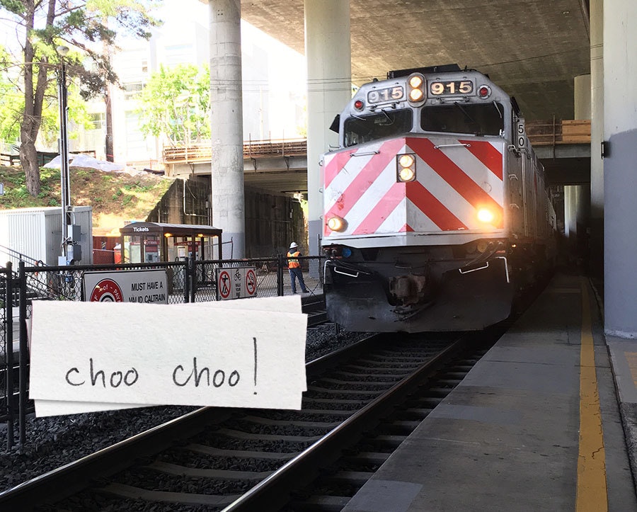
Finally home and ready for an interaction with my couch. Thanks for spending the day with me!
When people ask me what I do for a living, I say, “I design things that make the invisible, visible.” Sounds super vague. Let me explain: While the role of an interaction designer is usually associated with building apps, websites, and VR environments, my role at IDEO also includes thinking about how to bring digital-physical interactions that have never before existed to life.
5 Design Research Lessons I Learned From My Mom
Hint: Look for the unexpected, in unexpected places.
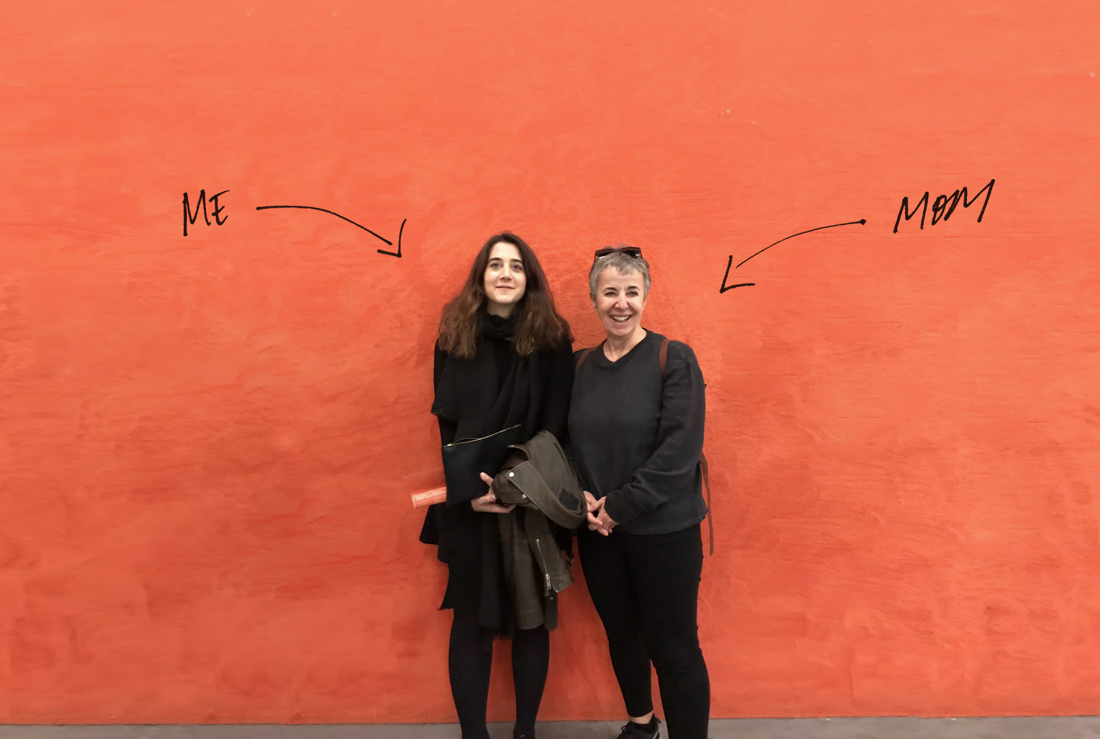
My mom and I have a lot in common. We think problem solving is fun. We love people watching. We both only wear black. But our most striking similarity is that we both ask questions for living. I am a design researcher, focused on helping organizations build innovation capabilities and evolve their culture, and my mom is a political journalist in Turkey. The influence of her profession on my personality has been enormous, and so much of the way that I work comes from watching her. Here are five design lessons she’s taught me.
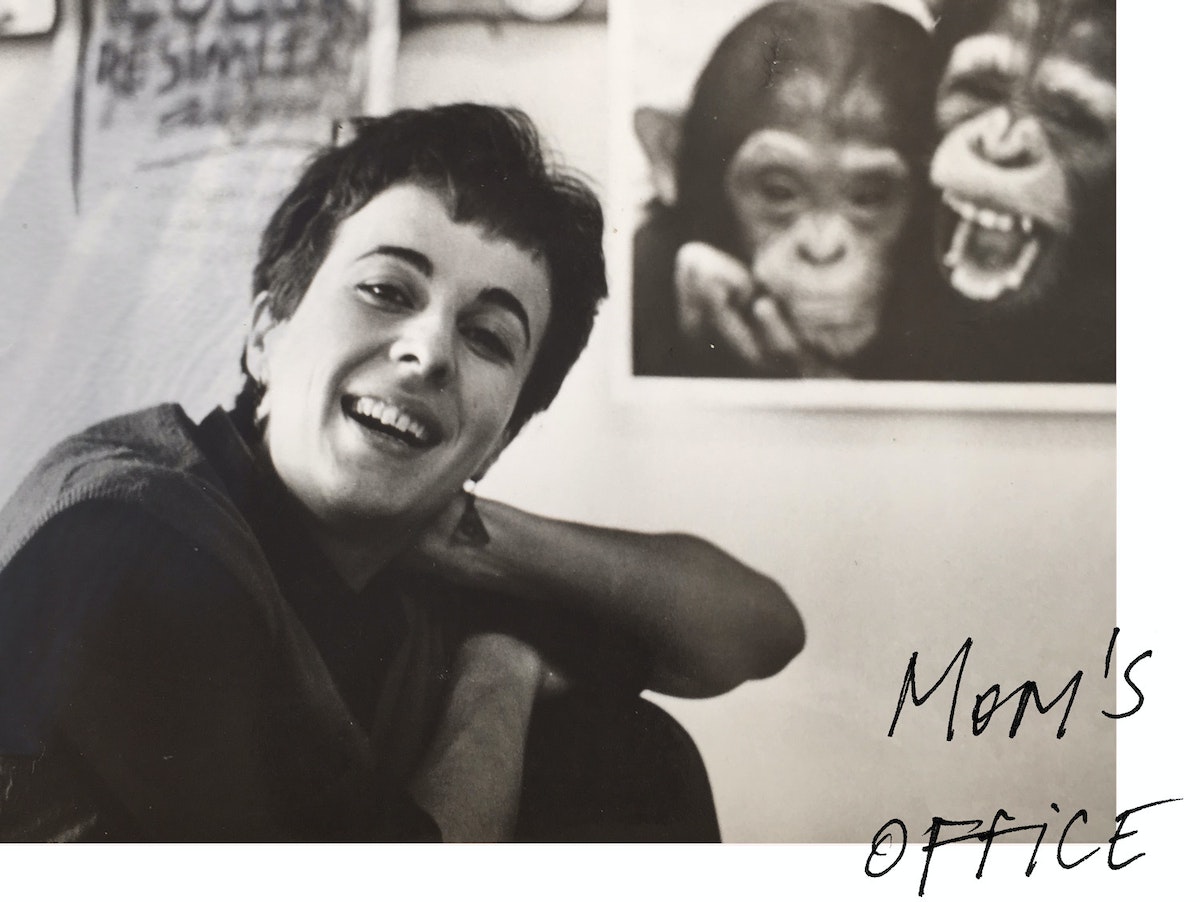
1. Plan the research through role playing.
My mom's favorite way of understanding the truth and planning her story is to put herself in others' shoes and go through the experience herself. For instance, when covering a policy change affecting a local community, she wouldn't just interview people from her desk, she would spend days embedded in the neighborhood, waiting in the same lines, sitting in the same overcrowded offices, eating at the same spots. That immersion helped her connect the dots of how the policy was actually playing out on the ground, and allowed her to focus on the details that mattered most to the people living through it.
Walking in someone else's shoes before you even meet them can also inform how you plan your research. On a recent project, we needed to understand what physicians experience when they do rounds in clinical contexts, so we went speed dating. We captured the pain points of quickly talking to a lot of people at once and trying to remember the essence of the conversation. This experience helped us to focus on asking the right questions during our interviews with physicians.
2. Lean-in the right moment.
She was great at tracking the questions politicians refused to answer, keeping a running list of what they sidestepped, deflected, or went silent on. She always said you learn more from what politicians decide not to say than from what they actually do.
As designers, we prioritize empathy in our interviews, but my mom’s approach always inspired me to keep going to discover better insights. Finding eloquent (and ethical) ways of asking more about an uncomfortable topic might require a bit of pre-work—creating the right environment to make a person feel at ease, or sharing a bit about yourself. I once worked on a project about bathroom hygiene— one of the most intimate topics a stranger can talk to you about—and instead of asking people about their own behaviors, I talked to them about their roommates or friends. Turns out, people are way more comfortable talking about someone else's bathroom ritual.
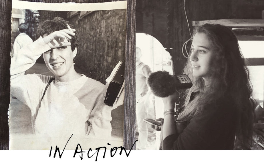
3. If you can’t ask, experiment.
As a journalist in Turkey in the 1980s, my mom covered many presidential elections and other world-changing events. Though occasionally her young age was to her advantage, from time to time, she had to come up with her own hacks to get the information she needed. One of her favorite tricks was to ask herself: how would a completely different journalist cover this story? She'd pick someone with an opposite beat — a sports writer, a foreign correspondent, a food critic — and imagine their approach. Even if she didn't follow their approach, it forced her out of the obvious angle and almost always pointed her toward the story she actually needed to tell.
My colleagues Sean Hewens and Mat Chow did something equally creative. To understand the influential layers in a major international law firm, they created what they call The Blue Hat experiment. They picked a blue hat and brought it to the leaders of the law firm and asked, “What would you do to convince everyone in your organization to wear this blue hat?” Some said a raise. Others said a friendly competition. And some said, get the “cool” lawyers to do it first, then the others will follow. These answers helped the team figure out how influence actually happens at the firm, and shaped how they thought about rolling out a new change initiative.
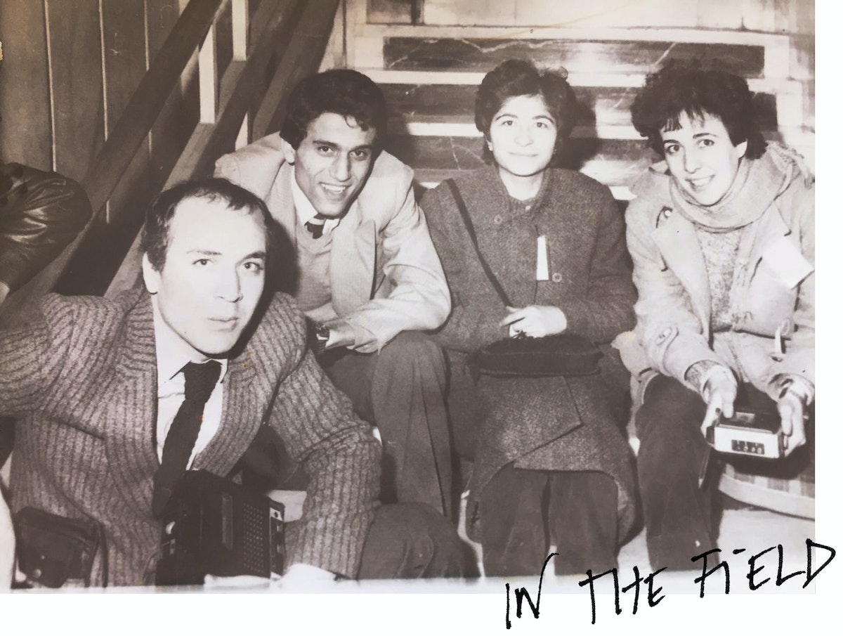
4. Look outside the mainstream.
My mom would always push me to think in extremes. She always says, “To avoid ready-made answers, don’t talk to expected people. Talk to the extremes. Gather witnesses from all walks of life and listen to stories that others didn’t cover.”
At IDEO one of our biggest source of inspiration in design research is talking to extreme users, or what we sometimes call “super users.” Those who are at the edge of the bell curve of the challenge help us capture workarounds and interesting behaviors. For instance, when we are designing for change inside an organization, we don’t just talk to people in the C-suite; we also focus on people who recently joined or quit the organization, who might have a fresher take or more honest feedback.
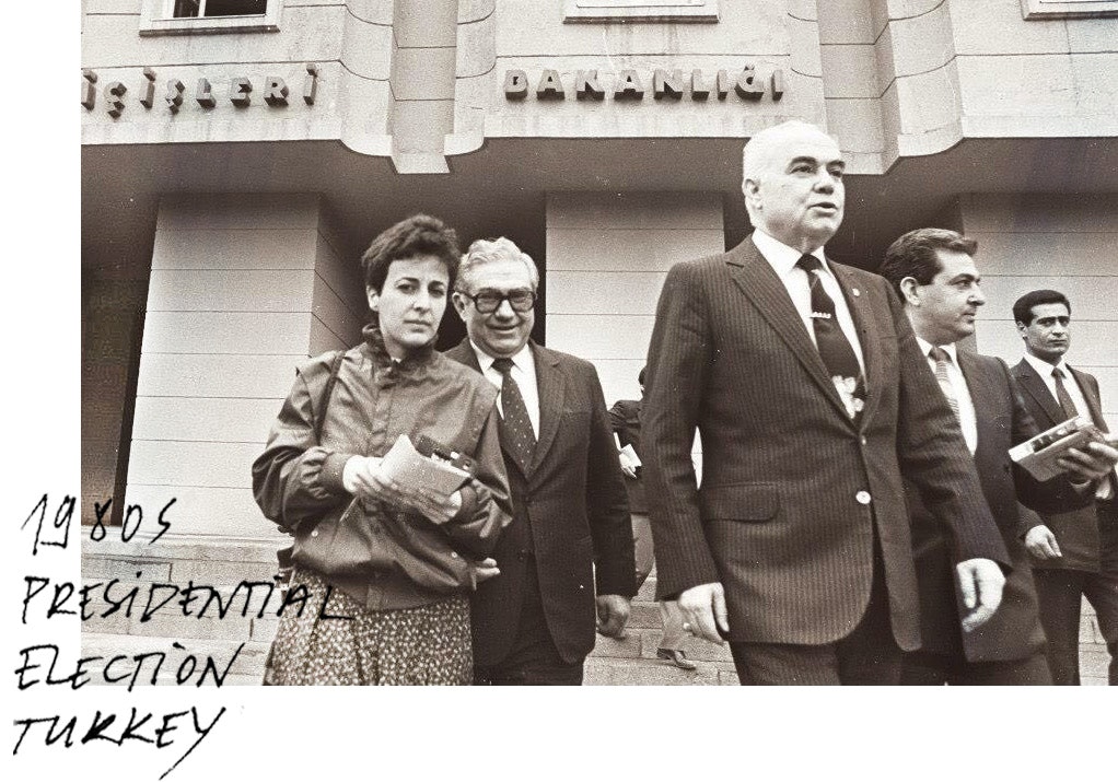
5. Don’t just research the people, research the system.
One of the most important parts of being a journalist is understanding the ecosystem you’re reporting in. Otherwise, you can’t make sense of what you find. For my mom, that meant making sure she understood who all the power players were, and how the system worked before she started crafting her stories. This is also true in our design process.
At IDEO, we believe that if you want to create the conditions that change behavior, you have to have a deep understanding of the landscape you are in. When my colleague Divya Viswanathan and her team took on a project to help unify a massive, 20,000-employee generic medicine manufacturer with operations in 27 countries, they didn’t just focus on talking to executives; they talked to everyone. When they chatted with a worker on the shop floor of one of their factories, he read them a poem he had written for the founder of the company. This conversation helped the team realize how much people care about the company’s purpose, and it changed the course and outcome of their project.
When I was a kid, my mom made up what she called “The Journalism Game” to keep me entertained while we were grocery shopping. She would give me a hypothetical scenario and ask me to think like a journalist, to tell her who I would talk to first to create the story.

Lindsey Turner
I’m passionate about building brands, products, and experiences that help organizations show up with meaning and momentum.
I help organizations cut through complexity by shaping how they show up, through brand strategy, identity, and storytelling.
Working at the intersection of brand and business, I bring an editorial eye and a bias toward making—turning ideas into tangible experiences that people can understand, trust, and believe in.
My work spans government, healthcare, financial services, media, and consumer goods, from launching Gen Z-focused ventures to building innovation labs and reimagining legacy brands. I relish moments of ambiguity and enjoy translating across teams, perspectives, and priorities to move ideas forward.
I started my career in editorial and digital design, shaping cross-platform experiences and identity systems in publishing and agency environments. That foundation still shapes how I work today: I’m detail-oriented, collaborative, and overreliant on the Oxford comma. I hold a BFA in Visual Communication from the School of the Art Institute of Chicago.

Rachel Young
My work helps organizations see who their products aren't working for—and build the will and the tools to do something about it
For 25 years, I've asked the same question: Who does this design exclude—and what are we going to do about it?
My work spans human-centered strategy, inclusive design, and qualitative research, with clients ranging from Microsoft, Google, and Verizon to the National Science Foundation, and San Francisco Unified School District.
Before IDEO, I taught elementary school in East Palo Alto and spent a decade doing design work with social service organizations—where I learned firsthand what it costs people when systems are built without them in mind.
I am currently writing User Error, a nonfiction book about digital access and the design decisions behind it. I live in Oakland, California.

Brian Pelsoh
I lead with craft, ensuring our work is creatively excellent: rooted in deep human insight and imagination, while also grounded in the realities of business and technology.
My expertise spans brand, communication, and product design across tech, education, the arts, and social impact.
I believe great work demands both high-level vision and obsessive attention to detail, and only happens through collaboration.
I bring an inclusive, hands-on approach and a deep understanding of business, which enables me to consistently deliver excellence while always asking why.
Before joining IDEO, I worked at the brand firms Pentagram and VSA Partners. I began my career as a designer, leading teams at the School of the Art Institute of Chicago and the Milwaukee Art Museum. I hold an MFA in graphic design from Maryland Institute College of Art and a BFA in communication design from the Milwaukee Institute of Art & Design, and have taught at some of the best design schools in the US.

Tony Wong
I am responsible for IDEO’s long-term success in China and working with clients to use design as a tool to enable growth.
I am responsible for IDEO’s long-term success in China and working with clients to use design as a tool to enable growth. Specifically, I have helped Chinese companies design holistic brand solutions through the development of their products, communication, services, and innovation teams, and I have helped multinationals expand their presence and influence in China.
I advise global leaders on developing China-led innovation and capabilities.
In over 15 years in IDEO Shanghai, I have worked on projects that use design to elevate the quality of the experience of healthcare products and services, streamline processes that increase productivity, create spaces and programs that promote and enable inclusive communities, and build next generation mobility solutions that are planet-positive.
Before joining IDEO, I worked at Philips Electronics and the Electrolux Group in Italy, the Netherlands, and Singapore on a number of breakthrough commercial products. I am a member of the Young President Organization in Shanghai.
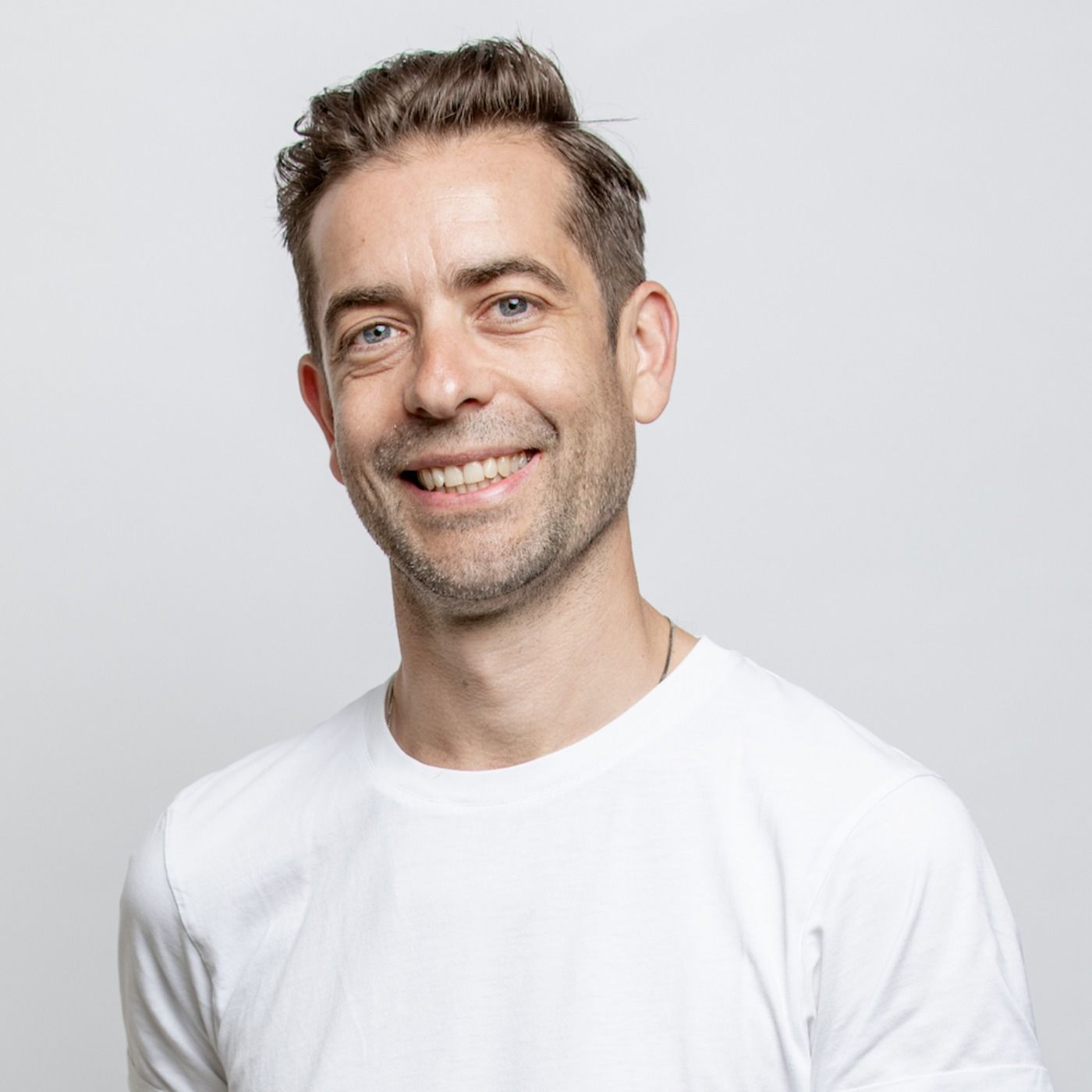
How to use AI as an editor, not a writer
Ed White shares how he uses AI as an editor—not a writer—to sharpen storytelling, rehearse ideas, and preserve the productive friction that makes creative work better.
Ed White has a rule he's tested on his own writing: hold yourself as the writer, and let AI be your editor. Ed is a Senior Design Director at IDEO's London studio, where he co-leads the firm's AI portfolio across Europe. Before IDEO, he spent 12 years as a writer and editor at the Financial Times, Wired, and Contagious. So when he talks about when to use AI for storytelling and when not to, it comes from two decades of crafting his storytelling skills.
In this episode, Mina Seetharaman talks with Ed about two specific tools he uses to keep AI in an editor's seat: a "roasting agent" prompted to critique his drafts without any sugarcoating, and a simulated audience he rehearses pitches on before the real thing. They also get into what Ed is hearing from design leaders at Anthropic, Lovable, Shopify, and Google Creative Lab about how creative work is changing, and why he thinks the friction of writing something yourself is worth protecting rather than automating away.

Building a personal AI for the messiness of life: Sida Li
Becca Carroll talks with Cue co-founder Sida Li about designing a personal AI for the messiness of everyday life—not just work. They explore how Sida stays anchored to human needs while navigating fast-changing technology, product tradeoffs, business-model experimentation, and the realities of building an AI company today.
Most AI products today are built for work—a space with clear problems and established systems. One founder noticed a gap: personal life is messier, harder to systematize, and mostly left behind by the AI boom. So she built Cue, a personal AI that lives inside iMessage and group chats, to go where the other tools haven't.
In this episode, Becca Carroll, IDEO's Chief Strategy Officer, talks with Sida Li, co-founder and CEO of Shared Context Lab, about staying anchored to a human need while the technology around her keeps changing shape, why she treats her business model with the same rigor she'd bring to a product, and what it feels like to build a company at this particular, disorienting moment in AI.
The conversation also gets into how Sida makes design decisions: the language Cue uses to describe itself, the tradeoffs behind building inside iMessage instead of a new app, and a real story about a business idea that didn’t pan out.
This is the second in a two-part series profiling founders from IDEO's Startups-in-Residence program. The first conversation is with Johannes Seemann, founder of Sooner, on designing GenAI for the emotional side of money.

Designing GenAI for the emotional side of money: Johannes Seemann
Designing financial tools around the feelings that shape money decisions.
Most personal financial tools are built to run the numbers and optimize towards a budget. While that works for some, most people experience money as a lived relationship that does not neatly fit into a spreadsheet. Johannes Seemann and Becca Carroll discuss why money is emotional before it is mathematical, and what a human-centered approach to building a generative AI financial product looks like in practice.

The curious leader's edge in uncertainty: Scott Shigeoka
How genuine curiosity helps leaders navigate uncertainty with greater confidence.
Mina Seetharaman talks with Scott Shigeoka, author of Seek and Head of Curiosity Cultivation at the Eames Institute, about what distinguishes genuinely curious leadership from performative curiosity, how power dynamics shape curiosity, and why practicing curiosity can restore energy rather than drain it.
Looks like you might be in search of something very specific?
Or reset the filters above and try another angle.
Here’s some random inspiration

Podcasts about creative leadership

Articles about the power of prototyping











.webp)