
.svg)




A friendlier, more tactile e-reader experience
Creating a digital reader that embodies the best aspects of paperback books.
International e-reading service Kobo, Inc., with more than 2.5 million digital book, magazine, and newspaper titles, approached IDEO to gain a strong foothold in the shifting publishing landscape. The design challenge was to create a new suite of advanced reading devices with the best aspects of paperback books—tangibility, portability, and a small footprint.
To make digital reading devices feel approachable, personal, and sophisticated, designers focused on the intersection of physical and digital interface design. The teams created a family of affordable e-readers with clearly differentiated feature sets, and the resulting design provides a reading experience that approximates holding and reading a paperback book. No larger than a novel, the front of the e-reader is designed for the reader’s eyes, while the back features a signature “quilted” back shell designed to create a pleasurable, tactile memory for the hands.
The Kobo family includes the Kobo WiFi, with a 6-inch glare-free E-Ink screen; the smaller Kobo Touch, with infrared touch-screen interface, E-Ink Pearl screen, and faster processor; and the Kobo Vox, a 7-inch Android tablet model with social and digital sharing options.
Kobo saw record sales of its digital reading devices during the 2011 holiday season, and was named “Editor’s Pick for Best e-reader” by Wired magazine.
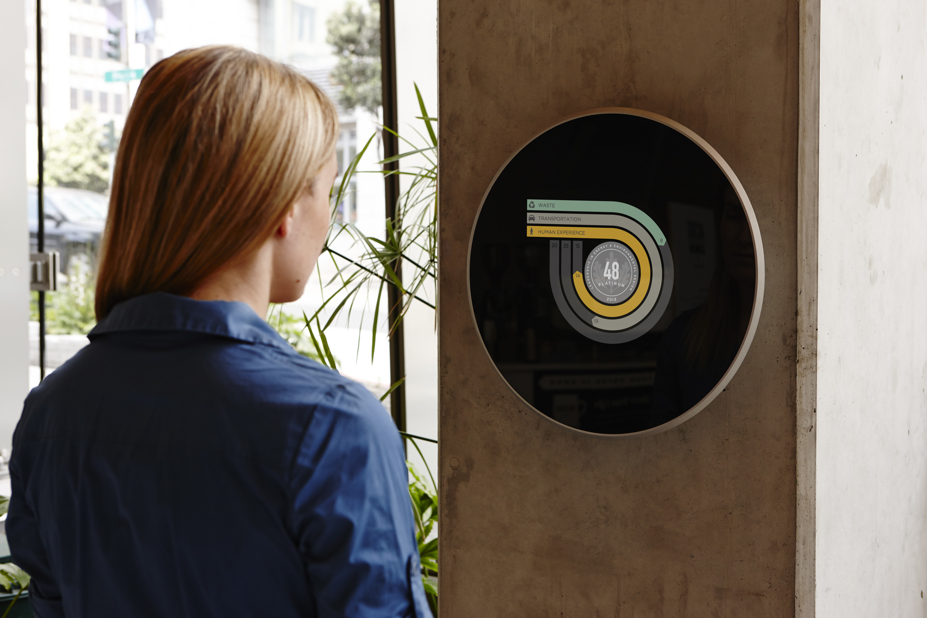
A digital display to measure energy use
Communicating environmental performance with an interactive plaque.
The U.S. Green Building Council asked IDEO to help visualize how buildings might communicate environmental performance. Together they came up with the LEED Dynamic Plaque, an elegant public declaration of a building’s environmental efforts.
Located in a lobby or other common space, the plaque displays real-time measurements about a building’s resource use—from energy to waste disposal. IDEO designed and built the physical plaque, and the IDEO Digital Shop created an online interface that allows USGBC’s software to interact with it, enabling people to enter data, analyze details, and make personal decisions that influence a building’s performance.
WATCH: "LEED Dynamic Plaque" video

A cook top designed for a wok
Culturally relevant kitchen appliances for a Chinese market.
In China, most kitchen appliances available on the market are rooted in Western cooking practices. High-end kitchen appliance company Fotile, based in Ningbo, China, was looking to design a new cook top and range hood that would satisfy the unique needs of Chinese cooking culture.
The new appliances designed by Fotile and IDEO support a key need of Chinese cooking: the dual-cooking center. This two-burner range eliminates unnecessary burners, instead dedicating one side to the wok, the primary tool in Chinese cooking, and the other side to a flat-bottom pan. The wok burner has a special stand with angled posts to hold steady a round-bottom wok (typical in China) and ease the rigorous, constant “tossing” movement that is prevalent in Chinese cooking. The Fotile cook top and range hood have become popular with Chinese consumers since market launch.

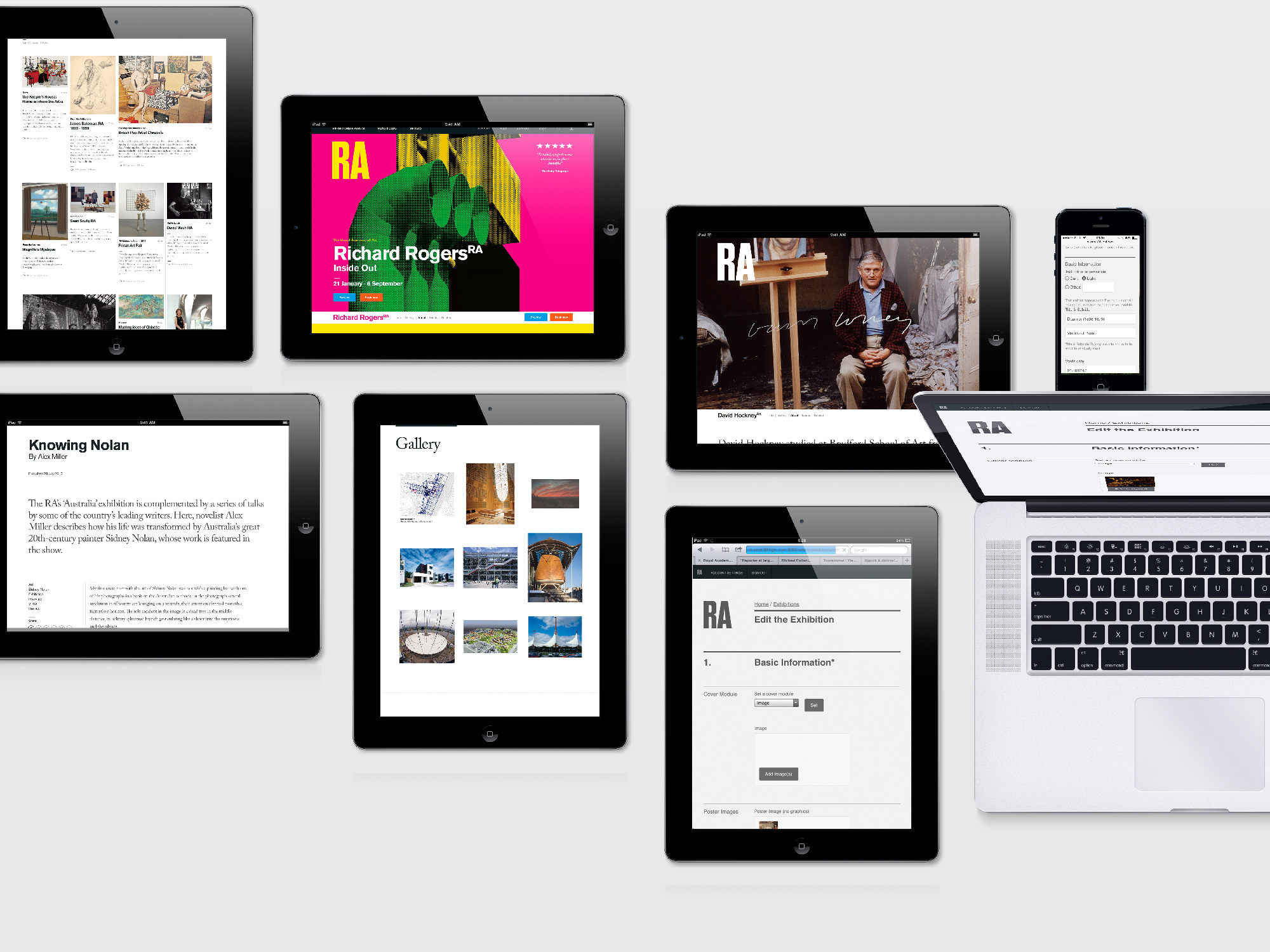
A digital identity for the Royal Academy of Arts
Building new audiences and opportunities for a 250-year-old institution.
Great art requires great openness, a space large enough to contain all the tragedy and comedy of the human experience.
The limestone walls and Palladian arches of the Royal Academy of Arts (RA) hold such a space. The institution’s building in Mayfair contains galleries where a wanderer can appreciate the everyday miracle of a Caravaggio or amble through the former home of Academicians, a group led by some of the most eminent artists in the world, from Anish Kapoor to Sir Norman Foster. This revered site has also been home to the Summer Exhibition for 246 years, an event open to submissions from any living artist.
As the RA approached its 250th anniversary, the institution came to IDEO to help create a digital strategy that would open new doors to these resources, reveal hidden avenues to new experiences, and offer broad vistas of the collection.

After rounds of research with artists, staff members, and visitors, our designers immediately started building and testing. They ran workshops to refine digital tools, watched as patrons scribbled notes about things they wanted to know more about, and built pop-up design studios in RA’s galleries where they could generate insights on the fly.
The result is a rich, immersive site for different audiences. Art lovers can view stunning images of the works, artists can learn more about RA schools, and RA staff can share surprising stories about some of the most prized pieces.
Based around human needs rather than organizational structure, the new digital space allows audiences to wander freely in this immense storehouse of inspiration and awe. And perhaps most important, the RA organization has benefitted from a human-centered paradigm shift that will enable the institution to forge boldly into its next quarter millennium.
A Cartography Nerd’s Guide to Mapping 100 Years of History
IDEO's resident mapmaker leverages a century-old resource to discover his neighborhood
If you live in an American city, big or small, there's a decent chance that Sanborn had a map (or a hundred) of your town. And best of all, the entire collection is open-source and available for download in high-resolution images. The Library of Congress database isn't exactly the easiest in the world to search, but keep at it.
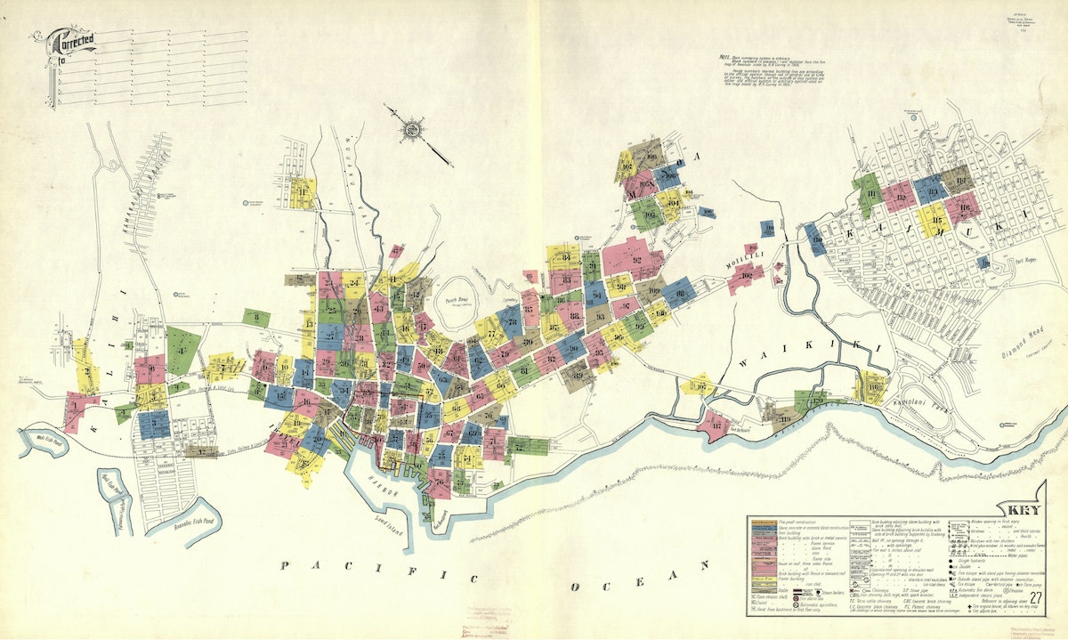
I live in San Francisco and was curious to see how my neighborhood was depicted by these amazingly-talented, fire insurance bureaucrats. I was delighted to find this map that shows my San Francisco neighborhood—the Lower Haight—in all of its 1899 glory. The colored rectangles form a grid, each pointing toward another map somewhere in the Sanborn collection that zooms in for much greater street-by-street detail.
I kept banging away at the rudimentary search function on the LOC website and eventually located Map 306, which visualizes my block in the year 1899.
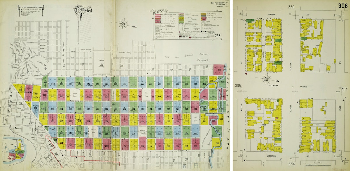
San Francisco is not the oldest of cities when it comes to architecture, and there was that little thing called the 1906 Earthquake (and subsequent fire), which destroyed a lot of the city as well. So I wasn't too surprised when I didn't recognize many of the buildings on my block. That said, it did get me curious: Were there any buildings that were visualized on the 1899 Sanborn map that are still present on my block in 2019? I decided to make a map to find out. See, being an ameteur cartographer is actually useful in 2019! Google Maps hasn’t ruined all of the fun.
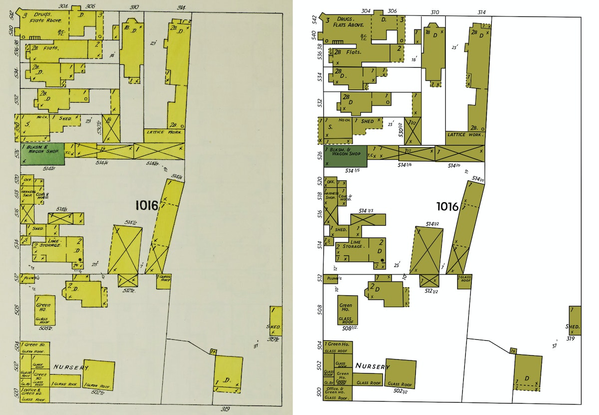
First, I set about converting the Sanborn map of my block into a file that I could manipulate in Adobe Illustrator. The original map is a JPEG, which means that it contains pixels. But since I wanted to have the freedom to tweak the map as I saw fit, I needed to convert the map to a vector version of the file. Why? A vector file (which, instead of pixels, is all about math coordinates) can be scaled infinitely large. What's more, it's much easier to change the colors on a vector-based map or make other modifications that I might need to later.
I'd like to say that there was some fancy way that I converted the map. I could have tried a Live Trace, but with a map this detailed, I wasn't optimistic. So I just rebuilt the file by tracing over the Sanborn map layer with new lines and fills and strokes. Detail by detail. This was mostly an act of love and definitely not a fast process. I recently had a kid and this turned out to be a fantastic New Year's Eve activity as we counted down the tired hours till midnight.
One unique challenge I encountered — there's no clear font out there that replicates the Sanborn hand-lettering. I spent too much time with the Adobe Typekit database and landed on Zeitung. It's not an exact match by any means, but close enough to pass the squint test.
That’s the original map on the left, in all of its pixels glory. And that’s the vector file on the right, built from scratch. How'd I do?
Okay. With the Sanborn map from 1899 more or less created, I turned my attention to the 2019 version of the map. I needed a detailed lot-by-lot map of San Francisco. My first go-to in moments like this is the Stanford University Earthworks website. The search function works quite well, and it links to open source maps from lots of other universities (like Tufts). After a quick search, I located a lot-by-lot map for the Bay Area and opened it up in QGIS, everyone’s favorite free and open-source cartography tool! Here’s what I had.
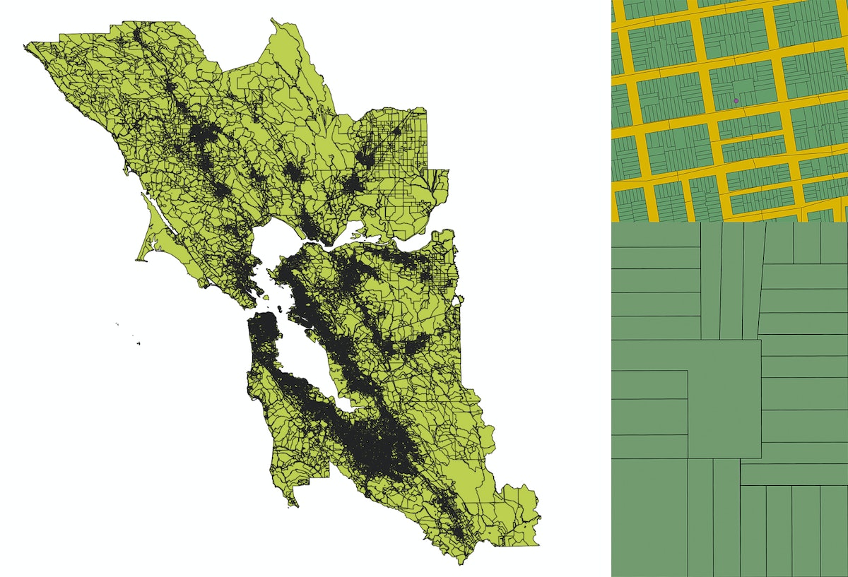
Totally overwhelming and, not surprisingly, it was actually quite tough to even find my block in all of that detail. So I loaded Google Maps, entered our home address, created a KML file with that single data point, and added it to the QGIS map. Once I zoomed way in, there was our block and our loft (represented by that little purple dot).
As I’ve mentioned before, QGIS is a wonderfully-powerful mapping tool, but mostly the pits when it comes to designing anything that would measure up to the esthetic standards of the average designer. So I zoomed way in to just our block, then exported the file as a vector file and opened it in our old friend Illustrator.
What I quickly realized is that this lot-by-lot map shows the property lines for each parcel on our block, but not the actual shapes of the buildings that sit inside each lot. Although I was getting close, I needed to go a step deeper to actually match the detail of the 1899 Sanborn map, which shows the outlines of individual buildings.
I opened Google Maps again and toggled to the satellite view of our block. If you zoom in as far as possible, you can see the outline of individual buildings. It's not perfect—shadows must get projected in weird ways when you snap photographs from orbit—but this was starting to get more interesting.
I snapped a fully zoomed-in screenshot of each building on the block, then traced them one-by-one using the Pen Tool in Illustrator. Once I had the outline of an individual building, I pasted it into the spot where it belonged inside the lot-by-lot map I’d exported over from QGIS. Then I repeated this process 31 times, for each of the buildings contained on my block.
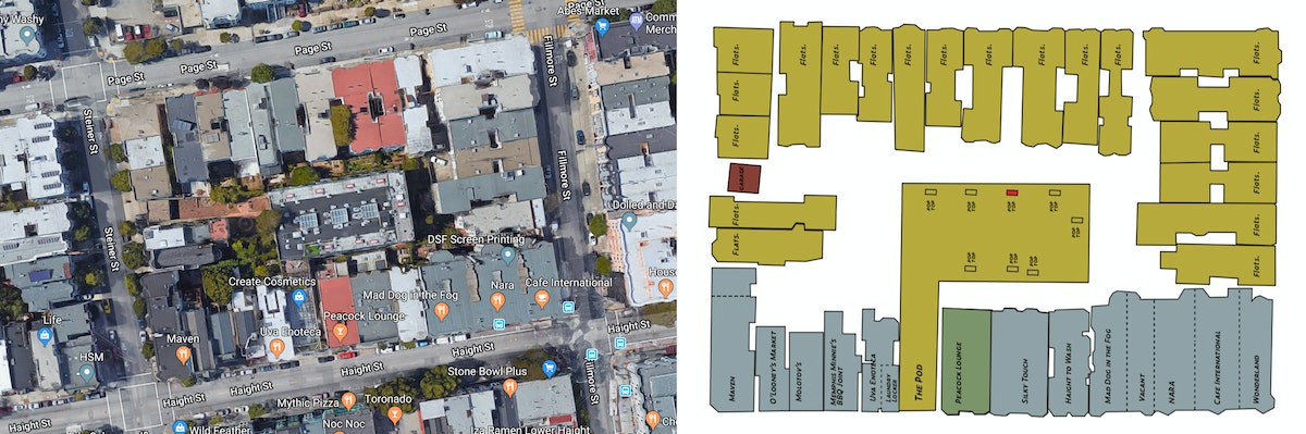
With the buildings in place, my next task was to figure out when they were built so that I could determine if any of them had been around back in 1899. After much poking around, I found this site from the San Francisco Planning Department that had exactly what I needed—the construction date for each of the 31 buildings on my block. Once I did the research, I discovered that three buildings can be found on the map in both 1899 and 2019, all of them clustered on the southwest corner of the block. One of them is my local bodega, home to Tiger the cat and famous (in the neighborhood) for the time that the Warriors eccentric three-point maestro Klay Thompson visited the bar to buy a bottle of Grey Goose. Super cool also to know that the building was built in 1890 and survived the 1906 Earthquake and Fire.
To finish up the map, I built out a key, borrowing inspiration from another Sanborn map visualizing neighborhoods in Honolulu, Hawaii.
Then I tweaked the colors, sticking to the Sanborn color palette, but borrowing some of the brighter colors found across the collection. I also added some polka dots to both maps to call attention to the three buildings that survived from 1899 to 2019. These last couple of tweaks are just two of the many benefits to working with vector files instead of pixels.
And voila, here is the final version of the map. What do you think? Now you can do the same for your city block.
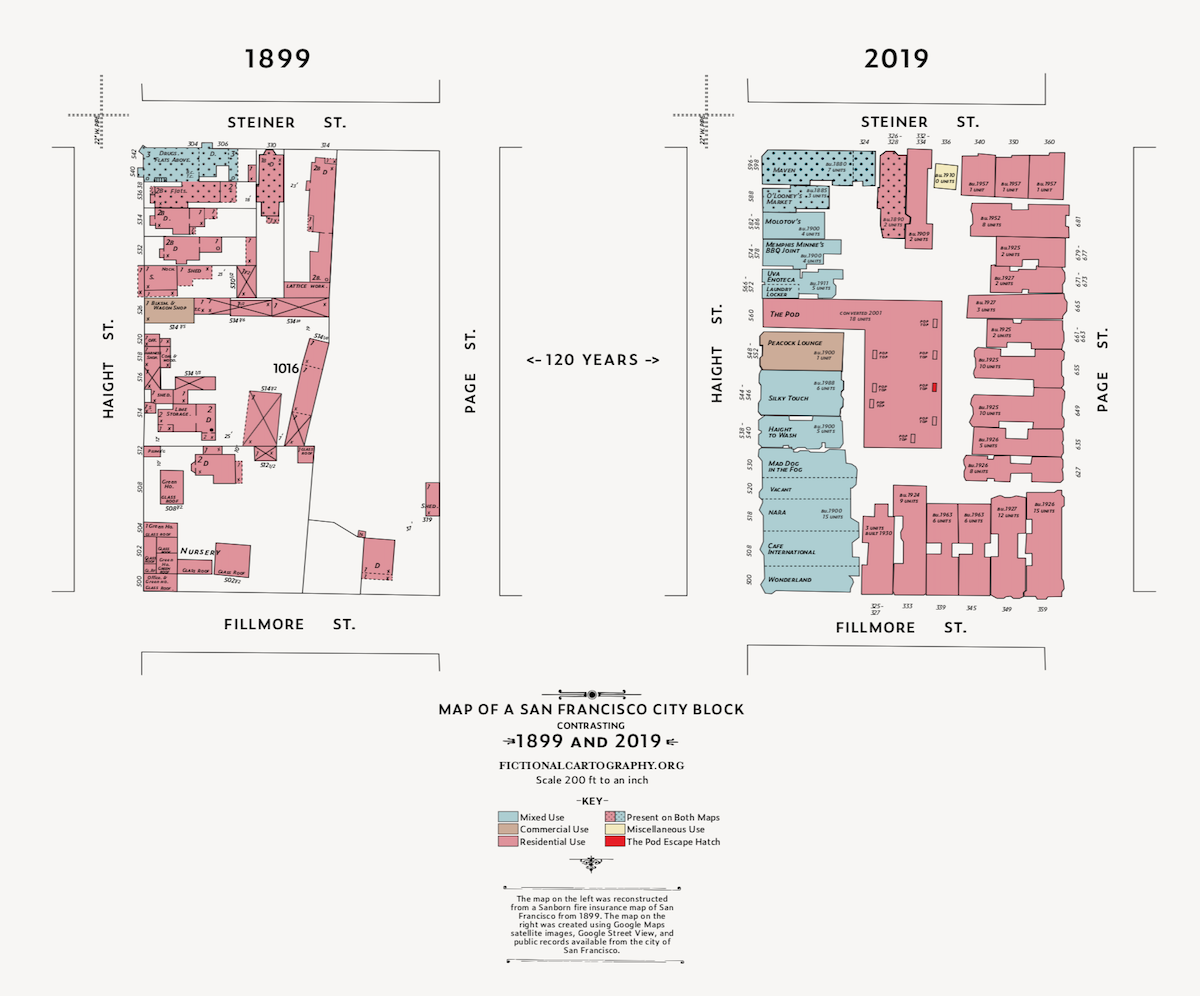
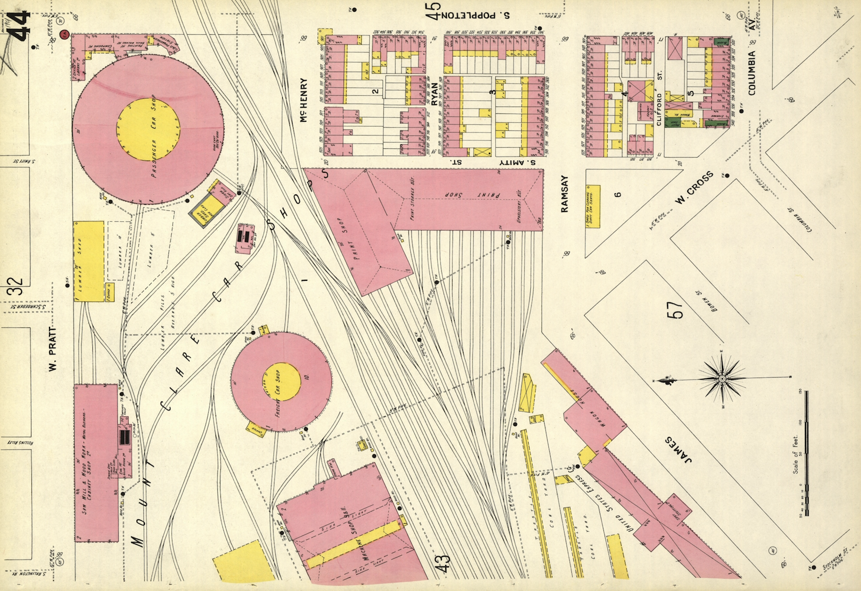
Do you have a few hours on your hands and want to head down a wormhole of unbelievably striking maps? Mosey on over to the Sanborn map collection at the Library of Congress. Originally created as a means for issuing fire insurance across major American cities, the quality of hand-drawn detail in these maps and the color palette used by the cartographers are stunning.
Why Coding Needs to be a Conversation, Not a List of Commands
4 tips for integrating your software developers into the design process
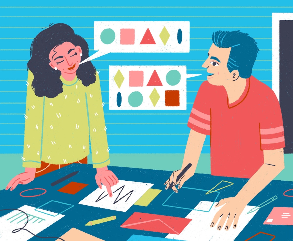
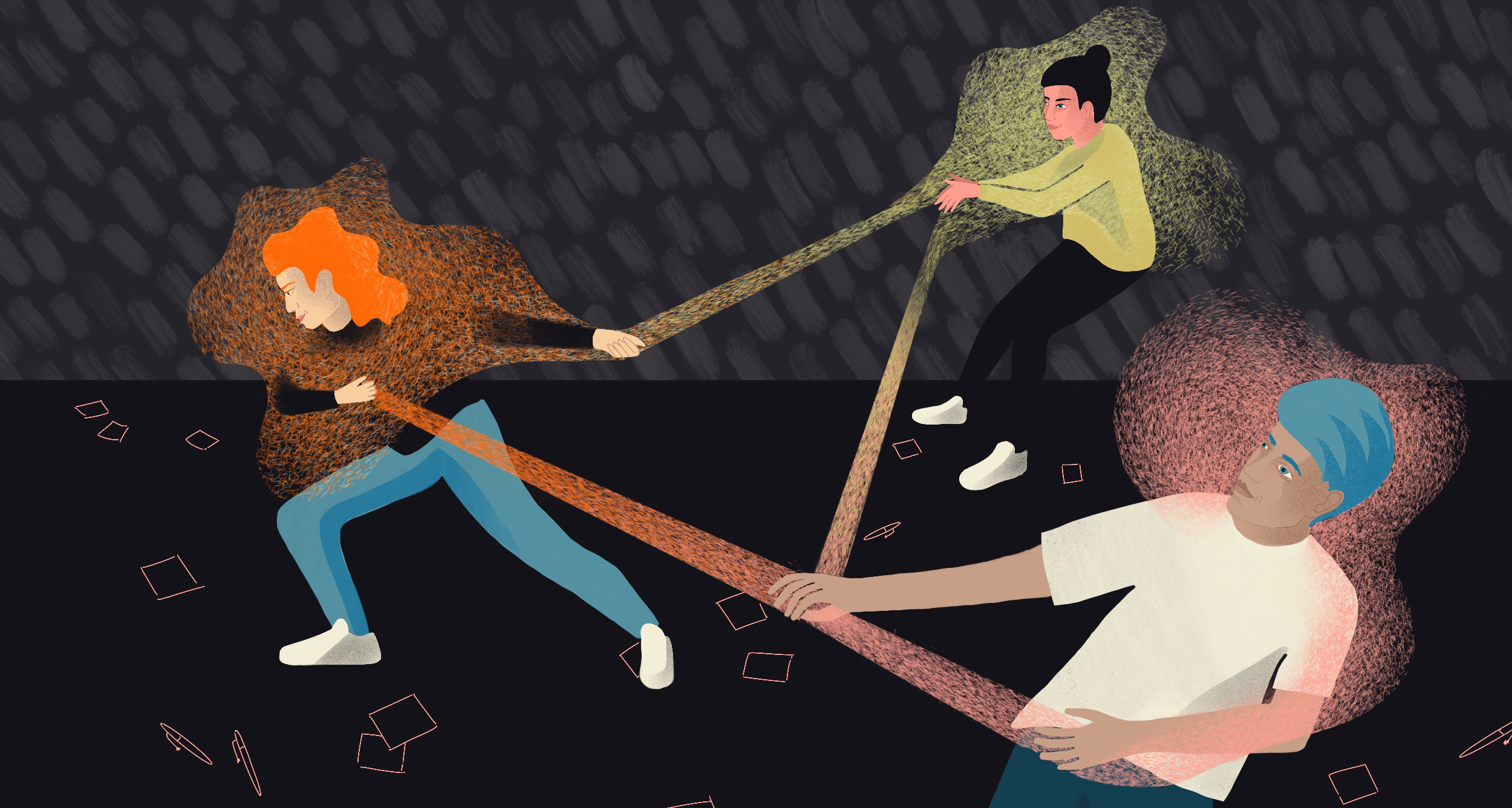
The role of an engineer on a product team may not exactly involve saving the world, but the scene has some origin in reality: Engineers and other team members often have to come together creatively to solve a problem, and they each have their own language and jargon for describing solutions. As teams practice leaner and leaner development cycles, the process of defining and agreeing on requirements, challenges, and solutions needs to be an ongoing conversation, where everyone comes away with a shared understanding and a feeling that their role’s needs have been met.
So how do you start that conversation, and keep it going successfully throughout the life of a product? Here’s a roadmap to get you started.
Start by developing a common language
Do some level-setting at the beginning of the project to agree on general terminology that everyone can understand. Sometimes, this piece can even be as small as defining your individual product’s features in a way that allows you to speak clearly about your product roadmap.
Early in a recent project, when we were going over wireframes, people were throwing around a lot of terms that referred to the same thing: Was a “folder” the same as a “collection”? What differentiated an “item” from an “object?” By coming together in the product’s infancy and agreeing upon these terms, we were able to define our system architecture and have meaningful database model names that we still use.
Share your vision for the product
Build in time to ask your team members how they feel about the product, and share your vision as well. Try to think outside the smaller details of what everyone’s currently working on, and find opportunities to share thoughts and feelings about the product at large. You might be surprised to hear that an engineer is anxious because they’re worried that the latest feature build is getting way more complicated than they originally planned, or that a designer is excited because users have been clamoring for the feature you’re working on. These small, casual interactions build a sense of trust and shared knowledge about the larger vision that each functional team has for the product as a whole.

Leverage disagreement to come together
It can often feel like product managers, designers, and engineers are at odds with each other. Between wanting to meet deadlines and stakeholder needs, pushing for a joyful and user-centric interface, and working toward robust and uncomplicated code, things can get tricky. The key is to take this source of potential conflict and turn it into a shared learning opportunity. Make sure that every side is not just arguing for a solution, but actually communicating the “why” of a solution. If an engineer understands the user research and decision-making that went into a proposed feature, it will help them communicate all the possible solutions that can meet that particular user need, and then the team can prioritize and make better decisions.
Find opportunities to translate for each other
This opportunity often presents itself when you’re integrating new members onto the team. For example, new engineers with fresh eyes often want to jump in and optimize and uncomplicate things. While that can be a good thing, there may be situations where the more experienced team member needs to explain the design decisions that led to certain features being a certain way—and suddenly the engineer is empowered to speak for the UX designer because they understand the shared vision.
Once you find your conversational rhythm, you’ll find that team members begin to understand each other’s roles better. Because the designer now understands why the engineer pushed back on a certain complicated feature, and the engineer understands why users have been wanting a different feature, both roles on the team are now better equipped to advocate for each other and push toward a common goal—whether that’s defusing the bomb on the bus, or building a successful product.
Illustrations by Cassandra Fountaine
We’ve all seen the action movie trope where our hero needs to defeat a ridiculously complicated doomsday device, and the plucky engineer has to explain how to reverse the polarity or engage the spatio-temporal hyperlink. The hero inevitably responds, “In English, please?”
Why You Should Invest in Real Friendships at Work
The benefits go far beyond coffee breaks
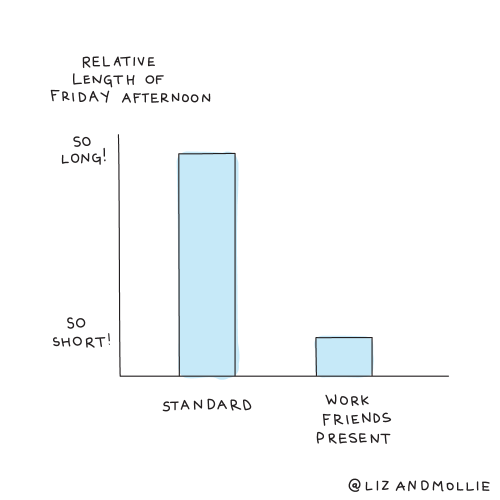
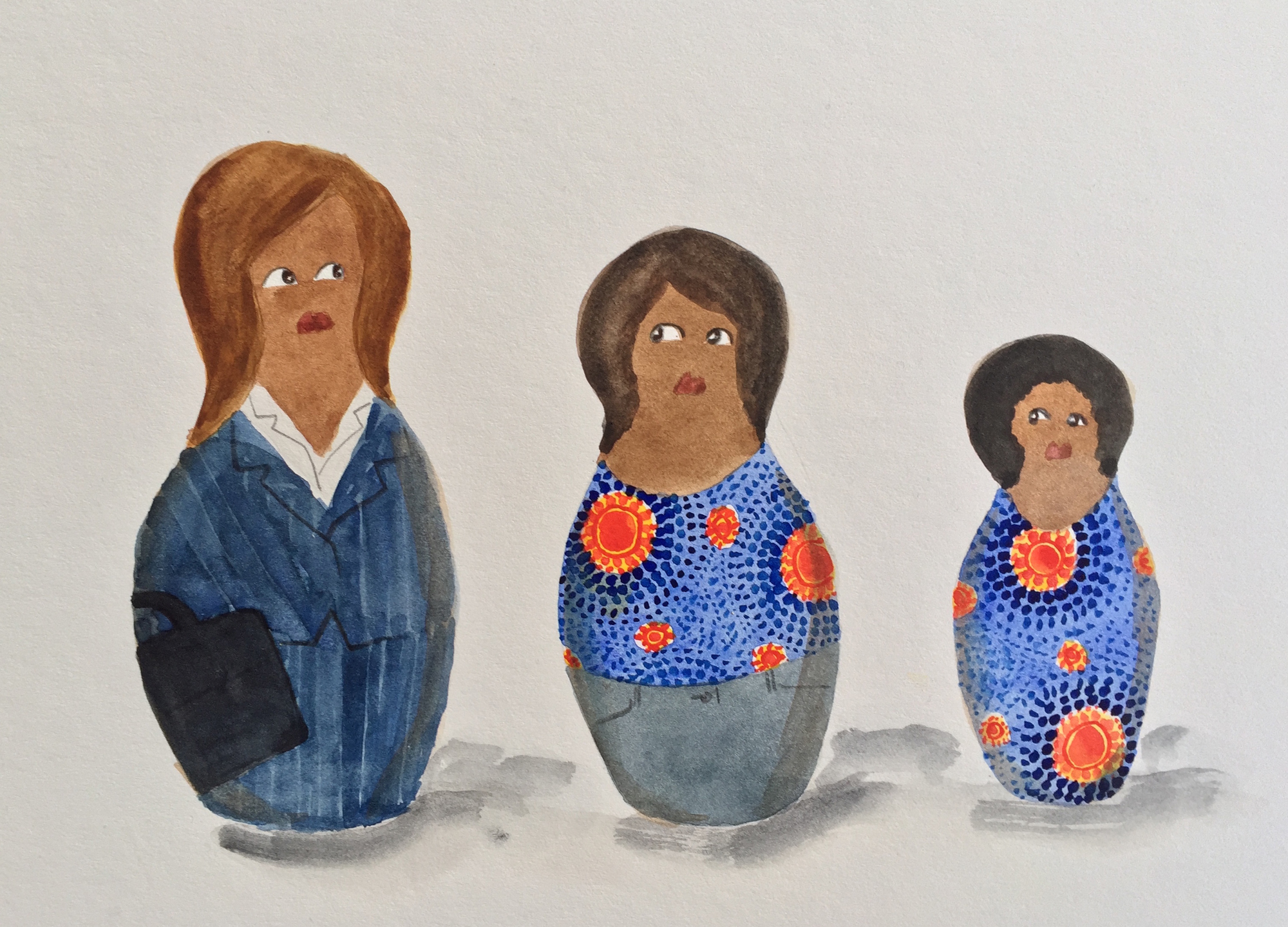
Work friends are very important, and different types of work friends can fill different needs. We’ll cover three: the confidante, the inspiration, and the frenemy. Understanding how and why you relate to these people will help you commit appropriate mental resources to developing workplace relationships that can bolster your motivation (and maybe even help get you out of bed on that Friday morning).
1. The confidante
This is the work friend who will commiserate when you’ve had a rough conversation with your boss, rush you to the bathroom when you’re about to cry, and give you honest feedback when you need it most. Confidantes make us feel like we can conquer the world—or at least ace a presentation and finally ask for that raise.
But these days, it can be tough to find a confidante at work. Because we tend to switch jobs more frequently, it can be hard to invest as heavily in workplace relationships. To counter that and find your confidente, start by building trust and sharing stories with a coworker you gravitate toward. Or initiate a get-together: People who provide social support to others—by organizing an office event or inviting colleagues to lunch—are ten times as likely to feel engaged at work than people who keep to themselves, says Shawn Achor, author of Before Happiness.
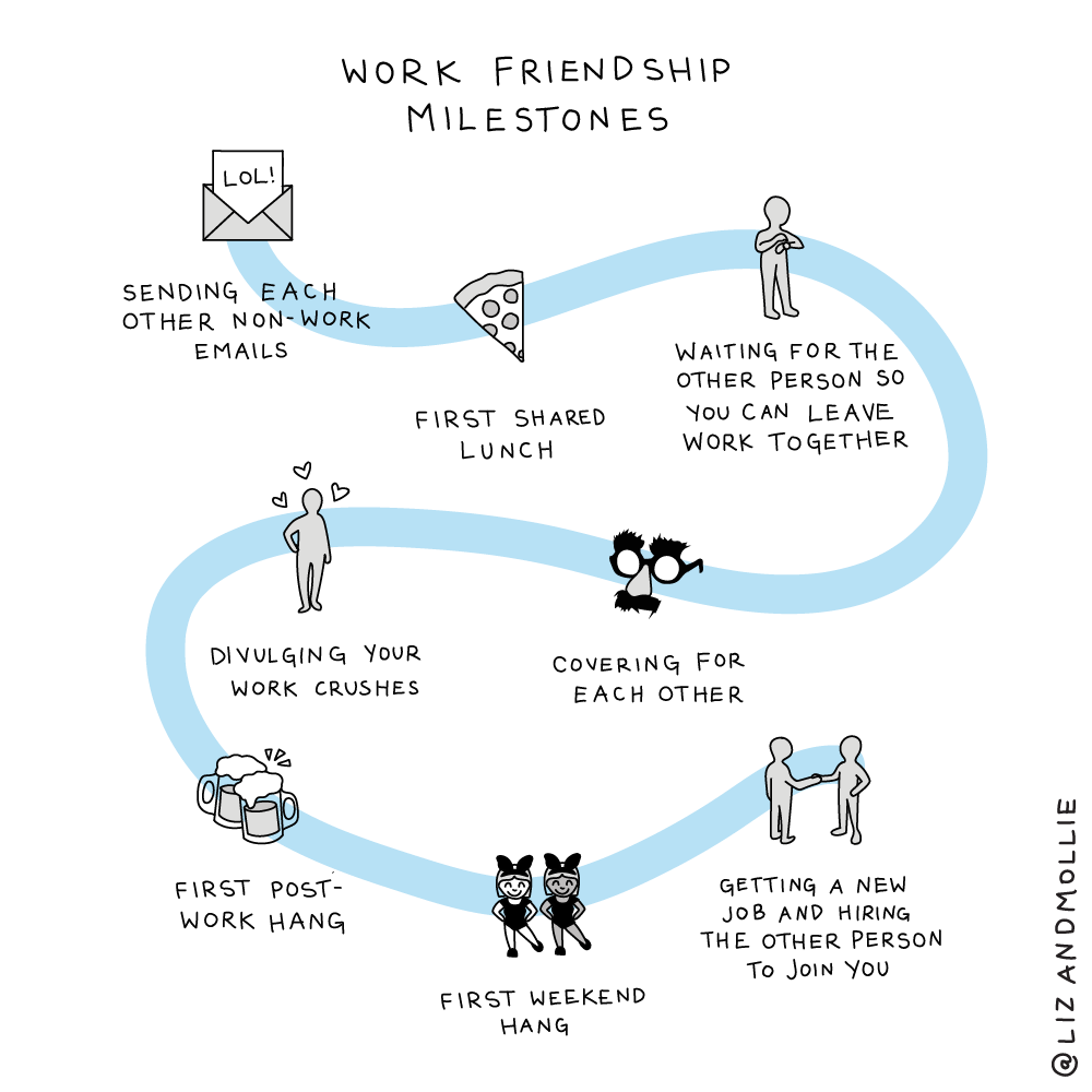
2. The inspiration
The inspiration is your platonic work crush: you don’t want to be with them, you simply want to be them.
This person can either be a colleague you deeply admire or a formal mentor. You probably could've guessed this, but mentors can help improve job satisfaction, teach us how to be effective leaders, and steer us towards the right career moves.
“They’ll bring a field to life for you. They’ll teach you how to find quality material in that field,” advises economist and author Tyler Cowen.
Pro tip: The best way to find a mentor isn't to ask, “Will you be my mentor?” but to start by asking someone for specific advice, then slowly work toward building a relationship.
3. The frenemy
We tend to choose friends who are similar to us, especially at work. But the more we have in common with someone, the more likely we are to compare ourselves to them. The frenemy is both our friend and our benchmark within the organization.
Another pro tip: Don’t feel guilty about experiencing the occasional twinge of envy! Frenemies account for almost half of all important members of our networks.

While frenemy relationships are linked to greater stress, they also motivate us to work harder. In a survey of consultants, those who had a frenemy made more of an effort to succeed and network. Leverage the positives of a tricky relationship by partnering on an important project; you’ll try harder to prove yourself and might end up with a real friendship.
But even the best work friendships have a dark side. Sometimes being close with our colleagues can leave us emotionally exhausted. Managing relationships we care deeply about while giving critical feedback or rushing to meet deadlines takes effort. Talk to anyone who has worked at a startup where coworkers describe themselves as a family, and you’ll inevitably hear how tiring it can be.
And for every friendship, there is also someone outside the friendship. The closer the relationship between two colleagues, the more others might feel left out, even if the friends aren’t actively excluding anyone.
Here are some concrete ways that you can engage with people at work to reap the rewards of having solid work-friends:
- Go for quality instead of quantity. High-quality connections don’t necessarily require deep or vulnerable relationships. Small moments of connection full of trust and engagement can be the beginning of something larger.
- Prevent silos from forming. IDEO structures all of its teams to include designers from different disciplines so each team is cross-functional. Our San Francisco office also has a ritual called tea time, in which people are invited to take a break from their work and mingle with people they don’t work with directly.
- Don’t rely on social events. Studies show that work parties aren’t always effective at helping people make friends. “People don’t mix much at mixers, and at company parties, they mostly bond with similar colleagues,” says Adam Grant.
- Spend casual time together. Google and Facebook plan times for employees to play games and eat meals together. At LinkedIn, the whole family can get in on the fun during Bring Your Parents to work day.
This post was adapted from Mollie and Liz's book No Hard Feelings: The Secret Power of Embracing Emotions at Work.
Choice, meaning, and opportunities for learning all make work more enjoyable. But on rainy Friday mornings when we’re low on sleep and irritated with our managers, research suggests our real motivation isn’t a what—it’s a who. People with friends at work find their jobs more satisfying, and are less affected by stress.
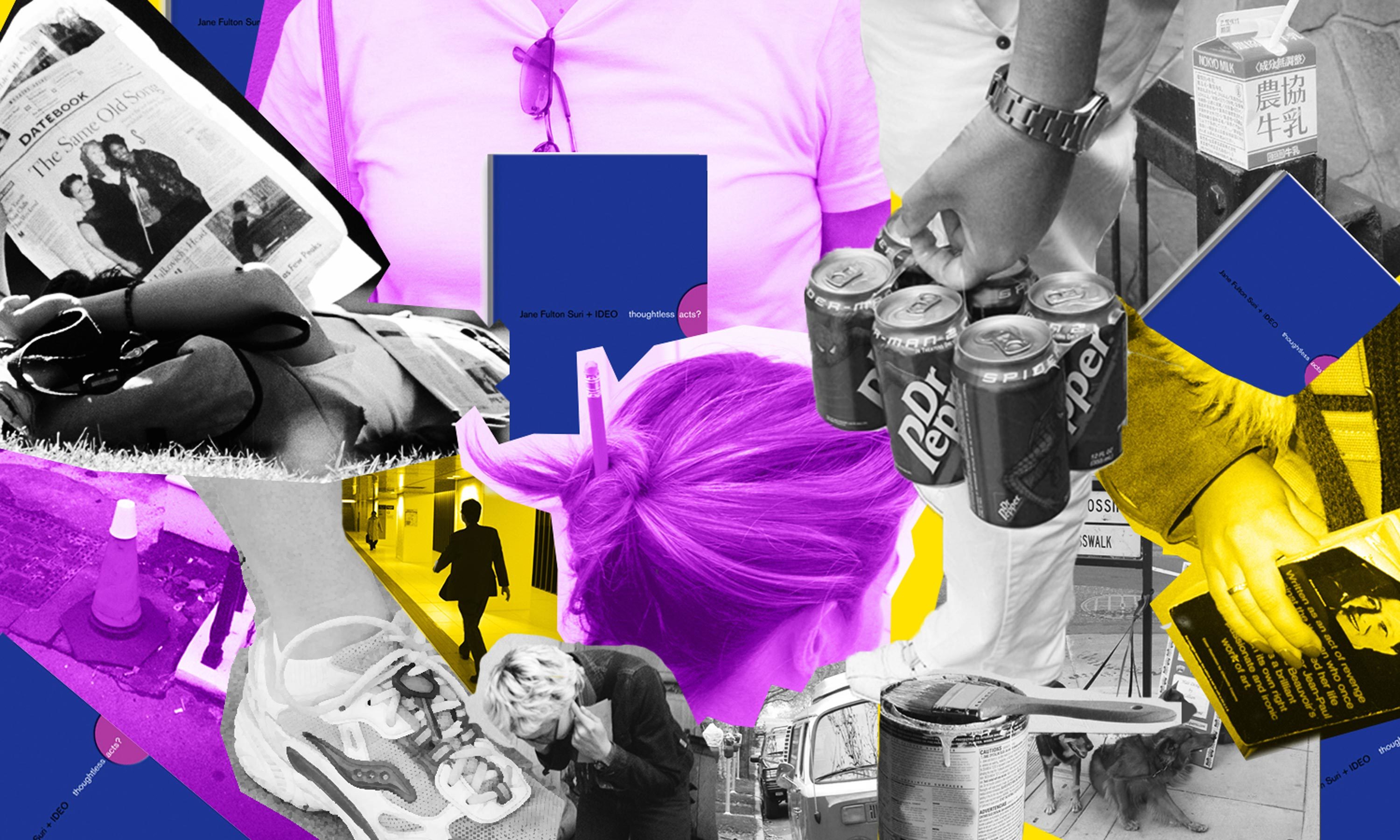
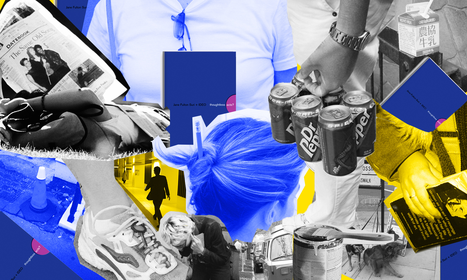
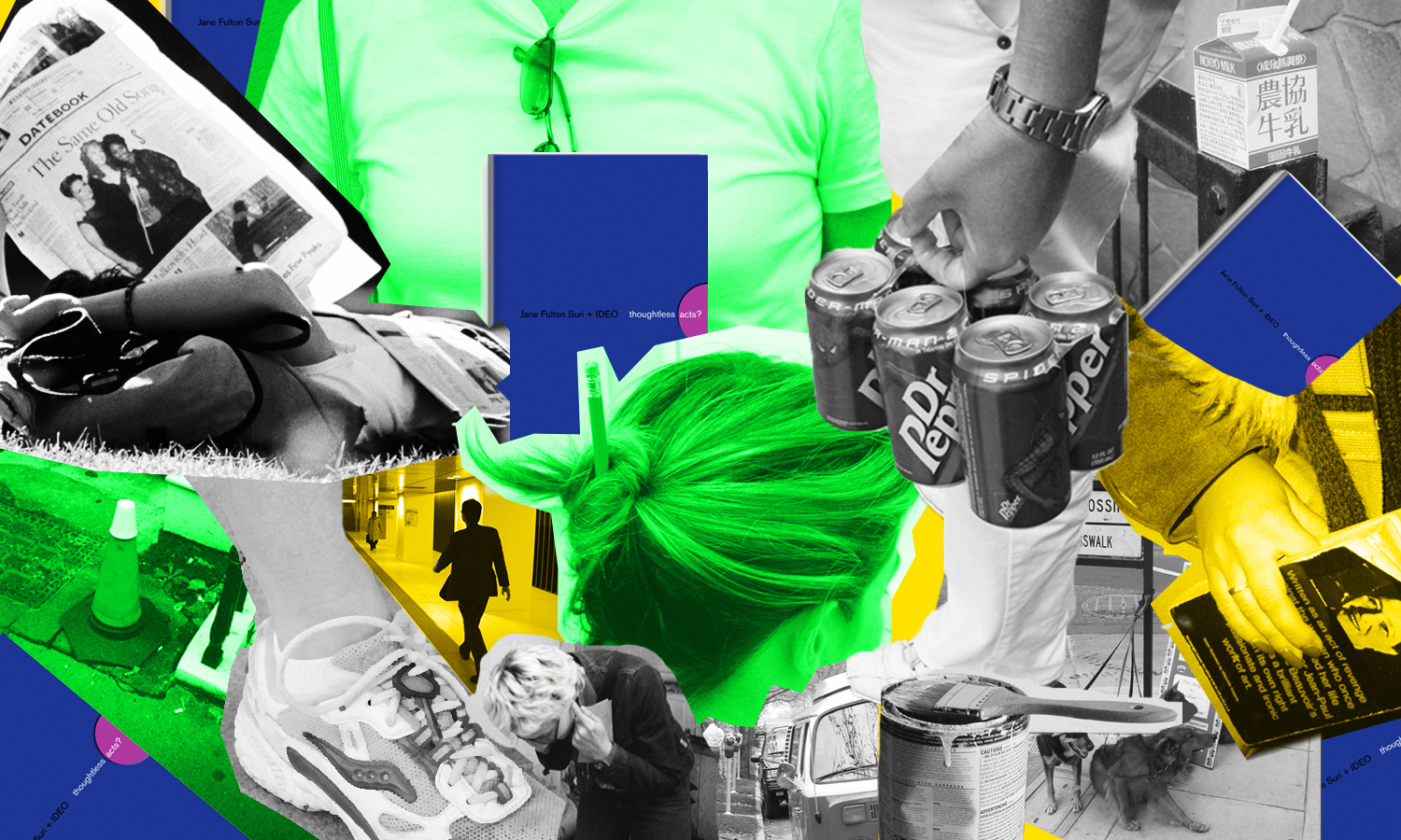
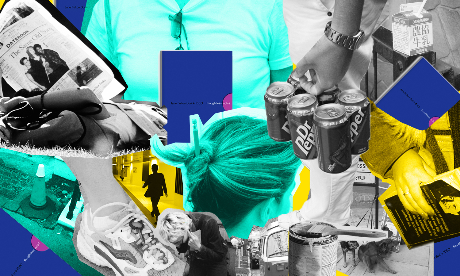
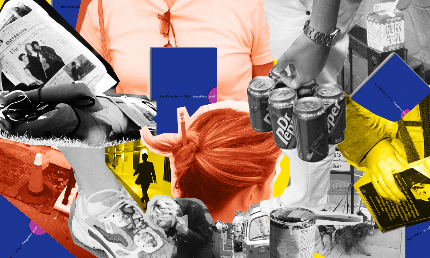
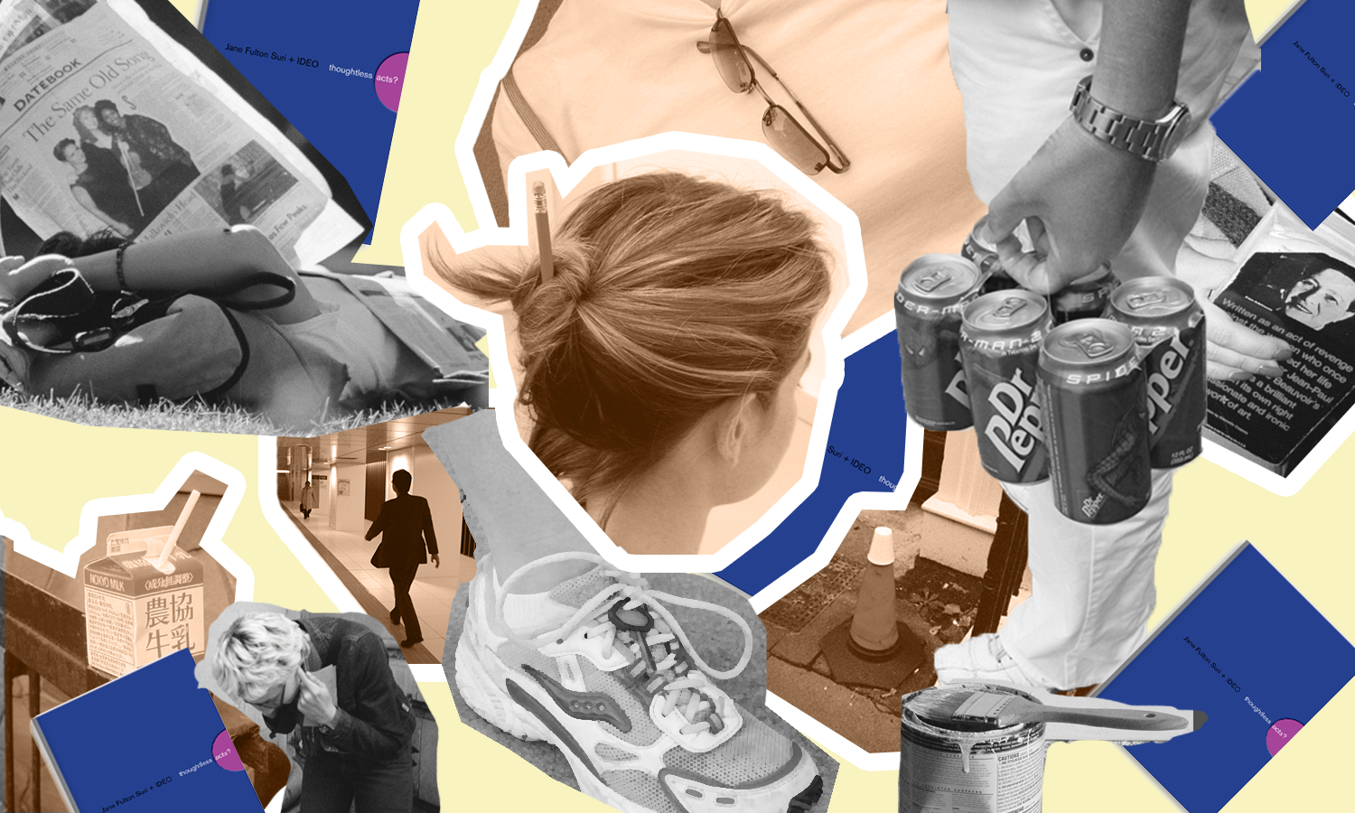
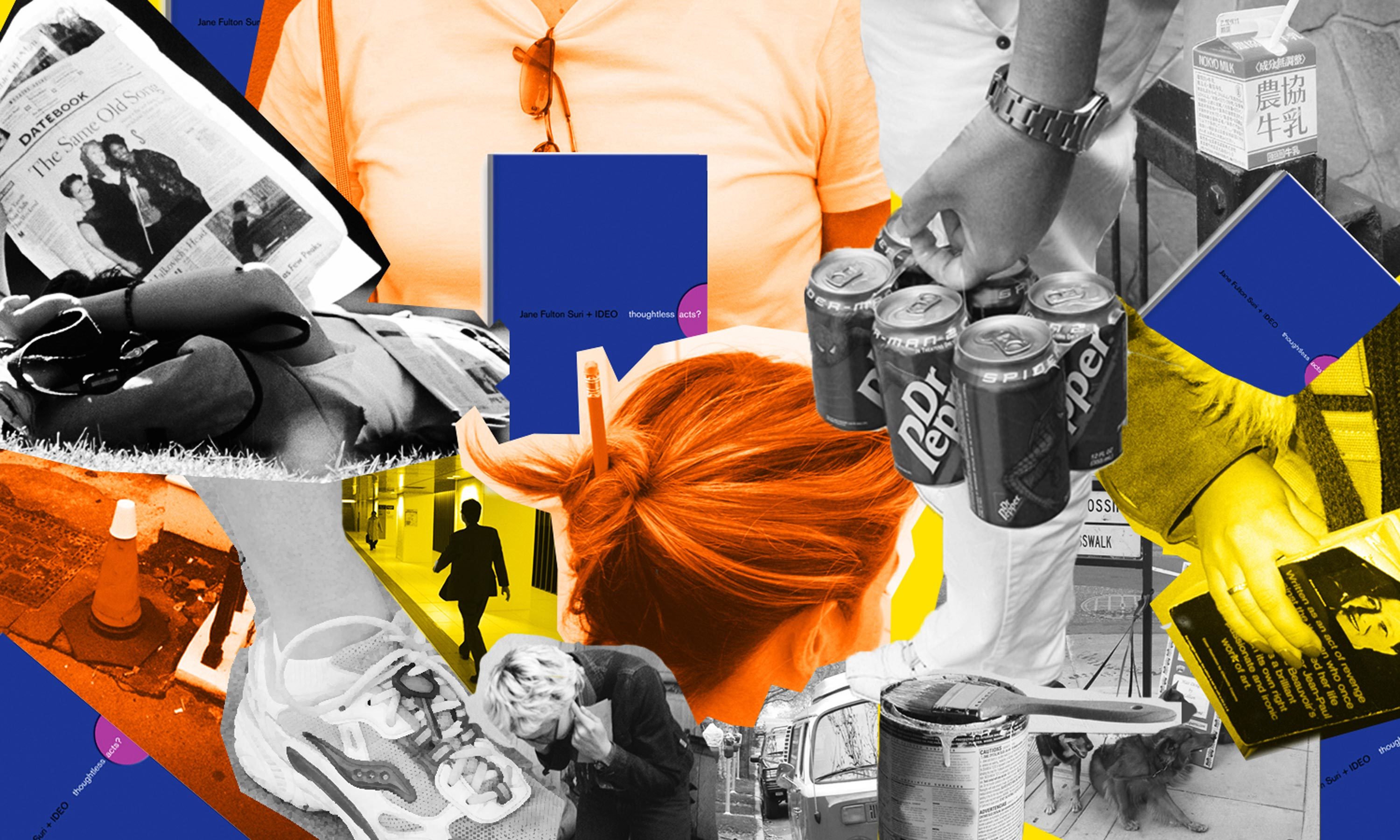
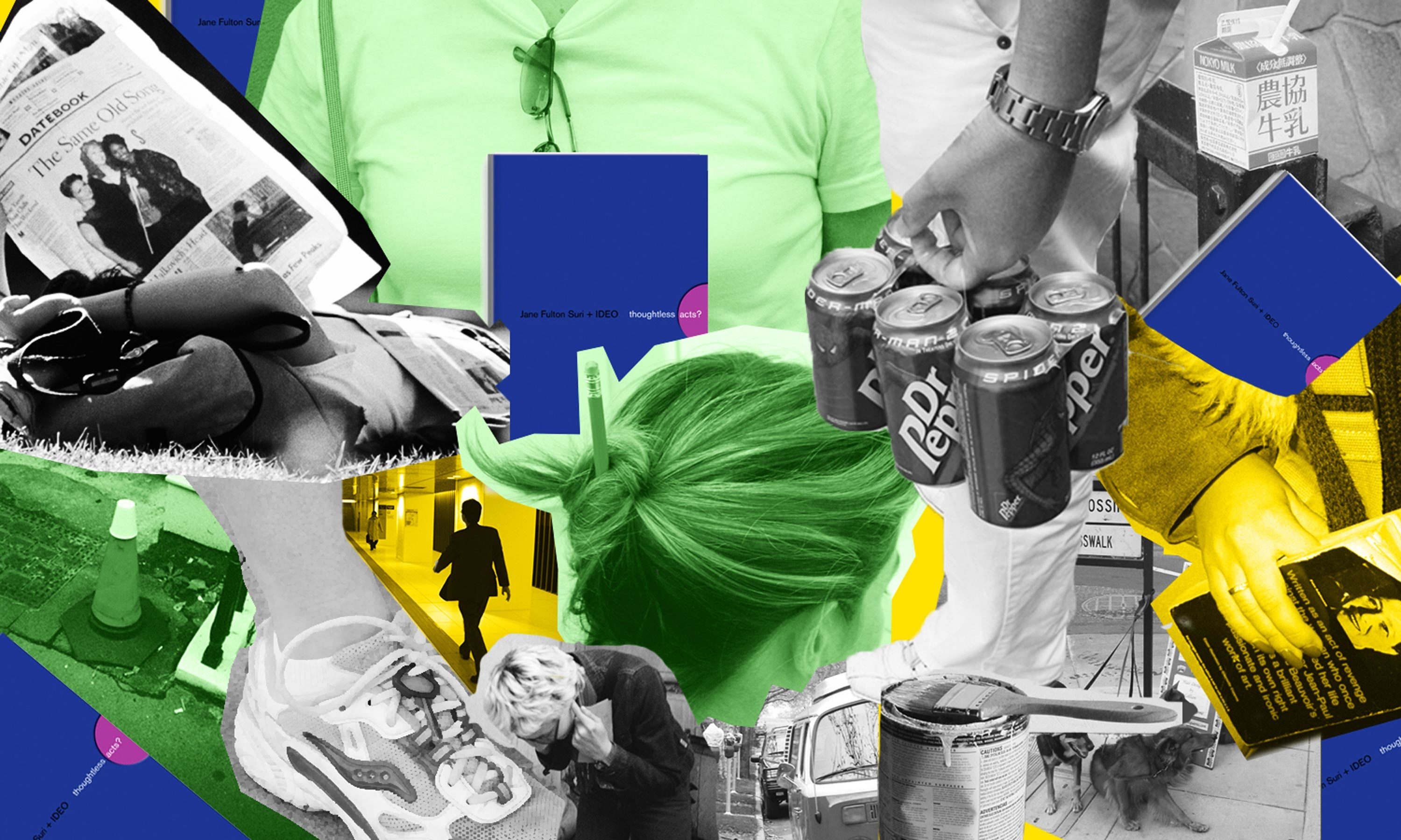
Thoughtless Acts: Monsoon Season
Thoughtless Acts: Monsoon Season. The intuitive ways we adapt and react to things in our environments

It's my first few hours in Bangkok, and by looking around the train, I can tell it's rainy season. Thin raincoats cover suits, and young mothers juggle both sunglasses and umbrellas.
As I exit the train, I look up, count to three and speed through a very thick rainstorm toward my Airbnb. After a much-needed nap, I open my eyes to a completely different climate. I peek through the shutters of my room and see an indigo sky, birds flying, and I am feeling the heat.
I pick up my fanny pack and leave the Airbnb immediately to explore the neighborhood. On a quiet side road, beside the fence of a wood craftsman shop, a thick black piece of tarp covers a corrugated fence. It’s held in place by a clever set of weights—filled plastic water bottles.
It strikes me that such an old trick can be found everywhere across the world. I start to wonder how can these four small bottles make it through such heavy, rainy days.
I stop to stare at a man approaching me. The woodchips on his shirt make it seem like he must be heading out from the shop nearby. He whispers something, unties a couple of bottles, and brings them to the shop's outdoor sink. These short bursts of sunlight heat must dry the water in them pretty quickly, I thought to myself. Regardless of the one million square meters of water falling over Bangkok each September, nothing beats the strength of a tropical sun, and the dedication of an old craftsman to keep his work tools dry.
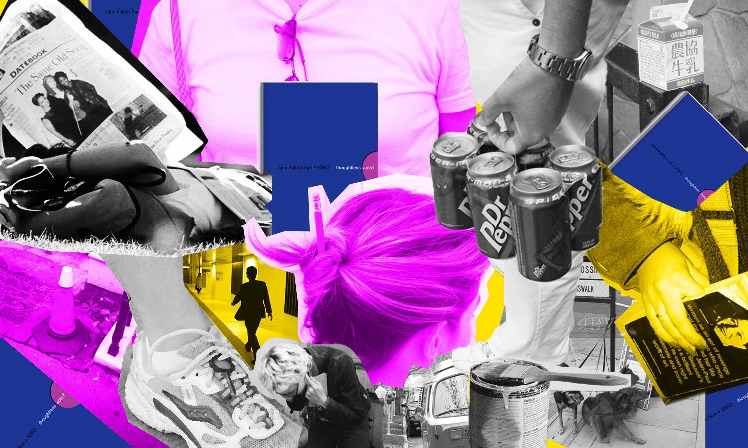
Human-centered design requires us to observe human behavior with beginner's eyes, so that we can spot the innate ways people interact with the world around them. We call these intuitive and unconscious reactions Thoughtless Acts, and IDEO designers collect photos of them to inspire their work.

Lindsey Turner
I’m passionate about building brands, products, and experiences that help organizations show up with meaning and momentum.
I help organizations cut through complexity by shaping how they show up, through brand strategy, identity, and storytelling.
Working at the intersection of brand and business, I bring an editorial eye and a bias toward making—turning ideas into tangible experiences that people can understand, trust, and believe in.
My work spans government, healthcare, financial services, media, and consumer goods, from launching Gen Z-focused ventures to building innovation labs and reimagining legacy brands. I relish moments of ambiguity and enjoy translating across teams, perspectives, and priorities to move ideas forward.
I started my career in editorial and digital design, shaping cross-platform experiences and identity systems in publishing and agency environments. That foundation still shapes how I work today: I’m detail-oriented, collaborative, and overreliant on the Oxford comma. I hold a BFA in Visual Communication from the School of the Art Institute of Chicago.

Rachel Young
My work helps organizations see who their products aren't working for—and build the will and the tools to do something about it
For 25 years, I've asked the same question: Who does this design exclude—and what are we going to do about it?
My work spans human-centered strategy, inclusive design, and qualitative research, with clients ranging from Microsoft, Google, and Verizon to the National Science Foundation, and San Francisco Unified School District.
Before IDEO, I taught elementary school in East Palo Alto and spent a decade doing design work with social service organizations—where I learned firsthand what it costs people when systems are built without them in mind.
I am currently writing User Error, a nonfiction book about digital access and the design decisions behind it. I live in Oakland, California.

Brian Pelsoh
I lead with craft, ensuring our work is creatively excellent: rooted in deep human insight and imagination, while also grounded in the realities of business and technology.
My expertise spans brand, communication, and product design across tech, education, the arts, and social impact.
I believe great work demands both high-level vision and obsessive attention to detail, and only happens through collaboration.
I bring an inclusive, hands-on approach and a deep understanding of business, which enables me to consistently deliver excellence while always asking why.
Before joining IDEO, I worked at the brand firms Pentagram and VSA Partners. I began my career as a designer, leading teams at the School of the Art Institute of Chicago and the Milwaukee Art Museum. I hold an MFA in graphic design from Maryland Institute College of Art and a BFA in communication design from the Milwaukee Institute of Art & Design, and have taught at some of the best design schools in the US.

Tony Wong
I am responsible for IDEO’s long-term success in China and working with clients to use design as a tool to enable growth.
I am responsible for IDEO’s long-term success in China and working with clients to use design as a tool to enable growth. Specifically, I have helped Chinese companies design holistic brand solutions through the development of their products, communication, services, and innovation teams, and I have helped multinationals expand their presence and influence in China.
I advise global leaders on developing China-led innovation and capabilities.
In over 15 years in IDEO Shanghai, I have worked on projects that use design to elevate the quality of the experience of healthcare products and services, streamline processes that increase productivity, create spaces and programs that promote and enable inclusive communities, and build next generation mobility solutions that are planet-positive.
Before joining IDEO, I worked at Philips Electronics and the Electrolux Group in Italy, the Netherlands, and Singapore on a number of breakthrough commercial products. I am a member of the Young President Organization in Shanghai.

How to use AI as an editor, not a writer
Ed White shares how he uses AI as an editor—not a writer—to sharpen storytelling, rehearse ideas, and preserve the productive friction that makes creative work better.
Ed White has a rule he's tested on his own writing: hold yourself as the writer, and let AI be your editor. Ed is a Senior Design Director at IDEO's London studio, where he co-leads the firm's AI portfolio across Europe. Before IDEO, he spent 12 years as a writer and editor at the Financial Times, Wired, and Contagious. So when he talks about when to use AI for storytelling and when not to, it comes from two decades of crafting his storytelling skills.
In this episode, Mina Seetharaman talks with Ed about two specific tools he uses to keep AI in an editor's seat: a "roasting agent" prompted to critique his drafts without any sugarcoating, and a simulated audience he rehearses pitches on before the real thing. They also get into what Ed is hearing from design leaders at Anthropic, Lovable, Shopify, and Google Creative Lab about how creative work is changing, and why he thinks the friction of writing something yourself is worth protecting rather than automating away.

Building a personal AI for the messiness of life: Sida Li
Becca Carroll talks with Cue co-founder Sida Li about designing a personal AI for the messiness of everyday life—not just work. They explore how Sida stays anchored to human needs while navigating fast-changing technology, product tradeoffs, business-model experimentation, and the realities of building an AI company today.
Most AI products today are built for work—a space with clear problems and established systems. One founder noticed a gap: personal life is messier, harder to systematize, and mostly left behind by the AI boom. So she built Cue, a personal AI that lives inside iMessage and group chats, to go where the other tools haven't.
In this episode, Becca Carroll, IDEO's Chief Strategy Officer, talks with Sida Li, co-founder and CEO of Shared Context Lab, about staying anchored to a human need while the technology around her keeps changing shape, why she treats her business model with the same rigor she'd bring to a product, and what it feels like to build a company at this particular, disorienting moment in AI.
The conversation also gets into how Sida makes design decisions: the language Cue uses to describe itself, the tradeoffs behind building inside iMessage instead of a new app, and a real story about a business idea that didn’t pan out.
This is the second in a two-part series profiling founders from IDEO's Startups-in-Residence program. The first conversation is with Johannes Seemann, founder of Sooner, on designing GenAI for the emotional side of money.

Designing GenAI for the emotional side of money: Johannes Seemann
Designing financial tools around the feelings that shape money decisions.
Most personal financial tools are built to run the numbers and optimize towards a budget. While that works for some, most people experience money as a lived relationship that does not neatly fit into a spreadsheet. Johannes Seemann and Becca Carroll discuss why money is emotional before it is mathematical, and what a human-centered approach to building a generative AI financial product looks like in practice.

The curious leader's edge in uncertainty: Scott Shigeoka
How genuine curiosity helps leaders navigate uncertainty with greater confidence.
Mina Seetharaman talks with Scott Shigeoka, author of Seek and Head of Curiosity Cultivation at the Eames Institute, about what distinguishes genuinely curious leadership from performative curiosity, how power dynamics shape curiosity, and why practicing curiosity can restore energy rather than drain it.
Looks like you might be in search of something very specific?
Or reset the filters above and try another angle.
Here’s some random inspiration

Podcasts about creative leadership

Articles about the power of prototyping













.webp)