Boston's new citizen-centered site
Designing a welcoming, intuitive platform for Bostonians.
More than 7 million people each year came to the Boston.gov site to tap into all sorts of city services: reporting a pothole, learning the assessed value of their property, paying a parking ticket, checking recycling schedules.
Boston wanted to create a beautiful platform that would make the process of finding and navigating information easy and intuitive, one that prioritized the needs of its people.
The Boston.gov site had outgrown its existing structure and needed an overhaul. The user experience was mired by the fact that Boston City Hall has nearly 50 different departments, each with its own microsite, navigation and content standards that feed into a centralized site.
So the City of Boston hired IDEO to design its new digital home, Boston.gov. IDEO designers worked with the major stakeholders—department heads, employees, and Boston residents, with a focus on those in underserved communities and those with varying levels of technical proficiency—to gather insights into what users needed.
The objective was to design something that would simplify how people navigate the site, to make it easier for residents to find answers to common questions, and, in the process, serve as a community facilitator—an up-to-date, reliable resource that makes life in the city more manageable.
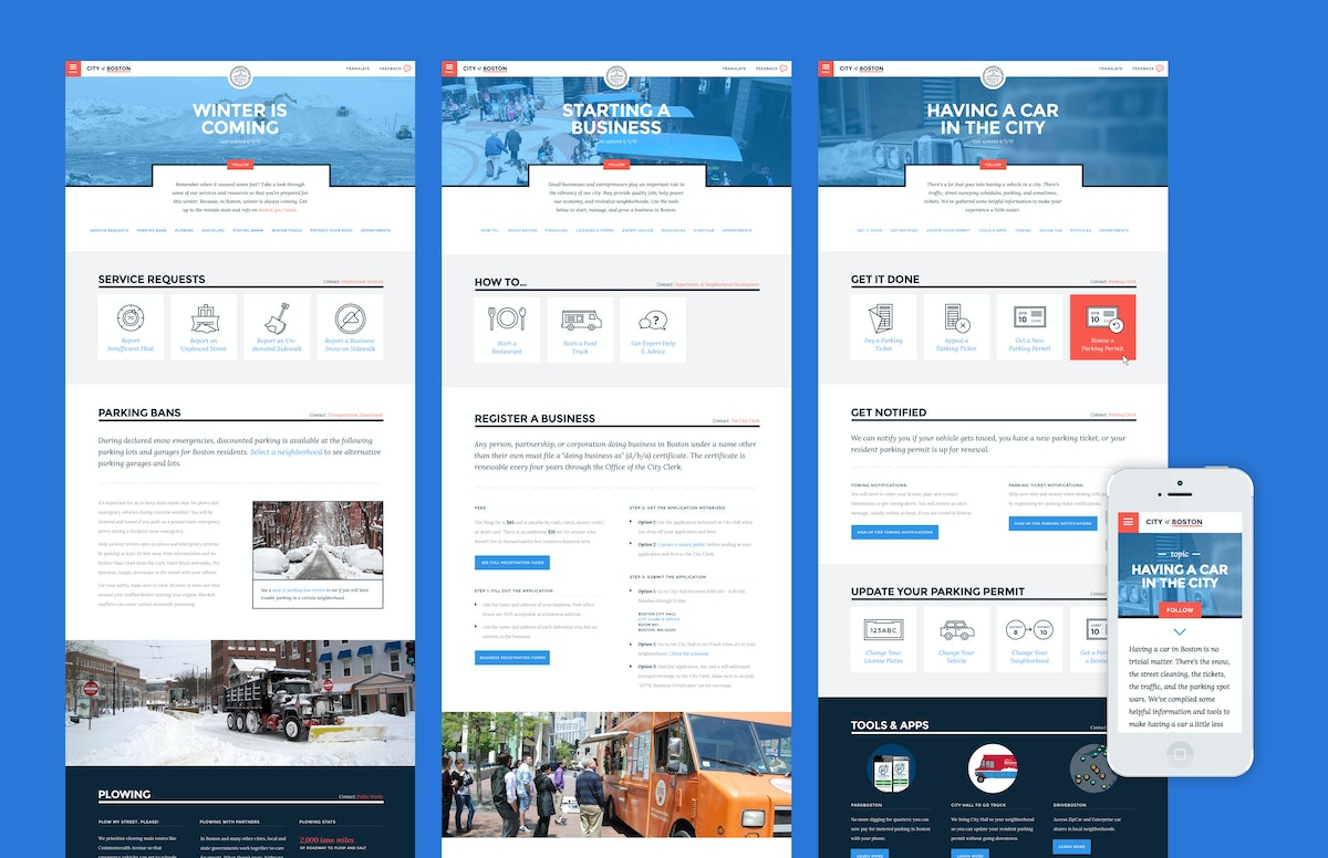
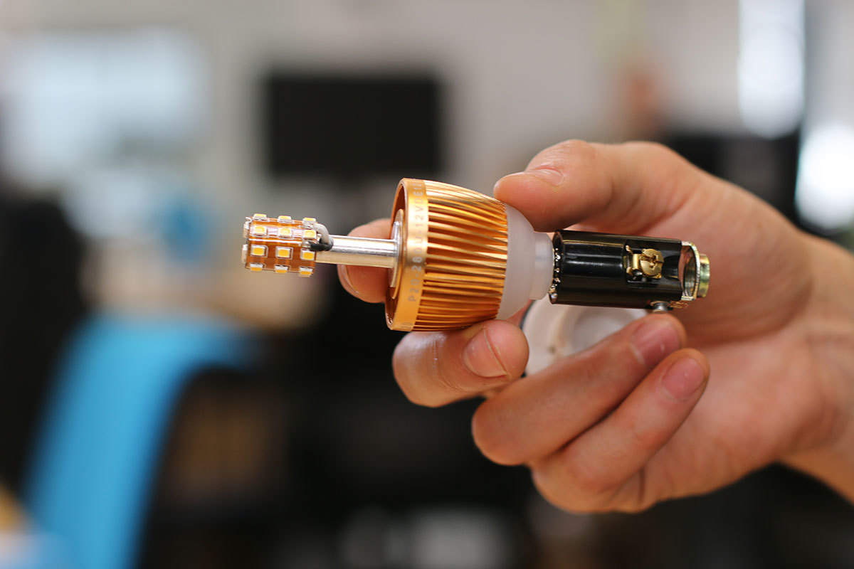
Rather than organize the site by the city’s departments, the design solution was rooted in illuminating relevant content by topics—people’s life moments—many of which overlapped through different branches of government. Owning a car in the city, for example, is closely related to preparing for winter, so bridging those common threads allowed for a more intuitive organizing principle.
In the process of the site redesign, IDEO also helped to create a visual identity system that underscores Boston’s strengths: the city’s confidence, humility, personality, and optimism.
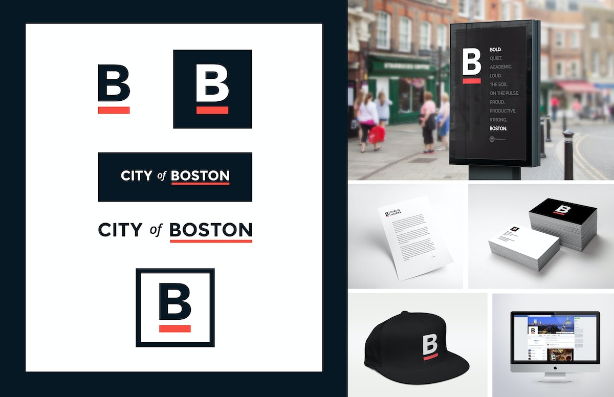
In addition to the web architecture and redesign, IDEO also produced a comprehensive style guide to help maintain design consistency, so departments can add content without compromising the overall integrity of the site, as well as a brand look that the city has decided to adopt across nearly all of its consumer-facing media. Now you’ll see the famous underlined B on T-shirts, banners, and even snow shovels.
Holding true to its mission to include Boston residents and all site users in its design process, the new Boston.gov site was piloted for six months, and the process document on the city’s blog (including the IDEO designed brand guide), before a full launch was rolled out in July 2016.
“The website should act like a helpful human. This is one of the big differences between the old site and the new site,” said Jascha Franklin-Hodge, the city’s chief of information technology in a Boston Globe article. “Oftentimes, when you looked at something on the old site, it would feel like you were interacting with some sort of lawyer-robot that was speaking to you in government-speak, using very formal language. We are trying to move away from that so your experience is akin to a person.”
The City of Boston was in need of a new digital home—one that emphasized a shift to a more welcoming tone and commitment to its citizens.

Growing an American brand in China
How an outdoor retail company found a new audience through digital and physical shops.
In the Western Hemisphere, The North Face brand has long represented an active, sporty lifestyle that’s filled with challenges and adventures. But appreciating “the great outdoors” in China is less about extreme sports and more about connecting with nature in a communal, spiritual way. This research-based insight led the team to identify new opportunities for The North Face to better target its messaging.

Designers found a key opportunity: Encourage Chinese consumers to escape the pressures of hectic city life by enjoying the freedom and renewal that comes with spending time outdoors.
Today, as people find less time to enjoy the benefits that lie just beyond China’s large cities, there’s a tangible desire to return to the outdoors to refresh, reassess, and renew oneself. The North Face aims to help consumers do exactly that.
To create a compelling new brand vision for The North Face in China, the team’s design research tapped into Chinese ways of spending time outdoors. IDEO’s insights and creative brief provided the essential brand story for The North Face in China and informed the tagline of the company’s current marketing campaign, “Go Wild” (去野). The North Face brand’s new messaging links “old nature” and “new outdoors” through a combination of digital, retail, and interactive community channels.
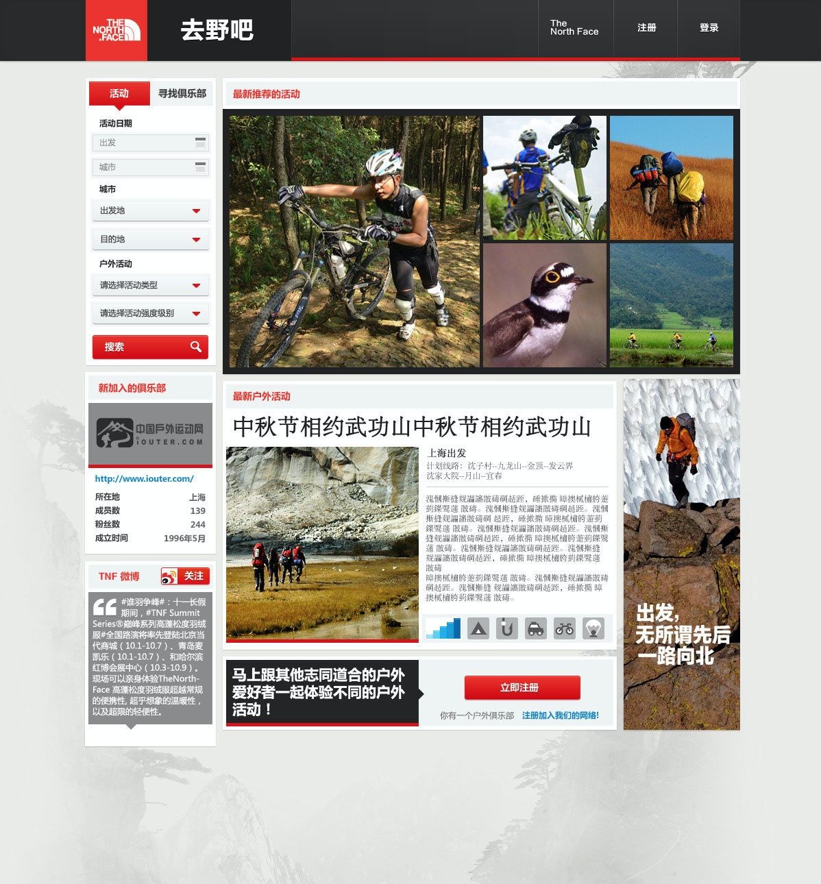
IDEO also collaborated with the company on designs and prototypes for a new digital platform and an updated store-within-a-store merchandising display. The digital community aims to attract newcomers and connect them with more experienced outdoors enthusiasts and clubs. As the platform evolves, it will help aspiring adventurers plan trips, learn skills, and share their experiences through photos.
The retail community space aims to integrate this digital community with in-store shoppers and an effort to turn the “buy-a-product moment” into a “join-the-outdoors moment.” Both will be integrated to provide a holistic brand experience in China centered on nature and community.
In the West, The North Face, with its decades-long history, has long symbolized an adventurous, active lifestyle. In China, however, the outdoor market only began accelerating in the early 21st century.
Success in this growing market depends on building strong and deep connections with Chinese consumers.
20% sales growth in China
from 2012 to 2013—the year the project was completed—propelling the brand from sixth place to a market-leading position
Nearly 40 years of designing pharmaceutical excellence
How a decades-long collaboration with Eli Lilly has transformed patients' lives and health outcomes.
Over the last 36 years, IDEO and Lilly, along with the pharmaceutical giant’s other design, development, and manufacturing partners, have collaborated on more than 250 projects. During this time, Lilly has not only honed its engineering-focused internal device-development team but also transformed into a human-centered organization with extensive, robust in-house innovation capabilities.
Early in the relationship, a team of IDEO designers and Eli Lilly leaders traveled the world to understand how people with diabetes live with the disease. Their findings led to the design of a series of award-winning insulin injection pens like SAVVIO. Portable, aesthetically pleasing, and discreet, the pens are suitable for use in both medical and personal settings. Combined with Lilly’s technical design prowess, this human-centered focus allows the devices to seamlessly integrate into patients’ lives and routines, making a challenging disease like diabetes feel more manageable.
Fast forward to today, Lilly’s innovative, easy-to-use auto-injectors are not only continuing to provide life-saving treatments to people with diabetes but also enabling the adoption of the popular GLP-1 weight-loss drugs Mounjaro and Zepbound, which together accounted for the majority of the company’s annual revenue in 2025. Perhaps most importantly, patients consistently rate the experience of using Lilly’s auto-injectors as relatively pain-free, easy to use, and preferable to competitors’ brands, improving adherence, satisfaction, and health outcomes.
This unwavering focus on driving innovation through a patient-first mindset is evident in some of the most impactful projects Lilly and IDEO collaborated on over the years:
GLP Auto-injectors
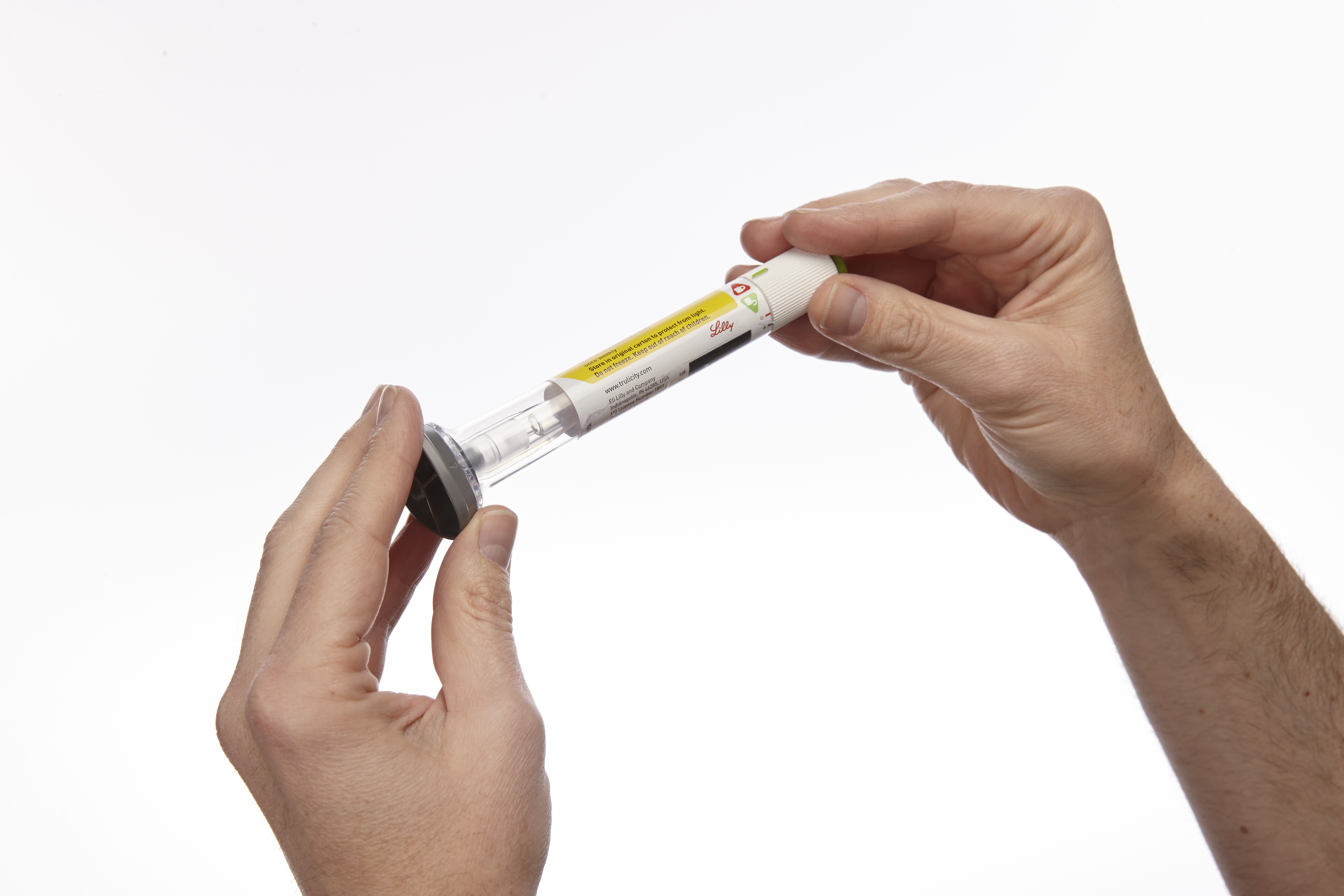
Convenient and cutting-edge, the first Trulicity injection device was originally designed to deliver the GLP-1 drug to treat type 2 diabetes. Today, it has been adapted for use with other GLP-1s, Mounjaro and Zepbound, which are increasingly popular weight-loss drugs and are also administered once weekly via fixed-dose injections. A wide base enables the pen to be held securely against the injection site, and the device automatically regulates the dose and needle depth.
Taltz Injectors
For most patients, living with severe plaque psoriasis means being your own medical technician—metering your drug dosage each time, and attaching and removing needles by hand. Taltz provides patients with clear visual and auditory feedback throughout the injection process through simple icons, bright colors, a translucent material, and clicking sounds. The devices are available in both autoinjector and prefilled-syringe formats and are adapted for Emgality, a preventive monthly migraine treatment, and Ebglyss, which helps treat eczema or atopic dermatitis.
HumaPen SAVVIO Injection Pen
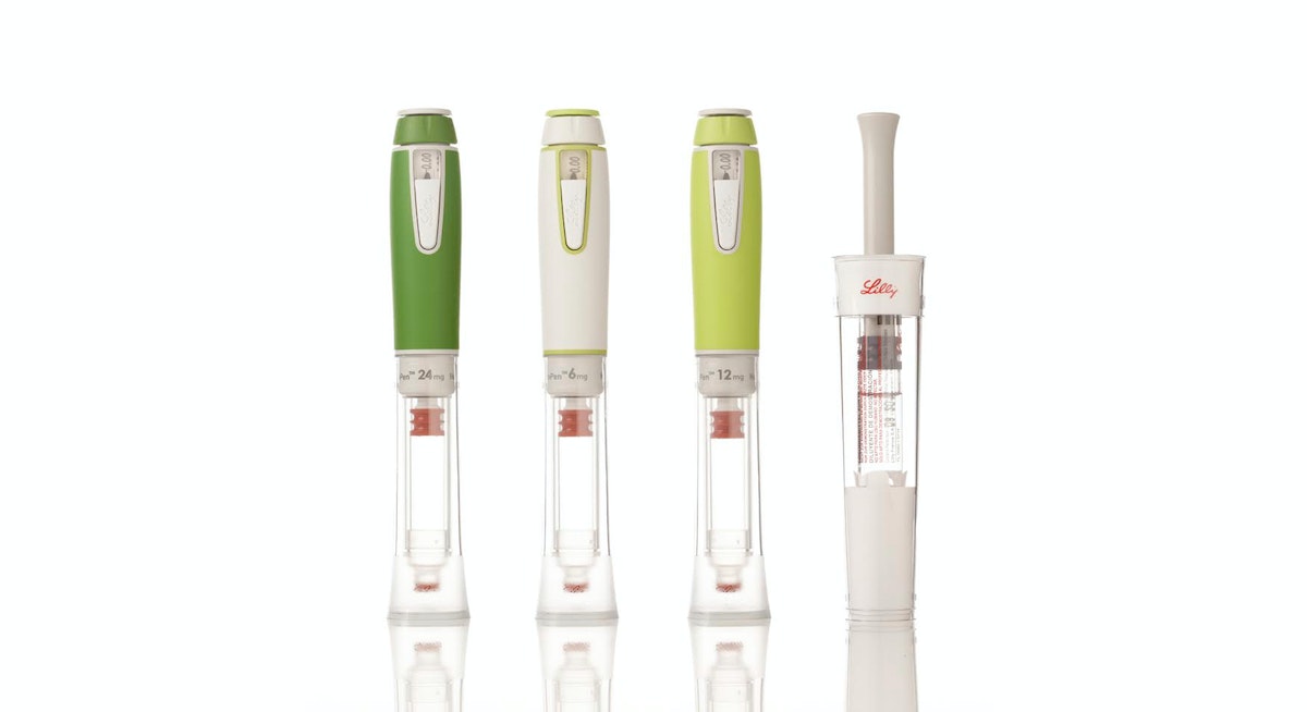
Key insights informed the design of SAVVIO, including patients’ preference for insulin pens that look less like medical devices and more like everyday objects you’d find in a backpack or purse. The sleek, colorful device was created to help patients feel comfortable and confident about fitting mealtime injections into their everyday lives.
Refillable Human Growth Hormone (HGH) Injector and Reconstitution Device
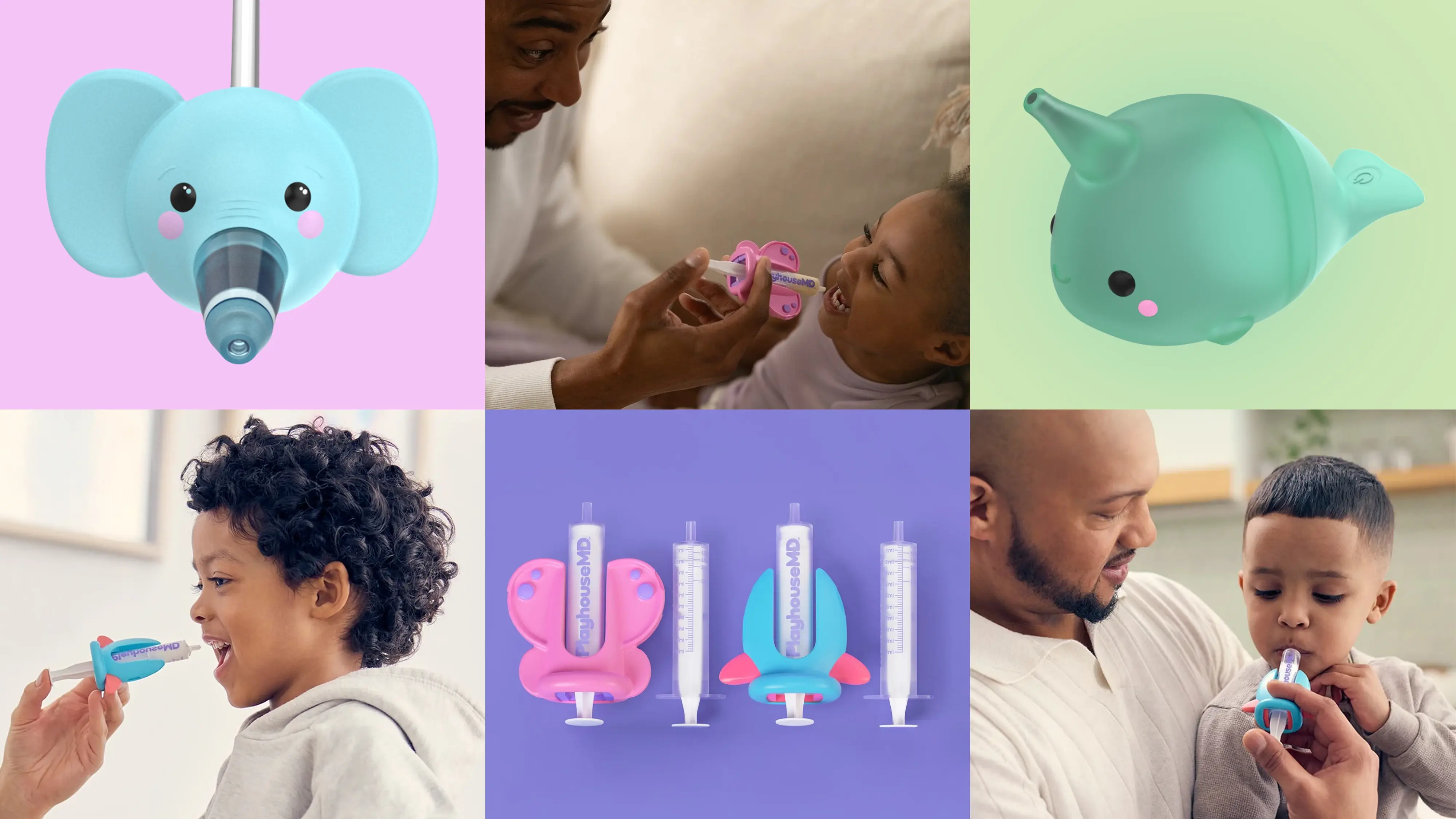
Designed to be kid-friendly, the Refillable HGH Injector leverages insights into pediatric treatment adherence to create a more integrated, systematic approach to treatment, while the Reconstitution Device makes mixing Lilly’s powder-and-liquid drug easier and less intimidating for parents and healthcare professionals alike.
KwikPen Insulin Pen
KwikPen is a next-generation, prefilled insulin injection pen that builds on the success of two previous designs, reducing its size to 5.7 inches and enhancing ease of use for patients.
HumaPen(R) Luxura™ Insulin Pen
HumaPen Luxura combines several innovations into a robust yet elegant pen that can be carried and used anywhere—an insulin pen solution that improves dosing accuracy, dose setting, and injection force.
In addition to designing products to meet the needs of people with diabetes, IDEO and Lilly have developed innovations in areas of oncology, autoimmunity, and men’s health. The results of this collaboration and expansion have won numerous design awards and produced one of the longest and most fruitful innovation relationships in IDEO’s history.
In the 1990s and early 2000s, Eli Lilly had a number of new, life-changing medications and two big challenges: Most of its drugs were self-injectables, not pills, so patients were hesitant to take them. And its drug-delivery device platform lagged behind its drug pipeline.
99%
of Trulicity users reported the auto-injector was “easy” to “very easy” to use in a JDST study
$36.5B
of Lilly’s $65.2B 2025 revenue came from sales of its auto-injectable GLP-1s, Mounjaro and Zepbound, a 45% increase from 2024

Designing a new women’s healthcare system
Introducing the new Cottage Center for Women’s Health.
Systemic transformation is not new to Cottage Health. Founded in 1888 by 50 forward-thinking women in Santa Barbara who wanted a proper hospital for their growing community, Cottage Health has since expanded to 4 hospitals and is quickly growing its outpatient services as well.
To understand the current Cottage Health experience, IDEO conducted dozens of in-depth interviews with patients, providers, caregivers, and staff. They also ran multi-week diary studies, engaged in inspirational research activities, and held events to hear from local women.
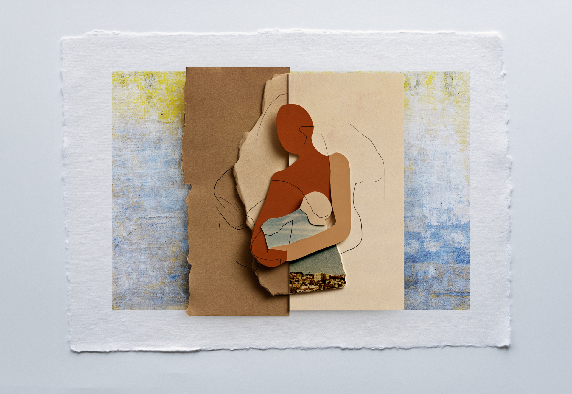
The qualitative research surfaced that women often carry the mental burden of repeatedly remembering, explaining, and advocating for themselves. Women’s pain is often minimized, which causes new providers to inherit mistrust from previous experiences, without having the tools to rebuild it. During significant life transitions, such as pregnancy or menopause, women may receive conflicting advice from health providers and seek additional outside support from informal networks. Access to quality care can sometimes depend on insider knowledge, private resources, or providers willing to go far beyond their job descriptions. And while providers make referrals, women must handle the time-consuming coordination required to make everything work, instead of focusing on healing. The bottom line: what women wanted most was to be seen, heard, believed, and supported in knowing what to do next.
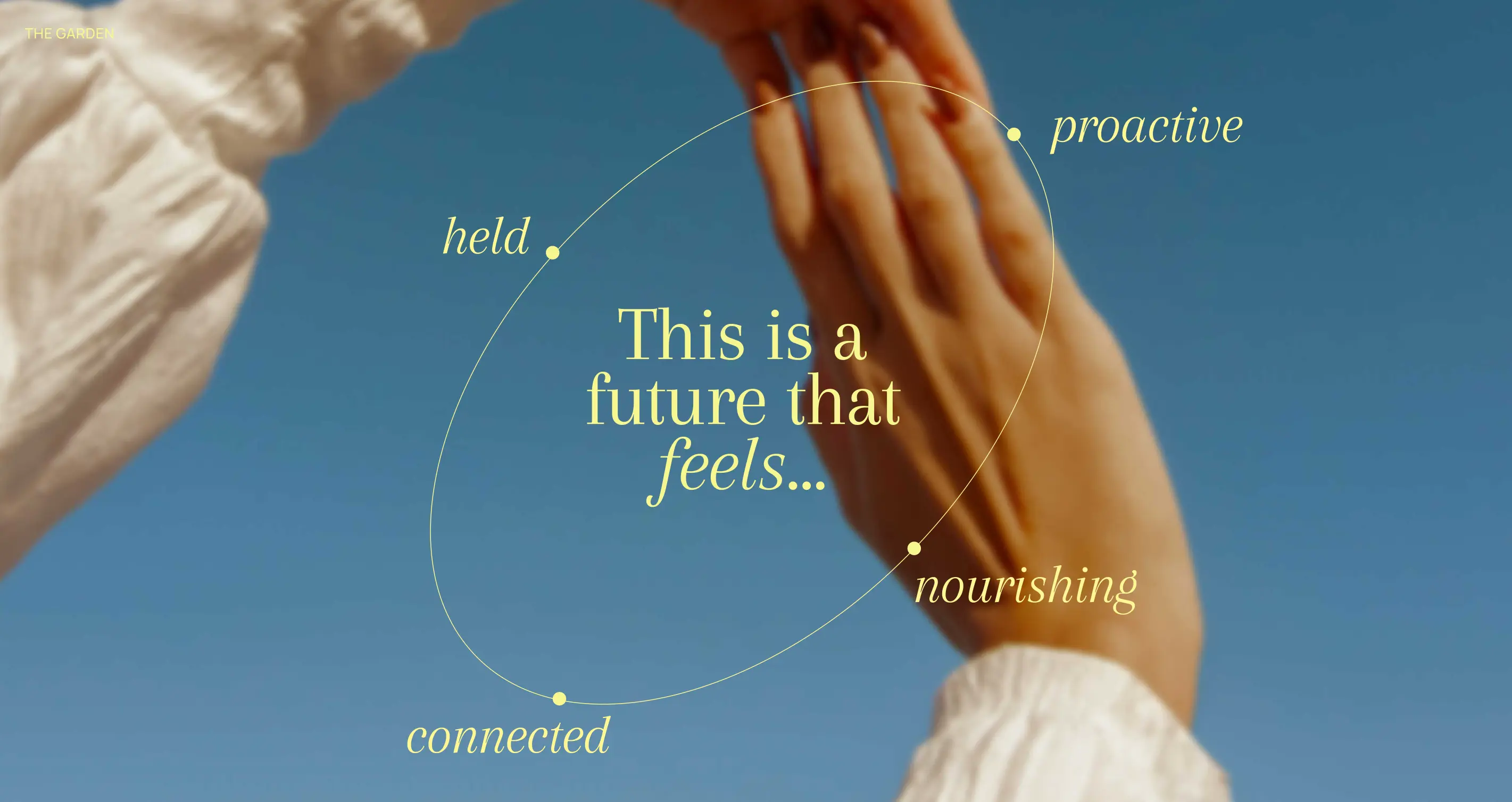
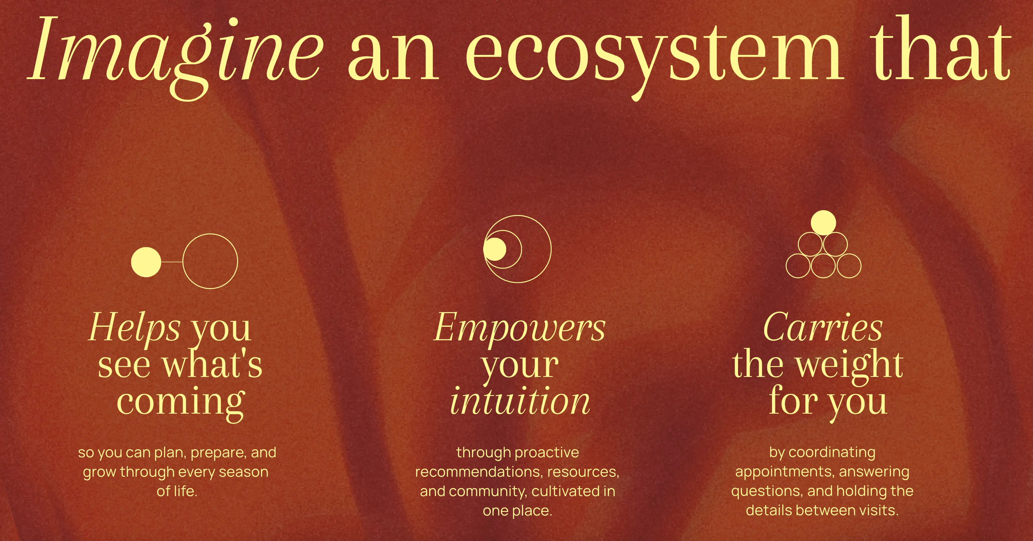
In order to address these challenges, IDEO proposed a new vision for women’s health, alongside design principles and concrete service shifts to guide future decision-making. Every interaction with Cottage Health should build on the information patients have already shared, demonstrating the system is listening. They should also guide women through life transitions by anticipating needs in future life phases, not just what’s happening now. Much like a community gathering, the Cottage Health experience should feel like a village, fostering belonging and shared care through warm, connected, human touchpoints.
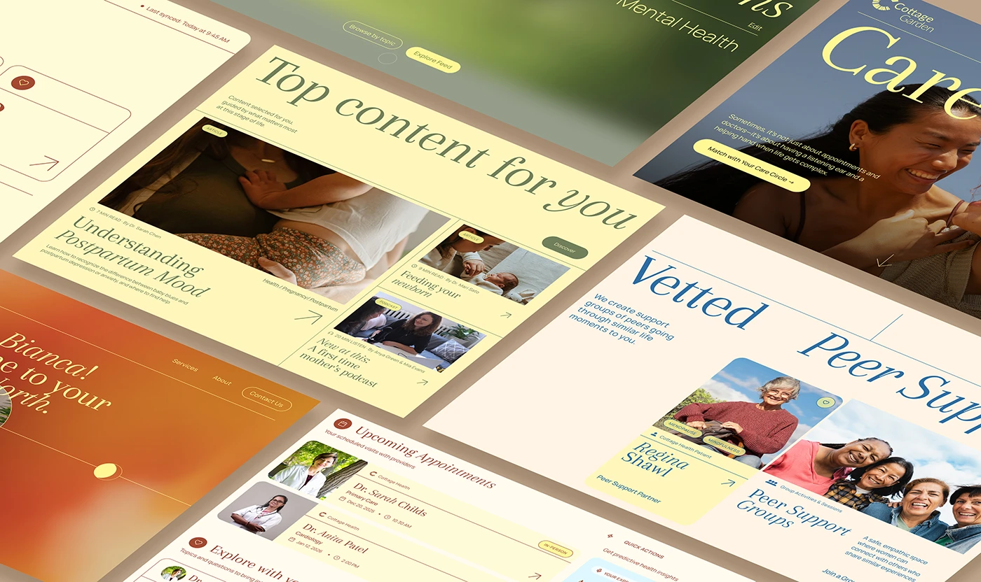
Building on these design principles, IDEO developed three exploratory service concepts that represented potential pathways for future development, rather than finalized offerings: True North, Wellness Commons, and Care Circle.
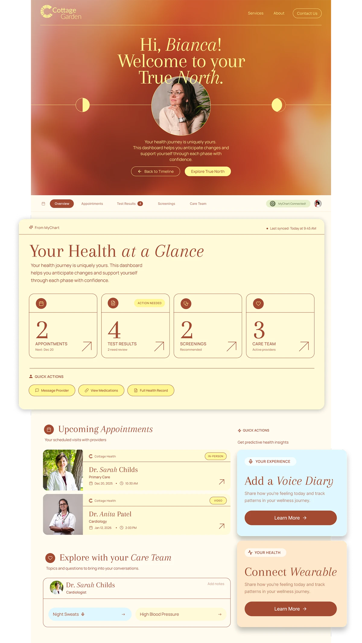
True North is a patient-facing tool that helps women see the long view of their health journey by integrating personal data, health goals, and reflections into a dynamic timeline they can share with their healthcare providers.
Wellness Commons serves as a digital front door, offering curated resources, including community events, discounted wellness programs, fitness classes, and trusted referrals, that help women navigate their well-being with clarity and agency.
Care Circle connects women to an extended support network inside and outside Cottage’s walls, including a hotline, health coaches, peer group support, and nurse navigators who can help patients manage complex care needs.
IDEO also provided Cottage Health with a multi-year roadmap building out the women’s health experience alongside continued pilot and implementation advisory. The roadmap included a comprehensive series of launch-to-learn pilots designed to test assumptions, reduce risks, and learn quickly, with IDEO stewarding the process. These pilots ranged from digital mockups and a curated community referral directory to a support line, a new nurse navigator role, and peer coaching services, among other experiments.
In July 2026, Cottage Health announced it was expanding its focus on women’s health through a new Center for Women’s Health campus in Santa Barbara. Led by Dr. Jane Varner, the Center is projected to open in early 2028. It will encompass women’s health services across the lifespan, from puberty to menopause and beyond, including OB-GYN, pelvic floor health, women’s heart health, a menopause clinic, and a breast care center of excellence. It will also include supportive services, including trained nurse navigators to coordinate patients’ care journeys, giving women a single, trusted entry point for integrated care at every life stage. Cottage Health is also exploring a new digital support system inspired by IDEO’s Wellness Commons concept.
Cottage Health had ambitious goals to expand its women’s health services and needed a partner to help it understand what women truly wanted from their healthcare and bring it to life.
7 months
from end of project to the announced launch of Cottage Center for Women’s Health
Moving Pictures
Benjamin Dix's comics draw out the plight of refugees, child soldiers, and others on the brink
Dix, a photojournalist, got on a plane for what he thought would be a 10-day trip. He ended up staying for four years, working at the United Nations to help find food and shelter for 300,000 displaced locals. It was during that time that Dix first came across Art Spiegelman’s Maus, the Pulitzer Prize-winning graphic novel charting Spiegelman’s father’s experience in the Holocaust as a Polish Jew.
Before Maus, Dix’s only exposure to comics came from reading Calvin and Hobbes and Asterix. But as he huddled in bunkers during air raids and artillery fire, Dix was struck by how simply and powerfully Spiegelman was able to render the complexities of identity, memory, and trauma in graphic form.
With violence between government and Tamil forces intensifying, the Sri Lankan government ordered the UN to evacuate the region in September 2008. Dix returned to London with post-traumatic stress disorder and a fierce determination to tell the stories of those he’d left behind.
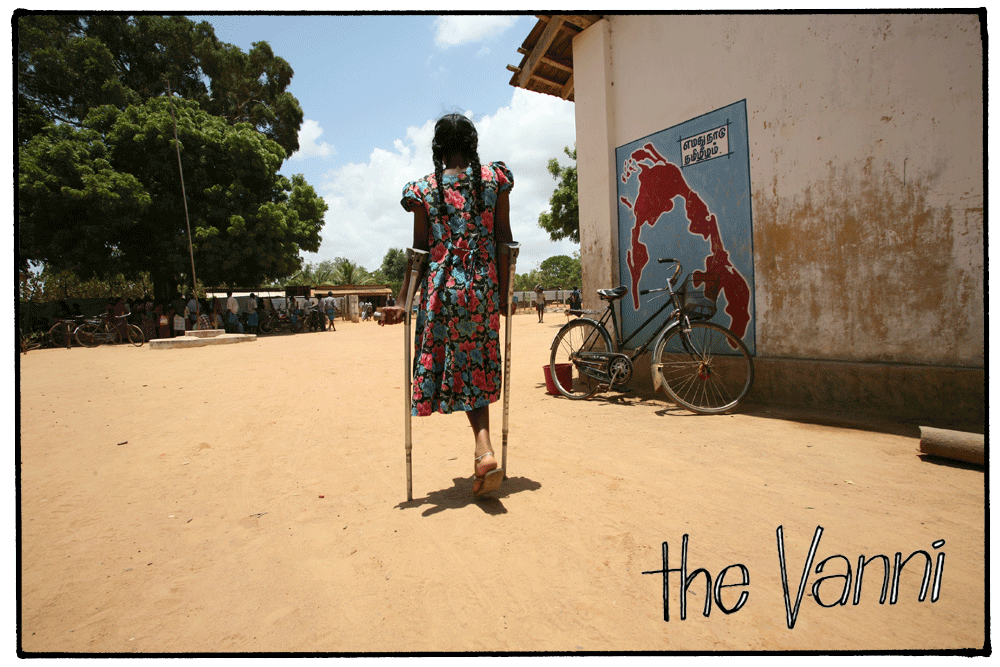
He travelled to meet refugee families and record their experiences, and worked with illustrator Lindsay Pollock to conceptualize them into a graphic storyline. Dix also embarked on a Ph.D. in anthropology to systematically research the production of the comic. The result of all his work? The Vanni, a 200-page graphic novel about the conflict, told through one Sri Lankan family’s eyes, and an accompanying thesis on the methodology and ethics of producing such a complex piece of graphic literature.
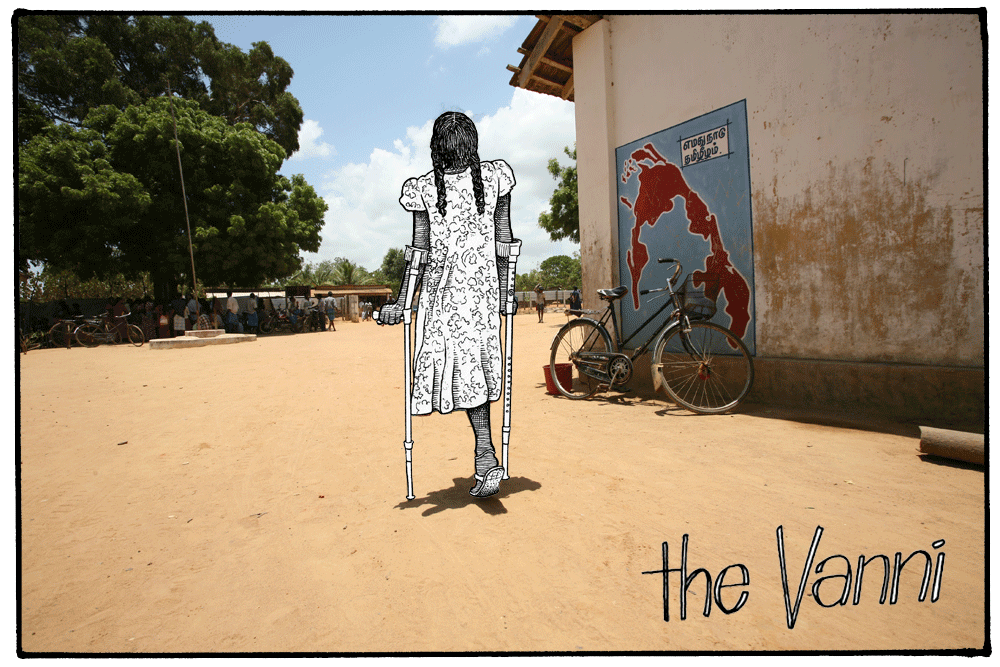
Dix has since brought to life stories about crack-cocaine addicts in Guinea Bissau, a Nigerian woman trafficked to London (Abike's story, below), and the plight of African and Asian migrants in the Persian Gulf. At every stage, Dix works alongside his subjects to ensure he’s best reflecting their experiences, and their stories have become a powerful educational tool, illustrating complex, often abstract issues including migration, human trafficking, and drug addiction at the most human level.



A chance meeting with an IDEO designer led Dix to our London studio, where we collaborated on a three-day long pro bono sprint to develop his stories into scalable, interactive teaching tools for classrooms. We designed and prototyped a WhatsApp-based multimedia story about Merha, an Eritrean refugee fleeing to London to escape persecution, as well as an app-based version of Merha’s story, including buttons and swipes on each frame of the story, so readers could learn more.

Dix’s next step is to secure funding to build out the app and develop lesson plans to roll out across schools internationally. But in the meantime, he’s not standing still. Dix is already testing a lo-fi version of the educational tool—an interactive PDF—in 300 schools across 26 countries including Brazil, Sri Lanka, Democratic Republic Of Congo, the UAE, and many others. His next comic? Capturing the story of the Yazidi community fleeing ISIS in Syria.
It was Boxing Day 2004 when Ben Dix, founder of British literary comic publisher PositiveNegatives, got the call. A university friend, stationed in the Tamil Tiger-held region of Vanni in northern Sri Lanka, was asking if he'd come and help. It was the day of the tsunami that killed 230,000 people, one of the deadliest natural disasters ever recorded.
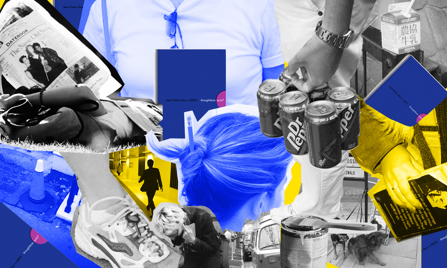
It’s Only Beautiful When it’s Broken
How I came to love broken type
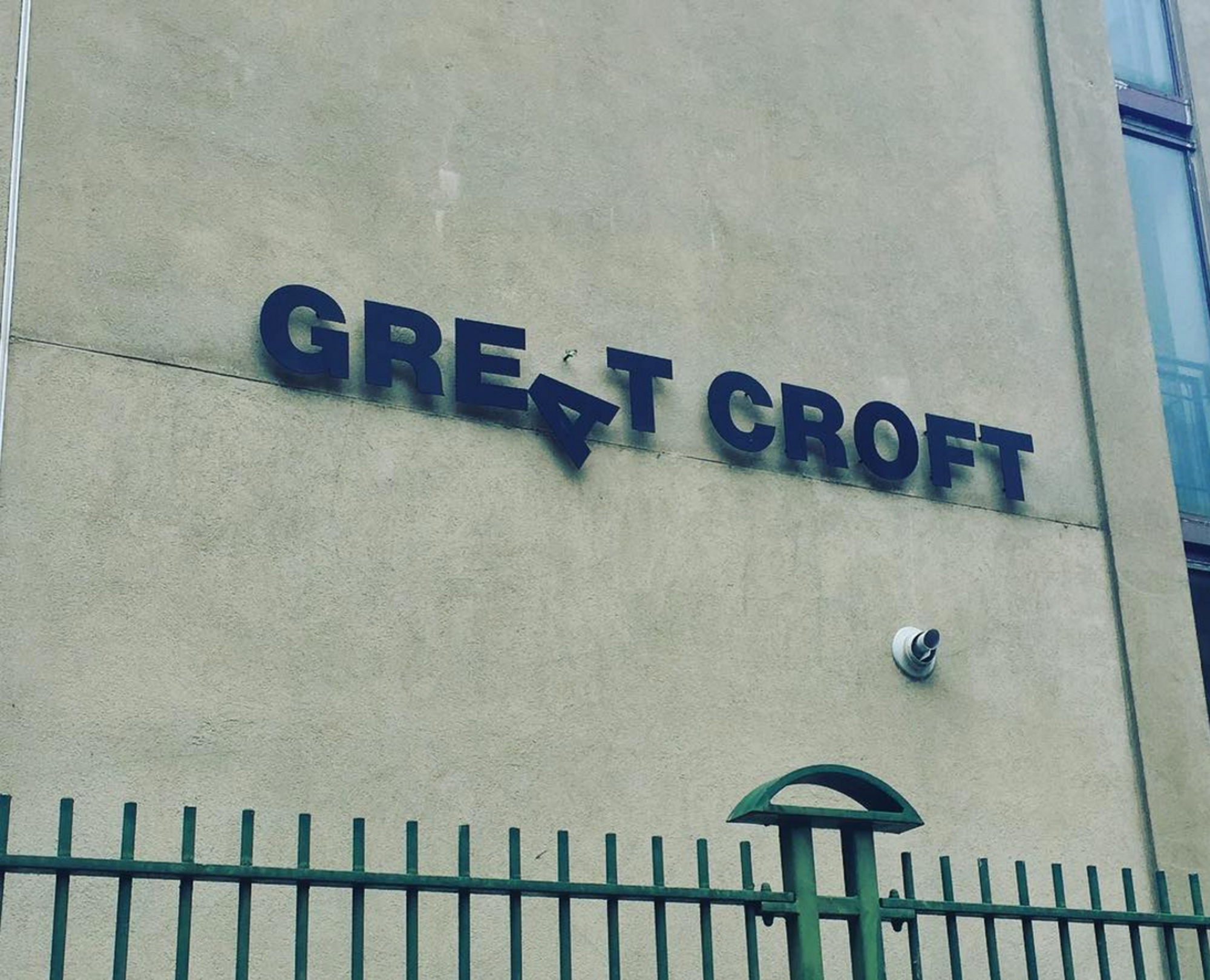
It turned what would be a humdrum brand mark into one that was tongue-in-cheek and playful. Optimistically, I wondered if it helped lift the spirits of the Great Croft residents. I also started looking for more typographical serendipity.
There are plenty of examples of signage that has degraded to the point of being unreadable, but a beautiful accident is where the change looks intentional and, ideally, adds to the meaning and character of the neighborhood.

I saw my second example at Unity Kitchen Cafe in the new Olympic park in East London, where residents and Londoners further afield are drawn by attractions such as the children’s adventure playground, nature park, or velodrome. The cafe contained a diverse mix of nationalities, so it seemed rather fitting that this broken C was reminiscent of a cedilla (ç), a nod to any European visitors. Please don't fix the sign, I love it the way it is.
I became obsessed. Searching everywhere for more evidence of meaningful mistakes, even engaging my family in the hunt, and it was on one such hunt that I found the Pelican restaurant in Peckham, south London.
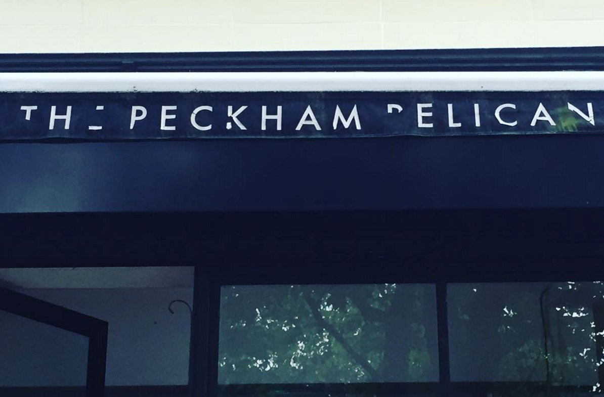
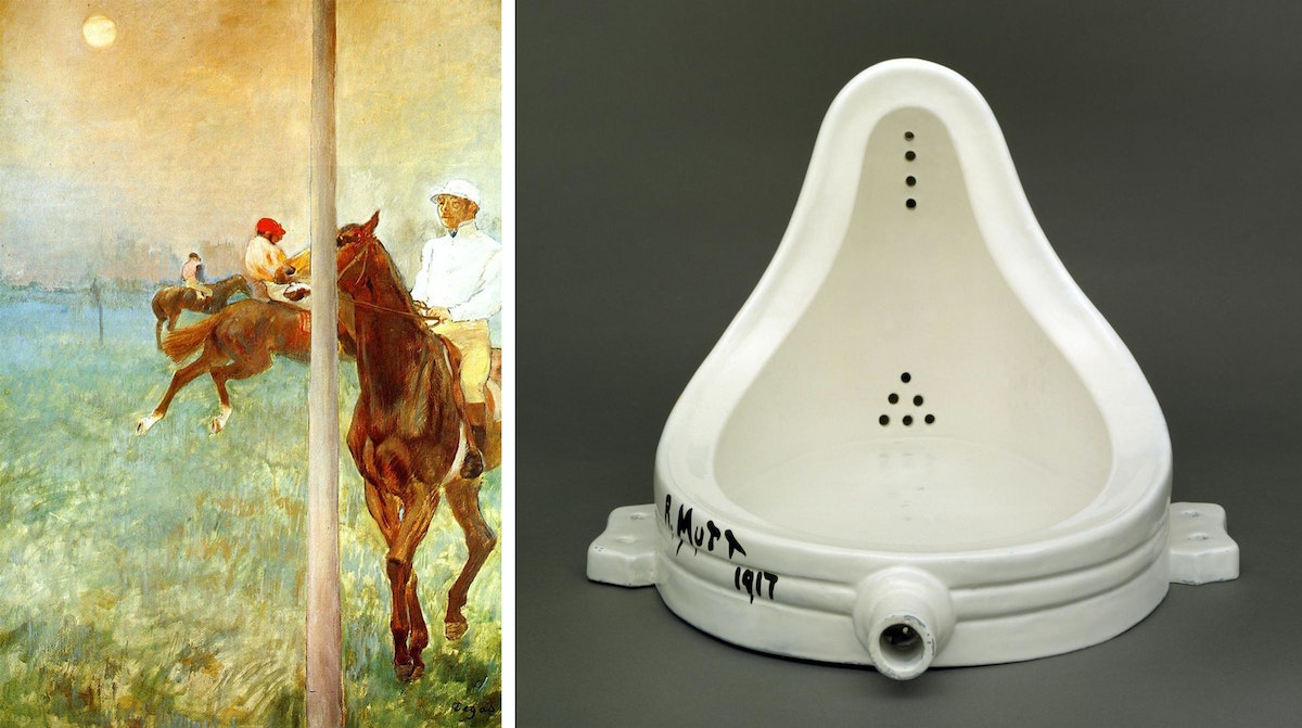
I’ve been wondering about how we might design for beautiful accidents: if wear and tear isn't a thing we can control, how we can make accidents appear elegant? At Wired magazine they call such intentional accidents Wrong Theory. Inspired by Edgar Degas’ painting, Jockeys Before the Race, in which the artist defied the conventional composition of his day by inserting a grey pole that bifurcates the scene, slicing right through one of the horses’ heads. The same could be said of Marcel Duchamp’s act of turning a urinal on its head, signing it R. Mutt, and deeming it art. Wrong Theory celebrates the act of breaking the rules.
But part of the beauty of Beautiful Accidents is that they are rare. If you find one, please share it with me! Check out my Instagram or tag your photos with #beautifulaccident.
I first spotted a beautiful accident when I saw the sign for the Great Croft housing estate in London. The A swinging down against the Akzidenz Grotesque type worked so well, in part aided by the horizontal seam in the concrete, that I had to think was that serendipity or intentional?

Looking for Love in All the Places
Why I stalk lovers and put their pictures on Instagram
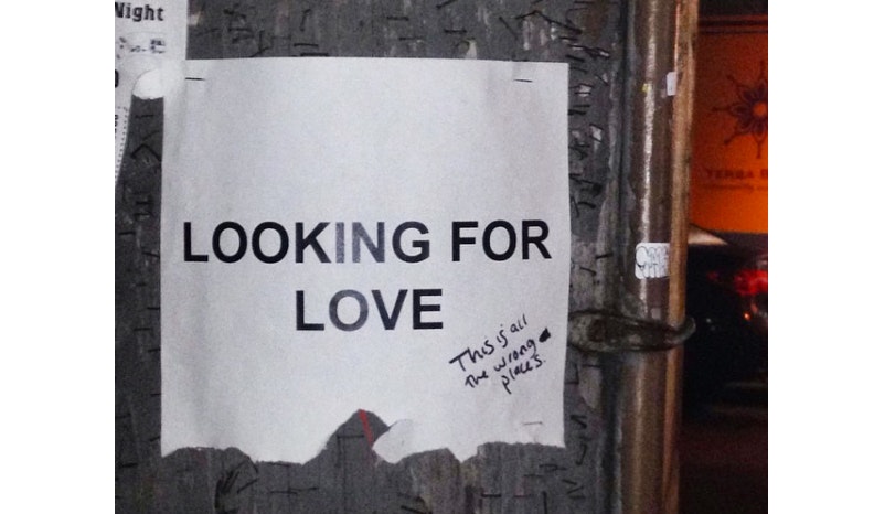
Two years, two photography classes, and a few countries later, I did a deep clean of my hard drive. Between filing away evidence of big parties in tiny apartments and hundreds of nearly identical photos of elephants, I realized that I had taken a lot of pictures of couples. Not five or 10, but closer to 100. And not of people that I knew, but of complete strangers.
On their own, these photos could have been easily overlooked amidst thousands of snapshots of friends and family, but seeing them all together gave me a rush of giddiness and warmth. So, I set out to gather more and began posting the shots on Instagram.

As soon as I launched the account, publicly declaring my habit, I found more and more moments of tenderness in everyday life. I shot from a distance to maintain a layer of anonymity and focus on the transfer of emotion rather than the individuals themselves. My intent wasn’t to get the story behind the shot, but simply to collect these unprovoked and unpolished moments. And as I collected, my definition of public displays of affection expanded to include heads on shoulders, joint selfies, synchronous footsteps—even the imagined closeness of two people standing in proximity to one another. I've found love on street corners, in subway cars, and at national monuments. Instead of walking around with my head down, I was discovering tiny moments of joy in the world.
And the more I found, the more I felt like at any given moment, anywhere in the world, hundreds of people are holding hands, or touching arms, or leaning in to each other. The act of looking for love led to finding it, which led to actually feeling it.
Head to @lookingforloveblog for your fix.

A few years ago, I spotted a tear-off paper flyer stapled to a telephone pole that read LOOKING FOR LOVE. Every tab had been pulled.
Welcoming Bots to the Design Team
How automation helped us dig into our data (and add magic to our prototypes)
However, more data means more time spent managing data. So about four months ago, I pulled together this little helper, an automated assistant that I coded to save our design team a little time. We even gave it a little personality to make living with it more fun.
The bots
The inspiration for this bot came from our Chicago team, which was working to develop a health monitoring app for smartphones and watches, and wanted to include a prototype messaging system. Rather than spending time coding a system that would automate responses, they hooked up the Slack interface to a service that would send and receive text messages. The result was a system that allowed a non-technical design researcher to send targeted messages directly from Slack, freeing up the developers to work on the next challenge.
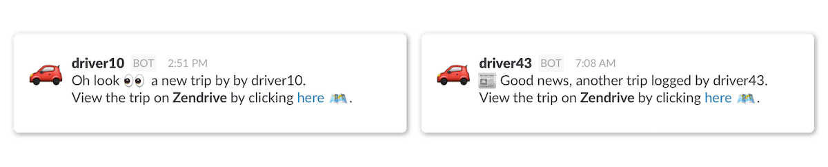
Meanwhile, in London, we were tracking the daily travel of more than 40 people. During the course of the project, we recorded more than 160,000km of driving, so we built a bot to help us keep tabs on our fleet. Each time a journey was complete, the bot would post a note into a special channel, allowing the whole team to see the activity without having to log in to a separate system. The bot also helpfully included a direct link to a separate dashboard, in case anyone wanted to dig deeper into the data.
The tech stacks
Chicago's bot was part of a loop that connected each of the participants’ smartwatches directly to a design researcher:
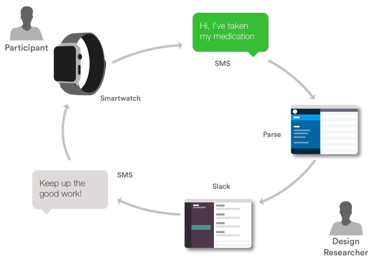
Each day, participants would log their activities using Siri’s voice-to-text feature. Siri then transcribed the voice message, and the text was sent to the database, where it was time stamped and stored. From there, a copy was sent to Slack, where each participant showed up as a team member in the chat interface.Then the whole stack reversed, allowing any member of the team to send a message to the participant. Each day, the design researcher simply had to send a normal Slack message and it appeared on the participant’s smartwatch.
We found their workaround really inspiring, so when we started our travel behavior project, we looked for similar ways to save time.
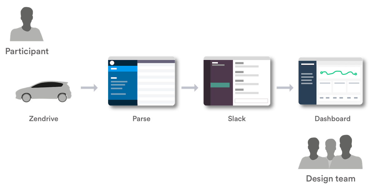
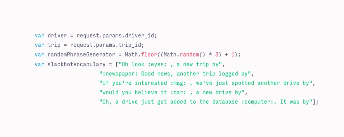
To start, we opted to store each trip in Parse. Once a drive was complete and recorded, we used Parse's Cloud Code functionality to send a message to Slack using the Incoming Webhook integration. The result was a message from the slackbot each time a drive finished. Cloud Code allowed us to format the message with a link back to the data, so it was easy for researchers to click to learn more about each trip. We could format the message however we wanted, so we gave the bot a small bank of phrases to use to add a little personality. We also gave it a few emoji so that it would fit in with the Slack communication style.

These messages popped up in a specific channel. Our team could choose to listen in, or mute it. Over the course of the project, it became a useful reminder that there were real people behind these driving patterns.
What we learned
The Chicago bot showed us that we don’t always need a technical person to manipulate complex systems. Not only did our bot save us time, we were also able to add a little magic to the prototype, which gave our participants a better experience. It also gave all parties—the design team, the client, and a technology partner—a better sense of what was going on, and a quicker way to jump into the data. We’re constantly working to find better ways to collaborate with our clients, and small touches like these make it easier to act on our research. Perhaps the most revealing thing about our adoption of these tools was how quickly we assimilated them into our teams. The new tool went from novel to normal surprisingly quickly.
The future
While adding intelligence to the bots seems like an obvious next step, it could be a dangerous move to outsource too much of our process. After all, we’re here to learn. I'd rather have a legion of simple "toolbots" shaving time off repetitive tasks than software that makes decisions for us, which could cause us to miss valuable insights. Our goal is to empower our teams, not to replace them.
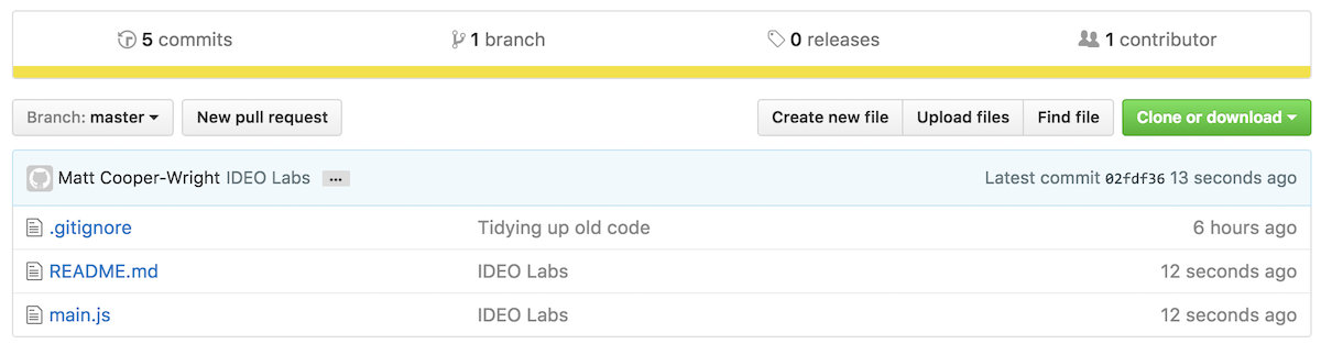
See the London Bot on GitHub here.
Special thanks to Ben Syverson for his help on this post.
We’re always looking for smart ways to learn more in less time. This mentality has led our researchers to push the boundaries of the data we can record in our research process. Alongside the qualitative data we gather from interviews, we also pull together behavioral data collected over longer time periods. We might record someone’s steps per day, or the route they take to work, in order to find insights into the patterns of everyday.

Lindsey Turner
I’m passionate about building brands, products, and experiences that help organizations show up with meaning and momentum.
I help organizations cut through complexity by shaping how they show up, through brand strategy, identity, and storytelling.
Working at the intersection of brand and business, I bring an editorial eye and a bias toward making—turning ideas into tangible experiences that people can understand, trust, and believe in.
My work spans government, healthcare, financial services, media, and consumer goods, from launching Gen Z-focused ventures to building innovation labs and reimagining legacy brands. I relish moments of ambiguity and enjoy translating across teams, perspectives, and priorities to move ideas forward.
I started my career in editorial and digital design, shaping cross-platform experiences and identity systems in publishing and agency environments. That foundation still shapes how I work today: I’m detail-oriented, collaborative, and overreliant on the Oxford comma. I hold a BFA in Visual Communication from the School of the Art Institute of Chicago.

Rachel Young
My work helps organizations see who their products aren't working for—and build the will and the tools to do something about it
For 25 years, I've asked the same question: Who does this design exclude—and what are we going to do about it?
My work spans human-centered strategy, inclusive design, and qualitative research, with clients ranging from Microsoft, Google, and Verizon to the National Science Foundation, and San Francisco Unified School District.
Before IDEO, I taught elementary school in East Palo Alto and spent a decade doing design work with social service organizations—where I learned firsthand what it costs people when systems are built without them in mind.
I am currently writing User Error, a nonfiction book about digital access and the design decisions behind it. I live in Oakland, California.

Brian Pelsoh
I lead with craft, ensuring our work is creatively excellent: rooted in deep human insight and imagination, while also grounded in the realities of business and technology.
My expertise spans brand, communication, and product design across tech, education, the arts, and social impact.
I believe great work demands both high-level vision and obsessive attention to detail, and only happens through collaboration.
I bring an inclusive, hands-on approach and a deep understanding of business, which enables me to consistently deliver excellence while always asking why.
Before joining IDEO, I worked at the brand firms Pentagram and VSA Partners. I began my career as a designer, leading teams at the School of the Art Institute of Chicago and the Milwaukee Art Museum. I hold an MFA in graphic design from Maryland Institute College of Art and a BFA in communication design from the Milwaukee Institute of Art & Design, and have taught at some of the best design schools in the US.

Tony Wong
I am responsible for IDEO’s long-term success in China and working with clients to use design as a tool to enable growth.
I am responsible for IDEO’s long-term success in China and working with clients to use design as a tool to enable growth. Specifically, I have helped Chinese companies design holistic brand solutions through the development of their products, communication, services, and innovation teams, and I have helped multinationals expand their presence and influence in China.
I advise global leaders on developing China-led innovation and capabilities.
In over 15 years in IDEO Shanghai, I have worked on projects that use design to elevate the quality of the experience of healthcare products and services, streamline processes that increase productivity, create spaces and programs that promote and enable inclusive communities, and build next generation mobility solutions that are planet-positive.
Before joining IDEO, I worked at Philips Electronics and the Electrolux Group in Italy, the Netherlands, and Singapore on a number of breakthrough commercial products. I am a member of the Young President Organization in Shanghai.

How to use AI as an editor, not a writer
Ed White shares how he uses AI as an editor—not a writer—to sharpen storytelling, rehearse ideas, and preserve the productive friction that makes creative work better.
Ed White has a rule he's tested on his own writing: hold yourself as the writer, and let AI be your editor. Ed is a Senior Design Director at IDEO's London studio, where he co-leads the firm's AI portfolio across Europe. Before IDEO, he spent 12 years as a writer and editor at the Financial Times, Wired, and Contagious. So when he talks about when to use AI for storytelling and when not to, it comes from two decades of crafting his storytelling skills.
In this episode, Mina Seetharaman talks with Ed about two specific tools he uses to keep AI in an editor's seat: a "roasting agent" prompted to critique his drafts without any sugarcoating, and a simulated audience he rehearses pitches on before the real thing. They also get into what Ed is hearing from design leaders at Anthropic, Lovable, Shopify, and Google Creative Lab about how creative work is changing, and why he thinks the friction of writing something yourself is worth protecting rather than automating away.

Building a personal AI for the messiness of life: Sida Li
Becca Carroll talks with Cue co-founder Sida Li about designing a personal AI for the messiness of everyday life—not just work. They explore how Sida stays anchored to human needs while navigating fast-changing technology, product tradeoffs, business-model experimentation, and the realities of building an AI company today.
Most AI products today are built for work—a space with clear problems and established systems. One founder noticed a gap: personal life is messier, harder to systematize, and mostly left behind by the AI boom. So she built Cue, a personal AI that lives inside iMessage and group chats, to go where the other tools haven't.
In this episode, Becca Carroll, IDEO's Chief Strategy Officer, talks with Sida Li, co-founder and CEO of Shared Context Lab, about staying anchored to a human need while the technology around her keeps changing shape, why she treats her business model with the same rigor she'd bring to a product, and what it feels like to build a company at this particular, disorienting moment in AI.
The conversation also gets into how Sida makes design decisions: the language Cue uses to describe itself, the tradeoffs behind building inside iMessage instead of a new app, and a real story about a business idea that didn’t pan out.
This is the second in a two-part series profiling founders from IDEO's Startups-in-Residence program. The first conversation is with Johannes Seemann, founder of Sooner, on designing GenAI for the emotional side of money.

Designing GenAI for the emotional side of money: Johannes Seemann
Designing financial tools around the feelings that shape money decisions.
Most personal financial tools are built to run the numbers and optimize towards a budget. While that works for some, most people experience money as a lived relationship that does not neatly fit into a spreadsheet. Johannes Seemann and Becca Carroll discuss why money is emotional before it is mathematical, and what a human-centered approach to building a generative AI financial product looks like in practice.

The curious leader's edge in uncertainty: Scott Shigeoka
How genuine curiosity helps leaders navigate uncertainty with greater confidence.
Mina Seetharaman talks with Scott Shigeoka, author of Seek and Head of Curiosity Cultivation at the Eames Institute, about what distinguishes genuinely curious leadership from performative curiosity, how power dynamics shape curiosity, and why practicing curiosity can restore energy rather than drain it.
Looks like you might be in search of something very specific?
Or reset the filters above and try another angle.
Here’s some random inspiration
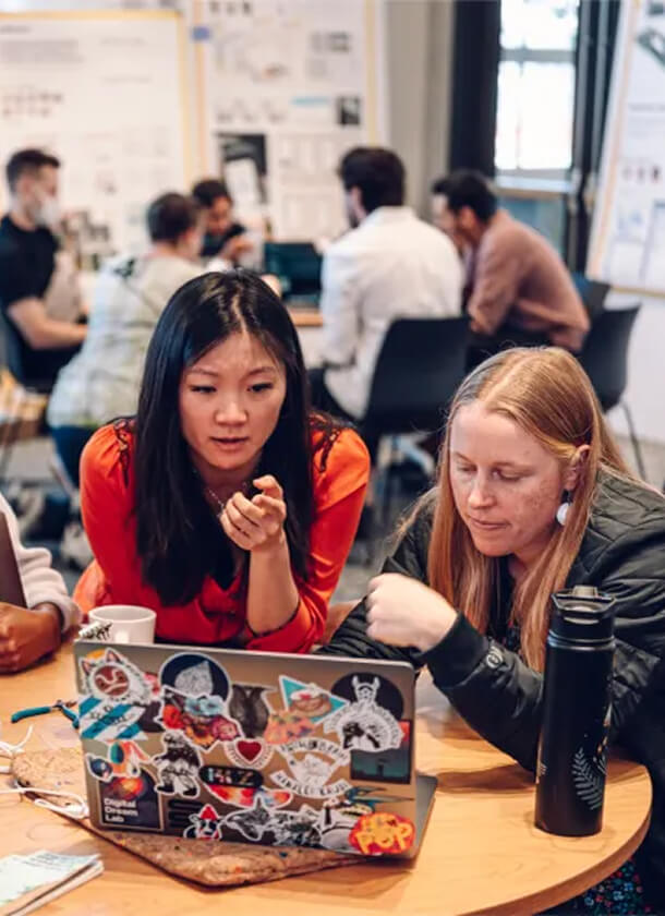
Podcasts about creative leadership
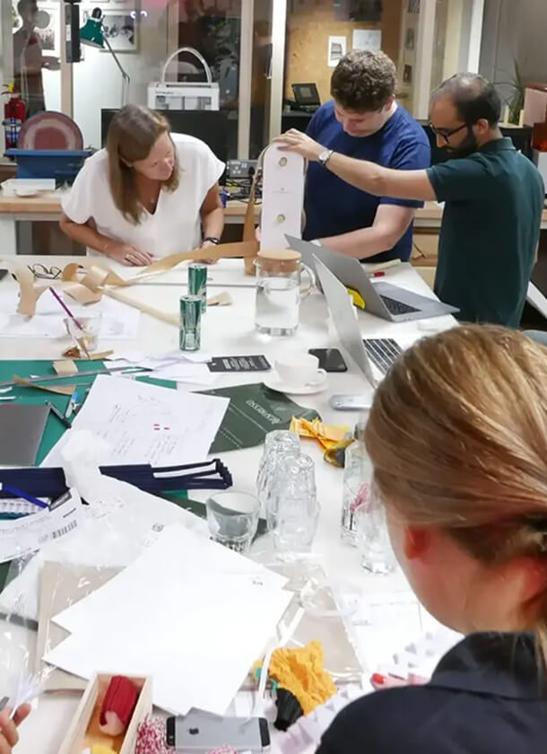
Articles about the power of prototyping