.svg)



Mental health, co-designed
Kooth partners with young people to create Soluna, a mental health resource for California youth.
Increasingly, digital spaces are proving detrimental to youth mental health. By co-designing with youth, Kooth and IDEO set out to flip the script, creating a positive digital space for young people to safely explore their mental wellbeing.
When Kooth, IDEO, and Blackbird, IDEO’s longtime development partner, first started working on the project, the window of opportunity was narrow, and the stakes were high. The group was up against a nine-week deadline to create a working proof of concept app. Also on the line: a $188 million contract with the Department of Health Care Services (DHCS)—one that would open an entirely new line of business for Kooth.
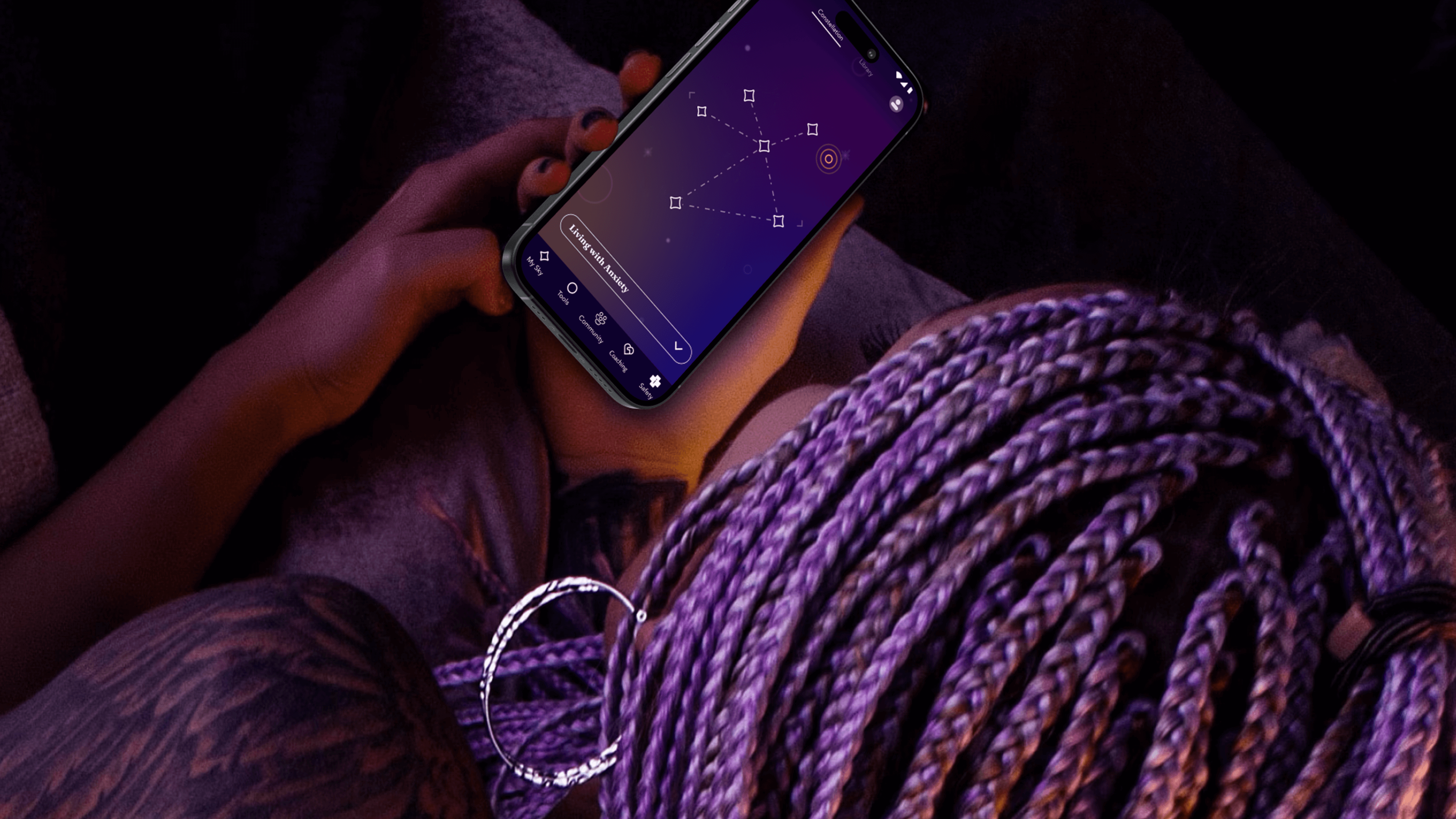
The app needed to do more than demonstrate functionality—it needed to prove its value. To ensure that they were creating an asset that truly fit the needs of young people, the team turned to an initial cohort of 13-25 year-old co-designers who explored early features, created video diaries, and shared their questions about and experiences with mental health. These young people often gravitated toward self-service tools that helped them take action based on their feelings. With their feedback, the team created new expressions of clinically-validated behavioral health tools like journaling, breathwork and white noise—and built novel tools, such as Starboard, an expressive drawing tool and a nod to art therapy.
The team took inspiration from content the co-designers liked to consume, such as story-driven video games that enable freedom of exploration, deepened by a unifying mythology. That led them to a constellation theme, which made the experience more intriguing and playful. The co-designers also recommended a dark color palette, because they preferred exploring the app at night.
With these insights, the team refined the proof of concept, and then conducted a one-week pilot with another 50 young people across California. Their positive feedback gave the State the confidence to invest in a $188 million, four-year contract for Kooth to bring the app to a platform at scale.
Over the next year, the team engaged another 150 young people to help design, shape, and test the app. At the same time, Kooth and IDEO created a clinical oversight group, which included a pediatrician, therapists, and other clinical specialists. This group anchored the platform in the practices of Acceptance and Commitment Therapy (ACT), cultivating psychological flexibility—the mindful acceptance of positive and negative emotions. Young people are invited to complete short reflections and surveys throughout their journey with the app, which includes rigorous, science-backed measurements to assess the therapeutic benefits.
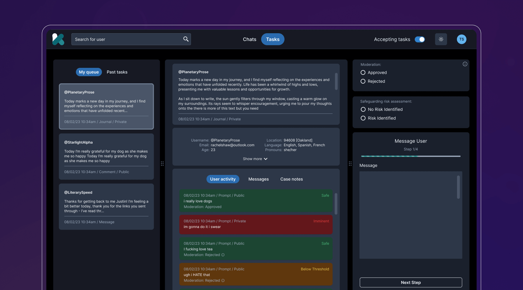
Behind the scenes, the team developed a clinical-facing service and digital platform that empowers Kooth’s peer specialists, social workers, community curators, and clinicians to support the youth experience, all while protecting privacy and confidentiality. They also navigated a complex landscape of state requirements and government legislation, ensuring that the platform could cover topics like substance abuse and gender identity, and that users could access coaching within 24 hours, and choose from a diverse set of experts.
The last step was to select a name that worked across multiple languages, trademarks, and competitor branding, and didn’t come off as a mental health service, something the youth co-designers believed was critical. IDEO and Kooth landed on Soluna, a name that alludes to the app’s presence in both the bright (“sol” for sun) and the dark times (“luna” for moon).
Now, Soluna is available for free to all youth in California, and the state has set ambitious targets for reaching all young people at scale. Soluna is a living platform that will continue to receive product and design updates for years to come, all deeply rooted in youth co-design.
The US Surgeon General named mental health “the defining public health crisis of our time,” and cited social media, online bullying, and the isolation exacerbated by the COVID-19 pandemic as major drivers that have significant negative outcomes for youth.
In California alone, more than 284,000 youth cope with major depression. 66% of kids with depression do not receive treatment. Between 2019-2020, the suicide rate for kids ages 10-18 increased by 20%.
In 2022, California Governor Gavin Newsom’s Master Plan for Kids’ Mental Health set aside $4.6 billion to increase access to mental health and substance abuse support, the largest commitment to youth mental health ever made by a state.
94%
of proof-of-concept app users would recommend the Soluna app to a friend, and believe that engaging with the app would be a positive addition to their daily/weekly routine
6 million
young people in California had access to Soluna at launch in January 2024
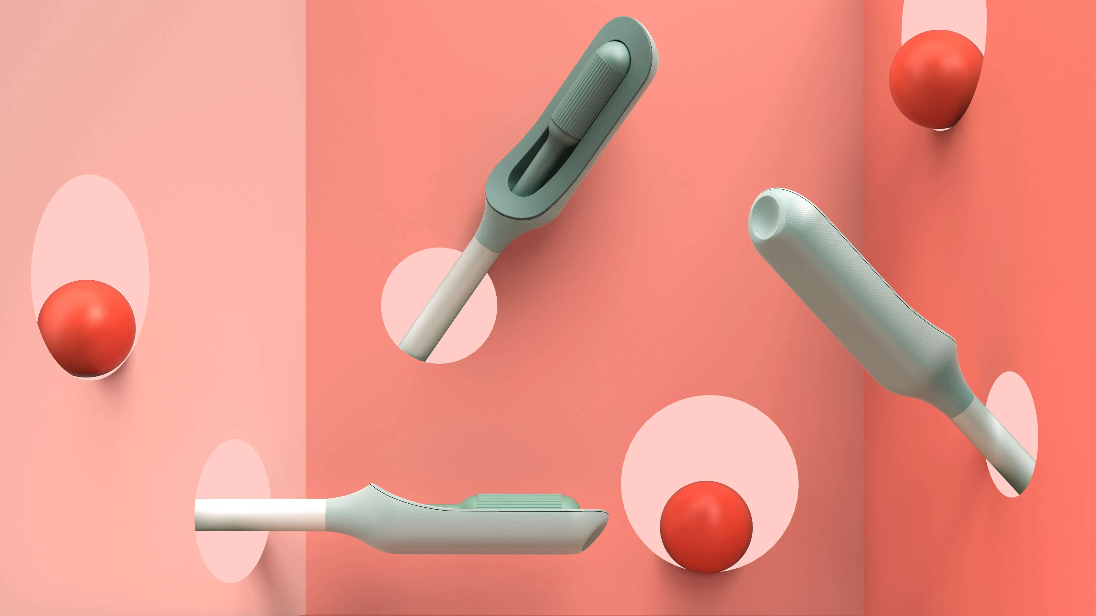
A more comfortable Pap smear
Teal Health creates a system for at-home cervical cancer screening.
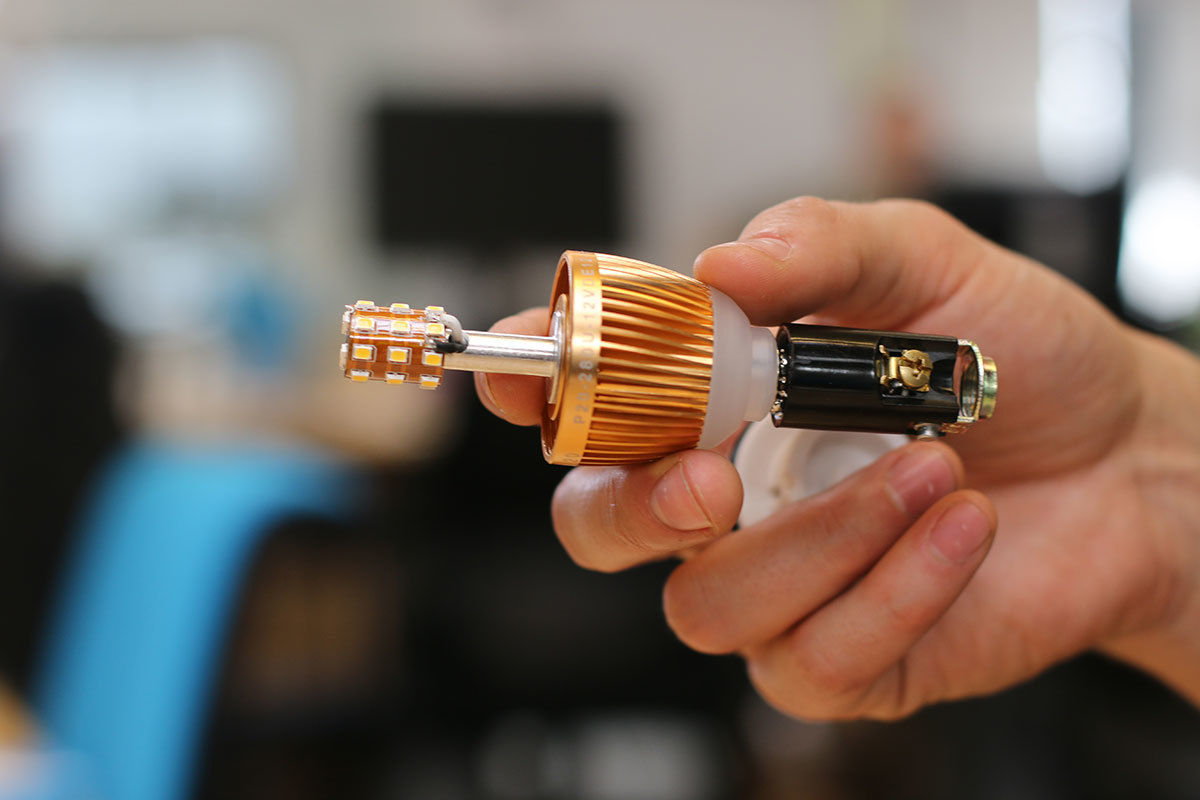
Creating a better cervical cancer screening experience is an important mission, but also a challenging one. Not only would Teal have to address the regulations that face healthcare device companies, it would also need to build a comprehensive telehealth platform and a physical product—a wand that could easily collect an adequate cell sample, even in the hands of an untrained person.
The first challenge was to create the wand. The device would need to do a lot: It’s impossible for a person to see their own cervix, so the user would have to be able to find the cervix blind, collect the sample themselves, and remove the wand from their bodies without contaminating it on other parts of their anatomy. Because this is something users are likely to do in their bathrooms, where there is no space to lie down, they would need to be able to use the device while standing—and with one hand. From the beginning, the IDEO team set out to design functional, testable prototypes to make sure the idea was viable, and incorporate diverse voices into the research process, including trans, minority, and disabled women.
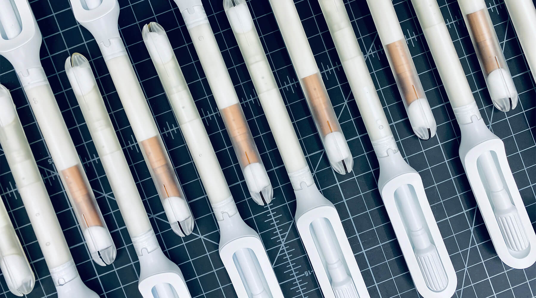
Because the product is meant for people who aren’t medical professionals, the team worked to design something as simple, intuitive, and unintimidating as possible. They used a 3-D printer to create multiples of every prototype, autoclaves to make sure that the designs they were creating were sterile, and leaned into shapes women are already used to, like the cylindrical shape of a tampon. The wand they created has that same basic form, but with a soft sponge that the user can deploy with the turn of a dial to collect the sample, then close to protect it from contamination on the way out of the body.
With working prototypes in hand, Teal set out to test their efficacy. In an initial study with 220 participants varying in age, race, socioeconomic status, and geography, Teal found that not only were participants able to successfully self-collect samples, they also preferred them over the speculum, the device doctors typically use during a screening. Some 92 percent said if they knew the results were equal they would prefer self-collection, while 87 percent reported they would stay current with screening if Teal Wand was an option. Self-collection took the vast majority under two minutes to complete, and 97% of study participants reported it was very easy or easy to use. The Teal Wand recently received a patent for its unique design.
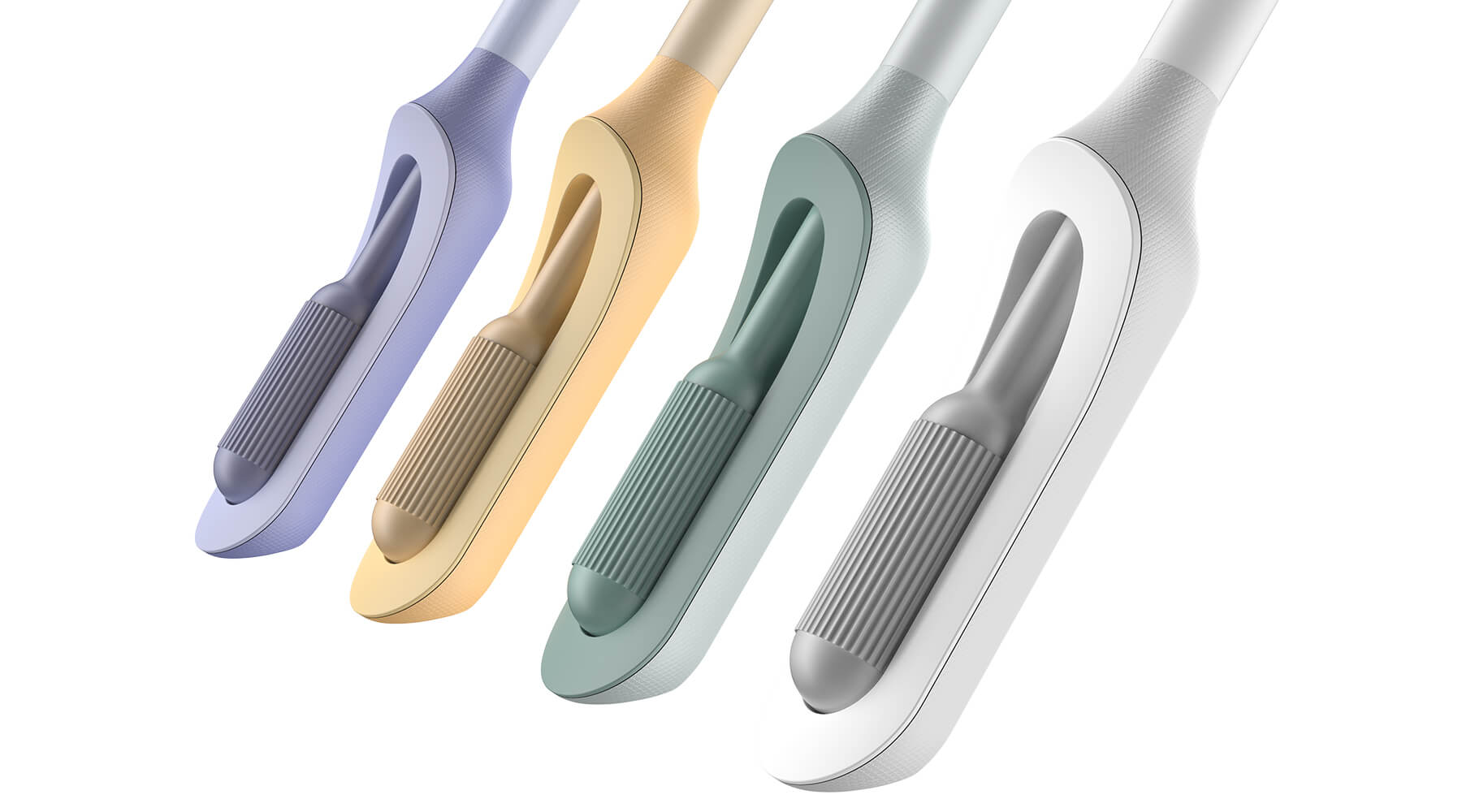
The IDEO team also worked on the packaging and unboxing experience, which plays an important role in supporting the user through the self-screening process. The team built in thoughtful design cues to give users reassurance that they are using the wand correctly, and to provide the same level of confidence they would have in the results of an in-clinic screening.
In January 2023, Teal raised $8.8 million in a seed funding round from Serena Ventures, Emerson Collective, and Metrodora. Later that year, the company launched a nationwide clinical trial with leading health organizations including Johns Hopkins University, Yale University, the University of Colorado, and Washington University, among others. In 2025, the Teal Wand became the first FDA-authorized device for at-home cervical cancer screening, with virtual medical provider support, and became available in all 50 states. Due to soaring consumer demand and increased insurance coverage starting in January 2027, Teal Health secured $22 million in Series A funding to expand access to the Teal Wand. It’s an enormous step toward the company’s North Star: catching cervical cancer earlier and saving lives.
Cervical cancer is nearly 100% preventable when it’s caught early, yet one in four women in the US are not up to date on their screenings.
More than 12,000 people in the US are being diagnosed with cervical cancer every year, and more than 4,000 people die of the disease, which disproportionately impacts Black, Asian, and Hispanic women.
More than half of cervical cancer cases are found in women that are not up-to-date on their screenings.
$22M
raised in a Series A round to expand access to the most accurate FDA-authorized at-home HPV cervical cancer screening
97%
of clinical study participants said the Teal Wand was very easy or easy to use.
87%
of participants said they would be more likely to stay current with screening guidelines if Teal Wand was an option.
94%
of participants said they would choose to collect their own sample from home rather than the current standard of care where a clinician collects it in-office.
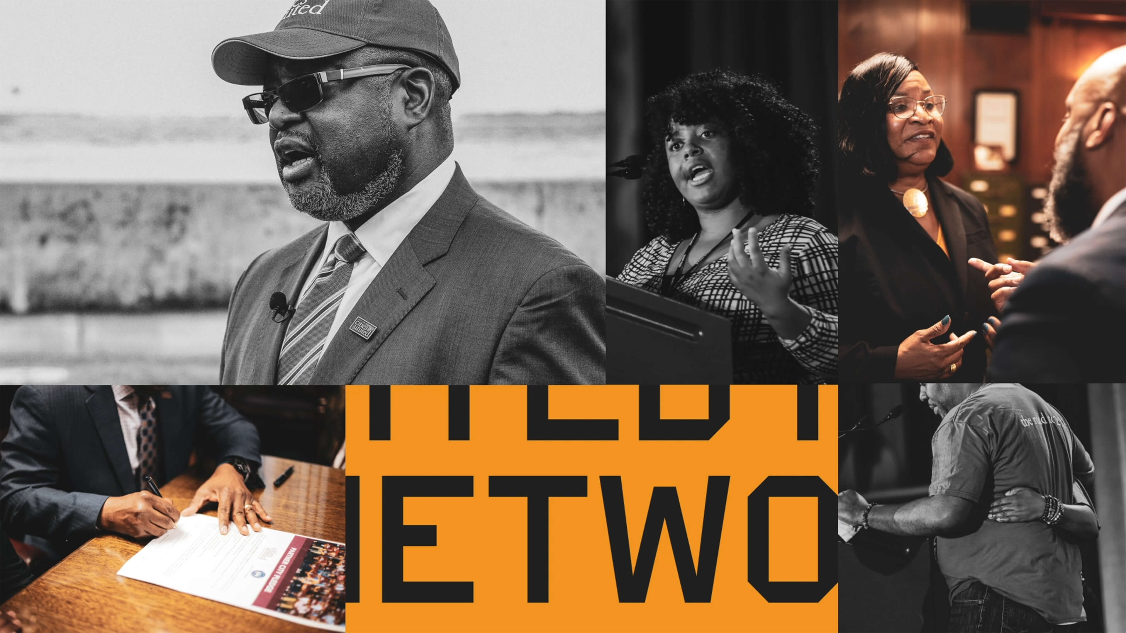
Amplifying a movement
Cities United rebrands to create safe, healthy, hopeful communities for Black men and boys.
Cities United already had a strong foundation with its stated mission, vision, and values. IDEO brought those to life with a new visual and verbal brand identity system that celebrates Cities United’s inclusive approach to building relationships and reimagining public safety.
To help Cities United with its verbal identity, the IDEO team defined the organization's voice, tone, and key messages, making it easier to tell its story more consistently and clearly, a crucial step toward engaging stakeholders.
To define the new visual identity, the team created a new logo, a letter C composed of interwoven shapes that represent the three tenets of their vision—“safe, happy, and hopeful;” a new design language that references city grids; and a typographic system anchored by the typeface VTC DuBois, inspired by W.E.B. DuBois’s own custom lettering and designed by the Black-owned Vocal Type Co. The team also designed a color palette that embodies the textures of city life with hues reminiscent of asphalt, sunrise, and brick.
To amplify the refreshed branding, the team designed a new responsive website, citiesunited.org. The intuitive site shares the organization’s mission, resources, ongoing projects, and partner network, inviting stakeholders to join in their transformative work. IDEO also created a video to humanize Cities United’s mission and showcase its nationwide impact. It underscores the unity, resilience, and hope embodied by the organization through a chorus of voices.
This comprehensive rebranding widens Cities United’s reach and impact, helping the organization share its goal of creating safe, healthy, hopeful communities for young Black men, boys, and their families, and reintroduces the organization to a national audience.
The Cities United work was supported by IDEO’s Racial Justice Impact Fund, part of a commitment IDEO made in 2020 to address systemic racism and advance equity within our own organization, our client work, and beyond.
Cities United is committed to reducing the epidemic of homicides and shootings among young Black men and boys ages 14-to-24 by 50%.
Between 2009 and 2019, the number of Black children who “did not go to school at least one day in the past month because they felt unsafe at school or on their way to or from school” increased by 84%, according to Cities United.
Homicide is the leading cause of death for Black men and boys from birth to age 44, according to the Centers for Disease Control and Prevention.
2023 SF Design Week Award
In recognition of IDEO’s brand work with Citizens United

Balancing work and sleep
Somni’s personalized sleep program helps workers maintain their health.
Sleep is a critical resource for shift workers—and their employers, too. Together, IDEO and Somni worked directly with people with acute and chronic sleep challenges to create concepts that could support their sleep goals, and provide employers with the means to improve employee health.
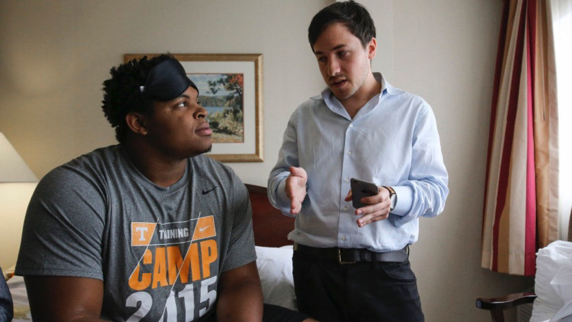
When IDEO and Somni first partnered, the startup was an early-stage company, so the team started small, with focused sprints and workshops to redesign the core aspects of the company and product offerings. The team interviewed shift workers about their sleep patterns, which can vary quite a bit. Even when people keep to a specific schedule on work days, they often have to change their patterns on days off to spend time with family and friends, leading to a very disruptive sleep cycle. Research revealed that many third shift workers were dealing with sleep and health issues, but also a pervasive “machismo” culture, pressure to “tough it out,” and a reliance on energy drinks to deal with lack of sleep.
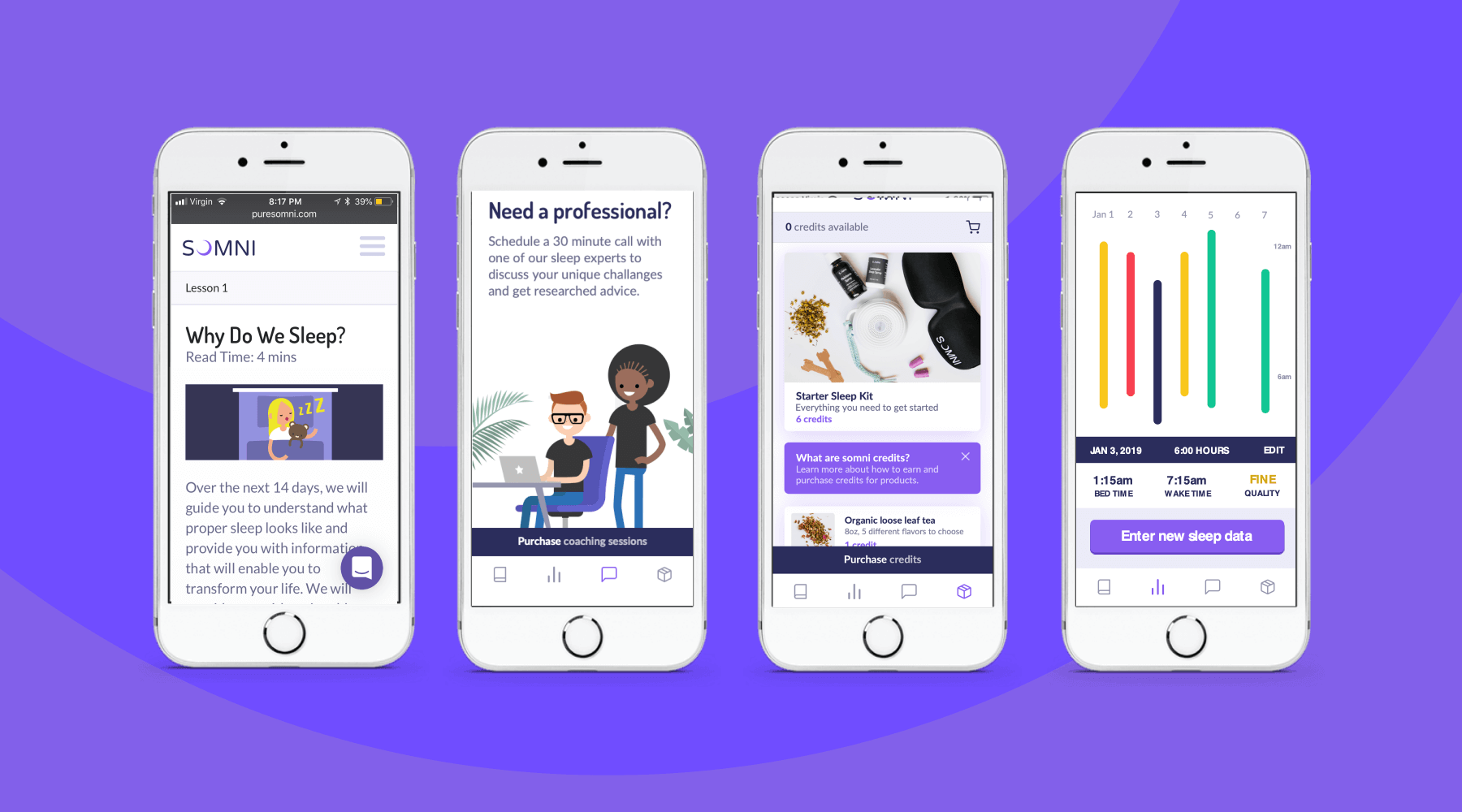
To address those issues, the team designed a digital experience for sleep cohorts, support groups where members could share their experiences and sleep strategies, and work with a coach and sponsor who already had been through the program. The platform analyzed workers’ data, and provided AI-enabled recommendations for improving their sleep. The big takeaway? Data by itself wasn’t necessarily helpful, and could be confusing for folks who were less digitally-fluent. Providing context, like a calendar that displayed sleep experiments at a glance, was crucial.
The IDEO team also created a new user experience for a genetic testing program that could uncover factors associated with sleep issues. Somni aims to use a saliva-based genetic test to monitor for DNA damage caused by circadian disruption, then leverage its sleep improvement program to prevent further damage. Because biomarker testing is a differentiating offer for Somni, it was extremely important that the team get it right, both to make sure that users could understand its utility, and for Somni to provide real value. The design challenge was unique—and not just because of data privacy concerns. Presenting data about DNA damage in a non-human-centered way could increase the anxiety workers had around their sleep.
At the end of the project, Somni leveraged the insights the IDEO team surfaced to improve products like its sleep coaching service, and to refine its biomarker testing offering. Based on this work, Somni has also created a pilot with a Fortune 100 company, which is currently in progress, as it works to mitigate the ill effects of disrupted sleep for employees and the companies they work for.
In the short-term, circadian rhythm disruption leads to an array of jet-lag-like symptoms, and in the long-run, it may contribute to weight gain, obesity, metabolic syndrome, type 2 diabetes, and cardiovascular disease.
It also impairs people’s ability to work, affecting productivity, creativity, and the overall work environment. Productivity loss can lead to employer baseline healthcare costs that are 26% higher, and over time, insomnia can result in an average cost of $4,267 more per employee per year.
In June 2019, the International Agency for Research on Cancer classified shift work as a probable carcinogen.
75%
user retention in Somni's sleep program
$2,450
savings per year per employee for users who complete the program
33%
improvement in sleep quality, and 41 more minutes per night
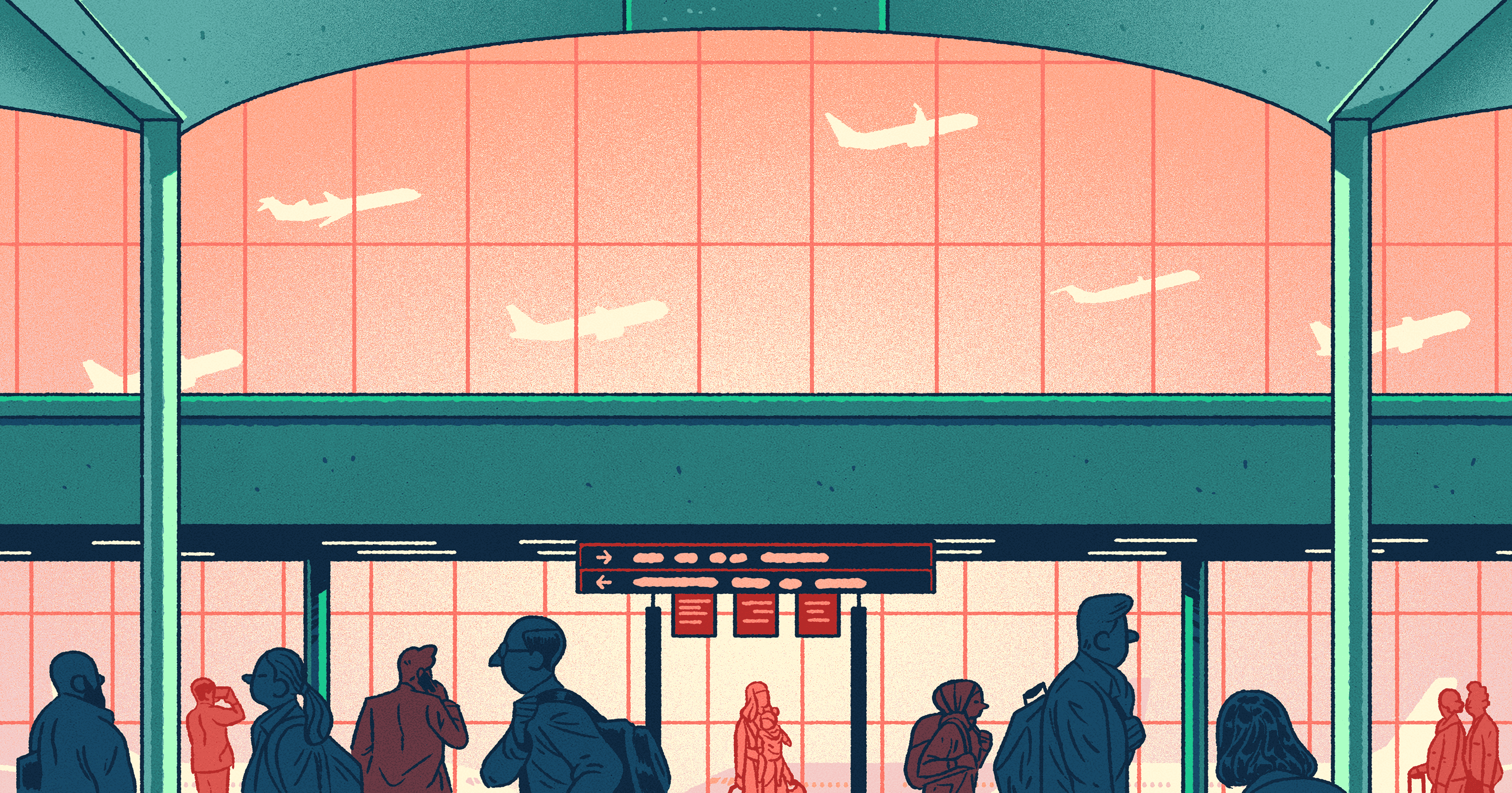
The 5-Year Collaboration to Turn Canada’s Busiest Airport Into Its Best
How human-centered design helped Toronto Pearson rise to the top of North American airport rankings
The following oral history recounts that process, which has been defined by an unusual collaboration: Greater Toronto Airport Authority (GTAA) manages the airport with a staff of 1400 employees, while the airport as a whole employs approximately 50,000 people across 400+ organizations. How do you bring them together?
The voices telling this story come from both sides of the relationship: Scott Collier is the Vice President of Customer and Terminal Services at GTAA, and Mike Ross is GTAA’s Director of Commercial Development. On the IDEO side, the project was led by Owen Rogers, a Partner and Senior Design Lead; along with Mat Chow, Director and Organizational Designer; and Nic Pajerski, former IDEO Design Lead.
Setting the Scene
In 2014, Scott Collier became GTAA’s Vice President, Customer and Terminal Services, a role that left him responsible for the Commercial and Terminal Operations of the airport—all of those things most visible and arguably most frustrating for passengers. He had an unusual background for an airport executive, having spent his career primarily at PepsiCo across North America.
WHY SCOTT TOOK THE JOB AT TORONTO PEARSON
Scott Collier, Vice-President, Customer and Terminal Services, GTAA: As a Toronto area native and an admittedly frequent traveller through Pearson, I was always fascinated by the incredible complexity of the airport, yet the apparent disregard for the interests and concerns of the traveling public. It felt as though every point within the travel journey was designed to frustrate the passenger, and, in most cases, for no apparent reason. I also knew that there are many industries that run hyper-complex operations but still manage to put the customers first. It seemed logical to me that we should be able to do that at an airport as well. If nothing else, it would be a heck of a challenge.
HOW DO YOU SOLVE A PROBLEM LIKE AN AIRPORT?
Mat Chow, Director and Organizational Designer, IDEO: Toronto Pearson—or really any airport—exists to move three things: people, planes, and baggage. But ironically, airports are never organized that way. They’re siloed. There is very little ownership of the airport as a whole. But at IDEO we have this principle: we organize around the work, not work around the organization.
Nic Pajerski, Design Lead, IDEO: Airports are gnarly because everything is no one's responsibility. Or at least that's what it felt like.
Mike Ross, Director of Commercial Development, GTAA: I like to joke that it says "authority" on my business card, but we really don't have “authority” over anything. The many tens of thousands of frontline employees, working for over 400 companies, all have their own mandates, their own safety rules, their own way of operating. We just house and host them.
Scott Collier, GTAA: Think about the passenger's journey through the airport. Where do you park? How fast is the check-in process? Will my carry-on bag be allowed? How long does it take to get through screening? Are the bathrooms clean? The number of decision points are insane! And if any one of those steps starts to break down, you're done—and we’re done. Our performance falls apart and we have let the passenger down. If they're running to their gate—and we proved this—our passengers aren’t spending any money. We know for a fact that improving wait times by one minute translates into about a million and a half dollars for the airport in sales. It's crazy, but what is even more appalling is that no one cares. You can’t make this stuff up! So long story short, unless the entire enterprise is aligned around the one thing we all have in common—the passenger—we will never achieve our aspiration to be the best in the world. And that’s the cool thing about working for an airport: bringing all of the organizations together toward a common cause. That's the challenge. The question, therefore, was “How?”
The Kickoff
In 2016, IDEO and GTAA began working together to improve the airport, kicking off the project with an exercise meant to let everyone see the airport with fresh eyes. Armed with a checklist, the two teams went out together to observe how different types of people moved through the terminal.
AN EPIPHANY AT SECURITY
Owen Rogers, Partner and Senior Design Lead, IDEO: We walked around the airport for about four or five hours, and we would stop and watch. Scott’s very inquisitive. He'd say, "What do you think about this? What do you think about that?"
Scott Collier, GTAA: I remember we were at domestic screening in Terminal One—our biggest. It was summertime. There are kids crying. And we see a mother losing her mind trying to keep her kids together while navigating through a massive wait line. It was so disheartening to watch her have to endure that in our airport. Welcome to Toronto Pearson! How do you like us so far?
Nic Pajerski, IDEO: She had a stroller and a baby in a sling, and her bags, and she was also trying to navigate the thing that everyone else is doing.
Owen Rogers, IDEO: We all stopped and watched. Scott’s team was with us as well. And they all kind of rushed over to help her—because that's what they do, they're customer service.
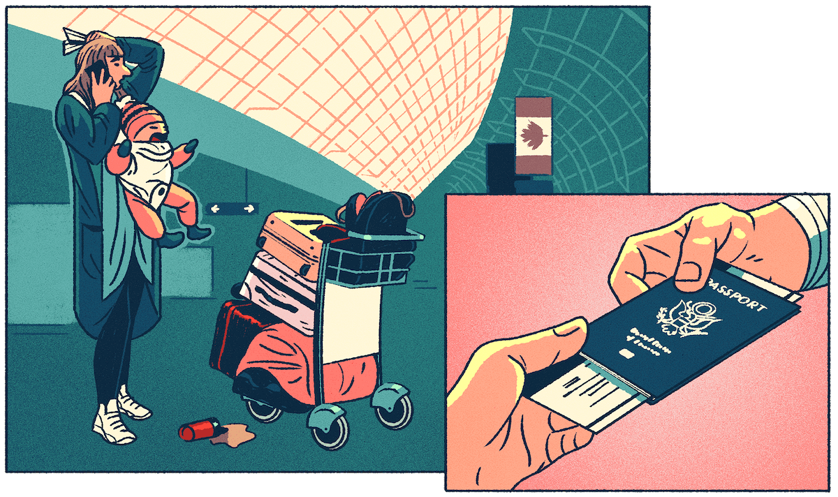
Nic Pajerski, IDEO: We had sent everyone out to do this design research activity as a team, thinking that they'd be able to dig deeper. But this was very demonstrative of how broken everything was. It was an enlightening moment: obviously the thing that we have isn't working. For everyone.
Scott Collier, GTAA: Owen and I were just kind of looking at each other and shaking our heads. And I said to him, “So, can you help us?”
Owen Rogers, IDEO: Scott seemed to realize in that moment, "Oh my God, this is what we're dealing with." But I said, "As a designer, all I see here is opportunity.” Airports have really driven themselves down to a place where—for a designer—there's nothing but upside. You could tweak the simplest thing and be heralded as a genius because it's so bad. I mean, they're all trying really hard, it's just, you know, they’re running around trying to fight fires the whole time. Nobody is actually stepping back and saying, “How can we make this whole thing better?”
WHAT IDEO COULD (AND COULDN’T) DO
Scott Collier, GTAA: Owen said to me, "We can work on this but it's a very different problem than you think it is.” And I said, “Oh really? What is it?” I'm thinking he's got the magic bullet. Instead he turns to me and he says, "The problem is you." And I go, “The problem is me? I'm new! I'm nine months into this! What do you mean?” He says, "You guys don't get it. You don't know how to empower this crazy place called an airport to get all the people who work here, the various stakeholders, the airlines, to work together. You act like an authority. You like to tell people what to do. And in this very complex ecosystem that's never gonna happen. So I can do this little project and we can come up with some suggestions. But fundamentally, unless you change the way you behave, and you demonstrate a willingness to others that you're going to think about this differently, you're wasting your time."
A CATALYTIC REALIZATION
Scott Collier, GTAA: Roughly 50,000 people work here. Over 450 different organizations. The airport authority is 1,500 people, and truth be told, we really don’t have much control over anything—although we delude ourselves sometimes into thinking we do. Our mindset was: We know better. We like to tell people what to do. We know what's right. But that wasn’t the right kind of leadership. It wasn't inspiring, wasn't passenger friendly, wasn't commercially successful. It had created an airport that was, quite frankly, not particularly effective. And it had to change. That one comment from Owen, that one sentence—"the problem is you"—was the turning point for me.
A Gnarly Problem
In 2016, IDEO and GTAA began their first project together, working to rethink the security screening process. But it soon became much bigger than that.
REGULATIONS AND RISK
Scott Collier, GTAA: In the U.S. you have TSA; in Canada we have CATSA (Canadian Air Transport Security Authority). At Pearson we had among the worst wait times in North America, certainly in the bottom 10% of any large airport. Worse, it was a horrendous experience. The staff weren't particularly friendly. Different sectors had different procedures. Different times of day were different. You never knew what you were going to get. Above all, our relationship with CATSA was broken. And their relationship with Air Canada, our flag carrier, was, to be blunt, toxic. We couldn’t have a conversation about improving things because we didn’t talk to each other at all! We talked over one another. And it was a real shame because the fact was all the people involved were really good folks. But I knew that unless we get our passengers through check-in and security quickly, they'll be running to the gates, they will be late, the airline's on-time performance will suffer, everyone is miserable, and it's a debacle all around. No winners, just losers. So it was kind of like, "I’ve got to fix this, but I have no idea where to start."
Mat Chow, IDEO: Airports are a place where safety and security is—and should be—the first concern. But that changes people's attitudes towards risk, and trying new things. When we started, we tried to encourage people to see the difference between taking risks unnecessarily—jeopardizing the safety and security of passengers—and challenging the status quo; not just doing things the same way because that’s how they’d always been done.
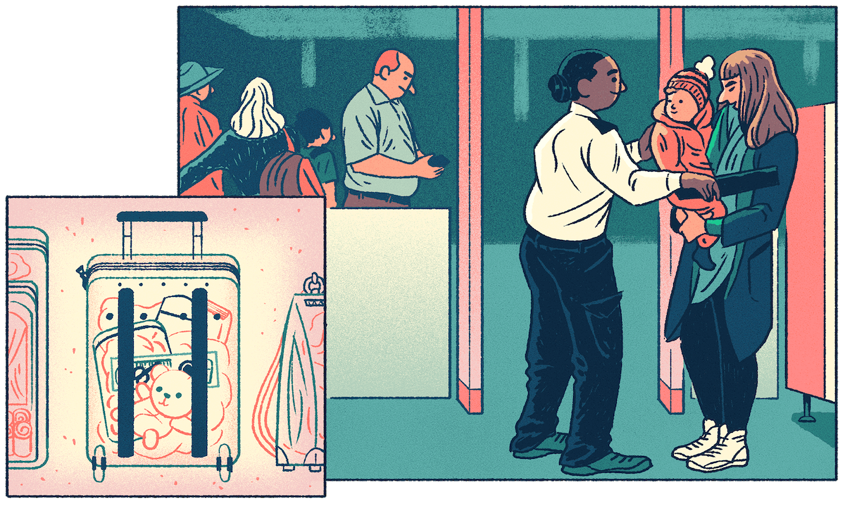
Owen Rogers, IDEO: When we first started working at the airport, whenever anything would happen—it could be a bit of paper on the floor, a light bulb not working, or god forbid an airplane crashing—everybody just points to someone else: "Wasn't me!" It was the biggest early insight we had. At IDEO, the way in which we design, the way in which we take on problem solving, is inherently collaborative. This wasn’t that.
THE MOMENT THINGS BEGAN TO CHANGE
Owen Rogers, IDEO: We had a workshop where we brought all the stakeholders together. We had groups of four to six people around a table. We'd framed the problem and we talked about it, but they're all pissed off that they have to be there. Their job is to run CATSA and it's really hard and nobody understands.
Nic Pajerski, IDEO: Going in, CATSA had this feeling that everyone in the airport kind of hates them, that their job is to be slow, to be meticulous, and it had built up into this kind of self-fulfilling aura. But then at the workshop, we presented all this inspirational work, and suddenly they get a lot of people outside of their organization thinking about their problems.
Owen Rogers, IDEO: We did one of IDEO’s creative exercises—we call it the spaghetti bridge—where we work in teams to build a cantilever out of spaghetti. Not one of them had done it before, and they started out suspicious. But next thing you know, they're all completely absorbed in the exercise! The yellow team wants to get the longest cantilever bridge! And the yellow team's winning! Everybody's whooping and cheering—and they don't even realize the CATSA people are working with the airline people!
Nic Pajerski, IDEO: By the end of the day, CATSA realized they had a lot of other people being sympathetic to the problems that they’d been dealing with all on their own. It was a powerful moment and a big milestone in the journey toward greater empathy and connection across disparate teams. This was the moment when human-centered design began to make sense across a large enough swathe of the airport population that it could take hold and start to facilitate change.
Owen Rogers, IDEO: So then we take the issue on: "What would you like to see the security experience of the future be like?" And they all lean into that question—together! And they make these amazing scenarios of what could be if, lo and behold, everyone works together and the passenger is at the center. Four hours later we finished this workshop, and the guy who ran CATSA stood up and said that: "Wow, if we could really put the passenger at the center of this, and we could all do this together, we could really change things." Up until that point, Scott and GTAA were measuring us on, "Have you solved it with your silver bullet?" And after that they understood, "This is about transforming our organization, writ large. This isn’t trying to fix baggage. This is about uniting the 50,000 people that work in this airport, regardless of which team they’re on." And that's where the second project came from.
Starting A Movement
A NEW MISSION STATEMENT
Scott Collier, GTAA: When I first arrived at GTAA, we had this nonsensical vision that nobody understood. So, thanks to Howard’s leadership, we put a new one in place. It was simple: our vision was to become the best airport in the world, which at the time was rather amusing because we were not very well regarded at all. We consistently ranked in the bottom quartile of any major passenger experience surveys (including our own)! We knew if we wanted to be the best airport in the world, we'd need to change the way we work, the way we think, and who we were ultimately serving. Instead of ourselves, we needed to all unite around our passengers. Our new mission statement reflected just that: "Passengers are our passion." I remember I got up in front of a crowd of our carriers, the airlines, and when I said it, they started laughing! They go, "Well, reallllly? The best? You've got a loooong way to go before you're that."
Mike Ross, GTAA: In the past we at GTAA had been the cops and the rule-makers and the ones who tried to put up all the signs that say, "Don't do this and don't do that." We knew if the airport experience was going to change, that had to change.
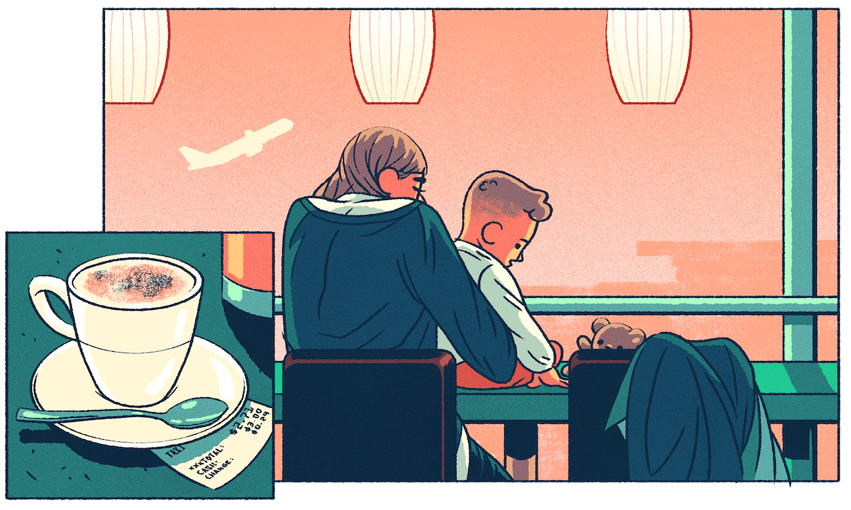
Scott Collier, GTAA: Fundamentally, we had been telling everyone what to do—just top-down. Instead, we said, "You know what? You guys know how to run this airport. You tell us how to do it.” We went to our friendlies—the commercial operators, the food and beverage, the duty-free retailers—and we said, “We don't want anything from you. We don't have a training program for you. We don't want any money. We just want to share an idea with you. And if you think it's a good idea, we'd like you to join us on this journey." We explained, we have this journey to become the best airport in the world. And we believe we can't be the best airport in the world unless we make you the best food and beverage retail operators in the world. And we want to start giving your people permission to start talking about it. We want to make your staff the heroes of Toronto Pearson. To a person, they signed off without any equivocation whatsoever!
GETTING PEOPLE ON BOARD FOR THE JOURNEY
Scott Collier, GTAA: IDEO asked us to think about how we—as the airport authority, just the 1,500 of us—could empower all 50,000 people who work here at the airport. How were we actually going to excite them? I realized that we had to change the conversation from "we" to "I.” Of course, at first everyone said, “That's not very Canadian," because Canadians are charmingly egalitarian. But I said, trust me on this, we've gotta figure out a way to make people personally accountable, and we can't go in and be the heroes on the high horse and say we're going to do it by ourselves. Until we start making people accountable for owning their business and doing what they say, this whole notion of going on a journey towards being the best will never happen.
Mike Ross, GTAA: There had been a very successful beer campaign in Canada called “I am Canadian,” and in the early days we were thinking of something similar to inspire that kind of spirit at the airport. But then IDEO prompted us to think about movements and see if we could make more than a campaign out of it, and really get something that was ground-up and not top-down. Ultimately we ended up calling that movement I Am Toronto Pearson.
I AM TORONTO PEARSON
Mike Ross, GTAA: We started with groups of ten people. We put them in a comfortable room and asked them to share their story of why they worked at the airport.
Scott Collier, GTAA: Calling it a “workshop” doesn't do it justice. We started a conversation. They started telling us stories about why they work at Pearson and their experiences with customers. These were front line people, these weren't middle managers and directors, these were everyday people who do the best they can, who struggle to get to the airport, and do magical things to make this place special. And just to watch them and see their pride was inspirational.
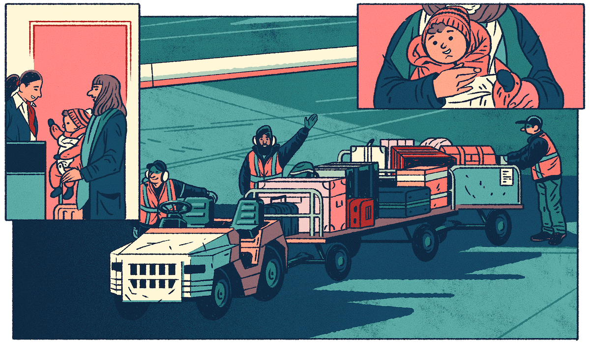
Mike Ross, GTAA: We learned that people could do the same work elsewhere—probably for more money and less hassle—but there was this pride in working at the airport, in such an emotionally charged place that moves millions of people a year. It turned out that this is a really sticky place to work. And that made people want to achieve that higher goal of being the best airport in the world.
Mat Chow, IDEO: I Am Toronto Pearson just played on what was already there: this deep sense of pride among so many airport employees for the human experiences they provided. You know, the airport can be this magical place of excitement—people are going somewhere or coming back, they’re meeting loved ones, there are these constant, intense, human-to-human connections. I Am Toronto Pearson gave people a moment to surface those human stories and really did tap into their pride in serving their customers, in serving Toronto, and really being ambassadors for Canada. When you're in the airport and you get to see the moments of gratitude and joy, that's incredibly infectious. Tapping into that broke down a lot of walls around the airport.
Scott Collier, GTAA: These first participants started to talk about it with their colleagues and it started to snowball! We learned as we went, and by the end of the year, roughly a thousand people had joined the movement. By the end of 2016, it was up to 5,000, and by the end of 2019, we will have 25,000 people as members of the club called I Am Toronto Pearson. It's remarkable.
Owen Rogers, IDEO: People went deeper than we'd ever imagined. They found reasons why they worked at the airport that even they hadn't seen. It was profound, the ability for so many people to truly show up. One participant shared that he and her family had fled a war in their native country and ended up in Toronto. She ended up getting a job at Pearson, and she recalled with gratitude the warm welcome her family had received there when they first arrived. Another employee spoke of her network of airport workers coming together to help find a child’s lost teddy bear—a moment that showed her how much individual workers care, and how much power they have when they work together.
CHANGING THE WAY THE ORGANIZATION THINKS
Scott Collier, GTAA: This was the key thing: creating a movement ultimately means changing the way an organization thinks. You don't show up to work to just grind away at the airport. You want to be part of something bigger than yourself. It's just extraordinary how powerful this idea is. It drives innovation. It creates better relationships. And—get this—it's damn good for business. I have become a believer. It works! But it takes courage, it takes leadership, and it takes trust.
More Gnarly Problems
APPLYING THE LESSONS TO BAGGAGE HANDLING
Scott Collier, GTAA: Well, they say imitation is the greatest form of flattery and some of my colleagues began to apply this approach as well. My amigos on the aviation side wondered, "How might I use human-centered design to reimagine how we do baggage?” Once again, we had a poor reputation for on-time baggage delivery, even though we at the “authority” don't handle any bags. So how do we engage the people who work on bags? How do we think about it differently to get them empowered and inspired?
Owen Rogers, IDEO: Scott’s counterpart Craig Bradbrook, Vice President of Aviation Services at GTAA, saw the work we had done together and called me into his office. He said, we're about to spend half a billion dollars on a new baggage system. And he drew this thing up on a whiteboard of like thirty-two stakeholders and said, “After all the work that I've seen you guys do, I've got to believe we're missing something. I want you to go and look at re-imagining baggage through a human lens.” We ended up changing things: different signage, cleaning up the washrooms, better lighting everywhere, new technology. But fundamentally it was about changing the culture of the people.
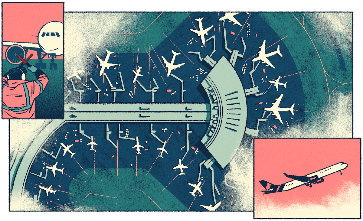
IT’S STARTING TO CATCH ON!
Scott Collier, GTAA: So something special is happening—the design-led movement is catching fire. One of my colleagues says, “Well, what about immigration?” So we think about a design project to help us reimagine customs and immigration. And another says, “We should do a design project on X, Y, and Z because this actually works!” But the best news is that the people who do the work are actually contributing to it. They're getting excited. Engagement scores are going up, performance scores are going up. Human-centered design and the design thinking process are a force multiplier. When you get like-minded people in a room together, and you take away all the nonsense and egos, when everybody shows up without an agenda—which is hard to do!—it is remarkable how quickly you can design a solution rather than just band-aid a problem. But you have to have the courage to do this. Everybody thinks they’re the smartest person in the room, but you know what? We’re not. Trust your people. It's amazing the stuff they'll do.
Illustrations by Michael Meier
Toronto Pearson is North America's second largest international airport and far and away the busiest in Canada. But despite the completion of a gleaming new Terminal 1 in 2004, its passenger satisfaction scores—as measured by Airports Council International—remained dismal. Beginning in 2014, a new executive team, led by CEO Howard Eng, was determined to change those results. It began with embracing a new vision—admittedly audacious—of becoming “the best airport in the world.” For help, they partnered with IDEO, launching a journey of transformation that continues today, and has been marked by many surprising, illuminating, and sometimes hilarious moments.
How design is driving Ford to reimagine what a car company can be
One of the world's earliest automakers is designing the future of transportation
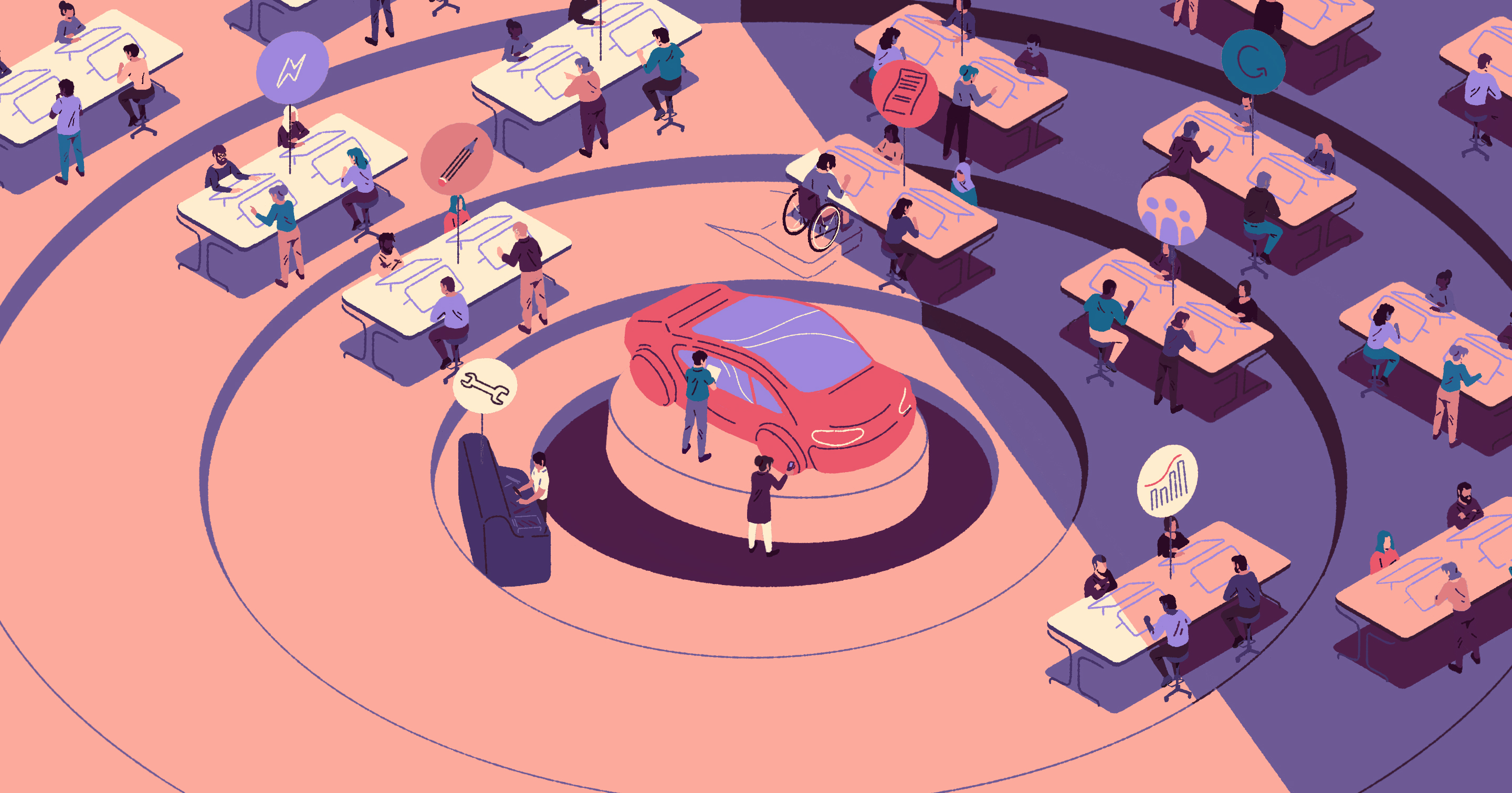
On that day, they pulled us into a room that resembled a basketball court. Wide, open decks were marked by signs and little flags identifying team workspaces: Purchasing Boulevard, Operations Corridor, and Design Central. The walls of the space were adorned with customers stories, insights, and frameworks that had been collected during design research and now pointed toward new opportunities. At the center of the room sat a new kind of prototype of a vehicle, which had been the focus of a startup-style development team made up of members of purchasing, HR, legal, design, accounting and more. The process of creating the low-fidelity prototype had been entirely new for this cross-functional team—defined by collaboration and experimentation—but the prototype that now appeared before us proved the value of their approach.
This was just one of dozens of war-rooms now filling the buildings of Ford's Dearborn campus, and also in Ford’s campuses around the world. This new kind of problem solving and rapid prototyping were new to the greater Ford team. And while the IDEO team had been alongside Ford through many projects, we had not touched this prototype.
When developing a new vehicle, defining the concept is a significant investment in time and resources. Using this approach, the team achieved a massive reduction in design development time, in turn reducing cost to the company and accelerating the time to market. It was a light-bulb moment for us. We suddenly saw that a comprehensive organizational change was in motion here—design thinking now lived in Ford’s DNA and they were taking it forward.
Over many years of deep collaboration with designers at Ford, we’ve worked primarily on specific projects or initiatives, all the while broadening our points of connection within the company. Early on, the IDEO team functioned like a pirate brigade on the edge of the business, with a mandate to run fast and break the rules—but you can’t scale that up.
Where scale has been achieved is in the aggregate, as numerous individual projects have exposed more and more members of Ford to the power of human-centered design. Although we did not do the work to create some of the vehicle prototypes we viewed that spring day, our deep collaboration with Ford over many years has helped enable the organization to shift its way of working, and that may be the greatest and most lasting success of our partnership. Together, we’ve moved with Ford toward the precipice of becoming a new kind of company, suited to lead not just auto manufacturing, but a radical revolution in mobility.
Mapping the entire span of our time with Ford, it’s clear that the way we’ve been working is its own kind of strategy. Design thinking has been permeating the organization system-wide, often spearheaded by inspired employees eager to explore new ways of working. At its best, design enables people to tackle complex, systemic challenges. Within a large organization, the work isn’t so much about applying a process, but helping the company itself improve its resilience and uptake of new ideas. We can push the edge by asking tough questions about what people—the customers or users of their products and services—really want, and figuring out what needs to change in order to fulfill those desires.
That unifying anchor point during this shift has been Jim Hackett, who took over as Ford’s CEO in 2017. Hackett came from Steelcase, a world-class furniture company that has been instrumental in applying design to shape the future of work. It was at Steelcase where Hackett first worked with IDEO, and through that collaboration cultivated an approach to business that put the customer at the center, evolving the company from simply a furniture manufacturer to a hub of leadership in the changing workplace landscape. When he came to Ford, he brought this human-centered approach with him.
The whole purpose of a business, ultimately, is to meet a customer’s need. Many legacy businesses that have been operating decades or centuries find themselves with very established business models. They know how to make money through those methods. But the consequence of entrenched models is that everything drives toward efficiencies and returns. If you live in that mode, you lose your customer. It’s easy to say legacy companies need to change the lens through which they’re viewing and operating their business; it is everything to get it done well.
During his tenure, Hackett has built an ecosystem that enables design to spread from the core innovation teams out to all corners of the more than 190,000-person organization. Creating change is about convincing networks of people to make different choices, which means unconvincing them of their current behaviors and helping seed the potential of doing things differently. By helping them align in new ways around ideas, they gain the bravery to make choices that may not be supported by their corporate or cultural DNA.
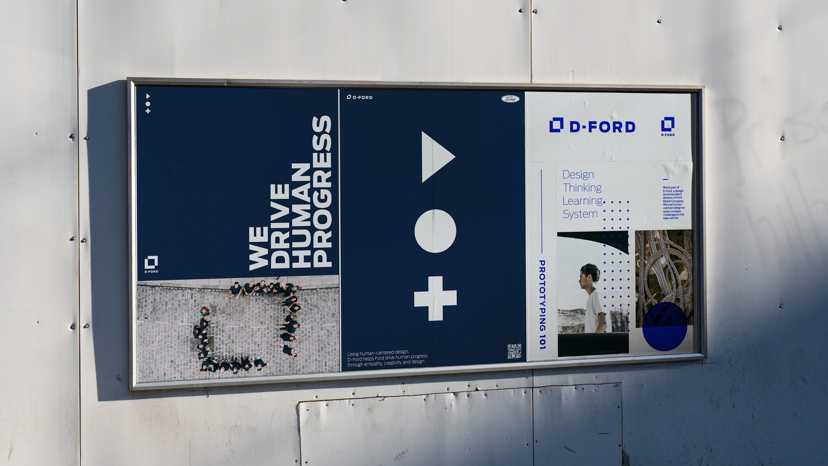
In an effort to be more intentional and comprehensive with this diffusion of ideas, Ford is moving forward with two primary initiatives: First, a global design lab network called D-Ford, with teams around the world focusing not on products, but on customers. And second, a robust, enterprise-wide learning program to give everyone at Ford access to the design tools and skill sets that the collaborative team of Ford and IDEO spent years refining together. With these two efforts in operation, design thinking can be disseminated from the inside out, spreading throughout the organization.
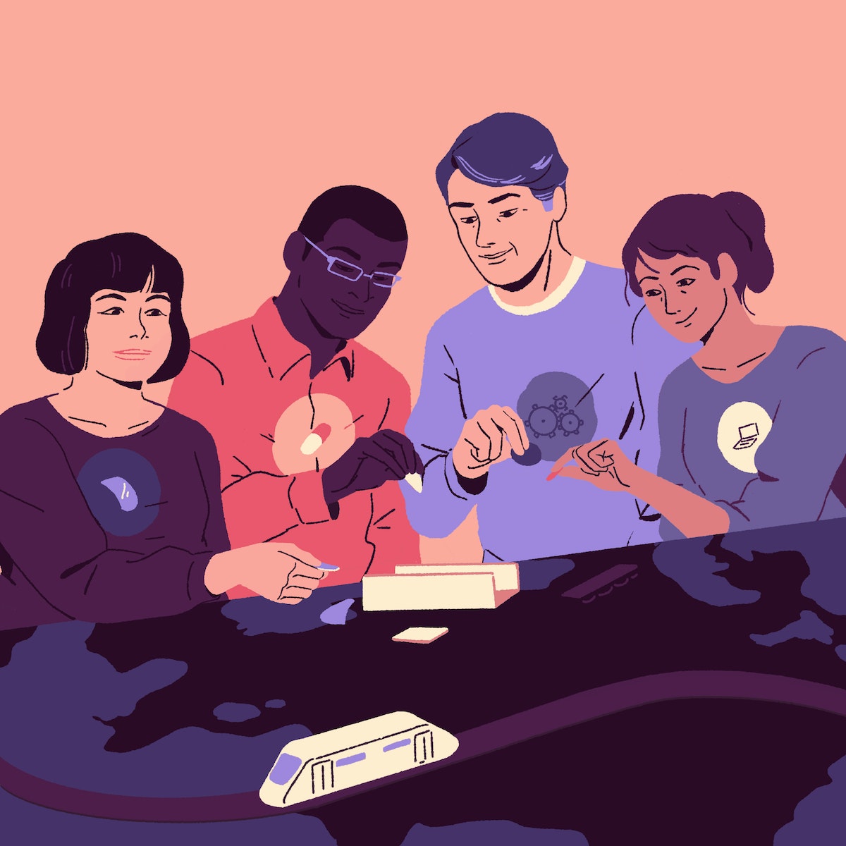
Ford’s global innovation labs represent the design-intensive core of the company. The D-Ford studios are housed in Detroit, London, Palo Alto, and Shanghai. In each, a nimble group of design practitioners gets their hands dirty iterating, fixing, and prototyping possibilities for the next era of mobility.
To be human-centered doesn’t just mean to put humans at the center of the design problem, but to put humans at the center of the design solution and empower them in different ways. The D-Ford Labs, and the associated learning program, are creating a radically new way of working that is accelerating Ford's evolution. It's not IDEO, it's not Ford, it's a third way.
Outside of these hands-on labs, the uptake of design thinking is more variable and sometimes controversial. Thousands of employees cross paths with the small group of radical experimenters so transformation happens more slowly. Communicating the value of design in this broad population requires moving from provocation to persuasion and proof, demonstrating how much leverage design can provide in solving problems that have seemed intractable through more conventional approaches.
Design requires being on the ground with the people who will use and experience any new offerings from Ford, but it also means reaching across aisles and opening dialogues where previously deep, daily collaboration has been unheard of.
This never would have happened had they not felt invited into the room to help with the design. Having cross-functional teams from engineering, design, purchasing and more, has been a breakthrough, because they gain empathy and respect for each other’s practices and work together, rather than sitting in silos that tend to block each other’s effort.
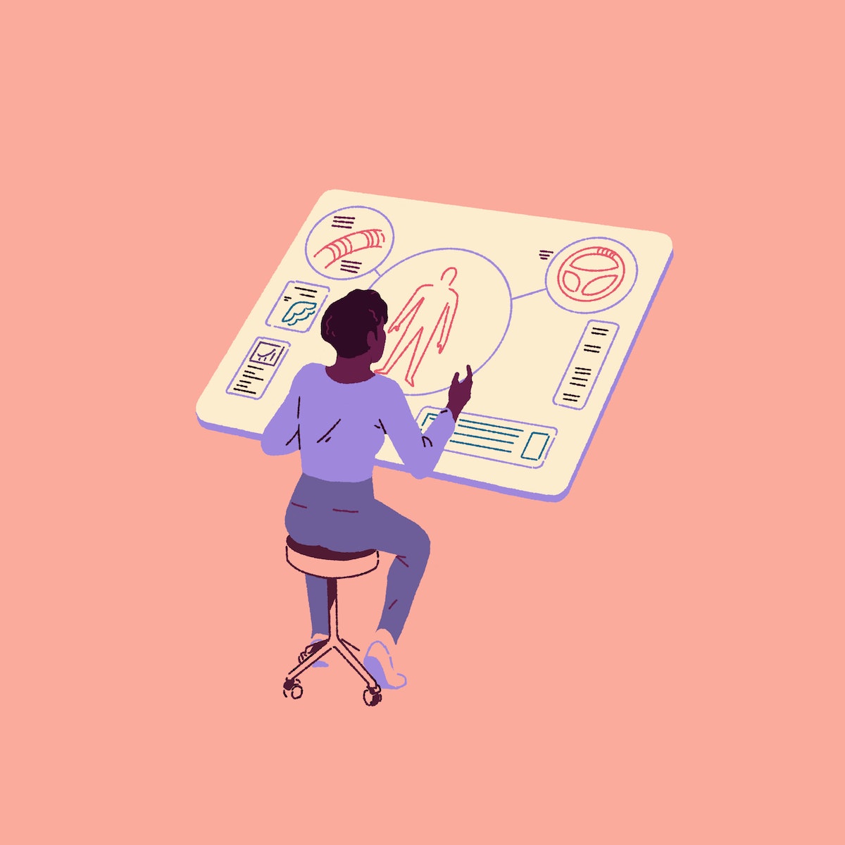
Perhaps one of the clearest proof points for Ford’s new way of working is the groundbreaking, all-electric SUV Mustang Mach-E, which was unveiled in Los Angeles late last month. The Mustang Mach-E came to life just a few blocks away from Henry Ford’s first factory in Detroit, through a development process grounded in human-centered design, concentrated entirely on customer needs and desires.
The development team, called Team Edison, was made up of broad expertise, including members leading the design, charging strategy, infotainment, and marketing of electric vehicles. Thanks to the company-wide shift toward human-centered design, Team Edison was truly able to exercise creative license and operate in a different way. The Mustang Mach-E represents change not only within Ford, but worldwide. Customer outlooks and desires are evolving, and by listening to what’s true for their user, the team created a vehicle that aligns with the changing world.
While this new mindset is thriving within the walls of the labs, it’s a feat to communicate the nuance and potential of human-centered design to parts of Ford where design itself isn’t necessarily top of mind. Across every level and department, the principles can apply, but putting them in context matters. In order to activate that deeper saturation, Ford has developed an internal learning program that guides employees through the different phases of design thinking. From teams assembling child safety seats in Nanjing, to a Dearborn group researching the nighttime patterns of taxi drivers, to sales representatives in London, Design Thinking at Ford unifies people across the organization around the mission of putting humans at the center of their work.
The learning tools and experience are available to anyone at Ford who wants to better understand design. Practical tools include methods cards that can be applied at intervals in the development process, and videos illustrating how design thinking has come to life at Ford in the past.
Ford believes that all of its employees will benefit from a human-centered perspective, and is making progress in its enterprise-wide effort to create a unique, design-led creative culture.
One of the most exciting aspects of the early learning about design is realizing just how many areas it encompasses. From making autonomous rideshare vehicles to designing an ecosystem of connected services around sustainable transit, human-centered design in particular enables individuals to rethink how they go about their lives and how they look at the world around them.
As a designer, I was always taught it’s valuable to be able to say, I designed that—it’s on a shelf somewhere. Now we’re getting to a moment when it’s more valuable to create impact and influence rather than an object in space. We’re beginning to see new ways to measure impact, and better ways to affect change.
If you teach people to question what they do, and to collaborate and take cues from others with diverse skills, they will learn to change on their own, and the company will follow suit. This is how large-scale transformation happens. This radically different approach is what will determine the future of Ford.
Illustrations by Johan Papin
On a warm spring day in Dearborn, Michigan, where Ford Motor Company has its world headquarters, our team met up with some of Ford’s senior leadership. It’s a visit we’ve made regularly during the 15 years IDEO has worked with the century-old carmaker.

4 Reasons Warm-Ups Will Fundamentally Change Your Work
Because warm-ups are so much more than awkward icebreakers
Did you just cringe? Perhaps your nostrils flared in suspicion. I’m at the far end of the extroverted spectrum and even I have on that grimace.
I’m here to talk to you about creative warm-ups, and to once and for all distinguish them from their brash, single-toned—that tone being forced, high-energy social interaction—cousin: the dreaded icebreaker.
But first, a brief interlude for sports. If you have played or watched any sport on the planet, you know that athletes do not run straight onto the field, into the pool, or out on the court. (If they did that, their game would be garbage and they'd likely pull a hammy.)
Athletes always warm up, and I’d argue that if you were to take one thing from the world of sports to use in your everyday work, it’s this: warm-ups are the thing that can radically change your game.
But if they’re not uncomfortable team cheers or cringe-worthy partner games, what are they?
Warm-ups are a critical part of the collaborative design process. They're a strategic way to set individuals, the team, and the work up for success. And if you do them consistently, you'll build your team’s awareness muscles. You'll become more self-reflective, tuned-in, empathetic, and intentional about the work you are setting out to do.
Here are 4 reasons I believe every collaborative work session needs one.
1. They build psychological safety
Warm-ups can create space to show our humanity. Instead of diving straight into the work, take three minutes to go around the room and check-in with the question: “On a scale of 1-5, how is everyone doing today?” In doing this, we acknowledge that we are not business-people-robots, but are instead complex humans with emotions. Moments of vulnerability help build a foundation of trust, especially when modeled by those with seniority.

Though it may seem trivial, asking people to start off a session by sketching, then sharing a place they loved to play as a child invites everyone to put their voice into the room in a way untethered to expertise or authority. A first contribution is often the hardest, particularly for people farther down the power hierarchy. If you actually want everyone there to collaborate, create a safe invitation for them to participate.
Small moments where you make space for people to bring their real and unique selves to work add up. They build a sense of safety that will allow your team to take risks, challenge the status quo, and propose new ideas.
2. They help you get into the specific mindset the work needs
Ever had someone walk into your meeting in a crappy mood and subsequently prevent your entire team from getting down to business? Everyone is coming from someplace different, whether that’s a stressful one-on-one, a heads-down working session, or a two-hour European lunch.
Take the time to design a transition into the new mindset your work requires. It could be as simple as giving people two minutes to write the to-do list that’s clogging up their brainspace, then putting those Post-its outside the room. Mode switching is hard!
Don't forget to consider not just where people are coming from, but where you want them to go to. The mental place your team needs to be in for a synthesis session (perhaps pattern-finding or decision-making) is totally different than for an ideation jam (maybe pattern-breaking or generating). Think critically about what specific mindsets the work you are embarking on needs.
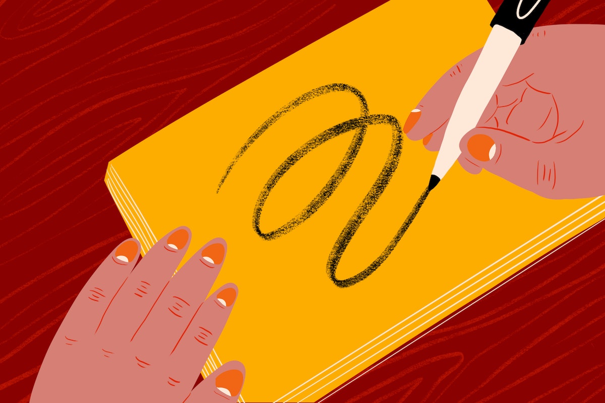
If you need folks to compromise and build together, have everyone draw an ambiguous squiggle on a Post-it, then pass their drawing to the right; turn that new squiggle into something, then pass each squiggle once more; and have the final person give the squiggle a provocative title and share it with the group.
Getting the right muscles firing up front will grease the gears, and you’ll find your team will be able to go farther faster.
3. They help you practice critical skills
Warm-ups are also a means for you to tangibly grow the core skills you need for your work. When you start a meeting with a three-minute brainstorm on the slimiest, bumpiest, or most laughter-inducing things you can think of, you’re creating a place for people to practice diverging in a low-risk way. If you try having everyone stand at the same spot at the window, each pointing out something they have never noticed before, you’re having them flex the skill of looking at something familiar with fresh eyes.
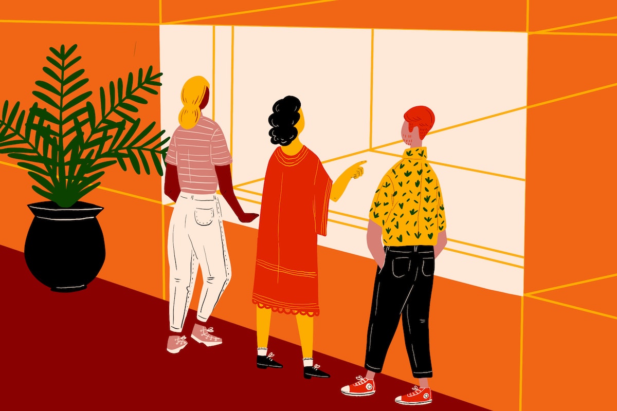
Working on these skills in a context not tethered directly to business outcomes builds creative confidence. It makes space for folks to grow through trying, flailing, or failing without pressure. When the time comes for them to apply these skills to the work at hand, they will have already built the muscle memory.
4. There's power in starting from a shared experience
The start of a meeting is mission-critical. As an experience designer, I know that it’s impossible (and not actually worth it) to design every moment to perfection. Rather, I focus on the few that really matter, like the beginning.
A warm-up is a way for your team to all start on the same page. If you set off on the wrong foot—or don’t set off at all, leaving everyone wandering whatever alternate plane they were on before your meeting started—you’re not going to get far.
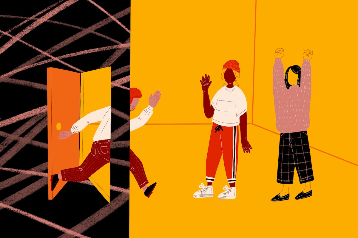
This is especially true for a team where there is currently tension. Designing a human moment that everyone can share will help people start the work at hand with a common understanding. Having each person describe one thing that brought them joy this week can shift the dynamic and set the team up to think collaboratively rather than combatively.
Warm-ups are a breath—a moment to pause in days spent running continuously from list to thing to email. They help us create the necessary space to check-in with ourselves and each other, leave the unnecessary outside the door, and invite in the things we actually want.
Can warm-ups really do all these things? Yes, they can. But they're not a one-size-fits-all solution. You have to be intentional in how you use them.
Let's go back to sports. What can we learn? You have to warm up slowly—jog before you sprint. You have to warm up specific muscle groups—shot putters and synchronized swimmers don’t warm up the same way. And lastly, you warm up together as a team.
When you make it a ritual that every meeting starts with a warm-up, your team will come to expect one, start to feel like they need one, and eventually take shared ownership in leading them. All because they have built the habit of asking what they, as individuals and a collective, need in order to shine.
Stay tuned for upcoming blog posts on warm-ups for all your needs (like when anxieties are high, the 3pm slump hits, your team needs a laugh, or you are diving into convergence).
Imagine yourself at a conference, team-building event, or bar mitzvah. The person at the front of the room claps their hands gleefully and announces they’re going to lead an icebreaker.

Resilience in Uncertain Times: Insights From Global Leaders
We asked global leaders what keeps them up at night. This is what they said.
IDEO’s global client and partner network gives us a unique view into how organizations are responding to rapid change. Recently, we decided to ask our clients what problems are keeping them up at night, and what promising solutions keep them leading with optimism.
We reached out to 55 global business leaders spanning 25 cities and 18+ industries. What we heard is that while uncertainty isn’t new, there have never been so many compounding causes for concern. A decade ago, it was easy to see what triggered the recession. Now, volatility surrounds us—in politics, markets, regulations, the environment, and society at large.
Leaders cited increasingly complex consumer expectations and interactions. They pointed out tension between fueling growth and tightening belts, and pressure to sustain their core businesses while spinning up new growth horizons. And they noted growing difficulty attracting and retaining the right talent.
Leaders agree that growth is still the primary business objective, but increasingly understand that the methods and mindsets to achieve growth have changed. In particular, it’s becoming more important and impactful to consider people—customers, employees, shareholders, and stakeholders—when making business decisions. A human-centered approach to strategy and innovation makes it possible to turn obstacles into opportunities.
How do leaders become more human-centered? By looking both inward and outward to identify the needs and conditions that drive innovation. Inwardly, it’s about evolving leadership qualities to encompass a combination of creativity, strategy, technology, and soft skills. Outwardly, it means testing tangible solutions with customers to inform execution and scale.
These shifts can unlock trapped value, fuel growth, and build trust and loyalty.
Our research identified six key tensions leaders face now. While tension can create stress, it can also—when approached thoughtfully—enable sustained balance between opposing priorities. In our client network, we see numerous examples of inspirational leaders and organizations learning to strike that balance, and in turn finding a new way forward that leads to profitable business growth.
1. Improving efficiencies while exploring new growth opportunities
In 2014, The Times and The Sunday Times worked with IDEO to define and design a new digital publishing strategy. The decision to move to four editions a day—and stop competing with round-the-clock breaking news—freed up tremendous resources to focus on big stories, and balance efficiencies with growth. Since moving to online editions in 2016, subscriptions are up 15% (April 2018) in a market where most content is free.
2. Balancing the needs of shareholders and stakeholders
Intercorp is a Peruvian conglomerate whose strategy focuses on providing Peru’s growing middle class with high quality and accessible healthcare services, competitive education, and financial service offers. In 2010, IDEO started working with Intercorp to design and launch Innova, a low-cost, for-profit education model built on the needs of families and aiming to make Peru an education leader in Latin America. Innova has become a successful business that investors are confident to back and scale. Innova has opened 63 schools in Peru, which will serve 52,000 students by 2020. They also recently opened the first Innova school in Mexico, welcoming 1100 students, and plan to open three more schools in 2020.
3. Rethinking data collection to unlock actionable insight
Ascensia Diabetes Care, a global healthcare company, has been a leader in diabetes treatment for over 70 years. In 2017, Ascensia set its sights on moving the company beyond producing blood glucose metering devices, to become a comprehensive health support provider for people living with diabetes. IDEO’s team worked with Ascensia to leverage real-time data from people with diabetes to identify behavior patterns, then share that information on demand with certified diabetes educators (CDEs). The team used the insights from the data to prototype various ways of connecting those health educators to people with diabetes, ultimately enabling a different kind of patient-provider interaction through live remote support and a suite of digital tools.
4. Approaching talent acquisition as a strategic venture
In order to future-proof its business, Mitsui & Co., one of Japan’s largest investment and trading firms, believes that they need to build greater internal capabilities to start and launch new businesses of their own, instead of relying purely on their trading investments. To that end, they have partnered with IDEO to create Moon Creative Lab, an innovation hub aiming not only to launch new ventures but also to develop entrepreneurial talent and capabilities as a strategic asset for Mitsui’s future. IDEO is working with Mitsui to attract, hire, and onboard new talent with skills and backgrounds radically different from that of the parent organization.
5. Investing in culture to build purpose and values
Leaders at Europe’s largest online fashion retailer, Zalando, recognized that staying competitive would not just require new offers, but new ways of working internally. IDEO partnered with Zalando to rally teams around a renewed corporate purpose, to deliver a best-in-class fashion experience, generating a greater sense of engagement and pride in the company culture. Zalando has since become a European success story that has sustained a high level of growth. The number of active customers grew by more than 15% year over year as of August 2019.
6. Refocusing leadership from individual experts to collaborative teams
Ford has spent nearly 15 years steering its global enterprise toward design-led innovation. By integrating teams to include diverse expertise and setting up dedicated innovation labs, the company has reduced both time and money spent on new product development while becoming a leading player in future mobility solutions.
Outside of the corporate context, there is a need for learning and development programs that can teach these new leadership approaches. IDEO and Tsinghua University, an esteemed Chinese academic institution, have created a year-long program to guide and support executives who aspire to transform China’s economy. The goal is to cultivate a generation of collaborative, creative, and purpose-driven leaders, enabling the country’s transformation from “Made in China” to “Created in China.”
Special thanks to a global team of IDEO collaborators including Charles Hayes (Shanghai), Michael Hendrix (Cambridge), and Madison Mount (San Francisco).
Illustration by Tynan Collins
With so many global challenges converging at once, businesses face unprecedented tension between present demands and future goals. Smart business leaders are formulating responses that will fortify their resilience and sustain growth. But many are also losing sleep over the monumental task of navigating through ambiguity in order to successfully adapt and thrive.

Lindsey Turner
I’m passionate about building brands, products, and experiences that help organizations show up with meaning and momentum.
I help organizations cut through complexity by shaping how they show up, through brand strategy, identity, and storytelling.
Working at the intersection of brand and business, I bring an editorial eye and a bias toward making—turning ideas into tangible experiences that people can understand, trust, and believe in.
My work spans government, healthcare, financial services, media, and consumer goods, from launching Gen Z-focused ventures to building innovation labs and reimagining legacy brands. I relish moments of ambiguity and enjoy translating across teams, perspectives, and priorities to move ideas forward.
I started my career in editorial and digital design, shaping cross-platform experiences and identity systems in publishing and agency environments. That foundation still shapes how I work today: I’m detail-oriented, collaborative, and overreliant on the Oxford comma. I hold a BFA in Visual Communication from the School of the Art Institute of Chicago.

Rachel Young
My work helps organizations see who their products aren't working for—and build the will and the tools to do something about it
For 25 years, I've asked the same question: Who does this design exclude—and what are we going to do about it?
My work spans human-centered strategy, inclusive design, and qualitative research, with clients ranging from Microsoft, Google, and Verizon to the National Science Foundation, and San Francisco Unified School District.
Before IDEO, I taught elementary school in East Palo Alto and spent a decade doing design work with social service organizations—where I learned firsthand what it costs people when systems are built without them in mind.
I am currently writing User Error, a nonfiction book about digital access and the design decisions behind it. I live in Oakland, California.

Brian Pelsoh
I lead with craft, ensuring our work is creatively excellent: rooted in deep human insight and imagination, while also grounded in the realities of business and technology.
My expertise spans brand, communication, and product design across tech, education, the arts, and social impact.
I believe great work demands both high-level vision and obsessive attention to detail, and only happens through collaboration.
I bring an inclusive, hands-on approach and a deep understanding of business, which enables me to consistently deliver excellence while always asking why.
Before joining IDEO, I worked at the brand firms Pentagram and VSA Partners. I began my career as a designer, leading teams at the School of the Art Institute of Chicago and the Milwaukee Art Museum. I hold an MFA in graphic design from Maryland Institute College of Art and a BFA in communication design from the Milwaukee Institute of Art & Design, and have taught at some of the best design schools in the US.

Tony Wong
I am responsible for IDEO’s long-term success in China and working with clients to use design as a tool to enable growth.
I am responsible for IDEO’s long-term success in China and working with clients to use design as a tool to enable growth. Specifically, I have helped Chinese companies design holistic brand solutions through the development of their products, communication, services, and innovation teams, and I have helped multinationals expand their presence and influence in China.
I advise global leaders on developing China-led innovation and capabilities.
In over 15 years in IDEO Shanghai, I have worked on projects that use design to elevate the quality of the experience of healthcare products and services, streamline processes that increase productivity, create spaces and programs that promote and enable inclusive communities, and build next generation mobility solutions that are planet-positive.
Before joining IDEO, I worked at Philips Electronics and the Electrolux Group in Italy, the Netherlands, and Singapore on a number of breakthrough commercial products. I am a member of the Young President Organization in Shanghai.
How to use AI as an editor, not a writer
Ed White shares how he uses AI as an editor—not a writer—to sharpen storytelling, rehearse ideas, and preserve the productive friction that makes creative work better.
Ed White has a rule he's tested on his own writing: hold yourself as the writer, and let AI be your editor. Ed is a Senior Design Director at IDEO's London studio, where he co-leads the firm's AI portfolio across Europe. Before IDEO, he spent 12 years as a writer and editor at the Financial Times, Wired, and Contagious. So when he talks about when to use AI for storytelling and when not to, it comes from two decades of crafting his storytelling skills.
In this episode, Mina Seetharaman talks with Ed about two specific tools he uses to keep AI in an editor's seat: a "roasting agent" prompted to critique his drafts without any sugarcoating, and a simulated audience he rehearses pitches on before the real thing. They also get into what Ed is hearing from design leaders at Anthropic, Lovable, Shopify, and Google Creative Lab about how creative work is changing, and why he thinks the friction of writing something yourself is worth protecting rather than automating away.

Building a personal AI for the messiness of life: Sida Li
Becca Carroll talks with Cue co-founder Sida Li about designing a personal AI for the messiness of everyday life—not just work. They explore how Sida stays anchored to human needs while navigating fast-changing technology, product tradeoffs, business-model experimentation, and the realities of building an AI company today.
Most AI products today are built for work—a space with clear problems and established systems. One founder noticed a gap: personal life is messier, harder to systematize, and mostly left behind by the AI boom. So she built Cue, a personal AI that lives inside iMessage and group chats, to go where the other tools haven't.
In this episode, Becca Carroll, IDEO's Chief Strategy Officer, talks with Sida Li, co-founder and CEO of Shared Context Lab, about staying anchored to a human need while the technology around her keeps changing shape, why she treats her business model with the same rigor she'd bring to a product, and what it feels like to build a company at this particular, disorienting moment in AI.
The conversation also gets into how Sida makes design decisions: the language Cue uses to describe itself, the tradeoffs behind building inside iMessage instead of a new app, and a real story about a business idea that didn’t pan out.
This is the second in a two-part series profiling founders from IDEO's Startups-in-Residence program. The first conversation is with Johannes Seemann, founder of Sooner, on designing GenAI for the emotional side of money.

Designing GenAI for the emotional side of money: Johannes Seemann
Designing financial tools around the feelings that shape money decisions.
Most personal financial tools are built to run the numbers and optimize towards a budget. While that works for some, most people experience money as a lived relationship that does not neatly fit into a spreadsheet. Johannes Seemann and Becca Carroll discuss why money is emotional before it is mathematical, and what a human-centered approach to building a generative AI financial product looks like in practice.

The curious leader's edge in uncertainty: Scott Shigeoka
How genuine curiosity helps leaders navigate uncertainty with greater confidence.
Mina Seetharaman talks with Scott Shigeoka, author of Seek and Head of Curiosity Cultivation at the Eames Institute, about what distinguishes genuinely curious leadership from performative curiosity, how power dynamics shape curiosity, and why practicing curiosity can restore energy rather than drain it.
Looks like you might be in search of something very specific?
Or reset the filters above and try another angle.
Here’s some random inspiration

Podcasts about creative leadership

Articles about the power of prototyping















.jpeg)