.svg)



New digital ways to pay
A flexible, functional form of payment.
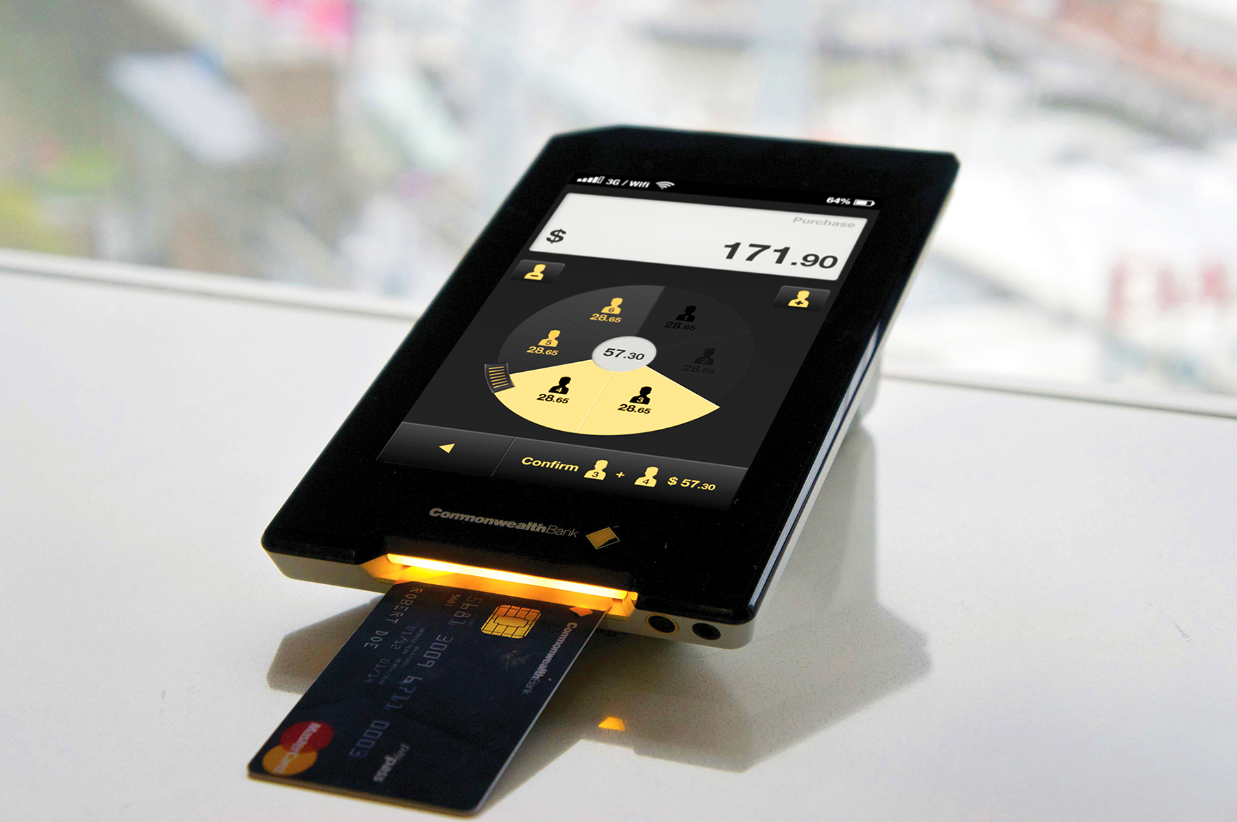
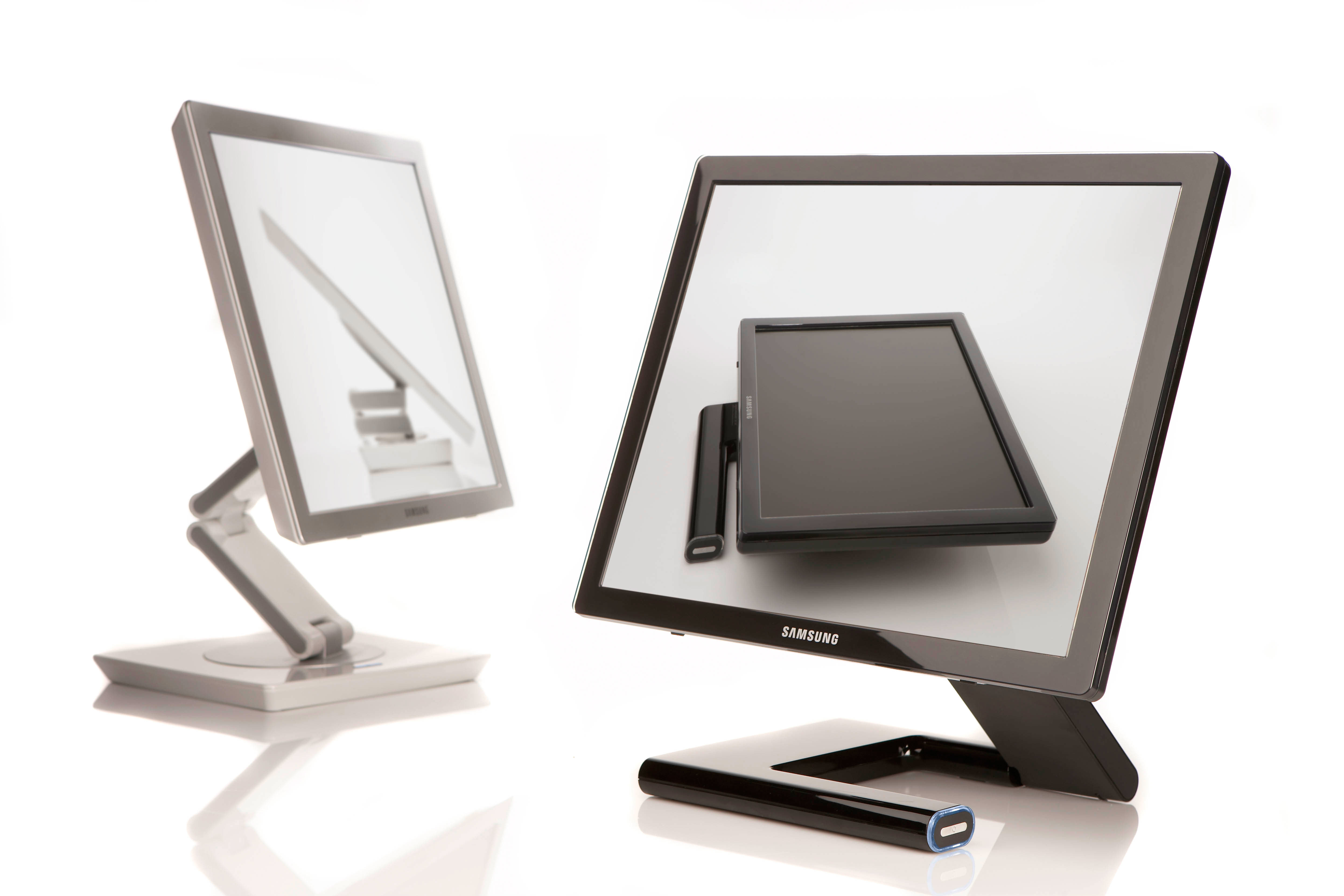
Commonwealth Bank of Australia was interested in helping customers and businesses build close connections. They believed the way to do this would be by creating richer interactions around different forms of payment. The bank approached IDEO to explore these opportunities, and the result is a new retail business platform—Pi—and a portable payment device—Albert.
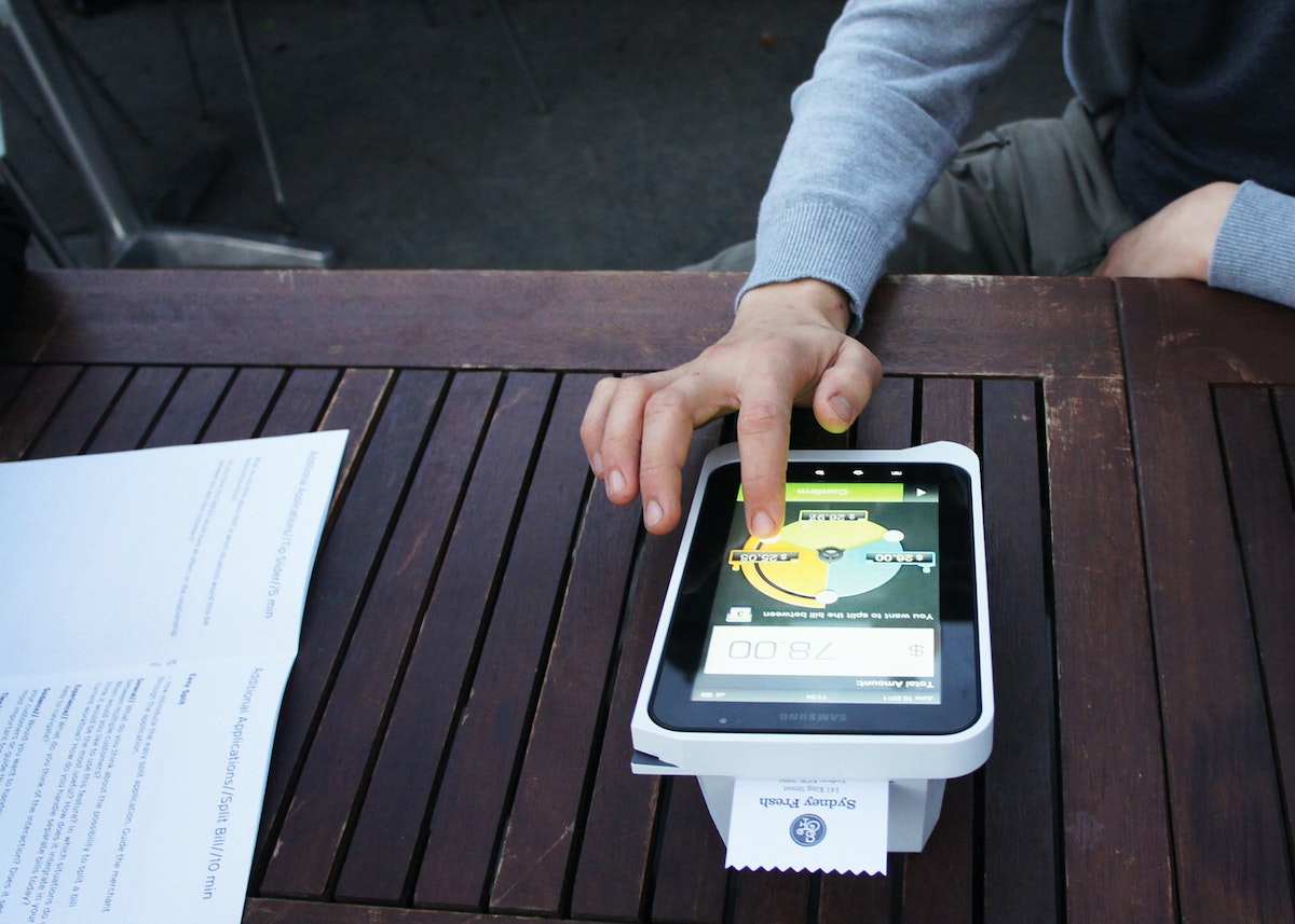
Pi brings a new level of flexibility, functionality, and customization to the face-to-face interaction between a cashier and a customer, improving everything from the process of splitting the bill in a restaurant to helping a guest find more personalized experiences at a hotel.
Insights
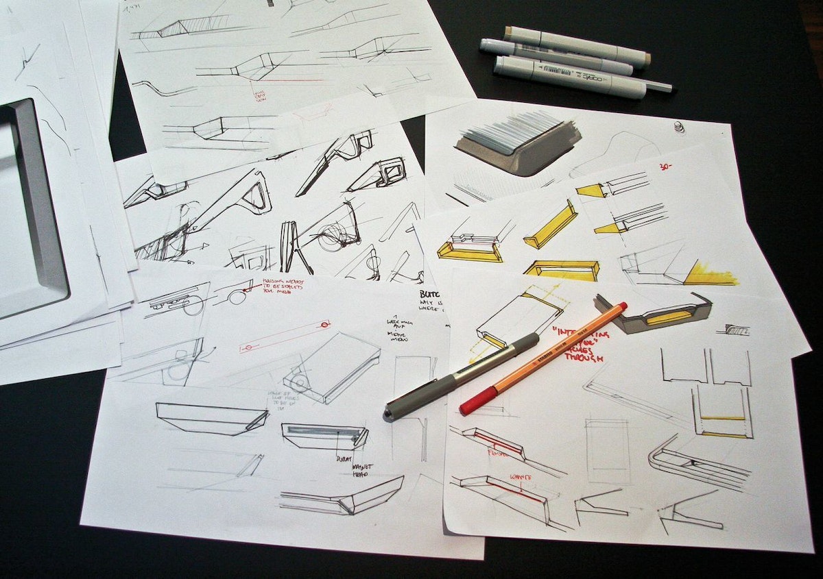
In the team’s research in Australia, the UK, and Germany, they found a few key insights that informed the design. First, they saw that an ideal platform should support the full spectrum of human behaviors around payment. Second, platforms can add value by improving the relationships among banks, merchants, and customers. And third, the payment experience should be customized to fit a specific setting, working one way in a luxury boutique and another in a gas station.
IDEO, CBA, and Wincor Nixdorf worked together closely to steward the design of Pi And Albert through product development and implementation, and to gather feedback from merchants during rapid, iterative cycles.
Results
The platform is flexible enough to benefit organizations of all sizes: Larger merchants can incorporate Pi as part of their existing network, while smaller merchants can grow their business using powerful business tools. And customers of all kinds can easily access a variety of payment methods and helpful applications.
Albert offers a large touchscreen that’s intuitive to use, the safety of virtually encrypted PIN entry, and a variety of ways to access data connections. A large battery provides power when retailers are on the go, and a modular housing means that Albert can be used in all kinds of situations. The device is built to handle current card payment methods but can also adapt to how cards might be accepted in the future, and even eliminates the need to swivel a screen from cashier to customer during the payment process.
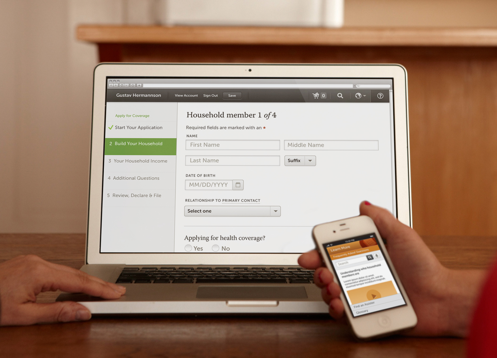
Making health insurance enrollment easy
Designing a digital platform prototype for Californians to sign up for health insurance.
Forty million Americans became newly eligible for health coverage when the Patient Protection and Affordable Care Act (ACA) was fully implemented in 2014. Some enrolled in health insurance for the first time, while others were able to get better access to affordable health coverage.
In preparation for the millions of applications, states were required to develop ways for people to sign up for health insurance online for plans that were operated by state and federal governments under the ACA. To help public and private agencies to meet the requirements, a coalition of nine national and state-based foundations, led by the California Health Care Foundation (CHCF) developed a digital enrollment prototype, and hired IDEO to lead the consumer research and design effort.
After a yearlong collaborative process, the resulting 300-page design manual and design reference prototype illustrates a customizable approach to public and private health insurance enrollment.
The flexible set of design standards developed for Enroll UX 2014 aims to make online health insurance enrollment simple, intuitive, and easy to navigate at scale.
Inspiring scientists in their research
Encouraging experts from different fields to collaborate on big ideas.
To encourage PhD candidates to think differently about how they tackle tough science problems, the University of California, San Francisco (UCSF) and IDEO embarked on a fruitful collaboration.
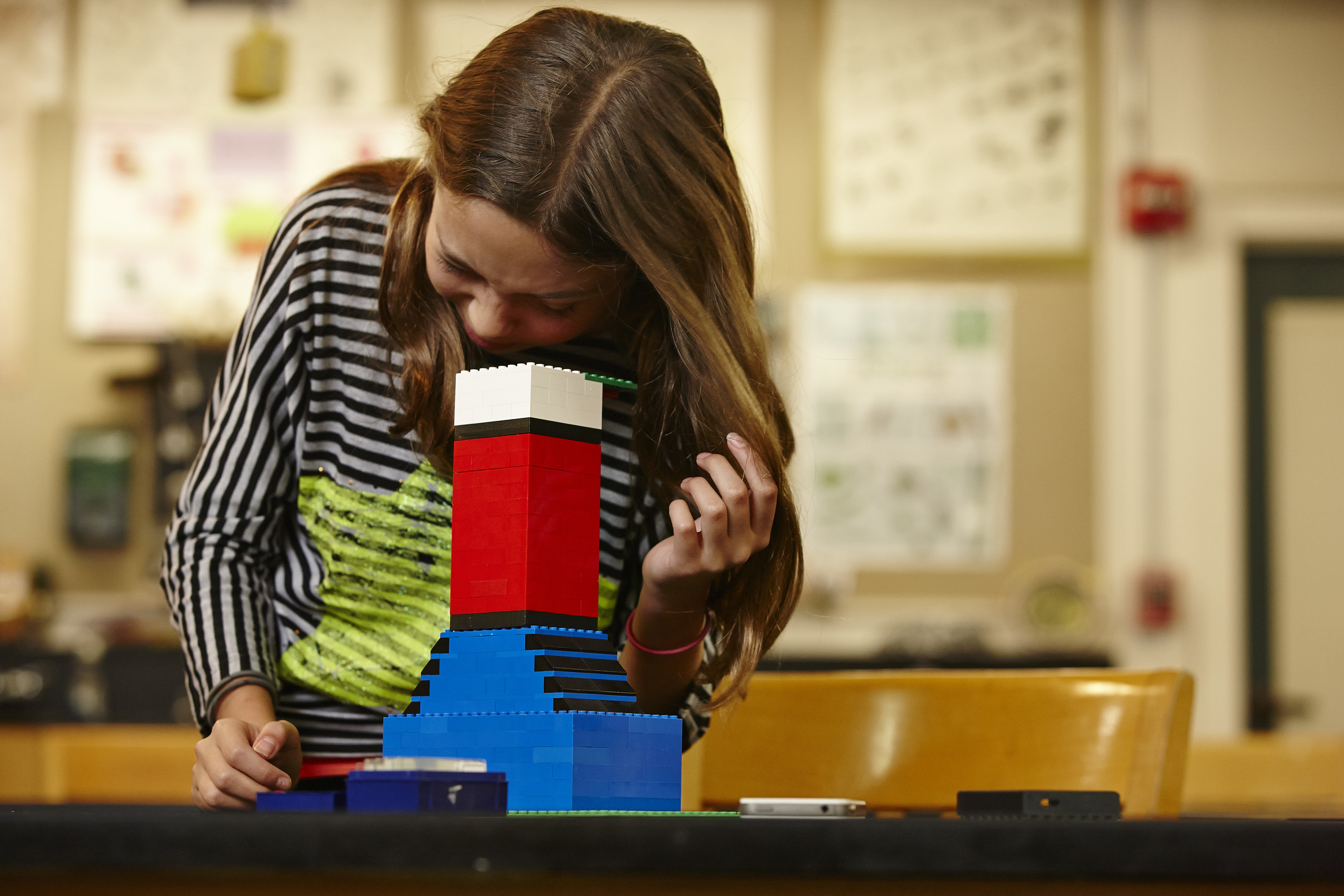
Three PhD candidates were tasked with the following challenge: Cultivate new audiences and uses for a microscope. Drawing inspiration from cell phone microscope CellScope, the trio arrived at a prototype that was less reliant on technology and easily disassembled and reassembled. How? By using the most basic building blocks: Legos.
Made of custom 3-D-printed parts and standard toy building blocks, the LegoScope, which functions as a microscope, can easily snap pieces in and out to hold different components. Both the device and the team-based process are now being used in various other campus projects to change how researchers think about conducting and advancing scientific research.
“The best work in the future is going to be done by teams of people with very different expertise, who know different things and think about things in different ways, who come together to focus on one big problem,” said Keith Yamamoto, vice chancellor of research at UCSF, who led the initiative.
Helping a tech product find its footing
A wearable device that measures concentration and focus gets a brand reboot.
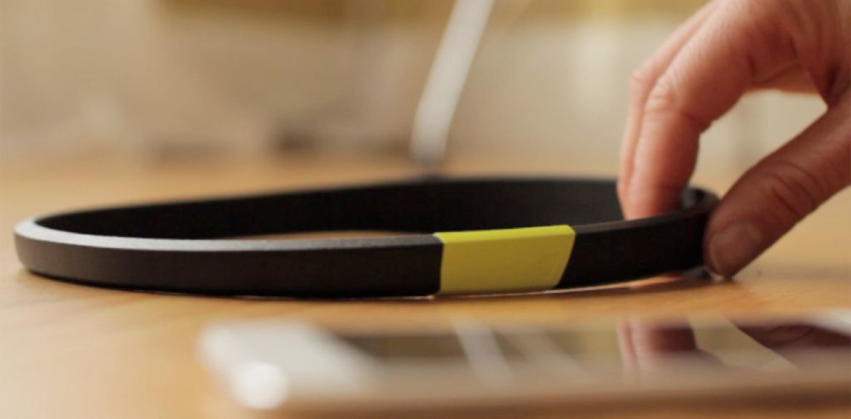
Arye Barnehama and Laura Michelle Berman wanted to take their invention—a headband that measures brain wave activity, focus, and concentration—to the next level. As a part of IDEO’s startup-in-residence program, Barnehama and Berman collaborated with IDEO on the product’s rebranding, hoping to refine and emphasize the product’s promise: When people improve their focus, they feel more mindful, confident, and productive.
With IDEO’s help, the company changed its name from Axio to Melon, delineated their brand, refined its product, developed its user experience, and prepared a Kickstarter campaign that garnered considerable press coverage. The new name, Melon, reflected the friendly, scalable character of the company. The name also suggested the intent of the product—using neuroscience data to inform a personal activity.
To distinguish Melon as a standout in the crowded quantified-self category, IDEO designers made the logo a faceted orb that references the gear-shifting mind, with “Melon” written in a distinctive font born from that same logo. The team went with fruit colors—cantaloupe, honeydew, watermelon—to evoke the sweet, refreshing experience the Melon headband promises.
Together, the Melon and IDEO teams also developed an app that shows increases in concentration after performing certain tasks and features a game in which you “fold” origami through mental focus to hone concentration.
Melon’s new brand strategy and UI set it apart from your typical fitness tracker, engaging the user in an elegant, joyful, and customized experience with every interaction.
Melon: a headband and mobile app to help you measure focus.
How to turn the familiar Into something new
6 design lessons from a Japanese art exhibition that embraces the art of surprise
Back in May, I saw an exhibition at the National Art Center Tokyo that delivered unexpected brilliance from start to finish. Hearing other visitors remark, “I really wasn’t expecting this!” as they walked through the gallery space, I knew I wasn’t the only one.
How do you go about creating something unexpectedly brilliant? What triggers that kind of experience? Here are some learnings I had from visiting the show:
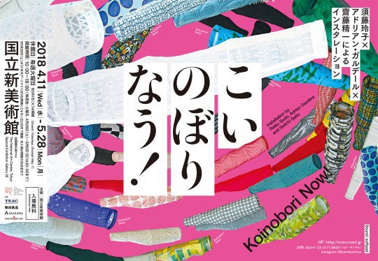
1. Disarm your audience with familiarity
This installation was created between renowned textile designer, Reiko Sudo; exhibition designer, Adrien Gardère; and Seiichi Saito from Rhizomatiks. The creators are famous, but the exhibition title, Koinobori Now!, communicated something common and familiar, with a hint of pop. Koinobori is the Japanese word for the carp streamers that appear as part of Children’s Day celebrations in Japan every spring. Nau is the Twitter-bred Japenglish word used for anything happening ‘now.’ The title Koinobori Now! is so direct it almost sounds like a children’s exhibition; everyone thought they knew what to expect. It was also a rare instance where NACT hosted a show for free, welcoming an exceptionally diverse audience.
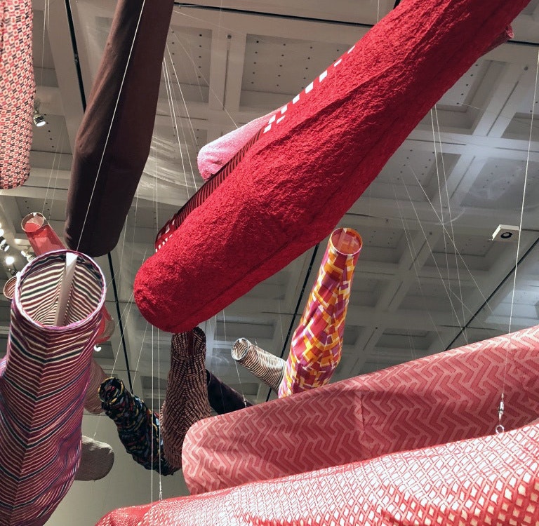
2. Reference conventions with disruptive edge
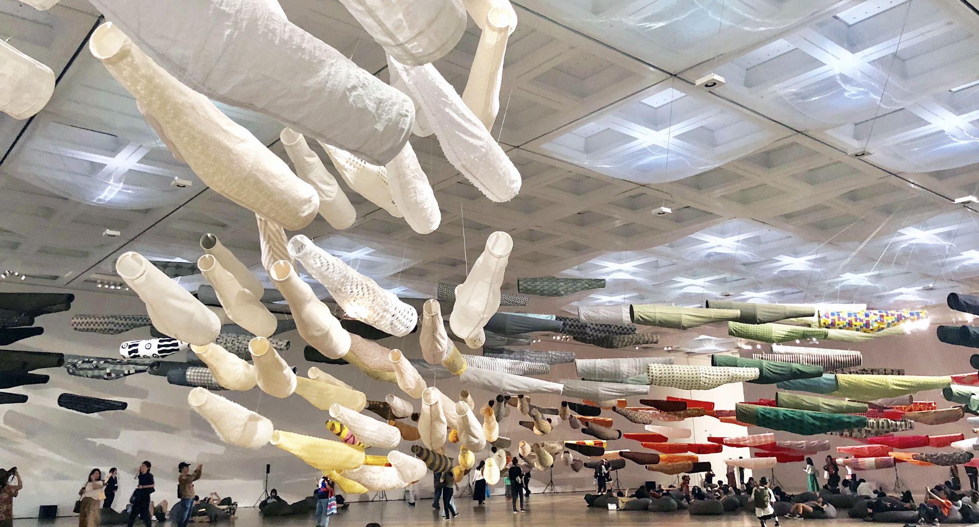
In reality, the show was much more than just a seasonal parade of modern carp streamers. Rather, the streamers served as inspiration and as a medium for presenting the textiles designed by Sudo and her company, Nuno. Gardère mentioned in an interview that as with any textile exhibition, the challenge was to showcase the works in a way that brought them to life in the absence of the human body. He looked for inspiration in the ways in which textiles lived and breathed in Japanese traditions—on this occasion, carp streamers. But instead of following the structure and styling traditionally used in koinobori, he reinterpreted it to be more structured. From the flat fish shape, he removed the fins, tails, eyes, and scales, and added backbones and rib cages so the carp would hold their shape. The resulting koinobori was something that looked familiar yet novel.
3. Give your audience the freedom to engage
This was the first time that the NACT took down all its partitions to create one large space for the installation. Everything was kept open between the work and audience.
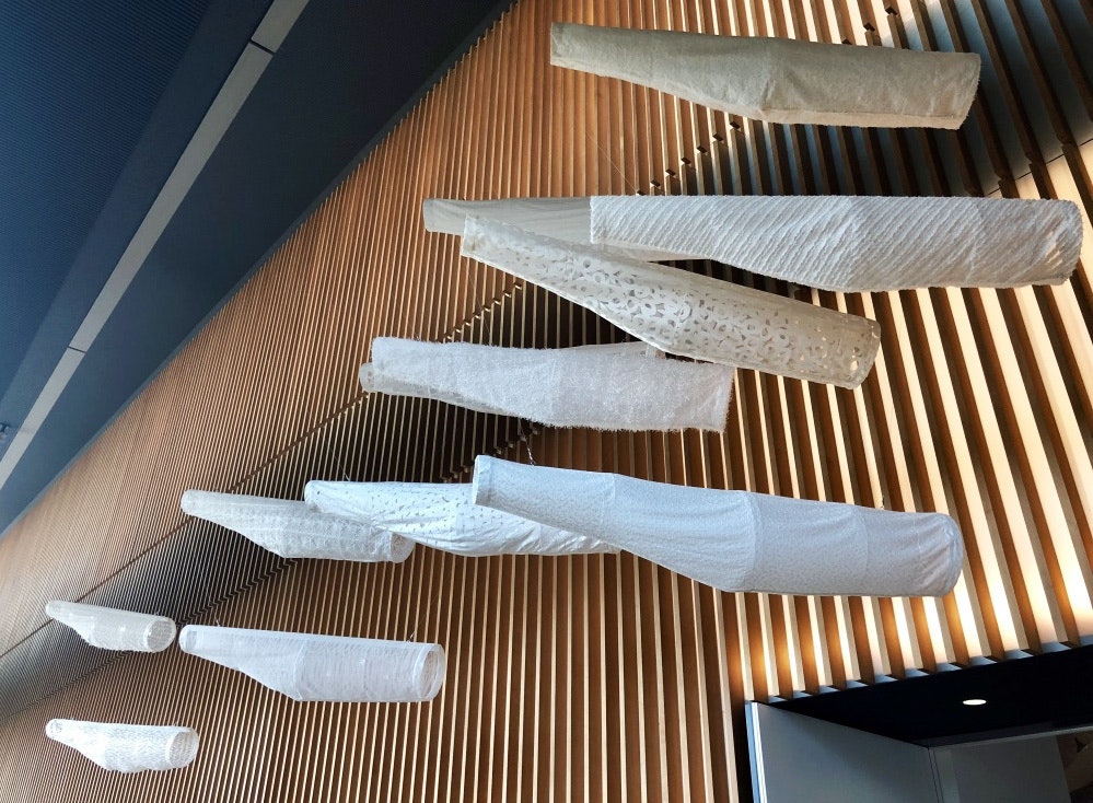
A school of white carp streamers floated by the entrance like phantoms beckoning people into the exhibition. Following them in, the room opened up to reveal over 300 textile carp swimming through the air in a sweeping gradation of colors. The mesmerized audience was free to wander, take photos through the carp streamers, and lay down on Muji bean bags to absorb the show at their own pace.
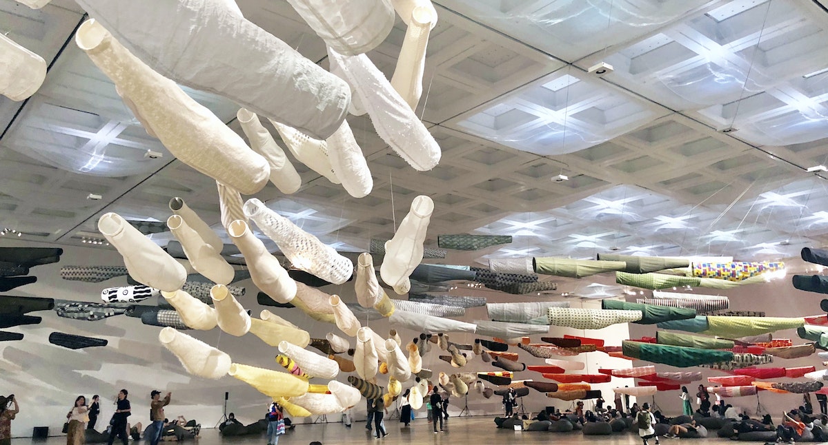
4. Let your theme go beyond objects to permeate the space
A lot of thought also went into the less noticeable parts of the exhibition. Saito from Rhizomatiks contributed to the environmental design by leveraging air flow and light sources. Small fans were set up on the ceiling, with shifting spotlights positioned alongside to create shimmers and ripples on the translucent fabrics The lights also cast shadows of the carp streamers onto the wall and floor.
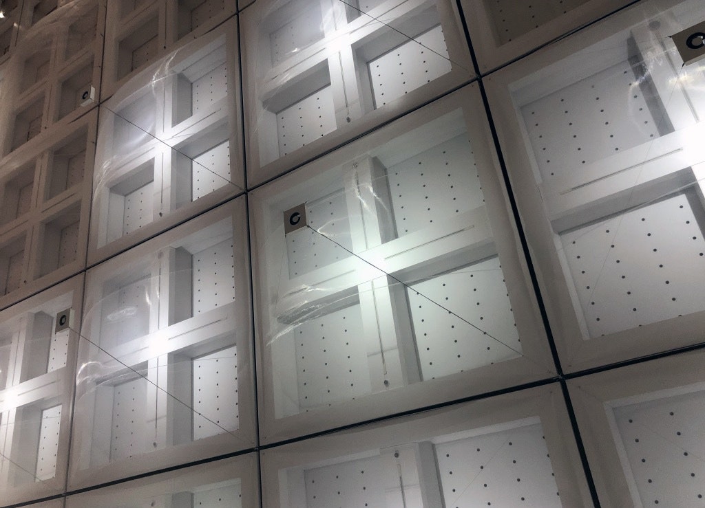
It was a subtle gesture that made the audience register a dynamic flow throughout the room, and gave the carp streamers a current to swim in. Together with the ambient soundscape by Softpad, the exhibit came to life.
5. Interlace sensory experience with informational storytelling to trigger curiosity and imagination
The exhibition could have easily ended here, but a small space at the back revealed the backstory behind the show. Video monitors played interviews of the three main collaborators as well as Nuno’s beautiful production videos. A make-your-own-carp workstation held fragments of patterned paper for people to craft their own streamers. And a long rack of textile samples lined the walls.
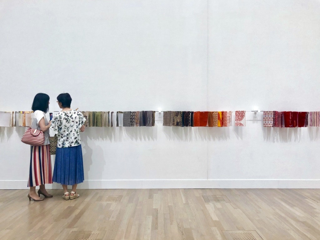
Here, all 300-something textiles designed by Sudo for the installation could be seen up close, touched, and read about in detail. Each textile had a background story. Here were two of my favorites:
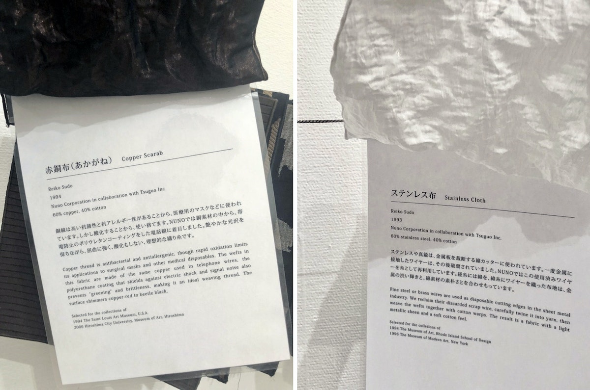
I learned through reading these stories that Sudo is famous for reusing and repurposing unconventional materials to create textiles that challenge the existing conventions.
Once you uncover these stories and return to the larger exhibit space to make an exit, the same installation begins to take on different dimensions.
6. Work in collaboration with others
One final learning from this exhibition—what made it so unexpectedly brilliant—was the way the collaboration between the creators materialized as a sort of alchemy, elevating each individual contribution into a magical whole. Sudo’s textiles, Gardère’s exhibit design, Saito’s space design, and NACT’s curation reacted to and considered one another, orchestrating a holistic experience beyond single objects, addressing themes beyond individual expertise, and creating something relevant and surprising for everyone.
*Exhibition flyer taken from Studio Adrien Gardère. All other photos taken by the author with permission from NACT.
What separates a great cultural experience from a truly memorable one? An element of surprise. Unexpected brilliance sticks in your mind, and the memory becomes something you can return to for inspiration.
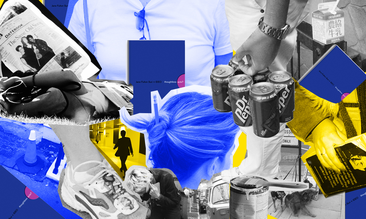
Thoughtless acts: Clean plate club
Thoughtless Acts: Clean Plate Club. The intuitive ways we adapt and react to things in our environments
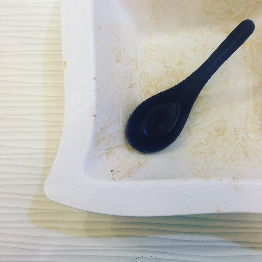
It doesn't look like much, but this spoon/bowl combo was a satisfying dining experience. Not long ago, I visited a college cafeteria that had several different stations, each with a different kind of plastic cutlery. Someone suggested that I use a plastic spoon from one station with a bowl from another, because they had observed over time that the inside radius fillet of this bowl perfectly matched the outside radius curve of the spoon. This way, your spoon always scraped the corner of the bowl clean. They had gone so far as to make sure there was always a supply of spoons at the the other counter, to make sure they could use them with the mis-matching bowl.
Human-centered design requires us to observe human behavior with beginner's eyes, so that we can spot the innate ways people interact with the world around them. We call these intuitive and unconscious reactions Thoughtless Acts, and IDEO designers collect photos of them to inspire their work.
To make sense of messy research, get visual
“Sketch synthesis” is a way to make sense of research data and share that sense with others
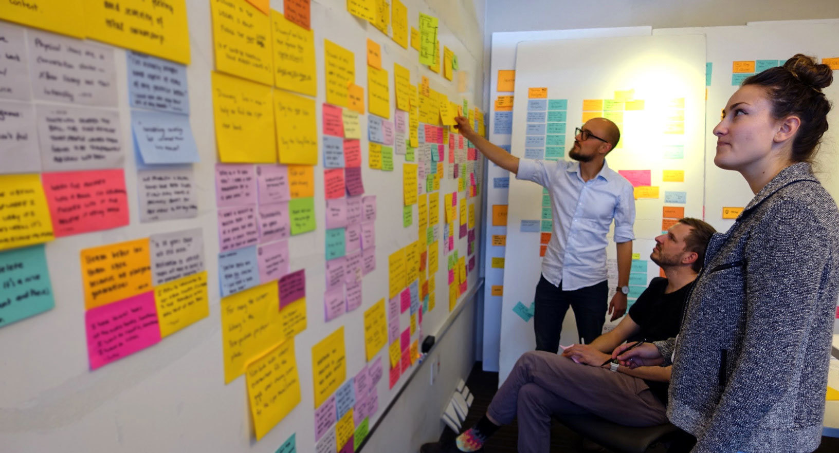
We’ve brought back thousands of photos and videos and hundreds of Post-its. As we stare at the sea of notes, I feel stuck and a little panicked. Are there answers in this data soup?
This messy moment in the design process is called “synthesis,” when designers start to distill all our research into tangible possibilities. Synthesis can feel ambiguous, stiff, and chaotic all at once; the secret is to keep moving forward any way you can.
My way of conquering the chaos is a method I call “sketch synthesis.”
Here's my sketching process for this project, which you can adapt for your own team.
Step 1: Pare it down
First, I put the notes from each research interview, observation, or experience onto separate poster boards. Then, I took a step back and distilled the information from each of these boards into just four or five sketched post-its.
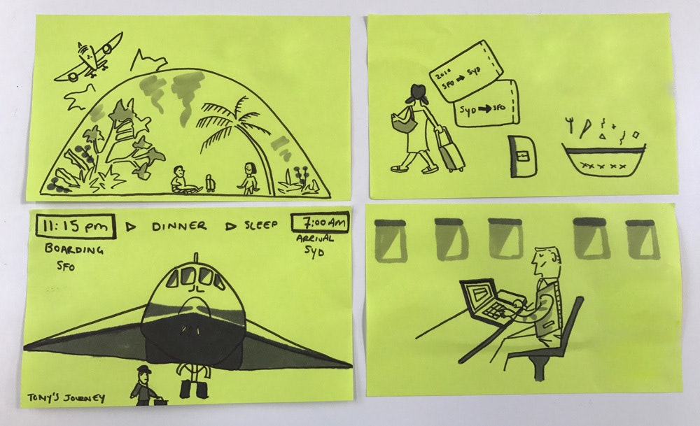
These sketches are from our interview with an extreme commuter. The express his ideal travel experience: an environment that brings the outside in and serves as an extended coworking space.
Sketches can feature characters, icons, or graphs—anything that provides a helpful cue for you. You don’t need to be a great artist to sketch. The idea is to summarize what you’ve learned visually, even if those visuals are stick figures!
Step 2: Cluster it up
Next, I took another step back and turned my individual sketches from each poster board into a series of sketch clusters, grouped around emerging themes.
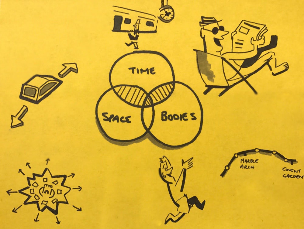
This cluster is focused on the theme of "place." It's a mind map of sorts, featuring images that represent a range of experiences, interviews, and secondary research we uncovered related to the theme.
Don’t be afraid to discard the ideas that aren’t standing out. The aim of this step is to sort and refine what you’ve learned, using sketching as a filter.
Step 3: Talk it through
I invited the rest of the team to review the sketch clusters with me. Working together, we turned the clusters into concrete design questions that could help us get tangible, fast.
The goal is to share your sense-making with others to figure out if you’ve captured the essence of the research, or need to go back to your original poster boards and find the missing thread that ties it all together.
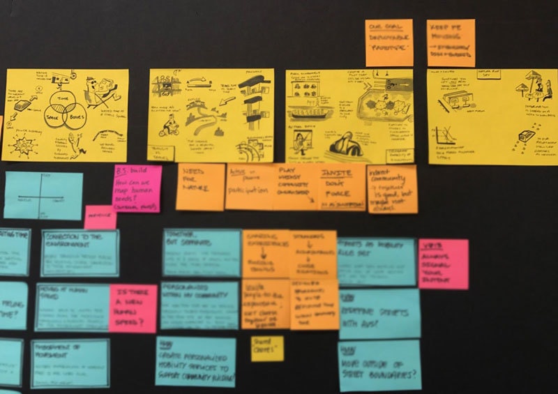
These sketch clusters helped the team gather our thoughts and articulate the questions we hoped to explore with our client in the next phase of the project. They captured our research insights and pointed the way to new transportation innovations.
For me, sketch synthesis is a way of bringing clarity and momentum to tough moments in the design process. Plus, drawings are a natural starting point for design, which the team can build on and our clients can easily understand.
Sketching also creates a common language for designers to communicate. At IDEO, people come from all around the world. On this team, I worked alongside designers from Germany, South Korea, France, and the U.S.
While I’m drawn to sketching, you might have a natural inclination to express yourself through role play, writing, film, or data. There are no limits to the creative problem-solving skills that might help your team synthesize.
The secret is to keep moving toward the answers, even when things feel messy—and to have a little fun along the way.
This post was adapted from a talk I presented for Mixed Methods, hosted at Airbnb in San Francisco.
It’s Monday morning and our design team is back after three weeks on the road researching the future of shared vehicles. We've soaked up a ton of inspiration by talking to transport experts and observing commuters.
How we can help technology to be good
Our technology should bring out the best in us
As someone whose profession is to design new experiences with technology, I find this thought-provoking. It’s a current and widely-experienced example of something that has always been true of new technology: It has as much potential to have negative impact as positive. Which way it goes has always been more about the path that we put the technology on than the technology itself.
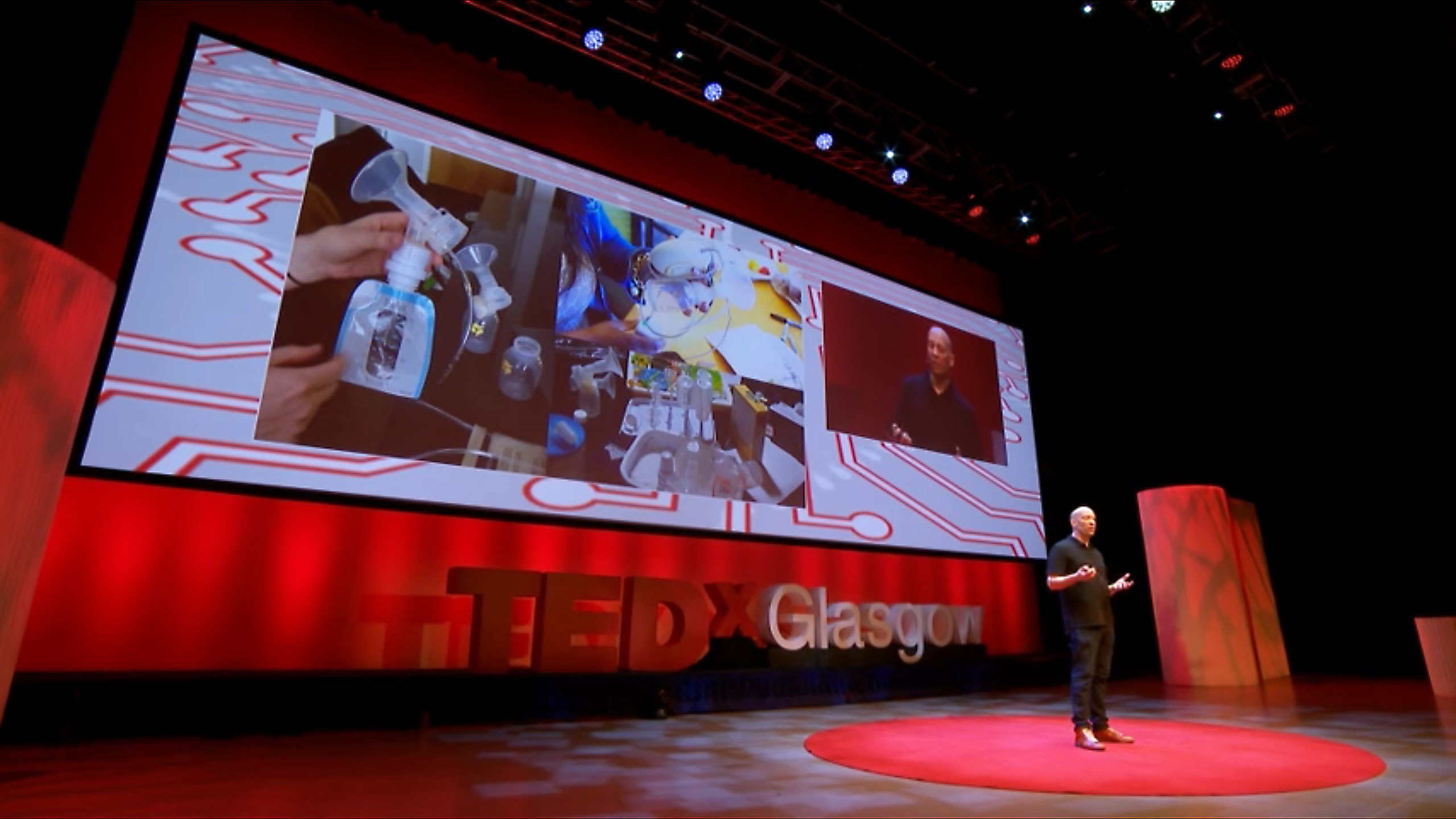
When I was asked to speak at TEDxGlasgow this year, I took the opportunity to explain how design can help. There are straightforward things that we can do to make sure that our technology brings out the best in us. Watch my talk below.
David Webster speaks at TEDxGlasgow.
We all have love-hate relationships with those buzzing bricks of aluminum in our pockets. On the one hand, they have the incredible power to connect us to people, information, and knowledge. But on the other, that constant access can become constant distraction, detaching us from real moments that matter.

Lindsey Turner
I’m passionate about building brands, products, and experiences that help organizations show up with meaning and momentum.
I help organizations cut through complexity by shaping how they show up, through brand strategy, identity, and storytelling.
Working at the intersection of brand and business, I bring an editorial eye and a bias toward making—turning ideas into tangible experiences that people can understand, trust, and believe in.
My work spans government, healthcare, financial services, media, and consumer goods, from launching Gen Z-focused ventures to building innovation labs and reimagining legacy brands. I relish moments of ambiguity and enjoy translating across teams, perspectives, and priorities to move ideas forward.
I started my career in editorial and digital design, shaping cross-platform experiences and identity systems in publishing and agency environments. That foundation still shapes how I work today: I’m detail-oriented, collaborative, and overreliant on the Oxford comma. I hold a BFA in Visual Communication from the School of the Art Institute of Chicago.

Rachel Young
My work helps organizations see who their products aren't working for—and build the will and the tools to do something about it
For 25 years, I've asked the same question: Who does this design exclude—and what are we going to do about it?
My work spans human-centered strategy, inclusive design, and qualitative research, with clients ranging from Microsoft, Google, and Verizon to the National Science Foundation, and San Francisco Unified School District.
Before IDEO, I taught elementary school in East Palo Alto and spent a decade doing design work with social service organizations—where I learned firsthand what it costs people when systems are built without them in mind.
I am currently writing User Error, a nonfiction book about digital access and the design decisions behind it. I live in Oakland, California.

Brian Pelsoh
I lead with craft, ensuring our work is creatively excellent: rooted in deep human insight and imagination, while also grounded in the realities of business and technology.
My expertise spans brand, communication, and product design across tech, education, the arts, and social impact.
I believe great work demands both high-level vision and obsessive attention to detail, and only happens through collaboration.
I bring an inclusive, hands-on approach and a deep understanding of business, which enables me to consistently deliver excellence while always asking why.
Before joining IDEO, I worked at the brand firms Pentagram and VSA Partners. I began my career as a designer, leading teams at the School of the Art Institute of Chicago and the Milwaukee Art Museum. I hold an MFA in graphic design from Maryland Institute College of Art and a BFA in communication design from the Milwaukee Institute of Art & Design, and have taught at some of the best design schools in the US.

Tony Wong
I am responsible for IDEO’s long-term success in China and working with clients to use design as a tool to enable growth.
I am responsible for IDEO’s long-term success in China and working with clients to use design as a tool to enable growth. Specifically, I have helped Chinese companies design holistic brand solutions through the development of their products, communication, services, and innovation teams, and I have helped multinationals expand their presence and influence in China.
I advise global leaders on developing China-led innovation and capabilities.
In over 15 years in IDEO Shanghai, I have worked on projects that use design to elevate the quality of the experience of healthcare products and services, streamline processes that increase productivity, create spaces and programs that promote and enable inclusive communities, and build next generation mobility solutions that are planet-positive.
Before joining IDEO, I worked at Philips Electronics and the Electrolux Group in Italy, the Netherlands, and Singapore on a number of breakthrough commercial products. I am a member of the Young President Organization in Shanghai.

How to use AI as an editor, not a writer
Ed White shares how he uses AI as an editor—not a writer—to sharpen storytelling, rehearse ideas, and preserve the productive friction that makes creative work better.
Ed White has a rule he's tested on his own writing: hold yourself as the writer, and let AI be your editor. Ed is a Senior Design Director at IDEO's London studio, where he co-leads the firm's AI portfolio across Europe. Before IDEO, he spent 12 years as a writer and editor at the Financial Times, Wired, and Contagious. So when he talks about when to use AI for storytelling and when not to, it comes from two decades of crafting his storytelling skills.
In this episode, Mina Seetharaman talks with Ed about two specific tools he uses to keep AI in an editor's seat: a "roasting agent" prompted to critique his drafts without any sugarcoating, and a simulated audience he rehearses pitches on before the real thing. They also get into what Ed is hearing from design leaders at Anthropic, Lovable, Shopify, and Google Creative Lab about how creative work is changing, and why he thinks the friction of writing something yourself is worth protecting rather than automating away.

Building a personal AI for the messiness of life: Sida Li
Becca Carroll talks with Cue co-founder Sida Li about designing a personal AI for the messiness of everyday life—not just work. They explore how Sida stays anchored to human needs while navigating fast-changing technology, product tradeoffs, business-model experimentation, and the realities of building an AI company today.
Most AI products today are built for work—a space with clear problems and established systems. One founder noticed a gap: personal life is messier, harder to systematize, and mostly left behind by the AI boom. So she built Cue, a personal AI that lives inside iMessage and group chats, to go where the other tools haven't.
In this episode, Becca Carroll, IDEO's Chief Strategy Officer, talks with Sida Li, co-founder and CEO of Shared Context Lab, about staying anchored to a human need while the technology around her keeps changing shape, why she treats her business model with the same rigor she'd bring to a product, and what it feels like to build a company at this particular, disorienting moment in AI.
The conversation also gets into how Sida makes design decisions: the language Cue uses to describe itself, the tradeoffs behind building inside iMessage instead of a new app, and a real story about a business idea that didn’t pan out.
This is the second in a two-part series profiling founders from IDEO's Startups-in-Residence program. The first conversation is with Johannes Seemann, founder of Sooner, on designing GenAI for the emotional side of money.

Designing GenAI for the emotional side of money: Johannes Seemann
Designing financial tools around the feelings that shape money decisions.
Most personal financial tools are built to run the numbers and optimize towards a budget. While that works for some, most people experience money as a lived relationship that does not neatly fit into a spreadsheet. Johannes Seemann and Becca Carroll discuss why money is emotional before it is mathematical, and what a human-centered approach to building a generative AI financial product looks like in practice.

The curious leader's edge in uncertainty: Scott Shigeoka
How genuine curiosity helps leaders navigate uncertainty with greater confidence.
Mina Seetharaman talks with Scott Shigeoka, author of Seek and Head of Curiosity Cultivation at the Eames Institute, about what distinguishes genuinely curious leadership from performative curiosity, how power dynamics shape curiosity, and why practicing curiosity can restore energy rather than drain it.
Looks like you might be in search of something very specific?
Or reset the filters above and try another angle.
Here’s some random inspiration

Podcasts about creative leadership

Articles about the power of prototyping











.jpeg)



.webp)
.jpeg)