.svg)


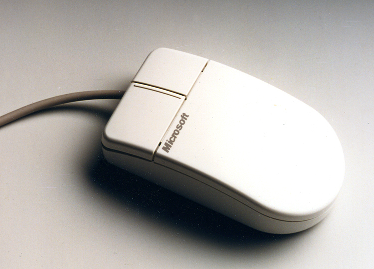

A hand-friendly, precisely controlled mouse
Ergonomic mouse design for better control and performance.
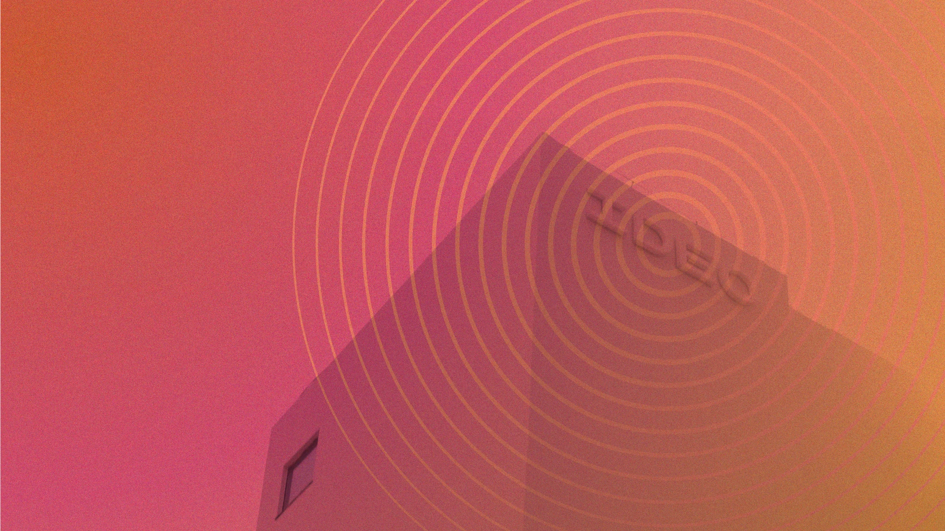
In 1987, the three companies that would later form IDEO worked together with Microsoft to create the world’s first ergonomically designed mouse. IDEO’s human factors research suggested a small but significant change: Moving the location of the mouse ball forward, from under the palm to under the fingertips, enabled more precise control and resulted in measurable performance differences compared with earlier models.
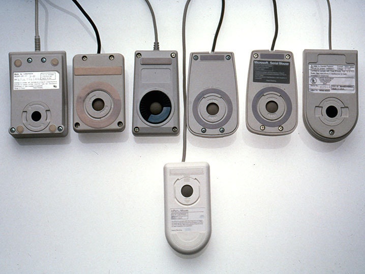
The industrial design effort examined and tested dozens of shapes in comfort and aesthetic studies that led to the famous “Dove Bar” form, a significant advance over the boxy mouses prevalent at the time. The resulting clean appearance, enhanced control, and improved reliability created enormous consumer appeal that replaced all earlier versions, and Microsoft sold more than 2 million units in its first two years.
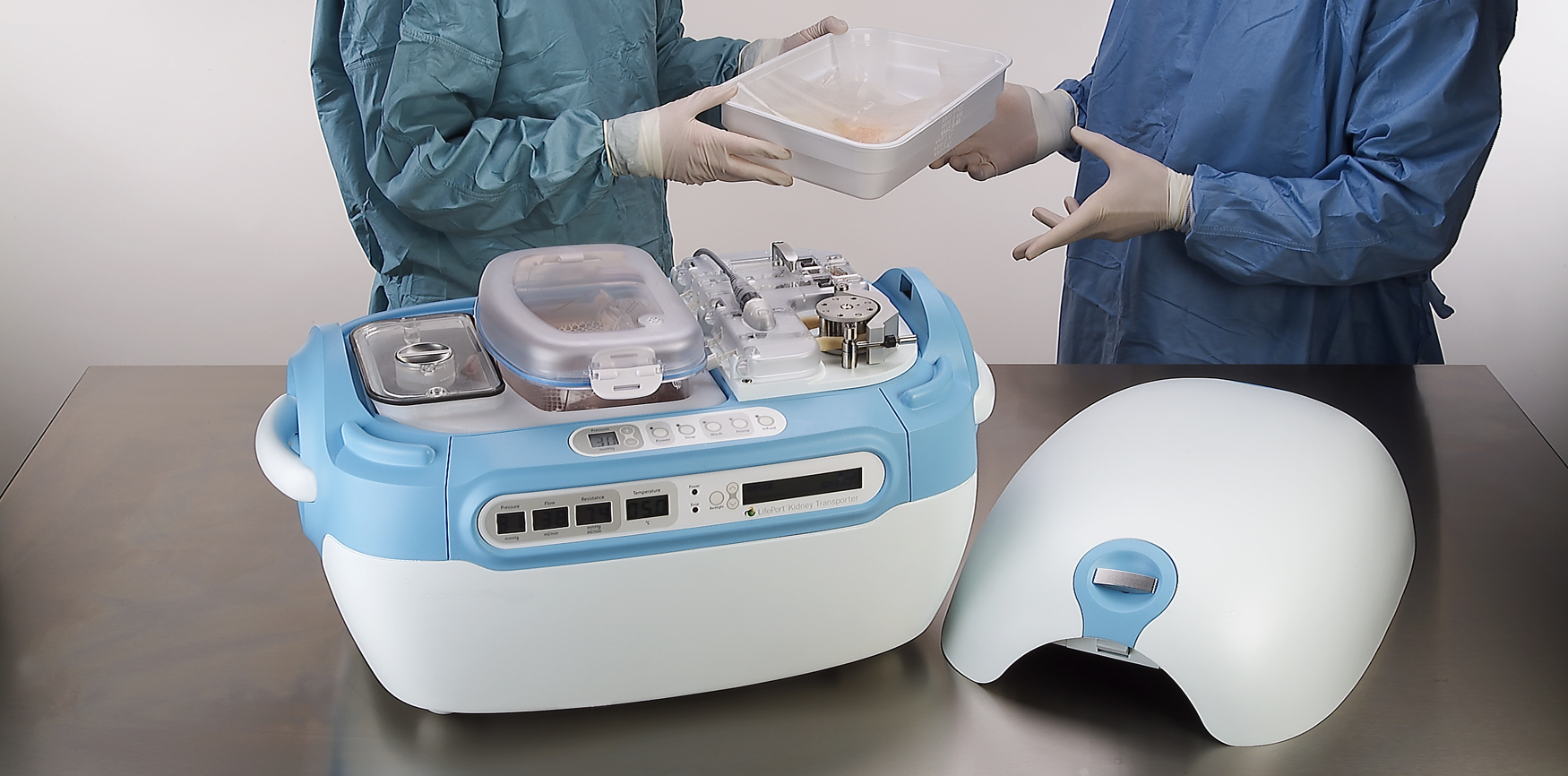
A high-tech kidney delivery system
A new standard in organ transport systems delivers kidneys in improved condition.
With approximately 55,000 Americans waiting to receive kidneys and a list that could double in the next 10 years, there is an acute and urgent need for new technology to increase the quality and number of organs available for transplant. Using the conventional method of organ storage and transportation—a cooler filled with ice—doctors and nurses needed to accompany the organ to ensure proper handling.
IDEO and Organ Recovery Systems created the LifePort Kidney Transporter to provide a new high-tech alternative. The LifePort gently perfuses, or pumps, the kidney with a cold liquid solution to improve its condition before transplantation, which can nearly double storage time and may increase the number of usable kidneys and improve patient outcomes. The device also provides critical data to monitor and evaluate kidneys during transport.
Organ Recovery Systems believes that perfusion has the potential to remove tens of thousands of patients from the waiting list and dialysis, and save the healthcare system more than $1 billion annually. In 2006, the LifePort Kidney Transporter was used to transport 350 kidneys per month in 12 countries, and was included in the permanent architecture and design collection at the Museum of Modern Art in New York City.
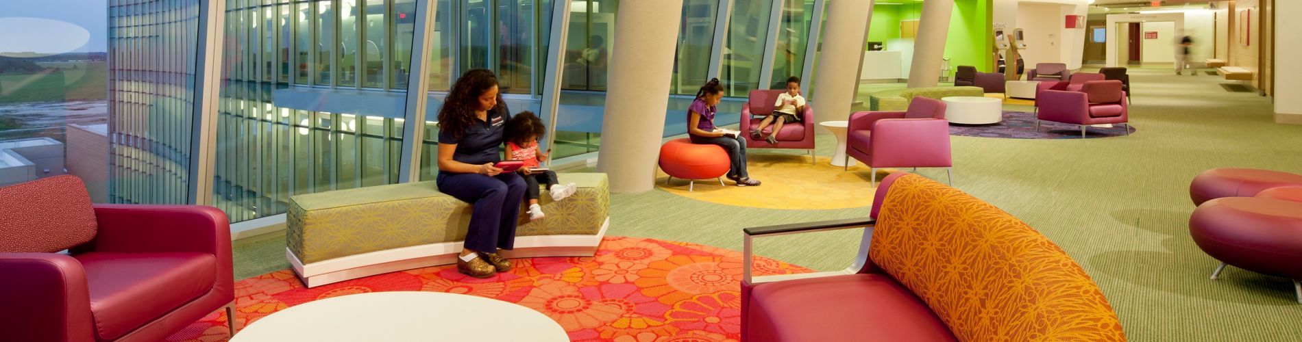
A hospital centered on the patient experience
Designing a pediatric hospital for children and parents.
Pediatric healthcare system Nemours provides primary, hospital, and clinic-based specialty care, prevention and health information services, and medical education programs in Delaware, Florida, New Jersey, and Pennsylvania. When Nemours wanted to strengthen its brand, it faced two challenges: Empowered patients had more access to information and choice than ever before, and new players—alternative-care centers, retail-based care clinics, and urgent-care centers—were entering the marketplace, diverting market share.
Nemours approached IDEO for help in creating an innovative, differentiated, and patient-centric experience for a new hospital in Orlando, with the goal of establishing Nemours as a destination care provider and industry leader. Together, they identified and clarified both family needs and key experience touchpoints in the patient journey, resulting in the state-of-the-art-designed, 60-acre, $400 million Nemours Children’s Hospital in Lake Nona Medical City, Florida. “The design team’s approach to defining key moments in the patient journey was highly instructive,” said Dr. David Milov, chief of clinical informatics at Nemours. “They captured insights otherwise unavailable to us.”
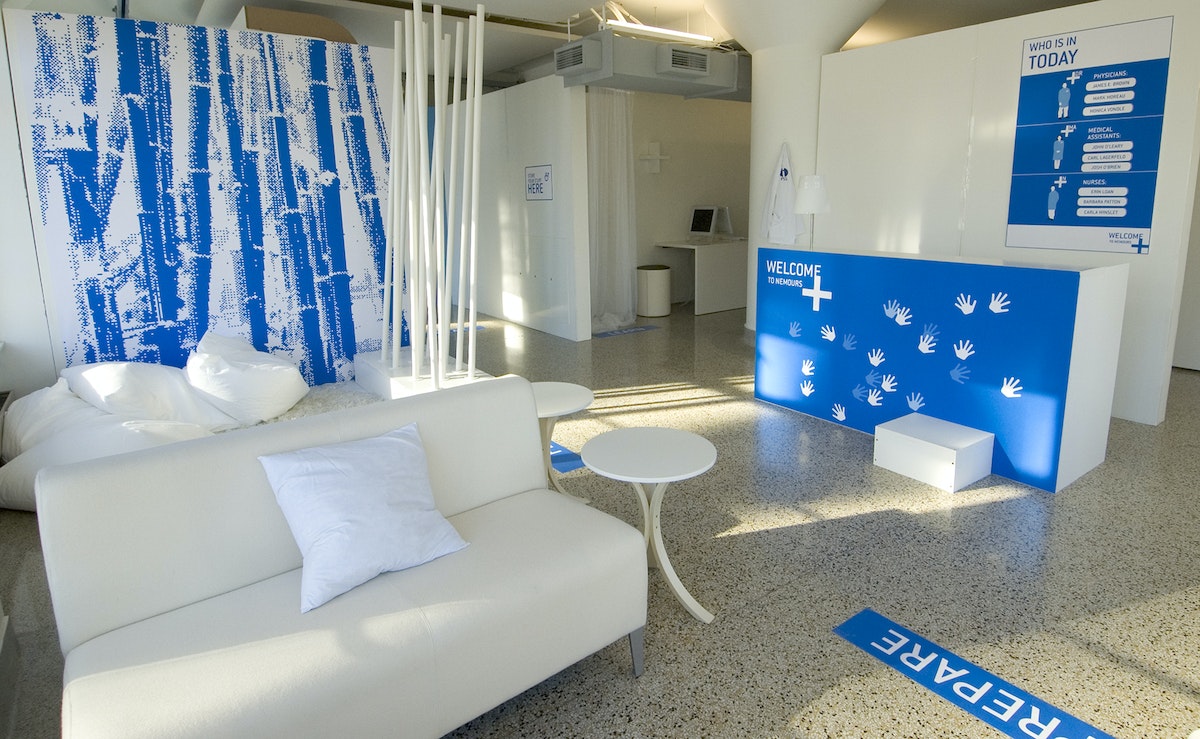
Concepts that were realized in the hospital’s final design include:
- Care Team Room ID: Patients and families are introduced to each member of their care team to ensure continuity of care.
- Floor Greeters: Concierge-like greeters welcome and orient families and answer questions.
- Family Lounges: Private dining rooms have kitchenettes, so families can cook and eat together.
- Emergency Department: Patients are greeted, sorted by medical condition, and immediately checked into rooms.
- Patient Information Screens: Doctors and nurses can access patient information prior to entering an exam room to enable informed conversations and build trust.
- Smart Bracelets: Personalized RFID-enabled bracelets keep track of the care team.
- Smart Rooms: Triggered by the Smart Bracelet, Smart Rooms “welcome” the patient upon entry.
To arrive at these designs, IDEO sought inspiration via analogous kid-friendly environments, such as museums, schools, toy stores, and zoos. Designers also conducted in-context interviews with patients, parents, families, doctors, nurses, support staff, and outside physicians. One key insight that led to the final design: Patients and families came to Nemours with varied levels of experience—first-timers, occasional visitors, and those who were chronically ill—but the hospital treated them all the same.
To address these needs, the team created an experience blueprint focused on welcoming, guiding, and supporting patients and families through unique environments, integrated service moments, and market-differentiating spaces and tools. To test the look, feel, and value of the designs, designers built full-scale foam core prototypes of welcome stations, waiting lounges, and exam rooms.
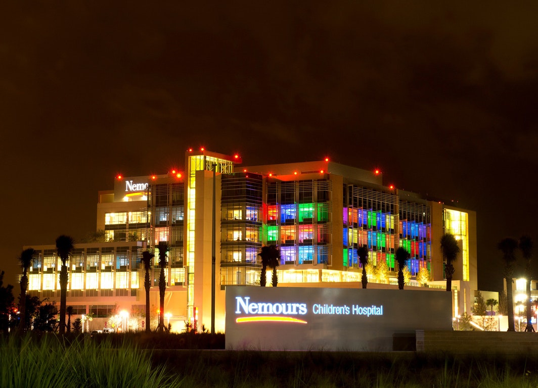
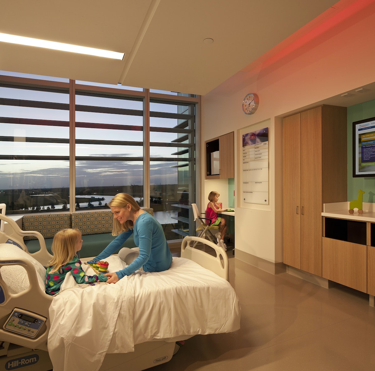
The results appeal to patients, families, and caregivers. According to Dr. Lane Donnelly, Nemours chief medical officer, “all the amenities at Nemours focus not only on the child but their parents and families as well.”
The hospital won two awards at the International Interior Design Association’s 2013 Best of the Best Gala (Georgia Chapter), one for the Healthcare Design category and one for best overall out of all 11 categories. Parenting.com writer Shawn Bean noted, “Set amidst a wooded expanse of central Florida, with theme park roller coasters peppering the horizon, Nemours Children’s Hospital is arguably the new high water mark for pediatric care in the United States.”
A global design movement led by children
A contest that teaches design-thinking skills to millions of kids across the globe.
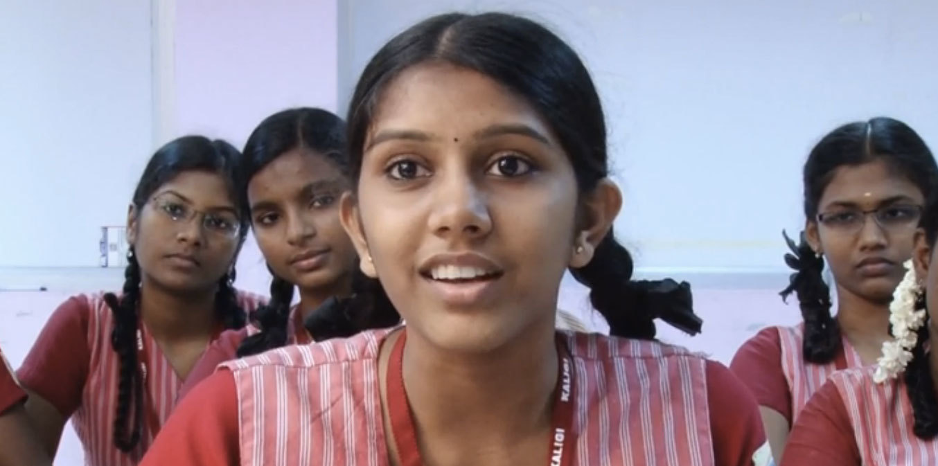
Designer turned educator Kiran Bir Sethi wanted to blur the boundaries between school and life to help young students become aware, enabled, and empowered to effect change in the world. In aiming to spread her message to millions of children across India , Sethi tapped IDEO and the d.school at Stanford to help create a design contest for youth that would show them that they could make a difference in their community.
Together with the d.school, IDEO designed a competition for middle school students called the Design for Change Contest. Adapting the human-centered design approach into a simple process that 10- to 13-year-old kids could follow on their own, the contest included rules, tools, and platforms that would be accessible to children and teachers throughout India regardless of their previous exposure to design.
The team shaped the rules so that students could learn core design-thinking skills such as empathy, brainstorming, collaboration, and reflection through the process of participating in the contest. And together, the group developed a toolkit to walk students through the simple four-step process.
The biggest challenges to the contest were overcoming the lack of infrastructure, language barriers, and a discrepancy in school resources. There was no national database of schools for easy outreach, so Riverside built relationships with NGOs across India to distribute the contest toolkit to more than 30,000 schools.
The contest receives about 2,000 entries from groups of youth in India each year. They have been addressing challenges such as illiteracy, pollution, traffic safety, care for the elderly, alcoholism, and the environment.
As of 2015, the Design for Change Contest has scaled far beyond India, and is being run in 30-plus countries, with millions of children participating. Each contest entry shows that kids really can make a big difference in the world.

How We Did It: GIF Dance Party
Coding the Internet's best party
Over the last three years I have been creating interactive experiences that bring some of these unexpected moments back to the Internet by putting emphasis on smiles and little else. No clients, no social media sharing, no analytics, no SEO, no log-in, no users, no brand, and no monetary objectives—smiles have become my motivation and my currency. Late at night, I stare intensely into my glowing rectangle, firing code into it, and imagining how I might turn the drab, emotionless faces of everyday, seen-it-all web surfers into expressions of delight.
While there are a number of projects on my site Fuzzy Wobble Dot Com that exist in the “smiles-as-currency” domain, I am going to share one of my favorites with you today: GIF DANCE PARTY. The name should give you a hint as to where this is headed…
The animated GIF was invented in the late '80s, but when GIF DANCE PARTY began back in 2012, they were still primarily used in blinking web banners for sleazy ad campaigns. Tumblr was the only mainstream site at the time with a GIF vernacular.
My fascination with both Tumblr and animated GIFs was surging at this time, and I could sense that there was an opportunity to bring animated GIFs out of the depths of Tumblr and into a more familiar context. This idea lead to an eight-hour coding session that resulted in the first release of the GIF DANCE PARTY website, which allowed visitors to create and share their own digital dance parties.
Despite my sub-mediocre coding skills at the time, the site was surprisingly functional. As with damn near everything in web dev, all the integral parts of the site had been executed thousands of times before, and with a little Googlin' and digital glue, the concept was realized. The code base was solid, although a serious problem remained: Transparent GIFs were extremely rare, never mind transparent dance GIFs, which were imperative to the concept. After many web searches, I found only four—not enough for a respectable digital dance party by any online standards.
So I asked my friends to help me with the tedious process of removing the backgrounds from GIF dancers, pixel by pixel, frame by frame, to generate the collection of transparent dancers featured in the first GIF DANCE PARTY release. Now, three years later, the GIF DANCE PARTY website has amassed an arsenal of more than 120 iconic dancers.
Over the years, GIF DANCE PARTY received millions of hits from around the world. The captivating nature of the animated GIF, injected into a familiar party context, touched the Internet in all the right places. I even had a collection of dancing cats in there for good measure. Today, GIF DANCE PARTY continues to make the rounds. On November 2, 2015 it made it to the front page of Reddit again, where one user commented:

The project was quite well received by my colleagues at IDEO, so we decided to set up a green screen and make our very own IDEO Boston (now IDEO Cambridge) GIF Dance Party.
It was extremely rewarding to maximize the smile-to-effort ratio with a project that could have so easily been discredited as "silly" had I not been surrounded by such creative and supportive people.
But the unfortunate outcome of this, a project that stemmed from a drive to create smiles, was that I could never see any of those smiles. At one point I considered turning on users’ webcams to use face detection and count the smiles, replacing the Facebook “like” widget with a smile counter (pretty sure this would have deterred a number of visitors). The only way to witness these smiles was to create an IRL experience—A GIF DANCE PARTY installation.
With the use of projectors, 3D cameras, and countless lines of code, we would be able to digitize partygoers into dance GIFs. These dance GIFs could become part of a wild and dynamic visual spectacle, projected for all to see. Together, the GIF DANCE PARTY VJ and partygoers would work together to create an otherworldly GIF DANCE PARTY digital dance floor.
There was no chance my Googlin’-and-digital-glue approach was going to work on a project of this scale. I put out a call for creative coders, which was answered by an exceptional team: Matt F., Wes T., Joe S., and Matt G. For many, many Saturdays, we met in hungover or otherwise compromised states and managed to stab away at the massive challenge of bringing GIF DANCE PARTY to an installation space with C++ and OpenFrameworks. Six months later:
We had a hit installation. We started booking frequent gigs. Jaws were dropping. What started off as not much more than a "cool art installation" evolved into a project that had a massive positive impact on partygoers. As we observed: This is the evolution of the photo booth. We have tapped into the selfie-lust habits of the modern day partygoer. But unlike the conventional photo booth experience, we went hyper dynamic, we went hyper visual, and for the first time in photo booth history, we introduced selflessness to the selfie. An experience for you, and an experience for all.

Partygoers were able to interact with the party environment in a way that was unprecedented. While traditional photo booths disconnect partygoers from the environment, our experience blasted them right into the center of it, no different than installing a Slip'N Slide down the middle of the dance floor.
As a team of artists, coders, and designers, we continue to experiment and evolve the experience. From website to installation, GIF DANCE PARTY has been a delightful project, not just for the users and participants but also for the creators. Smiles all around, and more to come.
I remember my first introduction to the web back in the mid '90s. It was a place of mad discovery. There was a great deal of uncertainty when clicking a link—where you would end and up and what you would see. The Internet was not a serious place. It was more of a playground, full of unexpected moments.
Kitchen Creative
A tasty testament to the London studio's communal, culinary adventures
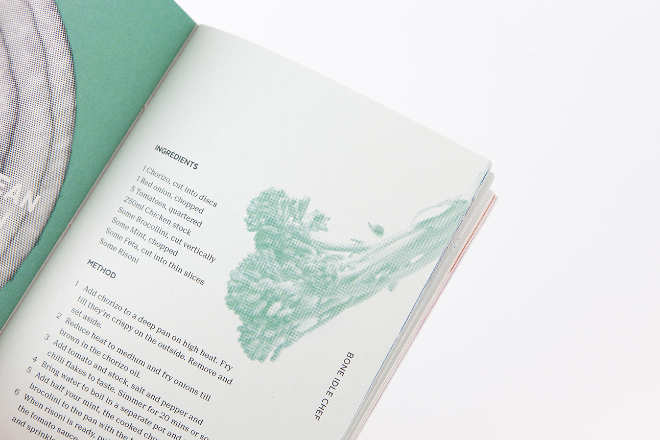
The Greek Shepherd’s Pie. Coconut Meatballs. The Mediterranean Yacht in Linen.
You won’t find these unlikely sounding recipes in any other cookbook, and you certainly can’t eat them anywhere. But last summer, these culinary creations graced the table and palates of our London studio.
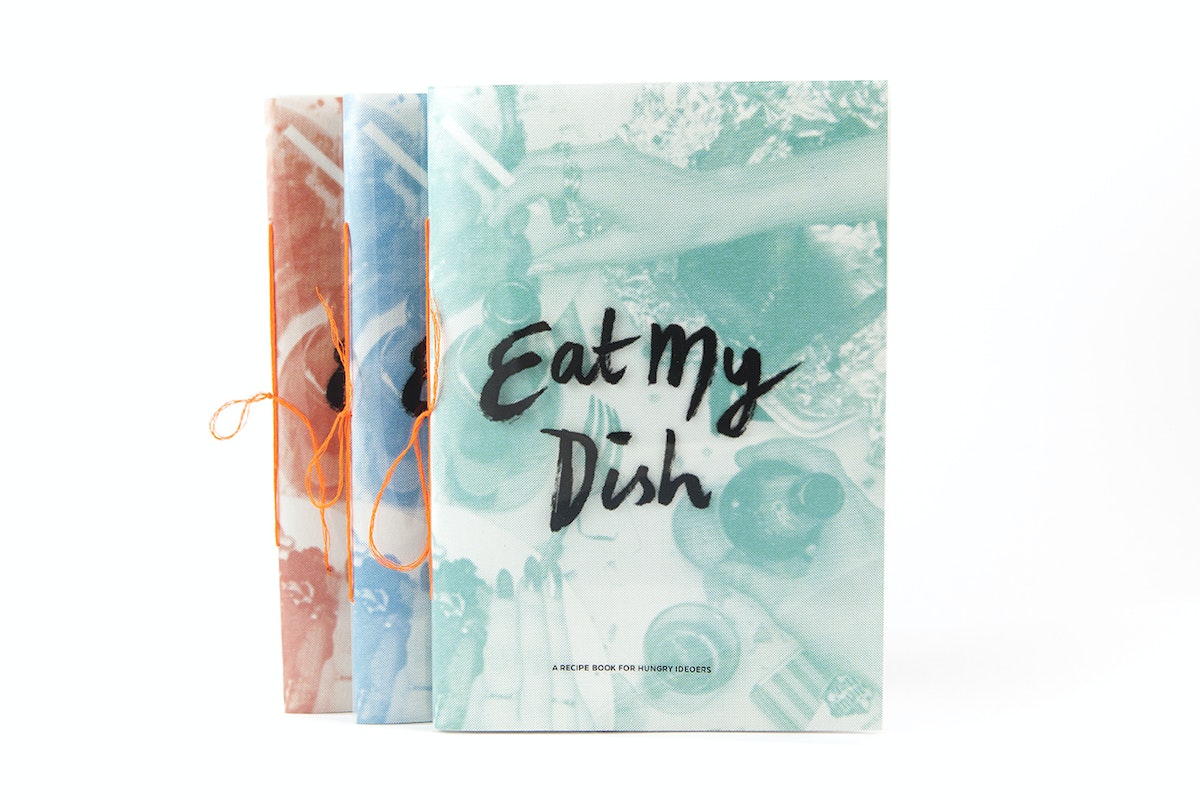
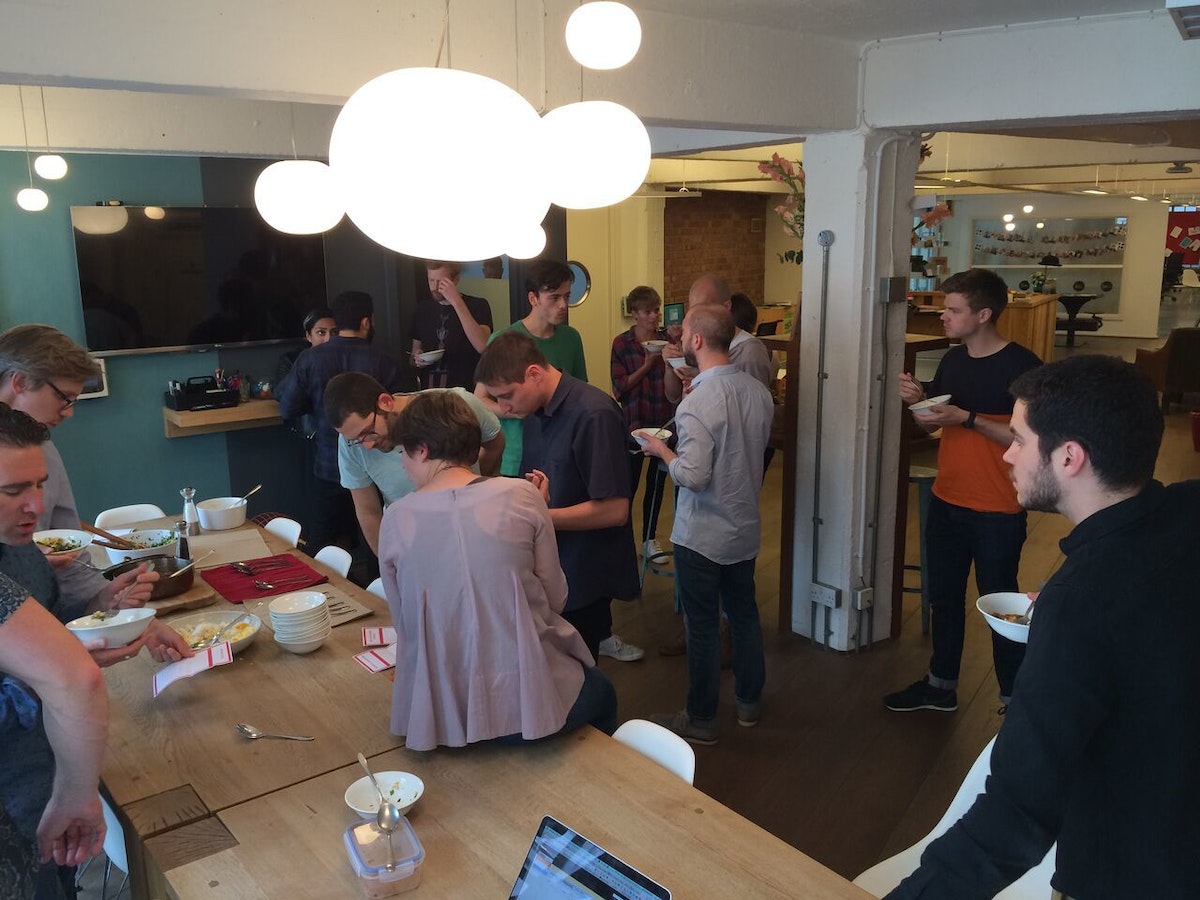
Eat My Dish came out of a desire to bring the studio together outside of our beloved social haunts (i.e, the pub). We wanted to do something that was hands on, creative and open to everyone.
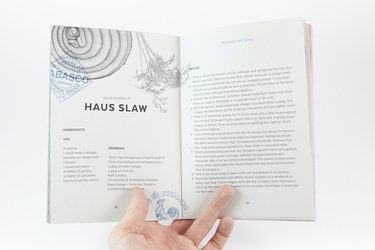
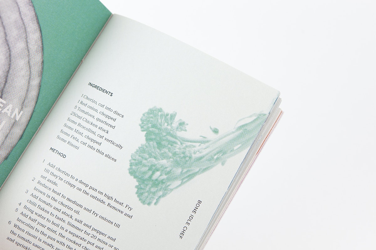
The rules were simple. Everyone was given a £10 budget for their dish. They had to cook offsite, and had to feed the studio. Entries were grouped in four categories: Culinary Peacock, Student Throwback, Feeding The 5,000, and the Bone Idle Chef.
It was a resounding success. Every Thursday afternoon, we summoned the whole studio to sample the recipes of the week. Our resident chefs would watch nervously as a crowd of designers descended on their dishes brandishing spoons and napkins. They devoured everything, every week, mumbling grateful compliments to the chef between mouthfuls. Things even got a bit competitive, with several dark horses impressing the studio against all odds (one participating chef claimed at the time to not even own a chopping board).
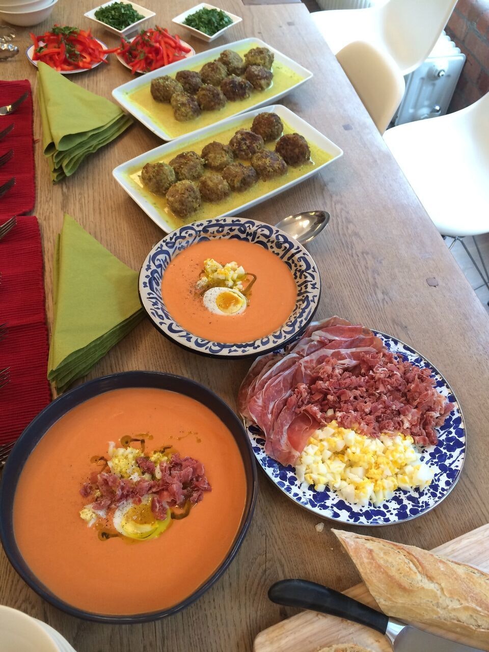
The UK has not historically been known for the quality of its food (unless your definition of quality includes jellied eels and deep-fried Mars bars) but things have started to shift in recent years. London in particular represents every style of food going, from late-night hole in the wall noodles to Nordic Michelin-starred blow-outs.
The studio’s recipes reflect the city’s culinary diversity, featuring dishes with roots in Brazil, Hungary, Iran and beyond, and catering to every occasion, from quick bites to dinner party extravaganzas.
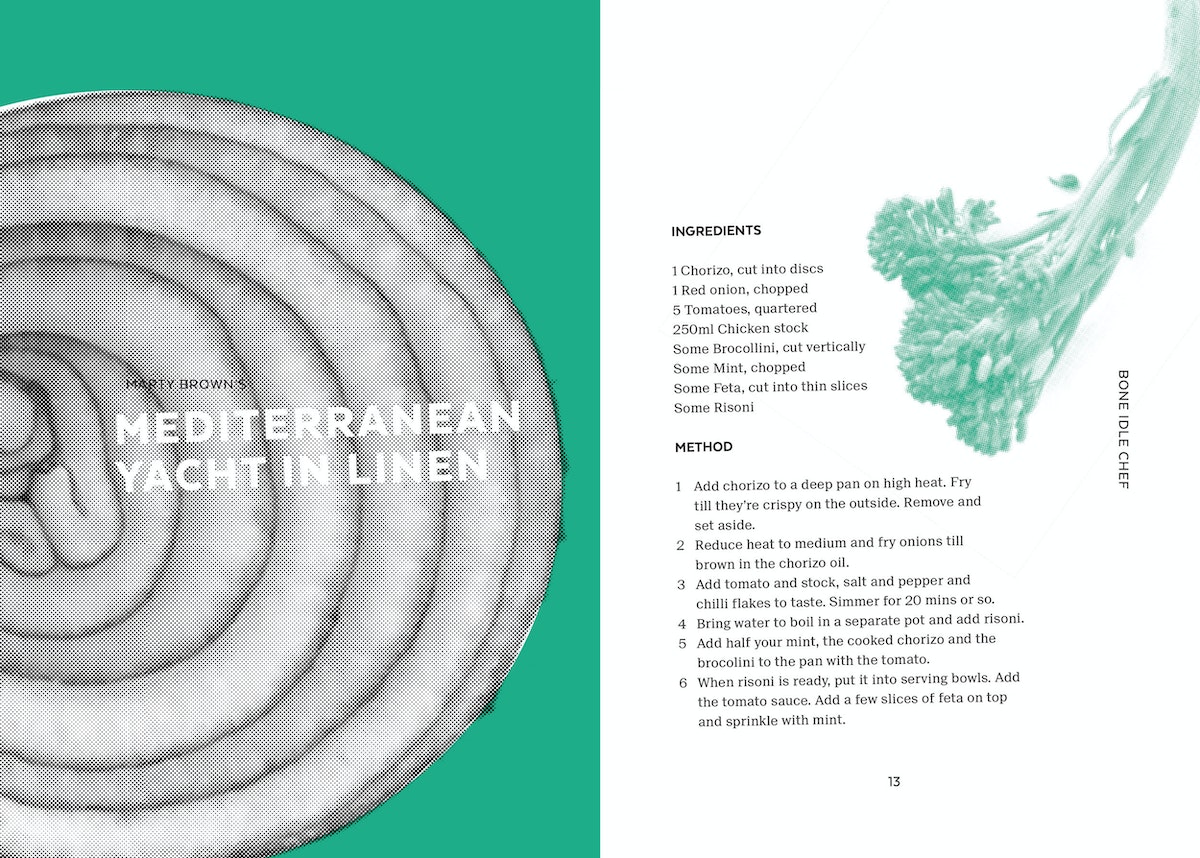
At the end of it all, we compiled the Eat My Dish recipe book. It’s been lovingly hand bound in four colours with neon thread and sent out to our studios around the world. We hope it inspires many a happy meal.
How to Hack Your Next Circuit Board Project
A toaster oven makes building circuits a piece of cake
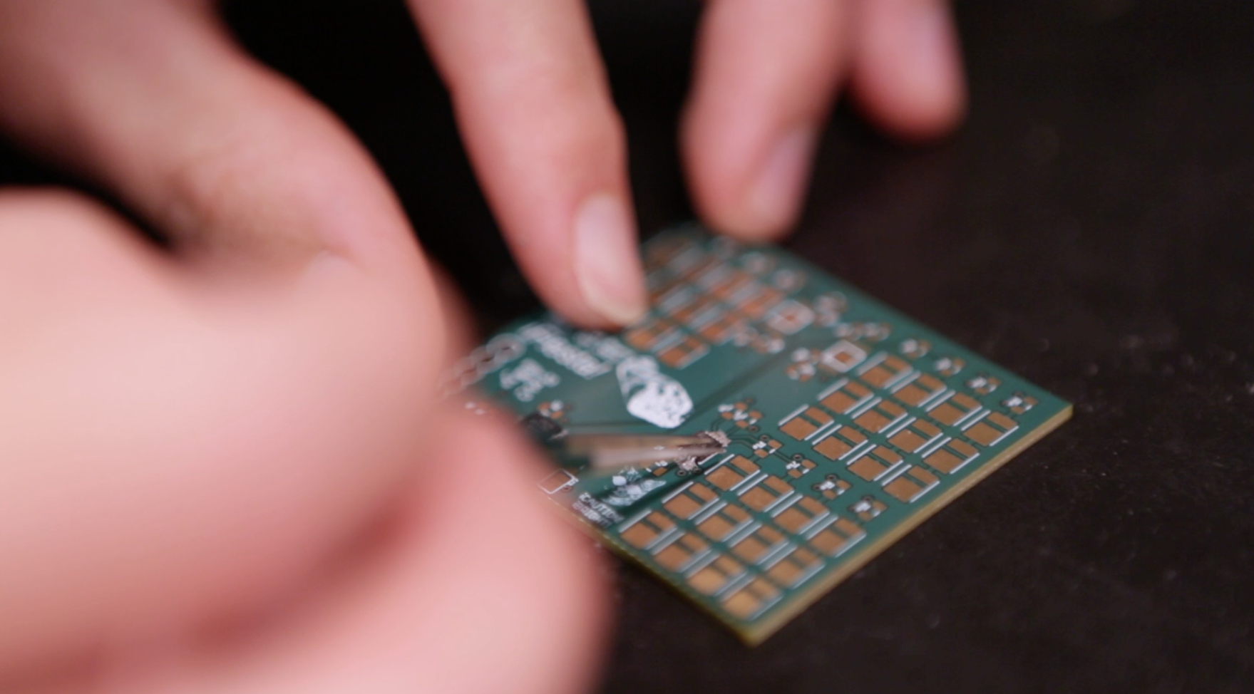
A few of the microchips on my PCB had unexposed connections to the board that I couldn’t solder by hand. I thought I’d have to send it out to be assembled, which could take a couple of days.
The hack
Instead of sending it out, I took a tip from my colleague and simply put some solder paste (small balls of solder in a sea of flux) under the microchips and popped the whole board in a toaster oven at 450° for a couple of minutes.
Safety first
Common sense may tell you that baking electrical components is a bad idea, but if you pay close attention and remove the board immediately after the solder liquefies, it’s a killer quick-and-dirty shortcut. Once the board has cooled, you can attach more sensitive components like LEDs and headers—the icing on the cake, so to speak.
The Easy-Bake Circuit Board Recipe
1. Apply solder paste to the PCB on all pads for parts with unexposed or hard-to-reach connections to the board. (Note: You don't need a whole lot of solder paste. Too much paste can result in bridging pins and will need to be cleaned up later.)
2. Carefully align the parts to be baked on the pads with solder paste.
3. Place the partially populated (or fully populated, if all your parts can be baked) PCB into the oven and set it to 450°.*
4. Watch for the moment when the solder balls liquefy (the solder will go from dull to shiny), about 1-2 minutes. The flux will help the solder hug tightly to any metal.
5. Carefully remove the PCB from the oven a few seconds after the solder liquifies. The extra couple seconds ensures all the solder has had time to liquefy.
6. Turn off the oven.
7. Let the PCB and solder connections cool down.
8. If possible, check solder connections under a microscope.
9. Clean up any bridging and test the connections.
10. Populate the rest of the board with parts you can solder by hand.
IMPORTANT: Always check the part's datasheet for temperature tolerances before putting it into the oven.
Pretty sure Charles Strite, inventor of the modern toaster, didn't see this coming.
Big thanks to Dave Vondle for the hackspiration and Sophie Feng for the awesome video!
I’m always on the lookout for shortcuts, especially when I’m on deadline for a project. Recently, another electrical engineer showed me a cool, time-saving trick that’s useful for all kinds of projects that involve a printed circuit board (PCB). I happened to be building up an LED test board for backlighting icons on a steering wheel prototype, a process similar to making a layer cake.
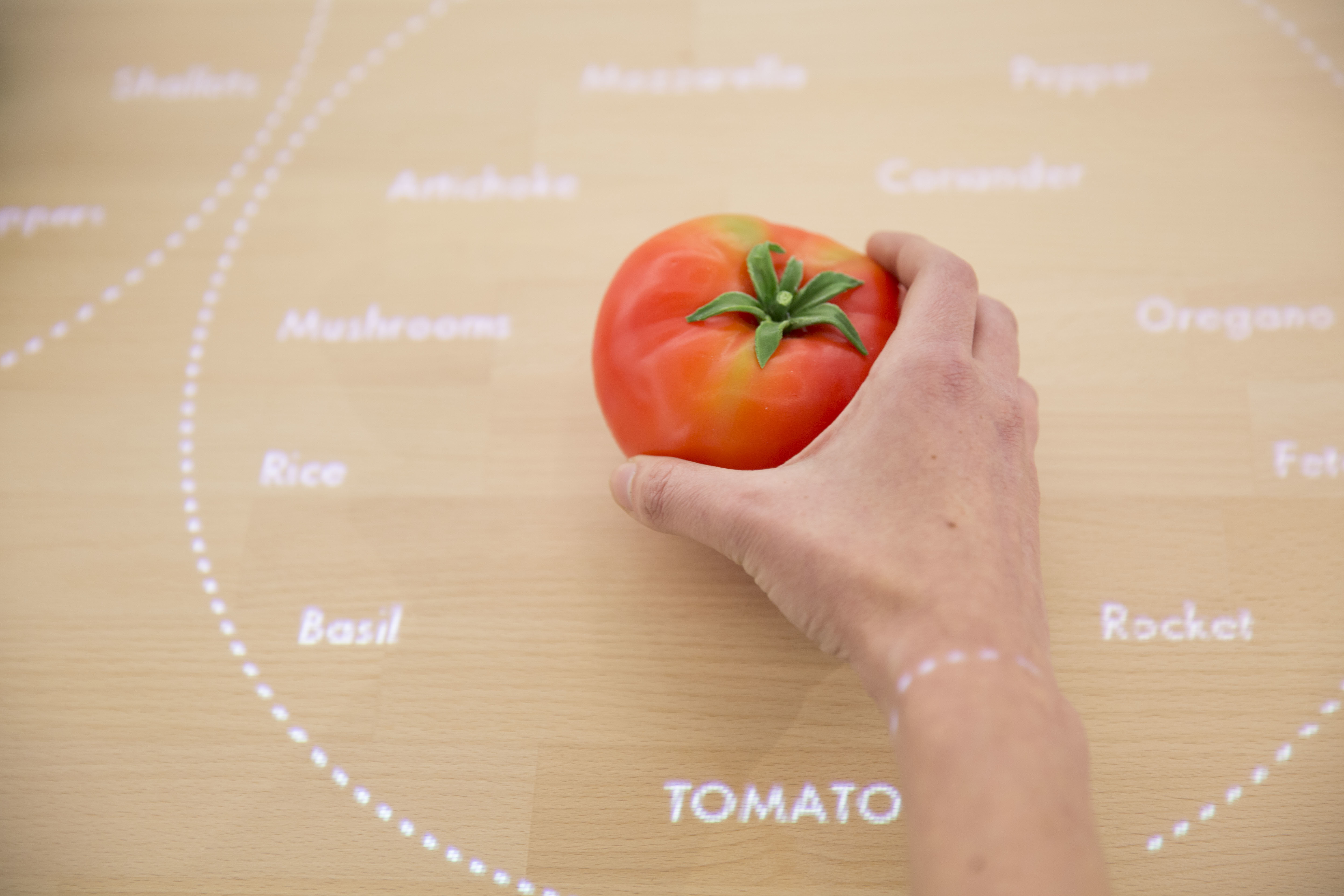
Veggie Vision: Designing the Kitchen of the Future
An interactive table recognizes foods on its surface
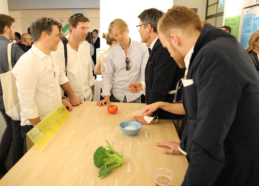
Taking this 2025 appliance from concept video to functional prototype meant creating a realistic experience of technologies that won’t exist for many years. Designers had to come up with a way for the system to see and recognize foods on table’s surface and respond accordingly—and they had to make it work reliably for more than six months while some 250,000 visitors tried it out at pop-up exhibitions at the Salone del Mobile and EXPO Milan.
To find out how they did it, I talked to IDEO London interaction designer Siri Johansson and developers David Brody and Kalyn Nakano of IDEO Palo Alto, who built custom software that borrows techniques from computer vision.
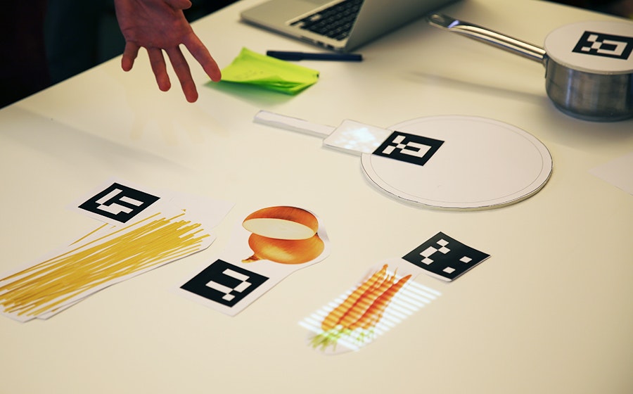
How did the need to build a prototype for real use affect the interaction design?
Siri: As soon you put something in a public setting, people are always going to try to break it, especially if they’re really excited about it. They don’t mean to break it, of course, but they want to play with it and see what it can do. We had to focus on a few key functions and figure out how to make them work well enough that it would be feasible for people to play freely with the installation. A key design principle was to keep the technology low-key and in the background, to preserve the warmth and tactility of the kitchen, so we focused on functions that demonstrate that intention and show how the table uses digital to free up your mind so you can engage with physical things. The table knows what I’m cooking and gently guides me through the process, so I don’t have to keep going back to my iPad to browse a recipe. I can focus more on my ingredients—how they feel, how they smell.
How did it affect the software design?
Kalyn: Knowing this was going to be a live prototype forced us to consider every scenario. With on-screen prototypes, predicting how a user might interact with the screen is a lot more straightforward. But here, adding another dimension and more objects to the mix challenged us to consider all the different ways people could position and interact with the items on the table. Once we started building, it became clear that the concept video for the design was really just a starting point. Testing all the different arrangements and permutations challenged some of our initial designs and software implementation methods, especially when we started thinking about transitions. Tracking objects while they were moved around on the table forced us to implement things more formulaically to achieve a display with smoother transitions between states.
How did people’s interactions with early versions of the table change the software?
Kalyn: With a live prototype like this, you give up control over the experience. You can’t send everyone down the path you want them to take. We started building and testing our software based on the interactions shown in concept video, but those interactions are choreographed, and when people in the office started playing with the prototype, we realized the behavior in the video—putting the veggies down on the table and sliding them from place to place—wasn’t natural for everyone. Some people would hold the vegetables in their hands or lift them off the table while deciding where to put them. These interactions weren’t wrong, but we hadn’t accounted for them in our initial designs. The need to accommodate for this forced us to reconsider our image processing techniques to make sure we could still recognize the objects no matter how they were being handled.
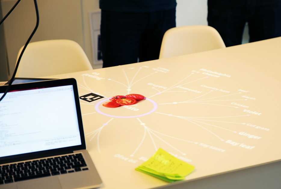
How did you adapt the CV software to the specific needs of the project?
David: Our approach wasn’t to make CV that could be used for anything, in any situation. The better route was to take advantage of our constraints for the exhibition and build a simplified version of CV (written with openFrameworks and OpenCV) that we knew could be tractable and provable in the time we had. The table has to consistently recognize three ingredients—broccoli, tomatoes, and rice—so that people can experience how it works. While more complex CV might create models of what generic broccoli looks like, our solution uses examples of broccoli that it has already seen, along with shape and color distribution. It compares those factors with what it’s seeing in order to distinguish between objects. The distribution of color helps it distinguish between broccoli and a blue bowl of rice, while comparing with previously seen examples help it distinguish between broccoli and a green shirt sleeve.
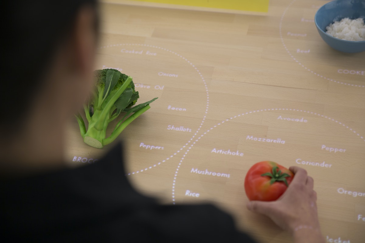
Why was this an efficient strategy?
David: A lot of conventional CV uses a “sliding window” approach: The computer identifies an aspect of an object, like its shape, and looks for that object within a larger image by sliding the window of vision until it recognizes something that matches what it’s looking for. The hard part is making it work in real time, because the computer compares every possible “window” that contains the criteria it’s looking to match, and each comparison takes time. Since our software is only looking at colors, it’s easier to identify which windows on the table might contain the objects it’s seeking. So the first thing it does is look for the points on the table where the intensities of color are the highest, and it says, “these might be objects.” It sends that information down the pipeline to the next step, and that’s where the color-recognition algorithm comes into play: It compares the histogram of a potential object with the histograms for broccoli, tomatoes, and rice, and determines which object it’s looking at.
What was it that excited you about this project?
Kalyn: This was a great example of building to learn. Creating a live prototype introduced a lot of interesting interaction design questions into the software development process, and it got us to solve technical challenges that wouldn’t normally come up during a screen-based prototype. It generated a new excitement for designing dynamic and thoughtful off-screen experiences, and watching people’s reaction to it was inspiring. When we set the table up in Milan, we came in the next morning and found construction workers playing with it, saying, “bellissima!”
The IKEA Concept Kitchen 2025 was on display at IKEA Temporary, a pop-up exhibition at Salone del Mobile in Milan, Italy, April 14-19, 2015 and can be seen at EXPO Milan, May 1-October 31, 2015.
Read more about Veggie Vision and the entire Concept Kitchen on Tech Insider and at IDEO.com.
What will kitchens be like a decade from now? IDEO recently helped IKEA envision some wild ideas that will likely be entirely plausible—someday. Usually, predictions like this exist only on screens, as concept videos and digital renderings. But this time, IKEA asked IDEO to build a working prototype of one future concept: the Table for Living, a cooking and work surface that recognizes the foods you place on it and projects customized recipes and cooking tips right onto the tabletop.

Lindsey Turner
I’m passionate about building brands, products, and experiences that help organizations show up with meaning and momentum.
I help organizations cut through complexity by shaping how they show up, through brand strategy, identity, and storytelling.
Working at the intersection of brand and business, I bring an editorial eye and a bias toward making—turning ideas into tangible experiences that people can understand, trust, and believe in.
My work spans government, healthcare, financial services, media, and consumer goods, from launching Gen Z-focused ventures to building innovation labs and reimagining legacy brands. I relish moments of ambiguity and enjoy translating across teams, perspectives, and priorities to move ideas forward.
I started my career in editorial and digital design, shaping cross-platform experiences and identity systems in publishing and agency environments. That foundation still shapes how I work today: I’m detail-oriented, collaborative, and overreliant on the Oxford comma. I hold a BFA in Visual Communication from the School of the Art Institute of Chicago.

Rachel Young
My work helps organizations see who their products aren't working for—and build the will and the tools to do something about it
For 25 years, I've asked the same question: Who does this design exclude—and what are we going to do about it?
My work spans human-centered strategy, inclusive design, and qualitative research, with clients ranging from Microsoft, Google, and Verizon to the National Science Foundation, and San Francisco Unified School District.
Before IDEO, I taught elementary school in East Palo Alto and spent a decade doing design work with social service organizations—where I learned firsthand what it costs people when systems are built without them in mind.
I am currently writing User Error, a nonfiction book about digital access and the design decisions behind it. I live in Oakland, California.

Brian Pelsoh
I lead with craft, ensuring our work is creatively excellent: rooted in deep human insight and imagination, while also grounded in the realities of business and technology.
My expertise spans brand, communication, and product design across tech, education, the arts, and social impact.
I believe great work demands both high-level vision and obsessive attention to detail, and only happens through collaboration.
I bring an inclusive, hands-on approach and a deep understanding of business, which enables me to consistently deliver excellence while always asking why.
Before joining IDEO, I worked at the brand firms Pentagram and VSA Partners. I began my career as a designer, leading teams at the School of the Art Institute of Chicago and the Milwaukee Art Museum. I hold an MFA in graphic design from Maryland Institute College of Art and a BFA in communication design from the Milwaukee Institute of Art & Design, and have taught at some of the best design schools in the US.

Tony Wong
I am responsible for IDEO’s long-term success in China and working with clients to use design as a tool to enable growth.
I am responsible for IDEO’s long-term success in China and working with clients to use design as a tool to enable growth. Specifically, I have helped Chinese companies design holistic brand solutions through the development of their products, communication, services, and innovation teams, and I have helped multinationals expand their presence and influence in China.
I advise global leaders on developing China-led innovation and capabilities.
In over 15 years in IDEO Shanghai, I have worked on projects that use design to elevate the quality of the experience of healthcare products and services, streamline processes that increase productivity, create spaces and programs that promote and enable inclusive communities, and build next generation mobility solutions that are planet-positive.
Before joining IDEO, I worked at Philips Electronics and the Electrolux Group in Italy, the Netherlands, and Singapore on a number of breakthrough commercial products. I am a member of the Young President Organization in Shanghai.

How to use AI as an editor, not a writer
Ed White shares how he uses AI as an editor—not a writer—to sharpen storytelling, rehearse ideas, and preserve the productive friction that makes creative work better.
Ed White has a rule he's tested on his own writing: hold yourself as the writer, and let AI be your editor. Ed is a Senior Design Director at IDEO's London studio, where he co-leads the firm's AI portfolio across Europe. Before IDEO, he spent 12 years as a writer and editor at the Financial Times, Wired, and Contagious. So when he talks about when to use AI for storytelling and when not to, it comes from two decades of crafting his storytelling skills.
In this episode, Mina Seetharaman talks with Ed about two specific tools he uses to keep AI in an editor's seat: a "roasting agent" prompted to critique his drafts without any sugarcoating, and a simulated audience he rehearses pitches on before the real thing. They also get into what Ed is hearing from design leaders at Anthropic, Lovable, Shopify, and Google Creative Lab about how creative work is changing, and why he thinks the friction of writing something yourself is worth protecting rather than automating away.

Building a personal AI for the messiness of life: Sida Li
Becca Carroll talks with Cue co-founder Sida Li about designing a personal AI for the messiness of everyday life—not just work. They explore how Sida stays anchored to human needs while navigating fast-changing technology, product tradeoffs, business-model experimentation, and the realities of building an AI company today.
Most AI products today are built for work—a space with clear problems and established systems. One founder noticed a gap: personal life is messier, harder to systematize, and mostly left behind by the AI boom. So she built Cue, a personal AI that lives inside iMessage and group chats, to go where the other tools haven't.
In this episode, Becca Carroll, IDEO's Chief Strategy Officer, talks with Sida Li, co-founder and CEO of Shared Context Lab, about staying anchored to a human need while the technology around her keeps changing shape, why she treats her business model with the same rigor she'd bring to a product, and what it feels like to build a company at this particular, disorienting moment in AI.
The conversation also gets into how Sida makes design decisions: the language Cue uses to describe itself, the tradeoffs behind building inside iMessage instead of a new app, and a real story about a business idea that didn’t pan out.
This is the second in a two-part series profiling founders from IDEO's Startups-in-Residence program. The first conversation is with Johannes Seemann, founder of Sooner, on designing GenAI for the emotional side of money.

Designing GenAI for the emotional side of money: Johannes Seemann
Designing financial tools around the feelings that shape money decisions.
Most personal financial tools are built to run the numbers and optimize towards a budget. While that works for some, most people experience money as a lived relationship that does not neatly fit into a spreadsheet. Johannes Seemann and Becca Carroll discuss why money is emotional before it is mathematical, and what a human-centered approach to building a generative AI financial product looks like in practice.

The curious leader's edge in uncertainty: Scott Shigeoka
How genuine curiosity helps leaders navigate uncertainty with greater confidence.
Mina Seetharaman talks with Scott Shigeoka, author of Seek and Head of Curiosity Cultivation at the Eames Institute, about what distinguishes genuinely curious leadership from performative curiosity, how power dynamics shape curiosity, and why practicing curiosity can restore energy rather than drain it.
Looks like you might be in search of something very specific?
Or reset the filters above and try another angle.
Here’s some random inspiration

Podcasts about creative leadership

Articles about the power of prototyping



.webp)


.webp)
.webp)