Why You Should Make Your Own Font
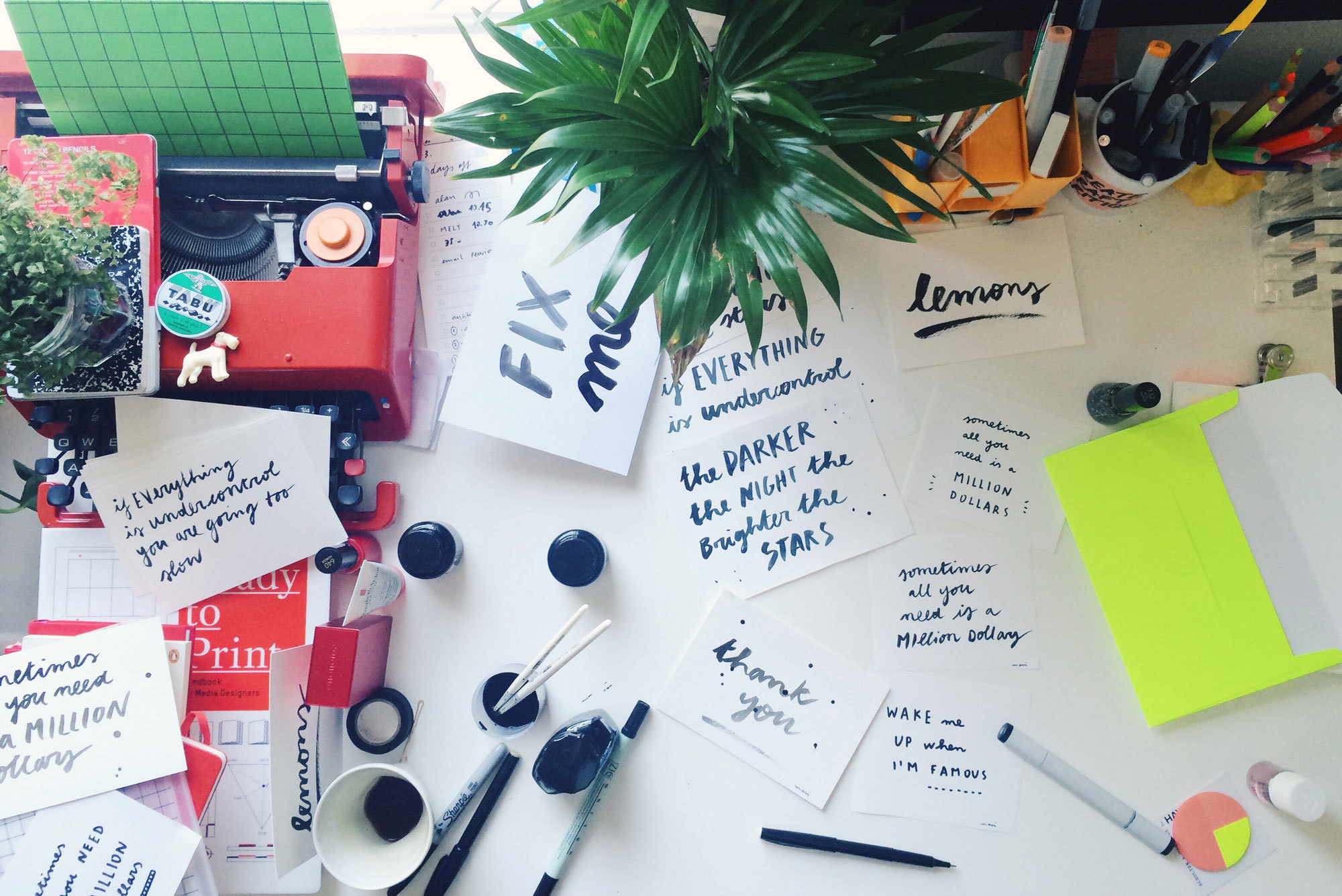
Look across the London studio’s stationery boxes, pet projects, and the odd client deliverable, and you can’t miss the handwritten flourish of Enrica Masi. Despite being an interaction designer, Masi is a firm believer in the physicality and imperfection of penmanship. It's a manifestation of personality, she says, which spurred her to lead the London studio in an exercise to create their very own font.
Downloaded more than 3,000 times online, Masi’s flowing font has got into the hands of quantified-self posterboy Nicholas Felton, photographer Todd Selby, and our very own David Kelley (founder of IDEO). We sat down to talk about her inspiration for Masi Font, her policeman-calligrapher grandfather, and why she thinks handwriting is one of the last modes of self-expression.
Where did your love of typography come from?
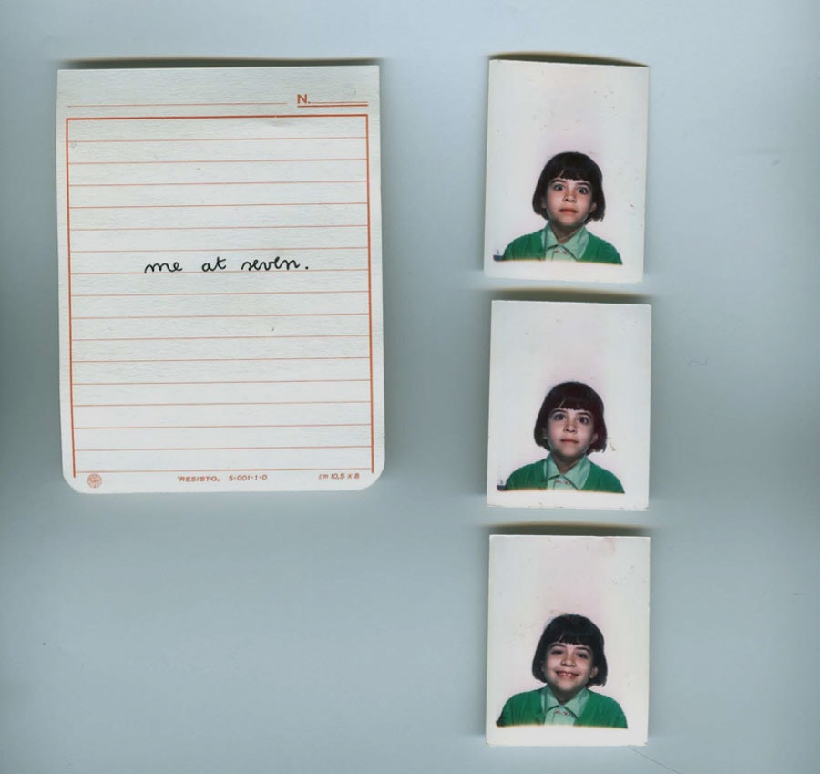
It started in elementary school. Learning to write was an obsession. I thought it was drawing beautiful things, rather than learning how to write words. If I made even a tiny mistake I would tear the page apart and start all over again. I would fill up pages with just one letter, repeated over and over again. Sometimes I would do other kids’ homework so that I had more to write.
Do you come from a family of artists?
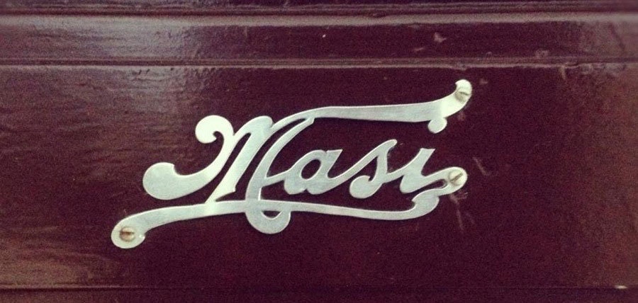
My grandpa, Amedeo Masi, was a Carabiniere (a member of the Italian national police force) and a calligrapher. I know, such a random combo, and he made his own house sign (above). Calligraphy used to be a subject in school in Italy. Having a beautiful handwriting was really important at the time—it meant you'd had a good education.
Who inspires you, and why?
Growing up in Italy, I was exposed to so many incredible logos and identities that haven’t changed. Everything stays 60s classic.
When I started my design studies in Rome, Vignelli (who made the original New York subway identity) was my main inspiration. I loved the way he used Helvetica with simple and effective graphics. Bob Noorda, was another great inspiration. When I worked for In Area (the Pentagram of Italy), I refreshed the design of the Milan Underground, and I loved how we made Helvetica cool in Italy.
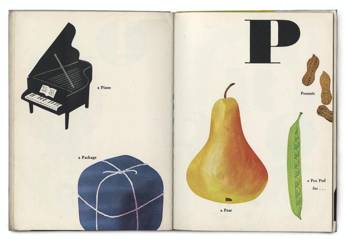
Munari, was another great inspiration. His friendly and simple style really resonated with me. His kids’ books are so clean but so playful at the same time. His style brings magic to everything, and that’s what I want to do too.
Once I moved to the Netherlands, Experimental Jetset and Wim Crowel also inspired me so much. I loved how they used typography in spaces, books, and museums.
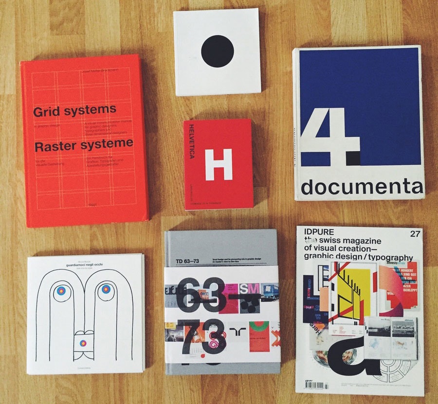
What was the first font you created?
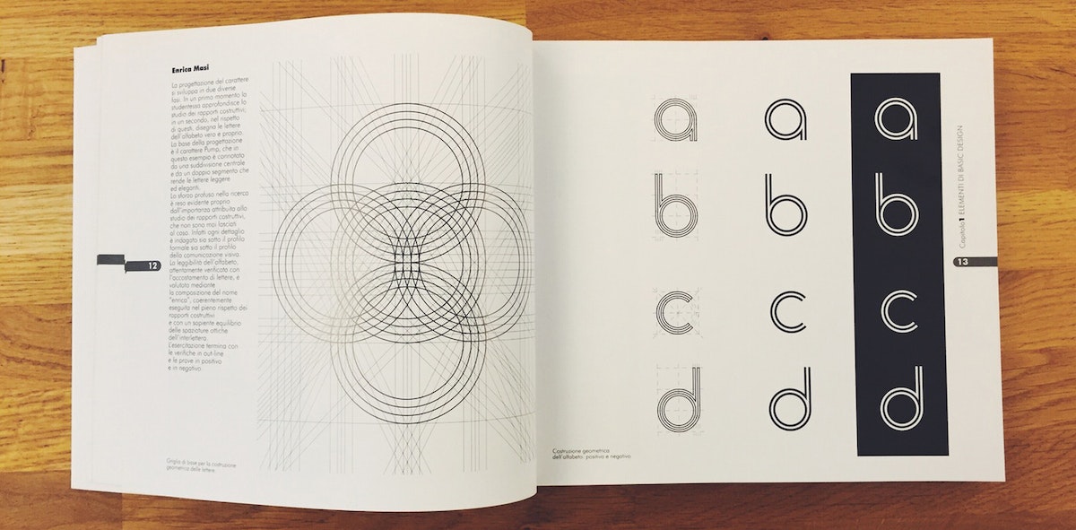
I created my first font, Cerchio Futuro, at university. It was a really rounded/modular font based on one unit (that’s the constraint they gave us). I hated it, but I got the highest mark in the class and was featured in a book Metodologia Progettuale Del Graphic Design (below).
You've talked about how important it is to have your own font. Why?
In this fucking digital world, no one writes by hand anymore. So, having a font is the truest visual expression of your mind and craft. No iPhone can take your handwriting away from you!
How did you develop the Masi font?
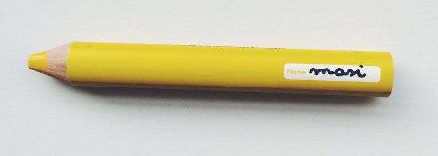
I never thought about creating my own font, but people really liked the way I wrote, and they kept asking me to "Masify" things. I realized I could just create a font that everybody could use, but I was overwhelmed by the technicalities of creating one.
Luckily my boyfriend, Alan, showed me this website where you can just download a form, print it, and fill in the blocks. Rescan the form, and—voila—I created my first Masi font. It’s not exactly the same fidelity as the handwritten font, which I hated for a long time, but after a while I liked the fact that the only original Masi font still comes from me.
What does the font say about you?
That I’ve stayed a kid forever, that I don’t want to grow up. Peter Pan, you know. That even if it looks consistent, each letter is different, every time.
Any Easter Eggs buried within?
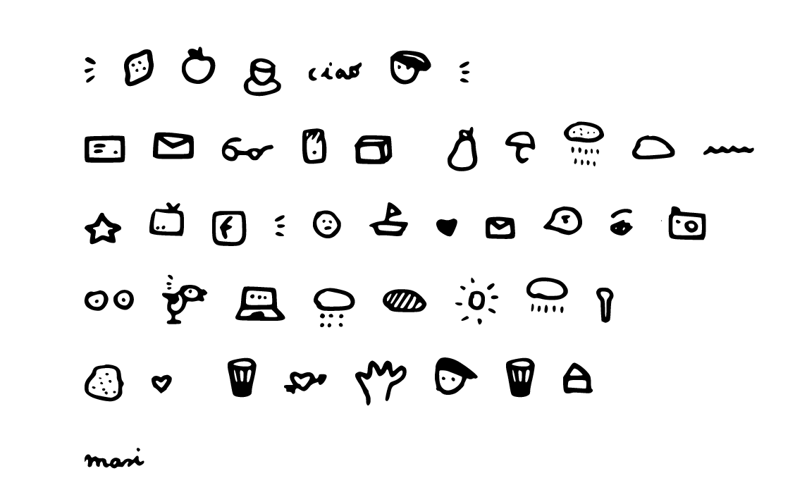
If you type certain letters you’ll see "tits" (Ö) and "lemons" (]) LOL.
Words and art

Subscribe

.svg)


