.svg)



Mental health, co-designed
Kooth partners with young people to create Soluna, a mental health resource for California youth.
Increasingly, digital spaces are proving detrimental to youth mental health. By co-designing with youth, Kooth and IDEO set out to flip the script, creating a positive digital space for young people to safely explore their mental wellbeing.
When Kooth, IDEO, and Blackbird, IDEO’s longtime development partner, first started working on the project, the window of opportunity was narrow, and the stakes were high. The group was up against a nine-week deadline to create a working proof of concept app. Also on the line: a $188 million contract with the Department of Health Care Services (DHCS)—one that would open an entirely new line of business for Kooth.
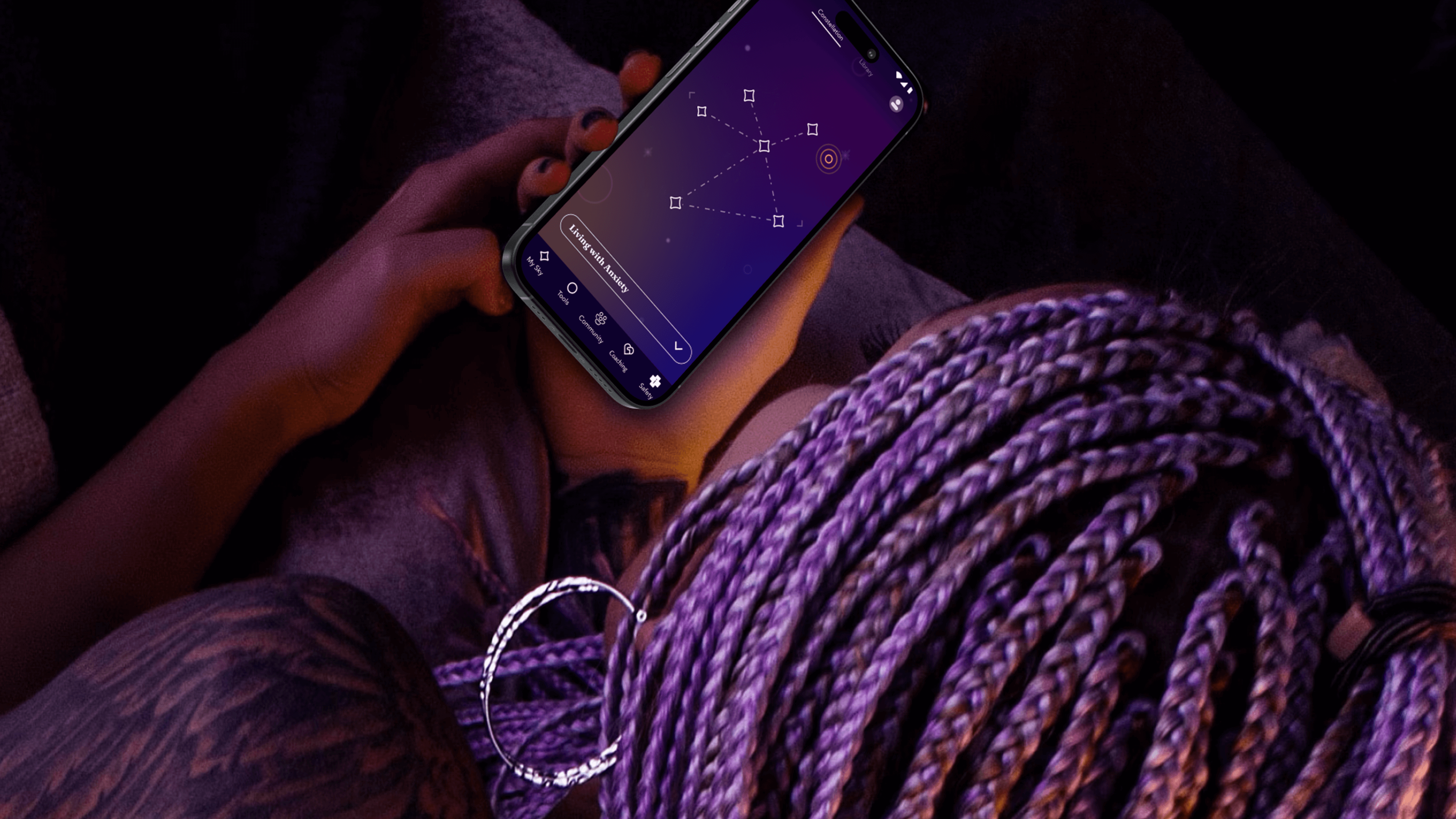
The app needed to do more than demonstrate functionality—it needed to prove its value. To ensure that they were creating an asset that truly fit the needs of young people, the team turned to an initial cohort of 13-25 year-old co-designers who explored early features, created video diaries, and shared their questions about and experiences with mental health. These young people often gravitated toward self-service tools that helped them take action based on their feelings. With their feedback, the team created new expressions of clinically-validated behavioral health tools like journaling, breathwork and white noise—and built novel tools, such as Starboard, an expressive drawing tool and a nod to art therapy.
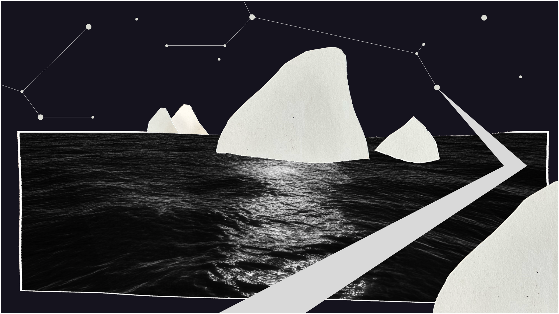
The team took inspiration from content the co-designers liked to consume, such as story-driven video games that enable freedom of exploration, deepened by a unifying mythology. That led them to a constellation theme, which made the experience more intriguing and playful. The co-designers also recommended a dark color palette, because they preferred exploring the app at night.
With these insights, the team refined the proof of concept, and then conducted a one-week pilot with another 50 young people across California. Their positive feedback gave the State the confidence to invest in a $188 million, four-year contract for Kooth to bring the app to a platform at scale.
Over the next year, the team engaged another 150 young people to help design, shape, and test the app. At the same time, Kooth and IDEO created a clinical oversight group, which included a pediatrician, therapists, and other clinical specialists. This group anchored the platform in the practices of Acceptance and Commitment Therapy (ACT), cultivating psychological flexibility—the mindful acceptance of positive and negative emotions. Young people are invited to complete short reflections and surveys throughout their journey with the app, which includes rigorous, science-backed measurements to assess the therapeutic benefits.
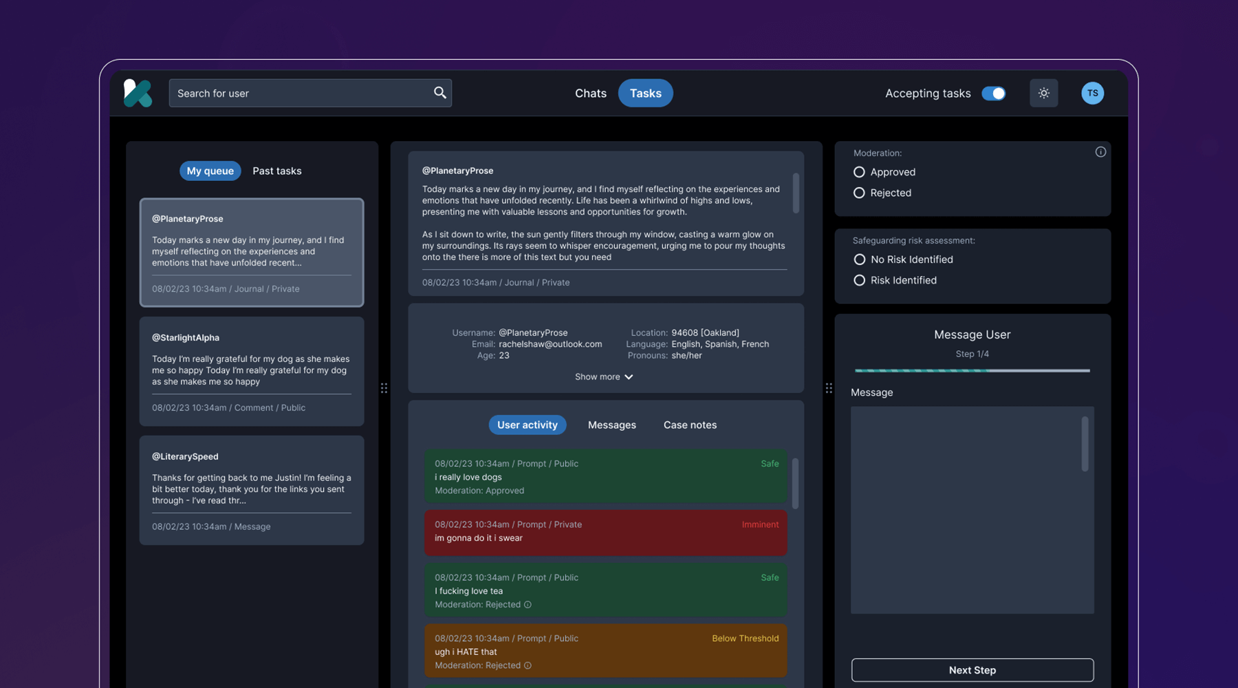
Behind the scenes, the team developed a clinical-facing service and digital platform that empowers Kooth’s peer specialists, social workers, community curators, and clinicians to support the youth experience, all while protecting privacy and confidentiality. They also navigated a complex landscape of state requirements and government legislation, ensuring that the platform could cover topics like substance abuse and gender identity, and that users could access coaching within 24 hours, and choose from a diverse set of experts.
The last step was to select a name that worked across multiple languages, trademarks, and competitor branding, and didn’t come off as a mental health service, something the youth co-designers believed was critical. IDEO and Kooth landed on Soluna, a name that alludes to the app’s presence in both the bright (“sol” for sun) and the dark times (“luna” for moon).
Now, Soluna is available for free to all youth in California, and the state has set ambitious targets for reaching all young people at scale. Soluna is a living platform that will continue to receive product and design updates for years to come, all deeply rooted in youth co-design.
The US Surgeon General named mental health “the defining public health crisis of our time,” and cited social media, online bullying, and the isolation exacerbated by the COVID-19 pandemic as major drivers that have significant negative outcomes for youth.
In California alone, more than 284,000 youth cope with major depression. 66% of kids with depression do not receive treatment. Between 2019-2020, the suicide rate for kids ages 10-18 increased by 20%.
In 2022, California Governor Gavin Newsom’s Master Plan for Kids’ Mental Health set aside $4.6 billion to increase access to mental health and substance abuse support, the largest commitment to youth mental health ever made by a state.
94%
of proof-of-concept app users would recommend the Soluna app to a friend, and believe that engaging with the app would be a positive addition to their daily/weekly routine
6 million
young people in California had access to Soluna at launch in January 2024
A more comfortable Pap smear
Teal Health creates a system for at-home cervical cancer screening.
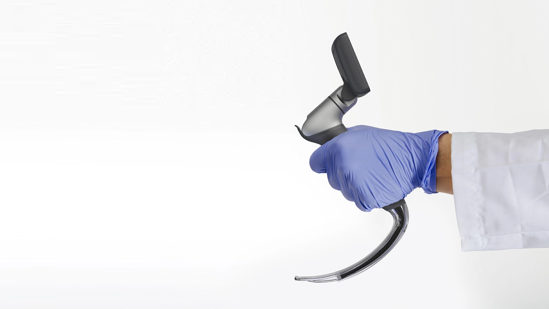
Creating a better cervical cancer screening experience is an important mission, but also a challenging one. Not only would Teal have to address the regulations that face healthcare device companies, it would also need to build a comprehensive telehealth platform and a physical product—a wand that could easily collect an adequate cell sample, even in the hands of an untrained person.
The first challenge was to create the wand. The device would need to do a lot: It’s impossible for a person to see their own cervix, so the user would have to be able to find the cervix blind, collect the sample themselves, and remove the wand from their bodies without contaminating it on other parts of their anatomy. Because this is something users are likely to do in their bathrooms, where there is no space to lie down, they would need to be able to use the device while standing—and with one hand. From the beginning, the IDEO team set out to design functional, testable prototypes to make sure the idea was viable, and incorporate diverse voices into the research process, including trans, minority, and disabled women.
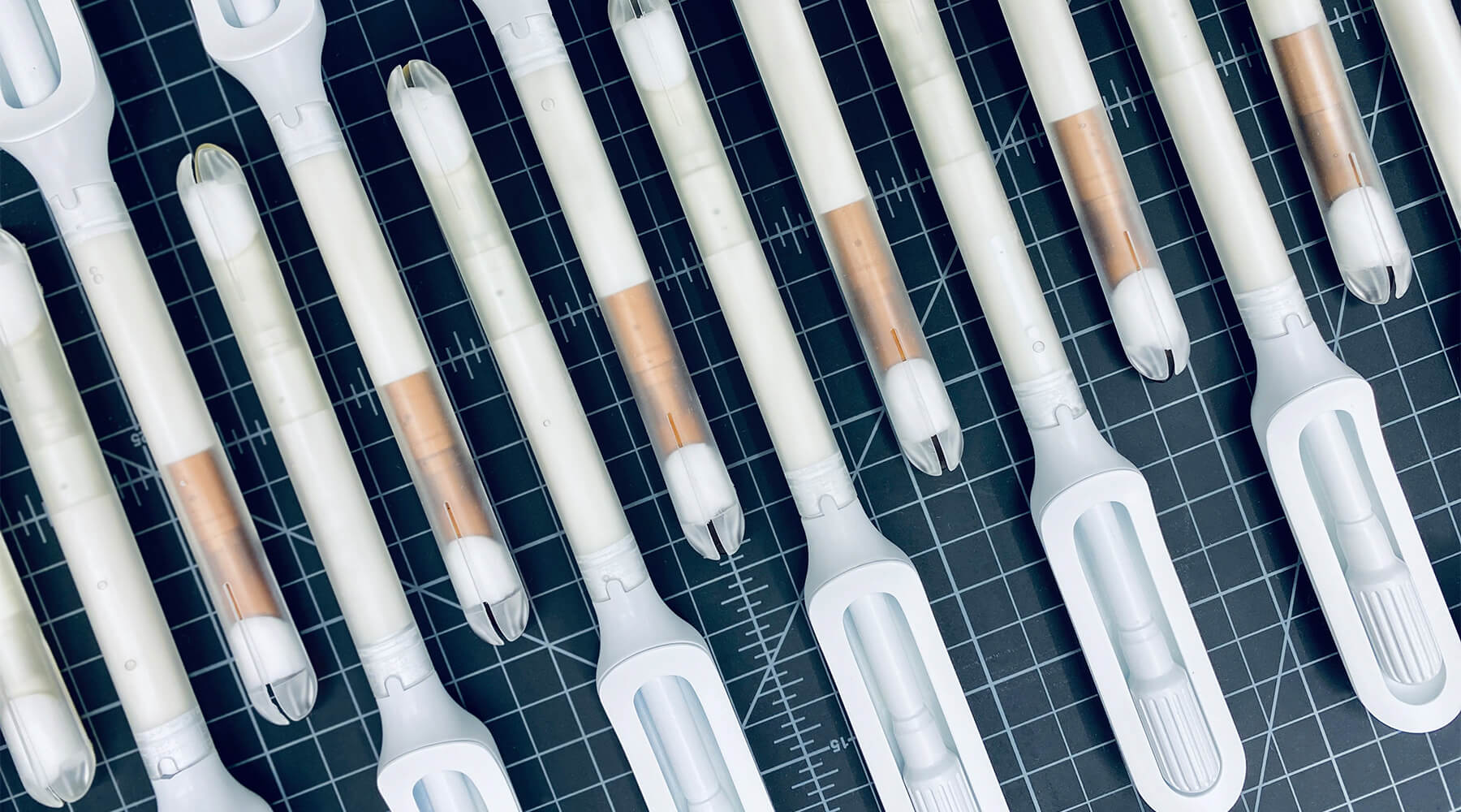
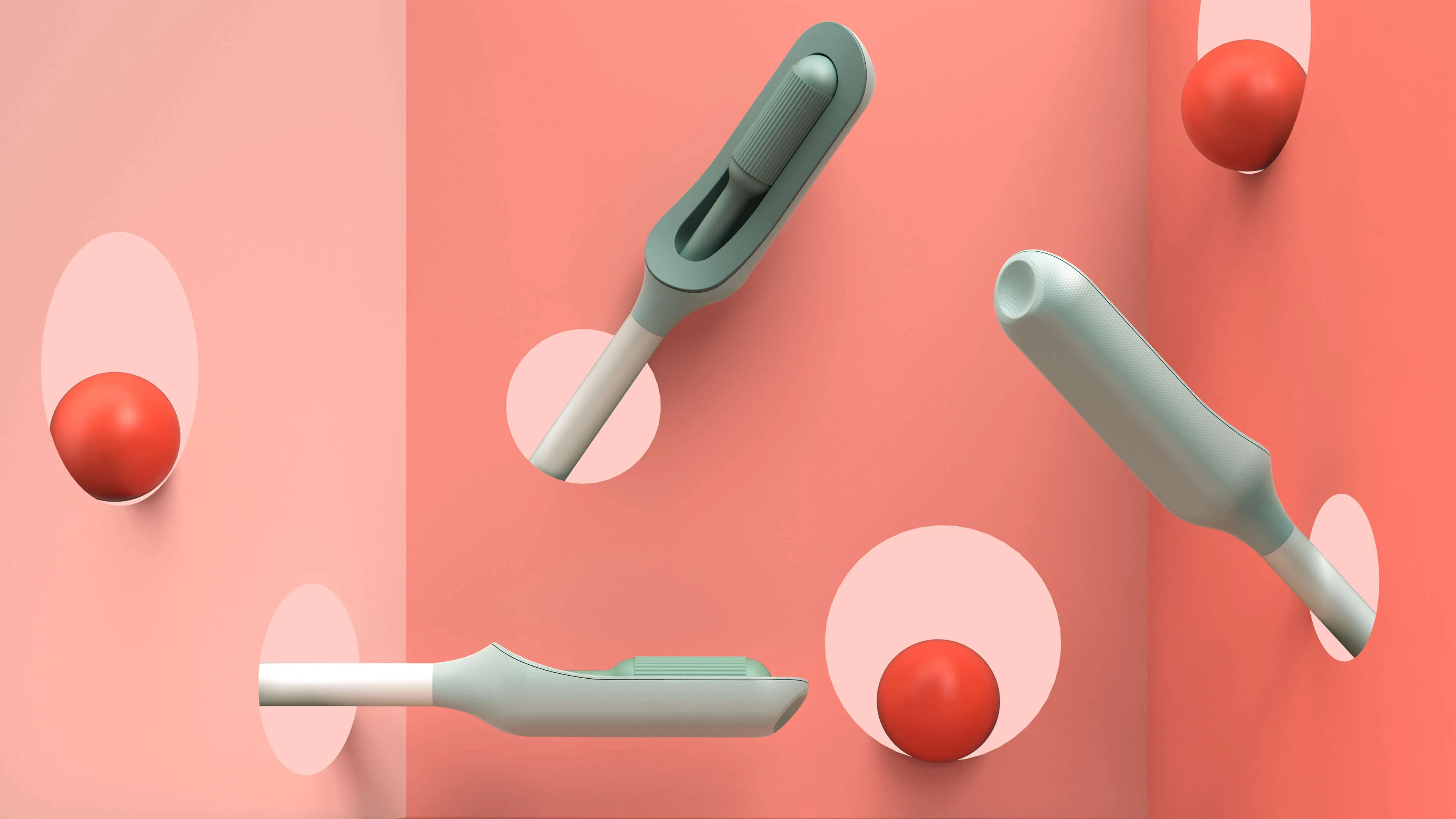
Because the product is meant for people who aren’t medical professionals, the team worked to design something as simple, intuitive, and unintimidating as possible. They used a 3-D printer to create multiples of every prototype, autoclaves to make sure that the designs they were creating were sterile, and leaned into shapes women are already used to, like the cylindrical shape of a tampon. The wand they created has that same basic form, but with a soft sponge that the user can deploy with the turn of a dial to collect the sample, then close to protect it from contamination on the way out of the body.
With working prototypes in hand, Teal set out to test their efficacy. In an initial study with 220 participants varying in age, race, socioeconomic status, and geography, Teal found that not only were participants able to successfully self-collect samples, they also preferred them over the speculum, the device doctors typically use during a screening. Some 92 percent said if they knew the results were equal they would prefer self-collection, while 87 percent reported they would stay current with screening if Teal Wand was an option. Self-collection took the vast majority under two minutes to complete, and 97% of study participants reported it was very easy or easy to use. The Teal Wand recently received a patent for its unique design.
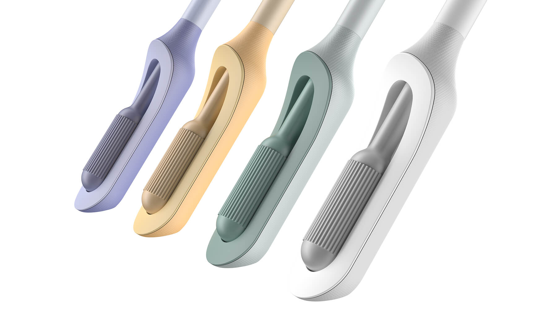
The IDEO team also worked on the packaging and unboxing experience, which plays an important role in supporting the user through the self-screening process. The team built in thoughtful design cues to give users reassurance that they are using the wand correctly, and to provide the same level of confidence they would have in the results of an in-clinic screening.
In January 2023, Teal raised an $8.8 million seed round from Serena Ventures, Emerson Collective, and Metrodora, and later that year, launched a nationwide clinical trial with leading health organizations including Johns Hopkins University, Yale University, the University of Colorado, Washington University, and others. In 2025, The Teal Wand became the first FDA-authorized device for at-home cervical cancer screening, with virtual medical provider support. Today, it's available in all 50 states. It’s an enormous step toward its North Star: catching cervical cancer earlier and saving lives.
Cervical cancer is nearly 100% preventable when it’s caught early, yet one in four women in the US are not up to date on their screenings.
More than 12,000 people in the US are being diagnosed with cervical cancer every year, and more than 4,000 people die of the disease, which disproportionately impacts Black, Asian, and Hispanic women.
More than half of cervical cancer cases are found in women that are not up-to-date on their screenings.
97%
of clinical study participants said the Teal Wand was very easy or easy to use.
87%
of participants said they would be more likely to stay current with screening guidelines if Teal Wand was an option.
94%
of participants said they would choose to collect their own sample from home rather than the current standard of care where a clinician collects it in-office.
2025
The Teal Wand becomes the first FDA authorized device for at-home cervical cancer screening, with virtual medical provider support.
Amplifying a movement
Cities United rebrands to create safe, healthy, hopeful communities for Black men and boys.
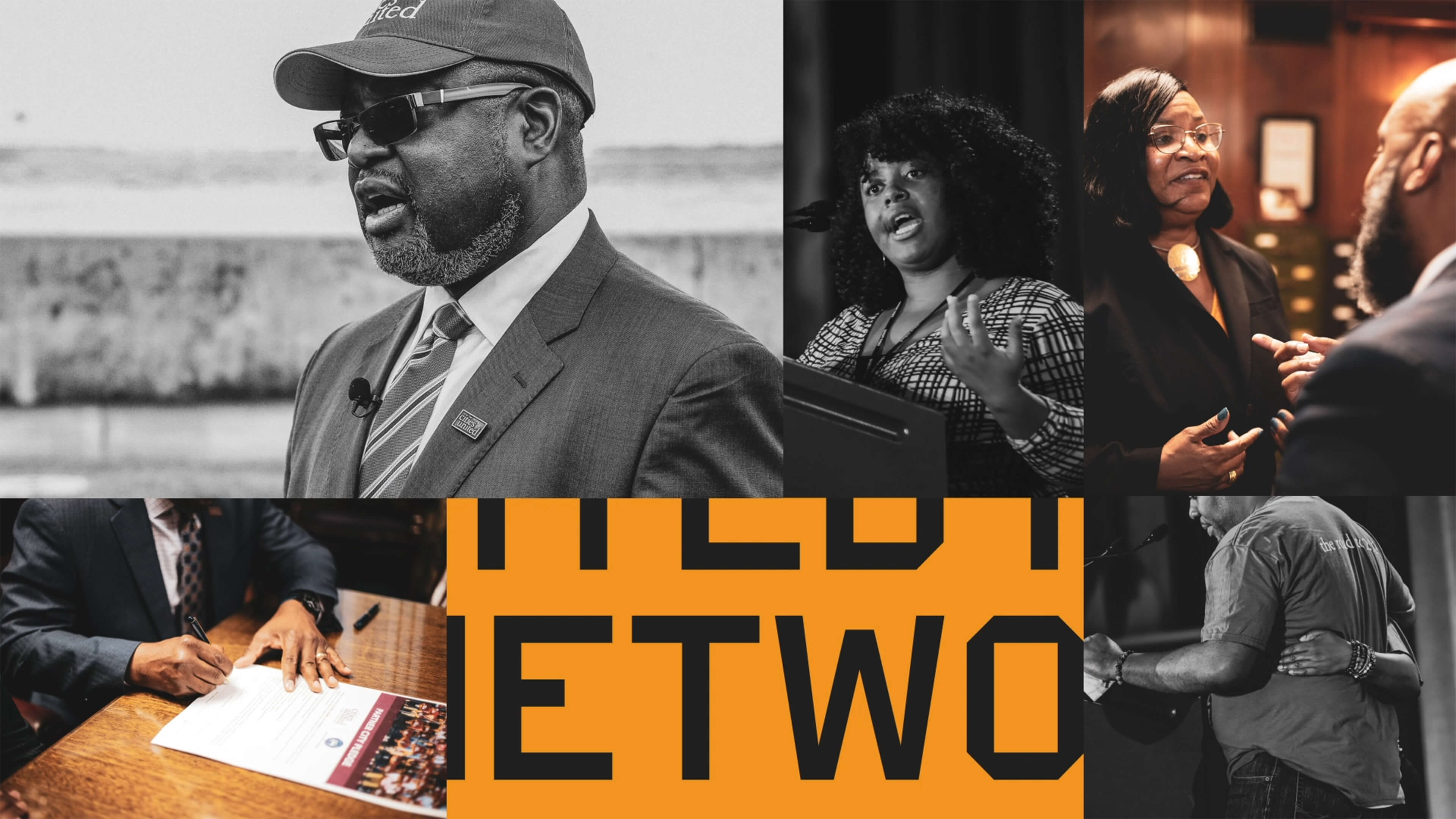
Cities United already had a strong foundation with its stated mission, vision, and values. IDEO brought those to life with a new visual and verbal brand identity system that celebrates Cities United’s inclusive approach to building relationships and reimagining public safety.
To help Cities United with its verbal identity, the IDEO team defined the organization's voice, tone, and key messages, making it easier to tell its story more consistently and clearly, a crucial step toward engaging stakeholders.
To define the new visual identity, the team created a new logo, a letter C composed of interwoven shapes that represent the three tenets of their vision—“safe, happy, and hopeful;” a new design language that references city grids; and a typographic system anchored by the typeface VTC DuBois, inspired by W.E.B. DuBois’s own custom lettering and designed by the Black-owned Vocal Type Co. The team also designed a color palette that embodies the textures of city life with hues reminiscent of asphalt, sunrise, and brick.
To amplify the refreshed branding, the team designed a new responsive website, citiesunited.org. The intuitive site shares the organization’s mission, resources, ongoing projects, and partner network, inviting stakeholders to join in their transformative work. IDEO also created a video to humanize Cities United’s mission and showcase its nationwide impact. It underscores the unity, resilience, and hope embodied by the organization through a chorus of voices.
This comprehensive rebranding widens Cities United’s reach and impact, helping the organization share its goal of creating safe, healthy, hopeful communities for young Black men, boys, and their families, and reintroduces the organization to a national audience.
The Cities United work was supported by IDEO’s Racial Justice Impact Fund, part of a commitment IDEO made in 2020 to address systemic racism and advance equity within our own organization, our client work, and beyond.
Cities United is committed to reducing the epidemic of homicides and shootings among young Black men and boys ages 14-to-24 by 50%.
Between 2009 and 2019, the number of Black children who “did not go to school at least one day in the past month because they felt unsafe at school or on their way to or from school” increased by 84%, according to Cities United.
Homicide is the leading cause of death for Black men and boys from birth to age 44, according to the Centers for Disease Control and Prevention.
2023 SF Design Week Award
In recognition of IDEO’s brand work with Citizens United

Balancing work and sleep
Somni’s personalized sleep program helps workers maintain their health.
Sleep is a critical resource for shift workers—and their employers, too. Together, IDEO and Somni worked directly with people with acute and chronic sleep challenges to create concepts that could support their sleep goals, and provide employers with the means to improve employee health.
When IDEO and Somni first partnered, the startup was an early-stage company, so the team started small, with focused sprints and workshops to redesign the core aspects of the company and product offerings. The team interviewed shift workers about their sleep patterns, which can vary quite a bit. Even when people keep to a specific schedule on work days, they often have to change their patterns on days off to spend time with family and friends, leading to a very disruptive sleep cycle. Research revealed that many third shift workers were dealing with sleep and health issues, but also a pervasive “machismo” culture, pressure to “tough it out,” and a reliance on energy drinks to deal with lack of sleep.
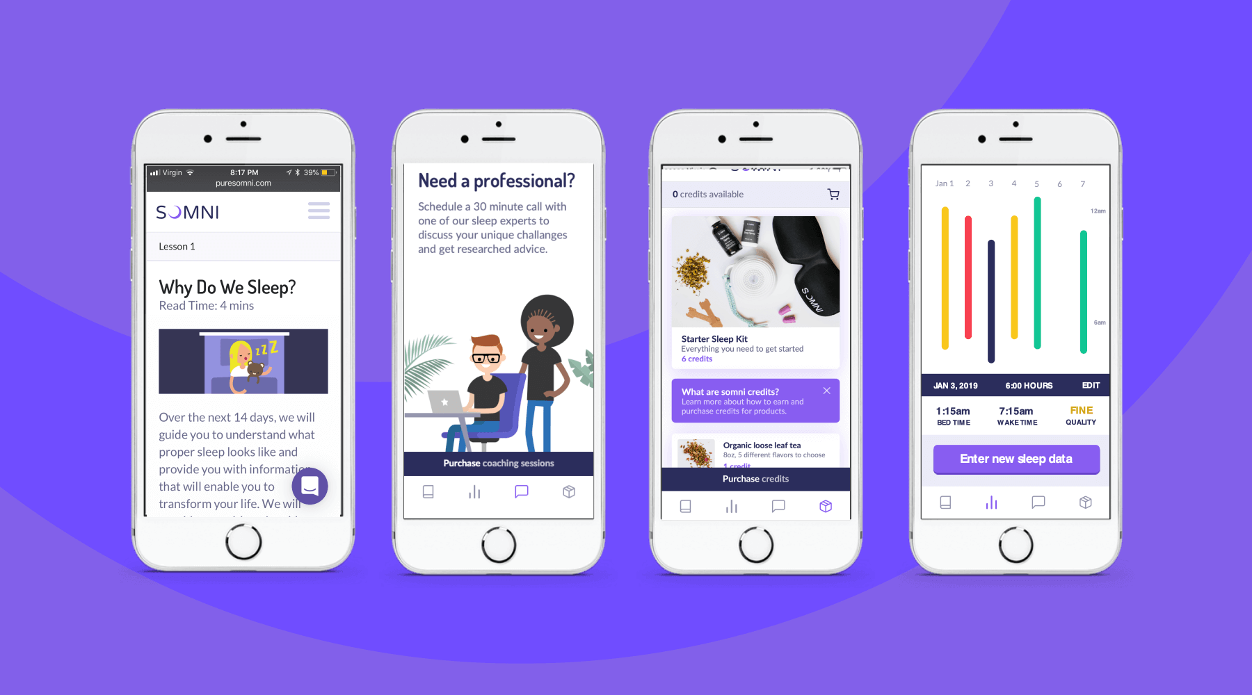
To address those issues, the team designed a digital experience for sleep cohorts, support groups where members could share their experiences and sleep strategies, and work with a coach and sponsor who already had been through the program. The platform analyzed workers’ data, and provided AI-enabled recommendations for improving their sleep. The big takeaway? Data by itself wasn’t necessarily helpful, and could be confusing for folks who were less digitally-fluent. Providing context, like a calendar that displayed sleep experiments at a glance, was crucial.
The IDEO team also created a new user experience for a genetic testing program that could uncover factors associated with sleep issues. Somni aims to use a saliva-based genetic test to monitor for DNA damage caused by circadian disruption, then leverage its sleep improvement program to prevent further damage. Because biomarker testing is a differentiating offer for Somni, it was extremely important that the team get it right, both to make sure that users could understand its utility, and for Somni to provide real value. The design challenge was unique—and not just because of data privacy concerns. Presenting data about DNA damage in a non-human-centered way could increase the anxiety workers had around their sleep.
At the end of the project, Somni leveraged the insights the IDEO team surfaced to improve products like its sleep coaching service, and to refine its biomarker testing offering. Based on this work, Somni has also created a pilot with a Fortune 100 company, which is currently in progress, as it works to mitigate the ill effects of disrupted sleep for employees and the companies they work for.
In the short-term, circadian rhythm disruption leads to an array of jet-lag-like symptoms, and in the long-run, it may contribute to weight gain, obesity, metabolic syndrome, type 2 diabetes, and cardiovascular disease.
It also impairs people’s ability to work, affecting productivity, creativity, and the overall work environment. Productivity loss can lead to employer baseline healthcare costs that are 26% higher, and over time, insomnia can result in an average cost of $4,267 more per employee per year.
In June 2019, the International Agency for Research on Cancer classified shift work as a probable carcinogen.
75%
user retention in Somni's sleep program
$2,450
savings per year per employee for users who complete the program
33%
improvement in sleep quality, and 41 more minutes per night
The case against AI-generated users
And alternative suggestions for design research.
What really brings value—and for what purpose—particularly in an era when budgets are tight? Similarly, folks focused on UX research argue that we are in the middle of a “reckoning,” questioning its ROI in certain contexts. Others disagree.
As this tension builds, the world of generative AI offers a new proposition: AI-generated—aka synthetic—users. Here’s the pitch: Are you sick and tired of going through the cost, time, and difficulty of crafting a research plan, finding participants, and creating thoughtful questions? Are moderated exploratory sessions and usability tests taking too long to conduct and synthesize into something actionable? There is a solution: generative AI tools that will simulate what real people might say and then feed it back to you instantaneously. Perhaps even synthesize it automatically!
The synthetic users proposition is meant to be a silver bullet. Already, folks are using it, skipping the time, cost, and hassle of doing research with real people. As leaders in this space, we felt obligated to take it seriously enough to try it out (with a healthy mix of skepticism and optimism).
As one of our teams kicked off a project to improve rural healthcare, they decided to enlist the help of ChatGPT to provide synthetic patient and practitioner insights, using several GenAI tools to create artificial users to interview. It turns out, after three weeks of swimming in a lukewarm sea of AI-generated information, all we needed was one hour with one real flesh-and-blood patient and a human physician who works with marginalized communities in rural areas to show us just how deep and complex real human experiences are—far more than our artificial users could convey.
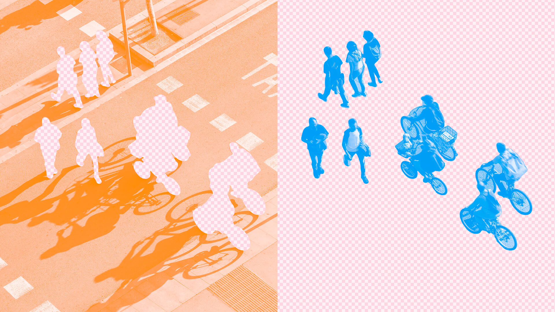
What design research accomplishes vs. what LLMs can deliver
Relying on synthetic users—really just a lot of data in an LLM model—isn’t just bad for practitioners; it’s bad for business outcomes, and the people we’re designing for and with. AI is unable to provide the key ingredients of research that are critical to our work:
Important tangents
In open-ended interviews, we follow the lead of participants, inviting them to take us on their journey, even when—or especially when—it seems to deviate from what we thought we were going to talk about.
Unexpected insights
Looking at something from research participants’ points of view leads to things we never would have learned otherwise, and creates sparks of insight that help us shift priorities or radically reimagine the problem we’re trying to solve, as well as potential business outcomes.
Context clues
When you spend time in someone’s home or place of work, their artifacts, photos, prized possessions, accidental intrusions from family members—and a host of other things—can dramatically alter the course of a research experience and lead to new insights.
Contemporary generative AI products enshrine design principles and methods of working that run counter to what we know about good research practice.
People pleasers
They are designed and trained to please you and be helpful. Sometimes participants try too hard to be helpful as well, but researchers are trained to sense this and dig further. There’s nowhere to dig further with a synthetic user.
Emotionless entities
Contemporary LLMs lack authentic emotion. They don’t leave the markers and cues that participants often drop to signal there might be more to learn. And if you want a more emotional response, then it’s up to you as a researcher to prompt it—which defeats the whole purpose of doing research in the first place.
A shallow context pool
LLMs have to be fed the right context. They can’t say unexpected things beyond what you’re already asking about. Meanwhile, researchers are only able to define what’s relevant as the process unfolds.
Forced assumptions
Actually writing a prompt that gets you meaningful answers requires you to make a ton of assumptions about what you might learn.
A disembodied “person” composed entirely of data, which has been synthesized by an LLM looking at vast collections of other disembodied artifacts or words, simply cannot provide the insights and discoveries that research is designed to produce.
Others agree. Even ChatGPT. When we asked it, “Is it ethical to use synthetic users instead of real ones?” ChatGPT told us, “Users provide valuable qualitative feedback, emotions, and insights that synthetic users cannot replicate. Overuse of synthetic users might result in missing these important human factors in design.”
Or, as researcher Christopher Roosen puts it, “Using synthetic humans for direct research is like navel gazing, but not at our own navels, but into the great messy, cluttered, and often- disgusting navel of the Internet-with-a-capital-I. The solution isn't to make up fake people. It’s getting better access to real people.”

Scrappy ways to accomplish the same goals
Design research can feel like it takes too long or is too speculative or unrewarding. Sometimes, it can lead to a lot of swirl, creating an anxiety gap between insights and the creation of new solutions. There’s also the real problem of resources. Or maybe your stakeholders are looking for immediate results. It’s reasonable for teams to wonder how they can take a more direct path.
But that doesn’t mean you have to discard human-centered research and design altogether. We too are often working on tight timelines, and having to find scrappy ways to get real data from real people. Here are some practical strategies for even the most shoe-string budget.
Friend and family interviews
You should strive to recruit a balanced sample of research participants and work to eliminate any bias baked into the sample design. But doing design research—especially in the early stages of the process—is different. At this stage, it’s actually beneficial to embrace the bias of the sample and use it as a tool to learn. Talking to friends and family to get feedback on early concepts is a viable way to recruit research participants—so long as those people care deeply about the subject matter and you understand the limitations of their perspectives.
Diary studies
When you want to quickly get data from people’s daily lives, often over a specific period of time, diary studies—having people log daily activity or respond to specific prompts throughout their day—come in handy. The size and scope of data you can study can be tailored to meet your immediate needs: You can ask participants to log their habits and thoughts throughout the day in a text or audio journal, take photos and videos, and reflect on your product or similar ones. There are even platforms like dscout that streamline the recruitment, data collection, and analysis process. In one diary study, we asked a couple dozen participants to show us the moments that mattered in their week—which completely changed how we design for major TV moments in the streaming era.
Intercepts
An intercept is a quick conversation with someone in a physical context. Where better to discuss a hospital’s waiting room experience than in that same waiting room? While the insights from intercepts are often targeted and specific, they’re ideal for quick, actionable feedback—and relatively inexpensive, too. On one project, we showed up at a major home appliance retailer to talk to customers and associates about the problems they were trying to solve together. We discovered that people often came in for a face-to-face interaction that would help them decide whether to repair or replace their home appliance. But while associates were eager to solve the problem, they felt incredibly ill-equipped to do so and could only offer anecdotes based on personal experience.
Expert interviews
Experts not only bring knowledge, but also intuition that can only be acquired through lived experiences, critical perspectives, and sometimes even information that may not be widely accessible. When our colleagues worked on that project to improve access to healthcare for rural populations, talking to one expert in that field gave them the broadest view of all the challenges that population is facing and helped them design for it with greater empathy. Instead of trying to create something purely digital, the team pivoted to creating solutions that foster trust and understanding between the doctor and patient.
Expert interviews are typically more expensive (they can range from $250 to $1000/hr depending on your expert) but luckily, you don’t need too many of them. You can also think broadly about what qualifies someone as an expert. Communities tied together by a common interest (e.g. Reddit) may get you a different kind of expertise than the capital E experts available for hire.
Social signals
If all else fails, sometimes it’s more impactful to hear the opinions of people directly through the data they leave behind online in the form of posts, comments, and reviews. Subreddits visited by particular interest demographics, trending topics on social media sites, and product reviews can uncover deeper insights around people’s true feelings and experiences, both bad and good. When we worked with a music gear manufacturer dealing with increased returns and customer dissatisfaction, a simple analysis of their own review data helped us identify specific problems, and customers’ suggested solutions.
Looking ahead
Generative AI and LLMs are very useful tools that we’ve embraced in many of our distinct design crafts. And we still believe that there is an opportunity to use LLMs in design research. They can help us think about problems in new ways, help shape a research plan, and guide interviews. After all, LLMs do have access to a wide variety of material that could be quite inspirational in planning phases—so long as we realize they are not providing insights from real people. At least, for now. (We remain open to what the future might bring.) Because today, unless you’re designing for LLMs, not accounting for real human input is a shortcut to nowhere.
Design research is at an inflection point. Practitioners and budget-setters are going back and forth over whether it’s worth the time and money.

Design lessons from the cultural exchange on Red Note
What the Chinese/American digital mash-up can teach us
Her home page had been crowded with English content and an attention-grabbing hashtag: #TikTokRefugee.
For years, Chinese and American netizens have largely lived in separate digital spheres, playing within their own ecosystems. But thanks to the change in TikTok’s legal status in the U.S., all of a sudden, we’re seeing a digital cultural exchange. On Red Note, people from the two countries are helping each other solve math problems and complete English assignments. They’re sharing photos of their pets, homes, food, and cities. They’re even fact-checking with each other about life on the “other side”—like what authentic Chinese food looks like beyond what’s offered at Panda Express.
We don’t know how long this migration of users will last, but it hints at what could be the beginning of a social experiment that could reshape norms, trends, and the way global internet cultures interact.
For us, two technologists, one currently living in Shanghai, working on a project on Chinese content creation and e-commerce platforms, this digital mingling kicked off a big conversation about what designers from different cultures can learn from each other. After all, firewalls have led to us building our tech ecosystems in totally different ways, with different design sensibilities and cultural use cases. And it’s really fun to see these two digital cultures coming together in one app.
Here’s what we’re learning from exploring this cultural exchange.
💫 The power of shared digital spaces to bring people together
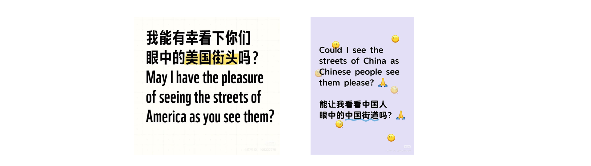
We’re always fascinated to see what happens when two people who are siloed connect with each other as human beings. On Red Note, people are finding ways to learn from each other, sharing photos of their pets and families, and asking authentic questions like, “May I have the pleasure of seeing the streets of America as you see them? ” Meanwhile, the folks who came from TikTok are trying to learn Chinese terms, and even taking quizzes. These spontaneous exchanges are more than casual interactions; they hold immense potential to create a powerful inspiration pool for intentionally designing spaces for connection and positive interaction. It’s an opportunity to uncover design hints and signals for commercial and social innovations, inspired by shared values, behaviors, and the nuanced differences between users.
🔮 Cultural cross-pollination
Behaviors that developed organically in one context are already getting adopted by the other. For example, the "😺 cat tax" concept from Reddit—a friendly requirement to share a photo of your cat to participate—has made its way into Chinese social platforms, blending humor and engagement strategies from Western online spaces with local norms. Slang from both sides is proliferating; American terms like LOL, AMA, JK, as well as Chinese ones: XSWL (laughing to die), NB (really really good). This cross-pollination feels like a preview of a future where internet cultures from the U.S. and China become even more intertwined.
📲Shifting data privacy norm
On a recent project on interaction design in content creation platforms, we found that some users from China, the U.S., and the EU were unfazed by the idea that the platforms are collecting and using their data. As one participant told us, “It’s okay to use my data for training if it gives me a better experience as the payoff.” Meanwhile, some American users on Red Note said they were knowingly trading data privacy for community (in slightly less polite terms).
While this sentiment doesn’t align with traditional data privacy ideals—prioritizing minimal data collection, strong user consent, and transparent usage practices—it highlights how people crave connection and great experiences, and are sometimes willing to pay for that with their data. It’s a nuanced area that presents both opportunities and challenges for designers and tech creators—and one where they need to tread carefully. Consent is extremely important, and experiences need to highlight choices to opt in, surfacing microexplanations for new users clarifying how their data will be used or implementing scenario-based toggles that help users understand data sharing.

😻Unique engagement strategies
While researching Chinese digital products, we noticed a fascinating norm: many apps cultivate unique ways for users to address each other. On Red Note, for instance, users don’t call each other "bro" or "buddy" but instead use "sister." This stems from Red Note’s design strategy, which intentionally engages female users by fostering a female-friendly community that feels safe, authentic, and supportive. It’s a small detail with a big impact, shaping how users interact and building trust through thoughtful, culturally-tailored design. It’s also a great lesson in intentionality.
👥A wider range of features and use cases
Many apps created in Western context have one function that they do really well. Think Pinterest, Uber, Zillow. But if you spend time using various apps in the Chinese tech market, you’ll discover there’s a lot more usability and depth to the products. For example, at face value, an app like Red Note could be seen as an Instagram-style app focused on real-life story sharing. But it also has a ton of deeper features: it’s heavily social, commenting with self-moderation on things like political speech, livestream, notes, and more. China’s UX designers have figured out how to distill the purpose of a product, and create deeper dimensionality in a way that aligns with user needs, and makes it easier to express yourself and accomplish goals on the platform..
🌎Protecting culture
The influx of new users and ideas is transforming platforms like Red Note into vibrant spaces for creativity, commerce, and cultural exchange. This evolution raises questions about how global norms and trends will influence—and be influenced by—local platforms, potentially reshaping the landscape for content creators and businesses.
As delighted as we are to watch and learn from these interactions, we’re very aware of the power of globalized social media to flatten cultures. Part of the fun and learning here is that they are so different. But that offers yet another design provocation: How can we balance connection and understanding and cat memes between people without flattening culture? That’s a question we’ll continue to explore.
Last Wednesday, when Zoey opened Xiaohongshu ( aka 小红书” or Red Note), her go-to Chinese social media app, to scroll through some of her favorite local food, fashion trends, and K-Pop content, she discovered something unexpected.
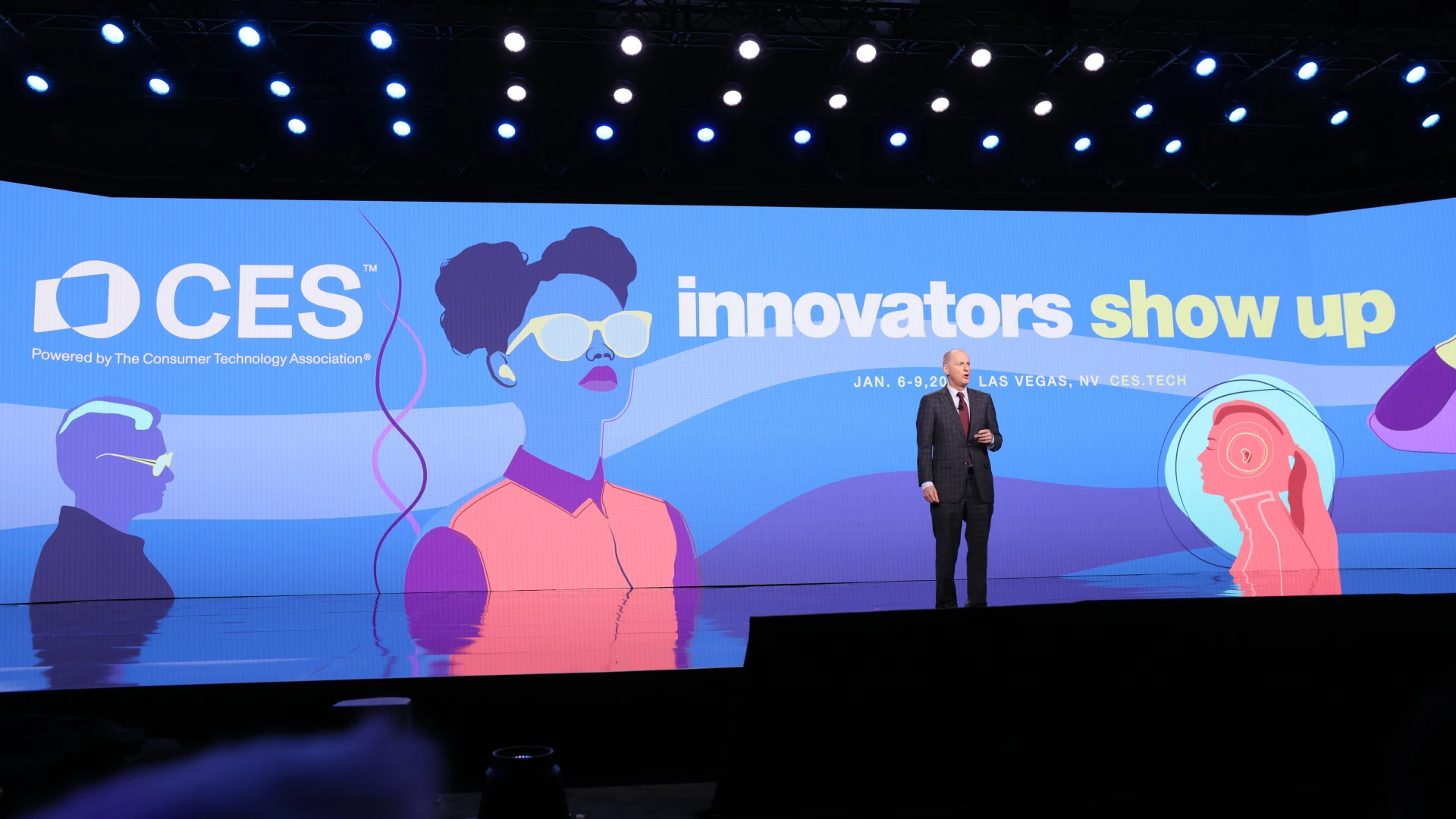
CES 2025: What we saw—and wish we had seen
Raising AI kids responsibly, an avalanche of smart glasses, and more.
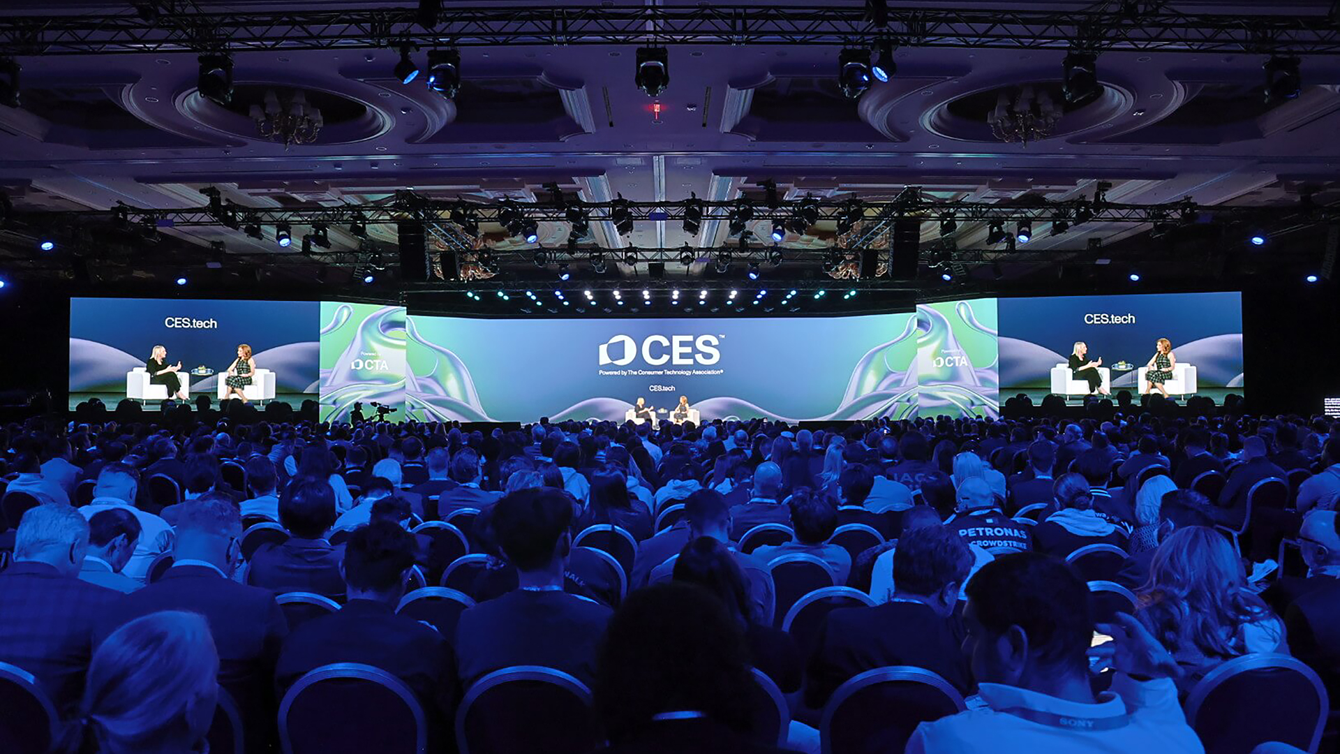
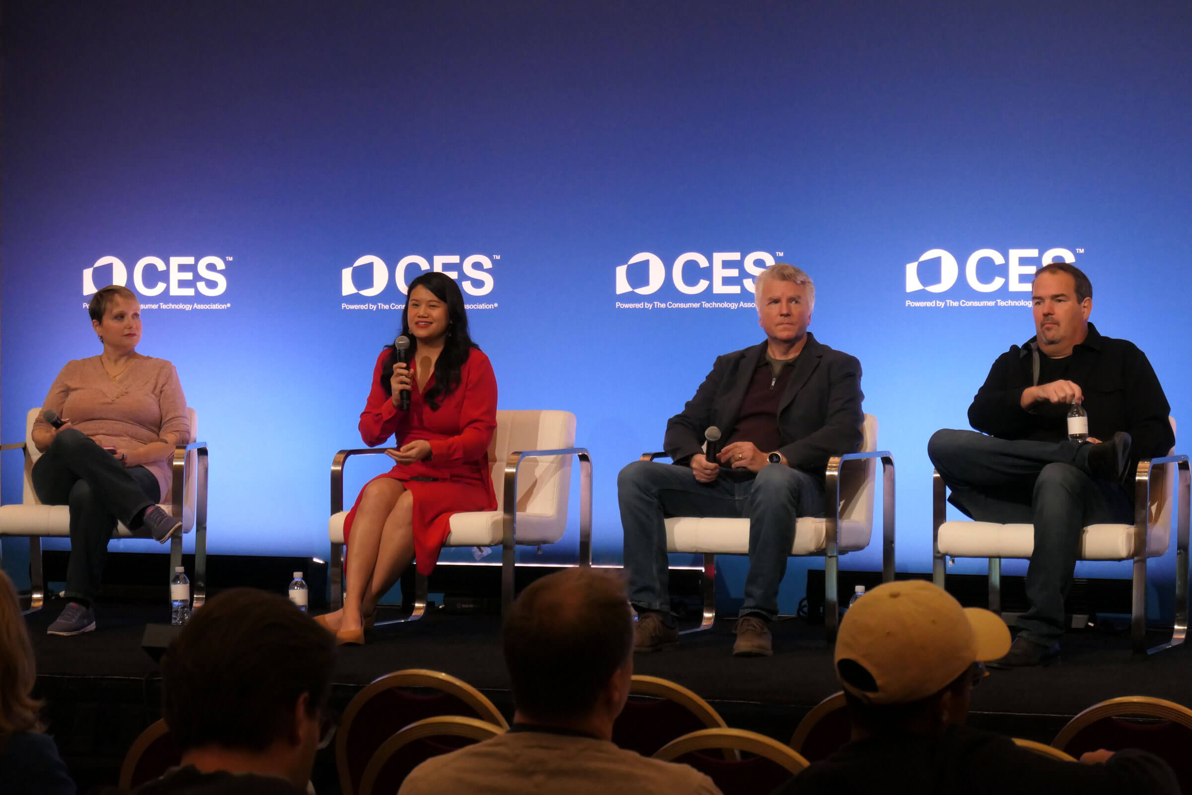
We headed there together—Keren to speak on a panel about raising AI kids responsibly, and Dan to meet with clients and partners and check out what’s coming in the world of media and technology.
What stood out most was the contrast between our panel discussion—where we focused on how AI can genuinely enhance kids’ lives in meaningful ways—and the exhibit halls, where much of the tech seemed designed to become the centerpiece of daily life. There were some promising ideas, like digital health assistants and travel concierges, but it was clear that many companies were betting on people reorganizing their lives around their products. That could be a tough sell for consumers, and one that leaves a big opportunity for companies to design technology that integrates into people’s lives, amplifying what they already value and care about.
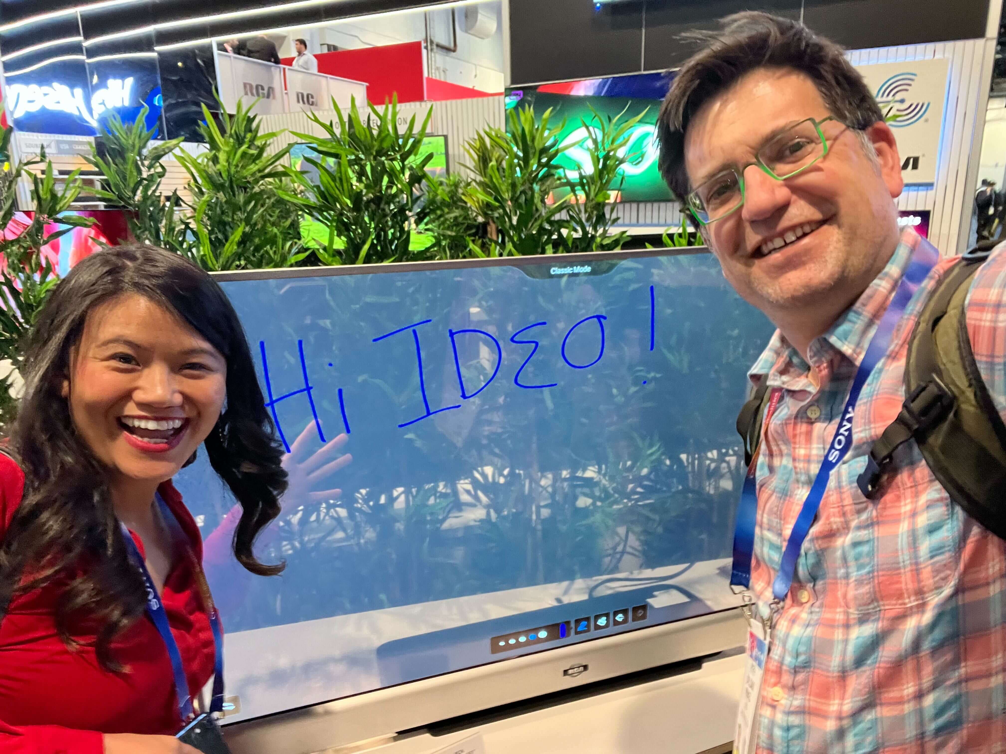
Here were the most interesting things we saw, heard—and wished we’d seen.
Things we heard
Kids aren’t impressed by AI alone: While adults can go ga-ga over everything AI, Keren’s co-panelist, Joshua Garrett, COO of Readyland, astutely pointed out that though adults might feel an experience is magical because of a novel tech interface or capability, kids aren’t wowed by the flash if the experience itself doesn’t deliver. At the IDEO Play Lab, we often see that adults will try to figure out how to make a product work because they're too embarrassed to admit they don’t get it. But kids will tell you right away if something isn’t intuitive. Youth have also told us directly: They want a chance to learn how to form relationships with real people, not a chatbot that might stunt their emotional growth during their formative years. While these insights were focused on designing for kids and youth, the idea of novelty wearing off applies to any audience. During our panel, there was consensus: Just because something can be automated or replaced, doesn’t mean it should be. There are the human moments we should hold on to and protect.
Things we saw
Smart glasses galore (or wearables that go anywhere but your wrist): On the way out of the CES showroom we were overwhelmed (well, almost) by just how many versions of smart glasses there were, not to mention all the people in line waiting to try them out. The Xreal/BMW partnership was particularly packed, and won a bunch of “Best of CES” awards. We were particularly intrigued by Rokid’s approach to the device, which included a separate controller and ability to take off your prescription glasses (a big win for Dan!) and adjust the image quality in the lens. For now, it seems like the smart glasses market is still in flux, and popularity will be determined by how well these companies pitch something that fits different social moments (e.g. being the passenger of a car, sitting on an airplane, hanging out in cafe, walking down the street, just saying hi to a friend, etc). One thing that still felt way underdesigned? The audio experience and the relationship between the glasses and the audio devices you might already have.
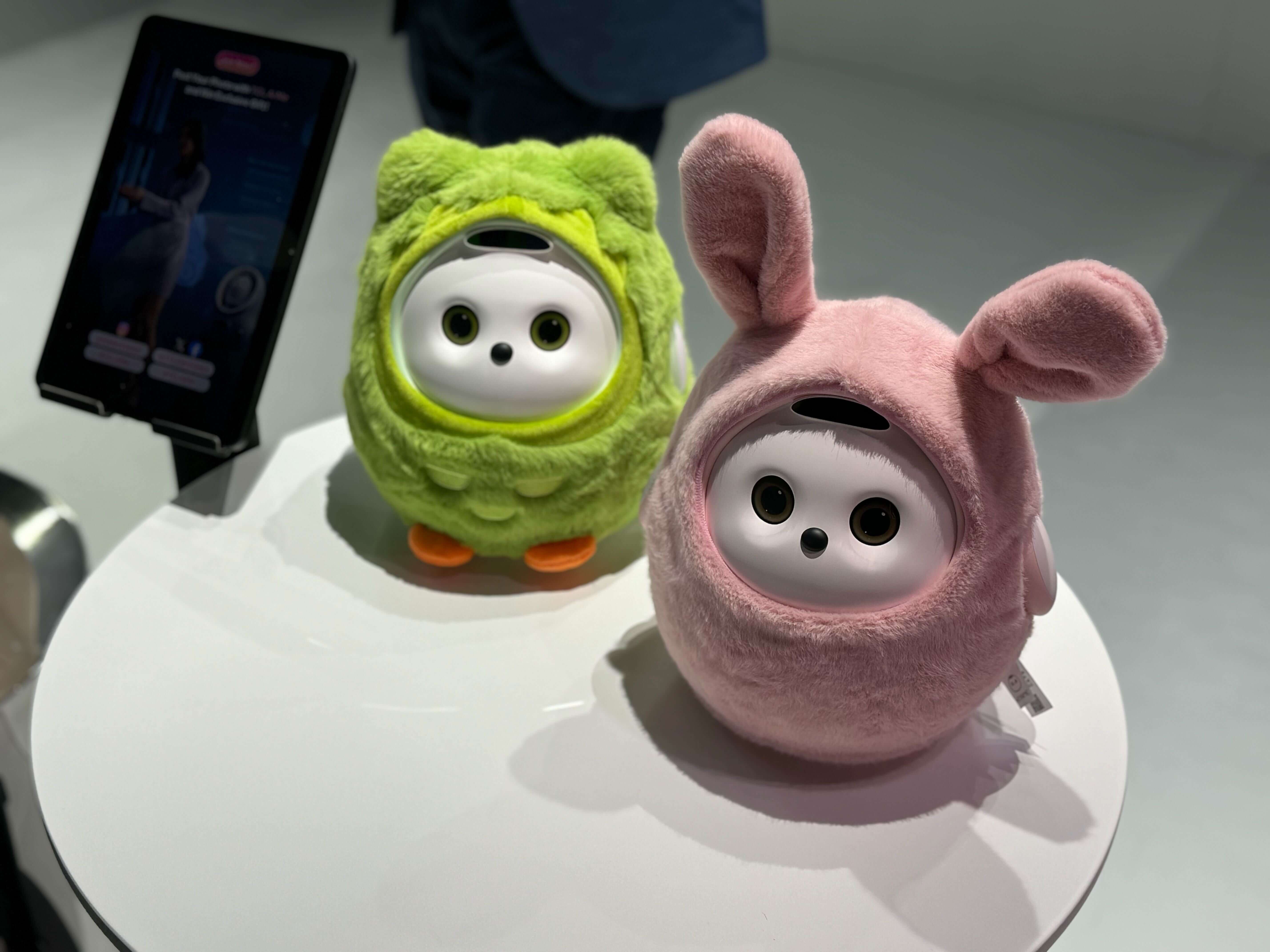
Creator tech ISO heart: As with most hype cycles, buzz around the creator economy has risen and fallen many times over the past few years. Are we on our third spring? We saw plenty of “pro creator” tools that can empower users to do everything from quickly capturing human motion (inertia-based motion capture and animation—no room sensors needed) to importing image assets with nothing more than a bluetooth connection and to software developer kits (SDKs) that enhance immersive experiences. Before, only professionals could access these powerful tools; now anyone (with the budget) can build an immersive game. Still, amid all this progress, it felt very refreshing to have dinner with execs in the creative space who emphasized the need for human stories and heart. The challenge isn’t just making creation faster; it’s ensuring the stories these tools help tell resonate on a deeper level, connecting with audiences in ways that transcend the tools themselves. After all, it’s the heart in the work that keeps audiences coming back.
IP content flywheel: Some of the longest lines we saw at this very techy tech convention were for the The Last of Us proof-of-concept immersive experience and the Demon Slayer photo opp at Sony. The uptick in location-based entertainment (aka, experiences that let people live out their fandom IRL) is a good reminder that characters and connections are the thing. The tech was in service of the experience. On the other end of the spectrum of the storytelling medium, at the Variety Summit, we heard about how webtoons and anime—long popular in the Asian market—are now finding incredible traction in other geographies. It was somewhat of a full circle moment for those of us who were coming of age during the era of LiveJournal and lo-fi sketches. There’s something nostalgic and comforting about the quick drawings and the 2D experience of absorbing a story in that way that appeals to users in the age of high-speed and seamless experiences. It’s a good reminder that some experiences benefit from slowing things down.
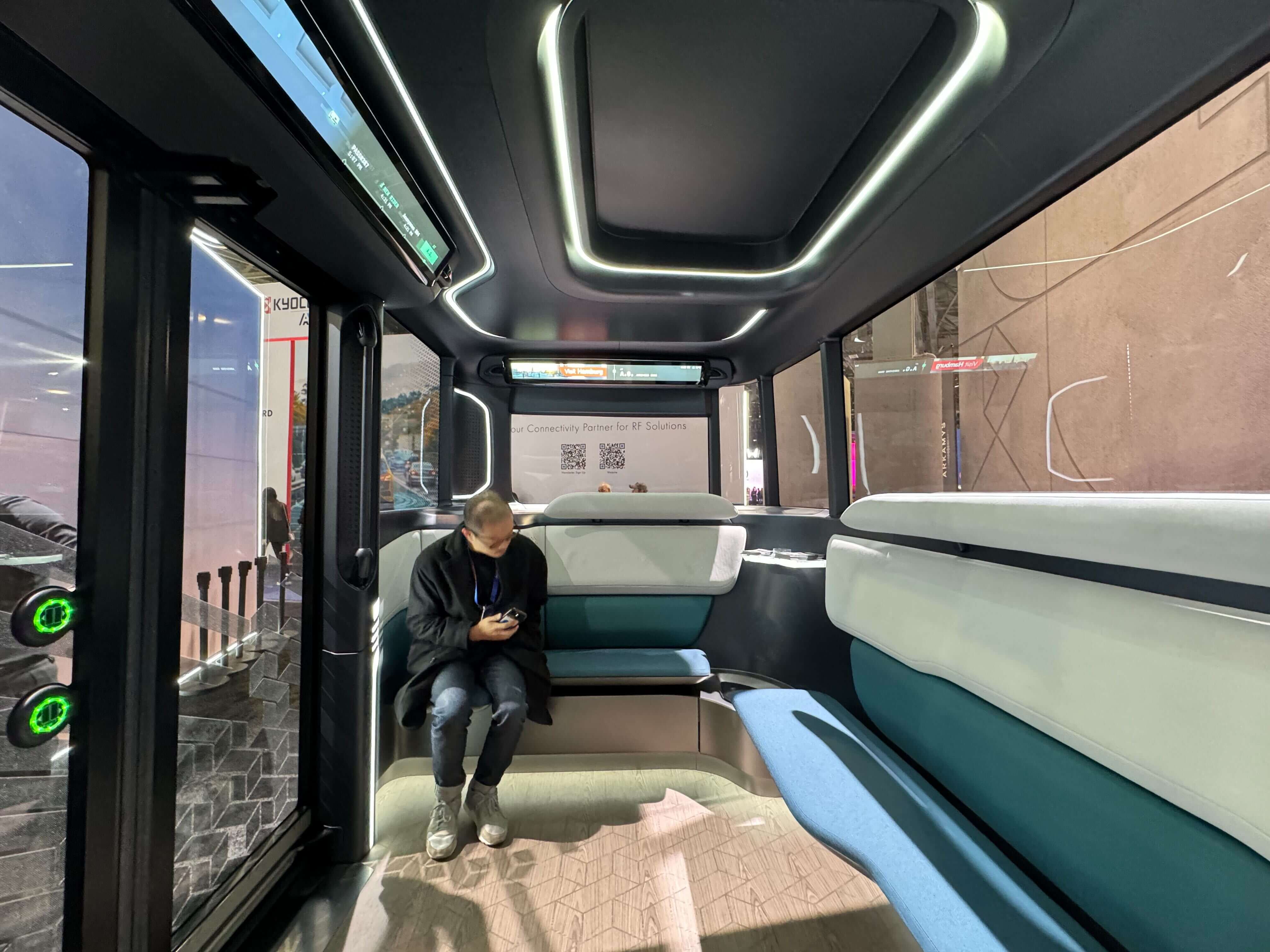
Things we wish we had seen
Solutions to big human problems: We were really hoping to see some innovative approaches to some of the looming problems we’re eager to get working on—like decades (centuries?!) of under-investment in women’s health. (And we’re not talking about period-tracking apps, either.) There is such a large opportunity area here.
We did really appreciate the AgeTech section, which was sponsored by AARP. Believe it or not, 2024 was actually known as “peak 65,” the year when the largest-ever number of Americans ever hit 65 at once. We need new solutions and interventions to support dignity and care in the aging process, improving not just the physical health experience, but mental and emotional health too. Some of the things we saw were cool and fun, like versions of classic games, tailored to audiences of different abilities, making it easier for families to connect. We’re hoping to see more solutions like this, that extend care beyond capturing health metrics, designing for delight and connection, which are important for longevity and joy.
Need help solving a problem in one of these opportunity areas? Get in touch. We’d love to hear from you.
This year’s Consumer Electronics Show (CES) was a whirlwind of AI—in your kitchen! In your car! In your bedroom!—smart glasses, “pro-creator tools,” and new media experiences (see-through tv screens, anyone?).
33 things we’d love to redesign in 2025
From crossing signals to patient portals and oh-so-much more.
As we move through the world in 2025, we have a long list of things we’d love to rethink, if only we had the chance. Here’s what’s risen to the top of our list this year.
PRODUCTS:
1. LED headlights make driving at night painful—and dangerous. Am I getting older and cranky? Yes! But that doesn’t change the fact that headlight brightness has doubled in the past 10 years, and the last time I checked, roads have not gotten darker. There are ways to keep ourselves safe on the road without blinding our fellow travelers.
—Will Notini, Chicago
2. Food storage lids and containers always seem to get separated, leaving mismatched pieces that feel impossible to pair. Containers rarely stack efficiently, taking up more space than they should, and any attempt at maintaining an organized and sustainable system seems destined to fail. How might we redesign everyday kitchen organization to turn common pain points into seamless experiences?
—Sindhura Sonnathi, San Francisco
3. Same. In addition to them getting separated and inefficient stacking, food containers never come out of the dishwasher completely dry. I’m constantly having to dry them with a towel and needing to get in those nooks and crannies to get all of the water out. The glass, ceramic, and metal dishes don’t do this. It’s just a nuisance. Let’s fix it!
—Shavon Gervasi, Cambridge
4. Assuming you’ve figured out what app the show you want to watch is in, you now get the joy of having to scroll through TV interfaces with long, flat horizontal “trays” down long flat horizontal pages. Sometimes there’s a bit of variation (Rectangles! Squares! Larger rectangles and squares!) but it’s easy to get lost, and hard to flip back and forth between things you’re interested in. I don’t miss my cable subscription, but I really do miss some of the things cable figured out how to do well.
—Dan Perkel, San Francisco
5. There must be a better solution than our current umbrellas. They're so inefficient and cumbersome to carry around. I always put off using one until I absolutely can't avoid it, and by that point, it often ends up breaking due to the wind anyway.
—Rita Nicolau, London
6. Many (most?) new cars have all of their radio functionality accessible only via touchscreen, which is 1) dangerous and 2) extremely inconvenient for your passenger DJ. Well-intentioned safety measures block smartphone syncing while the car is in motion (even when a passenger is doing the syncing instead of the driver), and many touchscreens require the user to navigate away from a map app in order to operate the music app or radio. Forcing all functionality to route through a screen is clunky and makes for a poor roadtrip experience.
—Meridith Halsey, Chicago

7. Compostable straws are better for the Earth than plastic straws! But, they get all mushy and disintegrate half-way through your drink. We can make something better.
—Nina Lampert, London
8. Why do white plastic fences exist? They’re a larger version of the white plastic bag. They are not good for the environment, they do not weather well, and you really can’t repair them like you can a wooden fence.
—Christina Abele, Cambridge
9. This might be more of a revival than a redesign, but I’d love to build a version of The Whole Earth Catalog (WEC) updated for 2025. First published in 1968, the original WEC was a compendium of product listings, how-to guides, and educational tools for those in the back-to-the-land movement, shaped by thinkers like Buckminster Fuller. We need a new version of that radical spirit. Whatever form it takes, a new WEC could offer practical resources, forward-thinking education, and hands-on toolkits with an eye toward sustainable living and ecological literacy.
—Beth Holzer, San Francisco
10. For so many people, financial decisions like planning, budgeting, etc., are group decisions—made with roommates, loved ones, spouses (former spouses!), parents, kids, and others. And yet due to a combination of regulations, conventions, and perhaps a bit of laziness, almost every financial product, service, or brand is oriented around a one-to-one relationship that people then have to hack or modify to truly use in a collaborative, group-first way. Does it really have to be this way?
—Dan Perkel, San Francisco
11. Streaming services don’t financially benefit most artists. How can we create more equitable, scalable systems for artists to make living wages?
—Ceci Gomez, San Francisco
12. When I was little we went to the store to buy a dishwasher and the display models all had glass fronts. I came BURSTING in the door to tell my mom that we were getting a dishwasher with a window. The disappointment I felt when it came with a metal front is an understatement. Why don’t they have clear glass doors?
—Molly Rolig, San Francisco
13. Flexible Spending Accounts (FSA) are tax-advantaged accounts that allow employees to set aside pre-tax money to pay for eligible medical expenses. And my bi-yearly dental cleaning is solidly within the eligibility guidelines. However, after every dental cleaning, my FSA provider tracks me down asking for an itemized receipt to “prove” that the visit was covered—even though there’s nothing at the dentist’s office that I can purchase that is outside of that coverage. This doesn’t happen with any other eligible medical expense I incur; how is it still the case that paying for dental care gets constantly flagged as potential fraud? It’s a friction point that makes me not want to deal with FSAs at all. If FSAs are meant to promote preventative care, they should be designed to promote as seamless an experience as possible for the employee.
—Meridith Halsey, Chicago
14. Shower curtains are hard to clean, the metal rusts, the little hooks fall off, they make noise, they are annoying to take down and put back up, and they aren’t easy to change out to suit your mood or time of day. Staying clean while keeping the rest of the bathroom dry could use some innovation.
—Dan Perkel, San Francisco

SYSTEMS:
15. Currently, the shareholder model of corporate governance requires the maximization of shareholder wealth, which has contributed to wage disparity, corporate greed, lowered local tax payments, lack of corporate social accountability, and inappropriate corporate influence on government legislation and policy. This could be redesigned so that, one, shareholder wealth is only a part of the corporate mandate; two, corporate “freedom of speech” is curtailed; three, corporations have less influence over government; and four, corporations contribute more to their local communities and economies.
—Jeremy Sallin, San Francisco
16. In Capitalism, we have a system that is rewarding greed and nonstop growth, while that growth is now killing our planet. Something’s gotta give, y’all.
—Stuart Getty, San Francisco
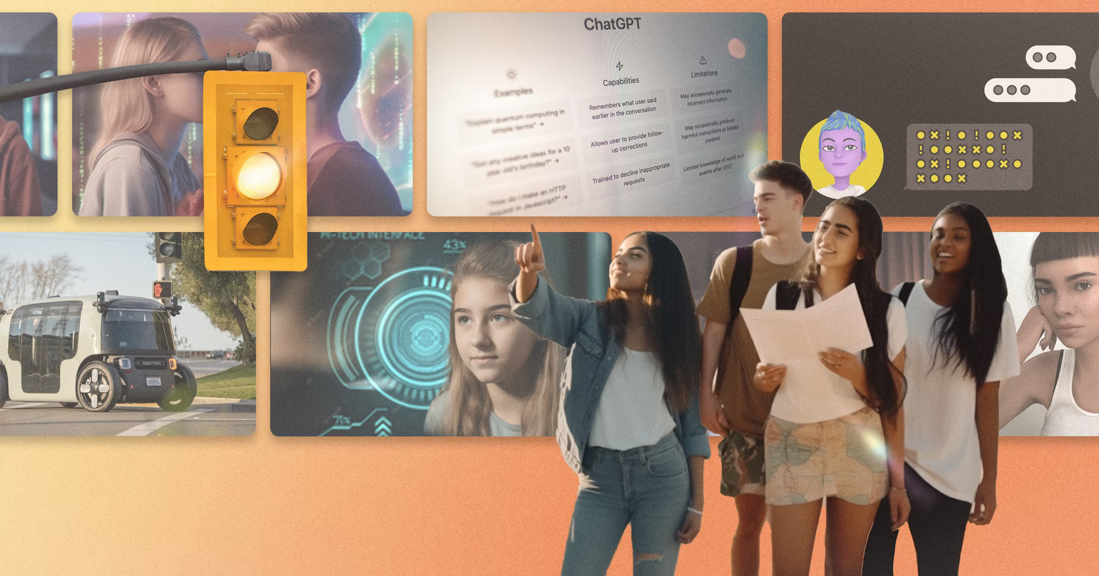
17. Why are pedestrians, who are the most vulnerable participants in traffic systems, often deprioritized by cities and our infrastructure? Especially here in the U.S. At times when traffic is light (at night, for example), pedestrian crossing signals are red by default, while the signal for main thoroughfare for cars is green. What if all pedestrian crossing had a default state of “cross” instead? Also why do pedestrians need to request the right to pass by pressing a button? I’d want our cities to shift from car-first systems, to people-first and would love traffic lights to lead the way.
—Juho Parviainen, San Francisco
18. Why do I need to install a new medical app on my phone, every time I go see a doctor? Why must every practice have their own portal, their own system, their own login info, and their own interface? Even my doctor sometimes struggles to pull all of the inputs into a single place where they can see everything and give an accurate assessment and advice. How might we streamline the use of patient data into a format that’s truly efficient for physicians and patients alike?
—Shannon Vossler, Chicago
19. As cities face more extreme and frequent heat waves, our built environment is failing to protect residents—especially vulnerable populations like the elderly, outdoor workers, and low-income communities who often lack access to cooling. Temporary cooling centers and emergency response plans are reactive band-aids that don't address systemic issues in heat resilience. Traditional infrastructure (dark pavement, lack of shade, heat-trapping buildings) actively makes the problem worse. The complex interplay between urban design, social equity, and climate science demands innovative thinking beyond just adding more AC units.
—Nazlican Goksu, San Francisco

EXPERIENCES:
20. Meetings are the backbone of how teams align, make decisions, and move work forward—but too often, they’re baaaaad. Unstructured, dominated by a few voices, or overly reliant on agendas that prioritize activities over outcomes. This leads to wasted time, drained energy, and frustrated participants. By applying a designer’s mindset—clarifying objectives, prototyping small changes, and making discussions tangible—meetings can become opportunities for collaboration, alignment, and momentum instead of sources of friction.
—Matt Cooper-Wright, London
21. The behavior we let people get away with under the guise of “the customer is always right” never ceases to shock me. We subject service workers, in-store employees, and more to the worst side of human behavior all because we decided—what?—that paying money at a store lets you say whatever you want to the people who work there? I am a customer of various places, and I am rarely ever right (although you don’t see me screaming about it)! I’d love to see our executive class stick their neck out for their employees, who are their most valuable asset, and set stricter public standards for customers’ treatment of their staff.
—Andy Reischling, Cambridge
22. People used to associate travel with wonder and adventure. Now, people grit their teeth and steel themselves when making their way to and through an airport. Airports should not be malls full of stuff that no one really wants. Instead of having overpriced corner shops, what if we had libraries for books and items? Instead of a mall food court, what if we had places to recharge, refresh, and have a free healthy snack?
—Dave Kim, San Francisco
23. Why is there so much beeping in hospitals? As a patient it is overwhelming. I am impressed that hospital employees can decipher all the beeps, emergency vs. non emergency.
—Christina Abele, Cambridge

24. Commercial flights have been around for about 110 years, and we still have to be there two hours in advance for a flight that is in the air for the same amount of time. The boarding process where you’re forced to stand in an even smaller space for 40 minutes before they open the plane doors deserves a human-centered takeover.
—Justine Syen, London
25. While people come to the emergency department for a whole range of reasons, they tend to have two things in common: they are nervous (for themselves or a loved one) and they have no idea how long they’ll be there. Instead of uncomfortable chairs, a single TV blaring the news on high volume, and a sad nearly-empty vending machine, there are so many opportunities to design an environment that better accommodates the feelings of stress and uncertainty in the air. A little privacy would be nice, too!
—Jen Halls, Cambridge
26. Can we all admit we made a mistake and just get rid of self-checkout? Where I live, in Watertown, MA, there are several stores that have gotten rid of most of their staff in favor of self-checkout machines and, simultaneously, put crucial items (like toothpaste) behind a locked door. Because the store is so understaffed, you might be waiting—and I timed this—15 minutes for someone to come unlock the toothpaste for you. And the machines themselves! We are all human here. We sometimes make mistakes with machinery that we are unfamiliar with. This just slows everything down and we end up calling for help in the end, anyway.
—Andy Reischling, Cambridge
27. Why does renting a car at an airport still feel like traveling back in time to the early ‘90s? Surely we can do better now. I want a better rental experience and 100 percent electric fleet.
—Juho Parviainen, San Francisco
28. There’s nothing like a good road trip. It’s an opportunity to get to know the U.S. and the people you’re traveling with in a new way. Improved ground transportation between cities is associated with greater employment opportunities for working professionals and economic growth for smaller towns. As autonomous and electric vehicle technologies improve, I’d love to design an intercity public transportation service run by electric, autonomous vehicles to promote travel between cities, towns, far-flung national parks, and more in a way that is fun and adventurous while also promoting stronger personal bonds and broader economic growth.
—Natasha Alani, Cambridge
29. With skyrocketing costs for labor and delivery as well as growing concerns around maternity mortality rates (particularly for people of color), it’s time to redesign the end-to-end experience for maternity care! I’d love to explore the rise of maternity care deserts especially in the shadow of recent changes in reproductive policy.
—Diana Tobey, Play Lab
30. There are so many reasons to redesign American elementary education, but ultimately kids need more movement and active learning. There are pockets of teachers that do this. But this doesn’t work for everyone and in my experience as a parent, I see and hear about kids who are not thriving in traditional classrooms. Certainly works for some, but not all, so let’s rethink it.
—Christina Abele, Cambridge
31. There’s so much anxiety, opaqueness, searching, follow-ups, making impossible decisions in the process of finding daycare for children. Why do parents get minimal notice (hours to days) on making day care acceptance decisions when providers can force families to commit thousands to secure spots and provide multiple months notice to leave? The equation doesn’t stack up fairly. How might we design transparent, fair, confidence-building methods to seek, select and find care for our children?
—Uvini Lokuge, San Francisco
32. Why does open enrollment have to be so confusing? I feel like I have to do advanced scenario analyses to compare healthcare plans and still honestly have no idea what my total health costs for the year will be. Can there be fewer options? Fewer acronyms? Some sort of feedback loop to tell you at the end of the year if you made the right enrollment decision?
—Jen Halls, Cambridge
33. I cannot praise our teachers and faculty enough for all they do—but the emails are hard to keep up with. The important information is often buried in the body of the emails, and because they’re often titled something like “week one” or “week two” they’re hard to search. Also—plot twist —some information comes home on a print out and isn’t mirrored in emails, so don’t throw anything away! How can we help redesign school communication so that our beloved teachers can easily share a window into our children's lives that we can keep track of?
—Kristin Boer, Chicago
Need help redesigning a product, system, or experience of your own? Get in touch.
When you spend your life designing products, experiences, and systems, everything you interact with is an invitation to wonder, “what if…”

Lindsey Turner
I’m passionate about building brands, products, and experiences that help organizations show up with meaning and momentum.
I help organizations cut through complexity by shaping how they show up, through brand strategy, identity, and storytelling.
Working at the intersection of brand and business, I bring an editorial eye and a bias toward making—turning ideas into tangible experiences that people can understand, trust, and believe in.
My work spans government, healthcare, financial services, media, and consumer goods, from launching Gen Z-focused ventures to building innovation labs and reimagining legacy brands. I relish moments of ambiguity and enjoy translating across teams, perspectives, and priorities to move ideas forward.
I started my career in editorial and digital design, shaping cross-platform experiences and identity systems in publishing and agency environments. That foundation still shapes how I work today: I’m detail-oriented, collaborative, and overreliant on the Oxford comma. I hold a BFA in Visual Communication from the School of the Art Institute of Chicago.

Rachel Young
My work helps organizations see who their products aren't working for—and build the will and the tools to do something about it
For 25 years, I've asked the same question: Who does this design exclude—and what are we going to do about it?
My work spans human-centered strategy, inclusive design, and qualitative research, with clients ranging from Microsoft, Google, and Verizon to the National Science Foundation, and San Francisco Unified School District.
Before IDEO, I taught elementary school in East Palo Alto and spent a decade doing design work with social service organizations—where I learned firsthand what it costs people when systems are built without them in mind.
I am currently writing User Error, a nonfiction book about digital access and the design decisions behind it. I live in Oakland, California.

Brian Pelsoh
I lead with craft, ensuring our work is creatively excellent: rooted in deep human insight and imagination, while also grounded in the realities of business and technology.
My expertise spans brand, communication, and product design across tech, education, the arts, and social impact.
I believe great work demands both high-level vision and obsessive attention to detail, and only happens through collaboration.
I bring an inclusive, hands-on approach and a deep understanding of business, which enables me to consistently deliver excellence while always asking why.
Before joining IDEO, I worked at the brand firms Pentagram and VSA Partners. I began my career as a designer, leading teams at the School of the Art Institute of Chicago and the Milwaukee Art Museum. I hold an MFA in graphic design from Maryland Institute College of Art and a BFA in communication design from the Milwaukee Institute of Art & Design, and have taught at some of the best design schools in the US.

Tony Wong
I am responsible for IDEO’s long-term success in China and working with clients to use design as a tool to enable growth.
I am responsible for IDEO’s long-term success in China and working with clients to use design as a tool to enable growth. Specifically, I have helped Chinese companies design holistic brand solutions through the development of their products, communication, services, and innovation teams, and I have helped multinationals expand their presence and influence in China.
I advise global leaders on developing China-led innovation and capabilities.
In over 15 years in IDEO Shanghai, I have worked on projects that use design to elevate the quality of the experience of healthcare products and services, streamline processes that increase productivity, create spaces and programs that promote and enable inclusive communities, and build next generation mobility solutions that are planet-positive.
Before joining IDEO, I worked at Philips Electronics and the Electrolux Group in Italy, the Netherlands, and Singapore on a number of breakthrough commercial products. I am a member of the Young President Organization in Shanghai.

How to use AI as an editor, not a writer
Ed White shares how he uses AI as an editor—not a writer—to sharpen storytelling, rehearse ideas, and preserve the productive friction that makes creative work better.
Ed White has a rule he's tested on his own writing: hold yourself as the writer, and let AI be your editor. Ed is a Senior Design Director at IDEO's London studio, where he co-leads the firm's AI portfolio across Europe. Before IDEO, he spent 12 years as a writer and editor at the Financial Times, Wired, and Contagious. So when he talks about when to use AI for storytelling and when not to, it comes from two decades of crafting his storytelling skills.
In this episode, Mina Seetharaman talks with Ed about two specific tools he uses to keep AI in an editor's seat: a "roasting agent" prompted to critique his drafts without any sugarcoating, and a simulated audience he rehearses pitches on before the real thing. They also get into what Ed is hearing from design leaders at Anthropic, Lovable, Shopify, and Google Creative Lab about how creative work is changing, and why he thinks the friction of writing something yourself is worth protecting rather than automating away.

Building a personal AI for the messiness of life: Sida Li
Becca Carroll talks with Cue co-founder Sida Li about designing a personal AI for the messiness of everyday life—not just work. They explore how Sida stays anchored to human needs while navigating fast-changing technology, product tradeoffs, business-model experimentation, and the realities of building an AI company today.
Most AI products today are built for work—a space with clear problems and established systems. One founder noticed a gap: personal life is messier, harder to systematize, and mostly left behind by the AI boom. So she built Cue, a personal AI that lives inside iMessage and group chats, to go where the other tools haven't.
In this episode, Becca Carroll, IDEO's Chief Strategy Officer, talks with Sida Li, co-founder and CEO of Shared Context Lab, about staying anchored to a human need while the technology around her keeps changing shape, why she treats her business model with the same rigor she'd bring to a product, and what it feels like to build a company at this particular, disorienting moment in AI.
The conversation also gets into how Sida makes design decisions: the language Cue uses to describe itself, the tradeoffs behind building inside iMessage instead of a new app, and a real story about a business idea that didn’t pan out.
This is the second in a two-part series profiling founders from IDEO's Startups-in-Residence program. The first conversation is with Johannes Seemann, founder of Sooner, on designing GenAI for the emotional side of money.

Designing GenAI for the emotional side of money: Johannes Seemann
Designing financial tools around the feelings that shape money decisions.
Most personal financial tools are built to run the numbers and optimize towards a budget. While that works for some, most people experience money as a lived relationship that does not neatly fit into a spreadsheet. Johannes Seemann and Becca Carroll discuss why money is emotional before it is mathematical, and what a human-centered approach to building a generative AI financial product looks like in practice.

The curious leader's edge in uncertainty: Scott Shigeoka
How genuine curiosity helps leaders navigate uncertainty with greater confidence.
Mina Seetharaman talks with Scott Shigeoka, author of Seek and Head of Curiosity Cultivation at the Eames Institute, about what distinguishes genuinely curious leadership from performative curiosity, how power dynamics shape curiosity, and why practicing curiosity can restore energy rather than drain it.
Looks like you might be in search of something very specific?
Or reset the filters above and try another angle.
Here’s some random inspiration

Podcasts about creative leadership

Articles about the power of prototyping

.webp)


.webp)


.webp)

.webp)

.webp)
.webp)