.svg)




Bringing tourists to a hidden coastal gem
An open-air pavilion to entice visitors to one of Boston’s best-kept recreational secrets.
Once considered one of Boston’s best-kept secrets, Boston Harbor Islands National Park was looking to increase visibility and entice visitors to its network of 34 islands, a Civil War–era fort, historic lighthouses, and more than 50 square miles of bays, harbors, and rivers within the Boston Harbor basin.
Together with the National Park Service, Boston Harbor Alliance, architecture firm Utile, and landscape architecture firm Reed Hilderbrand, IDEO and the National Park Service came up with a plan to design a pavilion on the Rose F. Kennedy Greenway, which reconnects the city’s historic waterfront to the downtown area. The team believed a successful pavilion would sell boat tickets, attract passers-by, and enable a positive encounter with the islands. Today, the structure serves as the primary gateway linking Boston to the Harbor Islands, equipping the city with an experiential anchor to better connect visitors with Boston’s coastal gems.
The Boston Harbor Islands Pavilion was officially unveiled on June 2, 2011, and honored with an Honor Award for Design Excellence from the Boston Society of Architects, the 2011 Grand Honor Award from the Associated General Contractors of New England, and a Silver Award from the 2012 ACEC/MA Engineering Excellence Awards.
The Boston Harbor Island Alliance, which acts as a steward for the 34 islands, anticipates that the pavilion will positively impact the number of visitors this year.

Bringing back the neighborhood pharmacy
Helping a retail chain build healthier relationships with customers.
In 1901, Charles R. Walgreen, Sr., opened up a small neighborhood pharmacy on Chicago’s South Side. Today, Walgreens is the largest drug retail chain in the US with more than 8,200 locations in all 50 states. As healthcare reform has become top of mind in the US and patient-centered care increasingly the norm, Walgreens sees its scale as an opportunity to rethink the role of the community pharmacy in the 21st century. The company collaborated with IDEO to redesign its pharmacy experience in order to foster rich, trust-based relationships between customers and the most highly trained medical professionals on staff—pharmacists.
Most Americans—75 percent—live within five miles of a Walgreens. With the Affordable Care Act bringing millions more Americans into the healthcare system, Walgreens’ proximity and reach provided a big opportunity to become a convenient and trusted touchpoint for patients outside of hospitals and doctors’ offices, especially those suffering from chronic conditions such as diabetes and heart disease. The challenge: Use design to shift customer perception of Walgreens from just another convenience store to a local place at “the corner of happy and healthy,” where customers could receive everyday health and wellness advice. In other words, bring Charles R. Walgreen’s vision of a community pharmacy to unprecedented scale.

IDEO built out two full-size prototypes of a reimagined Walgreens pharmacy designed to cultivate better relationships between customers and pharmacists. Key to building good relationships were private consultation rooms that allowed for close conversations, and friendly health guides that helped customers browse over-the-counter medications or schedule “take care” appointments. Pharmacists, usually barricaded behind their high counter at the rear of the store, were now positioned out on the pharmacy floor, ready to listen and—most important—ensure continuity of care.
"Patients are engaging with pharmacists even more often to ask about everything—including their medication, health conditions, and prescription regimens," said Nimest Jhaveri, Divisional Vice President, Pharmacy Transformation.
The new Well Experience format was launched in two pilot locations in Chicago just a few months after the prototypes were built. Combining IDEO’s pharmacy work with Walgreens’ new approaches to beauty products, fresh food, and online shopping, 750 Well Experience locations have opened in the US and Puerto Rico—including 14 flagship stores in major cities—and an additional 1,000 are planned for the coming years.
Walgreens is also expanding the scope of its Take Care Clinics, which are usually staffed by nurses or physician’s assistants, to include the diagnosis, treatment, and monitoring of chronic diseases such as diabetes that are typically handled by doctors. The company considers its Well Experience pharmacies a work in progress and plans to keep evolving the design based on customer feedback.
An ingenious way to preserve wine
A double-duty bottle opener that's an industry game-changer.
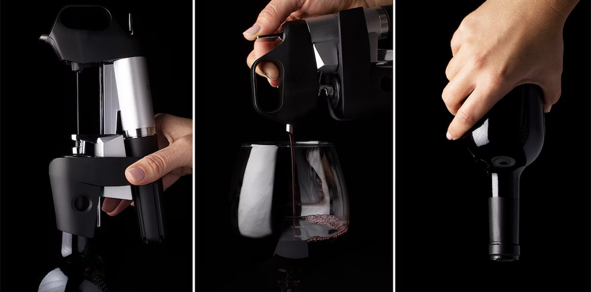
Opening a bottle of wine is typically a moment of no return, because what remains after the first pour almost immediately begins to oxidize.
But Greg Lambrecht knew there was a better way. He came up with an idea to pour the wine without opening the bottle. With a new device, a slender needle is inserted into the cork, and argon, an inert gas, pressurizes the bottle to pour a single glass. Remove the needle, and the tiny puncture in the cork naturally reseals, maintaining the integrity of the wine in the bottle.
Working with Lambrecht, IDEO refined the look, feel, and user experience of his device, designing and building a prototype that captured the expression of his eureka moment. Using this prototype, Lambrecht raised significant seed funding for his startup, and launched the Coravin System in July 2013. The company continues to grow year after year.
Lambrecht introduced the only product of its kind sold in the global market, and preliminary sales have far exceeded expectations. What’s more, for wine lovers everywhere, there’s finally a solution to savor and preserve every last drop.

An ATM designed for you
Making customer interactions fast and easy—without requiring any new hardware.
Wells Fargo, one of the United States’ largest banks, wanted to enable customers get to the ATM functions they wanted faster. The updated interface needed to be different enough to have a tangible impact, and had to appeal to an extremely broad audience. What’s more, any changes made to the interface had to be compatible with the existing hardware of all of the ATMs in operation nationwide.

Wells Fargo and IDEO worked to enhance and customize the ATM user experience by making it innovative, fast, and easy—without requiring any new hardware. The interface’s entire layout is personalized, based on what a user does most at the ATM. It gives users an immediate glance at their account balances (which they can also hide) and highlights the touch screen 'buttons' that they use most (by putting them at the top of the screen in green). New data hierarchy also facilitates skimming for fast decision-making and provides messages and notifications based on a customer’s priorities. “[The design] shows an intense attention to detail,” noted American Banker.
PHOTO ILLUSTRATION BY MAGGIE LYNN, IMAGE COURTESY OF BIZJOURNALS.COM
Information Overload
Can algorithms help us navigate the untamed landscape of online news?
IDEO New York developer Francis Tseng is—in his spare time—searching for a solution to the problem by exploring its root: the relationship between content and code. Tseng received a grant from the Knight Foundation to develop Argos*, an online news aggregation app that intelligently collects, summarizes and provides contextual information for news stories. Having recently finished version 0.1.0, which he calls the first “complete-ish” release of Argos, Tseng spoke with veteran journalist and documentary filmmaker Jason Cohn about the role technology can play in our consumption—and comprehension—of the news.
How would you describe to my mom, who just got her first smartphone, how Argos works and why it’s useful?
I’d say that it collects all of the important news and tells you exactly what you need to know about it. Instead of tracking separate publications, it pulls in new articles from a variety of different sources (right now, just a few major publications) and condenses everything into a set of bullet points. Argos uses a technique called “hierarchical agglomerative clustering” (HAC) to organize news stories. HAC takes each individual article and compares it to every other article, and comes up with a number representing how similar they are, on a scale of 0-1. If the similarity is above some threshold—say, greater than 0.7—the articles are considered to be talking about the same event, and they are grouped together into “event clusters.” The same HAC clustering technique is then applied to the event clusters to organize events into “story clusters.”
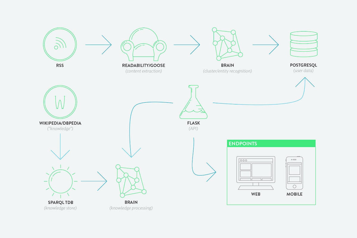
A sentence ranking algorithm generates a summary of each event cluster by analyzing the text of every article in the cluster and assigning an “informativeness” value to each sentence. It then takes the top five highest-ranked sentences and forms a summary. Right now I have a very simple version implemented, but the long-run focus will be on improving these core algorithms that do the heavy lifting.
Are journalists necessary anymore? Have I been replaced by an algorithm?
I personally don’t think that journalists will be replaced, at least not for a long time. Someone still needs to go out and do the research and the original reporting to get the information that the algorithm uses, which seems like the hardest and most valuable part of journalism.
It seems like some new tech applications derive from the recognition of a new technical capacity, which you then look for novel ways to use. In other cases, it begins with the recognition of a need, and you look for extant technologies that provide a possible solution. Which way did you approach Argos?
Both. I’ve always had a fascination with artificial intelligence, and that fascination has probably made me more sensitive to problem areas where AI approaches could be applicable. Personally, I find information overload, especially when it comes to keeping up with the news, really anxiety inducing and overwhelming, and I think because I was already familiar with some of these text processing techniques, it made sense to try applying them to this particular problem.
I’m glad you brought up information anxiety and overload. I think it’s a huge barrier to understanding the news today. There is so much information and analysis, but I don’t trust any of it, and I don’t know how to begin to get to the bottom of what’s really happening. Do you think Argos, or technology in general, can be an aid in this problem?
That's a particularly good example of the fact that there are different kinds of information overload. There’s one that is just about having too much information, but there’s another that is about figuring out which information you can trust. In general I would say technology has the potential to salve these kinds of anxieties, but it can just as easily do the opposite. More than anything, I hope Argos reduces the problem rather than adds to it, but one of the big failings I’ve felt with this first version is that it doesn’t accomplish that; it ends up generating more noise. Based on the feedback I’ve gotten, I'm looking at new designs and reevaluating techniques in order to rectify that.
What did you learn through building the first version that will influence the next one?
When I originally conceived of Argos, I was (and probably still am) naive about the extent of the issues that plague digital journalism. The more I looked into it, the more problems came up. Initially, the idea was about reducing information overload, mostly by supplying missing context to stories. But after completing this first version, I think that reducing overload and providing context might be really big and different issues. So right now I’m trying to determine how—and if—they can be solved simultaneously.
You mean because providing more context increases—by a lot—the amount of information a news consumer requires?
Exactly. The other main goal was increasing the understanding one got out of reading the news, which is what context is supposed to help with. But that’s kind of useless if all that information ends up driving people away from reading the news in the first place.
What changes are you planning for the next version of Argos?
In the first version the design was focused more on providing an experience similar to a traditional news publication or news reader. The app was organized around different feeds, or streams, presented as full-screen images with the title and summary of each event.
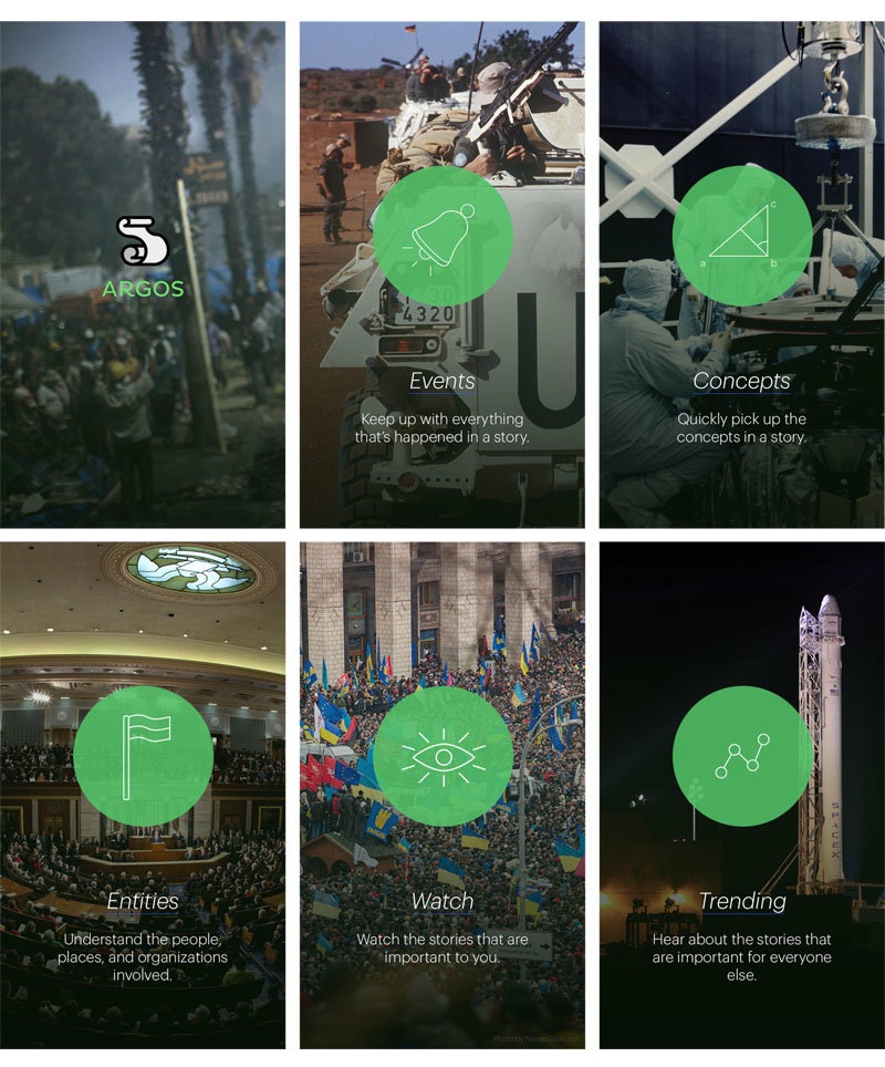
One issue was that the design wasn’t distinct from other news readers—you can’t really tell from looking at it that it’s offering anything different from a traditional RSS reader or news application. And it’s really hard to expect that every news story will come with a nice big image. Also, though, I think that in approaching the app as a traditional news publication, I missed the point of what I was trying to accomplish. The feedback I've gotten has helped me understand that Argos can have a more useful and unique place in being kind of a “daily scan” of the day's news events. So the new designs are more akin to brief updates about events around the world, to provide people with an entry or starting point for reading more and getting involved in discussions.
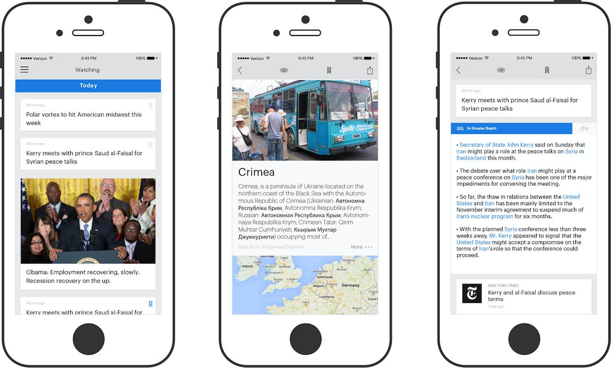
And you give them avenues for digging deeper into contexts and definitions?
Yes. The original source material is there to read, and context is optionally provided. You can choose to read more about the event itself, or about the people, places, organizations, etc. that are involved.
What about the issue of bias? As journalists, we’ve always had to be wary of our sources. And as consumers of news, it’s always been a good idea to assume that someone with an agenda is feeding reporters their information. How does Argos handle biases and opinions that are embedded in a story?
The issue of bias in journalism is one of those big problems that cropped up when I looked more closely at what I wanted Argos to do. It seems like a perennial issue. One potential solution is that, if you sample a large enough set of publications, bias might “average out,” so that any summary that is formed from their aggregate has less bias than any individual article. I don’t know if that works in practice though. My cop-out answer would be that Argos isn’t really trying to solve the problem of bias, but personally I hope that one day it can. Looking at the history and associations of the author who wrote the piece could actually be a very good technique. In the new version of Argos, I want to incorporate more community dialogue around the events and stories. In my experience, a lot of these issues about bias—being as complex and nuanced as they are—are best hashed out by individuals discussing them.
I think I have to disagree with you on that! My feeling about web comments on news stories is that they rarely shed much light relative to heat.
It is very difficult to pull off correctly. A lot of comments devolve into knee-jerk shouting matches. Occasionally, though, I’ve found something really insightful. On Reddit, sometimes experts will come in and succinctly explain things, and every once in a while you see a very levelheaded discussion about a story. I think the potential is there, but it’s hard to get it right.
One thing I’ve been focusing on is that I’m trying to get my hands mostly on reporting that’s coming from the field. The rest is just analysis, which, in my opinion, is more susceptible to ideological influence.
Yes! I have been thinking a lot about how to incorporate grassroots and community reporting. I’m dissatisfied with Argos’s current approach of relying on major publications, but it’s just easier at this stage.
Do you need to have content licensing relationships with news organizations to harvest the data or can you just… borrow it?
It’s possible this usage of the content falls under the terms of “fair use.” All the original articles are cited, and I’m hoping that these high-level summaries can interest people in reading the original posts. Since things are still quite experimental, I’m not worrying about the potential legal consequences now, but at some point I will want to talk to the publishers.
It seems to me that one really useful type of story for Argos is something like the lost Malaysian airliner. There was a big burst of real news when the plane disappeared, and then there was an endless cycle of conjecture and empty reportage with very little actual “news.” If you were following that story on Argos, would you avoid being updated every five minutes to discover that they still haven’t found the missing plane?
Yes, if the clustering algorithm works well enough, it should be able to recognize that these articles are talking about exactly the same thing as the ones from last week, so it’s not a new event.
It would be nice if cable news worked like that.
Maybe with Argos it will!
*Argos is a personal project of Francis Tseng's and is not affiliated with IDEO.
Digital journalism has evolved to a point of paradox: we now have access to such an overwhelming amount of news that it’s actually become more difficult to understand current events.
.jpeg)
Painting with Code
How generative art reveals new possibilities in visual expression and design
Generative art, or art derived from computer code, is a relatively new format, in which the artist-programmer realizes a vision or idea by defining parameters and commands. But making generative art is, in many ways, just like painting or any other classical fine art.
When you create a painting, you start with an inspiration and sketch it on paper. You then prepare your oils, brushes, and canvas, and you refine the painting until it’s just right. I follow a similar process with generative art. When something inspires me, whether it’s a contour map in a geographic magazine, a chart representing a mathematical formula, or the various mechE tools in my father’s workshop, I sketch it on paper and jot down the keywords that best describe it. Then, I sit down at my computer and compose the code (using the Python programming language) that will “paint” the right “brush strokes.” I run the code to generate images on my computer, and go through multiple iterations until the code outputs the shapes, colors, opacities, and shadows that perfectly express my original idea.
I leverage the power of my computer to generate the artwork. Where a classical fine artist would pull out their oils and brushes to express colors and shapes, I do the same with parameters. For example, I defined a palette of colors for painting waves like this:

As if the computer was a hand holding a brush, I tell it how to paint by defining command codes, like draw_wave:

Delightful randomness
While most of the parameters in my code are set statically, I have also added an algorithm that allows certain parameters to be generated randomly, so the visual elements of the image change randomly within a defined range. This way, the final product is unpredictable; I’ll never know exactly what image will be generated.
This function returns a float number randomly ranging from 0.1 to 0.7:

The random parameters are not only unpredictable, but also non-reiterative, so these images cannot be recreated—they are completely unique.
Algorithm as art
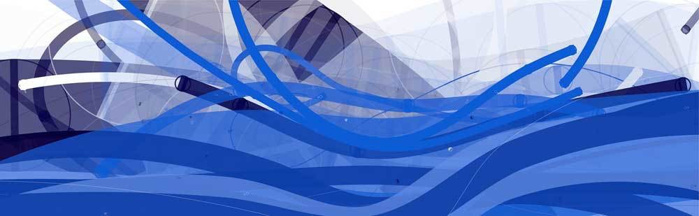
Computer graphics are based on mathematics, so when I paint with code, I am exploring and visualizing the beauty of structure, abstraction, and complexity in mathematics that most of us don’t get to see in our daily lives. It often happens that when I play with a new algorithm and see the images it generates, I'm inspired to develop them into artwork, as was the case with Tsunami, below. The inspiration for this series came while playing with an algorithm named Cornu Curve, which generates a fantastic visual effect of crazy waves. From the same code, I made six different images using a combination of a hundred curves in varying opacities and shades of blue.





Unlimited complexity
Creating art with code allows me to make complex images that I could never have made by hand, such as All Seeing Eye, below. It is composed of millions of lines and hundreds of layers, and each line has its own shadow, blur, and opacity.

My goal was to use the complex texture to create the visual effect of catching or entrapping the audience in the “eye.” The computer is an exciting tool for creating art like this, which requires repetitive, intricate work. A piece of generative artwork composed of millions of shapes can be drawn in just a few minutes. Rendered by hand, the same piece might take a human ten years to accomplish.

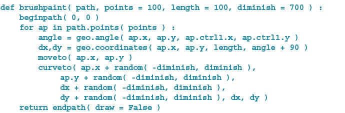
Like a painter selecting the perfect tool, I used the following piece of code to define a “brush” with just the right characteristics to create the lines I wanted:

Then, just as a painter would use a specific gesture to create a certain visual effect, I used the following code to tell my computer how to hold and draw with the brush I created:
Functional designs
The exciting thing about generative art is that it is not only beautiful, but also usable. We can create new patterns and unique fabrics for the fashion industry, or we can move beyond two-dimensional creations and use generative art to make sculpture, furniture, and even architecture.
Creating art with code, I’m constantly making new discoveries of exciting visual possibilities. Computers have revolutionized countless aspects of human life, and now, generative art has the potential to revolutionize artistic expression, opening infinite space for innovation.
By day, I code mobile apps and design digital experiences. In my free time, I create art. I recently began exploring both at once with generative art, a sublime combination of computer programming and graphic art.
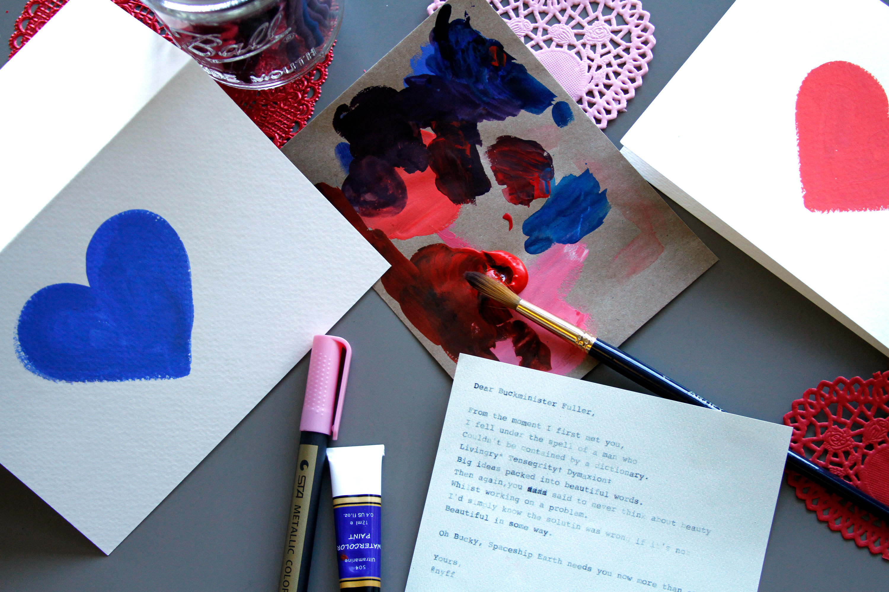
How to Make a Fauxtobooth
IDEO New York hacks by hand, building a photo booth that lets people get reacquainted with their inner artist
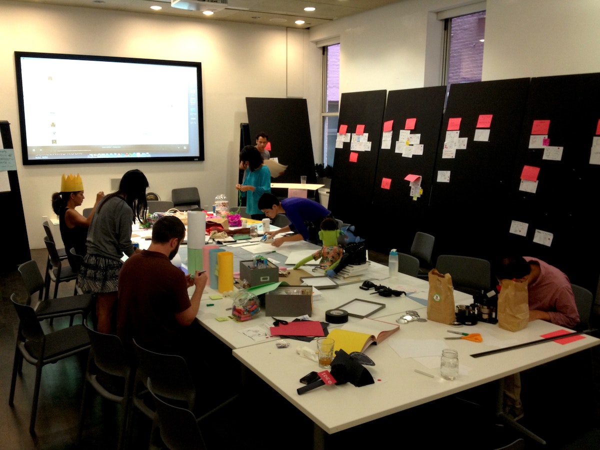
Wild ideas emerged: a Hug Deli, where patrons might order Ninja Hugs off the menu; a mystery bar, serving up a drink chosen by the previous guest. The big idea was to get people out of their “thinking minds“ in order to freely create.
And that brought us to Fauxtobooth.
A riff on the classic photobooth we all know and love, this version is completely handmade and doubles as a creative confidence booster—forcing people to draw on a deadline.
How it works
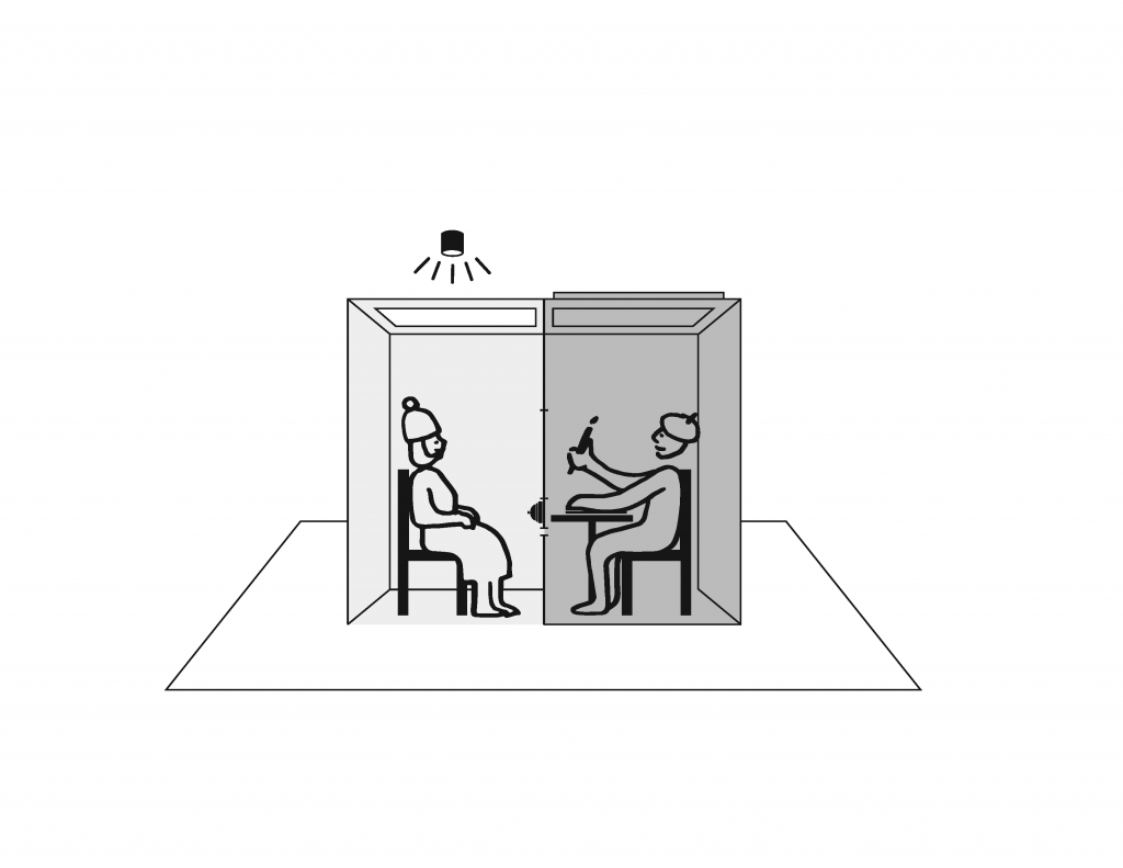
The subject takes a seat inside the booth, facing a mirror. Thirty seconds after pressing a button, the subject receives a slip of paper through a slot below the mirror with—whoa!—a hand-drawn sketch of his or her face on it.
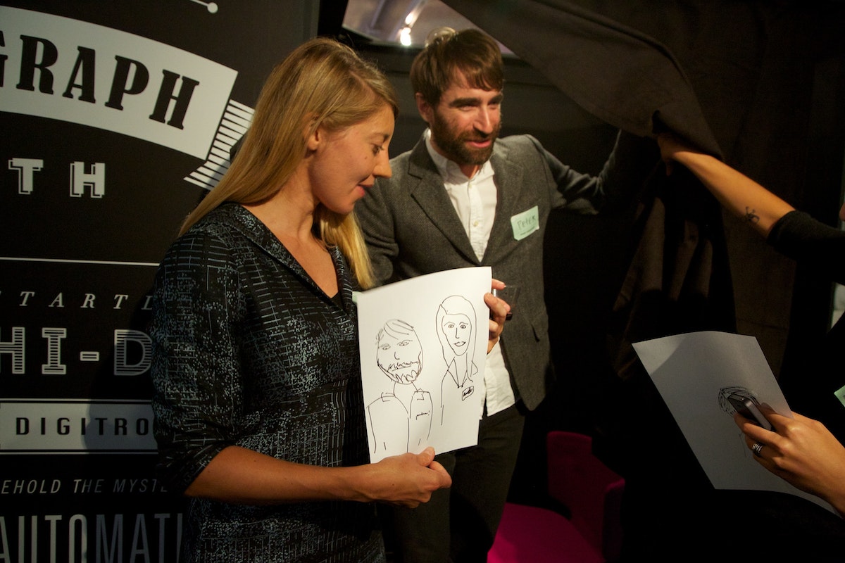
Um, how exactly did that work?
When the host brings the subject around to the back of the booth, the inner workings of the machine are revealed: table, chair, paper, Sharpies. The subject was actually posing in front of a two-way mirror and now it's his or her turn to take on the role of fauxtographer—of capturing the next unsuspecting subject.
How it's made
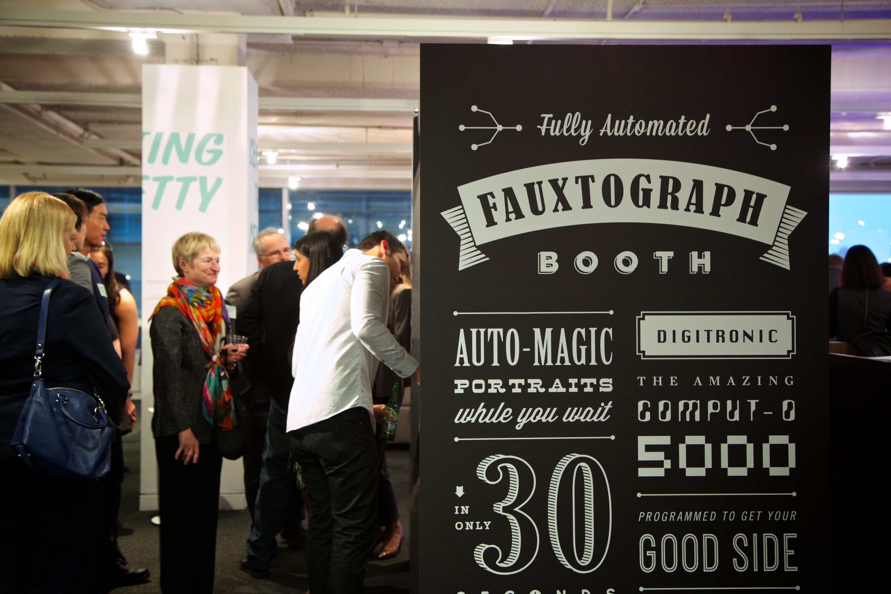
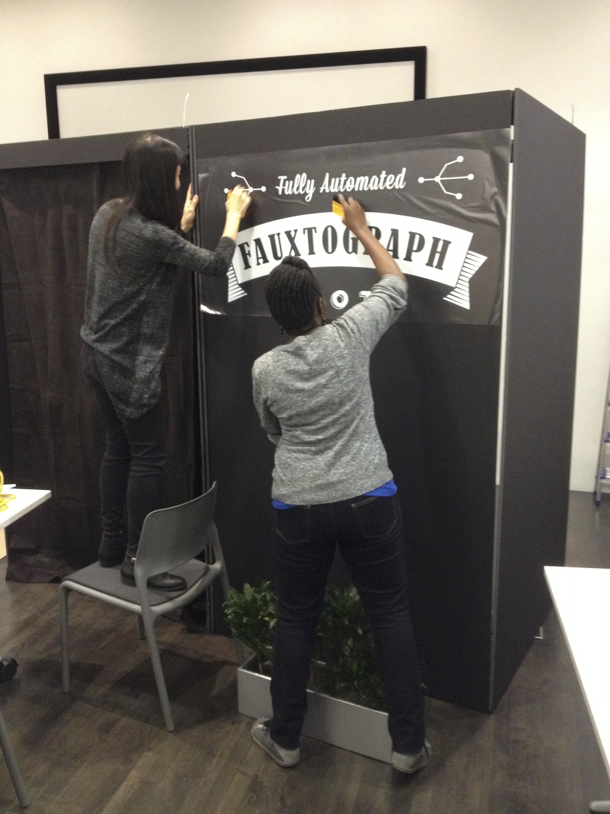
To make a full-scale prototype, you’ll need some foam core and tape. A crude model will help you get a sense of the dimensions and how long it would take to build. The massive black exterior offers an opportunity to advertise your offer. We used vinyl decals for our slogan: “Automatic portraits while you wait!“
Enlist friends: Building a Fauxtobooth takes a village (who likes to cut foam core alone anyway?).
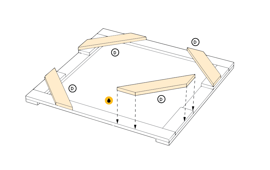
Glue together pieces of foam core to provide structural integrity, and attach the parts using industrial strength velcro, making it possible to easily deconstruct and transport the booth.
Finishing touches
A few key elements bring the Fauxtobooth to life: a two-way mirror, a giant red “Start” button, and graphic flourishes:
- Two-way mirror: The artist can see the subject, but not the other way around. Position the Fauxtobooth under direct light on the subject’s side (you can also use a spotlight), and make sure the curtain is closed on the other side to completely conceal the artist.
- “Start” button: Program an Arduino to keep time (we used an interval of 30 seconds). When pressed, the button lights up for 20 seconds; for the last 10 seconds it blinks and counts down. This serves a dual purpose: the subject knows to hold still for their portrait and the artist knows how much time they have to complete the portrait.
- Graphics: IDEO designer extraordinaire Njoki Gitahi loves bold, vintage signs, and playful, typographic compositions. She took inspiration from Lou Dorfsman’s “Gastrotypographicalassemblage.“ The team vinyl cut and applied the graphics—a tricky process, but well worth it in the end. The white lettering creates a dramatic display against the black backdrop.
What we learned
Once we narrowed in on the Fauxtobooth concept, we realized that (1) you can capture the gestalt of a person in a very short time, (2) people have fun with it, and (3) the collection of images make for an awesome display wall. Here are a few other things we discovered along the way:
- Get back to basics. Building with common materials like foam core, tape, and Velcro reconnects you to basic skills and tools. And the analog experience charmed the pants off people.
- Velcro is your friend. Not only is the sticky stuff forgiving if you don’t get the alignment just right on the first try, it also allows you to disassemble and reassemble structures on location. Consider it the new duct tape.
- Fine-tune light and sound. We were able to position the subject’s side of the booth under a light and keep the artist’s side relatively dark. Check your space ahead of time and use a spotlight if necessary. Also, as the party heats up, the sound of the Start button may be drowned out. Turn up the volume!
Your turn
Up for the challenge? We put together a handy manual so you can learn from our mistakes. If you do build a Fauxtobooth, we’d love to hear about it. Send us a few (real) photos!
Download the replication manual and vinyl graphics
There was a lot of work to be done. IDEO's New York studio was to host an event to celebrate Tom and David Kelley's new book, Creative Confidence, and whatever we designed had to reflect their ideas. Pressure on, we brainstormed over lunch—tools and sticky notes spread out across the largest room in our office.

Save the City, Stop the Muenster
To celebrate the discovery of the double-helix, IDEO & Genentech bring genetics to life with an iPad game inviting the curious to save SF from mutant cheese
Sixty years later, amidst technological advances that have spurred massive innovation and changed the face of science, we decided it was time to re-inspire today’s generation. James Musick, a digital communications lead at Genentech, came to us for help in creating an immersive iPad experience that would celebrate Watson and Crick’s seminal discovery, as well as engage the science-curious. But with three months to complete the project, we needed to hit the ground running.
Ralph and The Cheesy Mess
The idea of using a game or puzzle as a way to bring users into a world filled with genetics became an early favorite in the ideation stage. Puzzle-based gameplay was a great analogy to reflect the scientific process: from trial-and-error learning stages, to information synthesis, all the way through solving the puzzle and answering the question. A game hinging on a real-life genetic mechanic would be novel and stood to introduce the science to a new audience. If designed well, with engaging play and a compelling story, we would be able to integrate the science, narrative, and gameplay into a beautiful app.
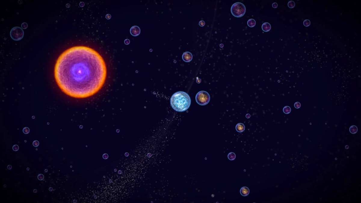
We started off diving deep into the world of video games. We indulged in playing some of our tried-and-true favorites, as well as newer games such as Osmos and Eufloria to understand how they bridged science and storytelling. At the same time, we were learning about cutting-edge research in genetics through conversations with Jason Long and other Genentech scientists, listening to podcasts, and a hefty amount of reading.
Throughout this inspiration phase, we kept coming back to a wildly intriguing area of research called epigenetics, which focuses on how environments affect genetic expression. In short, epigenetics is the area of genetics that, given a fixed DNA makeup, tells the DNA which parts of the code should express themselves and how they should express themselves as determined by external factors like weather, stress, diet, etc. So while we may have a fixed genetic makeup, the environment still plays a large modulating factor in our genetic expression.
Our fascination with the content—combined with a teamwide love of comic books and mutant-origin stories—evolved into an epigenetic-inspired noir-puzzle game based on Ralph, an artisanal cheese-maker, and his cheese company Ralph's Killer Muenster.
The mechanisms of genetics
Early on in the ideation phase, Evan Shapiro, who would become a core team member and help prototype game logic, introduced us to phylogenetic trees and maximum parsimony theory. You’ve probably encountered phylogenetic trees in biology class, where they serve to illustrate evolutionary relationships among species. Maximum parsimony, on the other hand, is more obscure. It serves as a computational forensic tool to help us understand the evolution of genetic traits along the phylogenetic tree, as well as help us infer species evolution. With maximum parsimony, the “preferred phylogenetic tree is the tree that supposes the least evolutionary change to explain observed data.” After mulling that over for a bit, we decided creating and solving a phylogenetic puzzle by employing maximum parsimony as a scoring criteria was a great jumping-off point and a compelling challenge.
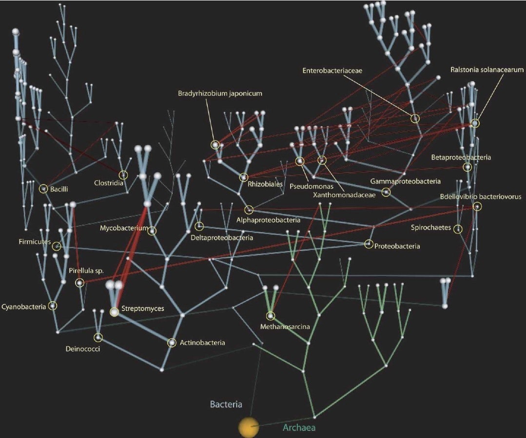
To test this, our first prototype was a paper prototype where we started with a sample origin genetic trait. We sketched out several generations by mutating one trait at a time, and created our own phylogenetic tree. Given the final generation of traits and no tree structure, the goal was to see if we could work backwards to recreate the tree structure and uncover the origin trait. Basically, reverse evolution. After a lot of finessing we came up with a rule set that actually reflected natural evolutionary rules and allowed us to solve the tree and find the origin species.

With this excitement, we spent a weekend programming a single prototype puzzle using mechanics that would become the main gameplay: players reverse engineer evolution by mutating a given set of species traits backwards to a common ancestor in the fewest moves possible. This was maximum parsimony made tangible. In order for the puzzles to be solvable, we had to use real evolutionary rules describing how the species’ traits can change. By the end of the weekend, we had puzzles and a game mechanic that were keeping us up late into the night trying to one-up each other’s scores, which, to us, meant we had hit the nail on the head.
From a design perspective, one of the significant balancing acts of the project involved weighing the desire to impart specific scientific knowledge against the value of experiential learning. When we used maximum parsimony it became clear that this was a perfect mechanic to give people an experiential interaction with real genetics.
Prototyping and puzzle design
From day one, Ralph’s Killer Muenster was an intensive prototyping project. The first bare-bones prototype of the puzzle was written in Qt because we wanted a framework in which we could rapidly prototype the GUI and could reuse game logic for the production app. Qt, although not extensively used, has great functionality and plays natively with Javascript and C++. It was a well-suited framework for prototyping the core puzzle experience, which included coding the evolutionary logic, adding and testing interactions, modifying visual communication, and testing informational displays.
Our daily workflow started with an early morning meeting so we could all share progress from the previous day. We spent the rest of the day implementing and testing new visuals and interactions on paper and integrating them into the Qt prototype architecture. Lastly, we tested them with people around IDEO to see how they reacted to specific design and gameplay decisions.
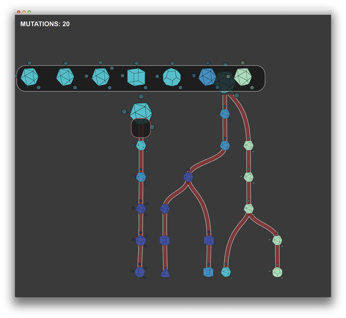
We used Unity for the production app in the development environment for many of the same reasons that we chose Qt. But Unity has the added benefit of working with native OpenGL, along with the capability to compile to iOS. As time-constrained as this project was, we still wanted to impart as much narrative and visual interest as possible, and Unity proved an excellent match for this challenge.
Nivi Ramesh, our interaction designer and art director, worked to create an amazing game landscape with analogies to microscopy and slide specimens. Working closely with developers at Substantial, we created layered and animated textures paired with OpenGL shaders to achieve the tone we wanted. We had parallel work streams throughout the prototyping phase, with one team working on developing the logic and overarching architecture of the production app while the prototyping team refined interaction elements, game mechanics, and informational displays in the prototype testbed.
What makes a good puzzle?
Before diving any further, we took a step back to make sure we got the puzzles right. Good puzzle games tend to adhere to some basic principles: They are purely cognitive challenges with a few simple rules, nearly infinite outcomes, difficulty that increases with mastery, and some clear goals. Plus, they're easy to learn.
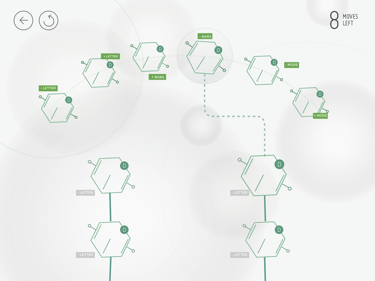
In building the game, one of our most critical challenges was creating visual representations of the genetic traits that people would be using to solve the puzzles. People had to quickly grasp how they could manipulate and evolve the traits given the genetic logic. If we couldn't get people to make this mental leap, the game wasn't going to succeed.
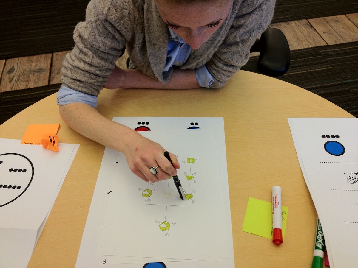

A real genetic trait is made up of a snippet of DNA and is a long, winding series of genetic code (or, a lot of AGTC). To make the game approachable, we chose to abstract and simplify the cheese trait representations as visual identifiers that had a bit of mystery and were themselves a puzzle to decode. We tested many different ways of visually representing the traits, the majority of which people could not directly connect to an increasing or decreasing series. The simplest visuals turned out to be the most effective: shapes, dots, and lines.
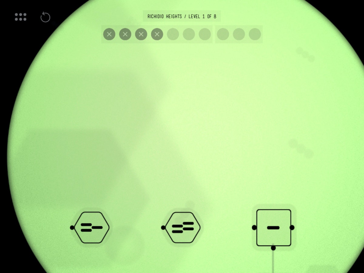
With simple geometric shapes, people could see that moving from a triangle to a square to a hexagon involved moving through a progression of increasing the numbers of sides. Similarly, lines and dots worked well for understanding how the traits could be mutated. They were easily accessible by players in planning a strategy for mutation.
Less is more
After the weekend of playing the prototype level, we needed a way to determine the optimal solution to these puzzles so that we could give user feedback and help players improve in the game. With Ralph's Killer Muenster, an optimal solution for any puzzle involves making the “most parsimonious” decisions, i.e. using the least number of moves or fewest mutations. We needed to find a way to reward people for doing less, contrary to typical game design where users are rewarded for doing more. Without a clear and appropriate qualitative feedback mechanism, we found that people were finishing puzzles without any sense for how much better they could perform.
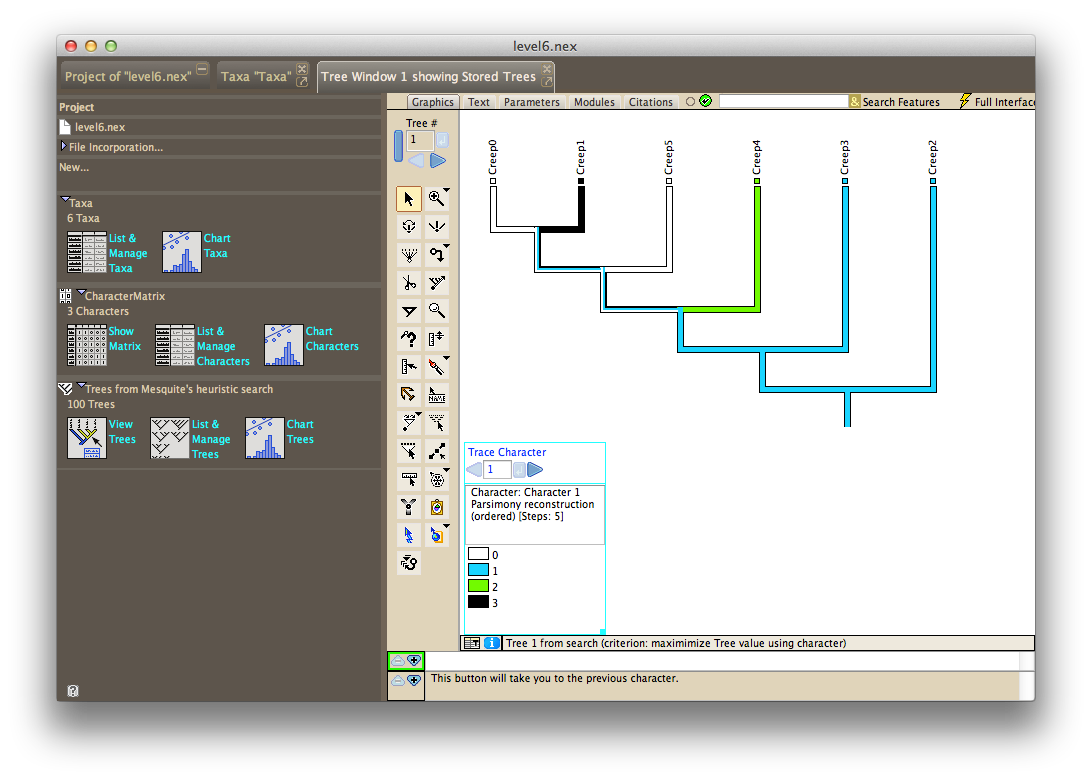
Scavenging the Internet for a tool to analyze phylogenetic trees uncovered Mesquite, a software package built specifically for computational biology and evolutionary analysis. After learning from tutorials produced by Harvard University, we could solve the initial species sets and puzzles we had created, and arrive at the most efficient tree structure and trait mutations.
We used the statistical language R to generate thousands of possible levels, export files for Mesquite to crunch, and output the moves required for each level into a custom level file that we could use to test in our prototype game.
Levels testing and design progressed in parallel with refining the scoring display and making hundreds of other visual and UX enhancements. With our trait visualizations, levels design and scoring mechanism solved, we felt we had achieved something that was both subtle and significant: People who grasped the underlying puzzle dynamics were quite literally using their brains in a way that mimics a core methodology of genetic science. This seemed to hit at the essence of experiential learning.
Muenster launches, Bill Nye approves
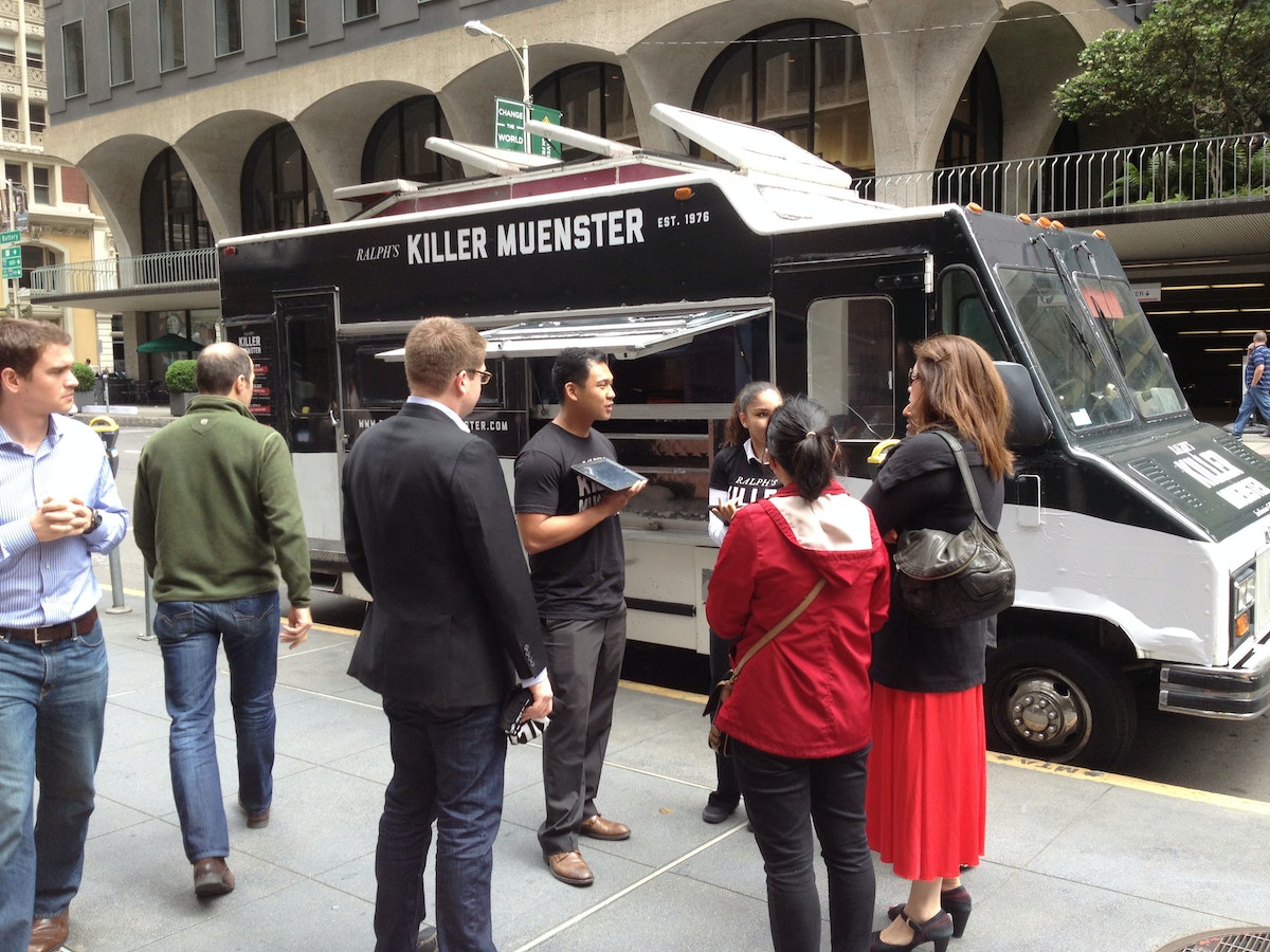
The Ralph's Killer Muenster iPad game launched at the 2013 GET (Genomics, Environments and Traits) conference, coinciding with the anniversary of Watson and Crick's seminal paper describing the structure of DNA. At the conference, Bill Nye the Science Guy, a long-time advocate of a science literate society, played the game, and loved it. This made our day. The app also caught Apple's attention, and was listed as a new and noteworthy Education app in the App Store.
To further raise awareness around the game, we created a Ralph's Killer Muenster brand, including a visual identity, packaging, website, Twitter, game trailer, and food truck—all mobilized by Ralph to push the only tool that could save the city (and his reputation) and allow him to lift the health code violations that kept him from producing and distributing cheese. Ralph’s food truck, sent throughout San Francisco, distributed grilled muenster cheese sandwiches.
What we learned
After the launch festivities, our team took a step back to consider what we had learned. Here's the take-away:
- Set constraints to help make a hard problem more approachable. Our self-imposed constraint that the game needed to rely on a scientific mechanism helped us narrow in on phylogenetic trees and maximum parsimony as our core concepts.
- A good story goes a long way. We spent significant time concocting Ralph's story, and getting the tone and art direction down in order to engage people. We want them to stick around for the more mentally taxing interactions later down the line.
- Find the right tool for the right job. We used a variety of prototyping and user testing methods and environments, rather than trying to find or force an all-in-one. Each tool elicited learnings unique to them.
1953 was a good year for science and technology. The polio vaccine was developed, the first open heart surgery performed, and color TVs hit the store shelves. It was also the year Watson and Crick revealed one of the most important discoveries of the 20th century: the double-helix structure of DNA.

Lindsey Turner
I’m passionate about building brands, products, and experiences that help organizations show up with meaning and momentum.
I help organizations cut through complexity by shaping how they show up, through brand strategy, identity, and storytelling.
Working at the intersection of brand and business, I bring an editorial eye and a bias toward making—turning ideas into tangible experiences that people can understand, trust, and believe in.
My work spans government, healthcare, financial services, media, and consumer goods, from launching Gen Z-focused ventures to building innovation labs and reimagining legacy brands. I relish moments of ambiguity and enjoy translating across teams, perspectives, and priorities to move ideas forward.
I started my career in editorial and digital design, shaping cross-platform experiences and identity systems in publishing and agency environments. That foundation still shapes how I work today: I’m detail-oriented, collaborative, and overreliant on the Oxford comma. I hold a BFA in Visual Communication from the School of the Art Institute of Chicago.

Rachel Young
My work helps organizations see who their products aren't working for—and build the will and the tools to do something about it
For 25 years, I've asked the same question: Who does this design exclude—and what are we going to do about it?
My work spans human-centered strategy, inclusive design, and qualitative research, with clients ranging from Microsoft, Google, and Verizon to the National Science Foundation, and San Francisco Unified School District.
Before IDEO, I taught elementary school in East Palo Alto and spent a decade doing design work with social service organizations—where I learned firsthand what it costs people when systems are built without them in mind.
I am currently writing User Error, a nonfiction book about digital access and the design decisions behind it. I live in Oakland, California.

Brian Pelsoh
I lead with craft, ensuring our work is creatively excellent: rooted in deep human insight and imagination, while also grounded in the realities of business and technology.
My expertise spans brand, communication, and product design across tech, education, the arts, and social impact.
I believe great work demands both high-level vision and obsessive attention to detail, and only happens through collaboration.
I bring an inclusive, hands-on approach and a deep understanding of business, which enables me to consistently deliver excellence while always asking why.
Before joining IDEO, I worked at the brand firms Pentagram and VSA Partners. I began my career as a designer, leading teams at the School of the Art Institute of Chicago and the Milwaukee Art Museum. I hold an MFA in graphic design from Maryland Institute College of Art and a BFA in communication design from the Milwaukee Institute of Art & Design, and have taught at some of the best design schools in the US.

Tony Wong
I am responsible for IDEO’s long-term success in China and working with clients to use design as a tool to enable growth.
I am responsible for IDEO’s long-term success in China and working with clients to use design as a tool to enable growth. Specifically, I have helped Chinese companies design holistic brand solutions through the development of their products, communication, services, and innovation teams, and I have helped multinationals expand their presence and influence in China.
I advise global leaders on developing China-led innovation and capabilities.
In over 15 years in IDEO Shanghai, I have worked on projects that use design to elevate the quality of the experience of healthcare products and services, streamline processes that increase productivity, create spaces and programs that promote and enable inclusive communities, and build next generation mobility solutions that are planet-positive.
Before joining IDEO, I worked at Philips Electronics and the Electrolux Group in Italy, the Netherlands, and Singapore on a number of breakthrough commercial products. I am a member of the Young President Organization in Shanghai.

How to use AI as an editor, not a writer
Ed White shares how he uses AI as an editor—not a writer—to sharpen storytelling, rehearse ideas, and preserve the productive friction that makes creative work better.
Ed White has a rule he's tested on his own writing: hold yourself as the writer, and let AI be your editor. Ed is a Senior Design Director at IDEO's London studio, where he co-leads the firm's AI portfolio across Europe. Before IDEO, he spent 12 years as a writer and editor at the Financial Times, Wired, and Contagious. So when he talks about when to use AI for storytelling and when not to, it comes from two decades of crafting his storytelling skills.
In this episode, Mina Seetharaman talks with Ed about two specific tools he uses to keep AI in an editor's seat: a "roasting agent" prompted to critique his drafts without any sugarcoating, and a simulated audience he rehearses pitches on before the real thing. They also get into what Ed is hearing from design leaders at Anthropic, Lovable, Shopify, and Google Creative Lab about how creative work is changing, and why he thinks the friction of writing something yourself is worth protecting rather than automating away.

Building a personal AI for the messiness of life: Sida Li
Becca Carroll talks with Cue co-founder Sida Li about designing a personal AI for the messiness of everyday life—not just work. They explore how Sida stays anchored to human needs while navigating fast-changing technology, product tradeoffs, business-model experimentation, and the realities of building an AI company today.
Most AI products today are built for work—a space with clear problems and established systems. One founder noticed a gap: personal life is messier, harder to systematize, and mostly left behind by the AI boom. So she built Cue, a personal AI that lives inside iMessage and group chats, to go where the other tools haven't.
In this episode, Becca Carroll, IDEO's Chief Strategy Officer, talks with Sida Li, co-founder and CEO of Shared Context Lab, about staying anchored to a human need while the technology around her keeps changing shape, why she treats her business model with the same rigor she'd bring to a product, and what it feels like to build a company at this particular, disorienting moment in AI.
The conversation also gets into how Sida makes design decisions: the language Cue uses to describe itself, the tradeoffs behind building inside iMessage instead of a new app, and a real story about a business idea that didn’t pan out.
This is the second in a two-part series profiling founders from IDEO's Startups-in-Residence program. The first conversation is with Johannes Seemann, founder of Sooner, on designing GenAI for the emotional side of money.

Designing GenAI for the emotional side of money: Johannes Seemann
Designing financial tools around the feelings that shape money decisions.
Most personal financial tools are built to run the numbers and optimize towards a budget. While that works for some, most people experience money as a lived relationship that does not neatly fit into a spreadsheet. Johannes Seemann and Becca Carroll discuss why money is emotional before it is mathematical, and what a human-centered approach to building a generative AI financial product looks like in practice.

The curious leader's edge in uncertainty: Scott Shigeoka
How genuine curiosity helps leaders navigate uncertainty with greater confidence.
Mina Seetharaman talks with Scott Shigeoka, author of Seek and Head of Curiosity Cultivation at the Eames Institute, about what distinguishes genuinely curious leadership from performative curiosity, how power dynamics shape curiosity, and why practicing curiosity can restore energy rather than drain it.
Looks like you might be in search of something very specific?
Or reset the filters above and try another angle.
Here’s some random inspiration

Podcasts about creative leadership

Articles about the power of prototyping









.webp)


.webp)
.webp)