
.svg)



In Mexico, redefining retail
FEMSA creates a digital ecosystem to increase customer value at its network of OXXO stores.
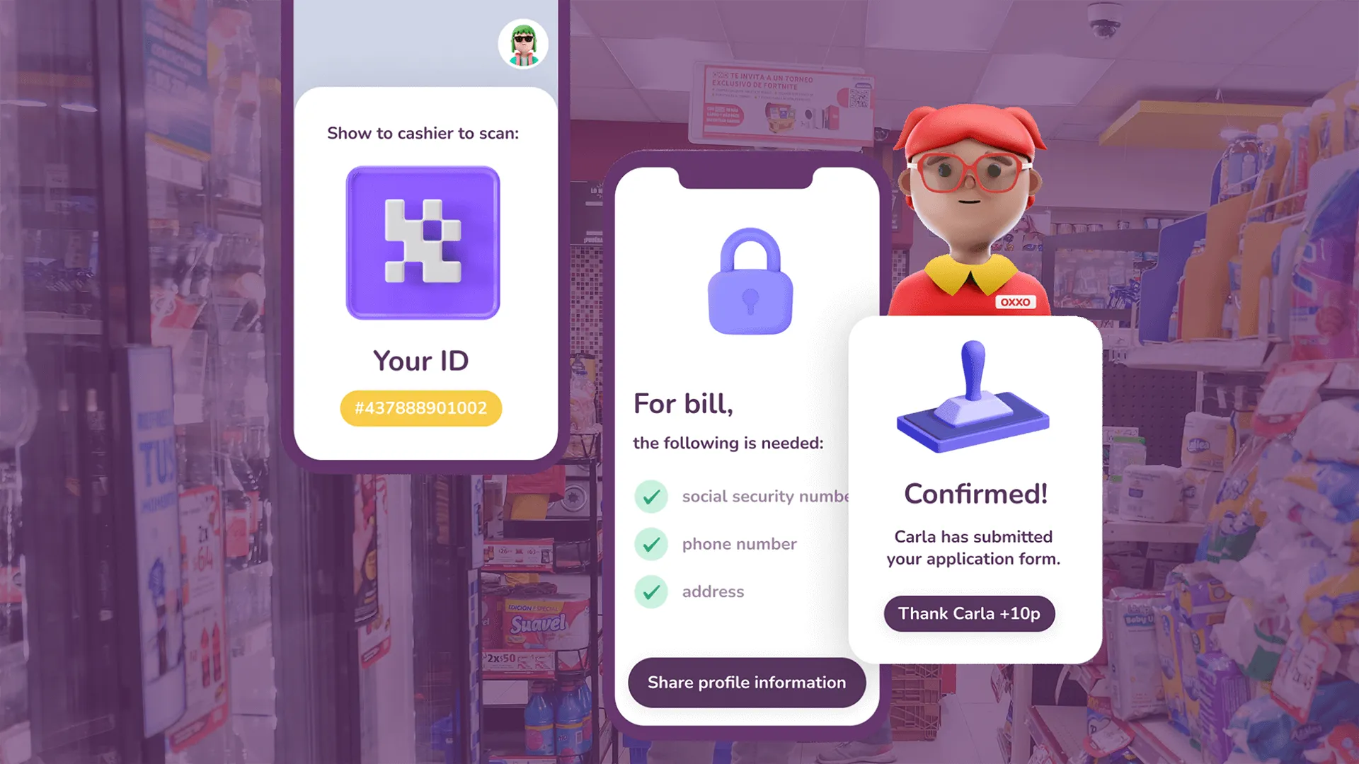
The IDEO team quickly discovered that the challenge of designing a Digital@FEMSA super app for tens of millions of customers was matched only by the operational complexity of bringing together different teams that had already created various apps with separate value propositions. Not to mention the 22,000 stores specifically tailored to local communities.
To kick off the project, the IDEO team built on FEMSA’s already deep understanding of its customers by meeting them in their homes and communities. The team discovered that users didn't care about long-term rewards; instead, they wanted everyday help to thrive long-term. Connecting omnichannel rewards to regular spending would allow them to save time and money—something they said was particularly important. Along with market research, insights like these directly informed the app's design, ensuring that it was compatible with users' everyday habits and preferences.
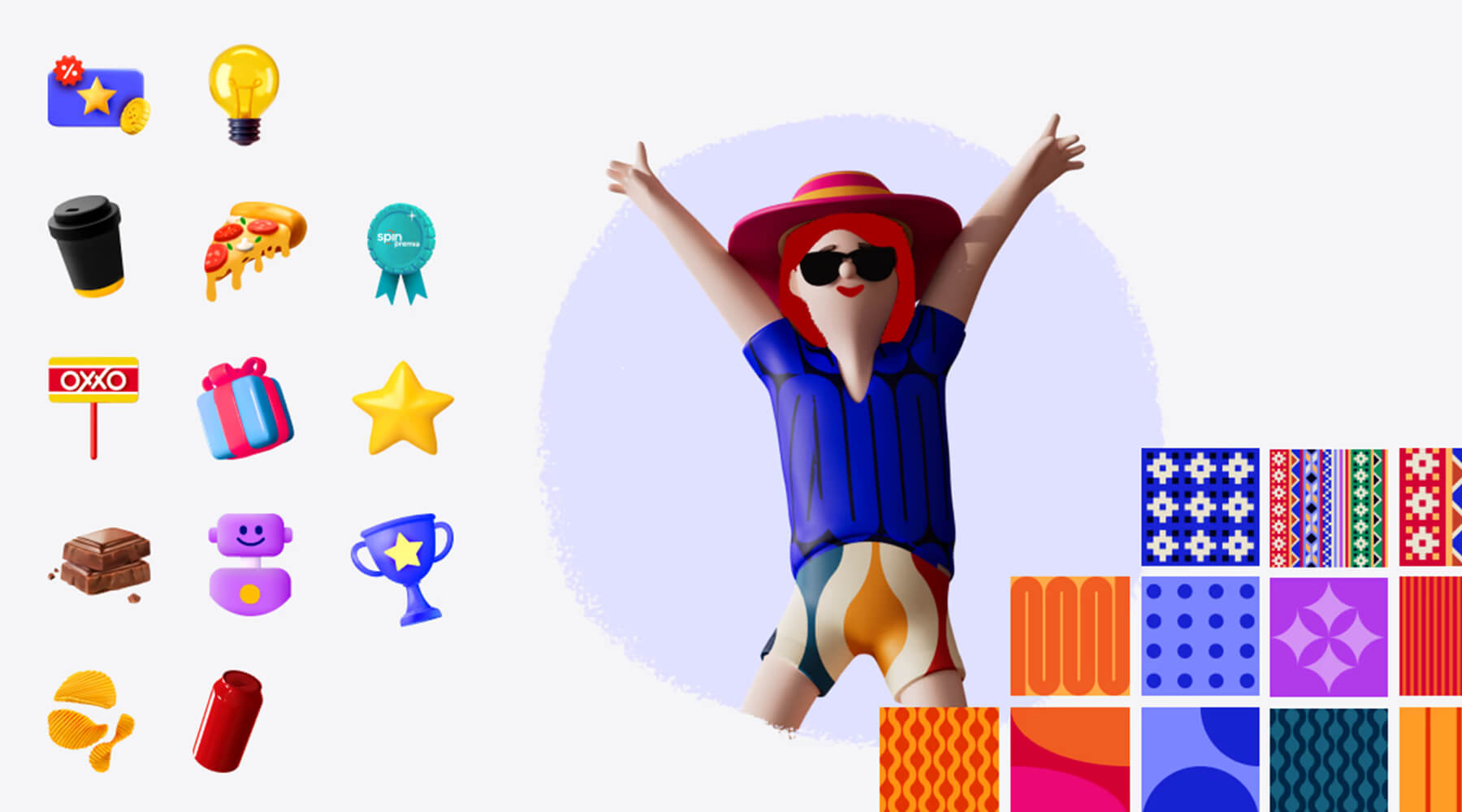
Meanwhile, the project team also worked to ensure the app fit the priorities of the various teams inside Digital@FEMSA, designing a comprehensive process for testing joint value propositions. Together, the team created a new design system, iconography, and set of unifying principles. IDEO also worked closely with the Digital@FEMSA teams to ensure that the app's design was in line with their strategic goals and technical capabilities, and built the app's initial information architecture. They incorporated secure transactions, effortless coupon redemption, personalized offers, and a cohesive loyalty program.
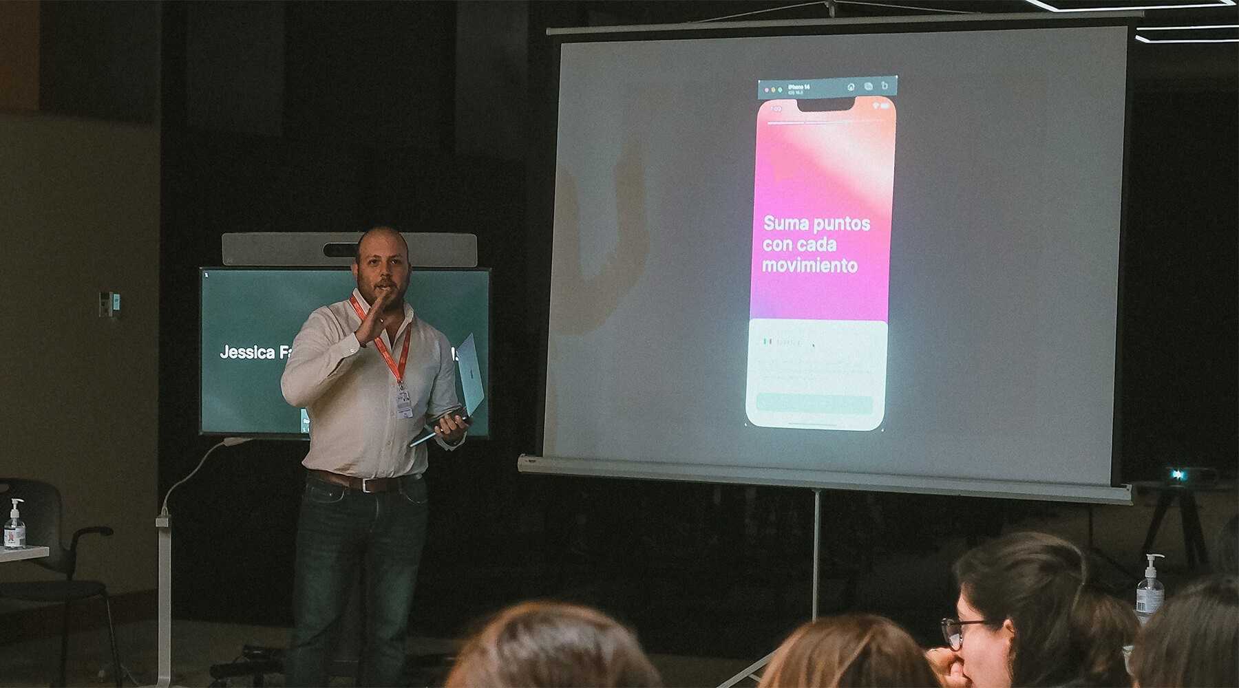
From there, the IDEO and Digital@FEMSA teams quickly transitioned into the design and development phase, producing prototypes of the new app, dubbed Spin Premia. With the help of user testing, they were able to continuously iterate to improve the app's features and functionalities, creating a user experience that was both seamless and intuitive. In just 10 months, they went from a small digital team with an ambitious idea, to a 150+ people product organization and an MVP launched in one region. And thanks to a tight partnership, the teams were able to seamlessly integrate Spin Premia into Digital@FEMSA's existing systems, resulting in a scalable implementation nationwide just a few months later.
The introduction of Spin Premia was a milestone in FEMSA's digital transformation path. Following a true ship and iterate model, just a few months into the project, the company released a smaller, focused version of the app in just one city in Mexico to quickly learn from customer experience before expanding to new regions. Since then, the Spin Premia app has quickly gained popularity, offering a safe and user-friendly platform that millions of Mexican consumers have embraced. It has also allowed FEMSA to broaden its digital portfolio and extend its customer base throughout Mexico, elevating customer satisfaction and fueling business expansion.
13 million Mexicans visit FEMSA’s OXXO convenience stores every day. But the company had ambitions to leverage digital experiences to increase customer engagement.
To get there, Digital@FEMSA needed to deliver exceptional digital products with the agility to serve an entire population.
4.7 stars
Spin Premia’s app store rating
22.8 million
active Spin Premia program users
A hotel brand for new travel paradigms
IHG introduces Garner, a midsize brand elevated by thoughtful design.
Midscale hotel brands are the fastest-growing hotel segment in the US, attractive to both travelers and hotel owners. But often, their messaging feels repetitive, and travelers have a tough time differentiating between them. With a warm, thoughtfully designed midscale brand, IHG had an enormous opportunity to distinguish itself in a crowded market.
IHG’s goal was to deliver a guest experience that felt genuinely unique and resonant—and quickly. With costs on the rise, many owners were motivated to turn toward conversion brands, which allow them to refurbish hotels under a new brand rather than invest in construction, a way to grow their portfolio in a tight financing market. Meanwhile, IHG’s competitors were set to introduce new conversion brands of their own. The company was looking for a partner that could work swiftly and iteratively to deliver a distinct brand.
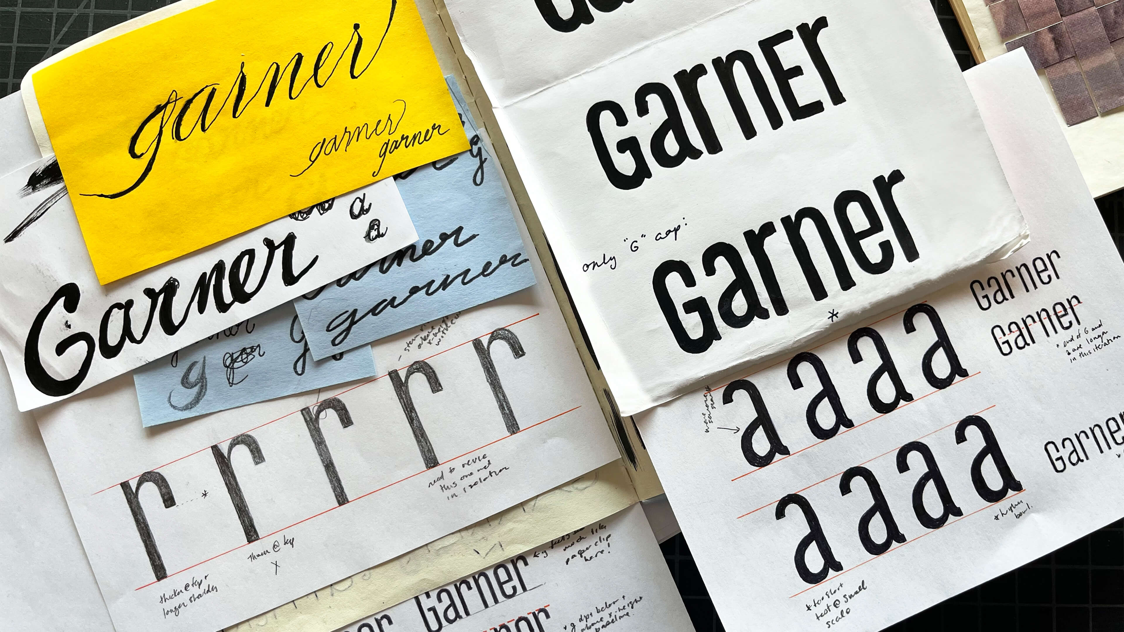
For the IDEO team, the answer lay in communicating the brand’s value, starting with a custom logo rendered by hand. Inspired by vintage sign painting and modernist typography, the team sketched different versions of the letterforms, reviewing them with IHG until they had a set that brought to life the generosity and sense of invitation associated with the hotel’s spaces. They also worked to ensure the wordmark was visually balanced and would translate well across a variety range of scales. From there, they built an expansive brand world, including bespoke navigation icons, a full interior and exterior signage system, and a video to support the Garner launch.
The result is a hotel brand that stands apart in its category for both travelers and owners: thoughtful and well-designed yet affordable. As competition in the midscale segment continues to increase, Garner has been central to IHG’s growth strategy. Launched in the fall of 2023, Garner opened 100 hotels worldwide in just 16 months, making it the fastest-ever IHG brand to scale globally. The brand’s increasing popularity among owners and developers is driven by the growing demand for conversion properties, which accounted for 52% of IHG’s room openings in 2025. Garner plans to continue its rapid expansion with nearly 80 additional hotels in 12 key markets, including the US, Mexico, Italy, and Japan.
Conversions account for 12% of the global hotel pipeline, enabling hotels to switch brands and refurbish, boosting revenue without expensive construction.
The US midscale hotel segment, valued at $14B, is expected to reach $18B by 2030.
100 new Garner Hotels
in less than 3 years—the fastest-scaling brand in IHG's history
500 Garner Hotels
planned in the next 10 years; 1,000 over the next 20

Moving dementia care forward
Together Senior Health provides digital solutions to combat cognitive decline.
Alzheimer’s and dementia are notoriously difficult to treat—and scientists estimate that some 50 percent of people who have dementia are undiagnosed. Recognition of symptoms and early intervention are key. Together and IDEO set out to conduct user research to inspire new products that would help patients with cognitive decline take charge of their brain health.
The first priority was to expand the reach of the Moving Together program, which combines group movement exercises with mindfulness techniques, led by a trained group instructor. The IDEO team conducted remote and in-person interviews in Florida, where one in five residents is age 65 and older, and rates of Alzheimer’s and dementia are among the highest in the country. One of the key insights the team discovered was that many older adults didn’t understand how behaviors like smoking, exercise, and diet can be risk factors for cognitive decline. Their input inspired a new design principle for the program: “No naked feedback.” Any time participants received health coaching advice about modifying their lifestyle, they would also be given resources on why and how to do it, so they would have a pathway to boosting their brain health.
The IDEO team folded insights like this one into the design for four new product offerings, including personalized brain health education, new online community engagement tools, partnership programs, and health coaching services, as well as a new user interface to illustrate them. Along with Together they also developed an implementation roadmap of next steps to bring the new digital product offerings to market, such as hiring a brain health coach and creating a new course curriculum. Now, Together has enrolled 165 people in the Boost Your Brain Health Clinical Trial, which is looking at outcomes such as reduced risk of Alzheimer's and maintenance of cognitive function for the Brain Health Together program. With trial completion in Q3 2024 and product launch in early 2025, growing numbers of people with MCI will have access to this exciting program. Together incorporated almost all of the elements from the IDEO roadmap into the final curriculum, and the team often refers back to insights the team gathered as guiding design principles.

Fighting barriers to diagnosis
With its online program growing, Together wanted to take on an even bigger problem: dementia underdiagnosis. Co-founder Dr. Deborah Barnes had recently developed an algorithm that uses patients’ health records to calculate their risk of undiagnosed dementia, called the electronic health record Risk of Alzheimer's and Dementia Assessment Rule (eRADAR). Together was looking to find creative ways to equip and empower providers to use risk scores like eRADAR in primary care settings.
One piece of the puzzle? Many primary care doctors are unaware that better management of Alzheimer’s disease and dementia can have a positive impact on other chronic health issues—like diabetes, hypertension, and depression. So by encouraging providers to prioritize dementia care, they can help support the overall health of older adults with cognitive decline. The IDEO team recommended a curriculum for continuing education courses for doctors that make that link clear—another step toward increasing dementia diagnosis and improving overall health.
Better help, sooner
To understand the patient experience, Together and IDEO decided to work directly with patients and caregivers to uncover what was stopping them from asking for dementia screening. The IDEO team quickly learned many patients were afraid of facing a diagnosis that signified a loss of agency and control, especially when they didn’t believe there were good treatment options. Often, they were unaware that there were things they could do to improve their brain health. They needed to know what steps to take after a diagnosis, and who could provide actionable advice. In response, the IDEO team designed a digital activity toolkit and physical booklet to guide patient families through the early stages of a dementia diagnosis, including recognizing the signs and symptoms, having better conversations with their doctor, and getting connected to support groups and programs like Moving Together.
Solving the problem of dementia underdiagnosis involves complex systems-level thinking and designing for the entire health ecosystem of patients, providers, and insurance payers, and solutions for Alzheimer’s and dementia care are still in their infancy. But already, this work is empowering patients and doctors to prioritize brain health and get screened sooner, and Together, which has since been acquired by Linus Health, is still working to move dementia care forward.
Approximately 12-18% of people aged 60 or older live with mild cognitive impairment, while memory loss, Alzheimer's and dementia affect more than 50 million people around the world.
An estimated 50% of people living with dementia are undiagnosed.
165 enrolled
in the Boost Your Brain Health Clinical Trial
Culture as catalyst
Moderna defines its Mindsets to preserve its future.
Many companies view culture-building initiatives as nice-to-haves. At Moderna, Mindsets are a business imperative, crucial to its plans to develop breakthrough products quickly.
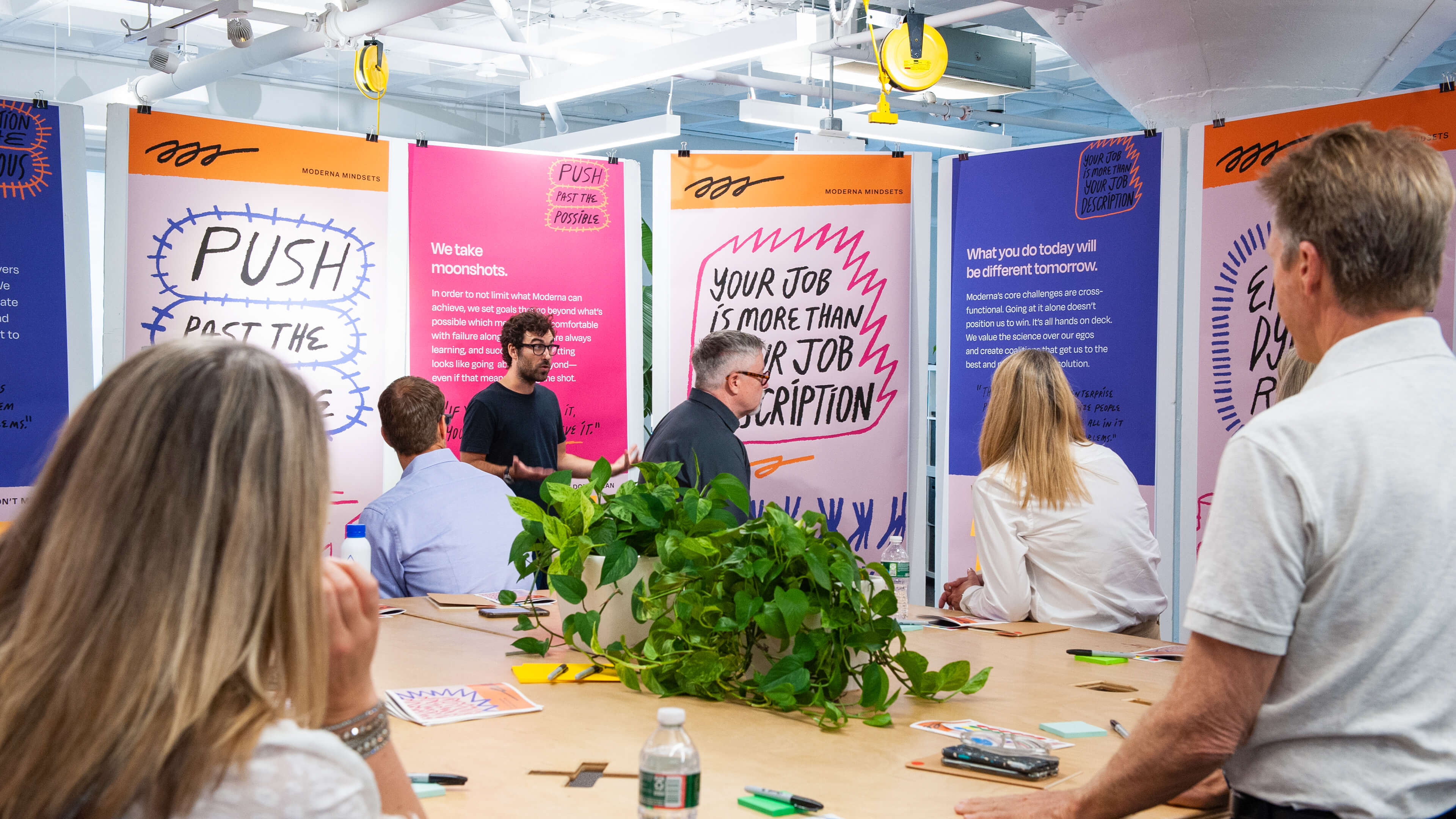
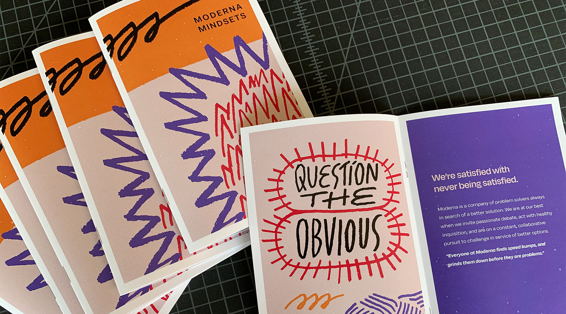
For companies working on solutions as vital as a COVID-19 vaccine, delays and mistakes don’t just mean missing a product launch date—they’re life-or-death, and on a large scale. Moderna had to ensure that its employees knew how to make the right decisions, evaluate risk, and move quickly—even if they came from organizations with more bureaucracy and less risk tolerance. In 2021, IDEO sat down with longtime Moderna veterans to hear stories about moments that exemplify the company's culture, like the day a critical piece of equipment arrived but was too big to fit through the door. Taking it apart would have added days to their timeline. So employees took sledgehammers to a wall instead. Stories like this one fed into the crafting of the list of Mindsets, such as “Act with urgency: Action today compounds the lives saved tomorrow” and “We behave like owners: The solutions we’re building go beyond any job description.”

To gather feedback, the team shared the draft Mindsets with a diverse set of employees—new hires, veterans, folks already closely aligned with the culture, folks for whom it wasn’t the most natural fit, and a plethora of employee resource groups. CEO Stéphane Bancel and the leadership team took crafting and iterating on the Mindsets very seriously, wordsmithing and tweaking them with the team until they were ready to share them officially. Now, new hires learn about the company’s Mindsets in Moderna ONE, an onboarding process that IDEO helped revamp, while existing employees attend a workshop to ensure everyone at the company knows not only what to do but also how to do it effectively. In a matter of weeks, IDEO helped Moderna codify its culture for employees and set the company up for continued success. Moderna continues to embed these Mindsets across the entire employee lifecycle to systematically scale its culture.
For employees new and old, the clarity of the Mindsets has made it easier to understand expectations and to understand the company itself. Long-term veterans responded with comments like, "These really help explain why we're working this way,” while one newbie said, "It feels like a homecoming to hear the culture that we’re trying to bring through.” But more than just solving a cultural issue, the new Mindsets have fulfilled a business imperative: Holding on to the secret sauce that made Moderna successful to begin with, setting the stage for its next five years of breakthroughs.
When the World Health Organization (WHO) declared the COVID-19 health crisis a pandemic in March of 2020, Moderna had fewer than 1,000 employees. Four years later, it’s more than five times the size.
Ranked #1
BioSpace Best Place to Work, large company in 2024
Ranked #6
Boston Consulting Group’s 50 Most Innovative Report in 2023
Ranked #4
Deloitte’s Technology Fast 500 List in 2023
Shattering the echo chamber
How human-centered thinking unlocks growth in mature categories.
For leading fast-moving consumer goods (FMCG) companies, one way to escape the echo chamber is to adopt a human-centered approach—to actively listen to consumers and reconnect with the realities of their lives. It’s about more than bringing them in at a certain stage of the project. Their needs have to be considered from the very beginning.
What follows is a story from IDEO Shanghai about what happens when a prominent consumer company returns to its customer-centric roots and discovers new growth in one of its most established categories.
What happens after a company hits the category ceiling?
China’s FMCG sector is known for its intensity. Even the most established companies cannot afford to relax; the competition is genuinely fierce.
In China’s major metropolitan cities and regional hubs, competitors launch new products at a rapid pace, all in pursuit of increasingly diverse consumer needs. Beyond these cities, smaller and lesser-known brands are making moves, constantly experimenting, and fighting hard for consumer attention through social media platforms.
Before coming to IDEO, our client had already made significant investments in consumer research to maintain its competitive edge. After the project started, its leaders showed us an elaborate chart filled with rows of consumer identity tags, behavioral patterns, and usage preferences, all organized by data dimensions and densely packed across different quadrants. Years of accumulated consumer insights had informed their product development and marketing strategies, helping them achieve significant commercial success.
And yet, despite all these efforts, they seemed to have hit a wall. To spur new growth in one of their flagship categories, for example, they had tried various strategies, such as conducting research in smaller cities, launching new products aligned with mass-market trends, and attempting to keep consumers engaged by offering more choices. None of it was enough to break through.
What else could they try? That question prompted the company’s senior leadership to come to IDEO. They were looking for a perspective that differed from their usual approach—one that could reveal new possibilities on top of everything they had built.
A revelation from consumers
Even though the client already had detailed data, we decided to conduct in-depth consumer interviews during our design research phase. Our goal was to start from a more fundamental place—to understand how people lived day to day and the role these products played in their lives.
From the client’s perspective, this seemed like a wasted effort. They struggled to understand why we wouldn’t simply begin with their assumed starting point: “Why do consumers choose our brand, and what do they expect from our flagship category?”
But the way consumers actually choose products revealed the “why” behind that question.
Whether they were “core consumers” who already frequently purchased the brand’s products, or “extreme consumers” whose preferences were well outside the mainstream, the decision-making process for buying these products was the same.
It started with a broad desire, for instance, “I want to try something different.”
From there, their life stage, immediate circumstances, and emotional state shaped that desire into a more specific need: “This is the type of product I’m looking for.”
Only then did consumers consider: “Which brand should I buy?”
In contrast, the client’s original framing—“Why do consumers choose our brand?”—treated the endpoint of the consumer’s decision journey as the starting point.
From a consumer’s perspective, this might seem obvious; it’s something we all do instinctively every time we shop.
But what is intuitive to the consumer is rarely intuitive to the brand.
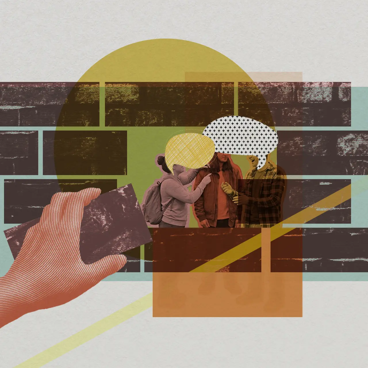
Mapping out a consumer’s actual decision-making process provides significant value for a brand. It establishes a consumer-centered through line that helps leaders navigate innovation in a mature category with greater precision.
Several elements naturally align along this through line: the deeper needs of various consumer types, the moments and motivations that trigger a purchase, the opportunity areas where a mature category can effectively meet specific consumer needs, and the competitive strengths the brand should build on to fulfill those needs. Not only do these components become clearer, but they also create interconnections among them.
The core insights from our design research defined those triggering moments and illustrated the map of how consumers actually make decisions. This clarity, in turn, helped the brand’s leaders determine where to focus their efforts in order to revive a mature category.
Building system-wide alignment from a human-centered insight
We took everything we’d heard from consumers, distilled the decision-making processes behind them, and translated everything into visuals on a series of boards, which we then brought into the client’s meeting room.
Step by step, we walked through the consumer’s chain of logic, highlighting what each need meant for the brand’s approach to category innovation. When we finished, a C-level executive at the company looked at the boards and said, “This is a billion-dollar idea.”
The insight disrupted the default reflex of category leaders, who often claim to prioritize consumer needs while unconsciously starting every decision from their brand’s own business priorities.
At first glance, taking a human-centered route may seem like a detour. In practice, it helps companies avoid the wasted investments that come from acting on incorrect assumptions. A clear understanding of what consumers truly need allows a brand to recognize which of its existing strengths to double down on, and which emerging opportunities are genuinely worth pursuing.
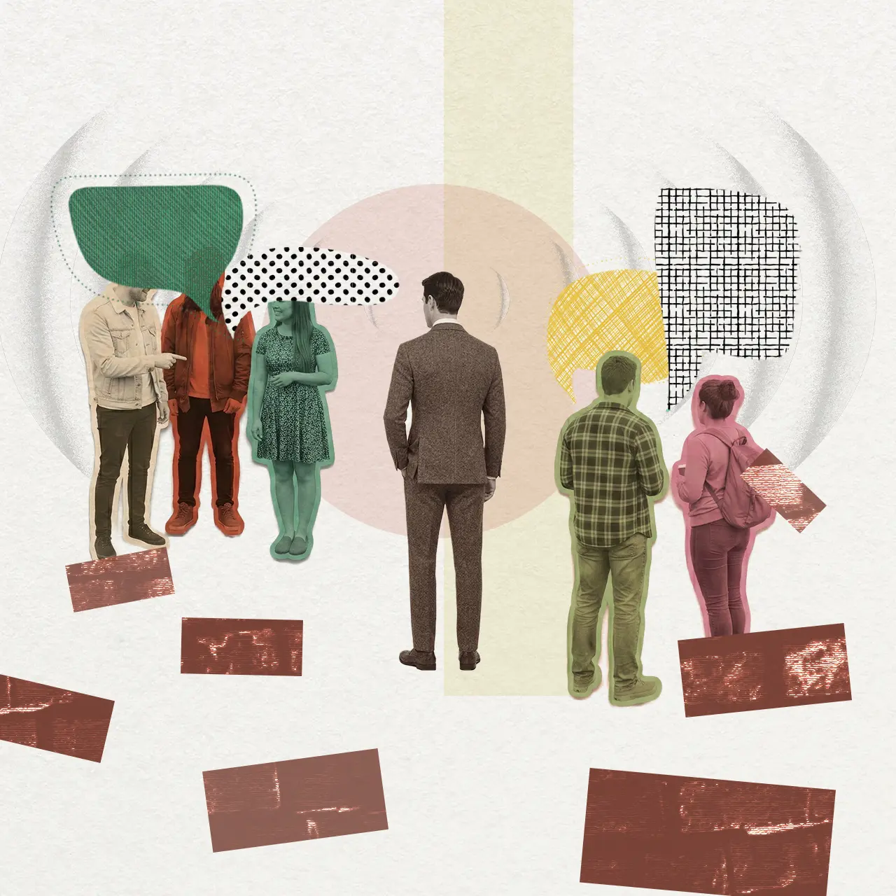
After that meeting, the direction for category innovation quickly took shape. The key insight regarding consumer needs and decision-making became a powerful anchor. The insight unified early-stage product development, mid-to-late-stage packaging design and manufacturing, and the marketing communications that followed the launch.
Beyond charting a new course for the client’s flagship category, the project established a framework for cross-functional teams to build a shared understanding and work toward a common goal.
In the end, the collaboration was successful because everyone involved in the project maintained a primary focus: human-centered thinking.
“The Making of...” is a series of behind-the-scenes articles written by IDEO Shanghai designers about our innovation methods and work with major clients across industries in China.
Success can create its own echo chamber. The more a company achieves, the easier it is to rely on familiar ways of seeing the market—often without even realizing it.
6 ways to improve at-home health monitoring
How to reduce anxiety, build trust, and increase adherence.
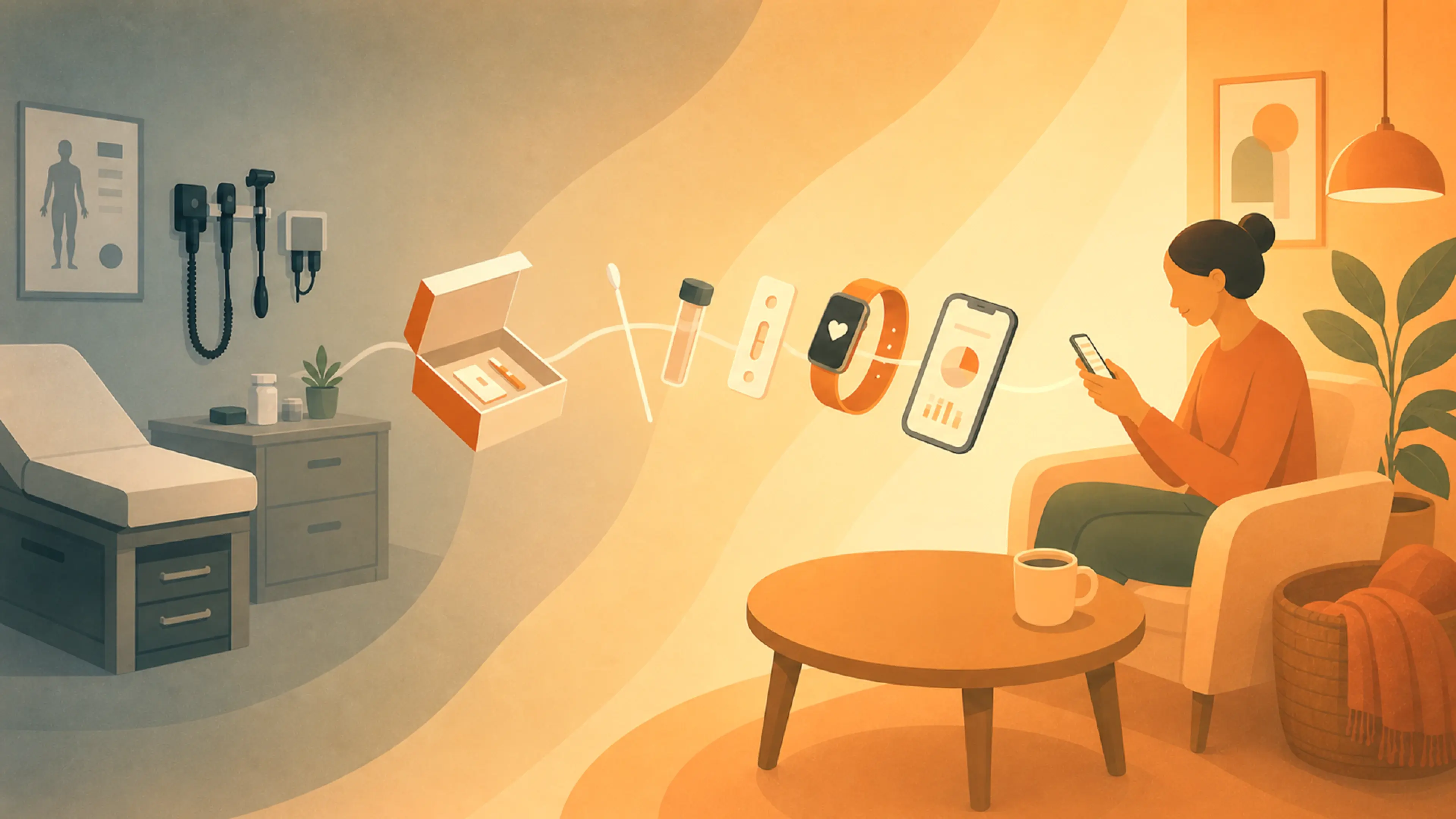
Healthcare was once centered on the doctor’s office. Today, it’s moving into the home. Since the pandemic, demand for at-home testing has surged, with 82 percent of older adults saying they’re interested in taking medical tests at home, and many preferring to age in place. From at-home influenza tests and COVID-19 swabs to cervical cancer collection kits and continuous health monitoring, people are taking a more active role in managing their care, with tools that enable both testing and tracking from home.
Designing for this shift means supporting people without medical training—who may struggle to interpret data, who might be nervous about collecting samples, or who might wonder about the efficacy of a test they perform themselves. In my work at IDEO, I’ve identified six principles for creating home-use diagnostics and monitoring tools that are more intuitive, reliable, and easier to use.

1. Design for emotion
Medical tests can evoke powerful feelings: fear of receiving bad news, memories of lost loved ones, or general anxiety. As a designer with a background in social science, I recognize that emotions often drive behavior. Our role as designers is to anticipate these emotional responses and design solutions that support them.
On a cancer screening project, for instance, we found that some users postponed testing not because they didn’t understand how to use the tests, but because they were afraid of the results. To address this, we softened the typography, refined the color palette, and shifted the messaging to focus on taking care of one’s health rather than screening for illness.
On a separate project, we discovered a completely different emotional pain point: clunky health monitors can be perceived as a sign of aging, making people feel self-conscious about wearing them. Which is a fair point. Medical devices often look outdated compared to sleek consumer technology. This disconnect can be emotionally jarring—and socially stigmatizing. To rectify this, we focused on portability and aesthetic improvements. The goal wasn’t to turn a home heart monitor into an iPhone, but to make it feel like a tool for enhancing well-being rather than just surviving an illness.
Time and again, we see that providing patients with a premium-feeling device or thoughtfully designed packaging can transform a medical experience from being a source of embarrassment into a moment that reinforces confidence and self-care.
2. Make use of the unboxing moment
First impressions of medical devices matter. If users can’t immediately see components or have to dig through packaging material, they may assume that the testing process is complicated or time-consuming, too.
During one at-home cancer screening project, we discovered that many people opened the box, took a quick look, and decided to postpone the test because it looked too overwhelming. By redesigning the unboxing experience to make the components and instructions more visible, participants reported feeling more confident and in control.
With some thoughtful changes, the unboxing moment can feel like an act of empowerment. Blank spaces on boxes can be valuable real estate for reassuring messages or simple diagrams, ensuring that essential information isn’t left buried in the instructions.

3. Keep it familiar
At-home screenings are a relatively new concept, and can feel intimidating. People often worry they won’t be able to perform the tests correctly—or worse, that making a mistake could invalidate their results. Thoughtful design can help alleviate these fears by leaning into familiarity and clarity.
When an IDEO team collaborated with Teal Health on an at-home cervical cancer test, they designed the testing wand to resemble a tampon—a form and function that many users were already familiar with and comfortable using.
Similarly, for an at-home stool collection kit for another client, we designed components that mimicked the contours of a toilet bowl, making the overall experience feel more intuitive.
4. Make data relatable
Designing at-home health monitoring systems requires a careful balance between what patients want to know and what healthcare providers need to see. Providing too much information can overwhelm patients, while too little can leave them feeling powerless. To drive adoption and adherence, designers must connect the data to patients’ real needs and challenges, empowering them to navigate their health effectively.
Recently, an IDEO team was designing an implant to monitor organ health. Data from the implant would go directly to the physician for review, but patients also wanted to see the results themselves. In today’s world, where smartwatches can track heart rates and sleep cycles, people expect feedback from health tools. When devices withhold information, it can feel as if they’re keeping secrets. To address this, we recommended a simple, intuitive interface: a stoplight notification system (green = all good, yellow = contact your doctor), along with the option to view a trend graph over time. Patients had the agency they desired, while more complex data remained accessible only to physicians.
In another project focused on at-home bladder monitoring, we discovered that a device that indicates bladder fullness was life-changing for patients who struggled to empty their bladders. People who felt homebound by the fear of embarrassing accidents or infections reported that the device would help them gain the confidence to plan their days and reclaim their lives. Even though the device would require surgery, the possibility of increased freedom was so appealing that patients felt it was worth the risk. The quality-of-life improvements the data enabled—not the monitor itself—motivated them to embrace this new device.

5. Lean into visual instructions
More words don’t always equal more clarity. In fact, overly detailed, multi-page instruction packets can discourage people from engaging and may give the impression that a test is too technical, even if the language is at a fourth-grade reading level.
In one project, we simplified an 11-step test guide into a user-friendly design with three main steps. We reduced the amount of text, emphasized illustrations, and broke down the process into manageable parts to make it feel achievable. This visual-first approach not only made the instructions easier to follow but also reduced user anxiety and improved accessibility for people with reading disabilities and those who speak English as an additional language.
6. Look to family and caregivers
While we typically think of patients as individuals, it’s important to recognize that they exist within complex networks of family, friends, and communities that support and supplement their abilities. When we do research for at-home devices and monitors, patients often request to be interviewed alongside their caregiver, or vice versa. Successful at-home medical monitoring and testing must take into account the motivations and needs of everyone involved in the patient care ecosystem.
Product teams may assume that older patients will not want to use even basic technology. This might not be true, and even when it is, it’s worth remembering that the end user might not always be the patient. At times, a caregiver might be more invested in the outcomes of monitoring or testing than the patient themselves, and could be more open to embracing digital and tech-forward solutions.
It’s this kind of health ecosystem thinking that becomes crucial as at-home testing and tracking grow more prevalent. What we have now may feel revolutionary compared to the pre-pandemic era of mandatory in-person care. Many innovations that once felt like futuristic fantasies—such as headsets that help treat depression and saliva-based hormone tracking to support conception—are now available for home use. Still, the potential that lies before us is far greater.
But only if designers get it right. By keeping human needs—across patient, caregiver, and providers—at the center, we can build more advanced solutions that help people take action on their own health.
Need help designing some at-home experiences of your own? Get in touch.
“Providing patients with a premium-feeling device or thoughtfully designed packaging can transform a medical experience from being a source of embarrassment into a moment that reinforces confidence and self-care."
It's time to tame the monsters of healthcare
How health organizations can overcome obstacles to improve outcomes.
In our healthcare work, we’re constantly partnering with clients to solve big, seemingly intractable problems that prevent them from delivering the care patients need. Bad UX. Tangled bureaucracy. Stigma. Disinformation. Systems that were never designed to communicate with one another or effectively serve people. These barriers ultimately decide who gets better and who doesn’t.
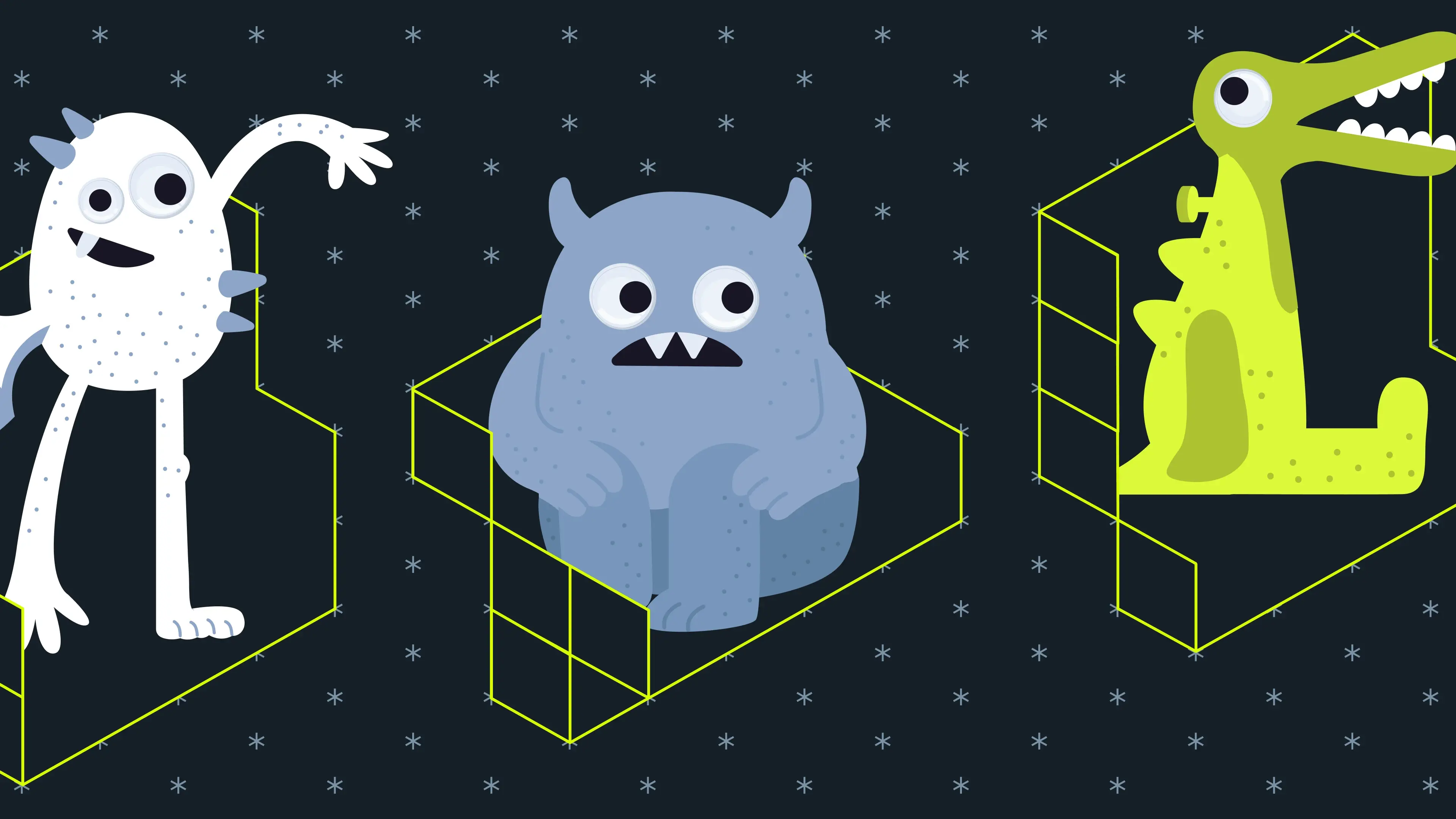
Over the decades, we’ve learned it’s easier to tame these monsters if you name them. So we’ve turned them into creatures to help people identify and defeat the obstacles that prevent them from delivering the healthcare experiences and outcomes that patients (and employees) truly deserve.
Here are five bogeymen we keep encountering in our healthcare work, and some projects that have taught us how to vanquish them.
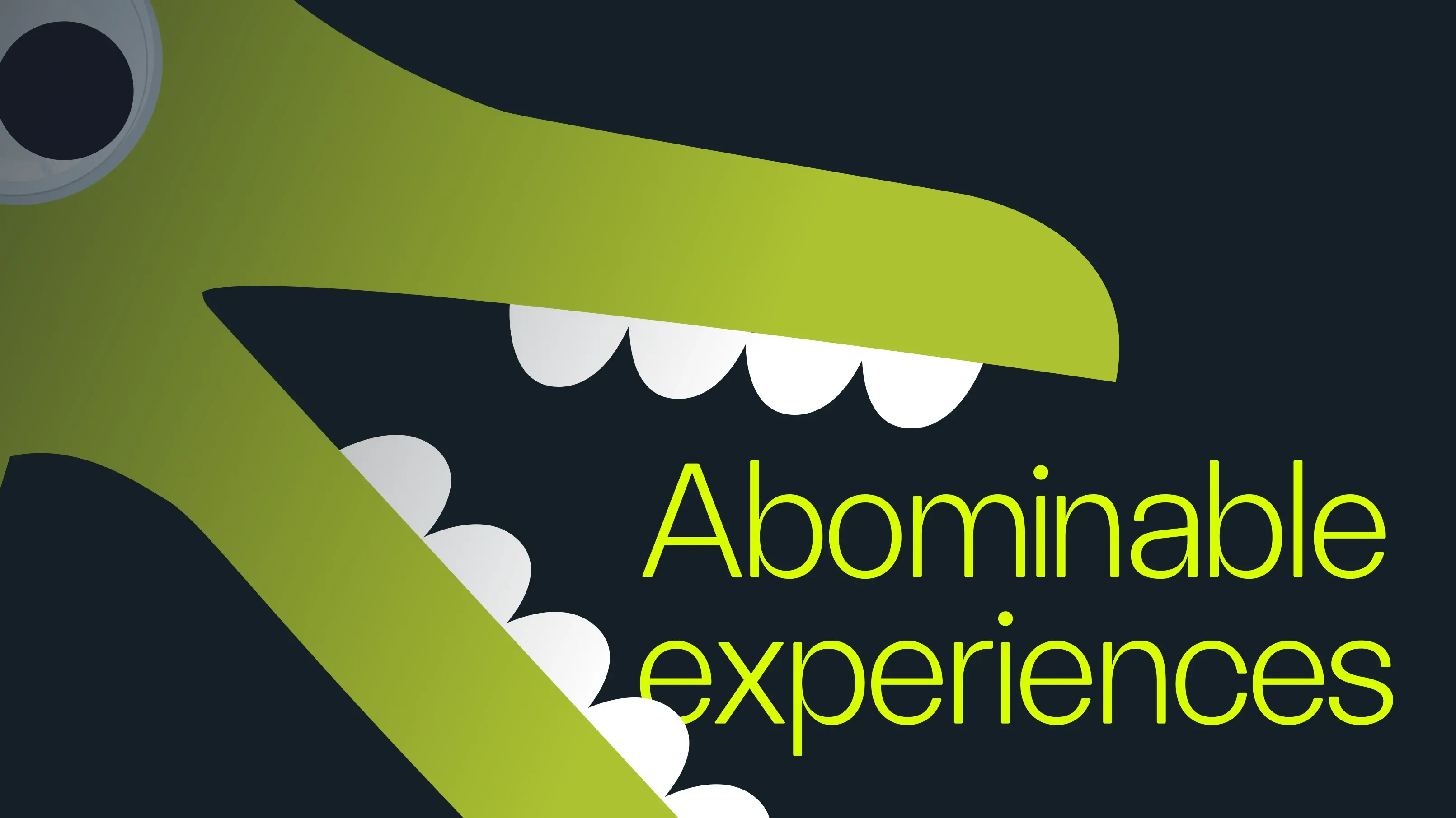
The Abominable Experiences Monster
Many medical procedures are more uncomfortable than they need to be. Women’s health, in particular, is full of experiences that feel a little medieval—painful, invasive, and undignified. Each one nudges patients toward skipping their next appointment.
The Abominable Experience Monster devours appointments. It also gobbles up early diagnoses, follow-up care, and long-term relationships between patients and clinicians that fuel good healthcare.
This is particularly true when it comes to cervical cancer screenings. When detected early, this form of cancer is completely preventable. But one in four American women is not up to date with their screenings. To address this issue, we partnered with Teal Health to reinvent the screening experience, focusing on much more than just the speculum.
Together, we designed a method for patients to collect their own samples at home, one-handed while standing, with clear instructions and welcoming packaging. In 2025, the FDA authorized the device. During the trial, 87 percent of participants reported that the new in-home experience made them more likely to stay current with their screenings.
Taming this monster starts with a question that isn’t asked often enough in healthcare: “Does it need to feel like this?”
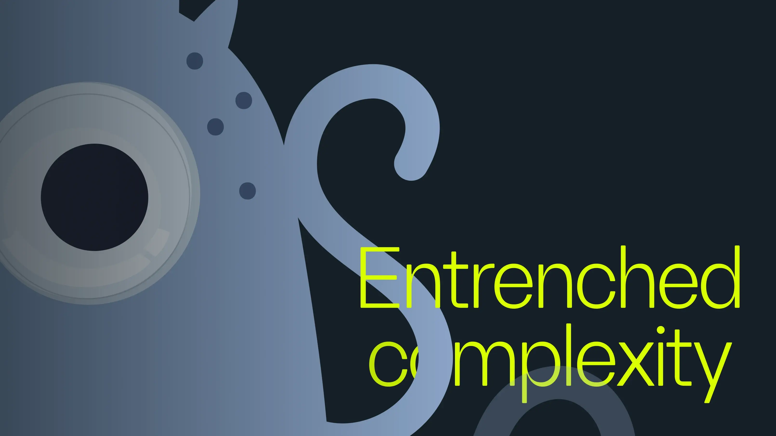
The Entrenched Complexity Monster
This monster stymies progress. Departments operate as fiefdoms. A patient’s record sits inside three different systems. A small change requires six committees. Clinicians who want to improve the patient experience run out of energy trying to fight the system.
Newton-Wellesley Hospital came to us because they saw an opportunity to drive better patient outcomes through cultural and organizational change. We worked together to imagine a different future for the hospital, then prototyped it in phases.
The team at the Women’s Imaging Center kicked things off by reimagining the mammogram experience. They defined the principles for the experience they wanted to create and designed prototypes to gather patient feedback. Then, they became ambassadors, helping other departments take on their own monsters. Patient-centered ideas soon spread, including a practice that the hospital integrated directly into its medical records: a method for flagging each patient’s communication and care preferences, allowing providers to meet them in ways that made them most comfortable.
The Entrenched Complexity Monster is tamed one project at a time. Each time a department demonstrates that change is possible, the monster shrinks a little more.
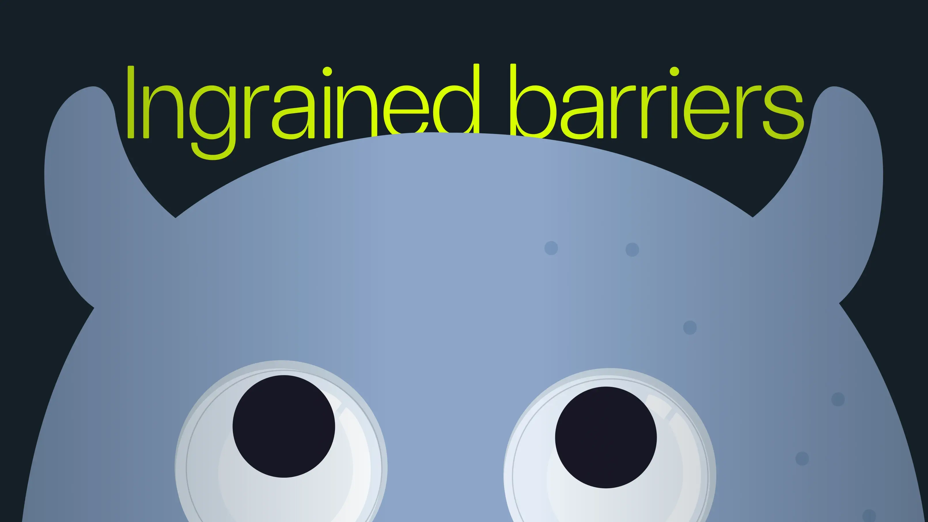
The Ingrained-Barriers Monster
For a teenager seeking mental health support, there can be multiple barriers to care: from parents who don’t believe in therapy and months-long waitlists, to school counselors who are overwhelmed with the needs of 400 other students and the high costs of treatment. Combine these challenges, and you’re dealing with a juggernaut.
The Ingrained-Barrier Monster festers in the gaps between systems that were never designed to support the people who need them most—especially young people.
Our solution? Design with them. We partnered with Kooth, the California Department of Healthcare Services, and hundreds of young Californians to create Soluna: an app featuring evidence-based behavioral health tools, free coaching, and resources designed by the people who will eventually use them. Soluna is now available for free to six million young people across California.
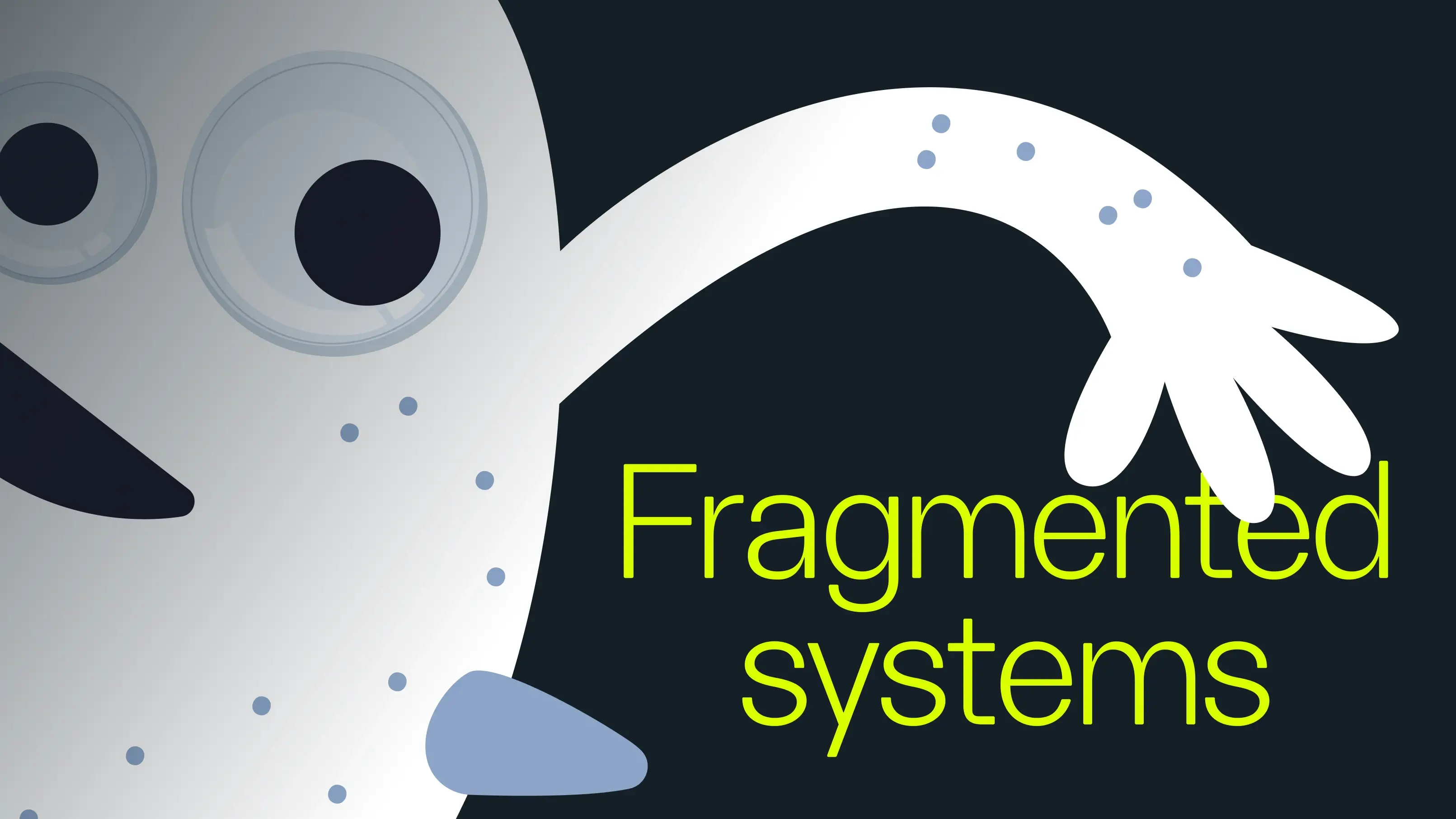
The Fragmented Systems Monster
For a working family in Lima, Peru, accessing routine healthcare services is a patchwork experience. Affordable, comprehensive care can be extremely hard to find. The Fragmented Systems Monster thrives in these cracks. It costs patients both time and money and, at times, leads them to miss appointments altogether.
Intercorp wanted to build something different: clinics specifically designed for Peru’s emerging middle class, rather than modifying existing models that weren’t intended for them. Before launching a real clinic, they constructed a full-scale prototype—a fake clinic—where patients could experience every aspect of their visit: registration, waiting room, examination, and pharmacy. Afterward, patients provided feedback on what was and wasn’t working. That feedback shaped Aviva, a clinic that opened in 2019 and now offers over 30 specialties. Since opening its doors, Aviva providers have performed more than 3,000 surgeries and assisted with more than 5,000 births.
Taming the Fragmented Systems Monster begins with a counterintuitive idea: quickly build a tangible, rough version of connected care, allowing patients to guide you in getting it right.
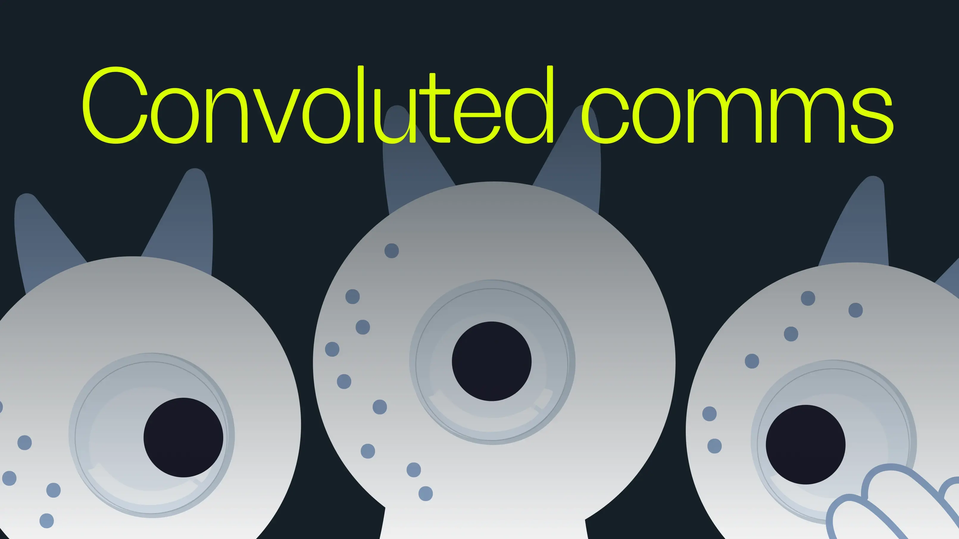
The Convoluted Comms Monster
Today’s parents receive a lot of information from their pediatricians, but they also turn to wellness influencers, online forums, and screenshots shared by people in their networks. By the time they’re in the doctor’s office, their opinions on care have been shaped by numerous sources, not all of which agree with each other.
The Convoluted Comms Monster flourishes in this noise, derailing even the most critical conversations, such as those a pediatrician must have with a concerned parent about a new immunization or vaccine.
When Sanofi prepared to launch Beyfortus—the first-ever RSV immunization for infants—the biopharma company approached us with a big question: How might we help pediatricians communicate clearly with worried parents across languages and cultures and amid the swirl of misinformation surrounding new medical developments? Together, we created materials to facilitate these important conversations. Beyfortus successfully launched in time for the 2024–2025 RSV season. Demand was so strong that Sanofi tripled its manufacturing capacity, and the immunization has been shown to reduce infant hospitalizations by 82 percent.
Taming this monster is about providing clinicians with clear, human-centered resources to cut through the noise, ultimately helping the parents in front of them and the children who depend on them.
Taming what’s blocking the way
At their core, these monsters arise from human decisions, organizational habits, and inherited assumptions. While technical issues may exacerbate the problems, strategy or software alone cannot resolve them.
The work is to find the monster, name it, and begin taming it by focusing on cultural behaviors and ways of working; in other words, prioritizing people, not just products.
We’ll be at HLTH Europe in Amsterdam later this month, on the lookout for more monsters. Bring us the obstacles in your work that feel too big, too tangled, or too entrenched for you to face. We’ll help you name them. And then we’ll help you tame them.
Have a monster of your own? Get in touch.
Special thanks to Ellora Jaggi and Tanya Kar for their work making the monsters come to life.
Here are the five bogeymen we keep encountering.

“Building the last piece of software"
Lovable’s Nad Chishtie on designing at the frontier of AI.
Tucked away behind the brightly-colored restaurant fronts of East London’s Brick Lane is Second Home, a co-working space housing the design team of “vibe coding” company Lovable, one of the fastest-growing start-ups in history.
Founded in 2023 by Swedish software engineers Anton Osika and Fabian Hedin, and currently valued at $6.6 billion, Lovable’s mission is to make software development accessible to everyone, not just the 0.6 percent of the planet who are professional developers. The firm talks about their goal as “building the last piece of software.”
Nad Chishtie, Head of Design at Lovable, discovered his passion for building through his childhood obsessions with music, online gaming, and computers. Initially drawn to coding at the age of 8, he later “fell into design by accident” when he discovered he preferred problem-solving to programming. After stints at two hypergrowth companies, Cmune and Element, he had an epiphany. “With the launch of OpenAI’s GPT-3, I was able to do 70 percent of the coding work of seven full-time developers. I thought, ‘Everything's going to change.’” This realization led Chishtie to seek out the most ambitious people in this space, which ultimately led him to Lovable co-founder Anton Osika.
I spoke with Chishtie at Second Home about the skills people need to design with AI, Lovable’s unique culture, the pros and cons of collaborating with agents, and why humans—and optimism—will always matter.
Ed White (EW): We’re increasingly hearing about a newer discipline called “design engineering” at companies like Lovable. What does that mean in practice?
Nad Chishtie (NC): It's essentially applying design thinking to code. Depending on your technical skills, design engineering could focus more on front-end development, microinteractions, or the architecture needed to support multiple initiatives.
An interesting example of a design engineer is Niklas, who joined us as the team’s second designer and has a background in industrial design. Until last year, he hadn’t written code professionally. Now, he’s the third-largest contributor to the Lovable codebase. That’s because today there are two paths: Path A involves ideation, creating comps, and managing stakeholders, while Path B is about directly translating ideas into code with 100 percent fidelity. Path B wins a lot. It’s why Niklas’ learning curve was just a couple of months.
It’s difficult to find people with this skill set, but a single person with this shape can be as valuable as an entire team.
Path B also means that, in design, we can drive initiatives forward without needing technical support or advocating for inclusion in the engineering roadmap. We can just implement ideas directly.
Initially, some of the engineering leaders questioned why the design department was hiring engineers. But after we became productive, their response changed. Now, it's one of the most requested roles within our company.
EW: What mindsets or skills are required to be a successful design engineer?
NC: You need to be a very strong systems thinker. Instead of focusing on a specific solution, you’re developing the system that enables that solution to exist.
In classic lean startup methodology, the focus has been on specializing both people and products. With AI, you need to do the inverse and adopt a generalist mindset—for two reasons. First, it’s more challenging to constrain AI models than to let them operate freely. Second, by allowing models to evolve and get better without constraints, your product improves, too. By thinking like a generalist, your product expands its footprint in tandem with AI’s growth. To design at the frontier of AI, you need to invert your perspective.

EW: What’s different about designing with LLMs?
NC: When you design software as a service (SaaS), the main task is to design constraints that make the system more deterministic. With AI, the goal is to develop something that is somewhat deterministic and also truly generative. Because if it isn’t generative, then it’s not truly intelligent; it just mimics patterns or picks templates in the background. This marks a shift in design from focusing on hard constraints to providing a broader design direction, while maintaining certain guardrails.
EW: How is working with these models changing design?
NC: From a technological perspective, we’re ruthlessly trying to reduce the time between having an idea and making it tangible. This applies to Lovable as a product and also to our internal practices. For instance, in our development pipeline, we’re trying to streamline processes as much as possible. If someone here has an idea and is curious about its viability, they can quickly tag an agent and receive immediate feedback. Today, it’s standard for a tech company to spend minutes, hours—even days—testing out a single part of their code base. Our goal is to reduce that time to zero.
In terms of people’s time here at Lovable, there are no sunk costs with LLMs. We can adopt a more experimental mindset and go from a customer insight to a tangible iteration within a few minutes. Then, we can share that with more people, gather feedback, and decide whether to double down on the idea or delete it. It's totally acceptable to pivot because the turnaround cycle was minutes.
EW: Lovable is one of the organizations that’s early to work with agents on a daily basis. What’s that experience like?
NC: We try to think of agents as if they were people. They need to have the proper context about how our team works, what’s important to us, the principles and philosophies behind our decisions, and what constitutes a good or bad decision. We have banks and banks of knowledge and skills that codify our thought processes for ourselves and for agents. They’re like a human employee onboarding Wiki, but for agents.
EW: What do agents do in practice, and what roles do they play in design?
NC: One role is called a “Linter.” You write some code, and then a Linter will dynamically check it against our codebase. A simple example is keyboard focus. Imagine you have an application with 20 different features that need to be added at various times. Keyboard focus can be quite invisible, making it challenging to maintain coherence. We have a skill bank dedicated to keyboard focus. If you’re designing or implementing a feature, a Linter might review your work and say, “With my end-to-end view of the application, this is how we think about keyboard focus. In the specific view you’re working in, you definitely should do it this way.”
Another role is a “Sweeper.” Whenever you propose changes in a pull request, Sweepers conduct a variety of checks. For example, a Sweeper agent might say, “You’re introducing a new mental model for the user here. Here’s a list of related mental models that you should consider. Should we extend an existing mental model instead of adding a new one?”
The final role we’ve found very helpful is the “Critic.” These agents critique your implementations as thoroughly as possible. You can even ask them to imitate experts. For instance, you could prompt, “You are [Danish usability pioneer] Jacob Nielsen. I want you to critique this from a purely UX perspective.” The models are trained on Nielsen’s entire body of work, so you’ll gain insights that reflect Nielsen’s expertise.
EW: What’s been particularly effective for you when you use these agents?
NC: Prompting Critics to ask questions rather than make statements. General-purpose AI is overly sycophantic. Having Critics ask questions flips that dynamic. It keeps you in control, which is crucial since humans are ultimately responsible for the outcomes of these systems, and it encourages you to continuously critique your thinking.
EW: As you work more often with powerful agents, what do you think the role of humans is?
NC: Human designers must be held accountable. We must create usable, desirable products that feel cohesive. I believe that across all mediums—be it film, TV, music, food, etc.—we have an innate ability to sense whether the people behind them genuinely care and what values guide their work. Do they value speed, a sense of luxury, quality, or something more experiential? I think the same applies to software. For Lovable, the experience of using our product is always the responsibility of the humans on our team; we don’t delegate that responsibility to AI.

EW: How are team structures changing?
NC: I keep coming back to the word “asymmetry.” We used to build teams in very symmetrical ways at tech companies: you’d have a product manager, engineers, a designer, and possibly a data analyst. This cookie-cutter approach was easy for hiring and HR purposes, but it didn’t necessarily lead to the best products or user experiences.
Today, team dynamics are evolving. Generalists can manage the entire design process—from user insights and analyzing data to building an initial product and testing it with users. A single generalist can deliver 20 times the value of someone focused on just one part of the process.
EW: What does that mean in terms of the people you look for?
NC: The “K-shaped” economy is an apt analogy for what we look for in design engineers. We’re seeing a split between those who are “AI native” and driven, and those who are more cautious about AI and hesitate. These two types of people are diverging significantly, with compounding effects in both directions. We hire people who are optimistic about AI’s potential and are eager to learn.
We also focus heavily on the slope of someone’s career trajectory—not just where they are today, but where they could be in this quickly evolving environment. During my introductory calls with designers, I spend time discussing their motivations for entering design, major influences from past roles, and self-initiated projects rather than just work history.
Ultimately, a company’s success comes down to its teams and the products they build. The best team is the one with the highest learning aptitude.
EW: How do you create an environment or culture of experimenting and learning?
NC: One of our core values—“våga vara annorlunda”—means “dare to be different” in Swedish. We encourage our employees to challenge norms and embrace innovation by fostering an environment where failure is acceptable. We encourage rapid experimentation and urge individuals to continually challenge their own workflows.
Many companies believe they need to adopt a single AI tool to write more code and then deploy it organization-wide. In contrast, at Lovable, we allow everyone to choose their own tools. It’s not only fun, but as the tools evolve and our understanding of how to use them expands, our organization adapts and grows as well.
We have a few helpful rituals, too. Every Friday, we host open demos to showcase what we’ve been doing during the week. Someone might share, “I figured out this new approach that required overhauling our development environment. If we use agents in this new way, we could be 20 times more productive.” We celebrate these achievements as part of our onboarding process, in our Monday morning meetings, and during our internal company awards.
EW: What’s important to remember when designing with LLMs?
NC: First, the models themselves are incredibly idiosyncratic; it's almost like having different children, each with their own strengths and weaknesses. To produce truly great outcomes, you need to understand these idiosyncrasies and build around them.
Second, you need to consider the entire system. You can't evaluate models, core product architecture, and user experience in isolation. You have to understand them all and integrate them to create a cohesive user experience.
EW: Any parting thoughts for designers?
NC: Be optimistic. Every door is open right now. I feel like a kid again, discovering technology for the first time.
“Design in the Age of AI” is a series of conversations with designers and makers from across industries and disciplines, building the future with AI, today.
“To design at the frontier of AI, you need to invert your perspective."

Lindsey Turner
I’m passionate about building brands, products, and experiences that help organizations show up with meaning and momentum.
I help organizations cut through complexity by shaping how they show up, through brand strategy, identity, and storytelling.
Working at the intersection of brand and business, I bring an editorial eye and a bias toward making—turning ideas into tangible experiences that people can understand, trust, and believe in.
My work spans government, healthcare, financial services, media, and consumer goods, from launching Gen Z-focused ventures to building innovation labs and reimagining legacy brands. I relish moments of ambiguity and enjoy translating across teams, perspectives, and priorities to move ideas forward.
I started my career in editorial and digital design, shaping cross-platform experiences and identity systems in publishing and agency environments. That foundation still shapes how I work today: I’m detail-oriented, collaborative, and overreliant on the Oxford comma. I hold a BFA in Visual Communication from the School of the Art Institute of Chicago.

Rachel Young
My work helps organizations see who their products aren't working for—and build the will and the tools to do something about it
For 25 years, I've asked the same question: Who does this design exclude—and what are we going to do about it?
My work spans human-centered strategy, inclusive design, and qualitative research, with clients ranging from Microsoft, Google, and Verizon to the National Science Foundation, and San Francisco Unified School District.
Before IDEO, I taught elementary school in East Palo Alto and spent a decade doing design work with social service organizations—where I learned firsthand what it costs people when systems are built without them in mind.
I am currently writing User Error, a nonfiction book about digital access and the design decisions behind it. I live in Oakland, California.

Brian Pelsoh
I lead with craft, ensuring our work is creatively excellent: rooted in deep human insight and imagination, while also grounded in the realities of business and technology.
My expertise spans brand, communication, and product design across tech, education, the arts, and social impact.
I believe great work demands both high-level vision and obsessive attention to detail, and only happens through collaboration.
I bring an inclusive, hands-on approach and a deep understanding of business, which enables me to consistently deliver excellence while always asking why.
Before joining IDEO, I worked at the brand firms Pentagram and VSA Partners. I began my career as a designer, leading teams at the School of the Art Institute of Chicago and the Milwaukee Art Museum. I hold an MFA in graphic design from Maryland Institute College of Art and a BFA in communication design from the Milwaukee Institute of Art & Design, and have taught at some of the best design schools in the US.

Tony Wong
I am responsible for IDEO’s long-term success in China and working with clients to use design as a tool to enable growth.
I am responsible for IDEO’s long-term success in China and working with clients to use design as a tool to enable growth. Specifically, I have helped Chinese companies design holistic brand solutions through the development of their products, communication, services, and innovation teams, and I have helped multinationals expand their presence and influence in China.
I advise global leaders on developing China-led innovation and capabilities.
In over 15 years in IDEO Shanghai, I have worked on projects that use design to elevate the quality of the experience of healthcare products and services, streamline processes that increase productivity, create spaces and programs that promote and enable inclusive communities, and build next generation mobility solutions that are planet-positive.
Before joining IDEO, I worked at Philips Electronics and the Electrolux Group in Italy, the Netherlands, and Singapore on a number of breakthrough commercial products. I am a member of the Young President Organization in Shanghai.

Building a personal AI for the messiness of life: Sida Li
Most AI products today are built for work—a space with clear problems and established systems. One founder noticed a gap: personal life is messier, harder to systematize, and mostly left behind by the AI boom. So she built Cue, a personal AI that lives inside iMessage and group chats, to go where the other tools haven't.
In this episode, Becca Carroll, IDEO's Chief Strategy Officer, talks with Sida Li, co-founder and CEO of Shared Context Lab, about staying anchored to a human need while the technology around her keeps changing shape, why she treats her business model with the same rigor she'd bring to a product, and what it feels like to build a company at this particular, disorienting moment in AI.
The conversation also gets into how Sida makes design decisions: the language Cue uses to describe itself, the tradeoffs behind building inside iMessage instead of a new app, and a real story about a business idea that didn’t pan out.
This is the second in a two-part series profiling founders from IDEO's Startups-in-Residence program. The first conversation is with Johannes Seemann, founder of Sooner, on designing GenAI for the emotional side of money.

Designing GenAI for the emotional side of money: Johannes Seemann
Most personal financial tools are built to run the numbers and optimize towards a budget. While that works for some, most people experience money as a lived relationship that does not neatly fit into a spreadsheet. Johannes Seemann and Becca Carroll discuss why money is emotional before it is mathematical, and what a human-centered approach to building a generative AI financial product looks like in practice.

The curious leader's edge in uncertainty: Scott Shigeoka
Mina Seetharaman talks with Scott Shigeoka, author of Seek and Head of Curiosity Cultivation at the Eames Institute, about what distinguishes genuinely curious leadership from performative curiosity, how power dynamics shape curiosity, and why practicing curiosity can restore energy rather than drain it.

How constraints make us more creative: David Epstein
Mina Seetharaman talks with David Epstein, author of Inside the Box and Range, about why total freedom often produces average work, how leaders can design useful limits on purpose, and what organizations such as General Magic and Pixar reveal about the relationship between boundaries and creativity.
Looks like you might be in search of something very specific?
Or reset the filters above and try another angle.
Here’s some random inspiration

Podcasts about creative leadership

Articles about the power of prototyping
