
.svg)


6 ways to improve at-home health monitoring
“Providing patients with a premium-feeling device or thoughtfully designed packaging can transform a medical experience from being a source of embarrassment into a moment that reinforces confidence and self-care."
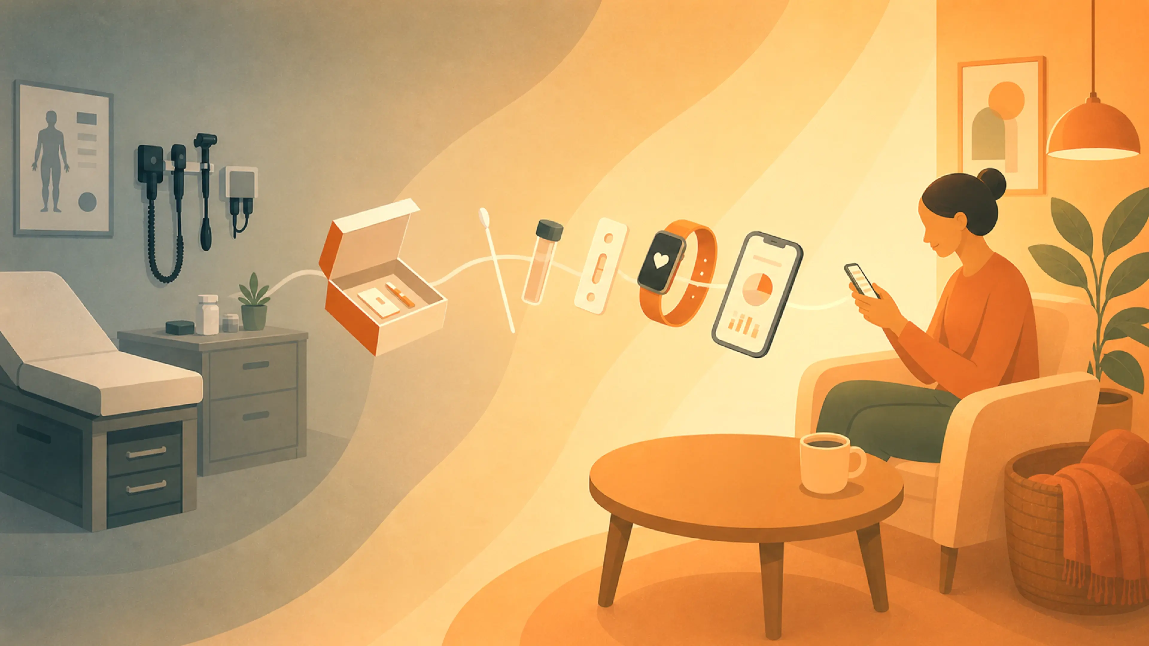
Healthcare was once centered on the doctor’s office. Today, it’s moving into the home. Since the pandemic, demand for at-home testing has surged, with 82 percent of older adults saying they’re interested in taking medical tests at home, and many preferring to age in place. From at-home influenza tests and COVID-19 swabs to cervical cancer collection kits and continuous health monitoring, people are taking a more active role in managing their care, with tools that enable both testing and tracking from home.
Designing for this shift means supporting people without medical training—who may struggle to interpret data, who might be nervous about collecting samples, or who might wonder about the efficacy of a test they perform themselves. In my work at IDEO, I’ve identified six principles for creating home-use diagnostics and monitoring tools that are more intuitive, reliable, and easier to use.

1. Design for emotion
Medical tests can evoke powerful feelings: fear of receiving bad news, memories of lost loved ones, or general anxiety. As a designer with a background in social science, I recognize that emotions often drive behavior. Our role as designers is to anticipate these emotional responses and design solutions that support them.
On a cancer screening project, for instance, we found that some users postponed testing not because they didn’t understand how to use the tests, but because they were afraid of the results. To address this, we softened the typography, refined the color palette, and shifted the messaging to focus on taking care of one’s health rather than screening for illness.
On a separate project, we discovered a completely different emotional pain point: clunky health monitors can be perceived as a sign of aging, making people feel self-conscious about wearing them. Which is a fair point. Medical devices often look outdated compared to sleek consumer technology. This disconnect can be emotionally jarring—and socially stigmatizing. To rectify this, we focused on portability and aesthetic improvements. The goal wasn’t to turn a home heart monitor into an iPhone, but to make it feel like a tool for enhancing well-being rather than just surviving an illness.
Time and again, we see that providing patients with a premium-feeling device or thoughtfully designed packaging can transform a medical experience from being a source of embarrassment into a moment that reinforces confidence and self-care.
2. Make use of the unboxing moment
First impressions of medical devices matter. If users can’t immediately see components or have to dig through packaging material, they may assume that the testing process is complicated or time-consuming, too.
During one at-home cancer screening project, we discovered that many people opened the box, took a quick look, and decided to postpone the test because it looked too overwhelming. By redesigning the unboxing experience to make the components and instructions more visible, participants reported feeling more confident and in control.
With some thoughtful changes, the unboxing moment can feel like an act of empowerment. Blank spaces on boxes can be valuable real estate for reassuring messages or simple diagrams, ensuring that essential information isn’t left buried in the instructions.

3. Keep it familiar
At-home screenings are a relatively new concept, and can feel intimidating. People often worry they won’t be able to perform the tests correctly—or worse, that making a mistake could invalidate their results. Thoughtful design can help alleviate these fears by leaning into familiarity and clarity.
When an IDEO team collaborated with Teal Health on an at-home cervical cancer test, they designed the testing wand to resemble a tampon—a form and function that many users were already familiar with and comfortable using.
Similarly, for an at-home stool collection kit for another client, we designed components that mimicked the contours of a toilet bowl, making the overall experience feel more intuitive.
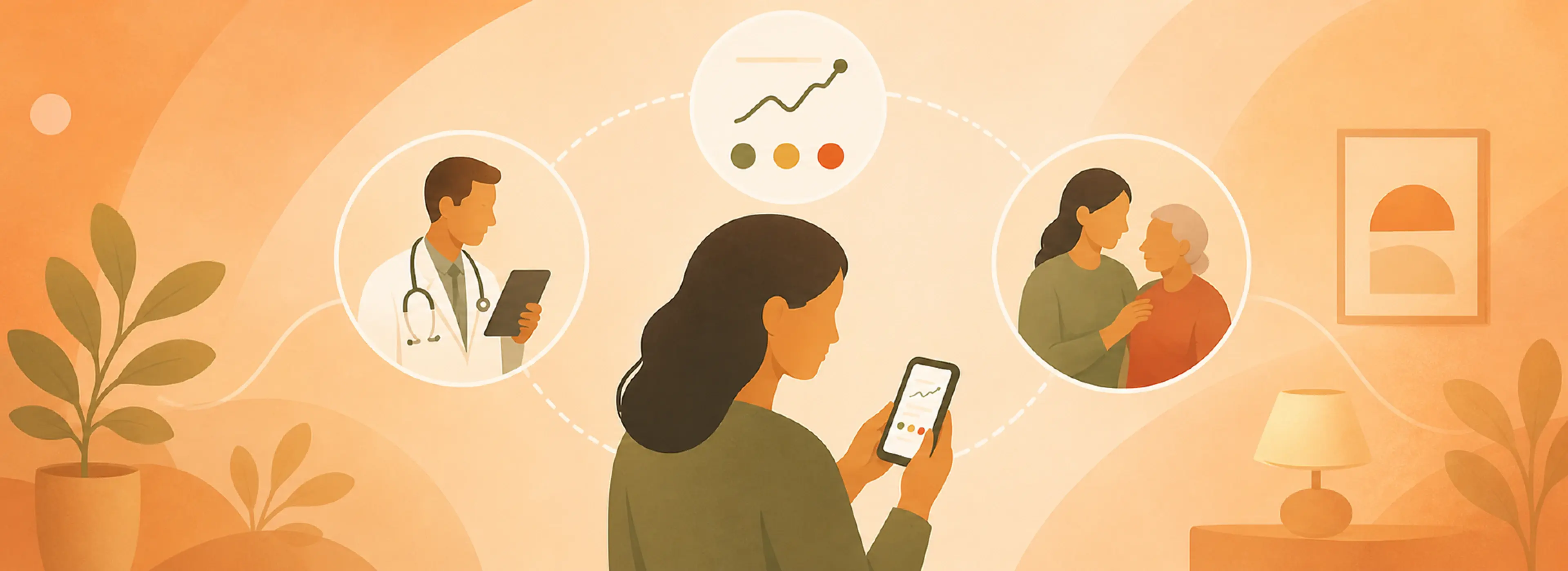
4. Make data relatable
Designing at-home health monitoring systems requires a careful balance between what patients want to know and what healthcare providers need to see. Providing too much information can overwhelm patients, while too little can leave them feeling powerless. To drive adoption and adherence, designers must connect the data to patients’ real needs and challenges, empowering them to navigate their health effectively.
Recently, an IDEO team was designing an implant to monitor organ health. Data from the implant would go directly to the physician for review, but patients also wanted to see the results themselves. In today’s world, where smartwatches can track heart rates and sleep cycles, people expect feedback from health tools. When devices withhold information, it can feel as if they’re keeping secrets. To address this, we recommended a simple, intuitive interface: a stoplight notification system (green = all good, yellow = contact your doctor), along with the option to view a trend graph over time. Patients had the agency they desired, while more complex data remained accessible only to physicians.
In another project focused on at-home bladder monitoring, we discovered that a device that indicates bladder fullness was life-changing for patients who struggled to empty their bladders. People who felt homebound by the fear of embarrassing accidents or infections reported that the device would help them gain the confidence to plan their days and reclaim their lives. Even though the device would require surgery, the possibility of increased freedom was so appealing that patients felt it was worth the risk. The quality-of-life improvements the data enabled—not the monitor itself—motivated them to embrace this new device.
5. Lean into visual instructions
More words don’t always equal more clarity. In fact, overly detailed, multi-page instruction packets can discourage people from engaging and may give the impression that a test is too technical, even if the language is at a fourth-grade reading level.
In one project, we simplified an 11-step test guide into a user-friendly design with three main steps. We reduced the amount of text, emphasized illustrations, and broke down the process into manageable parts to make it feel achievable. This visual-first approach not only made the instructions easier to follow but also reduced user anxiety and improved accessibility for people with reading disabilities and those who speak English as an additional language.
6. Look to family and caregivers
While we typically think of patients as individuals, it’s important to recognize that they exist within complex networks of family, friends, and communities that support and supplement their abilities. When we do research for at-home devices and monitors, patients often request to be interviewed alongside their caregiver, or vice versa. Successful at-home medical monitoring and testing must take into account the motivations and needs of everyone involved in the patient care ecosystem.
Product teams may assume that older patients will not want to use even basic technology. This might not be true, and even when it is, it’s worth remembering that the end user might not always be the patient. At times, a caregiver might be more invested in the outcomes of monitoring or testing than the patient themselves, and could be more open to embracing digital and tech-forward solutions.
It’s this kind of health ecosystem thinking that becomes crucial as at-home testing and tracking grow more prevalent. What we have now may feel revolutionary compared to the pre-pandemic era of mandatory in-person care. Many innovations that once felt like futuristic fantasies—such as headsets that help treat depression and saliva-based hormone tracking to support conception—are now available for home use. Still, the potential that lies before us is far greater.
But only if designers get it right. By keeping human needs—across patient, caregiver, and providers—at the center, we can build more advanced solutions that help people take action on their own health.
Need help designing some at-home experiences of your own? Get in touch.
Words and art


.webp)
.webp)
Subscribe