
.svg)


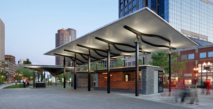

Bringing tourists to a hidden coastal gem
An open-air pavilion to entice visitors to one of Boston’s best-kept recreational secrets.
Once considered one of Boston’s best-kept secrets, Boston Harbor Islands National Park was looking to increase visibility and entice visitors to its network of 34 islands, a Civil War–era fort, historic lighthouses, and more than 50 square miles of bays, harbors, and rivers within the Boston Harbor basin.
Together with the National Park Service, Boston Harbor Alliance, architecture firm Utile, and landscape architecture firm Reed Hilderbrand, IDEO and the National Park Service came up with a plan to design a pavilion on the Rose F. Kennedy Greenway, which reconnects the city’s historic waterfront to the downtown area. The team believed a successful pavilion would sell boat tickets, attract passers-by, and enable a positive encounter with the islands. Today, the structure serves as the primary gateway linking Boston to the Harbor Islands, equipping the city with an experiential anchor to better connect visitors with Boston’s coastal gems.
The Boston Harbor Islands Pavilion was officially unveiled on June 2, 2011, and honored with an Honor Award for Design Excellence from the Boston Society of Architects, the 2011 Grand Honor Award from the Associated General Contractors of New England, and a Silver Award from the 2012 ACEC/MA Engineering Excellence Awards.
The Boston Harbor Island Alliance, which acts as a steward for the 34 islands, anticipates that the pavilion will positively impact the number of visitors this year.
Bringing back the neighborhood pharmacy
Helping a retail chain build healthier relationships with customers.
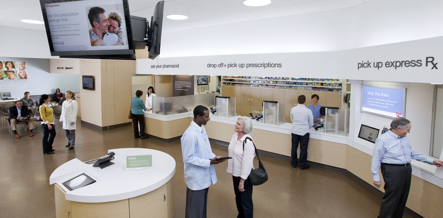
In 1901, Charles R. Walgreen, Sr., opened up a small neighborhood pharmacy on Chicago’s South Side. Today, Walgreens is the largest drug retail chain in the US with more than 8,200 locations in all 50 states. As healthcare reform has become top of mind in the US and patient-centered care increasingly the norm, Walgreens sees its scale as an opportunity to rethink the role of the community pharmacy in the 21st century. The company collaborated with IDEO to redesign its pharmacy experience in order to foster rich, trust-based relationships between customers and the most highly trained medical professionals on staff—pharmacists.
Most Americans—75 percent—live within five miles of a Walgreens. With the Affordable Care Act bringing millions more Americans into the healthcare system, Walgreens’ proximity and reach provided a big opportunity to become a convenient and trusted touchpoint for patients outside of hospitals and doctors’ offices, especially those suffering from chronic conditions such as diabetes and heart disease. The challenge: Use design to shift customer perception of Walgreens from just another convenience store to a local place at “the corner of happy and healthy,” where customers could receive everyday health and wellness advice. In other words, bring Charles R. Walgreen’s vision of a community pharmacy to unprecedented scale.
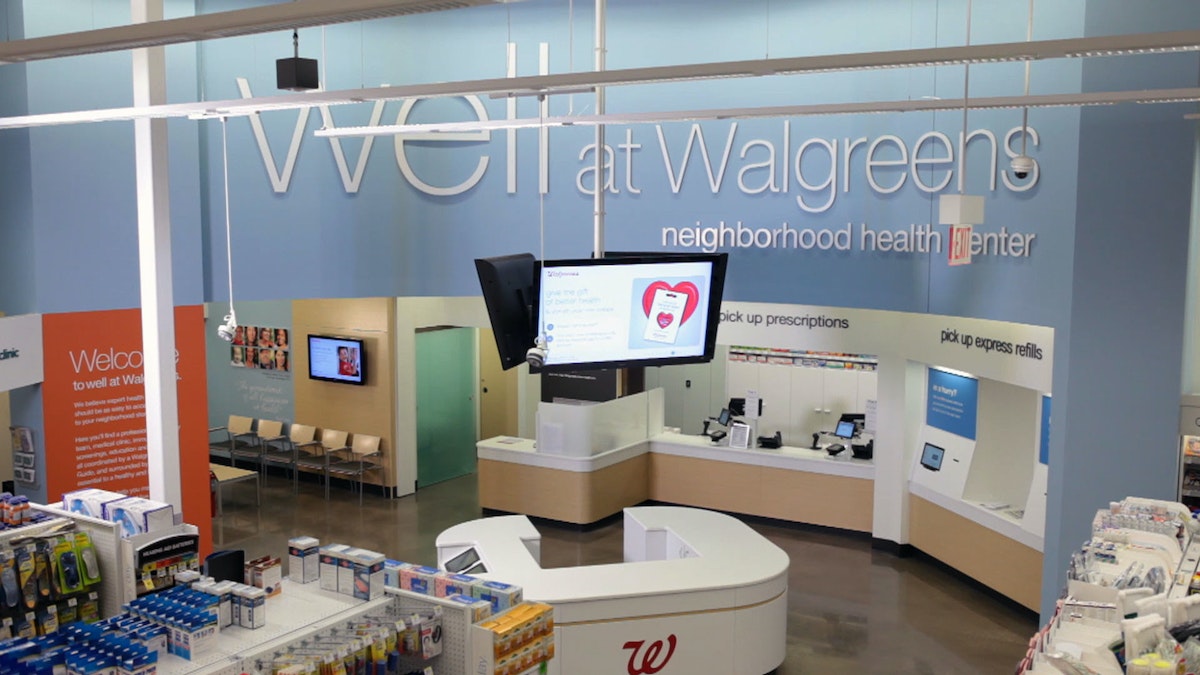
IDEO built out two full-size prototypes of a reimagined Walgreens pharmacy designed to cultivate better relationships between customers and pharmacists. Key to building good relationships were private consultation rooms that allowed for close conversations, and friendly health guides that helped customers browse over-the-counter medications or schedule “take care” appointments. Pharmacists, usually barricaded behind their high counter at the rear of the store, were now positioned out on the pharmacy floor, ready to listen and—most important—ensure continuity of care.
"Patients are engaging with pharmacists even more often to ask about everything—including their medication, health conditions, and prescription regimens," said Nimest Jhaveri, Divisional Vice President, Pharmacy Transformation.
The new Well Experience format was launched in two pilot locations in Chicago just a few months after the prototypes were built. Combining IDEO’s pharmacy work with Walgreens’ new approaches to beauty products, fresh food, and online shopping, 750 Well Experience locations have opened in the US and Puerto Rico—including 14 flagship stores in major cities—and an additional 1,000 are planned for the coming years.
Walgreens is also expanding the scope of its Take Care Clinics, which are usually staffed by nurses or physician’s assistants, to include the diagnosis, treatment, and monitoring of chronic diseases such as diabetes that are typically handled by doctors. The company considers its Well Experience pharmacies a work in progress and plans to keep evolving the design based on customer feedback.
An ingenious way to preserve wine
A double-duty bottle opener that's an industry game-changer.
Opening a bottle of wine is typically a moment of no return, because what remains after the first pour almost immediately begins to oxidize.
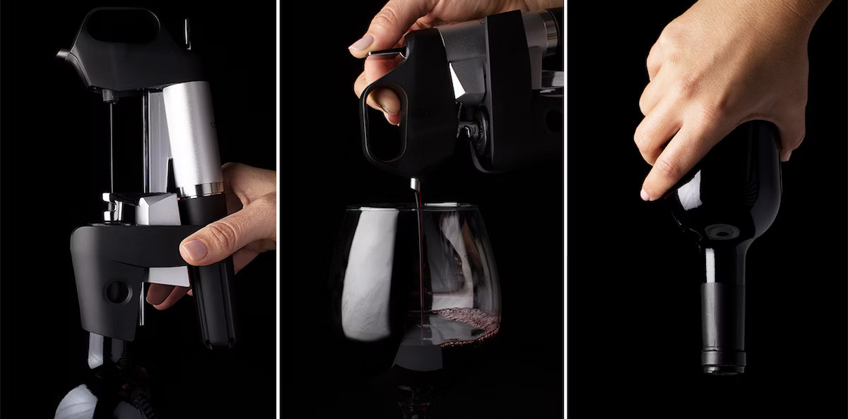
But Greg Lambrecht knew there was a better way. He came up with an idea to pour the wine without opening the bottle. With a new device, a slender needle is inserted into the cork, and argon, an inert gas, pressurizes the bottle to pour a single glass. Remove the needle, and the tiny puncture in the cork naturally reseals, maintaining the integrity of the wine in the bottle.
Working with Lambrecht, IDEO refined the look, feel, and user experience of his device, designing and building a prototype that captured the expression of his eureka moment. Using this prototype, Lambrecht raised significant seed funding for his startup, and launched the Coravin System in July 2013. The company continues to grow year after year.
Lambrecht introduced the only product of its kind sold in the global market, and preliminary sales have far exceeded expectations. What’s more, for wine lovers everywhere, there’s finally a solution to savor and preserve every last drop.
An ATM designed for you
Making customer interactions fast and easy—without requiring any new hardware.
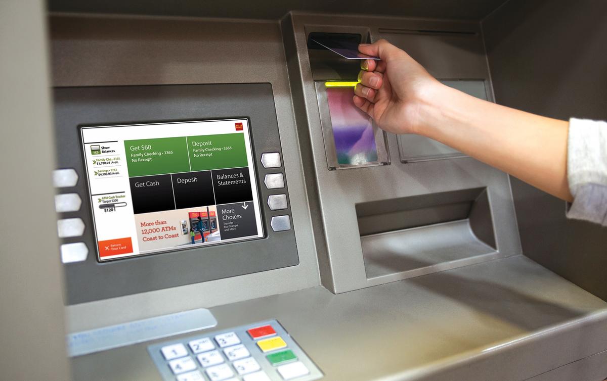
Wells Fargo, one of the United States’ largest banks, wanted to enable customers get to the ATM functions they wanted faster. The updated interface needed to be different enough to have a tangible impact, and had to appeal to an extremely broad audience. What’s more, any changes made to the interface had to be compatible with the existing hardware of all of the ATMs in operation nationwide.
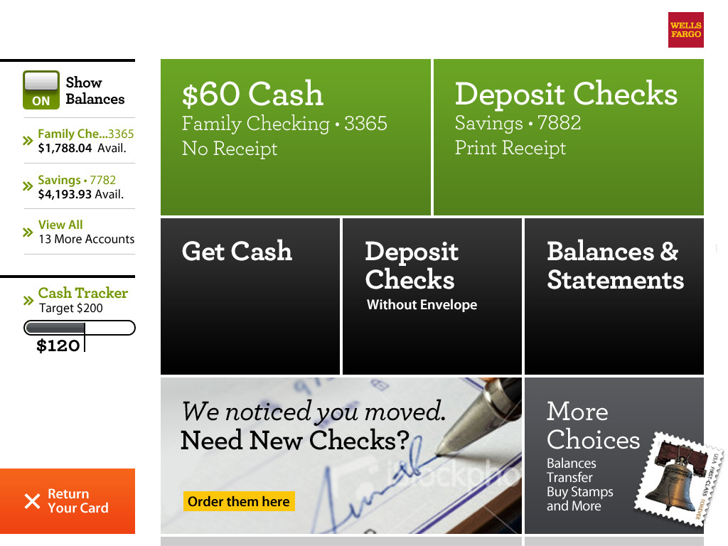
Wells Fargo and IDEO worked to enhance and customize the ATM user experience by making it innovative, fast, and easy—without requiring any new hardware. The interface’s entire layout is personalized, based on what a user does most at the ATM. It gives users an immediate glance at their account balances (which they can also hide) and highlights the touch screen 'buttons' that they use most (by putting them at the top of the screen in green). New data hierarchy also facilitates skimming for fast decision-making and provides messages and notifications based on a customer’s priorities. “[The design] shows an intense attention to detail,” noted American Banker.
PHOTO ILLUSTRATION BY MAGGIE LYNN, IMAGE COURTESY OF BIZJOURNALS.COM
What Brewing Beer Taught Me About Design
Mapping the future of beer drinking
So I decided to pursue my own absurd hobby that would combine my twin passions for beer brewing and fictional cartography into what I hope is the ultimate beer drinking experience. Or at least the most ridiculous. I call it Bean Brew.

We talk a lot about the user journey at IDEO. It’s a way to break down how a person experiences important moments when interacting with a product or service. While bottling my first few batches several years back, I obsessed over the taste of the beer and the bottle's label design—two key moments in the beer drinker's user journey. But then I realized that there are so many other moments that I was leaving out of the design process.
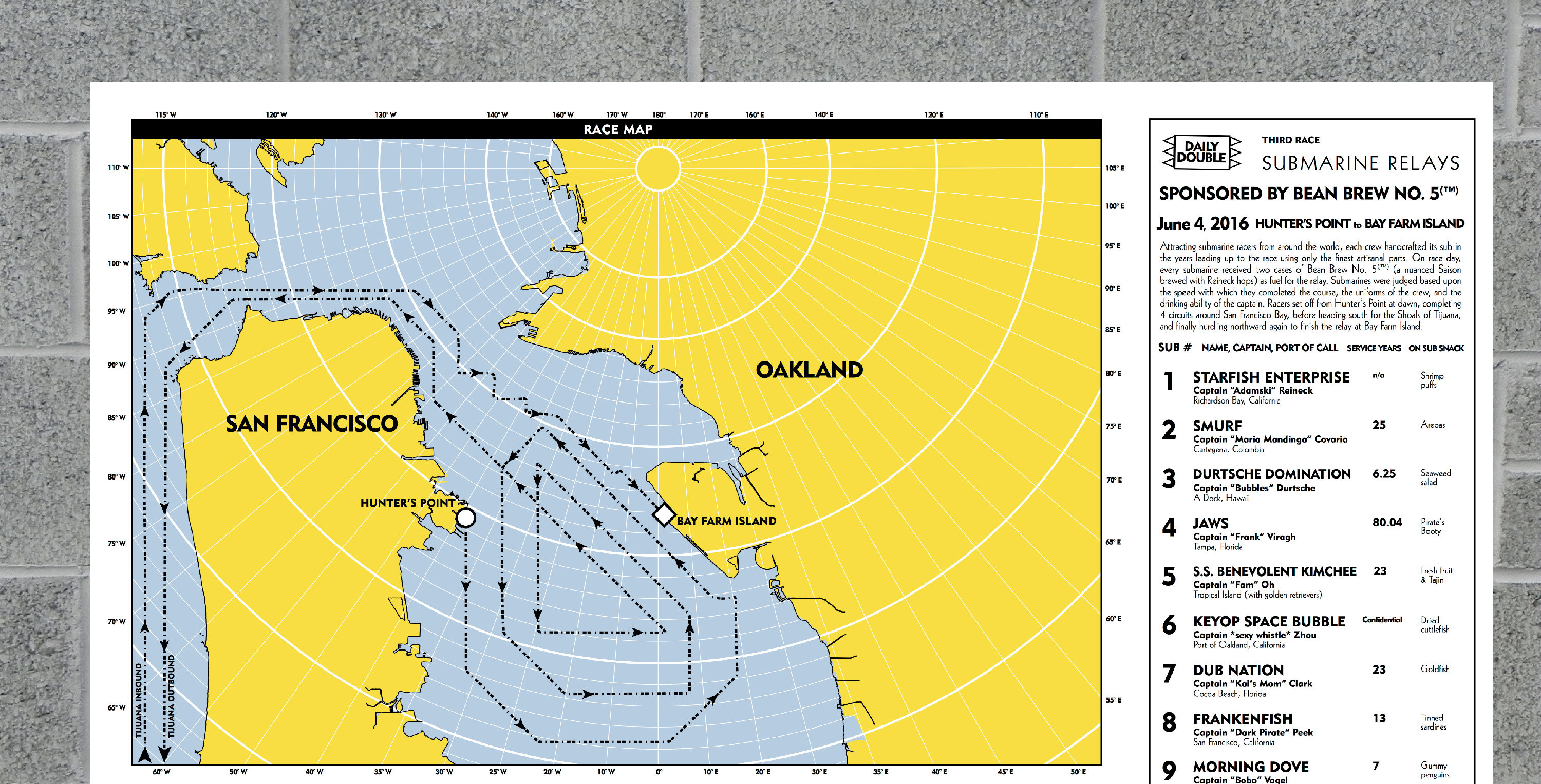
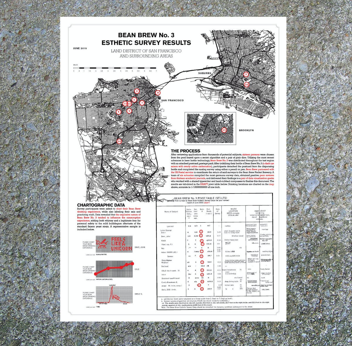
So I asked myself: Could I contextualize the combined drinking experiences of each person who received a bottle of Bean Brew? Could I turn that into a map? And could I deliver that map back to Bean Brew drinkers months later in the form of a delightful silkscreen poster? That became my design challenge.
So what have I learned from my side gig?
1. Quantitative data inspires design
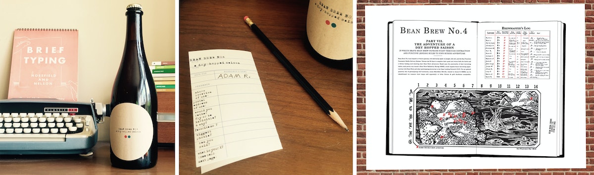
Bean Brew has taught me a lot about how to integrate quantitative survey data into a cohesive storytelling experience (something we’re trying to do more and more of at IDEO these days). I start with questions like these, which I include as part of a survey wrapped around the bottle’s neck:
- What are your three favorite board games?
- Complete the following sentence: If I were on a ship for 1 year, my ideal job position would be ________.
I then transform the responses I get from people who received a particular batch of Bean Brew into a poster that looks something like this.
2. There's more to design than what meets the eye
Sometimes, as you go through the design process, you realize the thing you think you're designing (a bottle of beer) isn’t what you're actually designing (a beer drinking experience). This is true for most of the projects I’ve worked on at IDEO, and for Bean Brew, too.
3. Side gigs = side skills
Finally, I’ve learned a bunch of tangible skills throughout the process of making Bean Brew: Arc GIS (cartography software), best practices for glue adhesion (getting elaborate labels to stick to bottles), and how to use the power of analog experience to blow away anything an iPhone can do. I’m confident that I’ll be applying at least some of these skills to an upcoming IDEO project.
Bean Brew is my attempt to bring as much joy and delight to my hobbies as possible, and in doing so, I find that I’m more more creative and productive as part of my day job. And so much happier.
I am not training for any marathons. Just an expedition to Antarctica. In a submarine. With beer.
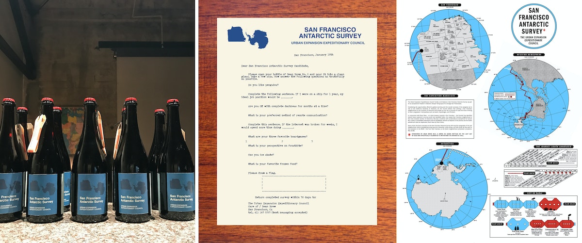
Years ago, I was working at a law firm in Boston. Many of my colleagues had the same hobby—training for the Boston Marathon in the middle of the frigid New England winter. This was what they did for “fun.” I was so amazed that these people with such unhappy day jobs would choose what seemed like such an unhappy hobby to fill their nights and weekends. Many years and two careers later, I moved to San Francisco to take a job as a designer at IDEO. In my first months here, I remember being struck by all of the wonderful and absurd hobbies that my new colleagues had. It was a delightful and inspiring contrast to my dark days in Boston.

Quick + Dirty Design Tips: Animation in After Effects
Animation tips from an After Effects power user
For this method of animation, make sure to use only lines in your Illustrator file. The idea is to animate the lines across their own path, so the way you design them will play a big part on how elaborate your animation will be.
Watch this video for a quick step-by-step guide to animating lines in After Effects:
- When your Illustrator file is ready, import it to After Effects. You can simply drag your Illustrator file to the Project area or go to File > Import > File.
- Drag the imported file to the Timeline. It will automatically create a Composition.
- Now you must turn your Illustrator file into Outlines that After Effects can control. On the timeline, right click on the layer and select "Create Shapes from Vector Layer.
- The next step is to animate your outlines. For that, you will need to add a Trim Paths feature to your new layer.
- On Trim Paths, use keyframes for Start/End to change when and where you want your paths to animate. If your file has multiple lines, you can choose to animate them simultaneously or individually.
This technique is a simple and effective way to create powerful motion graphics for storytelling, user interface behaviors, or even a simple animated gif. Hope you enjoyed it!
Adobe After Effects is one of my favorite tools for prototyping user interfaces, creating video scenarios to communicate a context of use, or simply crafting stories through animation. It's a tool that allows you to explore and visualize ideas, and there's no right or wrong way to use it. Here are a few tips for using After Effects to animate vector lines imported from Adobe Illustrator.
Why You Should Keep Making Stuff By Hand
Don't let technology stop you from getting your hands dirty
So, when the opportunity comes up, I like to turn off the computer and focus on creating artifacts. While an object is just a thing that serves its purpose until it’s tossed out, an artifact sparks an invisible conversation, a connection between the human who made it and the human experiencing it. Even something that people don’t think twice about, like an event name tag, deserves to be well designed.
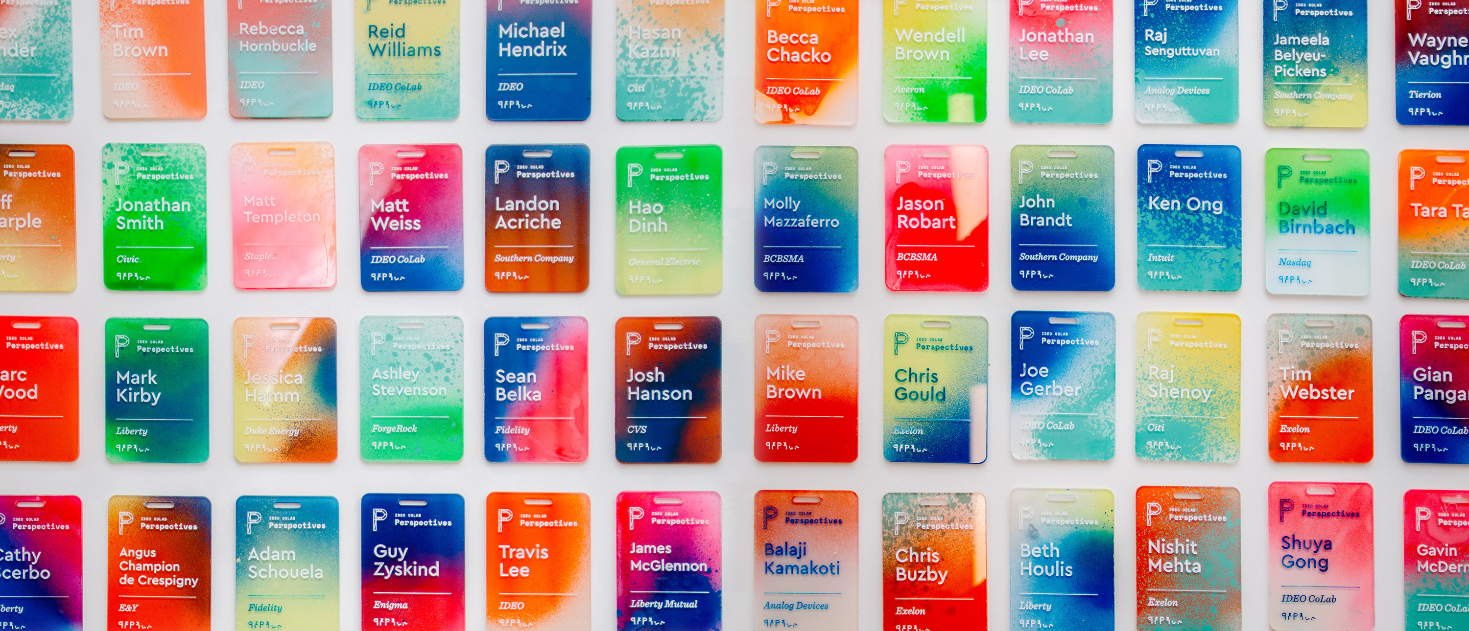
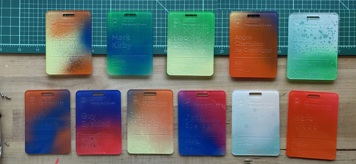
That belief drove me to create a collection of one-of-a-kind name tags for a CoLab event. I wanted to make something with my hands that would bring a level of craft to our content. The tags served as the icebreaker for more than a few conversations, and reminded people at the tech-focused event that there's a human element to everything. Many attendees we reached out to a month later said that they still had the tag on their desks.
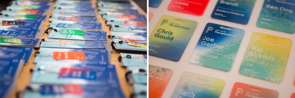
The process was simple, but arduous: I laser cut blanks, etched the names, spray painted each tag using unique colors and angles, and finished it off with acrylic screen printing ink to make the names readable.
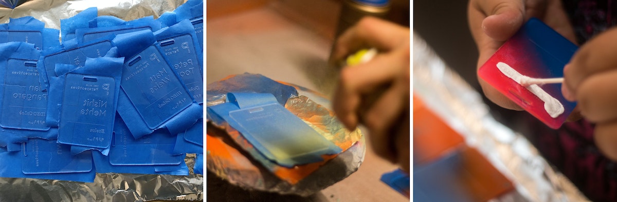
Here's how I did it, step by step:
1. Creating the blanks
I designed the negative of the template so that I could later use it as a jig. I used 18 x 24 inch sheets of 3mm acrylic, so that with the name tags at 2.5 inches x 3.5 inches, I could fit about 32 comfortably in each batch (as opposed to 38 if I used all available space and threw away the negative).
Acrylic sheets tend to melt and then cool quickly in the laser cutter, leading to possible sticking, so I usually add about .2mm to my thickness settings to compensate (i.e. I was using 3mm acrylic, but put 3.2mm in the settings). There are two benefits: One, you guarantee that you actually cut through the sheet. Two, it also gives you a little bit of wiggle room so you don’t end up with hard to pick out joints.
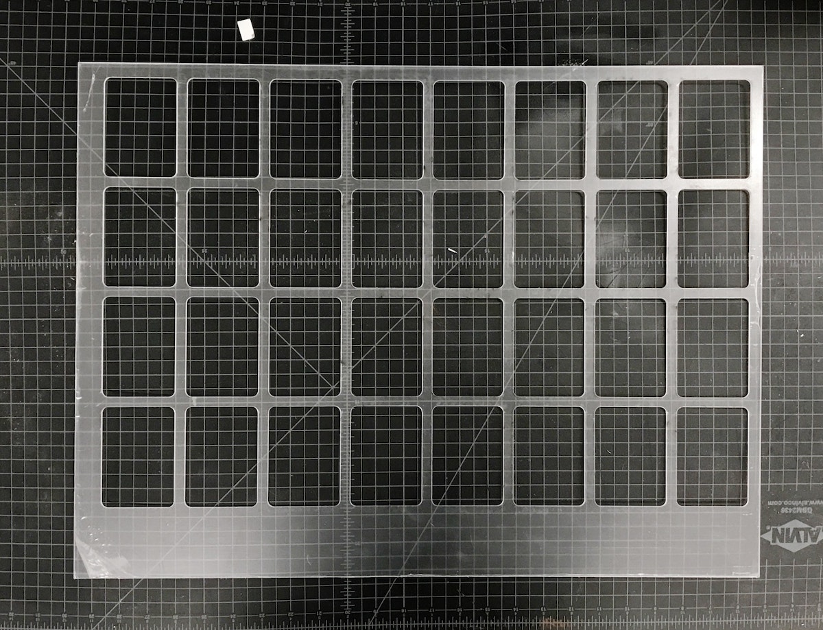
Pro tip: The key to making the most of your acrylic is to leave space for future cuts on the same piece. Instead of designing my reusable jig with all the name tags in the center, I threw them to one side so that I could use the other end again. After I cut the jig, I could get 38 tags out of each subsequent batch because I could simply throw away the negative. Another bonus: When there’s excess acrylic on one end, you can always tell which side goes in which direction.
2. Etching the blanks
Once the blanks were cut, I needed to take the protective plastic off of one side, so that I had a clean surface to etch onto. I peeled the tags, slipped my template jig back into the cutter, and dropped the blanks into place.
The etch file is the same as the template jig, just with a red cut box around the perimeter of the file denoting the edge of the acrylic.
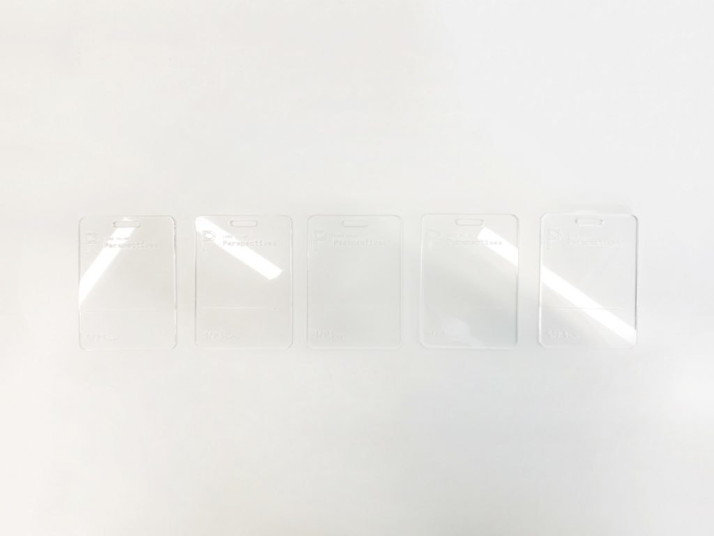
Once I had an etch file ready to go, all I had to do was push the file to the top left of the cutting area and check the focus points of the laser on the first tags on the first and second rows. Since the etch file is in the same grid form as the old cut file, everything is already spaced for me. The etch settings held ink best at around 74 to 76 percent power at 100 percent speed.
One final thing to note: We don’t want to cut anything (we’re just etching), so after setting my etch power, I set the cutting lines to 0 percent power and 100 percent speed, so we just blow right past them.
3. Taping the etched tags*
Once the blanks were etched, I peeled the plastic off of the back of the tags, then covered the etched side of each in painters tape to keep them clean.
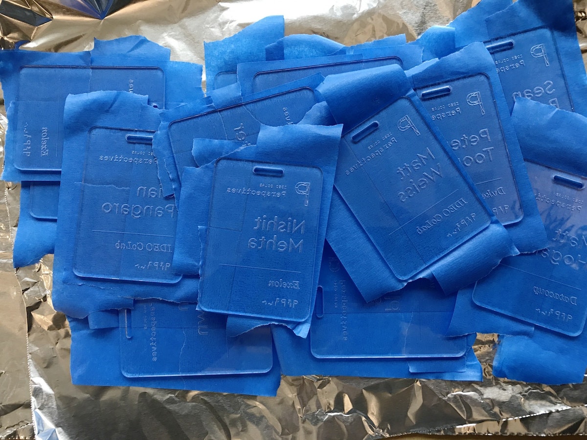
4. Spraying the tags
After everything was taped, I slapped some aluminum foil in the vent hood and got to work spraying each tag. The process allowed me to bring out some of the old airbrush tricks my dad showed me as a kid, like holding a tongue depressor at a 60 degree angle in front of the nozzle to create thicker splatter. I used two to three colors for each tag, at varying angles.
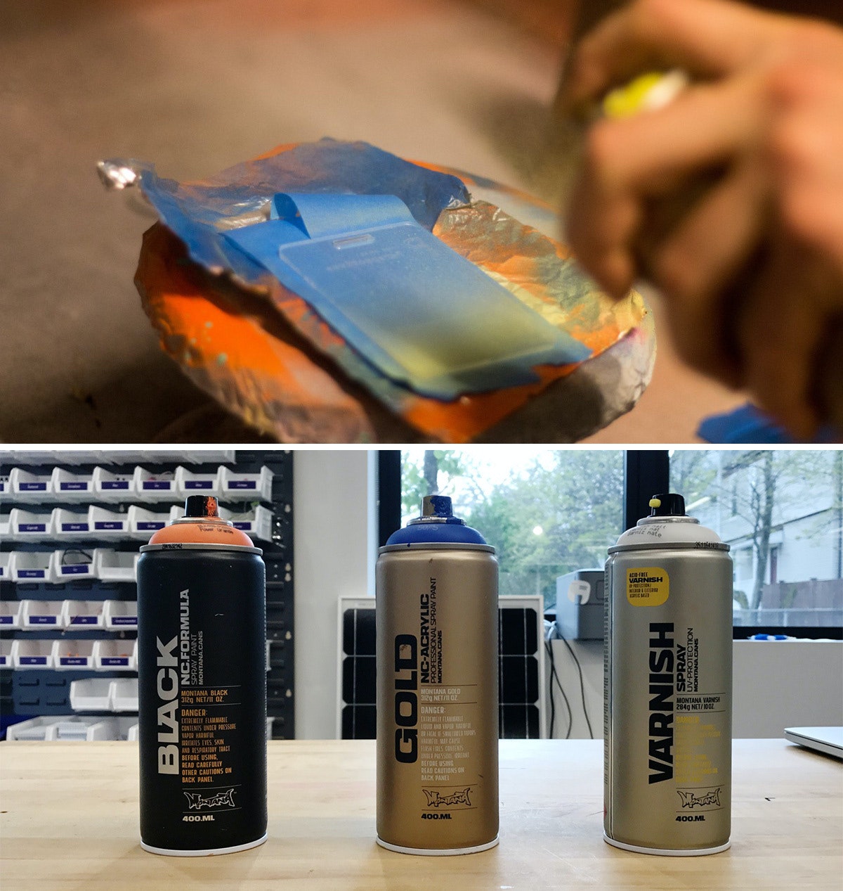
I used Montana brand spray paints, and I definitely recommend using the BLACK formula. Over the course of the project, it dried on the acrylic within four and-a-half minutes, which is pretty insane. The GOLD formula was comparable, but my run of the mill Krylon paints took much longer, so it’s worth the extra bucks to buy Montana.
Pro tip: If you’re spraying a bunch of parts in a hood, aluminum foil is actually a great material for coverage as it tends to not stick to your parts like paper.
5. Sealing the tags and revealing the beauty
After the sprayed tags had dried, I hit the painted side with a couple quick coats of the Montana clear matte varnish so that they wouldn’t stick to each other. When everything had dried, I peeled off the painter’s tape—my favorite part of the project.
6. Applying the ink inlay
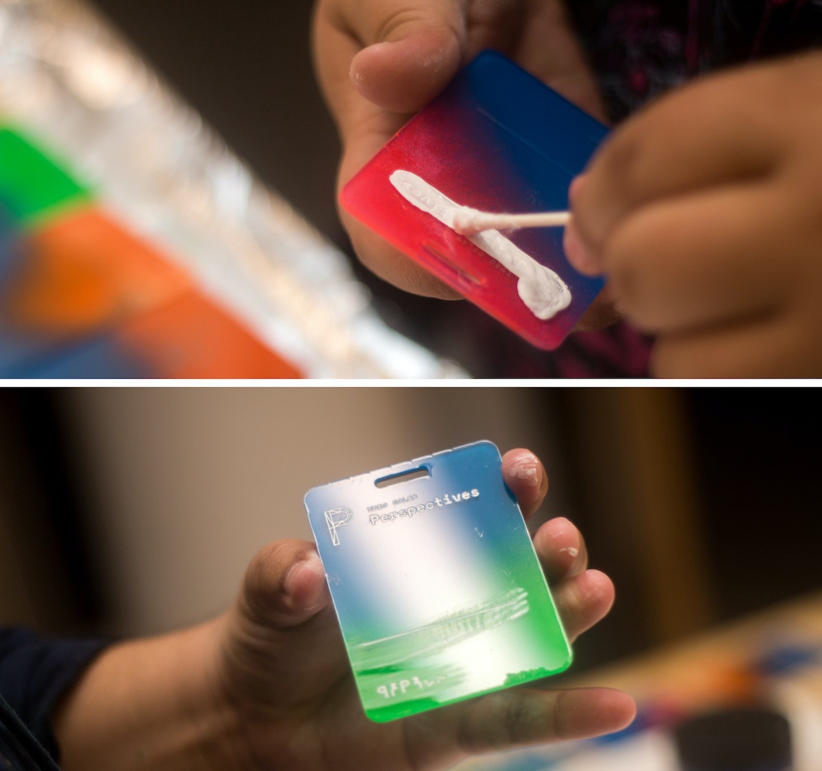
Next came the most time-consuming part: the ink inlay. I used speedball acrylic screen printing ink for its fast drying time, and how easily it wipes off acrylic. I liberally brushed and swabbed the ink into the etch using a Q-tip, then quickly wiped the excess off with a paper towel. Once dry, they were ready to go.
That's it!
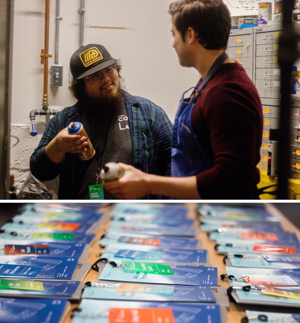
*Imperfect process: I know what you’re thinking—why didn’t you just remove one side of the plastic before etching, spray that side, then remove it from the other side, then etch that? I did! After a few batches, I added the taping step because I noticed the spray paint was eating away the plastic coating that kept the paint off the front of the tags.
I work with CoLab, IDEO’s tech-focused R&D group. I’m also someone who’s committed most of my life to craft. Luckily, my day job allows me to bring the two together. But the minute you start making a living from your craft, problems start to surface. You get burnt out. You compromise your vision to deliver things on time. At that point, you're no longer transforming objects—you’re just pushing matter around.
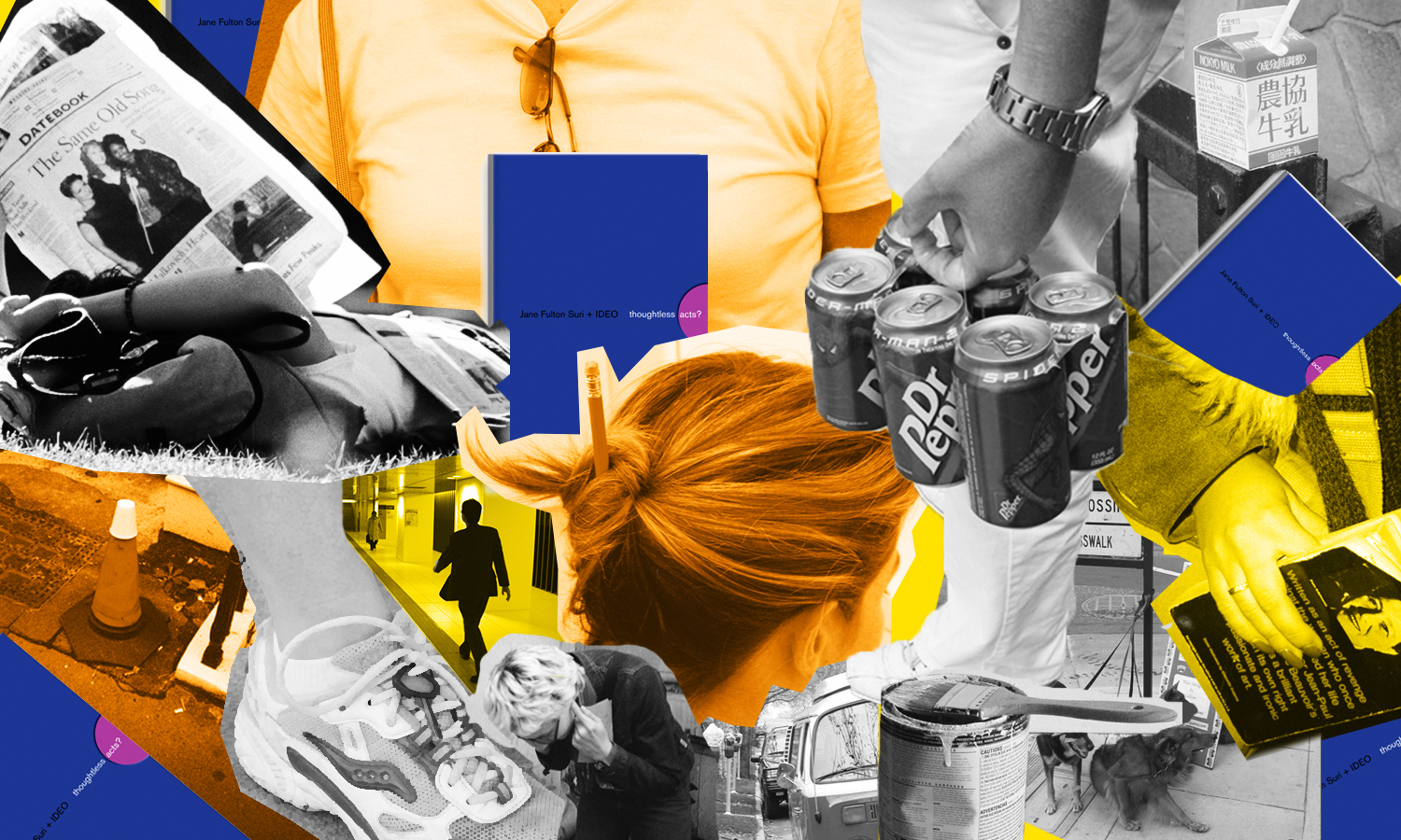
Thoughtless Acts: Single-Serve Medicine
Thoughtless Acts: Single-Serve Medicine. The intuitive ways we adapt and react to things in our environments
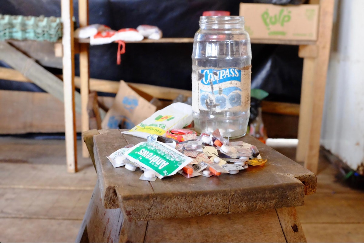
I snapped this photo in the Amazon jungle town of Iquitos, Peru. A jar full of individually cut blister packs sat in the corner of a general store set up in front of a family’s home. By making individual doses available—not even a daily dose, but a single, one-time dose—more families were able to afford treatment for their ailments. In a community where money is very scarce, this family was filling a very real, pressing need that wasn't being addressed by local stores.
Human-centered design requires us to observe human behavior with beginner's eyes, so that we can spot the innate ways people interact with the world around them. We call these intuitive and unconscious reactions Thoughtless Acts, and IDEO designers collect photos of them to inspire their work.

Lindsey Turner
I’m passionate about building brands, products, and experiences that help organizations show up with meaning and momentum.
I help organizations cut through complexity by shaping how they show up, through brand strategy, identity, and storytelling.
Working at the intersection of brand and business, I bring an editorial eye and a bias toward making—turning ideas into tangible experiences that people can understand, trust, and believe in.
My work spans government, healthcare, financial services, media, and consumer goods, from launching Gen Z-focused ventures to building innovation labs and reimagining legacy brands. I relish moments of ambiguity and enjoy translating across teams, perspectives, and priorities to move ideas forward.
I started my career in editorial and digital design, shaping cross-platform experiences and identity systems in publishing and agency environments. That foundation still shapes how I work today: I’m detail-oriented, collaborative, and overreliant on the Oxford comma. I hold a BFA in Visual Communication from the School of the Art Institute of Chicago.

Rachel Young
My work helps organizations see who their products aren't working for—and build the will and the tools to do something about it
For 25 years, I've asked the same question: Who does this design exclude—and what are we going to do about it?
My work spans human-centered strategy, inclusive design, and qualitative research, with clients ranging from Microsoft, Google, and Verizon to the National Science Foundation, and San Francisco Unified School District.
Before IDEO, I taught elementary school in East Palo Alto and spent a decade doing design work with social service organizations—where I learned firsthand what it costs people when systems are built without them in mind.
I am currently writing User Error, a nonfiction book about digital access and the design decisions behind it. I live in Oakland, California.

Brian Pelsoh
I lead with craft, ensuring our work is creatively excellent: rooted in deep human insight and imagination, while also grounded in the realities of business and technology.
My expertise spans brand, communication, and product design across tech, education, the arts, and social impact.
I believe great work demands both high-level vision and obsessive attention to detail, and only happens through collaboration.
I bring an inclusive, hands-on approach and a deep understanding of business, which enables me to consistently deliver excellence while always asking why.
Before joining IDEO, I worked at the brand firms Pentagram and VSA Partners. I began my career as a designer, leading teams at the School of the Art Institute of Chicago and the Milwaukee Art Museum. I hold an MFA in graphic design from Maryland Institute College of Art and a BFA in communication design from the Milwaukee Institute of Art & Design, and have taught at some of the best design schools in the US.

Tony Wong
I am responsible for IDEO’s long-term success in China and working with clients to use design as a tool to enable growth.
I am responsible for IDEO’s long-term success in China and working with clients to use design as a tool to enable growth. Specifically, I have helped Chinese companies design holistic brand solutions through the development of their products, communication, services, and innovation teams, and I have helped multinationals expand their presence and influence in China.
I advise global leaders on developing China-led innovation and capabilities.
In over 15 years in IDEO Shanghai, I have worked on projects that use design to elevate the quality of the experience of healthcare products and services, streamline processes that increase productivity, create spaces and programs that promote and enable inclusive communities, and build next generation mobility solutions that are planet-positive.
Before joining IDEO, I worked at Philips Electronics and the Electrolux Group in Italy, the Netherlands, and Singapore on a number of breakthrough commercial products. I am a member of the Young President Organization in Shanghai.

How to use AI as an editor, not a writer
Ed White shares how he uses AI as an editor—not a writer—to sharpen storytelling, rehearse ideas, and preserve the productive friction that makes creative work better.
Ed White has a rule he's tested on his own writing: hold yourself as the writer, and let AI be your editor. Ed is a Senior Design Director at IDEO's London studio, where he co-leads the firm's AI portfolio across Europe. Before IDEO, he spent 12 years as a writer and editor at the Financial Times, Wired, and Contagious. So when he talks about when to use AI for storytelling and when not to, it comes from two decades of crafting his storytelling skills.
In this episode, Mina Seetharaman talks with Ed about two specific tools he uses to keep AI in an editor's seat: a "roasting agent" prompted to critique his drafts without any sugarcoating, and a simulated audience he rehearses pitches on before the real thing. They also get into what Ed is hearing from design leaders at Anthropic, Lovable, Shopify, and Google Creative Lab about how creative work is changing, and why he thinks the friction of writing something yourself is worth protecting rather than automating away.

Building a personal AI for the messiness of life: Sida Li
Becca Carroll talks with Cue co-founder Sida Li about designing a personal AI for the messiness of everyday life—not just work. They explore how Sida stays anchored to human needs while navigating fast-changing technology, product tradeoffs, business-model experimentation, and the realities of building an AI company today.
Most AI products today are built for work—a space with clear problems and established systems. One founder noticed a gap: personal life is messier, harder to systematize, and mostly left behind by the AI boom. So she built Cue, a personal AI that lives inside iMessage and group chats, to go where the other tools haven't.
In this episode, Becca Carroll, IDEO's Chief Strategy Officer, talks with Sida Li, co-founder and CEO of Shared Context Lab, about staying anchored to a human need while the technology around her keeps changing shape, why she treats her business model with the same rigor she'd bring to a product, and what it feels like to build a company at this particular, disorienting moment in AI.
The conversation also gets into how Sida makes design decisions: the language Cue uses to describe itself, the tradeoffs behind building inside iMessage instead of a new app, and a real story about a business idea that didn’t pan out.
This is the second in a two-part series profiling founders from IDEO's Startups-in-Residence program. The first conversation is with Johannes Seemann, founder of Sooner, on designing GenAI for the emotional side of money.

Designing GenAI for the emotional side of money: Johannes Seemann
Designing financial tools around the feelings that shape money decisions.
Most personal financial tools are built to run the numbers and optimize towards a budget. While that works for some, most people experience money as a lived relationship that does not neatly fit into a spreadsheet. Johannes Seemann and Becca Carroll discuss why money is emotional before it is mathematical, and what a human-centered approach to building a generative AI financial product looks like in practice.

The curious leader's edge in uncertainty: Scott Shigeoka
How genuine curiosity helps leaders navigate uncertainty with greater confidence.
Mina Seetharaman talks with Scott Shigeoka, author of Seek and Head of Curiosity Cultivation at the Eames Institute, about what distinguishes genuinely curious leadership from performative curiosity, how power dynamics shape curiosity, and why practicing curiosity can restore energy rather than drain it.
Looks like you might be in search of something very specific?
Or reset the filters above and try another angle.
Here’s some random inspiration

Podcasts about creative leadership

Articles about the power of prototyping
