
.svg)


Get Inspired by 5 Great Film Title Designers
Great movie titles permanently burn into our brains. Everyone can identify a James Bond film by its graphic overlays of babes and guns. And who could ever forget Star Wars’ opening crawl, how it scrolls back into space as John Williams' famous theme—da, dee dee da, dee dee da—echoes through the theater.
Before you ever see a movie or watch a TV show, it’s likely that a title screen from a trailer or poster art has gotten you there. As a UX designer, the art of the film title has always inspired me and shaped the way I think about branding and design. Here are the title creators (and one typographer) who have inspired me:
1. Saul Bass
Saul Bass is among the pioneers of title design. In 1955, his title sequence for Preminger’s The Man with the Golden Arm made him famous. He then went on to design for Alfred Hitchcock, Stanley Kubrick, and Martin Scorsese. His work showed that the first minutes of a film are of great importance. When played right at the beginning, titles serve as an overture, foreshadowing part of the story, mood, or theme. It’s a dramatic device that puts the audience in the world of the movie before they even start watching it.

Opening title sequences by Saul Bass.
Bass put it this way: “I saw the title as a way of conditioning the audience, so that when the film actually began, viewers would already have an emotional resonance with it.” It's helpful advice for anyone designing a title page, presentation, or home screen. With those elements, title designers prepare audiences for what they're about to see. “Try to reach for a simple, visual phrase that tells you what the picture is all about and evokes the essence of the story,” he said.
Opening title sequences by Pablo Ferro.
2. Pablo Ferro
One of Bass’s fellow title designers was Cuban-born Pablo Ferro, who has designed title sequences for more than 100 films. He taught himself animation from a book by Preston Blair, who worked at Walt Disney productions.
Title designers like Ferro put a lot into setting the right tone, time period, and scene for the story you’re about to see—and it all starts with font. Whether it’s custom or off the shelf, font conveys a certain character and builds the brand for a movie or show. Ferro loved hand-lettering and designed many of his own fonts. When Kubrick asked him to design the title sequence for Dr. Strangelove, Ferro chose to use a tall, thin lettering that he had scribbled in one of his notebooks so that it wouldn't obscure or distract from the underlying footage.
3. Maurice Binder
Having designed title sequences for 14 James Bond films, Maurice Binder created a signature style that used silhouettes and bold typefaces to evoke espionage and intrigue. In the opening sequence for Agent 007 against Dr. No, Binder established the famous gun barrel sequence, initiating the pop era of graphic design. Binder's work is a great example of how consistency of style and typeface help build a strong brand.
4. Ed Benguiat
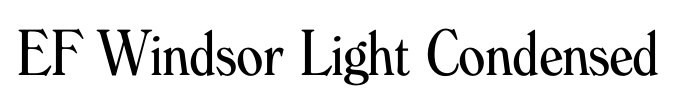
Does the font EF Windsor Light Condensed look familiar? Maybe set in white on a black background, accompanied by some jazz music? Yup, it’s the signature opening for Woody Allen movies. Allen happened to have a conversation with typographer Ed Benguiat in a diner in New Jersey one morning, and Benguiat recommended he use the Windsor typeface for its warmth and friendliness. Allen loved it and used it for almost all of his titles from then on. Though Benguiat isn't technically a title designer, his fonts have been an influence on many.
5. Imaginary Forces
Typographer Ed Benguiat plays a role in our final example, too. Michelle Dougherty—of acclaimed design firm Imaginary Forces—ended up choosing his self titled font, Benguiat, as the primary typeface for the Netflix series Stranger Things. She chose it for its strong 80s appeal and ties to paperback novels from that era.
Then there was the matter of animating the logotype and adding sound and music to bring it to life. The Stranger Things title sequence shows how powerful and expressive type in motion can be. Flickering lights that imitate the optical process, morphing serifs, and the admittedly intense score convey that eerie feeling of mystery. The title sequence for Stranger Things was so well received, a couple of title generators and copycats popped up on the internet to imitate its style.
Opening sequence of Stranger Things designed by Michelle Dougherty with the Benguiat typeface.
To view a great selection of classic and contemporary title sequences head over to The Art of the Title.
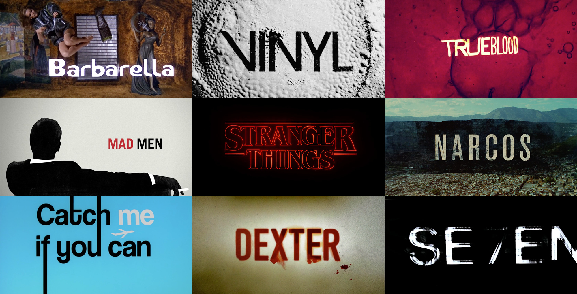
Title sequences in the header image by Maurice Binder (Barbarella), Imaginary Forces (Vinyl, Stranger Things, Mad Men), R/GA (Seven), Digital Kitchen (Trueblood, Narcos, Dexter), and Nexus Productions (Catch Me If You Can).
Words and art

Subscribe