
.svg)


Boston's new citizen-centered site
Designing a welcoming, intuitive platform for Bostonians.
More than 7 million people each year came to the Boston.gov site to tap into all sorts of city services: reporting a pothole, learning the assessed value of their property, paying a parking ticket, checking recycling schedules.
Boston wanted to create a beautiful platform that would make the process of finding and navigating information easy and intuitive, one that prioritized the needs of its people.
The Boston.gov site had outgrown its existing structure and needed an overhaul. The user experience was mired by the fact that Boston City Hall has nearly 50 different departments, each with its own microsite, navigation and content standards that feed into a centralized site.
So the City of Boston hired IDEO to design its new digital home, Boston.gov. IDEO designers worked with the major stakeholders—department heads, employees, and Boston residents, with a focus on those in underserved communities and those with varying levels of technical proficiency—to gather insights into what users needed.
The objective was to design something that would simplify how people navigate the site, to make it easier for residents to find answers to common questions, and, in the process, serve as a community facilitator—an up-to-date, reliable resource that makes life in the city more manageable.
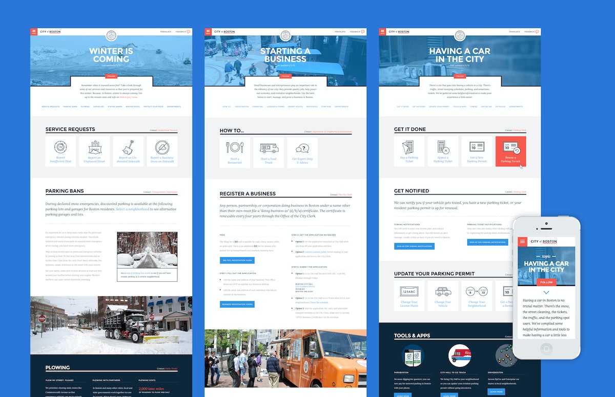
Rather than organize the site by the city’s departments, the design solution was rooted in illuminating relevant content by topics—people’s life moments—many of which overlapped through different branches of government. Owning a car in the city, for example, is closely related to preparing for winter, so bridging those common threads allowed for a more intuitive organizing principle.
In the process of the site redesign, IDEO also helped to create a visual identity system that underscores Boston’s strengths: the city’s confidence, humility, personality, and optimism.
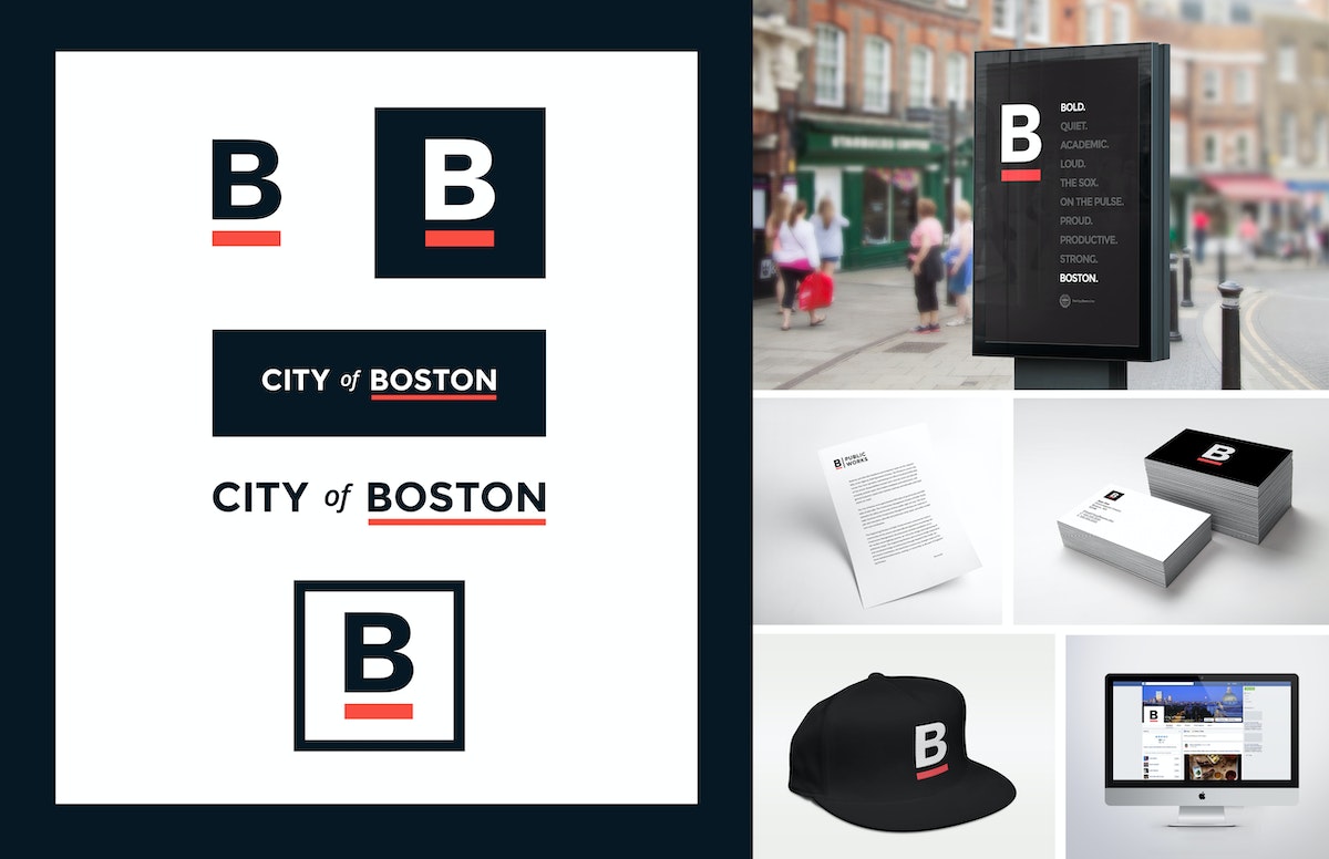
In addition to the web architecture and redesign, IDEO also produced a comprehensive style guide to help maintain design consistency, so departments can add content without compromising the overall integrity of the site, as well as a brand look that the city has decided to adopt across nearly all of its consumer-facing media. Now you’ll see the famous underlined B on T-shirts, banners, and even snow shovels.
Holding true to its mission to include Boston residents and all site users in its design process, the new Boston.gov site was piloted for six months, and the process document on the city’s blog (including the IDEO designed brand guide), before a full launch was rolled out in July 2016.
“The website should act like a helpful human. This is one of the big differences between the old site and the new site,” said Jascha Franklin-Hodge, the city’s chief of information technology in a Boston Globe article. “Oftentimes, when you looked at something on the old site, it would feel like you were interacting with some sort of lawyer-robot that was speaking to you in government-speak, using very formal language. We are trying to move away from that so your experience is akin to a person.”
The City of Boston was in need of a new digital home—one that emphasized a shift to a more welcoming tone and commitment to its citizens.
Growing an American brand in China
How an outdoor retail company found a new audience through digital and physical shops.
In the Western Hemisphere, The North Face brand has long represented an active, sporty lifestyle that’s filled with challenges and adventures. But appreciating “the great outdoors” in China is less about extreme sports and more about connecting with nature in a communal, spiritual way. This research-based insight led the team to identify new opportunities for The North Face to better target its messaging.

Designers found a key opportunity: Encourage Chinese consumers to escape the pressures of hectic city life by enjoying the freedom and renewal that comes with spending time outdoors.
Today, as people find less time to enjoy the benefits that lie just beyond China’s large cities, there’s a tangible desire to return to the outdoors to refresh, reassess, and renew oneself. The North Face aims to help consumers do exactly that.
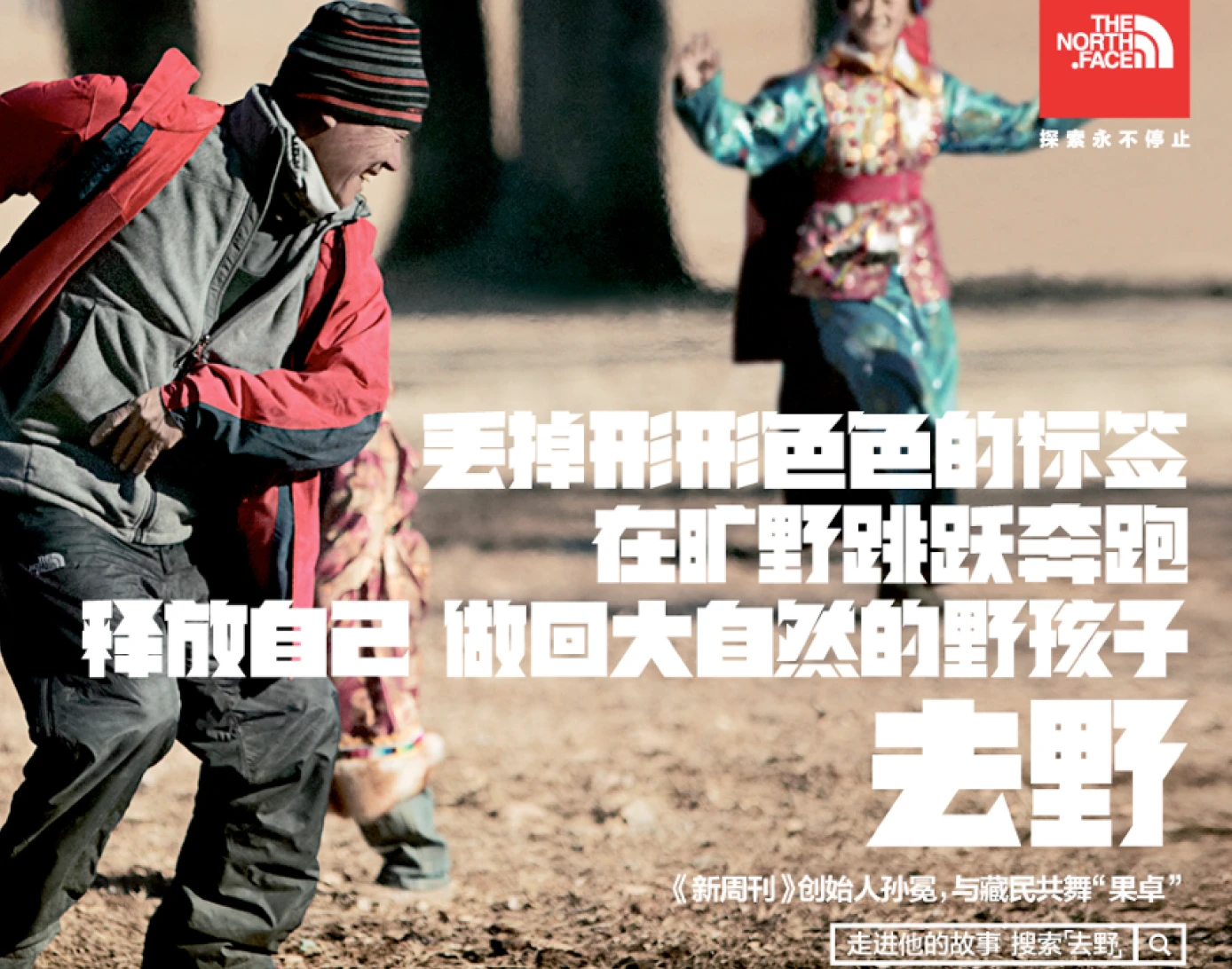
To create a compelling new brand vision for The North Face in China, the team’s design research tapped into Chinese ways of spending time outdoors. IDEO’s insights and creative brief provided the essential brand story for The North Face in China and informed the tagline of the company’s current marketing campaign, “Go Wild” (去野). The North Face brand’s new messaging links “old nature” and “new outdoors” through a combination of digital, retail, and interactive community channels.
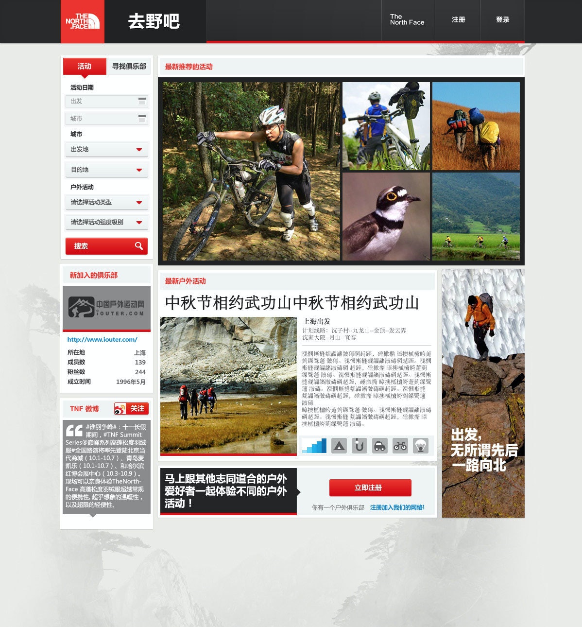
IDEO also collaborated with the company on designs and prototypes for a new digital platform and an updated store-within-a-store merchandising display. The digital community aims to attract newcomers and connect them with more experienced outdoors enthusiasts and clubs. As the platform evolves, it will help aspiring adventurers plan trips, learn skills, and share their experiences through photos.
The retail community space aims to integrate this digital community with in-store shoppers and an effort to turn the “buy-a-product moment” into a “join-the-outdoors moment.” Both will be integrated to provide a holistic brand experience in China centered on nature and community.
In the West, The North Face, with its decades-long history, has long symbolized an adventurous, active lifestyle. In China, however, the outdoor market only began accelerating in the early 21st century.
Success in this growing market depends on building strong and deep connections with Chinese consumers.
20% sales growth in China
from 2012 to 2013—the year the project was completed—propelling the brand from sixth place to a market-leading position
Nearly 40 years of designing pharmaceutical excellence
How a decades-long collaboration with Eli Lilly has transformed patients' lives and health outcomes.
Over the last 36 years, IDEO and Lilly, along with the pharmaceutical giant’s other design, development, and manufacturing partners, have collaborated on more than 250 projects. During this time, Lilly has not only honed its engineering-focused internal device-development team but also transformed into a human-centered organization with extensive, robust in-house innovation capabilities.
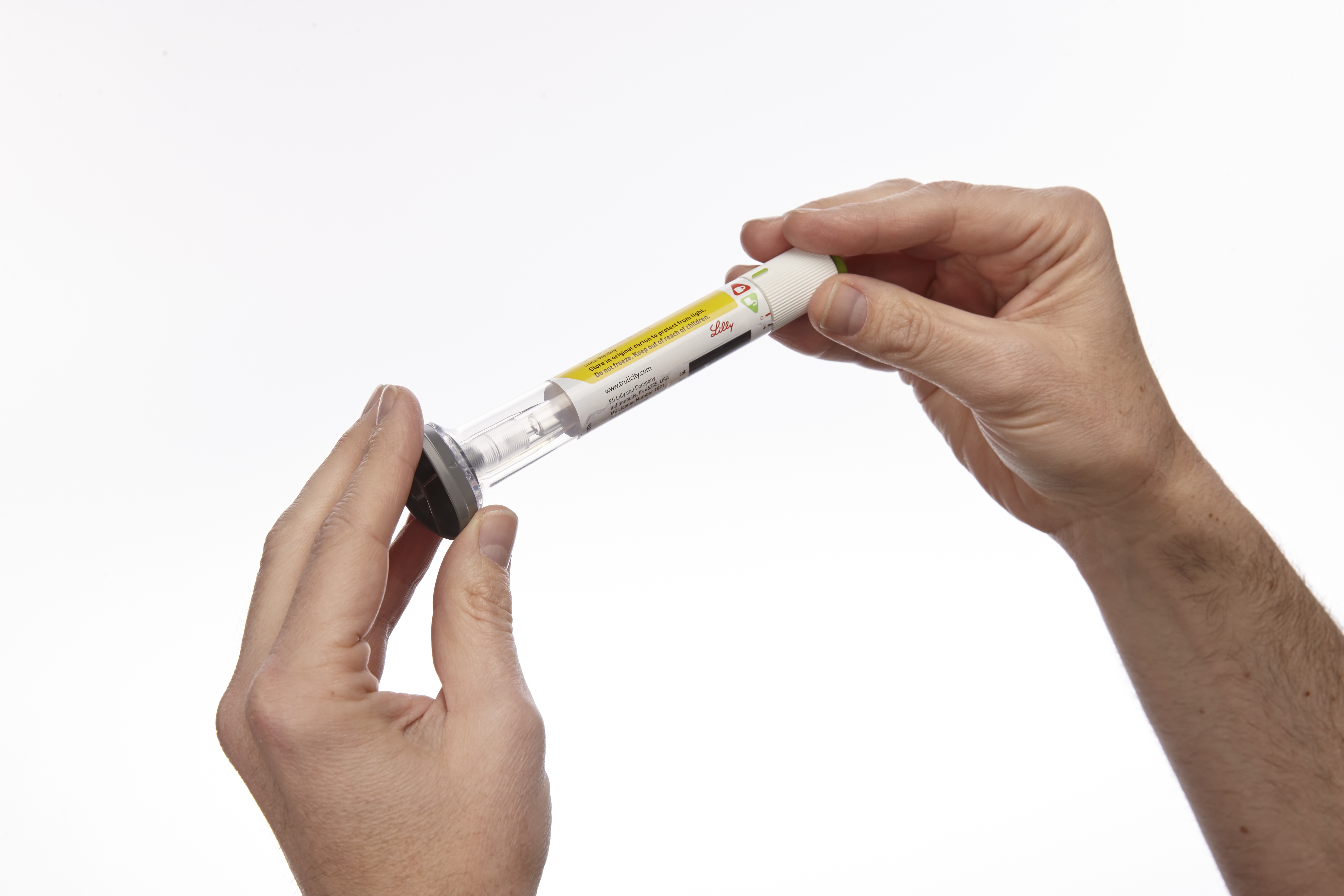
Early in the relationship, a team of IDEO designers and Eli Lilly leaders traveled the world to understand how people with diabetes live with the disease. Their findings led to the design of a series of award-winning insulin injection pens like SAVVIO. Portable, aesthetically pleasing, and discreet, the pens are suitable for use in both medical and personal settings. Combined with Lilly’s technical design prowess, this human-centered focus allows the devices to seamlessly integrate into patients’ lives and routines, making a challenging disease like diabetes feel more manageable.
Fast forward to today, Lilly’s innovative, easy-to-use auto-injectors are not only continuing to provide life-saving treatments to people with diabetes but also enabling the adoption of the popular GLP-1 weight-loss drugs Mounjaro and Zepbound, which together accounted for the majority of the company’s annual revenue in 2025. Perhaps most importantly, patients consistently rate the experience of using Lilly’s auto-injectors as relatively pain-free, easy to use, and preferable to competitors’ brands, improving adherence, satisfaction, and health outcomes.
This unwavering focus on driving innovation through a patient-first mindset is evident in some of the most impactful projects Lilly and IDEO collaborated on over the years:
GLP Auto-injectors
Convenient and cutting-edge, the first Trulicity injection device was originally designed to deliver the GLP-1 drug to treat type 2 diabetes. Today, it has been adapted for use with other GLP-1s, Mounjaro and Zepbound, which are increasingly popular weight-loss drugs and are also administered once weekly via fixed-dose injections. A wide base enables the pen to be held securely against the injection site, and the device automatically regulates the dose and needle depth.
Taltz Injectors
For most patients, living with severe plaque psoriasis means being your own medical technician—metering your drug dosage each time, and attaching and removing needles by hand. Taltz provides patients with clear visual and auditory feedback throughout the injection process through simple icons, bright colors, a translucent material, and clicking sounds. The devices are available in both autoinjector and prefilled-syringe formats and are adapted for Emgality, a preventive monthly migraine treatment, and Ebglyss, which helps treat eczema or atopic dermatitis.
HumaPen SAVVIO Injection Pen
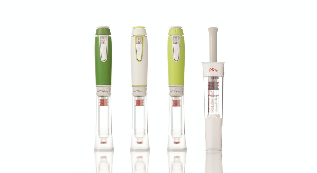
Key insights informed the design of SAVVIO, including patients’ preference for insulin pens that look less like medical devices and more like everyday objects you’d find in a backpack or purse. The sleek, colorful device was created to help patients feel comfortable and confident about fitting mealtime injections into their everyday lives.
Refillable Human Growth Hormone (HGH) Injector and Reconstitution Device
Designed to be kid-friendly, the Refillable HGH Injector leverages insights into pediatric treatment adherence to create a more integrated, systematic approach to treatment, while the Reconstitution Device makes mixing Lilly’s powder-and-liquid drug easier and less intimidating for parents and healthcare professionals alike.
KwikPen Insulin Pen
KwikPen is a next-generation, prefilled insulin injection pen that builds on the success of two previous designs, reducing its size to 5.7 inches and enhancing ease of use for patients.
HumaPen(R) Luxura™ Insulin Pen
HumaPen Luxura combines several innovations into a robust yet elegant pen that can be carried and used anywhere—an insulin pen solution that improves dosing accuracy, dose setting, and injection force.
In addition to designing products to meet the needs of people with diabetes, IDEO and Lilly have developed innovations in areas of oncology, autoimmunity, and men’s health. The results of this collaboration and expansion have won numerous design awards and produced one of the longest and most fruitful innovation relationships in IDEO’s history.
In the 1990s and early 2000s, Eli Lilly had a number of new, life-changing medications and two big challenges: Most of its drugs were self-injectables, not pills, so patients were hesitant to take them. And its drug-delivery device platform lagged behind its drug pipeline.
99%
of Trulicity users reported the auto-injector was “easy” to “very easy” to use in a JDST study
$36.5B
of Lilly’s $65.2B 2025 revenue came from sales of its auto-injectable GLP-1s, Mounjaro and Zepbound, a 45% increase from 2024

Reimagining San Quentin
Bringing together many voices for a report for the Governor of California.
“…the Advisory Council will recommend transformational programmatic, cultural, and physical change to San Quentin that can serve as a practical model that can be replicated and scaled to other institutions.”
Source: Office of Governor Gavin Newsom: Governor Newsom Names Leading Criminal Justice and Public Safety Experts to San Quentin Transformation Advisory Council, May 05, 2023 https://www.gov.ca.gov/2023/05/05/san-quentin-transformation-advisory-council/
The Advisory Council included the expertise of established criminal justice, public safety, healthcare, academic, reentry, and rehabilitation professionals, along with system-impacted/formerly incarcerated community leaders, and representatives of crime victims/survivors. The premise of IDEO’s involvement is to augment the Advisory Council Co-Chairs’ and members’ expertise in evidence-based best practices and lived experience living and working in prisons, with expertise in collaborative design, synthesis, visualization, storytelling and bringing visions to life.
Specifically, IDEO was brought in to facilitate input-gathering, and assist with incorporating the many viewpoints into a single, cohesive report of recommendations to the Governor. This included meeting the challenge of bringing together the viewpoints of 21 people on the Council (17 members, three Co-Chairs and an advisor to the Governor); incorporating the views of people who are most impacted (those incarcerated at San Quentin, San Quentin staff, community-based organizations, victim/survivor groups, among others); and formatting and designing the final report.

IDEO’s facilitation included workshops with the full Advisory Council, individual interviews and check-ins with Council members to gather their input to inform the recommendations. Each Advisory Council member was asked to speak with, and record feedback from, no fewer than five people at San Quentin or in affected communities and to share this feedback with IDEO. IDEO integrated this information and feedback into this report.
Research activities included visits to San Quentin to speak with and facilitate conversations with:
- San Quentin residents (100+) including the Citizens/Inmate Advisory Council, focus groups with Spanish-speaking residents, former gang members, ACT (LGBTQIA+), Voices Heal, People in Blue, San Quentin Citizens Advisory Council.
- San Quentin staff (100+) including interviews with numerous officers.
- San Quentin staff and residents together.
- Current participants and staff at Amistad (MCRP) and Beacon (former lifer) campuses (many who were previously incarcerated at San Quentin).
IDEO also organized listening, information sharing and feedback sessions, both at San Quentin and in the community, between Co-Chair representatives and various stakeholder groups, including victim/survivor groups, labor unions, and advocacy organizations. These perspectives were also brought into the report.
What Brewing Beer Taught Me About Design
Mapping the future of beer drinking
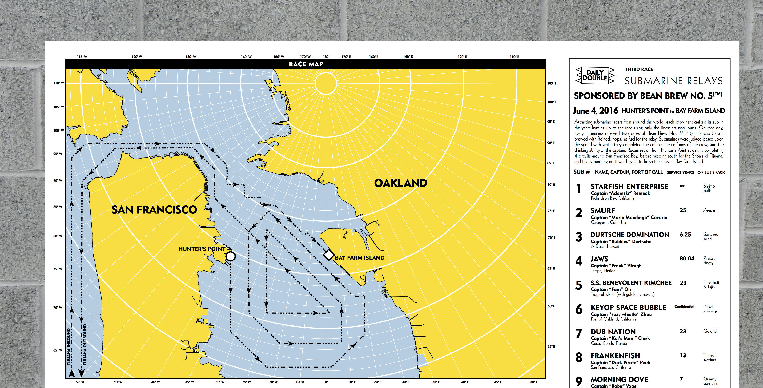
So I decided to pursue my own absurd hobby that would combine my twin passions for beer brewing and fictional cartography into what I hope is the ultimate beer drinking experience. Or at least the most ridiculous. I call it Bean Brew.

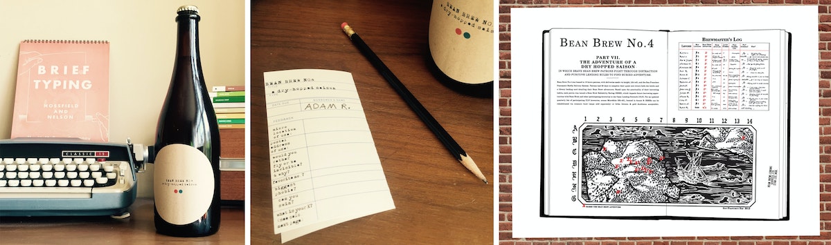
We talk a lot about the user journey at IDEO. It’s a way to break down how a person experiences important moments when interacting with a product or service. While bottling my first few batches several years back, I obsessed over the taste of the beer and the bottle's label design—two key moments in the beer drinker's user journey. But then I realized that there are so many other moments that I was leaving out of the design process.
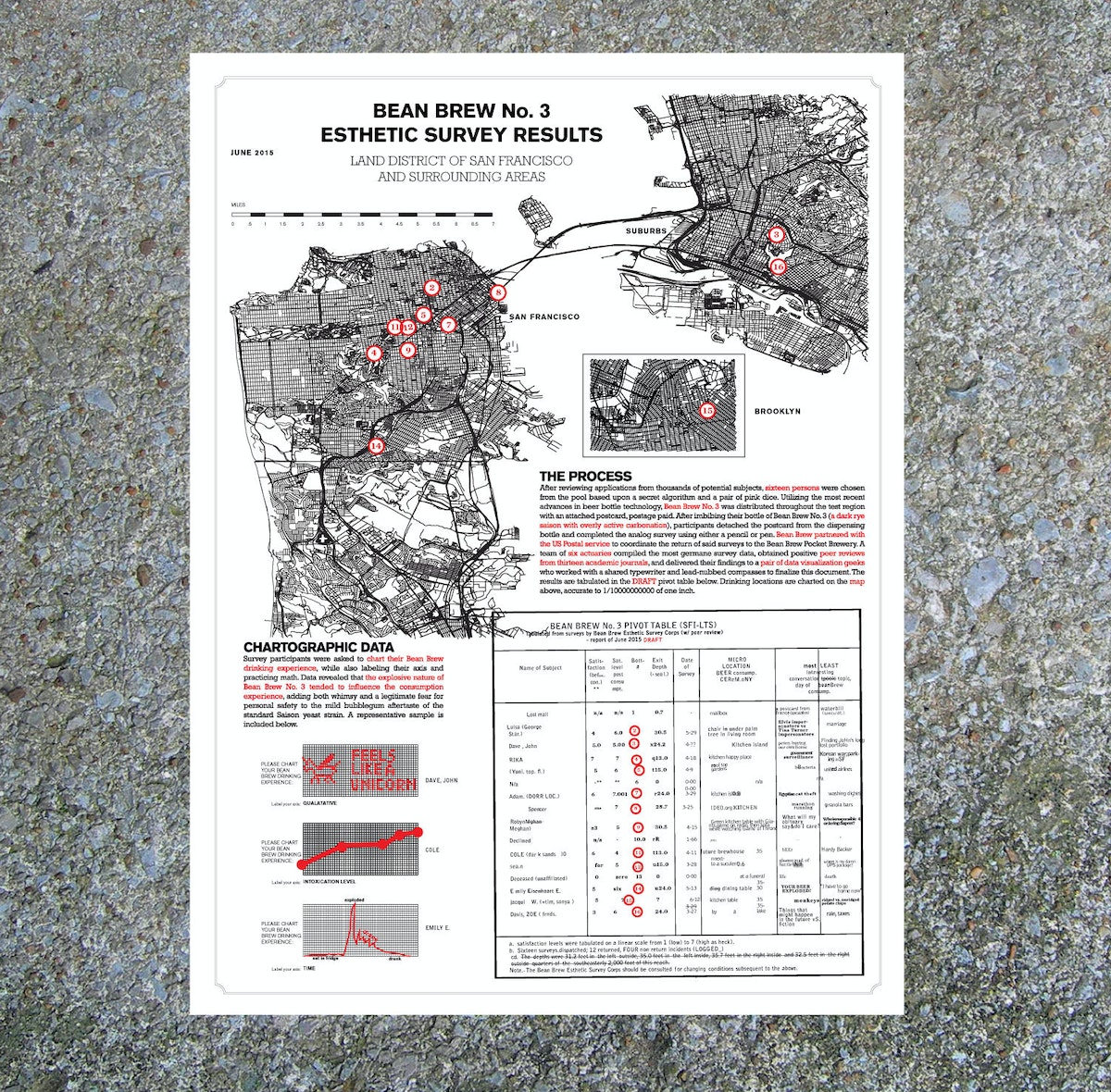
So I asked myself: Could I contextualize the combined drinking experiences of each person who received a bottle of Bean Brew? Could I turn that into a map? And could I deliver that map back to Bean Brew drinkers months later in the form of a delightful silkscreen poster? That became my design challenge.
So what have I learned from my side gig?
1. Quantitative data inspires design
Bean Brew has taught me a lot about how to integrate quantitative survey data into a cohesive storytelling experience (something we’re trying to do more and more of at IDEO these days). I start with questions like these, which I include as part of a survey wrapped around the bottle’s neck:
- What are your three favorite board games?
- Complete the following sentence: If I were on a ship for 1 year, my ideal job position would be ________.
I then transform the responses I get from people who received a particular batch of Bean Brew into a poster that looks something like this.
2. There's more to design than what meets the eye
Sometimes, as you go through the design process, you realize the thing you think you're designing (a bottle of beer) isn’t what you're actually designing (a beer drinking experience). This is true for most of the projects I’ve worked on at IDEO, and for Bean Brew, too.
3. Side gigs = side skills
Finally, I’ve learned a bunch of tangible skills throughout the process of making Bean Brew: Arc GIS (cartography software), best practices for glue adhesion (getting elaborate labels to stick to bottles), and how to use the power of analog experience to blow away anything an iPhone can do. I’m confident that I’ll be applying at least some of these skills to an upcoming IDEO project.
Bean Brew is my attempt to bring as much joy and delight to my hobbies as possible, and in doing so, I find that I’m more more creative and productive as part of my day job. And so much happier.
I am not training for any marathons. Just an expedition to Antarctica. In a submarine. With beer.
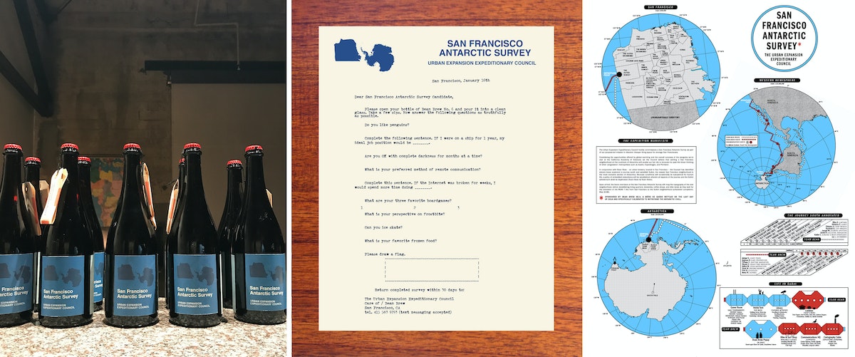
Years ago, I was working at a law firm in Boston. Many of my colleagues had the same hobby—training for the Boston Marathon in the middle of the frigid New England winter. This was what they did for “fun.” I was so amazed that these people with such unhappy day jobs would choose what seemed like such an unhappy hobby to fill their nights and weekends. Many years and two careers later, I moved to San Francisco to take a job as a designer at IDEO. In my first months here, I remember being struck by all of the wonderful and absurd hobbies that my new colleagues had. It was a delightful and inspiring contrast to my dark days in Boston.

Quick + Dirty Design Tips: Animation in After Effects
Animation tips from an After Effects power user
For this method of animation, make sure to use only lines in your Illustrator file. The idea is to animate the lines across their own path, so the way you design them will play a big part on how elaborate your animation will be.
Watch this video for a quick step-by-step guide to animating lines in After Effects:
- When your Illustrator file is ready, import it to After Effects. You can simply drag your Illustrator file to the Project area or go to File > Import > File.
- Drag the imported file to the Timeline. It will automatically create a Composition.
- Now you must turn your Illustrator file into Outlines that After Effects can control. On the timeline, right click on the layer and select "Create Shapes from Vector Layer.
- The next step is to animate your outlines. For that, you will need to add a Trim Paths feature to your new layer.
- On Trim Paths, use keyframes for Start/End to change when and where you want your paths to animate. If your file has multiple lines, you can choose to animate them simultaneously or individually.
This technique is a simple and effective way to create powerful motion graphics for storytelling, user interface behaviors, or even a simple animated gif. Hope you enjoyed it!
Adobe After Effects is one of my favorite tools for prototyping user interfaces, creating video scenarios to communicate a context of use, or simply crafting stories through animation. It's a tool that allows you to explore and visualize ideas, and there's no right or wrong way to use it. Here are a few tips for using After Effects to animate vector lines imported from Adobe Illustrator.
Why You Should Keep Making Stuff By Hand
Don't let technology stop you from getting your hands dirty
So, when the opportunity comes up, I like to turn off the computer and focus on creating artifacts. While an object is just a thing that serves its purpose until it’s tossed out, an artifact sparks an invisible conversation, a connection between the human who made it and the human experiencing it. Even something that people don’t think twice about, like an event name tag, deserves to be well designed.
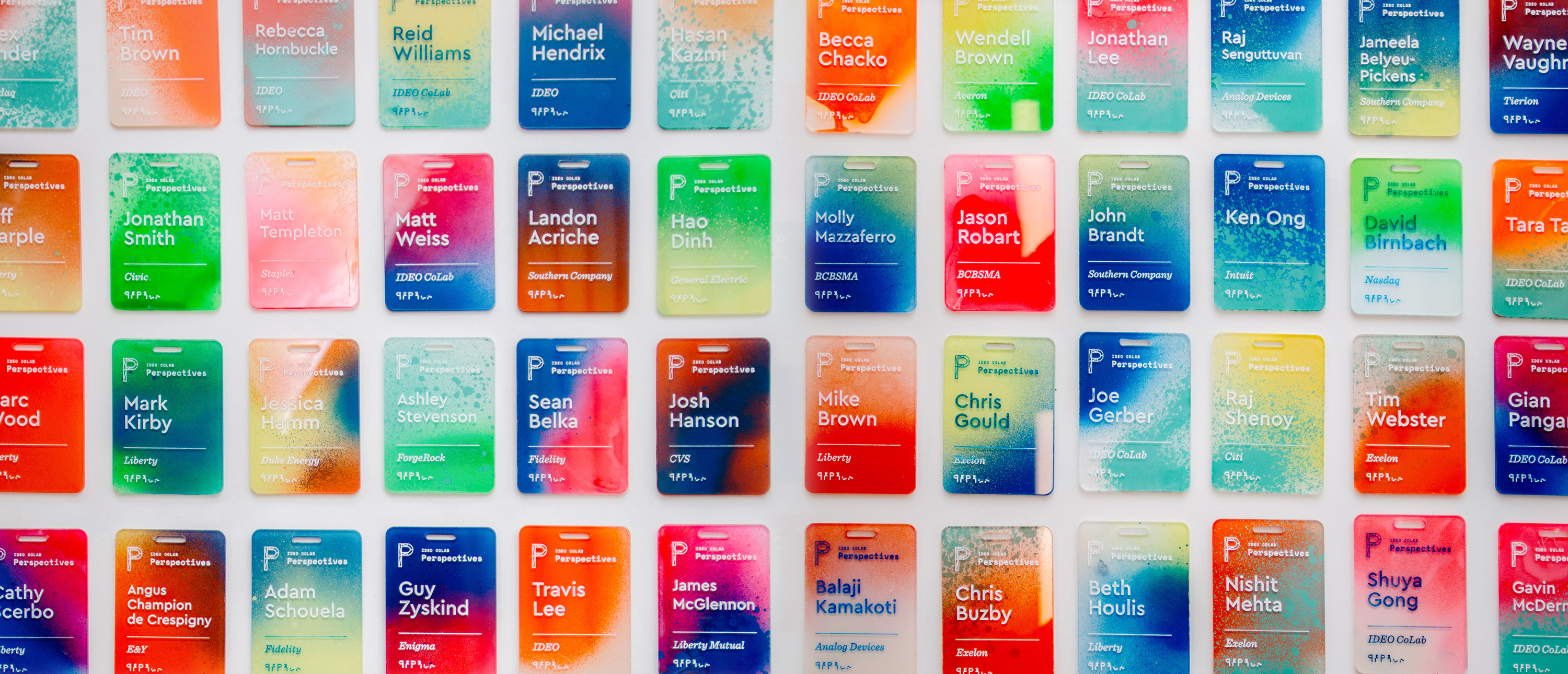
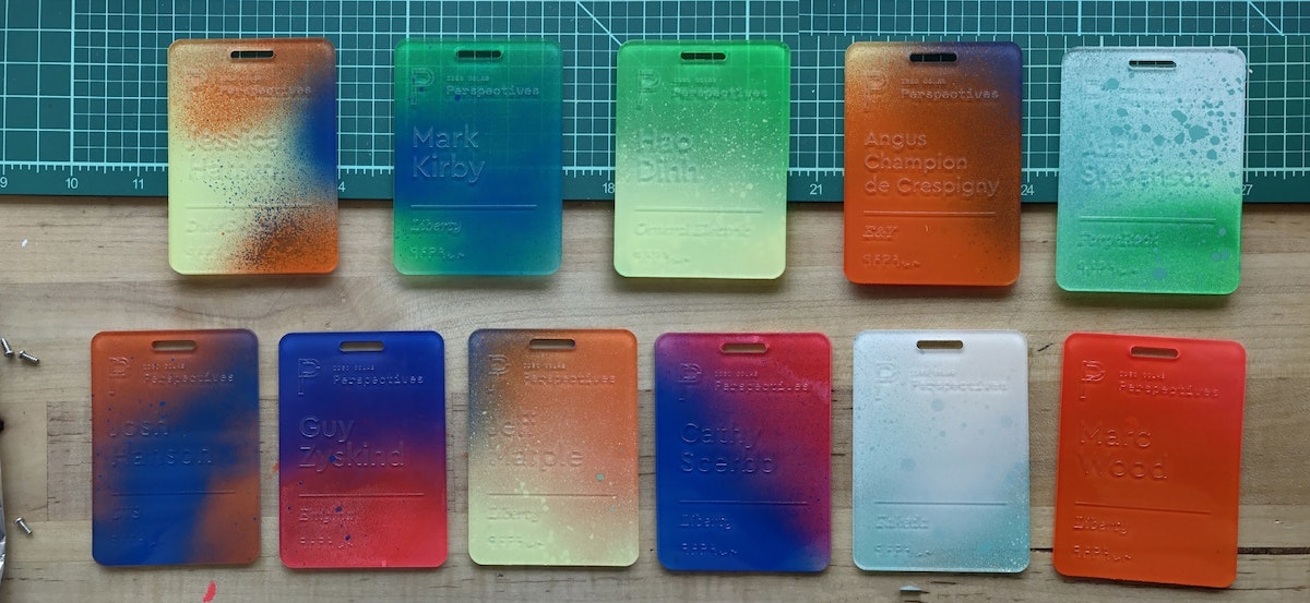
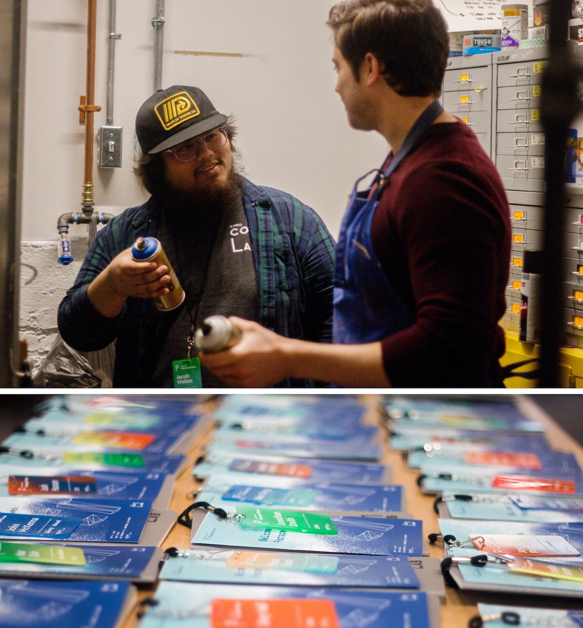
That belief drove me to create a collection of one-of-a-kind name tags for a CoLab event. I wanted to make something with my hands that would bring a level of craft to our content. The tags served as the icebreaker for more than a few conversations, and reminded people at the tech-focused event that there's a human element to everything. Many attendees we reached out to a month later said that they still had the tag on their desks.
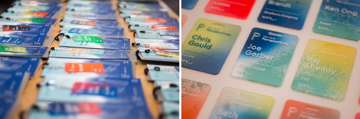
The process was simple, but arduous: I laser cut blanks, etched the names, spray painted each tag using unique colors and angles, and finished it off with acrylic screen printing ink to make the names readable.
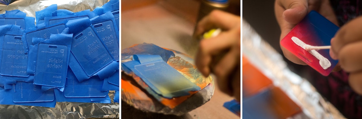
Here's how I did it, step by step:
1. Creating the blanks
I designed the negative of the template so that I could later use it as a jig. I used 18 x 24 inch sheets of 3mm acrylic, so that with the name tags at 2.5 inches x 3.5 inches, I could fit about 32 comfortably in each batch (as opposed to 38 if I used all available space and threw away the negative).
Acrylic sheets tend to melt and then cool quickly in the laser cutter, leading to possible sticking, so I usually add about .2mm to my thickness settings to compensate (i.e. I was using 3mm acrylic, but put 3.2mm in the settings). There are two benefits: One, you guarantee that you actually cut through the sheet. Two, it also gives you a little bit of wiggle room so you don’t end up with hard to pick out joints.
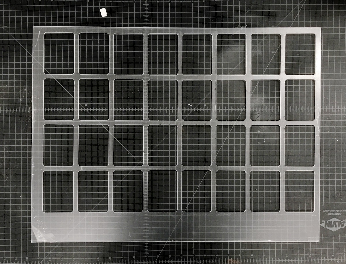
Pro tip: The key to making the most of your acrylic is to leave space for future cuts on the same piece. Instead of designing my reusable jig with all the name tags in the center, I threw them to one side so that I could use the other end again. After I cut the jig, I could get 38 tags out of each subsequent batch because I could simply throw away the negative. Another bonus: When there’s excess acrylic on one end, you can always tell which side goes in which direction.
2. Etching the blanks
Once the blanks were cut, I needed to take the protective plastic off of one side, so that I had a clean surface to etch onto. I peeled the tags, slipped my template jig back into the cutter, and dropped the blanks into place.
The etch file is the same as the template jig, just with a red cut box around the perimeter of the file denoting the edge of the acrylic.
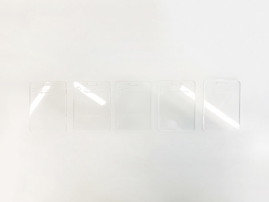
Once I had an etch file ready to go, all I had to do was push the file to the top left of the cutting area and check the focus points of the laser on the first tags on the first and second rows. Since the etch file is in the same grid form as the old cut file, everything is already spaced for me. The etch settings held ink best at around 74 to 76 percent power at 100 percent speed.
One final thing to note: We don’t want to cut anything (we’re just etching), so after setting my etch power, I set the cutting lines to 0 percent power and 100 percent speed, so we just blow right past them.
3. Taping the etched tags*
Once the blanks were etched, I peeled the plastic off of the back of the tags, then covered the etched side of each in painters tape to keep them clean.
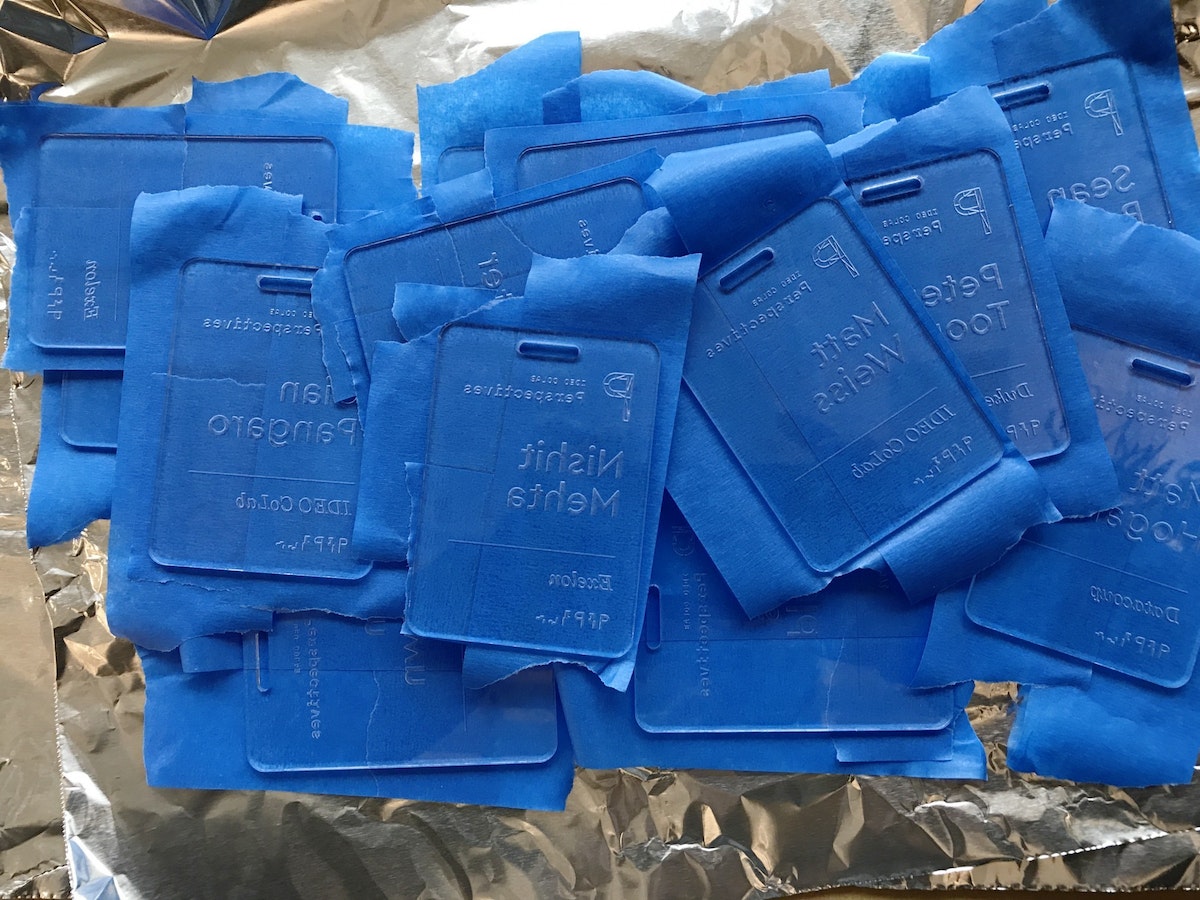
4. Spraying the tags
After everything was taped, I slapped some aluminum foil in the vent hood and got to work spraying each tag. The process allowed me to bring out some of the old airbrush tricks my dad showed me as a kid, like holding a tongue depressor at a 60 degree angle in front of the nozzle to create thicker splatter. I used two to three colors for each tag, at varying angles.
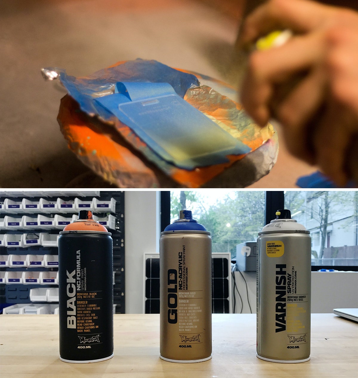
I used Montana brand spray paints, and I definitely recommend using the BLACK formula. Over the course of the project, it dried on the acrylic within four and-a-half minutes, which is pretty insane. The GOLD formula was comparable, but my run of the mill Krylon paints took much longer, so it’s worth the extra bucks to buy Montana.
Pro tip: If you’re spraying a bunch of parts in a hood, aluminum foil is actually a great material for coverage as it tends to not stick to your parts like paper.
5. Sealing the tags and revealing the beauty
After the sprayed tags had dried, I hit the painted side with a couple quick coats of the Montana clear matte varnish so that they wouldn’t stick to each other. When everything had dried, I peeled off the painter’s tape—my favorite part of the project.
6. Applying the ink inlay
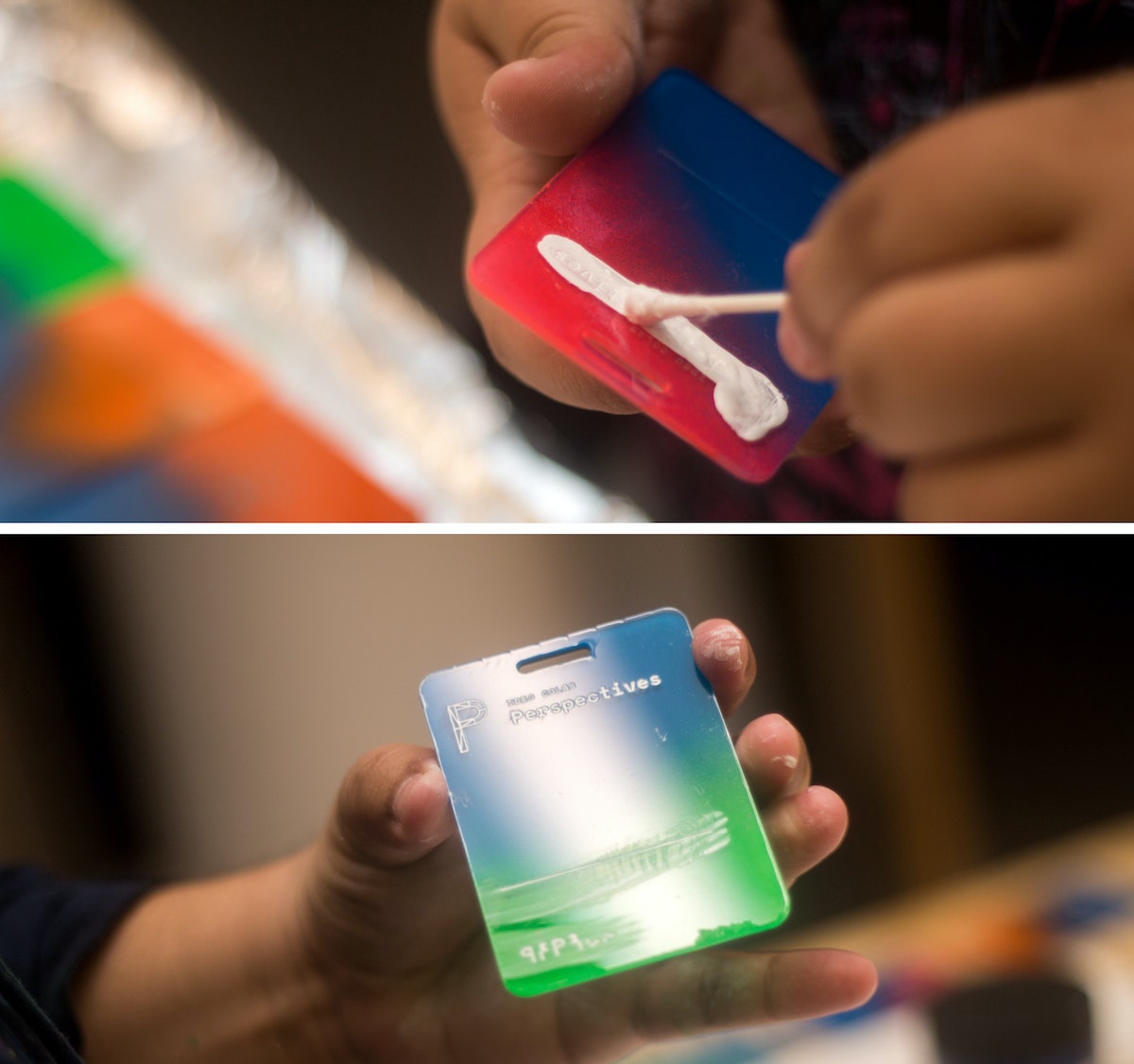
Next came the most time-consuming part: the ink inlay. I used speedball acrylic screen printing ink for its fast drying time, and how easily it wipes off acrylic. I liberally brushed and swabbed the ink into the etch using a Q-tip, then quickly wiped the excess off with a paper towel. Once dry, they were ready to go.
That's it!
*Imperfect process: I know what you’re thinking—why didn’t you just remove one side of the plastic before etching, spray that side, then remove it from the other side, then etch that? I did! After a few batches, I added the taping step because I noticed the spray paint was eating away the plastic coating that kept the paint off the front of the tags.
I work with CoLab, IDEO’s tech-focused R&D group. I’m also someone who’s committed most of my life to craft. Luckily, my day job allows me to bring the two together. But the minute you start making a living from your craft, problems start to surface. You get burnt out. You compromise your vision to deliver things on time. At that point, you're no longer transforming objects—you’re just pushing matter around.
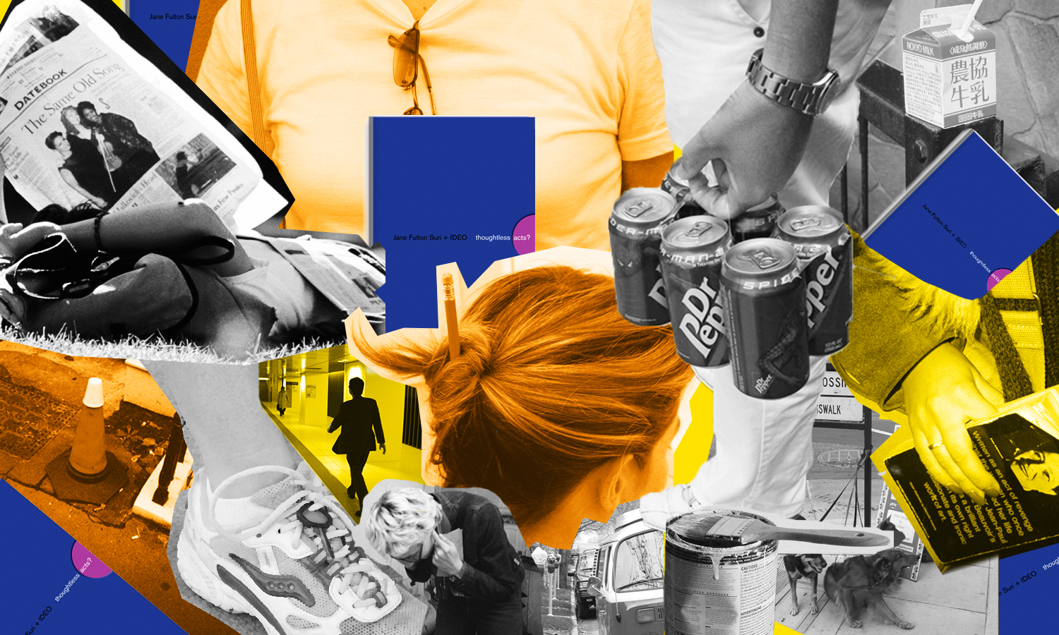
Thoughtless Acts: Single-Serve Medicine
Thoughtless Acts: Single-Serve Medicine. The intuitive ways we adapt and react to things in our environments
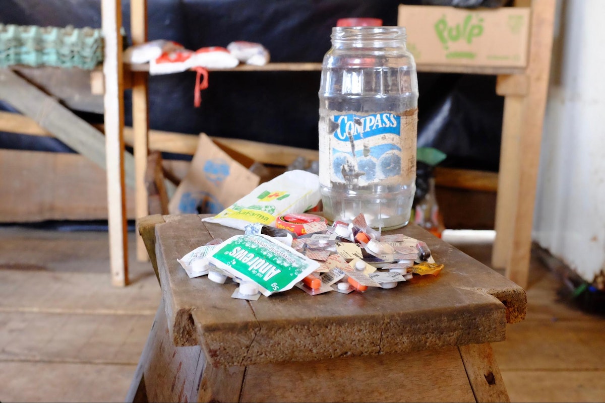
I snapped this photo in the Amazon jungle town of Iquitos, Peru. A jar full of individually cut blister packs sat in the corner of a general store set up in front of a family’s home. By making individual doses available—not even a daily dose, but a single, one-time dose—more families were able to afford treatment for their ailments. In a community where money is very scarce, this family was filling a very real, pressing need that wasn't being addressed by local stores.
Human-centered design requires us to observe human behavior with beginner's eyes, so that we can spot the innate ways people interact with the world around them. We call these intuitive and unconscious reactions Thoughtless Acts, and IDEO designers collect photos of them to inspire their work.

Lindsey Turner
I’m passionate about building brands, products, and experiences that help organizations show up with meaning and momentum.
I help organizations cut through complexity by shaping how they show up, through brand strategy, identity, and storytelling.
Working at the intersection of brand and business, I bring an editorial eye and a bias toward making—turning ideas into tangible experiences that people can understand, trust, and believe in.
My work spans government, healthcare, financial services, media, and consumer goods, from launching Gen Z-focused ventures to building innovation labs and reimagining legacy brands. I relish moments of ambiguity and enjoy translating across teams, perspectives, and priorities to move ideas forward.
I started my career in editorial and digital design, shaping cross-platform experiences and identity systems in publishing and agency environments. That foundation still shapes how I work today: I’m detail-oriented, collaborative, and overreliant on the Oxford comma. I hold a BFA in Visual Communication from the School of the Art Institute of Chicago.

Rachel Young
My work helps organizations see who their products aren't working for—and build the will and the tools to do something about it
For 25 years, I've asked the same question: Who does this design exclude—and what are we going to do about it?
My work spans human-centered strategy, inclusive design, and qualitative research, with clients ranging from Microsoft, Google, and Verizon to the National Science Foundation, and San Francisco Unified School District.
Before IDEO, I taught elementary school in East Palo Alto and spent a decade doing design work with social service organizations—where I learned firsthand what it costs people when systems are built without them in mind.
I am currently writing User Error, a nonfiction book about digital access and the design decisions behind it. I live in Oakland, California.

Brian Pelsoh
I lead with craft, ensuring our work is creatively excellent: rooted in deep human insight and imagination, while also grounded in the realities of business and technology.
My expertise spans brand, communication, and product design across tech, education, the arts, and social impact.
I believe great work demands both high-level vision and obsessive attention to detail, and only happens through collaboration.
I bring an inclusive, hands-on approach and a deep understanding of business, which enables me to consistently deliver excellence while always asking why.
Before joining IDEO, I worked at the brand firms Pentagram and VSA Partners. I began my career as a designer, leading teams at the School of the Art Institute of Chicago and the Milwaukee Art Museum. I hold an MFA in graphic design from Maryland Institute College of Art and a BFA in communication design from the Milwaukee Institute of Art & Design, and have taught at some of the best design schools in the US.

Tony Wong
I am responsible for IDEO’s long-term success in China and working with clients to use design as a tool to enable growth.
I am responsible for IDEO’s long-term success in China and working with clients to use design as a tool to enable growth. Specifically, I have helped Chinese companies design holistic brand solutions through the development of their products, communication, services, and innovation teams, and I have helped multinationals expand their presence and influence in China.
I advise global leaders on developing China-led innovation and capabilities.
In over 15 years in IDEO Shanghai, I have worked on projects that use design to elevate the quality of the experience of healthcare products and services, streamline processes that increase productivity, create spaces and programs that promote and enable inclusive communities, and build next generation mobility solutions that are planet-positive.
Before joining IDEO, I worked at Philips Electronics and the Electrolux Group in Italy, the Netherlands, and Singapore on a number of breakthrough commercial products. I am a member of the Young President Organization in Shanghai.

How to use AI as an editor, not a writer
Ed White shares how he uses AI as an editor—not a writer—to sharpen storytelling, rehearse ideas, and preserve the productive friction that makes creative work better.
Ed White has a rule he's tested on his own writing: hold yourself as the writer, and let AI be your editor. Ed is a Senior Design Director at IDEO's London studio, where he co-leads the firm's AI portfolio across Europe. Before IDEO, he spent 12 years as a writer and editor at the Financial Times, Wired, and Contagious. So when he talks about when to use AI for storytelling and when not to, it comes from two decades of crafting his storytelling skills.
In this episode, Mina Seetharaman talks with Ed about two specific tools he uses to keep AI in an editor's seat: a "roasting agent" prompted to critique his drafts without any sugarcoating, and a simulated audience he rehearses pitches on before the real thing. They also get into what Ed is hearing from design leaders at Anthropic, Lovable, Shopify, and Google Creative Lab about how creative work is changing, and why he thinks the friction of writing something yourself is worth protecting rather than automating away.

Building a personal AI for the messiness of life: Sida Li
Becca Carroll talks with Cue co-founder Sida Li about designing a personal AI for the messiness of everyday life—not just work. They explore how Sida stays anchored to human needs while navigating fast-changing technology, product tradeoffs, business-model experimentation, and the realities of building an AI company today.
Most AI products today are built for work—a space with clear problems and established systems. One founder noticed a gap: personal life is messier, harder to systematize, and mostly left behind by the AI boom. So she built Cue, a personal AI that lives inside iMessage and group chats, to go where the other tools haven't.
In this episode, Becca Carroll, IDEO's Chief Strategy Officer, talks with Sida Li, co-founder and CEO of Shared Context Lab, about staying anchored to a human need while the technology around her keeps changing shape, why she treats her business model with the same rigor she'd bring to a product, and what it feels like to build a company at this particular, disorienting moment in AI.
The conversation also gets into how Sida makes design decisions: the language Cue uses to describe itself, the tradeoffs behind building inside iMessage instead of a new app, and a real story about a business idea that didn’t pan out.
This is the second in a two-part series profiling founders from IDEO's Startups-in-Residence program. The first conversation is with Johannes Seemann, founder of Sooner, on designing GenAI for the emotional side of money.

Designing GenAI for the emotional side of money: Johannes Seemann
Designing financial tools around the feelings that shape money decisions.
Most personal financial tools are built to run the numbers and optimize towards a budget. While that works for some, most people experience money as a lived relationship that does not neatly fit into a spreadsheet. Johannes Seemann and Becca Carroll discuss why money is emotional before it is mathematical, and what a human-centered approach to building a generative AI financial product looks like in practice.

The curious leader's edge in uncertainty: Scott Shigeoka
How genuine curiosity helps leaders navigate uncertainty with greater confidence.
Mina Seetharaman talks with Scott Shigeoka, author of Seek and Head of Curiosity Cultivation at the Eames Institute, about what distinguishes genuinely curious leadership from performative curiosity, how power dynamics shape curiosity, and why practicing curiosity can restore energy rather than drain it.
Looks like you might be in search of something very specific?
Or reset the filters above and try another angle.
Here’s some random inspiration

Podcasts about creative leadership

Articles about the power of prototyping
