.svg)



Designing a better onboarding experience for an AI symptom checker at clinics
Enabling doctors to spend less time on paperwork and more on patient care.
D4V is a Tokyo-based early stage Venture Capital in partnership with IDEO. Two years ago, D4V invested in healthcare startup Ubie, which develops a service called AI Monshin Ubie. The digital service was created with the goal of reducing the burden on healthcare professionals working long hours, under harsh conditions. AI Monshin Ubie automates a number of patient registration and documentation processes through digital tools, enabling doctors to spend less of their time on manual paperwork, and to dedicate their valuable skills and attention to the patients themselves. Currently, the service is installed in 200 medical institutions in 41 prefectures across Japan.
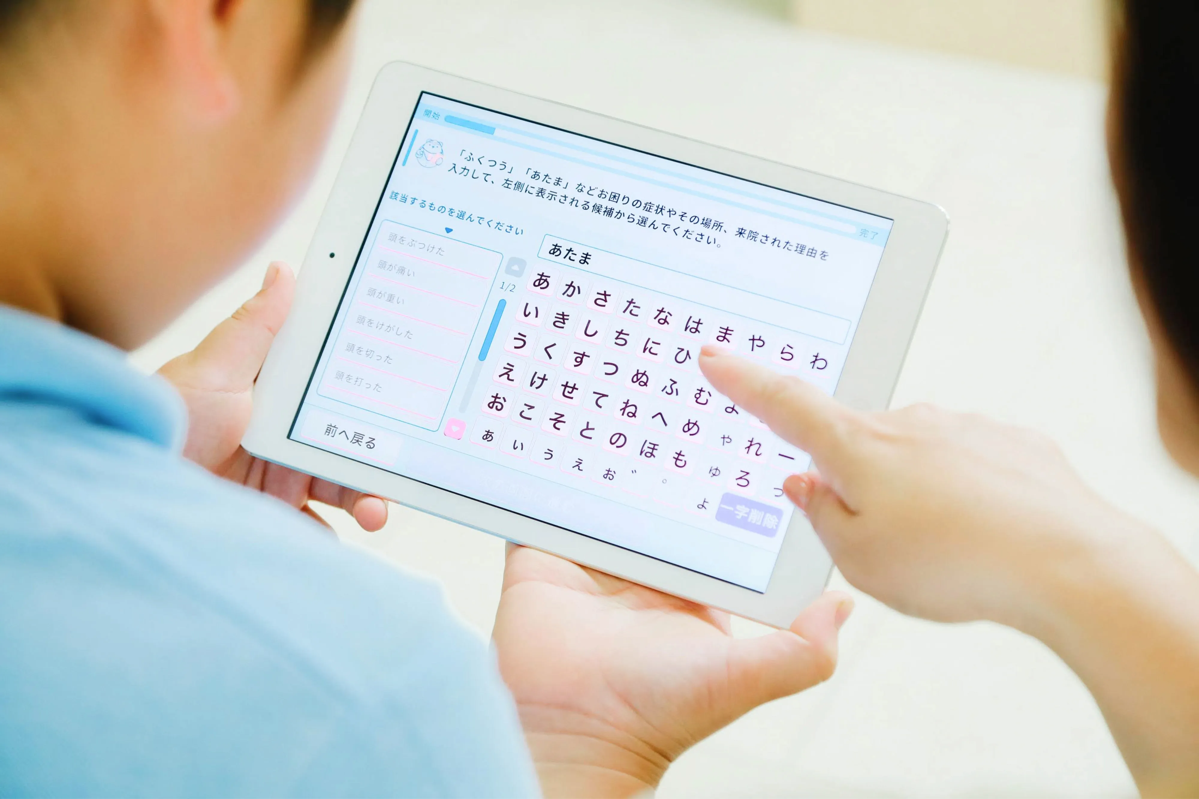
With AI Monshin Ubie, patients fill out preliminary forms on a tablet, rather than paper, entering information about their health history and current symptoms directly into their digital medical record. As patients fill out the questionnaire, the Ubie AI generates questions in real-time according to patients’ responses, which results in more appropriate and accurate data. The patient’s responses are automatically formatted for the doctor to review prior to and during the consultation. As a result, doctor consultation times and facility operation times are drastically reduced.
With the Coronavirus raising fears of a possible health system breakdown, Ubie has made improvements to anticipate and possibly prevent in-hospital infections. Until recently, Ubie’s services have been primarily used by large hospitals; but in light of the global health crisis, Ubie approached D4V—who partners with IDEO—to help rethink the onboarding experience and quickly facilitate the introduction of AI Monshin Ubie in regional clinics across Japan. D4V and IDEO have been working with Ubie for many years to collaborate in various areas, including UX, rebranding, international research, and more. Therefore, they had a foundation of knowledge from which to build these new features.
Typically, AI Monshin Ubie has been introduced to new hospital clients through direct, in-depth instructional visits from Ubie sales staff. This approach has worked well for rolling out the product to Japan’s 8,000 large hospitals; but for the 100,000 smaller clinics, Ubie needed a more efficient onboarding method to enable staff to get set up smoothly and independently.
During research, D4V and IDEO team members engaged with many different clinic staff members, including full-time doctors, part-time doctors, nurses and receptionists. The researchers found that staff tend to react skeptically to new tools and services, with a common preconception that they will add to their workload. One clinic director’s first impression of AI Monshin Ubie was, “It looks complicated.” But once he actually used the service, he realized that it was very user-friendly.
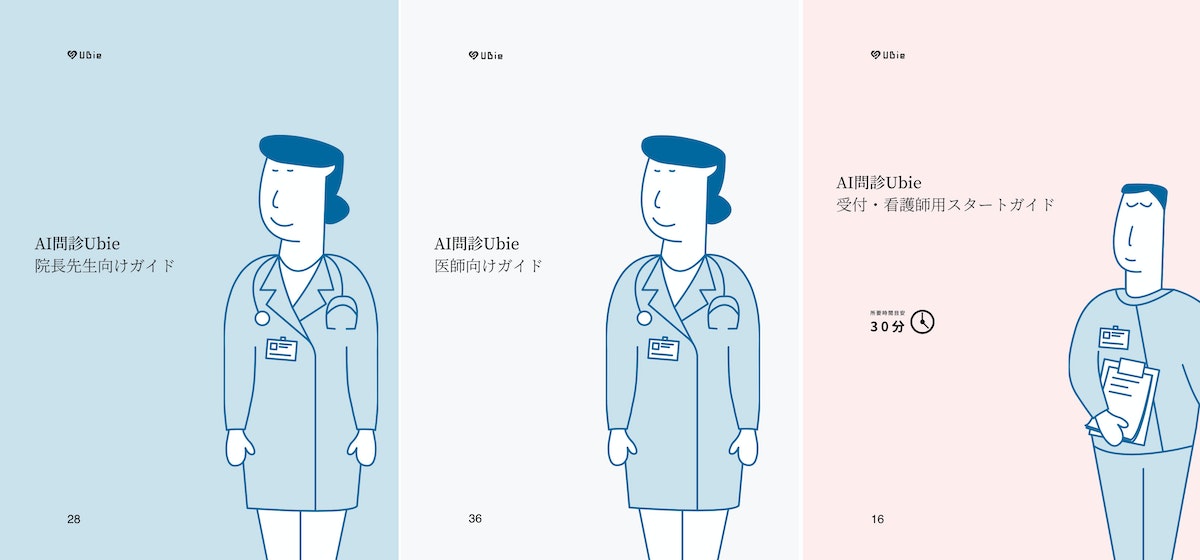
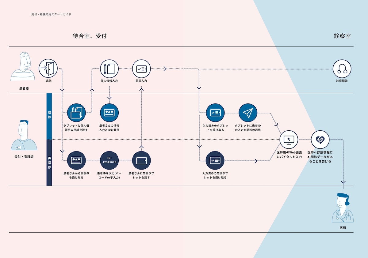
The team quickly understood that it was important to remove preconceptions by clearly communicating Ubie’s benefits and ease of use. They created a two-minute animation and designed three separate guidebooks. The animation adopted a friendly tone and expressed empathy for doctors, staff members and patients, highlighting how Ubie can bring benefits to each of them. The animation showed how Ubie fits into the existing workflow and explained complex systems in a straightforward and accessible way.
WATCH: A short video clip explains the benefit of their product and service to avoid the users’ concerns in advance.
The guidebook for doctors and directors explains how Ubie’s AI smooths the patient consultation experience and greatly improves the quality of medical care. It also introduces concrete how-tos around set-up, implementation, and ideal workflow. FAQs were also included, addressing concerns about whether or not elderly people would be able to use it.
Ubie business development leader Kenji Yamada says, “D4V and IDEO have a deep understanding not only of design, but of our entire business. They provide inspiration by bringing experience and knowledge that comes from working with other industries and clients outside of healthcare. We appreciate that they can share the knowledge that they’ve obtained with our business.”
Read the Japanese-language version of the Ubie case study here.
When You Feel Unwell, Ask Ubie: Check your symptoms for free
Learn more about Ubie: Global Company Website
An improved airway intubation system that helps physicians save more lives
The GlideScope Core offers elevated visibility and a seamless workflow for intubation, allowing doctors to better conduct routine procedures and respond to health crises.
In the emergency room, an intervention that’s administered too slowly could cost a patient their life. With COVID-19 fueling a surge in acute respiratory conditions, intubation—a procedure that involves inserting a tube through the mouth or nose and into the airway—is more common than ever. For patients struggling to breathe, the tube can be connected to a ventilator that pumps oxygen to the lungs, keeping them alive.
While a laser-focus on the present is critical for successful patient outcomes, hospitals and physicians often don’t have time to look ahead and anticipate the future of the operating room experience. As technology rapidly improves, there is a ripe opportunity and pressing need to evolve medical equipment to be more innovative and intuitive. Verathon Medical, a global medical device manufacturer, is supporting health care providers at the cutting-edge of care.
Verathon approached IDEO to redesign the existing product system for laryngoscopies and bronchoscopies—procedures that examine parts of the throat through intubation. During these examinations, a tube with a camera embedded in the tip is inserted through the patient’s nose or mouth. The doctor can then see inside the throat on a video monitor, and therefore more easily and quickly intubate and perform the exam.
To create a groundbreaking device, the team observed over a dozen laryngoscopies, bronchoscopies, and intubations. They noticed that many anesthesiologists relied on fixed equipment during the procedures. For example, some had grown accustomed to looking over their shoulder—away from the patient—to view the monitor.
During interviews, physicians and residents expressed difficulties with the current technology, sharing that the small screens aren’t conducive to team viewing or student instruction, and they must often use a separate computer to record patient notes. Others reported frustrating workflows, needing to constantly divert their attention and move their hands between the patient, prep tray, monitor, sterile bin, and disposal bin. These inconveniences and inefficiencies are not only cumbersome, but can increase the risk of infection and fatality.
The team relied on these insights to start designing a next-generation product. Through sketching, storyboarding, and building in real-time alongside doctors and clinic staff, designers quickly teased out additional findings and validated concepts.
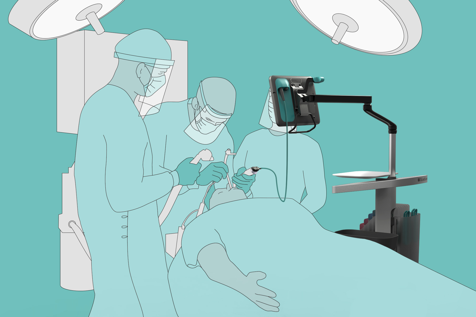
This work led to the creation of the GlideScope Core: an all-in-one, portable product system that supports both video laryngoscopies and bronchoscopies. The base of the device—a wheeled cart—has built-in storage units for tools and a disposal bin, offering more mobility and accessibility for medical professionals.
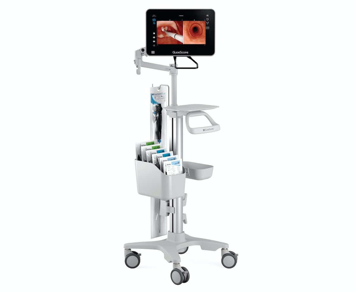
The product’s tagline, “see more, do more,” points to the improvements made to the video system, including a large 10- or 15-inch high-definition touch screen monitor. Displayed images can be enlarged and rotated 180 degrees for improved visualization, team viewing, resident training, and classroom demonstration. To help doctors keep both the patient and monitor in their line of sight, the detachable screen can be secured to an adjustable arm that can be positioned directly over the patient. Additionally, the monitor’s patient annotation feature gives staff access to more of what they need in one device.
The product has been especially valuable for providers and patients during the coronavirus pandemic, when it’s imperative for doctors to keep their distance from patients’ mouths and noses. The GlideScope Core’s movable, detachable, and large, high-definition monitor makes it easier to take this precaution and intubate more quickly. This usefulness is reflected in the 5-fold increase in cart-based device orders for Verathon. While most providers typically order anywhere from 1 to 20 devices for airway procedures, one hospital system requested 600 GlideScope Core systems to meet current intubation demands.
Through modern technology and a focus on human needs, the GlideScope Core supports improved patient outcomes and creates a more seamless operating experience for medical professionals. The product underlines the key but often overlooked fact that often, in order to ensure the healthcare industry is patient-centered, medical device manufacturers and hospitals must also focus on improving the experience of providers.
Transforming a community hospital from the inside out
Designing for caregivers to create world-class care for patients.
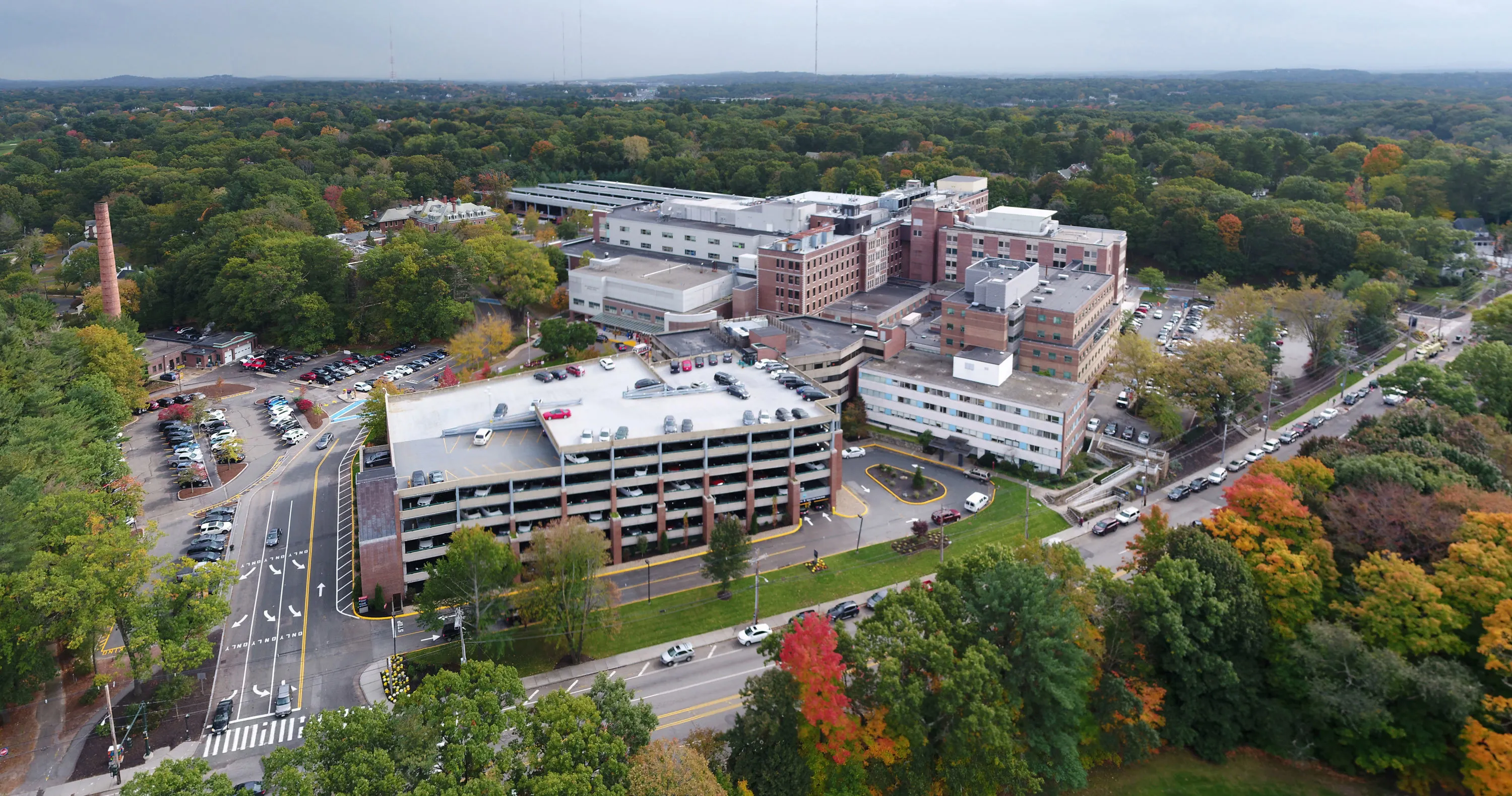
Healthcare is notoriously difficult to change. Rules and regulations present complex barriers; health practitioners and organizations often have entrenched ways of working; and lives are literally on the line. Despite these significant barriers, the leaders at Newton-Wellesley Hospital (NWH) boldly committed to improving patient care through a new approach.
NWH is a community teaching medical center in Newton, Massachusetts. Because of its proximity to Boston—a city known for world-class healthcare institutions—NWH needed to differentiate itself. The hospital's new president, Dr. Michael R. Jaff, reached out to IDEO for help: "I knew that providing an unparalleled patient experience would set us apart from our competitors." But, Dr. Jaff’s particular approach was unique. He and Dr. Jodi Larson, Chief Quality and Experience Offer (CQXO), saw an opportunity to drive better patient outcomes through cultural and organizational change.
"You cannot learn any more than when you get to listen to your potential patients say why they would never walk into your place." —Dr. Michael R. Jaff
IDEO partnered with NWH for a year of work together, kicked off by defining the vision for NWH and ramping up to in-hospital prototyping and the launch of several new initiatives. A pilot project with the Women's Imaging Center (WIC) focused on solving departmental and employee challenges to provide a better experience for women getting mammograms.
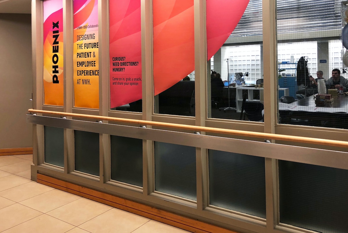
Fueled by this potential, the WIC team redesigned key work processes and created a set of experience principles that inspired new service prototypes. Guided by principles like "Express mutual gratitude" and "Honor every voice," the WIC team tested ways for patients to acknowledge outstanding caregivers and created tools to gather better feedback from patients and adjust quickly. The experience of designing better services inspired the WIC staff to become ambassadors for the power of design thinking across other departments inside NWH and they continue to build on the work through new prototypes and experiments.
Next, IDEO partnered with NWH’s ambulatory surgery group. They took an analogous research trip to Boston’s Logan airport to see with fresh eyes how other high-touch customer service organizations provide customer value in a complex setting. Insights from the trip were applied through live prototyping of several new experiences inside the hospital, including a pre-surgery visit summary and pre-operation care carts.
Analogous research helped us realize that we can learn from other industries and incorporate some (cool) best practices if we allow ourselves to get over the ‘that would never work in the hospital’ mentality. - Dr. Jodi Larson

One of the most impactful prototypes was Care Modes, a tool to empower the NWH care teams to tailor their approach and interaction with patients based on the patients’ unique needs, beyond simply their clinical requirements. Four distinct approaches were identified for engaging a patient before surgery—Explain, Partner, Embrace, and Encourage. The Care Mode is determined based on the provider's understanding of a patient's degree of self-advocacy and their confidence that surgery is the best solution to their issue.
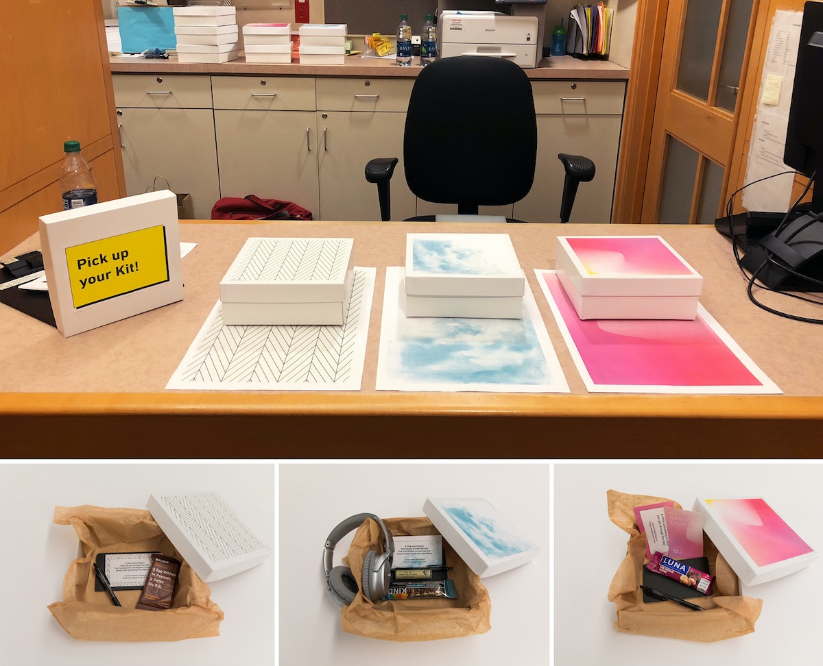
Historically, care providers have been trained to deliver consistent care above all else. However, Care Modes powerfully acknowledge that patients respond differently to different types of care. The Care Modes empower the team—from surgeon to nurse to anesthesiologist—with a clear framework for how to interact with and provide care for patients so they feel most comfortable. Based on the prototype's success with patients and impact on the staff culture, NWH has incorporated Care Modes into EPIC, the hospital's electronic medical record.
The importance of being patient-centered has been central to the healthcare conversation over the past thirty years; but new explorations reveal that there’s far more potential for innovation and improvement when the provider experience is considered in tandem with the patient’s. Each enables the other, and design for both together yields stronger solutions and better outcomes. IDEO's work with NWH demonstrates this vital shift in user-centered healthcare—one can't design services and experiences for patients without designing for their providers’ culture as well. When these go hand-in-hand, meaningful institutional change in healthcare is more than possible.

Helping a historic museum prepare for the future
Using design thinking to improve access, experience, and culture.
The mission of Chicago's Museum of Science and Industry (MSI) is to inspire children to achieve their full potential in the fields of science, technology, medicine, and engineering. Leaders at MSI realized they needed to drive day-to-day operations and maintain historic exhibits while focusing on where to go next. To prepare for its next decade, MSI worked with IDEO to create a new business focus to support the museum’s aspirations for the future. The plan would allow MSI to respond to the demands of the marketplace and raise the funds to get there.
At the beginning of the project, MSI laid out its priorities: improve equity of access, enhance the museum experience, and create a more innovative culture. To dive into each of these areas, IDEO conducted immersive research with families, teachers, donors, and staff.

IDEO brought together 60-plus donors, board members, and staff members to engage in a design thinking exercise to unpack and address the tensions that come with choosing a new strategic trajectory. Instead of having a standard ballot vote, the IDEO team encouraged participants to get up and vote with their feet, helping the group of stakeholders physically align on the museum’s new direction.
At the end of the research and prototyping phases, MSI and IDEO developed a vision called Provoking Minds, Inspiring Futures, creating six detailed design briefs to equip MSI teams to bring initiatives forward. The briefs laid out everything from recommending a new Department of Next, dedicated to ensuring that the future is at the heart of everything the MSI does, to MSI Runway, a place for experimental, small-scale, and limited-run exhibits. The ideas were brought to life with an interactive exhibit, built quickly with everyday materials like plywood and circuit boards, to demonstrate that creating an inspiring vision of the future doesn’t have to be an expensive endeavor.
The team also focused on insights that highlighted accessibility issues some families brought up early in the design process—travel across the city via public transportation can be lengthy, and the cost of admission to special exhibits could be prohibitive. To address these concerns, IDEO came up with the Mission Accessible brief: Inspired by casino buses, MSI bus stop signs would be posted in various low-income neighborhoods, signaling a way to take kids and families to the museum for free.
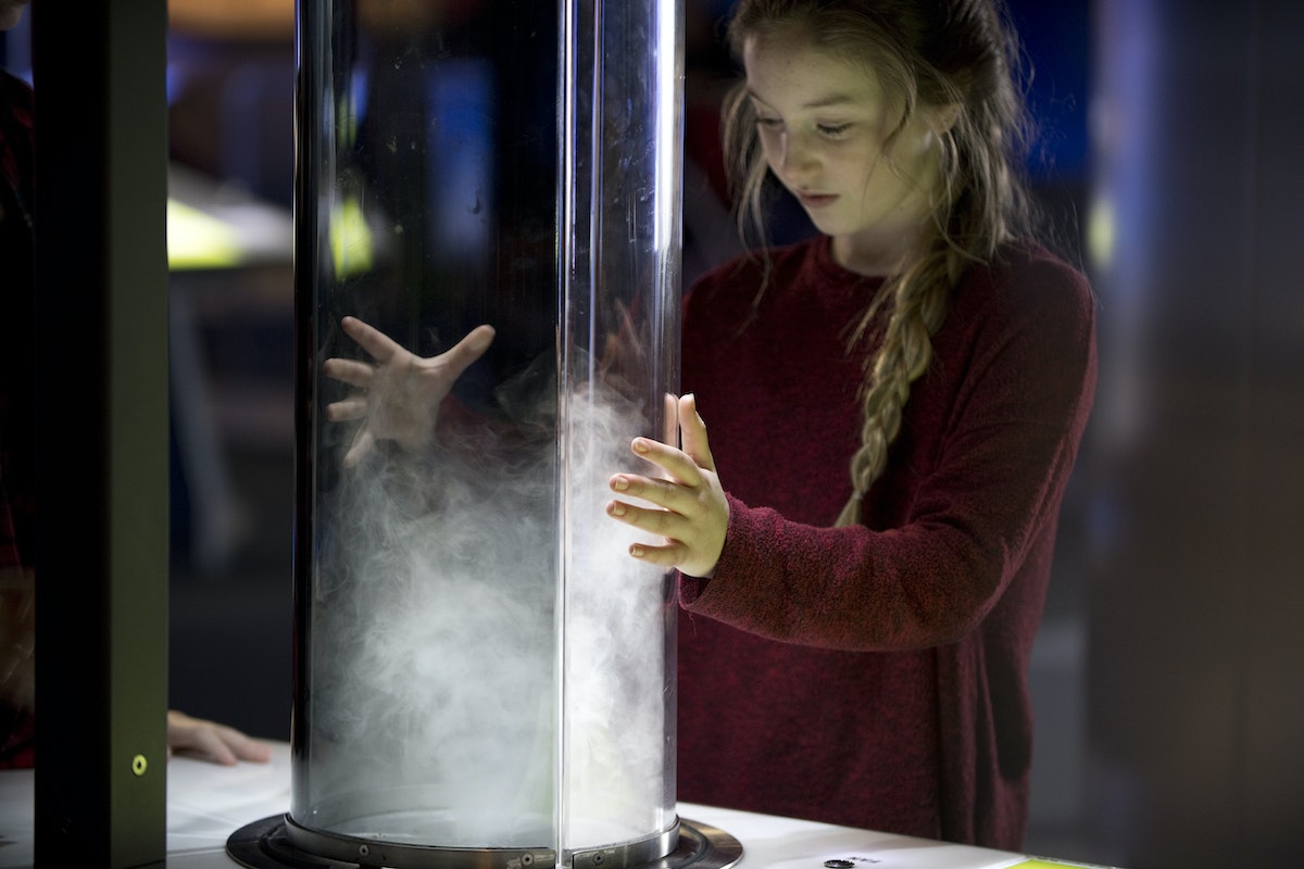
During the project, the IDEO team identified some low-hanging fruit, like rethinking ticketing and improving the student field trip experience, and helped the museum create cross-functional innovation teams to apply design thinking skills towards solving those challenges. They researched, brainstormed, and pushed forward new concepts, meeting weekly to share and build on ideas. At the end of the four week period, each team prototyped their ideas—new outdoor programming, software tools for visiting tour groups—and pitched them to each other.
In 2019, two years after the conclusion of the project, the collaboration paid off. With its new strategic plan and additional resources, the museum has renewed its commitment to serving youth, and MSI’s team, including donors, are aligned on a collective vision of the future. MSI raised more funds than in any previous year, including the single largest gift in its history—$125 million, nearly half of its $380 million fundraising goal—that will help ensure the years ahead.

3 Rules for Making a Government Site Work for the People
The state of Georgia proves it can be done
Inspired by the recent overhauls of government sites like gov.uk and boston.gov, Georgia tapped IDEO to explore how it could give more than 80 state agencies flexibility in the look and feel of their websites, while also preserving a uniform branding experience that residents could recognize and trust.
To get acquainted with the state, we took a road trip, wandering around the historic streets of Savannah, getting to know the resilient spirit of Macon, and soaking up the innovative energy of Atlanta. We learned a lot about what Georgians would like from their government, and took a strong look at how the look, feel, and content of a digital experience might impact delivery of services. But we also learned a lot about the difficulties of accessing—and providing—government services. Soon, we realized that this project could be more than just an identity exercise.
The state of Georgia’s population has grown 25 percent over the past decade while the size of its government has decreased by 25 percent. These diverging trends have put a strain on government staff, adding even more pressure to the promises of efficiency that come with civic tech. The transition to digital delivery is not easy, and governments around the world are working to define digital best practices. Because the work is still in progress, service delivery is a serious challenge. Our project wasn’t just about identity, but about how changes in CSS, information, and color schemes could fix the concerns residents had about trust and access to information and services.
During our journey through Georgia, residents told us they felt that government was removed from their lives, monolithic, opaque, and solemn. While it plays a necessary and—in some cases—critical role in their lives, their relationship to it was transactional. Armed with that feedback, our goal was to leverage Georgia.gov to make that relationship feel more collaborative from both a functional and emotional perspective. Thanks to conversations with many people from the great state of Georgia, we synthesized the shortcomings of government websites, explored the needs of the people, and came up with a list of three rules for anyone looking to create a better digital link between a government and its people.
1. Empower users to make an impact
When there are limits to what government can do, give constituents a clear role in how they can work with government to solve problems together. In our research, we chatted with civic technology expert Cliff Lampe, a professor at the University of Michigan School of Information Studies. In one project, Professor Lampe and his students developed a technology that allowed residents to flag the presence of rats in their neighborhoods. Though the technology empowered residents to report health and safety issues, the staff in Ferndale, Michigan didn’t actually have the capacity to keep up with them. They started replying to requests for support with information about what residents could do to help mitigate the rat population, like getting rid of clutter in the backyard or keeping pet food inside. Instead of ignoring work it couldn’t get to, the government brought the people into a collaborative relationship, so that they could fight the rodent population together.
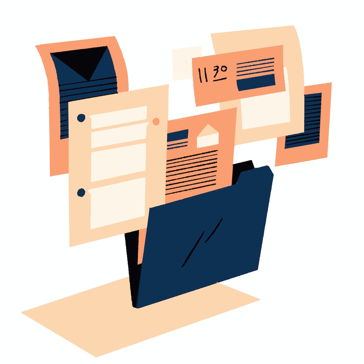
2. Leverage UI to let residents know that government is on their side
People on both sides of the conversation called interacting with the government “a necessary pain.” Government staff recognize that if you’re coming to a website to pay taxes, you’re probably not in the greatest mood. Residents often mentioned that the look and feel of the websites didn’t give them the sense that they were welcome to reach out and call agency staff for help.
Our testing of early prototypes revealed that shifts in language and color schemes could change how both government staff and residents felt about their experiences. When we changed the color scheme from a traditional red, white, and blue to more approachable and ownable peaches and greens, residents used words like “warm” and “welcoming” to describe the look and feel. Adding language that invites people to call if they needed help also lead to a much better reception.
One resident told us that these changes gave her the feeling that the government services actually wanted to help her, rather than giving a feeling of what in the past felt like reluctant support.
3. Give constituents insider knowledge
When we visited Atlanta, we spoke to Tara, a program manager at a nonprofit that connects low-income individuals to state financial and educational resources. As an intermediary, Tara knows that state workers are stretched thin, so she advises her clients to do what they can to help move the process along. To this end, she has developed a series of strategies that make the process a little bit easier for everyone involved. Tara, like other superuser intermediaries we spoke to, relies on these strategies to empower herself in her work, helping to move the process along more efficiently.
Sharing tips on how to best navigate the application process brings residents into a collaborative relationship with agency staff, helping them understand obstacles and needs. Some of the tips that Tara shares with her clients include scheduling periodic check-in times to get updates on applications, keeping a file on previous conversations, and having key information on hand before making a call. Following her example, we provided step-by-step application instructions as well as advice from agency staff. Articulating these strategies on the agency website allows constituents to have smoother and more efficient conversations with agency staff without doing a deep dive overhaul of the service model.
Supporting collaboration between government and constituents doesn’t have to mean an overhaul of services. You can make things better with seemingly surface-level changes, like changes to tone, color schemes, and the way information is shared. Though they may appear to be band-aid fixes compared to solving larger systemic challenges, they really can change the way people see and experience their relationship with the government.
Special thanks to the residents of Georgia who shared their experiences with us, and to the IDEO design team of Tom Kershaw, Lindsey Turner, and Emma Baker that shared in this journey. See the state of Georgia's new website at pilot.georgia.gov.
Illustrations by Matteo Berton
There’s a reason government sites don’t have a reputation for great user experiences. They rarely have the budget or staffing even for digital updates, much less innovation. But the state of Georgia wanted to change that.

Design Concepts to Help New Yorkers Fall Back in Love With Their City
What does it mean to design for inconvenience?
New York is a city that invites (or demands) personal reinvention and grit, a home where you choose your own adventure and meet your true self.
While everyone comes to New York for different reasons, chances are each person is drawn to the seemingly endless opportunities, rich culture, and potential for discovery. The city is a blank slate for bucket lists that keep on growing. But New York is also notoriously difficult for many to navigate and discover. In the midst of everything going on, it’s hard to stop and see the magic that brought us here in the first place.
In the true spirit of design provocation, a handful of us at IDEO New York asked ourselves: How might we help New Yorkers get lost in the city, and by doing so, allow them to discover something new and surprising along the way?
In between projects, we gave ourselves a job—design some speculative concepts to bring these two complex, potentially oppositional ideas to life.
Lost
The first design concept, Lost, explores how we can lose ourselves in the city by going off the grid. As we asked people how they disconnect in the Big Apple, we heard about different rituals to reclaim time and attention: from turning on Do Not Disturb mode to giving an iPhone to the local bodega for safekeeping.
Intrigued by the implications these tactics had on a person’s digital footprint, we took this idea even further. Instead of simply flipping a switch or hanging our phones off to a confidant at the corner store, we explored sealing off our entire digital footprint with a 3D-printed aluminum Faraday cage. By blocking all wireless emissions, a Faraday cage is one of the only surefire ways to ensure your phone is safe from transmittance.
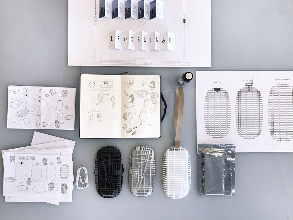
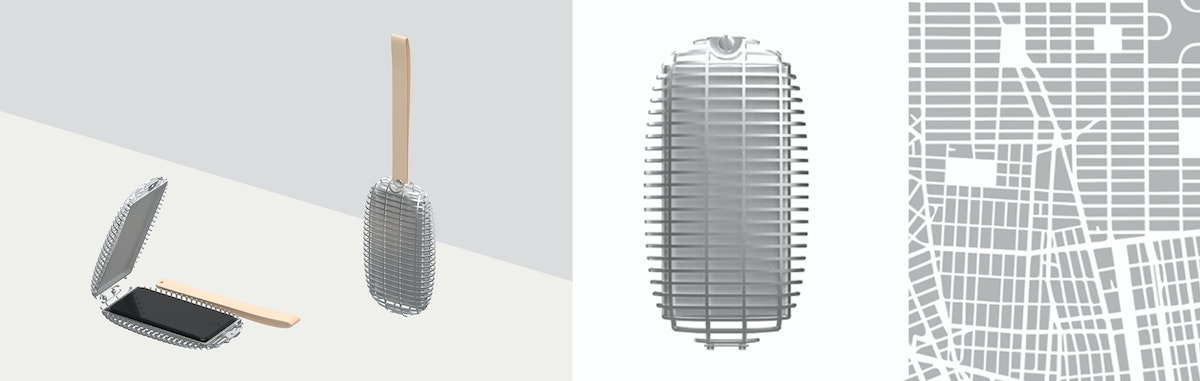
We added a touch of personalization to the design—the grids of the 3D printed file mirror the New York City map. By going off the grid before setting out to explore New York, you reclaim your anonymity, commit yourself to living in the moment, and immerse yourself in the serendipity of the city.
Found
You can find virtually any tidbit of information with a few taps: movie times, breaking news, the exact Pantone shade of a celebrity’s jacket. Our second design concept, Found, explores how we might reintroduce discovery and spontaneity into our daily lives.
As a nod to the legacy of open-world gaming maps, the app—affectionately named Streetheart—begins with the map of New York City shrouded in darkness. As the user moves, the app reveals the paths of the city that you explore, block by block, avenue by avenue.
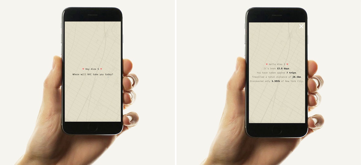
By illustrating how much of New York City is (always) left to uncover, Streetheart encourages you to leave your comfort zone and embrace the curiosity and spontaneity that made the city magic in the first place. The percentage discovered feature reminds you of the scale of New York City and humbles even the most high-handed New Yorkers.
We pushed things a little further and coded a web prototype to test our concept out in the Big Apple. In just an hour and fifteen minutes, we discovered beautiful brownstones in Boerum Hill, a bustling downtown Brooklyn, an unusual park hidden near the Manhattan Bridge, and so much more. Yet a quick peek at the app revealed we only discovered 0.6225% of New York City.
In a city fueled by efficiency and hustle, we’re fascinated by choices that help us slow down, even if it means intentionally designing not for convenience, but inconvenience. We hope that Lost and Found allow you to lose yourself in New York City—and by doing so, rediscover the city and each other.
Taking the subway in the wrong direction for many stops; getting blindsided by the unimaginable smells emerging from the MTA; living among 8.6 million people but feeling completely anonymous, even isolated. These are some of the experiences IDEO’s New York community described when asked what living in the Big Apple is like.
From Startup to Grown-up: Helping Digitally-Native Companies Come of Age
Three principles to help startup founders become company leaders
Like a gawky teen who acts like a kid but resembles an adult, many Internet-born organizations find, a few years in, that their mode of operation no longer matches their growing size. The acceptable norms of a small startup—like decision-making around a shared kitchen table—actually prevent these companies from continuing to innovate once they’ve scaled. As a result, they begin to plateau and become susceptible to disruption and competition.
Often, companies in this teen stage seek guidance in areas they've neglected during their initial growth spurt. As one CEO recently shared, she needed help “jumping the S-curve.” The following three principles can enable digitally-native companies to keep thriving and achieve sustainability—in other words, help the skinny kid fill out and establish the traits needed to become a grown-up.

Rethink team structures and incentives
When startups consist of just a few people in a room, there’s no separation between disciplines: An engineer sits next to the head of sales, who sits across from a project manager and shares a file cabinet with a designer. But as the company scales, teams often become siloed into discrete functions. When disparate groups are responsible for specific parts of the customer experience, it becomes fragmented.
In a project IDEO led with an online retail startup that had fallen into this trap, we noticed that the front-end engineers and UX designers—who were responsible for the website search interface—rarely communicated with the back-end engineers and data analysts. Because of this, the front-end team designed user search experiences that weren’t even feasible from a back-end point of view. In addition to this being a massive waste of time and effort, it represented a misalignment between teams working at the same company, on the same product, and serving the same customer. If internal teams are disconnected, the customer experience will inevitably be disconnected as well.
For organizations struggling with this, there’s an opportunity to reorganize teams around moments along the customer journey (account creation, browse or search, checkout, and so on), rather than function. Eventually, that misaligned company created an interdisciplinary search team that included designers, data analysts, account managers, customer success associates, and others. This resulted in a more consistent and functional search experience for users, which in turn led to more people finding, and ultimately buying, products on their site.
The customer experience needs to guide not only team organization, but also incentives. In early start-ups, individuals and teams are rewarded for speed and execution: The quicker features are released, the better. But this mindset only reinforces the tendency for teams to evolve into myopic silos, unable to grasp the holistic experience beyond their discrete function.
When reorganizing their teams around the customer journey, that online retail startup established new incentives and shared success metrics that encouraged the newly-formed groups to work together and focus on the customer experience, rather than speed and quantity. The new interdisciplinary search team’s incentives were tied to a customers’ success in finding the item they were looking for on the website or app.

Dig deeper into data
Internet-born startups tend to have an abundance of engineers who are experts at collecting and leveraging data. They relentlessly A/B test the product and often immediately take action based on the results: If button A is generating more clicks than button B, it’s best to go with the former.
This is where teenage companies take a wrong turn. Engineering teams rely on their same tried-and-true data and analysis methods used when they were chasing the next round of funding. But now that the company has matured and needs to become profitable, it must change its habits to match this new stage of growth. Continuing to blindly A/B test without considering the implications leads to over-optimizing their current product features. This results in feature bloat and prevents innovation beyond a hallmark product or technology.
Instead of reinforcing old habits, it’s useful for startups to ask why something is occuring—why is this button outperforming the other? Many teams skip this question. As a comparison, during qualitative research, we ask target customers open-ended questions to learn why they think, feel, or behave in a certain way. For example, a shopper may share that they prefer organic produce. But learning why—perhaps due to climate concern or wanting the best for their kids—unlocks the potential to understand how an online grocery delivery startup could innovate.
Rather than merely pushing organic strawberries on the homepage or building an “organic” product filter, the company can use this valuable knowledge to grow beyond their primary offering. They can consider questions like: Do environmental activists or health-conscious parents represent new or existing customer segments? How might we meaningfully shift our product or create a new one to serve them? The key is to follow data collection and A/B testing with qualitative research aimed at understanding why. Engineers will need to push beyond their comfort zone to ask these questions. Companies may also consider bringing qualitative research specialists onto engineering teams to help build this capacity.
For Internet-born startups, data can’t be only an optimization tool. It’s also a catalyst for deeper qualitative understanding and continuous innovation.

Embrace a new mode of leadership
When founders are used to working alongside engineers and designers, they often hesitate or struggle to step into the level of leadership required to run a company with hundreds of employees. The skills that enable someone to build a company are not always the same as those required to lead a mature and rapidly growing organization.
During a meeting with a digitally-native healthcare startup, the founder asked for a pause so he could weigh in on new illustration icons. By this point, the company had 200 employees and the founder had hired over a dozen senior leaders with deep experience managing teams and scaling mid-sized startups. But because of this CEO’s tendency to do the work (which he embraced when the startup was 10 people) rather than delegate the work, he wasn’t empowering this new talent do their jobs. Letting go, trusting others, and delegating can be particularly difficult and humbling for founders of companies in this adolescent period. But it’s essential to make these shifts for the startup to flourish.
This same founder also shared that communicating the company’s vision and big decisions to employees felt like more of a challenge than it used to. When an organization can fit inside a conference room, leaders have a simpler time with this: Small startup teams are often made up of generalists with an “all hands on deck” mindset. But with hundreds of specialists on board, CEOs must translate their strategy to multiple teams with differing expertise.
Each quarter, the founder began holding meetings with each team in addition to town halls with the entire company. Rethinking one’s communication strategy at this adolescent stage can create more of an opportunity for understanding, connection, and inspiration. This transition also reflects a new level of maturity for a leader.
Digitally-native startups initially grow and succeed due to a certain set of conditions: They’re technologically innovative, data-driven, and have leaders who can inspire early hires and investors and build from the ground up. But when these startups scale, those core conditions no longer do the trick. Evolving from a rambunctious, scrappy teen to a promising adult requires a new willingness to centralize around the customer experience, think before acting, and reach a higher level of leadership.
Special thanks to Mike Stringer, Jill Levinsohn, and Deb de Vries for their contribution to this article.
Visuals by Kate Bingaman-Burt
Startups enjoy a reputation as the bright young things of the business world. They’re digitally fluent, small enough to be nimble, and new enough to be free of legacy baggage. Yet many successful startups face a rude awakening if they make it past infancy and scale to hundreds of employees. While success is exciting, puberty is awkward. These principles can help.

How four people live (happily) in 400 square feet
One designer's values-based system for life in a small space
Now, almost seven years and two babies later, all four of us are still in the same space. I accidentally gave birth to our second child on the apartment floor—a life-changing moment that only took up about twelve square feet. Eric calmly delivered her, while speaking to the paramedics, and our two-year-old stood in the corner.
So, our apartment has served many different purposes. With each additional human, black shirt, pair of boots, friendship, painting, plant, and piece of furniture we have had to really evaluate what stays in the apartment and what must go.
I’ve devoured all the decluttering blogs, books, documentaries, and conversations. I’ve tried a lot of the methodologies, and written “get rid of everything” on my weekend to-do list for more than seven years—and failed. But over the years, I’ve built a framework for making decisions about what to bring into my life—and our space—based on what matters most to me and to us.
I’m not sure that this is the final version of my criteria for what stays and goes, but I’m trying it out—a true IDEO prototype. I would like to think that these five principles could apply to whatever life you have—whether you have a huge space with three closets, a tiny room with no closet, or you actually live in a closet, like my daughters do.
1. Relationships
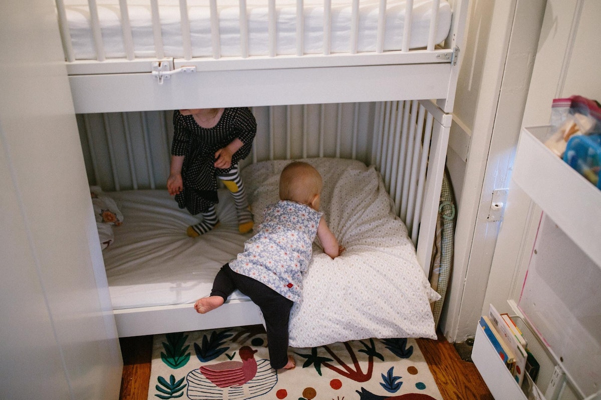
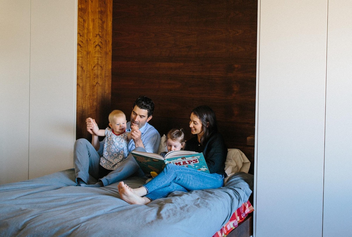
Relationships are what matter most to me. I value people. I love having them over to celebrate, I love feeding them, letting them stay overnight, hearing their stories, letting them shower, and taking meals to them. We built a Murphy bed for my husband and me to give us more space, but, mostly, so that we can have people over to talk and eat together, and develop those relationships that mean so much to us. We also built bunk bed cribs in the closet (bedroom) so that the girls would learn to share. Instead of being a constraint, I think of our tiny space as a way to share happiness, motivate us to resolve conflict more quickly, and cry and be sad—together.
2. Cleanliness
Cleanliness isn’t just about Pine-Sol and bleach—it’s also about reducing visual clutter. White walls, curated with colorful artwork and flooded with natural light, feel clean and visually calm. With a human baby for a Swiffer, I am also particularly aware of accumulating dust. And although it would be more convenient, I find it difficult to give up my duties to a cleaning person because of my high standards and weird obsession with fresh grout and shiny floors. And so, cleaning and reducing visual clutter are a family affair filled with songs, dance breaks, snacks, and high fives.
3. Long-term vs. short-term
For me, investing in things that will be with me for the long term is a balance between using my money better and producing less waste. In the short term, I will reuse something that I already have, like a hand me down click-on kid booster seat, even though I don’t like the way it looks or the exact function of it. (My kids will eventually be able to sit in a regular chair unassisted, right?) To help manage the amount of waste we produce, we also have the super luxury of curbside compost, recycling, and garbage and we have communities that will happily use things that we no longer can.
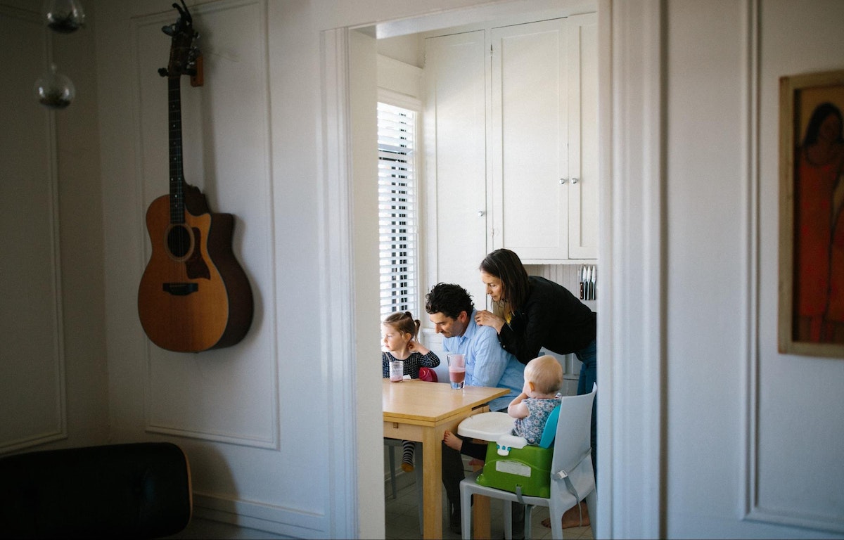
4. Aesthetics
When one thing is out of place in a small space, everything looks like chaos. To create order and balance, you need a bit of white space to breathe, and nice things to look at. To give us more storage we installed cabinets high up on the wall, out of our line of sight. We hang our laundry bags on a dowel in our front closet, hiding dirty laundry and freeing up the floor space that a laundry hamper would take up. We often rotate the refrigerator artwork to keep things interesting and curated. We make our home a place filled with things that we’re proud to talk about, look at, and live with.
5. Health and wellness
We all need space to be together and to be apart, space to retreat to and be quiet, space to move around and dance, or space to exercise or meditate. The place where you live can’t always serve all of those purposes. Creating cozy, soft places to read, moving furniture to the perimeter to make room to dance and run in circles, and hanging out in the shower just one minute longer to clear your thoughts have all helped us be a healthier family. And when it feels like everything is breaking down, we buckle the girls in the stroller and go outside. The outdoors have become our extended living room, allowing us to spread out our arms a little wider and play.

We won’t be in our tiny home forever; two growing children mean that one day our apartment will actually be too small. But we—and you—can take this methodology we’ve created wherever we go.
When you think about your own space, remember to consider the things that matter most to you, and the things that work for you. Take pride in your home and make it your own sanctuary. Learn to see the possibility in your space and in your life.
In the meantime, we’ll be thriving in our 400 square feet. If you’d like to drop by, we’d love to feed you.

It all started in 2011, with eight weeks of apartment searching, a lot of flirting with landlords, a couple of rejections (because “couples always break up in studio spaces”), and an eventual win—four hundred square feet for my husband Eric and me.

Lindsey Turner
I’m passionate about building brands, products, and experiences that help organizations show up with meaning and momentum.
I help organizations cut through complexity by shaping how they show up, through brand strategy, identity, and storytelling.
Working at the intersection of brand and business, I bring an editorial eye and a bias toward making—turning ideas into tangible experiences that people can understand, trust, and believe in.
My work spans government, healthcare, financial services, media, and consumer goods, from launching Gen Z-focused ventures to building innovation labs and reimagining legacy brands. I relish moments of ambiguity and enjoy translating across teams, perspectives, and priorities to move ideas forward.
I started my career in editorial and digital design, shaping cross-platform experiences and identity systems in publishing and agency environments. That foundation still shapes how I work today: I’m detail-oriented, collaborative, and overreliant on the Oxford comma. I hold a BFA in Visual Communication from the School of the Art Institute of Chicago.

Rachel Young
My work helps organizations see who their products aren't working for—and build the will and the tools to do something about it
For 25 years, I've asked the same question: Who does this design exclude—and what are we going to do about it?
My work spans human-centered strategy, inclusive design, and qualitative research, with clients ranging from Microsoft, Google, and Verizon to the National Science Foundation, and San Francisco Unified School District.
Before IDEO, I taught elementary school in East Palo Alto and spent a decade doing design work with social service organizations—where I learned firsthand what it costs people when systems are built without them in mind.
I am currently writing User Error, a nonfiction book about digital access and the design decisions behind it. I live in Oakland, California.

Brian Pelsoh
I lead with craft, ensuring our work is creatively excellent: rooted in deep human insight and imagination, while also grounded in the realities of business and technology.
My expertise spans brand, communication, and product design across tech, education, the arts, and social impact.
I believe great work demands both high-level vision and obsessive attention to detail, and only happens through collaboration.
I bring an inclusive, hands-on approach and a deep understanding of business, which enables me to consistently deliver excellence while always asking why.
Before joining IDEO, I worked at the brand firms Pentagram and VSA Partners. I began my career as a designer, leading teams at the School of the Art Institute of Chicago and the Milwaukee Art Museum. I hold an MFA in graphic design from Maryland Institute College of Art and a BFA in communication design from the Milwaukee Institute of Art & Design, and have taught at some of the best design schools in the US.

Tony Wong
I am responsible for IDEO’s long-term success in China and working with clients to use design as a tool to enable growth.
I am responsible for IDEO’s long-term success in China and working with clients to use design as a tool to enable growth. Specifically, I have helped Chinese companies design holistic brand solutions through the development of their products, communication, services, and innovation teams, and I have helped multinationals expand their presence and influence in China.
I advise global leaders on developing China-led innovation and capabilities.
In over 15 years in IDEO Shanghai, I have worked on projects that use design to elevate the quality of the experience of healthcare products and services, streamline processes that increase productivity, create spaces and programs that promote and enable inclusive communities, and build next generation mobility solutions that are planet-positive.
Before joining IDEO, I worked at Philips Electronics and the Electrolux Group in Italy, the Netherlands, and Singapore on a number of breakthrough commercial products. I am a member of the Young President Organization in Shanghai.

How to use AI as an editor, not a writer
Ed White shares how he uses AI as an editor—not a writer—to sharpen storytelling, rehearse ideas, and preserve the productive friction that makes creative work better.
Ed White has a rule he's tested on his own writing: hold yourself as the writer, and let AI be your editor. Ed is a Senior Design Director at IDEO's London studio, where he co-leads the firm's AI portfolio across Europe. Before IDEO, he spent 12 years as a writer and editor at the Financial Times, Wired, and Contagious. So when he talks about when to use AI for storytelling and when not to, it comes from two decades of crafting his storytelling skills.
In this episode, Mina Seetharaman talks with Ed about two specific tools he uses to keep AI in an editor's seat: a "roasting agent" prompted to critique his drafts without any sugarcoating, and a simulated audience he rehearses pitches on before the real thing. They also get into what Ed is hearing from design leaders at Anthropic, Lovable, Shopify, and Google Creative Lab about how creative work is changing, and why he thinks the friction of writing something yourself is worth protecting rather than automating away.

Building a personal AI for the messiness of life: Sida Li
Becca Carroll talks with Cue co-founder Sida Li about designing a personal AI for the messiness of everyday life—not just work. They explore how Sida stays anchored to human needs while navigating fast-changing technology, product tradeoffs, business-model experimentation, and the realities of building an AI company today.
Most AI products today are built for work—a space with clear problems and established systems. One founder noticed a gap: personal life is messier, harder to systematize, and mostly left behind by the AI boom. So she built Cue, a personal AI that lives inside iMessage and group chats, to go where the other tools haven't.
In this episode, Becca Carroll, IDEO's Chief Strategy Officer, talks with Sida Li, co-founder and CEO of Shared Context Lab, about staying anchored to a human need while the technology around her keeps changing shape, why she treats her business model with the same rigor she'd bring to a product, and what it feels like to build a company at this particular, disorienting moment in AI.
The conversation also gets into how Sida makes design decisions: the language Cue uses to describe itself, the tradeoffs behind building inside iMessage instead of a new app, and a real story about a business idea that didn’t pan out.
This is the second in a two-part series profiling founders from IDEO's Startups-in-Residence program. The first conversation is with Johannes Seemann, founder of Sooner, on designing GenAI for the emotional side of money.

Designing GenAI for the emotional side of money: Johannes Seemann
Designing financial tools around the feelings that shape money decisions.
Most personal financial tools are built to run the numbers and optimize towards a budget. While that works for some, most people experience money as a lived relationship that does not neatly fit into a spreadsheet. Johannes Seemann and Becca Carroll discuss why money is emotional before it is mathematical, and what a human-centered approach to building a generative AI financial product looks like in practice.

The curious leader's edge in uncertainty: Scott Shigeoka
How genuine curiosity helps leaders navigate uncertainty with greater confidence.
Mina Seetharaman talks with Scott Shigeoka, author of Seek and Head of Curiosity Cultivation at the Eames Institute, about what distinguishes genuinely curious leadership from performative curiosity, how power dynamics shape curiosity, and why practicing curiosity can restore energy rather than drain it.
Looks like you might be in search of something very specific?
Or reset the filters above and try another angle.
Here’s some random inspiration

Podcasts about creative leadership

Articles about the power of prototyping