
.svg)



Mental health, co-designed
Kooth partners with young people to create Soluna, a mental health resource for California youth.
Increasingly, digital spaces are proving detrimental to youth mental health. By co-designing with youth, Kooth and IDEO set out to flip the script, creating a positive digital space for young people to safely explore their mental wellbeing.
When Kooth, IDEO, and Blackbird, IDEO’s longtime development partner, first started working on the project, the window of opportunity was narrow, and the stakes were high. The group was up against a nine-week deadline to create a working proof of concept app. Also on the line: a $188 million contract with the Department of Health Care Services (DHCS)—one that would open an entirely new line of business for Kooth.
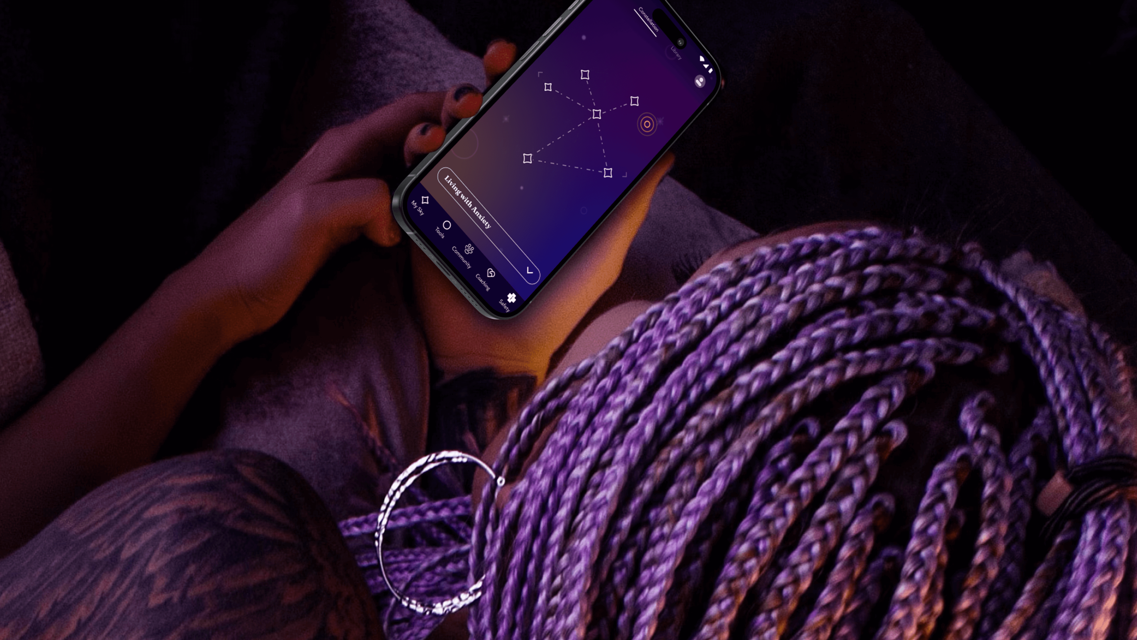
The app needed to do more than demonstrate functionality—it needed to prove its value. To ensure that they were creating an asset that truly fit the needs of young people, the team turned to an initial cohort of 13-25 year-old co-designers who explored early features, created video diaries, and shared their questions about and experiences with mental health. These young people often gravitated toward self-service tools that helped them take action based on their feelings. With their feedback, the team created new expressions of clinically-validated behavioral health tools like journaling, breathwork and white noise—and built novel tools, such as Starboard, an expressive drawing tool and a nod to art therapy.
The team took inspiration from content the co-designers liked to consume, such as story-driven video games that enable freedom of exploration, deepened by a unifying mythology. That led them to a constellation theme, which made the experience more intriguing and playful. The co-designers also recommended a dark color palette, because they preferred exploring the app at night.
With these insights, the team refined the proof of concept, and then conducted a one-week pilot with another 50 young people across California. Their positive feedback gave the State the confidence to invest in a $188 million, four-year contract for Kooth to bring the app to a platform at scale.
Over the next year, the team engaged another 150 young people to help design, shape, and test the app. At the same time, Kooth and IDEO created a clinical oversight group, which included a pediatrician, therapists, and other clinical specialists. This group anchored the platform in the practices of Acceptance and Commitment Therapy (ACT), cultivating psychological flexibility—the mindful acceptance of positive and negative emotions. Young people are invited to complete short reflections and surveys throughout their journey with the app, which includes rigorous, science-backed measurements to assess the therapeutic benefits.
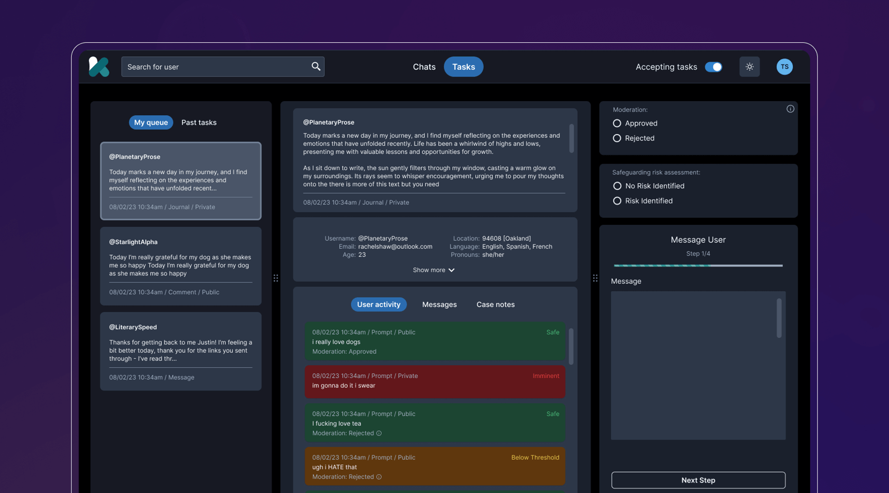
Behind the scenes, the team developed a clinical-facing service and digital platform that empowers Kooth’s peer specialists, social workers, community curators, and clinicians to support the youth experience, all while protecting privacy and confidentiality. They also navigated a complex landscape of state requirements and government legislation, ensuring that the platform could cover topics like substance abuse and gender identity, and that users could access coaching within 24 hours, and choose from a diverse set of experts.
The last step was to select a name that worked across multiple languages, trademarks, and competitor branding, and didn’t come off as a mental health service, something the youth co-designers believed was critical. IDEO and Kooth landed on Soluna, a name that alludes to the app’s presence in both the bright (“sol” for sun) and the dark times (“luna” for moon).
Now, Soluna is available for free to all youth in California, and the state has set ambitious targets for reaching all young people at scale. Soluna is a living platform that will continue to receive product and design updates for years to come, all deeply rooted in youth co-design.
The US Surgeon General named mental health “the defining public health crisis of our time,” and cited social media, online bullying, and the isolation exacerbated by the COVID-19 pandemic as major drivers that have significant negative outcomes for youth.
In California alone, more than 284,000 youth cope with major depression. 66% of kids with depression do not receive treatment. Between 2019-2020, the suicide rate for kids ages 10-18 increased by 20%.
In 2022, California Governor Gavin Newsom’s Master Plan for Kids’ Mental Health set aside $4.6 billion to increase access to mental health and substance abuse support, the largest commitment to youth mental health ever made by a state.
94%
of proof-of-concept app users would recommend the Soluna app to a friend, and believe that engaging with the app would be a positive addition to their daily/weekly routine
6 million
young people in California had access to Soluna at launch in January 2024
A more comfortable Pap smear
Teal Health creates a system for at-home cervical cancer screening.
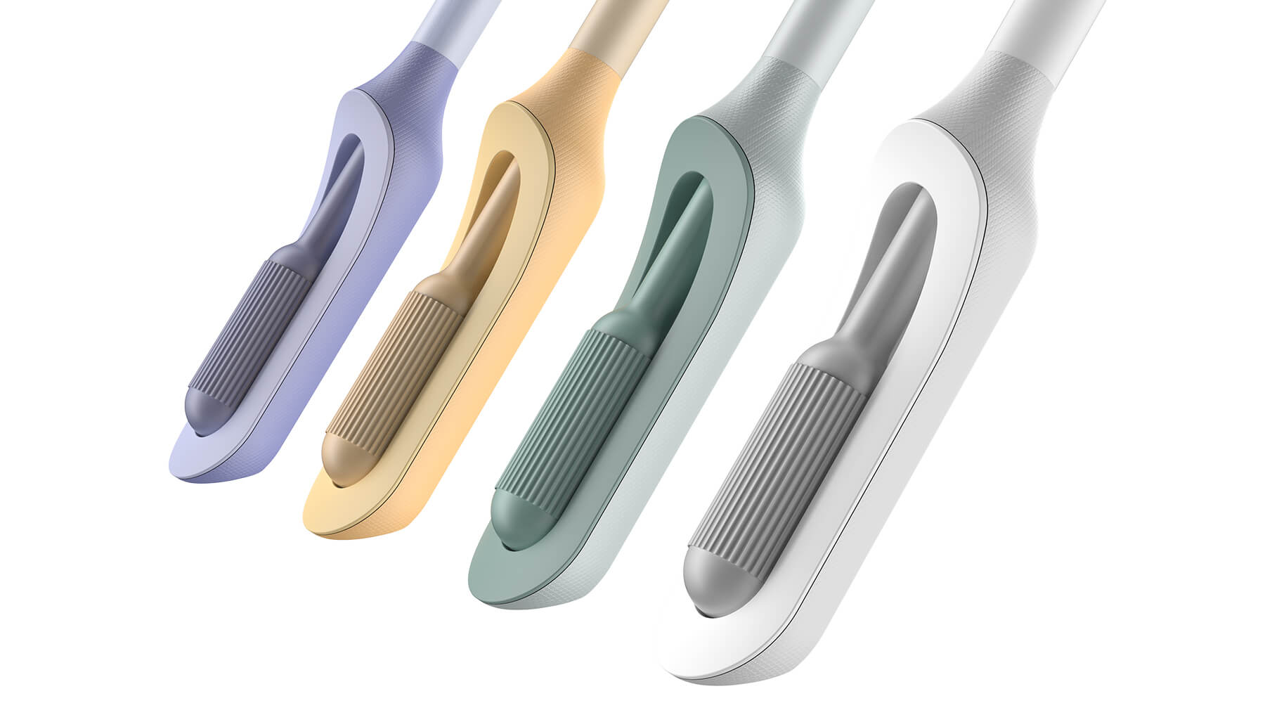
Creating a better cervical cancer screening experience is an important mission, but also a challenging one. Not only would Teal have to address the regulations that face healthcare device companies, it would also need to build a comprehensive telehealth platform and a physical product—a wand that could easily collect an adequate cell sample, even in the hands of an untrained person.
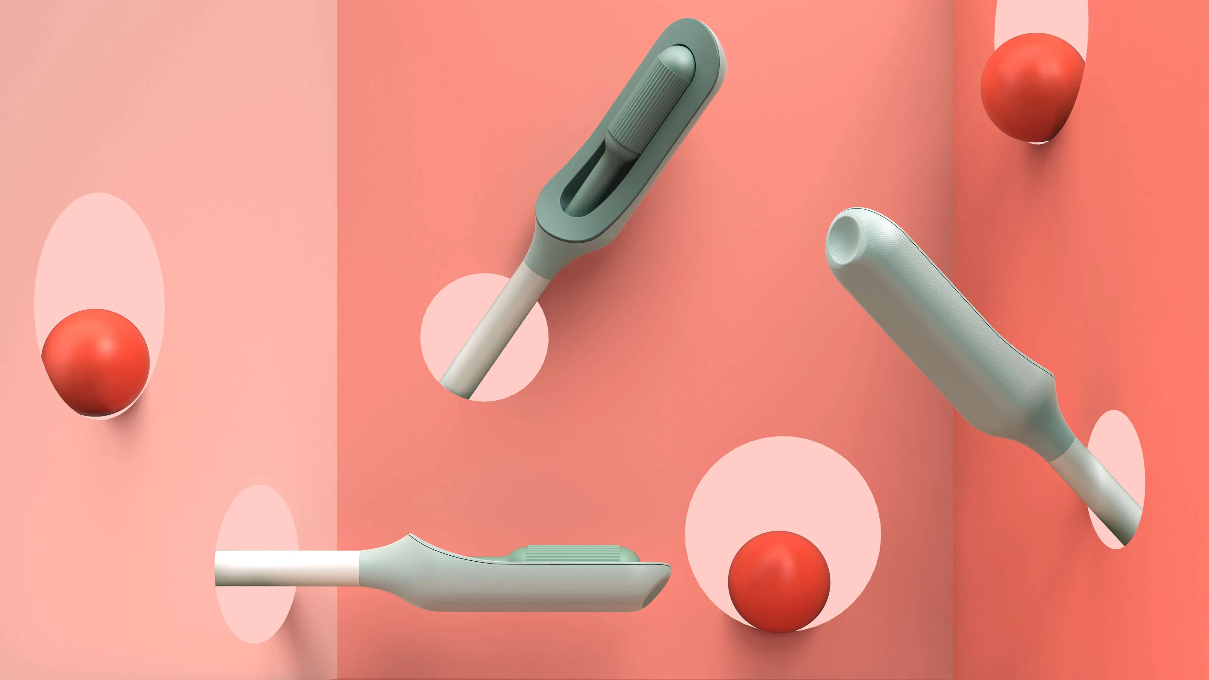
The first challenge was to create the wand. The device would need to do a lot: It’s impossible for a person to see their own cervix, so the user would have to be able to find the cervix blind, collect the sample themselves, and remove the wand from their bodies without contaminating it on other parts of their anatomy. Because this is something users are likely to do in their bathrooms, where there is no space to lie down, they would need to be able to use the device while standing—and with one hand. From the beginning, the IDEO team set out to design functional, testable prototypes to make sure the idea was viable, and incorporate diverse voices into the research process, including trans, minority, and disabled women.
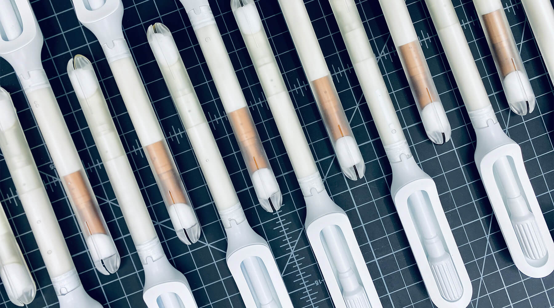
Because the product is meant for people who aren’t medical professionals, the team worked to design something as simple, intuitive, and unintimidating as possible. They used a 3-D printer to create multiples of every prototype, autoclaves to make sure that the designs they were creating were sterile, and leaned into shapes women are already used to, like the cylindrical shape of a tampon. The wand they created has that same basic form, but with a soft sponge that the user can deploy with the turn of a dial to collect the sample, then close to protect it from contamination on the way out of the body.
With working prototypes in hand, Teal set out to test their efficacy. In an initial study with 220 participants varying in age, race, socioeconomic status, and geography, Teal found that not only were participants able to successfully self-collect samples, they also preferred them over the speculum, the device doctors typically use during a screening. Some 92 percent said if they knew the results were equal they would prefer self-collection, while 87 percent reported they would stay current with screening if Teal Wand was an option. Self-collection took the vast majority under two minutes to complete, and 97% of study participants reported it was very easy or easy to use. The Teal Wand recently received a patent for its unique design.
The IDEO team also worked on the packaging and unboxing experience, which plays an important role in supporting the user through the self-screening process. The team built in thoughtful design cues to give users reassurance that they are using the wand correctly, and to provide the same level of confidence they would have in the results of an in-clinic screening.
In January 2023, Teal raised an $8.8 million seed round from Serena Ventures, Emerson Collective, and Metrodora, and later that year, launched a nationwide clinical trial with leading health organizations including Johns Hopkins University, Yale University, the University of Colorado, Washington University, and others. In 2025, The Teal Wand became the first FDA-authorized device for at-home cervical cancer screening, with virtual medical provider support. Today, it's available in all 50 states. i’s an enormous step toward its North Star: catching cervical cancer earlier and saving lives.
Cervical cancer is nearly 100% preventable when it’s caught early, yet one in four women in the US are not up to date on their screenings.
More than 12,000 people in the US are being diagnosed with cervical cancer every year, and more than 4,000 people die of the disease, which disproportionately impacts Black, Asian, and Hispanic women.
More than half of cervical cancer cases are found in women that are not up-to-date on their screenings.
97%
of clinical study participants said the Teal Wand was very easy or easy to use.
87%
of participants said they would be more likely to stay current with screening guidelines if Teal Wand was an option.
94%
of participants said they would choose to collect their own sample from home rather than the current standard of care where a clinician collects it in-office.
2025
The Teal Wand becomes the first FDA authorized device for at-home cervical cancer screening, with virtual medical provider support.
Amplifying a movement
Cities United rebrands to create safe, healthy, hopeful communities for Black men and boys.
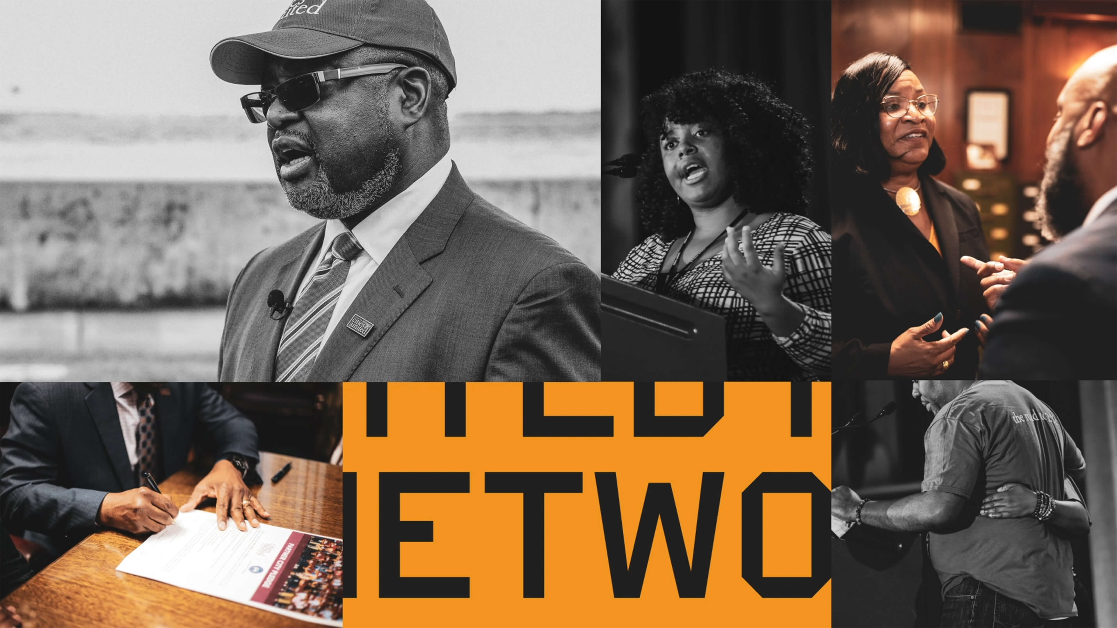
Cities United already had a strong foundation with its stated mission, vision, and values. IDEO brought those to life with a new visual and verbal brand identity system that celebrates Cities United’s inclusive approach to building relationships and reimagining public safety.
To help Cities United with its verbal identity, the IDEO team defined the organization's voice, tone, and key messages, making it easier to tell its story more consistently and clearly, a crucial step toward engaging stakeholders.
To define the new visual identity, the team created a new logo, a letter C composed of interwoven shapes that represent the three tenets of their vision—“safe, happy, and hopeful;” a new design language that references city grids; and a typographic system anchored by the typeface VTC DuBois, inspired by W.E.B. DuBois’s own custom lettering and designed by the Black-owned Vocal Type Co. The team also designed a color palette that embodies the textures of city life with hues reminiscent of asphalt, sunrise, and brick.
To amplify the refreshed branding, the team designed a new responsive website, citiesunited.org. The intuitive site shares the organization’s mission, resources, ongoing projects, and partner network, inviting stakeholders to join in their transformative work. IDEO also created a video to humanize Cities United’s mission and showcase its nationwide impact. It underscores the unity, resilience, and hope embodied by the organization through a chorus of voices.
This comprehensive rebranding widens Cities United’s reach and impact, helping the organization share its goal of creating safe, healthy, hopeful communities for young Black men, boys, and their families, and reintroduces the organization to a national audience.
The Cities United work was supported by IDEO’s Racial Justice Impact Fund, part of a commitment IDEO made in 2020 to address systemic racism and advance equity within our own organization, our client work, and beyond.
Cities United is committed to reducing the epidemic of homicides and shootings among young Black men and boys ages 14-to-24 by 50%.
Between 2009 and 2019, the number of Black children who “did not go to school at least one day in the past month because they felt unsafe at school or on their way to or from school” increased by 84%, according to Cities United.
Homicide is the leading cause of death for Black men and boys from birth to age 44, according to the Centers for Disease Control and Prevention.
2023 SF Design Week Award
In recognition of IDEO’s brand work with Citizens United

Balancing work and sleep
Somni’s personalized sleep program helps workers maintain their health.
Sleep is a critical resource for shift workers—and their employers, too. Together, IDEO and Somni worked directly with people with acute and chronic sleep challenges to create concepts that could support their sleep goals, and provide employers with the means to improve employee health.
When IDEO and Somni first partnered, the startup was an early-stage company, so the team started small, with focused sprints and workshops to redesign the core aspects of the company and product offerings. The team interviewed shift workers about their sleep patterns, which can vary quite a bit. Even when people keep to a specific schedule on work days, they often have to change their patterns on days off to spend time with family and friends, leading to a very disruptive sleep cycle. Research revealed that many third shift workers were dealing with sleep and health issues, but also a pervasive “machismo” culture, pressure to “tough it out,” and a reliance on energy drinks to deal with lack of sleep.
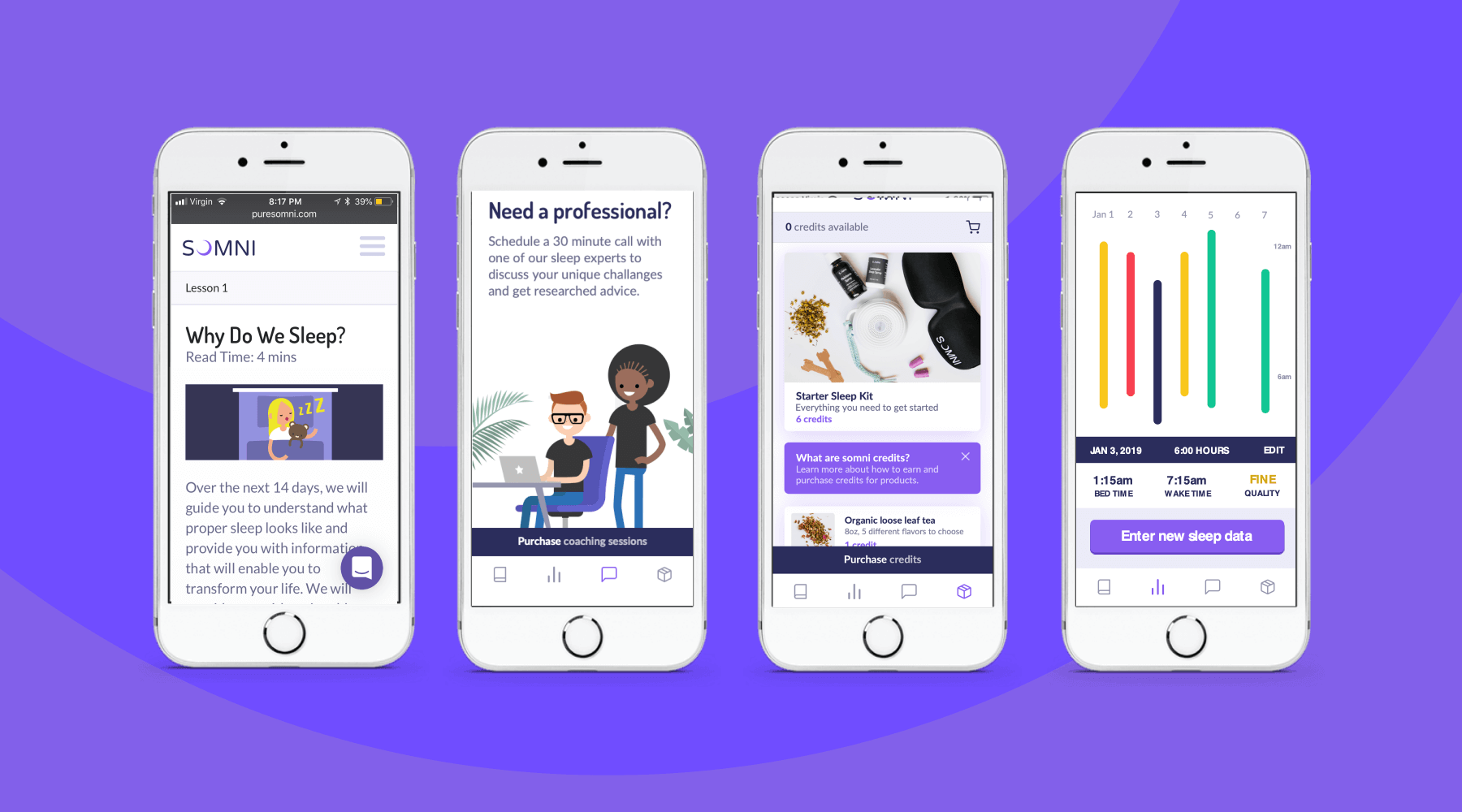
To address those issues, the team designed a digital experience for sleep cohorts, support groups where members could share their experiences and sleep strategies, and work with a coach and sponsor who already had been through the program. The platform analyzed workers’ data, and provided AI-enabled recommendations for improving their sleep. The big takeaway? Data by itself wasn’t necessarily helpful, and could be confusing for folks who were less digitally-fluent. Providing context, like a calendar that displayed sleep experiments at a glance, was crucial.
The IDEO team also created a new user experience for a genetic testing program that could uncover factors associated with sleep issues. Somni aims to use a saliva-based genetic test to monitor for DNA damage caused by circadian disruption, then leverage its sleep improvement program to prevent further damage. Because biomarker testing is a differentiating offer for Somni, it was extremely important that the team get it right, both to make sure that users could understand its utility, and for Somni to provide real value. The design challenge was unique—and not just because of data privacy concerns. Presenting data about DNA damage in a non-human-centered way could increase the anxiety workers had around their sleep.
At the end of the project, Somni leveraged the insights the IDEO team surfaced to improve products like its sleep coaching service, and to refine its biomarker testing offering. Based on this work, Somni has also created a pilot with a Fortune 100 company, which is currently in progress, as it works to mitigate the ill effects of disrupted sleep for employees and the companies they work for.
In the short-term, circadian rhythm disruption leads to an array of jet-lag-like symptoms, and in the long-run, it may contribute to weight gain, obesity, metabolic syndrome, type 2 diabetes, and cardiovascular disease.
It also impairs people’s ability to work, affecting productivity, creativity, and the overall work environment. Productivity loss can lead to employer baseline healthcare costs that are 26% higher, and over time, insomnia can result in an average cost of $4,267 more per employee per year.
In June 2019, the International Agency for Research on Cancer classified shift work as a probable carcinogen.
75%
user retention in Somni's sleep program
$2,450
savings per year per employee for users who complete the program
33%
improvement in sleep quality, and 41 more minutes per night
日本酒のブランドデザインに込めた作り手の心
アメリカで学んだデザインで、日本らしさが持つ美しさを世界へ。
日本とアメリカの狭間で
私はそもそもお酒が好きです。東北の秋田県で生まれ育ったので、日本の米文化・酒文化は私の細胞の中に深く浸透しています。少し市街から外れると広がる田園風景と、季節毎に移り変わる田んぼの表情・匂いは私の大事な原体験のひとつです。祝いの席にはお酒が必ず出て、杯を交わしながら大人が賑やかに話しをしているのを見て、子供ながらに「お酒は楽しいもの」だと感じていました。また五穀豊穣を願う竿灯まつりは、東北を代表する夏の風物詩でもあり、稲穂を模した何千ともいう柔らかい提灯の灯りが夜の町に揺らぐ光景は、是非一度は見てもらいたい日本を代表する文化です。
現在私はIDEO Tokyoでコミュニケーション・デザイナーとして働いていますが、デザインの基礎はアメリカで学びました。在学中も、卒業後も、海外のデザイン会社で仕事をする機会に恵まれましたが、日々さまざまなグラフィックを作る中で感じたのは、同僚のデザイナーたちの作品に比べて、自分が表現するモノはどうしても日本的になることでした。海外のデザインに感化されながらも、水のような、空気のような、すっと入り込んでくるアジアのデザインに惹かれている自分がいました。日々違う表現に触れる中で、自分の中で消化して出てくるものは、自然と自分のルーツに近づいていく。日本社会に馴染めずに飛び出した私ですが、故郷である日本との強いつながりを感じました。
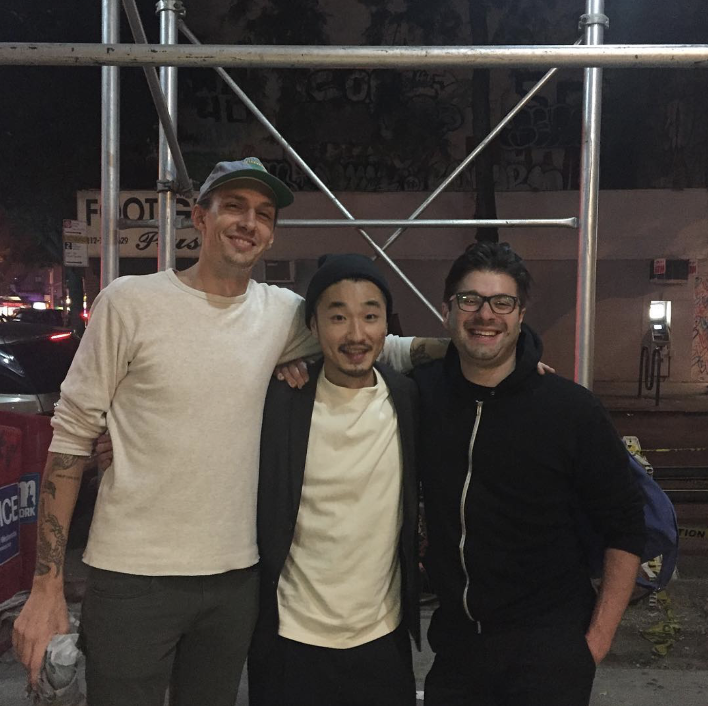
その一方で常に葛藤があったことも事実です。日本でデザインを勉強してきた人たちが表現する日本らしさに本能的に魅力を感じるものの、私には日本でデザインを学んだ経験がありません。原体験は日本ですが、デザインの手法は海外で身につけたため、どうしても日本的になり切らない。ある意味でどっち付かずの状態とも言えます。
IDEOで働くようになってからも、そんな葛藤を抱えていた中、日本酒応援団のリブランディングの話が舞い込んできました。何かデザイナーとしてのきっかけを掴めるかもしれない。ワクワクする気持ちがある一方で、「日本酒」という日本文化を代表するものを扱うことに、プレッシャーも感じていました。
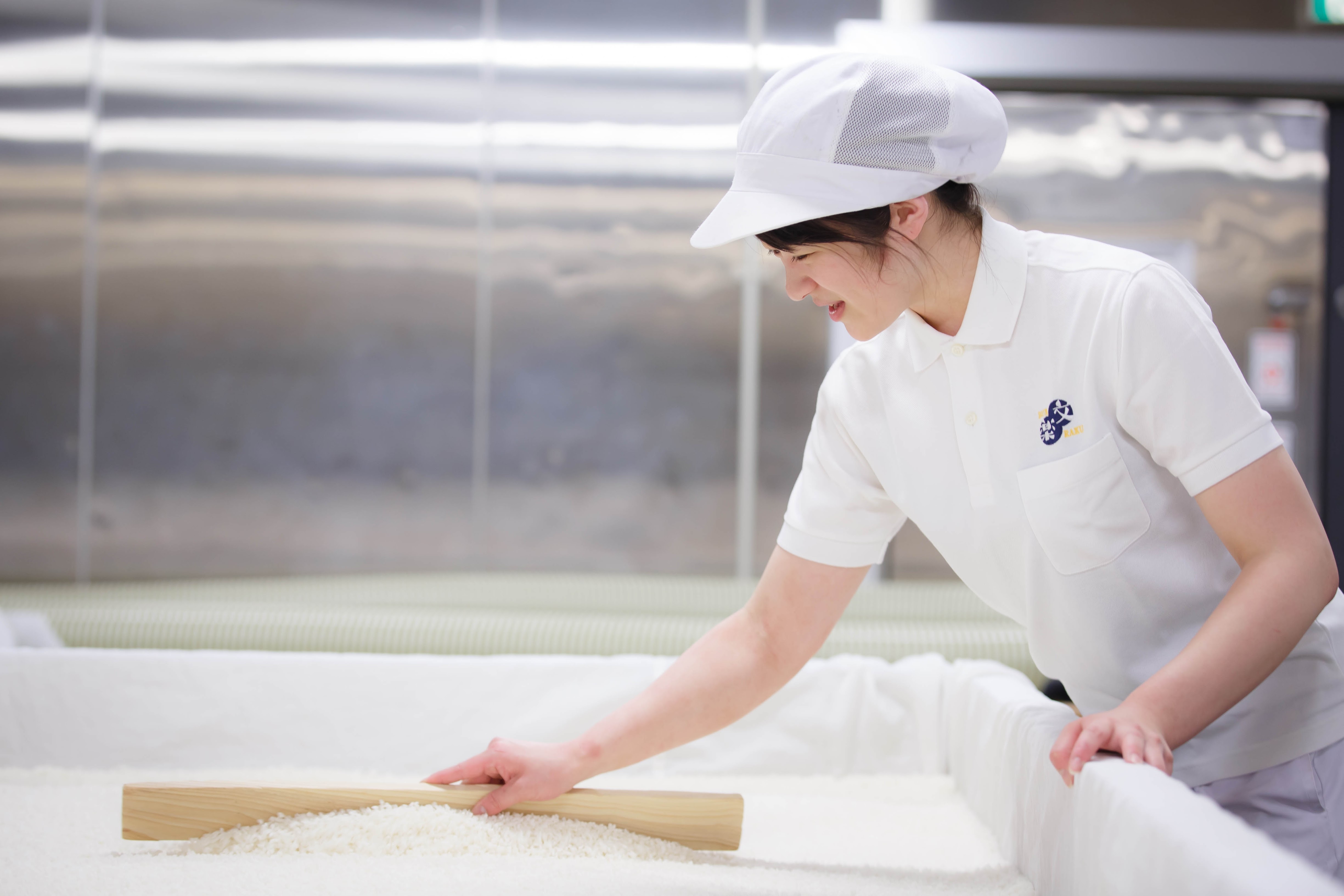
「応援」したくなったきっかけ
今回のプロジェクトの依頼は、日本酒応援団のリブランドとそれに伴う商品パッケージの作成です。日本酒応援団は、全国各地の蔵とパートナーシップを結び、自社オリジナルの無濾過生原酒を醸造、提供しているブランドです。今後、海外のマーケットを目指す上で、世界に通用するようなブランドにしていきたいということで、お話をいただきました。
日本酒応援団は、それぞれの蔵・地域との結び付きが非常に強い会社で、酒造だけではなく、お米の生産者たちとの関係性も大事にしています。代表の古原忠直さんからビジョンやミッションを聞いたときに、「思い」と「ストーリー」がしっかりとあると感じました。ビジョンやミッションが形式化している中で、それが実際に実践できている会社はそこまで多くありません。
新たな名前には、お酒が作られる地域と、お酒作りに関わる人たちとの関係性を大事にするKinship(親しい関係・関連をもつ)、そして日本の美しい文化を表す”美”(み=Mi)
この二つを合わせて”KINMI”と名付けました。
リモートでも人々の想いに触れられた
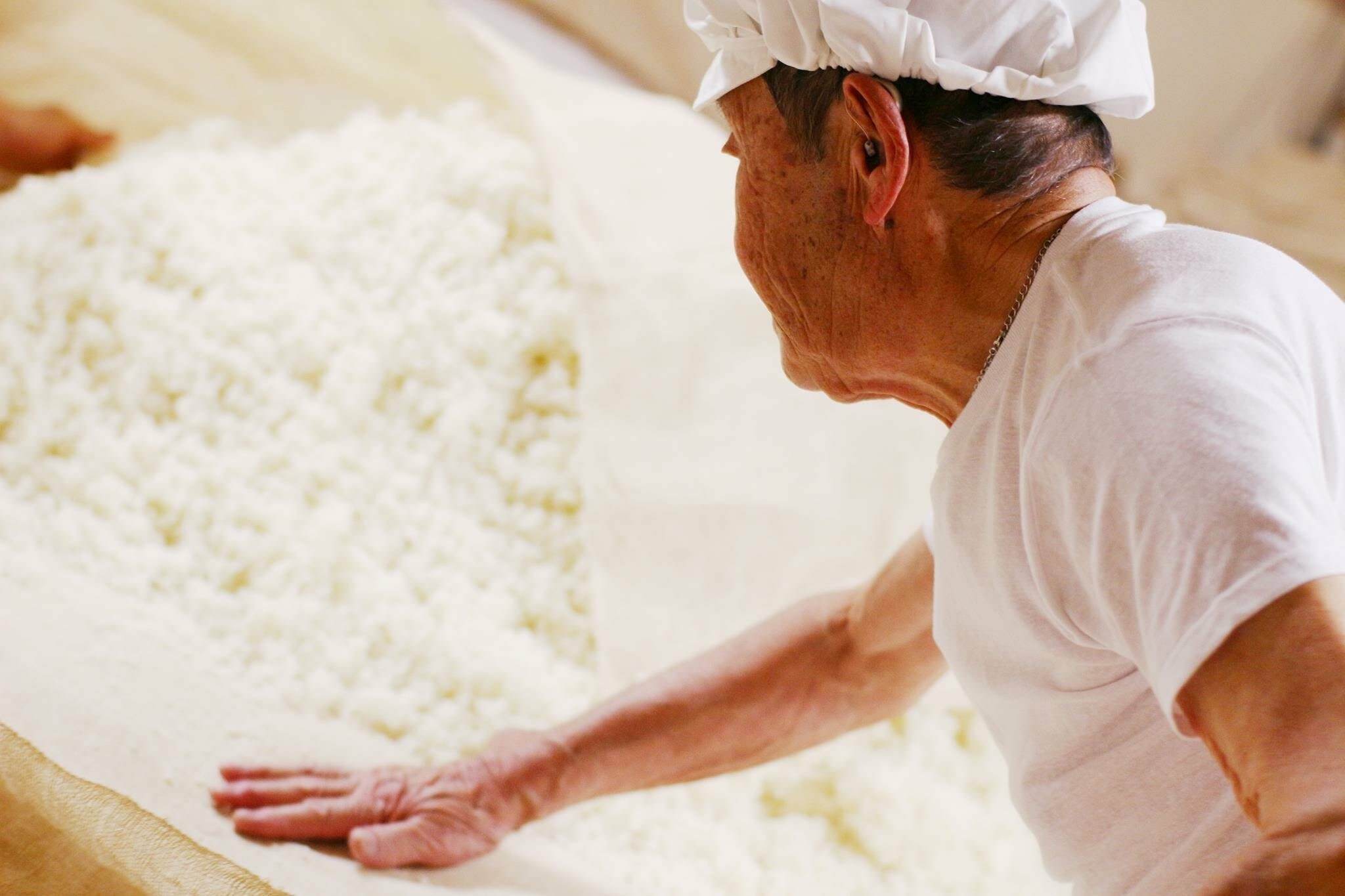
本来であれば実際の蔵に出向いて、酒造を囲む環境を観察したり、そこで働く人たちと話したり、蔵の中の様子を書き留める様なリサーチをしたかったのですが、コロナ禍だったためそれが叶いませんでした。そこで非常に助けになったのが、KINMI(旧名:日本酒応援団)のYoutubeチャンネルにあるオンライン酒蔵ツアーでした。酒作りのプロセスを丁寧に説明しながら、米作りに携わる方々や酒造で働く人々の思いも知ることができる。そんな優良コンテンツが満載のチャンネルです。
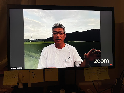
特に印象に残っているのが、国東の「萱島酒造」の元蔵人で、現在は米生産者として働かれている岡泰弘さんのエピソードです。岡さんが家業の農業を継ぐために萱島酒造を退職することになった際、萱島社長と交わした話が紹介されていました。地域を支えていくという大きな目標を持ち、米作りという新たな挑戦に挑む岡さんに対して、萱島社長は「お前が作る米は全部持ってこい、俺の所で買って作ってやる」と言ったそうで、この激励の言葉に心強さを感じたとおっしゃっていました。
この話だけでもお酒が一杯やれてしまいそうですが、お酒が作られている舞台裏ではこのような思いとストーリーが絡み合って、それが日本酒としてカタチになっている。それを、日本酒応援団という媒体を通して世界に発信していかなくてはいけないのだ、と感じました。
伝統に寄せず日本らしさをデザインする
日本らしさを担保しつつも、伝統に寄せすぎないデザインを作るのは終始課題としてありました。
様々なボトルを店頭で見ていると、競合他社のアプローチは大きく2つの流れに別れています。一つは、蔵の歴史を生かしてそれを前面に押し出し、直球的な日本の伝統スタイルを具現化するやり方。有名な書家の方たちに一筆お願いし、それをボトルのセンターに。日本酒応援団自体は歴史も深くなく、あくまでも地域を押し上げる媒体として機能すべきなので、最初から選択肢として外しました。
そしてもう一つは、一見するとナチュラルワインのようなラベルのデザイン。日本の人たちにとっては意外性があり面白いかもしれませんが、海外のマーケットに目を向けるとどうしても日本らしさが圧倒的に無くなってしまう。今回のリブランディングは海外マーケットへの進出が大きな目的の一つだったため、日本のお酒だと理解してもらうことは絶対的に外せない条件でした。
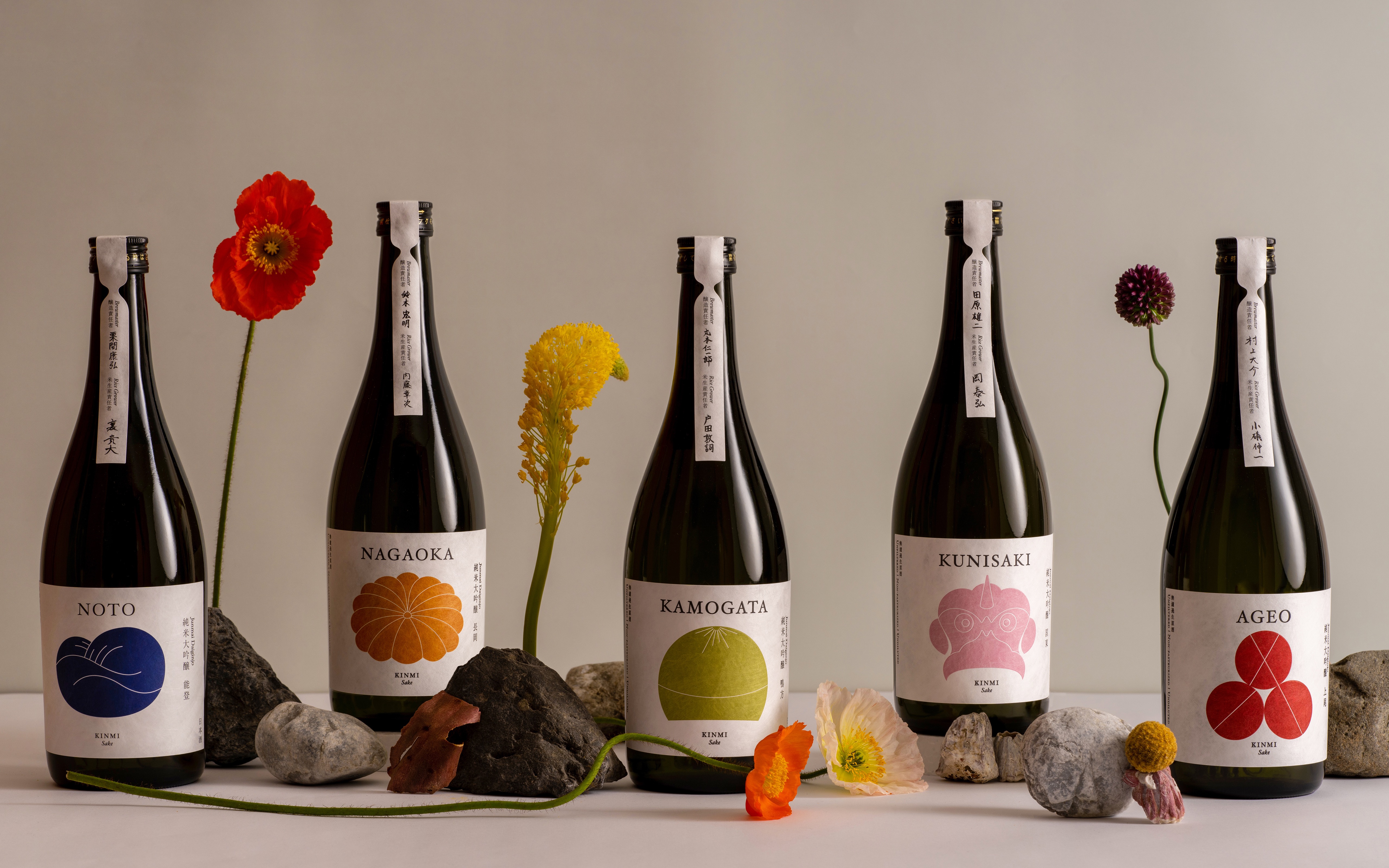
その上で、全国にある5つの蔵、それぞれの個性がしっかりと立つようにデザインをする事も、ブランドのビジョン・ミッションを体現する上で大事なポイントです。これは日本酒応援団が既に行っていたリサーチ、そして既存のラベルデザインの意匠からインスピレーションをもらいながら、アイコニックなものになるようにデザインを進めていきました。NOTOのラベルでは能登の豊かな里山里海の風景と、日本海の海の幸に合う味わいを表現。NAGAOKAは日本を代表する長岡花火を意識して、大きく夜空に輝く花をラベルに落とし込みました。
「新しさ」ということにあまりこだわらず、むしろ日本酒のもつ世界観は踏襲しつつ、幅広い層に共感してもらえることを意識しました。より親しみを感じてもらい、現代の生活にも馴染めるようなものに。それと同時に海外でも日本というオリジンを感じ取ってもらえるものになったと自負しています。
アメリカで学んだ自分が表現する日本らしさ
表層的に日本を表現したものがまだまだ溢れている海外のマーケットですが、国籍を問わず本当に良いものを見分ける力は潜在的に備わっていると感じています。だからこそ本当に良い日本らしさを伝統的なアプローチに寄せすぎず伝えたいという思いは強かったです。
当初は日本らしさを代表するものを扱うことにプレッシャーも感じていましたが、幼い頃から日本酒が身近にあり、海外でデザインを学んだ自分だからこそ、日本酒が持つ日本らしさというのを本質的に表現することができたと思っており、デザイナーとして今回のプロジェクトに関われたことをとてもありがたく思っています。
そして何より大切にしたかったのは、日本酒作りのプロセス、それに関わる人たちの心の美しさであり、それをデザインに宿らせることです。今回のプロジェクトを通じて表現できたものはその片鱗にすぎないのかもしれませんが、これからのKINMIの取り組みを通して、その美を世界に伝搬していくお手伝いができるのを楽しみにしています。
アメリカで学んだデザインで、日本らしさが持つ美しさを世界へ。
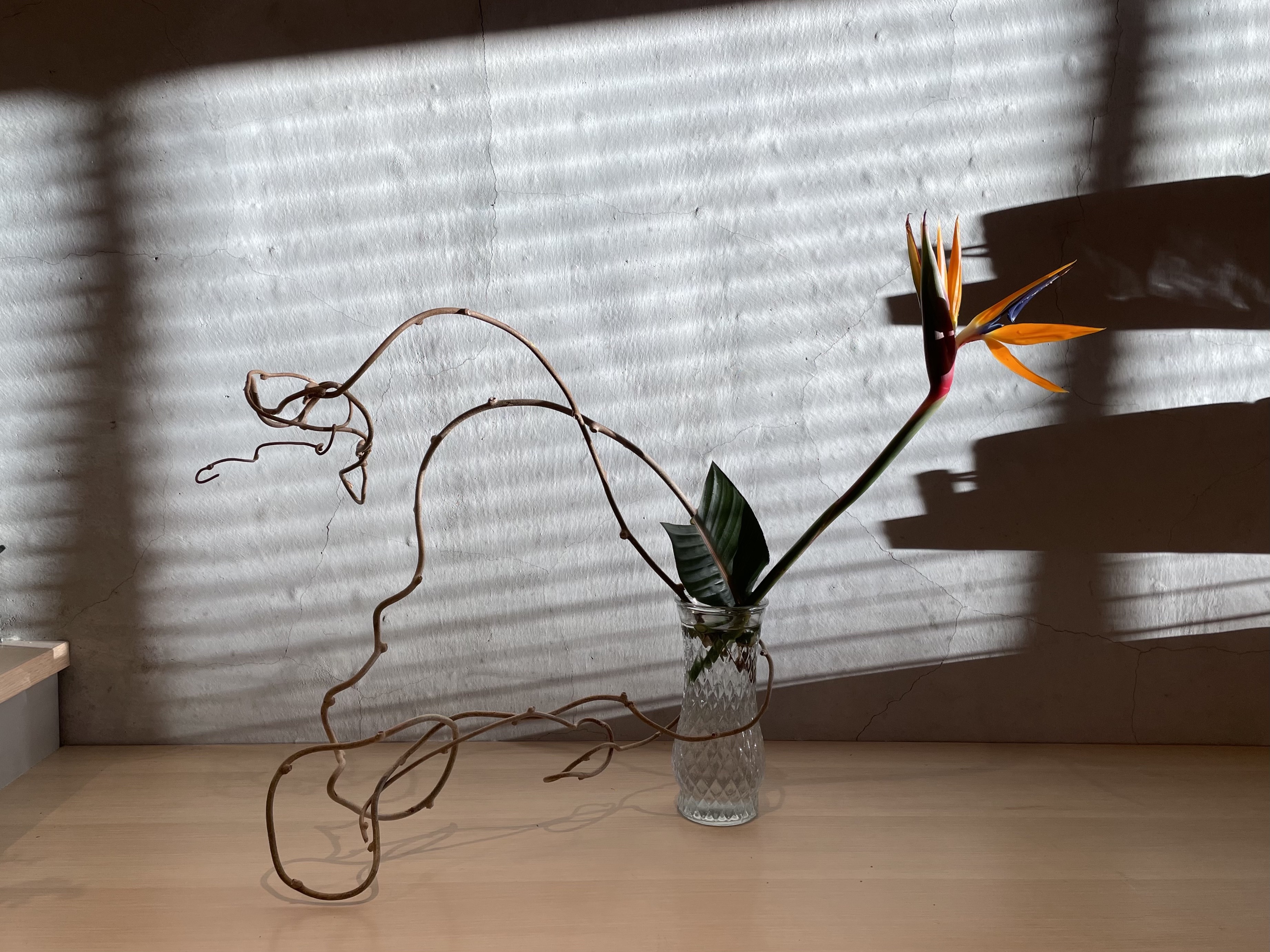
花をいかすこと、アイデアをいかすこと
花をいけるとき、心が躍る瞬間が2回ある。1回目は蕾がきれいに開いたとき。2回目はその花がきれいに枯れたとき。
いけばなをはじめてみて
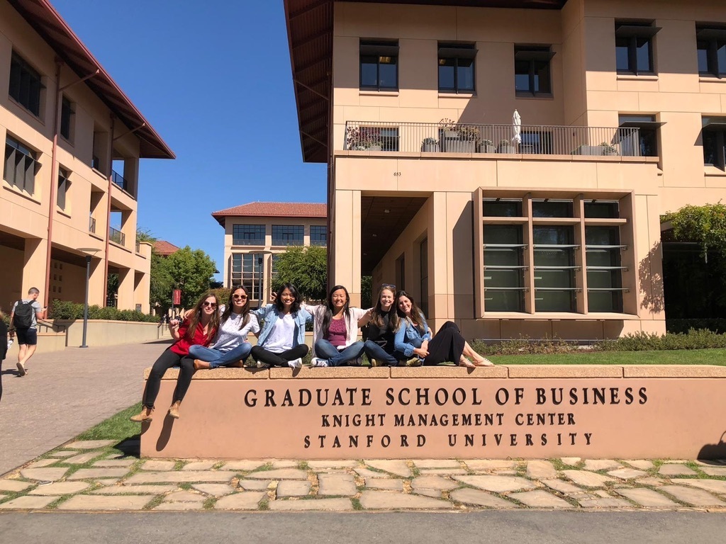
アメリカのビジネススクールに在学中、キャンパスから通える三味線・琴・いけばなの教室の中からいけばなを選んだのは、単純にやってて一番ワクワクしたからだ。教室でいけた花をそのまま持って帰ることはできないので、一度分解して、家でいけなおす。教室で感じたワクワクを家でまた感じることができ、それをルームメイトと共有できることも継続につながった。
いけばなでは、花をいける過程を大切にしている。花との向き合い方を自分なりに掴んでいくことが、花、そして自分を引き出すことにつながる。ビジネスデザイナーとしてIDEOで実践してきたデザイン思考も、アイデアを作り込む過程から学ぶことが多い。一つ一つの行為やその意図についても考える機会が増え、いけばなとデザイン思考に意外と共通点が多いことに気づいた。そしてどちらも、ビジネスの現場での私の視野を広げてくれている。
制約によって発展させる
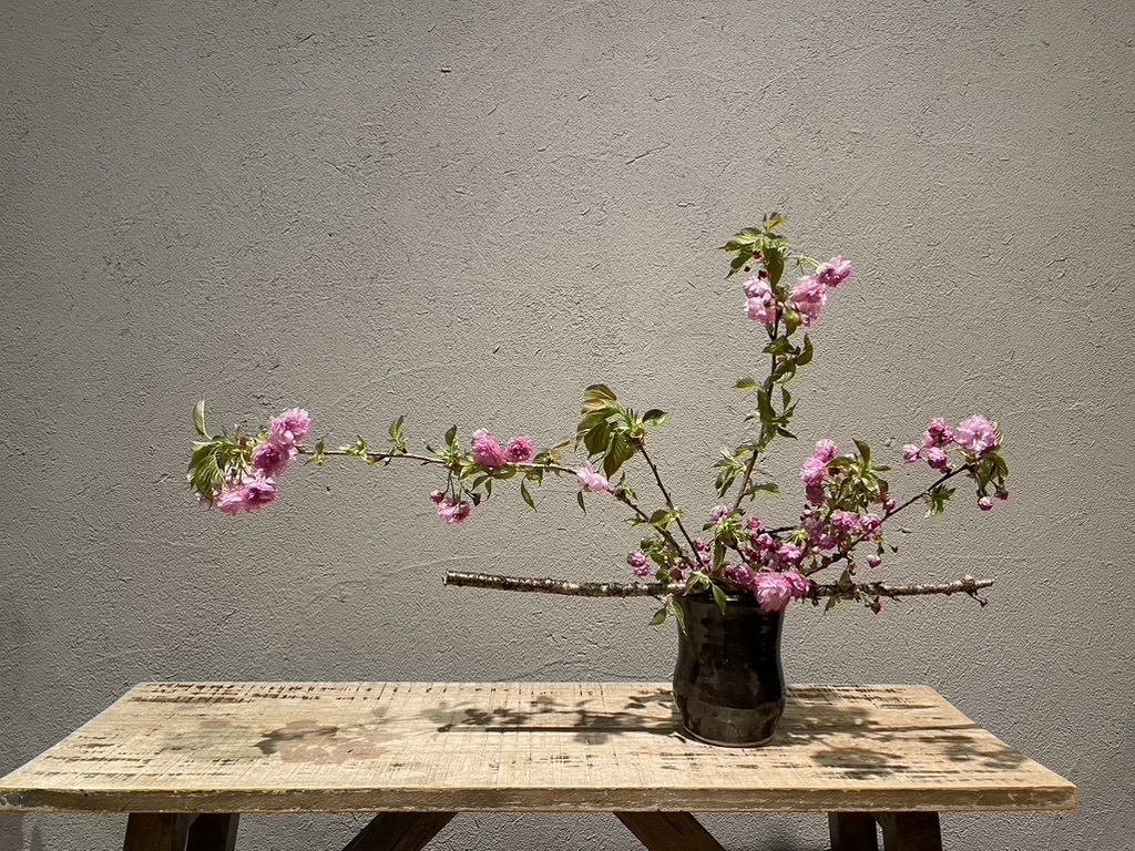
いけばなを習い始めて一番驚いたのは、切ることが意外にも怖いということ。花の輪郭や枝の美しさ、「線」や「余白」を際立たせるために、小枝や葉を切り落とす。でも、一度切ったら後戻りができない。繊細さのなかに、結構、勇気と大胆さがいる。
「きれいだからもったいない」と思って切ることを躊躇していると、その迷いは作品に如実にあらわれる。いけばなはとても正直なのだ。逆に思い切って切ってみたはいいものの、短く切りすぎて失敗したと思うことも。でも、今度はその花材を活かすいけ方を探せばいい。花器を変えてみたり、あわせる花材を変えてみたり、やり方はいくらでもある。「切ってしまった」ことで自由度が減り、使いづらいと思うかもしれない。だが、逆にみえてくることもある。
花材による制約はIDEOでいうCreative Constraint(クリエイティブ・コンストレイント:制約がクリエイティビティを高めるという考え方)だ。制約はクリエイティビティを阻むバリアと思われがちだが、クリエイティブ・コンストレイントは一歩、半歩踏み出すための方向性を示すディレクションであり、むしろ、試行錯誤を促し、とことん考えさせる動力だ。IDEOではあえてクリエイティブ・コンストレイントを使ってアイデアをブレストすることがある。例えば「明日から◯◯が消えたら」、「子供しかいない世界だったら」という制約を作ってアイデアをブレストする。
流派によっての違いはあるが、いけばなでは基本の「型」を学んだ後、「自由花」を実践していく。でも、いきなり自由と言われてもどこから手を付ければいいか分からない。だから、テーマを決める(線を極める、色を対比させる)。場所を考える(自宅の玄関、ホテルのロビー)。主役を決める(ひまわり、南天)。制約を課すことで表現の幅を思案する。
ビジネスデザイナーは、市場規模や予算など、ビジネス上の制約で外枠を作ってアイデアをフィルターしていく役割だと思われがちだが、IDEOでは制約を一つの支点として扱い、アイデアを発展させようとする。いまのアイデアのままではユーザーが限られ、市場規模が小さすぎる。だったら購入単価をあげる工夫はできないか、サービスの使用頻度を増やせないかなどの問いかけでアイデアの可能性をチームと巡る。言うは易しでなかなか上手くいかないことも多いが、制約とどう付き合うかが大事なのであり、自分にとって大きなマインドシフトだった。
作り手として責任、作り手としての主観を持つ
花は切り花になった瞬間からカウントダウンがはじまってしまう。だからこそ、その花が「いきる」姿を探すために、花の声に寄り添いたい。心を無にして花と対峙し、そこから見えてきたことを表現する。花との向き合いがいけばなの出発点だ。
花道家の上野雄次さんの花いけ教室に参加したとき、「いけばなはアート性が高い。それは作り手の主観が入るから」と話していたのが印象的だった。テーブルに飾って360度あらゆる方向から楽しめるフラワーアレンジメントに対して、床の間から発展したいけばなは見る人の目線が自然と限定される*。対峙する人に対して花の顔をどう設定するか。床の間という小さな舞台でどんな世界観を作るか。器に張った水や差し込む光でその世界観をどう演出するかを意識する分、作り手の意思が大事になるとのこと。
花材に、作り手の意思、主観が融合することで一つの作品ができる。だから、同じ花材を扱っていても、作り手の花の声の解釈によって表現は変わる。そこに個性がにじみ出て、自分らしさが「いきる」。

デザイン思考の基本は「人間中心」であること。いかにユーザーに寄り添い、核心を引き出す問いを立てられるかが大事になってくる。そこに聞き手の意思は入らないと思われがちだが、IDEOではあらゆる場面で個人の主観が求められる。ユーザーがなぜその言動をしたのかを想像したり、直感的に感じたことを持ち寄り、対話をすることで、多角的にユーザーの声を振り返る。同じインタビューを見聞きしてても人によって捉え方は違うし、大事だと思うポイントも人それぞれ。だから、同じテーマでも、チームによってインサイトやそこから生まれるアイデアが変わってくる。IDEOでいう「人間中心」とはユーザーに限ったことではない。ユーザーから得たインサイトに自らの意思をかけあわせてデザインしていく。
ビジネスの現場では客観性が重視されがちだ。具体性のあるロジックは多くの人に理解されやすい。でも、いけばなを習いはじめて、IDEOでの仕事をはじめて、その場その場で感じた直感や曖昧な主観をもっと大事にしたいと思うようになった。未発達で感覚的でもいいから、人に伝えることでそれが誰かの思考のヒントになるかもしれないし、言語化する過程で新しい気付きが得られるかもしれない。「なぜか」はわからないけど、「何か」を感じた自分の直感を大事にしたい。
*建築や生活様式の西洋化でいけばなも多方面から見られることを意識するようになっている。
ありかなしかなら、ありを選ぶ
桜は折ってもよい。これはれっきとした折り溜めという技法だ。ハランやニューサイランは水中に沈めてもよい。葉が丈夫なので数日水に浸かっていても雑菌が繁殖するリスクが少ない。ガラスの花器を使ってハランを水中にいけると鮮やかな緑が生える。
「これはありですか?」と先生に聞くと大抵力強い「あり!」が返ってくる。それでも花材の性質上、やらない方がいいことはあるし、まだ知らないこの世界の暗黙のルールがあるのではとつい考え込んでしまうときがある。そんなときは、ありの前提で、思うがままにいける。結果的になしだったとしても、それは学びになる。

「プロトタイプしよう」。IDEOではよく聞く言葉だ。プロジェクト中、これでもかというくらいたくさんのプロトタイプを作る。そして、それは商品・サービスに限ったことではない。仕事のやり方もよくプロトタイプする。Zoom疲れから、何か別の方法はないかとオンライン会議ツールのAroundやSlack Huddleを利用してチーム会議をしてみたり。クライアントに自己紹介アクティビティとしてTIKTOK動画を作らせたり。全社で年間のプロジェクト全ての振り返りをするポートフォリオレビューという会で夏フェスをテーマに「音」でそれぞれのプロジェクトを表現してみたり。好評で続くものもあれば「そんなこともやったね」とあっさり消えるものもある(大半が後者だ)。
「プロトタイプ」と言うと気が楽になる。完璧・完成ではない前提だから、気軽に試してみようと思える。最初から正解を弾き出そうとするとみえる世界が偏ったり、仕事の進め方も慣れた手法にデフォルトしがちだが、プロトタイプのマインドセットでいると柔軟になり、幅が広がる。上手くいかなかったら、すぐやめればいい。IDEOもありかなしかだったら、ありを選ぶ。

出典:『UN FIORE CON AMORE』ブルーノ・ムナーリ
変わり続けるから、学び続けられる
いけばなを習いはじめて、IDEOでの仕事をはじめて、物事への向き合い方が変わったように思う。花は、一度いけて終わりではない。次の日、そしてその次の日と、花の状態に合わせて、いけなおし、かたちを変えていく。アイデアも、商品やサービスとして市場に出て完成ではない。ユーザーの声を取り入れながら進化し続けなければ、いつか置いていかれる。
花もアイデアも「生きている」。変化するたびに学びがある。そして、さまざまな花とアイデアと対峙することで、私自身も変わっていく。デザイナーとして、人として、どのように変容していくのか、これからもその過程を楽しみたい。
花をいけるとき、心が躍る瞬間が2回ある。1回目は蕾がきれいに開いたとき。2回目はその花がきれいに枯れたとき。
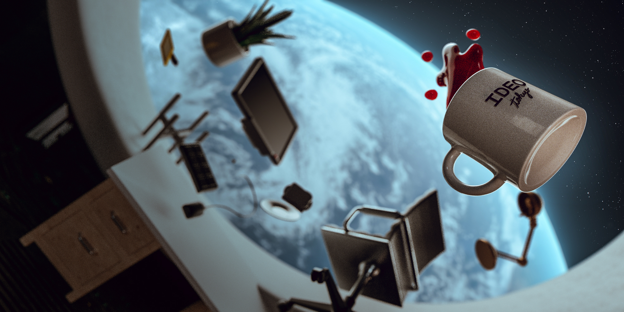
コーヒーカップが教えてくれた、宇宙旅行とデザインの未来
もちろん、これには理由がある。飲料がパックに入っていれば、液体が飛び散って宇宙船内の電子機器に付着することを防げるからだ。しかし、コーヒーを飲むという行為は単なる水分補給ではない。多くの人々にとって、朝のコーヒーは頭のスイッチを入れるための大切な儀式でもある。
この朝の習慣を宇宙でも再現したいと強く思ったのは、2008年に国際宇宙ステーション(ISS)に滞在したNASAの宇宙飛行士、ドン・ペティだ。ドンはISSで迎えたある朝、とうとうストローでコーヒーを飲むことに飽きてしまった。熱々のコーヒーの香りを楽しみ、啜って目を覚ます『体験』が恋しくなったのだ。
そこでドンは船内で見つけた透明フィルムを材料に、宇宙でも使えるカップの試作に取りかかった。無重力下での液体の動きを利用して、コーヒーが壁を登ってカップの縁に達するようにちょうど良い角度でフィルムを折り曲げた。そうして誕生したのが、涙型の「ゼログラビティ・カップ」だ。この発明によって、ISSに滞在するすべての宇宙飛行士は、コーヒーに限らずお好みのドリンクをカップに注ぎ、乾杯をし、地球を眺めながら味わえるようになった。
これまで各国の宇宙機関が重視してきたのは、宇宙飛行士の安全性を最大限に高め、コストを最小限に抑えることだった。その観点は今後も変わらず重要であり続けるが、この「おいしいコーヒーを飲みたい」というドンの素朴な願いは、これから宇宙旅行ビジネスが発展する上で考慮しなければならない数多くの欲求のひとつだ。一般人が宇宙に行くようになると、旅行者が宇宙でも人間らしく、より快適に過ごせるための体験をデザインすることが大切になる。
快適な宇宙旅行体験を目指して
ISSへの3日間の宇宙旅行のチケットが当たったと想像して欲しい。宇宙での生活なんてスターウォーズやスタートレックのようなハリウッド映画でしか観たことがないあなたは、抑えきれない不安とワクワクを胸に当日を迎えるだろう。
出発の日の朝、用意されたファッショナブルな宇宙服を身に纏い、宇宙船に乗り込む。そしてカウントダウンの合図とともに、地面が割れるような振動が全身を揺さぶり、体が座席に張り付く。すると数分後、急な静けさに包まれたと思ったら腕がふんわりと浮かびあがる。シートベルト解除のサインを確認したあなたは、他の乗客と一緒にフワフワと窓際に近寄り、自分の目前に浮かぶ地球の姿に思わず息を呑む。すぐに写真を撮り、インスタグラムに「#地球は本当に青かった」と投稿する。数時間後にISSに到着し、待望の3日間が始まるのだ。
しかし無重力環境になかなか慣れないあなたは、船内の電子機器やほかの旅行客にぶつかり、最初は笑い飛ばすが、徐々に気まずくなっていく。そしてポーチに入った食事を取り、チューブ型のトイレで用を足しながら残りの数日間を過ごす。初日の感動も時間とともに薄れ、最終日には人生最高の旅行がまるで試練のように思えるかもしれない。
このようなことが本当に起こると、せっかくの宇宙旅行が台無しになってしまう。そこで、ドンの遊び心に溢れた好奇心に感銘を受けたIDEOの有志が集まり、宇宙での滞在をより快適で楽しくする方法を模索し始めた。
1. 「遊び」で導く

無重力というと聞こえはいいが(そして科学的には微小重力なのだが)、私たち地球人にとっては身体的負荷が多い環境でもある。例えば、振り向くという単純な動作でも、今までとは全く違う身体の使い方が求められる。短い滞在期間を最大限に楽しむためには、できるだけ早く体の使い方を学び直す必要があるだろう。
ディズニーランドがテーマパークにおける「待ち時間」を「楽しい体験」に変えたように、身体的に辛くなりがちな無重力に慣れるための時間を、より楽しい旅のひとつの体験として再設計することは可能だ。遊びを通して、人々が無重力環境でより快適に過ごすための体の使い方を学ぶ手助けができるだろう。
私たちは幼い頃、好奇心と創造力に任せて日常の未知を探検し、視界に入るあらゆるものから刺激を受け、すべてを「遊び」に変えてきた。床をマグマに見立てて、椅子やクッションの上を飛び跳ねながらバランス力を鍛えたり。お互いの影を踏む遊びをしながら、時間と影の長さの関係について学んだり。この無邪気な世界の捉え方を、宇宙旅行にも応用できないだろうか?
2. 打ち上げから帰還までが宇宙旅行

宇宙旅行のクライマックスは、意外にも軌道上にたどり着いた最初の瞬間かもしれない。それは同時に、滞在中に徐々に興奮が冷めていく可能性も暗示している。
私たちは大人になるにつれて、場所から場所への最適な道のりを探すことに集中するあまり、道のりそのものを楽しむことを忘れがちだ。宇宙旅行も例外ではない。ISSに到着すれば、90分ごとに昇る日の出、宇宙から眺めるオーロラ、まるで電車からのぞく景色のように目の前を過ぎ去っていく大陸など、宇宙ならではの体験がたくさん待っている。さらに、地球の大気圏に再突入しながら窓の外が赤く光る光景、そして地上に着陸する瞬間の衝撃も貴重な体験の一部だ。その一つ一つの体験をつなぎ合わせて興奮のボルテージを徐々に上げて、テンションマックスの気分で旅の終わりを迎えられるような体験が望ましい。
どのようにすれば、打ち上げから帰還まで、宇宙ならではのユニークな瞬間が、グランドフィナーレまで続くような宇宙旅行プログラムをデザインできるだろうか?
3. 誰もが楽しめる体験デザイン
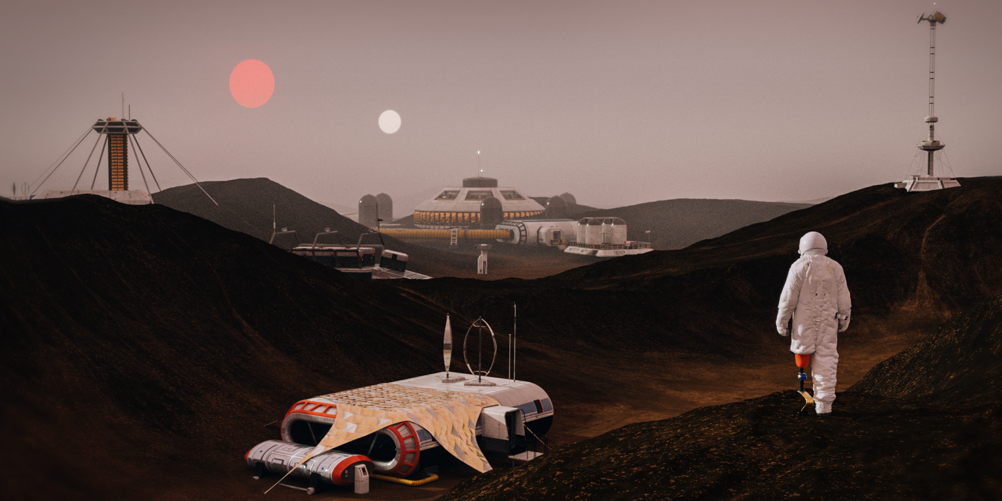
SpaceX社のクルー・ドラゴンによる世界初の民間宇宙飛行士ミッションには、骨肉腫サバイバーで、金属製のロッドを左足に入れているヘイリー・アルセノーが搭乗する。宇宙飛行士の選抜では身体面を含めた厳しい条件をクリアする必要があるが、民間宇宙飛行の基準は異なる。
ヘイリーの選抜は、宇宙に行ける人の定義が変わってきていることを象徴している。近い将来、さまざまな身体障がいを持つ人々が宇宙を訪れるようになるだろう。さらに、耳の聞こえない人は宇宙酔いに強い傾向があるなど、地上での不自由が宇宙では有利に働くケースもあることが証明されている。重力に縛られない世界では、障がいという概念さえも覆される。
地球上では健常者であっても、宇宙で生活すれば思わぬ事故は起きるだろうし、新たな障がいが出てくることも予想される。宇宙ジャーナリストのミリアム・クレイマーがAxiosに寄稿した記事で述べたように、「身体障がい者のために宇宙船を設計すれば、すべての宇宙飛行士の生活がより快適になる」のだ。
例えば、無重力環境は視力の低下を引き起こすことが知られている。そこで、視覚障がいを持つ人も宇宙旅行を楽しめるように、状況の変化を音や感触で伝えることはできないだろうか?五感を刺激する体験や船内構造をデザインすることで、誰にとっても快適で楽しい宇宙旅行を実現できるはずだ。
宇宙旅行の台頭は、人々の地球に対する意識を大きく変えるきっかけになるだろう。そのきっかけを最大限活かすためにも、最高に快適な旅行体験をデザインすることが重要になる。
もちろん、最初に宇宙に行けるのは裕福な人たちばかりだ。しかし、そのようなアーリーアダプターにとって最高の滞在を提供することが産業の発展を加速させる。やがて、より多くの人々が宇宙旅行を通して地球とより良い関係性を育むチャンスを与えてくれるだろう。
そして、無重力環境ではあらゆる常識が覆される。音楽バンドの「OK GO」の言葉を借りれば、「Gravity is just a habit (重力はただの癖)」だ。その体に染み付いた癖を一旦忘れることで、日常に隠れた人間らしさについて考え直し、あらゆるモノやコトを一からデザインできる。重力に縛られない世界では、誰もが子供のように未知と遊びながら日常を捉え直すことができるのだ。
次回はこれらの考え方を体現した、宇宙旅行をより快適で楽しくするコンセプトをいくつか紹介していく。それまで、みなさんのアイデアを是非聞かせてもらいたい。
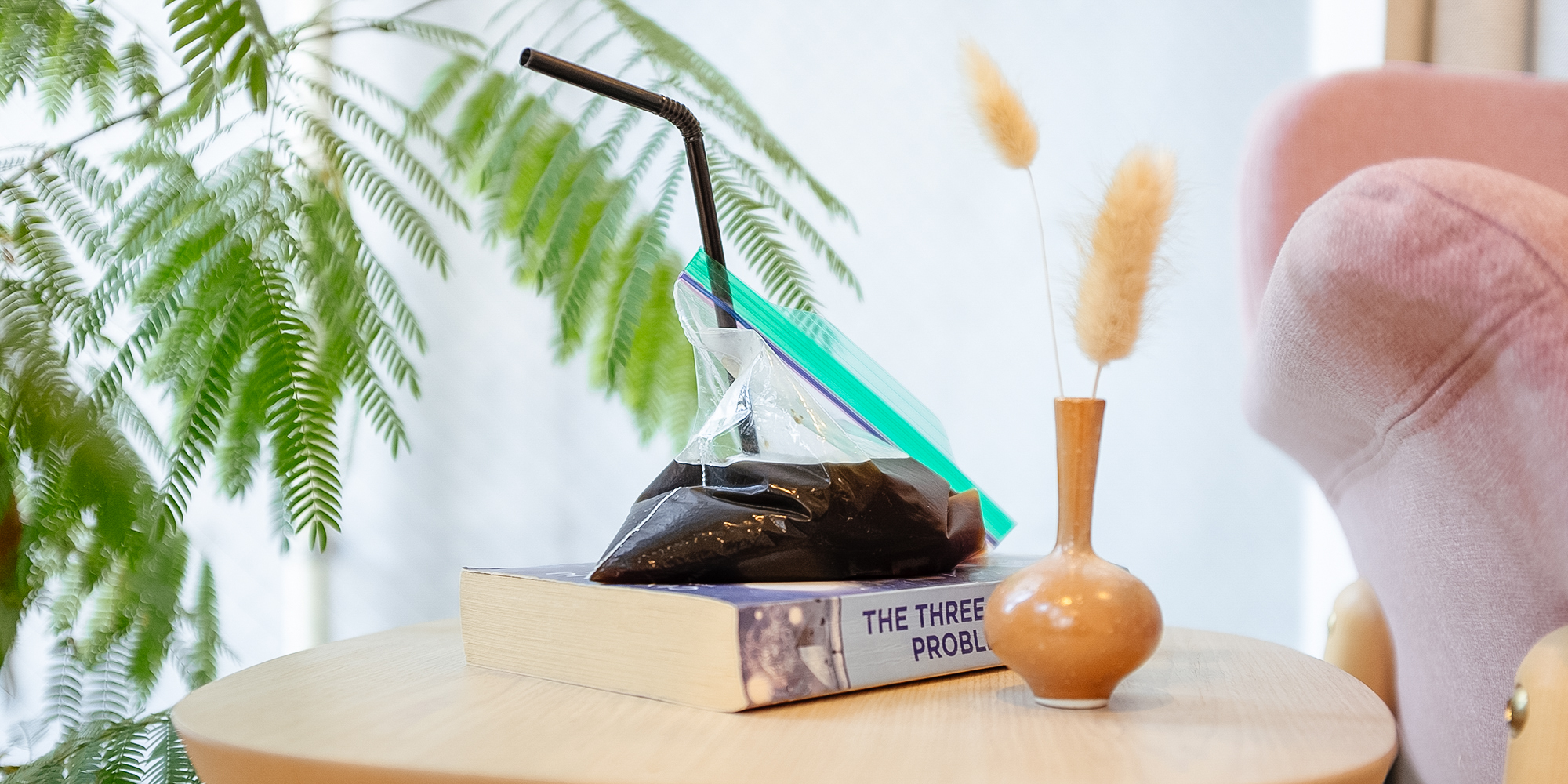
この記事を読む前に、まずコーヒーを淹れよう。とっておきのコーヒーができたら、ジップロックバッグの中に注ぎ込んで、ストローで飲んでもらいたい。これが宇宙での飲料の飲み方だ。お世辞にも美味しそうとは言えない。
English here
僕たちが中高生にデザインの力を本気で伝えたい理由
IDEOには、学校や企業向けの研修を積極的に行っていたり、創業者デイヴィッド・ケリーを始めとする多くのメンバーが教育機関で教鞭をとっていたりと、ド直球の教育的な取り組みも沢山ある。だが実は、そもそもIDEOが本業として行っているクライアントワーク自体がかなり教育的要素が強いのだ。
もちろん、どの案件も最終的にはデザイン会社として、プロダクトなりサービスなり空間設計なりのデザインに落とし込み納品するのだが、そのプロセス自体も同等な納品物として捉えており、我々が日々行っているデザイン思考をベースに制作の過程を少しでもクライアントチームに体験・理解してもらいたいという想いが非常に強い。
そのため、クライアントのコアチームにはなるべくデザイン・リサーチやブレストに参加してもらうし、エンジニアリングチームを持つクライアントであれば、プロトタイピングも僕達と一緒になって、まるで競い合うかのようにスピード感を持って作ることもある。結果そうした方が、プロジェクト終了後にクライアントチームがしっかりとそのプロジェクトを引き継げる、また組織内のプロジェクトへの理解が浸透しやすい、といったコンサルティングとしての意図も当然ある。だが、それにしてもやり過ぎなのでは、と思うくらい、クライアントチームを巻き込むことへの努力とコストを惜しまないのである。
特に我々東京スタジオにおいては、これが顕著である。つまり、デザインを納品することと、そのデザインに行き着く制作過程にどっぷり浸ってもらうことが、同等の価値を持つと考えられている。まるでモノ作りを行うデザイナーとしての自分と、デザイン思考を伝える教育者としての自分、その両者を常にどのプロジェクトでも求められているような感じだ。
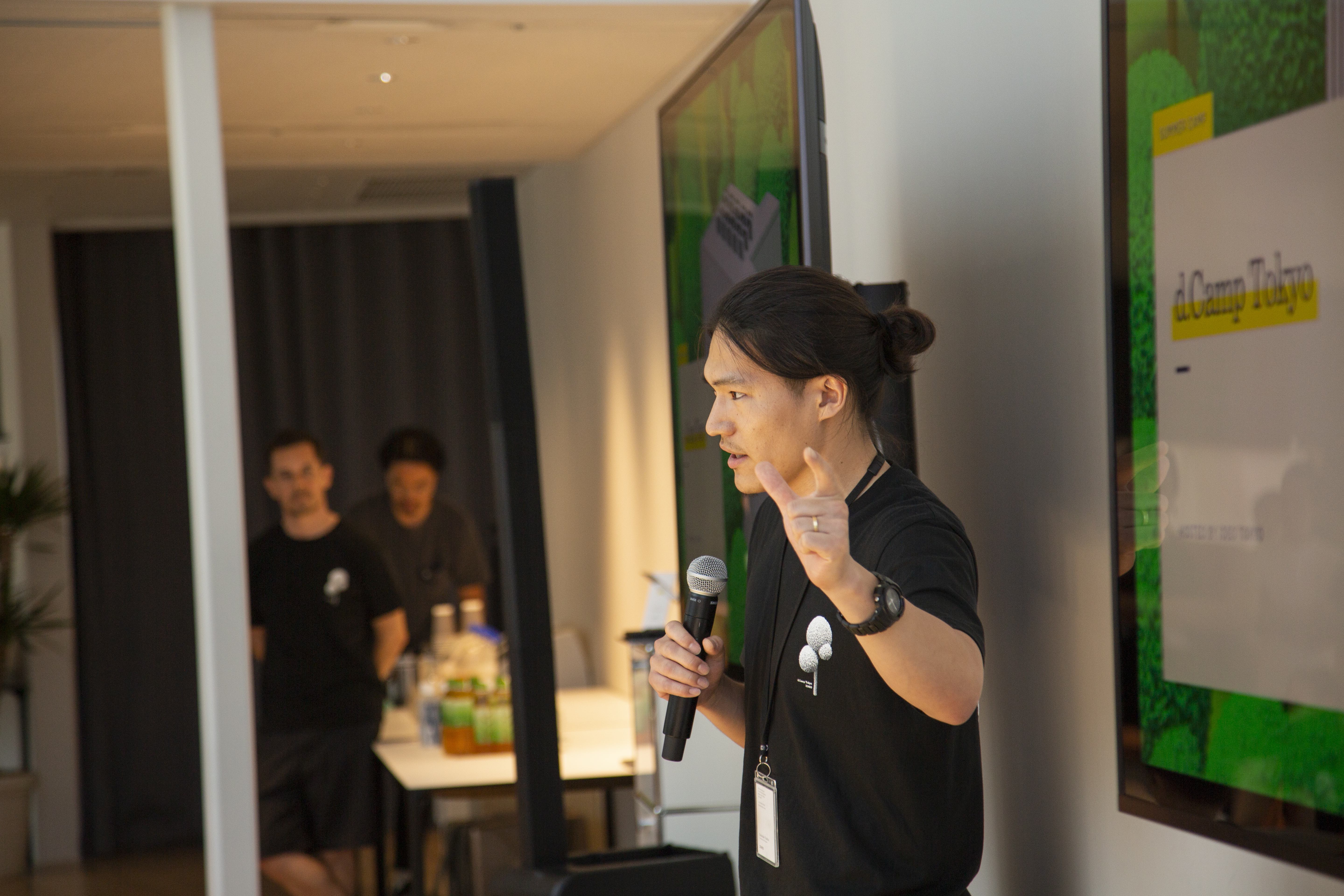
かくいう私も、何かを作ることと同じくらい(もしくはそれ以上に)、作る楽しさとその社会的意義を少しでも多くの人に広めたいという想いを持ってIDEOに転職してきたので、こうした文化が組織の隅々まで浸透していることを誇らしくなったことが何度もある。(そもそも、最終面接で最後に僕から「皆さんの理想のプロジェクトは?」と聞いた際に、同席していた3名のデザイナーがが口を揃えて「学校をつくりたい」と言っていたことが入社の決定打となったので、当たり前といえば当たり前なのかもしれないが。)そして、そんなIDEOのデザインと教育の両者への想いの交差点に鎮座しているのが、d.campである。
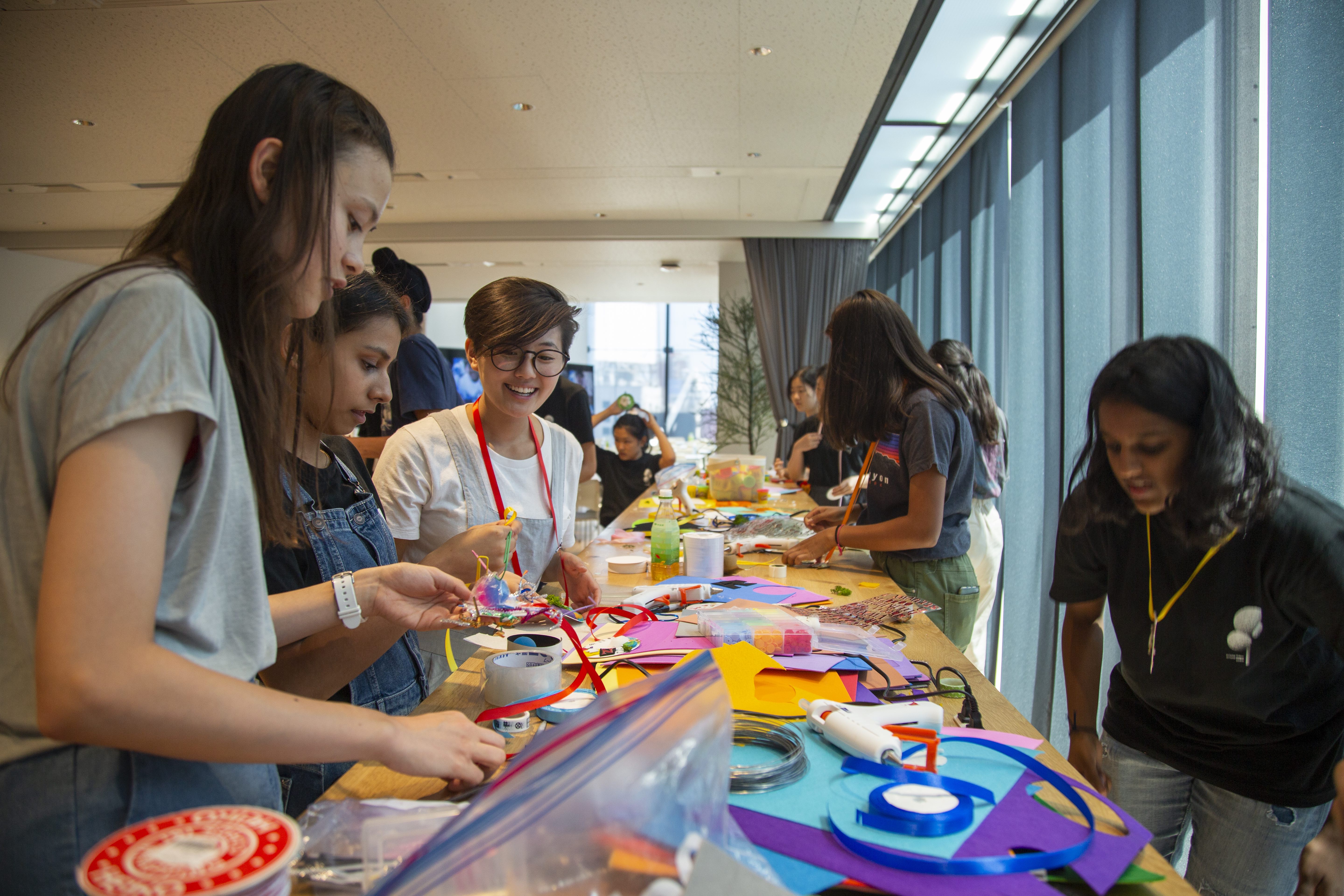
d.campとは、もともとシリコンバレーの創業スタジオで始まった取り組みで、中高生を相手にデザイン思考を体験してもらうサマーキャンプである。3年前から東京スタジオでも実施されるようになり、去年と今年はコロナウイルスの影響で完全オンラインで行った。スタジオによってオペレーションは異なり、有料で開催しているところもあれば、東京スタジオのように今の所無料で実施しているところもあるが、概ね5日間のサマーキャンプ形式である点は統一されている。
国内の中高でもデザイン思考が登場することは増えてきたが、微分積分やフレミングの法則と同じような感覚で「単元」として捉えられてる節がある。そうではなく、己の手で作り上げたもので周囲の誰かを少しでも幸せにする「体験」としてデザインを体感してもらうことが、より一層不確実性を増す今後の社会を生き抜く世代に不可欠なように思う。
デザイナーがデザインを教える
東京スタジオのd.campでは、毎朝ちょっと変わったエクササイズから始まる。即興演劇を行ったり、ひたすら落書きをしてみたり、といったいわゆるアイスブレイクのようなものから、実際に一片15cmの氷の立方体を「アイス・ブレイク」してみたり、Google Slideを使ってチームでZoom背景を共同で作ってみたり、といったクリエイティブなアクティビティもある。それが終わると、IDEOの数多のデザイナーが自分の専門分野についての簡単なワークショップを行う、「クラフト・モジュール」が行われる。午後は、5日間を通してデザイン思考を使って挑んでいく 、「デザイン・チャレンジ」を進める時間だ。リサーチ、シンセシス、問い立て、アイディア出し、プロトタイピング、ユーザーフィードバック、といったプロセスを、行ったり来たりしながら、チームで進めていく。その途中で、現役のIDEOのデザイナーたちと少人数でのコーヒーブレイクがあったり、共同経営者のトム・ケリーによる人生相談タイムがあったりもする。
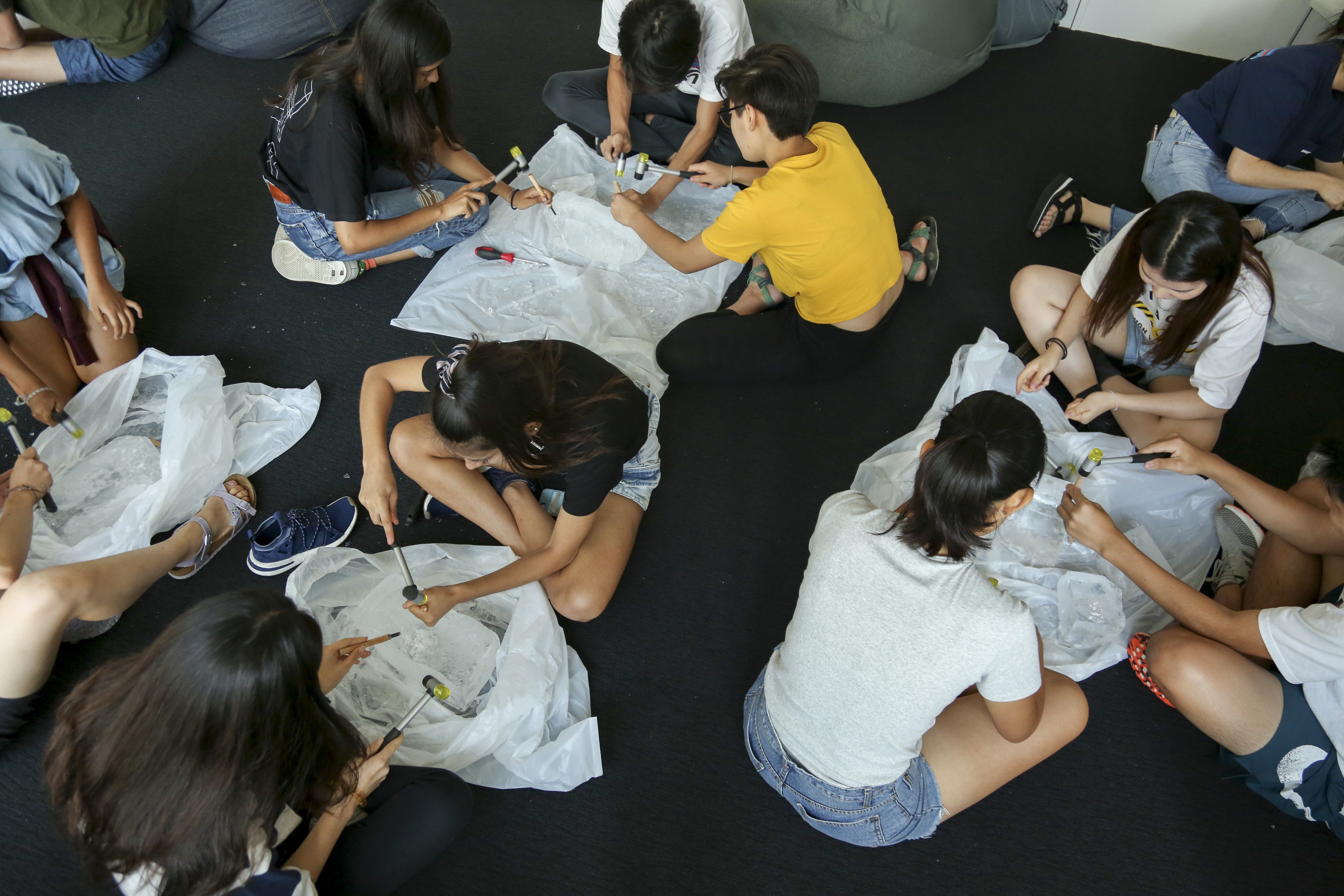
盛り沢山なコンテンツで、一日中頭をいろんな方向に切り替えるように設計してあるが、根底として絶対にブレないのは、デザイナーがデザインを教える、という構図である。当たり前なようで、意外と珍しいことでもあるのだが、各分野のプロがその分野について教えることが、d.campの大事な価値の一つだ。最近作っているものの紹介や、実際にプロジェクトで苦労したこと、それを乗り越えて出てきたプロトタイプ等、プロフェッショナルが試行錯誤した実例はとてつもなく贅沢であり、信ぴょう性がある。
更には、ビジュアル・コミュニケーション・デザイン担当のデザイナーが実はその年のd.camp自体のブランディングを行っていたり、それまでキャンプで使っていたツールが実はインタラクション・デザイン担当のデザイナーが自作したものであったことを知らされたりすることで、制作物と製作者の距離がぐっと近付く。
そして何よりも、「これなら自分でもできるかも」、と思ってもらえる。言うまでもなく、デザイナー一人ひとりも普通のいち人間であり、悩むこともあれば、つまずくこともある。そして、培ってきたスキルも、これまで経験してきたことの積み重ねにすぎない。そうしたIDEOメンバーの人間くさい思考や実験を知り、体験してもらうことで、「何かを作り出すという行為は、思っていたほど遠いものではないのかもしれない」と知ってもらいたい。そもそも、日常的に無自覚にデザインを行っている人たちは沢山いる。現CEOのサンディ・スパイカーは「既に自分達は日々デザインを行っていたのだと気付いてもらうことが大事だ」と言っているが、まさに自覚するだけで、自分のクリエイティビティに対する理解と自信が強化され、より自由に毎日が過ごせるようになる。
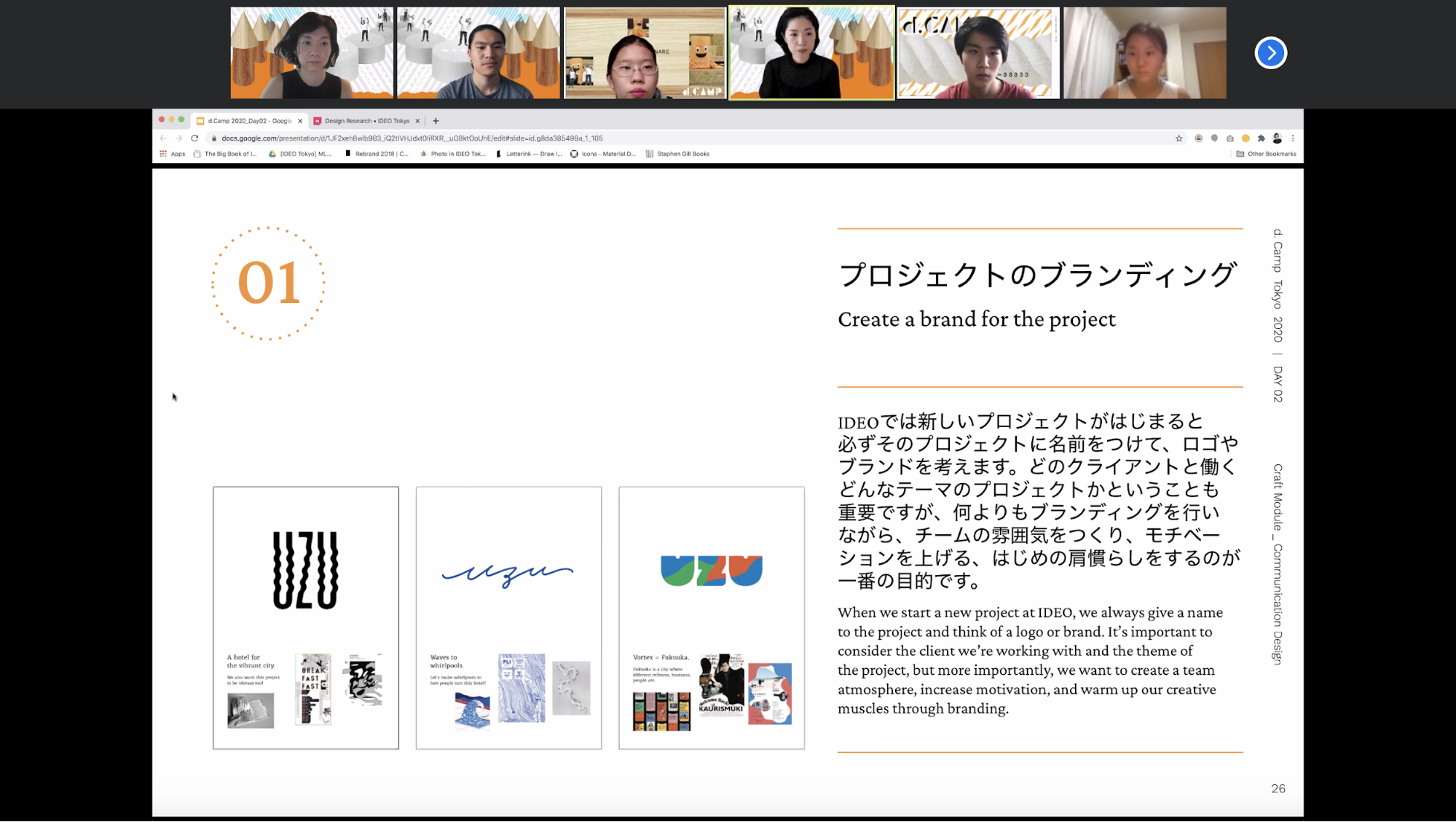
デザインする力は、スーパーパワーである
なぜそこまでデザインする力を身近に感じてもらいたいかというと、デザインする力は、スーパーパワーであるからだ。まず、何かを作れるようになると、その必然的な結果として、世界のあらゆるものごとに対して、「自分だったらこう作るのに」と考えるようになる。
そうした「目」で世界を見れるようになるだけで、いかに世の中が完璧からは程遠いかということに気付き、その改善案を常に頭の中で模索し続けるようになる。
どうしてこの家はここに段差を作ってしまったのだろうか、どうしてこの機械はこんなところにボタンを配置したのだろうか。
数あるスティーブ・ジョブスの名言の中でも、 ”Life can be much broader once you discover one simple fact. And that is: Everything around you that you call life was made up by people that were no smarter than you.” (とある事実に気付いた時、人生の可能性は更に開ける。その事実とは、あなたが世界と呼んでるものが、あなたより賢いわけではない同じような人々が作り上げたものである、ということだ。) という言葉があるが、まさにこの「目」(モノやコトは自分の手で変えられる、作れるという捉え方) についてのことだ。
少なくとも僕は、デザインを学び、自分でアイディアを考え、プロトタイプし、木工、鉄工、電子工作、プログラミング等をするようになってから、この事実にハッと気付くことができた。そしてそれに気付いてからは、”you’ll never be the same again (もう元には戻れない)”。
もう一つのデザインのスーパーパワーが、それを周りの大切な人たちへと還元できることである。IDEOのメンバーの多くは、何か新しいモノやツールが必要になったときに、まず最初に、自分でどう作れるだろう?と考える。
かくいう僕も、家にキッチンカウンターが必要だったので作ったし、コロナの手洗いがしんどくなってきたのでそれを楽しくするべくGoogle Assistant用の手洗いDJアプリ(手洗いをしている20秒間に当てはまる曲を自動で選曲してくれる)を作ったし、オンラインで行うワークショップにどうにかして手触り感を戻したく、遠隔ハイタッチシステムを作った。何かを作り出せるようになると、自分や、自分の大切な人たちの困りごとが、自分の手によって少しだけでも良い方向に変化を起こせるかもしれない、という希望に変わる。かくして、デザインという力を手に入れた人は、スーパーパワーを手に入れるのである。
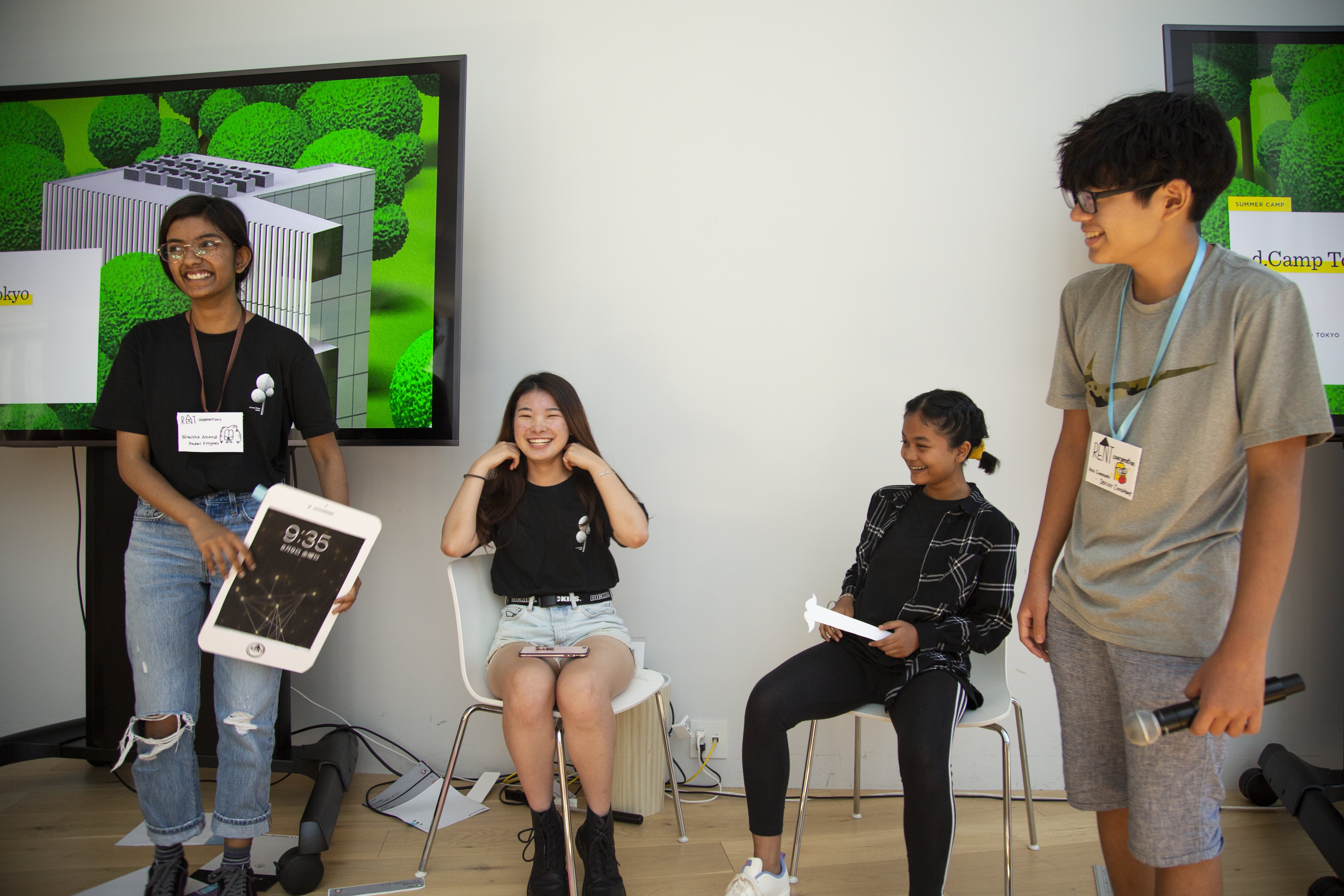
総クリエイティブ・コンフィデンス時代を目指して
このスーパーパワーは、心理学の用語ではSelf Efficacy(自己効力感)であり、それをデイヴィッド&トム・ケリー 兄弟がIDEO流に翻訳した結果が、クリエイティブ・コンフィデンス(創造性に対する自信)である。おそらくIDEOに限らず、モノづくりに携わる全ての人たちが、このクリエイティブ・コンフィデンスを自覚した瞬間があるはずだ。そして、僕たち自身も、まだこのクリエイティブ・コンフィデンスを拡張していく長い旅路の真っ只中にあるように思う。
自分の周囲10mの範囲内の困りごとに対して何かポジティブな変化を起こせると気付いた人は、次に周囲100m、1km、100kmと、自分が変化を起こす範囲を少しずつ広げていくことができる。その過程で、一人でできることの限界を知り、今度は仲間と一緒に、より大きな課題へとぶつかっていくようになる。結果として、新しい電化製品、自転車、医療器具、学校、政策など、より規模の大きいデザインを行っていくことができる。
d.campにこれまで参加したキャンパーたちは、(知ってか知らずか)この果てしないクリエイティブ・コンフィデンスの旅路の一歩目を踏んでもらっているのである。
VUCAと呼ばれるこの時代、更にはパンデミックの先行きが未だに見えない中では、このクリエイティブ・コンフィデンスを華麗に使いこなし、主体的に動ける人たちが一人でも多く必要である。その一歩目を踏み出すことをサポートし、かつそれがいかに楽しくて素晴らしいことであるかを知ってもらうことが、d.campの目的であり、ひいてはIDEOという組織の隠れミッションであるように思う。
僕がIDEOに入って驚いたことは沢山ある。みんなが17時にはあっという間に帰宅してしまうことや、ワインを片手に作業することなど、いわゆる外資の洗礼みたいなことも多い中で、特に驚いたのが、IDEOという会社が教育にかける想いの強さである。

Lindsey Turner
I’m passionate about building brands, products, and experiences that help organizations show up with meaning and momentum.
I help organizations cut through complexity by shaping how they show up, through brand strategy, identity, and storytelling.
Working at the intersection of brand and business, I bring an editorial eye and a bias toward making—turning ideas into tangible experiences that people can understand, trust, and believe in.
My work spans government, healthcare, financial services, media, and consumer goods, from launching Gen Z-focused ventures to building innovation labs and reimagining legacy brands. I relish moments of ambiguity and enjoy translating across teams, perspectives, and priorities to move ideas forward.
I started my career in editorial and digital design, shaping cross-platform experiences and identity systems in publishing and agency environments. That foundation still shapes how I work today: I’m detail-oriented, collaborative, and overreliant on the Oxford comma. I hold a BFA in Visual Communication from the School of the Art Institute of Chicago.

Rachel Young
My work helps organizations see who their products aren't working for—and build the will and the tools to do something about it
For 25 years, I've asked the same question: Who does this design exclude—and what are we going to do about it?
My work spans human-centered strategy, inclusive design, and qualitative research, with clients ranging from Microsoft, Google, and Verizon to the National Science Foundation, and San Francisco Unified School District.
Before IDEO, I taught elementary school in East Palo Alto and spent a decade doing design work with social service organizations—where I learned firsthand what it costs people when systems are built without them in mind.
I am currently writing User Error, a nonfiction book about digital access and the design decisions behind it. I live in Oakland, California.

Brian Pelsoh
I lead with craft, ensuring our work is creatively excellent: rooted in deep human insight and imagination, while also grounded in the realities of business and technology.
My expertise spans brand, communication, and product design across tech, education, the arts, and social impact.
I believe great work demands both high-level vision and obsessive attention to detail, and only happens through collaboration.
I bring an inclusive, hands-on approach and a deep understanding of business, which enables me to consistently deliver excellence while always asking why.
Before joining IDEO, I worked at the brand firms Pentagram and VSA Partners. I began my career as a designer, leading teams at the School of the Art Institute of Chicago and the Milwaukee Art Museum. I hold an MFA in graphic design from Maryland Institute College of Art and a BFA in communication design from the Milwaukee Institute of Art & Design, and have taught at some of the best design schools in the US.

Tony Wong
I am responsible for IDEO’s long-term success in China and working with clients to use design as a tool to enable growth.
I am responsible for IDEO’s long-term success in China and working with clients to use design as a tool to enable growth. Specifically, I have helped Chinese companies design holistic brand solutions through the development of their products, communication, services, and innovation teams, and I have helped multinationals expand their presence and influence in China.
I advise global leaders on developing China-led innovation and capabilities.
In over 15 years in IDEO Shanghai, I have worked on projects that use design to elevate the quality of the experience of healthcare products and services, streamline processes that increase productivity, create spaces and programs that promote and enable inclusive communities, and build next generation mobility solutions that are planet-positive.
Before joining IDEO, I worked at Philips Electronics and the Electrolux Group in Italy, the Netherlands, and Singapore on a number of breakthrough commercial products. I am a member of the Young President Organization in Shanghai.

Building a personal AI for the messiness of life: Sida Li
Most AI products today are built for work—a space with clear problems and established systems. One founder noticed a gap: personal life is messier, harder to systematize, and mostly left behind by the AI boom. So she built Cue, a personal AI that lives inside iMessage and group chats, to go where the other tools haven't.
In this episode, Becca Carroll, IDEO's Chief Strategy Officer, talks with Sida Li, co-founder and CEO of Shared Context Lab, about staying anchored to a human need while the technology around her keeps changing shape, why she treats her business model with the same rigor she'd bring to a product, and what it feels like to build a company at this particular, disorienting moment in AI.
The conversation also gets into how Sida makes design decisions: the language Cue uses to describe itself, the tradeoffs behind building inside iMessage instead of a new app, and a real story about a business idea that didn’t pan out.
This is the second in a two-part series profiling founders from IDEO's Startups-in-Residence program. The first conversation is with Johannes Seemann, founder of Sooner, on designing GenAI for the emotional side of money.

Designing GenAI for the emotional side of money: Johannes Seemann
Most personal financial tools are built to run the numbers and optimize towards a budget. While that works for some, most people experience money as a lived relationship that does not neatly fit into a spreadsheet. Johannes Seemann and Becca Carroll discuss why money is emotional before it is mathematical, and what a human-centered approach to building a generative AI financial product looks like in practice.

The curious leader's edge in uncertainty: Scott Shigeoka
Mina Seetharaman talks with Scott Shigeoka, author of Seek and Head of Curiosity Cultivation at the Eames Institute, about what distinguishes genuinely curious leadership from performative curiosity, how power dynamics shape curiosity, and why practicing curiosity can restore energy rather than drain it.

How constraints make us more creative: David Epstein
Mina Seetharaman talks with David Epstein, author of Inside the Box and Range, about why total freedom often produces average work, how leaders can design useful limits on purpose, and what organizations such as General Magic and Pixar reveal about the relationship between boundaries and creativity.
Looks like you might be in search of something very specific?
Or reset the filters above and try another angle.
Here’s some random inspiration

Podcasts about creative leadership

Articles about the power of prototyping
