
.svg)



Mental health, co-designed
Kooth partners with young people to create Soluna, a mental health resource for California youth.
Increasingly, digital spaces are proving detrimental to youth mental health. By co-designing with youth, Kooth and IDEO set out to flip the script, creating a positive digital space for young people to safely explore their mental wellbeing.
When Kooth, IDEO, and Blackbird, IDEO’s longtime development partner, first started working on the project, the window of opportunity was narrow, and the stakes were high. The group was up against a nine-week deadline to create a working proof of concept app. Also on the line: a $188 million contract with the Department of Health Care Services (DHCS)—one that would open an entirely new line of business for Kooth.
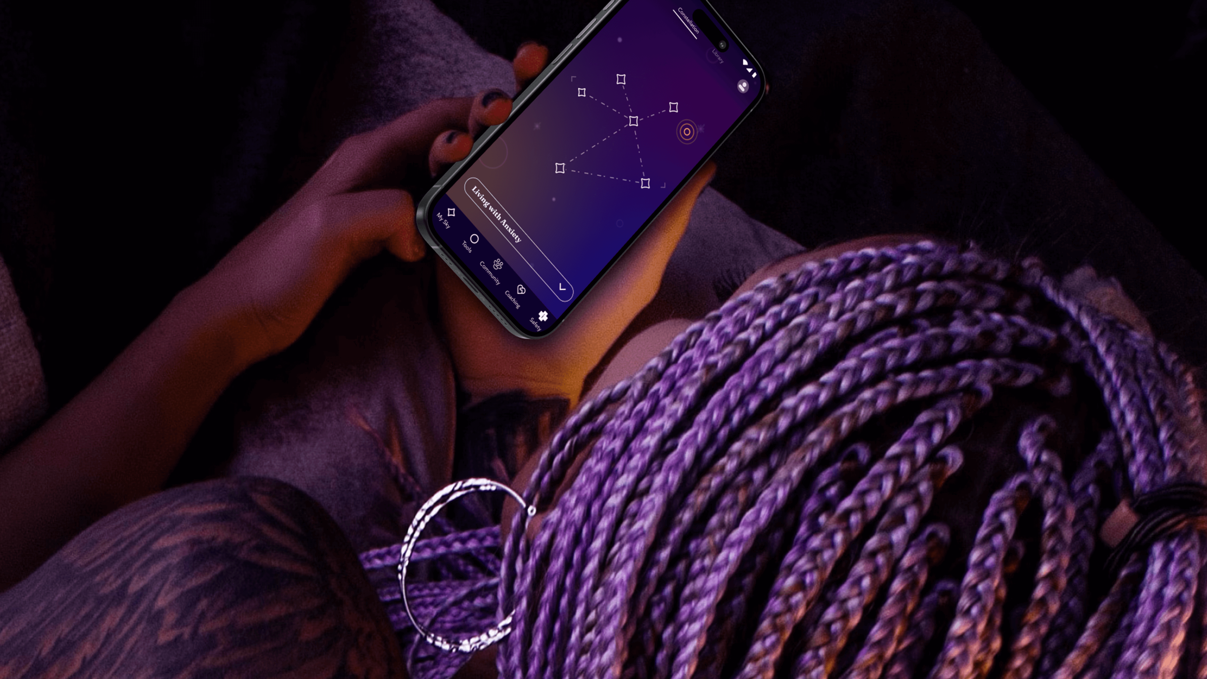
The app needed to do more than demonstrate functionality—it needed to prove its value. To ensure that they were creating an asset that truly fit the needs of young people, the team turned to an initial cohort of 13-25 year-old co-designers who explored early features, created video diaries, and shared their questions about and experiences with mental health. These young people often gravitated toward self-service tools that helped them take action based on their feelings. With their feedback, the team created new expressions of clinically-validated behavioral health tools like journaling, breathwork and white noise—and built novel tools, such as Starboard, an expressive drawing tool and a nod to art therapy.
The team took inspiration from content the co-designers liked to consume, such as story-driven video games that enable freedom of exploration, deepened by a unifying mythology. That led them to a constellation theme, which made the experience more intriguing and playful. The co-designers also recommended a dark color palette, because they preferred exploring the app at night.
With these insights, the team refined the proof of concept, and then conducted a one-week pilot with another 50 young people across California. Their positive feedback gave the State the confidence to invest in a $188 million, four-year contract for Kooth to bring the app to a platform at scale.
Over the next year, the team engaged another 150 young people to help design, shape, and test the app. At the same time, Kooth and IDEO created a clinical oversight group, which included a pediatrician, therapists, and other clinical specialists. This group anchored the platform in the practices of Acceptance and Commitment Therapy (ACT), cultivating psychological flexibility—the mindful acceptance of positive and negative emotions. Young people are invited to complete short reflections and surveys throughout their journey with the app, which includes rigorous, science-backed measurements to assess the therapeutic benefits.
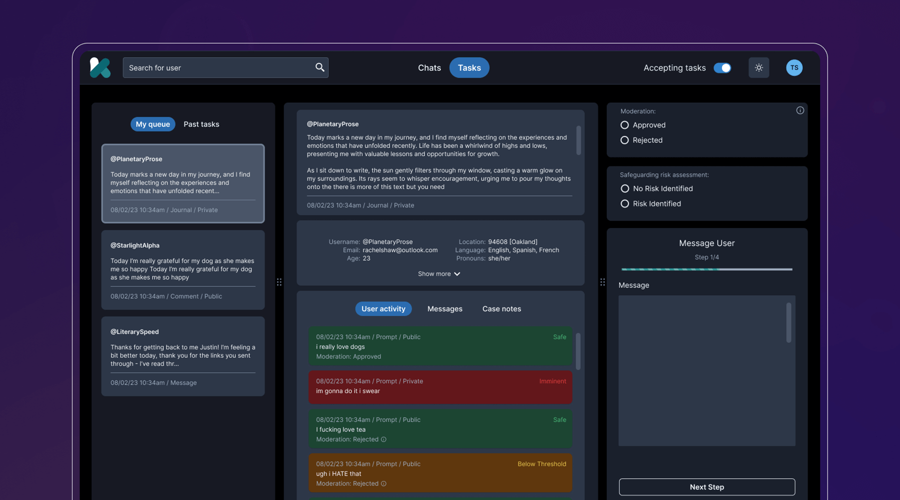
Behind the scenes, the team developed a clinical-facing service and digital platform that empowers Kooth’s peer specialists, social workers, community curators, and clinicians to support the youth experience, all while protecting privacy and confidentiality. They also navigated a complex landscape of state requirements and government legislation, ensuring that the platform could cover topics like substance abuse and gender identity, and that users could access coaching within 24 hours, and choose from a diverse set of experts.
The last step was to select a name that worked across multiple languages, trademarks, and competitor branding, and didn’t come off as a mental health service, something the youth co-designers believed was critical. IDEO and Kooth landed on Soluna, a name that alludes to the app’s presence in both the bright (“sol” for sun) and the dark times (“luna” for moon).
Now, Soluna is available for free to all youth in California, and the state has set ambitious targets for reaching all young people at scale. Soluna is a living platform that will continue to receive product and design updates for years to come, all deeply rooted in youth co-design.
The US Surgeon General named mental health “the defining public health crisis of our time,” and cited social media, online bullying, and the isolation exacerbated by the COVID-19 pandemic as major drivers that have significant negative outcomes for youth.
In California alone, more than 284,000 youth cope with major depression. 66% of kids with depression do not receive treatment. Between 2019-2020, the suicide rate for kids ages 10-18 increased by 20%.
In 2022, California Governor Gavin Newsom’s Master Plan for Kids’ Mental Health set aside $4.6 billion to increase access to mental health and substance abuse support, the largest commitment to youth mental health ever made by a state.
94%
of proof-of-concept app users would recommend the Soluna app to a friend, and believe that engaging with the app would be a positive addition to their daily/weekly routine
6 million
young people in California had access to Soluna at launch in January 2024
A more comfortable Pap smear
Teal Health creates a system for at-home cervical cancer screening.
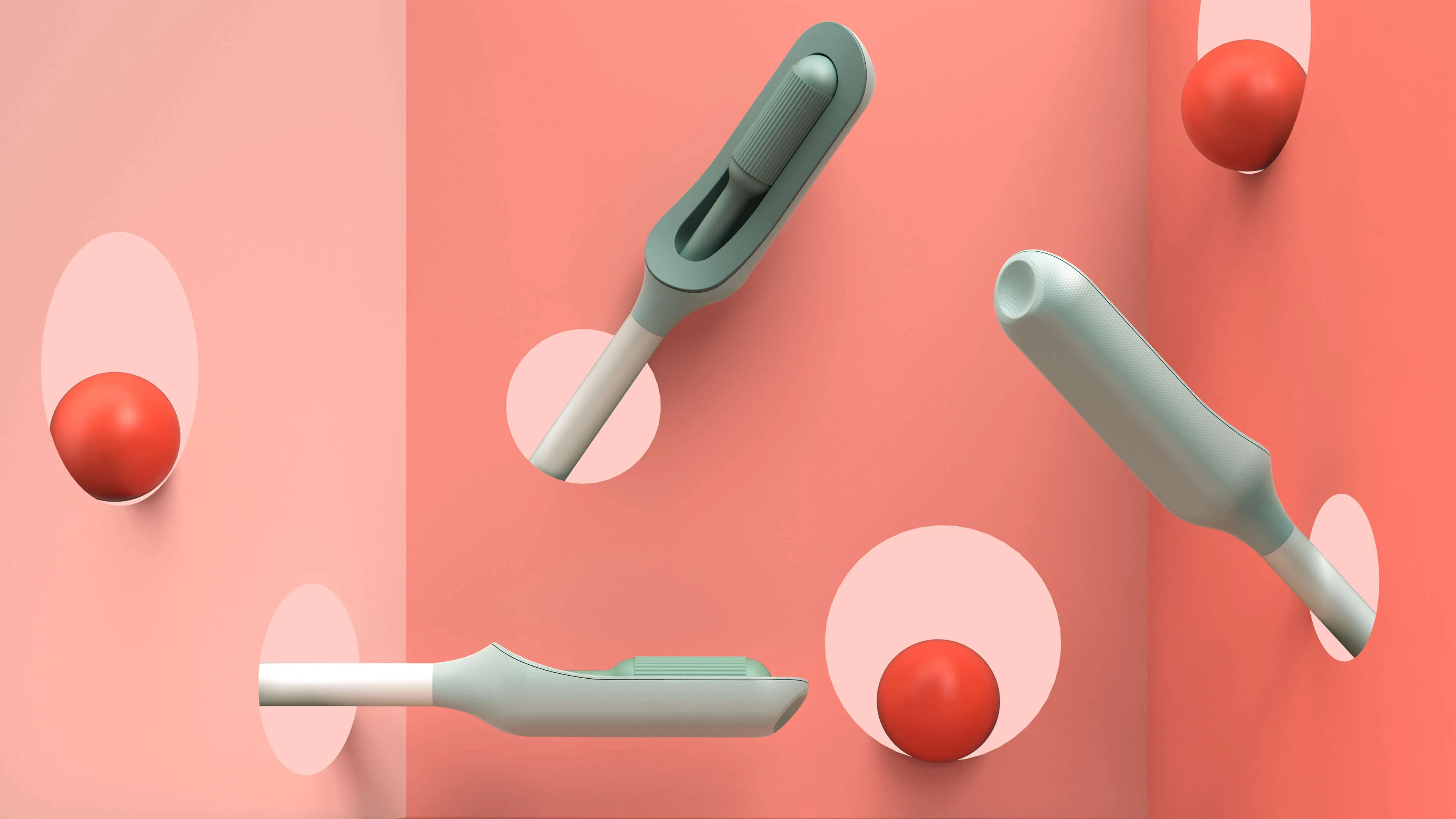
Creating a better cervical cancer screening experience is an important mission, but also a challenging one. Not only would Teal have to address the regulations that face healthcare device companies, it would also need to build a comprehensive telehealth platform and a physical product—a wand that could easily collect an adequate cell sample, even in the hands of an untrained person.
The first challenge was to create the wand. The device would need to do a lot: It’s impossible for a person to see their own cervix, so the user would have to be able to find the cervix blind, collect the sample themselves, and remove the wand from their bodies without contaminating it on other parts of their anatomy. Because this is something users are likely to do in their bathrooms, where there is no space to lie down, they would need to be able to use the device while standing—and with one hand. From the beginning, the IDEO team set out to design functional, testable prototypes to make sure the idea was viable, and incorporate diverse voices into the research process, including trans, minority, and disabled women.
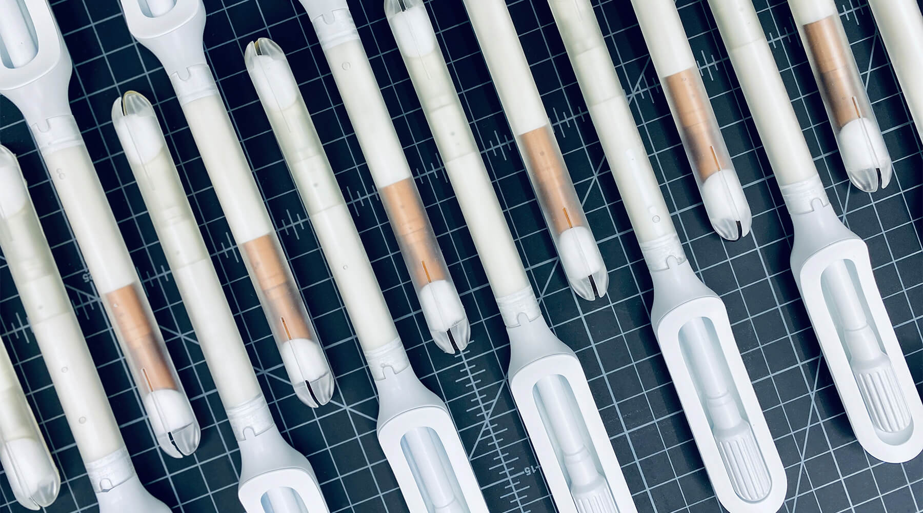
Because the product is meant for people who aren’t medical professionals, the team worked to design something as simple, intuitive, and unintimidating as possible. They used a 3-D printer to create multiples of every prototype, autoclaves to make sure that the designs they were creating were sterile, and leaned into shapes women are already used to, like the cylindrical shape of a tampon. The wand they created has that same basic form, but with a soft sponge that the user can deploy with the turn of a dial to collect the sample, then close to protect it from contamination on the way out of the body.
With working prototypes in hand, Teal set out to test their efficacy. In an initial study with 220 participants varying in age, race, socioeconomic status, and geography, Teal found that not only were participants able to successfully self-collect samples, they also preferred them over the speculum, the device doctors typically use during a screening. Some 92 percent said if they knew the results were equal they would prefer self-collection, while 87 percent reported they would stay current with screening if Teal Wand was an option. Self-collection took the vast majority under two minutes to complete, and 97% of study participants reported it was very easy or easy to use. The Teal Wand recently received a patent for its unique design.
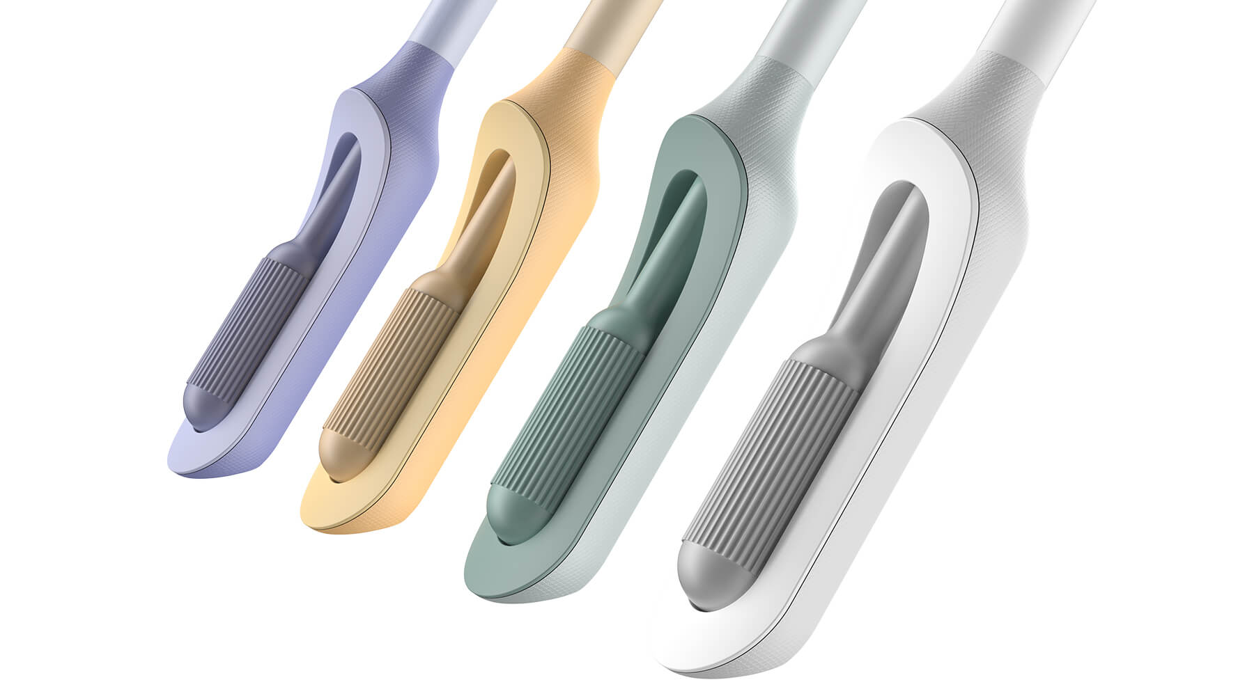
The IDEO team also worked on the packaging and unboxing experience, which plays an important role in supporting the user through the self-screening process. The team built in thoughtful design cues to give users reassurance that they are using the wand correctly, and to provide the same level of confidence they would have in the results of an in-clinic screening.
In January 2023, Teal raised an $8.8 million seed round from Serena Ventures, Emerson Collective, and Metrodora, and later that year, launched a nationwide clinical trial with leading health organizations including Johns Hopkins University, Yale University, the University of Colorado, Washington University, and others. In 2025, The Teal Wand became the first FDA-authorized device for at-home cervical cancer screening, with virtual medical provider support. Today, it's available in all 50 states. i’s an enormous step toward its North Star: catching cervical cancer earlier and saving lives.
Cervical cancer is nearly 100% preventable when it’s caught early, yet one in four women in the US are not up to date on their screenings.
More than 12,000 people in the US are being diagnosed with cervical cancer every year, and more than 4,000 people die of the disease, which disproportionately impacts Black, Asian, and Hispanic women.
More than half of cervical cancer cases are found in women that are not up-to-date on their screenings.
97%
of clinical study participants said the Teal Wand was very easy or easy to use.
87%
of participants said they would be more likely to stay current with screening guidelines if Teal Wand was an option.
94%
of participants said they would choose to collect their own sample from home rather than the current standard of care where a clinician collects it in-office.
2025
The Teal Wand becomes the first FDA authorized device for at-home cervical cancer screening, with virtual medical provider support.
Amplifying a movement
Cities United rebrands to create safe, healthy, hopeful communities for Black men and boys.
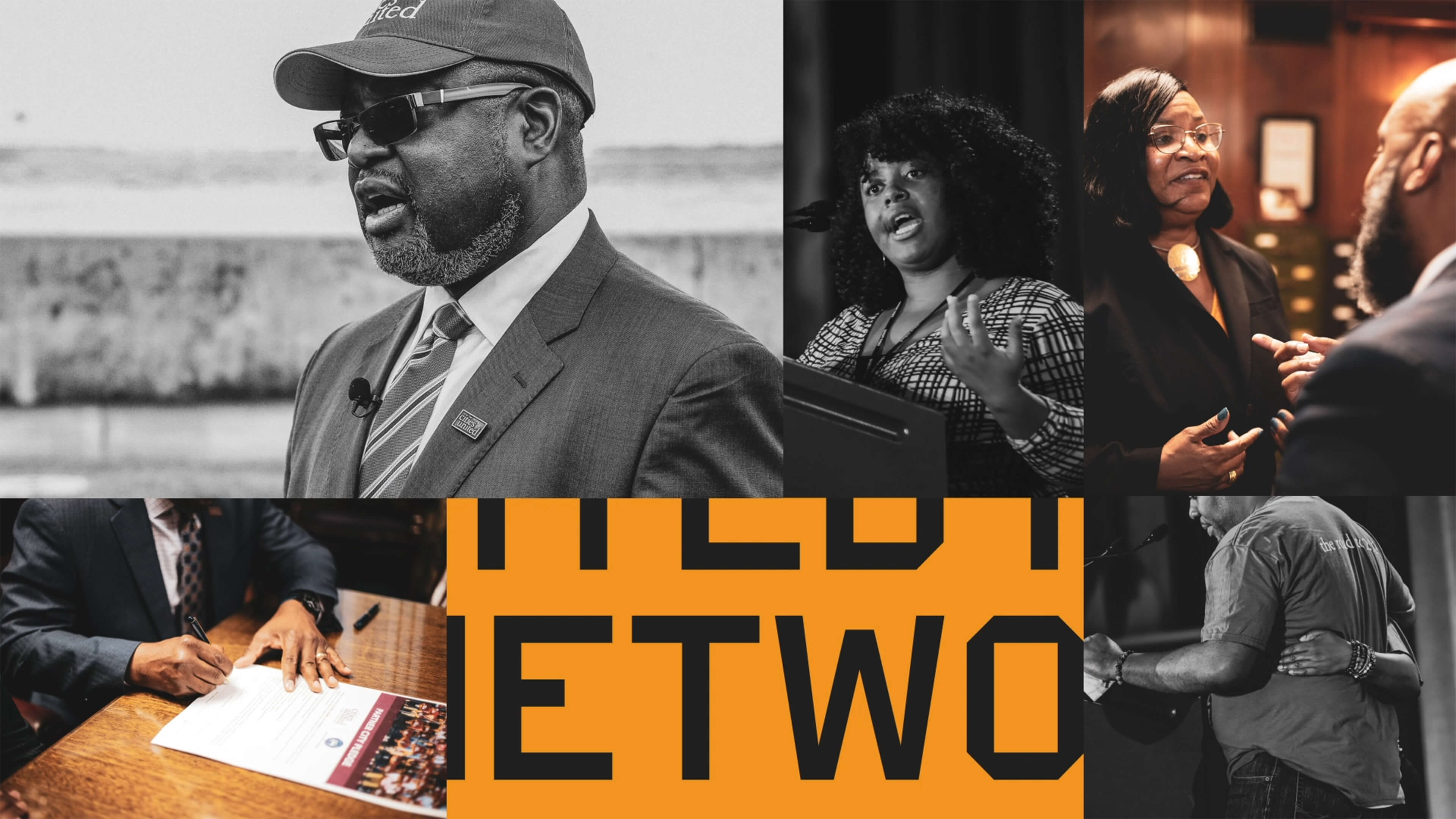
Cities United already had a strong foundation with its stated mission, vision, and values. IDEO brought those to life with a new visual and verbal brand identity system that celebrates Cities United’s inclusive approach to building relationships and reimagining public safety.
To help Cities United with its verbal identity, the IDEO team defined the organization's voice, tone, and key messages, making it easier to tell its story more consistently and clearly, a crucial step toward engaging stakeholders.
To define the new visual identity, the team created a new logo, a letter C composed of interwoven shapes that represent the three tenets of their vision—“safe, happy, and hopeful;” a new design language that references city grids; and a typographic system anchored by the typeface VTC DuBois, inspired by W.E.B. DuBois’s own custom lettering and designed by the Black-owned Vocal Type Co. The team also designed a color palette that embodies the textures of city life with hues reminiscent of asphalt, sunrise, and brick.
To amplify the refreshed branding, the team designed a new responsive website, citiesunited.org. The intuitive site shares the organization’s mission, resources, ongoing projects, and partner network, inviting stakeholders to join in their transformative work. IDEO also created a video to humanize Cities United’s mission and showcase its nationwide impact. It underscores the unity, resilience, and hope embodied by the organization through a chorus of voices.
This comprehensive rebranding widens Cities United’s reach and impact, helping the organization share its goal of creating safe, healthy, hopeful communities for young Black men, boys, and their families, and reintroduces the organization to a national audience.
The Cities United work was supported by IDEO’s Racial Justice Impact Fund, part of a commitment IDEO made in 2020 to address systemic racism and advance equity within our own organization, our client work, and beyond.
Cities United is committed to reducing the epidemic of homicides and shootings among young Black men and boys ages 14-to-24 by 50%.
Between 2009 and 2019, the number of Black children who “did not go to school at least one day in the past month because they felt unsafe at school or on their way to or from school” increased by 84%, according to Cities United.
Homicide is the leading cause of death for Black men and boys from birth to age 44, according to the Centers for Disease Control and Prevention.
2023 SF Design Week Award
In recognition of IDEO’s brand work with Citizens United

Balancing work and sleep
Somni’s personalized sleep program helps workers maintain their health.
Sleep is a critical resource for shift workers—and their employers, too. Together, IDEO and Somni worked directly with people with acute and chronic sleep challenges to create concepts that could support their sleep goals, and provide employers with the means to improve employee health.
When IDEO and Somni first partnered, the startup was an early-stage company, so the team started small, with focused sprints and workshops to redesign the core aspects of the company and product offerings. The team interviewed shift workers about their sleep patterns, which can vary quite a bit. Even when people keep to a specific schedule on work days, they often have to change their patterns on days off to spend time with family and friends, leading to a very disruptive sleep cycle. Research revealed that many third shift workers were dealing with sleep and health issues, but also a pervasive “machismo” culture, pressure to “tough it out,” and a reliance on energy drinks to deal with lack of sleep.
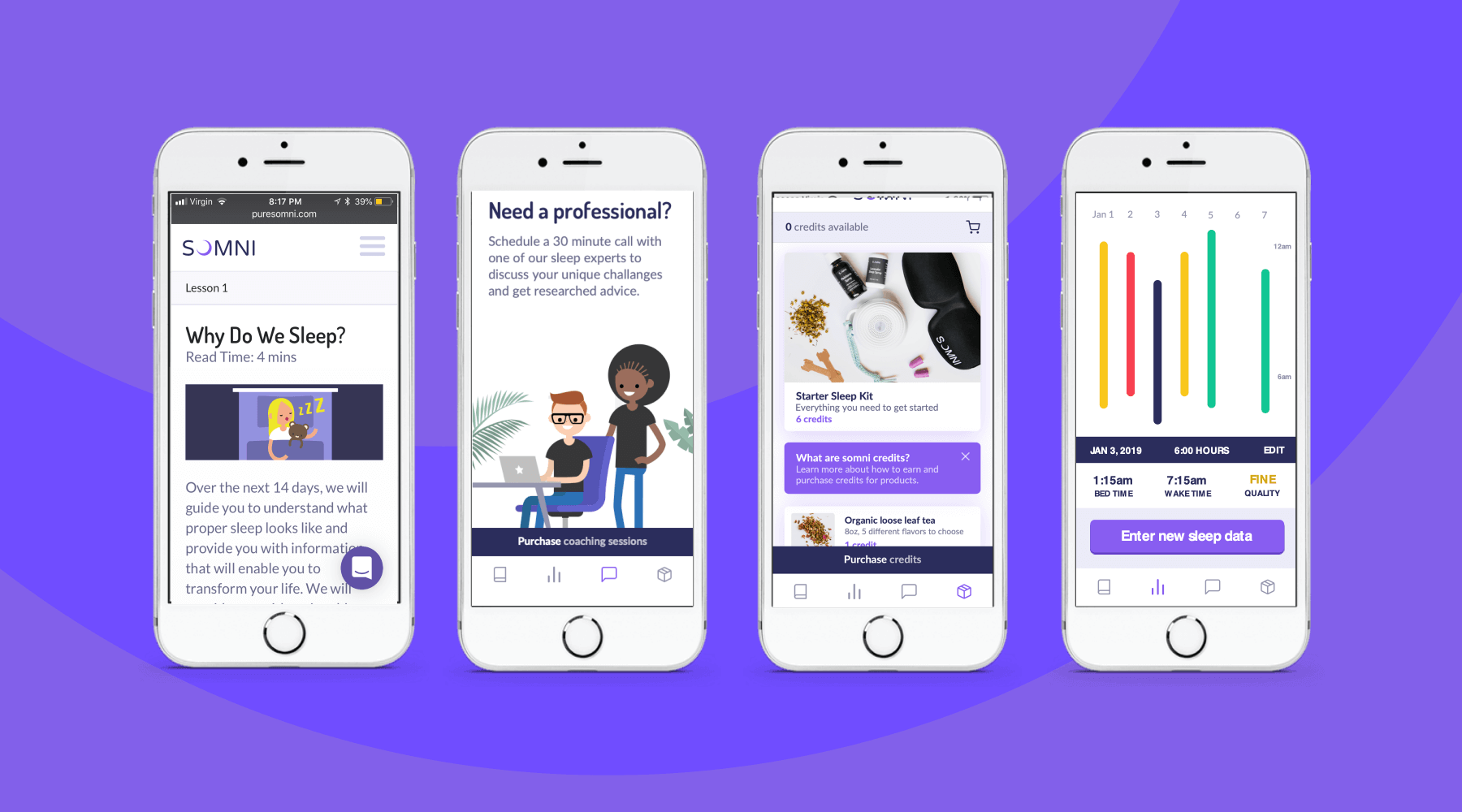
To address those issues, the team designed a digital experience for sleep cohorts, support groups where members could share their experiences and sleep strategies, and work with a coach and sponsor who already had been through the program. The platform analyzed workers’ data, and provided AI-enabled recommendations for improving their sleep. The big takeaway? Data by itself wasn’t necessarily helpful, and could be confusing for folks who were less digitally-fluent. Providing context, like a calendar that displayed sleep experiments at a glance, was crucial.
The IDEO team also created a new user experience for a genetic testing program that could uncover factors associated with sleep issues. Somni aims to use a saliva-based genetic test to monitor for DNA damage caused by circadian disruption, then leverage its sleep improvement program to prevent further damage. Because biomarker testing is a differentiating offer for Somni, it was extremely important that the team get it right, both to make sure that users could understand its utility, and for Somni to provide real value. The design challenge was unique—and not just because of data privacy concerns. Presenting data about DNA damage in a non-human-centered way could increase the anxiety workers had around their sleep.
At the end of the project, Somni leveraged the insights the IDEO team surfaced to improve products like its sleep coaching service, and to refine its biomarker testing offering. Based on this work, Somni has also created a pilot with a Fortune 100 company, which is currently in progress, as it works to mitigate the ill effects of disrupted sleep for employees and the companies they work for.
In the short-term, circadian rhythm disruption leads to an array of jet-lag-like symptoms, and in the long-run, it may contribute to weight gain, obesity, metabolic syndrome, type 2 diabetes, and cardiovascular disease.
It also impairs people’s ability to work, affecting productivity, creativity, and the overall work environment. Productivity loss can lead to employer baseline healthcare costs that are 26% higher, and over time, insomnia can result in an average cost of $4,267 more per employee per year.
In June 2019, the International Agency for Research on Cancer classified shift work as a probable carcinogen.
75%
user retention in Somni's sleep program
$2,450
savings per year per employee for users who complete the program
33%
improvement in sleep quality, and 41 more minutes per night
The Magic Patio
Behind the curtain at a secret magic theater in San Francisco
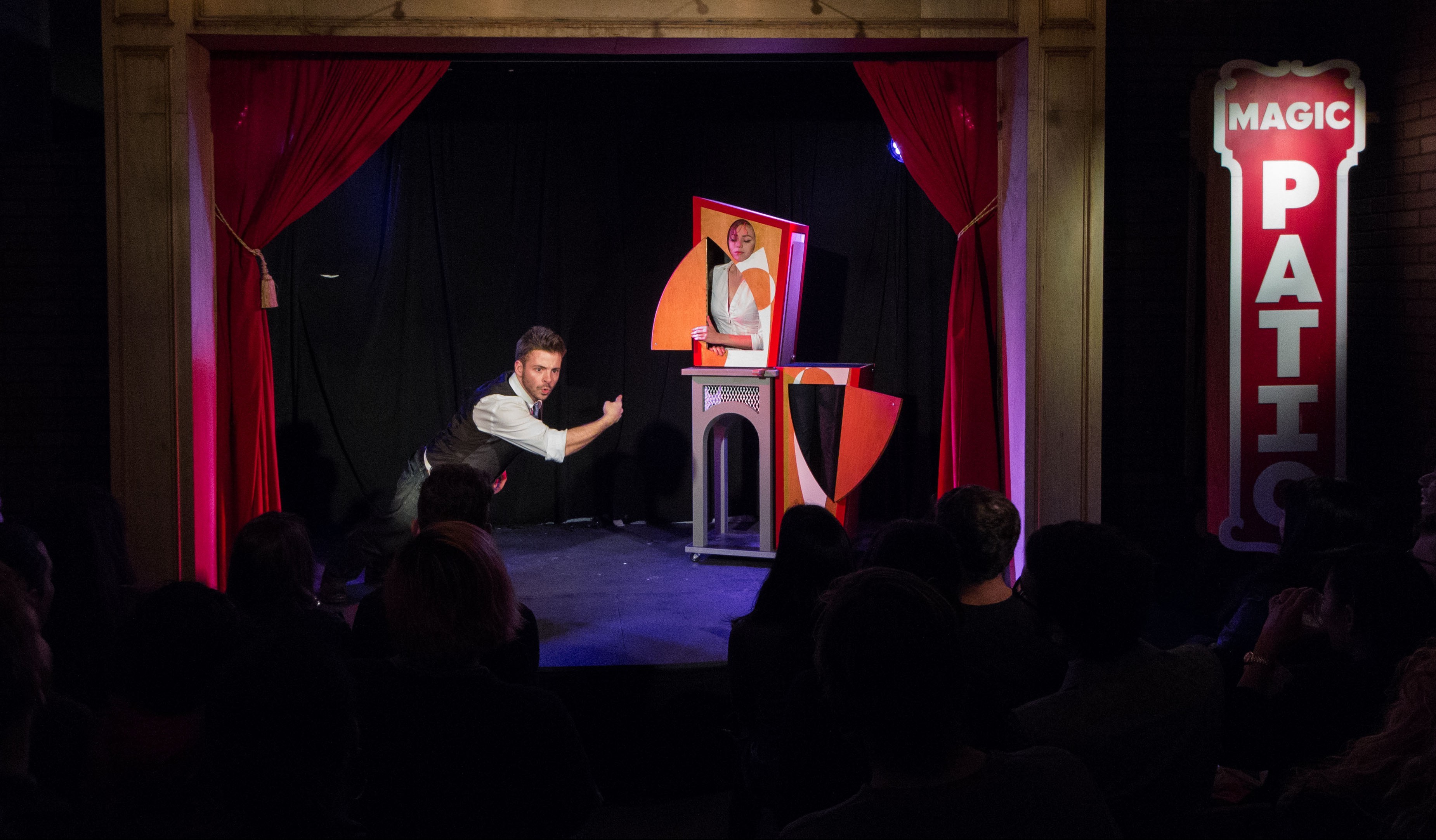
He created The Magic Patio, a custom-made stage and theater outside his building where he hosts invite-only, speakeasy-style events. The Magic Patio is specifically designed for a small, intimate experience of classic illusion, because Evans aims to recreate a bygone era of magic—specifically, 1890-1910—when the best illusions in the world were being performed at a tiny theater in London called Egyptian Hall, for an audience of about 100. I recently featured the Magic Patio for San Francisco magazine’s “Hidden City” issue (read the article online here). For Labs, Evans revealed some of the design and technical details hidden behind the curtain.
You built the box for your saw-the-lady-in-half illusion in IDEO’s shop. What did your fellow engineers bring to the project?
This is a design by illusion designer Jim Steinmeyer called Modern Art. It has slides that let the top half of the box slide over, and they create a sort of rail, like train tracks. But if you’re doing illusion design, the question is always how you can make it look like a piece of furniture as opposed to a magic prop. Not that the box actually looks like a piece of furniture, but if you actually have a rail sitting on top of it, it’s clearly a rig. I worked with Peter Bronk from the shop, and what he designed is genius. The slides are countersunk into the table, making them completely invisible. They’re milled on the CNC out of Delrin, which is a super low-friction material. The tolerance is to like one ten thousandth of an inch, and you can’t lift the top half up because it has T-slots that lock underneath. Magicians look at this prop and they’re like, “How did you get that?!” This is engineering, not a theater prop. When you’re doing tricks five feet away from the audience, it’s got to be super top notch, like product-design quality. There was no way I could have done this without IDEO.
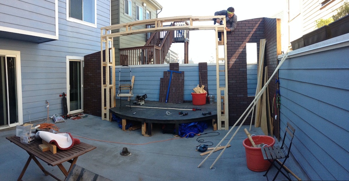
How does your immersion in IDEO’s engineering community help you develop your craft as a magician?
This show, “Illusions of Grandeur,” is meant to be the first act of a two-act show, and the second show, “Vodvil,” which is going to premiere in May, will be all new tricks, three of which are the most complicated I’ve ever conceived of. By far the most complex trick is completely original, and it’s inspired by engineering, not magic. It’s based on a really cool technique, a visual principle, that doesn’t seem to be used very much anymore. Without giving anything away, I can say that it takes incredible control of audience and lighting, which you can have when you have your own theater.
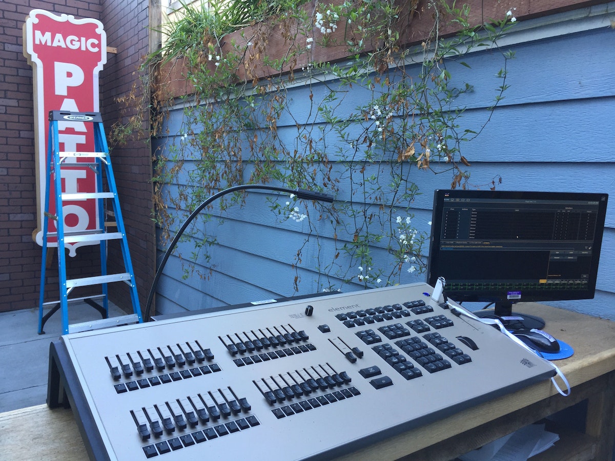
You take advantage of total control to design surprisingly small details, such as scent. Why?
When I designed the experience, I was thinking about how many juxtapositions we could play with, which is key because it’s this show from 100 years ago that’s staged in 2015. There is a transition between entering from the street and arriving on the patio, in which you first walk up this super sketchy alleyway. It smells like pee, but we very purposefully didn’t change that. When you go through the door into the lobby, there is a specifically designed scent that we put into the room. A perfumery called Tigerlily on Valencia Street worked with me for a month trying to find the right scent. It plays with indoors and outdoors, so it’s got some woods notes to it, but then it’s also got a lot of warmth, something seductive and mysterious, a little musky. So you go from pee smell to that, and to complete the transition to outdoors, we have a different scent that we use on the patio. It’s very woodsy, and it’s also from a perfumer in San Francisco.
You’ve said that good designers and good magicians share the ability to create a sense of wonder. What does that mean you, and how did you express it with the Magic Patio?
Childlike wonder is a beautiful concept. Kids have not experienced half the world, so everything new they encounter changes the way they see the world around them. That’s the definition of wonder that I like—something that changes your perspective of the world. If you’ve been in this world for 30-plus years and then suddenly something you see makes you be like, “whoa, whoa, whoa… wait a second,” that’s a beautiful moment. But beyond that instant during a magic trick, I hope that when people leave the Patio, they think, “What else am I maybe not looking at closely enough?” I get emails after the show saying, “I just left there in this state of non-alcoholic buzz, and I was walking through San Francisco in awe, thinking, ‘I love this city! What else does it have to offer?’” Those are the responses that make me think we’re doing this right.
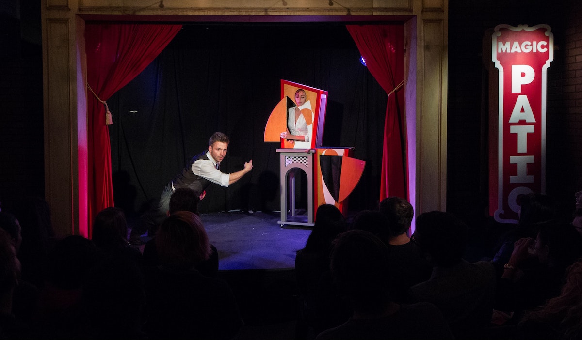
How do you balance your commitment to magic with your work as a designer?
I made my full living doing magic for two years. The reason I don’t do it full time is that it’s a very lonely pursuit—it’s me on my computer writing scripts, practicing magic in front of a mirror, taking video of myself, watching footage. When shows are coming up, sometimes I’ll spend a full 40 hours a week preparing, on top of IDEO work, but it fulfills me very personally and creatively. Simultaneously, IDEO gives me culture and people. It’s a beautiful pairing.
Keep a close eye on Andrew Evans—he might be an innocent-looking product designer in IDEO’s Palo Alto studio, but he’s also a professional magician and a master of sleight of hand. Evans travels around the world speaking about the intersection of design and magic, and now, he’s made his San Francisco apartment a nexus of the two.

How We Did It: GIF Dance Party
Coding the Internet's best party
Over the last three years I have been creating interactive experiences that bring some of these unexpected moments back to the Internet by putting emphasis on smiles and little else. No clients, no social media sharing, no analytics, no SEO, no log-in, no users, no brand, and no monetary objectives—smiles have become my motivation and my currency. Late at night, I stare intensely into my glowing rectangle, firing code into it, and imagining how I might turn the drab, emotionless faces of everyday, seen-it-all web surfers into expressions of delight.
While there are a number of projects on my site Fuzzy Wobble Dot Com that exist in the “smiles-as-currency” domain, I am going to share one of my favorites with you today: GIF DANCE PARTY. The name should give you a hint as to where this is headed…
The animated GIF was invented in the late '80s, but when GIF DANCE PARTY began back in 2012, they were still primarily used in blinking web banners for sleazy ad campaigns. Tumblr was the only mainstream site at the time with a GIF vernacular.
My fascination with both Tumblr and animated GIFs was surging at this time, and I could sense that there was an opportunity to bring animated GIFs out of the depths of Tumblr and into a more familiar context. This idea lead to an eight-hour coding session that resulted in the first release of the GIF DANCE PARTY website, which allowed visitors to create and share their own digital dance parties.
Despite my sub-mediocre coding skills at the time, the site was surprisingly functional. As with damn near everything in web dev, all the integral parts of the site had been executed thousands of times before, and with a little Googlin' and digital glue, the concept was realized. The code base was solid, although a serious problem remained: Transparent GIFs were extremely rare, never mind transparent dance GIFs, which were imperative to the concept. After many web searches, I found only four—not enough for a respectable digital dance party by any online standards.
So I asked my friends to help me with the tedious process of removing the backgrounds from GIF dancers, pixel by pixel, frame by frame, to generate the collection of transparent dancers featured in the first GIF DANCE PARTY release. Now, three years later, the GIF DANCE PARTY website has amassed an arsenal of more than 120 iconic dancers.
Over the years, GIF DANCE PARTY received millions of hits from around the world. The captivating nature of the animated GIF, injected into a familiar party context, touched the Internet in all the right places. I even had a collection of dancing cats in there for good measure. Today, GIF DANCE PARTY continues to make the rounds. On November 2, 2015 it made it to the front page of Reddit again, where one user commented:

The project was quite well received by my colleagues at IDEO, so we decided to set up a green screen and make our very own IDEO Boston (now IDEO Cambridge) GIF Dance Party.
It was extremely rewarding to maximize the smile-to-effort ratio with a project that could have so easily been discredited as "silly" had I not been surrounded by such creative and supportive people.
But the unfortunate outcome of this, a project that stemmed from a drive to create smiles, was that I could never see any of those smiles. At one point I considered turning on users’ webcams to use face detection and count the smiles, replacing the Facebook “like” widget with a smile counter (pretty sure this would have deterred a number of visitors). The only way to witness these smiles was to create an IRL experience—A GIF DANCE PARTY installation.
With the use of projectors, 3D cameras, and countless lines of code, we would be able to digitize partygoers into dance GIFs. These dance GIFs could become part of a wild and dynamic visual spectacle, projected for all to see. Together, the GIF DANCE PARTY VJ and partygoers would work together to create an otherworldly GIF DANCE PARTY digital dance floor.
There was no chance my Googlin’-and-digital-glue approach was going to work on a project of this scale. I put out a call for creative coders, which was answered by an exceptional team: Matt F., Wes T., Joe S., and Matt G. For many, many Saturdays, we met in hungover or otherwise compromised states and managed to stab away at the massive challenge of bringing GIF DANCE PARTY to an installation space with C++ and OpenFrameworks. Six months later:
We had a hit installation. We started booking frequent gigs. Jaws were dropping. What started off as not much more than a "cool art installation" evolved into a project that had a massive positive impact on partygoers. As we observed: This is the evolution of the photo booth. We have tapped into the selfie-lust habits of the modern day partygoer. But unlike the conventional photo booth experience, we went hyper dynamic, we went hyper visual, and for the first time in photo booth history, we introduced selflessness to the selfie. An experience for you, and an experience for all.

Partygoers were able to interact with the party environment in a way that was unprecedented. While traditional photo booths disconnect partygoers from the environment, our experience blasted them right into the center of it, no different than installing a Slip'N Slide down the middle of the dance floor.
As a team of artists, coders, and designers, we continue to experiment and evolve the experience. From website to installation, GIF DANCE PARTY has been a delightful project, not just for the users and participants but also for the creators. Smiles all around, and more to come.
I remember my first introduction to the web back in the mid '90s. It was a place of mad discovery. There was a great deal of uncertainty when clicking a link—where you would end and up and what you would see. The Internet was not a serious place. It was more of a playground, full of unexpected moments.
Kitchen Creative
A tasty testament to the London studio's communal, culinary adventures
The Greek Shepherd’s Pie. Coconut Meatballs. The Mediterranean Yacht in Linen.
You won’t find these unlikely sounding recipes in any other cookbook, and you certainly can’t eat them anywhere. But last summer, these culinary creations graced the table and palates of our London studio.
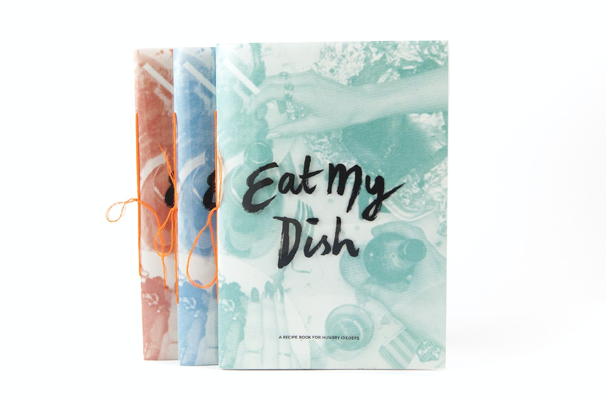
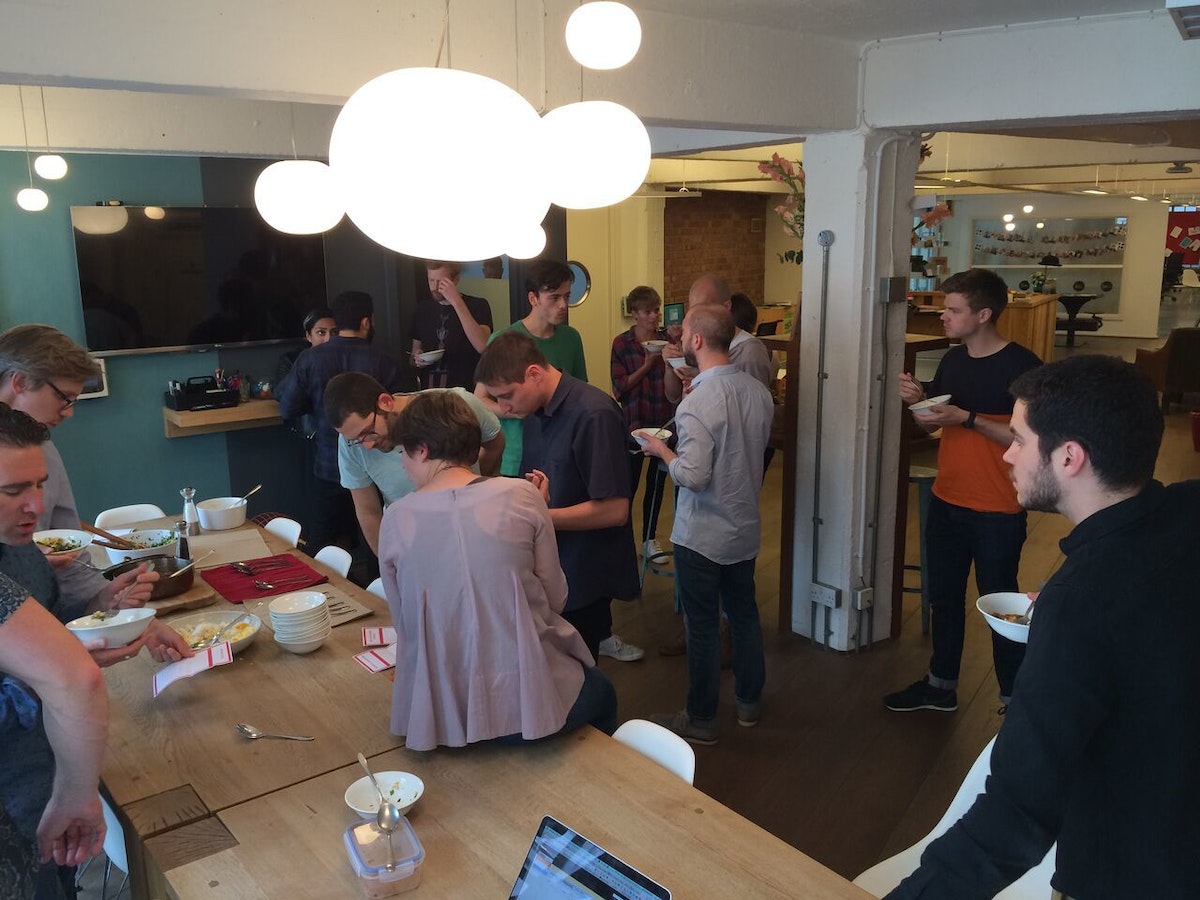
Eat My Dish came out of a desire to bring the studio together outside of our beloved social haunts (i.e, the pub). We wanted to do something that was hands on, creative and open to everyone.
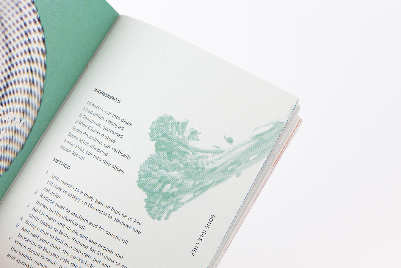
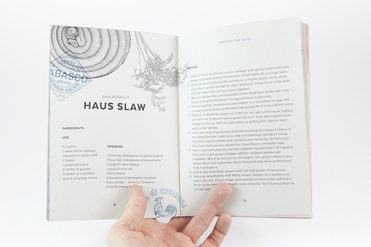
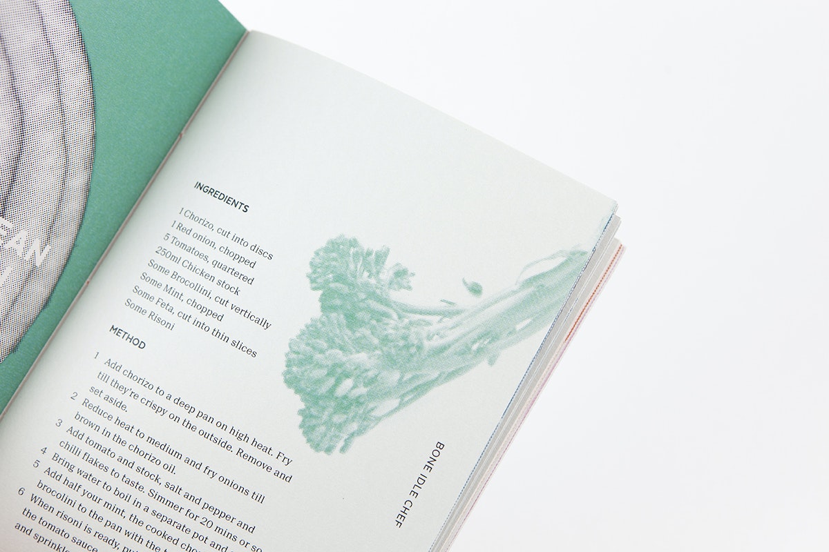
The rules were simple. Everyone was given a £10 budget for their dish. They had to cook offsite, and had to feed the studio. Entries were grouped in four categories: Culinary Peacock, Student Throwback, Feeding The 5,000, and the Bone Idle Chef.
It was a resounding success. Every Thursday afternoon, we summoned the whole studio to sample the recipes of the week. Our resident chefs would watch nervously as a crowd of designers descended on their dishes brandishing spoons and napkins. They devoured everything, every week, mumbling grateful compliments to the chef between mouthfuls. Things even got a bit competitive, with several dark horses impressing the studio against all odds (one participating chef claimed at the time to not even own a chopping board).
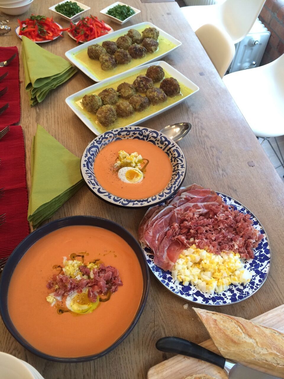
The UK has not historically been known for the quality of its food (unless your definition of quality includes jellied eels and deep-fried Mars bars) but things have started to shift in recent years. London in particular represents every style of food going, from late-night hole in the wall noodles to Nordic Michelin-starred blow-outs.
The studio’s recipes reflect the city’s culinary diversity, featuring dishes with roots in Brazil, Hungary, Iran and beyond, and catering to every occasion, from quick bites to dinner party extravaganzas.
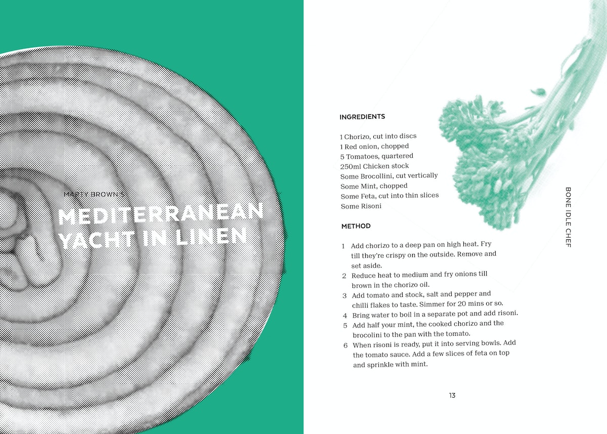
At the end of it all, we compiled the Eat My Dish recipe book. It’s been lovingly hand bound in four colours with neon thread and sent out to our studios around the world. We hope it inspires many a happy meal.
How to Hack Your Next Circuit Board Project
A toaster oven makes building circuits a piece of cake
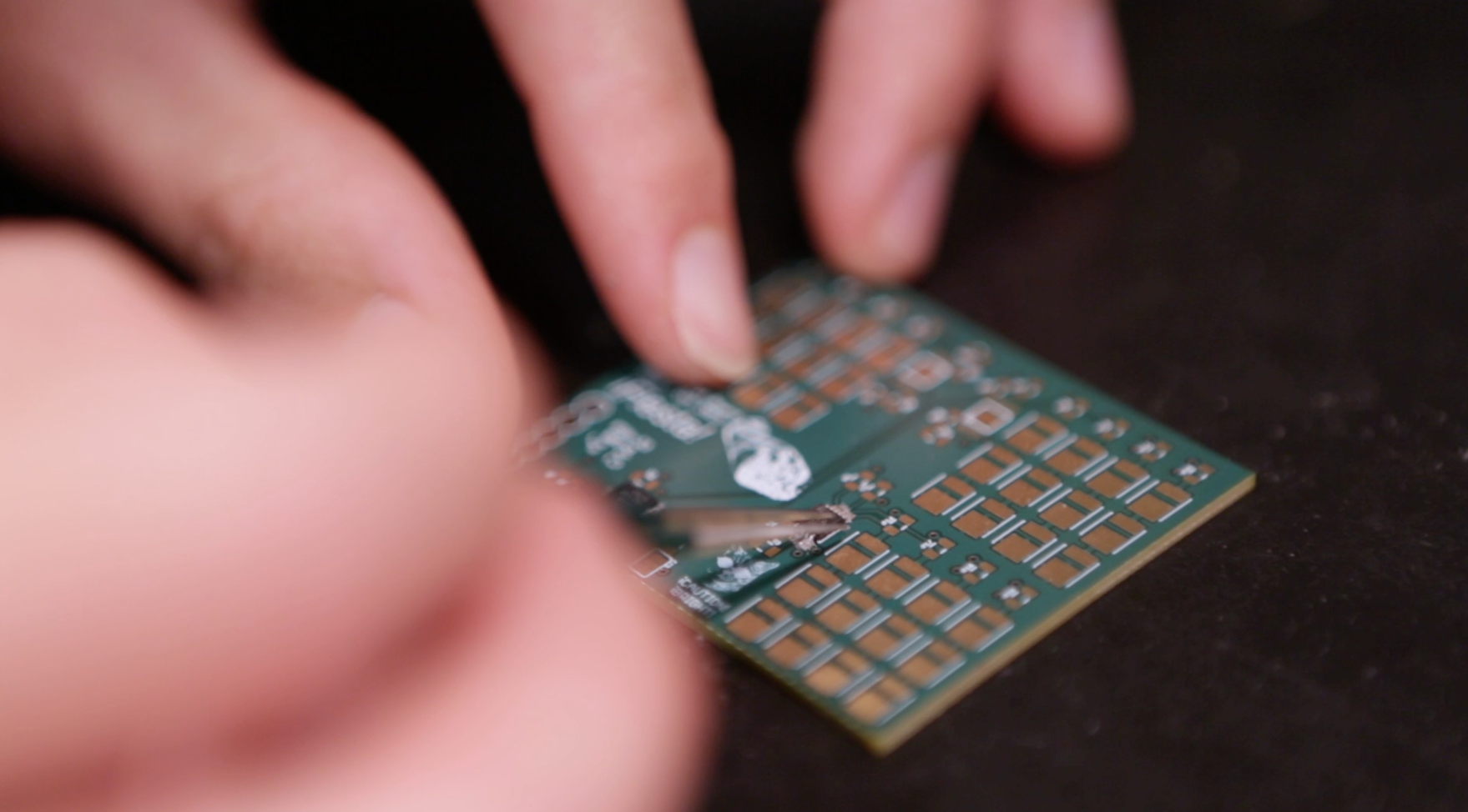
A few of the microchips on my PCB had unexposed connections to the board that I couldn’t solder by hand. I thought I’d have to send it out to be assembled, which could take a couple of days.
The hack
Instead of sending it out, I took a tip from my colleague and simply put some solder paste (small balls of solder in a sea of flux) under the microchips and popped the whole board in a toaster oven at 450° for a couple of minutes.
Safety first
Common sense may tell you that baking electrical components is a bad idea, but if you pay close attention and remove the board immediately after the solder liquefies, it’s a killer quick-and-dirty shortcut. Once the board has cooled, you can attach more sensitive components like LEDs and headers—the icing on the cake, so to speak.
The Easy-Bake Circuit Board Recipe
1. Apply solder paste to the PCB on all pads for parts with unexposed or hard-to-reach connections to the board. (Note: You don't need a whole lot of solder paste. Too much paste can result in bridging pins and will need to be cleaned up later.)
2. Carefully align the parts to be baked on the pads with solder paste.
3. Place the partially populated (or fully populated, if all your parts can be baked) PCB into the oven and set it to 450°.*
4. Watch for the moment when the solder balls liquefy (the solder will go from dull to shiny), about 1-2 minutes. The flux will help the solder hug tightly to any metal.
5. Carefully remove the PCB from the oven a few seconds after the solder liquifies. The extra couple seconds ensures all the solder has had time to liquefy.
6. Turn off the oven.
7. Let the PCB and solder connections cool down.
8. If possible, check solder connections under a microscope.
9. Clean up any bridging and test the connections.
10. Populate the rest of the board with parts you can solder by hand.
IMPORTANT: Always check the part's datasheet for temperature tolerances before putting it into the oven.
Pretty sure Charles Strite, inventor of the modern toaster, didn't see this coming.
Big thanks to Dave Vondle for the hackspiration and Sophie Feng for the awesome video!
I’m always on the lookout for shortcuts, especially when I’m on deadline for a project. Recently, another electrical engineer showed me a cool, time-saving trick that’s useful for all kinds of projects that involve a printed circuit board (PCB). I happened to be building up an LED test board for backlighting icons on a steering wheel prototype, a process similar to making a layer cake.

Lindsey Turner
I’m passionate about building brands, products, and experiences that help organizations show up with meaning and momentum.
I help organizations cut through complexity by shaping how they show up, through brand strategy, identity, and storytelling.
Working at the intersection of brand and business, I bring an editorial eye and a bias toward making—turning ideas into tangible experiences that people can understand, trust, and believe in.
My work spans government, healthcare, financial services, media, and consumer goods, from launching Gen Z-focused ventures to building innovation labs and reimagining legacy brands. I relish moments of ambiguity and enjoy translating across teams, perspectives, and priorities to move ideas forward.
I started my career in editorial and digital design, shaping cross-platform experiences and identity systems in publishing and agency environments. That foundation still shapes how I work today: I’m detail-oriented, collaborative, and overreliant on the Oxford comma. I hold a BFA in Visual Communication from the School of the Art Institute of Chicago.

Rachel Young
My work helps organizations see who their products aren't working for—and build the will and the tools to do something about it
For 25 years, I've asked the same question: Who does this design exclude—and what are we going to do about it?
My work spans human-centered strategy, inclusive design, and qualitative research, with clients ranging from Microsoft, Google, and Verizon to the National Science Foundation, and San Francisco Unified School District.
Before IDEO, I taught elementary school in East Palo Alto and spent a decade doing design work with social service organizations—where I learned firsthand what it costs people when systems are built without them in mind.
I am currently writing User Error, a nonfiction book about digital access and the design decisions behind it. I live in Oakland, California.

Brian Pelsoh
I lead with craft, ensuring our work is creatively excellent: rooted in deep human insight and imagination, while also grounded in the realities of business and technology.
My expertise spans brand, communication, and product design across tech, education, the arts, and social impact.
I believe great work demands both high-level vision and obsessive attention to detail, and only happens through collaboration.
I bring an inclusive, hands-on approach and a deep understanding of business, which enables me to consistently deliver excellence while always asking why.
Before joining IDEO, I worked at the brand firms Pentagram and VSA Partners. I began my career as a designer, leading teams at the School of the Art Institute of Chicago and the Milwaukee Art Museum. I hold an MFA in graphic design from Maryland Institute College of Art and a BFA in communication design from the Milwaukee Institute of Art & Design, and have taught at some of the best design schools in the US.

Tony Wong
I am responsible for IDEO’s long-term success in China and working with clients to use design as a tool to enable growth.
I am responsible for IDEO’s long-term success in China and working with clients to use design as a tool to enable growth. Specifically, I have helped Chinese companies design holistic brand solutions through the development of their products, communication, services, and innovation teams, and I have helped multinationals expand their presence and influence in China.
I advise global leaders on developing China-led innovation and capabilities.
In over 15 years in IDEO Shanghai, I have worked on projects that use design to elevate the quality of the experience of healthcare products and services, streamline processes that increase productivity, create spaces and programs that promote and enable inclusive communities, and build next generation mobility solutions that are planet-positive.
Before joining IDEO, I worked at Philips Electronics and the Electrolux Group in Italy, the Netherlands, and Singapore on a number of breakthrough commercial products. I am a member of the Young President Organization in Shanghai.

Building a personal AI for the messiness of life: Sida Li
Most AI products today are built for work—a space with clear problems and established systems. One founder noticed a gap: personal life is messier, harder to systematize, and mostly left behind by the AI boom. So she built Cue, a personal AI that lives inside iMessage and group chats, to go where the other tools haven't.
In this episode, Becca Carroll, IDEO's Chief Strategy Officer, talks with Sida Li, co-founder and CEO of Shared Context Lab, about staying anchored to a human need while the technology around her keeps changing shape, why she treats her business model with the same rigor she'd bring to a product, and what it feels like to build a company at this particular, disorienting moment in AI.
The conversation also gets into how Sida makes design decisions: the language Cue uses to describe itself, the tradeoffs behind building inside iMessage instead of a new app, and a real story about a business idea that didn’t pan out.
This is the second in a two-part series profiling founders from IDEO's Startups-in-Residence program. The first conversation is with Johannes Seemann, founder of Sooner, on designing GenAI for the emotional side of money.

Designing GenAI for the emotional side of money: Johannes Seemann
Most personal financial tools are built to run the numbers and optimize towards a budget. While that works for some, most people experience money as a lived relationship that does not neatly fit into a spreadsheet. Johannes Seemann and Becca Carroll discuss why money is emotional before it is mathematical, and what a human-centered approach to building a generative AI financial product looks like in practice.

The curious leader's edge in uncertainty: Scott Shigeoka
Mina Seetharaman talks with Scott Shigeoka, author of Seek and Head of Curiosity Cultivation at the Eames Institute, about what distinguishes genuinely curious leadership from performative curiosity, how power dynamics shape curiosity, and why practicing curiosity can restore energy rather than drain it.

How constraints make us more creative: David Epstein
Mina Seetharaman talks with David Epstein, author of Inside the Box and Range, about why total freedom often produces average work, how leaders can design useful limits on purpose, and what organizations such as General Magic and Pixar reveal about the relationship between boundaries and creativity.
Looks like you might be in search of something very specific?
Or reset the filters above and try another angle.
Here’s some random inspiration

Podcasts about creative leadership

Articles about the power of prototyping
