
.svg)




A return to simplicity with a bottled tea brand
Bringing the grounding and authenticity of tea culture into the rhythm of modern life.
Master Kong (known internationally as Tingyi Holding Corporation) is number one in market share in both instant noodles and ready-to-drink teas, with over $10 billion USD in annual revenue. While China has a rich tea culture, most sugar-free bottled tea on store shelves markets itself as “healthy” and “tasty.” Wanting to set itself apart from the competition by uncovering new consumer needs, Master Kong reached out to IDEO. Together, Master Kong and IDEO immersed themselves in modern Chinese tea culture and built a new, premium, sugar-free bottled tea brand that resonates deeply with contemporary tea drinkers.
During research, the combined IDEO/Master Kong team took a two-pronged approach to uncovering new opportunities: industry exploration and consumer research. The team visited various tea-related businesses, from traditional tea houses to modern beverage shops, as well as “third place” tea spaces outside of home or work. They also conducted in-depth, in-home interviews with consumers with various levels of interest in tea, delving deeply into their daily routines to better understand their lifestyles and any emotional or functional needs related to tea.
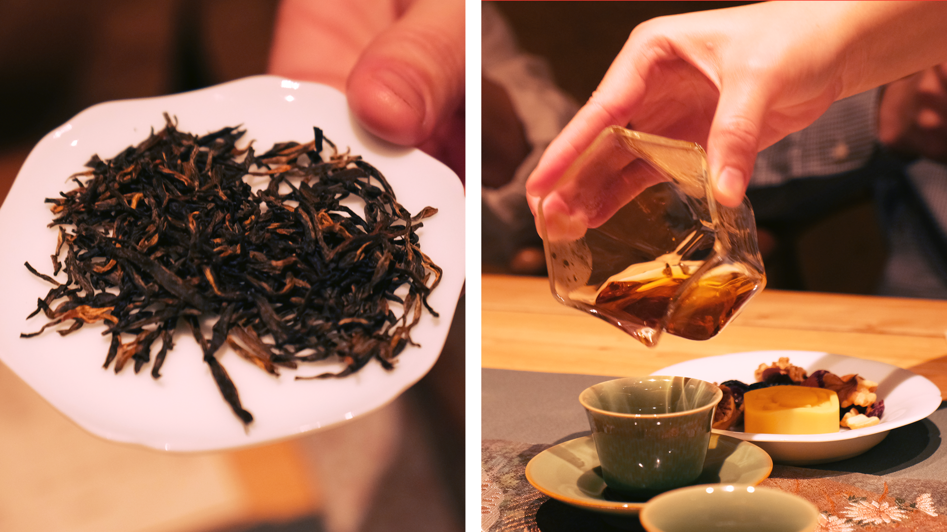
The team discovered that the essence of Chinese tea culture resonated with contemporary consumers’ longing for authenticity, simplicity, and physical rejuvenation in their fast-paced lives. This insight presented a unique opportunity for Master Kong. Instead of positioning its new sugar-free tea brand as merely a “healthy alternative” to other beverages, it could spark a meaningful connection to tea culture, seamlessly integrating into various moments of modern life.
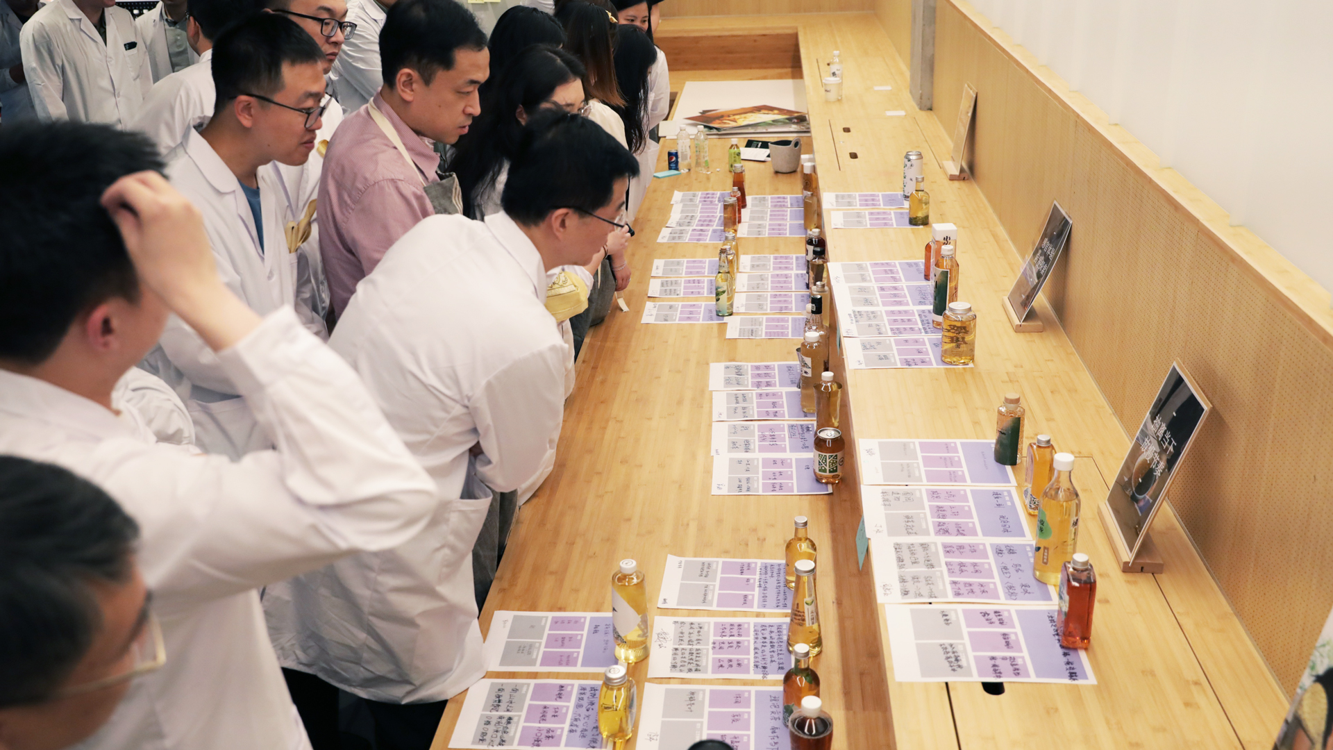
Armed with this insight, IDEO designers and dozens of Master Kong beverage team members participated in a series of immersive, hands-on tea innovation workshops. Teams of experts from R&D, marketing, supply chain, and other company departments temporarily set aside their job titles to explore, iterate, and refine dozens of new tea concepts that were commercially viable, feasible for mass production, and aligned with consumer needs. The cross-departmental collaboration allowed for a broad mix of perspectives, experiences, and expertise, enriching the innovation process.

The co-creation sessions led to a new sugar-free tea product and flagship brand called Cha De Chuan Ren (“Descendants of the Tea”), which celebrates fine, origin-sourced tea and the passion and dedication of tea farmers. The novel concept resonated strongly with consumers and was validated during subsequent rounds of quantitative market testing, ensuring its relevance and market potential.
Cha De Chuan Ren launched with two signature flavors: Tieguanyin (green tea) from Fujian and Pu’er (black tea) from Yunnan. The unique mottled bottle design pays tribute to traditional handcrafted glass containers and the handiwork of tea farmers. The tactile paper label, which features Jia Ma-inspired woodblock illustrations of local tea fields and tea farmers’ hands, nods to the artisanal craft of tea making and the source of the tea inside.
“Descendants of the Tea” debuted on Tmall in April 2024. It claimed the top spot on the commerce site’s Tea Beverage V-List in August and September. Offline, it launched in FamilyMart convenience stores in May and has since expanded nationwide. The new brand received a 2024 Red Dot Award for “Brands & Communication Design.”
“We are honored to collaborate with IDEO, a global leader in innovation, as our strategic partner. ‘Descendants of the Tea’ is not just an exceptional product but also a tribute to the rich heritage of tea culture. Only by continuously integrating culinary traditions with innovation can we sustainably meet consumers’ true needs.”
Richard Chen
CEO, Master Kong (Tingyi Holding Corporation)
“Innovation is incredibly fragile. If even one leader is unsupportive or hesitant, the culture of innovation can collapse. I always encourage my team to take risks, as long as they’re not high stakes. After all, what’s the worst that can happen? At the very least, we’ll have a fair chance at creating something new.”
Wei Hong-Chen
Chairman of Master Kong Beverage Holdings Co., Ltd.
Sugary bottled teas were once very popular in China. Today, rising consumer demand for healthier beverage options has expanded the market for sugar-free tea.
#1
on Tmall’s Tea Beverage V-List, August- September 2024
2024 Red Dot Award Winner
for Brands & Communication Design
A luxury water bottle takes precision engineering to the extreme
Elevating the everyday with next-level design.
Twenty years ago, carrying a single-use plastic water bottle was a status symbol—no more. Growing awareness of the negative environmental impact of plastic pollution, combined with the adoption of healthier lifestyles and social media influencer trends, has made reusable water bottles “it” accessories for on-the-go consumers. While brands such as Stanley, Yeti, S’well, and Hydro Flask own the under-$100 market, fashion brands such as Louis Vuitton, Chanel, Dior, and Prada have etched out a new and growing market for high-end bottles that appeal to discerning, trend-conscious young people looking to perfect their hydration habits.
Spotting an opportunity to disrupt the predominantly utilitarian water bottle market, Steinmann partnered closely with IDEO, tasking the team with developing an industrial design that perfected the tactile and sensory user experience, from drinking and carrying to disassembling and cleaning thoroughly. The collaboration deepened over time, with Steinmann and IDEO working together to develop the high-level engineering concept, the OKAPA logo mark, and packaging ideas.
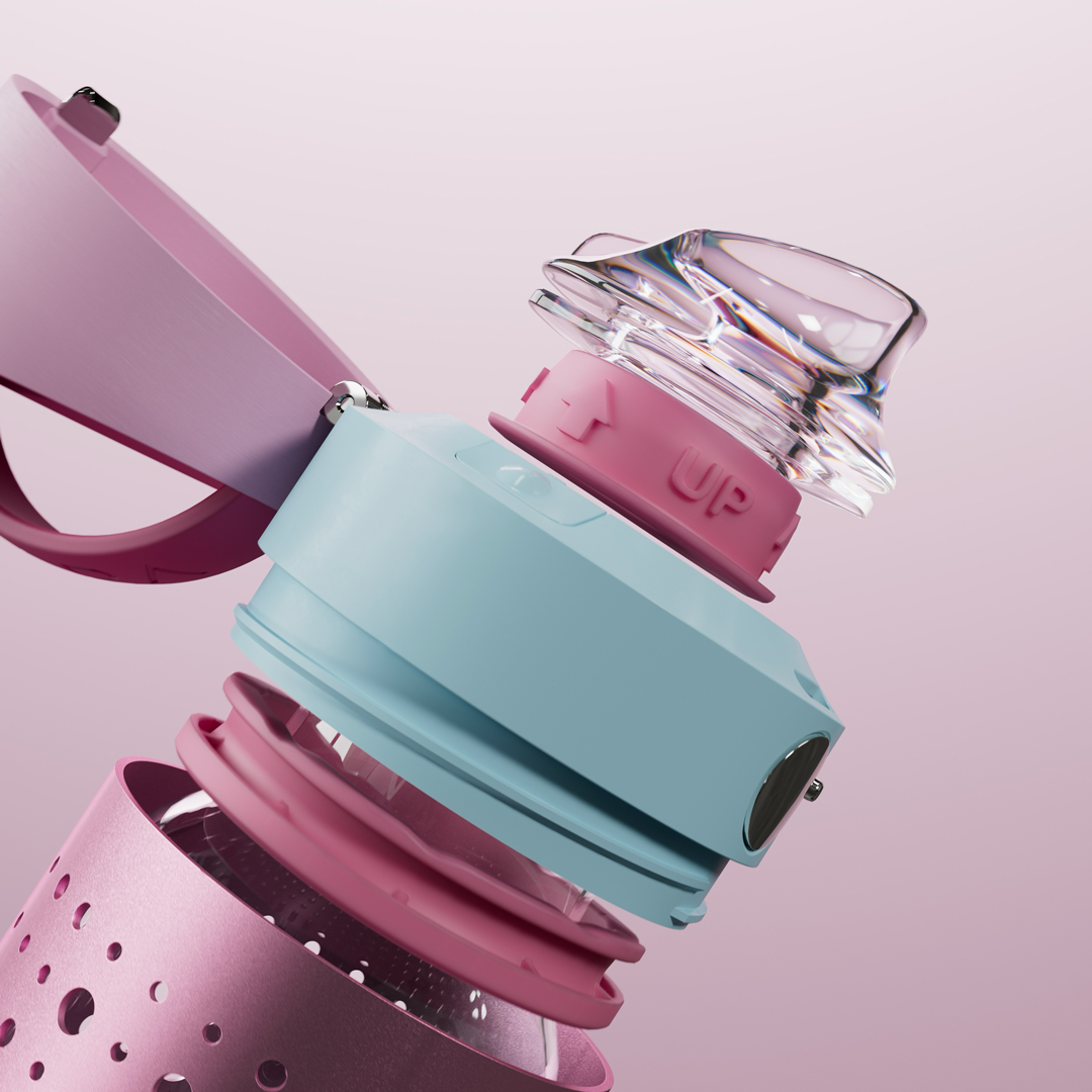
Key user-centered features of the OKAPA bottle include a medical-grade German borosilicate glass interior for superior taste of hot or cold beverages with no lingering odors; a Swiss-engineered thermoplastic lockable and leak-proof tilt cap that can be easily operated with one hand when driving or doing other activities; and an ergonomically shaped mouthpiece for a pleasurable drinking experience. Precision-engineered for maximum longevity, the inner glass bottle is suspended via a shock-absorbing system inside a bead-blasted, extruded, and anodized aluminum outer shell. Eight modular parts come apart easily for either a quick or thorough cleaning.
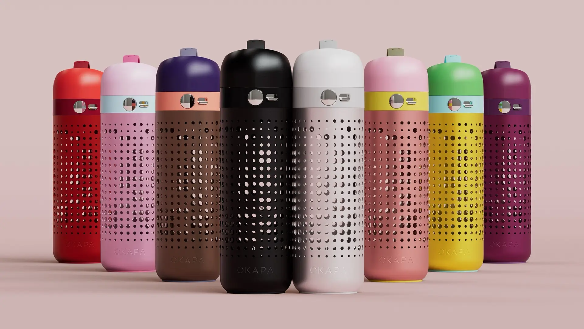
At its core, the OKAPA bottle elevates an everyday ritual through meticulous design and uncompromising engineering. Launched in January 2025, the new bottles are available in eight contemporary colorways curated by renowned color and materials specialist Beatrice Santiccioli (BSD), including Misti Pinku, Goldie Samba, and Fetishe Noir, among others.
In the US, the reusable water bottle market is estimated to increase from $10.2B in 2024 to $14.1B by 2031, with 69 percent of Gen Zers owning at least one. Customization trends, such as personalized design and branding, are anticipated to boost the market, ripe territory for disruptive startups such as OKAPA. (Persistence Market Research)
Once a practical accessory for hikers and outdoor enthusiasts, reusable water bottles have gone mainstream. Yet none check all the boxes in terms of purity of taste, hygiene, durability, functionality, and beauty.
8
modular pieces ensure hygienic cleaning is quick and easy
100%
recyclable materials in each bottle
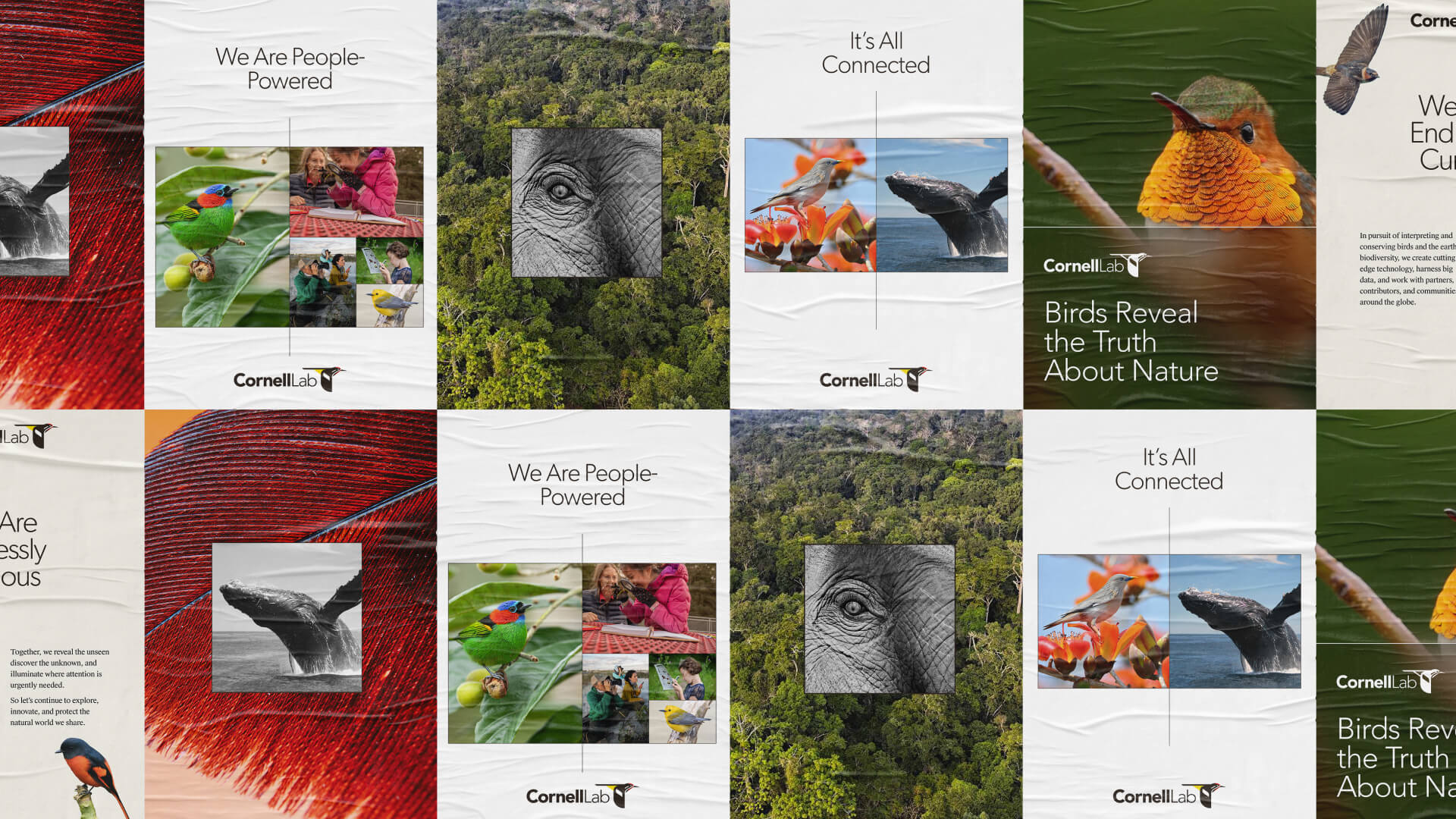
Brand as a conservation strategy
The Cornell Lab of Ornithology unites as “One Lab,” galvanizing a conservation movement.
The Cornell Lab of Ornithology’s mission is to interpret and conserve the earth’s biological diversity through research, education, and citizen science. Over its 110-plus-year history, its offerings grew to include everything from a quarterly magazine, popular websites and apps with millions of users (Merlin, eBird), partnerships with outside organizations, and the world’s largest database of photographs and audio recordings of birds. This abundance is a testament to the passionate enthusiasm of its employees. Still, it confused potential members and led to siloed internal efforts, preventing the Lab from advancing its urgent collective vision. “Birds and biodiversity are in peril,” said Executive Director Dr. Ian Owens. “We must take radical action with a coherent vision, united voice, and purpose.”
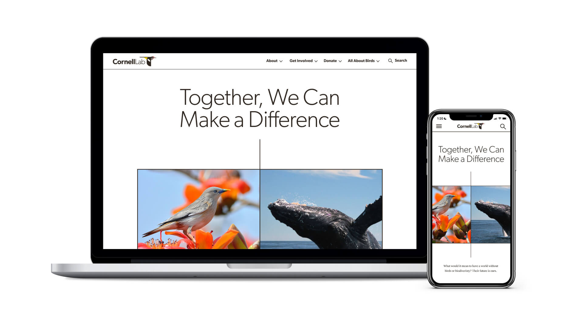
IDEO began by helping the Lab better define its audience. While primarily composed of people passionate about birds, IDEO discovered its larger audience was nature lovers interested in biodiversity, bioacoustics, conservation, and science. From there, IDEO created a brand strategy and architecture focused on helping the Lab streamline its efforts under the “One Lab” brand. The brand architecture visually articulated the relationship between Cornell University, the Cornell Lab of Ornithology, and the Lab’s many products and offerings. IDEO designed a comprehensive brand identity system to work across mediums, including a simplified logo system, new colors, type, graphic language, voice and tone, and key messaging.
When the Lab’s design team began implementing the new branding elements across its website and many digital products, it became clear that the organization also needed IDEO’s help in creating tools to facilitate cross-department collaboration. To better understand the day-to-day nuances of the organization, IDEO designers worked out of the Lab, co-creating a brand activation playbook. The playbook, launched in 2023, contains recommendations for new cross-functional working groups (partnerships, visual identity, and brand voice), as well as exercises and interactive tools designed to build trusting relationships, gain alignment, foster collaboration, and manage change at scale.
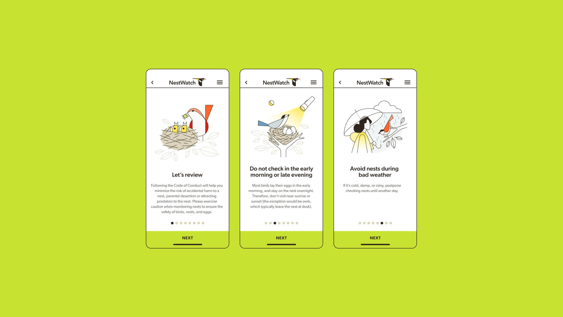
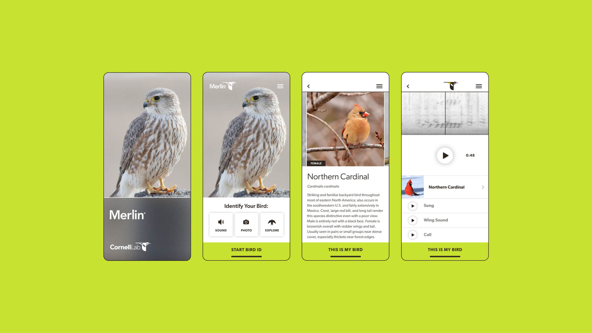
Post-collaboration, the Lab has applied the new brand across its website, apps including Merlin and eBird, Living Bird magazine, email and newsletter templates, and its line of merchandise. A new internal brand guidelines site has become central to employee onboarding, while new working groups are helping to bring down barriers between teams and spur collective action. Like a flock of birds, the Lab now sings one collective song.
The Cornell Lab’s 300+ scientists, professors, staff, and students were passionately dedicated to their individual team’s unique conservation projects, but segmented internal systems could stymie their collective impact.
1 brand
unifying 300+ employees and 8 departments

Charting a bold educational future
Ascend Public Charter Schools designs a “grown-up” vision for its young educational network.
Founded in 2008, Ascend Public Charter Network prides itself on providing “rich, joyful learning experiences that unlock lives of boundless choice” for its students, 93 percent of whom identify as Black or Latinx. The organization is also proud of being Black-led: 78 percent of staff and 80 percent of the executive team are people of color. Using co-design and joy, IDEO held a mirror up to Ascend’s core optimistic spirit during a moment of anxiety and change, helping its new CEO, staff, students, and parents reflect a dynamic, collectively imagined vision.
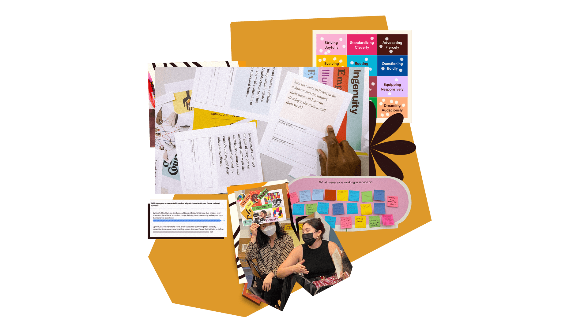
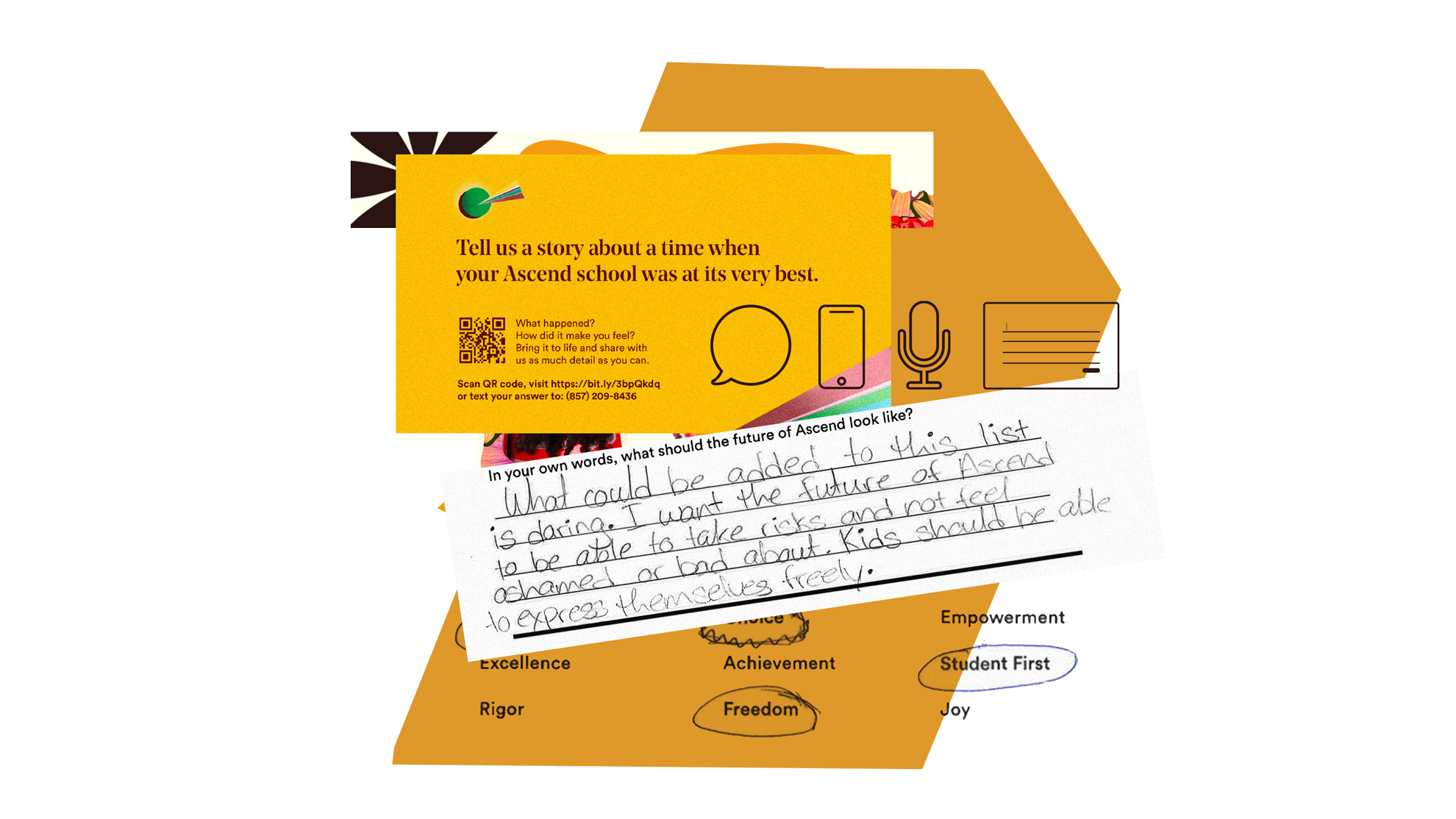
While the project’s goal was serious, the combined team centered the collaboration on bringing back fun, beauty, and imagination to those who could use it most: educators. Through engaging interactive activities, the IDEO team invited principals, PTA members, student council representatives, and board members to join “organizationally sanctioned play” moments like creating collaged vision boards and writing poems about Ascend’s impact. These interventions helped burned-out educators escape the day-to-day tasks of running schools and dream expansively about Ascend’s future. The team also solicited written, visual, and audio stories, asking community members to describe Ascend at its very best.

Stitching together submissions from 551 students, 75 parents, and 16 staff members, the co-design sessions resulted in a powerful new purpose, mission, and values, as well as a vibrant visual language and activation tools to bring Ascend’s vision of a “dope,” “unapologetically Brooklyn” charter network to life. The joyful, eye-catching visuals are embedded throughout its 17 Brooklyn schools, staff recruiting and training materials, and digital presence.
Shortly after the collaboration with IDEO, Ascend received an unsolicited $11 million donation from MacKenzie Scott's foundation, Yield Giving, the most significant gift the then-14-year-old institution had ever received. The pivotal funding will allow the organization, with its bold new “grown-up” vision, to focus on becoming the school of choice in Brooklyn by 2027.
In the summer of 2021, one in four K-12 teachers was ready to quit. Pandemic stressors and increased curriculum scrutiny were to blame, according to a 2021 Rand Survey.
In 2022, 44% of K-12 workers reported burnout, the most of any US professions the time, according to a Gallup Poll.
Pandemic exhaustion and leadership turnover left Ascend’s new CEO eager to align staff around an exciting new vision.
$11M grant
Ascend received an $11M grant from the MacKenzie Scott Foundation a few months after the collaboration
1 collective vision
to guide a network of 17 schools

What’s in my Moleskine: Dave Russell
Dave Russell's doodles have a life of their own
IDEO: Tell us about your drawings
Dave Russell: A few months ago I committed myself to drawing a comic a day for one month. I’ve never consciously drawn comics before, but I’ve always admired the narrative skill of artists like Chris Ware and Adrian Tomine, so I thought it would be fun to experiment with the format. While both these artists employ a semi-realistic style to tell human stories, I’m equally inspired by the strange and absurd worlds created by the likes of David OReilly and Pendleton Ward.
When do you find the time?
For me, drawing can be a way of escaping the everyday and exploring imagined worlds. Doodling is like my meditation—it clears my mind and helps me to focus. I try to keep these scribblings to a minimum in face-to-face meetings, but when I’m on the phone my drawing hand has a mind of its own. I’m often surprised by what ends up on the page.
What are your favorite tools?
My go-to, everyday weapon is the Muji Gel Pen. It’s versatile—thin enough to write with and a great weight for small sketches. It’s got to be black and it’s got to be 0.5mm. No exceptions. I recently started using a Pentel Sign Pen to draw with, too. It’s super smooth and the nib feels quite dynamic. It also bleeds less than Sharpies, the ubiquitous IDEO design tool.
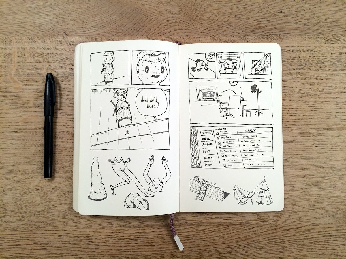
Welcome to the What's in My Moleskine series, a periodic peek inside the notebook of an IDEO designer. Fast Company recently did the same with IDEO's Joe Brown, who had a lot to say about the all-powerful Muji thread-bound A6 notebook.
In this installment we hear from Dave Russell, a communications designer based in our London studio.

Just Skeu It
Translating physical objects to the digital realm through skeuomorphism
I have to find out if I can pull off a successful translation.
I found my most recent skeuomorphic inspiration in Tokyo’s Nezu museum, one of the best traditional Japanese art museums in the country. Nezu was hosting an exhibit on sensu fans. Originally invented in China, sensu fans were popularized in Japan by artists and calligraphers, who used them as a medium for their work.
Taking in the fans, I immediately appreciated the fantastic woodblock artwork and beautiful brush strokes, but what really struck me was their construction and mechanics: the hand-held fans open with the flick of a wrist. I couldn’t get them out of my mind. How did they open and close so efficiently? How did the bamboo supports slide smoothly over one another? Did the creators consciously build them to open with a simple hand gesture? And what was the point of making them retractable in the first place?
I began to realize that the only way to satiate my curiosity was to make a digital re-creation of the sensu fan. Translating the fan’s physical systems to the digital world would test my skills as a designer and help me to understand its essential systems.
Observable systems
In any skeuomorphic project, the question I usually start with is: What elements capture the essence of the subject? Is it its purpose? Or is it characterized by its design, its construction, its movement, or its interaction? To find the answer, I need to look beyond the face of the object and break it down into the shapes, motions, and systems that define it.
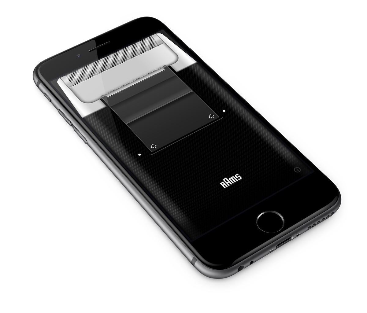
The first app I ever created was a tribute to an electric razor from the late 70s designed by Dieter Rams. I can remember watching my father run that razor over his face every morning. Though I didn't know it at the time, it was the first well-designed product I ever came in contact with. I can still hear the click of the slide-up power button and the sound of the vibration that it made as it glided over my dad’s stubble. When I built an app version of the razor, I realized that the sound and the micro-movements were the two key aspects of the design that I had to translate to make a satisfying digital interpretation.
I used a combination of animation, vibration, and sound (tilting the phone toward your face makes the phone play a beard-cutting sound) to bring the razor to life. The result was a super-tangible app that made the device feel so much like a real razor that you could almost forget it was a phone. Unfortunately, Apple didn’t quite get it—they claimed it was “too useless” for the app store—but for me, it was a ticket back to my childhood.
Considering design
Far from useless, skeumorphic explorations make me a better designer. The challenge of breaking down a real-world object into a set of Photoshop layer styles is my idea of time well spent. I strive for efficiency: Whether it’s lines of code or the number of layer effects, minimization is the key to honing my design skills.
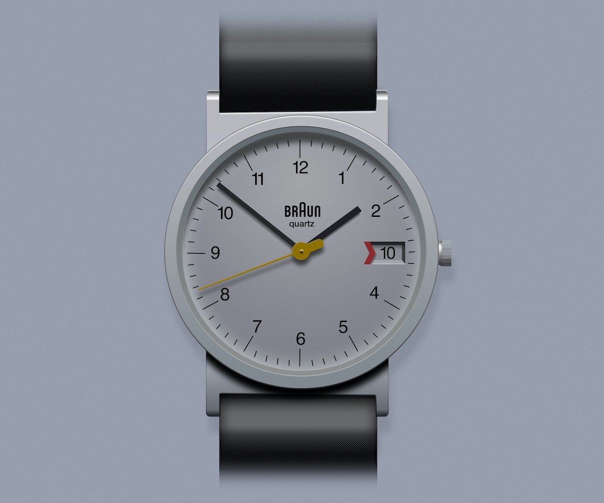
When I did a translation of my Braun AW-20 watch, I managed to perfectly capture the essence of the watch in 27 layers with one to three styles each. I plan on returning to it one day to bring it life in code.
Bringing it to life
When I began my skeumorphic translation of the sensu fan, I felt it was critical to capture the physics of the opening and closing motion. This meant that I wasn’t working with Photoshop layers, but with code. At IDEO, I tend to design with code as much as I do with Photoshop or Sketch. Having a good grasp on code allows me to think deeper about physical-to-digital translations, and real-world systems are better expressed and executed in certain programming languages than others. My first attempts at recreating the fan were standalone applications in openFrameworks—a set of C++ libraries packaged together for creative programming. I started playing with the Box2D add-on for openFrameworks, which was put together by my colleague Todd Vanderlin from our Cambridge office. While the add-on worked perfectly, the digital replication of the fan’s real-world physics just didn’t capture the magic of the construction and movement.
Because the stand-alone nature of openFrameworks limited the reach of the project, I moved on to exploring more accessible web technologies like CSS3 and JavaScript. I had to compromise slightly on the real-world look of the fan, but the final expression really embodies the movement and interaction that fascinated me when I encountered the Sensu fans at the museum. What’s more, users can manipulate jQuery parameters to change the fan's size, color, and decoration—a digital version of what traditional Japanese artists have done with the fans throughout history.
By creating these translations and exploring the life of the subject, I end up discovering something deeper about the object's design and meaning in the world. Likewise, by creating these challenges, I end up discovering something about myself and my skills as well.
A few times a year, I’ll come across something—maybe an object or system; maybe just an idea—and I’m overwhelmed with a burning urge to translate it into code and design. It’s a practice usually referred to as skeuomorphism, and once a project captures my imagination, there's no going back.
How We Did It: Buildings Tell Us Just How Green They Really Are
A revolutionary new LEED plaque makes sure structures live up to their green potential
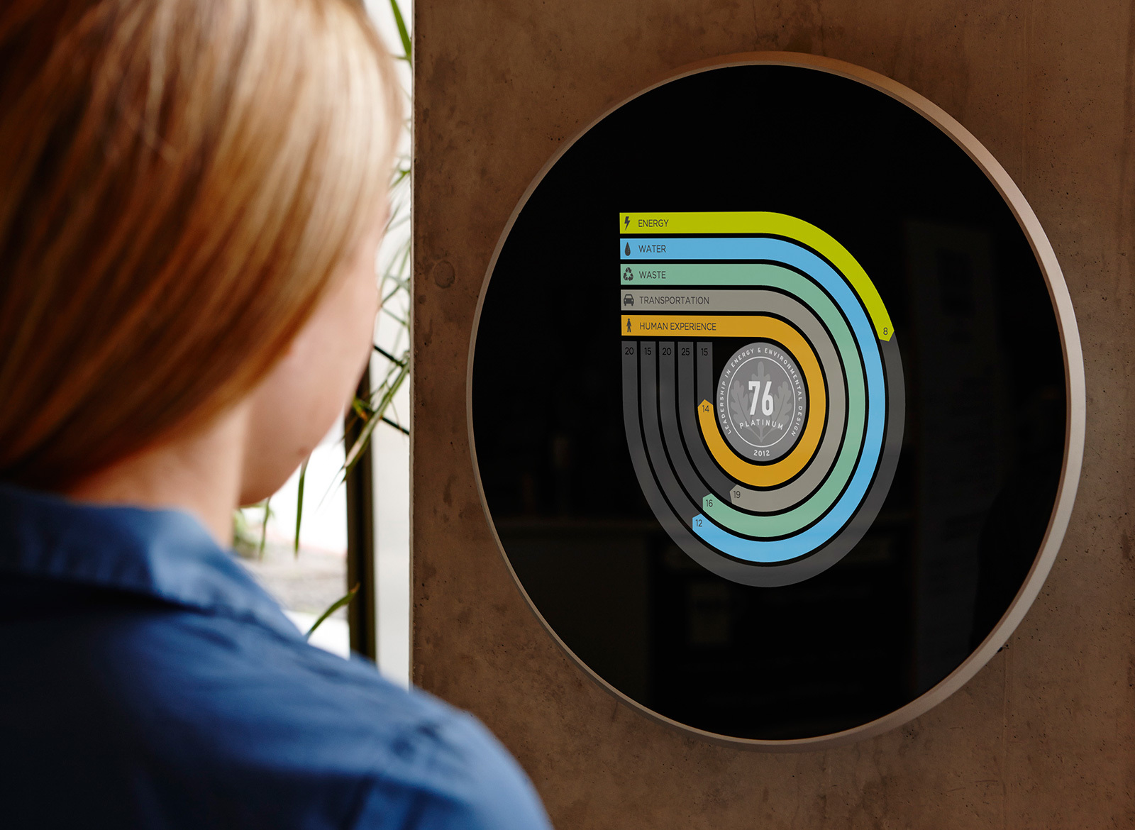
But when IDEO worked with the USGBC to come up with a new LEED certification plaque, it became clear that software design would be a fundamental part of LEED’s future: The idea was to replace the static plaque with a continually updated digital display. Initially, LEED only looked at a building’s performance at the time of certification. The USGBC has long been working on ways to evaluate what happens after certification, and a recertification program has been in place since 2004. The new plaque was conceived to go even further, monitoring a building’s sustainability in real time on a dynamic digital graph.
That sounds (and looks) pretty simple and intuitive, but to make it work, we had to bust down some interesting technical walls, in a way that nicely encompassed the breadth of IDEO's capabilities, from design research, business development, industrial design, shop building, and interaction design to the software I helped create with an incredible team.
I came on board after the actual visual design had been finished. A small IDEO team had already completed a concept video, unveiled at the 2013 Greenbuild conference, for a plaque that calculates a building’s ongoing performance in five categories: energy, waste, water, transportation, and human experience. For each of the five ratings, there is a curving pathway that gets longer as the score improves.
The team came up with this “racetrack” design to show real sustainability data in a way that encourages positive behavior change. Familiar graphics like charts and graphs tend to make people focus on the negative, whereas we wanted people to focus on progress. No matter how long the strip on the racetrack is, you can see that you’re on your way, even if you still have a ways to go. We weren’t sure we could achieve the requisite combination of elegance and functionality in the time allotted. But it was a good challenge, and that in itself was compelling.
The animation has a big purpose: Showing the building’s use of energy, waste, and water makes people more aware and more conscientious of their own use. I think that’s really positive. The plaque also shows how occupants travel to and from the building, as well as how comfortable and happy they feel when they’re inside, which are new ideas for what it means for a building to be “green.” I wouldn’t have thought, when LEED was introduced in 2000, that a software developer could have a meaningful impact on sustainable architecture, but the fact that I could really speaks to the opportunities that will be open to us in the future.
--
Many folks helped to contribute to this post. Huge thanks to Scot Horst, Gretchen Sweeney, Jennifer Easton, Kim Cullen, Gerry Harris, Steve Bishop, Beau Trincia, Mark Harrison, John Stoddard, Alastair Warren, and Building Robotics.
I've always had a layman's interest in architecture and in LEED, the U.S. Green Building Council’s certification program for sustainable buildings. I’m a software developer, so designing buildings is well outside my area of expertise.
Nature Cards
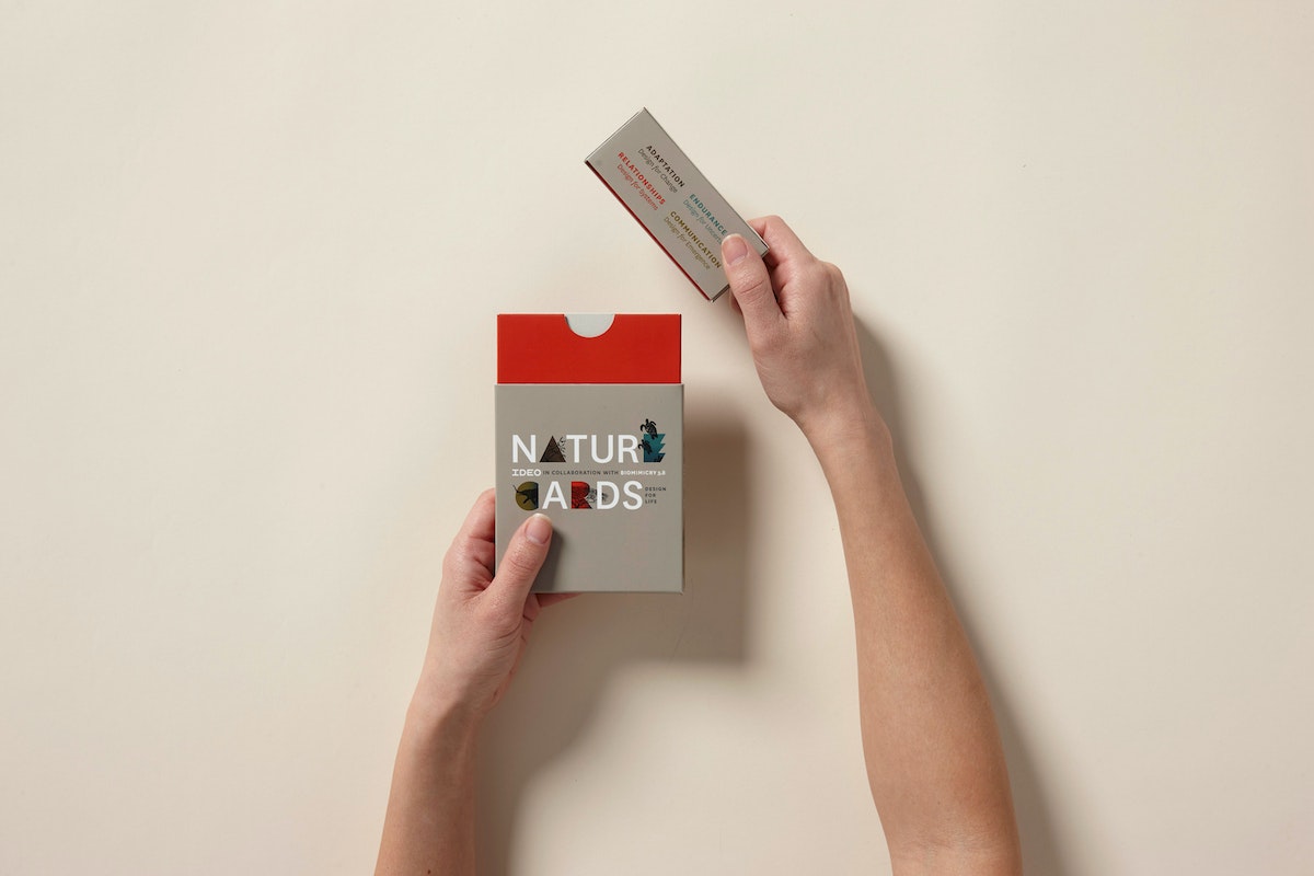
Nature Cards are a collection of cards featuring strategies from the natural world that inspire us with a new mindset as we approach design challenges.
Nature Cards are a collection of cards featuring strategies from the natural world that inspire us with a new mindset as we approach design challenges. Use them to frame your design challenge, evolve your business strategy, brainstorm, teach, or simply to think creatively and holistically with nature in mind.
As human-centered designers and innovators, our work has always been inspired by observing people’s natural behavior in its physical, social, and cultural context. As we address increasingly complex and systemic challenges, recently some of us at IDEO have been exploring how human-centered design might broaden its lens to include observation of the natural world in which humans are an integral part. With the help of experts in biology and the life sciences, we are learning about the principles of successful strategies in living systems. This knowledge is inspiring new thinking about how and what we can create for a thriving future.
Download the complete set of Nature Cards here.

Lindsey Turner
I’m passionate about building brands, products, and experiences that help organizations show up with meaning and momentum.
I help organizations cut through complexity by shaping how they show up, through brand strategy, identity, and storytelling.
Working at the intersection of brand and business, I bring an editorial eye and a bias toward making—turning ideas into tangible experiences that people can understand, trust, and believe in.
My work spans government, healthcare, financial services, media, and consumer goods, from launching Gen Z-focused ventures to building innovation labs and reimagining legacy brands. I relish moments of ambiguity and enjoy translating across teams, perspectives, and priorities to move ideas forward.
I started my career in editorial and digital design, shaping cross-platform experiences and identity systems in publishing and agency environments. That foundation still shapes how I work today: I’m detail-oriented, collaborative, and overreliant on the Oxford comma. I hold a BFA in Visual Communication from the School of the Art Institute of Chicago.

Rachel Young
My work helps organizations see who their products aren't working for—and build the will and the tools to do something about it
For 25 years, I've asked the same question: Who does this design exclude—and what are we going to do about it?
My work spans human-centered strategy, inclusive design, and qualitative research, with clients ranging from Microsoft, Google, and Verizon to the National Science Foundation, and San Francisco Unified School District.
Before IDEO, I taught elementary school in East Palo Alto and spent a decade doing design work with social service organizations—where I learned firsthand what it costs people when systems are built without them in mind.
I am currently writing User Error, a nonfiction book about digital access and the design decisions behind it. I live in Oakland, California.

Brian Pelsoh
I lead with craft, ensuring our work is creatively excellent: rooted in deep human insight and imagination, while also grounded in the realities of business and technology.
My expertise spans brand, communication, and product design across tech, education, the arts, and social impact.
I believe great work demands both high-level vision and obsessive attention to detail, and only happens through collaboration.
I bring an inclusive, hands-on approach and a deep understanding of business, which enables me to consistently deliver excellence while always asking why.
Before joining IDEO, I worked at the brand firms Pentagram and VSA Partners. I began my career as a designer, leading teams at the School of the Art Institute of Chicago and the Milwaukee Art Museum. I hold an MFA in graphic design from Maryland Institute College of Art and a BFA in communication design from the Milwaukee Institute of Art & Design, and have taught at some of the best design schools in the US.

Tony Wong
I am responsible for IDEO’s long-term success in China and working with clients to use design as a tool to enable growth.
I am responsible for IDEO’s long-term success in China and working with clients to use design as a tool to enable growth. Specifically, I have helped Chinese companies design holistic brand solutions through the development of their products, communication, services, and innovation teams, and I have helped multinationals expand their presence and influence in China.
I advise global leaders on developing China-led innovation and capabilities.
In over 15 years in IDEO Shanghai, I have worked on projects that use design to elevate the quality of the experience of healthcare products and services, streamline processes that increase productivity, create spaces and programs that promote and enable inclusive communities, and build next generation mobility solutions that are planet-positive.
Before joining IDEO, I worked at Philips Electronics and the Electrolux Group in Italy, the Netherlands, and Singapore on a number of breakthrough commercial products. I am a member of the Young President Organization in Shanghai.

Building a personal AI for the messiness of life: Sida Li
Most AI products today are built for work—a space with clear problems and established systems. One founder noticed a gap: personal life is messier, harder to systematize, and mostly left behind by the AI boom. So she built Cue, a personal AI that lives inside iMessage and group chats, to go where the other tools haven't.
In this episode, Becca Carroll, IDEO's Chief Strategy Officer, talks with Sida Li, co-founder and CEO of Shared Context Lab, about staying anchored to a human need while the technology around her keeps changing shape, why she treats her business model with the same rigor she'd bring to a product, and what it feels like to build a company at this particular, disorienting moment in AI.
The conversation also gets into how Sida makes design decisions: the language Cue uses to describe itself, the tradeoffs behind building inside iMessage instead of a new app, and a real story about a business idea that didn’t pan out.
This is the second in a two-part series profiling founders from IDEO's Startups-in-Residence program. The first conversation is with Johannes Seemann, founder of Sooner, on designing GenAI for the emotional side of money.

Designing GenAI for the emotional side of money: Johannes Seemann
Most personal financial tools are built to run the numbers and optimize towards a budget. While that works for some, most people experience money as a lived relationship that does not neatly fit into a spreadsheet. Johannes Seemann and Becca Carroll discuss why money is emotional before it is mathematical, and what a human-centered approach to building a generative AI financial product looks like in practice.

The curious leader's edge in uncertainty: Scott Shigeoka
Mina Seetharaman talks with Scott Shigeoka, author of Seek and Head of Curiosity Cultivation at the Eames Institute, about what distinguishes genuinely curious leadership from performative curiosity, how power dynamics shape curiosity, and why practicing curiosity can restore energy rather than drain it.

How constraints make us more creative: David Epstein
Mina Seetharaman talks with David Epstein, author of Inside the Box and Range, about why total freedom often produces average work, how leaders can design useful limits on purpose, and what organizations such as General Magic and Pixar reveal about the relationship between boundaries and creativity.
Looks like you might be in search of something very specific?
Or reset the filters above and try another angle.
Here’s some random inspiration

Podcasts about creative leadership

Articles about the power of prototyping
