
.svg)



New digital ways to pay
A flexible, functional form of payment.
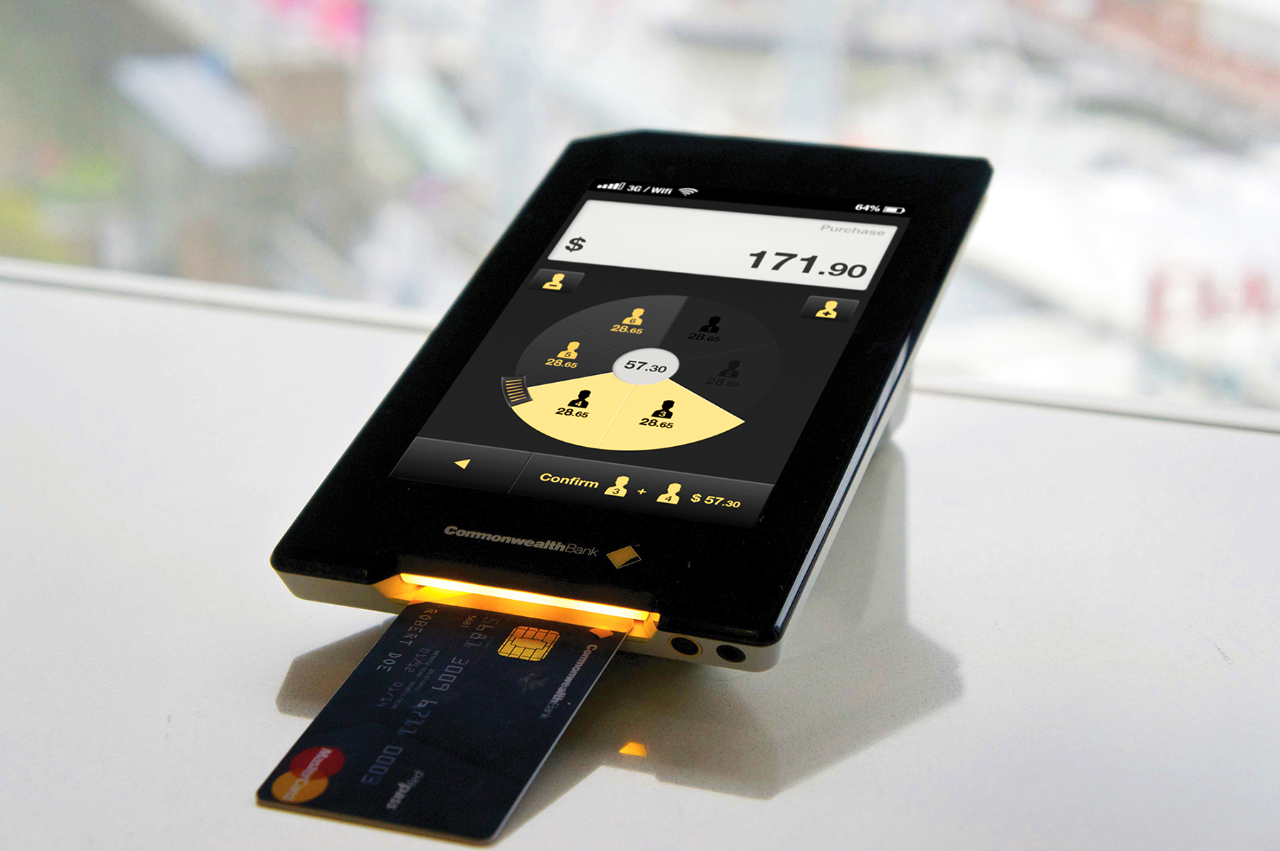
Commonwealth Bank of Australia was interested in helping customers and businesses build close connections. They believed the way to do this would be by creating richer interactions around different forms of payment. The bank approached IDEO to explore these opportunities, and the result is a new retail business platform—Pi—and a portable payment device—Albert.
Pi brings a new level of flexibility, functionality, and customization to the face-to-face interaction between a cashier and a customer, improving everything from the process of splitting the bill in a restaurant to helping a guest find more personalized experiences at a hotel.
Insights
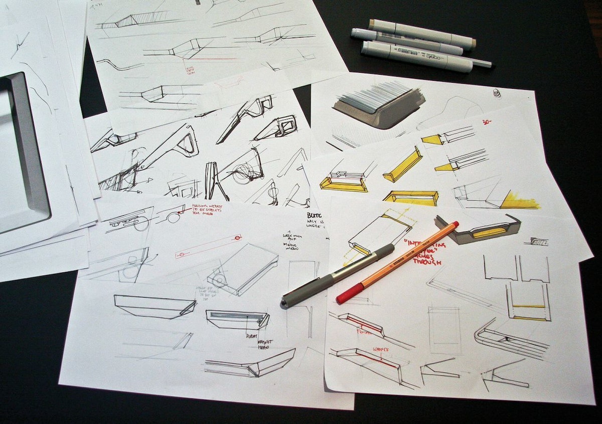
In the team’s research in Australia, the UK, and Germany, they found a few key insights that informed the design. First, they saw that an ideal platform should support the full spectrum of human behaviors around payment. Second, platforms can add value by improving the relationships among banks, merchants, and customers. And third, the payment experience should be customized to fit a specific setting, working one way in a luxury boutique and another in a gas station.
IDEO, CBA, and Wincor Nixdorf worked together closely to steward the design of Pi And Albert through product development and implementation, and to gather feedback from merchants during rapid, iterative cycles.
Results
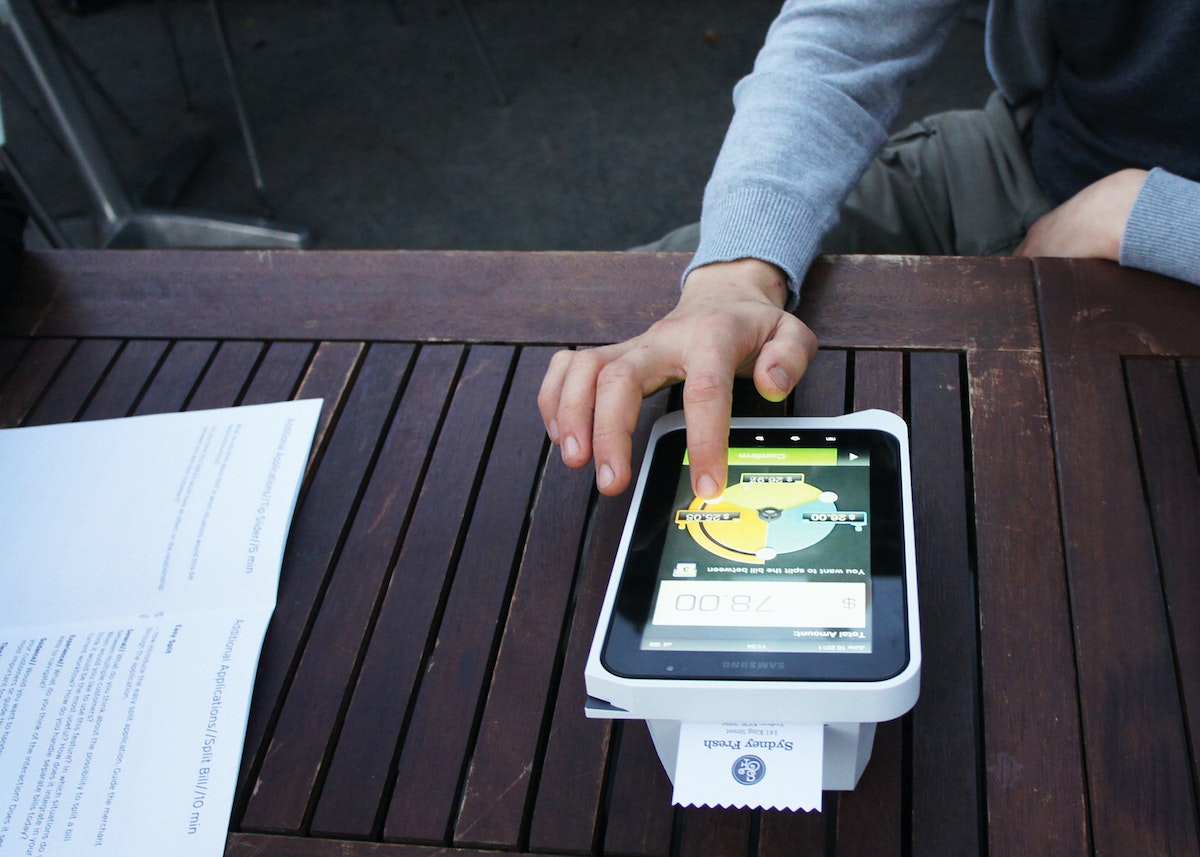
The platform is flexible enough to benefit organizations of all sizes: Larger merchants can incorporate Pi as part of their existing network, while smaller merchants can grow their business using powerful business tools. And customers of all kinds can easily access a variety of payment methods and helpful applications.
Albert offers a large touchscreen that’s intuitive to use, the safety of virtually encrypted PIN entry, and a variety of ways to access data connections. A large battery provides power when retailers are on the go, and a modular housing means that Albert can be used in all kinds of situations. The device is built to handle current card payment methods but can also adapt to how cards might be accepted in the future, and even eliminates the need to swivel a screen from cashier to customer during the payment process.
Making health insurance enrollment easy
Designing a digital platform prototype for Californians to sign up for health insurance.
Forty million Americans became newly eligible for health coverage when the Patient Protection and Affordable Care Act (ACA) was fully implemented in 2014. Some enrolled in health insurance for the first time, while others were able to get better access to affordable health coverage.
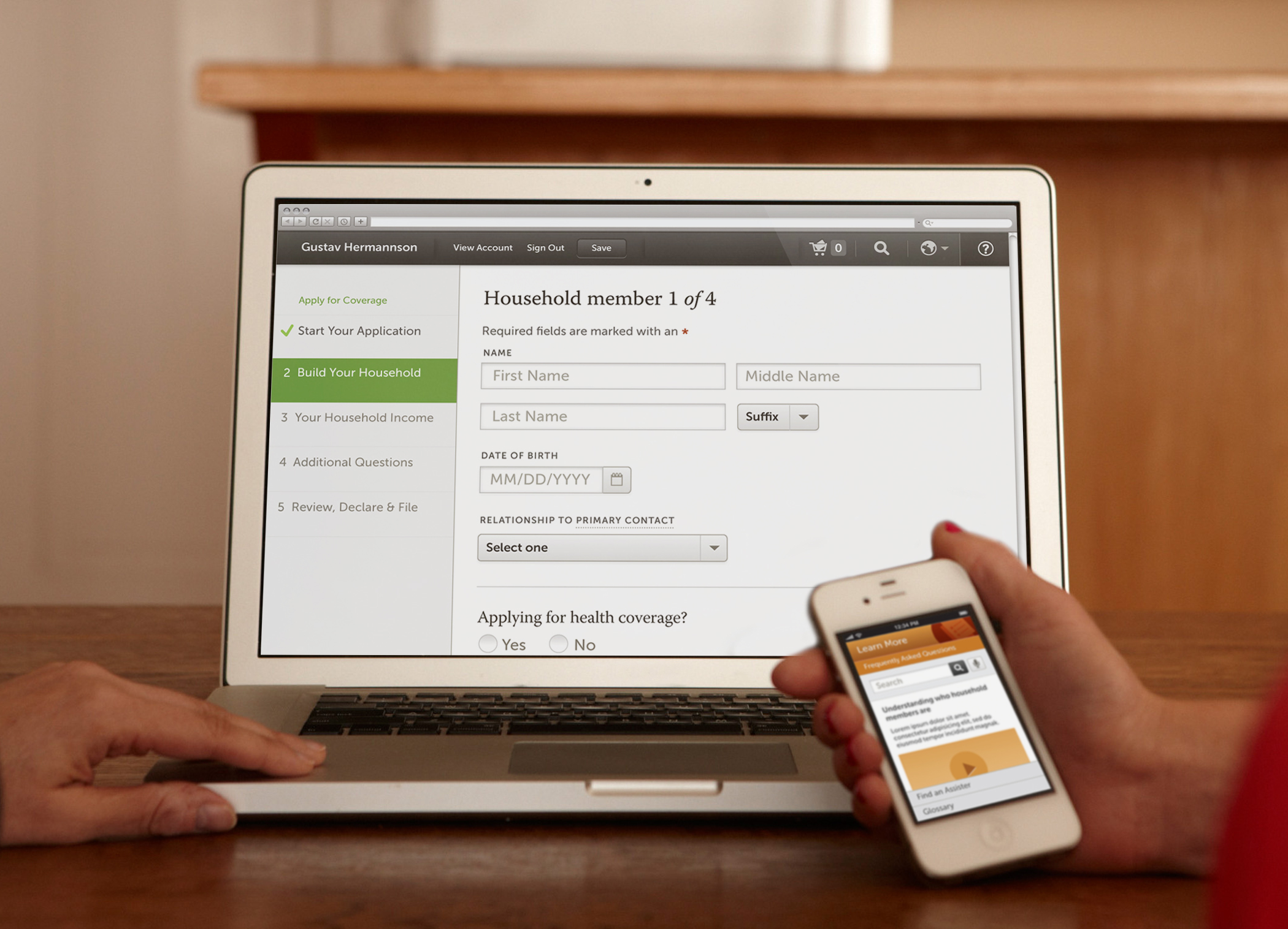
In preparation for the millions of applications, states were required to develop ways for people to sign up for health insurance online for plans that were operated by state and federal governments under the ACA. To help public and private agencies to meet the requirements, a coalition of nine national and state-based foundations, led by the California Health Care Foundation (CHCF) developed a digital enrollment prototype, and hired IDEO to lead the consumer research and design effort.
After a yearlong collaborative process, the resulting 300-page design manual and design reference prototype illustrates a customizable approach to public and private health insurance enrollment.
The flexible set of design standards developed for Enroll UX 2014 aims to make online health insurance enrollment simple, intuitive, and easy to navigate at scale.
Inspiring scientists in their research
Encouraging experts from different fields to collaborate on big ideas.
To encourage PhD candidates to think differently about how they tackle tough science problems, the University of California, San Francisco (UCSF) and IDEO embarked on a fruitful collaboration.
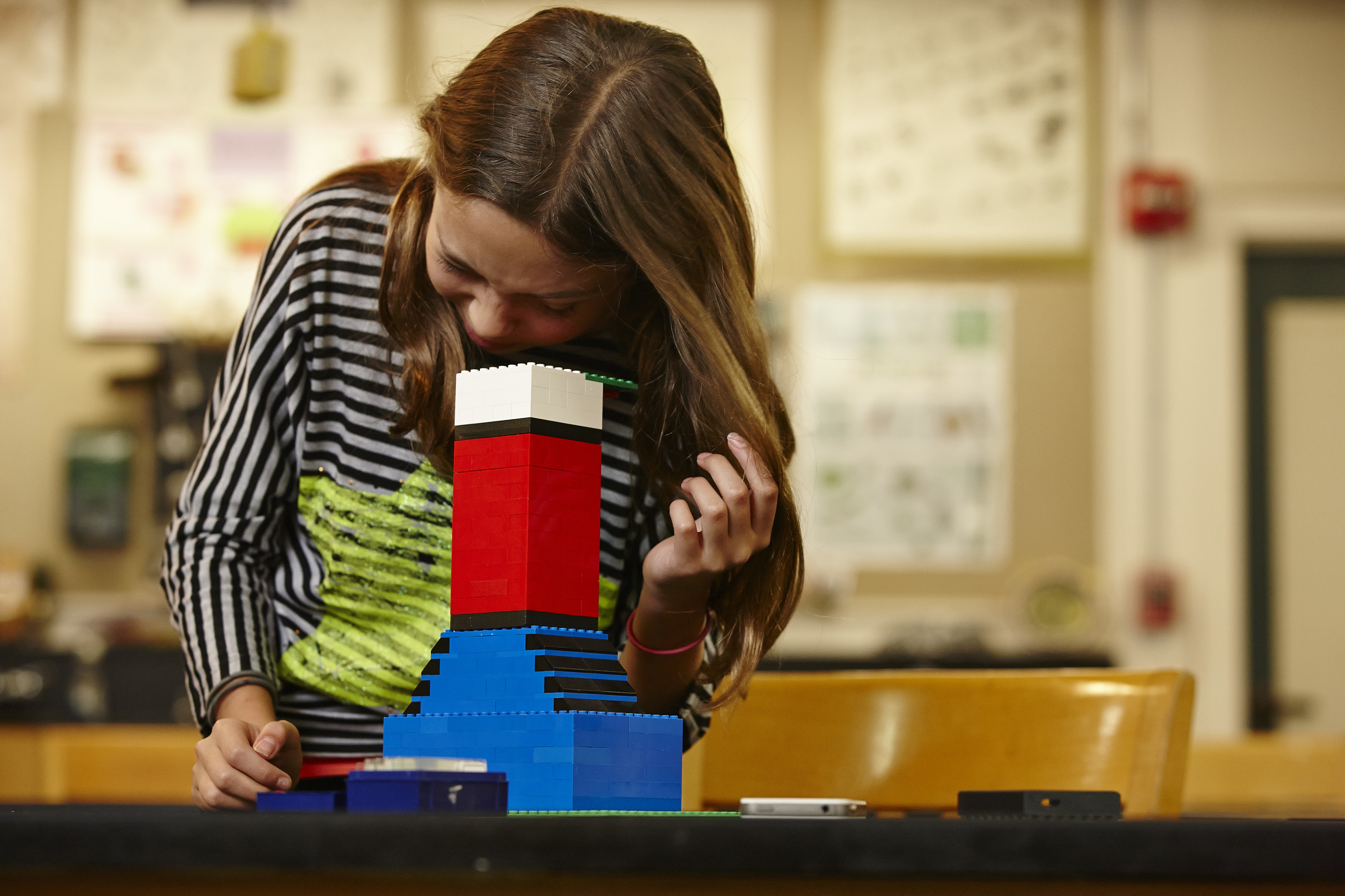
Three PhD candidates were tasked with the following challenge: Cultivate new audiences and uses for a microscope. Drawing inspiration from cell phone microscope CellScope, the trio arrived at a prototype that was less reliant on technology and easily disassembled and reassembled. How? By using the most basic building blocks: Legos.
Made of custom 3-D-printed parts and standard toy building blocks, the LegoScope, which functions as a microscope, can easily snap pieces in and out to hold different components. Both the device and the team-based process are now being used in various other campus projects to change how researchers think about conducting and advancing scientific research.
“The best work in the future is going to be done by teams of people with very different expertise, who know different things and think about things in different ways, who come together to focus on one big problem,” said Keith Yamamoto, vice chancellor of research at UCSF, who led the initiative.
Helping a tech product find its footing
A wearable device that measures concentration and focus gets a brand reboot.
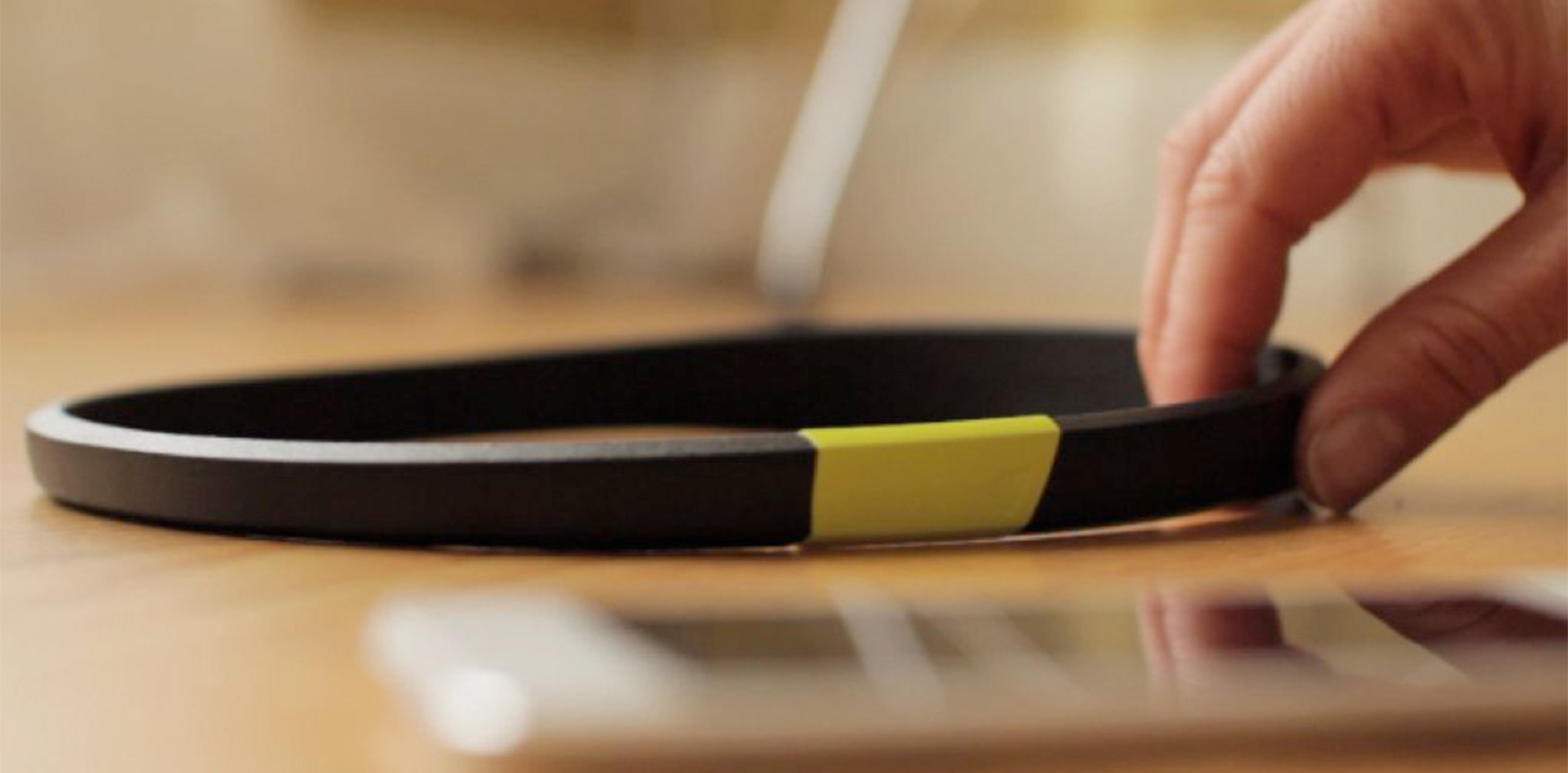
Arye Barnehama and Laura Michelle Berman wanted to take their invention—a headband that measures brain wave activity, focus, and concentration—to the next level. As a part of IDEO’s startup-in-residence program, Barnehama and Berman collaborated with IDEO on the product’s rebranding, hoping to refine and emphasize the product’s promise: When people improve their focus, they feel more mindful, confident, and productive.
With IDEO’s help, the company changed its name from Axio to Melon, delineated their brand, refined its product, developed its user experience, and prepared a Kickstarter campaign that garnered considerable press coverage. The new name, Melon, reflected the friendly, scalable character of the company. The name also suggested the intent of the product—using neuroscience data to inform a personal activity.
To distinguish Melon as a standout in the crowded quantified-self category, IDEO designers made the logo a faceted orb that references the gear-shifting mind, with “Melon” written in a distinctive font born from that same logo. The team went with fruit colors—cantaloupe, honeydew, watermelon—to evoke the sweet, refreshing experience the Melon headband promises.
Together, the Melon and IDEO teams also developed an app that shows increases in concentration after performing certain tasks and features a game in which you “fold” origami through mental focus to hone concentration.
Melon’s new brand strategy and UI set it apart from your typical fitness tracker, engaging the user in an elegant, joyful, and customized experience with every interaction.
Melon: a headband and mobile app to help you measure focus.
This Artist Takes Weaving to a Whole New Level
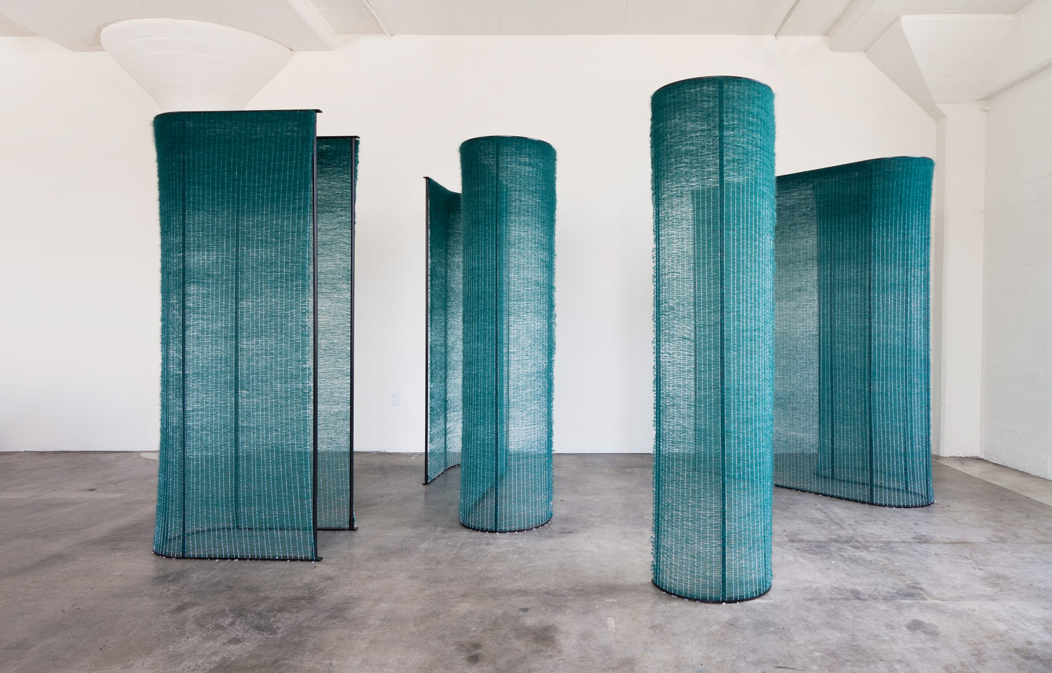
Mimi Jung is pushing the boundaries of textile arts
In one sentence, who are you?
Someone who isn’t ever too embarrassed or ashamed to try.
What do you do? How did you learn to do it?
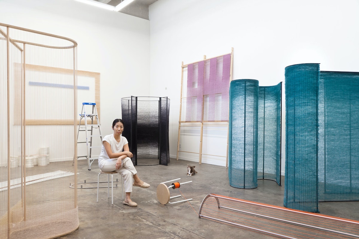
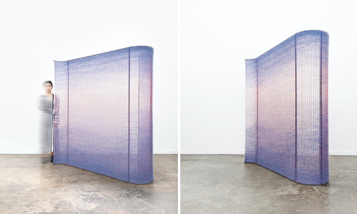
I make work that’s hard to explain to Lyft drivers. The long explanation of how I learned it would be based on a class I took at Cooper Union, my inability to work for others, and a creative yet rough upbringing. The short version is this: Six years ago during a creative drought, I took a few workshops, and basic weaving was one of them. I walked away from it regretful and uninspired. In an effort to salvage the money I spent on the class, I started a project with my new skill set. I broke all the rules I had learned and created my own, and that’s when everything fell into place.
3 favorite possessions?
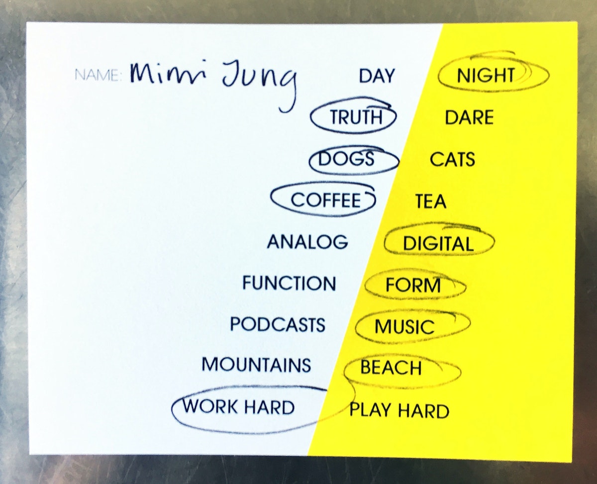
My dogs, Truffle, Stitch, and Sunday.
What does a typical work session look like?
On average, when I’m not under a heavy deadline, I put in about eight hours of studio time. I enjoy working alone, and often in silence.
How do you get over creative block?
I focus on improving my personal life. Usually that’s where I'll find the source of the block.
How do you see the world in 2078?
I’m no longer going to four different supermarkets to get my groceries because I’m dead. In all seriousness, I would like to think that in 2078, a former foster kid will become or already have been elected president of the United States.
What’s your number one bucket list item?
Design my own home/studio on 20+ acres of land.
Who are you creative crushin’ on lately?
My current crushes are Natalie Herrera, Linda Lopez, Ellen Van Dusen, Mimi O Chun, Rami Kim, Dina Satti, and the ladies of Egg Collective.
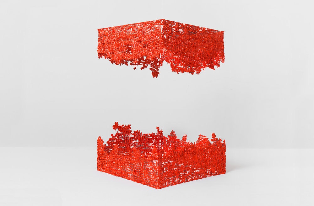
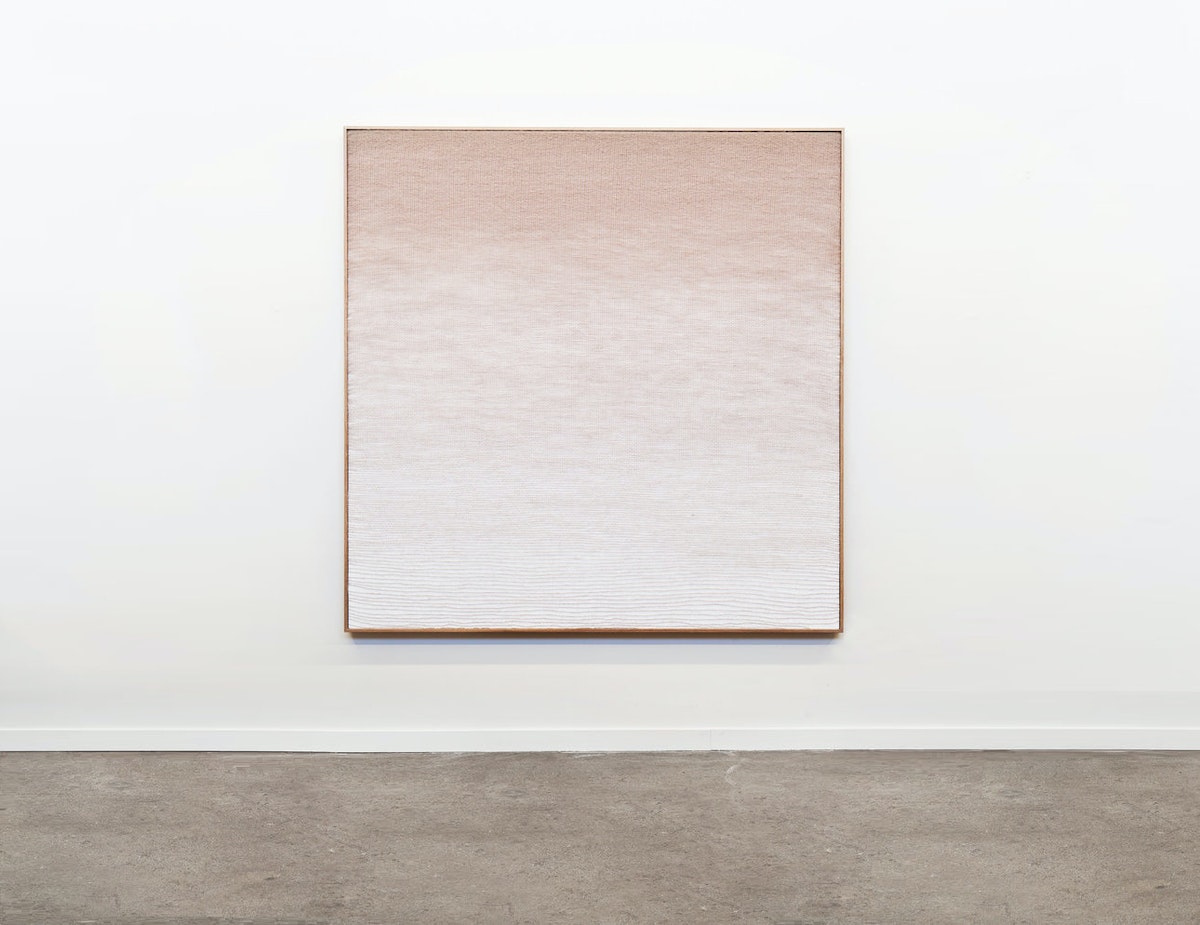
A few years ago, while taking weaving classes in Brooklyn, I stumbled upon Mimi Jung's textile works and was transfixed by their sculptural nature and Mimi's painterly ability. She was accomplishing something with fibers that I had been struggling—and failing—to capture on canvas for years. I've been following her prolific pursuits ever since, and draw on them often for inspiration, so I jumped at the opportunity to get to know Mimi for our Creative Crushes series. Her latest and greatest works continue to push the boundaries of what we know is possible in fiber arts, and it turns out, she's not just a fantastic artist, but a pretty amazing woman too.
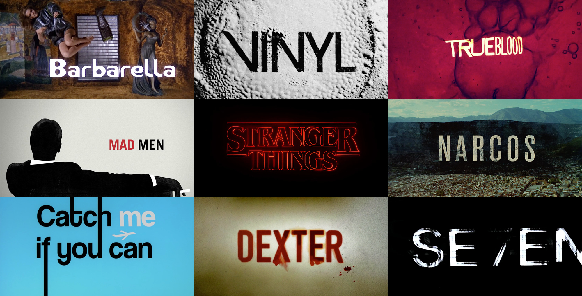
Get Inspired by 5 Great Film Title Designers
How I learned design principles from going to the movies
Before you ever see a movie or watch a TV show, it’s likely that a title screen from a trailer or poster art has gotten you there. As a UX designer, the art of the film title has always inspired me and shaped the way I think about branding and design. Here are the title creators (and one typographer) who have inspired me:
1. Saul Bass
Saul Bass is among the pioneers of title design. In 1955, his title sequence for Preminger’s The Man with the Golden Arm made him famous. He then went on to design for Alfred Hitchcock, Stanley Kubrick, and Martin Scorsese. His work showed that the first minutes of a film are of great importance. When played right at the beginning, titles serve as an overture, foreshadowing part of the story, mood, or theme. It’s a dramatic device that puts the audience in the world of the movie before they even start watching it.

Opening title sequences by Saul Bass.
Bass put it this way: “I saw the title as a way of conditioning the audience, so that when the film actually began, viewers would already have an emotional resonance with it.” It's helpful advice for anyone designing a title page, presentation, or home screen. With those elements, title designers prepare audiences for what they're about to see. “Try to reach for a simple, visual phrase that tells you what the picture is all about and evokes the essence of the story,” he said.
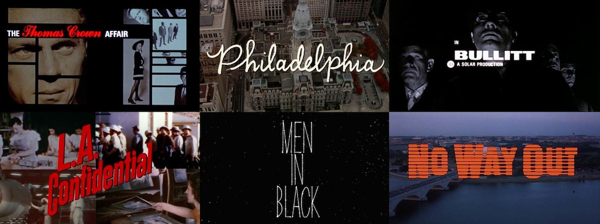
Opening title sequences by Pablo Ferro.
2. Pablo Ferro
One of Bass’s fellow title designers was Cuban-born Pablo Ferro, who has designed title sequences for more than 100 films. He taught himself animation from a book by Preston Blair, who worked at Walt Disney productions.
Title designers like Ferro put a lot into setting the right tone, time period, and scene for the story you’re about to see—and it all starts with font. Whether it’s custom or off the shelf, font conveys a certain character and builds the brand for a movie or show. Ferro loved hand-lettering and designed many of his own fonts. When Kubrick asked him to design the title sequence for Dr. Strangelove, Ferro chose to use a tall, thin lettering that he had scribbled in one of his notebooks so that it wouldn't obscure or distract from the underlying footage.
3. Maurice Binder
Having designed title sequences for 14 James Bond films, Maurice Binder created a signature style that used silhouettes and bold typefaces to evoke espionage and intrigue. In the opening sequence for Agent 007 against Dr. No, Binder established the famous gun barrel sequence, initiating the pop era of graphic design. Binder's work is a great example of how consistency of style and typeface help build a strong brand.
4. Ed Benguiat
Does the font EF Windsor Light Condensed look familiar? Maybe set in white on a black background, accompanied by some jazz music? Yup, it’s the signature opening for Woody Allen movies. Allen happened to have a conversation with typographer Ed Benguiat in a diner in New Jersey one morning, and Benguiat recommended he use the Windsor typeface for its warmth and friendliness. Allen loved it and used it for almost all of his titles from then on. Though Benguiat isn't technically a title designer, his fonts have been an influence on many.

5. Imaginary Forces
Typographer Ed Benguiat plays a role in our final example, too. Michelle Dougherty—of acclaimed design firm Imaginary Forces—ended up choosing his self titled font, Benguiat, as the primary typeface for the Netflix series Stranger Things. She chose it for its strong 80s appeal and ties to paperback novels from that era.
Then there was the matter of animating the logotype and adding sound and music to bring it to life. The Stranger Things title sequence shows how powerful and expressive type in motion can be. Flickering lights that imitate the optical process, morphing serifs, and the admittedly intense score convey that eerie feeling of mystery. The title sequence for Stranger Things was so well received, a couple of title generators and copycats popped up on the internet to imitate its style.
Opening sequence of Stranger Things designed by Michelle Dougherty with the Benguiat typeface.
To view a great selection of classic and contemporary title sequences head over to The Art of the Title.
Title sequences in the header image by Maurice Binder (Barbarella), Imaginary Forces (Vinyl, Stranger Things, Mad Men), R/GA (Seven), Digital Kitchen (Trueblood, Narcos, Dexter), and Nexus Productions (Catch Me If You Can).
Great movie titles permanently burn into our brains. Everyone can identify a James Bond film by its graphic overlays of babes and guns. And who could ever forget Star Wars’ opening crawl, how it scrolls back into space as John Williams' famous theme—da, dee dee da, dee dee da—echoes through the theater.
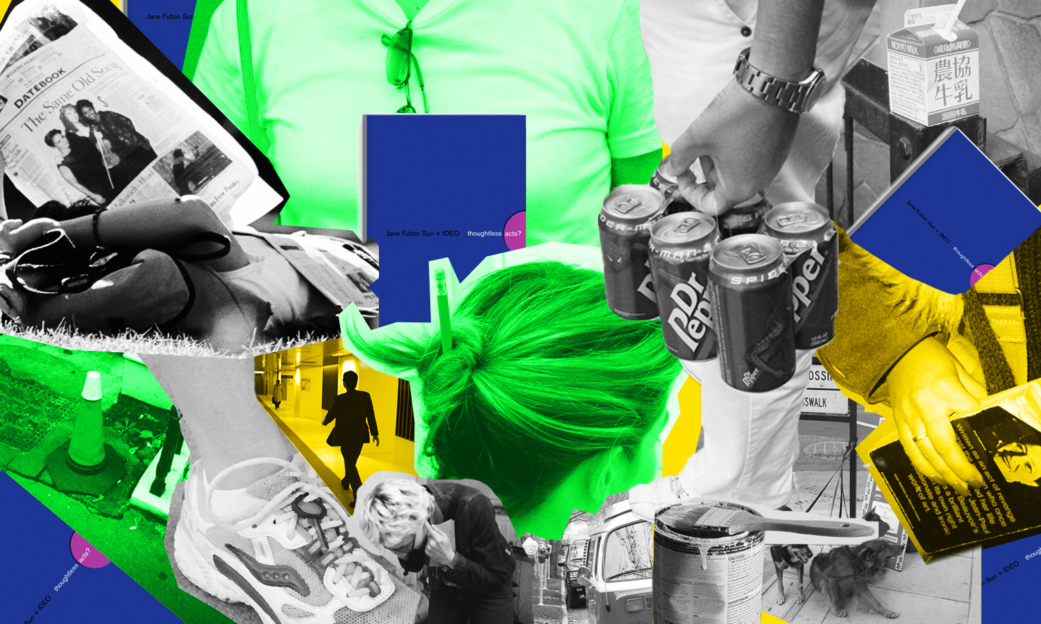
Thoughtless Acts: Headphone Helper
Thoughtless Acts: Headphone Helper. The intuitive ways we adapt and react to things in our environments
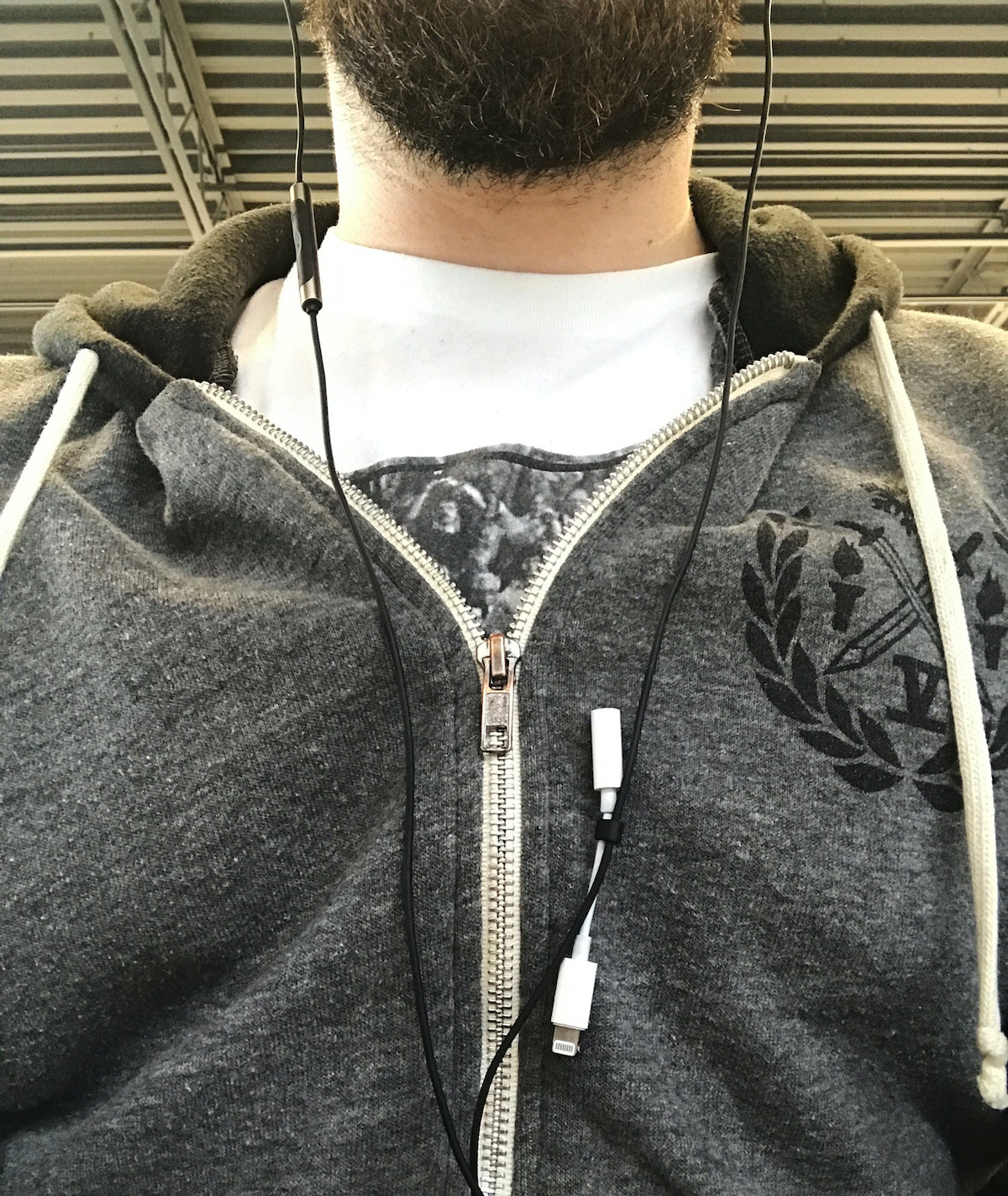
My coworkers recently called me out on a thoughtless act I'd been doing for months without even noticing. Not long ago, I upgraded my phone to a certain unnamed model whose designers decided to remove the headphone jack—meaning you either need Bluetooth headphones or an adapter. As a music nerd who is overly particular about the headphones I use, I wasn't ready to give up my trusty corded earbuds. But I also know that I'll inevitably lose said adapter, because I lose anything that isn't attached to my everyday carry. The catch? Everyday at work, I listen to music from my laptop, which uses a traditional headphone jack. I guess, subconsciously, I found a solution to avoid losing the adapter that was there all along: When I'm not using it, I clip the adapter into the rubber piece that's attached to the the earbuds to keep their cords together. I'm going on six months without needing to buy a new adapter. #Success.
Human-centered design requires us to observe human behavior with beginner's eyes, so that we can spot the innate ways people interact with the world around them. We call these intuitive and unconscious reactions Thoughtless Acts, and IDEO designers collect photos of them to inspire their work.
What Brewing Beer Taught Me About Design
Mapping the future of beer drinking
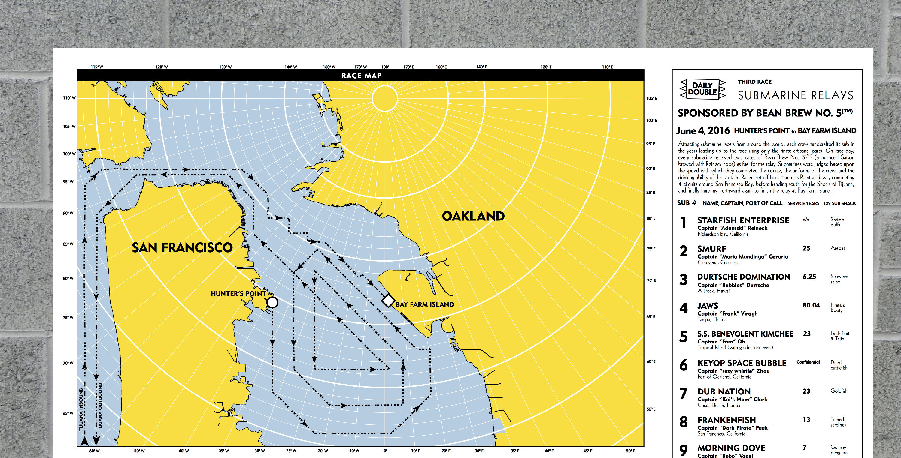
So I decided to pursue my own absurd hobby that would combine my twin passions for beer brewing and fictional cartography into what I hope is the ultimate beer drinking experience. Or at least the most ridiculous. I call it Bean Brew.

We talk a lot about the user journey at IDEO. It’s a way to break down how a person experiences important moments when interacting with a product or service. While bottling my first few batches several years back, I obsessed over the taste of the beer and the bottle's label design—two key moments in the beer drinker's user journey. But then I realized that there are so many other moments that I was leaving out of the design process.
So I asked myself: Could I contextualize the combined drinking experiences of each person who received a bottle of Bean Brew? Could I turn that into a map? And could I deliver that map back to Bean Brew drinkers months later in the form of a delightful silkscreen poster? That became my design challenge.
So what have I learned from my side gig?
1. Quantitative data inspires design
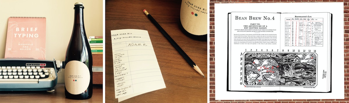
Bean Brew has taught me a lot about how to integrate quantitative survey data into a cohesive storytelling experience (something we’re trying to do more and more of at IDEO these days). I start with questions like these, which I include as part of a survey wrapped around the bottle’s neck:
- What are your three favorite board games?
- Complete the following sentence: If I were on a ship for 1 year, my ideal job position would be ________.
I then transform the responses I get from people who received a particular batch of Bean Brew into a poster that looks something like this.

2. There's more to design than what meets the eye
Sometimes, as you go through the design process, you realize the thing you think you're designing (a bottle of beer) isn’t what you're actually designing (a beer drinking experience). This is true for most of the projects I’ve worked on at IDEO, and for Bean Brew, too.
3. Side gigs = side skills
Finally, I’ve learned a bunch of tangible skills throughout the process of making Bean Brew: Arc GIS (cartography software), best practices for glue adhesion (getting elaborate labels to stick to bottles), and how to use the power of analog experience to blow away anything an iPhone can do. I’m confident that I’ll be applying at least some of these skills to an upcoming IDEO project.
Bean Brew is my attempt to bring as much joy and delight to my hobbies as possible, and in doing so, I find that I’m more more creative and productive as part of my day job. And so much happier.
I am not training for any marathons. Just an expedition to Antarctica. In a submarine. With beer.
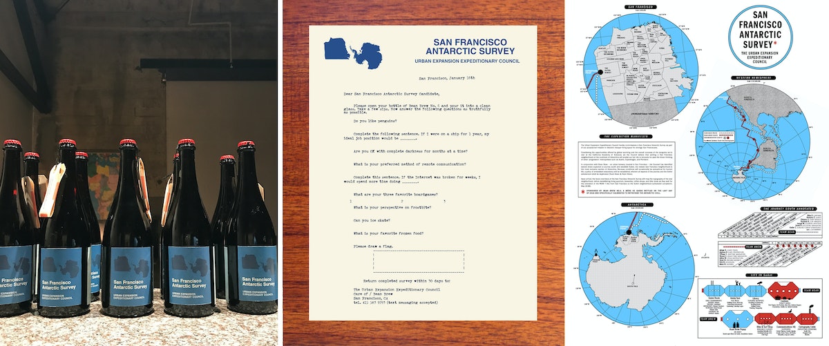
Years ago, I was working at a law firm in Boston. Many of my colleagues had the same hobby—training for the Boston Marathon in the middle of the frigid New England winter. This was what they did for “fun.” I was so amazed that these people with such unhappy day jobs would choose what seemed like such an unhappy hobby to fill their nights and weekends. Many years and two careers later, I moved to San Francisco to take a job as a designer at IDEO. In my first months here, I remember being struck by all of the wonderful and absurd hobbies that my new colleagues had. It was a delightful and inspiring contrast to my dark days in Boston.

Lindsey Turner
I’m passionate about building brands, products, and experiences that help organizations show up with meaning and momentum.
I help organizations cut through complexity by shaping how they show up, through brand strategy, identity, and storytelling.
Working at the intersection of brand and business, I bring an editorial eye and a bias toward making—turning ideas into tangible experiences that people can understand, trust, and believe in.
My work spans government, healthcare, financial services, media, and consumer goods, from launching Gen Z-focused ventures to building innovation labs and reimagining legacy brands. I relish moments of ambiguity and enjoy translating across teams, perspectives, and priorities to move ideas forward.
I started my career in editorial and digital design, shaping cross-platform experiences and identity systems in publishing and agency environments. That foundation still shapes how I work today: I’m detail-oriented, collaborative, and overreliant on the Oxford comma. I hold a BFA in Visual Communication from the School of the Art Institute of Chicago.

Rachel Young
My work helps organizations see who their products aren't working for—and build the will and the tools to do something about it
For 25 years, I've asked the same question: Who does this design exclude—and what are we going to do about it?
My work spans human-centered strategy, inclusive design, and qualitative research, with clients ranging from Microsoft, Google, and Verizon to the National Science Foundation, and San Francisco Unified School District.
Before IDEO, I taught elementary school in East Palo Alto and spent a decade doing design work with social service organizations—where I learned firsthand what it costs people when systems are built without them in mind.
I am currently writing User Error, a nonfiction book about digital access and the design decisions behind it. I live in Oakland, California.

Brian Pelsoh
I lead with craft, ensuring our work is creatively excellent: rooted in deep human insight and imagination, while also grounded in the realities of business and technology.
My expertise spans brand, communication, and product design across tech, education, the arts, and social impact.
I believe great work demands both high-level vision and obsessive attention to detail, and only happens through collaboration.
I bring an inclusive, hands-on approach and a deep understanding of business, which enables me to consistently deliver excellence while always asking why.
Before joining IDEO, I worked at the brand firms Pentagram and VSA Partners. I began my career as a designer, leading teams at the School of the Art Institute of Chicago and the Milwaukee Art Museum. I hold an MFA in graphic design from Maryland Institute College of Art and a BFA in communication design from the Milwaukee Institute of Art & Design, and have taught at some of the best design schools in the US.

Tony Wong
I am responsible for IDEO’s long-term success in China and working with clients to use design as a tool to enable growth.
I am responsible for IDEO’s long-term success in China and working with clients to use design as a tool to enable growth. Specifically, I have helped Chinese companies design holistic brand solutions through the development of their products, communication, services, and innovation teams, and I have helped multinationals expand their presence and influence in China.
I advise global leaders on developing China-led innovation and capabilities.
In over 15 years in IDEO Shanghai, I have worked on projects that use design to elevate the quality of the experience of healthcare products and services, streamline processes that increase productivity, create spaces and programs that promote and enable inclusive communities, and build next generation mobility solutions that are planet-positive.
Before joining IDEO, I worked at Philips Electronics and the Electrolux Group in Italy, the Netherlands, and Singapore on a number of breakthrough commercial products. I am a member of the Young President Organization in Shanghai.

Building a personal AI for the messiness of life: Sida Li
Most AI products today are built for work—a space with clear problems and established systems. One founder noticed a gap: personal life is messier, harder to systematize, and mostly left behind by the AI boom. So she built Cue, a personal AI that lives inside iMessage and group chats, to go where the other tools haven't.
In this episode, Becca Carroll, IDEO's Chief Strategy Officer, talks with Sida Li, co-founder and CEO of Shared Context Lab, about staying anchored to a human need while the technology around her keeps changing shape, why she treats her business model with the same rigor she'd bring to a product, and what it feels like to build a company at this particular, disorienting moment in AI.
The conversation also gets into how Sida makes design decisions: the language Cue uses to describe itself, the tradeoffs behind building inside iMessage instead of a new app, and a real story about a business idea that didn’t pan out.
This is the second in a two-part series profiling founders from IDEO's Startups-in-Residence program. The first conversation is with Johannes Seemann, founder of Sooner, on designing GenAI for the emotional side of money.

Designing GenAI for the emotional side of money: Johannes Seemann
Most personal financial tools are built to run the numbers and optimize towards a budget. While that works for some, most people experience money as a lived relationship that does not neatly fit into a spreadsheet. Johannes Seemann and Becca Carroll discuss why money is emotional before it is mathematical, and what a human-centered approach to building a generative AI financial product looks like in practice.

The curious leader's edge in uncertainty: Scott Shigeoka
Mina Seetharaman talks with Scott Shigeoka, author of Seek and Head of Curiosity Cultivation at the Eames Institute, about what distinguishes genuinely curious leadership from performative curiosity, how power dynamics shape curiosity, and why practicing curiosity can restore energy rather than drain it.

How constraints make us more creative: David Epstein
Mina Seetharaman talks with David Epstein, author of Inside the Box and Range, about why total freedom often produces average work, how leaders can design useful limits on purpose, and what organizations such as General Magic and Pixar reveal about the relationship between boundaries and creativity.
Looks like you might be in search of something very specific?
Or reset the filters above and try another angle.
Here’s some random inspiration

Podcasts about creative leadership

Articles about the power of prototyping
