
.svg)




Using design thinking to create a better car
A legacy car brand embraces design thinking and collaboration to develop the luxury crossover Lincoln MKC.
Designing a new car takes years and requires strong collaboration between thousands of people. So when the Lincoln Motor Company began developing the luxury crossover Lincoln MKC, they invited IDEO to share key design-thinking methods to employees and departments to improve the process and to land on a better product.
IDEO built a pop-up studio inside an old manufacturing bay at the company’s Dearborn, Michigan, headquarters, and organized a collaboration between IDEO designers-in-residence and Lincoln employees from different departments. During the six-month collaboration, the IDEO team built a full-scale interactive car prototype to make various in- and out-of-car experiences tangible, and collected user feedback along the way. And they shared key design-thinking methods, which helped galvanize action across different teams, and sped up understanding of design thinking.
The MKC is credited with helping the Lincoln brand outpace growth in the luxury segment by more than two-to-one over competitors. Next up is turning the heads of luxury customers in China, where Lincoln plans to open 60 stores in 50 cities by 2016.
"By bringing together all our key internal stakeholders, the MKC meets and exceeds customer expectation," said Scott Tobin, Director, Lincoln Product Development.
Transforming the banking experience
A Peruvian bank creates a more welcoming environment for customers.
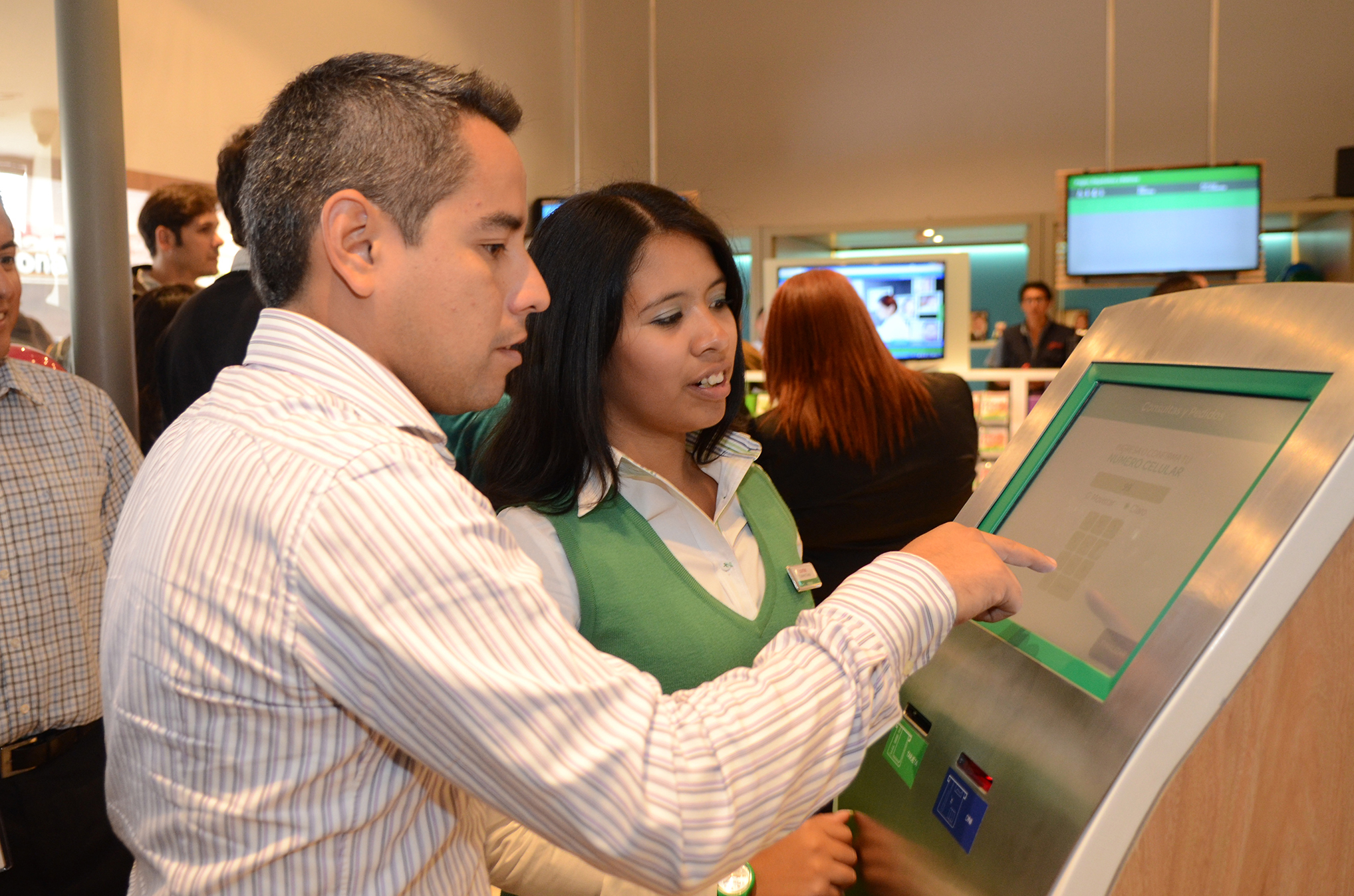
Despite recent advances in Peru's banking infrastructure, the Peruvian public remains largely disengaged with its country’s banks. About 75 to 80 percent of the population lacks a bank account, preferring to safeguard cash at home versus entrust it to any institution. This represents a huge challenge—and opportunity—for Interbank, one of Peru’s largest financial-services firms.
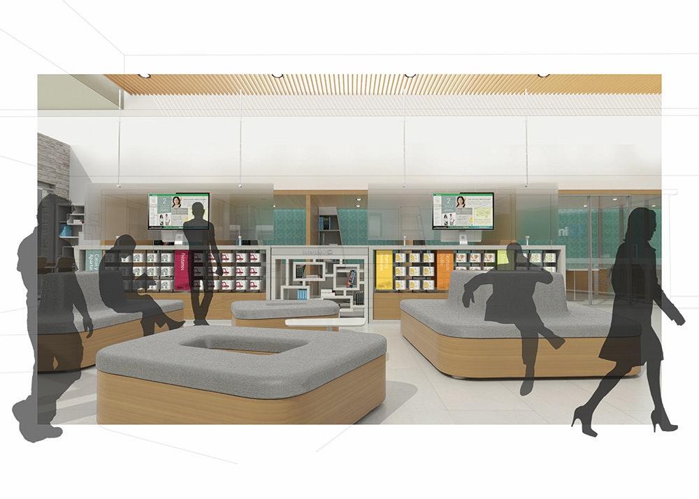
Interbank and IDEO designed a customer experience that would differentiate the Interbank brand and capture a larger share of market. The result, an experimental space called Interbank Explora, is intended to serve as an “innovation lab,” where the company can continue to try the most advanced financial service offerings and get feedback from clients.
This fun and expressive environment—designed for customers, with customers—provides a sharp contrast to competing banks in Peru, which tend to be sterile, formal places that look like hospitals and have long lines. In its initial 60 days of operation, Explora exceeded expectations: Sales more than doubled overall, customer satisfaction rates improved from 33 to 84 percent, and profitability grew, including a 138 percent gain in non-interest-income activities.
The next-generation hotel experience
Getting the details right to improve travelers' stays.
Whether it’s the receptionist’s smile at check-in, the tasty snack at the bar, the thoughtfully designed lobby, or an easy-to-use mobile app, a hotel is no longer just a place to sleep—every detail plays a part in how much customers enjoy their stay.
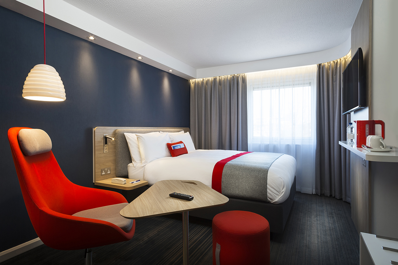
Multinational hotel company IHG asked IDEO to help revamp its Holiday Inn Express brand in Europe—everything from public spaces to food and beverage, digital, and guest room interiors. Through their research, designers learned that the brand’s guests are independent and value-conscious, and appreciate a human touch. And yes, they prize good design.
Designers created a series of principles that informed every part of the hotel chain’s next-generation experience—things like a to-go concept for breakfast, an easy way for guests to stream their own media through their room’s TV, and assigned quiet floors for business-weary travelers.
As IHG rolls out the next-generation guest experience in the UK and across Europe, smart travelers can expect to check in to a high-touch, well-designed hotel.
“A hotel room is no longer just a place to sleep. This investment in guest insight and innovation is enabling us to stay ahead of the game,” said Mike Greenup, Vice President, Brand Management, Holiday Inn Brand Family, Europe.

This startup revolutionized an industry through design
Launching a nationwide venture that redefines and simplifies how customers engage with their pharmacy.
Dealing with medication can often be a bigger pain than the ailment itself. Standing in long lines at the pharmacy, keeping up with expiration dates, making sure you take this medicine with food and that one on an empty stomach—it can be overwhelming.
An online pharmacy called PillPack had a mission to make it easier. PillPack worked to build a prescription home-delivery system that takes the pain out of the whole process. The venture brought their business to IDEO’s Cambridge office as a startup-in-residence, and worked with designers to fine-tune their offer and showcase it to the world.
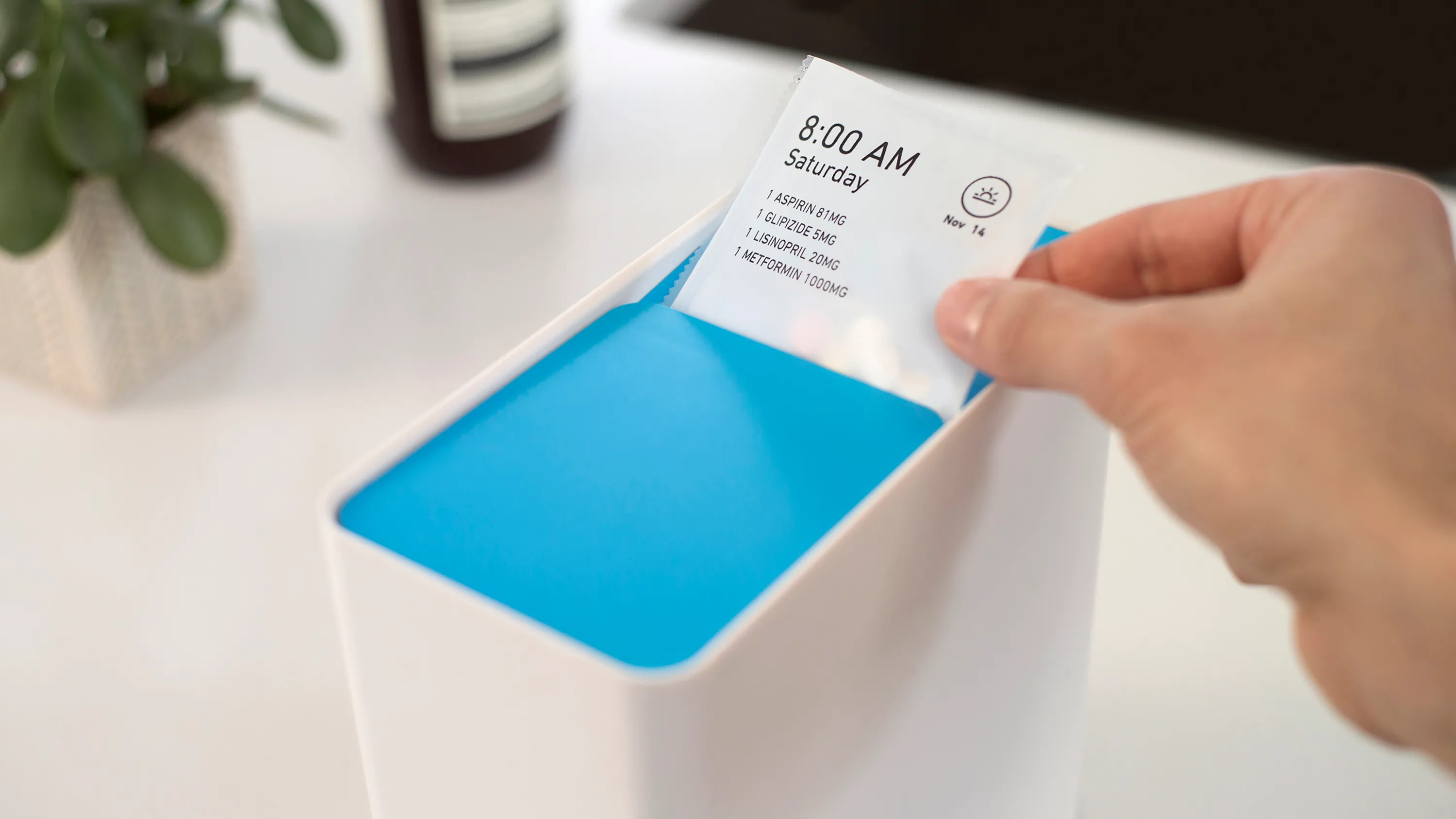
Here’s how it works: Your doctor sends your prescriptions straight to the pharmacists at PillPack, who organize the medications—including refills, over-the-counter drugs, vitamins, and supplements—into presorted, personalized packets. These tidy little packets are labeled by date and time and delivered to your doorstep. Every 14-day supply of medication fits neatly into an IDEO-designed durable dispenser that is meant to become part of customers’ routines and fit seamlessly into their homes. IDEO also designed a travel pouch that makes taking medicine on-the-go simple and discreet. For those who need a human to talk to, pharmacists at PillPack's pharmacies are available anytime via phone or email to answer questions.
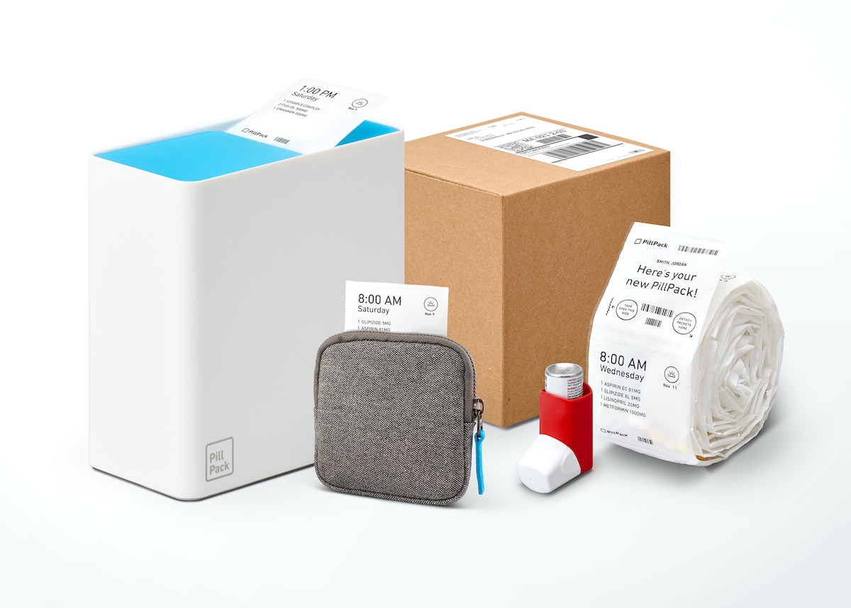
PillPack was the second startup-in-residence to work with IDEO Cambridge. Company founders Elliot Cohen and TJ Parker joined forces with the design team to redefine how consumers engage with their pharmacy. During the three-month residency, the teams focused on making sure that every customer interaction with PillPack—from signing up for the service online to using its product daily—was straightforward and reassuring.
Designers worked to refine the company’s brand vision, strategy, and identity across channels, and used this framework to completely redesign PillPack’s website, as well as a private dashboard for customers and a suite of physical products.
The result was a set of tools that reflected a true understanding of PillPack’s customers, a well-articulated product and service, and a human-centered approach. PillPack is still the only independent pharmacy in the U.S. that serves customers nationwide.
“PillPack has revealed the massive potential of combining design thinking and the drug market... This simple innovation makes life easier for seniors who can be a bit forgetful and have difficulty with bottles,” Wired wrote in an article about the company. “Younger patients with active lifestyles and chronic diseases can just pull as many packets as they need and go. All told, PillPack means you’ll never have to help your grandma sort pills into a tacky day-of-the-week organizer again.”
In June 2018, Amazon outbid other retailers to acquire PillPack for $1 billion.
Perspectives, Practices, and Resources for Design Thinking
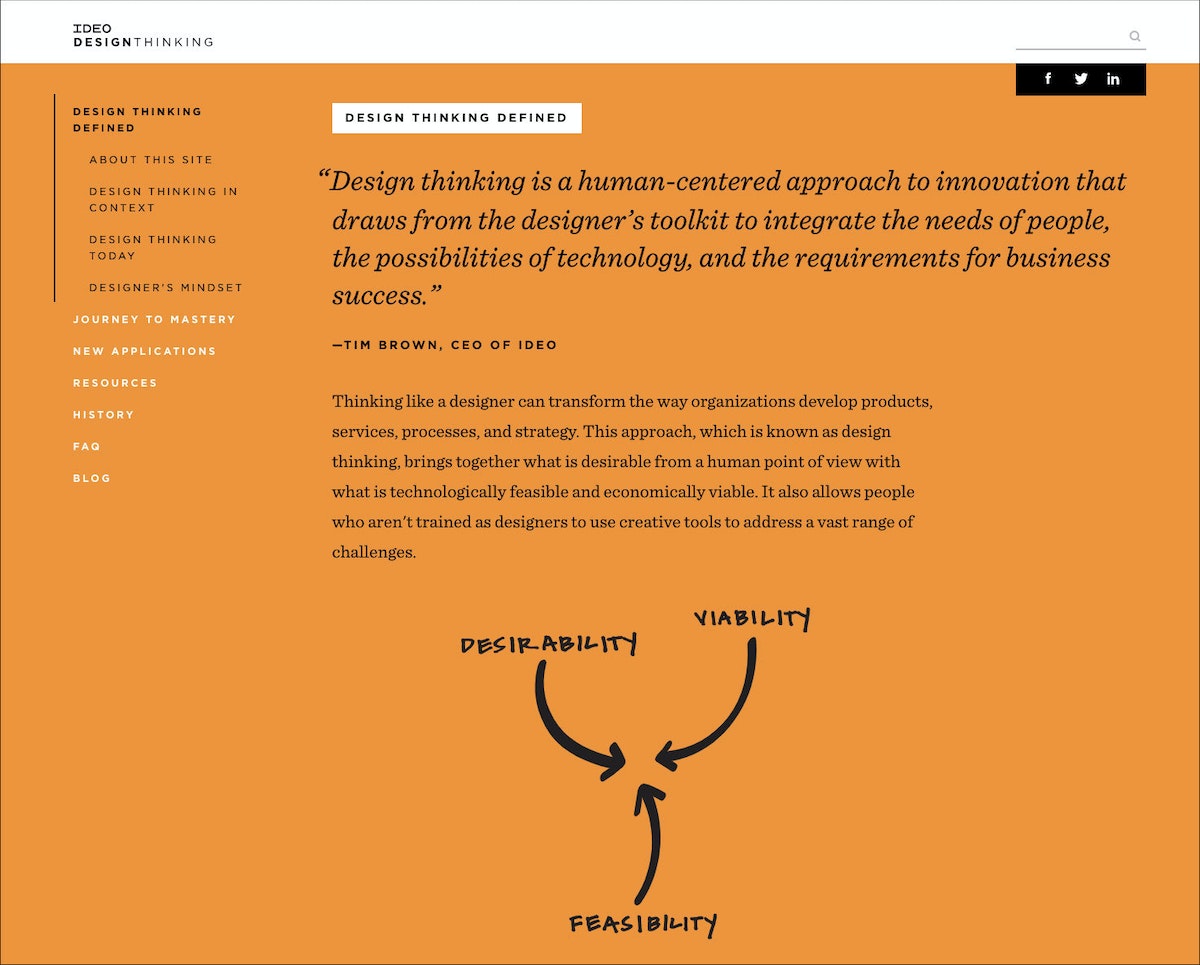
At IDEO, we’re often asked to share what we know about design thinking. We’ve developed designthinking.ideo.com in response to that request.
At IDEO, we’re often asked to share what we know about design thinking. We’ve developed designthinking.ideo.com in response to that request. On the site we introduce design thinking, how it came to be, how it is being used, and steps and tools for mastering it. You’ll find our particular take on design thinking, as well as the perspectives of others.
Build Your Creative Confidence: Nickname Warm-Up
While Speed Dating is useful in situations where people don’t know each other well, sometimes in group meetings you will encounter the opposite problem: a group where people know each other too well.
Creativity Challenge # 7: Eliminate hierarchy to improve idea flow.
While Speed Dating is useful in situations where people don’t know each other well, sometimes in group meetings you will encounter the opposite problem: a group where people know each other too well. Or, more specifically, a group in which hierarchy is so well established that the more junior members in the room self-edit and defer to the executives rather than putting their best ideas on the table.
To reduce hierarchy (which inhibits conversation) and self-censoring (which is equally limiting), the d.school has recently been experimenting with a “nickname warm-up.” Using a stack of colorful names the instructors have prepared in advance, the activity is a way to temporarily level out the organization during a creative working session. Each participant is given a persona to allow them to “try on” new behaviors.
Tool: Nickname Warm-up
Participants: Groups of 6-12 people per facilitator
Time: A few minutes per person
Supplies: Nametags for each person with the fake names written out. A hat and a ball for each facilitator.
Instructions
Step 1: Each participant reaches into the hat, draws out a name tag, and puts it on. Use names that lend themselves to humor and emotion. Teams tend to produce their best work when the group is having fun. Some of the monikers can imply a big dose of street credibility, while others suggest quirky personalities. For example: Dr. Fabulous, Squirt, Mr. Big Heart, The Clumsy Entertainer, or The Rooster.
Step 2: The facilitator gathers the group in a circle and tosses the ball. Whoever catches it introduces themselves using their new nickname and then tells a short story (created on the spot) about how they acquired this nickname as a child.
Step 3: After their self-introduction, they toss the ball to a new person, until everyone has had a chance to share their new name and story.
Step 4: The rule for the rest of the workshop—strictly enforced—is that everyone must use only these nicknames when referring to themselves or others.
Tips from the Field
Do the nametags work? Although this is a relatively new exercise, experience so far suggests that the answer is yes. At a recent management event, the CEO of a global hospitality company drew the “Squirt” nickname. There was a pregnant pause in the room as everyone waited to see how he would react. But he gamely played along through the rest of the workshop, and the organizers felt it contributed to an open environment in which people could speak freely.
The goal is to flatten out the hierarchy, so it’s important to get the senior people in the room to participate. Leading by example will naturally break some of the barriers to free-flowing collaboration.
This post was taken from Chapter 7 of Creative Confidence. Purchase the book for more on how to use creativity to solve problems, or read more from this series of creative exercises on the IDEO blog.
Everyone is creative. This belief runs through everything we do at IDEO, and in 2013, it led my brother David and me to write a book that would help others—even those who don’t think of themselves as “creative types”—to unleash their creative potential. Creative Confidence has inspired thousands of people to adopt a creative mindset and apply it to the diverse real-world challenges they face. In this series, we’ll share some exercises from the book that can help you approach your challenges from a new perspective.
4 Tips for Addressing—and Even Embracing—Tension
Focusing on differences can be challenging, but productive
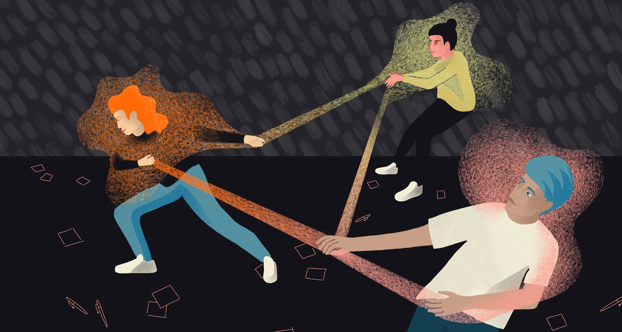
As leaders at the CoLab, IDEO’s platform for collaborative impact, we’re familiar with tension in all its forms. CoLab brings together organizations from across industries to focus on tough challenges, from designing for the circular economy to opening our financial systems. During design sprints, small teams build prototypes to explore new opportunities. Given that team members are often industry competitors with divergent approaches and ideas, tension tends to arise. We notice participants are often used to acting with the interests of their business first, rather than seeing the collaborative potential.
In order to create the impact we’re striving for at CoLab, we need to meet this tension head-on and create ways of moving forward. No matter what you’re designing or who you’re designing alongside—be it a colleague or another organization—here are four quick tips for adopting this mindset and productively addressing tension.
Observe the dynamic
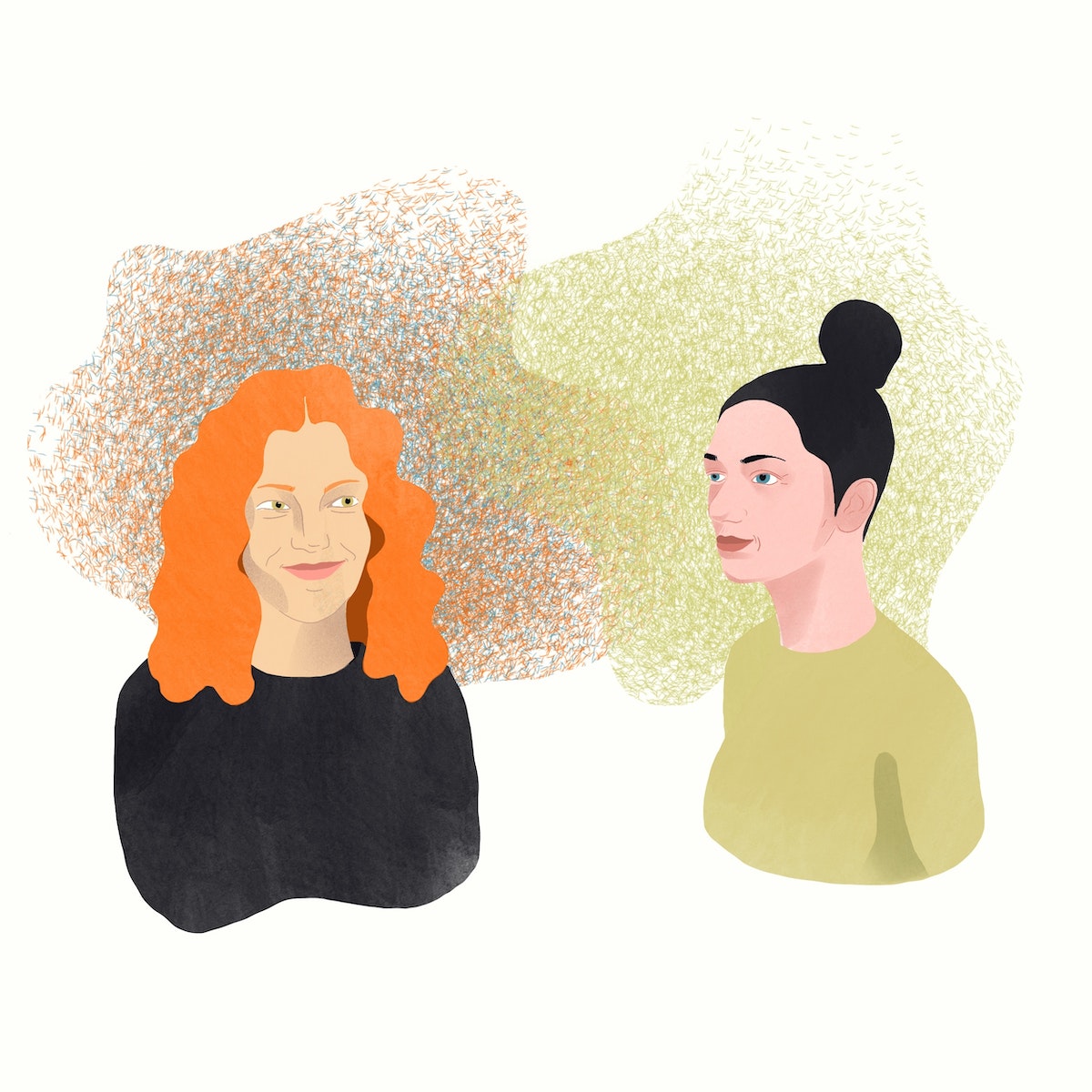
Though tension can sometimes make us want to jump into action to resolve it, there’s value in sitting back, too. Try answering the following questions for yourself: What opinion is each team member pushing forward? Why might they have this view?
Paying attention helps you establish empathy. As designers, we use empathy not only to deeply understand the realities of the people we’re designing for, but also the realities of those we’re designing with. Even if you disagree, understanding why a teammate might have a certain opinion can help you create solutions that ultimately meet a need that you might not have noticed alone.
Give it a name
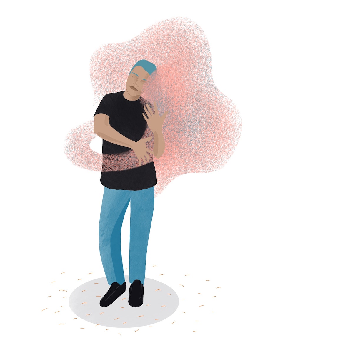
Once you’ve spent time observing, try naming the tension out loud or writing it down on a piece of paper. Saying or jotting down, “There’s tension around X right now,” or simply, “I’m feeling tension,” externalizes the tension. It’s is no longer this abstract, all-encompassing feeling. The tension is a named, tangible thing that the team can hear and see — not just feel — and therefore more objectively address through listening, dialogue, or compromise. In fact, mapping out seemingly conflicting interests or goals is a great tool for synthesis and identifying opportunities for design.
Just start making
Tension frequently arises when teams are trying to align on a shared vision or strategy. After all, when there are various stakeholders involved, they’ll likely have a variety of approaches. But it’s draining to debate things like your purpose or mission statement all day long. Reaching consensus can take hours, and may not even be useful at such an early stage before teams have had a chance to validate concepts through building.
It may seem counterintuitive, but to move teams through this tension, we recommend to just start doing. Whether it’s a whiteboard sketch or a model made of construction paper and glue, acts of making can offer clarity to subjective, “big picture” items. Shifting your mental focus from defining to doing has the power to shift a team’s dynamic.
Assume good intent
Though tension can sometimes feel like opposition, it often happens because teammates are passionate about the same thing. They may just want to apply or direct this shared passion in different ways. When things get tense, remember that you’re all working towards the same goal, and that the tension is likely not about you. Don’t take it personally.
Reinforce this “oneness” and good intent through language or actions. Try this: “I’m glad we’re in the same room solving this problem together.”
The next time things get tense, try not to jump into defense mode or sink down in your chair. Tension in team environments is inevitable because each of us bring a different set of experiences and perspectives to the table (so don’t crawl under it). As a team committed to collaboration across organizations that wouldn’t otherwise work together, we’ll keep embracing tension to get to the impact we all want to see in the world.
Tension in a team environment can make us nervously glance at the clock, play mediator, get defensive, or cling to the tried-and-true. But tension isn't always so bad (you can unclench your jaw now). In fact, we’ve found that some of our greatest work has come from embracing—even seeking out—these difficult moments.
A Cartography Nerd’s Guide to Mapping 100 Years of History
IDEO's resident mapmaker leverages a century-old resource to discover his neighborhood
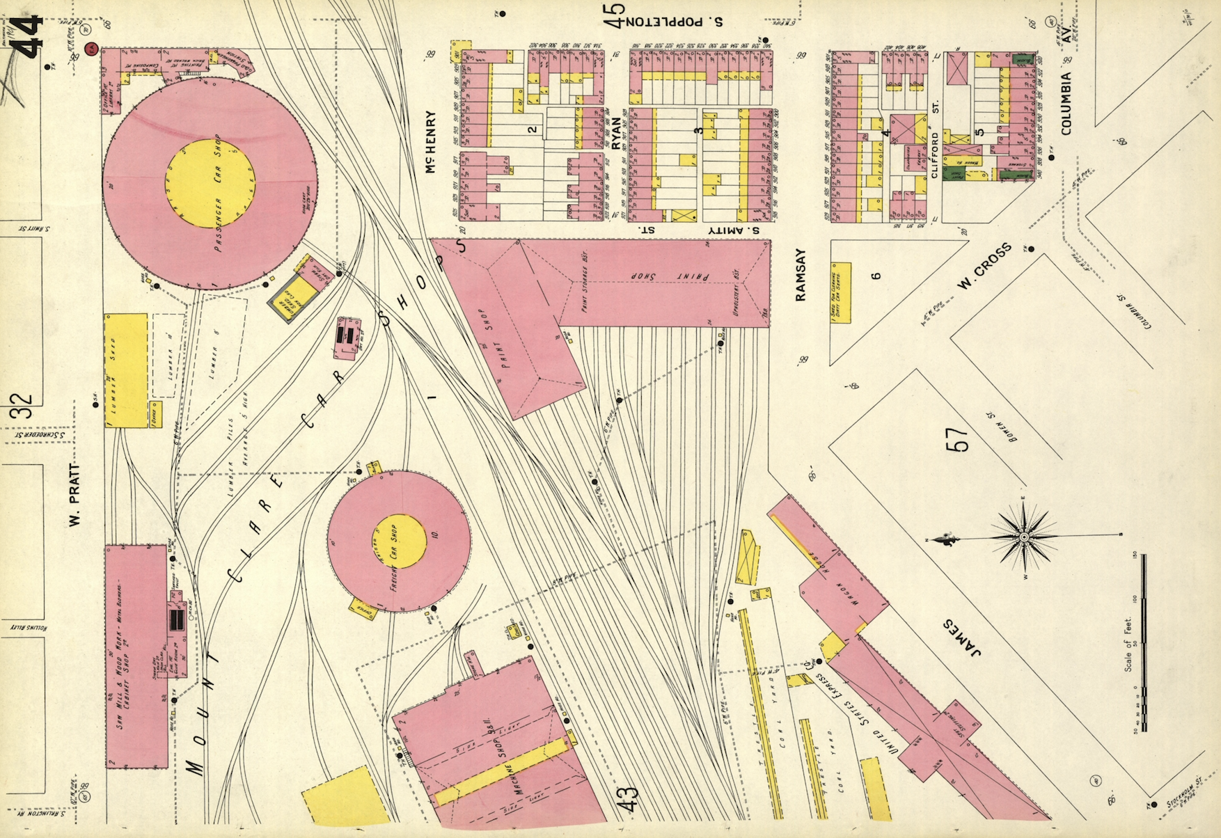
If you live in an American city, big or small, there's a decent chance that Sanborn had a map (or a hundred) of your town. And best of all, the entire collection is open-source and available for download in high-resolution images. The Library of Congress database isn't exactly the easiest in the world to search, but keep at it.
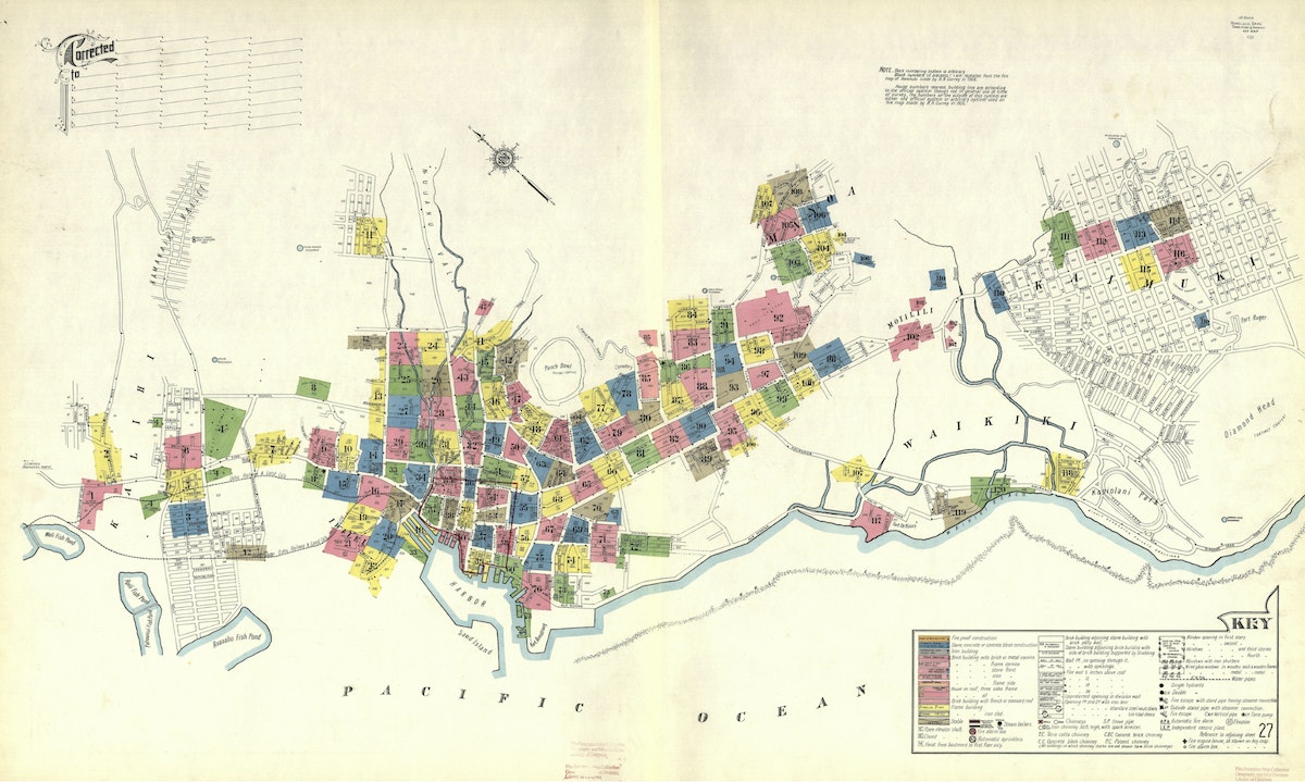
I live in San Francisco and was curious to see how my neighborhood was depicted by these amazingly-talented, fire insurance bureaucrats. I was delighted to find this map that shows my San Francisco neighborhood—the Lower Haight—in all of its 1899 glory. The colored rectangles form a grid, each pointing toward another map somewhere in the Sanborn collection that zooms in for much greater street-by-street detail.
I kept banging away at the rudimentary search function on the LOC website and eventually located Map 306, which visualizes my block in the year 1899.
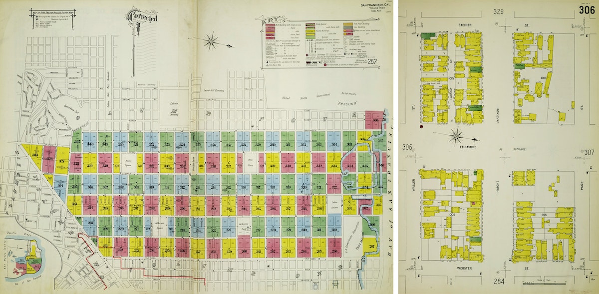
San Francisco is not the oldest of cities when it comes to architecture, and there was that little thing called the 1906 Earthquake (and subsequent fire), which destroyed a lot of the city as well. So I wasn't too surprised when I didn't recognize many of the buildings on my block. That said, it did get me curious: Were there any buildings that were visualized on the 1899 Sanborn map that are still present on my block in 2019? I decided to make a map to find out. See, being an ameteur cartographer is actually useful in 2019! Google Maps hasn’t ruined all of the fun.
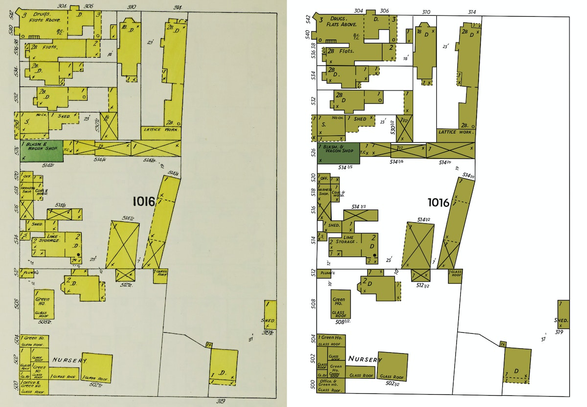
First, I set about converting the Sanborn map of my block into a file that I could manipulate in Adobe Illustrator. The original map is a JPEG, which means that it contains pixels. But since I wanted to have the freedom to tweak the map as I saw fit, I needed to convert the map to a vector version of the file. Why? A vector file (which, instead of pixels, is all about math coordinates) can be scaled infinitely large. What's more, it's much easier to change the colors on a vector-based map or make other modifications that I might need to later.
I'd like to say that there was some fancy way that I converted the map. I could have tried a Live Trace, but with a map this detailed, I wasn't optimistic. So I just rebuilt the file by tracing over the Sanborn map layer with new lines and fills and strokes. Detail by detail. This was mostly an act of love and definitely not a fast process. I recently had a kid and this turned out to be a fantastic New Year's Eve activity as we counted down the tired hours till midnight.
One unique challenge I encountered — there's no clear font out there that replicates the Sanborn hand-lettering. I spent too much time with the Adobe Typekit database and landed on Zeitung. It's not an exact match by any means, but close enough to pass the squint test.
That’s the original map on the left, in all of its pixels glory. And that’s the vector file on the right, built from scratch. How'd I do?
Okay. With the Sanborn map from 1899 more or less created, I turned my attention to the 2019 version of the map. I needed a detailed lot-by-lot map of San Francisco. My first go-to in moments like this is the Stanford University Earthworks website. The search function works quite well, and it links to open source maps from lots of other universities (like Tufts). After a quick search, I located a lot-by-lot map for the Bay Area and opened it up in QGIS, everyone’s favorite free and open-source cartography tool! Here’s what I had.
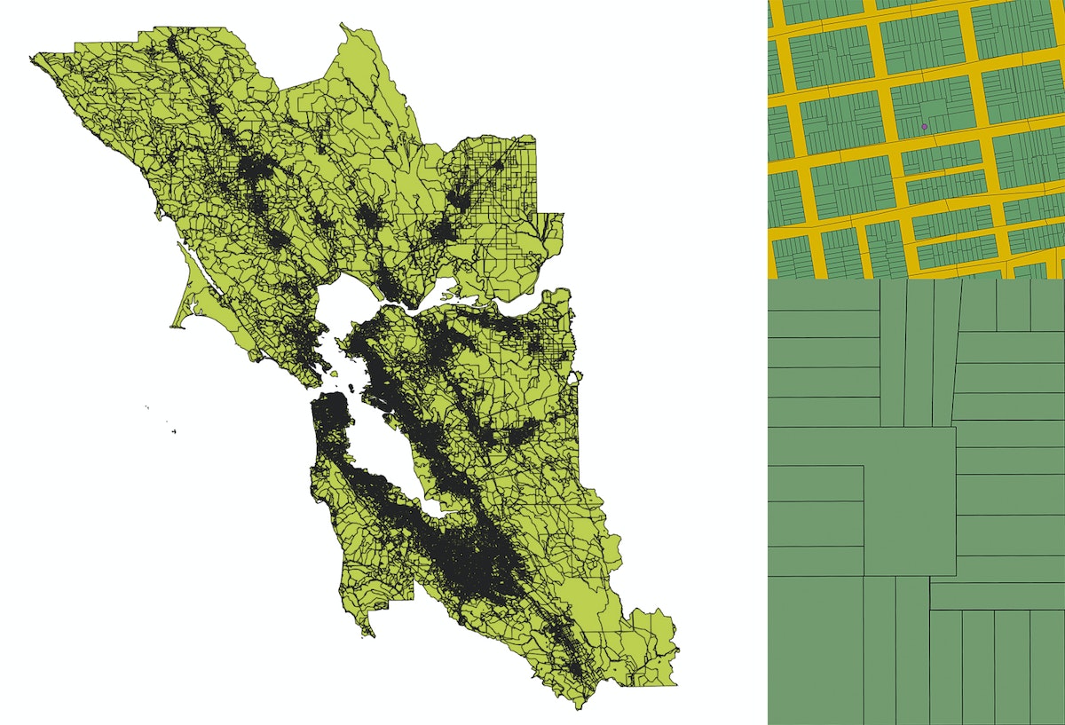
Totally overwhelming and, not surprisingly, it was actually quite tough to even find my block in all of that detail. So I loaded Google Maps, entered our home address, created a KML file with that single data point, and added it to the QGIS map. Once I zoomed way in, there was our block and our loft (represented by that little purple dot).
As I’ve mentioned before, QGIS is a wonderfully-powerful mapping tool, but mostly the pits when it comes to designing anything that would measure up to the esthetic standards of the average designer. So I zoomed way in to just our block, then exported the file as a vector file and opened it in our old friend Illustrator.
What I quickly realized is that this lot-by-lot map shows the property lines for each parcel on our block, but not the actual shapes of the buildings that sit inside each lot. Although I was getting close, I needed to go a step deeper to actually match the detail of the 1899 Sanborn map, which shows the outlines of individual buildings.
I opened Google Maps again and toggled to the satellite view of our block. If you zoom in as far as possible, you can see the outline of individual buildings. It's not perfect—shadows must get projected in weird ways when you snap photographs from orbit—but this was starting to get more interesting.
I snapped a fully zoomed-in screenshot of each building on the block, then traced them one-by-one using the Pen Tool in Illustrator. Once I had the outline of an individual building, I pasted it into the spot where it belonged inside the lot-by-lot map I’d exported over from QGIS. Then I repeated this process 31 times, for each of the buildings contained on my block.
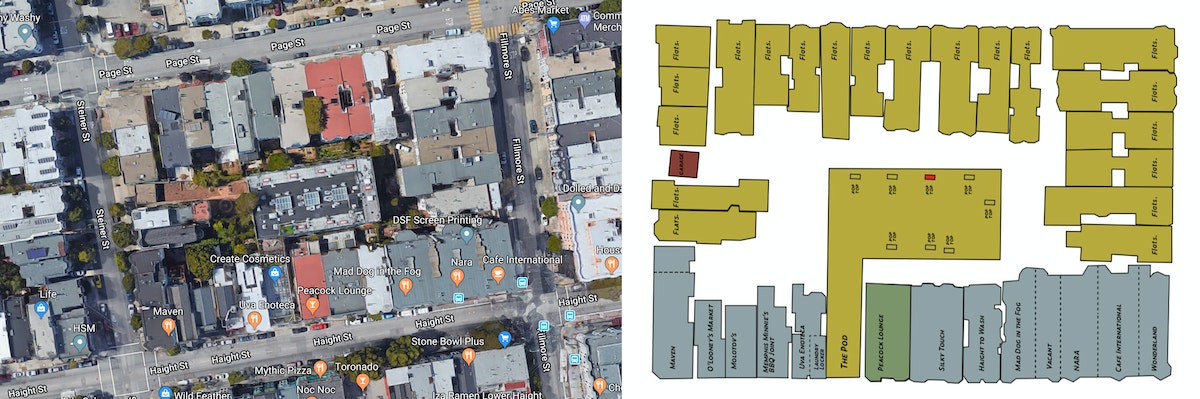
With the buildings in place, my next task was to figure out when they were built so that I could determine if any of them had been around back in 1899. After much poking around, I found this site from the San Francisco Planning Department that had exactly what I needed—the construction date for each of the 31 buildings on my block. Once I did the research, I discovered that three buildings can be found on the map in both 1899 and 2019, all of them clustered on the southwest corner of the block. One of them is my local bodega, home to Tiger the cat and famous (in the neighborhood) for the time that the Warriors eccentric three-point maestro Klay Thompson visited the bar to buy a bottle of Grey Goose. Super cool also to know that the building was built in 1890 and survived the 1906 Earthquake and Fire.
To finish up the map, I built out a key, borrowing inspiration from another Sanborn map visualizing neighborhoods in Honolulu, Hawaii.
Then I tweaked the colors, sticking to the Sanborn color palette, but borrowing some of the brighter colors found across the collection. I also added some polka dots to both maps to call attention to the three buildings that survived from 1899 to 2019. These last couple of tweaks are just two of the many benefits to working with vector files instead of pixels.
And voila, here is the final version of the map. What do you think? Now you can do the same for your city block.
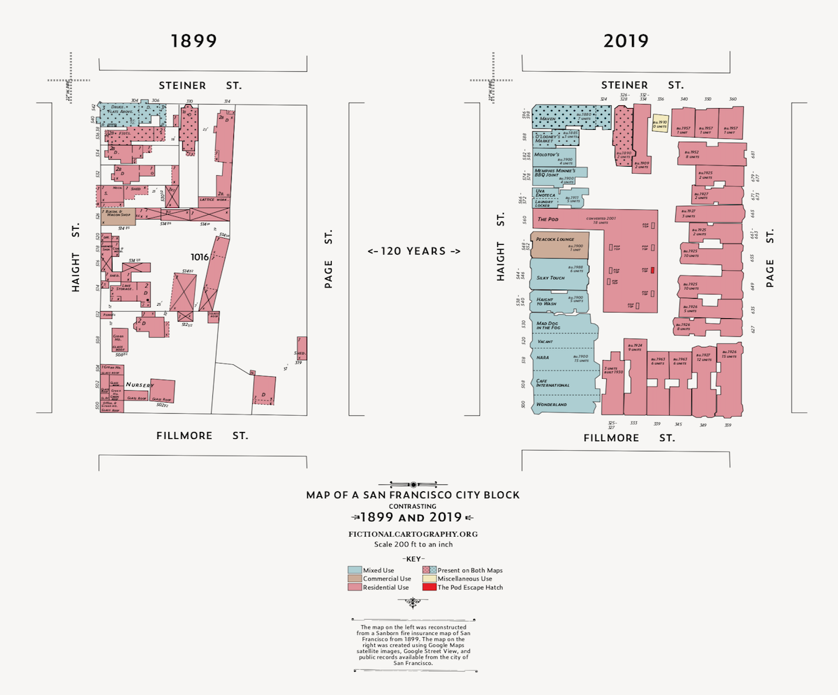
Do you have a few hours on your hands and want to head down a wormhole of unbelievably striking maps? Mosey on over to the Sanborn map collection at the Library of Congress. Originally created as a means for issuing fire insurance across major American cities, the quality of hand-drawn detail in these maps and the color palette used by the cartographers are stunning.

Lindsey Turner
I’m passionate about building brands, products, and experiences that help organizations show up with meaning and momentum.
I help organizations cut through complexity by shaping how they show up, through brand strategy, identity, and storytelling.
Working at the intersection of brand and business, I bring an editorial eye and a bias toward making—turning ideas into tangible experiences that people can understand, trust, and believe in.
My work spans government, healthcare, financial services, media, and consumer goods, from launching Gen Z-focused ventures to building innovation labs and reimagining legacy brands. I relish moments of ambiguity and enjoy translating across teams, perspectives, and priorities to move ideas forward.
I started my career in editorial and digital design, shaping cross-platform experiences and identity systems in publishing and agency environments. That foundation still shapes how I work today: I’m detail-oriented, collaborative, and overreliant on the Oxford comma. I hold a BFA in Visual Communication from the School of the Art Institute of Chicago.

Rachel Young
My work helps organizations see who their products aren't working for—and build the will and the tools to do something about it
For 25 years, I've asked the same question: Who does this design exclude—and what are we going to do about it?
My work spans human-centered strategy, inclusive design, and qualitative research, with clients ranging from Microsoft, Google, and Verizon to the National Science Foundation, and San Francisco Unified School District.
Before IDEO, I taught elementary school in East Palo Alto and spent a decade doing design work with social service organizations—where I learned firsthand what it costs people when systems are built without them in mind.
I am currently writing User Error, a nonfiction book about digital access and the design decisions behind it. I live in Oakland, California.

Brian Pelsoh
I lead with craft, ensuring our work is creatively excellent: rooted in deep human insight and imagination, while also grounded in the realities of business and technology.
My expertise spans brand, communication, and product design across tech, education, the arts, and social impact.
I believe great work demands both high-level vision and obsessive attention to detail, and only happens through collaboration.
I bring an inclusive, hands-on approach and a deep understanding of business, which enables me to consistently deliver excellence while always asking why.
Before joining IDEO, I worked at the brand firms Pentagram and VSA Partners. I began my career as a designer, leading teams at the School of the Art Institute of Chicago and the Milwaukee Art Museum. I hold an MFA in graphic design from Maryland Institute College of Art and a BFA in communication design from the Milwaukee Institute of Art & Design, and have taught at some of the best design schools in the US.

Tony Wong
I am responsible for IDEO’s long-term success in China and working with clients to use design as a tool to enable growth.
I am responsible for IDEO’s long-term success in China and working with clients to use design as a tool to enable growth. Specifically, I have helped Chinese companies design holistic brand solutions through the development of their products, communication, services, and innovation teams, and I have helped multinationals expand their presence and influence in China.
I advise global leaders on developing China-led innovation and capabilities.
In over 15 years in IDEO Shanghai, I have worked on projects that use design to elevate the quality of the experience of healthcare products and services, streamline processes that increase productivity, create spaces and programs that promote and enable inclusive communities, and build next generation mobility solutions that are planet-positive.
Before joining IDEO, I worked at Philips Electronics and the Electrolux Group in Italy, the Netherlands, and Singapore on a number of breakthrough commercial products. I am a member of the Young President Organization in Shanghai.

Building a personal AI for the messiness of life: Sida Li
Most AI products today are built for work—a space with clear problems and established systems. One founder noticed a gap: personal life is messier, harder to systematize, and mostly left behind by the AI boom. So she built Cue, a personal AI that lives inside iMessage and group chats, to go where the other tools haven't.
In this episode, Becca Carroll, IDEO's Chief Strategy Officer, talks with Sida Li, co-founder and CEO of Shared Context Lab, about staying anchored to a human need while the technology around her keeps changing shape, why she treats her business model with the same rigor she'd bring to a product, and what it feels like to build a company at this particular, disorienting moment in AI.
The conversation also gets into how Sida makes design decisions: the language Cue uses to describe itself, the tradeoffs behind building inside iMessage instead of a new app, and a real story about a business idea that didn’t pan out.
This is the second in a two-part series profiling founders from IDEO's Startups-in-Residence program. The first conversation is with Johannes Seemann, founder of Sooner, on designing GenAI for the emotional side of money.

Designing GenAI for the emotional side of money: Johannes Seemann
Most personal financial tools are built to run the numbers and optimize towards a budget. While that works for some, most people experience money as a lived relationship that does not neatly fit into a spreadsheet. Johannes Seemann and Becca Carroll discuss why money is emotional before it is mathematical, and what a human-centered approach to building a generative AI financial product looks like in practice.

The curious leader's edge in uncertainty: Scott Shigeoka
Mina Seetharaman talks with Scott Shigeoka, author of Seek and Head of Curiosity Cultivation at the Eames Institute, about what distinguishes genuinely curious leadership from performative curiosity, how power dynamics shape curiosity, and why practicing curiosity can restore energy rather than drain it.

How constraints make us more creative: David Epstein
Mina Seetharaman talks with David Epstein, author of Inside the Box and Range, about why total freedom often produces average work, how leaders can design useful limits on purpose, and what organizations such as General Magic and Pixar reveal about the relationship between boundaries and creativity.
Looks like you might be in search of something very specific?
Or reset the filters above and try another angle.
Here’s some random inspiration

Podcasts about creative leadership

Articles about the power of prototyping
