
.svg)


A Cartography Nerd’s Guide to Mapping 100 Years of History
Do you have a few hours on your hands and want to head down a wormhole of unbelievably striking maps? Mosey on over to the Sanborn map collection at the Library of Congress. Originally created as a means for issuing fire insurance across major American cities, the quality of hand-drawn detail in these maps and the color palette used by the cartographers are stunning.
If you live in an American city, big or small, there's a decent chance that Sanborn had a map (or a hundred) of your town. And best of all, the entire collection is open-source and available for download in high-resolution images. The Library of Congress database isn't exactly the easiest in the world to search, but keep at it.
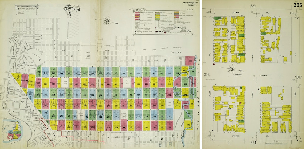
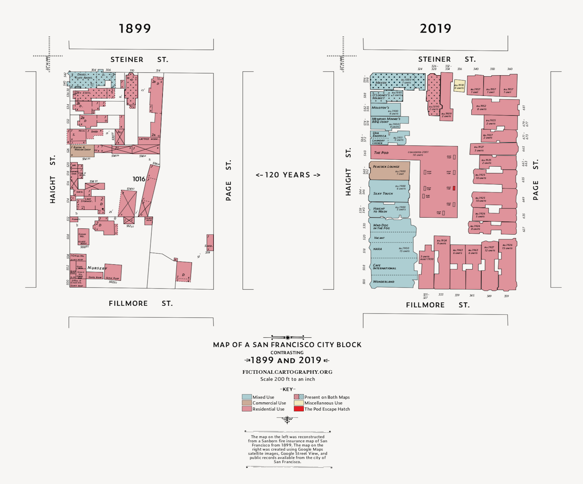
I live in San Francisco and was curious to see how my neighborhood was depicted by these amazingly-talented, fire insurance bureaucrats. I was delighted to find this map that shows my San Francisco neighborhood—the Lower Haight—in all of its 1899 glory. The colored rectangles form a grid, each pointing toward another map somewhere in the Sanborn collection that zooms in for much greater street-by-street detail.
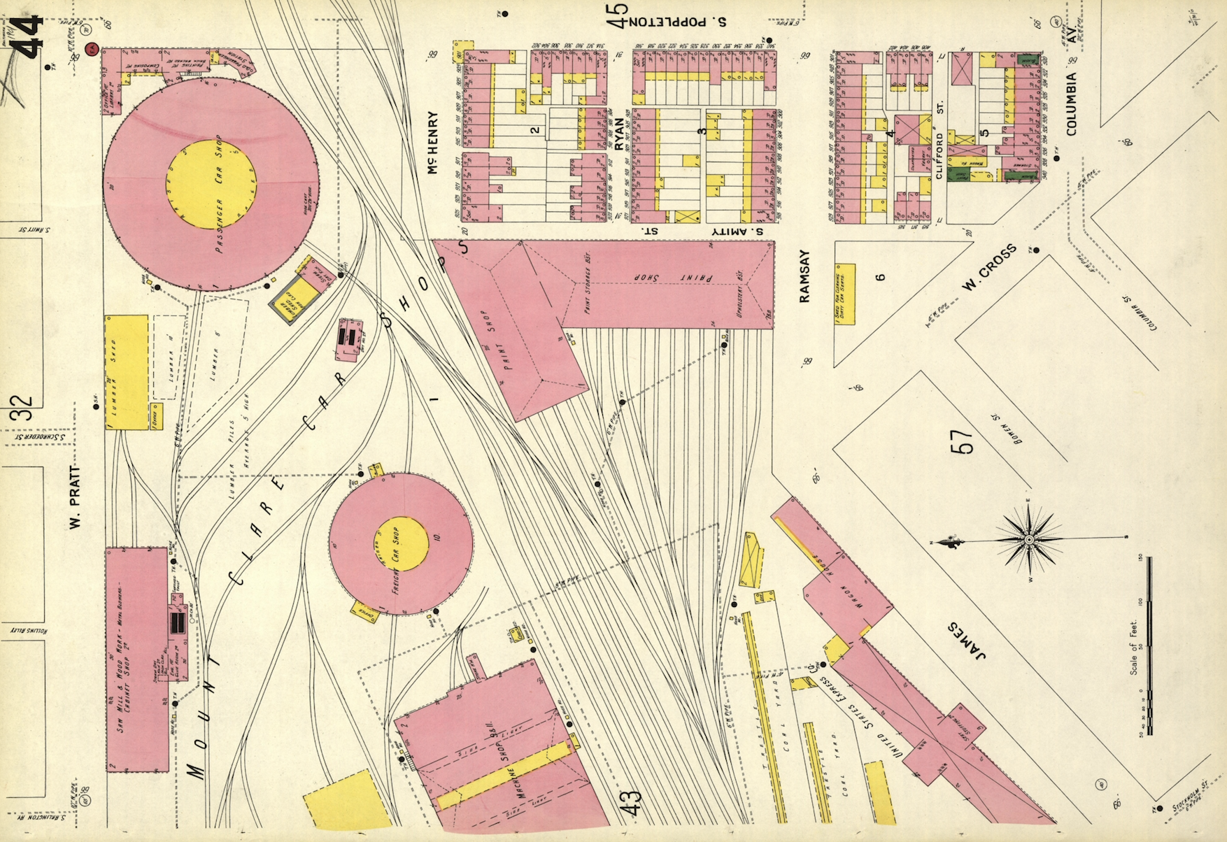
I kept banging away at the rudimentary search function on the LOC website and eventually located Map 306, which visualizes my block in the year 1899.
San Francisco is not the oldest of cities when it comes to architecture, and there was that little thing called the 1906 Earthquake (and subsequent fire), which destroyed a lot of the city as well. So I wasn't too surprised when I didn't recognize many of the buildings on my block. That said, it did get me curious: Were there any buildings that were visualized on the 1899 Sanborn map that are still present on my block in 2019? I decided to make a map to find out. See, being an ameteur cartographer is actually useful in 2019! Google Maps hasn’t ruined all of the fun.
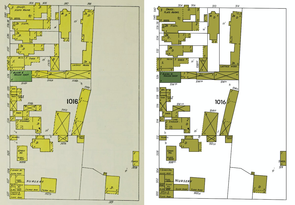
First, I set about converting the Sanborn map of my block into a file that I could manipulate in Adobe Illustrator. The original map is a JPEG, which means that it contains pixels. But since I wanted to have the freedom to tweak the map as I saw fit, I needed to convert the map to a vector version of the file. Why? A vector file (which, instead of pixels, is all about math coordinates) can be scaled infinitely large. What's more, it's much easier to change the colors on a vector-based map or make other modifications that I might need to later.
I'd like to say that there was some fancy way that I converted the map. I could have tried a Live Trace, but with a map this detailed, I wasn't optimistic. So I just rebuilt the file by tracing over the Sanborn map layer with new lines and fills and strokes. Detail by detail. This was mostly an act of love and definitely not a fast process. I recently had a kid and this turned out to be a fantastic New Year's Eve activity as we counted down the tired hours till midnight.
One unique challenge I encountered — there's no clear font out there that replicates the Sanborn hand-lettering. I spent too much time with the Adobe Typekit database and landed on Zeitung. It's not an exact match by any means, but close enough to pass the squint test.
That’s the original map on the left, in all of its pixels glory. And that’s the vector file on the right, built from scratch. How'd I do?
Okay. With the Sanborn map from 1899 more or less created, I turned my attention to the 2019 version of the map. I needed a detailed lot-by-lot map of San Francisco. My first go-to in moments like this is the Stanford University Earthworks website. The search function works quite well, and it links to open source maps from lots of other universities (like Tufts). After a quick search, I located a lot-by-lot map for the Bay Area and opened it up in QGIS, everyone’s favorite free and open-source cartography tool! Here’s what I had.
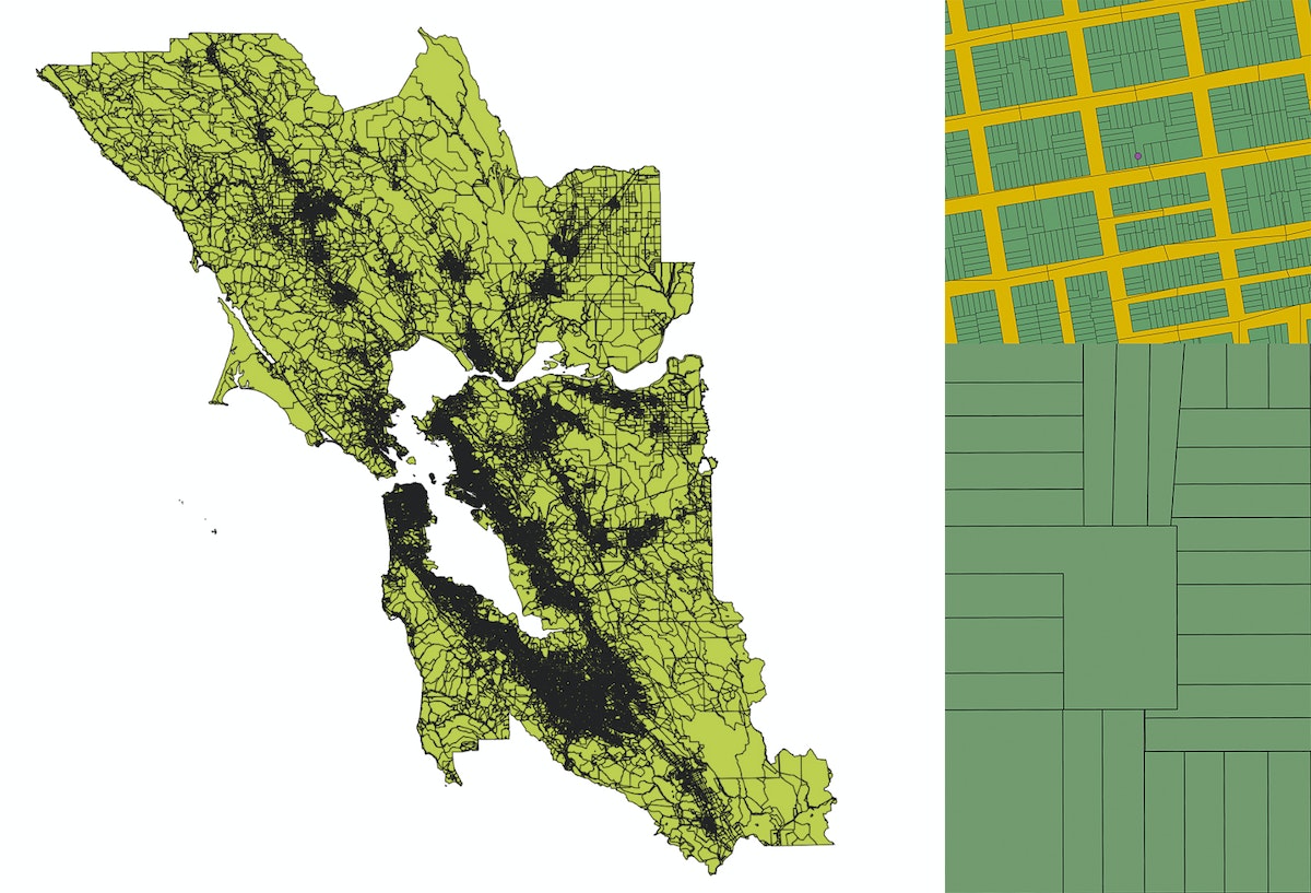
Totally overwhelming and, not surprisingly, it was actually quite tough to even find my block in all of that detail. So I loaded Google Maps, entered our home address, created a KML file with that single data point, and added it to the QGIS map. Once I zoomed way in, there was our block and our loft (represented by that little purple dot).
As I’ve mentioned before, QGIS is a wonderfully-powerful mapping tool, but mostly the pits when it comes to designing anything that would measure up to the esthetic standards of the average designer. So I zoomed way in to just our block, then exported the file as a vector file and opened it in our old friend Illustrator.
What I quickly realized is that this lot-by-lot map shows the property lines for each parcel on our block, but not the actual shapes of the buildings that sit inside each lot. Although I was getting close, I needed to go a step deeper to actually match the detail of the 1899 Sanborn map, which shows the outlines of individual buildings.
I opened Google Maps again and toggled to the satellite view of our block. If you zoom in as far as possible, you can see the outline of individual buildings. It's not perfect—shadows must get projected in weird ways when you snap photographs from orbit—but this was starting to get more interesting.
I snapped a fully zoomed-in screenshot of each building on the block, then traced them one-by-one using the Pen Tool in Illustrator. Once I had the outline of an individual building, I pasted it into the spot where it belonged inside the lot-by-lot map I’d exported over from QGIS. Then I repeated this process 31 times, for each of the buildings contained on my block.
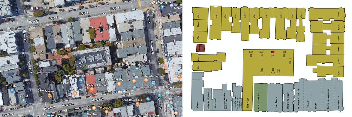
With the buildings in place, my next task was to figure out when they were built so that I could determine if any of them had been around back in 1899. After much poking around, I found this site from the San Francisco Planning Department that had exactly what I needed—the construction date for each of the 31 buildings on my block. Once I did the research, I discovered that three buildings can be found on the map in both 1899 and 2019, all of them clustered on the southwest corner of the block. One of them is my local bodega, home to Tiger the cat and famous (in the neighborhood) for the time that the Warriors eccentric three-point maestro Klay Thompson visited the bar to buy a bottle of Grey Goose. Super cool also to know that the building was built in 1890 and survived the 1906 Earthquake and Fire.
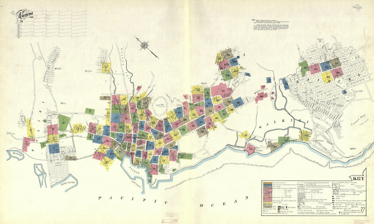
To finish up the map, I built out a key, borrowing inspiration from another Sanborn map visualizing neighborhoods in Honolulu, Hawaii.
Then I tweaked the colors, sticking to the Sanborn color palette, but borrowing some of the brighter colors found across the collection. I also added some polka dots to both maps to call attention to the three buildings that survived from 1899 to 2019. These last couple of tweaks are just two of the many benefits to working with vector files instead of pixels.
And voila, here is the final version of the map. What do you think? Now you can do the same for your city block.
Words and art

Subscribe