
.svg)


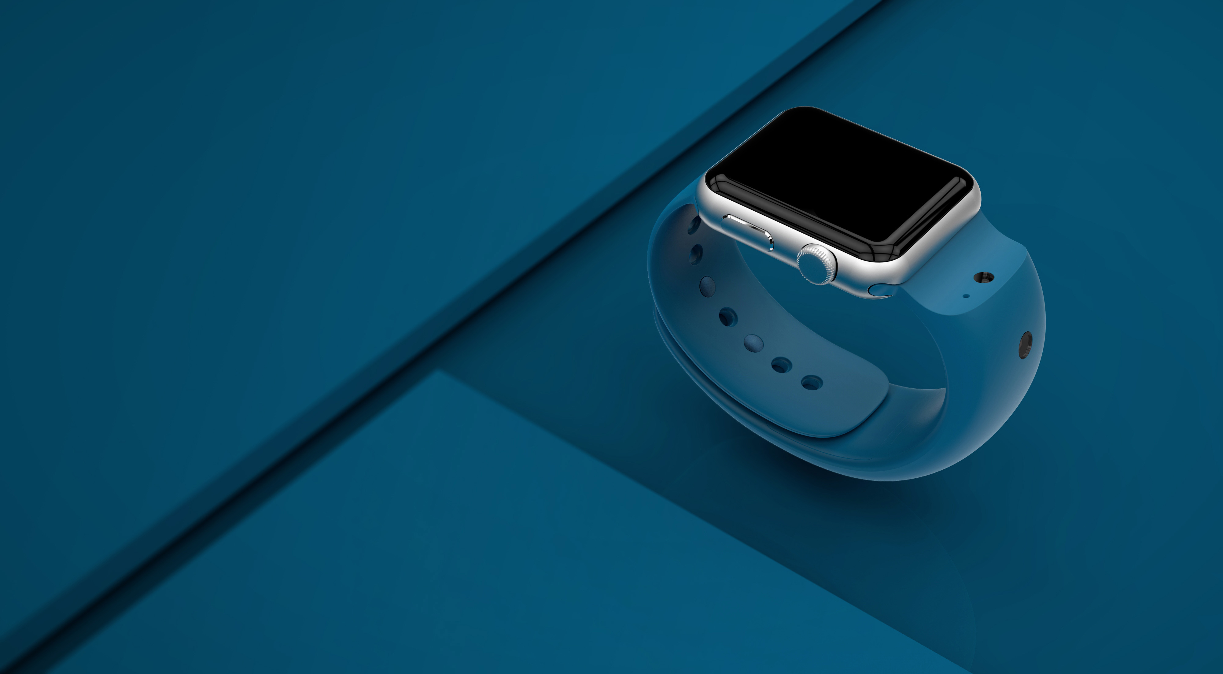

A sleek, seamless Apple Watch camera band
A six-week design sprint for a startup results in a market-ready wearable.
Glide, a video communication software startup, came to IDEO to collaborate on the design of its first hardware product. With current Apple Watch models not including cameras, Glide sought to design a compatible band that would empower users to capture and share photos and videos directly from their wrist.
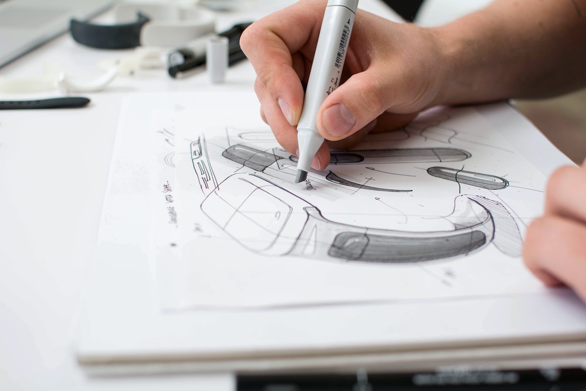
Faced with this challenge, IDEO designers embarked on a six week-long design sprint, involving users in the research to understand how they might use the band for interactions such as taking reminder snapshots and intuitively sharing photo and video messages with friends. The team then brought these ideas to life through a comprehensive industrial design and engineering process, working to meet a range of technical and performance requirements along the way.
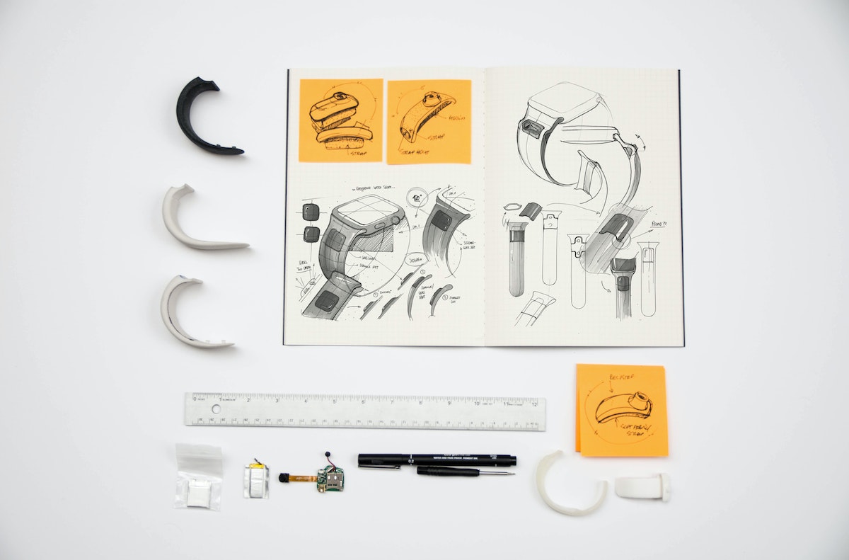
IDEO’s final band design elegantly integrates two cameras—one nestled in a wave-shaped notch above the watch face, and the other on the band’s outward-facing surface. Together, the cameras ensure that, between recording themselves and the vibrant world around them, users never miss capturing a moment worth sharing.
IDEO also designed a compatible, on-the-go charging dock that conveniently refuels both the watch and band with a single plug-in, completing an effortless user experience.
Designing a modern work experience for business travelers
Helping a top hotel brand better support its guests' productivity needs.
Today’s younger workers are more comfortable dressed casually. They prefer an impromptu meeting over coffee, than at the conference table. They’re used to working flexibly, collaboratively and creatively. And, via smartphones, tablets and laptops, they’re accustomed to having everything from hailing a cab, to doing work, to getting groceries, at their fingertips.
Tech-savvy, independent, entrepreneurial, demanding: this new generation of business people and the lingering impact of the financial crisis, are reshaping hospitality.
To that end, Crowne Plaza approached IDEO to understand the needs of this audience, the macro trends impacting them, and to develop a new meeting and work offer that expressed the brand’s values.
Research, sensor data, surveys, interviews with potential customers revealed what modern travelers wanted, but lacked: informal, flexible experiences; energizing and uplifting spaces; peer-style service; curated choices; and integrated technology to control it all.
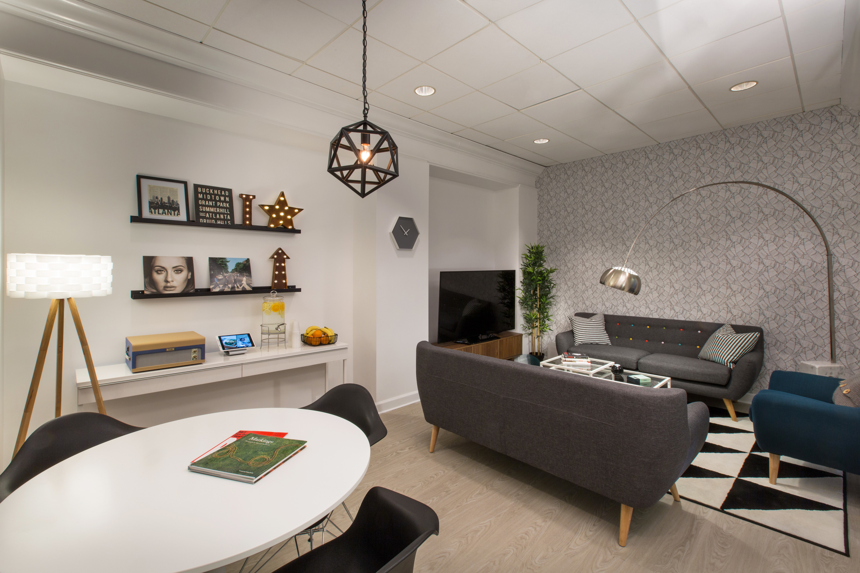
IDEO translated those customer insights, and Crowne Plaza’s promise—Making Business Travel Work—into an integrated, designed and built-out branded offer. Launched with two pilot schemes in Atlanta, Ignition is a free-to-use, innovative new meeting and working experience, housed in the lobby of Crowne Plaza hotels.
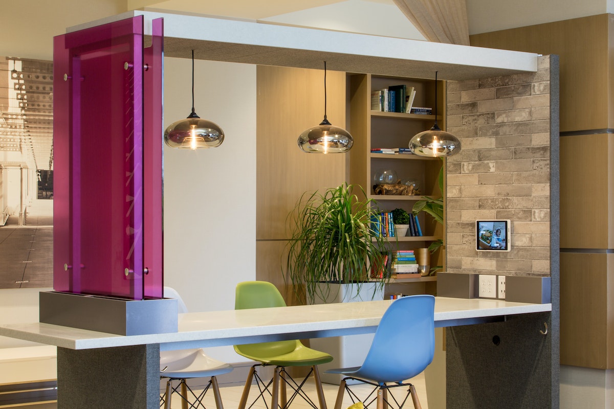
Spanning space, food and beverage, service, and digital, every touchpoint is designed to keep travelers in a state of flow, and heightened productivity. From single-person Pods, to the Nooks and Huddles for four-person impromptu meetings, to the 10-person Apartment (bookable by the hour), Ignition’s spaces cater to every professional’s needs, whether they’re on the road or in their home city.
Food and beverage offerings have been redesigned specifically for work meetings. Delivered to where you’re working, it’s non-drippy, made to be eaten one-handed, and served on square plates to sit neatly alongside laptops. Out of hours, a new self-service marketplace offers 24-hour premium sustenance.
A new role, the Host, provides peer-style support, whether greeting guests’ guests, helping with meetings, or sourcing local restaurants for a client dinner.
Underpinning Ignition is a new tablet-based ordering system (Food To You), and Host chat platform, to easily get everything from photocopies to coffees.
But ultimately, IHG’s ambition for Ignition goes beyond its existing guests. It’s designed to become a local business fixture in its own right, attracting people to meet, and work, irrespective of whether they’re staying. As one guest summed it up: “There is nothing any hotel brand in this range is doing to stand out. This concept, however, could completely change that. It could even live on its own. It’s what you would seek out.”

An acoustic amp that steals the show
Balancing high-tech performance with the warm, natural sound of acoustic for an iconic brand.
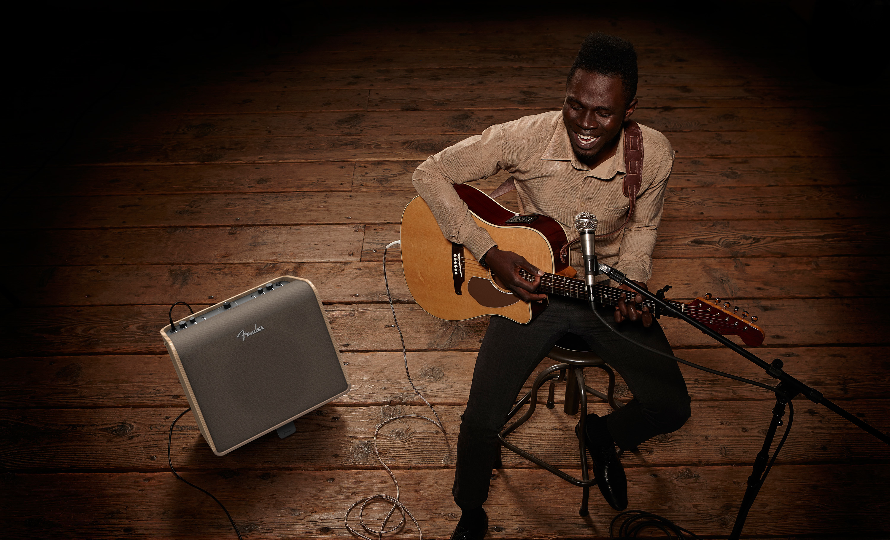
Fender, a brand that’s been synonymous with rock ’n’ roll since 1946, is best known for its iconic electric guitars—think Stratocaster—played by everyone from Eric Clapton to The Edge, the lead guitarist of U2. Less well known is the imprint Fender has made on the acoustic space. IDEO worked with the company to design a new family of acoustic amplifiers: one professional and one with stereo effects.
After gathering insights from amateurs, professionals, music magazine editors, and producers, the team explored portability, storage, materiality, and form through a series of early prototypes that they tested with users.
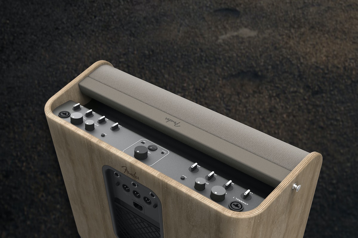
While most acoustic amps in the market don’t look all that different from their electric cousins, the new Fender product line reflects the pure, natural sound at the core of acoustic. This new line of amps uses a unique manufacturing technique with bent plywood that’s new to acoustic amp design. Not just a design statement, the innovation also improves sound quality.
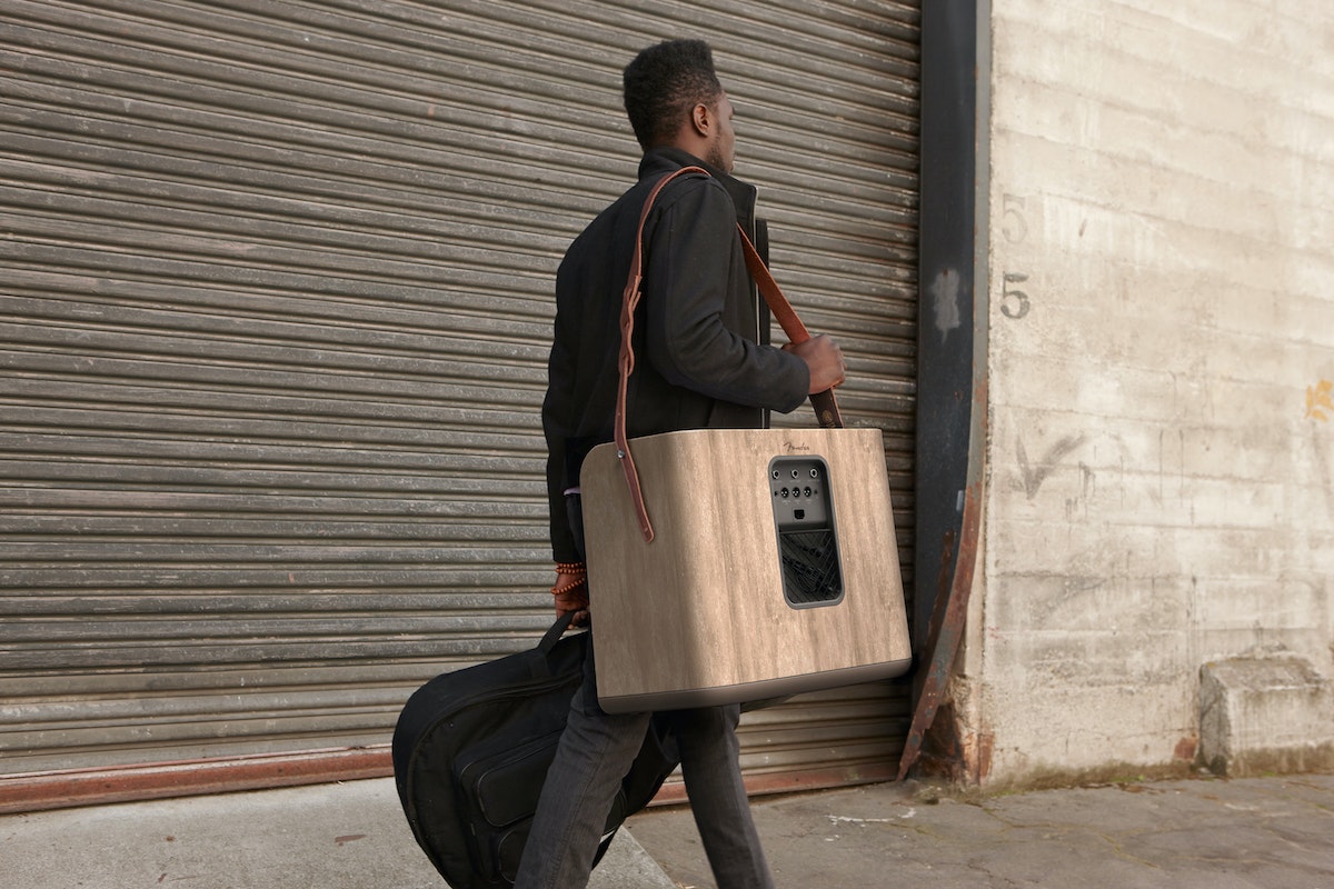
The acoustic amps were also designed with simple, intuitive controls, and with illuminated features that balance high-tech performance with a satisfyingly analog experience. The design emphasizes portability and maneuverability, targeting the acoustic artist who often may have to make a tough choice between traveling light and using the often unreliable house PA.
Pi Jacobs, a singer-songwriter who participated in the design research process, said acoustic sound requires its own unique medium. "Acoustic is raw, pure, no bells and whistles. You see someone playing and singing, it’s like looking through a window into someone’s soul," he said.
For Fender, the work proved to be transformative. "Working with IDEO was an eye-opening and refreshing experience," said James Gifford, vice president of design for Fender. "The result of the work that was done with IDEO on the acoustic amp project was a game-changer that challenged the traditional definition of the design and experience received from using acoustic guitar amplifiers."

A better box of tea
Updating Bigelow Tea’s packaging to convey family-owned quality.
To better articulate the Bigelow family values—obsessive about ingredients, environmentally conscious, community-oriented—the company asked IDEO to help convey its story to a younger demographic, for whom tea was popular but the Bigelow brand was not. Any changes to the product or its packaging would have to improve the offering without alienating Bigelow Tea’s loyal customers.
IDEO worked with the company to update its positioning statement, brand identity, and packaging. After many interviews with tea drinkers, IDEO and Bigelow executives learned that the brand could differentiate itself by crafting a strong point of view—one that cultivates and celebrates tea enthusiasts with a superior yet accessible product. With a refined positioning statement in hand, a refreshed identity system followed.
The new packaging ties together all of Bigelow’s lines of tea. Each box features bold graphic elements like a larger, easier-to-read logo, instructions for brewing a perfect cup of tea, a caffeine “caff-o-meter,” and the name of the team member who packed the box. Bigelow boxes now stand out when stacked on store shelves, winning over tea drinkers and retailers alike.
Mondays, Redesigned
A collaboration with WNYC's Studio 360
At least that's what the listeners of Studio 360 said when host Kurt Andersen asked them to suggest places or experiences that could use more joy as part of the WNYC radio program’s Redesigns series. Inspired by IDEO Design Director Ingrid Fetell’s Aesthetics of Joy blog, our New York team did an extreme Monday makeover—in three weeks.
But first, the team interviewed the founder of a pet-therapy program and explored the physical and emotional benefits of chuckling with a laughter yoga teacher. A teammate’s 5-year-old daughter, quickly dubbed the “giggler-in-residence,” upped the joy quotient, as only a small child can do.
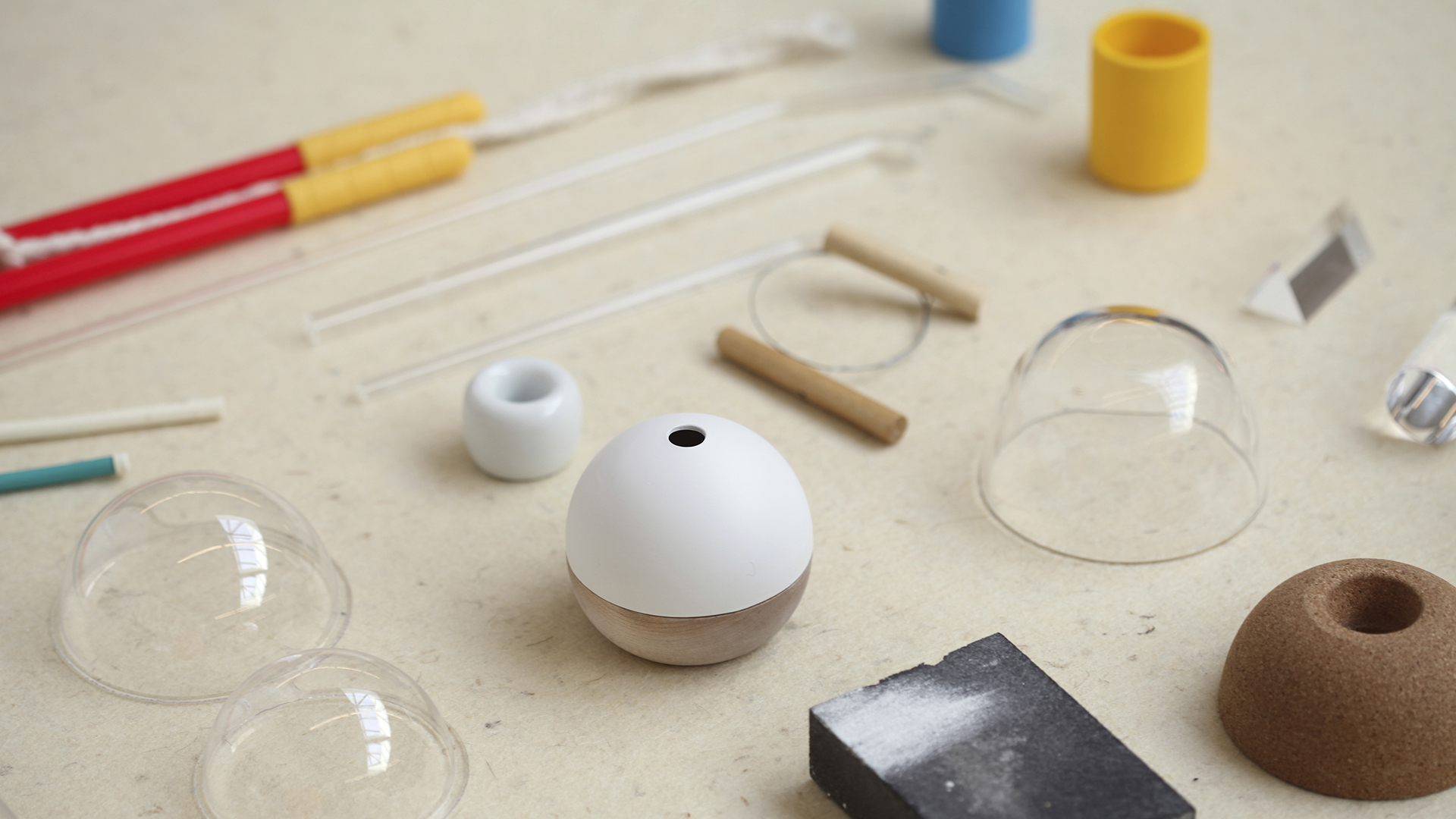
The result is MonYay!, a collection of objects and digital concepts designed to make Mondays fundays.
Listen to the Studio 360 episodes and check out our microsite to get a behind-the-scenes peek into the design process.
The shrill beep of an alarm clock. The rush-hour commute. A calendar that looks like a failed game of Tetris. Of all the weekdays, Monday looks most like a problem in search of a solution.
How We Did It: Prototyping in Virtual Reality
"We just might need a few decades to figure out how to make it work best."
Part of Project Literacy, a campaign founded and convened by Pearson, the installation is intended for large, influential gatherings like the General Assembly of the United Nations, the World Economic Forum annual meeting in Davos, and the Social Good Summit, so the concept needed to scale to different physical contexts. But because the goal was to reach a much wider audience, there had to be a way to distribute the work easily through digital channels.
IDEO had just eight weeks to research the topic, develop ideas, test them with users, and build both physical and digital prototypes. Along with Toronto-based content studio Secret Location, who executed the concept, IDEO and Pearson launched a stunning virtual reality installation at Davos in January. In conversation with Ed White, designers Martin Brown, Kate Burn, and Jure Martinec reveal the backstory of prototyping with the new technology, including software and storytelling tips for others beginning to work in the medium.
What inspired you to use VR?
Jure: It was clear that we would have to find an engaging way of stepping into the shoes of those challenged by illiteracy. It wasn’t just about showing some confusing scrambled text on a website, which is forgettable in seconds. The problem is often marginalized, so we had to do more than just show it. We had to make people really feel it. VR seemed like a natural choice.
Martin: Chris Milk and Spike Jonze have done some great stuff with their VR platform Vrse, particularly “Clouds Over Sidra,” which is the story of a girl living her life in a Syrian refugee camp. The feeling that you’re actually, physically there in the camp with her is intense. Chris Milk calls VR “the ultimate empathy machine,” and he’s right. No amount of statistics or explaining can substitute for the visceral empathy that VR is capable of creating. Though the medium is still very much in the experimental phase—a bit like the early days of film—we felt there was a very compelling opportunity to use it to create empathy for a situation like illiteracy, which many people find impossible to imagine.
What other avenues did you explore to express this story?
Martin: We looked at a lot of different possibilities. We really wanted people to experience illiteracy from the inside, so we thought about immersive theatre, in the vein of Punchdrunk’s Sleep No More, or You Me Bum Bum Train, or even physically immersive games or puzzles that the audience would need to solve, similar to Hinthunt. We really felt that we needed a physical aspect to the experience, because no matter how good a digital-only solution might be, the age of truly viral content seems to be over, and without a huge marketing push, it would be incredibly hard to cut through all the cat videos on the Internet.
Why was VR a good choice for the presentation and distribution needs of this project?
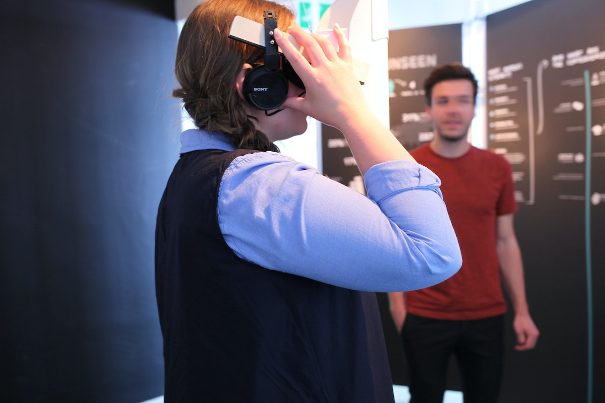
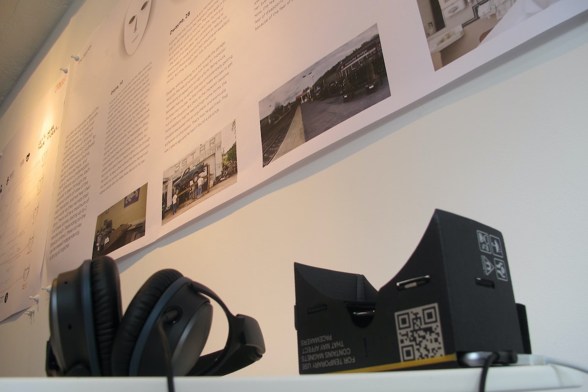
Martin: Because VR is so new, it really suits an exhibition context where users can experience it for the first time in a guided and controlled setting. At the same time, the availability of Google VR, Samsung Gear VR and even YouTube VR meant that it was also something that could spread beyond the initial exhibition and be experienced anywhere.
What was your process for prototyping in VR?
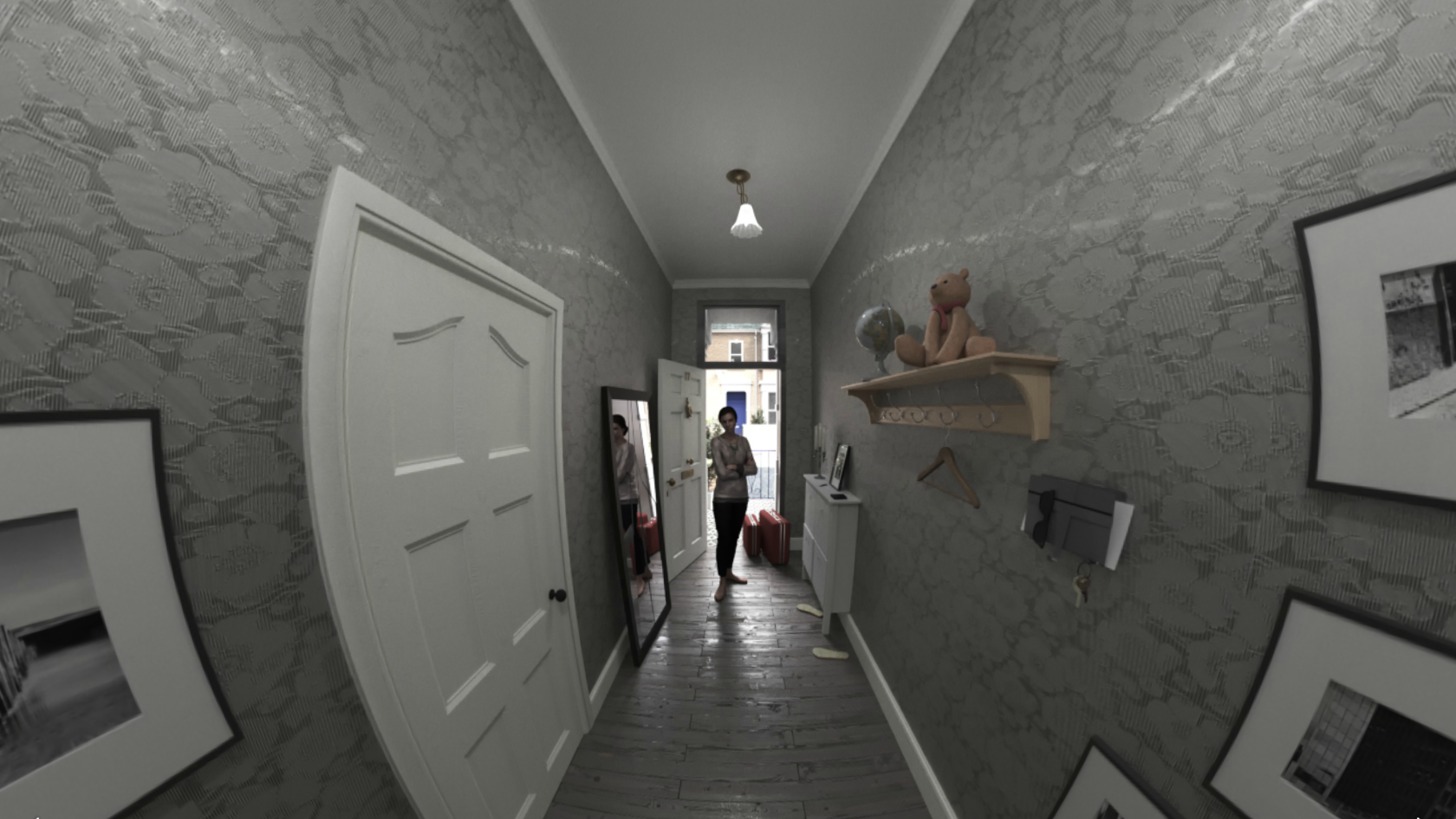
Jure: We tried many different experiences, from simple gimmicky Cardboard apps to quite strong Gear VR narratives and cutting-edge Oculus Rift examples, also using extensions such as Leap Motion. I spent a lot of time tripping over things and waving my hands around the office. Once we had a somewhat good understanding of the dos and don’ts of the medium, we made the first script, recorded some sound on a laptop, and played it over Google StreetView’s VR view to see what a first person, in-the-scene narrative feels like and got some quick feedback. Then we tested interactions to find out how the story would feel if we broke linearity. We took a basic Cardboard example in Unity and tweaked it to show a static scene with interactive hotspots. This let us finalize the script as well as define the assets we needed for final production.
Kate: We invited a few of the people we'd met during our research interviews to help us test, iterate, and develop the prototype. This was potentially very nerve-wracking! We were very conscious of how easy it might be to misrepresent, patronize, or trivialize the issues surrounding illiteracy, and we sought feedback from pre-literate people and our expert adult literacy teachers at a midpoint in the design to ensure we were communicating people's experiences accurately and respectfully.

What hardware, software, and coding languages did you use, and why?
Jure: The scene had two major requirements: It needed to feel realistic and the hotspots had to be in optimal positions. So although live-action video would have been great, it would be hard to iterate on it quickly. Instead, we went for a fully custom photorealistic 3D render to set the direction for the feeling and interactions of the story. We hit a bit of a wall with Unity, but luckily there was an Android developer floating around. Since at that point it was clear what we needed to make, we wrote a pretty dirty Cardboard/GearVR app directly in Java. Just to put it in context, I think it took us around a week and a half for all of this.
What were the technical challenges that came with designing in VR?
Jure: The medium is fairly new, so unlike when you design apps or websites, there are few approachable tools that help you prototype and learn quickly. None of us had really worked with VR before, but that was just another excuse to go for it. Luckily there is a lot of talk online about how to design for the medium, and pioneering companies like Google are sharing tools like Cardboard Design Lab. Their Cardboard SDK is also quite accessible, so it was easy to get started. If you’re familiar with game engines like Unity, you can quickly create advanced experiences for many different platforms, including the Oculus Rift. As WebVR is being pushed, frameworks are starting to pop up and many web developers are suddenly in the VR world as well.
What were the storytelling considerations you faced in VR?
Martin: Everything is so new that there is no rulebook. Google, among others, is starting to codify what the language of VR filmmaking should be, but no one really knows. For example, who or what is the viewpoint you’re looking from? Is it invisible, like in film? Possibly, but that somehow feels weird, like you’re a voyeur. We intuitively felt like you had to be experiencing the scene from the first person.
What are your technical tips for coders prototyping in VR?
Jure: Be smart and inventive. Yes, you can make very complex things, but it's really fun to think about how you can learn with smart interactions and storytelling. Also, be mindful of the platform you're designing for. A Google Cardboard app will be much less immersive than an Oculus Rift app, but on the other hand, it will be much more accessible to people. Think of who you're designing for and why.
What about filmmaking tips for budding VR directors and videographers?
Martin: Prototype and test everything. Traditional filmmaking took decades to figure out the basic tropes. I think that as VR filmmaking evolves, things will become standardized, but it’s the Wild West at the moment. For now, simplicity wins. The audience is so wowed just to be there, inside a movie, that you don’t need to resort to a lot of tricks to keep people entertained.
What do you see as the most exciting potential for the technology moving forward?
Jure: VR is becoming big. Technical standards are being established, making development and prototyping tools more powerful and accessible for developers. As platforms like Google Cardboard and Oculus grow, their distribution channels are lowering the barrier of adoption for developers and viewers. The medium is maturing, so the content is becoming much more engaging, with rich storytelling, which almost forces big production companies to move into the field. Things are definitely happening soon.
Martin: There’s that story about the Lumière brothers in 1895, screening a film of a train arriving at a station. People in the theatre, who had never seen moving pictures before, ran away because they thought they’d get hit. That’s where we’re at with VR. It’s raw and unsophisticated but still incredibly visceral, and because of that, it’s powerful. I think it has the capacity to be the dominant art form of the 21st century—like film was for the 20th. I really think it will be that big. We just might need a few decades to figure out how to make it work best.
If you’re reading this now, chances are you have no idea what it’s like to navigate the world without full literacy. In May 2015, Pearson asked IDEO to design an experience that would inspire empathy for the struggles of people with illiteracy.
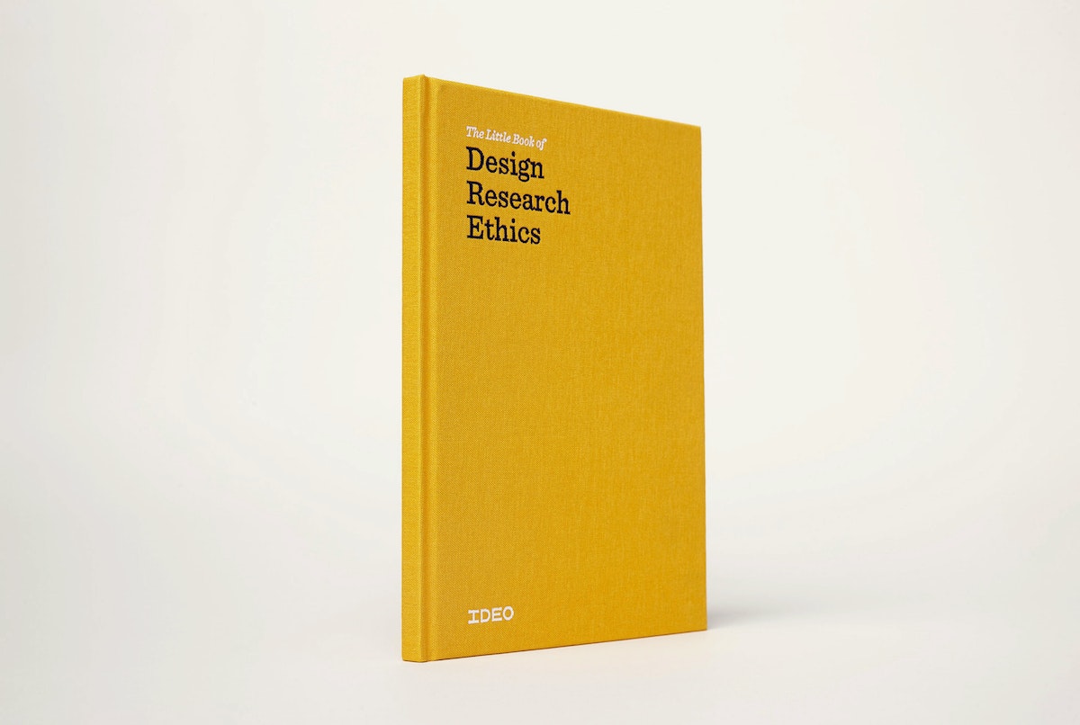
The Little Book of Design Research Ethics
For human-centered designers, there is nothing more valuable than discovering what matters to people—what triggers frustration and what provides ease, what brings grief and what sparks joy.
For human-centered designers, there is nothing more valuable than discovering what matters to people—what triggers frustration and what provides ease, what brings grief and what sparks joy. That’s why IDEO studies subtle and often unspoken details of daily life: habits, circumstances, thoughts, feelings, and reactions. We rely upon access to people’s unguarded selves. Their trust is precious, and comes with responsibility. How do we seek and share insights about people’s lives in an ethical way?
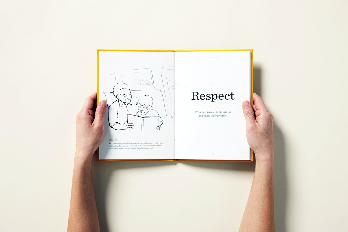
Three timeless principles guide all our work: respect, honesty, and responsibility. While the concepts are well known, they’re abstractions that resist concrete definition, and applying them to the ambiguities, complexities, and messy scenarios of real life is no simple task. The Little Book of Design Research Ethics provides a practical guideline, along with tools and examples from IDEO's work in the field. It integrates more than a quarter century of IDEO experience with advice and recommendations from ethicists, as well as codes of conduct in related professions, from journalism to market research. Though it was originally created for IDEO designers, the book offers applicable guidance to a wide range of situations in which it’s crucial to build relationships of trust. It’s the first of its kind, and we hope it will facilitate ongoing conversation and reflection about what it means to work with empathy and cultural sensitivity and ensure that interactions are safe, fair, enjoyable, and mutually beneficial.
Download the book here.
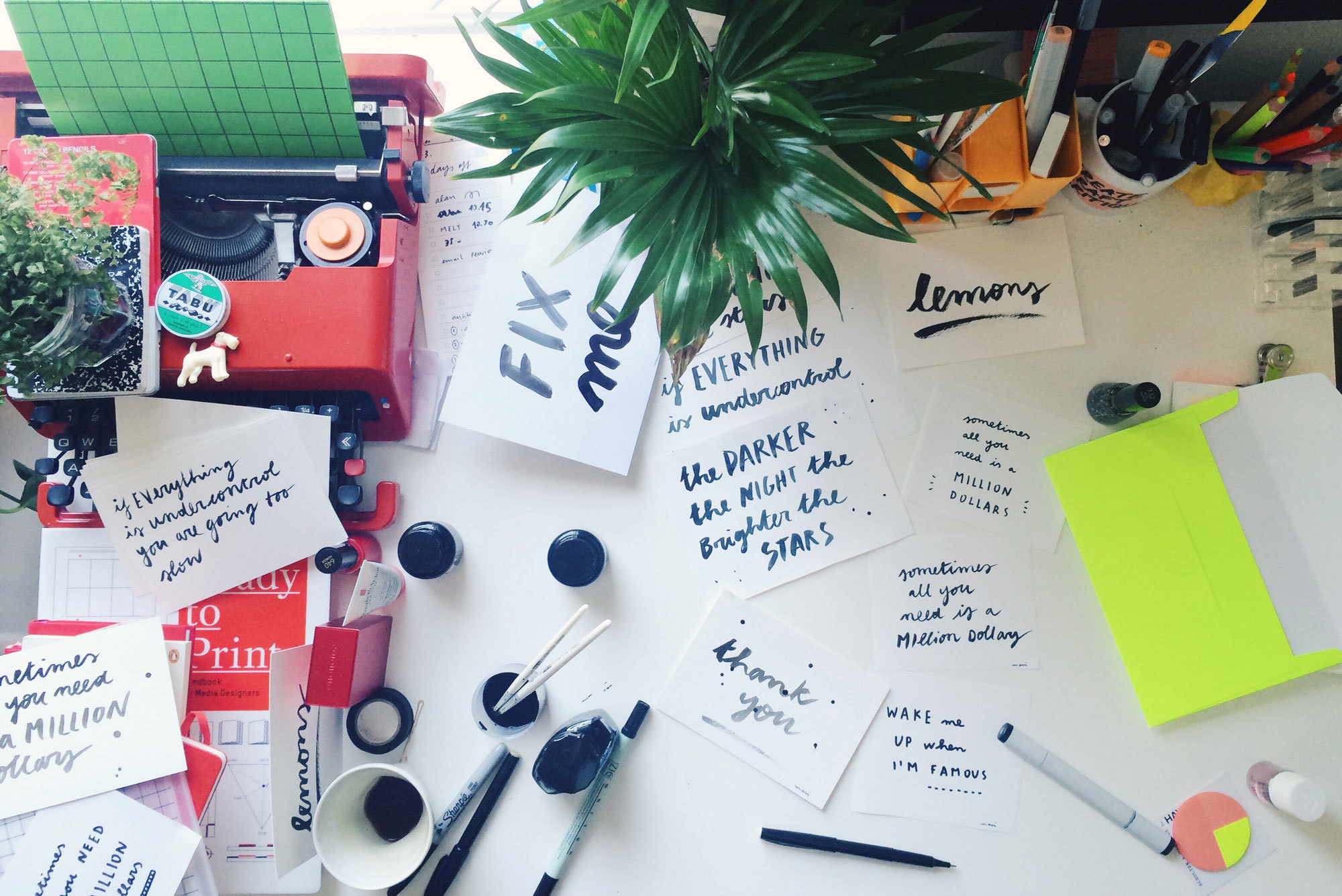
Why You Should Make Your Own Font
Handwriting is our best defense against anonymity
Downloaded more than 3,000 times online, Masi’s flowing font has got into the hands of quantified-self posterboy Nicholas Felton, photographer Todd Selby, and our very own David Kelley (founder of IDEO). We sat down to talk about her inspiration for Masi Font, her policeman-calligrapher grandfather, and why she thinks handwriting is one of the last modes of self-expression.
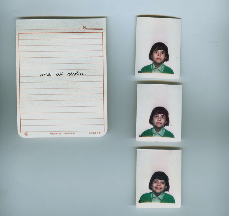
Where did your love of typography come from?
It started in elementary school. Learning to write was an obsession. I thought it was drawing beautiful things, rather than learning how to write words. If I made even a tiny mistake I would tear the page apart and start all over again. I would fill up pages with just one letter, repeated over and over again. Sometimes I would do other kids’ homework so that I had more to write.
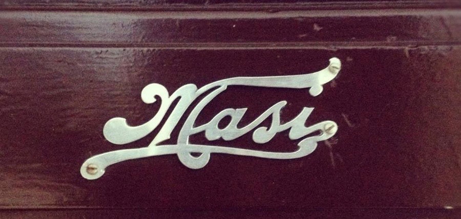
Do you come from a family of artists?
My grandpa, Amedeo Masi, was a Carabiniere (a member of the Italian national police force) and a calligrapher. I know, such a random combo, and he made his own house sign (above). Calligraphy used to be a subject in school in Italy. Having a beautiful handwriting was really important at the time—it meant you'd had a good education.
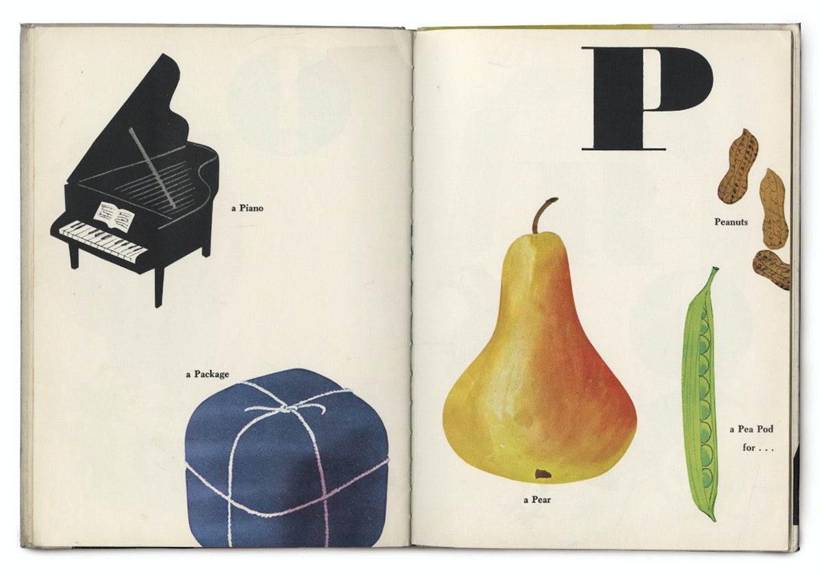
Who inspires you, and why?
Growing up in Italy, I was exposed to so many incredible logos and identities that haven’t changed. Everything stays 60s classic.
When I started my design studies in Rome, Vignelli (who made the original New York subway identity) was my main inspiration. I loved the way he used Helvetica with simple and effective graphics. Bob Noorda, was another great inspiration. When I worked for In Area (the Pentagram of Italy), I refreshed the design of the Milan Underground, and I loved how we made Helvetica cool in Italy.
Munari, was another great inspiration. His friendly and simple style really resonated with me. His kids’ books are so clean but so playful at the same time. His style brings magic to everything, and that’s what I want to do too.
Once I moved to the Netherlands, Experimental Jetset and Wim Crowel also inspired me so much. I loved how they used typography in spaces, books, and museums.
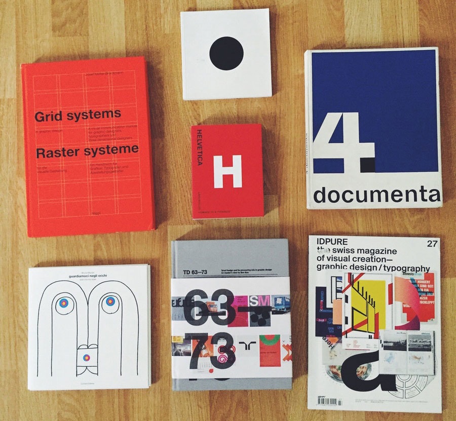
What was the first font you created?
I created my first font, Cerchio Futuro, at university. It was a really rounded/modular font based on one unit (that’s the constraint they gave us). I hated it, but I got the highest mark in the class and was featured in a book Metodologia Progettuale Del Graphic Design (below).
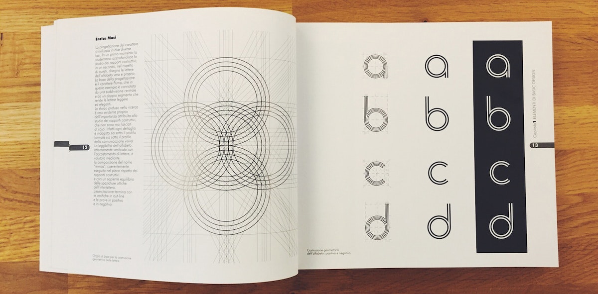
You've talked about how important it is to have your own font. Why?
In this fucking digital world, no one writes by hand anymore. So, having a font is the truest visual expression of your mind and craft. No iPhone can take your handwriting away from you!
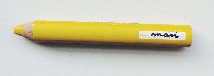
How did you develop the Masi font?
I never thought about creating my own font, but people really liked the way I wrote, and they kept asking me to "Masify" things. I realized I could just create a font that everybody could use, but I was overwhelmed by the technicalities of creating one.
Luckily my boyfriend, Alan, showed me this website where you can just download a form, print it, and fill in the blocks. Rescan the form, and—voila—I created my first Masi font. It’s not exactly the same fidelity as the handwritten font, which I hated for a long time, but after a while I liked the fact that the only original Masi font still comes from me.
What does the font say about you?
That I’ve stayed a kid forever, that I don’t want to grow up. Peter Pan, you know. That even if it looks consistent, each letter is different, every time.
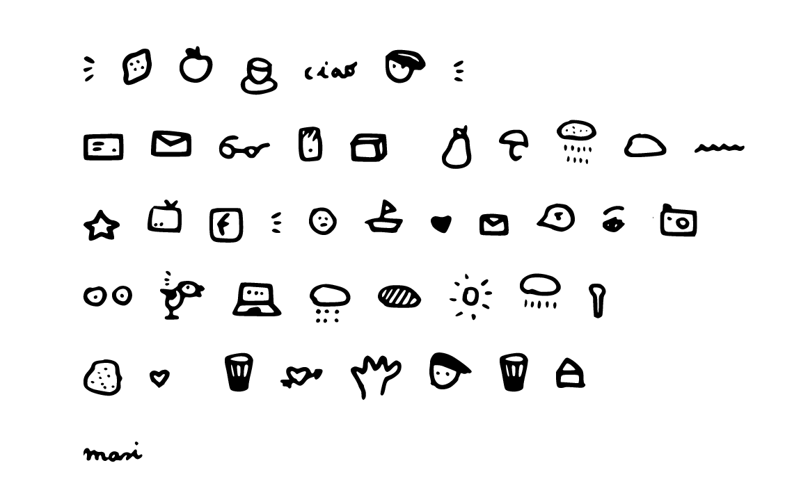
Any Easter Eggs buried within?
If you type certain letters you’ll see "tits" (Ö) and "lemons" (]) LOL.
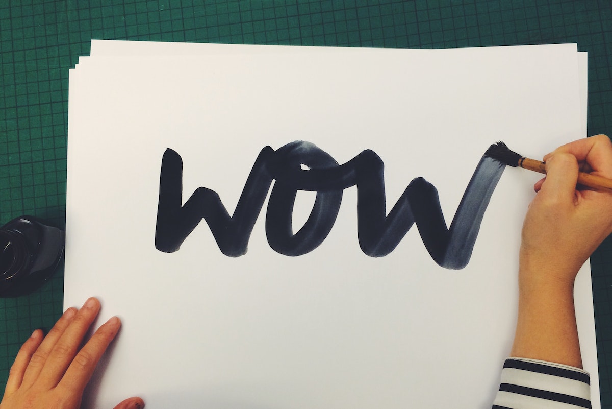
Look across the London studio’s stationery boxes, pet projects, and the odd client deliverable, and you can’t miss the handwritten flourish of Enrica Masi. Despite being an interaction designer, Masi is a firm believer in the physicality and imperfection of penmanship. It's a manifestation of personality, she says, which spurred her to lead the London studio in an exercise to create their very own font.

Lindsey Turner
I’m passionate about building brands, products, and experiences that help organizations show up with meaning and momentum.
I help organizations cut through complexity by shaping how they show up, through brand strategy, identity, and storytelling.
Working at the intersection of brand and business, I bring an editorial eye and a bias toward making—turning ideas into tangible experiences that people can understand, trust, and believe in.
My work spans government, healthcare, financial services, media, and consumer goods, from launching Gen Z-focused ventures to building innovation labs and reimagining legacy brands. I relish moments of ambiguity and enjoy translating across teams, perspectives, and priorities to move ideas forward.
I started my career in editorial and digital design, shaping cross-platform experiences and identity systems in publishing and agency environments. That foundation still shapes how I work today: I’m detail-oriented, collaborative, and overreliant on the Oxford comma. I hold a BFA in Visual Communication from the School of the Art Institute of Chicago.

Rachel Young
My work helps organizations see who their products aren't working for—and build the will and the tools to do something about it
For 25 years, I've asked the same question: Who does this design exclude—and what are we going to do about it?
My work spans human-centered strategy, inclusive design, and qualitative research, with clients ranging from Microsoft, Google, and Verizon to the National Science Foundation, and San Francisco Unified School District.
Before IDEO, I taught elementary school in East Palo Alto and spent a decade doing design work with social service organizations—where I learned firsthand what it costs people when systems are built without them in mind.
I am currently writing User Error, a nonfiction book about digital access and the design decisions behind it. I live in Oakland, California.

Brian Pelsoh
I lead with craft, ensuring our work is creatively excellent: rooted in deep human insight and imagination, while also grounded in the realities of business and technology.
My expertise spans brand, communication, and product design across tech, education, the arts, and social impact.
I believe great work demands both high-level vision and obsessive attention to detail, and only happens through collaboration.
I bring an inclusive, hands-on approach and a deep understanding of business, which enables me to consistently deliver excellence while always asking why.
Before joining IDEO, I worked at the brand firms Pentagram and VSA Partners. I began my career as a designer, leading teams at the School of the Art Institute of Chicago and the Milwaukee Art Museum. I hold an MFA in graphic design from Maryland Institute College of Art and a BFA in communication design from the Milwaukee Institute of Art & Design, and have taught at some of the best design schools in the US.

Tony Wong
I am responsible for IDEO’s long-term success in China and working with clients to use design as a tool to enable growth.
I am responsible for IDEO’s long-term success in China and working with clients to use design as a tool to enable growth. Specifically, I have helped Chinese companies design holistic brand solutions through the development of their products, communication, services, and innovation teams, and I have helped multinationals expand their presence and influence in China.
I advise global leaders on developing China-led innovation and capabilities.
In over 15 years in IDEO Shanghai, I have worked on projects that use design to elevate the quality of the experience of healthcare products and services, streamline processes that increase productivity, create spaces and programs that promote and enable inclusive communities, and build next generation mobility solutions that are planet-positive.
Before joining IDEO, I worked at Philips Electronics and the Electrolux Group in Italy, the Netherlands, and Singapore on a number of breakthrough commercial products. I am a member of the Young President Organization in Shanghai.

Building a personal AI for the messiness of life: Sida Li
Most AI products today are built for work—a space with clear problems and established systems. One founder noticed a gap: personal life is messier, harder to systematize, and mostly left behind by the AI boom. So she built Cue, a personal AI that lives inside iMessage and group chats, to go where the other tools haven't.
In this episode, Becca Carroll, IDEO's Chief Strategy Officer, talks with Sida Li, co-founder and CEO of Shared Context Lab, about staying anchored to a human need while the technology around her keeps changing shape, why she treats her business model with the same rigor she'd bring to a product, and what it feels like to build a company at this particular, disorienting moment in AI.
The conversation also gets into how Sida makes design decisions: the language Cue uses to describe itself, the tradeoffs behind building inside iMessage instead of a new app, and a real story about a business idea that didn’t pan out.
This is the second in a two-part series profiling founders from IDEO's Startups-in-Residence program. The first conversation is with Johannes Seemann, founder of Sooner, on designing GenAI for the emotional side of money.

Designing GenAI for the emotional side of money: Johannes Seemann
Most personal financial tools are built to run the numbers and optimize towards a budget. While that works for some, most people experience money as a lived relationship that does not neatly fit into a spreadsheet. Johannes Seemann and Becca Carroll discuss why money is emotional before it is mathematical, and what a human-centered approach to building a generative AI financial product looks like in practice.

The curious leader's edge in uncertainty: Scott Shigeoka
Mina Seetharaman talks with Scott Shigeoka, author of Seek and Head of Curiosity Cultivation at the Eames Institute, about what distinguishes genuinely curious leadership from performative curiosity, how power dynamics shape curiosity, and why practicing curiosity can restore energy rather than drain it.

How constraints make us more creative: David Epstein
Mina Seetharaman talks with David Epstein, author of Inside the Box and Range, about why total freedom often produces average work, how leaders can design useful limits on purpose, and what organizations such as General Magic and Pixar reveal about the relationship between boundaries and creativity.
Looks like you might be in search of something very specific?
Or reset the filters above and try another angle.
Here’s some random inspiration

Podcasts about creative leadership

Articles about the power of prototyping
