
.svg)




Helping a startup design video games to build kids’ emotional strength
A one-month sprint to develop new products—and a new way of working.
For 6-year-old Dave Jr., a long line at Disneyland triggered a massive meltdown. His parents were concerned and a little embarrassed, but not surprised; Dave Jr. struggled to keep his emotions in check.
Hoping to help, Dave Jr.'s uncle, entrepreneur Craig Lund, joined forces with researchers at Harvard Medical School and Boston Children’s Hospital, along with a video game designer who had worked on Quick Hit and NBA 2K. Together, they set out to design something that could teach coping skills to kids like Dave Jr. who need to manage “big emotions,” as well as children suffering from anxiety, ADHD, and other behavior issues, which are on the rise.
Their collaboration resulted in a video game called Mightier and a startup called Neuromotion Labs—a 10-person team of psychologists, game designers, and engineers who embedded at IDEO Cambridge for a one-month sprint to improve the game and get ready for launch.
To play Neuromotion's game, kids are first taught simple, calming breathing exercises. During gameplay, kids wear heart-rate monitors on a wrist or arm that detect spikes caused by stress or anger; as their heart rates go up, the game's difficulty increases. Kids have opportunities to pause and try deep breathing to counter the ramped up challenge. As it turns out, "gamifying" restraint builds strong incentives for kids to take charge of their emotions—they have to if they want to win.
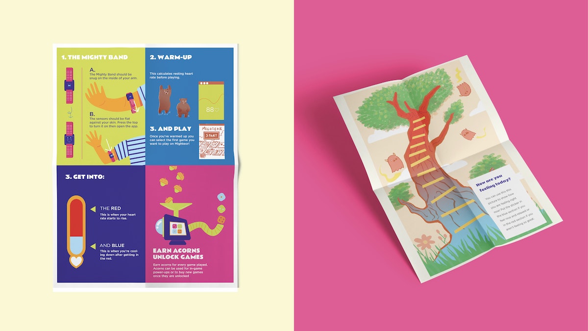
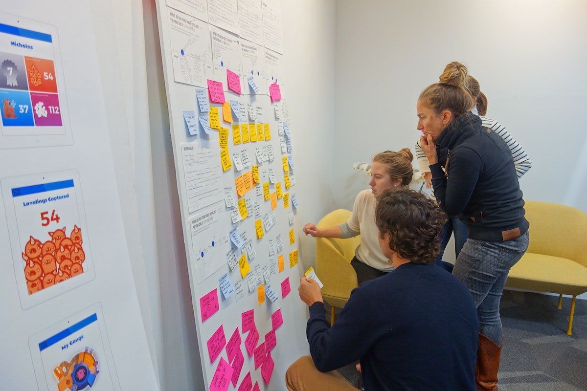
Already activated around boosting mental and emotional health, IDEO's design team worked side-by-side with Neuromotion to study how parents and children experience Mightier. From home visits to group interviews to a summer camp-style design session with kid players, live feedback fueled the next iteration of the gaming platform and better product-market fit.
IDEO helped Neuromotion hone the visual design and mechanics of Mightier and expand it's suite of games. The team observed that the Mightier program was more successful the more involved parents of players became, which revealed a need for additional resources for adults. So they created new supports, including a more detailed orientation and a personalized coaching service for parents staffed by trained therapists.
But can a video game actually help kids cope? Early peer-reviewed studies showed that playing Mightier reduced outbursts by 62 percent, oppositional behaviors by 40 percent, and parental stress by 19 percent. After 12 weeks of using Mightier, a survey of kids and parents showed that 96 percent of parents saw positive behavior changes in their children, while 92 percent of kids learned new coping skills.
Shortly after the design sprint, Neuromotion secured its next round of funding and officially launched Mightier’s array of “bioresponsive games.” The games have already been played more than a million times, and Neuromotion has measured more than a 100 million heartbeats. Mightier games are helping kids and families across the country.
What about Dave Jr.? Recently, his sister told Lund she "accidentally" bumped Dave Jr.’s bike off a pier and into the ocean. She was expecting an outburst of anger, but after eight months of playing Mightier, Dave Jr. stayed cool. His uncle couldn’t be prouder.
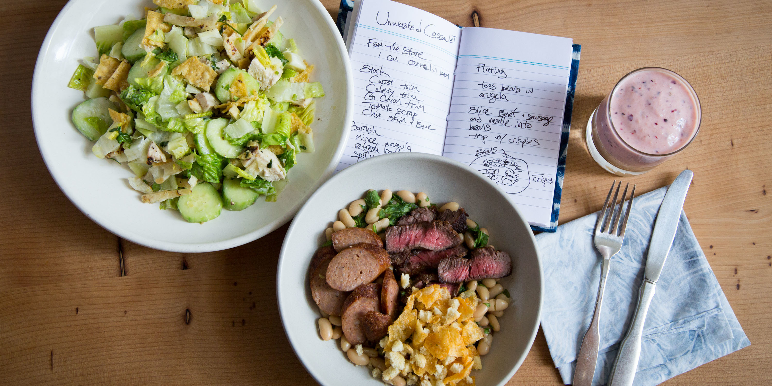
Designing waste out of the food system
IDEO partnered with hotels, food banks, foundations, and entrepreneurs to combat food waste.
Many of us have let vegetables wither in the crisper drawer, or thrown out a child’s half-eaten restaurant meal, but the sheer scale of food waste around the globe is hard to grasp. According to the United Nations, about a third of the food the world produces every year—1.3 billion tons—is lost during production or tossed by consumers, with North Americans throwing out the most food per capita. The average American wastes enough food each month to feed another person for 19 days.
IDEO received a series of grants from The Rockefeller Foundation to find solutions, given the power of IDEO’s human-centered design approach to address systemic challenges. Through a number of projects with The Rockefeller Foundation and other organizations, IDEO designers from across the U.S. devised novel ways to tackle food waste.
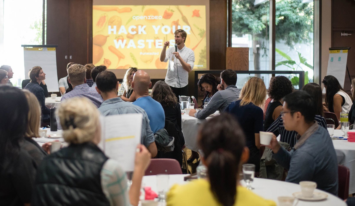
For IDEO’s first initiative, designers tapped into the enthusiasm of the broader creative community, in partnership with The Rockefeller Foundation, the City of San Francisco’s Department of Environment, the Closed Loop Foundation, ReFED, and other groups. In the summer of 2016, OpenIDEO—IDEO’s open innovation practice—launched the Food Waste Challenge, asking how people might curtail waste by rethinking our relationship with food. Between June and October, more than 20,000 people from 113 countries took part in the challenge, tracking their personal waste and brainstorming solutions.

Challenge participants submitted more than 450 ideas. A team of food industry experts helped select the 12 top proposals, which included software to help people buy food collectively from wholesalers and a service that delivers extra meals from corporate events to those in need. Ultimately, the Closed Loop Foundation chose to award Full Cycle Bioplastics a $50,000 grant to scale up its idea to convert inedible food and paper waste into a fully compostable alternative to oil-based plastic.
At the conclusion of the Food Waste Challenge, OpenIDEO launched the Food Waste Alliance, a platform for participants and experts to stay engaged with the most promising ideas and innovators. The alliance helped entrepreneurs share resources, prototype new concepts, secure funding, hire staff, and form partnerships. OpenIDEO invited hundreds to join the alliance, and 92 percent of members told IDEO they made progress in their work as a result. One member company, RISE, received funding from another participant who discovered RISE through the alliance. This investment let RISE prototype its concept for milling spent grain from beer brewing into flour for baked goods and ultimately join the prestigious Food-X accelerator.
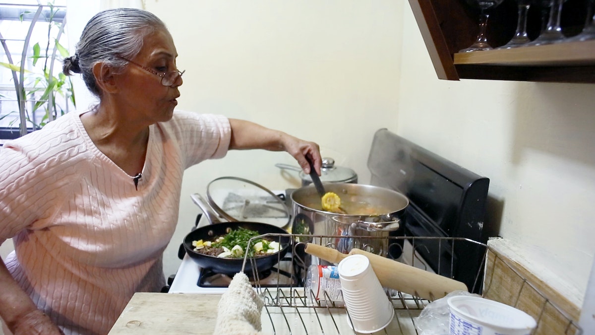
The Rockefeller Foundation also supported IDEO’s work with City Harvest, a New York organization that collects 160,000 pounds of unused food each day and delivers it to soup kitchens and food pantries. City Harvest wanted to understand the habits of local families who visit food banks in an effort to ensure all the food the group distributes gets eaten. To get a peek into these families’ kitchens, in January 2017, IDEO researchers conducted observations and interviews across New York City’s five boroughs. Pantry customers cooked for the researchers, giving them an inside look at how the families engaged with the food they had available and what food meant to each of them: tradition, stability, even adventure. Based on insights from pantry visitors, IDEO made recommendations for City Harvest, including community-run cooking classes and a way for families to request specific foods or reserve pick-up times by text message. IDEO also created three video vignettes to help build even greater empathy between City Harvest and the people it serves.
In spring 2017, capping IDEO’s work with The Rockefeller Foundation, the organizations teamed up with World Wildlife Fund and Hyatt hotels in Florida, New York, and New Jersey to rethink all-you-can-eat buffets. IDEO studied diners and staff at Hyatt buffets and found that employees—from event planners to kitchen staff—each add a cushion of extra food to cover their bases, while guests overfill their plates to avoid missing out. In the end, diners eat just half the food organizers serve, while the rest goes to waste. This and other data-driven insights gleaned about diners’ habits led to subtle substitutions, including smaller plates of meats and cheeses that can be ordered from servers and individual pastries rather than whole cakes. These alternatives have not only built on Hyatt’s existing food waste management strategies, but have also helped reduce buffet costs at Hyatt Regency Orlando and continued to receive support from guests.
The problem of food waste is too enormous to ignore. Wasted food means squandered resources, lost money, and ultimately, hungry people—more than 15 million in the United States alone. Designers and innovators from coast to coast have helped find solutions to the crisis that fulfill a variety of needs, from preserving produce sent to food pantries to keeping plastic packaging out of the oceans. The Rockefeller Foundation and other IDEO partners are leveraging powerful design techniques to pave the way for a waste-free future.
Launching a bootcamp for data scientists
Designing a rigorous program that prepares students for a career in the data-driven economy.
In 2017, IDEO acquired longtime partner Datascope and integrated the company’s data scientists and engineers. Datascope team members aren’t just passionate data scientists; they’re human-centered designers who happen to work with data, as illustrated by successful collaborations like this one:
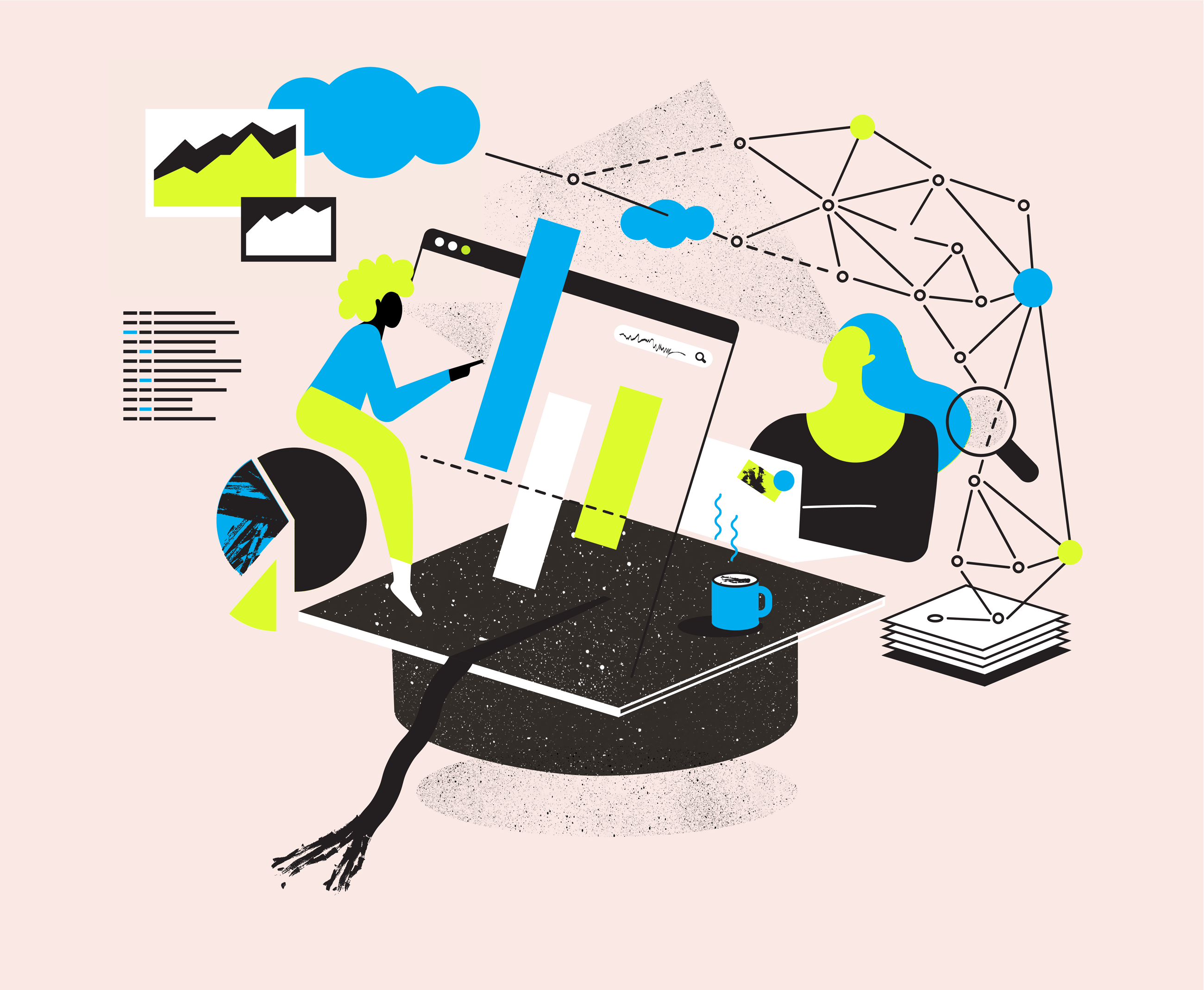
In today’s job market, there’s no such thing as being "done" with your education. This is particularly true in the fields of data science, machine learning, and AI, where significant advances are made on a monthly basis. To meet this need for more in-depth training, Metis—part of Kaplan—wanted to create a comprehensive data science program for students from all backgrounds. Metis asked Datascope to design the curriculum from scratch, drawing on the company’s deep expertise in the field.
Datascope spoke with practitioners across industries to identify the key skill sets that make them successful: a grasp of design; fluency with data management, coding, and algorithms; and effective communication with coworkers and the wider world. The team crafted a 12-week bootcamp that develops these specific abilities.
In order to prepare students for the work world, the bootcamp is structured less like a class and more like a company, where students are “hired” as data scientists—with projects to complete—starting on day one.
Students collaborate on group projects and presentations in a way that mirrors real workflows, and practice pair programming to learn from one another. Using techniques drawn from design, students are invited to refine their project briefs and continually reevaluate their approach.
Instead of a final exam, at the end of the course, students tackle five real-world, open-ended data science projects inspired by Datascope’s client work. One project involves using data from subway turnstiles to detect patterns in the volume of street traffic; another asks students to use data they scrape from the web to predict a movie’s box office profits using regression analysis.
After students complete the bootcamp, they receive an additional three months of career support, from mock interviews to site visits with potential employers. In addition to designing the curriculum, Datascope taught the first three student cohorts and helped Metis build its teaching team as it expanded the program from New York to San Francisco, Chicago, and Seattle. Metis now offers online courses, evening classes, and corporate trainings in data science.
If you’re going to take a data science bootcamp, it’s best to take one designed by data scientists.

Designing the Levi’s Commuter Trucker Jacket with Jacquard by Google
When Google teamed up with Levi’s to craft a jacket with technology woven in, the company turned to IDEO to help make the experience of wearing the garment feel seamless, intuitive, and familiar.
You’re whizzing along on your bike, en route to a new restaurant for a client meeting. You reach an unfamiliar intersection; which way to go now?
Instead of dismounting and digging for a phone, you brush your hand along your jacket sleeve for directions, then double-tap the denim to re-start your music. Without taking your eyes off the road, you’ve taken care of the problem.
This intuitive interface for connected apparel began with Levi's, makers of durable workwear for 140 years, and Google, creators of forward-looking technology, which joined forces to fashion the first item of clothing with touch-sensitive, copper-core threads woven directly into the fabric. Once it was established that the first connected garment from the partnership would be a jacket within Levi’s Commuter line, with interaction on the sleeve, Google worked with IDEO, leaders in designing for human needs, to develop the gesture language of the jacket and industrial design of the technology within.
This is the first connected garment that helps us break free from devices. It seamlessly incorporates Jacquard by Google technology to perform digital tasks, such as navigation, communication, and music playing with a few swipes or taps on the sleeve.
Jacquard by Google—a platform that makes it possible to integrate touch and gesture interactivity into fabrics using conductive yarn and standard, industrial looms—was inspired by a curious twist of history. The Jacquard loom, invented in France in 1804, used punch cards to automate the process of weaving complex patterns into fabric. In the 1940s and ’50s, engineers employed a similar punch-card technique to program the first computers.

IDEO spent time on the project early on, collaborating with Google engineers and Levi’s clothiers on the jacket’s development, helping craft an experience that would make the intelligent threads intuitive to wearers.
Working alongside Google and Levi’s, IDEO’s work included:
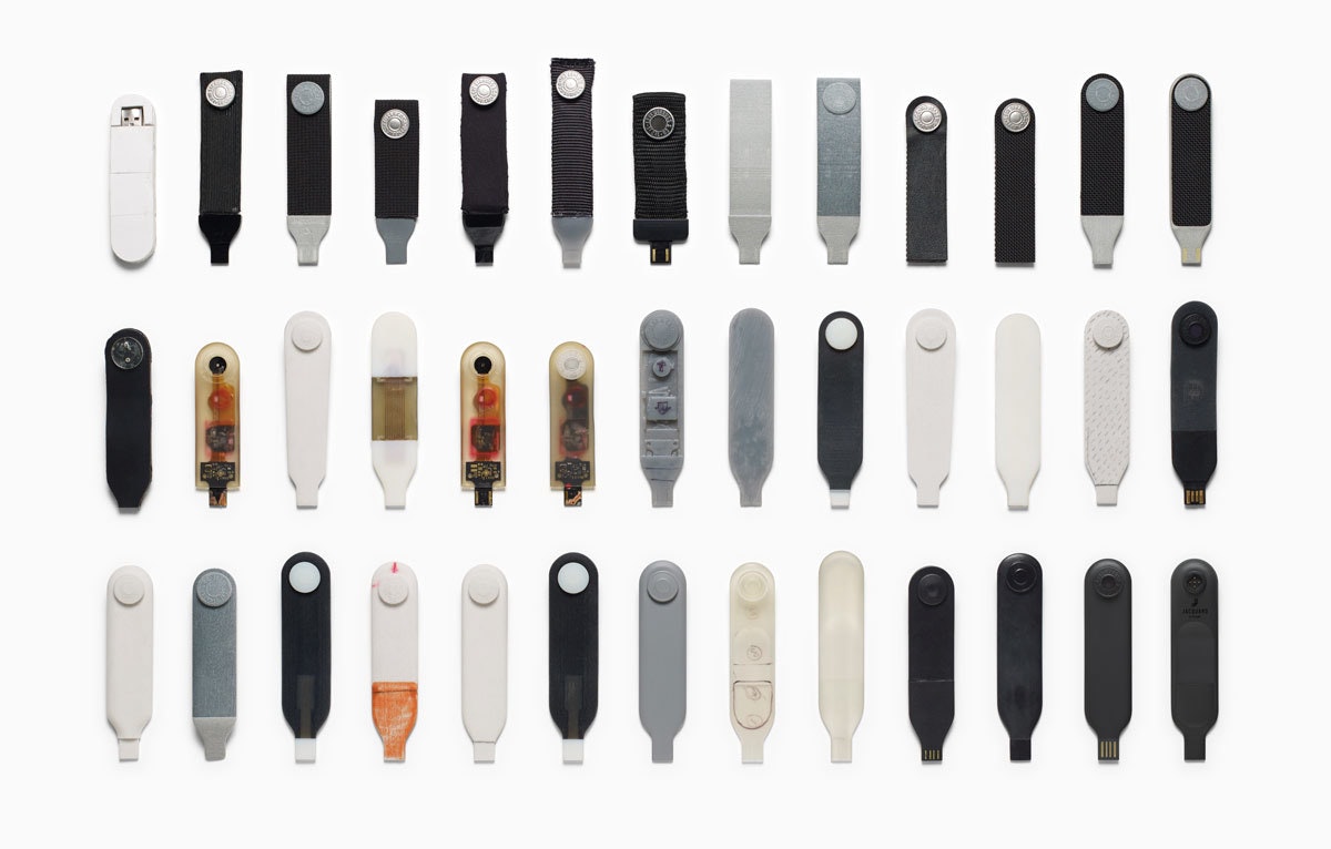
- The industrial design of the electronics integrated into the snap tag and connector (the tag snaps onto the jacket’s cuff and connects to your phone via Bluetooth)
- A vocabulary of gestures on the cuff of the jacket that lets you interact with the jacket’s technology
- Early exploration of the basic design philosophy and conceptual design for the interaction model of a corresponding smartphone app that ties it all together (works with both iOS and Android phones)

The IDEO team’s first task was to validate what commuters of all stripes wanted from the garment, in addition to the work Levi’s did in researching with its consumers. In interviews, group exercises, and wear tests with urban cyclists and other workers on the go, the team learned that cyclists needed a way to stay connected, while still living in the moment. That meant being able to answer calls, hear text messages, get the next direction, and control their music without using a screen.
Levi’s, Google, and IDEO developed a language of movement for Jacquard-enabled fabric that feels familiar and human and builds on the ways people would naturally interact with a garment (a whole-hand brush along the sleeve, as opposed to a one-finger tap on a touch screen, for instance).
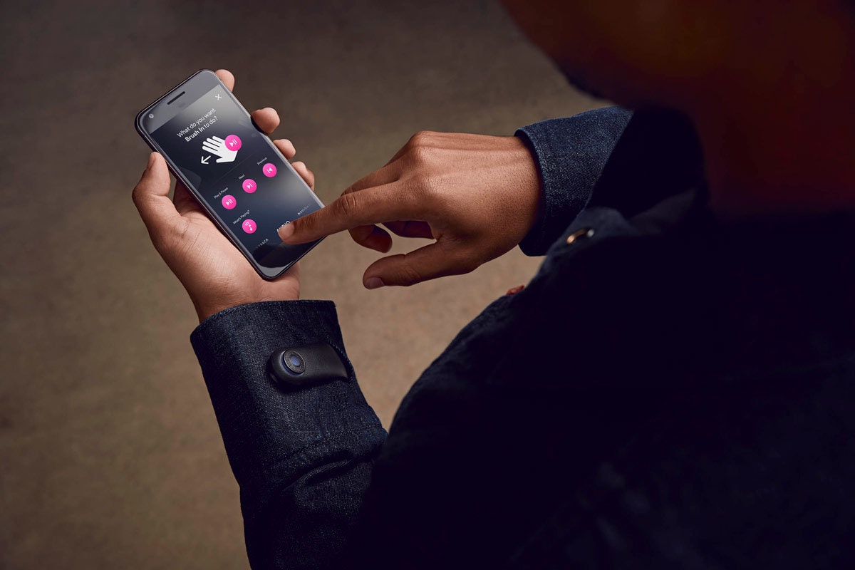
Then came the design and engineering of the snap tag on the jacket’s cuff, which gently notifies you of calls, texts, and other jacket interactions with light and vibration feedback. The flexible, lightweight strap incorporates the look and feel of a Levi’s jean button, while housing advanced electronics that capture touch data. The tag is removable, charges via USB connection, and works in conjunction with a mobile app that lets you configure settings for the garment, set notifications, and customize gestures and interactions.
The Levi’s Commuter Jacket with Jacquard by Google changes the game because it’s simply that—a jacket—with technology that adds new utility and value, allowing us to wear our everyday interactions on our sleeves.
The Levi’s Commuter Trucker Jacket with Jacquard by Google hit stores in October 2017.
IDEO and Google have a long history of collaboration. Learn more about our work on Google Bloks here.
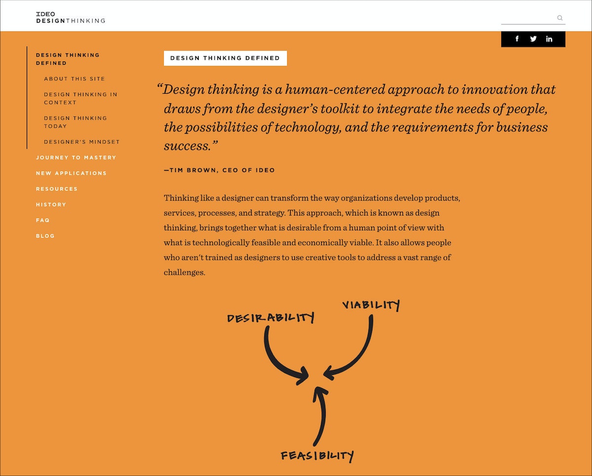
Perspectives, Practices, and Resources for Design Thinking
At IDEO, we’re often asked to share what we know about design thinking. We’ve developed designthinking.ideo.com in response to that request.
At IDEO, we’re often asked to share what we know about design thinking. We’ve developed designthinking.ideo.com in response to that request. On the site we introduce design thinking, how it came to be, how it is being used, and steps and tools for mastering it. You’ll find our particular take on design thinking, as well as the perspectives of others.
Build Your Creative Confidence: Nickname Warm-Up
While Speed Dating is useful in situations where people don’t know each other well, sometimes in group meetings you will encounter the opposite problem: a group where people know each other too well.
Creativity Challenge # 7: Eliminate hierarchy to improve idea flow.
While Speed Dating is useful in situations where people don’t know each other well, sometimes in group meetings you will encounter the opposite problem: a group where people know each other too well. Or, more specifically, a group in which hierarchy is so well established that the more junior members in the room self-edit and defer to the executives rather than putting their best ideas on the table.
To reduce hierarchy (which inhibits conversation) and self-censoring (which is equally limiting), the d.school has recently been experimenting with a “nickname warm-up.” Using a stack of colorful names the instructors have prepared in advance, the activity is a way to temporarily level out the organization during a creative working session. Each participant is given a persona to allow them to “try on” new behaviors.
Tool: Nickname Warm-up
Participants: Groups of 6-12 people per facilitator
Time: A few minutes per person
Supplies: Nametags for each person with the fake names written out. A hat and a ball for each facilitator.
Instructions
Step 1: Each participant reaches into the hat, draws out a name tag, and puts it on. Use names that lend themselves to humor and emotion. Teams tend to produce their best work when the group is having fun. Some of the monikers can imply a big dose of street credibility, while others suggest quirky personalities. For example: Dr. Fabulous, Squirt, Mr. Big Heart, The Clumsy Entertainer, or The Rooster.
Step 2: The facilitator gathers the group in a circle and tosses the ball. Whoever catches it introduces themselves using their new nickname and then tells a short story (created on the spot) about how they acquired this nickname as a child.
Step 3: After their self-introduction, they toss the ball to a new person, until everyone has had a chance to share their new name and story.
Step 4: The rule for the rest of the workshop—strictly enforced—is that everyone must use only these nicknames when referring to themselves or others.
Tips from the Field
Do the nametags work? Although this is a relatively new exercise, experience so far suggests that the answer is yes. At a recent management event, the CEO of a global hospitality company drew the “Squirt” nickname. There was a pregnant pause in the room as everyone waited to see how he would react. But he gamely played along through the rest of the workshop, and the organizers felt it contributed to an open environment in which people could speak freely.
The goal is to flatten out the hierarchy, so it’s important to get the senior people in the room to participate. Leading by example will naturally break some of the barriers to free-flowing collaboration.
This post was taken from Chapter 7 of Creative Confidence. Purchase the book for more on how to use creativity to solve problems, or read more from this series of creative exercises on the IDEO blog.
Everyone is creative. This belief runs through everything we do at IDEO, and in 2013, it led my brother David and me to write a book that would help others—even those who don’t think of themselves as “creative types”—to unleash their creative potential. Creative Confidence has inspired thousands of people to adopt a creative mindset and apply it to the diverse real-world challenges they face. In this series, we’ll share some exercises from the book that can help you approach your challenges from a new perspective.
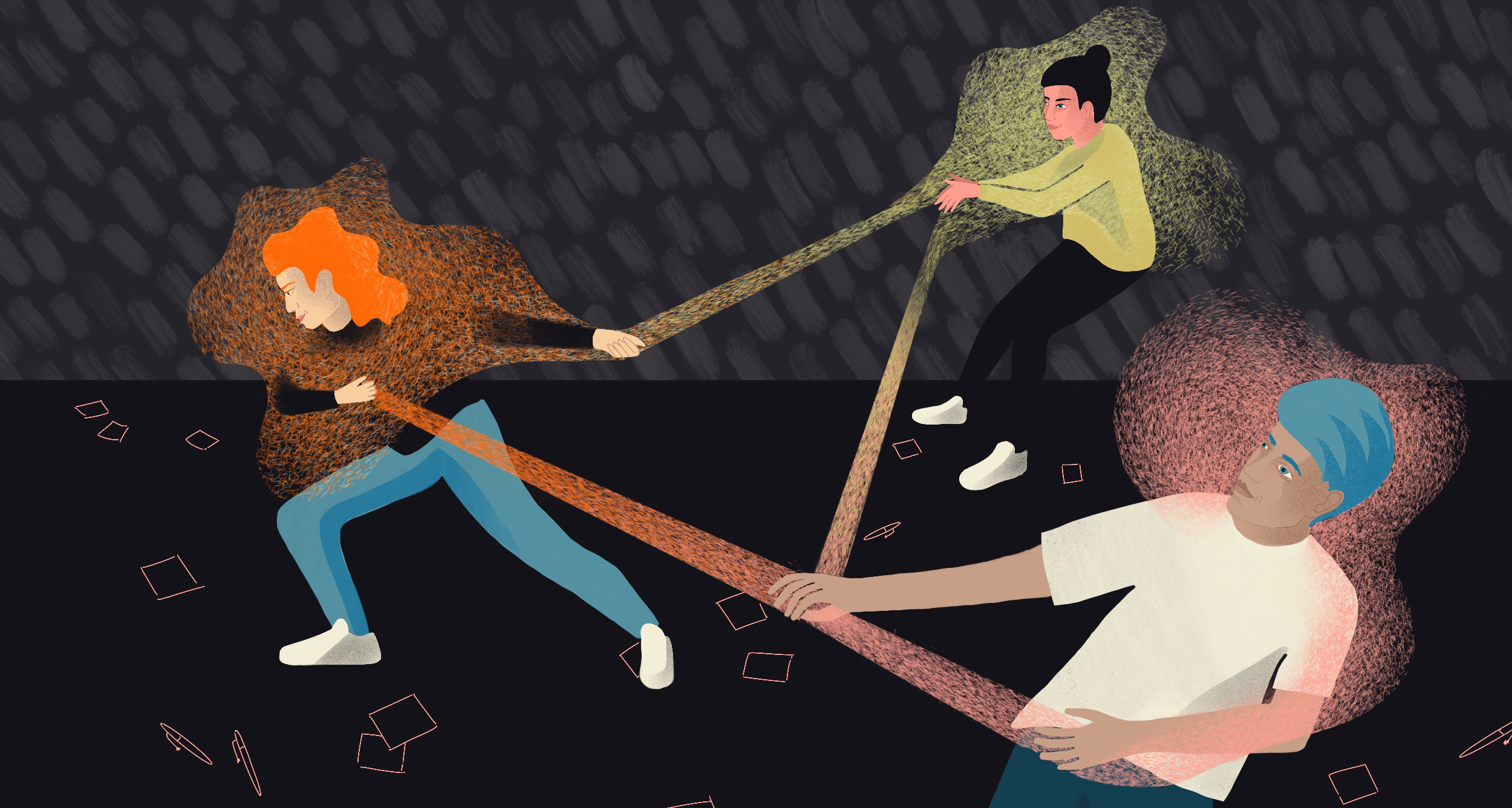
4 Tips for Addressing—and Even Embracing—Tension
Focusing on differences can be challenging, but productive
As leaders at the CoLab, IDEO’s platform for collaborative impact, we’re familiar with tension in all its forms. CoLab brings together organizations from across industries to focus on tough challenges, from designing for the circular economy to opening our financial systems. During design sprints, small teams build prototypes to explore new opportunities. Given that team members are often industry competitors with divergent approaches and ideas, tension tends to arise. We notice participants are often used to acting with the interests of their business first, rather than seeing the collaborative potential.
In order to create the impact we’re striving for at CoLab, we need to meet this tension head-on and create ways of moving forward. No matter what you’re designing or who you’re designing alongside—be it a colleague or another organization—here are four quick tips for adopting this mindset and productively addressing tension.
Observe the dynamic
Though tension can sometimes make us want to jump into action to resolve it, there’s value in sitting back, too. Try answering the following questions for yourself: What opinion is each team member pushing forward? Why might they have this view?
Paying attention helps you establish empathy. As designers, we use empathy not only to deeply understand the realities of the people we’re designing for, but also the realities of those we’re designing with. Even if you disagree, understanding why a teammate might have a certain opinion can help you create solutions that ultimately meet a need that you might not have noticed alone.
Give it a name
Once you’ve spent time observing, try naming the tension out loud or writing it down on a piece of paper. Saying or jotting down, “There’s tension around X right now,” or simply, “I’m feeling tension,” externalizes the tension. It’s is no longer this abstract, all-encompassing feeling. The tension is a named, tangible thing that the team can hear and see — not just feel — and therefore more objectively address through listening, dialogue, or compromise. In fact, mapping out seemingly conflicting interests or goals is a great tool for synthesis and identifying opportunities for design.
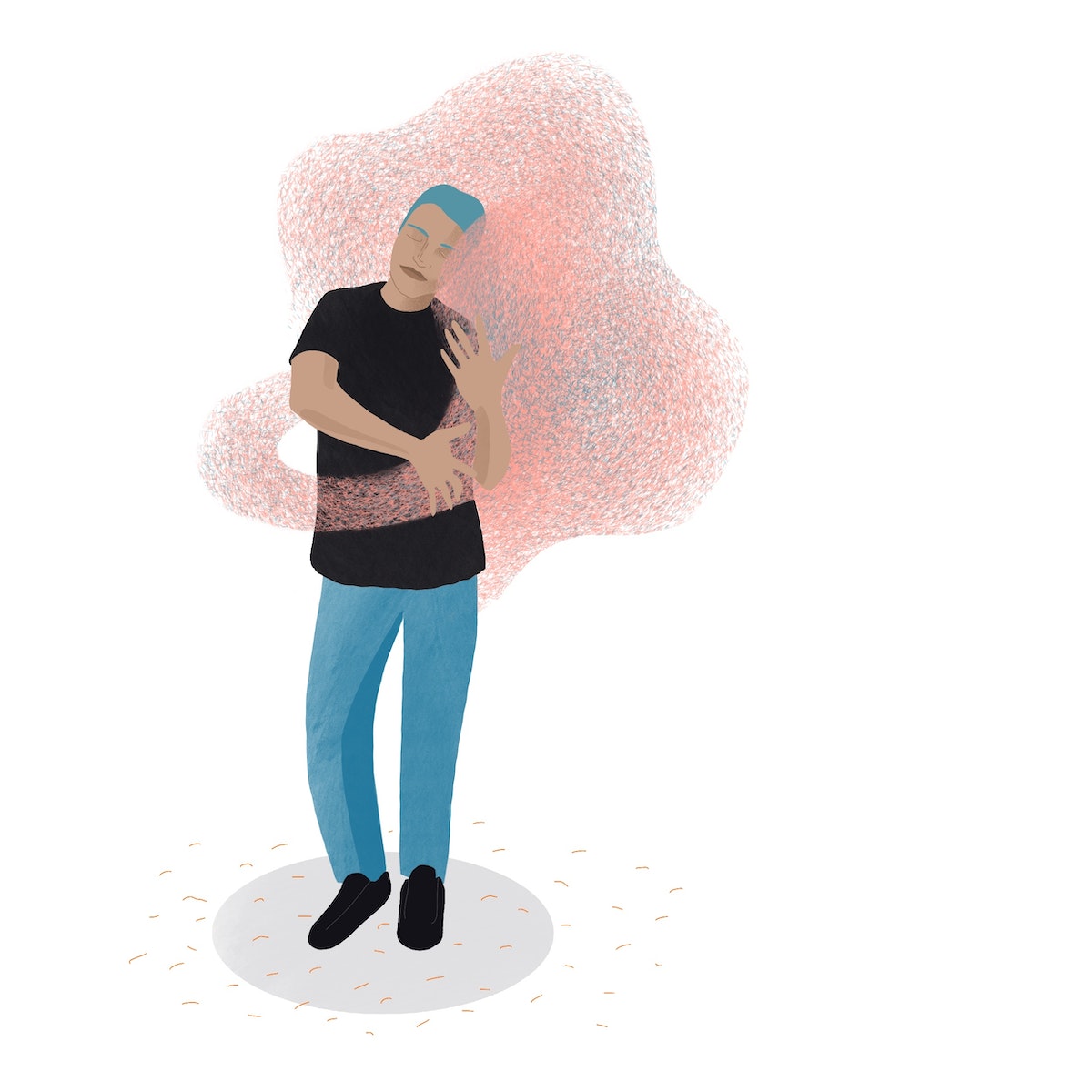
Just start making
Tension frequently arises when teams are trying to align on a shared vision or strategy. After all, when there are various stakeholders involved, they’ll likely have a variety of approaches. But it’s draining to debate things like your purpose or mission statement all day long. Reaching consensus can take hours, and may not even be useful at such an early stage before teams have had a chance to validate concepts through building.
It may seem counterintuitive, but to move teams through this tension, we recommend to just start doing. Whether it’s a whiteboard sketch or a model made of construction paper and glue, acts of making can offer clarity to subjective, “big picture” items. Shifting your mental focus from defining to doing has the power to shift a team’s dynamic.
Assume good intent
Though tension can sometimes feel like opposition, it often happens because teammates are passionate about the same thing. They may just want to apply or direct this shared passion in different ways. When things get tense, remember that you’re all working towards the same goal, and that the tension is likely not about you. Don’t take it personally.
Reinforce this “oneness” and good intent through language or actions. Try this: “I’m glad we’re in the same room solving this problem together.”
The next time things get tense, try not to jump into defense mode or sink down in your chair. Tension in team environments is inevitable because each of us bring a different set of experiences and perspectives to the table (so don’t crawl under it). As a team committed to collaboration across organizations that wouldn’t otherwise work together, we’ll keep embracing tension to get to the impact we all want to see in the world.
Tension in a team environment can make us nervously glance at the clock, play mediator, get defensive, or cling to the tried-and-true. But tension isn't always so bad (you can unclench your jaw now). In fact, we’ve found that some of our greatest work has come from embracing—even seeking out—these difficult moments.
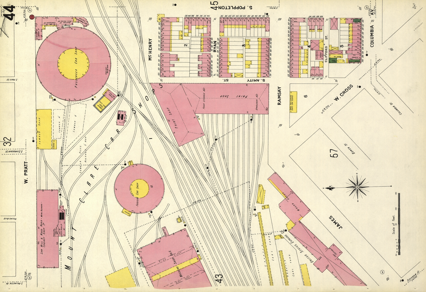
A Cartography Nerd’s Guide to Mapping 100 Years of History
IDEO's resident mapmaker leverages a century-old resource to discover his neighborhood
If you live in an American city, big or small, there's a decent chance that Sanborn had a map (or a hundred) of your town. And best of all, the entire collection is open-source and available for download in high-resolution images. The Library of Congress database isn't exactly the easiest in the world to search, but keep at it.
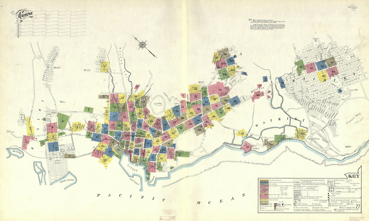
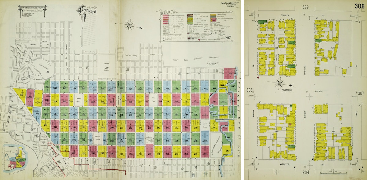
I live in San Francisco and was curious to see how my neighborhood was depicted by these amazingly-talented, fire insurance bureaucrats. I was delighted to find this map that shows my San Francisco neighborhood—the Lower Haight—in all of its 1899 glory. The colored rectangles form a grid, each pointing toward another map somewhere in the Sanborn collection that zooms in for much greater street-by-street detail.
I kept banging away at the rudimentary search function on the LOC website and eventually located Map 306, which visualizes my block in the year 1899.
San Francisco is not the oldest of cities when it comes to architecture, and there was that little thing called the 1906 Earthquake (and subsequent fire), which destroyed a lot of the city as well. So I wasn't too surprised when I didn't recognize many of the buildings on my block. That said, it did get me curious: Were there any buildings that were visualized on the 1899 Sanborn map that are still present on my block in 2019? I decided to make a map to find out. See, being an ameteur cartographer is actually useful in 2019! Google Maps hasn’t ruined all of the fun.
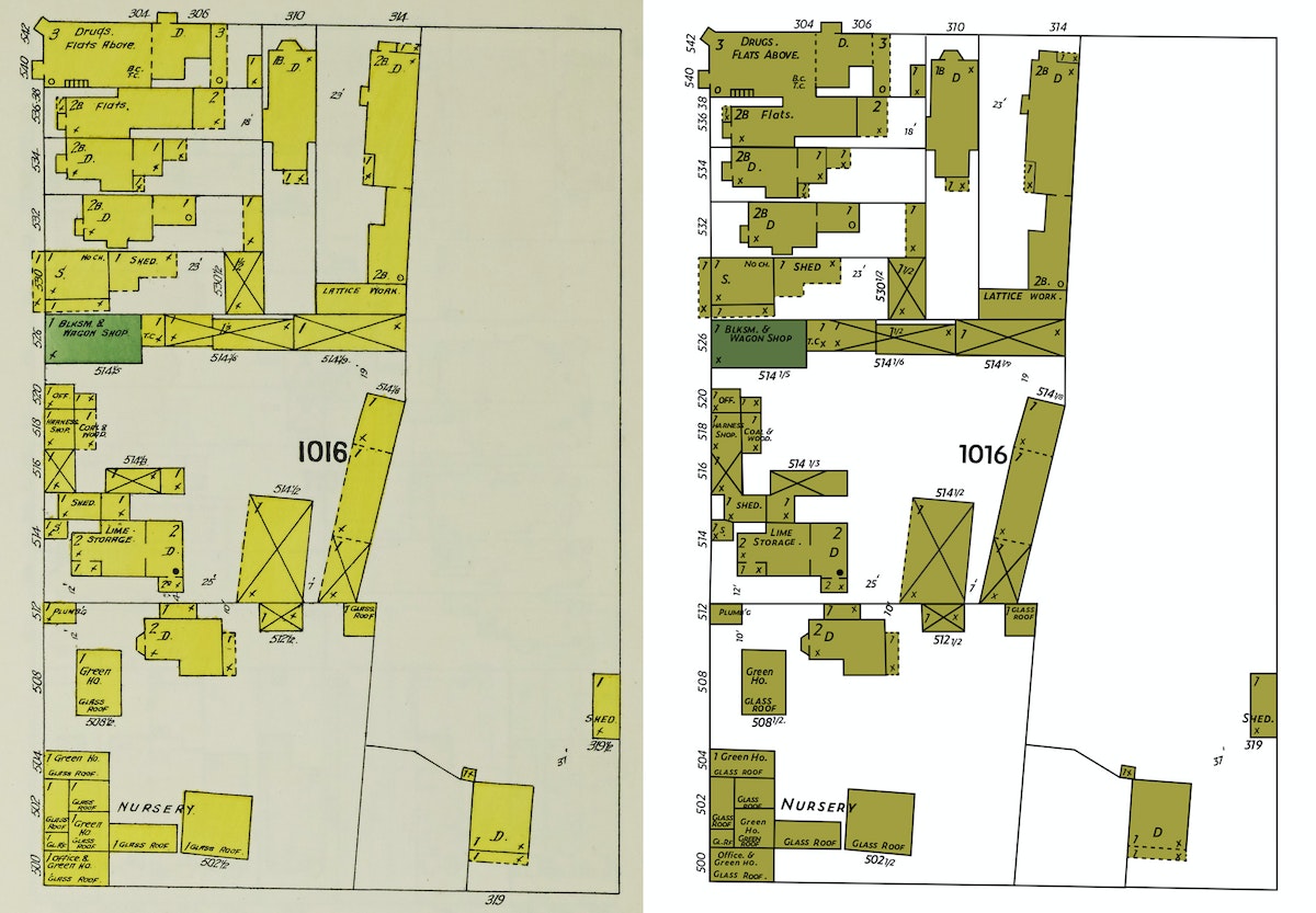
First, I set about converting the Sanborn map of my block into a file that I could manipulate in Adobe Illustrator. The original map is a JPEG, which means that it contains pixels. But since I wanted to have the freedom to tweak the map as I saw fit, I needed to convert the map to a vector version of the file. Why? A vector file (which, instead of pixels, is all about math coordinates) can be scaled infinitely large. What's more, it's much easier to change the colors on a vector-based map or make other modifications that I might need to later.
I'd like to say that there was some fancy way that I converted the map. I could have tried a Live Trace, but with a map this detailed, I wasn't optimistic. So I just rebuilt the file by tracing over the Sanborn map layer with new lines and fills and strokes. Detail by detail. This was mostly an act of love and definitely not a fast process. I recently had a kid and this turned out to be a fantastic New Year's Eve activity as we counted down the tired hours till midnight.
One unique challenge I encountered — there's no clear font out there that replicates the Sanborn hand-lettering. I spent too much time with the Adobe Typekit database and landed on Zeitung. It's not an exact match by any means, but close enough to pass the squint test.
That’s the original map on the left, in all of its pixels glory. And that’s the vector file on the right, built from scratch. How'd I do?
Okay. With the Sanborn map from 1899 more or less created, I turned my attention to the 2019 version of the map. I needed a detailed lot-by-lot map of San Francisco. My first go-to in moments like this is the Stanford University Earthworks website. The search function works quite well, and it links to open source maps from lots of other universities (like Tufts). After a quick search, I located a lot-by-lot map for the Bay Area and opened it up in QGIS, everyone’s favorite free and open-source cartography tool! Here’s what I had.
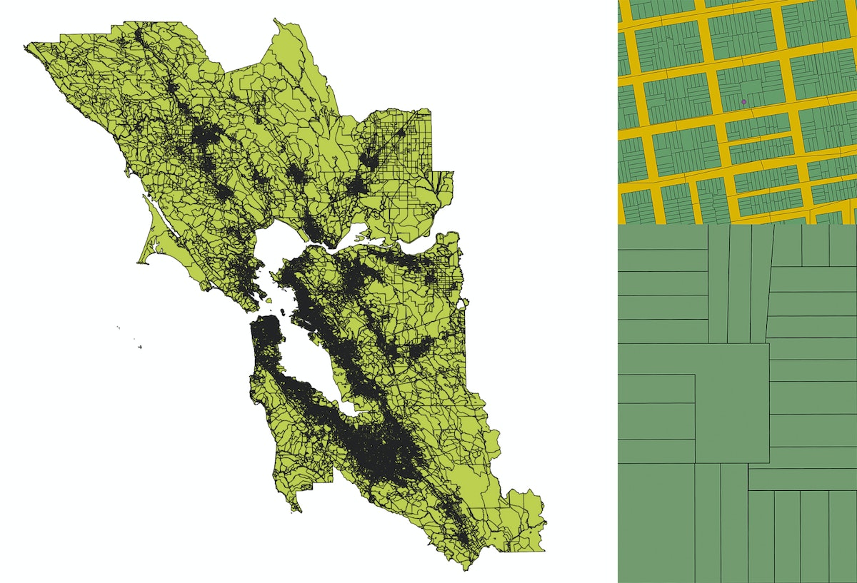
Totally overwhelming and, not surprisingly, it was actually quite tough to even find my block in all of that detail. So I loaded Google Maps, entered our home address, created a KML file with that single data point, and added it to the QGIS map. Once I zoomed way in, there was our block and our loft (represented by that little purple dot).
As I’ve mentioned before, QGIS is a wonderfully-powerful mapping tool, but mostly the pits when it comes to designing anything that would measure up to the esthetic standards of the average designer. So I zoomed way in to just our block, then exported the file as a vector file and opened it in our old friend Illustrator.
What I quickly realized is that this lot-by-lot map shows the property lines for each parcel on our block, but not the actual shapes of the buildings that sit inside each lot. Although I was getting close, I needed to go a step deeper to actually match the detail of the 1899 Sanborn map, which shows the outlines of individual buildings.
I opened Google Maps again and toggled to the satellite view of our block. If you zoom in as far as possible, you can see the outline of individual buildings. It's not perfect—shadows must get projected in weird ways when you snap photographs from orbit—but this was starting to get more interesting.
I snapped a fully zoomed-in screenshot of each building on the block, then traced them one-by-one using the Pen Tool in Illustrator. Once I had the outline of an individual building, I pasted it into the spot where it belonged inside the lot-by-lot map I’d exported over from QGIS. Then I repeated this process 31 times, for each of the buildings contained on my block.
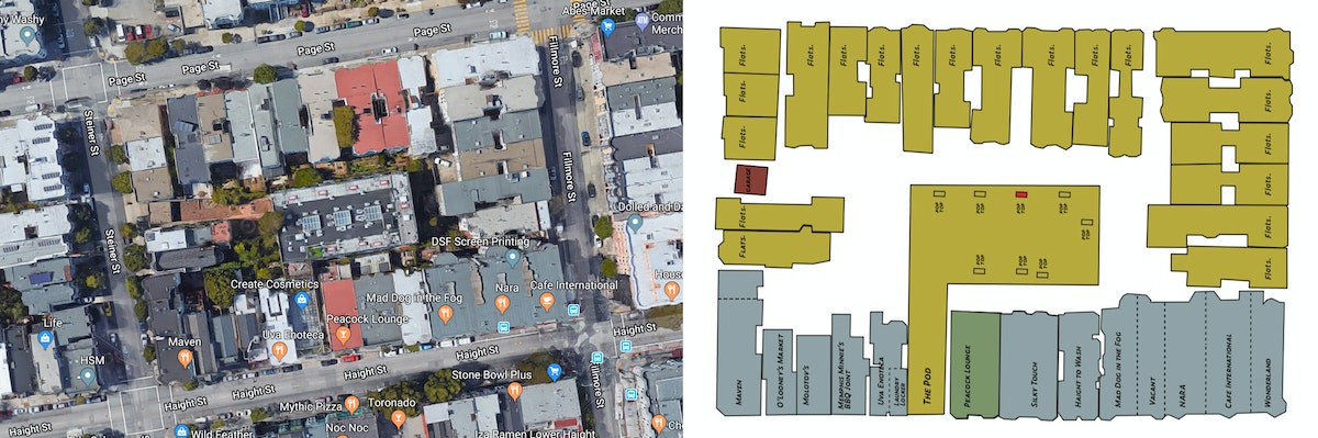
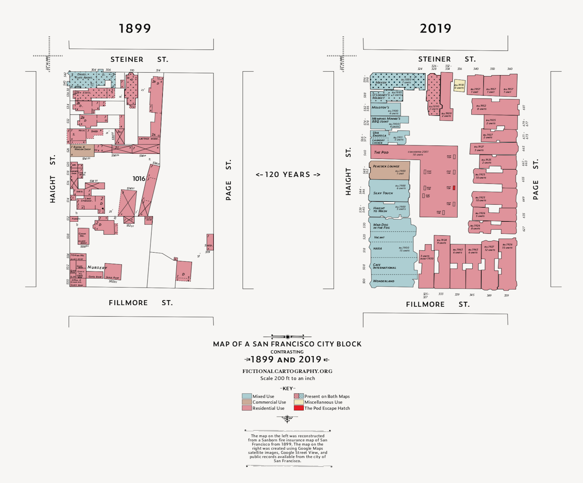
With the buildings in place, my next task was to figure out when they were built so that I could determine if any of them had been around back in 1899. After much poking around, I found this site from the San Francisco Planning Department that had exactly what I needed—the construction date for each of the 31 buildings on my block. Once I did the research, I discovered that three buildings can be found on the map in both 1899 and 2019, all of them clustered on the southwest corner of the block. One of them is my local bodega, home to Tiger the cat and famous (in the neighborhood) for the time that the Warriors eccentric three-point maestro Klay Thompson visited the bar to buy a bottle of Grey Goose. Super cool also to know that the building was built in 1890 and survived the 1906 Earthquake and Fire.
To finish up the map, I built out a key, borrowing inspiration from another Sanborn map visualizing neighborhoods in Honolulu, Hawaii.
Then I tweaked the colors, sticking to the Sanborn color palette, but borrowing some of the brighter colors found across the collection. I also added some polka dots to both maps to call attention to the three buildings that survived from 1899 to 2019. These last couple of tweaks are just two of the many benefits to working with vector files instead of pixels.
And voila, here is the final version of the map. What do you think? Now you can do the same for your city block.
Do you have a few hours on your hands and want to head down a wormhole of unbelievably striking maps? Mosey on over to the Sanborn map collection at the Library of Congress. Originally created as a means for issuing fire insurance across major American cities, the quality of hand-drawn detail in these maps and the color palette used by the cartographers are stunning.

Lindsey Turner
I’m passionate about building brands, products, and experiences that help organizations show up with meaning and momentum.
I help organizations cut through complexity by shaping how they show up, through brand strategy, identity, and storytelling.
Working at the intersection of brand and business, I bring an editorial eye and a bias toward making—turning ideas into tangible experiences that people can understand, trust, and believe in.
My work spans government, healthcare, financial services, media, and consumer goods, from launching Gen Z-focused ventures to building innovation labs and reimagining legacy brands. I relish moments of ambiguity and enjoy translating across teams, perspectives, and priorities to move ideas forward.
I started my career in editorial and digital design, shaping cross-platform experiences and identity systems in publishing and agency environments. That foundation still shapes how I work today: I’m detail-oriented, collaborative, and overreliant on the Oxford comma. I hold a BFA in Visual Communication from the School of the Art Institute of Chicago.

Rachel Young
My work helps organizations see who their products aren't working for—and build the will and the tools to do something about it
For 25 years, I've asked the same question: Who does this design exclude—and what are we going to do about it?
My work spans human-centered strategy, inclusive design, and qualitative research, with clients ranging from Microsoft, Google, and Verizon to the National Science Foundation, and San Francisco Unified School District.
Before IDEO, I taught elementary school in East Palo Alto and spent a decade doing design work with social service organizations—where I learned firsthand what it costs people when systems are built without them in mind.
I am currently writing User Error, a nonfiction book about digital access and the design decisions behind it. I live in Oakland, California.

Brian Pelsoh
I lead with craft, ensuring our work is creatively excellent: rooted in deep human insight and imagination, while also grounded in the realities of business and technology.
My expertise spans brand, communication, and product design across tech, education, the arts, and social impact.
I believe great work demands both high-level vision and obsessive attention to detail, and only happens through collaboration.
I bring an inclusive, hands-on approach and a deep understanding of business, which enables me to consistently deliver excellence while always asking why.
Before joining IDEO, I worked at the brand firms Pentagram and VSA Partners. I began my career as a designer, leading teams at the School of the Art Institute of Chicago and the Milwaukee Art Museum. I hold an MFA in graphic design from Maryland Institute College of Art and a BFA in communication design from the Milwaukee Institute of Art & Design, and have taught at some of the best design schools in the US.

Tony Wong
I am responsible for IDEO’s long-term success in China and working with clients to use design as a tool to enable growth.
I am responsible for IDEO’s long-term success in China and working with clients to use design as a tool to enable growth. Specifically, I have helped Chinese companies design holistic brand solutions through the development of their products, communication, services, and innovation teams, and I have helped multinationals expand their presence and influence in China.
I advise global leaders on developing China-led innovation and capabilities.
In over 15 years in IDEO Shanghai, I have worked on projects that use design to elevate the quality of the experience of healthcare products and services, streamline processes that increase productivity, create spaces and programs that promote and enable inclusive communities, and build next generation mobility solutions that are planet-positive.
Before joining IDEO, I worked at Philips Electronics and the Electrolux Group in Italy, the Netherlands, and Singapore on a number of breakthrough commercial products. I am a member of the Young President Organization in Shanghai.

Building a personal AI for the messiness of life: Sida Li
Most AI products today are built for work—a space with clear problems and established systems. One founder noticed a gap: personal life is messier, harder to systematize, and mostly left behind by the AI boom. So she built Cue, a personal AI that lives inside iMessage and group chats, to go where the other tools haven't.
In this episode, Becca Carroll, IDEO's Chief Strategy Officer, talks with Sida Li, co-founder and CEO of Shared Context Lab, about staying anchored to a human need while the technology around her keeps changing shape, why she treats her business model with the same rigor she'd bring to a product, and what it feels like to build a company at this particular, disorienting moment in AI.
The conversation also gets into how Sida makes design decisions: the language Cue uses to describe itself, the tradeoffs behind building inside iMessage instead of a new app, and a real story about a business idea that didn’t pan out.
This is the second in a two-part series profiling founders from IDEO's Startups-in-Residence program. The first conversation is with Johannes Seemann, founder of Sooner, on designing GenAI for the emotional side of money.

Designing GenAI for the emotional side of money: Johannes Seemann
Most personal financial tools are built to run the numbers and optimize towards a budget. While that works for some, most people experience money as a lived relationship that does not neatly fit into a spreadsheet. Johannes Seemann and Becca Carroll discuss why money is emotional before it is mathematical, and what a human-centered approach to building a generative AI financial product looks like in practice.

The curious leader's edge in uncertainty: Scott Shigeoka
Mina Seetharaman talks with Scott Shigeoka, author of Seek and Head of Curiosity Cultivation at the Eames Institute, about what distinguishes genuinely curious leadership from performative curiosity, how power dynamics shape curiosity, and why practicing curiosity can restore energy rather than drain it.

How constraints make us more creative: David Epstein
Mina Seetharaman talks with David Epstein, author of Inside the Box and Range, about why total freedom often produces average work, how leaders can design useful limits on purpose, and what organizations such as General Magic and Pixar reveal about the relationship between boundaries and creativity.
Looks like you might be in search of something very specific?
Or reset the filters above and try another angle.
Here’s some random inspiration

Podcasts about creative leadership

Articles about the power of prototyping
