
.svg)




Rethinking the food bank
A crucial resource reconsiders everything to design more dignity into its digital tools.
Giving food assistance is about more than handing over a box of groceries. It’s about allowing people to make their own choices.
But the pandemic only narrowed people’s choices. Undeterred, Northern Illinois Food Bank (NIFB) put people’s needs above everything else, leading to innovations that could improve food banks everywhere. IDEO recruited neighbors to co-design a new digital tool intended to improve people’s access to food. Local residents provided more than insights—they steered design decisions and helped transform the relationship between NIFB and the community.

Northern Illinois Food Bank’s My Pantry Express app allows people to browse and order groceries online and to choose a pickup time and location that works for their schedule. We designed the app to provide useful information on dietary preferences and to be inclusive of cultural differences. The result allows choice and flexibility, helps prevent food waste, and preserves the dignity of shoppers throughout the process by making My Pantry Express feel like any other grocery site.
Ultimately, Northern Illinois Food Bank and IDEO’s strategy for success relied on new metrics. In addition to measuring effectiveness in pounds of food distributed, we found new ways to measure shoppers’ satisfaction—a solution that works better for all parties involved because it was designed by all parties involved.
An estimated 1 in 8 Americans experience food insecurity.
The food insecurity rate is 2-3x higher for persons of color than for white households.
60% of food insecure households do not use food pantries.
1.9M
meals distributed through My Pantry Express in 2021
50%
increase in distribution from prior year
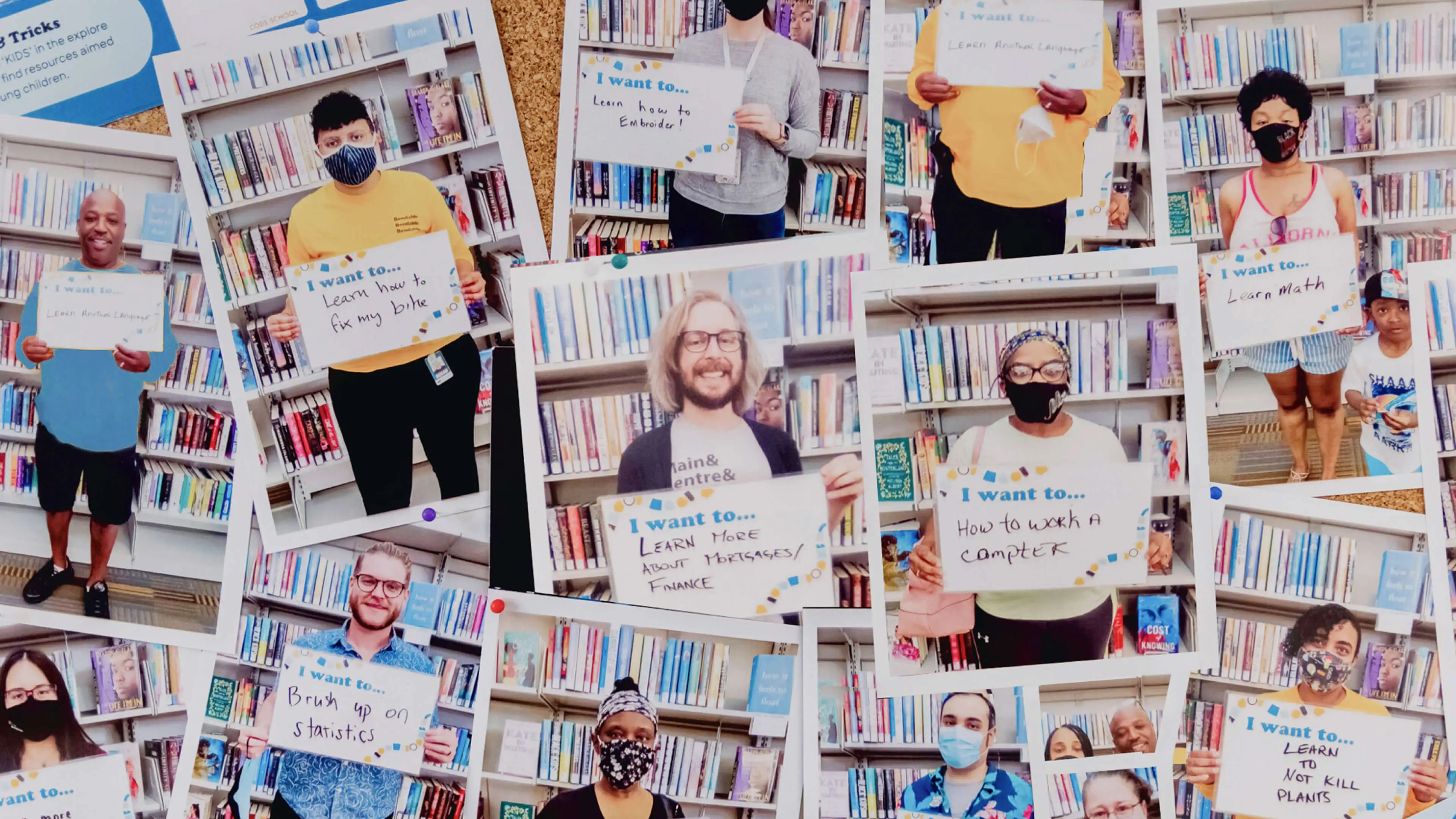
New skill city
The people of South Bend, IN, have the power to design a lifelong learning platform for themselves.
To create Bendable, IDEO worked alongside the people closest to the problem, so every important decision grew out of their experience.
IDEO and the Drucker Institute aligned with the library system and city leaders in South Bend, Indiana, on a single objective: build a learning platform that offered education opportunities to people affected by the decline of manufacturing in the region. But even the earliest phases of research revealed that there’s no common profile that matched the diversity of learners. There are innumerable reasons why people seek to learn and as many barriers holding them back.
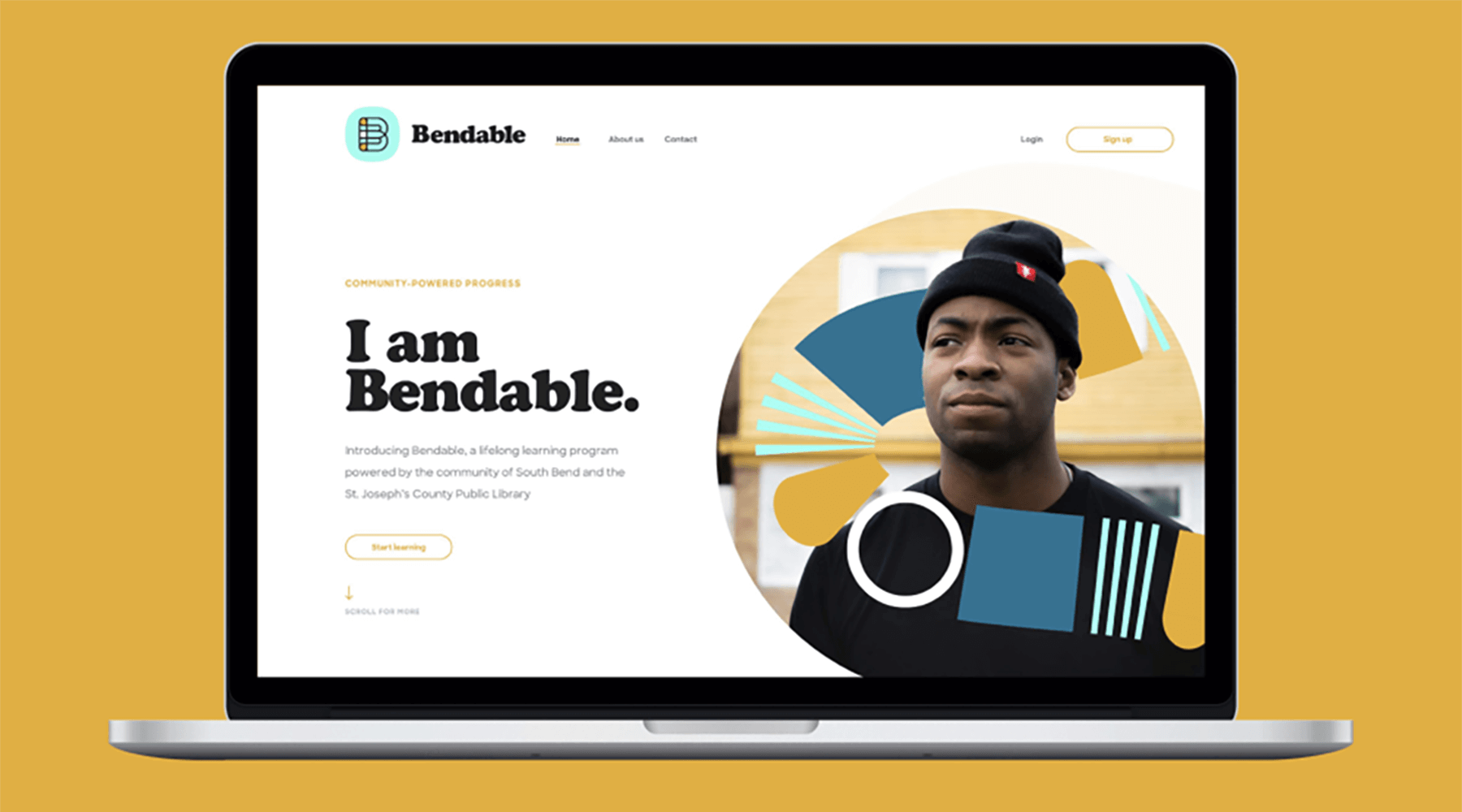
Knowing this, South Bend residents were the acknowledged authority for this work, and a design consultancy all their own. This radically simplified crucial decisions. Negative associations around traditional education led people to seek knowledge from those they already trusted. And they often lacked awareness about or the ability to access the many free resources already available.
The residents of South Bend helped the entire consortium see that the city wasn’t under-resourced but under-connected. That insight, and the power the community and the library system held to rectify it, made Bendable into the people-driven, connection-based learning platform it is today.
By 2025, as many as 85 million jobs will be displaced by automation, yet 97 million new ones could emerge.
More than a third of adults pursuing postsecondary education before the COVID-19 pandemic were forced to abandon those plans.
25
programs and other resources offerings are now available to residents of South bend
4
states have begun to integrate Bendable into library systems
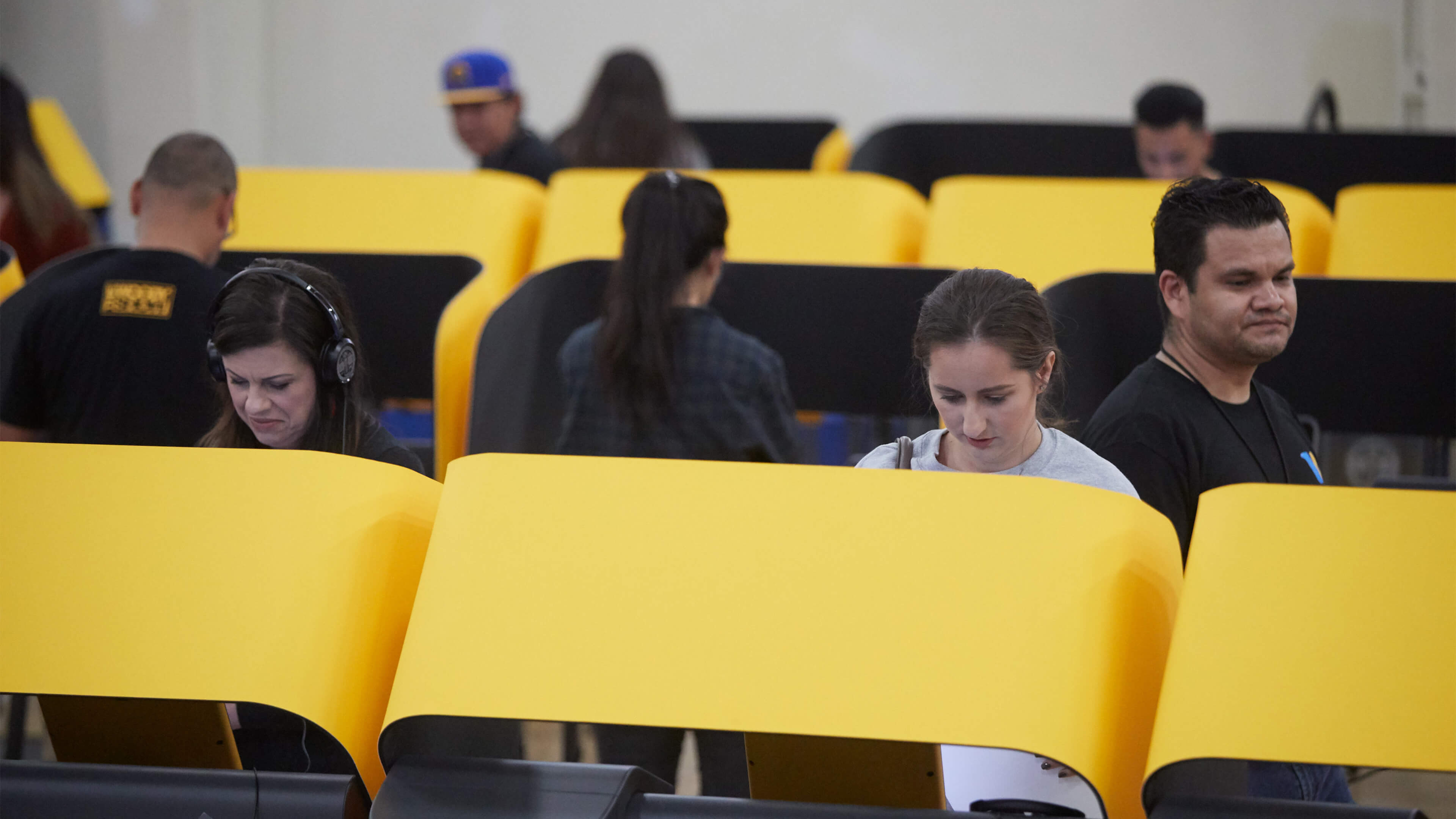
Making voting easier
The country’s largest jurisdiction creates a more accessible voting experience.
Protecting the right to vote means ensuring that all citizens can cast their ballots privately, independently, and easily.
With that principle in mind, Los Angeles County sought out a design strategy firm to create a next-generation, customizable system that would meet the needs of its large and diverse voter population while satisfying myriad voting regulations. The result: an accessible, self-enclosed ballot-marking device with a touchscreen that allows any voter to easily navigate, mark, verify, and submit a paper ballot. We also worked to improve the entire voting experience, including vote-by-mail ballots, interactive sample ballots, and the tally process.
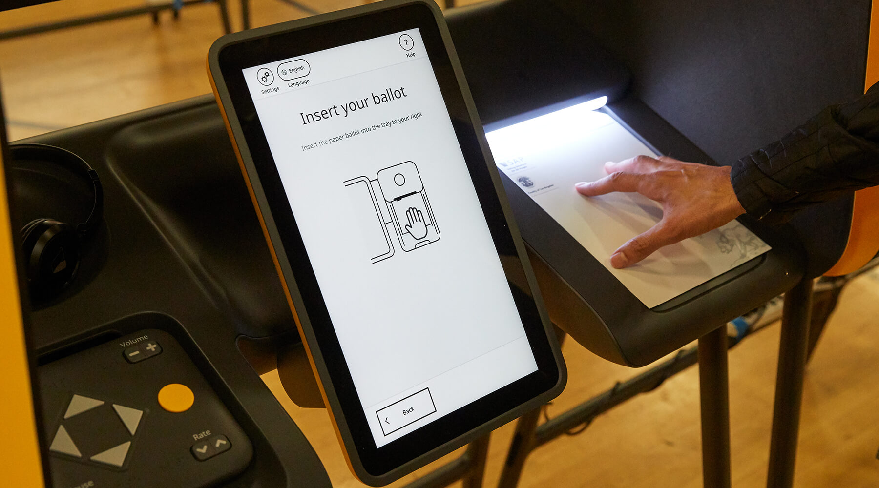
As with any inclusive design, details matter. Voters with vision impairment or reading disabilities can opt for audio and tactile experiences with the push of a few simple buttons. And for voters who prefer to read the ballot in their native language—Spanish, Chinese, Korean, or any one of the 11 others supported by the county—the device lets them select their preference.
After extensive research and testing with constituents, we designed a solution that makes voting easier for anyone. And knowing that the only constant is change, we made the system flexible enough to adapt to emerging needs and technologies, protecting voters’ rights now and in the future. Read the full case study here.
26% of American adults have some type of disability. In the 2020 election, 18% of disabled voters nationally reported difficulty voting, about twice as many as non-disabled voters.
In 2020, national voter turnout among disabled people was 7% lower than among non-disabled people in the same age group.
"Intuitive & secure"
was the sentiment most Los Angeles County voters expressed about the new voting system after the 2020 primary election

Human problems, human solutions
A conservation leader rewrites the role humans play in the narrative of climate change.
Conservation International is made up of conservation experts. To bolster its work, we bring a focus on scale, speed, and the human element to every project.
How does that look in the field? To restore the forest of Fiji, Conservation International paid a cash incentive to the community to buy, plant, and care for new trees and foliage. But once those cash incentives stopped flowing, the work ground to a halt. Taking a human-centered-design approach, one employee uncovered an insight: Fijians are more motivated to help in exchange for longer-term, noncash incentives like building infrastructure in villages. Small projects such as footpaths, repairs to communal trucks, beehives, or sports programs for youth continually reminded the community that the environment is a provider for their families, imparting a feeling of shared ownership in its conservation.
Stories like this, repeated around the globe, are how we hope to help Conservation International find sustainable outcomes. Our work together, including a six-month fellowship to help emerging leaders develop new capabilities, and a series of strategic, future-focused events for executives, has brought more tangibility and deeper collaboration to the organization.
Together we hope to create businesses, food solutions, and energy alternatives that conserve nature, and improve human health—because humans are a part of nature, too.
The scientific community overwhelmingly agrees that we have ten years to drastically cut greenhouse gas emissions or humanity will suffer devastating consequences.
We need to conserve one third of the global ocean using area-based measures and ensure at least 75% of seafood is harvested using socially responsible, environmentally sustainable methods by 2030.
75% of the world’s poor rely on agriculture for their livelihoods, which in turn depends on nature for pollination, irrigation, and soil replenishment.
20
leaders integrated human-centered design into annual goals, project pipelines, and fundraising efforts
20%
of the organization is now involved in design-thinking projects

The Jam Session That Spanned Three Continents
Eight designers, five cities, three countries, one song
Since 2008, when I officially started making music under the name Crunchybird, I’ve learned a fair amount about recording and playing. One of the biggest lessons has been how awfully lonely being a one-man band can be—not just socially, but creatively. There's no pushing and pulling, no building on each other's ideas.
So I asked myself: How could I pull in some of my friends from around the globe to make music with me?
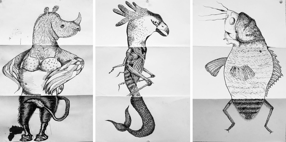
I’ve always loved the concept of Exquisite Corpse, the Surrealist parlor game where someone starts a drawing and passes it on to others to continue. The final artwork is always unexpected, occasionally horrifying, and unavoidably original. Could we pull off a musical version? I was curious to see where it could go, so I threw the challenge to a motley crew of musically-minded colleagues around the world.
The rules were simple: Start something and pass it to someone else, somewhere else. That person spends a day adding to it, then sends the track to the next collaborator. And so on. We called the project "Exquisite Chords."
I learned a lot from the process. Before I walk you through the track my friends and I built together, here are some design principles to get you going.
3 tips for creative collaboration
- Start small and let go. When you collaborate with others, it’s tempting to set up a very detailed structure with a lot of constraints. For this project, it was fun to start with something more basic and give people the room to interpret it and shape it their own way. Don’t overthink it. Just let everyone throw something into the mix.
- Make each other successful. It can be really cool to see how participants take each other's work and improve on it. It's the musical version of the classic improv response "Yes, And…" Take what’s awesome and make it more awesome.
- Guide the vision. Creative collaboration can be terrifying. You have no clue how something will turn out, and it can be a disaster—the phrase "too many creatives in the kitchen” comes to mind. But as the leader, you have the opportunity to influence the end result. It’s important to respect people’s contributions, but to also know when to take the wheel and shape the outcome.
Exquisite Chords, step by step
Here's how our musical experiment started: One night, while sitting on the couch on our tiny apartment in Tokyo, with my wife and kid sleeping in the next room, I recorded a one-bar bass line over a simple beat on my Mac. What you’ll hear is an insomniac trying to make some sound very quietly:
I tossed the track over to my friend George Joseph, a communications designer at IDEO San Francisco, and an actual musician. He laid down some sweet, dynamic goodness atop my track in just a couple of minutes because he is, as noted above, an actual bassist. He also recorded an awesome vocal take. The lyrics are still a mystery to me:
George then shared the track with our friend Simon Heather, a business designer at IDEO New York, who we had heard has some shreddy chops on the electric guitar. It was true:
Simon passed the ball to Nick Dupey, a design director at IDEO Cambridge. Nick has a toddler named Julian Rose, who he recorded making toddler sounds:
Nick punted it to merry Munich, where design directors Franz Blach and Trent Huon took the whole affair to another level. Franz busted out a cornucopia of manipulated acoustic guitar sounds. He then arranged the pieces into a more dramatic song structure—verse, chorus, bridge, and outro included:
Trent added a touch of madness, crooning about the changing of the seasons on top of the new arrangement, improving the melody George had created:
And then it went back to San Francisco, where interaction designer Zubin Pastakia tacked on some angelic synths to round out the crescendoing finale:
Once the track was back in my hands in Japan, I realized the bass line that started it all would work better on the piano, so I re-recorded the melody and added a few parts to fill in the new arrangement. The piano complemented Franz’s acoustic guitar, which unfurled into a nice little wandering outro that could probably go on to be another song.
Finally, I worked with my producer friend Hamacide (a.k.a. Yusuke Hama) here in Tokyo to help tuck everything in, smooth it out, and make some final mixing and mastering adjustments to bring it all up to the next level.
Here's the final track, “Leaving Light”:
Our first collaboration as Exquisite Chords was indeed unexpected (and not too horrifying, I hope). What started as quiet plucking on a sleepless Tokyo night had blossomed into a trip-hop adventure for eight people from five cities in three countries. We never spoke to one another—it all happened over email and Dropbox.
It may not be perfect, or even be for everyone, but it's ours.
Want to join our digital jam sesh? Download the tracks above, add your own layer of sound, and tag your new mix with #ExquisiteChords.
I’m not a trained musician. But music is my favorite way to carve things out creatively. That is to say, I tinker with instruments to make noises that sound good together until I am smiling a lot. I'm not spitting out perfect tracks, but I'm having fun.
7 Tips for Seamless, Sexy Typography
For more friends and fewer misunderstandings
1. Keep a steady rhythm with ideal line lengths
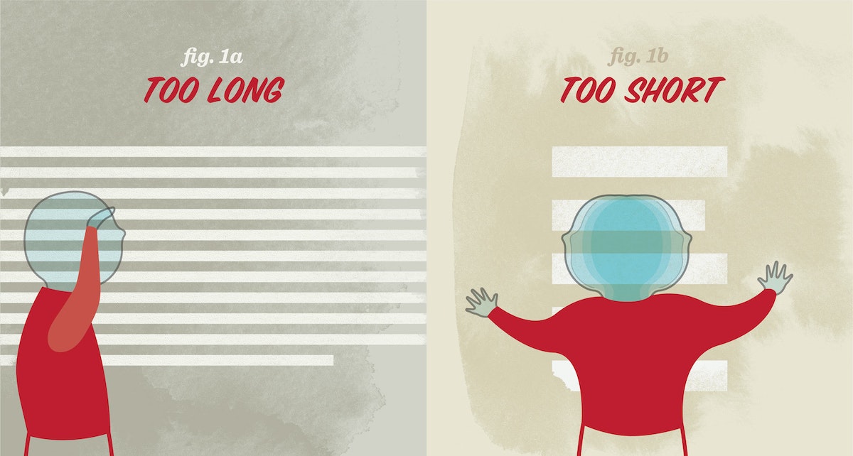
The length of a line determines how much distance the reader’s eyes must cover to read it from left to right. Long line lengths make the text seem never-ending. Short line lengths make the reading experience erratic, and can cause the reader to miss important words. An ideal line length is 66 characters (including letters and spaces). For one column of text, aim for 45–75 characters per line; for two columns of text, 40–50 characters per line.
2. Use the right kind of dash
Dashes, such as hyphens, vary in length depending on the typeface.
The em dash (—) is a long dash, the length of the uppercase “M.” It can be used as an alternate for commas, parentheses, or colons, and is an incredibly versatile way to create emphasis in your writing. When used in multiples, the em dash also indicates missing portions of a word (s——t).
The en dash (–) is half the length of the upper case “M”—shorter than the em dash, but longer than the hyphen. It is used to separate a range or span of numbers, and is sometimes used to connect a prefix to a proper noun.
Keyboard Shortcuts
Em dash (—): shift + option + hyphen
En dash (–): option + hyphen
3. Don't put hyphenation in auto-drive
In the digital age, we often take hyphenation for granted, opting to use the “auto-hyphenate” setting, but there are some best practices to keep in mind when typesetting with hyphens.
If you are breaking a word between two lines, keep at least two characters in the first line and at least three characters on the second line. Try not to hyphenate consecutive lines. To “un-break” a word between lines, use a soft return (shift + return) at the beginning of the word to force it onto the second line.
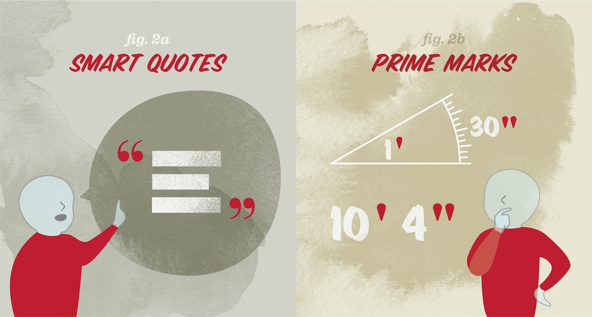
4. Know the difference between smart quotes and prime marks
Prime marks ( ' ), also known as straight quotes or dumb quotes, are often accidentally used in place of smart quotes ( ‘ ), also known as curly quotes. Prime marks are a remnant of the typewriter, which only had prime marks to save space on the keyboard. So what’s the difference? Prime marks are used for units of measure (feet, inches, seconds, and minutes); smart quotes are used to indicate something someone has said.
Keyboard shortcuts
Left single quote ( ‘ ): option + ]
Right single quote ( ’ ): shift + option + ]
Left double quote ( “ ): option + [
Right double quote ( ” ): shift + option + [
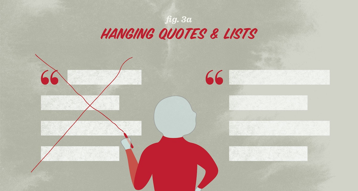
5. Maintain a strong vertical axis
Hanging text, or outdenting, means moving typographic elements into the left margin. You do this to create a consistent vertical axis along the left end of the text. Quotes, bullets, and dashes do not take up as much visual space as a letter, so a list or quote that has not been hung, or outdented, can sometimes be mistaken for a new paragraph and cause unintended breaks in the reading rhythm.
6. Be on the lookout for widows and orphans
Try to avoid widows and orphans in your text. Widows and orphans are one or two words at the end of a sentence that are pushed to a new column or page; widows are at the end of a column, orphans are at the top of a page. They create very short lines and gaping holes of white space that can be visually disruptive for the reader. Maintain the flow of each sentence by using a soft return to eliminate stray words.
7. Track out all-caps text and use all-caps sparingly
When designing fonts, typographers must determine the amount of space around each letter so that letters of different sizes appear evenly spaced. The spacing around uppercase letters is often a little tighter, so that they can sit closer to the lowercase letters in a mixed-case word. When you typeset a word in all-caps, the letters will appear very close together. Remedy this by tracking out, or letter-spacing, all-caps words by about 10% of the point size height. For more details and examples on tracking (and how it’s different from kerning), take a look at Ellen Lupton’s book Thinking with Type, also available digitally here.
If your writing uses a lot of acronyms, consider selecting a typeface with a small caps font. Small caps are all-caps fonts designed within a typeface so that each letterform is only slightly taller than a lowercase letter. Small caps are automatically letter-spaced, and should not need any additional tracking.
Hungry for more on typesetting? Below are a couple of my favorite tried-and-true typesetting references:
A Type Primer by John Kane
The Elements of Typographic Style by Robert Bringhurst
Practical Typography by Matthew Butterick
Typography can be expressive, informational, or abstract. But sometimes it just wants to be invisible, allowing the content to take center stage. In this first installment of our Type Talks series—where IDEO designers nerd out about all things typographical—we offer tips for seamless, sexy typesetting (that you hardly notice).
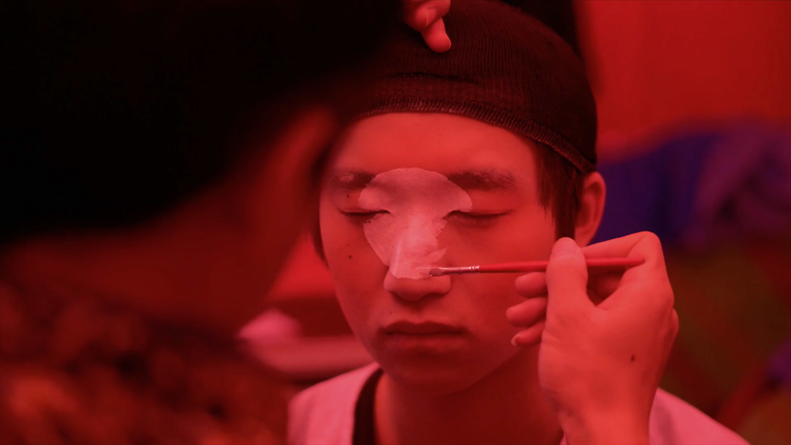
These Eye-Popping Videos Capture the Madness of Cities
An interview with nomadic filmmaker Brandon Li
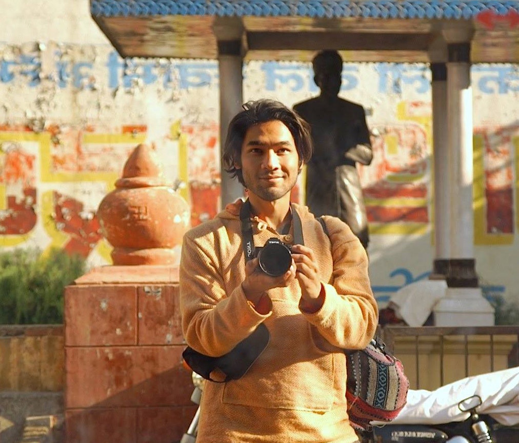
In one sentence, who are you?
I'm a nomadic filmmaker.
How did you learn to do it?
I travel the world and make short films about the places I visit. While I did go to film school, I'd say I learned most of my skills on the road, by trial and error.
WATCH: Hong Kong Strong. A film about the madness and beauty of this seemingly impossible city in the days leading up to Chinese New Year.
What are your three favorite possessions?
1. Good boots
2. My phone with Google Maps
3. My camera gimbal
What does a typical work session look like for you?
Shooting for about 12 hours a day, in the thick of a crazy festival in a foreign country. Then spending another 12 hours editing the footage and hiding from society.
WATCH: Nomads of Mongolia. Training eagles to hunt, herding yaks, and racing camels are just a few of the daily activities of the nomadic Kazakh people.
How do you get over creative block?
Travel to a new place.
WATCH: Tokyo Roar. Tokyo saturates the senses. This is my impression of the city's many personalities.
How do you see the world in 2078?
I see a mix of environmental catastrophe and remarkable human innovation. As the seas rise, we'll meet the challenge with ingenuity and eventually become fully sustainable, because it's the only way to survive.
Who are you (creative) crushing on lately?
Tokyo-born filmmaker Hiro Murai.
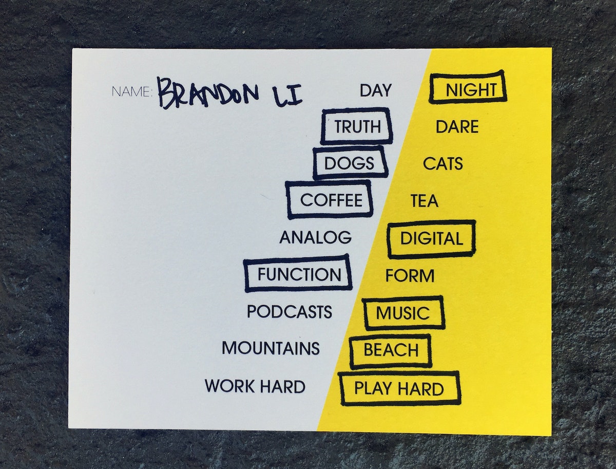
Getting the energy of a place on film is not an easy thing to do. Especially a transient place like Hong Kong. The city is both familiar and foreign to me. I was born there, and though I moved away at age 12, work has brought back many times over the years. On one of these trips, I was introduced to Brandon Li’s short film Hong Kong Strong (chosen by Vimeo as one of the best of staff picks in May 2016). In swooping, panoramic shots, it puts the beautiful madness of urban life and ordinary people on display. As a designer, I was instantly taken by Li's approach, as we, too, set about taking snapshots of daily life for inspiration. In this installment of Creative Crushes, I caught up with Brandon to find out more about his work.
8 Ways to Fail Your Way to Success
One designer's take on how to fail to succeed
At some point, though, we come to accept that screwing up is a key part of the creative process. Think about how kids play: They don’t think, they just do. And if the whole contraption comes crashing to the floor, they laugh at the mess and start over. (Or throw a fit, but hey, they’re learning about emotion, too!) Point is, when you embrace setbacks and don’t let them cripple you, you’re more likely to get across the finish line.
Maybe we should stop talking about failure and call our botched projects “experiments." And let’s take a cue from Edison and crowd as many experiments into 24 hours as we can. Here are eight ways to fail your way forward.
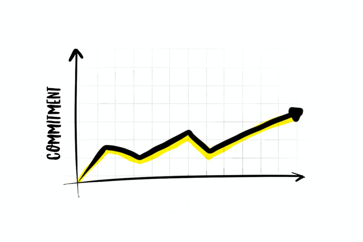
1. Keep it basic
Don’t start by trying to find a fully developed solution to a problem. Keep fidelity low at first to allow others to see the possibility in the idea, not the flaws. The higher the polish, the more likely you’ll get the wrong kind of feedback.
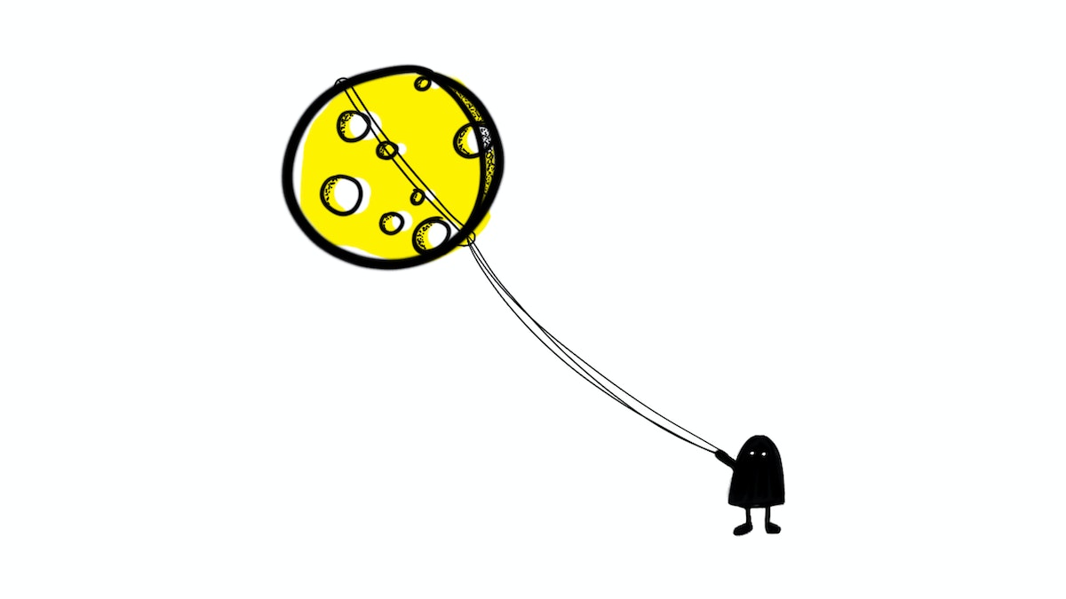
2. Design impossible tasks
Such as: How might we create a new color? How might we live forever? Moonshoot thinking frees us from limiting ourselves, helping us produce a bunch of wild ideas. None of them will be right, but they’ll rev the engine of our imagination.
3. Don’t assume your final format
What are you making? Will you be hand sketching? Wireframing? Sculpting out of modeling clay? Drafting a written piece? Even when our end goal is to end up on screen, it is often helpful to start in a different medium—and maybe a tactile one.
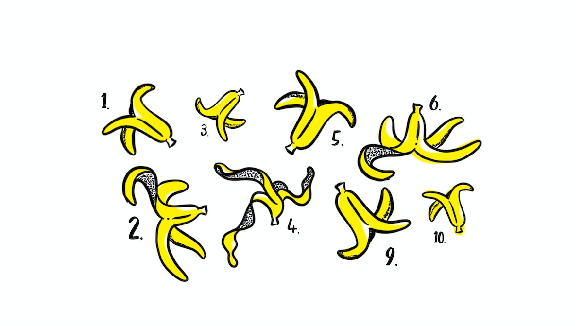
4. Set a goal for failure
Follow this advice from 100 Days of Rejection by Jian Jiang: “We will fail at least 30 times before we figure out the right solution.” Lowering the stakes and making a solution less precious makes it easier to generate a bounty of ideas to build from.
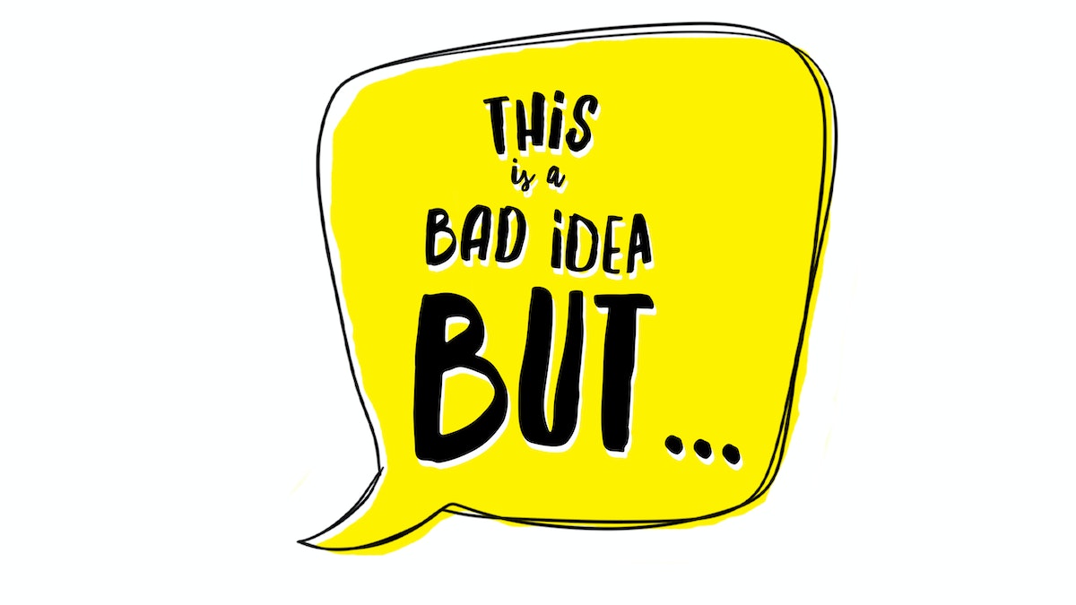
5. "This is a bad idea, but…"
Every time you throw out an idea, start with, “This is a bad idea, but what if…” That helps you practice non-attachment and prepare for the reality that most of your ideas won’t stick.
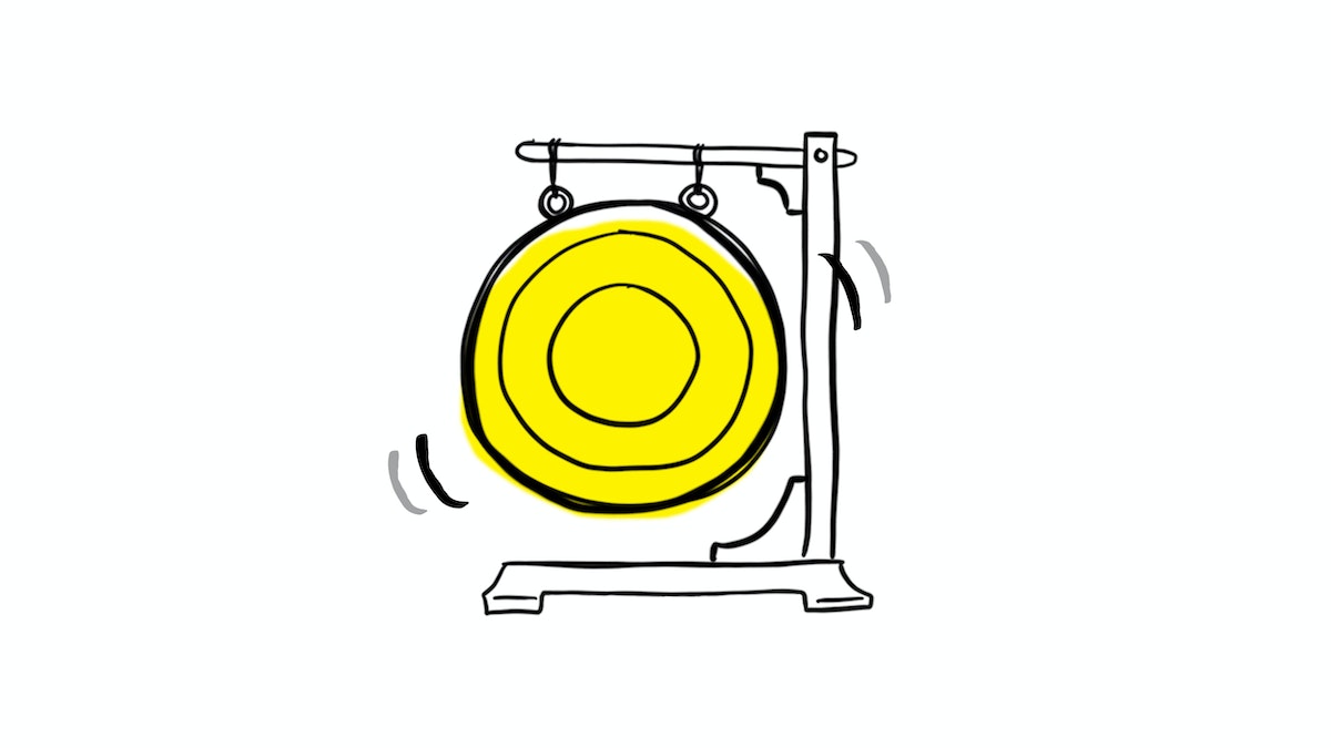
6. The Shame Gong
Every time someone makes a mistake or fails, hit the gong and have the team whisper "shame" in unison. It actually lowers the barrier for admitting to failure and makes for more honest, less bullshitty brainstorms. It also lightens the mood when you’re struggling with a particularly tough challenge or client. Plus: Ringing a gong is just fun. Missed a line item from the plan? Shame. Couldn't guess the grape of the wine at happy hour? Shame!
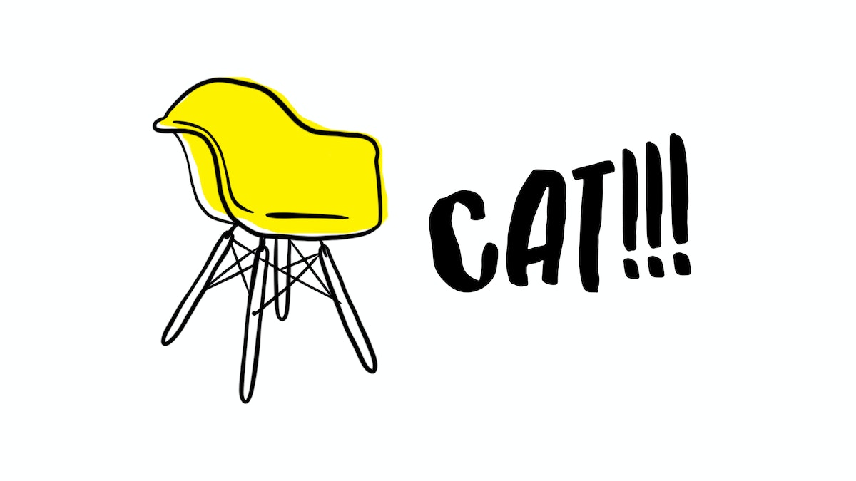
7. The mis-name game
Walk around the room and loudly, courageously, and boldly point at objects and yell out the wrong name for them. Do this for three to four minutes. Then pause and debrief. What was that like? Why was it difficult? There is a stubborn voice in your head telling you what is wrong, infeasible, impractical, too risky. The exercise reminds us that there’s a voice enforcing our fear of failure that can overpower our ability to take creative risks. Our job is to learn how to quiet that voice at the right moments to break out of the expected.
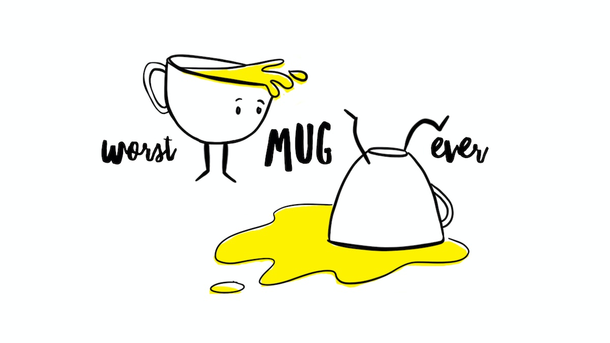
8. Worst experience ever
Design the WORST _blank_ experience ever (airplane/shopping/dining/laundry) and really encourage people to visualize it. Then use that to design the best version using an insight you learned from the worst. So, if the worst dining experience involved a waiter who would not leave you alone on a romantic date, what does that say about the key elements that make or break a date?
One final note for aspiring leaders: Don’t be afraid to talk about past failures and what you learned from them. Admitting failure will help your team gracefully shut down initiatives that aren’t working and move on to the next thing. Now get out there and gong.
Thanks to Tom Kelley, Kenneth Robertsen, Neil Stevenson, Olivia Vagelos, Eri Sugiura, and Sally Madsen for contributing to the piece.
“The real measure of success is the number of experiments that can be crowded into 24 hours.” —Thomas Edison
Most projects start with confidence. We’re going to crush this! Then come the mistakes. We squirm. We become riddled with self-doubt. Suddenly the prospect of success seems like a dim light bulb.

Lindsey Turner
I’m passionate about building brands, products, and experiences that help organizations show up with meaning and momentum.
I help organizations cut through complexity by shaping how they show up, through brand strategy, identity, and storytelling.
Working at the intersection of brand and business, I bring an editorial eye and a bias toward making—turning ideas into tangible experiences that people can understand, trust, and believe in.
My work spans government, healthcare, financial services, media, and consumer goods, from launching Gen Z-focused ventures to building innovation labs and reimagining legacy brands. I relish moments of ambiguity and enjoy translating across teams, perspectives, and priorities to move ideas forward.
I started my career in editorial and digital design, shaping cross-platform experiences and identity systems in publishing and agency environments. That foundation still shapes how I work today: I’m detail-oriented, collaborative, and overreliant on the Oxford comma. I hold a BFA in Visual Communication from the School of the Art Institute of Chicago.

Rachel Young
My work helps organizations see who their products aren't working for—and build the will and the tools to do something about it
For 25 years, I've asked the same question: Who does this design exclude—and what are we going to do about it?
My work spans human-centered strategy, inclusive design, and qualitative research, with clients ranging from Microsoft, Google, and Verizon to the National Science Foundation, and San Francisco Unified School District.
Before IDEO, I taught elementary school in East Palo Alto and spent a decade doing design work with social service organizations—where I learned firsthand what it costs people when systems are built without them in mind.
I am currently writing User Error, a nonfiction book about digital access and the design decisions behind it. I live in Oakland, California.

Brian Pelsoh
I lead with craft, ensuring our work is creatively excellent: rooted in deep human insight and imagination, while also grounded in the realities of business and technology.
My expertise spans brand, communication, and product design across tech, education, the arts, and social impact.
I believe great work demands both high-level vision and obsessive attention to detail, and only happens through collaboration.
I bring an inclusive, hands-on approach and a deep understanding of business, which enables me to consistently deliver excellence while always asking why.
Before joining IDEO, I worked at the brand firms Pentagram and VSA Partners. I began my career as a designer, leading teams at the School of the Art Institute of Chicago and the Milwaukee Art Museum. I hold an MFA in graphic design from Maryland Institute College of Art and a BFA in communication design from the Milwaukee Institute of Art & Design, and have taught at some of the best design schools in the US.

Tony Wong
I am responsible for IDEO’s long-term success in China and working with clients to use design as a tool to enable growth.
I am responsible for IDEO’s long-term success in China and working with clients to use design as a tool to enable growth. Specifically, I have helped Chinese companies design holistic brand solutions through the development of their products, communication, services, and innovation teams, and I have helped multinationals expand their presence and influence in China.
I advise global leaders on developing China-led innovation and capabilities.
In over 15 years in IDEO Shanghai, I have worked on projects that use design to elevate the quality of the experience of healthcare products and services, streamline processes that increase productivity, create spaces and programs that promote and enable inclusive communities, and build next generation mobility solutions that are planet-positive.
Before joining IDEO, I worked at Philips Electronics and the Electrolux Group in Italy, the Netherlands, and Singapore on a number of breakthrough commercial products. I am a member of the Young President Organization in Shanghai.

Building a personal AI for the messiness of life: Sida Li
Most AI products today are built for work—a space with clear problems and established systems. One founder noticed a gap: personal life is messier, harder to systematize, and mostly left behind by the AI boom. So she built Cue, a personal AI that lives inside iMessage and group chats, to go where the other tools haven't.
In this episode, Becca Carroll, IDEO's Chief Strategy Officer, talks with Sida Li, co-founder and CEO of Shared Context Lab, about staying anchored to a human need while the technology around her keeps changing shape, why she treats her business model with the same rigor she'd bring to a product, and what it feels like to build a company at this particular, disorienting moment in AI.
The conversation also gets into how Sida makes design decisions: the language Cue uses to describe itself, the tradeoffs behind building inside iMessage instead of a new app, and a real story about a business idea that didn’t pan out.
This is the second in a two-part series profiling founders from IDEO's Startups-in-Residence program. The first conversation is with Johannes Seemann, founder of Sooner, on designing GenAI for the emotional side of money.

Designing GenAI for the emotional side of money: Johannes Seemann
Most personal financial tools are built to run the numbers and optimize towards a budget. While that works for some, most people experience money as a lived relationship that does not neatly fit into a spreadsheet. Johannes Seemann and Becca Carroll discuss why money is emotional before it is mathematical, and what a human-centered approach to building a generative AI financial product looks like in practice.

The curious leader's edge in uncertainty: Scott Shigeoka
Mina Seetharaman talks with Scott Shigeoka, author of Seek and Head of Curiosity Cultivation at the Eames Institute, about what distinguishes genuinely curious leadership from performative curiosity, how power dynamics shape curiosity, and why practicing curiosity can restore energy rather than drain it.

How constraints make us more creative: David Epstein
Mina Seetharaman talks with David Epstein, author of Inside the Box and Range, about why total freedom often produces average work, how leaders can design useful limits on purpose, and what organizations such as General Magic and Pixar reveal about the relationship between boundaries and creativity.
Looks like you might be in search of something very specific?
Or reset the filters above and try another angle.
Here’s some random inspiration

Podcasts about creative leadership

Articles about the power of prototyping
