
.svg)



Reintroducing The Lawrence Hall of Science
A lively new brand reenergizes a STEM learning institution.
Named after Ernest O. Lawrence, UC Berkeley’s first Nobel Laureate, The Lawrence Hall of Science’s wide-ranging products, services, and tools developed organically over half a century. To begin to make sense of the breadth and depth of its offerings, IDEO asked leadership and staff to surface the myriad activities, audiences, and relationships with external partners, enabling the group to visualize—and make sense of—the totality of The Lawrence brand.
During in-depth research with parents and kids, educators, and experts, IDEO discovered that each of these audiences had distinct mindsets. Parents and kids engaged with The Lawrence to explore, have fun, and dive deeper into a specific topic. Educators utilized it for professional learning opportunities and to discover new, exciting classroom tools. While experts, including UC Berkeley faculty, STEM educators across the US, and funders, viewed the center as a resource for best-in-class STEM education research. The mindsets highlighted The Lawrence’s unique capabilities, but the complexity also created some opportunity areas, including ways to use storytelling to create emotional resonance around The Lawrence’s core values and how to design a unified narrative to connect the dots across audiences and offers.
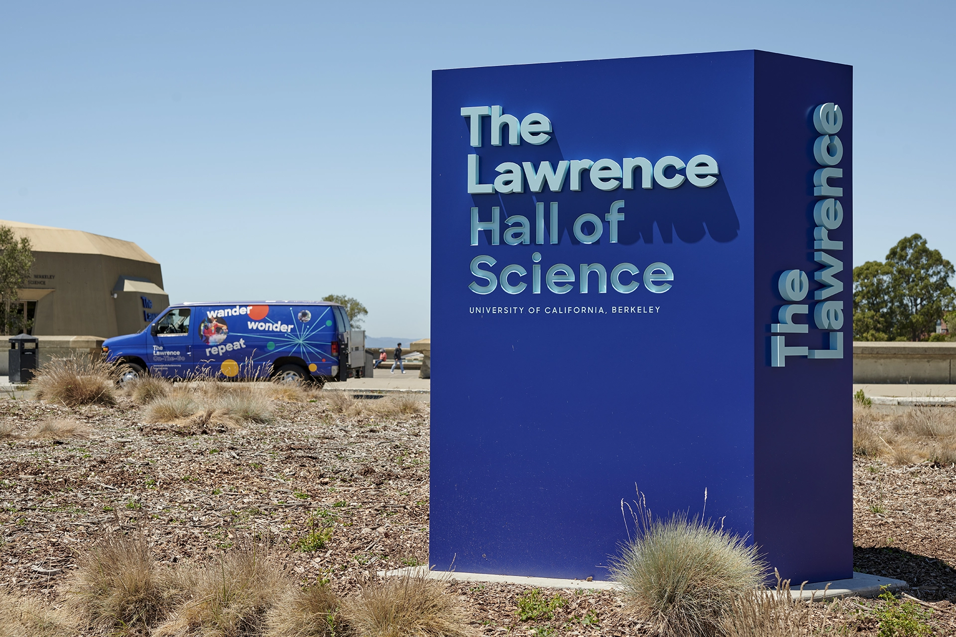
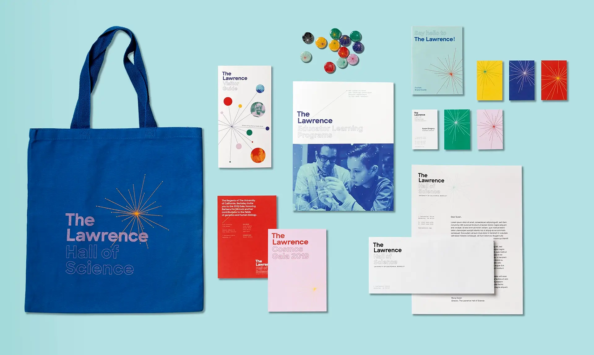
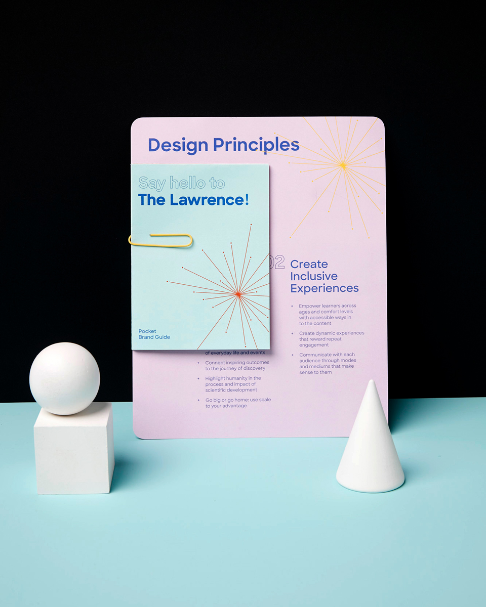
Building on its strengths as an institution and the identified opportunity areas, IDEO created a modern, vibrant, and flexible brand that strategically and visually unites all of The Lawrence’s offerings, working across digital and physical media. Grounded by a grid system, the updated brand identity is simultaneously rigorous and fun, featuring a bright color palette and signature retro-cool super-nova mark. Different offerings are bundled together based on different audience needs, preventing confusion and easing navigation. Even the name of the science museum, The Lawrence Hall of Science, was updated to a more contemporary and approachable, The Lawrence, inspired by The Met.
The Lawrence unveiled its new brand with much fanfare in late 2018 as part of its year-long 50th anniversary celebrations. Visitors can see the updated identity across all public-facing elements, including The Lawrence’s website, curriculum and educator materials, letterhead, collateral, and exhibition and wayfinding signage. The redesigned brand has been credited with bolstering the popularity of the science center among families and schools and causing ticket sales to return to—and exceed—pre-pandemic levels. Internally, the rebranding effort has helped generate excitement and energy across departments, helping solidify a collective future strategy and vision for its next 50 years.

The Lawrence Hall of Science’s diverse offerings had grown extensively over the decades, creating a confusing and disjointed experience for its various audiences. On the eve of its 50th anniversary, Lawrence leadership sought a brand refresh to better connect with its target audiences and differentiate itself in the STEM education ecosystem.
Over $6M in new funding
raised to transform and modernize The Lawrence, thanks to IDEO's rebranding effort
Reinventing classic British pubs and inns
Greene King’s upscale Everly Hotels Collection combines modern comfort with local impact.
When Greene King approached IDEO in early 2022, it was (and still is) one of the UK’s leading hospitality brands, with over 2,600 pubs, restaurants, and hotels. At that time, consumers in the UK and other parts of the world were beginning to rediscover the joys of travel after years of pandemic lockdowns. Greene King’s newly formed Venture Hotels Team wanted to understand how guest expectations had shifted during Covid-19 and how a new customer-centric hotel brand and signature service experience might meet—or exceed—their expectations.
To get inspired, the IDEO team interviewed a range of travelers of different ages and backgrounds, met with hospitality and luxury experts, and conducted immersion visits, including visiting high-end hotels. The research revealed modern travelers want unique hotel experiences that cater to their curiosity, support local communities, and are environmentally sustainable. Luxury, which once meant “exclusive,” was now about enabling one-of-a-kind cultural experiences. Today’s travelers value inclusivity, accessibility, and well-being; they want to feel welcome, do things at their own pace and have thoughtfully curated options to choose from. They also expect hospitality practices to be ethical and sustainable, contributing to the welfare of local communities and the planet.
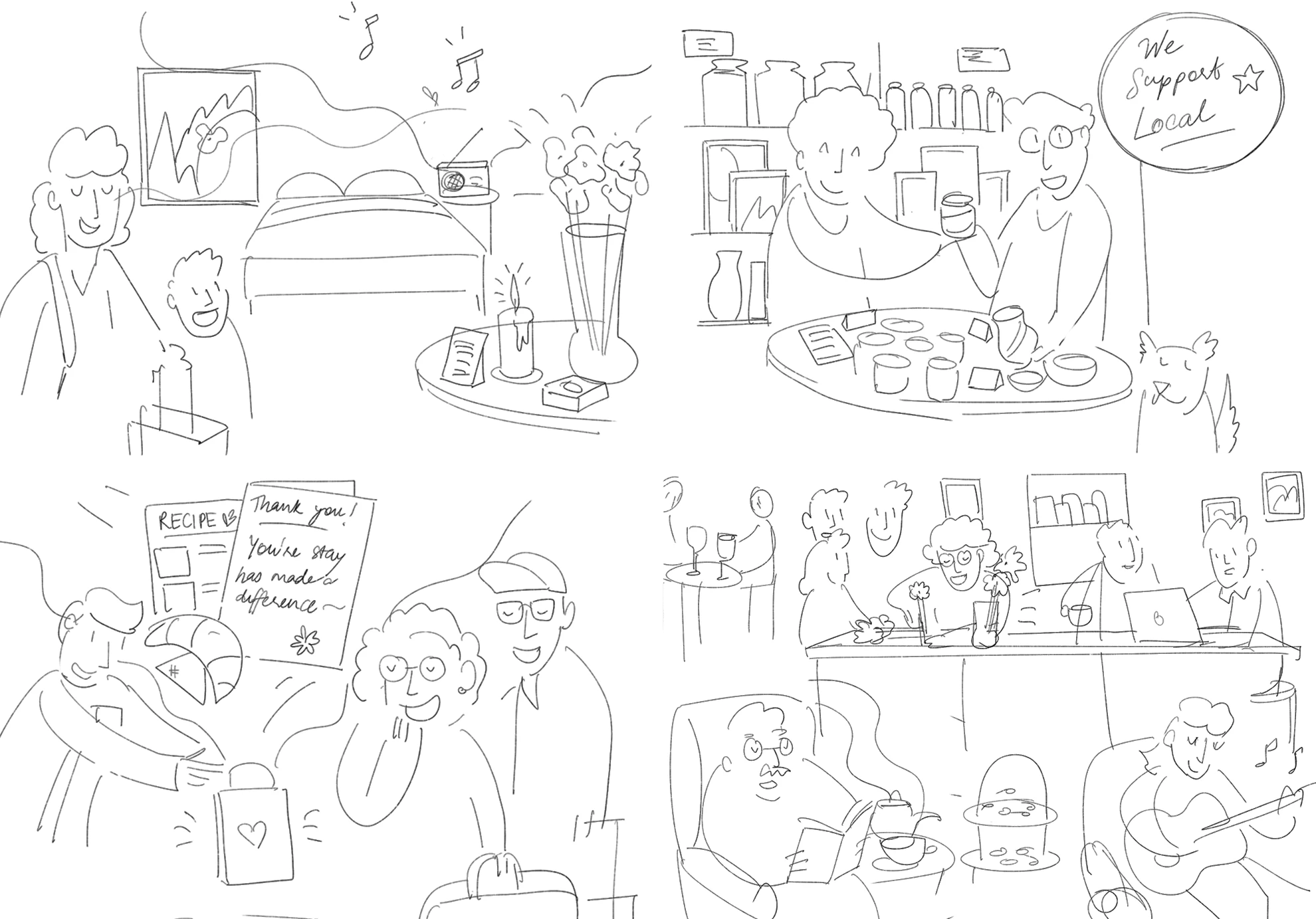
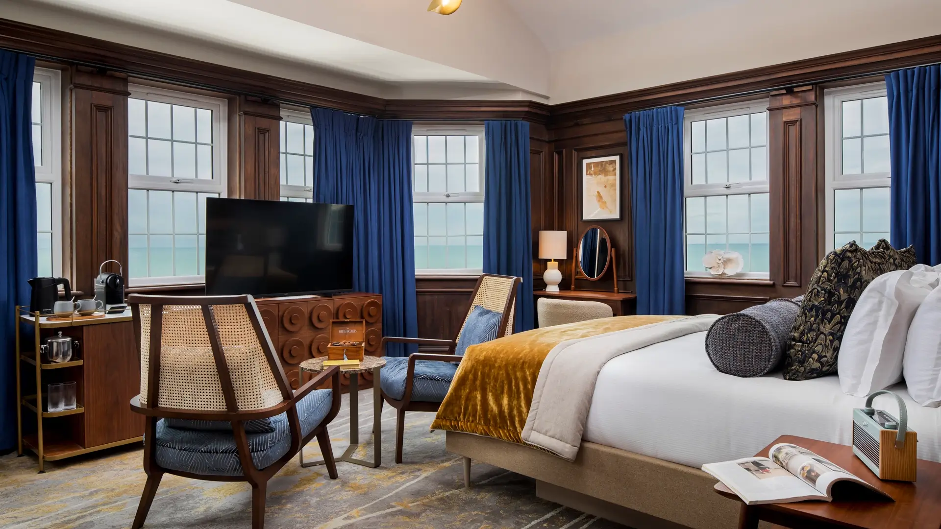
Building off this research, IDEO crafted a new entry proposition for Greene King’s new Everly Hotels Collection called “The Discover Collection,” which leverages the best parts of a classic British pub and inn—bespoke historic locations full of character, culture, and stories—while offering guests a modern experience from pre-arrival to departure, all grounded in supporting the communities they are in.
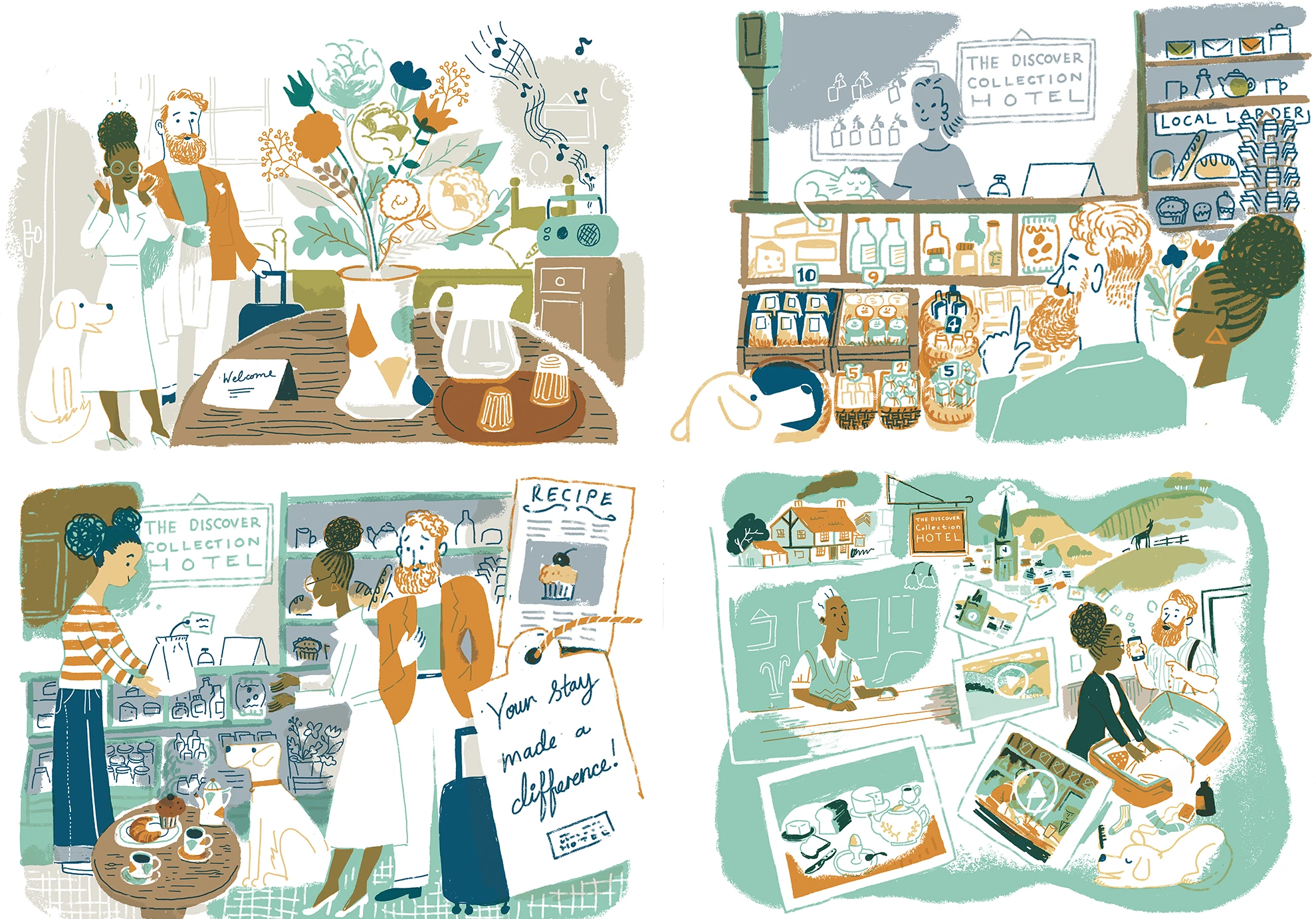
Signature moments include a warm welcome during check-in, as well as staff recommendations and local maps highlighting neighborhood gems. During their stay, guests enjoy expansive seasonal food menus, as well as a beverage menu that includes a wide variety of locally brewed, distilled, and crafted drinks by local suppliers. Rooms feature a smuggler's treasure chest with a surprise treat. Art and books from local talent are on display throughout the hotel, and local experts lead activities and events. Guests tangibly experience Greene King’s commitment to sustainability through its use of local materials, produce, talent, and partnerships, all designed to support the surrounding community. Upon departure, guests receive a personalized postcard.

In addition to the hotel experience moments, IDEO delivered branding recommendations for The Everly Hotels Collection, including visual identity and tone of voice that provide a cohesive look and feel for the collection of hotels while simultaneously showcasing each property's unique character. This was all packaged as an experience playbook, with design principles and briefs to help guide implementation decision-making across Greene King’s marketing, digital, interior design, and food and beverage teams.
A few months after the project ended, Greene King launched The Everly Hotels Collection. Its pilot hotel, The White Horses in Rottingdean, East Sussex, opened within the year. The new brand and guest experience strengthened bonds with Greene King’s loyal customers and first-time guests, ensuring the brand's relevance and appeal in a competitive market. More hotels are planned in the future in other scenic UK locations.
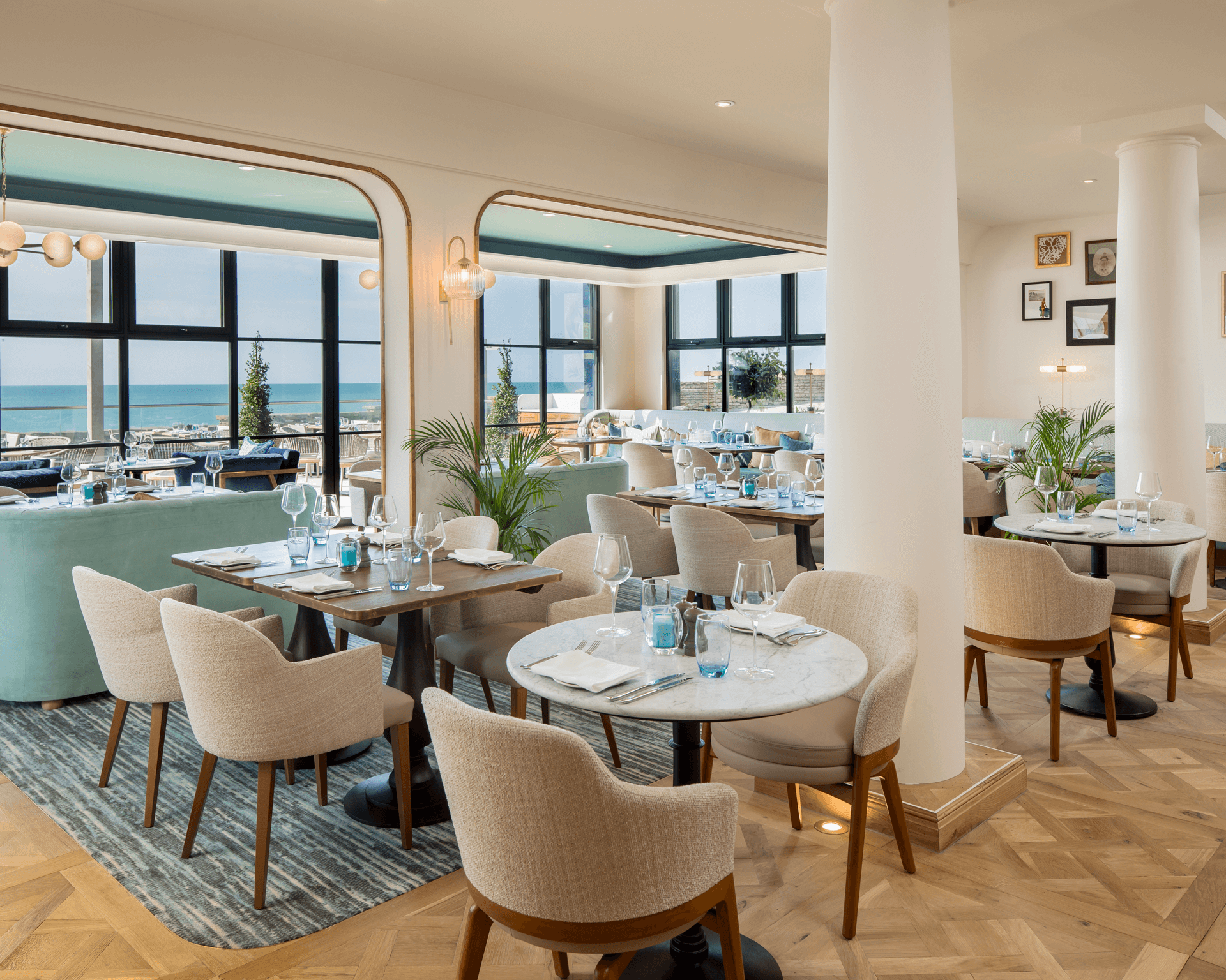
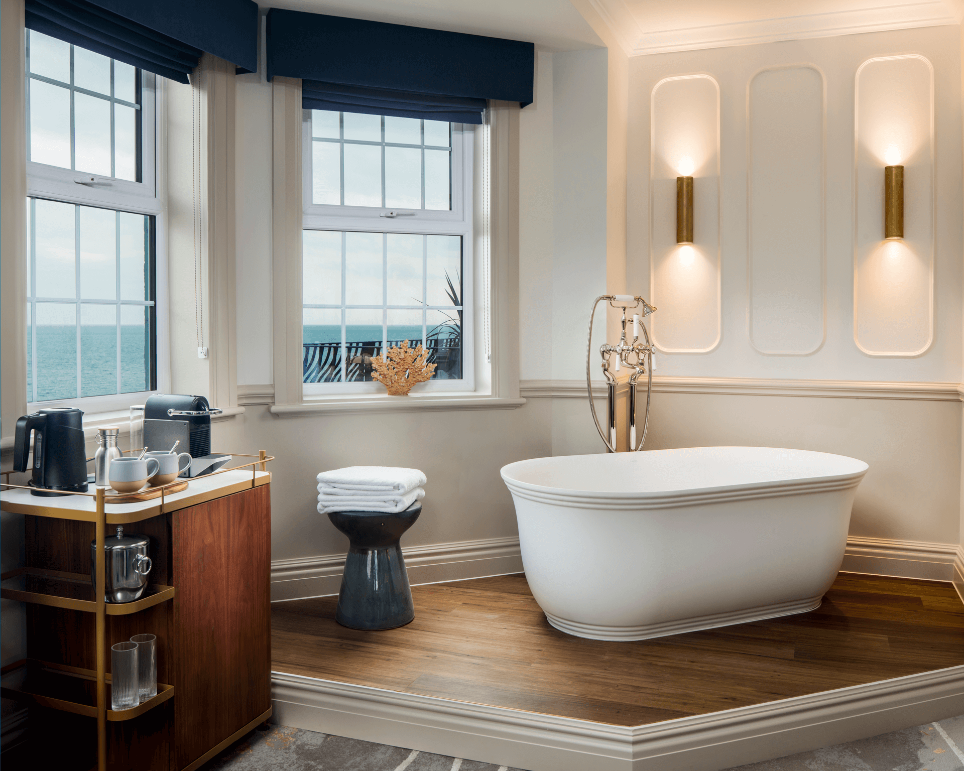
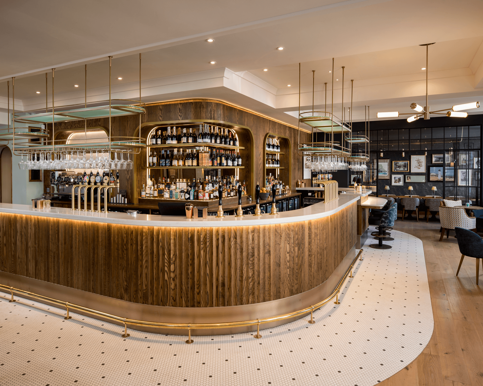
Greene King wanted guests to have a consistent brand experience while maintaining the storied charm that makes each property unique.
2 years
from concept to the launch of Greene King’s boutique Everly Hotels Collection
1 pilot hotel
The White Horses opened in Rottingdean in 2024

A new paradigm in data storage
Designing the iodyne Pro Data and Pro Mini hard drives.
The hard drive space is full of companies competing over technology and performance. But iodyne wanted to add another layer, focusing on user needs and product aesthetics to better position the company to meet the values of a broader audience and create compelling new entrants into this crowded market.
Together, IDEO and iodyne jumped into in-depth discovery research to learn more about the needs of their end users. The team sat down with photographers, videographers, and digital imaging technicians, asking questions about their file management systems, how they used hard drives in the field, and how they stored them for transport and at home. They also headed to the source, visiting studios and home office set-ups to understand the full range of potential use cases.
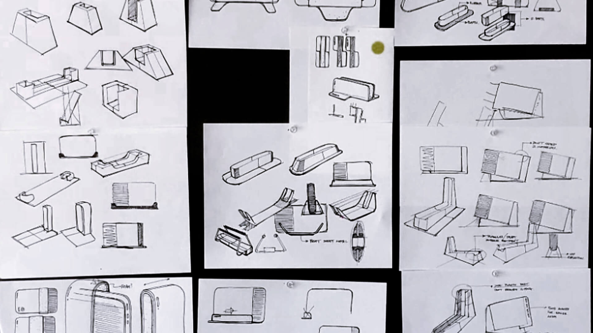
A few big discoveries leaped out. No one had a single storage solution to rely on. Users constantly transferred data from different hard drives designed for different purposes (in the field versus at home), accumulating hundreds of old hard drives over time. Traditional hard drives also don’t allow multiple users to work off them simultaneously or come with software systems that help keep projects and tasks organized, protected, and sharable. Meanwhile, the ever-shrinking size and weight of laptops—and people’s willingness to take them everywhere—set a new benchmark for portability, one that iodyne could lean into.
With these and other insights in hand, the team brought unrivaled performance and aesthetics together to create a far superior user experience. IDEO and iodyne developed Pro Data’s engineering architecture, collaborating on thermal performance analysis, material choice, inspection of sample parts, and even packaging design. By combining integrated venting, multiple laptop-quality fans, smart power management, and 20 thermal sensors, the team was able to minimize cooling fan loads and reduce noise and power consumption. A single, centralized, and consolidated storage space makes sharing data among teammates easy, too—up to four computers can connect to the Pro Data at the same time and access the same files. The redesigned Pro Data creates new value for consumers in a highly mobile, secure package that can go from desktop to backpack and back again.
The iodyne Pro Data hard drive launched in 2021 to overwhelmingly positive reviews. Storage Review wrote “Nothing else comes close to this level of performance in a package this size,” while Jemery Boros of StarGate Studios said “I don’t think I could have done the shoot without Pro Data. It was easy to use, fast, and kept all of our data safe on the other side of the world.” The drives have since been used in the making of major motion pictures from F1 to A Complete Unknown.
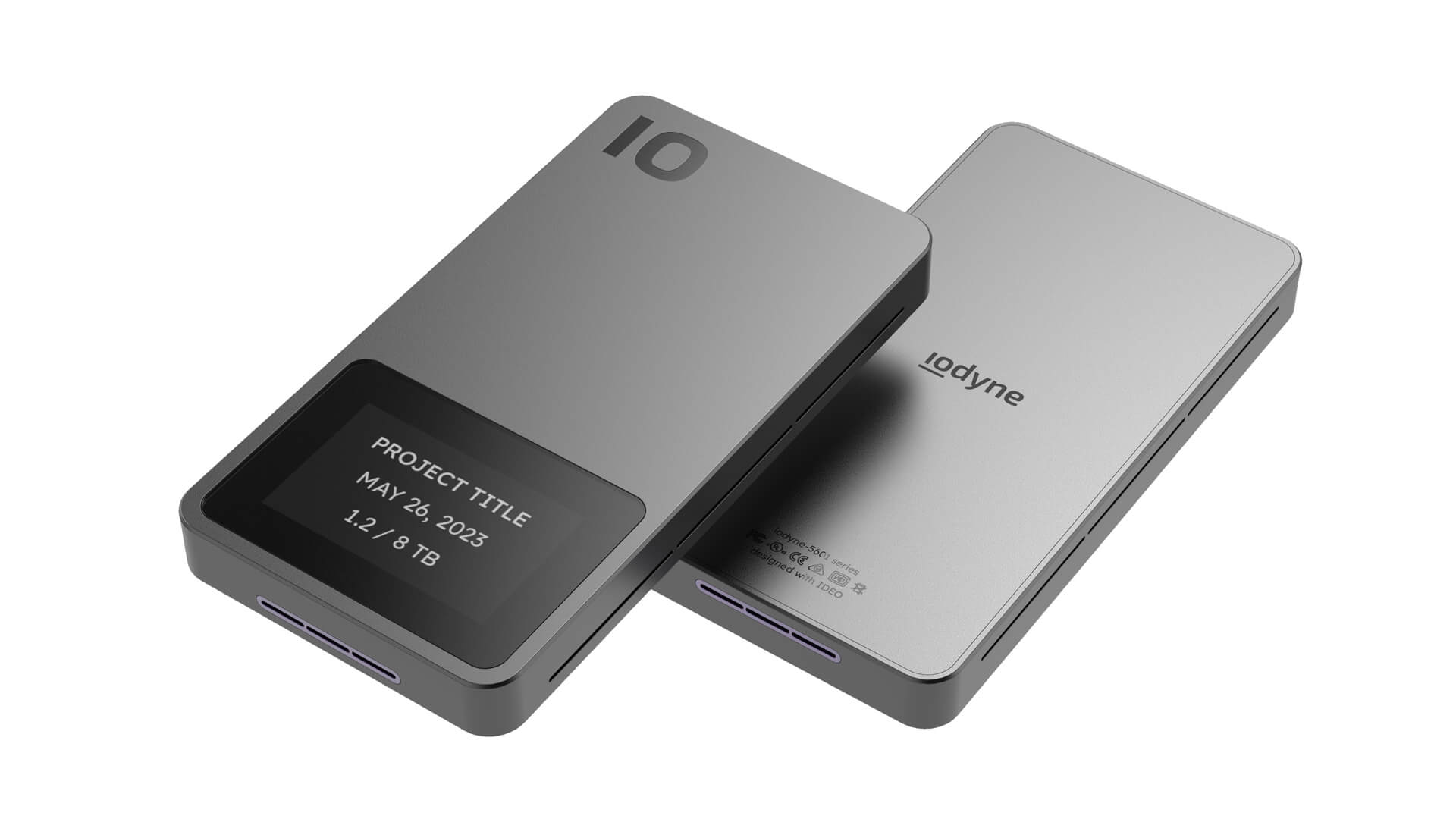
Spurred by Pro Data’s success, iodyne decided to create a second product with IDEO, a Pro Mini that could provide the same cutting-edge performance and sleek design but scaled down to fit the needs of customers who required less storage capacity in an even more portable package. Pairing Pro phone-quality industrial design with a unique internal solid-state cooling architecture that imposed key constraints on airflow was critical.
IDEO worked with iodyne to create the Pro Mini’s internal layout and collaborated with an emerging engineering company to incorporate novel solid-state cooling technology, positioning the vents to maximize airflow and optimizing how users physically interact with the device. The team also addressed users’ durability concerns, advising iodyne on part selection as samples came in from vendors. The new Pro Mini is set to ship in the second half of 2025.
Hard drives are essential tools of the trade for people with large troves of media to store and transfer, like photographers and videographers. But beyond rolls of masking tape and label makers, there isn’t an easy way to see what’s on each drive without literally going through them one by one.
Traditional hard drives generate a lot of heat and need fans to cool them, making them bulky, loud, and slowing transfer speeds.
Many external hard drives are treated like commodities. They’re designed for mass production rather than for durability and aesthetics.
2 cutting-edge hard drives
to market in 3 years
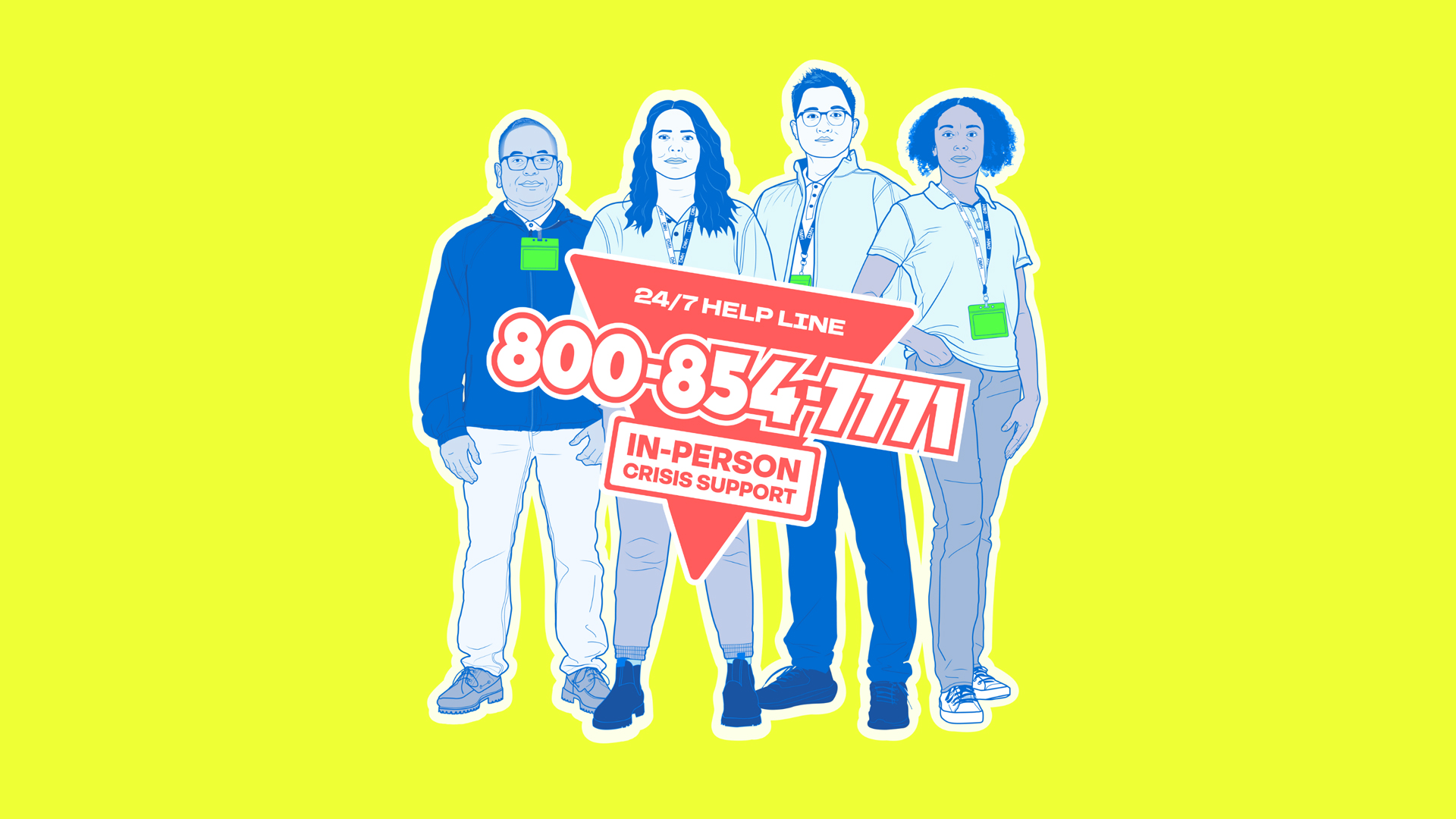
Introducing LA’s mental health crisis first responders
Helping a kinder, safer emergency support arrive first on the scene.
LACDMH is the nation’s largest public mental health department, serving over 10 million people. The agency provides critical support for the most vulnerable, including staffing a toll-free, 24/7 Help Line. Since late 2024, more than 70 Field Intervention Teams—comprised of mental health clinicians (social workers, psychologists, licensed psychiatric technicians, and registered nurses) and community health workers (trained peers or community members with lived experience)—have been dispatched around the county to help de-escalate mental health crises quickly, compassionately, and without force.
Because those experiencing a crisis are often too disoriented, confused, or otherwise unable to seek help for themselves, IDEO’s communication strategy targeted reaching “trusted messengers”—parents, spouses, siblings, and friends of people who have a mood or personality disorder like schizophrenia or bipolar disorder. The campaign aimed to define mental health crises, help people understand what to expect when they call, build trust in FITs, and divert mental health crisis calls away from 911.
To understand what drives these specially trained mental health professionals to do this type of work—and what sparks trusted messengers to call for help—IDEO met and interviewed former clients and loved ones who had reached out to the county for support during a mental health crisis. The team also interviewed multiple FIT staff to learn more about how they approach clients and families.
The research inspired the communication strategy’s central idea: position FIT members as real-life superheroes and first responders. By associating FITs with that term, the campaign changes the narrative and communicates their compassion and expertise to those in crisis. Custom illustrated portraits feature actual FIT staff in strong, action-figure-style poses, while a bright, eye-catching color palette and clear, direct language convey confidence and inspire trust.

The team explored their initial design directions in a series of focus groups with LA residents, trusted messengers, and county and mental health workers to better understand the impact of the potential messaging and visuals. The research uncovered the importance of clarity, even in an inherently emotional situation. The IDEO team discovered that transparency—and real personal stories—would be the key to building public trust in ACR.
Between March and June of 2025, the robust awareness campaign will run across LA County in a number of languages on city buses, in Metro stations, on social media, streaming TV, radio, and more. An updated landing page on LACDMH’s website includes in-depth information and educational videos about mental health crises, as well as heartfelt testimonials from staff and former clients who have been helped by the service.
LA County Department of Mental Health created an innovative new program to provide urgent, compassionate care to Angelenos experiencing a mental health crisis but needed help driving awareness of its service across the region.
Calling 911 is an entrenched behavior in an emergency. However, dispatching police officers who are not trained in mental health can make a bad situation worse. In 2022, 39 percent of people shot by LA police officers were in the midst of a mental health crisis.
172 million impressions
delivered via digital and physical ads across LA
50% increase
in calls to the ACR helpline, year-over-year, attributed to IDEO’s awareness messaging
24%
of Angelenos now name LACDMH as the first to call in a mental health crisis, leapfrogging 911 or the police, which slipped 14.3 points
Building an enduring futuring system
How to create the blueprint for a future-fit organization.
Organizations are quite good at optimizing for today. They’re laser-focused on KPIs, governance, budgeting cycles, and incentives that reward delivering on a quarter’s results. But these systems aren’t well-designed for exploring uncertainty 10 to 20 years in the future. Most organizations don’t have the capacity to continuously sense, interpret, and act on future possibilities. This means they can easily lose their edge.
As a futurist, I’ve been helping organizations do this work for years. Sometimes it begins with a foresight project, a unique product design, or the creation of provocative future scenarios. But often the ultimate goal is much more ambitious. Futurists help organizations build systems designed around the habits, capabilities, and leadership practices that make futures thinking part of everyday work, helping an organization develop the confidence to navigate uncertainty now and into the future.
I’ve written about why having a futurist-in-residence (FIR)—and the tools and craft they bring to an organization—is crucial. What most organizations don’t understand is that an FIR is not an organizational Magic 8 Ball. Instead of making predictions, they equip the organization to be more curious and ready for what might happen. Their goal is to broadly build and distribute futures thinking, a role that is focused on both foresight and organizational development.
When organizations hire an FIR, there is a temptation to centralize the foresight practice. Initially, this is actually a great idea. Even though an FIR’s remit is broad distribution of capabilities, it’s important to give them the space to create a clear, consistent strategy and put it into motion. This makes it possible to design necessary systems, teach and spread new mindsets, and build capabilities. But once the approach is clear and the integration of futures thinking is ready to go, foresight needs to be the work of the whole organization. You want product managers spotting signals, HR folks anticipating workforce shifts, finance teams modeling longer-horizon scenarios, and strategy people running future stress tests. Everyone in the organization can participate in making operations future-fit across the board.
To do this successfully, the FIR needs to design and build a future-forward operating model. And that requires them to cycle through a specific set of roles.
Stage 1: Futurist as explorer
In the first stage, the FIR is an explorer, honing and utilizing their craft to see around corners and spot what might be changing. They conduct research, scan for signals in the market and adjacent spaces, craft provocations, and author stories about the future. The goal in this stage is to broaden the organization’s perspective, challenge long-held assumptions, and introduce new questions that leaders haven’t been asking. The FIR might create:
- Dynamic signals repositories that continuously identify and track changes from the edge
- Cross-industry trend scans to identify changes that could reshape the market
- Future storytelling or artifact building to capture the attention and interest of the organization
What that might look like: An FIR at a healthcare organization might track signals across AI, longevity, beauty, consumer behavior, and the workforce, while looking to adjacent industries like hospitality or finance for emerging models that could reshape care. They might also explore broader shifts, such as changing trust in institutions, and use these insights to build an artifact—a news headline, job description, or story of the future—that engages a wider audience, challenges existing assumptions, and sparks new questions about what healthcare could become.
Now the stage is set to bring in the rest of the organization.
Stage 2: Futurist as translator
Once the initial exploration is underway, the FIR can serve as a translator, starting the process of connecting futures to strategy and operations. During this stage, their work begins to reshape leadership practices, strategic planning, portfolio decisions, talent development, innovation governance, and the organization’s approach to risk and investment. That might include:
- Establishing new practices that focus on curiosity and questioning assumptions with leaders
- Designing opportunities to explore multiple plausible futures with teams and business units
- Identifying critical capabilities like AI fluency and systems thinking with HR
What that might look like: An FIR in the financial services industry might take an emerging shift they identified during exploration, such as the growing use of prediction markets, and bring it into an upcoming strategy review. They could use this signal of change to stress-test the strategy, asking whether it is flexible enough to respond across multiple plausible futures. They might then work with innovation teams to reconsider priorities and with leadership to surface assumptions, investments, or strategic choices that may need to change.
Stage 3: Futurist as builder
In the next stage, the FIR serves as a builder. They create and test ways to make futures thinking a part of everyone’s role. They develop learning experiences, write and test out curriculum, facilitate workshops, and coach leaders to build futures literacy. They establish systems for large-scale signal scanning, incorporate future scenarios into strategic planning, and create knowledge-sharing approaches. They find opportunities to embed new rituals and practices into everyday work in ways that are repeatable and clear. That could mean:
- Every leadership meeting begins with a five-minute discussion of an emerging signal
- Every major investment proposal includes testing one future assumption
- Every potential new concept or innovation is stress-tested against future scenarios
What that might look like: An FIR at a global retailer might establish a network of frontline employees across markets who regularly contribute signals of consumer behavior, technology, and culture to a shared platform. Those signals become part of weekly leadership conversations, while future scenarios inform decisions about new store concepts, services, and major investments.
Stage 4: Futurist as catalyst
In the final stage, the FIR is the catalyst for organizational transformation. Their goal is to make futures thinking a repeatable organizational habit—something embedded across business units, integrated into strategy, and reinforced through leadership development, HR, innovation, and planning processes. The systems built in earlier stages are now self-sustaining. Leaders no longer rely on the futurist to introduce new or provocative thinking. Teams are empowered to do it on their own. This could mean:
- Innovation teams build future scenarios as a standard part of concept development
- Leadership teams adopt regular signals reviews alongside operational metrics reviews
- Cross-functional communities of practice emerge, with individuals contributing signals and interpreting change
- Performance reviews reward curiosity, experimentation, systems thinking, and learning
What that might look like: At a global technology company, major investment proposals might routinely identify the future assumptions they depend on be stress-tested against multiple plausible scenarios before funding decisions are made. Innovation teams evaluate new concepts against both current consumer needs and future conditions, while leaders use scenarios-based reviews to make portfolio choices. At this stage, the FIR is no longer directing these activities; the futures infrastructure is in place and working.
Every organization has systems for finance, HR, legal, and operations, but very few have a system for understanding the future. A futures ecosystem isn't a single tool or annual planning exercise. It’s a new way of working that identifies the rituals, language, and decision-making practices to help an organization continuously sense change and adapt. This includes everything from signal scanning and scenario building to leadership routines, governance, knowledge sharing, and strategic decision-making.
The FIR serves as the architect of an enduring futures structure for any transformative organization by developing futures thinking into a strategic, differentiated capability. A great FIR should eventually work themselves out of a job as futures thinking becomes an integral part of how the organization operates—and how it prepares to thrive across multiple, plausible futures.
If you haven't yet read it, please check out the first story in this series,
"Why every company needs a futurist-in-residence.” Need help setting up futures systems at your organization? Get in touch.
“A great futurist-in-residence should eventually work themselves out of a job as futures thinking becomes an integral part of how the organization operates—and how it prepares to thrive across multiple, plausible futures.”
“Crafting the last mile of delight”
Anthropic’s Head of Product Design on designing at the speed of AI.
What will it mean when an algorithm can handle 90 percent of your job? What will working with dozens of agents be like? When anyone can build enterprise tools—instantaneously?
That future has already arrived at the major AI labs—and faster than almost everyone expected, even Anthropic. Founded in 2021 by a group of researchers who set out to build AI that is safe and useful, it’s now used by millions and was valued at $965 billion in its most recent funding round.
The company operates on the assumption that AI capabilities will keep improving quickly—and that its own internal ways of working have to keep pace. That means fomenting and accepting exponential change. Speaking to Joel Lewenstein, Anthropic’s refreshingly honest head of product design, provides a visceral sense of what the future we’re all heading toward feels like—both exhilarating and, occasionally, overwhelming.
I spoke with Lewenstein about why protecting our thinking matters more than ever, why his team members don’t feel AI is atrophying their craft skills, and why enterprise collaboration is the next frontier for research and product.
Ed White (EW): Do you remember a moment when you first realized AI’s true potential?
Joel Lewenstein (JL): My wife is an appellate lawyer. It was around 2023, and she was trying to explain this extremely dense legal case to me. After three tries, I still didn’t understand it. So one night, while she was asleep, I pulled out my phone and asked a gen AI to explain the case. It got two-thirds right, but then it started hallucinating, providing incorrect but insistently confident information. I remember having this conspiracy theorist-like out-of-body experience. I felt so alive because I’m learning this deep thing, and I felt so scared and confused because I’m being lied to, but it was insistent. I remember thinking that there’s so much good here, along with confusion and complexity that would be interesting to work on.
The second moment was hearing Dario [Amodei, CEO of Anthropic] on the Dwarkesh Podcast. This was also in 2023. Dwarkesh asked him: “If we reach AGI [artificial general intelligence] and it cures cancer, should it be governed by a company, the US government, or the international government?” I thought it was a crazy premise. But Dario launched into a deep reflection on governance, ethics, and international order. I realized these people fully believed in the goodness of AI. That made me very excited.
EW: What’s your role at Anthropic?
JL: I lead the product design, user research, and content design teams. There are about 30 folks, and we basically put a product designer, a user researcher, and a content designer on our platform API business (Claude Code, Cowork), our consumer apps, and our enterprise and growth areas. Our designers are deeply embedded and trying to figure out what the hell this role is in 2026.
EW: Having come from more classic product design roles at organizations like Airtable and Quora, how is this experience different?
JL: The most interesting dimension here is speed. You hear this constantly, right? But the weird part is the time compression. There’s a measure-twice-cut-once quality to the work. You do a lot more preparation, thinking, and consideration before you build because the time to build is so short. The question is: How do we keep up in an environment where everyone’s shipping all the time?
We also build a ton of internal tools. Our content design team created a GitHub agent that monitors strings sent to production. It checks for adherence to our content guidelines and opens PRs [pull requests] for any that don’t comply. That’s crazy because this used to be 50 percent of the job. Now it’s just 5 percent, allowing us to focus on other things. All of our designers are writing code.
EW: Where does the design or craft bit fit in, then?
JL: With design, there are three steps to the process. Step one: determining what we should build, why we’re building it, and what problem we’re solving. Step two: creating user flows and ensuring the basic components are in place. Step three: crafting the last mile of delight, those little details that many people may not notice, but subtly make a difference. Step two is now gone. We just prompt Claude, and it just does it. Step one—deciding whether we should build something, why we should do it, and where it leads—is still a very human and messy process. As for the last step of getting all of those little interactions and visual details right, our designers are still better than the models. Maybe that won’t be the case forever, but for now, it is.
EW: Tim Brown, IDEO’s former CEO, co-authored an article about this recently titled “The AI dividend.” Now that AI has reduced a task that used to take 50 percent of your time to 5 percent, what do you feel it’s allowing you to do?
JL: I would love to tell you that all the boring tasks have been automated, allowing the designers to sit at whiteboards thinking bigger, more ambitious thoughts. But our Slack and GitHub are flooded with PRs from dozens of engineers. We’re juggling 17 different Claude Code instances, and each one is pinging, “I’m done! Can you review this?” It’s a cacophony of tiny projects. It’s similar to the attention-economy notification overload we experienced in our personal and social media lives. Now, it feels the same way in our work life. We’re fighting harder than ever for half a day or a day to just think, dream, and explore.
EW: Do you think the pendulum will eventually swing back?
JL: It has to because the human condition will require it. I think two things will happen. First, we haven’t invented an interface for managing hundreds or thousands of Claude instances. There’s still an unsolved UX problem. The best analogy is the American presidency. There are hundreds, thousands, or even millions of staffers running around making big and small decisions, producing piles of status updates. A human chief of staff manages all that. Eventually, we’ll need a digital equivalent who will serve up a concise summary from a few of your SVPs [senior vice presidents] on Monday morning—agents who have dealt with 10,000 individual contributors—so that you don’t have to think about each task.
EW: How else are you seeing designers’ roles change?
JL: Being close to the code and adopting a code-first, prototype-first mindset is really central. We’re not too precious about our work. If something has a decent UX, we put it out there in a beta and collect feedback.
As someone who has always worked in the digital space, I think about how creative professionals in the past, like musicians, operated: once an album was finished and the record was pressed, that was it. I could never have worked that way creatively. Back when I started, in the Ruby on Rails era, we could simply deploy again next week and fix any issues. But for AI native folks, if something goes wrong on a Tuesday night, they just submit a PR on Wednesday morning to fix it. Everything is malleable and adaptable all the time.
This lack of preciousness, the idea that “done and shipped” is better than “perfect,” is crucial. Of course, there are challenges. Sometimes the coded output doesn’t look great, but we accept we’re going to learn from this vibe-coded thing and get on with it. We refer to this approach as “intentional craft,” meaning that if we need to make this outstanding, we still have the chops to do it, but we also need the discipline and the judgment to recognize when it’s appropriate to let a rough version go out.
User expectations are changing fast. During the heart of the mobile app era, people had incredibly high bars for their experience. We’re no longer in that era. When we put out these vibe-coded, early experimental things, we get feedback like, “Guys, this broke three times, and this button is called three different things.” But they also say, “I love it. Please make it better, and I'll keep using it.” We’re in a part of the S-curve where users have a lot of tolerance for jank. Eventually, this field will mature.
EW: How do you maintain your craft in a world where models can perform many design tasks?
JL: Collaboration with these models is not a replacement story. You get better as a writer, editor, and thinker with a creative partner who pushes you, asks questions, and explores alternative theories. There’s a nice sparring partner quality to collaborating with AI that I appreciate.
The models aren’t doing anything better than a thoughtful designer can with enough time. In a head-to-head competition between Claude and an outstanding designer, the designer still wins most of the time. I don’t hear our designers being concerned about skill atrophy. They’re worried about not having the time and mental space to practice the skills they already have and care about.
EW: That’s very heartening to hear, to be honest. With so many options of what to build and many more people who can do many more things, how do you find a sense of direction? Do you and Mike [Krieger, co-lead of Anthropic Labs] share an ethos on product development?
JL: We’re letting the model lead the way. For example, in the pre-AI era, a product like Claude Design would have emerged through a TAM [total addressable market] analysis: evaluating our position as market leaders in coding, identifying adjacent spaces, interviewing stakeholders, spinning up a team, and committing to a 6- to 18-month timeline.
In reality, the complete opposite unfolded. People using Claude Code were organically making UIs [user interfaces]. One of our designers noticed that these URIs [uniform resource identifiers] were pretty good and wrote a skill to coax the models into producing even better front-end designs, specifically using our design system. He realized it was useful and spoke with our researchers, who confirmed it wasn’t a fluke. He then refined the skill into a standalone app. That’s the genesis of Claude Design. We felt comfortable launching it at a research preview because we believe the models will continue to advance.

EW: That’s interesting because organizations don’t generally use what I’m going to call “academic research” as a way of thinking about how products come about.
JL: It’s crazy because at any other place that I worked, nothing changes on a product unless you assign an engineering team to change it. If your product engineers all went on vacation, no features would launch. But at Anthropic, if our product team went on vacation, the models would just keep improving.
EW: What’s it like working alongside agents daily, and how does it impact the organization?
JL: Everyone at Anthropic has dozens of Claude Code agents running in the background. We recently worked on a navigation IA [information architecture] refresh. Anyone who’s done a navigation redesign knows there are a million questions in the kickoff meeting: Are people really using this tab? Are the users of this tab and this tab the same, etc. In my old-school, pre-AI brain, I’m like, “We’ll need a week to explore, a follow-up meeting, and then we’ll come back with all these questions.” But in the meeting, the designers are just tap, tap, tapping on their Claude Code agents, asking, “Will you look at our internal documents, Slack, and our data to figure out how many people click on this tab?” And 45 seconds later, someone chimes in, “Hey, it turns out that tab is still used a lot.” It’s like everybody has a team of research assistants behind them, finding answers for them in real time.
EW: What’s inspiring you right now?
JL: I’m curious what the next three to five years hold for the unit of computing. We learned how to use websites, then apps, and now chatbots. What will be the next unit, and will it be vibe-coded or developed by individuals, corporations, or models that generate it in real time?
EW: Looking ahead, what’s most exciting to you and your team?
JL: We’re thinking a lot about teams and team productivity. Claude is amazing in single-player mode. But while we’ve become more productive individually, the collaborative aspect of work hasn’t changed dramatically. Right now, we have a World Cup collection of individual superstars producing amazing things, but their collective chemistry remains unmediated by AI. But then again, you and I are speaking right now completely unmediated by AI, and that’s also beautiful.
EW: What advice would you give designers? What should they be doing and thinking about?
JL: When users have a problem, our instinct as designers is to create a new feature—design the rectangles and the flows—and let AI build it. We’ve started to invert that approach. If users have a problem, we ask, “Can Claude solve it on its own with prompting?” Then, if it can’t or needs additional structure, we add a feature or product architecture.
“Design in the Age of AI” is a series of conversations with designers and makers from across industries and disciplines, building the future with AI today.
“Being close to the code and adopting a code-first, prototype-first mindset is really central.”
.webp)
Preserving the humanity of travel in the agentic AI era
IDEO and Expedia on loyalty, discovery, and how AI can make travel more human.
Travel is fundamentally a human experience, and personalization has always been the ideal: the concierge who remembers your name, the host who anticipates your needs, the perfect room tailored to your preferences.
But true personalization has traditionally been a luxury, reserved for those with wealth and elite status. Even as technology has enabled mass travel and big data and CRM systems have laid the foundation for personalization, brands have struggled to scale hyperpersonalization to everyone. Loyalty programs have become the industry’s best attempt at bridging this gap: Points and tiers quantify who deserves what, with status serving as a proxy for real relationships and customer understanding.
Until now. With the introduction of AI agents, hyperpersonalization can scale from the segment level to the individual traveler. Done right, it has the potential to democratize what was once a luxury good: the experience of being recognized.
Of course, serendipity and delight remain a huge part of the travel experience: unsolicited dinner recommendations from local shopkeepers, wrong turns that lead to hidden gems, and conversations with strangers that become core memories. Our research shows that, especially for Gen Z customers, agency and spontaneity play a big part in shaping their tastes and identities. The opportunity is for AI to know travelers well enough to make their experience feel personal—but also to know when to get out of their way.
Capturing this opportunity means redesigning loyalty so that rewards are legible to agents, personalization scales to the individual, and the system delivers an ecosystem of value matched to what each traveler actually cares about. In doing so, brands can finally deliver the kind of personalization that has always been the industry’s ideal.

The dual audiences challenge
Every travel brand is now designing for two distinct audiences. The first is the person who is comfortably waking up in their hotel bed, enjoying the aroma of morning coffee from the lobby brunch, or grabbing a beer with their new Scottish best friend by Fenway Park. The other is an AI agent that’s handling the searching, comparing, and booking tasks on that person’s behalf.
These two audiences have different priorities, attention spans, and methods for evaluating information. Hyper-optimize a webpage for one audience, and you may inadvertently block traffic coming from the other.
It’s tempting to treat these dual audiences as a marketing problem—a matter of making pages readable to agents without alienating people. And that is part of it. Stripe has already built a wallet for agents, and AI coworkers are beginning to handle multi-step bookings. But the consumer trust gap is wider than the technology gap. The travel industry has not gathered enough data to determine whether travelers will allow an agent to optimize their preferences about brand, travel occasion, or loyalty points.
As brands strive to cater to both audiences, agents in the funnel are revealing three outdated assumptions baked into the way most travel and hospitality loyalty programs operate. First: transactions are the best measure of loyalty. Second: personalization doesn’t scale. Third: points are the primary reward. Once these assumptions are challenged, a different kind of reward emerges: the reward of travel itself. In the age of AI, loyalty programs should be designed with enough emotional intelligence to preserve the romance of travel while harnessing the superpowers of machine intelligence.
False assumption 1: Transactions are the best measure of loyalty
When American Airlines launched its AAdvantage program in 1981, it introduced the first large-scale frequent-flyer program by mining its reservation system for recurring phone numbers. This marked the first time the airline could identify returning customers and begin building direct relationships with them rather than with their travel agents. The airline built the program on the data it had at the time: transactions. Forty-five years later, most loyalty programs still follow a similar structure—offering points for spending, tiers for hotel nights, and miles for distance traveled.
This transactional dynamic is increasingly ineffective. The average American belongs to 17.4 loyalty programs, but actively engages in fewer than half. Many brands claim loyalty membership sizes that rival the entire adult population of the United States. These transactions may look like loyalty, but are they really?
The next generation of travelers will have an agent doing the work that only the most dedicated points gurus do today: discerning what each traveler finds valuable and surfacing the options that match. Imagine a Gold-tier member with a brutal travel schedule who is looking for a hotel close to tourist attractions. In a regular search, they filter by price, reviews, and location. An agent can do that, plus spot the perks that actually matter at six in the morning after a red-eye: early check-in and a quiet room away from the elevators.
Now, the measure of loyalty broadens beyond the transactional into the experiential and emotional utility of being seen and cared for. Agents simultaneously reveal which programs offer real value and match them to what each traveler values for each and every trip.

False assumption 2: Personalization doesn't scale
Top loyalty programs like Amazon Prime offer around 30 distinct benefits. They range from free next-day shipping to cash-back options and streaming media subscriptions. Brands surface long lists of these perks because they can’t possibly know which one will land with a given member. The list is often a coping mechanism for the brand’s inability to fully personalize and the consumer’s inability to remember everything the brand offers.
Marketers often use robust quantitative surveys, such as conjoint analyses, to gain insight into consumer preferences. Run enough permutations with enough travelers, and you can statistically estimate which combination of benefits they value most. Marketing teams still debate granular tactics, like the order of perks to list in an email. But those debates are entirely unnecessary when agents can just choose based on the traveler’s preferences.
Consider the scale this can reach. Expedia Group alone encompasses more than 3.5 million lodging and vacation rental properties. One can imagine that in the near future, by analyzing a traveler’s bookings and reviews across this vast selection, an agent can ensure that a guest’s preferences are prioritized for every booking, regardless of who operates the property.
Personalization scales when agents do the matching. The new design challenge is enabling agents to interpret hundreds of personal preference variations and reward ecosystems, making offerings sufficiently readable for an agent to match and communicate well on the consumer’s behalf.

False assumption 3: The points are the reward
Ask anyone who has been a road warrior what real loyalty feels like, and the answer is rarely the points. It’s often Shirley at the front desk, who remembers you like a higher floor, a firm pillow, and a bigger room rather than a view. The recognition itself was the reward, a relationship rather than a transaction. But for too long, it was too expensive to offer to anyone beyond elite travelers.
Now, the behaviors that used to earn that recognition are fading just as technology is emerging to recognize customers without them. Today’s consumers are less loyal and less inclined to align themselves with a specific loyalty program or brand because they value choice, flexibility, simplicity, and convenience. The number of people who used to go on mileage status runs in December just to hit status is decreasing. Instead, they’re seeking something more, and brands are increasingly able to provide it, thanks to advancements in AI.
Expedia’s recent partnership with CLEAR offers a glimpse into the future of travel loyalty: It is evolving from individual brand perks to an integrated ecosystem of complementary benefits that enhance each step of the journey (think: Apple ecosystem logic, but applied to travel). For example, CLEAR offers Expedia members discounted memberships to CLEAR+ lanes and access to its Concierge services, providing VIP treatment as they head to their next destination. What stitches the ecosystem together is the underlying agent layer. It reads each traveler’s preferences across the partner brands and surfaces the right benefit at the right moment, without the traveler having to coordinate it themselves. No longer just a perk for road warriors, recognition becomes an experience any traveler can enjoy at every stage of their journey.
The opportunity to make travel more human
People often talk about compound interest when it comes to money. You invest a small amount, it grows over time—that’s the magic of compound interest. But we believe the memories, stories, and friendships formed through travel compound even harder. Years later, a distinctive smell, a friend, a menu item—whatever—can magically transport you back to that travel moment.
Loyalty has never really been about earning points. It’s about the memories of being cared for while away from home, discovering something new and unexpected, and feeling seen and recognized. It’s about the desire to return because those memories capture the joy of travel.
Nights, miles, and dollars are the receipts for a trip. They are not what the trip leaves behind, which is more sensorial and more personal than anything a tier structure has ever captured. The next era of travel loyalty will be about making travel more human, powered by the combined strengths of machine intelligence and emotional intelligence.
“In the age of AI, loyalty programs should be designed with enough emotional intelligence to preserve the romance of travel while harnessing the superpowers of machine intelligence."
The lost art of watching people work
What The Pitt can teach us about learning on the job.
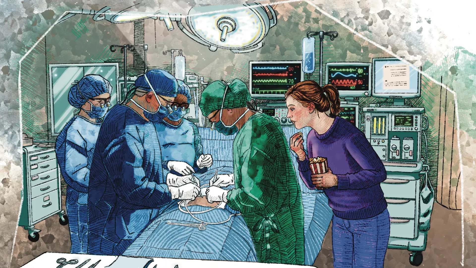
I’ve never been a big fan of medical dramas, but I couldn’t stop watching The Pitt, the HBO Max show about a fictional Pittsburgh ER at a public teaching hospital. The high-stakes medical cases, relentless pace, and scrappy, sleep-deprived team you can’t help but root for had millions of viewers counting down to Thursday nights earlier this year. But for me, it was about watching the work itself.
Apparently, I’m not alone. The Washington Post called the Emmy-winning show “perhaps the purest example of ‘competency porn’ on TV”—a term that surged into the cultural vocabulary this year to name the satisfaction of watching people who are really, really good at their jobs.
But what they’re really good at goes beyond the practice of medicine. They excel at teaching and learning on the job. They think out loud, trust learners with calls that matter, and dissect what just happened before moving on to what’s next. I find it inspiring to watch.
Here are three lessons on teaching and learning in the workplace that we can take from The Pitt, and ways to activate them in your own work.
Make mastery observable
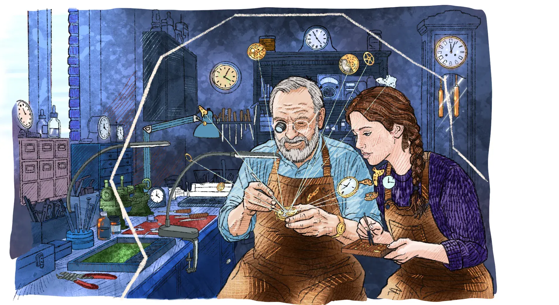
Every scene on The Pitt has two things going on: someone doing the work, and someone learning to do the work. A recent nursing school grad shadows as the charge nurse guides a survivor through a rape kit exam—every choice a lesson in how to move at the patient’s pace. A resident observes as the attending decides out loud whether a procedure is worth trying if it might cost their patient her sight. A specialist performs an emergency procedure the attending has never seen before, teaching the room as she does it. Watching people at the top of their game work out a problem from beginning to end—including the messy middle, not just the outcome—is a sight to behold.
Most of us don’t work in a teaching hospital, but “see one, do one, teach one”—the century-old learning model attributed to Johns Hopkins co-founder and surgeon William Stewart Halsted—is how most of us pick up a craft, medical or otherwise. But that kind of learning is harder to come by these days. For years, most knowledge work has been evolving to a less readily observable state. Increased remote work makes it challenging to know what other people are working on, receive mentorship, get feedback from peers, or signal when you need help. The explosion of single-player AI tools has increased output, but made the thinking that informed it harder to see and, some research suggests, to trust.
When my San Francisco colleague Thomas Overthun worked at Philips early in his career, he would pass by hundreds of drawing boards on his way out of the studio, displaying an amazing range of work in progress. Our workplaces look very different now, but it’s entirely possible to design tools, rituals, and ways of working that can help us see and get inspired by one another’s in-process work.
Here are a few practices that are helping us tilt our work toward each other:
- Use video shares: Kaii Tu in our Shanghai studio records short Loom videos to walk his team through the design choices he made—and why. The format forces him to make his reasoning legible, and makes it possible to share across time zones.
- Host “Screen Share Fridays”: On Fridays at our Cambridge studio, the studio-wide Slack channel explodes with screenshots of work in progress, sketches, project Post-it Notes, photography from the field, and presentation decks. Questions naturally follow, which then leads to dialogue about the work.
- Think in public: My Chicago colleague Leah Marcus builds incredible FigJam boards at the start of each project with relevant research, inspiration, and connections she’s making across our digital product portfolio. She uses plain language, bringing others who don’t share her business design discipline into her thinking.
Let the learner try
The best teachers I’ve observed share one hard-earned skill: they show restraint, letting learners grapple and find their feet with just the right amount of support. In The Pitt, when a new patient arrives in critical condition, the attending physician, Dr. Robby, turns to a resident and asks, “What’s your plan?” He doesn’t jump in, even when the clock is ticking. As a viewer, you feel the pressure that the resident is under and wonder, “Is he trusting a beginner with too much?” Turns out, this is an important part of the learning process.
This is the “do one” part of Halsted’s model, and it’s harder than it sounds. We know from decades of research that learning happens when we reach the edges of what we know how to do, and it happens even faster with scaffolding: a gradual release of responsibility from teacher to student. Instead of just telling residents to do the procedure on their own, Dr. Robby asks them questions, nudges them to consider alternatives, and fills in information they miss if it will have consequences for the patient. He lets them try first, then steps in when they get stuck. The scaffolding makes the risk survivable but not invisible.
As a firstborn, Virgo, recovering perfectionist, I’ll be the first to admit that it is hard to use suggesting mode when you can just use editing mode. But the shortcut has real implications for my colleagues and the work. While I may get a cleaner draft, we both skip the interesting part that could help someone else grow, and probably get the draft to a better place than I could alone.
How might we demonstrate restraint and let learners try?
- Provide feedback in the margins: Suggest, don’t edit. Offer comments over rewrites. The extra friction is the point—it forces a conversation about the choice you would have made, instead of making it.
- Design it now: My colleague Bri Patawaran in our San Francisco studio is a huge fan of design-it-now moments to get a team out of swirl and uplift viewpoints that haven’t been heard. She asks, “What would you do if you had to deliver this today?” Everyone goes heads-down and then presents.
- Ask, don’t answer: When your team is stuck or a direct report brings you a challenge, resist the urge to solve it. Ask, “What's your first take?” and stay in question-asking mode as long as you can to help them explore their own thinking, giving you a chance to see their problem-solving skills in the process.
Tell the story
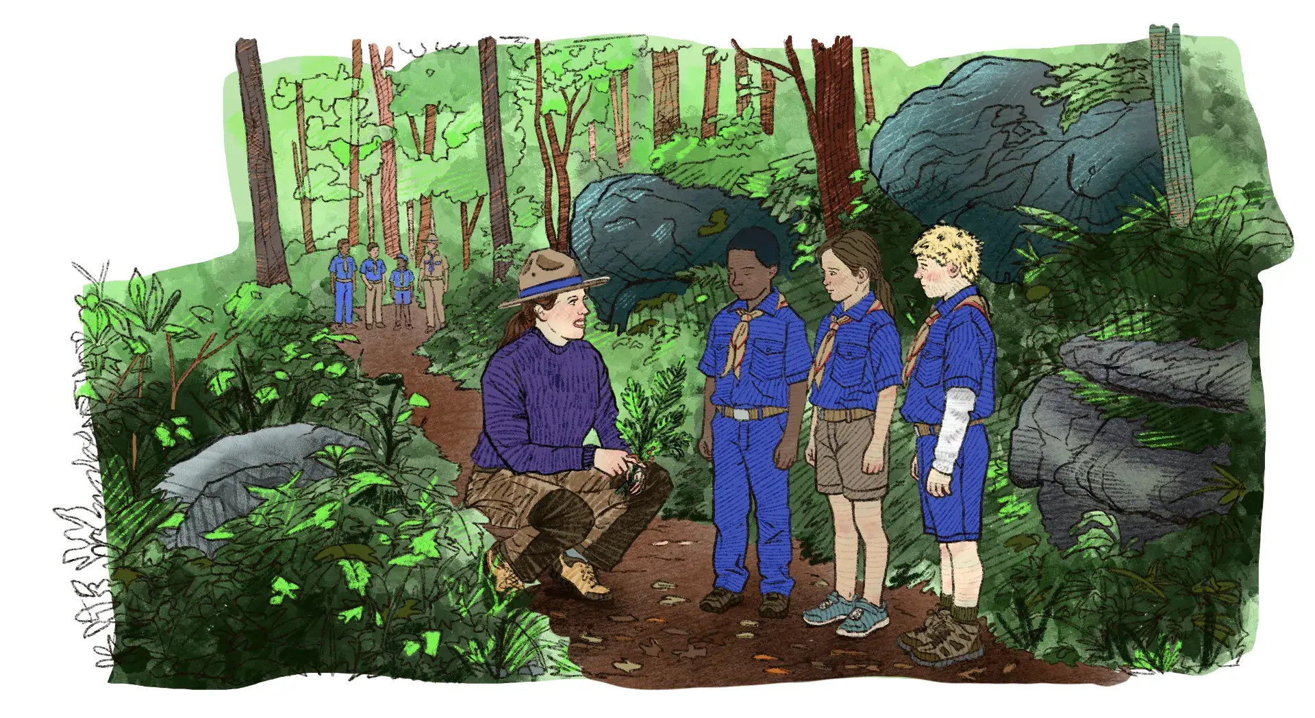
The story we tell about what just happened is how we absorb what we’ve learned. On The Pitt, residents present each case to the attending after their patient is discharged. They walk through what the patient came in with, the diagnoses they considered and ruled out, the call they made, and the result. It’s a small ritual with an outsized effect—the resident consolidates what they learned by teaching it, and everyone within earshot learns alongside them.
Reflection doesn’t have to be formal. Christopher Myers, a researcher at Johns Hopkins, studied medical transport teams—paramedics and nurses who fly in helicopters to accident scenes and rush patients back to the hospital. On any given day, they have no idea what they’ll encounter, and no single person can accumulate enough experience to be ready for all of it. What Myers found is that the crews built shared expertise through vicarious learning: telling each other stories, informally, between calls. These stories—casual, unscheduled, and recounted in whatever time they had—were how the whole team became more prepared together.
There are plenty of ways to build reflection into your work. The harder—and more interesting—work is building it into your culture.
Here are a few practices we use across IDEO to encourage reflective storytelling.
- Ask “What are you working on?” The deceptively simple five-word question is a reflective invitation dressed up as small talk. Ask it in hallways, on Slack, at the start of one-on-ones. Half the time people just answer. The other half, they tell you something they didn’t realize they’d learned.
- Never skip a retro: It’s easy to nix a project post-mortem when you’re running short of time. But “I liked…,” “I learned…,” “I lacked…,” and “I longed for…,” is an easy and effective feedback framework to prompt everyone to share their ah-has and takeaways from the work.
- Host a “Wrap Party”: Once a month, we host a virtual IDEO-wide “Wrap Party” where teams share three behind-the-scenes stories about recently completed work, giving everyone an opportunity to learn and get inspired together.
At one point while watching The Pitt, I said to my husband, “Wow, if I’d seen this when I was younger, I might have wanted to become a doctor.” (He gently reminded me that I have to avert my eyes every time I see blood.) Though what we see on screen may seem aspirational, none of the lessons The Pitt shares about teaching and learning on the job is exclusive to an emergency room. Observability, restraint, and storytelling are choices—small ones, mostly—that we can put into practice every day wherever we work. None of them require a shift change.
Curious about how to improve ways of working at your organization? Get in touch.
“The best teachers I’ve observed share one hard-earned skill: they show restraint, letting learners grapple and find their feet with just the right amount of support.”

Lindsey Turner
I’m passionate about building brands, products, and experiences that help organizations show up with meaning and momentum.
I help organizations cut through complexity by shaping how they show up, through brand strategy, identity, and storytelling.
Working at the intersection of brand and business, I bring an editorial eye and a bias toward making—turning ideas into tangible experiences that people can understand, trust, and believe in.
My work spans government, healthcare, financial services, media, and consumer goods, from launching Gen Z-focused ventures to building innovation labs and reimagining legacy brands. I relish moments of ambiguity and enjoy translating across teams, perspectives, and priorities to move ideas forward.
I started my career in editorial and digital design, shaping cross-platform experiences and identity systems in publishing and agency environments. That foundation still shapes how I work today: I’m detail-oriented, collaborative, and overreliant on the Oxford comma. I hold a BFA in Visual Communication from the School of the Art Institute of Chicago.

Rachel Young
My work helps organizations see who their products aren't working for—and build the will and the tools to do something about it
For 25 years, I've asked the same question: Who does this design exclude—and what are we going to do about it?
My work spans human-centered strategy, inclusive design, and qualitative research, with clients ranging from Microsoft, Google, and Verizon to the National Science Foundation, and San Francisco Unified School District.
Before IDEO, I taught elementary school in East Palo Alto and spent a decade doing design work with social service organizations—where I learned firsthand what it costs people when systems are built without them in mind.
I am currently writing User Error, a nonfiction book about digital access and the design decisions behind it. I live in Oakland, California.

Brian Pelsoh
I lead with craft, ensuring our work is creatively excellent: rooted in deep human insight and imagination, while also grounded in the realities of business and technology.
My expertise spans brand, communication, and product design across tech, education, the arts, and social impact.
I believe great work demands both high-level vision and obsessive attention to detail, and only happens through collaboration.
I bring an inclusive, hands-on approach and a deep understanding of business, which enables me to consistently deliver excellence while always asking why.
Before joining IDEO, I worked at the brand firms Pentagram and VSA Partners. I began my career as a designer, leading teams at the School of the Art Institute of Chicago and the Milwaukee Art Museum. I hold an MFA in graphic design from Maryland Institute College of Art and a BFA in communication design from the Milwaukee Institute of Art & Design, and have taught at some of the best design schools in the US.

Tony Wong
I am responsible for IDEO’s long-term success in China and working with clients to use design as a tool to enable growth.
I am responsible for IDEO’s long-term success in China and working with clients to use design as a tool to enable growth. Specifically, I have helped Chinese companies design holistic brand solutions through the development of their products, communication, services, and innovation teams, and I have helped multinationals expand their presence and influence in China.
I advise global leaders on developing China-led innovation and capabilities.
In over 15 years in IDEO Shanghai, I have worked on projects that use design to elevate the quality of the experience of healthcare products and services, streamline processes that increase productivity, create spaces and programs that promote and enable inclusive communities, and build next generation mobility solutions that are planet-positive.
Before joining IDEO, I worked at Philips Electronics and the Electrolux Group in Italy, the Netherlands, and Singapore on a number of breakthrough commercial products. I am a member of the Young President Organization in Shanghai.

How to use AI as an editor, not a writer
Ed White shares how he uses AI as an editor—not a writer—to sharpen storytelling, rehearse ideas, and preserve the productive friction that makes creative work better.
Ed White has a rule he's tested on his own writing: hold yourself as the writer, and let AI be your editor. Ed is a Senior Design Director at IDEO's London studio, where he co-leads the firm's AI portfolio across Europe. Before IDEO, he spent 12 years as a writer and editor at the Financial Times, Wired, and Contagious. So when he talks about when to use AI for storytelling and when not to, it comes from two decades of crafting his storytelling skills.
In this episode, Mina Seetharaman talks with Ed about two specific tools he uses to keep AI in an editor's seat: a "roasting agent" prompted to critique his drafts without any sugarcoating, and a simulated audience he rehearses pitches on before the real thing. They also get into what Ed is hearing from design leaders at Anthropic, Lovable, Shopify, and Google Creative Lab about how creative work is changing, and why he thinks the friction of writing something yourself is worth protecting rather than automating away.

Building a personal AI for the messiness of life: Sida Li
Becca Carroll talks with Cue co-founder Sida Li about designing a personal AI for the messiness of everyday life—not just work. They explore how Sida stays anchored to human needs while navigating fast-changing technology, product tradeoffs, business-model experimentation, and the realities of building an AI company today.
Most AI products today are built for work—a space with clear problems and established systems. One founder noticed a gap: personal life is messier, harder to systematize, and mostly left behind by the AI boom. So she built Cue, a personal AI that lives inside iMessage and group chats, to go where the other tools haven't.
In this episode, Becca Carroll, IDEO's Chief Strategy Officer, talks with Sida Li, co-founder and CEO of Shared Context Lab, about staying anchored to a human need while the technology around her keeps changing shape, why she treats her business model with the same rigor she'd bring to a product, and what it feels like to build a company at this particular, disorienting moment in AI.
The conversation also gets into how Sida makes design decisions: the language Cue uses to describe itself, the tradeoffs behind building inside iMessage instead of a new app, and a real story about a business idea that didn’t pan out.
This is the second in a two-part series profiling founders from IDEO's Startups-in-Residence program. The first conversation is with Johannes Seemann, founder of Sooner, on designing GenAI for the emotional side of money.

Designing GenAI for the emotional side of money: Johannes Seemann
Designing financial tools around the feelings that shape money decisions.
Most personal financial tools are built to run the numbers and optimize towards a budget. While that works for some, most people experience money as a lived relationship that does not neatly fit into a spreadsheet. Johannes Seemann and Becca Carroll discuss why money is emotional before it is mathematical, and what a human-centered approach to building a generative AI financial product looks like in practice.

The curious leader's edge in uncertainty: Scott Shigeoka
How genuine curiosity helps leaders navigate uncertainty with greater confidence.
Mina Seetharaman talks with Scott Shigeoka, author of Seek and Head of Curiosity Cultivation at the Eames Institute, about what distinguishes genuinely curious leadership from performative curiosity, how power dynamics shape curiosity, and why practicing curiosity can restore energy rather than drain it.
Looks like you might be in search of something very specific?
Or reset the filters above and try another angle.
Here’s some random inspiration

Podcasts about creative leadership

Articles about the power of prototyping
