
.svg)


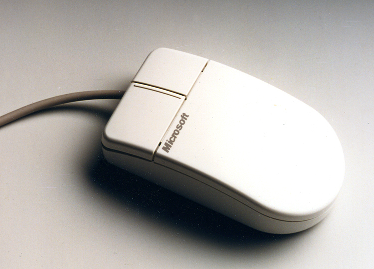

A hand-friendly, precisely controlled mouse
Ergonomic mouse design for better control and performance.
In 1987, the three companies that would later form IDEO worked together with Microsoft to create the world’s first ergonomically designed mouse. IDEO’s human factors research suggested a small but significant change: Moving the location of the mouse ball forward, from under the palm to under the fingertips, enabled more precise control and resulted in measurable performance differences compared with earlier models.
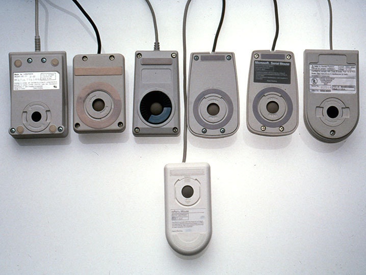
The industrial design effort examined and tested dozens of shapes in comfort and aesthetic studies that led to the famous “Dove Bar” form, a significant advance over the boxy mouses prevalent at the time. The resulting clean appearance, enhanced control, and improved reliability created enormous consumer appeal that replaced all earlier versions, and Microsoft sold more than 2 million units in its first two years.
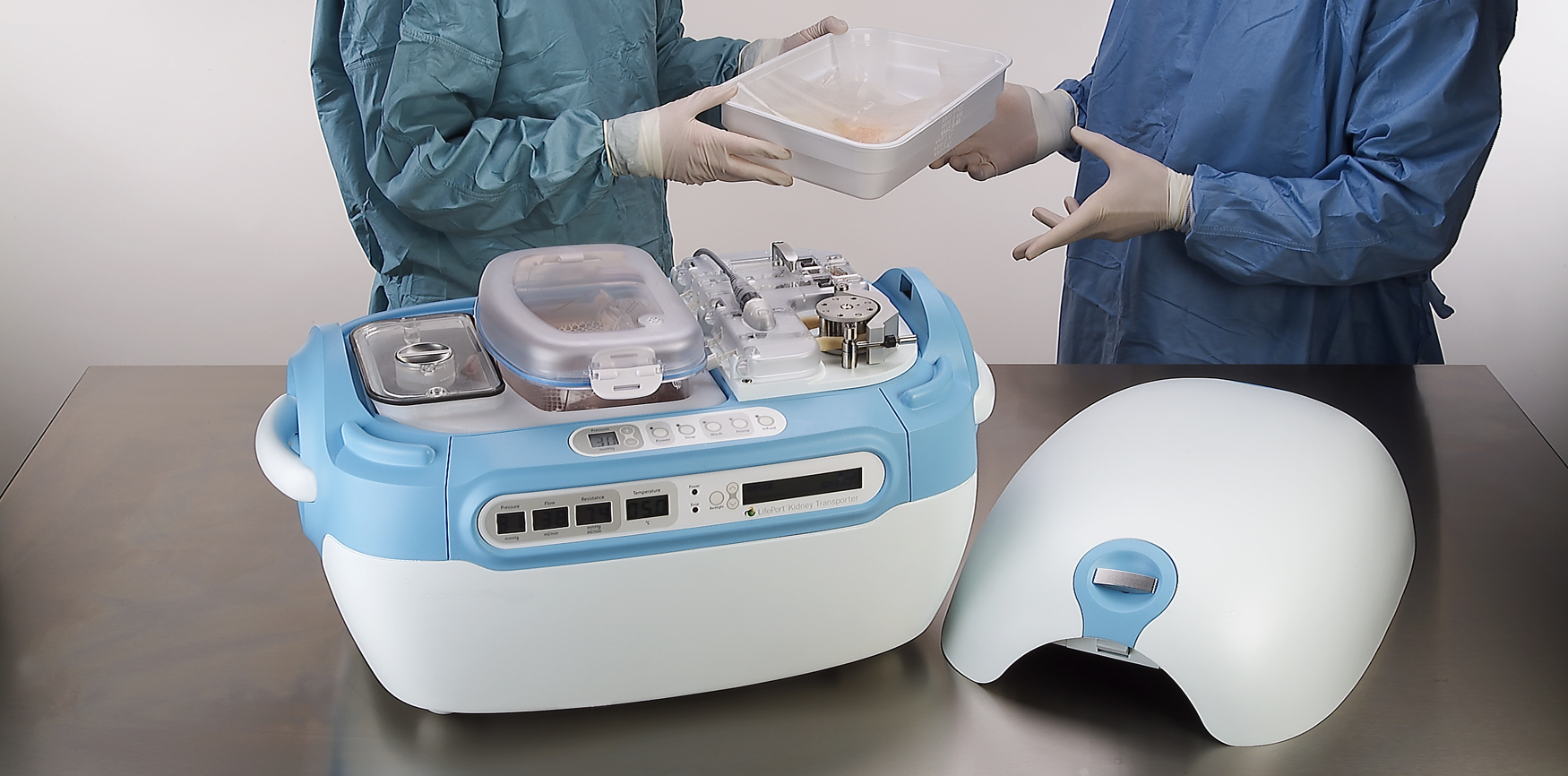
A high-tech kidney delivery system
A new standard in organ transport systems delivers kidneys in improved condition.
With approximately 55,000 Americans waiting to receive kidneys and a list that could double in the next 10 years, there is an acute and urgent need for new technology to increase the quality and number of organs available for transplant. Using the conventional method of organ storage and transportation—a cooler filled with ice—doctors and nurses needed to accompany the organ to ensure proper handling.
IDEO and Organ Recovery Systems created the LifePort Kidney Transporter to provide a new high-tech alternative. The LifePort gently perfuses, or pumps, the kidney with a cold liquid solution to improve its condition before transplantation, which can nearly double storage time and may increase the number of usable kidneys and improve patient outcomes. The device also provides critical data to monitor and evaluate kidneys during transport.
Organ Recovery Systems believes that perfusion has the potential to remove tens of thousands of patients from the waiting list and dialysis, and save the healthcare system more than $1 billion annually. In 2006, the LifePort Kidney Transporter was used to transport 350 kidneys per month in 12 countries, and was included in the permanent architecture and design collection at the Museum of Modern Art in New York City.
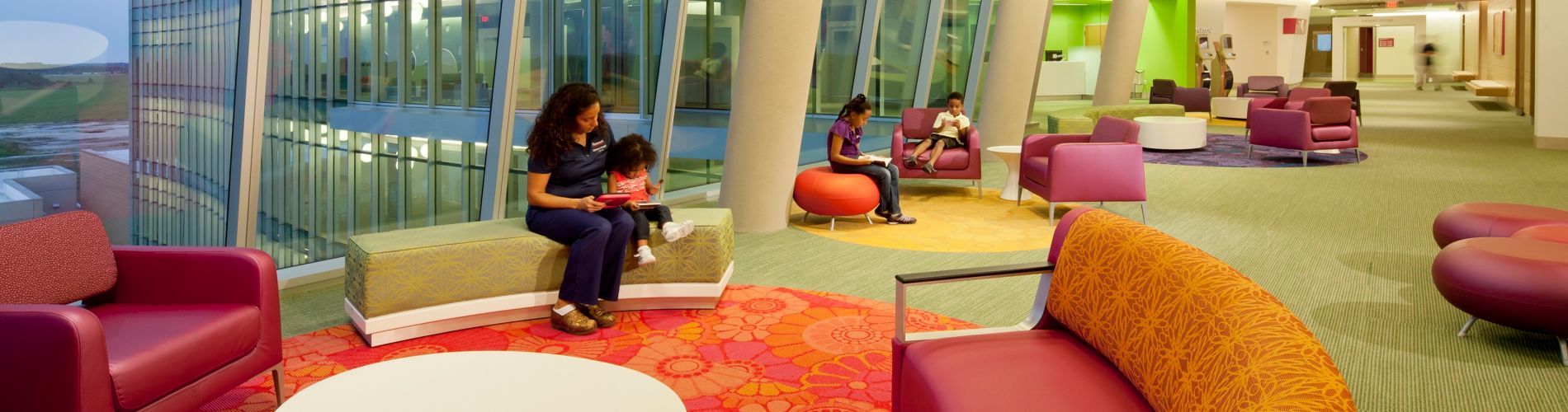
A hospital centered on the patient experience
Designing a pediatric hospital for children and parents.
Pediatric healthcare system Nemours provides primary, hospital, and clinic-based specialty care, prevention and health information services, and medical education programs in Delaware, Florida, New Jersey, and Pennsylvania. When Nemours wanted to strengthen its brand, it faced two challenges: Empowered patients had more access to information and choice than ever before, and new players—alternative-care centers, retail-based care clinics, and urgent-care centers—were entering the marketplace, diverting market share.
Nemours approached IDEO for help in creating an innovative, differentiated, and patient-centric experience for a new hospital in Orlando, with the goal of establishing Nemours as a destination care provider and industry leader. Together, they identified and clarified both family needs and key experience touchpoints in the patient journey, resulting in the state-of-the-art-designed, 60-acre, $400 million Nemours Children’s Hospital in Lake Nona Medical City, Florida. “The design team’s approach to defining key moments in the patient journey was highly instructive,” said Dr. David Milov, chief of clinical informatics at Nemours. “They captured insights otherwise unavailable to us.”
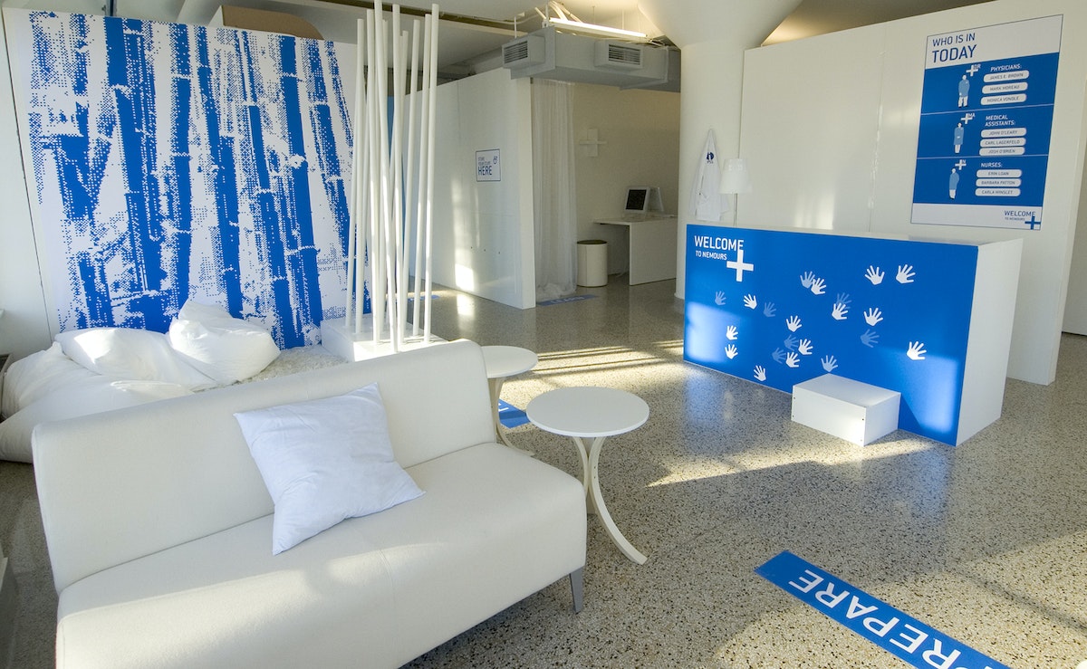
Concepts that were realized in the hospital’s final design include:
- Care Team Room ID: Patients and families are introduced to each member of their care team to ensure continuity of care.
- Floor Greeters: Concierge-like greeters welcome and orient families and answer questions.
- Family Lounges: Private dining rooms have kitchenettes, so families can cook and eat together.
- Emergency Department: Patients are greeted, sorted by medical condition, and immediately checked into rooms.
- Patient Information Screens: Doctors and nurses can access patient information prior to entering an exam room to enable informed conversations and build trust.
- Smart Bracelets: Personalized RFID-enabled bracelets keep track of the care team.
- Smart Rooms: Triggered by the Smart Bracelet, Smart Rooms “welcome” the patient upon entry.
To arrive at these designs, IDEO sought inspiration via analogous kid-friendly environments, such as museums, schools, toy stores, and zoos. Designers also conducted in-context interviews with patients, parents, families, doctors, nurses, support staff, and outside physicians. One key insight that led to the final design: Patients and families came to Nemours with varied levels of experience—first-timers, occasional visitors, and those who were chronically ill—but the hospital treated them all the same.
To address these needs, the team created an experience blueprint focused on welcoming, guiding, and supporting patients and families through unique environments, integrated service moments, and market-differentiating spaces and tools. To test the look, feel, and value of the designs, designers built full-scale foam core prototypes of welcome stations, waiting lounges, and exam rooms.
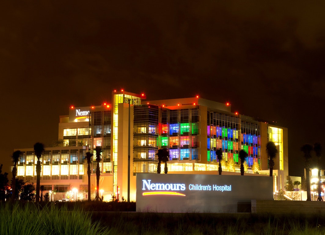
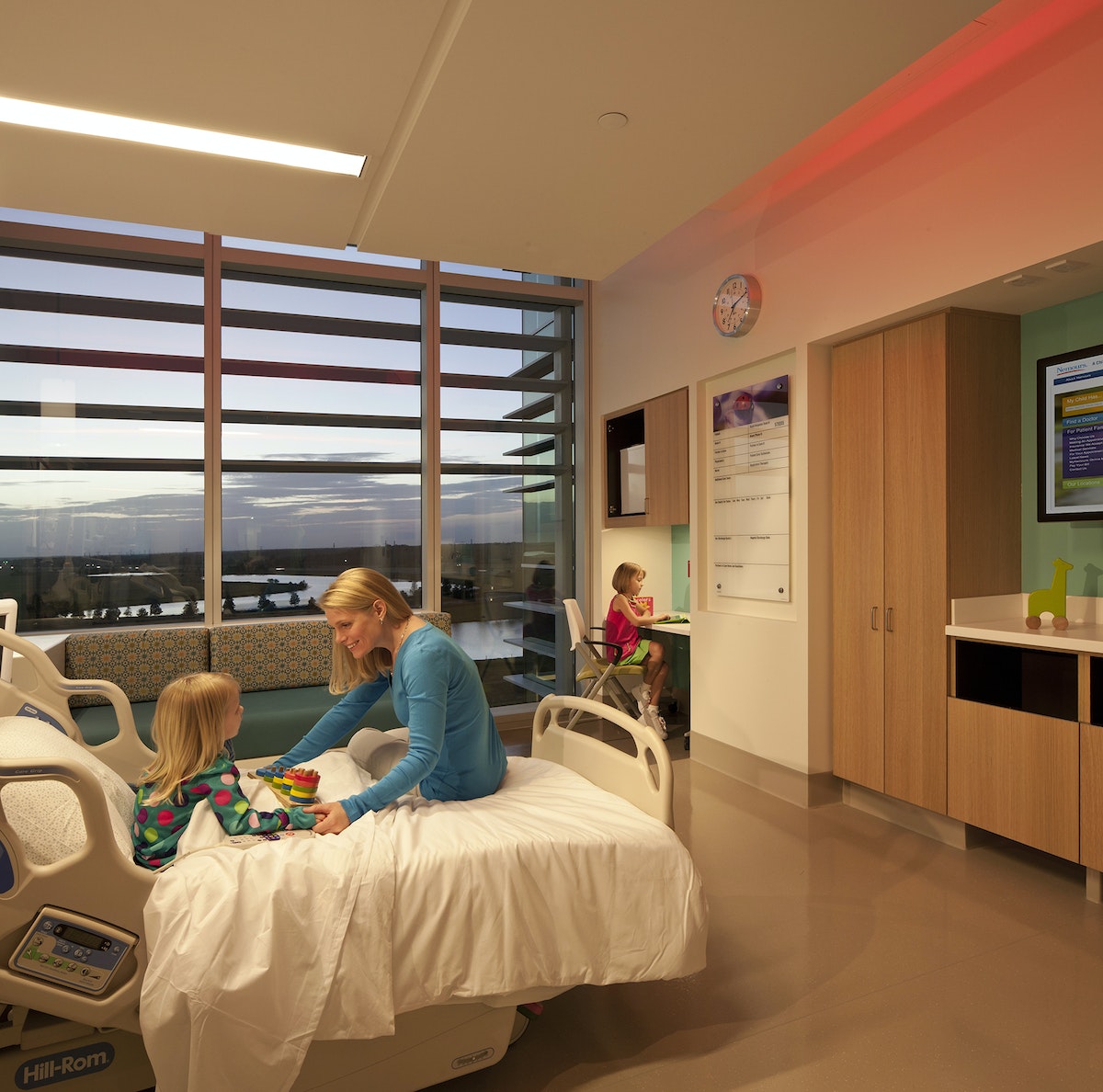
The results appeal to patients, families, and caregivers. According to Dr. Lane Donnelly, Nemours chief medical officer, “all the amenities at Nemours focus not only on the child but their parents and families as well.”
The hospital won two awards at the International Interior Design Association’s 2013 Best of the Best Gala (Georgia Chapter), one for the Healthcare Design category and one for best overall out of all 11 categories. Parenting.com writer Shawn Bean noted, “Set amidst a wooded expanse of central Florida, with theme park roller coasters peppering the horizon, Nemours Children’s Hospital is arguably the new high water mark for pediatric care in the United States.”
A global design movement led by children
A contest that teaches design-thinking skills to millions of kids across the globe.
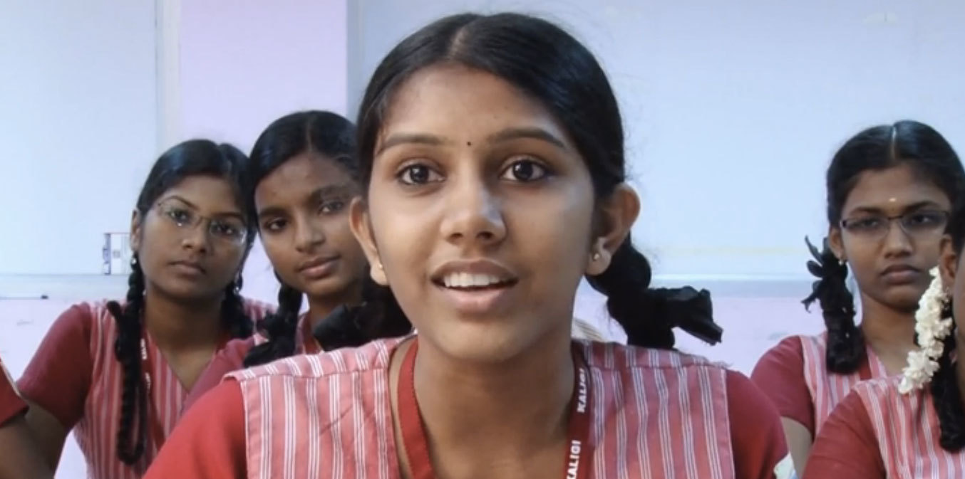
Designer turned educator Kiran Bir Sethi wanted to blur the boundaries between school and life to help young students become aware, enabled, and empowered to effect change in the world. In aiming to spread her message to millions of children across India , Sethi tapped IDEO and the d.school at Stanford to help create a design contest for youth that would show them that they could make a difference in their community.
Together with the d.school, IDEO designed a competition for middle school students called the Design for Change Contest. Adapting the human-centered design approach into a simple process that 10- to 13-year-old kids could follow on their own, the contest included rules, tools, and platforms that would be accessible to children and teachers throughout India regardless of their previous exposure to design.
The team shaped the rules so that students could learn core design-thinking skills such as empathy, brainstorming, collaboration, and reflection through the process of participating in the contest. And together, the group developed a toolkit to walk students through the simple four-step process.
The biggest challenges to the contest were overcoming the lack of infrastructure, language barriers, and a discrepancy in school resources. There was no national database of schools for easy outreach, so Riverside built relationships with NGOs across India to distribute the contest toolkit to more than 30,000 schools.
The contest receives about 2,000 entries from groups of youth in India each year. They have been addressing challenges such as illiteracy, pollution, traffic safety, care for the elderly, alcoholism, and the environment.
As of 2015, the Design for Change Contest has scaled far beyond India, and is being run in 30-plus countries, with millions of children participating. Each contest entry shows that kids really can make a big difference in the world.
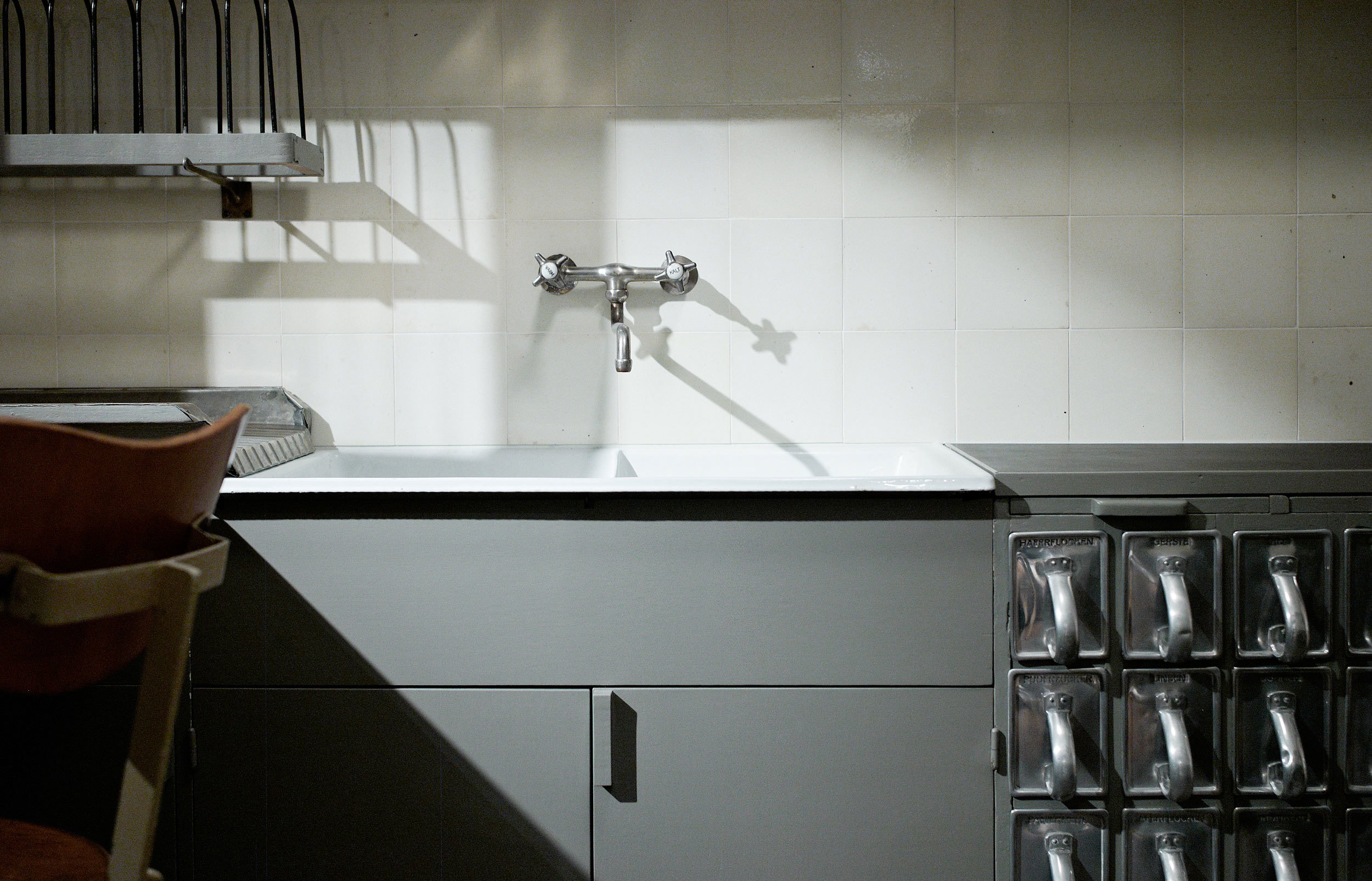
The Kitchen Designer Who Helped Women Get Out of the Kitchen
Ever heard of Margarete Schütte-Lihotzky? Her Frankfurt Kitchen changed women's work
Designers often have the biggest impact when they reimagine the relationship we have with everyday utilities, like those in the kitchen. Decisions as straightforward as the height of a stool can change the fabric of everyday life.
One great example is Austrian designer Margarete Schütte-Lihotzky, the woman who arguably had more impact on modern kitchen design than anyone in history. In celebration of International Women's Day and as an homage to my own grandmother, I wanted to tell her story.
The “fitted” kitchen
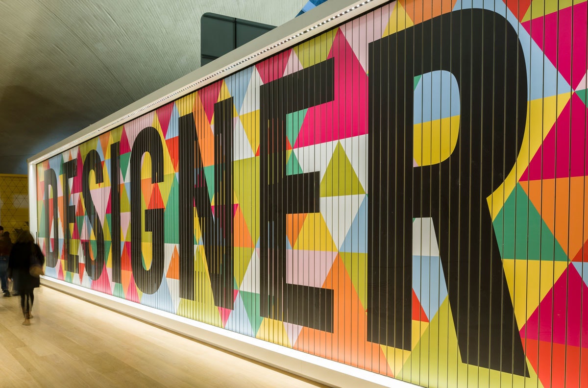
I discovered Schütte-Lihotzky on a recent visit to The Design Museum London, when I went to see the “Designer Maker User” exhibit. I'd never heard of her before, but she is credited with creating the first modern, efficient, "fitted" kitchen in 1926. A "fitted" space means that units are attached to a wall rather than free-floating. It was the first time someone thought to design for cooks instead of home builders.
Schütte-Lihotzky worked in the Municipal Building Department in Vienna, which controlled all aspects of housing, but as a newly-graduated architect, she had little experience with cooking. Instead of letting that naiveté hold her back, she embraced her beginner’s mindset and embarked on an early form of design research, interviewing and observing women in their homes and using film to conduct time-motion studies.
She found that women were spending their entire day preparing, cooking, and cleaning. This endurance activity started with trips to the local store, as fridges and storage units were not the norm and food would spoil within a day or so.
To add to the challenge, the stove, sink, and pantry were installed without any consideration for food prep workflow or the relationship between tasks, and work surfaces were installed at varying heights, putting strain on women’s bodies.
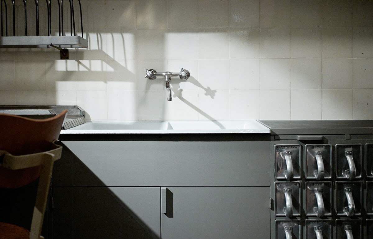
From her interactions with everyday cooks and the application of factory-line principles popularized by Henry Ford, Schütte-Lihotzky introduced her replicable, affordable, space-saving, and egalitarian “Frankfurt Kitchen,” named after the New Frankfurt initiative to address the city's shortage of public housing in the 1920s.
Each kitchen came with a swivel stool, a gas stove, built-in storage, a garbage drawer, and an ironing board. Schütte-Lihotzky used resilient materials like oak to repel critters from getting into perishables and installed aluminum storage bins for staples like sugar and flour. The main objective was to free up hours each day for women to devote to other pursuits.
Within a few years, 10,000 of Schütte-Lihotzky’s units were installed in apartment buildings across Frankfurt, and her design became the model for all subsequent Western kitchens. Her work reframed women’s relationship with cooking and set in motion a radical wave of change.
My grandmother, Ruth Kandel, who was born in Frankfurt just as Schütte-Lihotzky's work started getting acclaim, would often tell me about her upbringing—that her purpose in life was defined by “Kirche, Küche, Kinder” (church, kitchen, children.)
While she loved her husband and children dearly, she also dreamed of becoming a lawyer or a social worker and contributing to the world beyond her kitchen. I feel extremely blessed to have had women like Schütte-Lihotzky blaze the trail through design, freeing up my time so that I’m able to embody my grandmother’s desire to go forth and create.

Can the design of today’s food liberate us further?
Now that I’m at IDEO, I have the opportunity to carry Schütte-Lihotzky’s work forward. We partnered with IKEA to think about the future kitchen—how we might design it to be more efficient and use less energy while making it easier for home cooks to feel confident about preparing healthy food.
We also worked with a startup called INFARM to design modular, stackable units that use far less soil, water, and space to grow food at an optimal light and temperature. Because of the compact size of the units, you could install one in your own home kitchen, or stack them up to feed thousands of employees a day during winter months when produce typically has to be shipped in from far away. Good for cooks and good for the planet.
People used to say that a woman’s place was in the kitchen. Today, thanks to pioneers like Schütte-Lihotzky, a woman’s place is anywhere she wants to work.
As a designer who loves to cook, I’m intrigued by the way kitchen design has enabled me—and generations of women who came before me—to spend less time preparing and more time enjoying the food we make, so we can move on to other things.
How We Turned an Old Gas Station into a Community Hot Spot
Great design doesn't just happen in big cities
Small cities provide the character that comes from not having the world’s largest corporations on their hips. Communities are close-knit and form at a slower, more intimate pace. And cultural spaces in those locales are stronger for being able to bring people from diverse backgrounds together to have a dialogue that goes beyond a town hall meeting.
Designing a design community
After graduating from Florida State University and working professionally in Tallahassee, I started to realize that there were a lot of talented folks who were brought up in the community only to eventually light out for a larger zip code—taking their skills and passion with them. At the same time, I saw the community starting to rally around Domi Station, its growing co-working space and tech incubator,.
Wanting to pull those threads together, I quit my job at the large ad agency where I worked to form a creative collective called Foremost, which does international design work and supports local startups and events to help grow Tallahassee’s design community.
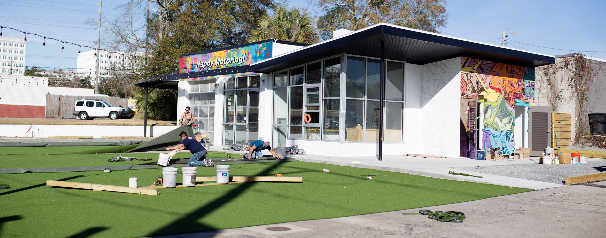
Today, when I’m not busy with my day job designing emerging technology at IDEO’s CoLab, I volunteer with Foremost. Our latest project, led locally by my business partners Jake Kiker, Lucas Lindsey, and Micah Widen, is a physical space created for the local community. We call it Happy Motoring.
Finding our station
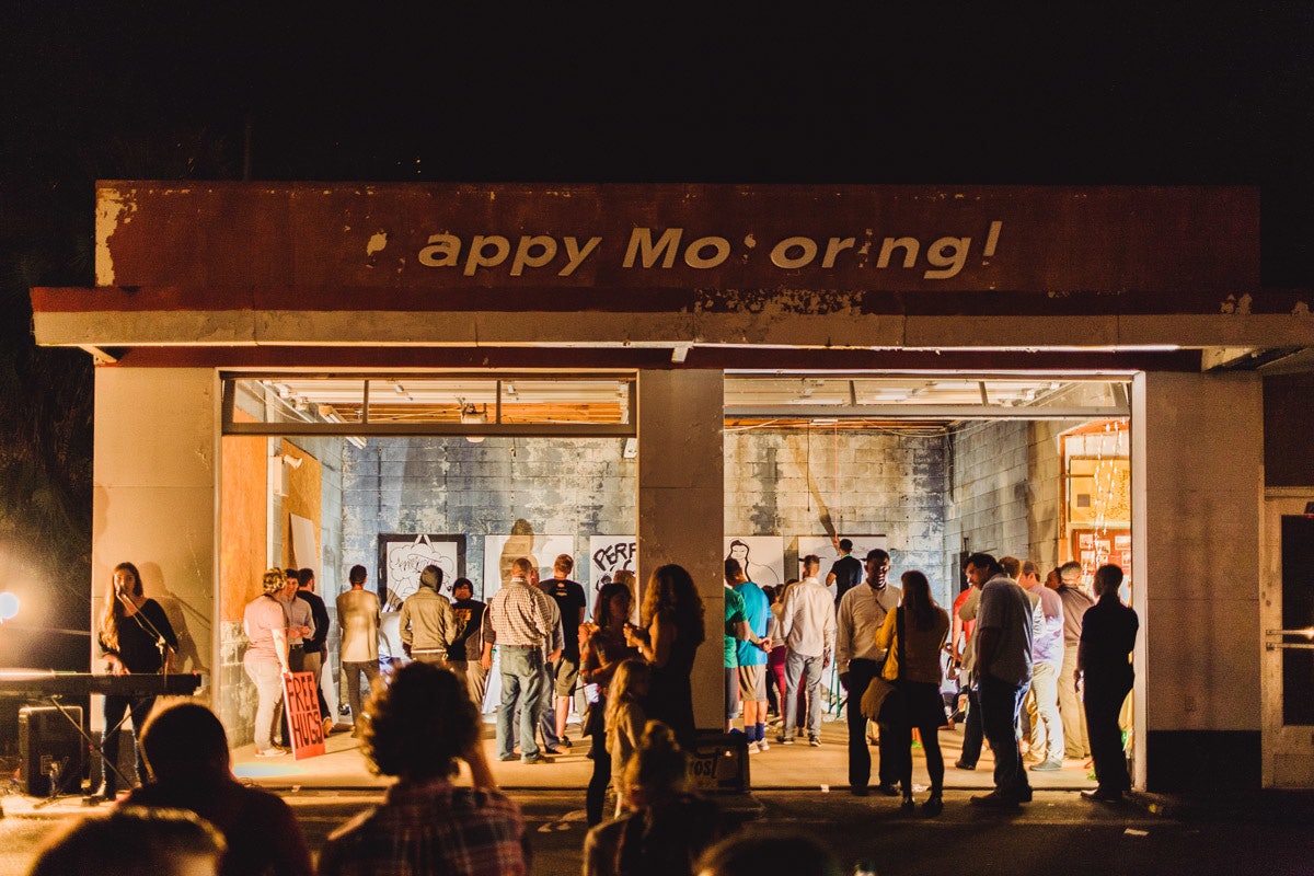
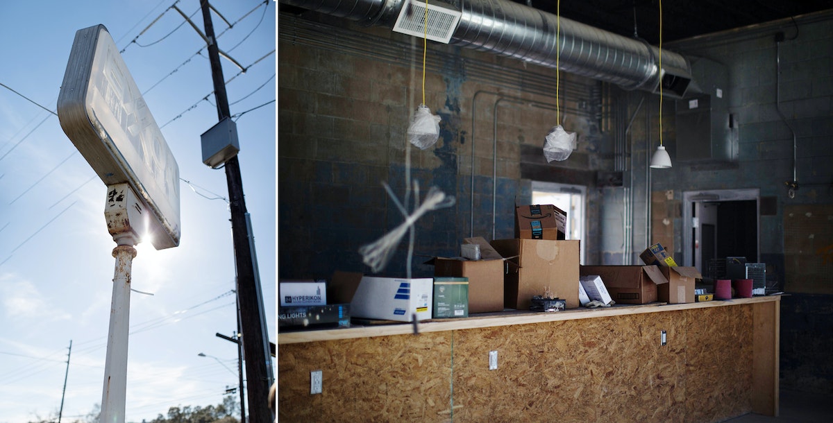
It all started with an abandoned Esso gas station on the Southside of Tallahassee. I was ecstatic when Foremost bought it in 2015 to create a community space. The mid-century design of the building was (and is) beautiful, something to be preserved, and we knew that creating something locals would get excited about meant bringing them in as co-creators.
So we organized an event where Southside inhabitants could tell us what they wanted, inviting our friends at Street Art Tallahassee to put together a pop-up gallery and Juniors Roasted Coffee to host a campfire that would bring people together.
A shared vision
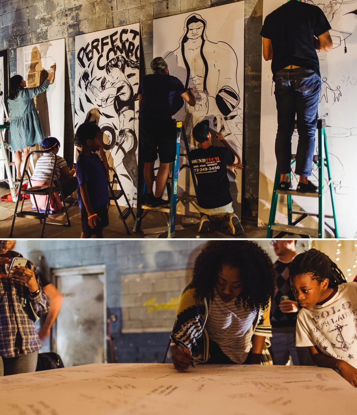
Part of what I wanted to do in creating Foremost was to show the city how many talented creatives live here. So, for the community event, I rallied five of the best young artists I knew in the illustration scene to battle it out in a Battle of the Boards (based on Ink Wars, an awesome event series put on every year in Georgia at Creative South.) The illustrators were each given an inspirational word and an hour and a half to fill an eight-foot board. The theme was "knockout."
We reserved two of the boards for the Southside community to write down their ideas—big, small, impossible, and plausible—about what the space might become.
Video by Conner Hill.
Building community comes from listening to diverse voices. Too often, we divide ourselves into bite-size neighborhoods or groups that lack a space for hearing each other out. We hope Happy Motoring will become that space—by giving everyone a chance to contribute, we’ll have all of the pieces we need to start building something local and real.
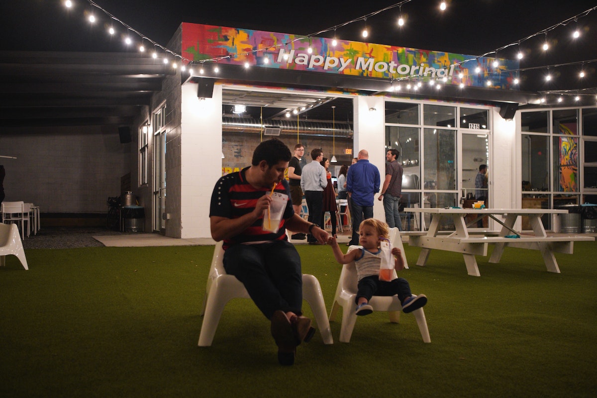
Want to do the same in your hood? It might be easier than you think. Organizations like the Knight Foundation fund grassroots urban innovation in cities. You can start small—create a meetup group, find someone with an empty lot and start a weekend market, or invite some food trucks and organize pop up events. Plant a community garden. Hold group bike rides. Whatever feels right to gain trust and start a dialogue in your hometown.
And if you’re interested in joining the next event in Tallahassee, be sure to follow our updates and join us for Happy Motoring Station’s official launch on March 8, 2018!
When you hear about “design hubs,” your mind may not instantly jump to Tallahassee. But small communities have just as much passion for design as larger metropolises—they just lack the resources to attract the same attention. Though I live in a big city now (Boston), I learned a lot about the importance of community from working and growing up in small towns in Florida.
A Cartography Nerd's Guide to Custom Map-Making
How to one designer used public data to create an interactive map of San Francisco tennis courts
Sure the game is fun (although neither of us is very good), but what interested us more were the distributed locations of the courts around the city. Spread out across the city like sprinkles on a hipster cupcake, these tennis courts would be a great new way to explore San Francisco. And it would keep us busy for at least the next couple of years of Saturdays.
There was only one problem. I couldn’t find a decent tennis map of San Francisco. I wanted a map that was useful, of course, but also one that was well designed. So I decided to make one myself and give it to my wife as a birthday gift, with the goal of making it attractive enough that she would agree to hang it on our wall, but also useful enough that we would actually make it a centerpiece of our new Saturday hobby. And lastly, I wanted to visualize the MUNI bus routes to each court (since—oddly—riding the bus is another avocation that my wife enjoys).
My starting point was the only map I could find—a fantastically unattractive google map that shows the tennis courts of San Francisco in 2003 graphic design glory.
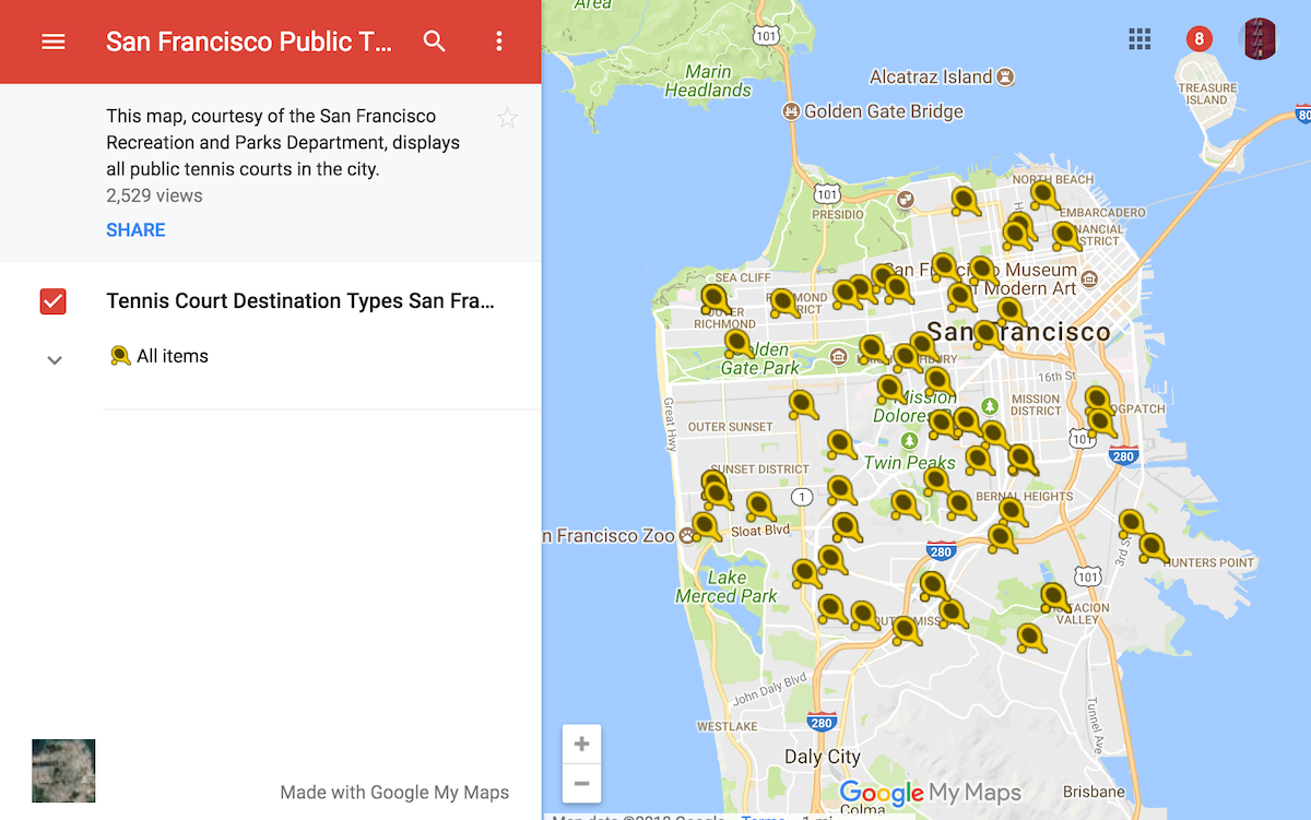
A tennis map of San Francisco in all its 2003 graphic design glory.
But this was a start! I downloaded it as a KML file. What’s a KML file? It stands for “Keyhole Markup Language” (I have no idea what this means), but what it does is important. With a KML file of the tennis courts, I could manipulate the data file in ArcGIS or QGIS, two enormously powerful pieces of cartography software. For anyone looking to get into amateur cartography, I strongly recommend GQIS. It works on a Mac (which ArcGIS doesn’t) and its cost (zero dollars!) outweighs its bugginess.
My next stop was DataSF.org, which has lots of great open source data, including maps of the city. What I was looking for here was something called a Shapefile, a geospatial data format that nerdy geographers use. I found one corresponding to San Francisco neighborhoods and another for San Francisco parks. Lastly, I found one for the MUNI bus routes of San Francisco.
Next it was off to QGIS to combine my various datasets into a single map.
First there were neighborhoods, then tennis courts, then parks, then bus lines.
With a couple of tweaks, I was able to label the tennis courts and isolate the MUNI bus lines according to route number, so that it looked less like a giant red spider web.
There are many a professional cartographer out there who would have kept playing in QGIS to make their map a bit prettier. But I’m a designer, and the sooner I’m able to get out out of QGIS and into the Adobe Creative Suite, the happier I feel (and the higher likelihood that the final design of the map will be something that someone is willing to hang on a wall). Luckily, QGIS has an option to export a file as an SVG file (a vector format that can be opened by Illustrator).
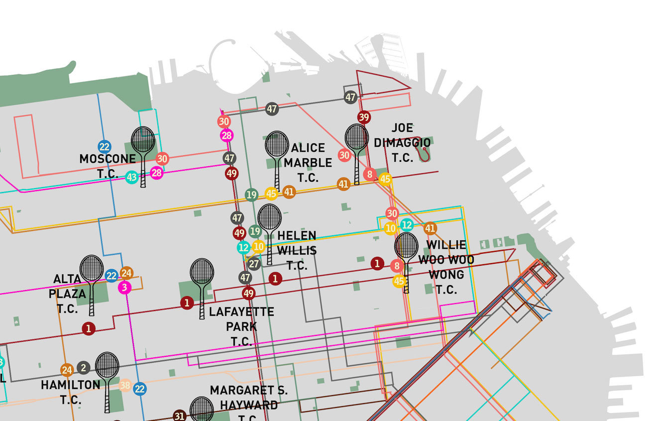
Post-export, the file looked like this.
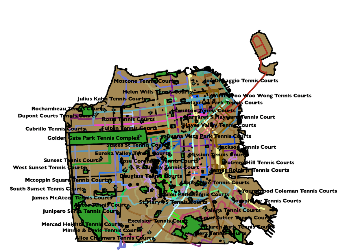
You wouldn't hang this baby on the wall?
Wait, what? Why does it look worse? Totally natural and easily fixable. I isolated each layer (parks, tennis courts, MUNI Lines, neighborhoods) and then got to work playing around with colors and stroke weight and other good stuff, all of it so much easier because I was working with a piece of software most designers are familiar with.
At some point during this process, my day job at IDEO led me to Amsterdam. While there, I was inspired by the fantastically-designed Dutch train maps and a pro tip from my graphic designer colleague (Anthony Stimola) that the Dutch font of choice is DIN. Back in front of my computer, I created a look and feel for the map inspired by my travels.
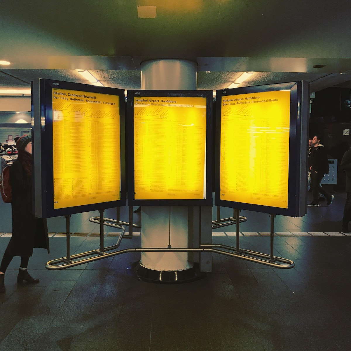
A trip to Amsterdam inspired the look and feel for the finished map.
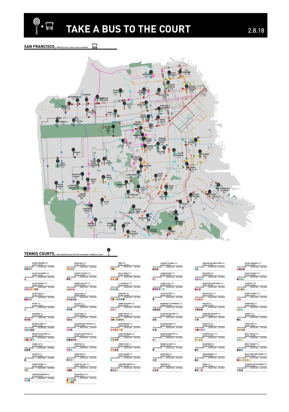
Next up was the laborious process of determining which bus lines one could actually take to each tennis court. My approach was 100% analog, starting from the top of the alphabetical list of tennis courts (Alamo Square) and marching straight through to the end (Youngblood Coleman), noting all of the bus lines that had a stop within reasonable walking distance to a court. I discovered that Helen Wills court in North Beach takes the prize as most MUNI-accessible tennis court (it's served by nine bus lines!), while five tennis courts around the city are served only by a single bus line.
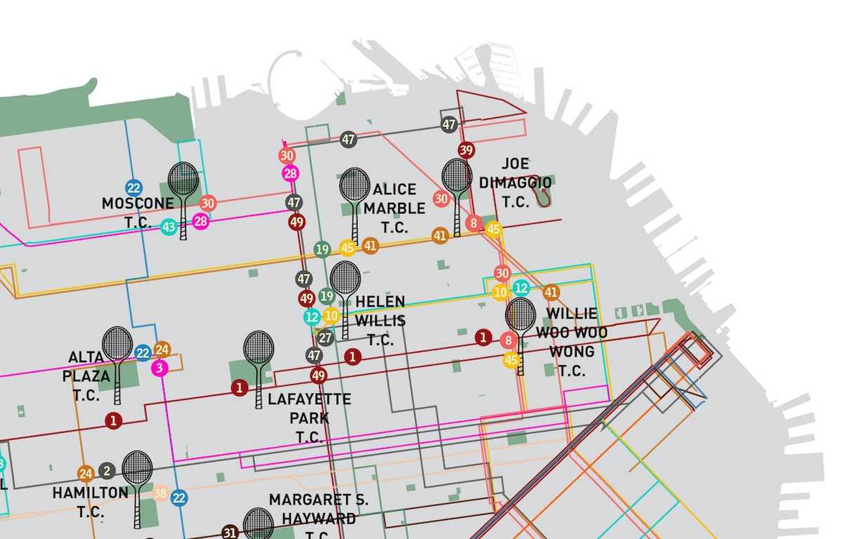
The painstaking work of manually matching tennis courts to nearby bus lines.
Lastly, I considered how this map would be used. Of course I was hoping that my wife (and others) would find it attractive enough to hang on a wall in full analog glory. But this is 2018, and in order to be useful, the map also needed some connection back to the digital world. I added GPS coordinates and a clickable URL link to a Google Maps location for each tennis court.

A detailed view of the court's location and the corresponding bus routes
That’s it! My wife was happy with her birthday gift, and agreed to hang it on our wall. This past weekend, we used our new map to find the McCoppin Square court in the Sunset neighborhood. A few minutes after we started playing, two women arrived. Unfortunately, they would need to wait until our 30 minute time limit had elapsed. Eager to play, they asked us if we knew of any other tennis courts in the area. In fact, we did. I texted her a PDF of my new map and off they went to a nearby court. Hooray for the power of a good map!
My wife and I are city people, and our only family car is a Vespa that is much too slow to cross any bridges. So most weekends, if it’s nice out, we’ll chart an urban hike through San Francisco, targeting a different neighborhood and a different park. This has kept us occupied for the last few years. But they don’t call it the 7x7 for nothing—San Francisco is actually a small city. So my wife and I have started to play tennis.
A Day in the Life of a Graphic Designer
Follow an IDEO designer through a day of research, prototyping, and inspiration
7:10 AM: A Reluctant Jog
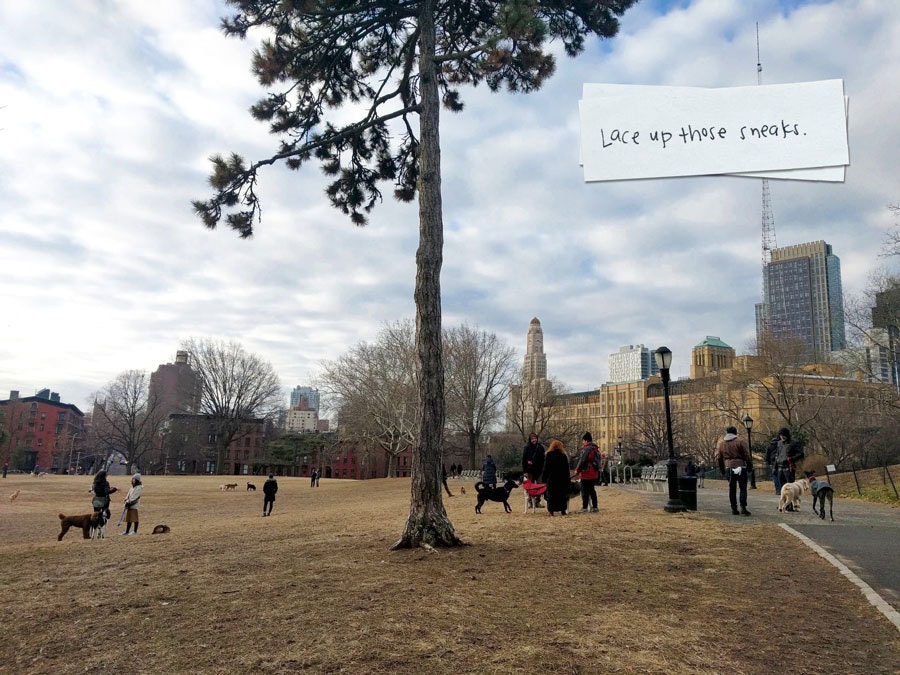
I run to Fort Greene Park, where I’m rewarded with a Seurat-like tableau of what seems like all the dogs in Brooklyn. I’m not a jogger, but I’m doing a six-week food-and-fitness challenge with coworkers. I'm grateful for the peer pressure, because it may be the only thing keeping me going.
7:45 AM: A Bristling Problem
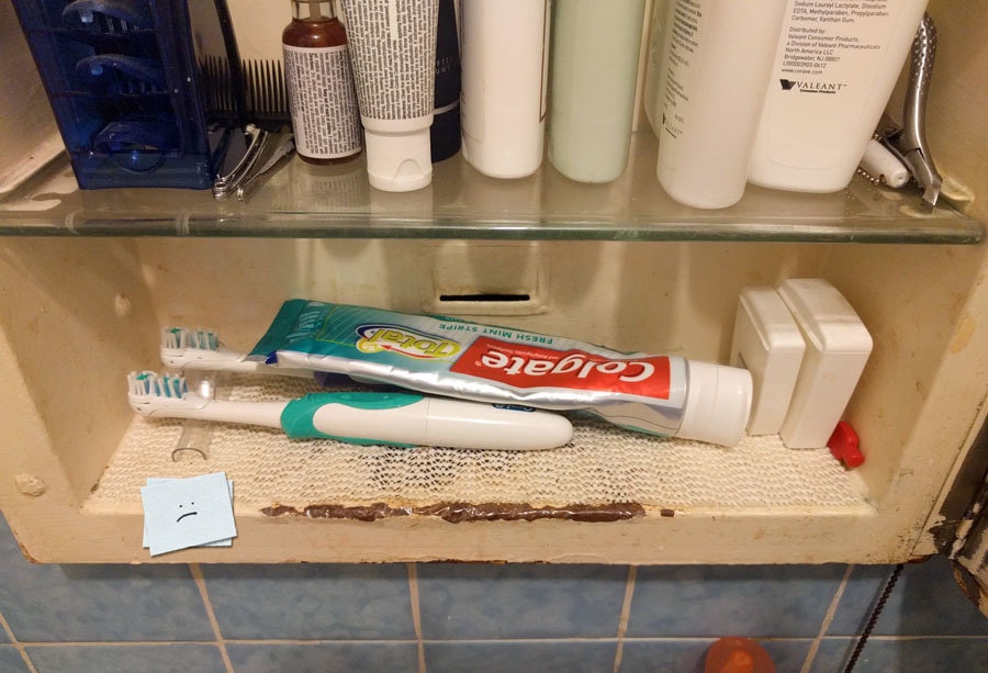
As I brush my teeth and stare into my rusty medicine cabinet, I decide it’s time do something about the crowding in there. Since the space is so small, I probably can’t find an off-the-shelf fix, but maybe I can come up with a bespoke solution.
8:35 AM: Swift Passage
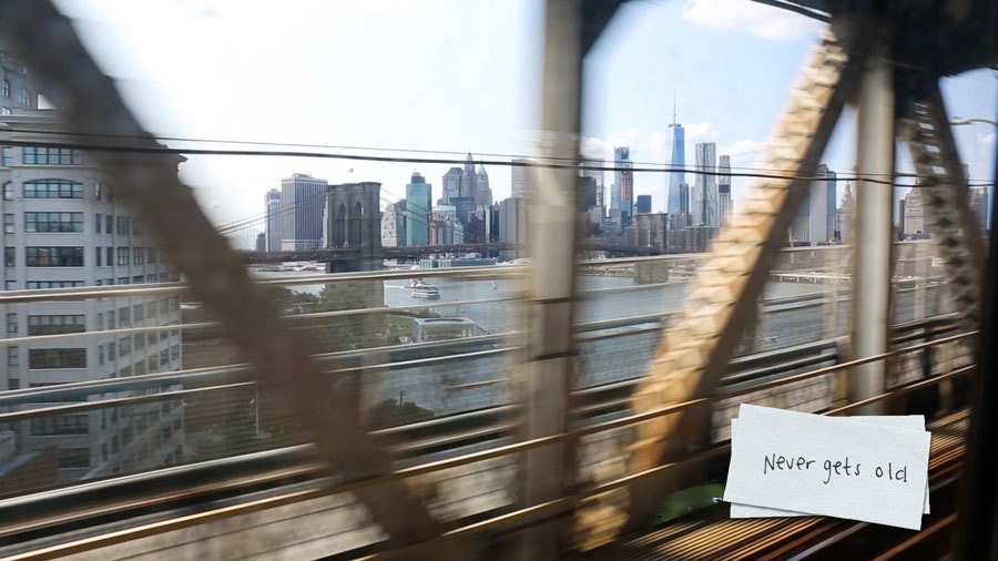
This sweeping view across the East River and the Manhattan skyline is my favorite part of the morning commute. It reminds me of the hope and excitement I felt when I first moved here 12 years ago. On the way, I steal some winter fashion ideas from my fellow commuters, noodle through a crossword on my phone, and listen to a podcast about the perils of multitasking.
9:10 AM: I Loaf This Place
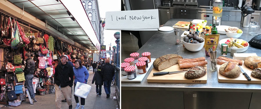
IDEO New York sits on an invigorating corner of the city where tourists, tchotchkes, and street food collide with colorful chaos. Upstairs in the studio, the best part of the week awaits: A selection of delicious, crusty bread and a variety of spreads. It’s Loaf Day! Bonus: Someone has scrawled on the kitchen chalkboard: “Might as well face it, you’re addicted to loaf.”
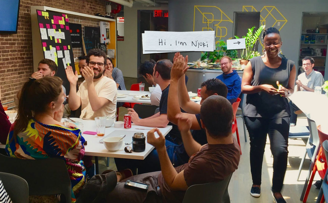
10:00 AM: Team Standup
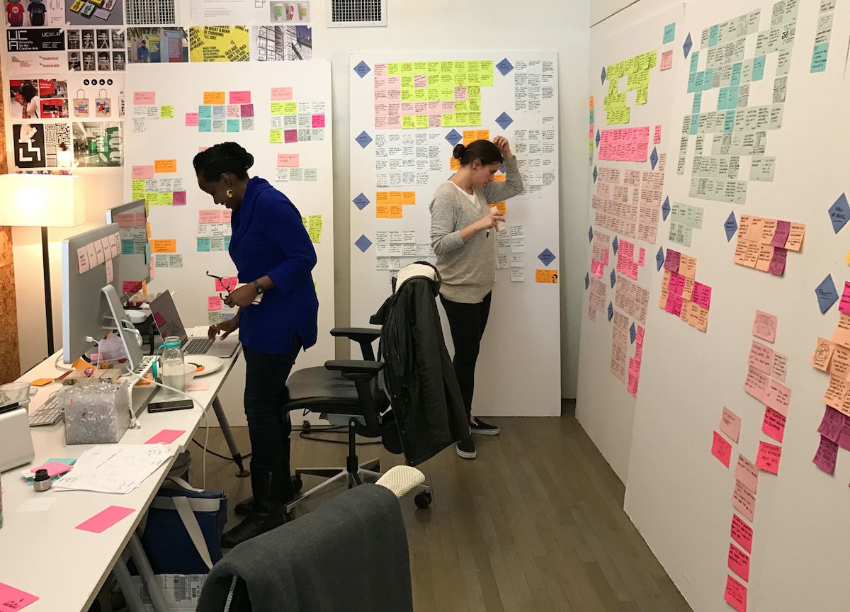
Our project is about investigating how cities and workplaces can support human potential and resilience. Today we’ve got a lot to do, including hosting some research participants in the afternoon. Deliberately coming together at the start of each day helps our team align and stay on track. In our project space, we take turns sharing our energy level on a scale of 1 to 10 and write a long punch list for the day.
10:30 AM: Download & Synthesis
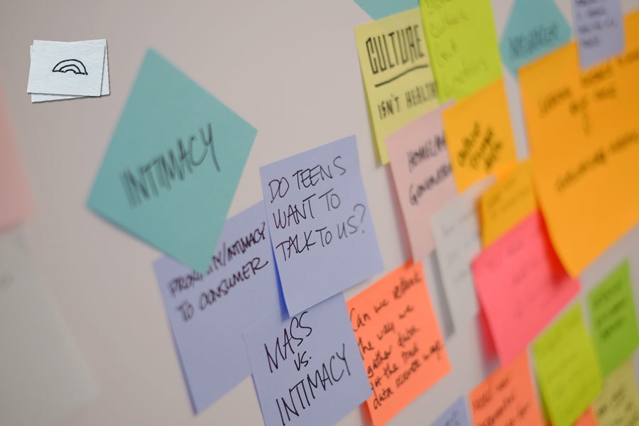
We’ve spent the last few days traveling for research and speaking to lots of people in the field. We transcribe the important things we’ve learned, filling Post-it notes and boards with quotes and observations. We start move things around into clusters, looking for patterns that will lead us to insights. One theme we're seeing is how hiring systems often overlook valuable skills that are hard to quantify, kicking qualified applicants out of the process early. “So much of the hiring process is gaming to get past the system,” reads one quote.
11:30 AM: Scrappy Prototyping
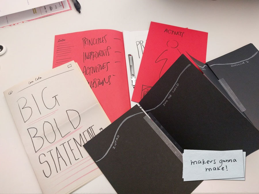
We take a break and head to the office makespace. We think we might want to make something printed, so we grab some construction paper and markers and each create some prototypes. Should we make a gallery walk of posters? A tabloid-size newspaper printed on pulp? Maybe a giant book with an accordion fold!
12:30 PM: Fun With Lasers
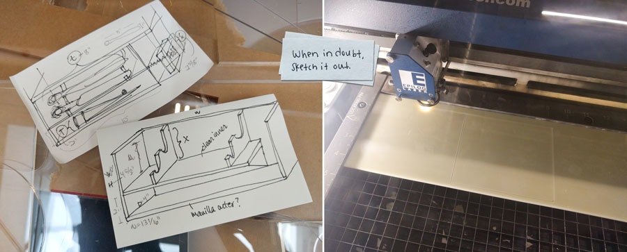
It's lunchtime and I can’t stop thinking about the toothbrush situation. I make some quick sketches of a slot-in shelf that would allow the toothbrushes and toothpaste to sit above the floor of the cabinet, still be easily accessible in the short vertical space, and cover up the unsightly rust. I transfer the specs to Adobe Illustrator, grab some spare acrylic, and fire up the laser cutter. A few minutes and a little glue later, I’ve got a prototype of a tiny shelf that I can take home and try out.
3:00 PM: Learning from Users
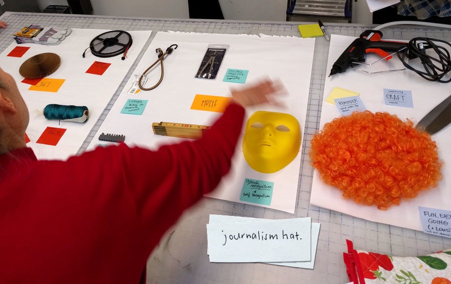
As part of our research, we’ve invited a few people into the studio to share how they think about themselves in relation to their jobs. We take them through a hands-on exercise, asking them to pick objects that represent the key attributes and skills they value in themselves. As they describe their collections, we begin to see a rich picture of their work-life experiences and connections.
4:30 PM: Moodmaking
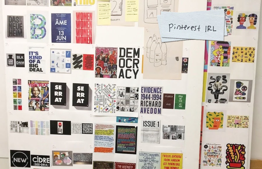
I gather visual inspiration for our deliverable. I troll design sites, look through books, and research brands and designers that have been on my radar recently. As I pin up images, I think about how the various elements of typography, color, photography, illustration, and scale could come together to create a unique look and feel for everything we’ll design for our client and the people they serve.
6:30 PM: A Melodic Exit
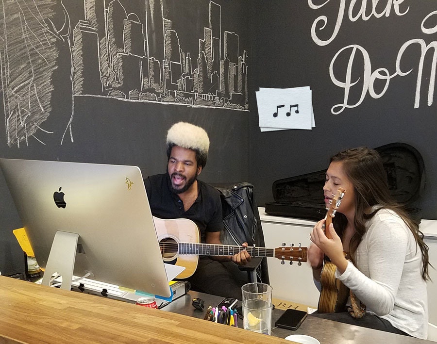
Time to head home. As he often does at the end of the day, Jared, our experience lead and sometime maestro, is slaying with some live guitar and singing. Today he’s accompanied by Kati on ukulele, and together they send us off down the elevator to the strains of "Wild Horses."
7:20 PM: Installation
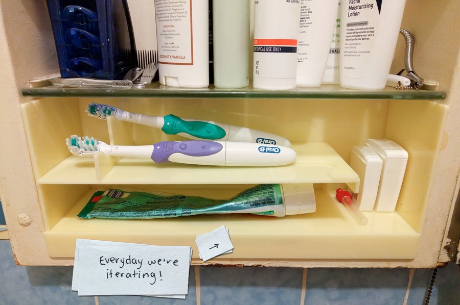
It’s in! The tiny shelf is a big improvement, but in practice it’s still a bit tough to reach the toothbrush in the back. Next iteration needs more simplicity and maybe some better color matching. It’s back to the sketchpad for tomorrow’s prototype.
When people ask me what I do for a living, what I really want to do is just show them. For me, graphic design is about finding the best way to bring ideas to life: posters, film, installation, animation, or even objects. So, a day at IDEO is following ideas wherever they may lead and getting distracted (I mean, inspired) along the way.

Lindsey Turner
I’m passionate about building brands, products, and experiences that help organizations show up with meaning and momentum.
I help organizations cut through complexity by shaping how they show up, through brand strategy, identity, and storytelling.
Working at the intersection of brand and business, I bring an editorial eye and a bias toward making—turning ideas into tangible experiences that people can understand, trust, and believe in.
My work spans government, healthcare, financial services, media, and consumer goods, from launching Gen Z-focused ventures to building innovation labs and reimagining legacy brands. I relish moments of ambiguity and enjoy translating across teams, perspectives, and priorities to move ideas forward.
I started my career in editorial and digital design, shaping cross-platform experiences and identity systems in publishing and agency environments. That foundation still shapes how I work today: I’m detail-oriented, collaborative, and overreliant on the Oxford comma. I hold a BFA in Visual Communication from the School of the Art Institute of Chicago.

Rachel Young
My work helps organizations see who their products aren't working for—and build the will and the tools to do something about it
For 25 years, I've asked the same question: Who does this design exclude—and what are we going to do about it?
My work spans human-centered strategy, inclusive design, and qualitative research, with clients ranging from Microsoft, Google, and Verizon to the National Science Foundation, and San Francisco Unified School District.
Before IDEO, I taught elementary school in East Palo Alto and spent a decade doing design work with social service organizations—where I learned firsthand what it costs people when systems are built without them in mind.
I am currently writing User Error, a nonfiction book about digital access and the design decisions behind it. I live in Oakland, California.

Brian Pelsoh
I lead with craft, ensuring our work is creatively excellent: rooted in deep human insight and imagination, while also grounded in the realities of business and technology.
My expertise spans brand, communication, and product design across tech, education, the arts, and social impact.
I believe great work demands both high-level vision and obsessive attention to detail, and only happens through collaboration.
I bring an inclusive, hands-on approach and a deep understanding of business, which enables me to consistently deliver excellence while always asking why.
Before joining IDEO, I worked at the brand firms Pentagram and VSA Partners. I began my career as a designer, leading teams at the School of the Art Institute of Chicago and the Milwaukee Art Museum. I hold an MFA in graphic design from Maryland Institute College of Art and a BFA in communication design from the Milwaukee Institute of Art & Design, and have taught at some of the best design schools in the US.

Tony Wong
I am responsible for IDEO’s long-term success in China and working with clients to use design as a tool to enable growth.
I am responsible for IDEO’s long-term success in China and working with clients to use design as a tool to enable growth. Specifically, I have helped Chinese companies design holistic brand solutions through the development of their products, communication, services, and innovation teams, and I have helped multinationals expand their presence and influence in China.
I advise global leaders on developing China-led innovation and capabilities.
In over 15 years in IDEO Shanghai, I have worked on projects that use design to elevate the quality of the experience of healthcare products and services, streamline processes that increase productivity, create spaces and programs that promote and enable inclusive communities, and build next generation mobility solutions that are planet-positive.
Before joining IDEO, I worked at Philips Electronics and the Electrolux Group in Italy, the Netherlands, and Singapore on a number of breakthrough commercial products. I am a member of the Young President Organization in Shanghai.

Building a personal AI for the messiness of life: Sida Li
Most AI products today are built for work—a space with clear problems and established systems. One founder noticed a gap: personal life is messier, harder to systematize, and mostly left behind by the AI boom. So she built Cue, a personal AI that lives inside iMessage and group chats, to go where the other tools haven't.
In this episode, Becca Carroll, IDEO's Chief Strategy Officer, talks with Sida Li, co-founder and CEO of Shared Context Lab, about staying anchored to a human need while the technology around her keeps changing shape, why she treats her business model with the same rigor she'd bring to a product, and what it feels like to build a company at this particular, disorienting moment in AI.
The conversation also gets into how Sida makes design decisions: the language Cue uses to describe itself, the tradeoffs behind building inside iMessage instead of a new app, and a real story about a business idea that didn’t pan out.
This is the second in a two-part series profiling founders from IDEO's Startups-in-Residence program. The first conversation is with Johannes Seemann, founder of Sooner, on designing GenAI for the emotional side of money.

Designing GenAI for the emotional side of money: Johannes Seemann
Most personal financial tools are built to run the numbers and optimize towards a budget. While that works for some, most people experience money as a lived relationship that does not neatly fit into a spreadsheet. Johannes Seemann and Becca Carroll discuss why money is emotional before it is mathematical, and what a human-centered approach to building a generative AI financial product looks like in practice.

The curious leader's edge in uncertainty: Scott Shigeoka
Mina Seetharaman talks with Scott Shigeoka, author of Seek and Head of Curiosity Cultivation at the Eames Institute, about what distinguishes genuinely curious leadership from performative curiosity, how power dynamics shape curiosity, and why practicing curiosity can restore energy rather than drain it.

How constraints make us more creative: David Epstein
Mina Seetharaman talks with David Epstein, author of Inside the Box and Range, about why total freedom often produces average work, how leaders can design useful limits on purpose, and what organizations such as General Magic and Pixar reveal about the relationship between boundaries and creativity.
Looks like you might be in search of something very specific?
Or reset the filters above and try another angle.
Here’s some random inspiration

Podcasts about creative leadership

Articles about the power of prototyping
