
.svg)


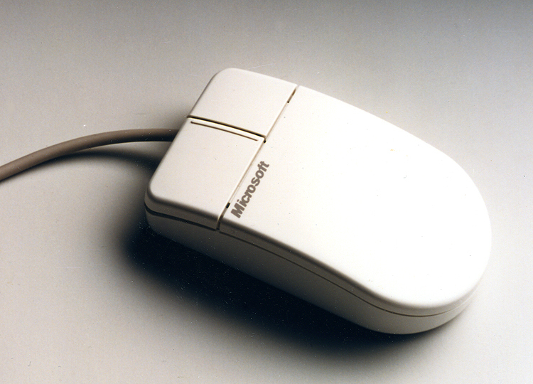

A hand-friendly, precisely controlled mouse
Ergonomic mouse design for better control and performance.
In 1987, the three companies that would later form IDEO worked together with Microsoft to create the world’s first ergonomically designed mouse. IDEO’s human factors research suggested a small but significant change: Moving the location of the mouse ball forward, from under the palm to under the fingertips, enabled more precise control and resulted in measurable performance differences compared with earlier models.
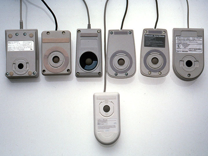
The industrial design effort examined and tested dozens of shapes in comfort and aesthetic studies that led to the famous “Dove Bar” form, a significant advance over the boxy mouses prevalent at the time. The resulting clean appearance, enhanced control, and improved reliability created enormous consumer appeal that replaced all earlier versions, and Microsoft sold more than 2 million units in its first two years.
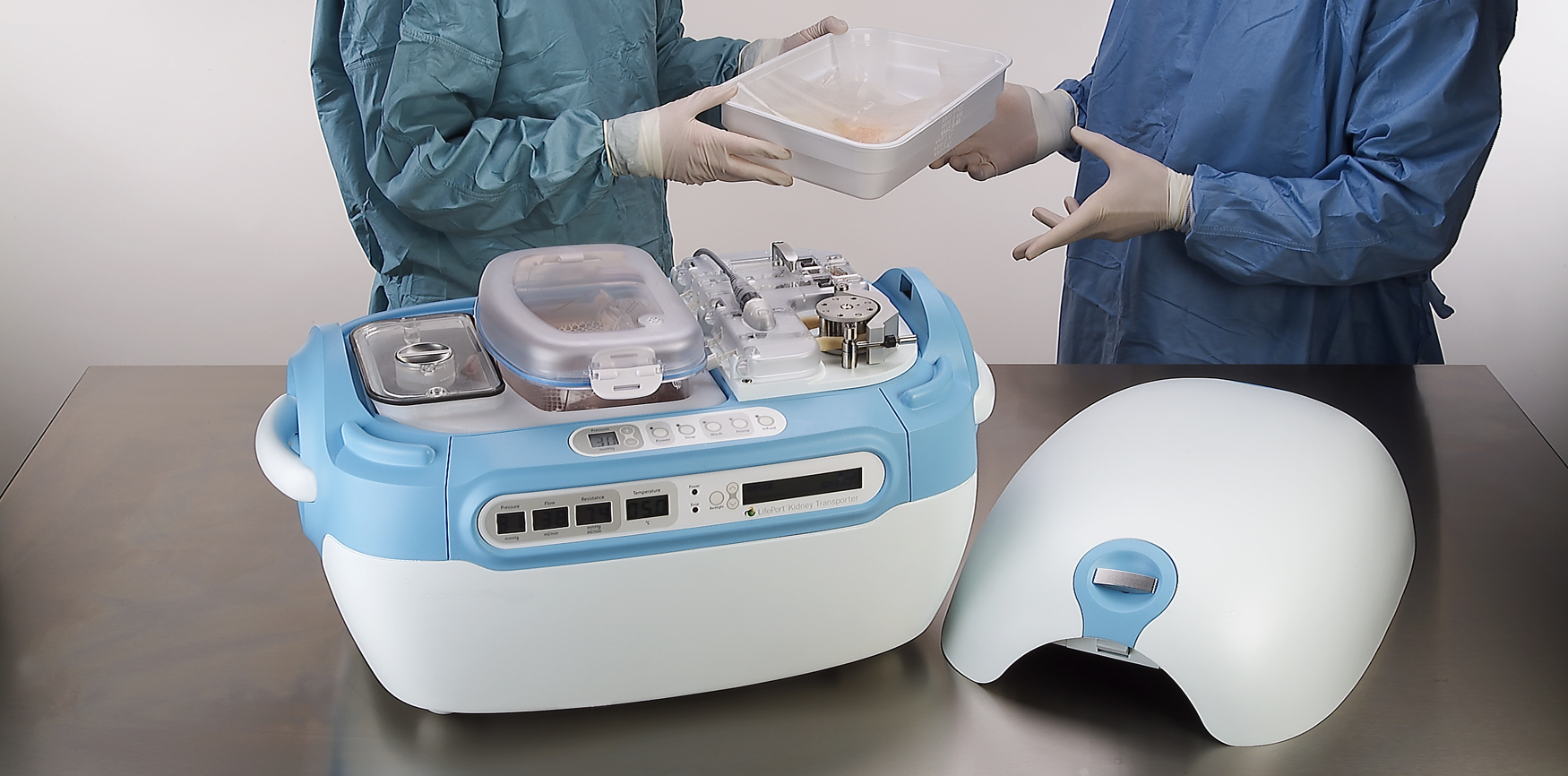
A high-tech kidney delivery system
A new standard in organ transport systems delivers kidneys in improved condition.
With approximately 55,000 Americans waiting to receive kidneys and a list that could double in the next 10 years, there is an acute and urgent need for new technology to increase the quality and number of organs available for transplant. Using the conventional method of organ storage and transportation—a cooler filled with ice—doctors and nurses needed to accompany the organ to ensure proper handling.
IDEO and Organ Recovery Systems created the LifePort Kidney Transporter to provide a new high-tech alternative. The LifePort gently perfuses, or pumps, the kidney with a cold liquid solution to improve its condition before transplantation, which can nearly double storage time and may increase the number of usable kidneys and improve patient outcomes. The device also provides critical data to monitor and evaluate kidneys during transport.
Organ Recovery Systems believes that perfusion has the potential to remove tens of thousands of patients from the waiting list and dialysis, and save the healthcare system more than $1 billion annually. In 2006, the LifePort Kidney Transporter was used to transport 350 kidneys per month in 12 countries, and was included in the permanent architecture and design collection at the Museum of Modern Art in New York City.
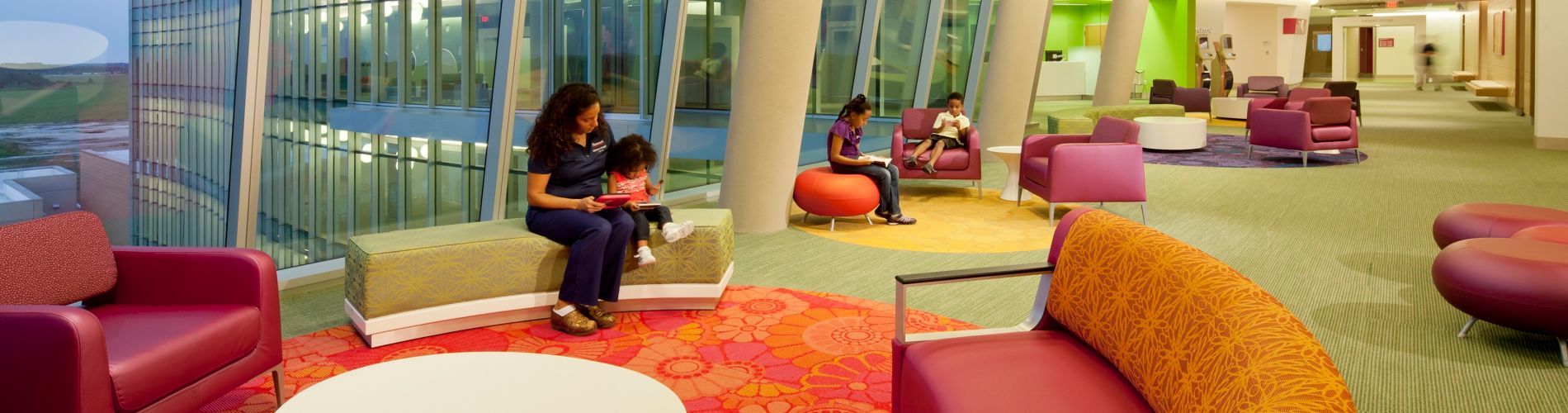
A hospital centered on the patient experience
Designing a pediatric hospital for children and parents.
Pediatric healthcare system Nemours provides primary, hospital, and clinic-based specialty care, prevention and health information services, and medical education programs in Delaware, Florida, New Jersey, and Pennsylvania. When Nemours wanted to strengthen its brand, it faced two challenges: Empowered patients had more access to information and choice than ever before, and new players—alternative-care centers, retail-based care clinics, and urgent-care centers—were entering the marketplace, diverting market share.
Nemours approached IDEO for help in creating an innovative, differentiated, and patient-centric experience for a new hospital in Orlando, with the goal of establishing Nemours as a destination care provider and industry leader. Together, they identified and clarified both family needs and key experience touchpoints in the patient journey, resulting in the state-of-the-art-designed, 60-acre, $400 million Nemours Children’s Hospital in Lake Nona Medical City, Florida. “The design team’s approach to defining key moments in the patient journey was highly instructive,” said Dr. David Milov, chief of clinical informatics at Nemours. “They captured insights otherwise unavailable to us.”
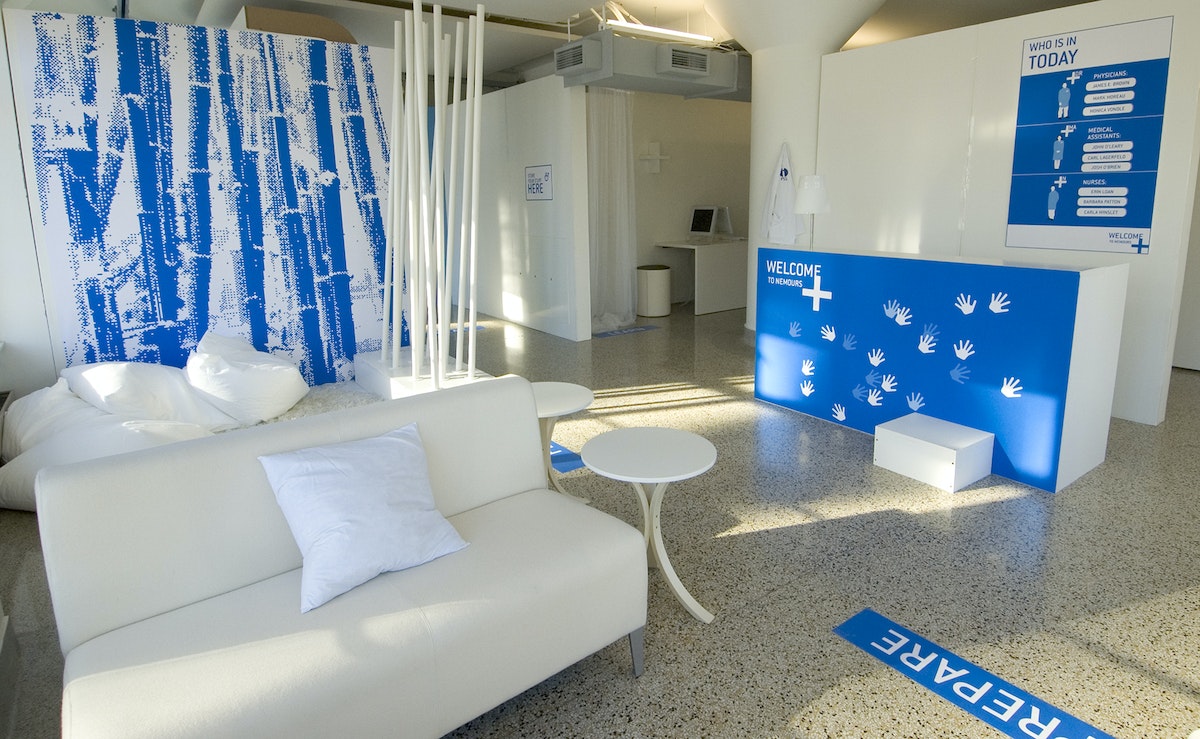
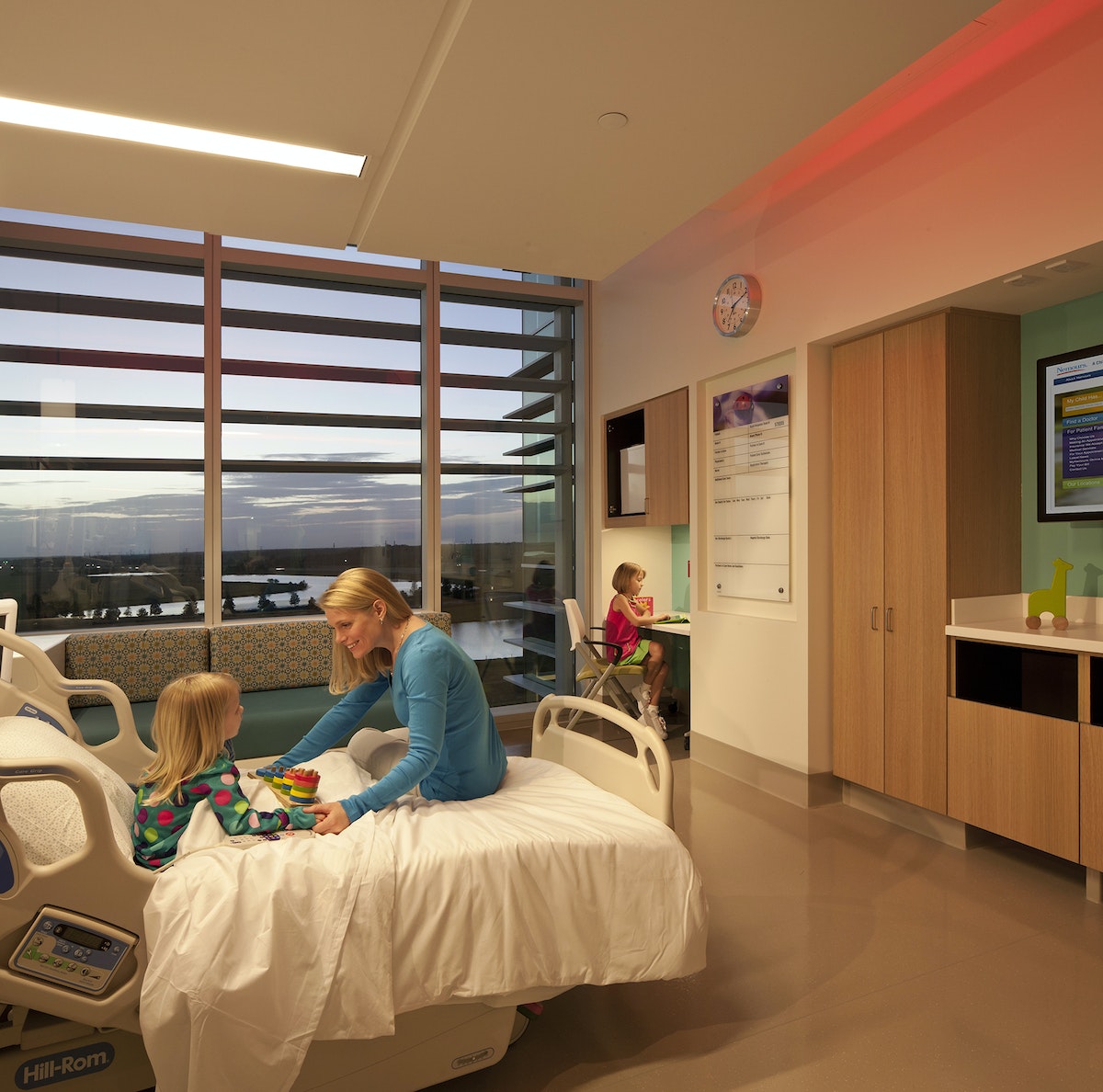
Concepts that were realized in the hospital’s final design include:
- Care Team Room ID: Patients and families are introduced to each member of their care team to ensure continuity of care.
- Floor Greeters: Concierge-like greeters welcome and orient families and answer questions.
- Family Lounges: Private dining rooms have kitchenettes, so families can cook and eat together.
- Emergency Department: Patients are greeted, sorted by medical condition, and immediately checked into rooms.
- Patient Information Screens: Doctors and nurses can access patient information prior to entering an exam room to enable informed conversations and build trust.
- Smart Bracelets: Personalized RFID-enabled bracelets keep track of the care team.
- Smart Rooms: Triggered by the Smart Bracelet, Smart Rooms “welcome” the patient upon entry.
To arrive at these designs, IDEO sought inspiration via analogous kid-friendly environments, such as museums, schools, toy stores, and zoos. Designers also conducted in-context interviews with patients, parents, families, doctors, nurses, support staff, and outside physicians. One key insight that led to the final design: Patients and families came to Nemours with varied levels of experience—first-timers, occasional visitors, and those who were chronically ill—but the hospital treated them all the same.
To address these needs, the team created an experience blueprint focused on welcoming, guiding, and supporting patients and families through unique environments, integrated service moments, and market-differentiating spaces and tools. To test the look, feel, and value of the designs, designers built full-scale foam core prototypes of welcome stations, waiting lounges, and exam rooms.

The results appeal to patients, families, and caregivers. According to Dr. Lane Donnelly, Nemours chief medical officer, “all the amenities at Nemours focus not only on the child but their parents and families as well.”
The hospital won two awards at the International Interior Design Association’s 2013 Best of the Best Gala (Georgia Chapter), one for the Healthcare Design category and one for best overall out of all 11 categories. Parenting.com writer Shawn Bean noted, “Set amidst a wooded expanse of central Florida, with theme park roller coasters peppering the horizon, Nemours Children’s Hospital is arguably the new high water mark for pediatric care in the United States.”
A global design movement led by children
A contest that teaches design-thinking skills to millions of kids across the globe.
Designer turned educator Kiran Bir Sethi wanted to blur the boundaries between school and life to help young students become aware, enabled, and empowered to effect change in the world. In aiming to spread her message to millions of children across India , Sethi tapped IDEO and the d.school at Stanford to help create a design contest for youth that would show them that they could make a difference in their community.
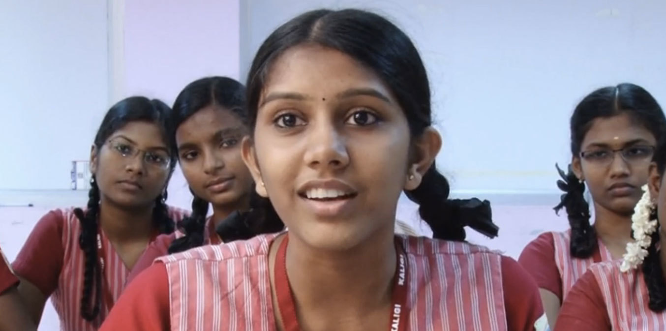
Together with the d.school, IDEO designed a competition for middle school students called the Design for Change Contest. Adapting the human-centered design approach into a simple process that 10- to 13-year-old kids could follow on their own, the contest included rules, tools, and platforms that would be accessible to children and teachers throughout India regardless of their previous exposure to design.
The team shaped the rules so that students could learn core design-thinking skills such as empathy, brainstorming, collaboration, and reflection through the process of participating in the contest. And together, the group developed a toolkit to walk students through the simple four-step process.
The biggest challenges to the contest were overcoming the lack of infrastructure, language barriers, and a discrepancy in school resources. There was no national database of schools for easy outreach, so Riverside built relationships with NGOs across India to distribute the contest toolkit to more than 30,000 schools.
The contest receives about 2,000 entries from groups of youth in India each year. They have been addressing challenges such as illiteracy, pollution, traffic safety, care for the elderly, alcoholism, and the environment.
As of 2015, the Design for Change Contest has scaled far beyond India, and is being run in 30-plus countries, with millions of children participating. Each contest entry shows that kids really can make a big difference in the world.
This Menswear Maker Works out of a 19th-Century London Workshop
A hidden, rain-damp shop houses S.E.H Kelly’s obsessively detailed clothing line
In one sentence, who are you?
I am Paul, and I run S.E.H Kelly, which is a menswear company based in London.

What do you do? How did you learn it?
We make clothes for men, every aspect of which—the cloth, the buttons, the buckles—is made by suppliers from around the British Isles. There are two of us at the company, and the other one, Sara, learned the trade in a tailoring house on London's Savile Row. I have a background in retail and design and other things, and together we cover most bases.
3 favorite possessions?
I don't really cherish possessions. I like my watch, which was a Christmas present, and—well, my bag is very much appreciated, being as it carries half my life without much complaint. My third favourite possession eludes me, sorry.
What does a typical work session look like?
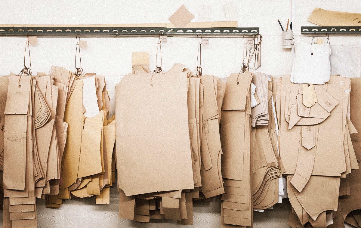
Wake up, reply to emails, get train to workshop, pick up things, get train to a factory, drop off things, reply to emails, run around chasing up problems with cloth or patterns or making, eat, reply to emails, wrap and pack orders, print order documentation, walk to post office to send orders, walk back to factory, tie up loose ends, tidy up, get train home, eat, update or fix website, reply to emails, bed. Oh—and fit in some design if chance permits.
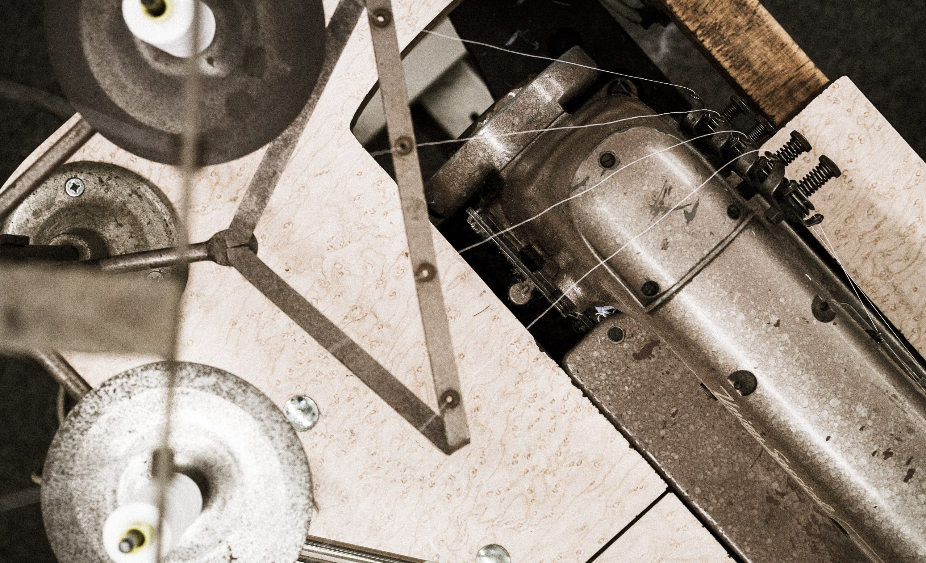
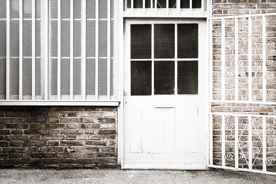
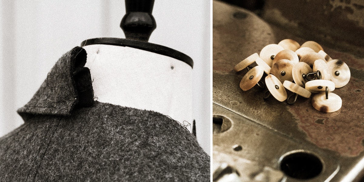
The workshop is our headquarters, and is first in a row of very small workers' units built at the end of the 1800s. It has a downstairs where we hang a selection of our garments and store various components such as buckles and horn buttons; and an upstairs, where we use a makeshift office and undertake the various more moribund duties of running a business.
It is a good little space—although rather dark—and is difficult to locate even when you're standing nearby. Visitors often remark, "Not easy to find, are you?" which I take as a compliment, since I've always enjoyed visiting places which are off the beaten track, or require some effort to discover. Always more fun, I think, and exciting, and hopefully brings a tinge more interest and character than a typical shopfront.
How do you get over creative block?
I don't force anything. If I struggle for a solution—be it a design solution or some written words—I leave it alone and do something else. I find the best ideas are those that at least appear to come naturally, even if they're the result of days or weeks of subconscious thinking.
What was the last item on your to do list?
"Remove collar from shirt for man in Norway."

How do you see the world in 2078?
Much more convergence of culture facilitated with cheaper travel, cheaper and more widely available communication technology, and hopefully much more mutual appreciation of one another rather than squabbling.
What’s your number one bucket list item?
Be absolutely, fully, and entirely satisfied, without caveat or "to-do," with every piece of our collection.
Who are you creative crushin’ on lately?
The game developer Ojiro Fumoto.
Shopping online often feels like work. To find one shirt, you have to slog through dozens of pages of boring photos of boring people wearing boring clothes. This isn't true of S.E.H Kelly. A visit online feels like a tour through their hidden, rain-damp workshop—from photos of button jars and bolts of cloth to the quirky ways that they describe their proper attire. I absolutely adore it. For this installment of Creative Crushes, S.E.H Kelly founder Paul Vincent shared some details about his label and design process.
5 Ways Mindfulness Can Make You a Better Designer
Incorporating mindfulness into the design process can help you feel more grounded and be more creative
I’m not alone in turning to mindfulness during the design process. Here’s how my colleagues and I use mindfulness to move from overwhelmed to optimistic, even during the toughest projects.
1. Adopt a beginner's mindset
When you're approaching a new design challenge, it’s easy to bring your biases and baggage to the table. But this is the moment to stay open: The root of creativity is embracing the millions of possibilities at your fingertips.
The “beginner's mindset” is a Buddhist principle we practice at IDEO. It means starting fresh, assuming nothing, and living the question. We see a lack of deep expertise in a new topic as an opportunity to get creative. Anyone can adopt a beginner’s mindset—all that’s required is openness and receptivity.

2. Practice radical acceptance
When I first learned about acceptance, it seemed to me it was just another word for complacency. As if to say, “That’s the way things are! Why bother trying to change them?” But on closer reflection, I realized that accepting the world as it is today requires a willingness to sit with uncomfortable truths and to see problems from all angles before jumping in to solve them.
By accepting a situation, you’re able to design a better approach from a place of non-resistance. At IDEO, we have a bias toward action: We make lots of tangible designs as a way of imagining the future. But action can be so much more impactful when it’s grounded in reality and driven by clear intentions.
3. Drop your ego
Mindfulness teaches us that the ego—the part of us that demands to be “right”—is not our true self. Our true self is found in the in-between moments when we’re able to just be—the times when we take in what’s around us, quiet our minds, and open ourselves up to feedback from the people we’re designing for.
One way we try to drop our egos at IDEO is by creating “sacrificial concepts”— prototypes that we design but ultimately cast aside in service of learning. Critiquing a sacrificial concept is an invitation for people to share their reactions without hurting anyone else’s feelings.
I sometimes suffer from the “disease to please,” wanting people to like everything I’ve made. But as I’ve leaned into mindfulness, I’ve realized that my ego can slow me down, and I've learned how to set it aside.
4. Listen deeply
Have you ever noticed during a conversation that the person you’re talking to is mimicking your posture? If you put your hands on the table, so do they; if you sit up straight, they follow suit. In conversation, people are often looking for an opening to make their next point, rather than paying attention to what’s being said. But if you focus on your own replies, you miss out on the words, tone, and body language of the people around you.
In The Power of Now, Eckhart Tolle says that when you practice judgement-free listening, you’re giving another person the power of your presence. At IDEO, every project starts with listening. Our human-centered, interdisciplinary design approach means that the whole team learns empathy skills and joins in the design research process. Listening elevates the voices of the people we’re designing for and ensures that their dreams and worries are our starting point.
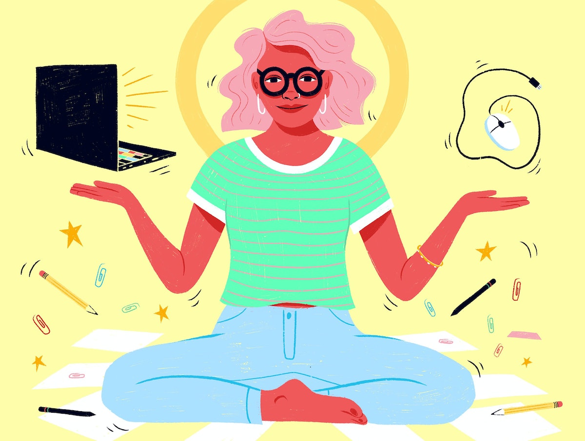
5. Meditate in order to create
One of the biggest misconceptions about creativity is that creative people always wake up feeling compelled to create. The truth is that this compulsion is often blocked by insecurities or external pressures. In The Untethered Soul, Michael Singer describes these as “samskaras,” or energy blockages, which can be cleared by acknowledging them and focusing on your breathing. Tolle suggests that when you want to be creative, you should go back and forth between breathing and the task at hand every few minutes. Only when you’re clear-headed can you make.
At IDEO, we have a meditation group that meets every day, and any designer is welcome to be in the presence of others and connect inward. This ritual, and the support of the wider IDEO community, are wonderful reminders that everyone still has room to learn and improve.
By making mindfulness a regular part of my design practice, I’ve not only become a better designer, but hopefully a kinder, more patient, and more empathetic person. It’s been a journey well worth taking.
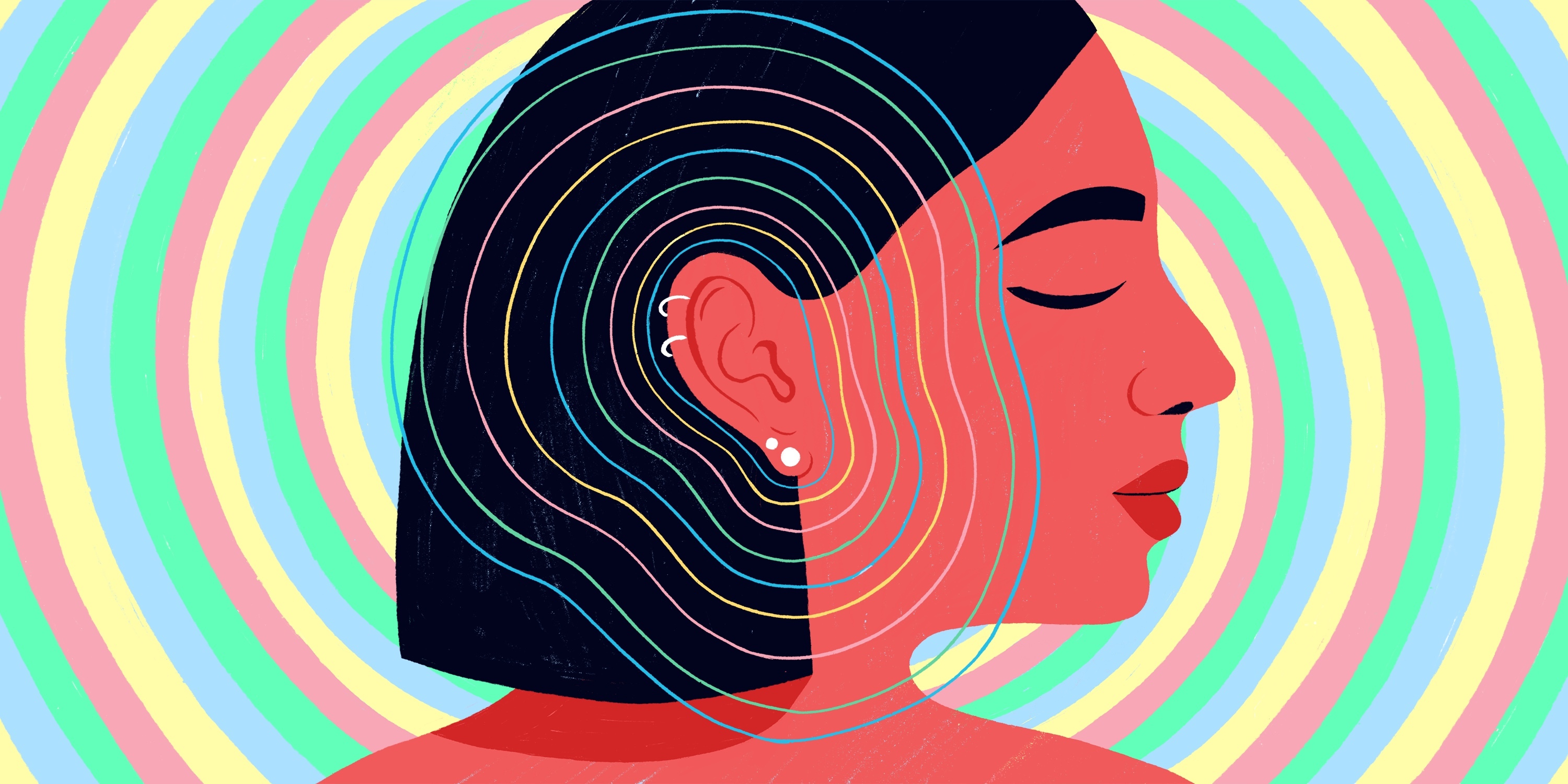
Illustrations by Cassandra Fountaine
When I start to feel overwhelmed at work, with too much information to take in and too little time to process it all, I rely on mindfulness. Dr. Jon Kabat-Zinn, one of the fathers of modern mindfulness, describes the practice as “paying attention on purpose, in the present moment, and non-judgmentally.” It’s all about tuning into your sense of inner calm so you can be a better conduit for new insights and solutions.
Design your very own non-partisan voting guide
One IDEO alum’s plan to to increase voter engagement
A San Franciscan, Jimmy worried that California’s blue state status might make residents apathetic about voting, even though there were important state and local issues on the ballot that were hardly being covered. “Luckily, there was a proposition requiring porn stars to wear condoms,” he says. “I felt I could help make the local ballot a little more interesting.”
Jimmy created a site called ballot.fyi, an online voter guide dedicated to explaining the issues in a nonpartisan way. To his surprise, it reached 125,000 people in 24 hours, and a million over the course of the election.
For the last year, he and his cofounder Yvonne Leow have been working on the next iteration, By The Bay. Thanks to a grant from the Knight Foundation, they’re helping inform younger voters. “We’re committed to turning residents into citizens by educating them on local issues and elections,” he says.
We chatted with Jimmy about how he and Yvonne designed the guide, what he’s working on for November, and how you can replicate the process.
1. Your guide looks a lot different from the boring, I mean, um, more basic, civic materials we’re used to seeing. What can design bring to a voter guide?
By putting design first, and pairing it with a casual voice, we’re hoping we can make topics like legislation engaging. As consumers, we expect a user experience to have thought behind it, but that’s not something we’re used to seeing in voter guides. We want to make this information digestible, first by making the guide as beautiful and usable as possible, and second by using approachable language.
We assume the reader is smart, but isn’t yet familiar with all the wonky terms in politics, like general obligation bond. Other guides tell you how to vote. We want people to understand what they’re voting on and make their own decision.
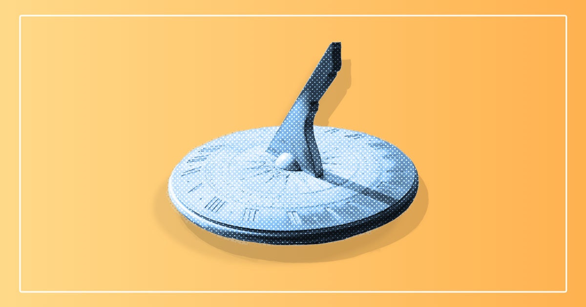
Proposition 7: Makes permanent daylight savings, meaning we don't change the clock twice a year.
2. What was your process, and how did you avoid partisanship?
Like any good journalist, we’re first focused on understanding as much as possible, from as many sides as possible. This means reading all relevant materials and talking to people in the orbit of each issue.
Local issues are less polarizing and ideological than national politics, so avoiding bias is easier than you might think. After we’ve done all the research, my cofounder and I are often more conflicted on where we stand on the issues personally.
We design the information to make it easy to process. If it makes sense to visualize something, we’ll create a graphic rather than explaining it with words. After I published ballot.fyi and it blew up, I received many emails suggesting corrections. As stressful as it was, I took it as an opportunity to debate the sender and absorb their knowledge and perspective.
3. What did you want to give voters in your community that wasn't already out there?
In the past, I’ve left a voting booth feeling ashamed that I was sometimes guessing on how to vote. I consider myself well-educated, but I needed to be a better educated citizen. I suspect a lot of people feel that way.
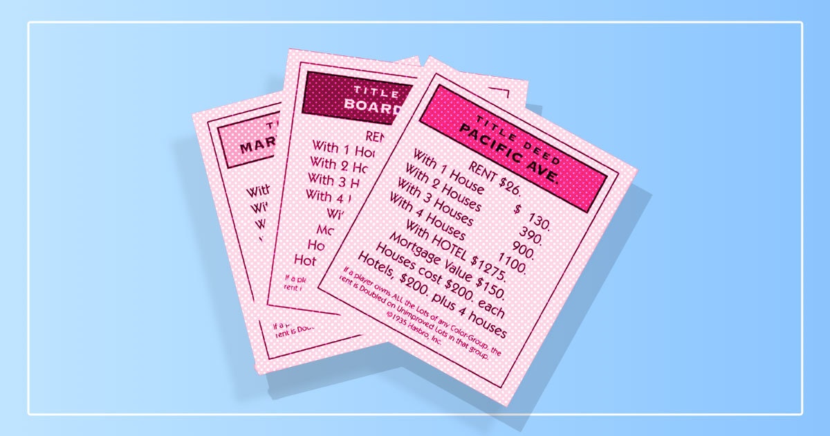
Proposition 10: Perhaps one of the most consequential initiatives, it would allow cities to enact rent control laws again. There's a huge fight from all sides about whether this is a good idea.
4. What design constraints did you need to think about?
Brevity is our primary constraint, but we also do our best to make everything mobile-friendly, because 60 percent of people will visit our site on their phone. Even if they don’t read through an entire explainer, we write our content so that people can understand both sides within a few sentences.
Above all else, we design for the busy professional, who is educated and well-intentioned, but may not have time to fully research everything themselves. We try to get to the point as quickly as possible, make navigation as easy as possible, and have fun with the content.
We picture our users as three personas: One is the diligent voter who spends hours on their absentee ballot well before election day rolls around. Another is the voter who knows they have to vote on Tuesday, so they’re going to spend some time looking into it the weekend before. Then there’s the oh-shit voter who, on election day, doesn’t want to feel stupid and researches as much as they can at work, then runs to the polls right before they close.
We actually see the most traffic the day before the election and the day of the election.
5. What was the hardest part about building it, and how long did it take? (San Francisco is a wacky place with a lot to vote on, so I would imagine a while?)
The hardest part of ballot.fyi was maintaining accurate and up-to-date information. It was just me, and it’s all manual, so I was debating people via email, researching as much as I could, and trying to wordsmith it all to be as succinct and understandable as possible.
Ballot.fyi took about three months, from concept to election day—roughly a month of design, a month of coding and design, and a month of maintenance and advertising. Knowing 20,000-30,000 people were seeing my site every day made October 2016 the most stressful and exhilarating month of my life.

Proposition 12: Mandates a minimum square footage for animals sold for meat, but there's a clause in there that makes all eggs in California cage-free (like literally, not just in minimum size) by 2022.
6. What advice would you give people in other communities about creating their own voter guide?
I’d recommend using whatever tool/medium you’re most comfortable using. You don’t have to build a whole website.
We've seen people create voter guides with Google Slides or Sheets, or simply put together a blog on Squarespace. I've also seen long FB posts, or PDFs shared around social media. The week before the election, people will be looking for the information, and different formats find different audiences. I have yet to see someone make a comprehensive and compelling YouTube series—I’d love to see that.
My best advice: Focus on a specific part of the ballot, and do it well. Don’t worry about reaching a wide audience. Write it for the people you know: your close friends, coworkers, or club soccer team. Research your way to nonpartisanship. In terms of resources, Ballotpedia is dense but can be a good starting place. When in doubt, you can also call your city hall or state government and request information. Having friends that can translate legalese is also useful.
7. What kind of feedback have you received, and what are you planning for the general election in November?
Most of our feedback is positive. I think most people want to get more involved in local politics and understand more, but people are busy and other things take priority.
For November, we’re interviewing the Supervisor candidates in San Francisco and posting the videos. We’re hoping it’s an easy way for residents to quickly get a sense of who’s running and what they stand for. We’re also beefing up a feature we released in June—the ability to take notes on our webpages and then share that with your friends via a private link. We’ve noticed that people rely on their friends to vote, and friends typically have one or two people who are their go-to political person. We want to empower those individuals and compile the research and summarize for them, so they can simply add their commentary and recommendations. By The Bay does not give recommendations, but we encourage individuals to—it helps get the vote out.
As the 2016 election approached, and the vitriol around the presidential race grew, IDEO alum and engineer Jimmy Chion wanted to do something to keep voters engaged.
3 tips to help you prototype a service
Prototyping is an integral part of design, but what does the process look like for experiences and human interactions?
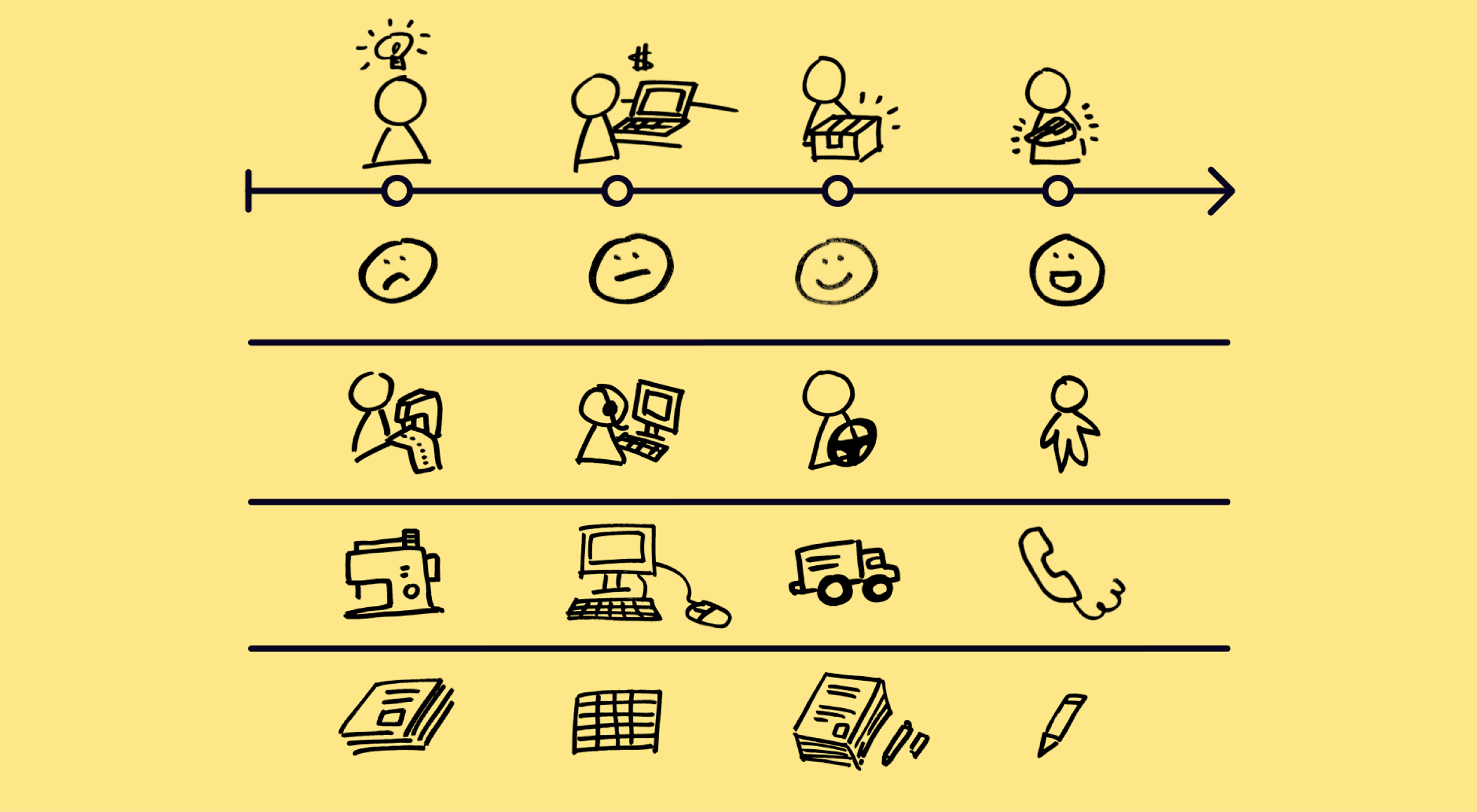
A prototype of a physical product is easy to imagine, but the process of leaving the hospital after giving birth, or having a new kind of conversation between a traveler and a flight attendant, is not easily built out of cardboard and foam core.
In my years at IDEO—and at companies like LeapFrog and Virgin Entertainment Group—I’ve seen service prototypes come in many shapes and sizes, but I’ve found the most successful ones are based on real customer needs and co-created with the people responsible for delivering the service. Whether you’re building storyboards and sketches, simulated interactions, or mocked-up physical spaces, these three tips should give you a little inspiration to help you create your own.
1. Design only the details that matter
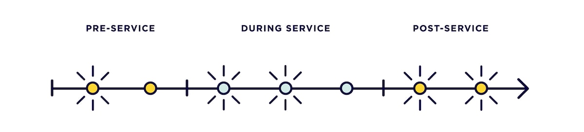
Keep in mind that with any prototype—service design included—you’re looking to spend a little (effort and money) to learn a lot. This is especially relevant in service prototypes, which can change over time, and often involve components like people, space, and physical and digital objects. Figure out what elements of your service are necessary to show potential users what their experience would actually feel like, and eliminate the rest. For instance, if you want people to feel welcomed to an experience, you might spend more time designing the human-to-human interactions, and less time figuring out the design of the space where the interactions take place. If you want people to feel efficiently handled during a check-in moment, you might spend more time designing the digital interface for the process, and less time designing the artifacts and documents that are sprinkled throughout.
In a project with Kaiser, we created a visual checklist that nurses could use to help parents understand all the steps that needed to happen before they could take their babies home. To make sure that the new tool wouldn’t add to parents’ confusion, we hung paper prototypes in some rooms, and had nurses mark the number of calls they got from each patient. It turned out, parents who had a prototype had 60 percent fewer questions than parents who didn’t. And we were able to pick up all those insights without even worrying about what the space looked like—just a simple prototype.
2. Factor in the before and after
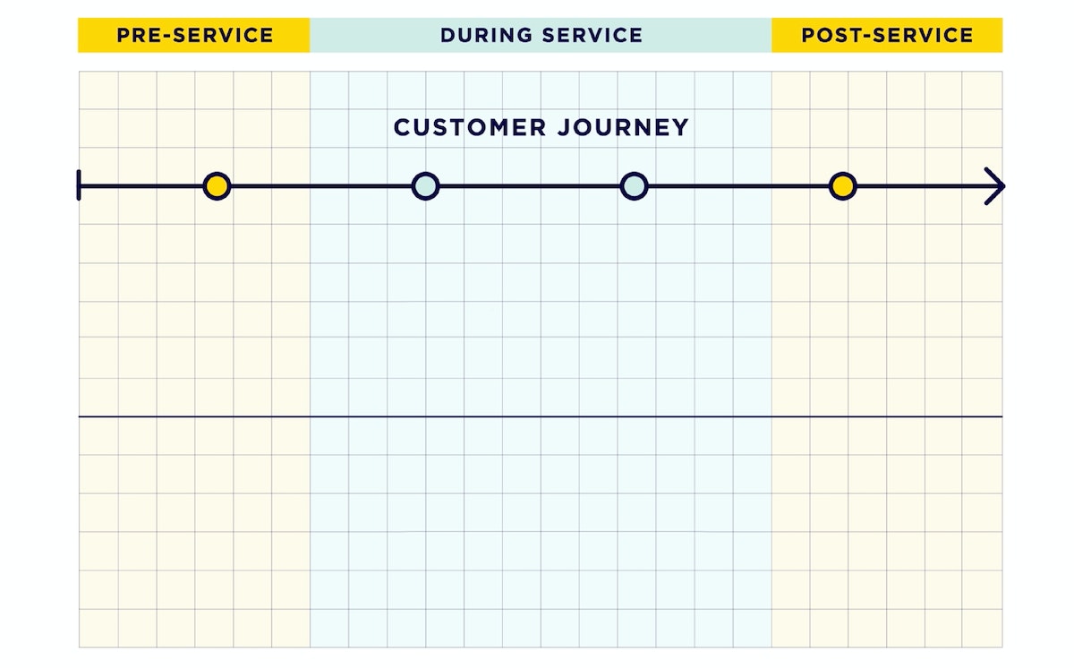
When designing a service moment, consider the user experience not just during the moment, but also before and after. Think about a simple moment, for example checking into a hotel. What happens before? Are guests arriving travel weary and jetlagged? Are they coming to celebrate their honeymoon? As a service provider, it’s important to remember that you’re not the only thing on the user’s mind, they’re processing this moment along with everything else going on in their day. After check in, could they easily find their room and was it clean? Were they able to quickly transition into desired activities whether to celebrate, get pampered, and relax, or get to an event like a conference?
In a project with the hotel chain Crowne Plaza, our goal was to design a lobby space that would work for all business travelers. We created a concept that would include spaces for heads-down time, places for group work, a grab-and-go menu of healthy items, and a staff member who could help with business needs. To test it, we set up a network of sensors and cameras to track traffic flow through the different spaces, and which were used most, and when. With these metrics, and interview answers from guests before and after seeing the prototypes, we were able to gauge how well we were meeting traveler needs at every stage of their journey.
3. Involve users and employees
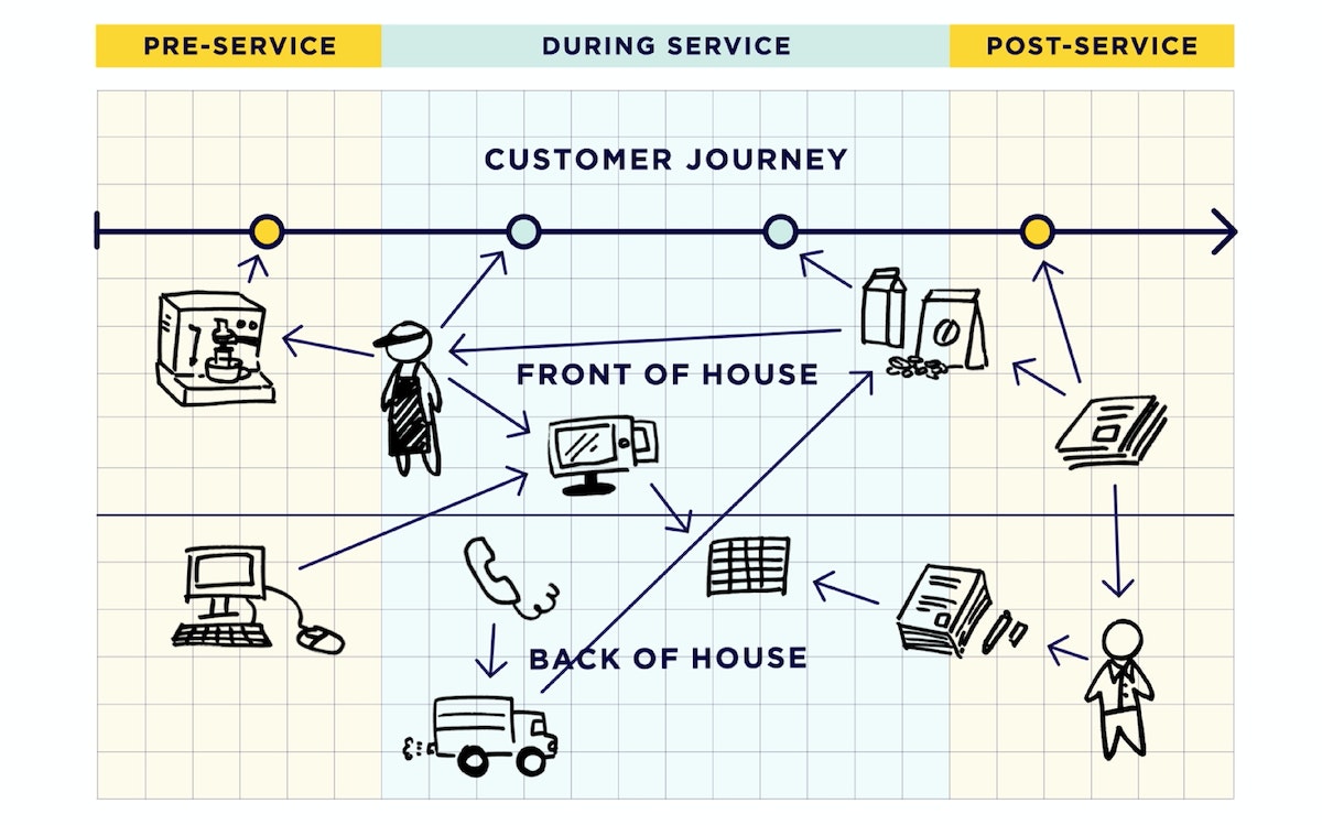
Prototyping helps us pick apart our assumptions, see where we’ve made progress, and where we’ve failed. Designing services is a process that must be done collaboratively, particularly with those who are ultimately responsible for delivering the service to customers. That ensures that you have the right experience and depth to inform new ideas. And it helps you get crucial buy-in when you’re promoting the future vision of your service.
So who should you invite to create and test your prototypes? Think about employees, end users, even people moving around behind the scenes, and figure out how they should show up in your prototypes. Do you need a real nurse chatting with a real patient? An actual bellman who can try out a new check in process with a million-miler business traveler? What about the executive who is ultimately in charge of the project?
In a project with Lufthansa, we were looking to redesign business class to keep up with modern travelers. Once we homed in on the experience we wanted to create, we built a 1:1 scale mockup of a plane with some foam core and business class seats, then invited real travelers and crew to test it out. Not only could they report on the experience from both sides, execs could check out the experience, too, and sign off on our new ideas.
The best advice for service design prototyping, though, is the same as any other kind of design work: Do it early, do it often, and keep iterating toward the right solution.
Prototyping is an integral part of design, but when it comes to experiences and human interaction, it can be hard to figure out exactly how to do it.

Lindsey Turner
I’m passionate about building brands, products, and experiences that help organizations show up with meaning and momentum.
I help organizations cut through complexity by shaping how they show up, through brand strategy, identity, and storytelling.
Working at the intersection of brand and business, I bring an editorial eye and a bias toward making—turning ideas into tangible experiences that people can understand, trust, and believe in.
My work spans government, healthcare, financial services, media, and consumer goods, from launching Gen Z-focused ventures to building innovation labs and reimagining legacy brands. I relish moments of ambiguity and enjoy translating across teams, perspectives, and priorities to move ideas forward.
I started my career in editorial and digital design, shaping cross-platform experiences and identity systems in publishing and agency environments. That foundation still shapes how I work today: I’m detail-oriented, collaborative, and overreliant on the Oxford comma. I hold a BFA in Visual Communication from the School of the Art Institute of Chicago.

Rachel Young
My work helps organizations see who their products aren't working for—and build the will and the tools to do something about it
For 25 years, I've asked the same question: Who does this design exclude—and what are we going to do about it?
My work spans human-centered strategy, inclusive design, and qualitative research, with clients ranging from Microsoft, Google, and Verizon to the National Science Foundation, and San Francisco Unified School District.
Before IDEO, I taught elementary school in East Palo Alto and spent a decade doing design work with social service organizations—where I learned firsthand what it costs people when systems are built without them in mind.
I am currently writing User Error, a nonfiction book about digital access and the design decisions behind it. I live in Oakland, California.

Brian Pelsoh
I lead with craft, ensuring our work is creatively excellent: rooted in deep human insight and imagination, while also grounded in the realities of business and technology.
My expertise spans brand, communication, and product design across tech, education, the arts, and social impact.
I believe great work demands both high-level vision and obsessive attention to detail, and only happens through collaboration.
I bring an inclusive, hands-on approach and a deep understanding of business, which enables me to consistently deliver excellence while always asking why.
Before joining IDEO, I worked at the brand firms Pentagram and VSA Partners. I began my career as a designer, leading teams at the School of the Art Institute of Chicago and the Milwaukee Art Museum. I hold an MFA in graphic design from Maryland Institute College of Art and a BFA in communication design from the Milwaukee Institute of Art & Design, and have taught at some of the best design schools in the US.

Tony Wong
I am responsible for IDEO’s long-term success in China and working with clients to use design as a tool to enable growth.
I am responsible for IDEO’s long-term success in China and working with clients to use design as a tool to enable growth. Specifically, I have helped Chinese companies design holistic brand solutions through the development of their products, communication, services, and innovation teams, and I have helped multinationals expand their presence and influence in China.
I advise global leaders on developing China-led innovation and capabilities.
In over 15 years in IDEO Shanghai, I have worked on projects that use design to elevate the quality of the experience of healthcare products and services, streamline processes that increase productivity, create spaces and programs that promote and enable inclusive communities, and build next generation mobility solutions that are planet-positive.
Before joining IDEO, I worked at Philips Electronics and the Electrolux Group in Italy, the Netherlands, and Singapore on a number of breakthrough commercial products. I am a member of the Young President Organization in Shanghai.

Building a personal AI for the messiness of life: Sida Li
Most AI products today are built for work—a space with clear problems and established systems. One founder noticed a gap: personal life is messier, harder to systematize, and mostly left behind by the AI boom. So she built Cue, a personal AI that lives inside iMessage and group chats, to go where the other tools haven't.
In this episode, Becca Carroll, IDEO's Chief Strategy Officer, talks with Sida Li, co-founder and CEO of Shared Context Lab, about staying anchored to a human need while the technology around her keeps changing shape, why she treats her business model with the same rigor she'd bring to a product, and what it feels like to build a company at this particular, disorienting moment in AI.
The conversation also gets into how Sida makes design decisions: the language Cue uses to describe itself, the tradeoffs behind building inside iMessage instead of a new app, and a real story about a business idea that didn’t pan out.
This is the second in a two-part series profiling founders from IDEO's Startups-in-Residence program. The first conversation is with Johannes Seemann, founder of Sooner, on designing GenAI for the emotional side of money.

Designing GenAI for the emotional side of money: Johannes Seemann
Most personal financial tools are built to run the numbers and optimize towards a budget. While that works for some, most people experience money as a lived relationship that does not neatly fit into a spreadsheet. Johannes Seemann and Becca Carroll discuss why money is emotional before it is mathematical, and what a human-centered approach to building a generative AI financial product looks like in practice.

The curious leader's edge in uncertainty: Scott Shigeoka
Mina Seetharaman talks with Scott Shigeoka, author of Seek and Head of Curiosity Cultivation at the Eames Institute, about what distinguishes genuinely curious leadership from performative curiosity, how power dynamics shape curiosity, and why practicing curiosity can restore energy rather than drain it.

How constraints make us more creative: David Epstein
Mina Seetharaman talks with David Epstein, author of Inside the Box and Range, about why total freedom often produces average work, how leaders can design useful limits on purpose, and what organizations such as General Magic and Pixar reveal about the relationship between boundaries and creativity.
Looks like you might be in search of something very specific?
Or reset the filters above and try another angle.
Here’s some random inspiration

Podcasts about creative leadership

Articles about the power of prototyping
