
.svg)



New digital ways to pay
A flexible, functional form of payment.
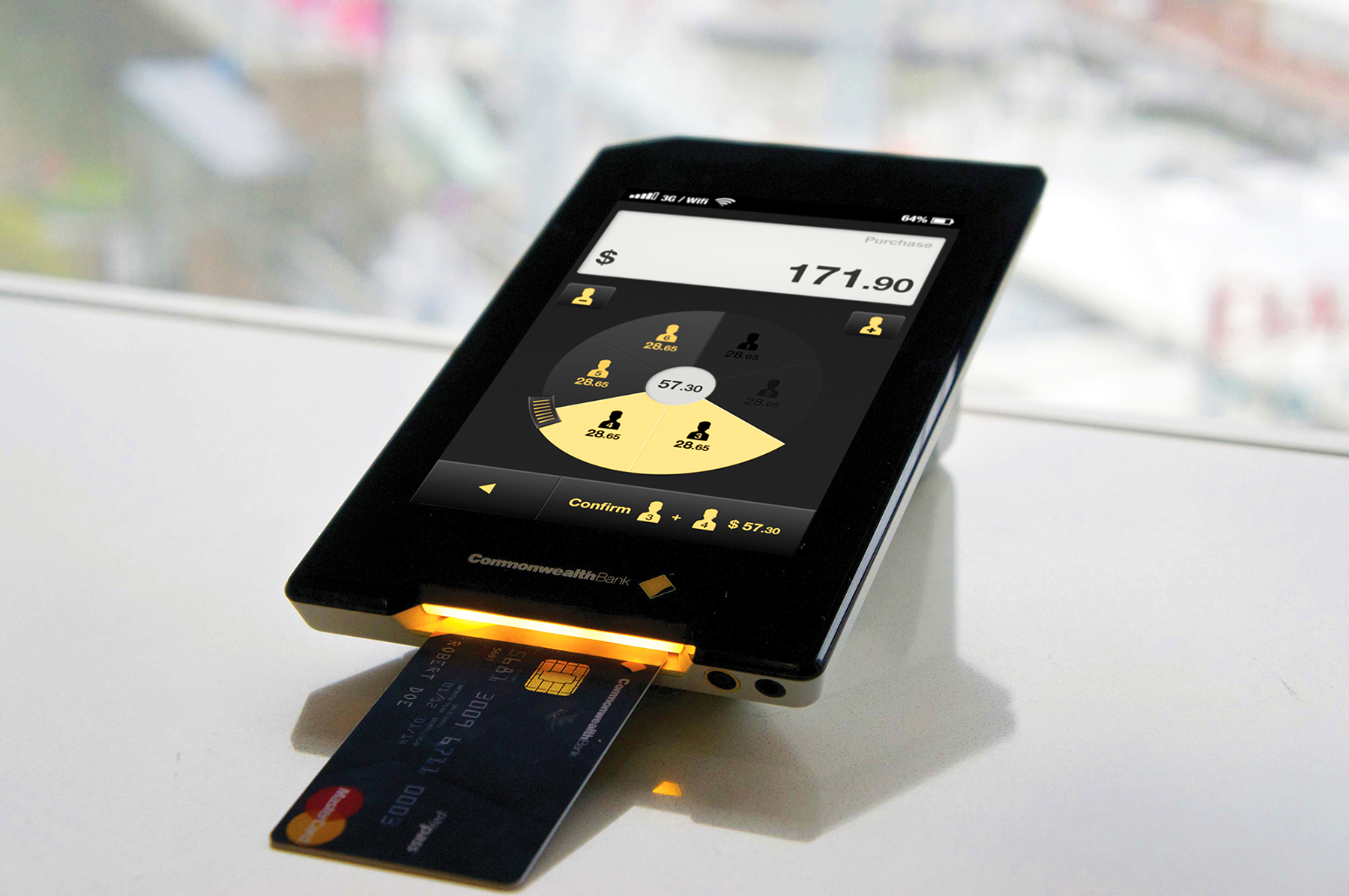
Commonwealth Bank of Australia was interested in helping customers and businesses build close connections. They believed the way to do this would be by creating richer interactions around different forms of payment. The bank approached IDEO to explore these opportunities, and the result is a new retail business platform—Pi—and a portable payment device—Albert.
Pi brings a new level of flexibility, functionality, and customization to the face-to-face interaction between a cashier and a customer, improving everything from the process of splitting the bill in a restaurant to helping a guest find more personalized experiences at a hotel.
Insights
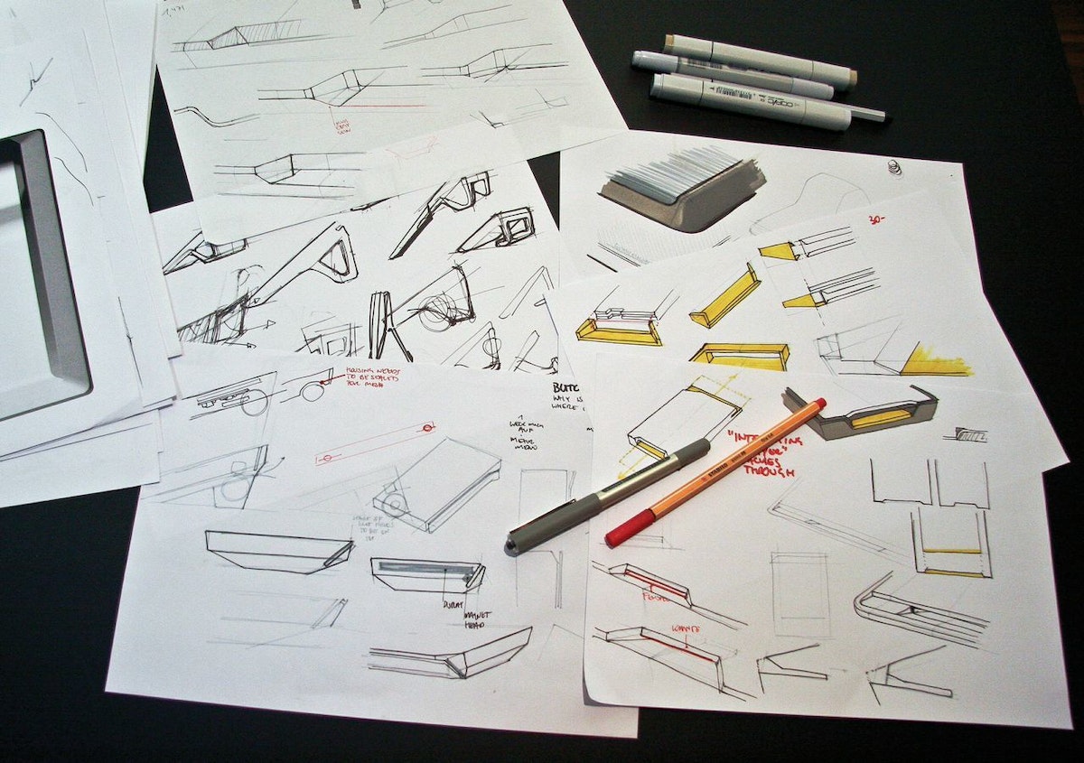
In the team’s research in Australia, the UK, and Germany, they found a few key insights that informed the design. First, they saw that an ideal platform should support the full spectrum of human behaviors around payment. Second, platforms can add value by improving the relationships among banks, merchants, and customers. And third, the payment experience should be customized to fit a specific setting, working one way in a luxury boutique and another in a gas station.
IDEO, CBA, and Wincor Nixdorf worked together closely to steward the design of Pi And Albert through product development and implementation, and to gather feedback from merchants during rapid, iterative cycles.
Results
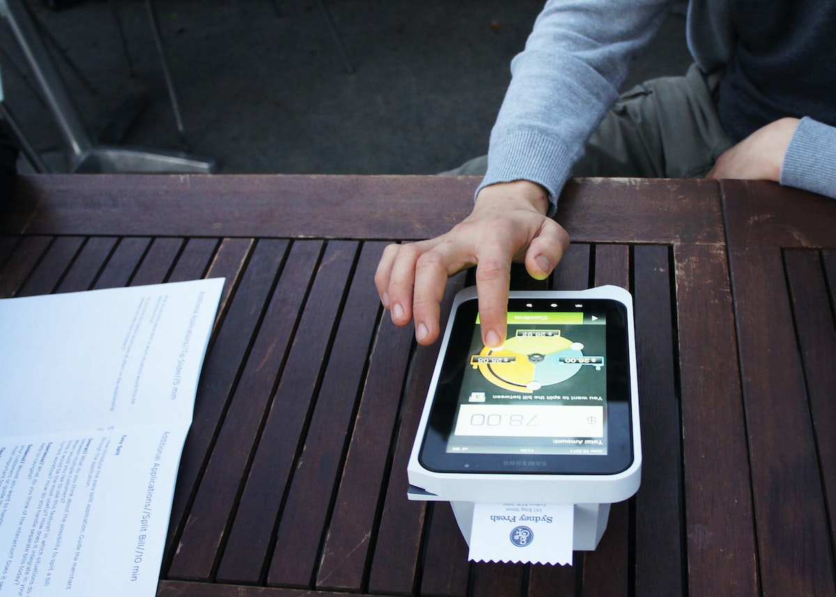
The platform is flexible enough to benefit organizations of all sizes: Larger merchants can incorporate Pi as part of their existing network, while smaller merchants can grow their business using powerful business tools. And customers of all kinds can easily access a variety of payment methods and helpful applications.
Albert offers a large touchscreen that’s intuitive to use, the safety of virtually encrypted PIN entry, and a variety of ways to access data connections. A large battery provides power when retailers are on the go, and a modular housing means that Albert can be used in all kinds of situations. The device is built to handle current card payment methods but can also adapt to how cards might be accepted in the future, and even eliminates the need to swivel a screen from cashier to customer during the payment process.

Making health insurance enrollment easy
Designing a digital platform prototype for Californians to sign up for health insurance.
Forty million Americans became newly eligible for health coverage when the Patient Protection and Affordable Care Act (ACA) was fully implemented in 2014. Some enrolled in health insurance for the first time, while others were able to get better access to affordable health coverage.
In preparation for the millions of applications, states were required to develop ways for people to sign up for health insurance online for plans that were operated by state and federal governments under the ACA. To help public and private agencies to meet the requirements, a coalition of nine national and state-based foundations, led by the California Health Care Foundation (CHCF) developed a digital enrollment prototype, and hired IDEO to lead the consumer research and design effort.
After a yearlong collaborative process, the resulting 300-page design manual and design reference prototype illustrates a customizable approach to public and private health insurance enrollment.
The flexible set of design standards developed for Enroll UX 2014 aims to make online health insurance enrollment simple, intuitive, and easy to navigate at scale.

Inspiring scientists in their research
Encouraging experts from different fields to collaborate on big ideas.
To encourage PhD candidates to think differently about how they tackle tough science problems, the University of California, San Francisco (UCSF) and IDEO embarked on a fruitful collaboration.
Three PhD candidates were tasked with the following challenge: Cultivate new audiences and uses for a microscope. Drawing inspiration from cell phone microscope CellScope, the trio arrived at a prototype that was less reliant on technology and easily disassembled and reassembled. How? By using the most basic building blocks: Legos.
Made of custom 3-D-printed parts and standard toy building blocks, the LegoScope, which functions as a microscope, can easily snap pieces in and out to hold different components. Both the device and the team-based process are now being used in various other campus projects to change how researchers think about conducting and advancing scientific research.
“The best work in the future is going to be done by teams of people with very different expertise, who know different things and think about things in different ways, who come together to focus on one big problem,” said Keith Yamamoto, vice chancellor of research at UCSF, who led the initiative.

Helping a tech product find its footing
A wearable device that measures concentration and focus gets a brand reboot.
Arye Barnehama and Laura Michelle Berman wanted to take their invention—a headband that measures brain wave activity, focus, and concentration—to the next level. As a part of IDEO’s startup-in-residence program, Barnehama and Berman collaborated with IDEO on the product’s rebranding, hoping to refine and emphasize the product’s promise: When people improve their focus, they feel more mindful, confident, and productive.
With IDEO’s help, the company changed its name from Axio to Melon, delineated their brand, refined its product, developed its user experience, and prepared a Kickstarter campaign that garnered considerable press coverage. The new name, Melon, reflected the friendly, scalable character of the company. The name also suggested the intent of the product—using neuroscience data to inform a personal activity.
To distinguish Melon as a standout in the crowded quantified-self category, IDEO designers made the logo a faceted orb that references the gear-shifting mind, with “Melon” written in a distinctive font born from that same logo. The team went with fruit colors—cantaloupe, honeydew, watermelon—to evoke the sweet, refreshing experience the Melon headband promises.
Together, the Melon and IDEO teams also developed an app that shows increases in concentration after performing certain tasks and features a game in which you “fold” origami through mental focus to hone concentration.
Melon’s new brand strategy and UI set it apart from your typical fitness tracker, engaging the user in an elegant, joyful, and customized experience with every interaction.
Melon: a headband and mobile app to help you measure focus.
An Artist’s Love Affair with Cute Patterns
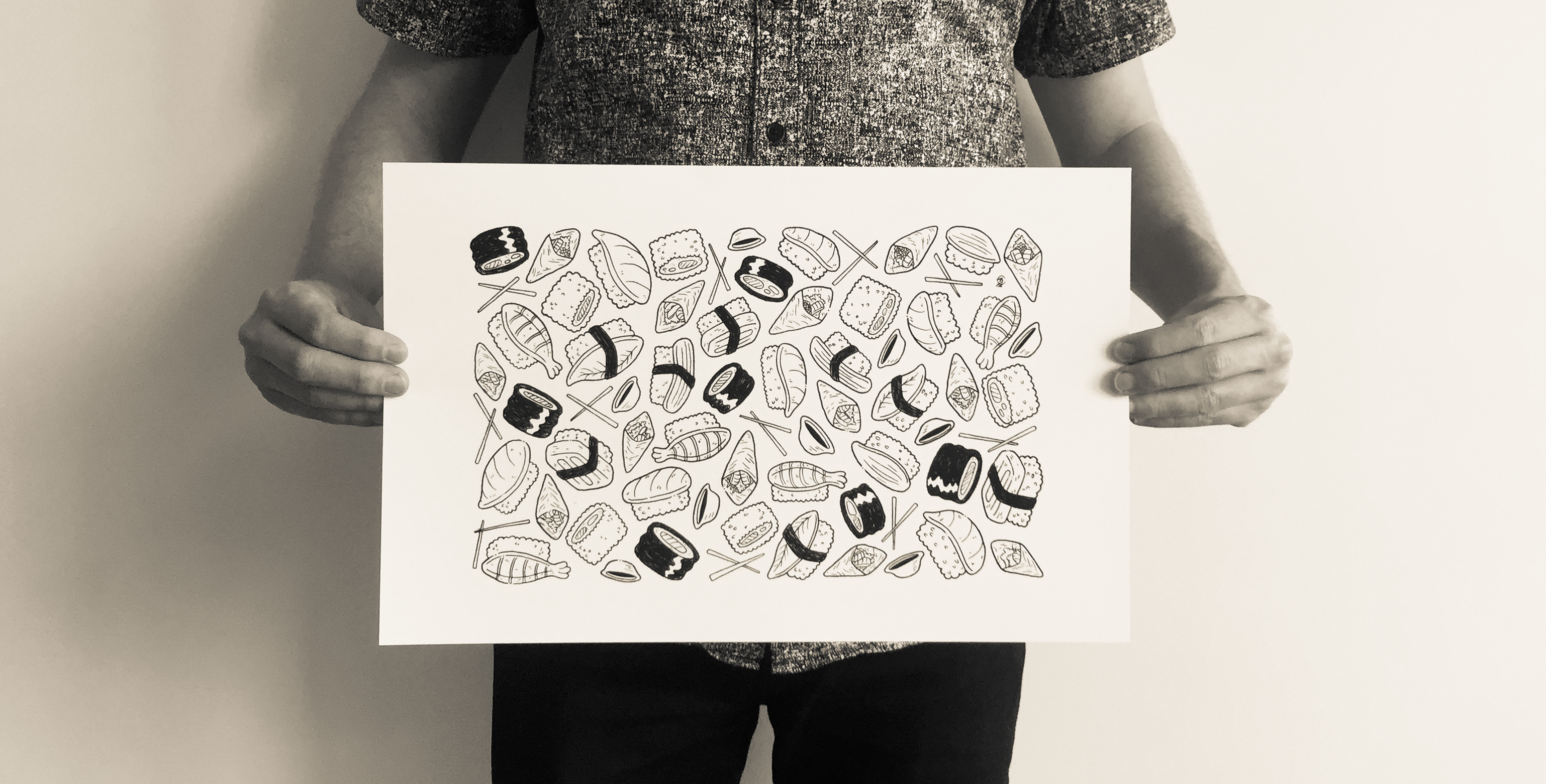
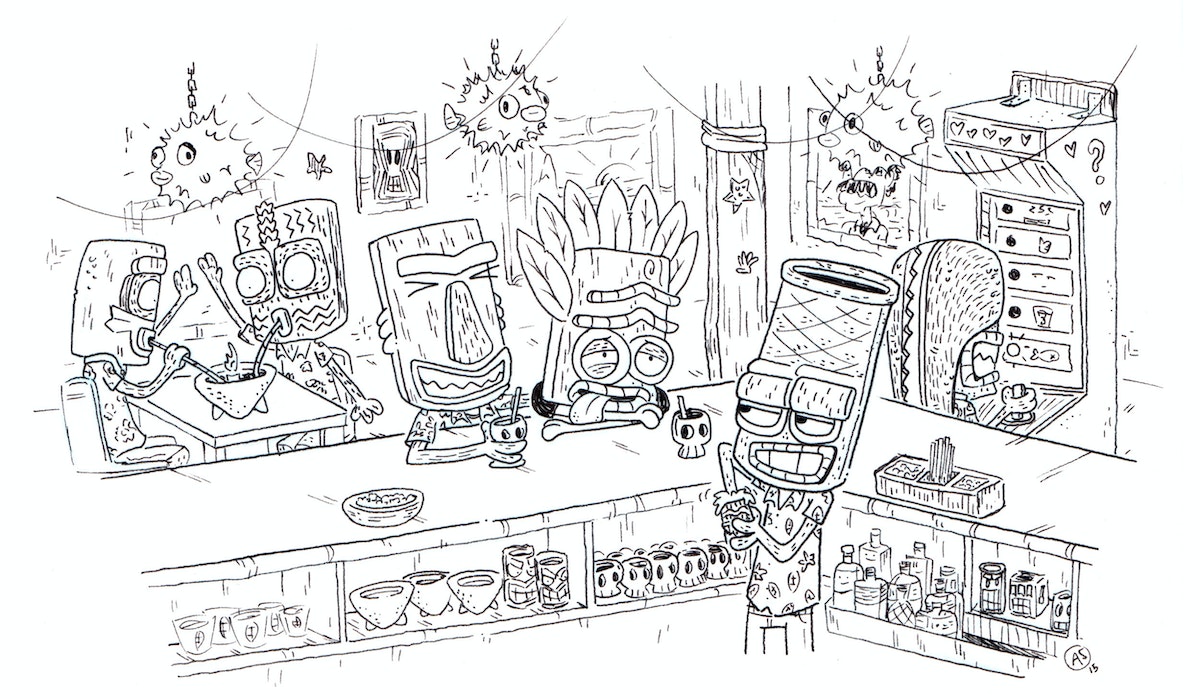
Austin Salmi makes a habit of frequenting tiki bars and drawing clean patterns

In one sentence, who are you?
I am an illustrator who enjoys bringing any amount of joy to people through my creations.
What do you do? How did you learn how to do it?
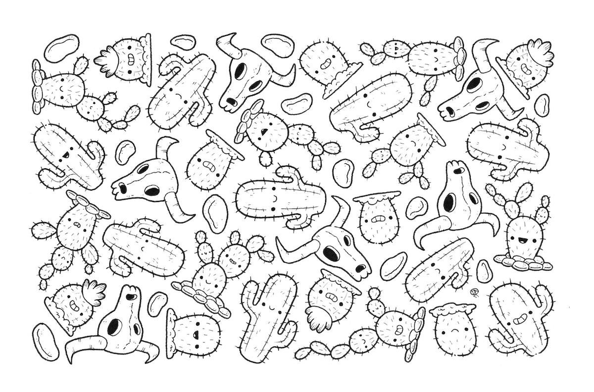
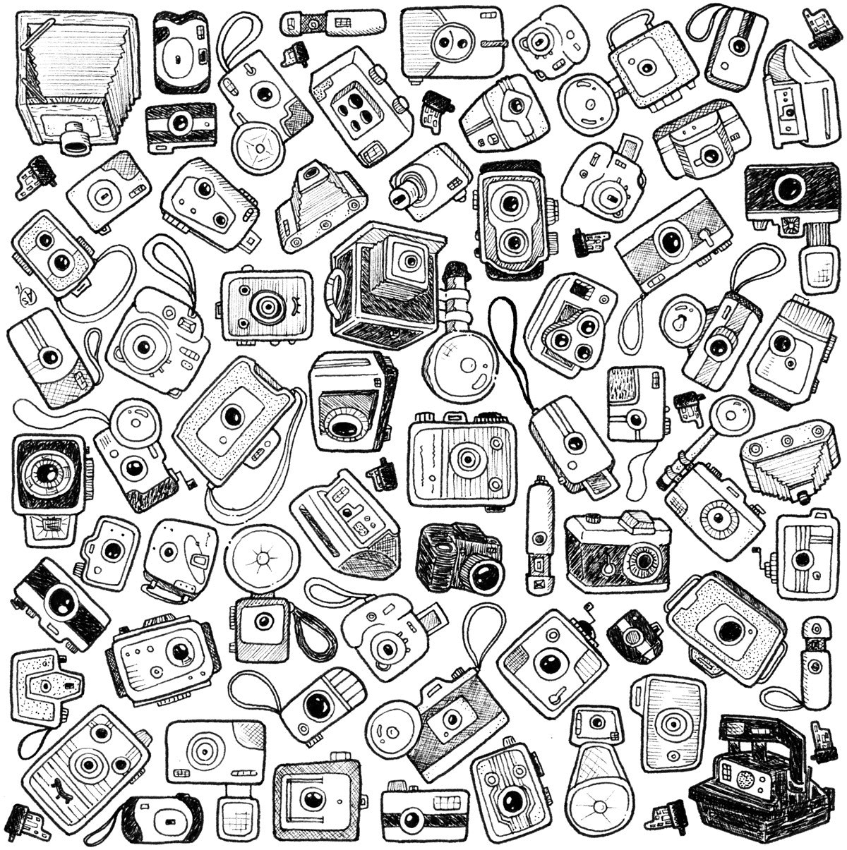
I create different drawings using pencil and ink. The illustrations range from patterns to caricatures, unique creatures, and other one-off ideas. I grew up sketching and doodling and it has continued. When I moved to LA, I was suddenly surrounded by an amazing cadre of artists and creators who constantly inspire me, as well as push me to keep improving myself. That is how I learned my craft and continue to learn, because I believe you never truly finish learning.
What are your 3 favorite possessions?
Miniature Back to the Future 2 hover board; Magnum P.I. Tiki Mug; a drawing of my fiancé and me, which she drew. Not in that order.
What does a typical work session look like?
I have a running list of ideas and sketches that I pull from if I don't have an art show with a specific topic that I am working towards. Usually, I'll do some Google searches on the topic at hand and pull a bunch of reference photos for perusal during the pencil drawing stage. I sketch out the drawing inside a pre-drawn area, such as 4x6 or 5x7. Art that is easy to frame is always a goal of mine, because I love framed art and it drives me mad when I see things tacked onto a wall or cork board. After finalizing the pencil drawing, I'll usually step away for a moment or two to play a video game or watch a show. I like to do something that differentiates the time between stages. Once I come back to the drawing, I pull out all the different micron pens that I think I will use for the piece. I check the nibs, and then I begin inking. I put on dramas in the background to listen to, or things I've seen a ridiculous number of times. West Wing and Parks and Recreation are two such shows.
I don't like to start inking unless I am going to finish a drawing that night. Sometimes, a piece is too large, and I have to break it up over two nights. If that happens, I make sure the pens I've used on the previous night are away from all my other pens. I do this to achieve a consistency within the lines. Once finished, I scan the piece, put it within a predetermined frame, and pack it up for a craft fair or deliver it if it's for an art show. Rinse and repeat as necessary.
How do you get over creative block?
I used to stop drawing and just stew for a bit until it finally passed, which could take a bit of time. As I've gotten older, and ever so slightly more confident in my abilities, I push through it. I just keep drawing. Yes, sometimes the drawings are awful, but as Lauren (my future wife) always says, "sometimes you just have to pass a rat."
How do you see the world in 2078?
A lazy utopia, filled with autonomous everything. Humanity will have moved past Earth and outward into the stars while robots cater to our every whim and we become fat and happy. I could be confusing my vision of the world in 2078 with the timeline in Wall-E—who doesn't yearn for the saccharine dreams of Pixar in 2017. It is tough to image the future right now because at this moment it feels as though we are hanging by a loose wire, and any minute now someone with a spray tan is going to cut the wire and tell us all how huge his ratings are, as we all fall to our collective doom. I hope we make it to 2078, if only so that I can enjoy my hover chair and 128-ounce Slurpee.
What’s number one on your bucket list?
I should say something epic like bungee jumping off of Thomas Jefferson's nose on Mount Rushmore, but honestly, I'd like to have my own artist's studio. Some place I could retreat to and tune out the world and draw silly pictures. That to me is something I want to do before I fade out of this existence.
Who are you creative crushin’ on lately?
I've had a one-sided love affair with Dustin Harbin for a long time. I own two of his original pieces and his diary comics book. The man can use an ink nib like Aaron Sorkin can turn a phrase.
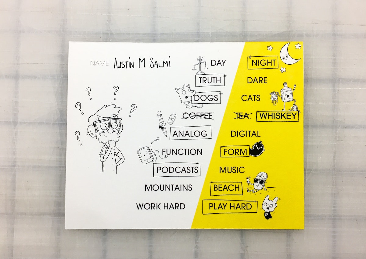
I’ve been creative crushing on Austin Salmi since I saw his doodles, patterns, and adorable characters on Instagram almost two years ago. Austin’s work, learned through practice and osmosis in his job surrounded by artists, has a giggly character about it that fits his intention to hide the ugliness of the world for a moment, and make lovely order out of chaos. I got to learn a bit more about him and his process in this installment of Creative Crushes.
AI Needs an Ethical Compass. This Tool Can Help.
A new, downloadable set of cards for designing with data
We had just begun work on a project exploring how we might help a medical-liability insurance company increase patient safety by learning from past incidents. As we talked, our conversation shifted away from excitedly imagining ideas for data-driven tools toward ways our work might potentially do harm.
What if our designs ended up raising premiums for doctors and, in turn, healthcare costs for patients? What if they kicked doctors off their insurance? What if doctors stopped reporting adverse events to keep their premiums from rising? There was real potential that our work could result in reduced patient safety or increased cost of care. We could inadvertently build a tool that could be used against the very people we were trying to help.
Today, data systems and algorithms can be deployed at unprecedented scale and speed—and unintended consequences will affect people with that same scale and speed. How can we always make sure we’re putting people first when designing large scale systems? Especially when those systems will change over time and evolve without direct human supervision?
The seed planted during that bar conversation has grown into a set of principles, activities, and now a set of cards that our teams—both data scientists and designers across every other discipline—use to ensure we’re intentionally designing intelligent systems in service of people.
We’re far from the first people to ponder this. We’ve been inspired by organizations like AI Now and Data + Society, books like Weapons of Math Destruction and Technically Wrong, academic communities like FATML and CXI. In particular, we’ve been eagerly following O’Reilly’s series on data ethics (and encourage you to read their free ebook, Ethics and Data Science).
To develop our own set of guiding principles, we started with people. We talked to folks all across the globe: We interviewed IDEO teams about where they found challenges. We spoke to our clients about where they saw intelligent systems go awry. We spoke to the public about where smart designs seemed to cross lines. We observed and read about AI systems that had gone off the rails and worked to understand how this might have been avoided. We learned a lot.
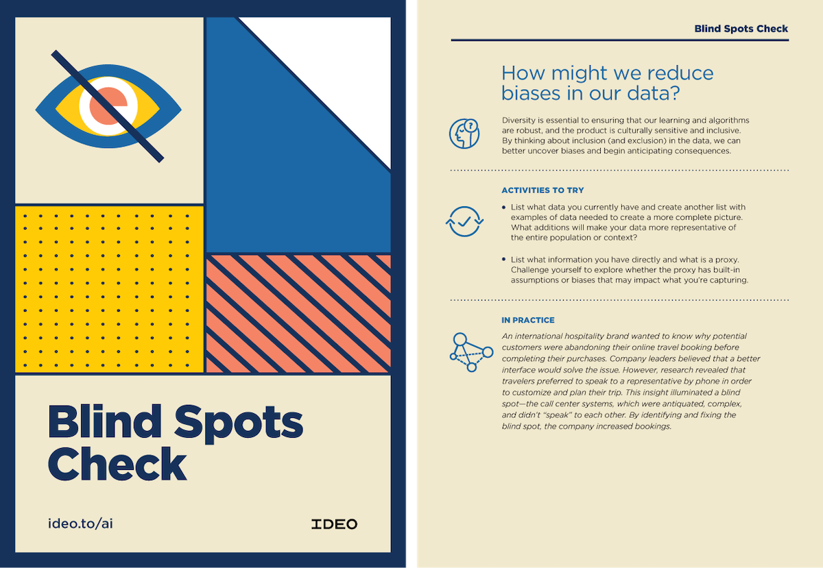
We came up with an original design, iterated on them, and landed on a set of four design principles and ten activities that can help guide an ethically responsible, culturally considerate, and humanistic approach to designing with data. These activities are meant to provoke thought; they’re a vehicle for introducing new ideas and stimulating conversations around ethics throughout the design process.
To start, here are our principles:
1. Data is not truth
Data is human-driven. Humans create, generate, collect, capture, and extend data. The results are often incomplete, and the process of analyzing them can be messy. Data can be biased through what is included or excluded, how it is interpreted, and how it is presented. Unpacking the human influence on data is essential to understanding how it can best serve our needs.
2. Don’t presume the desirability of AI
Just because AI can do something doesn’t mean that it should. When AI is incorporated into a design, designers should continually pay attention to whether people’s needs are changing, or an AI’s behavior is changing.
3. Respect privacy and the collective good
While there are policies and laws that shape the governance, collection, and use of data, we must hold ourselves to a higher standard than “will we get sued?” Consider design, governance of data use for new purposes, and communication of how people’s data will be used.
4. Unintended consequences of AI are opportunities for design
Just as with any design endeavor, we know that we’re not going to get it right the first time. Use unanticipated consequences and new unknowns as starting points for iteration.
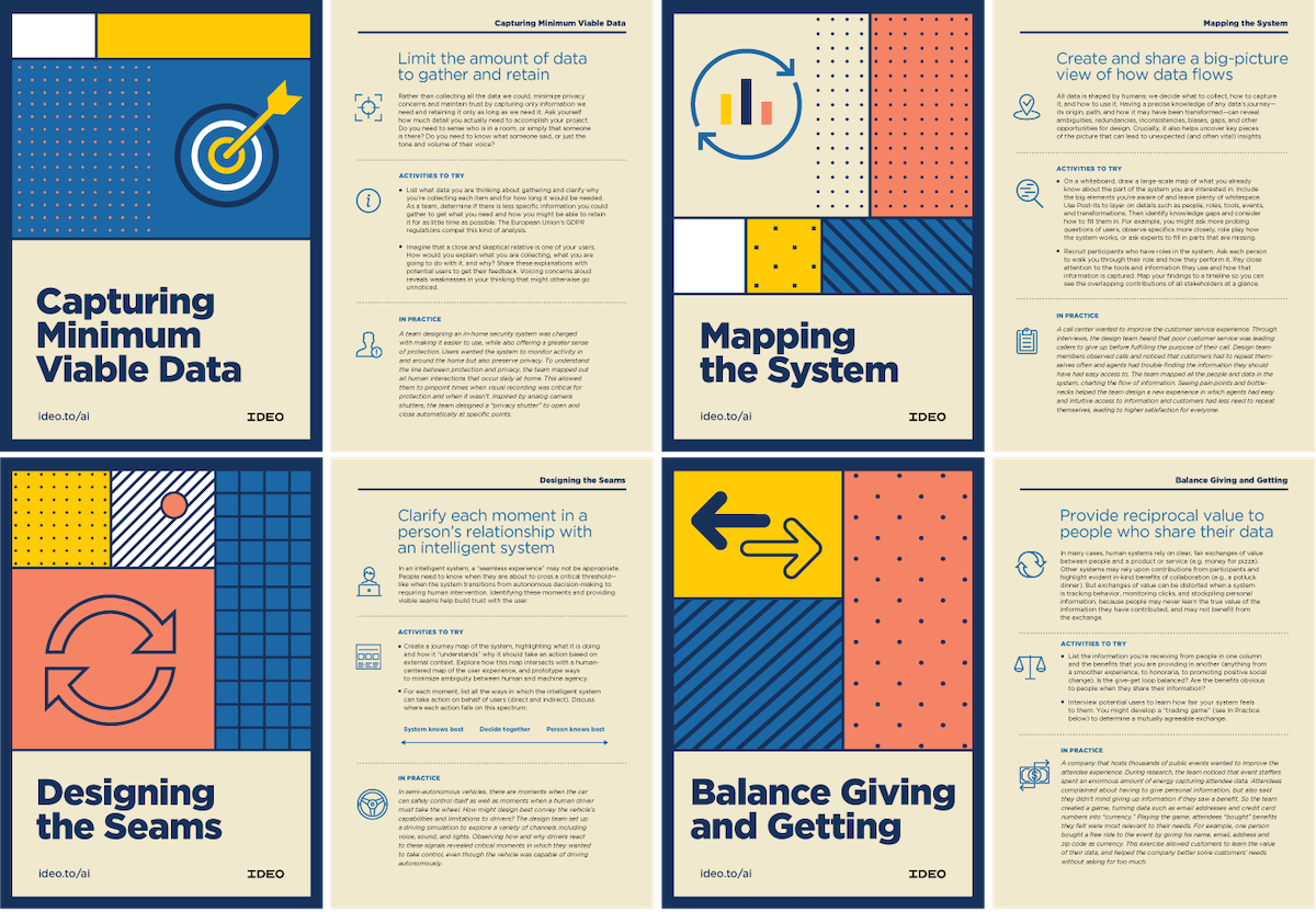
To get started with the activities, you can download the cards here. We hope that these activities provoke dialogue and provide concrete tools to help our community ethically design intelligent systems.
Thank you to the larger team who helped make these cards come to life—Ben Healy, Jane Fulton Suri, Jess Freaner, Mike Stringer, Justin Massa, Connie Oh, and KP Gupta, who designed them.
A design researcher, a business designer, and a data scientist were sitting at a bar. It sounds like the setup of a joke, but the conversation was actually quite serious.
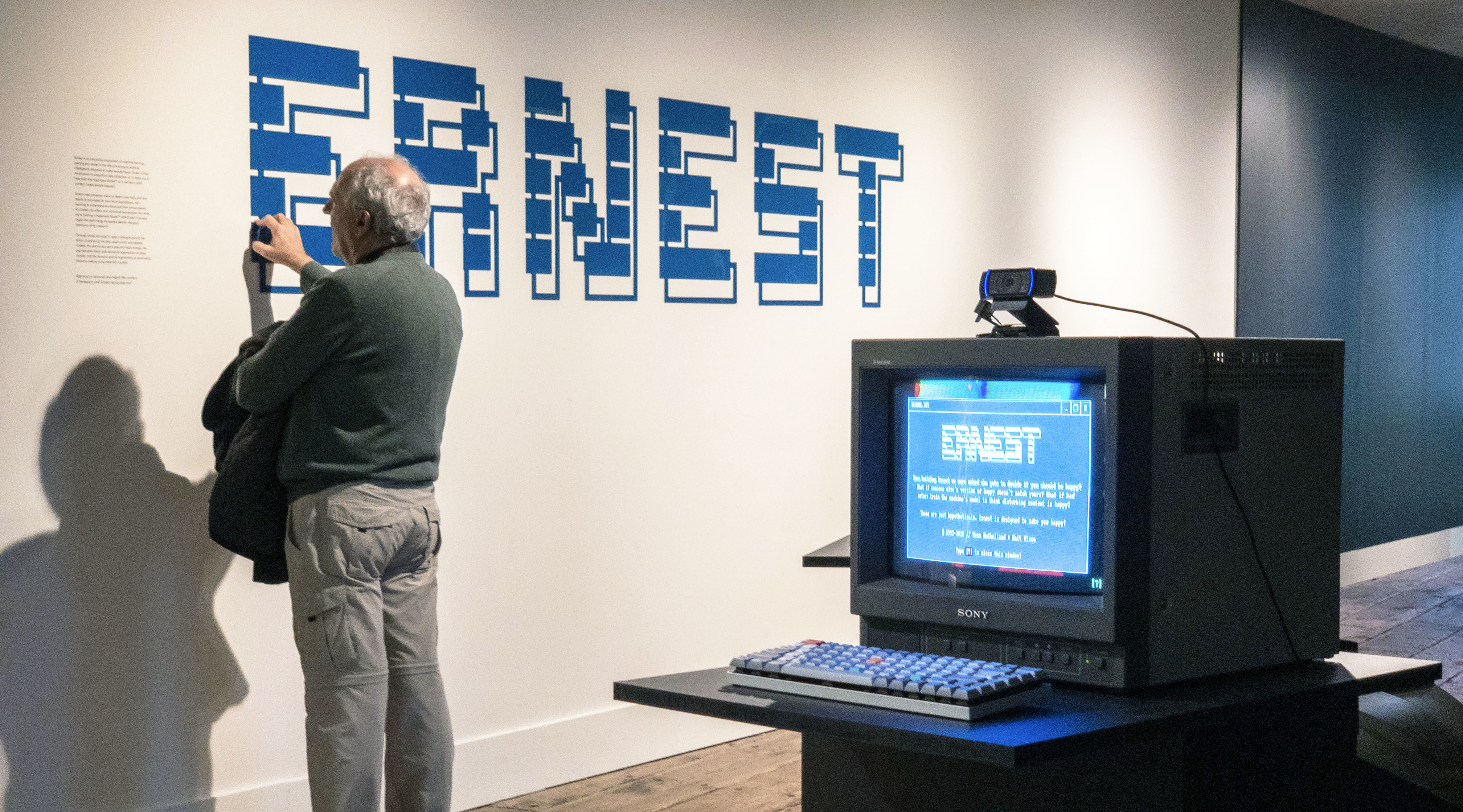
No Beards Allowed: Exploring Bias in Facial Recognition AI
How a creative code experiment helped people understand the pros and cons of artificial intelligence
As a user experience and interaction designer with a hybrid art and tech background, I’ve long been a fan of the concept of using art and design as a Trojan horse to make tricky concepts accessible. Through intrigue, curiosity, and play, these experiences can bypass our biases and open the door to understanding, without requiring deep comprehension. If you’ve ever visited a children’s science museum and watched kids excitedly engaging with subjects that would bore them to tears in book form, then you’ve seen the power of experience and play at work.
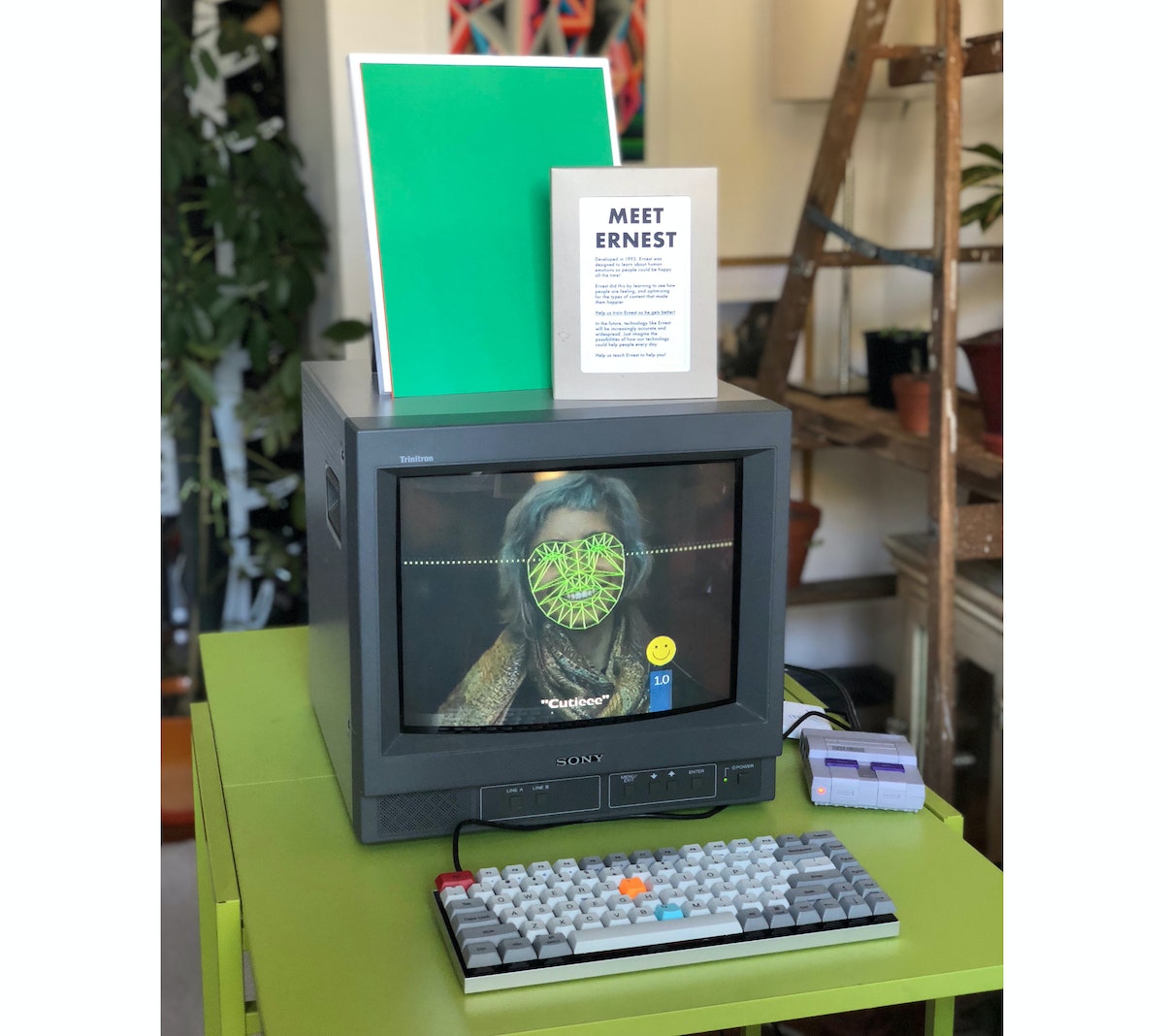
Meet ERNEST
That’s why my colleagues and I created ERNEST, an installation that gives the viewer the job of training a rudimentary artificial intelligence. Using facial and emotional recognition tech, ERNEST shows the user imagery and tries to see how happy it makes them. Our goal for this project was to engage users in a game-like experience to help them understand how machine learning models are trained, and subtly hint at the areas where bias could creep in.
Fellow IDEOer Matt Visco and I wanted to make sure ERNEST didn’t look like a modern computer—we designed it to look vintage. With its old hardware and nostalgic graphics, ERNEST doesn’t feel smart on the surface. Its look is meant to evoke a time when computers carried the promise of a utopian future, prior to mass connectivity and the ubiquitous collection of personal data.
The full installation uses five monitors, two computers, and three Raspberry Pis, which power several video loops that reveal the training data behind ERNEST, and give passersby a sense of the experience even if they don’t engage directly with it.
How it Works
ERNEST uses computer vision to perceive the user ambiently through facial recognition, allowing it to detect when a user is looking at it and how far away they are. When a user gets close enough, ERNEST comes alive and asks the user to help it learn. It then shows the viewer images intended to make the user happy, and gauges their emotional reaction based on their facial expression using a pre-trained model. The facial tracking and emotional data is displayed to the viewer in real time, encouraging users to make faces at ERNEST. Viewers can then validate the accuracy of the model to help ERNEST know if it was correct or not.
(Sound complicated? The video below might make it clearer.)
We installed ERNEST in IDEO San Francisco’s lobby for a couple of months, and also brought it to the San Francisco Art Institute Fort Mason Gallery for the CODAME Intersections exhibition in November 2018.
The Results
Many participants loved to challenge ERNEST, often emoting in varying ways through numerous loops of the game. Once, a group of participants spent nearly 20 minutes playing with ERNEST, takings turns to compare how it perceived each person.
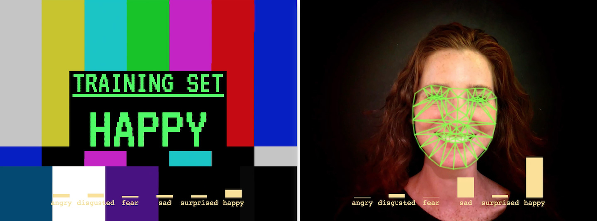
When viewers interact and play with ERNEST, we’re helping them see that machines can have almost human-like perception, reacting differently to different faces, and sometimes being uncannily accurate...or completely wrong. The wrong guesses were in many cases more interesting, and were in fact a very intentional part of the design. We wanted users to see that artificial intelligence is sometimes not as intelligent as we might think.
ERNEST is meant to be a game, but what happens when real-world AI makes the wrong guesses? Or what if those wrong guesses are uneven, indicating an unintentional bias, such as working well for some faces but not others?
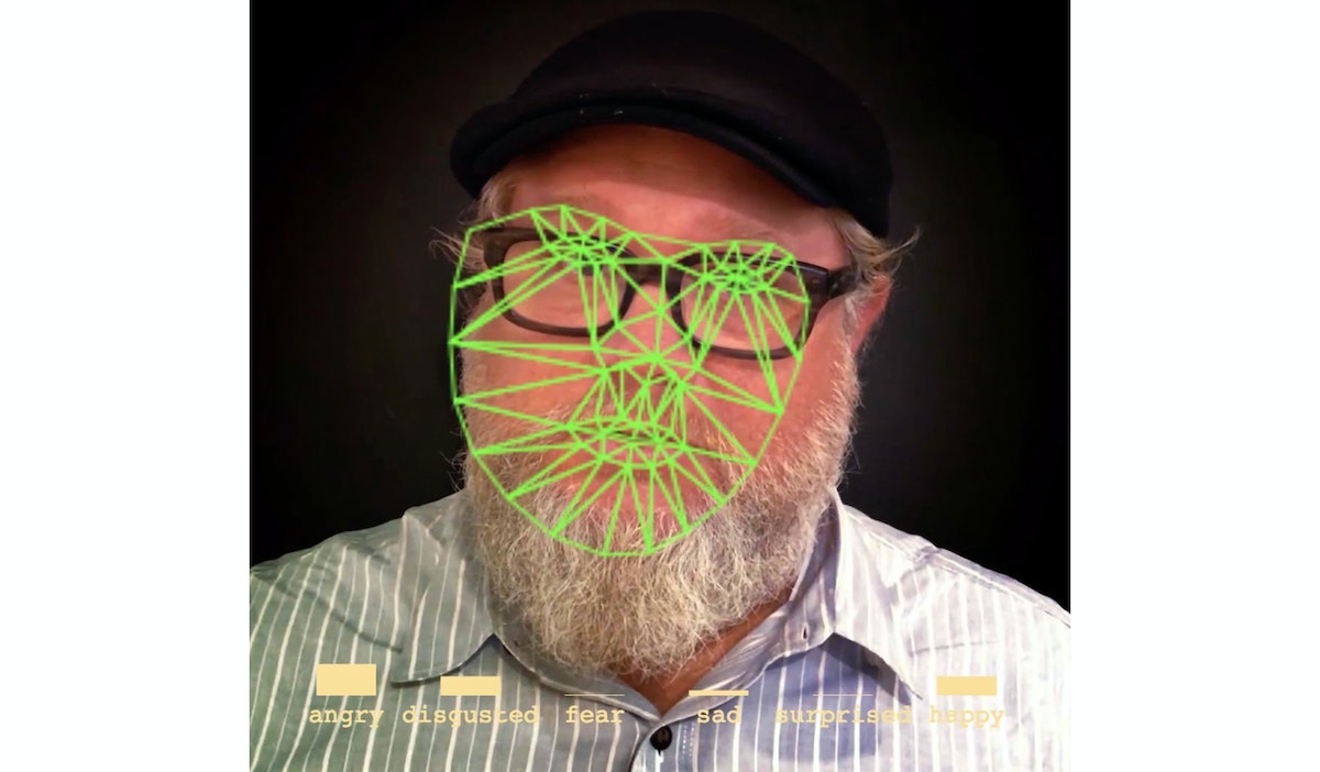
We wanted people to realize that designing systems that can ambiently perceive humans without direct input is rife with ethical concerns. And already, systems like these are being deployed at scale. The Guardian predicts emotionally-aware tech is already a $20B industry. Even something seemingly benign like ERNEST causes us to wonder—if an AI is trying to make the viewer happy, who determines what “happy” is? What if bad actors train Ernest to think that disturbing content is “happy?” What if the technology is repurposed to provoke anxiety or anger? What happens if we deploy technology like ERNEST widely?
Of course, ERNEST only scratches the surface of these big ethical questions, but we hope that it helps give people insight into how artificial intelligence thinks, and the ways its thinking can be flawed. The more that we as a society can start to understand these systems, the better we can judge their quality, and work to design them to be in line with our shared human values.
Artificial intelligence and machine learning are among the hottest topics of the tech world, but some of us at the frontier forget that many people feel intimidated—or even afraid of—these technologies. The pop-culture trope of machine intelligence gone rogue has been a part of our cultural psyche for a good 150 years. Think 2001: A Space Odyssey’s HAL 9000, The Terminator’s Skynet, and The Matrix’s... Matrix. Combine that fear with arcane tech-speak like “recurrent neural network” and “generative adversarial network,” and in addition to feeling emotionally intimidating, AI and ML can also feel incomprehensible.
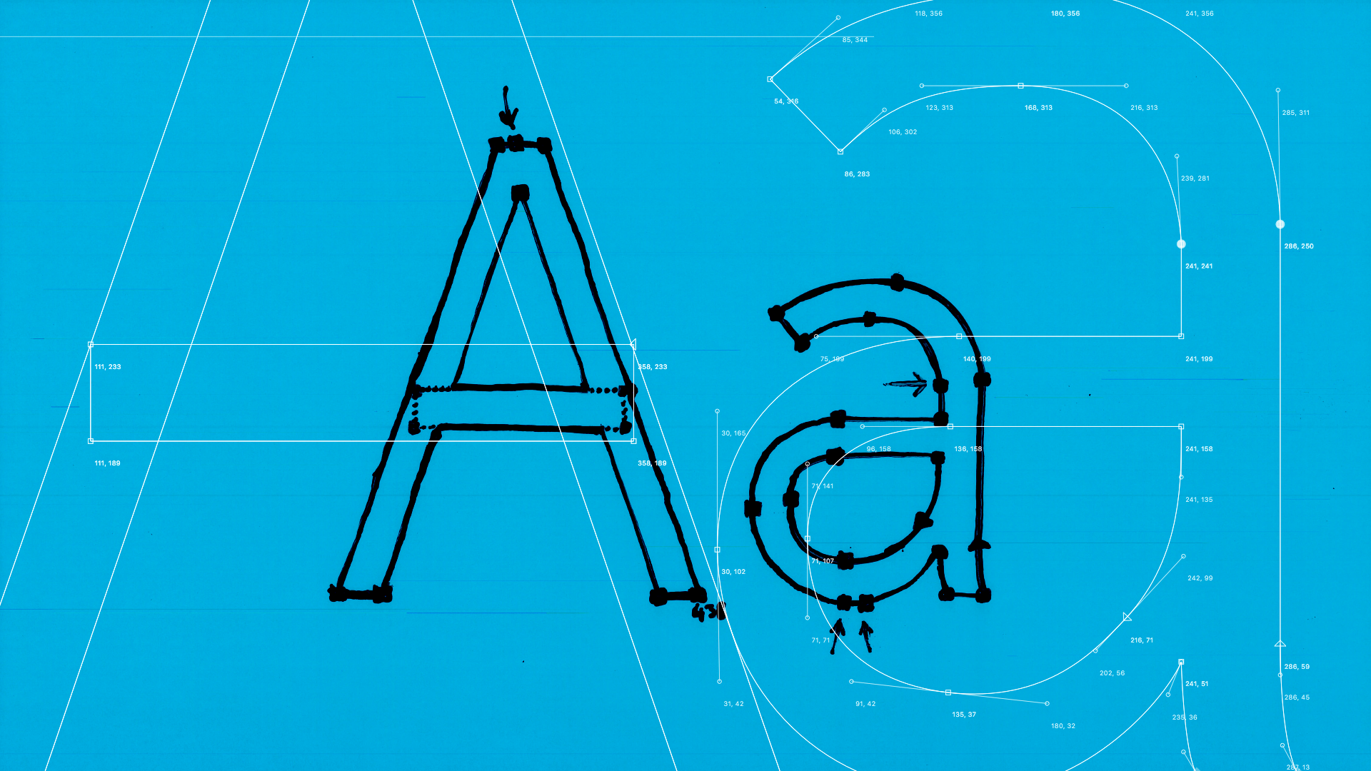
How to Make Hard Feedback Pay Off
It's not easy to have your work ripped apart, but it's essential to the creative process. Here's how to make it less hard.
Feedback is a tricky thing. There’s always going to be differing opinions of right and wrong, and even if it’s explained to you in a calm, clear voice, it can sting like nothing else. But getting feedback on your work is the only way you'll grow. It forces you to rationalize your thinking and creative decision-making, and teaches you to swallow your pride.
I learned the hard way: A few years ago, I designed my first typeface called Emotiv. It was a concept for a messaging app that would help people express their emotions through language (instead of emojis).
Eager to get my work out there, I decided to send a sample to a very well-respected typographer whose work I greatly admired. Given this individual’s reputation (and my lack of experience) I was reluctant to share at first, but with encouragement from friends, I sent it along with an explanation of how it came to be, not really expecting a response.

A few days passed, and much to my surprise, an incredibly lengthy reply fell into my inbox and hit me like a ton of bricks. It was the toughest feedback I’d ever received. Alignment issues, inconsistencies, readability problems, the email went on and on. It felt like my career was ending before it even had a chance to begin. We designers consider our creations extensions of ourselves—meaning that we take the pain of feedback personally.
While I can't offer up permanent thick skin, I have come up with 4 mindset shifts that will help you get—and give—negative feedback in a constructive way:

1. Introduce constraints
The least helpful feedback goes something like, “Hmmm, I’m not sure I like this.” We all have personal tastes, but there is no build-off point from that—no way to develop and improve. Instead, ask the person giving you feedback to be constructive, give their rationale, and ask as many questions as they’d like, rather than give you a gut reaction.
2. Tag team
Rather than putting yourself on the receiving end, get involved in the process. Imagine that the work being critiqued isn’t yours and offer your own thoughts. That will help you stay focused on the work itself. Plus, by making the feedback process more of a collaborative effort, you can understand the work from new angles to make it better together.

3. Be Spock
Do your best to take your emotions out of the equation. Instead of hanging on every negative word, look for unbiased points that will help you better define and execute the work. Even if the person giving you feedback is using words like “I like...”, or “I don’t like…”, those words aren’t aimed at you—they’re aimed at uncovering the fundamental thinking or execution behind the work.
4. Don’t ask for the answer
When the feedback process unearths a problem with your work, it’s tempting to simply ask for a clear solution to the problem. But that won’t push you to go further and explore other possibilities. Solving the problem yourself gives you another opportunity to learn and grow your skills.
Looking back, I now see now that the typographer who crushed me was actually providing a great service. (Honestly, you could tell someone they are terrible at something in considerably fewer words.)
I’d made the same mistake my fellow design student had made in that first class—I reacted as if it was a personal attack on me as a designer. But that feedback prodded me to become much more critical about my own work, studying details that others might not notice, with an eye toward readability and alignment.
Getting negative feedback can hurt. You pour your time and effort into creating something, and with the swiftest of comments, it gets cut down. But receiving it not only makes your work better, it makes you better... especially at giving feedback.
Nothing prepares you for the reality of receiving negative feedback. In one of my first design classes, I watched in horror as a fellow student had his work ripped in two for the first time in front of all of us. Shortly afterwards, he quit the course.

Lindsey Turner
I’m passionate about building brands, products, and experiences that help organizations show up with meaning and momentum.
I help organizations cut through complexity by shaping how they show up, through brand strategy, identity, and storytelling.
Working at the intersection of brand and business, I bring an editorial eye and a bias toward making—turning ideas into tangible experiences that people can understand, trust, and believe in.
My work spans government, healthcare, financial services, media, and consumer goods, from launching Gen Z-focused ventures to building innovation labs and reimagining legacy brands. I relish moments of ambiguity and enjoy translating across teams, perspectives, and priorities to move ideas forward.
I started my career in editorial and digital design, shaping cross-platform experiences and identity systems in publishing and agency environments. That foundation still shapes how I work today: I’m detail-oriented, collaborative, and overreliant on the Oxford comma. I hold a BFA in Visual Communication from the School of the Art Institute of Chicago.

Rachel Young
My work helps organizations see who their products aren't working for—and build the will and the tools to do something about it
For 25 years, I've asked the same question: Who does this design exclude—and what are we going to do about it?
My work spans human-centered strategy, inclusive design, and qualitative research, with clients ranging from Microsoft, Google, and Verizon to the National Science Foundation, and San Francisco Unified School District.
Before IDEO, I taught elementary school in East Palo Alto and spent a decade doing design work with social service organizations—where I learned firsthand what it costs people when systems are built without them in mind.
I am currently writing User Error, a nonfiction book about digital access and the design decisions behind it. I live in Oakland, California.

Brian Pelsoh
I lead with craft, ensuring our work is creatively excellent: rooted in deep human insight and imagination, while also grounded in the realities of business and technology.
My expertise spans brand, communication, and product design across tech, education, the arts, and social impact.
I believe great work demands both high-level vision and obsessive attention to detail, and only happens through collaboration.
I bring an inclusive, hands-on approach and a deep understanding of business, which enables me to consistently deliver excellence while always asking why.
Before joining IDEO, I worked at the brand firms Pentagram and VSA Partners. I began my career as a designer, leading teams at the School of the Art Institute of Chicago and the Milwaukee Art Museum. I hold an MFA in graphic design from Maryland Institute College of Art and a BFA in communication design from the Milwaukee Institute of Art & Design, and have taught at some of the best design schools in the US.

Tony Wong
I am responsible for IDEO’s long-term success in China and working with clients to use design as a tool to enable growth.
I am responsible for IDEO’s long-term success in China and working with clients to use design as a tool to enable growth. Specifically, I have helped Chinese companies design holistic brand solutions through the development of their products, communication, services, and innovation teams, and I have helped multinationals expand their presence and influence in China.
I advise global leaders on developing China-led innovation and capabilities.
In over 15 years in IDEO Shanghai, I have worked on projects that use design to elevate the quality of the experience of healthcare products and services, streamline processes that increase productivity, create spaces and programs that promote and enable inclusive communities, and build next generation mobility solutions that are planet-positive.
Before joining IDEO, I worked at Philips Electronics and the Electrolux Group in Italy, the Netherlands, and Singapore on a number of breakthrough commercial products. I am a member of the Young President Organization in Shanghai.

Building a personal AI for the messiness of life: Sida Li
Most AI products today are built for work—a space with clear problems and established systems. One founder noticed a gap: personal life is messier, harder to systematize, and mostly left behind by the AI boom. So she built Cue, a personal AI that lives inside iMessage and group chats, to go where the other tools haven't.
In this episode, Becca Carroll, IDEO's Chief Strategy Officer, talks with Sida Li, co-founder and CEO of Shared Context Lab, about staying anchored to a human need while the technology around her keeps changing shape, why she treats her business model with the same rigor she'd bring to a product, and what it feels like to build a company at this particular, disorienting moment in AI.
The conversation also gets into how Sida makes design decisions: the language Cue uses to describe itself, the tradeoffs behind building inside iMessage instead of a new app, and a real story about a business idea that didn’t pan out.
This is the second in a two-part series profiling founders from IDEO's Startups-in-Residence program. The first conversation is with Johannes Seemann, founder of Sooner, on designing GenAI for the emotional side of money.

Designing GenAI for the emotional side of money: Johannes Seemann
Most personal financial tools are built to run the numbers and optimize towards a budget. While that works for some, most people experience money as a lived relationship that does not neatly fit into a spreadsheet. Johannes Seemann and Becca Carroll discuss why money is emotional before it is mathematical, and what a human-centered approach to building a generative AI financial product looks like in practice.

The curious leader's edge in uncertainty: Scott Shigeoka
Mina Seetharaman talks with Scott Shigeoka, author of Seek and Head of Curiosity Cultivation at the Eames Institute, about what distinguishes genuinely curious leadership from performative curiosity, how power dynamics shape curiosity, and why practicing curiosity can restore energy rather than drain it.

How constraints make us more creative: David Epstein
Mina Seetharaman talks with David Epstein, author of Inside the Box and Range, about why total freedom often produces average work, how leaders can design useful limits on purpose, and what organizations such as General Magic and Pixar reveal about the relationship between boundaries and creativity.
Looks like you might be in search of something very specific?
Or reset the filters above and try another angle.
Here’s some random inspiration

Podcasts about creative leadership

Articles about the power of prototyping
