
.svg)



Reintroducing The Lawrence Hall of Science
A lively new brand reenergizes a STEM learning institution.
Named after Ernest O. Lawrence, UC Berkeley’s first Nobel Laureate, The Lawrence Hall of Science’s wide-ranging products, services, and tools developed organically over half a century. To begin to make sense of the breadth and depth of its offerings, IDEO asked leadership and staff to surface the myriad activities, audiences, and relationships with external partners, enabling the group to visualize—and make sense of—the totality of The Lawrence brand.
During in-depth research with parents and kids, educators, and experts, IDEO discovered that each of these audiences had distinct mindsets. Parents and kids engaged with The Lawrence to explore, have fun, and dive deeper into a specific topic. Educators utilized it for professional learning opportunities and to discover new, exciting classroom tools. While experts, including UC Berkeley faculty, STEM educators across the US, and funders, viewed the center as a resource for best-in-class STEM education research. The mindsets highlighted The Lawrence’s unique capabilities, but the complexity also created some opportunity areas, including ways to use storytelling to create emotional resonance around The Lawrence’s core values and how to design a unified narrative to connect the dots across audiences and offers.
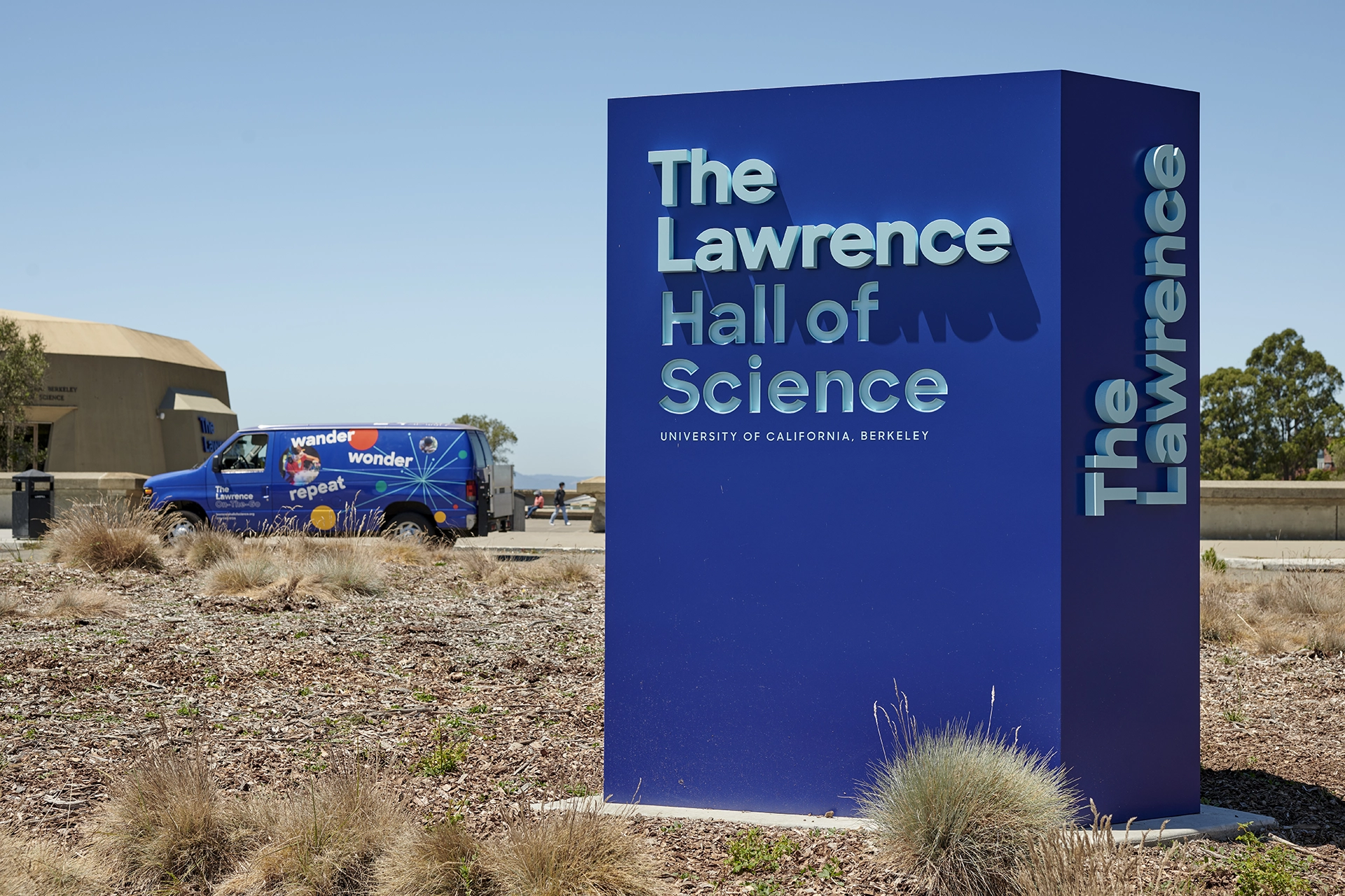
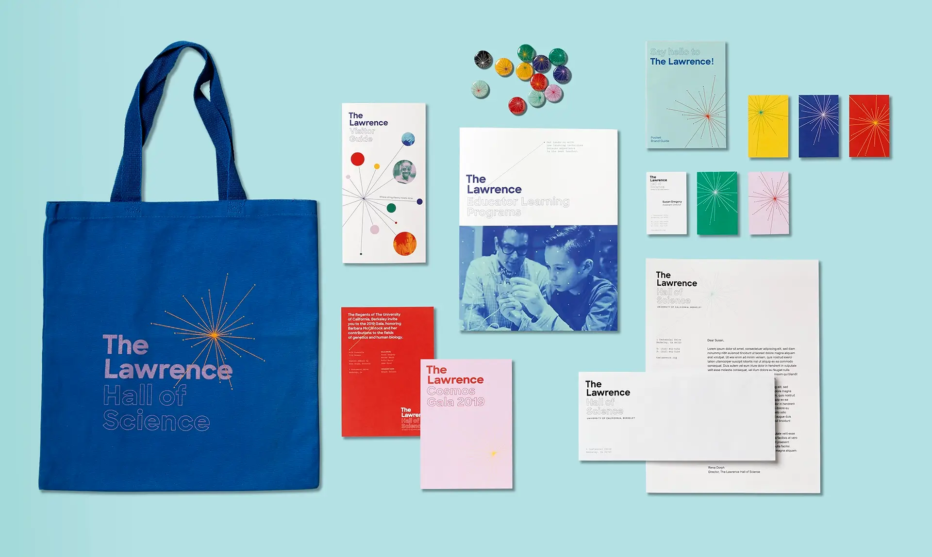
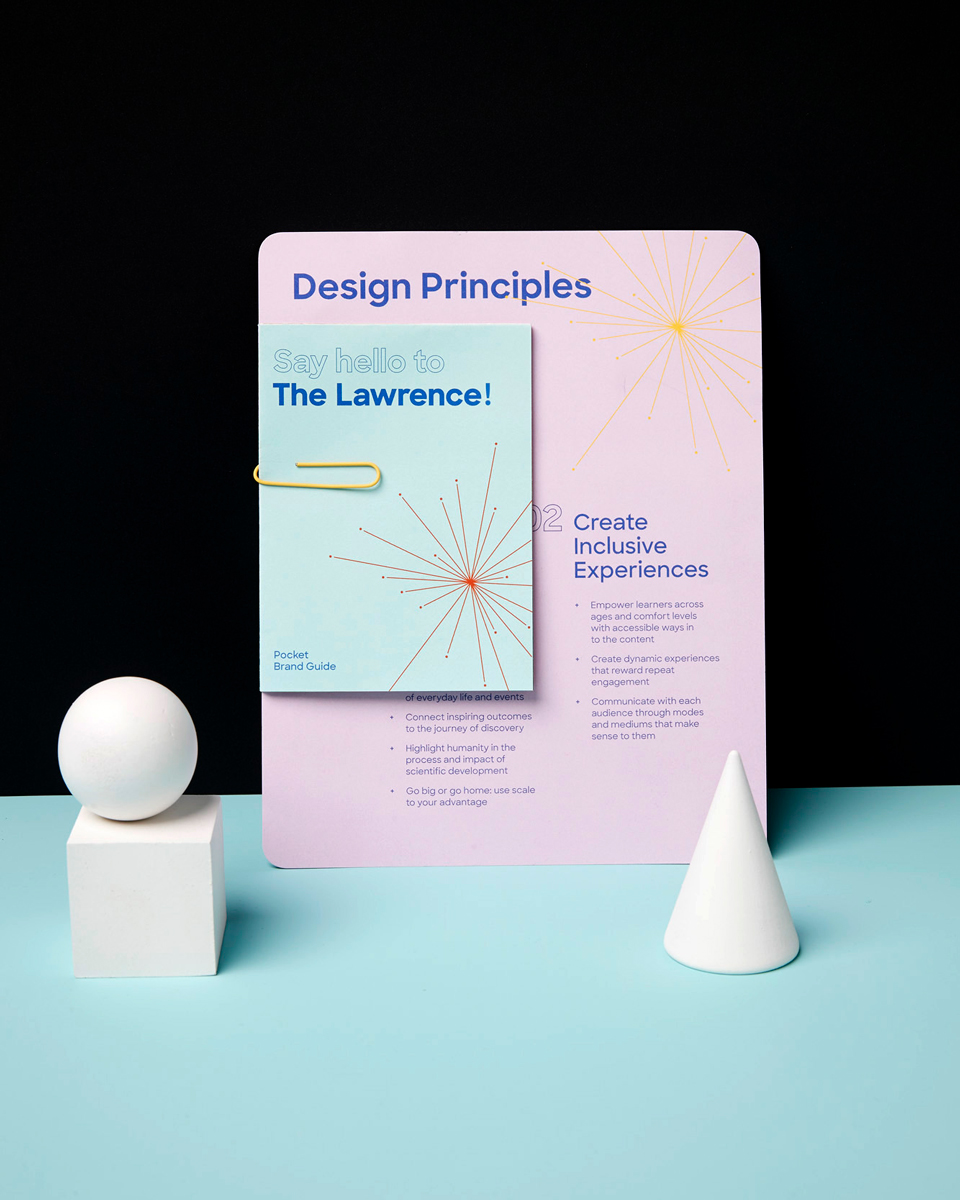
Building on its strengths as an institution and the identified opportunity areas, IDEO created a modern, vibrant, and flexible brand that strategically and visually unites all of The Lawrence’s offerings, working across digital and physical media. Grounded by a grid system, the updated brand identity is simultaneously rigorous and fun, featuring a bright color palette and signature retro-cool super-nova mark. Different offerings are bundled together based on different audience needs, preventing confusion and easing navigation. Even the name of the science museum, The Lawrence Hall of Science, was updated to a more contemporary and approachable, The Lawrence, inspired by The Met.
The Lawrence unveiled its new brand with much fanfare in late 2018 as part of its year-long 50th anniversary celebrations. Visitors can see the updated identity across all public-facing elements, including The Lawrence’s website, curriculum and educator materials, letterhead, collateral, and exhibition and wayfinding signage. The redesigned brand has been credited with bolstering the popularity of the science center among families and schools and causing ticket sales to return to—and exceed—pre-pandemic levels. Internally, the rebranding effort has helped generate excitement and energy across departments, helping solidify a collective future strategy and vision for its next 50 years.

The Lawrence Hall of Science’s diverse offerings had grown extensively over the decades, creating a confusing and disjointed experience for its various audiences. On the eve of its 50th anniversary, Lawrence leadership sought a brand refresh to better connect with its target audiences and differentiate itself in the STEM education ecosystem.
Over $6M in new funding
raised to transform and modernize The Lawrence, thanks to IDEO's rebranding effort
Reinventing classic British pubs and inns
Greene King’s upscale Everly Hotels Collection combines modern comfort with local impact.
When Greene King approached IDEO in early 2022, it was (and still is) one of the UK’s leading hospitality brands, with over 2,600 pubs, restaurants, and hotels. At that time, consumers in the UK and other parts of the world were beginning to rediscover the joys of travel after years of pandemic lockdowns. Greene King’s newly formed Venture Hotels Team wanted to understand how guest expectations had shifted during Covid-19 and how a new customer-centric hotel brand and signature service experience might meet—or exceed—their expectations.
To get inspired, the IDEO team interviewed a range of travelers of different ages and backgrounds, met with hospitality and luxury experts, and conducted immersion visits, including visiting high-end hotels. The research revealed modern travelers want unique hotel experiences that cater to their curiosity, support local communities, and are environmentally sustainable. Luxury, which once meant “exclusive,” was now about enabling one-of-a-kind cultural experiences. Today’s travelers value inclusivity, accessibility, and well-being; they want to feel welcome, do things at their own pace and have thoughtfully curated options to choose from. They also expect hospitality practices to be ethical and sustainable, contributing to the welfare of local communities and the planet.
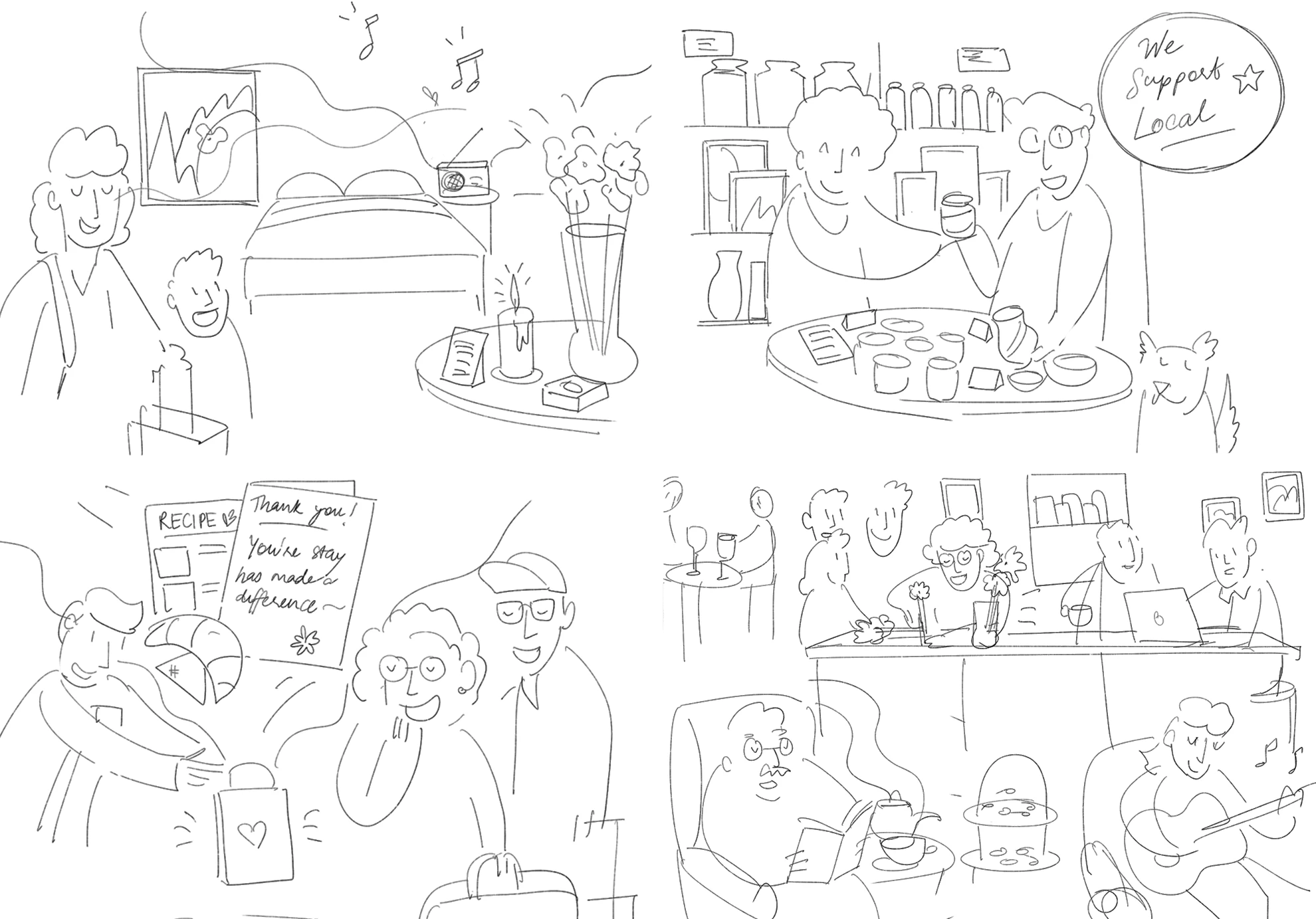
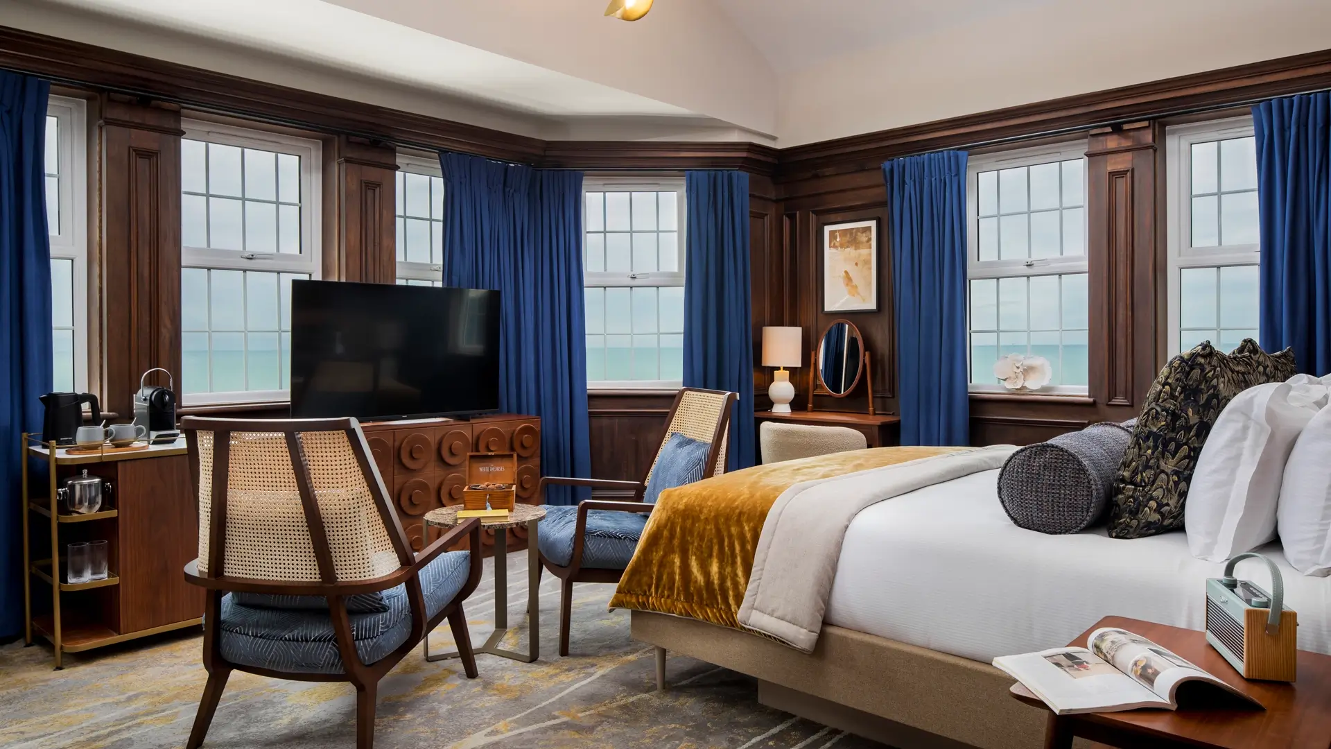
Building off this research, IDEO crafted a new entry proposition for Greene King’s new Everly Hotels Collection called “The Discover Collection,” which leverages the best parts of a classic British pub and inn—bespoke historic locations full of character, culture, and stories—while offering guests a modern experience from pre-arrival to departure, all grounded in supporting the communities they are in.
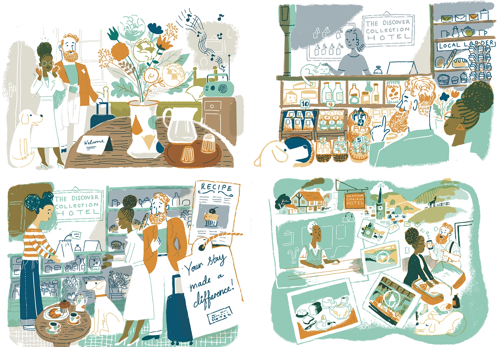
Signature moments include a warm welcome during check-in, as well as staff recommendations and local maps highlighting neighborhood gems. During their stay, guests enjoy expansive seasonal food menus, as well as a beverage menu that includes a wide variety of locally brewed, distilled, and crafted drinks by local suppliers. Rooms feature a smuggler's treasure chest with a surprise treat. Art and books from local talent are on display throughout the hotel, and local experts lead activities and events. Guests tangibly experience Greene King’s commitment to sustainability through its use of local materials, produce, talent, and partnerships, all designed to support the surrounding community. Upon departure, guests receive a personalized postcard.

In addition to the hotel experience moments, IDEO delivered branding recommendations for The Everly Hotels Collection, including visual identity and tone of voice that provide a cohesive look and feel for the collection of hotels while simultaneously showcasing each property's unique character. This was all packaged as an experience playbook, with design principles and briefs to help guide implementation decision-making across Greene King’s marketing, digital, interior design, and food and beverage teams.
A few months after the project ended, Greene King launched The Everly Hotels Collection. Its pilot hotel, The White Horses in Rottingdean, East Sussex, opened within the year. The new brand and guest experience strengthened bonds with Greene King’s loyal customers and first-time guests, ensuring the brand's relevance and appeal in a competitive market. More hotels are planned in the future in other scenic UK locations.
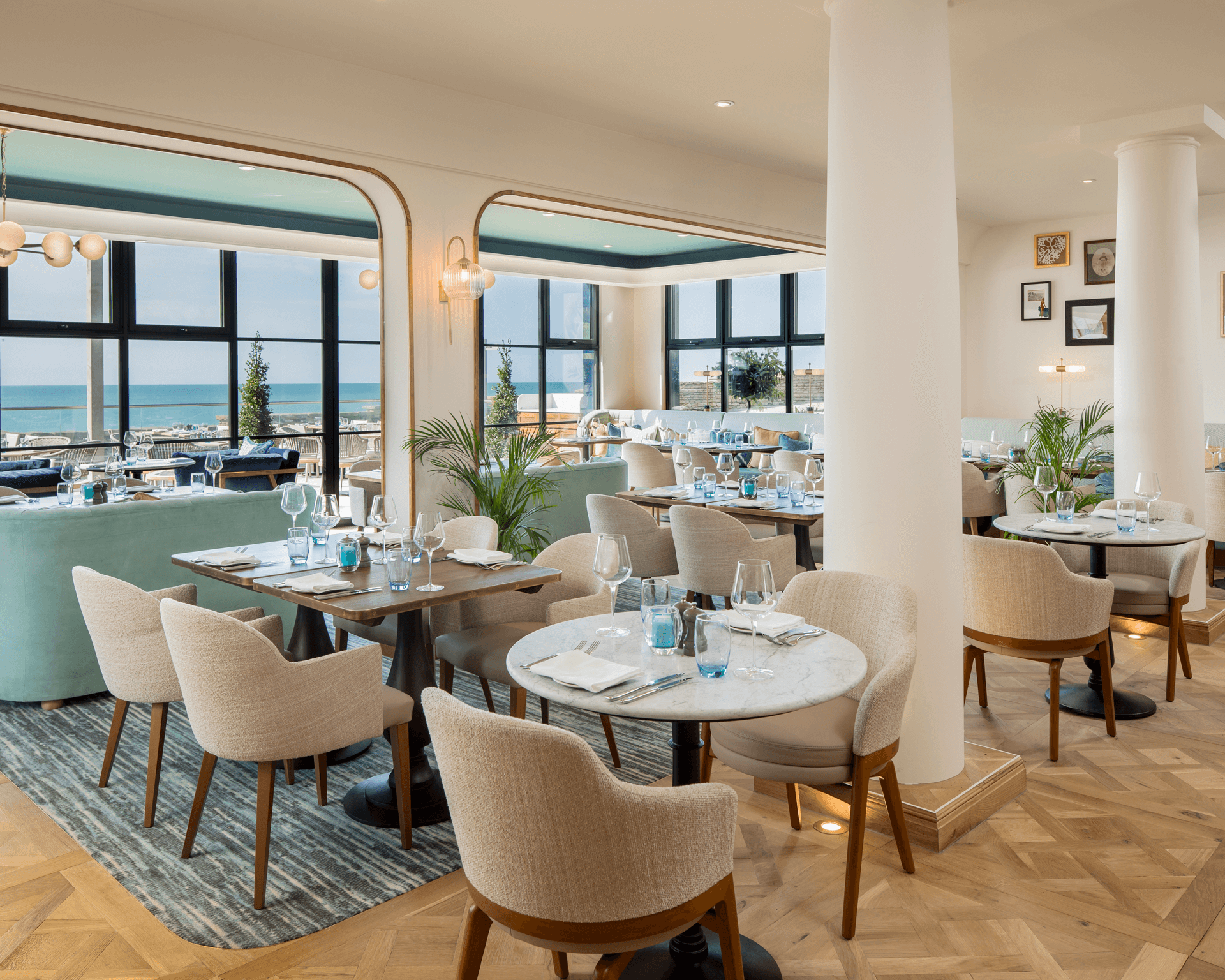
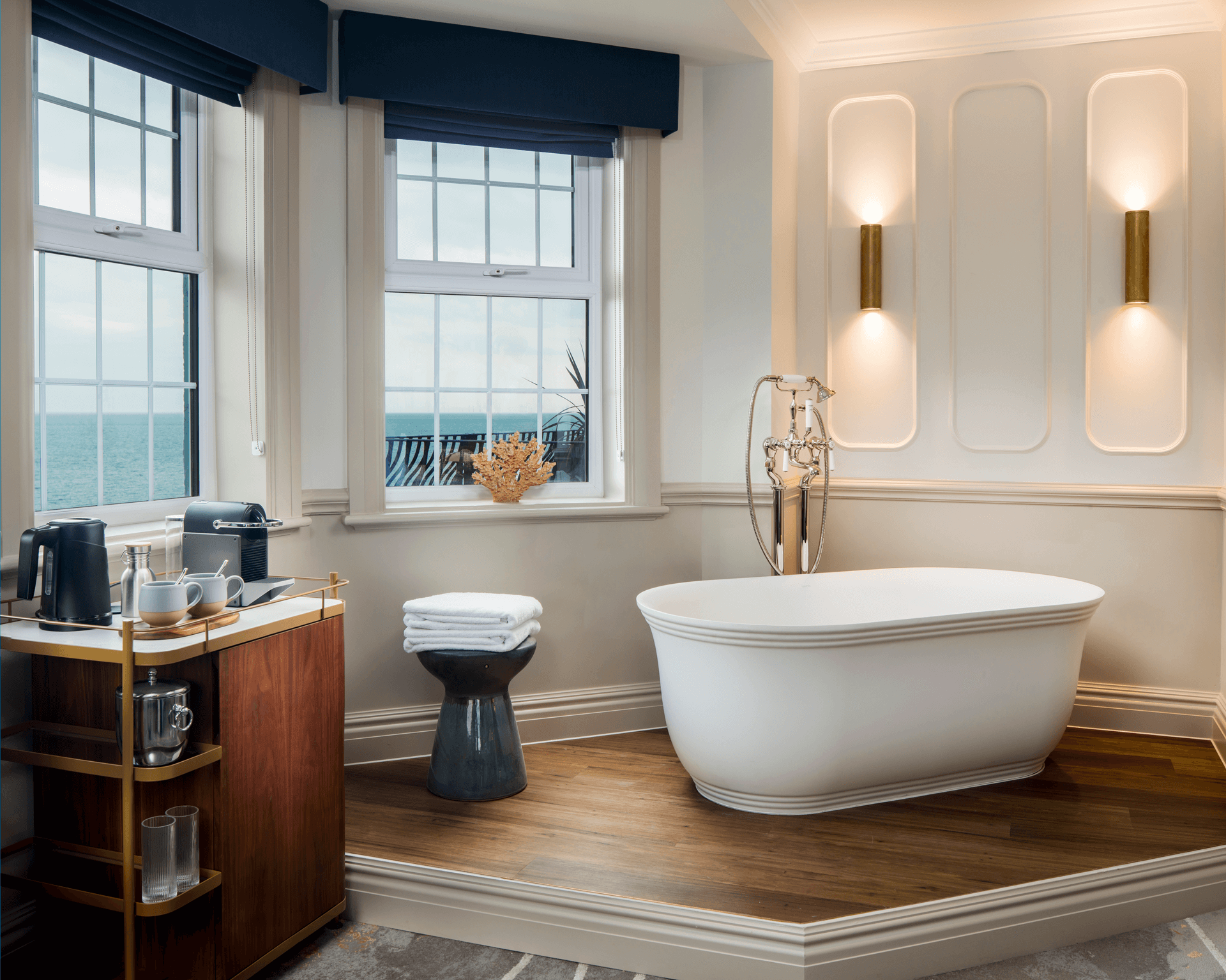
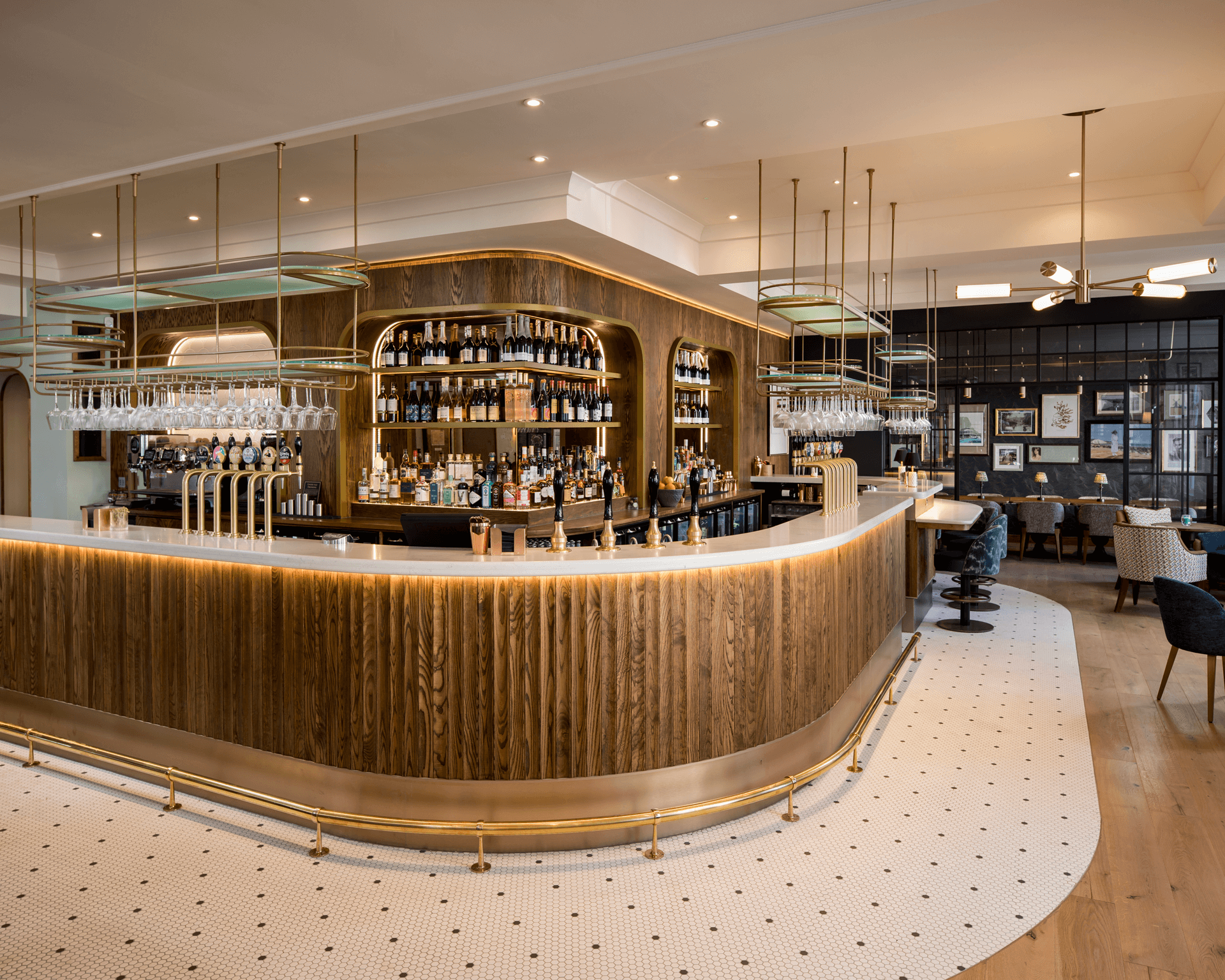
Greene King wanted guests to have a consistent brand experience while maintaining the storied charm that makes each property unique.
2 years
from concept to the launch of Greene King’s boutique Everly Hotels Collection
1 pilot hotel
The White Horses opened in Rottingdean in 2024
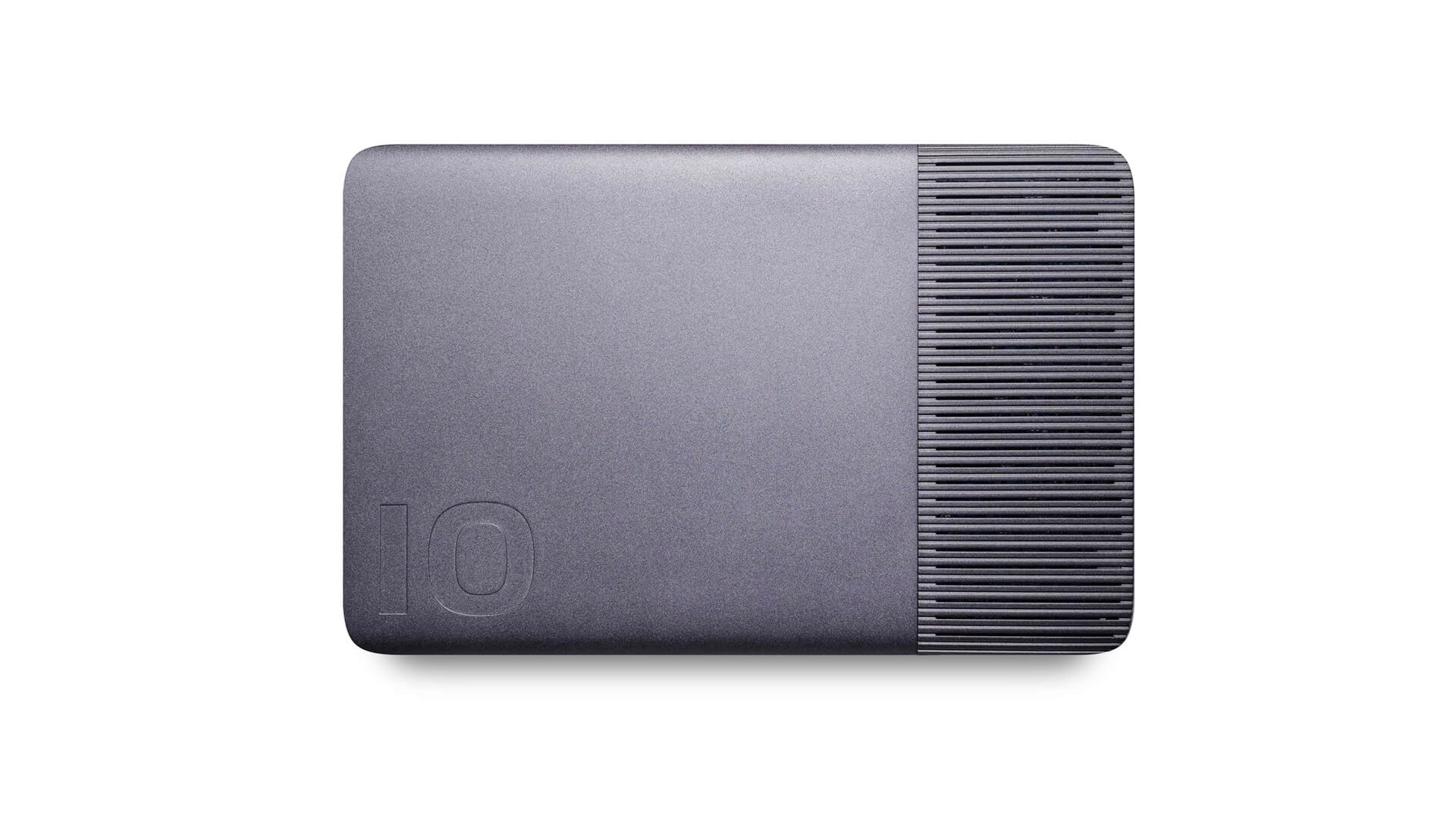
A new paradigm in data storage
Designing the iodyne Pro Data and Pro Mini hard drives.
The hard drive space is full of companies competing over technology and performance. But iodyne wanted to add another layer, focusing on user needs and product aesthetics to better position the company to meet the values of a broader audience and create compelling new entrants into this crowded market.
Together, IDEO and iodyne jumped into in-depth discovery research to learn more about the needs of their end users. The team sat down with photographers, videographers, and digital imaging technicians, asking questions about their file management systems, how they used hard drives in the field, and how they stored them for transport and at home. They also headed to the source, visiting studios and home office set-ups to understand the full range of potential use cases.
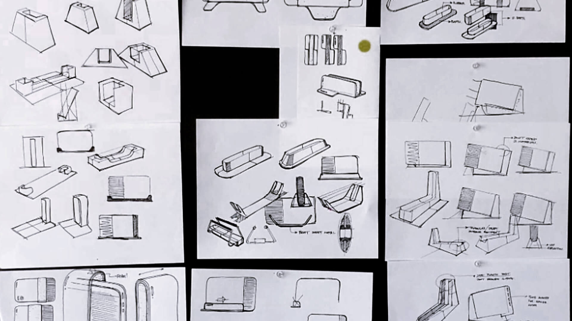
A few big discoveries leaped out. No one had a single storage solution to rely on. Users constantly transferred data from different hard drives designed for different purposes (in the field versus at home), accumulating hundreds of old hard drives over time. Traditional hard drives also don’t allow multiple users to work off them simultaneously or come with software systems that help keep projects and tasks organized, protected, and sharable. Meanwhile, the ever-shrinking size and weight of laptops—and people’s willingness to take them everywhere—set a new benchmark for portability, one that iodyne could lean into.
With these and other insights in hand, the team brought unrivaled performance and aesthetics together to create a far superior user experience. IDEO and iodyne developed Pro Data’s engineering architecture, collaborating on thermal performance analysis, material choice, inspection of sample parts, and even packaging design. By combining integrated venting, multiple laptop-quality fans, smart power management, and 20 thermal sensors, the team was able to minimize cooling fan loads and reduce noise and power consumption. A single, centralized, and consolidated storage space makes sharing data among teammates easy, too—up to four computers can connect to the Pro Data at the same time and access the same files. The redesigned Pro Data creates new value for consumers in a highly mobile, secure package that can go from desktop to backpack and back again.
The iodyne Pro Data hard drive launched in 2021 to overwhelmingly positive reviews. Storage Review wrote “Nothing else comes close to this level of performance in a package this size,” while Jemery Boros of StarGate Studios said “I don’t think I could have done the shoot without Pro Data. It was easy to use, fast, and kept all of our data safe on the other side of the world.” The drives have since been used in the making of major motion pictures from F1 to A Complete Unknown.
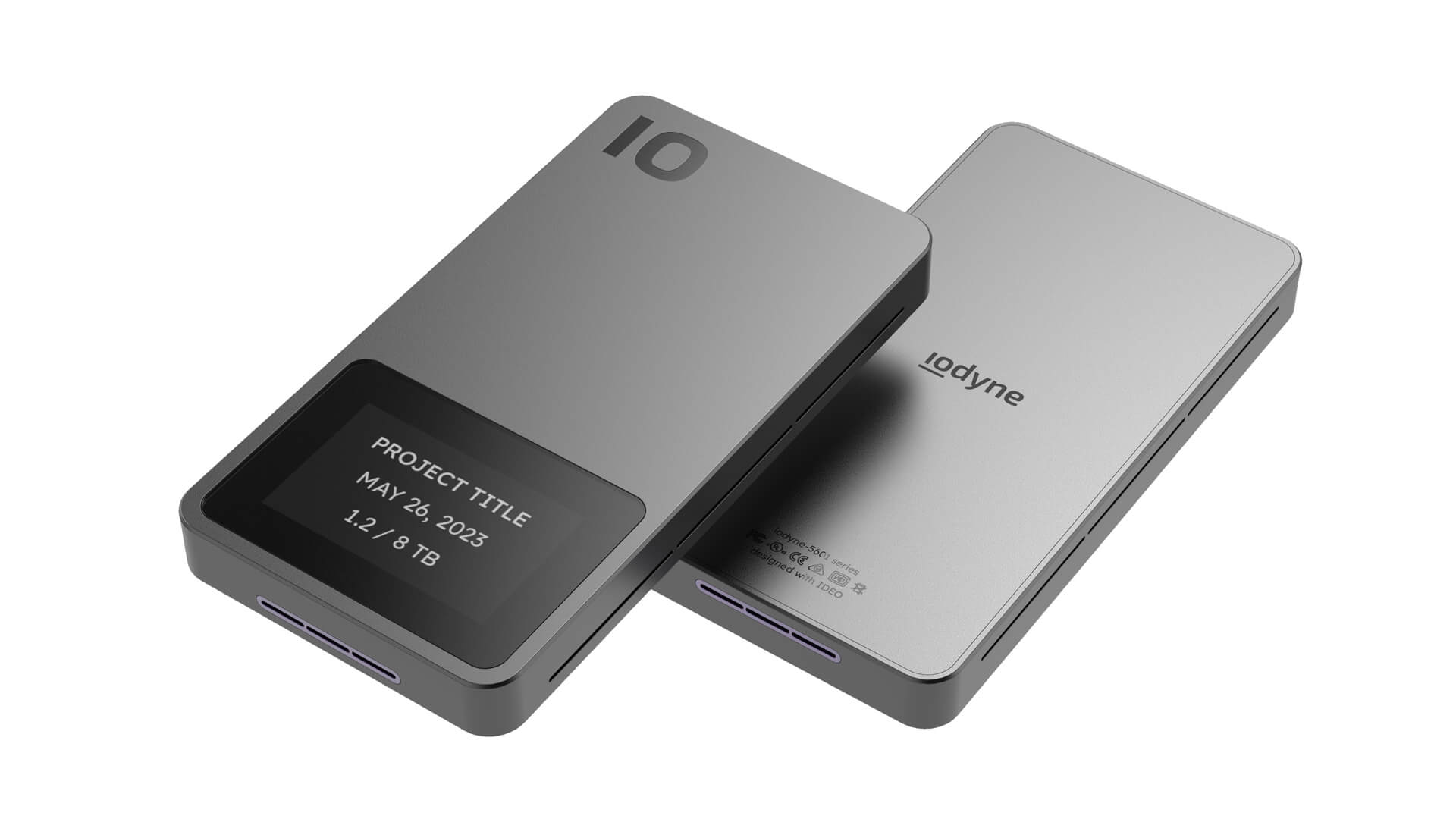
Spurred by Pro Data’s success, iodyne decided to create a second product with IDEO, a Pro Mini that could provide the same cutting-edge performance and sleek design but scaled down to fit the needs of customers who required less storage capacity in an even more portable package. Pairing Pro phone-quality industrial design with a unique internal solid-state cooling architecture that imposed key constraints on airflow was critical.
IDEO worked with iodyne to create the Pro Mini’s internal layout and collaborated with an emerging engineering company to incorporate novel solid-state cooling technology, positioning the vents to maximize airflow and optimizing how users physically interact with the device. The team also addressed users’ durability concerns, advising iodyne on part selection as samples came in from vendors. The new Pro Mini is set to ship in the second half of 2025.
Hard drives are essential tools of the trade for people with large troves of media to store and transfer, like photographers and videographers. But beyond rolls of masking tape and label makers, there isn’t an easy way to see what’s on each drive without literally going through them one by one.
Traditional hard drives generate a lot of heat and need fans to cool them, making them bulky, loud, and slowing transfer speeds.
Many external hard drives are treated like commodities. They’re designed for mass production rather than for durability and aesthetics.
2 cutting-edge hard drives
to market in 3 years
Introducing LA’s mental health crisis first responders
Helping a kinder, safer emergency support arrive first on the scene.
LACDMH is the nation’s largest public mental health department, serving over 10 million people. The agency provides critical support for the most vulnerable, including staffing a toll-free, 24/7 Help Line. Since late 2024, more than 70 Field Intervention Teams—comprised of mental health clinicians (social workers, psychologists, licensed psychiatric technicians, and registered nurses) and community health workers (trained peers or community members with lived experience)—have been dispatched around the county to help de-escalate mental health crises quickly, compassionately, and without force.
Because those experiencing a crisis are often too disoriented, confused, or otherwise unable to seek help for themselves, IDEO’s communication strategy targeted reaching “trusted messengers”—parents, spouses, siblings, and friends of people who have a mood or personality disorder like schizophrenia or bipolar disorder. The campaign aimed to define mental health crises, help people understand what to expect when they call, build trust in FITs, and divert mental health crisis calls away from 911.
To understand what drives these specially trained mental health professionals to do this type of work—and what sparks trusted messengers to call for help—IDEO met and interviewed former clients and loved ones who had reached out to the county for support during a mental health crisis. The team also interviewed multiple FIT staff to learn more about how they approach clients and families.
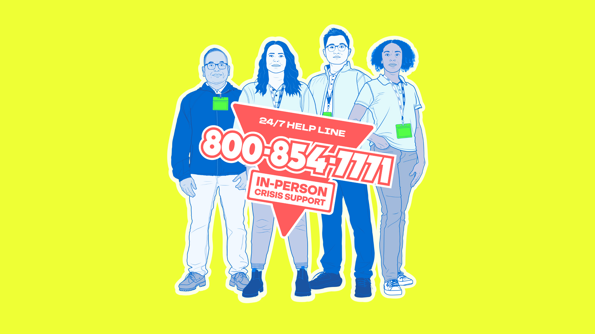
The research inspired the communication strategy’s central idea: position FIT members as real-life superheroes and first responders. By associating FITs with that term, the campaign changes the narrative and communicates their compassion and expertise to those in crisis. Custom illustrated portraits feature actual FIT staff in strong, action-figure-style poses, while a bright, eye-catching color palette and clear, direct language convey confidence and inspire trust.
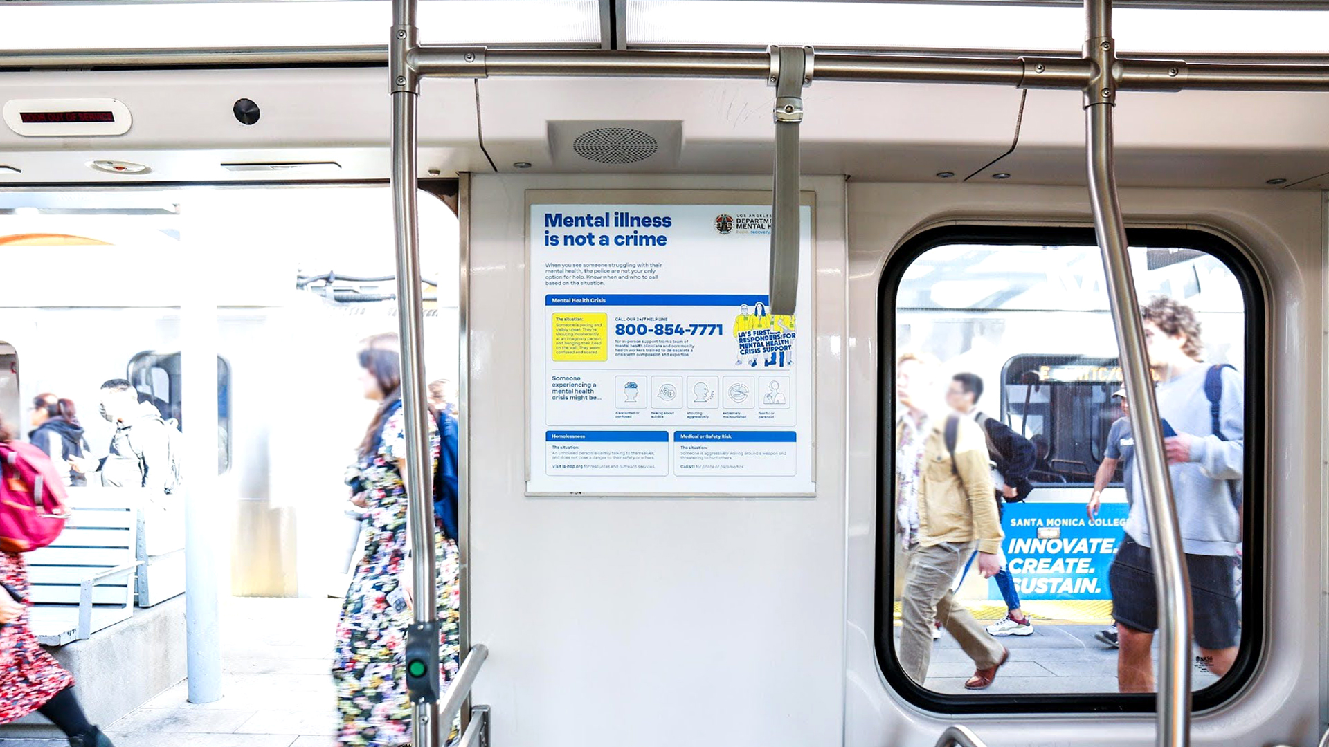
The team explored their initial design directions in a series of focus groups with LA residents, trusted messengers, and county and mental health workers to better understand the impact of the potential messaging and visuals. The research uncovered the importance of clarity, even in an inherently emotional situation. The IDEO team discovered that transparency—and real personal stories—would be the key to building public trust in ACR.
Between March and June of 2025, the robust awareness campaign will run across LA County in a number of languages on city buses, in Metro stations, on social media, streaming TV, radio, and more. An updated landing page on LACDMH’s website includes in-depth information and educational videos about mental health crises, as well as heartfelt testimonials from staff and former clients who have been helped by the service.
LA County Department of Mental Health created an innovative new program to provide urgent, compassionate care to Angelenos experiencing a mental health crisis but needed help driving awareness of its service across the region.
Calling 911 is an entrenched behavior in an emergency. However, dispatching police officers who are not trained in mental health can make a bad situation worse. In 2022, 39 percent of people shot by LA police officers were in the midst of a mental health crisis.
172 million impressions
delivered via digital and physical ads across LA
50% increase
in calls to the ACR helpline, year-over-year, attributed to IDEO’s awareness messaging
24%
of Angelenos now name LACDMH as the first to call in a mental health crisis, leapfrogging 911 or the police, which slipped 14.3 points
Veggie Vision: Designing the Kitchen of the Future
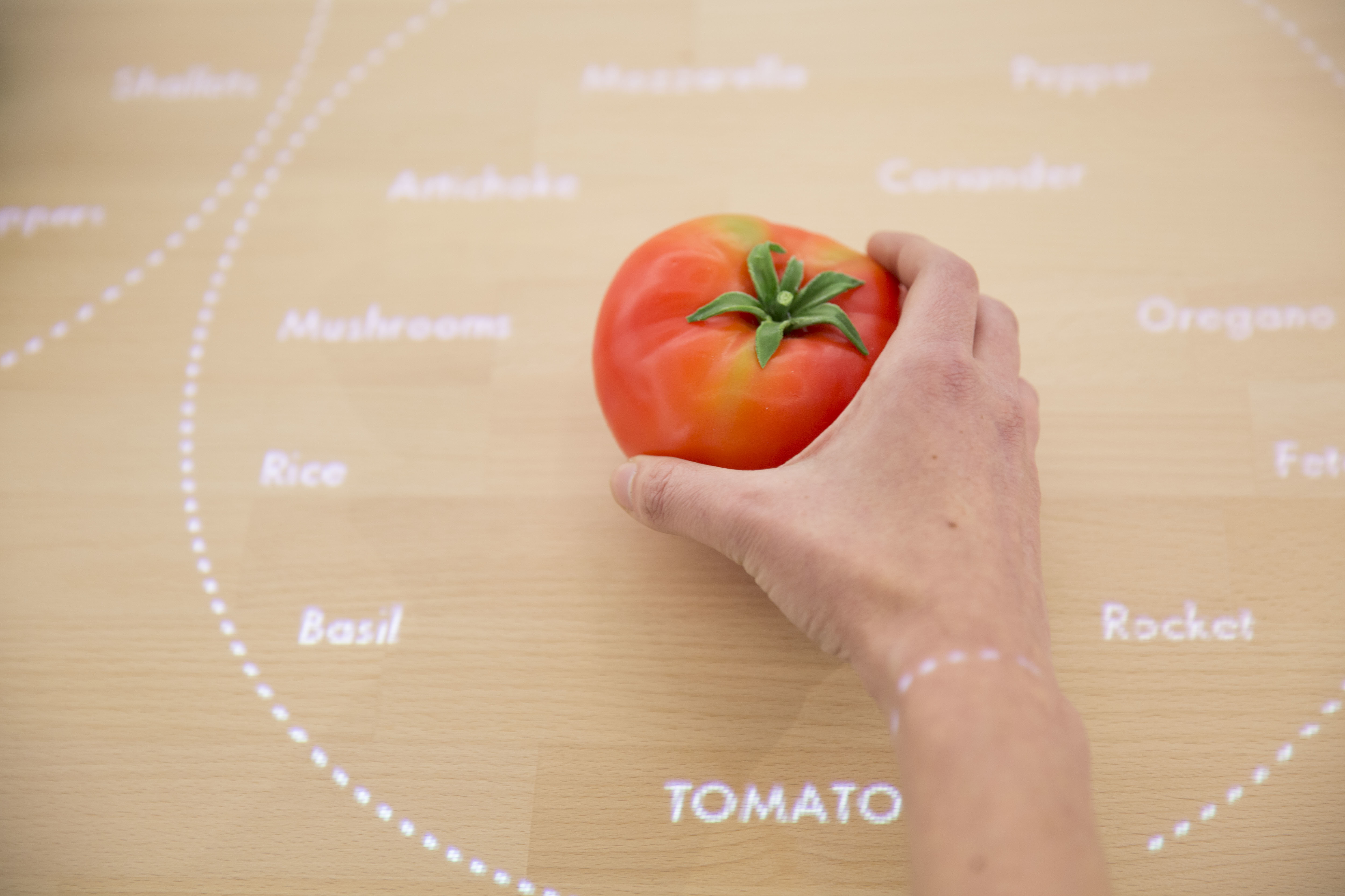
An interactive table recognizes foods on its surface
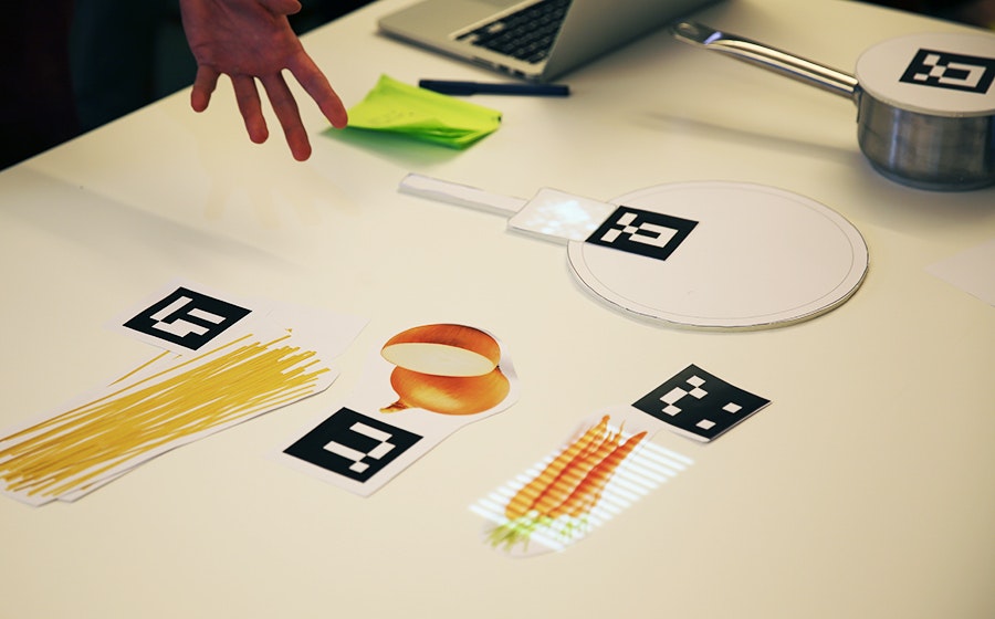
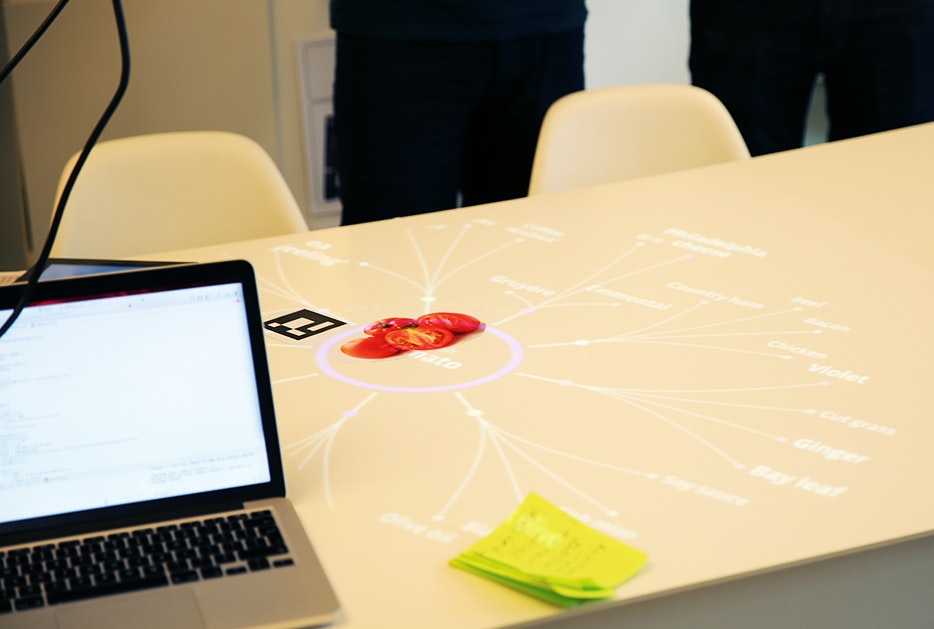
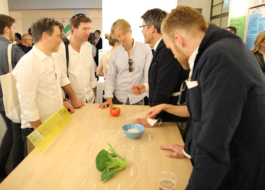
Taking this 2025 appliance from concept video to functional prototype meant creating a realistic experience of technologies that won’t exist for many years. Designers had to come up with a way for the system to see and recognize foods on table’s surface and respond accordingly—and they had to make it work reliably for more than six months while some 250,000 visitors tried it out at pop-up exhibitions at the Salone del Mobile and EXPO Milan.
To find out how they did it, I talked to IDEO London interaction designer Siri Johansson and developers David Brody and Kalyn Nakano of IDEO Palo Alto, who built custom software that borrows techniques from computer vision.
How did the need to build a prototype for real use affect the interaction design?
Siri: As soon you put something in a public setting, people are always going to try to break it, especially if they’re really excited about it. They don’t mean to break it, of course, but they want to play with it and see what it can do. We had to focus on a few key functions and figure out how to make them work well enough that it would be feasible for people to play freely with the installation. A key design principle was to keep the technology low-key and in the background, to preserve the warmth and tactility of the kitchen, so we focused on functions that demonstrate that intention and show how the table uses digital to free up your mind so you can engage with physical things. The table knows what I’m cooking and gently guides me through the process, so I don’t have to keep going back to my iPad to browse a recipe. I can focus more on my ingredients—how they feel, how they smell.
How did it affect the software design?
Kalyn: Knowing this was going to be a live prototype forced us to consider every scenario. With on-screen prototypes, predicting how a user might interact with the screen is a lot more straightforward. But here, adding another dimension and more objects to the mix challenged us to consider all the different ways people could position and interact with the items on the table. Once we started building, it became clear that the concept video for the design was really just a starting point. Testing all the different arrangements and permutations challenged some of our initial designs and software implementation methods, especially when we started thinking about transitions. Tracking objects while they were moved around on the table forced us to implement things more formulaically to achieve a display with smoother transitions between states.
How did people’s interactions with early versions of the table change the software?
Kalyn: With a live prototype like this, you give up control over the experience. You can’t send everyone down the path you want them to take. We started building and testing our software based on the interactions shown in concept video, but those interactions are choreographed, and when people in the office started playing with the prototype, we realized the behavior in the video—putting the veggies down on the table and sliding them from place to place—wasn’t natural for everyone. Some people would hold the vegetables in their hands or lift them off the table while deciding where to put them. These interactions weren’t wrong, but we hadn’t accounted for them in our initial designs. The need to accommodate for this forced us to reconsider our image processing techniques to make sure we could still recognize the objects no matter how they were being handled.
How did you adapt the CV software to the specific needs of the project?
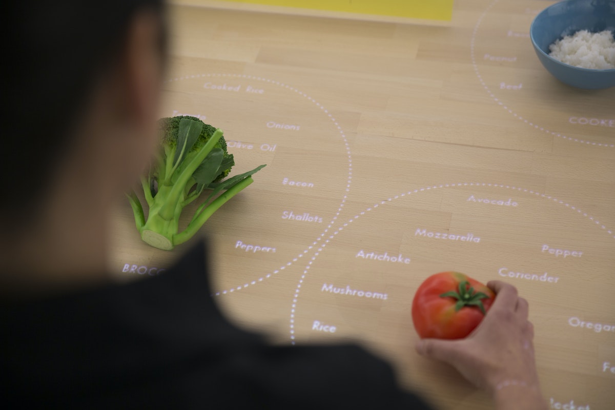
David: Our approach wasn’t to make CV that could be used for anything, in any situation. The better route was to take advantage of our constraints for the exhibition and build a simplified version of CV (written with openFrameworks and OpenCV) that we knew could be tractable and provable in the time we had. The table has to consistently recognize three ingredients—broccoli, tomatoes, and rice—so that people can experience how it works. While more complex CV might create models of what generic broccoli looks like, our solution uses examples of broccoli that it has already seen, along with shape and color distribution. It compares those factors with what it’s seeing in order to distinguish between objects. The distribution of color helps it distinguish between broccoli and a blue bowl of rice, while comparing with previously seen examples help it distinguish between broccoli and a green shirt sleeve.
Why was this an efficient strategy?
David: A lot of conventional CV uses a “sliding window” approach: The computer identifies an aspect of an object, like its shape, and looks for that object within a larger image by sliding the window of vision until it recognizes something that matches what it’s looking for. The hard part is making it work in real time, because the computer compares every possible “window” that contains the criteria it’s looking to match, and each comparison takes time. Since our software is only looking at colors, it’s easier to identify which windows on the table might contain the objects it’s seeking. So the first thing it does is look for the points on the table where the intensities of color are the highest, and it says, “these might be objects.” It sends that information down the pipeline to the next step, and that’s where the color-recognition algorithm comes into play: It compares the histogram of a potential object with the histograms for broccoli, tomatoes, and rice, and determines which object it’s looking at.
What was it that excited you about this project?
Kalyn: This was a great example of building to learn. Creating a live prototype introduced a lot of interesting interaction design questions into the software development process, and it got us to solve technical challenges that wouldn’t normally come up during a screen-based prototype. It generated a new excitement for designing dynamic and thoughtful off-screen experiences, and watching people’s reaction to it was inspiring. When we set the table up in Milan, we came in the next morning and found construction workers playing with it, saying, “bellissima!”
The IKEA Concept Kitchen 2025 was on display at IKEA Temporary, a pop-up exhibition at Salone del Mobile in Milan, Italy, April 14-19, 2015 and can be seen at EXPO Milan, May 1-October 31, 2015.
Read more about Veggie Vision and the entire Concept Kitchen on Tech Insider and at IDEO.com.
What will kitchens be like a decade from now? IDEO recently helped IKEA envision some wild ideas that will likely be entirely plausible—someday. Usually, predictions like this exist only on screens, as concept videos and digital renderings. But this time, IKEA asked IDEO to build a working prototype of one future concept: the Table for Living, a cooking and work surface that recognizes the foods you place on it and projects customized recipes and cooking tips right onto the tabletop.
Dispatch from the Toy Lab: Monster Moves
IDEO is a global design company. We believe a better future is for all of us to design.
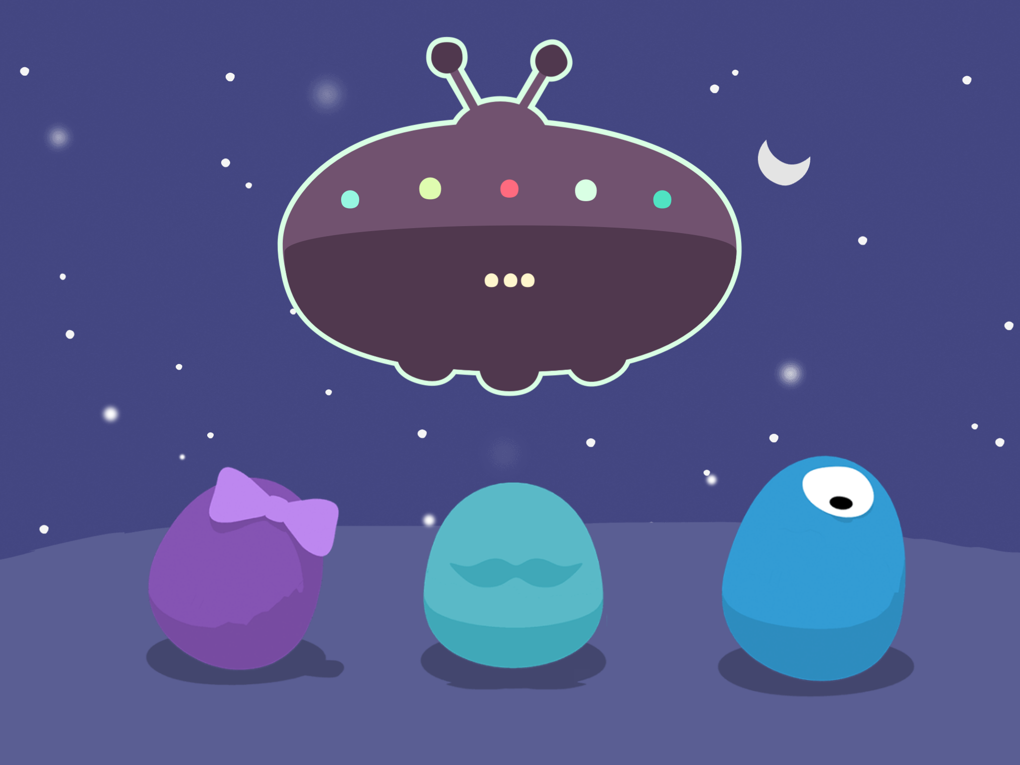
On a recent visit to the lab, I got an early look at Monster Moves, a new app that lets kids choreograph moves for a team of dance-happy monsters. If that conjures images of elaborate 3D creatures, think again: At first glance, Monster Moves appears to be completely flat. Any single frame of the game looks just like a simple 2D illustration.
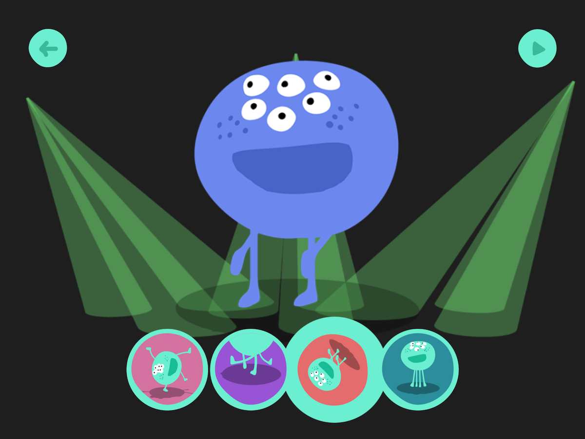
But when one of those 2D monsters does a twirl or flip, suddenly (and pretty magically), you see that each one has a complete three-dimensional physiology, from the top of his head to the booty he’s shaking.
It might seem hardly noticeable, but think about it: if the image was truly two dimensional, there would be no top or bottom, no back or sides. To make the monsters look flat, but still have the ability to rotate 360°, the team used 3D modeling to create the characters, and then stripped down the art to make the monsters look two dimensional. Even though they appear flat, all the monsters have skeletons and skins, and they can turn to any angle.
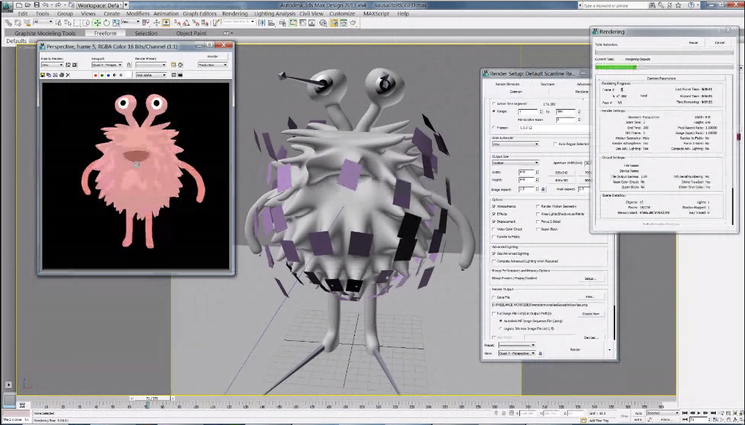
So why bother making them look flat?
Toy Lab’s Michelle Lee explains that the 2D look of the game is crucial to its function. The mission of Monster Moves is to help kids understand that they are the choreographer, and that there is a direct connection between their choices and the monsters’ dance steps, which develops an awareness of creative control. The designers wanted kids to focus on the dance moves, so it was important that the art not distract them with too much 3D detail. That’s why they stripped away all the fancy shadows and shiny curves and kept the monsters as simple as possible.
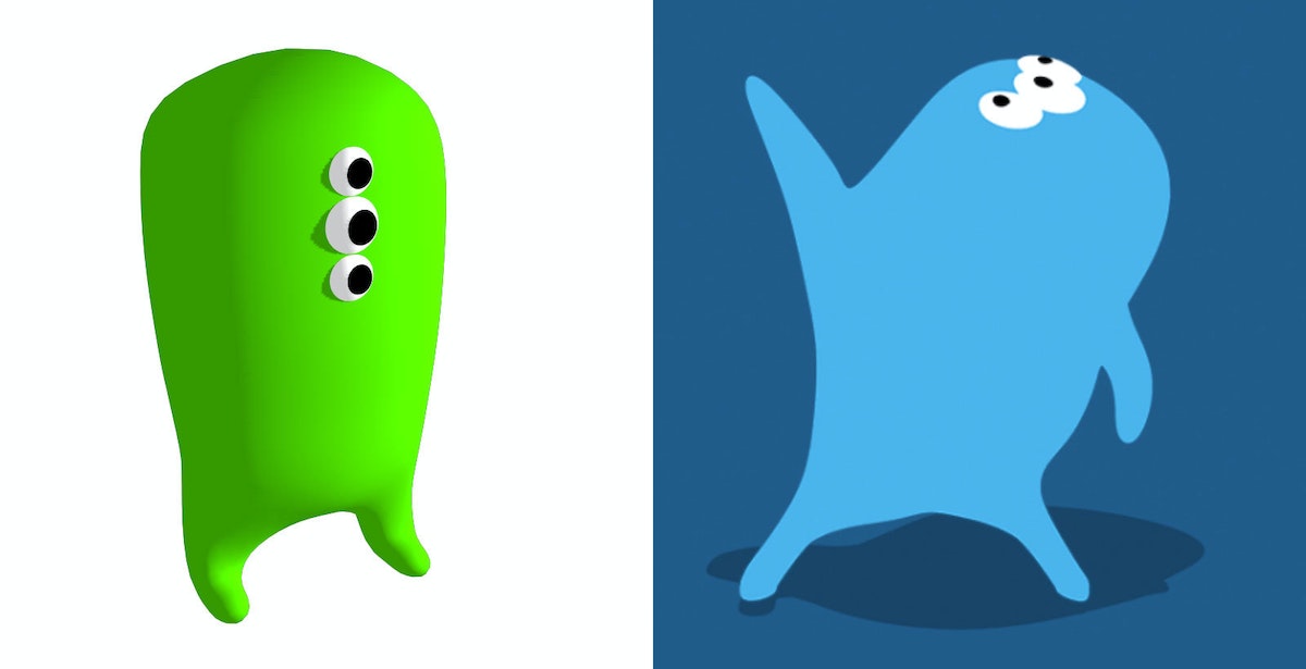
The early version (left) has a 3D look, which the designers thought was still "too much." They chose to eliminate all shadows except for the drop shadow beneath the character (right).
Curious to check out the monsters for yourself? Learn more about Monster Moves and the entire portfolio of IDEO Toy Lab apps at IDEOToyLab.com.
Just like the rest of IDEO, the Toy Lab is dedicated to building creative confidence. Admittedly, they have a bit of an edge when making kids’ products—children have natural creative confidence, so the Toy Lab’s job is to encourage them to preserve it and show them new ways to apply their innate creativity.
Build Your Own Light Pipe
A step-by-step guide
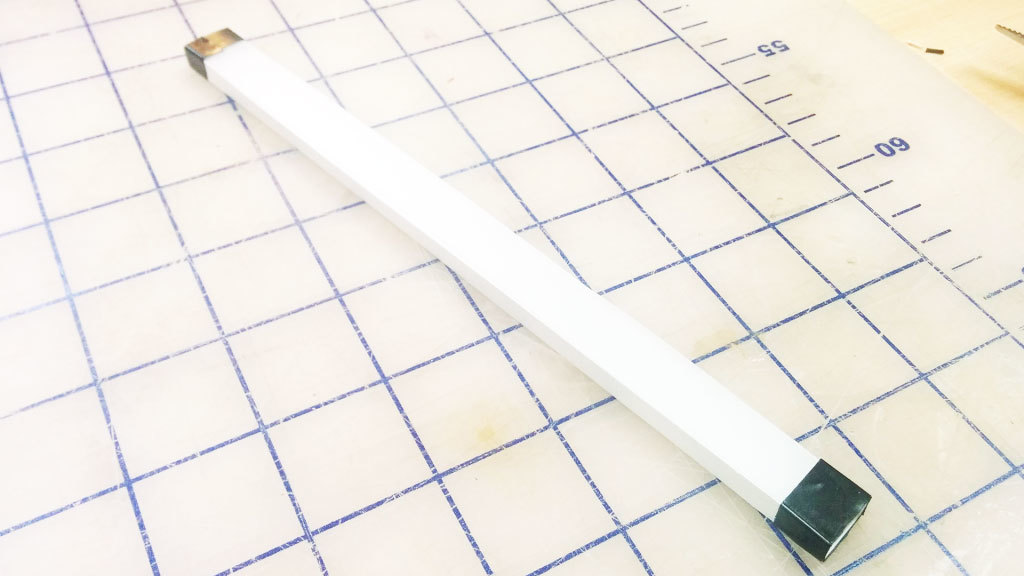
We built a light pipe, which, in principle, can be viewed as a fiber optic cable. All the sides are polished to a clear finish so that the light can be reflected internally inside the pipe. If the light hits a section of pipe where the surface is not perfectly reflective, like if it’s gouged or scratched, it will use that section as an "emitter" and attempt to escape the pipe. We take advantage of this by covering the bottom surface of the pipe with dimples. To make the path consistently bright, we arranged the dimples in a gradient with fewer dimples closer to the source, where the light from LEDs is brightest, and more dimples to catch the light farther along the light path (where the light is dimmest).
This step-by-step guide describes our process of quick experimentation and prototyping to achieve good illumination without having to run extensive light bouncing simulations. The design is created in Illustrator using blend modes, and the light pipe is manufactured with a laser cutter on 1/4" thick clear acrylic.
Please note that results will vary depending on many factors. The optical design, LED brightness, and beam angle are important factors to consider.
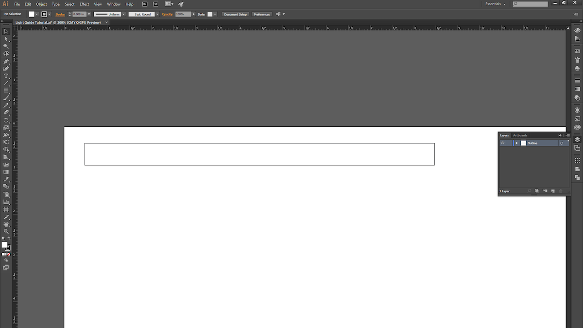
1. Open a new Illustrator document and draw a rectangle. We chose 8" x .5".
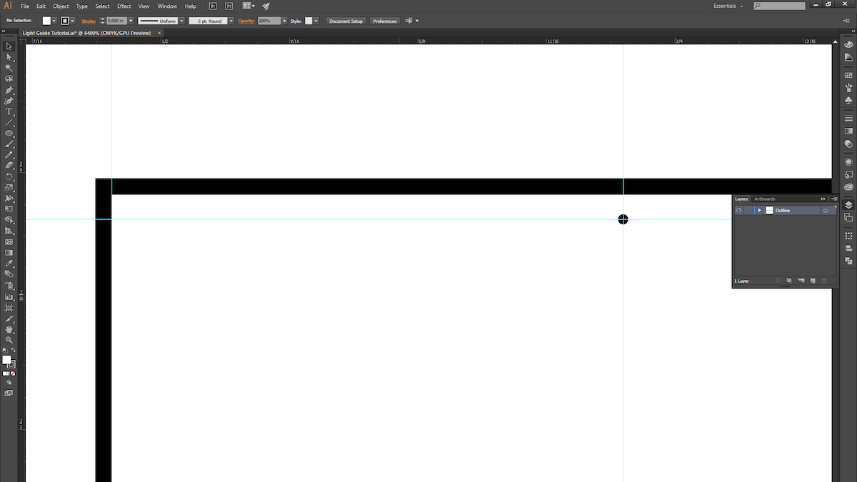
2. Make a guide and space it roughly 1/4" away from the edge of the rectangle. This is where the dimple pattern will begin. (Leaving a 1/4” margin allows us to later mask off the area to prevent seeing excessive LED brightness near the source in the light pipe.) Now draw a circle with a .005" diameter.
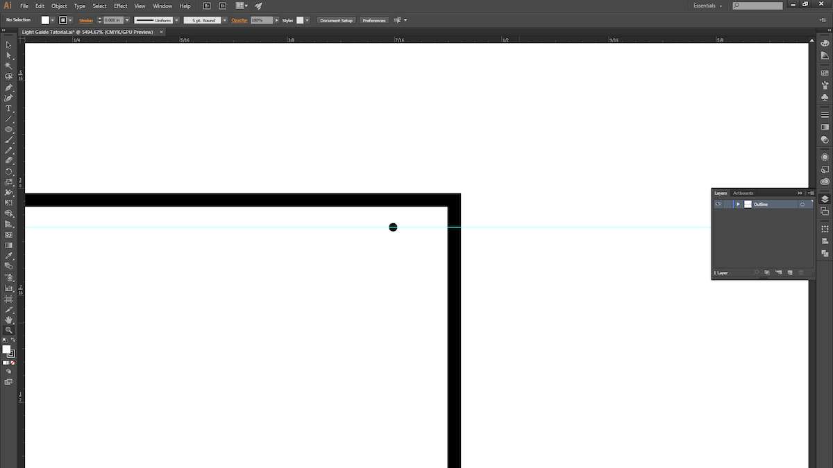
3. ALT + Click and drag the circle to duplicate it, and move it to the other side of the rectangle. The two circles mark the two ends of the dimple pattern.
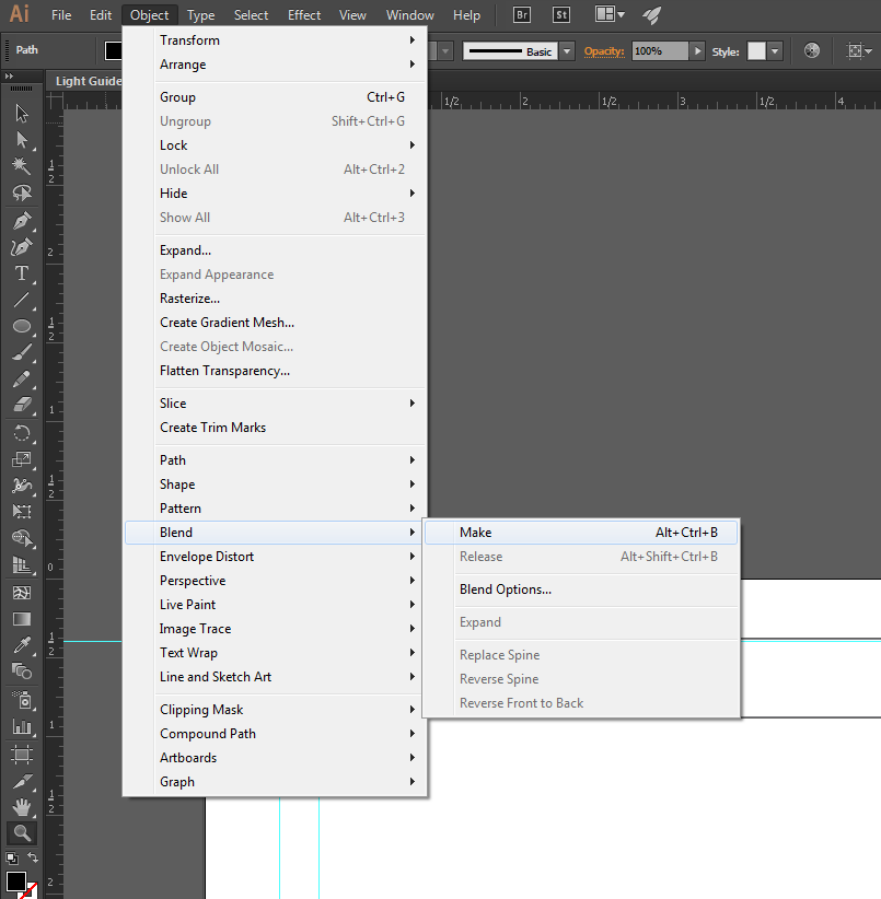
4. Select both circles and create a blend.
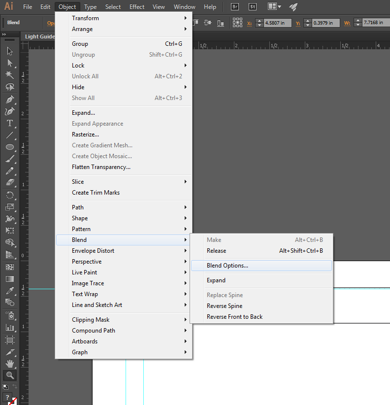
5. Open up the blend options to fine-tune the blend.
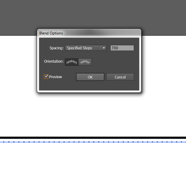
6. Change the spacing to "Specified Steps" and set the number to 700.
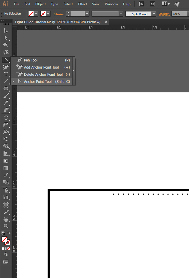
7. You should see 700 evenly spaced dots! In order to get them to start off sparsely spaced and then get closer together, we'll modify the path of the blend. Select the Anchor Point Tool (Shift + C).
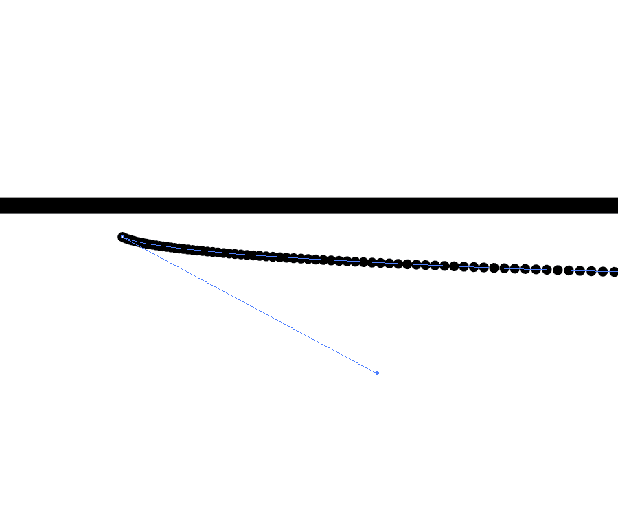
8. Use the white arrow to select the first point and drag it until you see the spacing start to change.
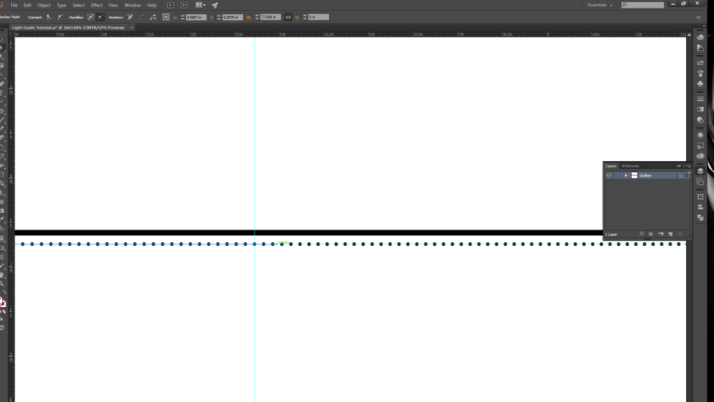
9. Create another guide halfway along the path, and then drag the anchor point (with the white arrow selection tool) just past the guide. Repeat the same process with the last circle, but move its anchor point about half an inch to the right.
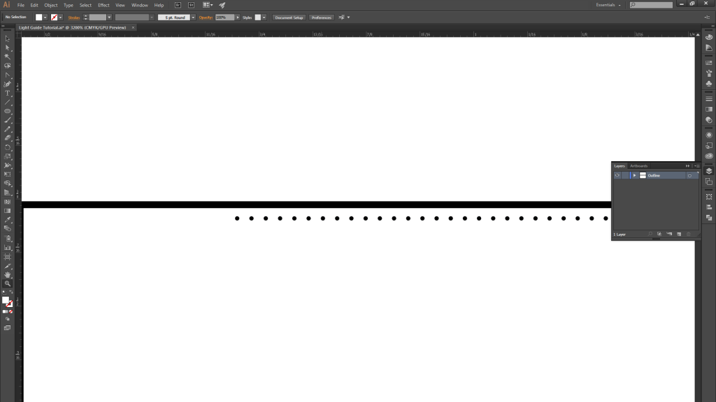
10. You should now have a gradient spacing of 700 circles becoming more closely spaced as you move from left…
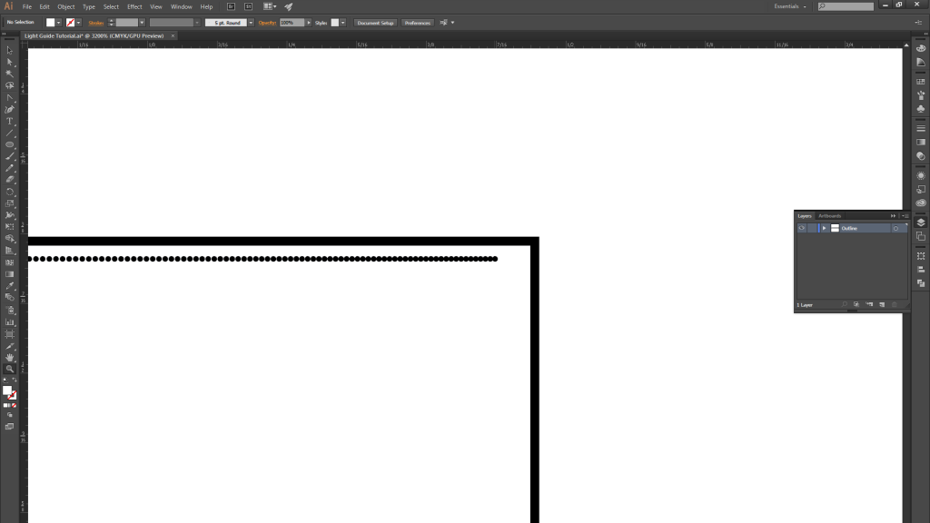
11. …to right.
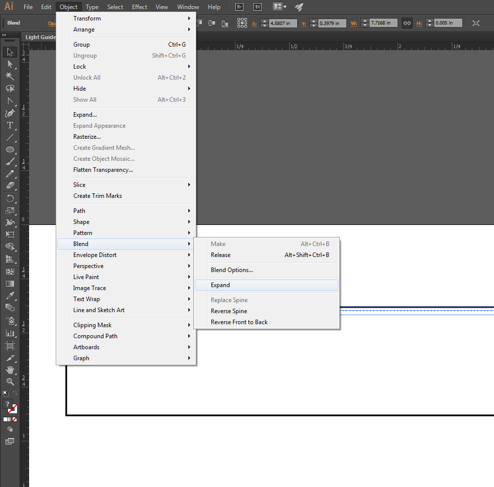
12. Once you are satisfied with the blend, expand it.
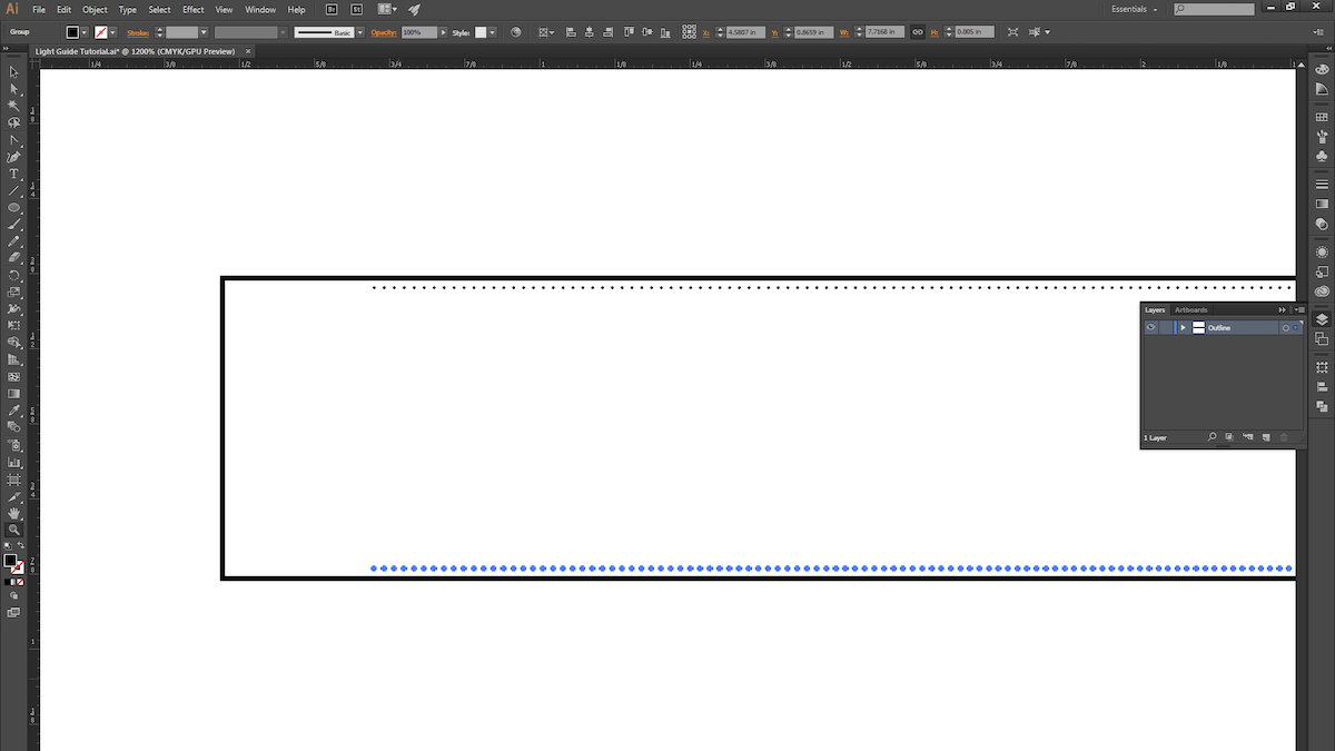
13. ALT+Click and drag the blend to copy it, and place it at the bottom of the rectangle.
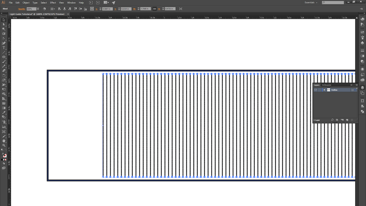
14. Select both blends and then use the instructions from Step 4 to create another blend.
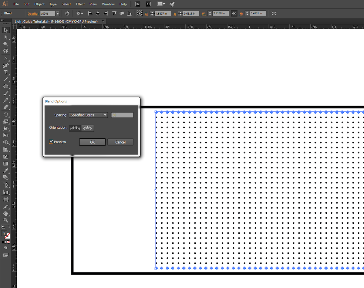
15. Use the instructions from Step 5 to fine-tune the new blend.

16. We chose to give our pattern a little bit of randomness, so we ALT+Click-ed and dragged the blend down and to the right ever so slightly.
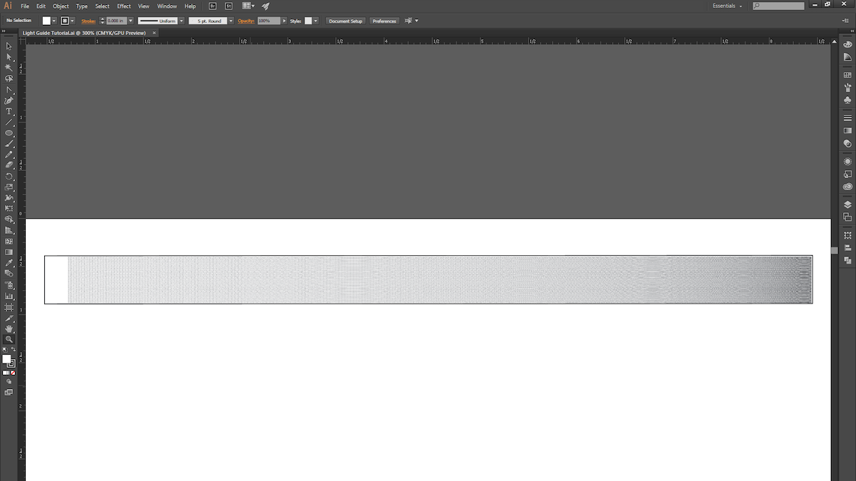
17. With that, we’re ready for the laser cutter! This process is pretty quick to prototype (roughly 15 minutes from start to finish), so explore different gradient patterns and techniques, and try light pipes that are curved or bent (just keep in mind the critical angle).
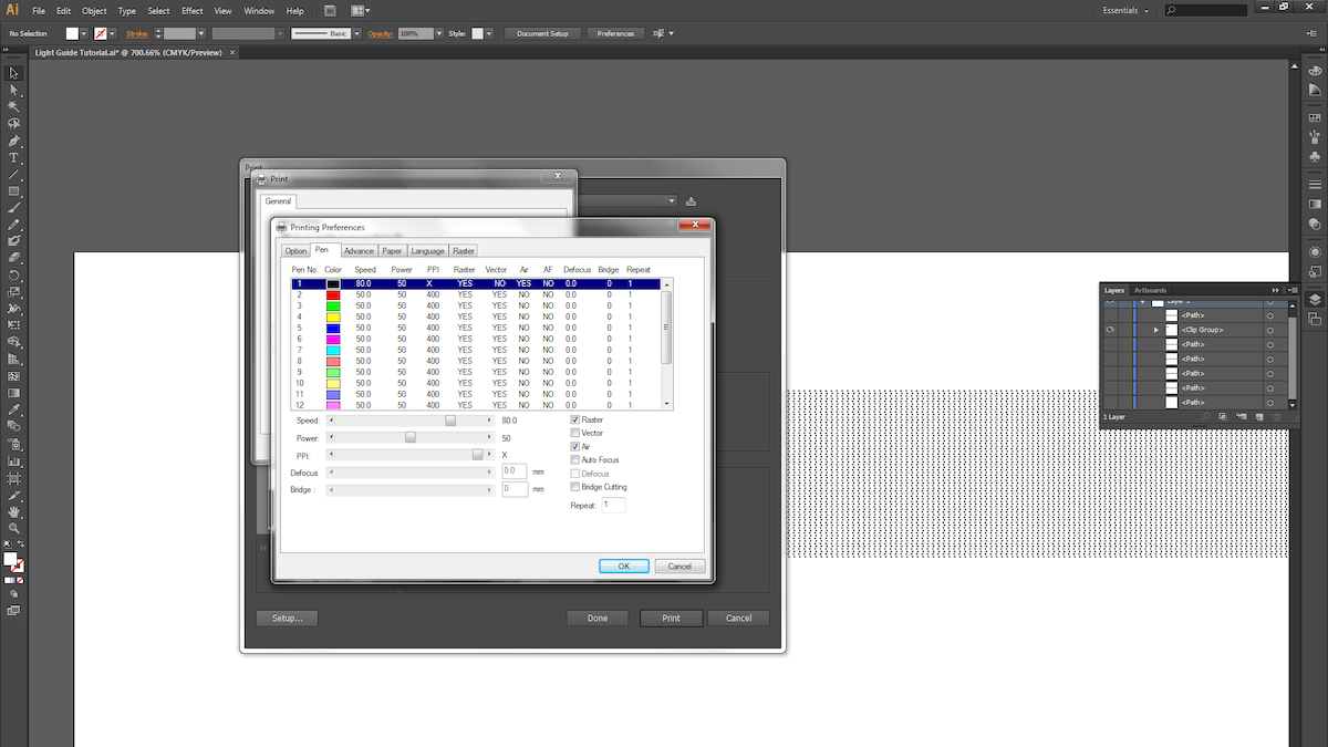
18. Next, we raster the dot pattern on 1/4″ thick acrylic. Be sure the acrylic surface is clean and scratch-free.

19. Different laser cutters have different settings for varying materials and thicknesses, so keep that in mind when choosing your settings. We used a speed of 80, power of 50 and maximum PPI for the raster. For the vector cuts, we took 4 cuts at speed of 4, power of 95, and maximum PPI.
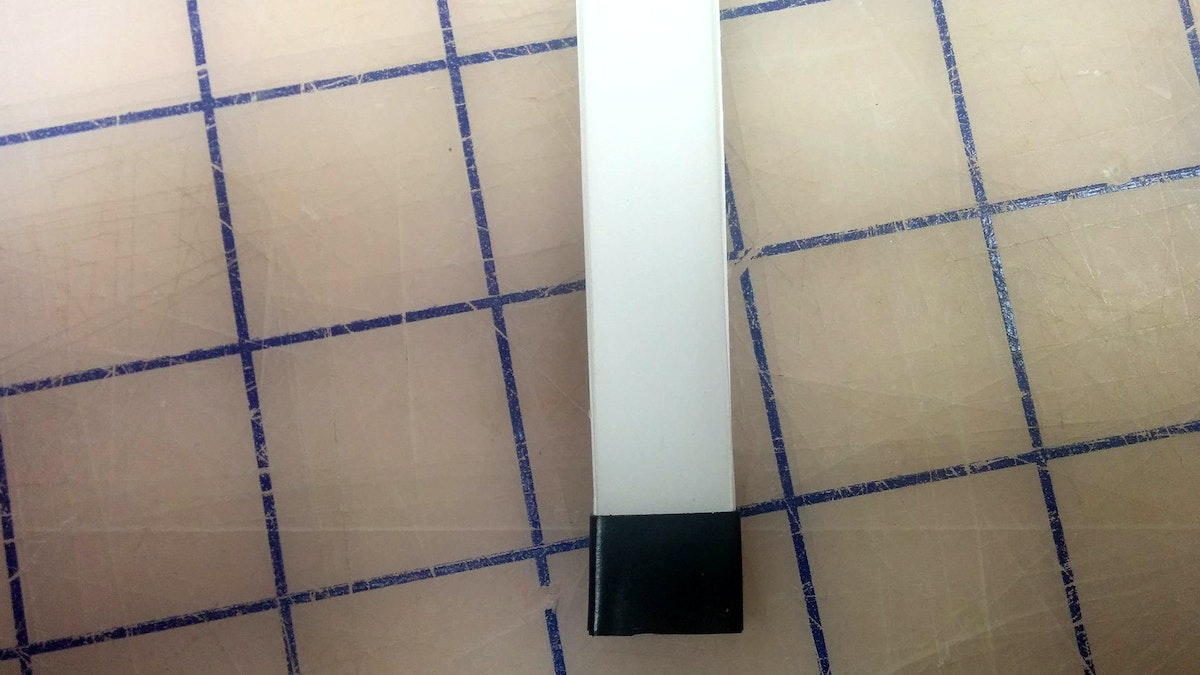
20. Now take your light guide and examine the edges. Make sure the material is transparent; otherwise you’ll need to do some hand-polishing.
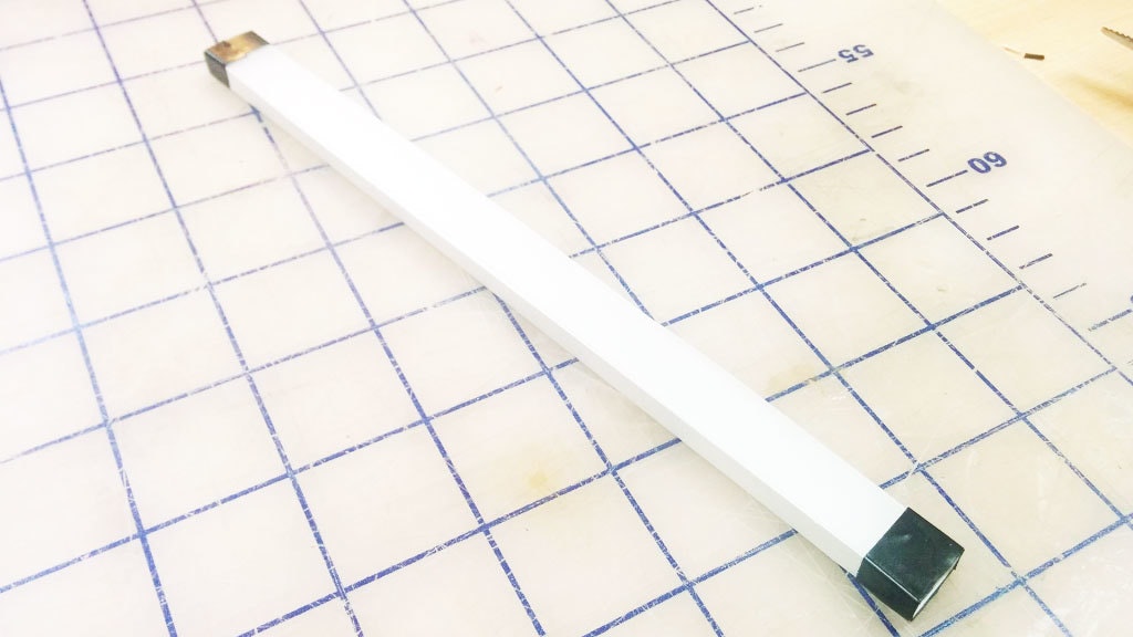
21. The slightly bumpy yet clear finish the laser leaves after a cut works great for our purposes. You’ll want to surround all clear surfaces with white reflective paper or tape, and mask off the quarter inch where the light first enters the pipe.
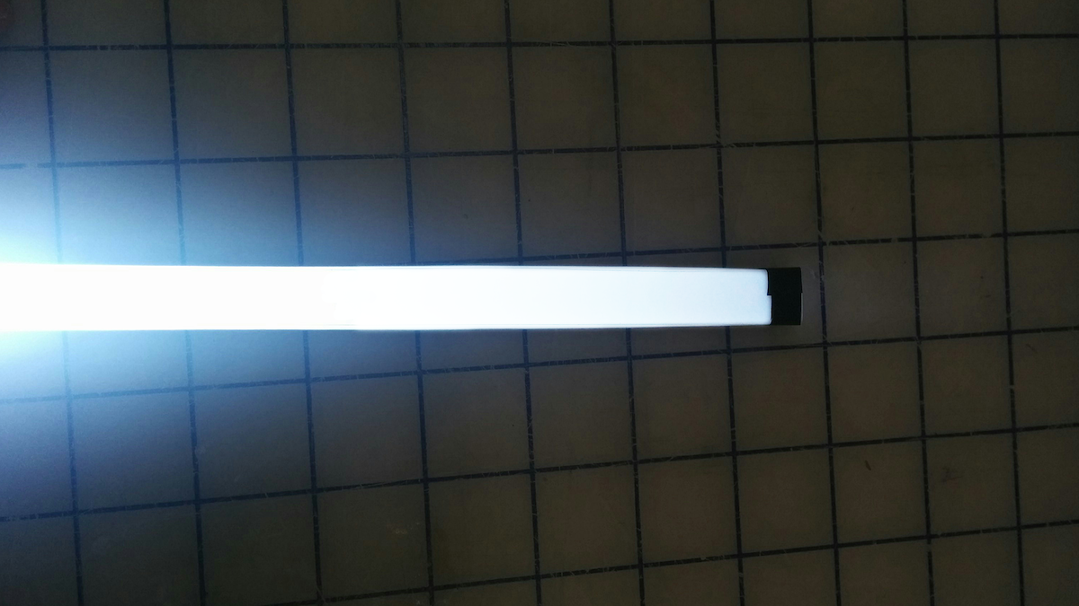
22. Here are the results with a super-bright LED! You can see that the light starts to drop off a little toward the end of the pipe.
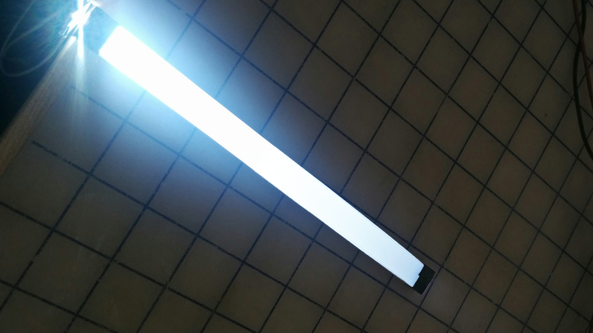
23. We could come back to tweak the blend pattern (reducing the number of dots at the beginning of the light pipe and increasing it toward the end).
Light guides are physical tools that transmit light along a path from an illumination source while maintaining constant brightness. They’re often used in products to create a line of light that is consistently bright and dynamic-looking, even when it comes from a single source. Unfortunately, there is no simple how-to guide available for making them. The process is kept tightly guarded by optical engineering companies. We came up with a quick process to make our own light guides, and now you can too.
Future of automobility
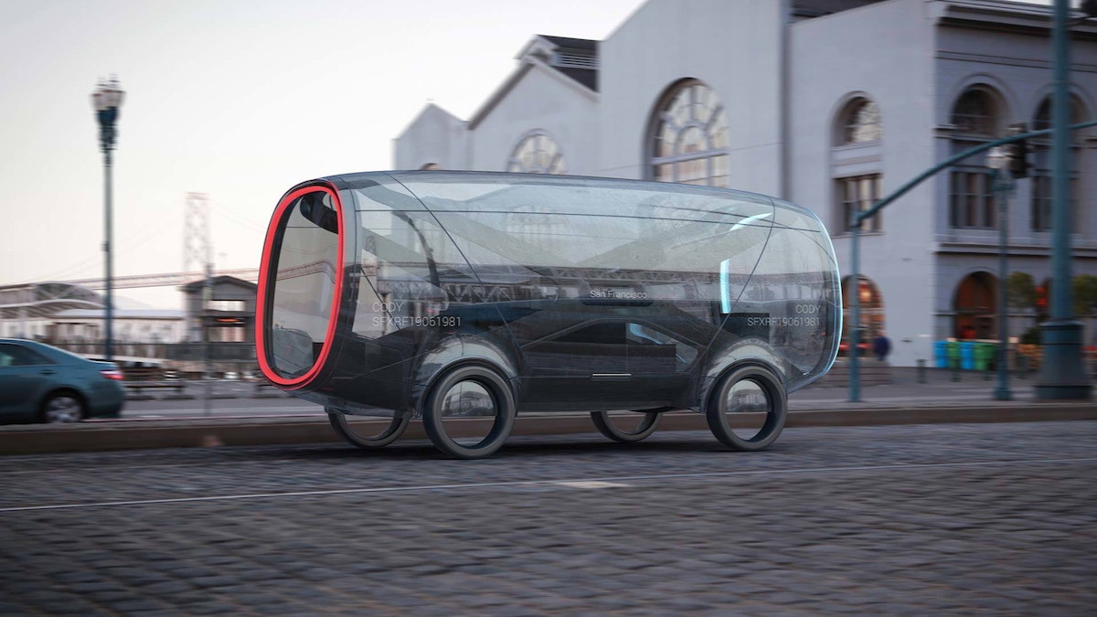
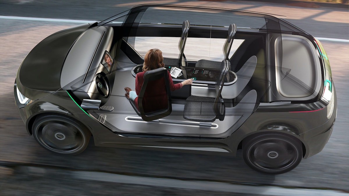
We’re on the cusp of a revolution in transportation. What will streets teeming with self-driving cars really mean?
IDEO has decades of experience with automotive work, which has brought keen insight into the trends and technologies that will define the vehicles of the future. This presents an important design opportunity: If we visualize today the way we’ll live in decades to come, we’ll be better prepared to make smart decisions when the age of autonomous vehicles arrives.
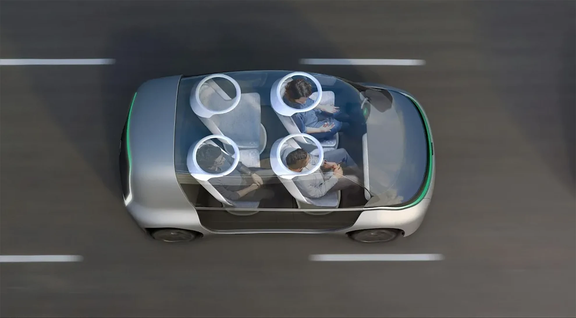
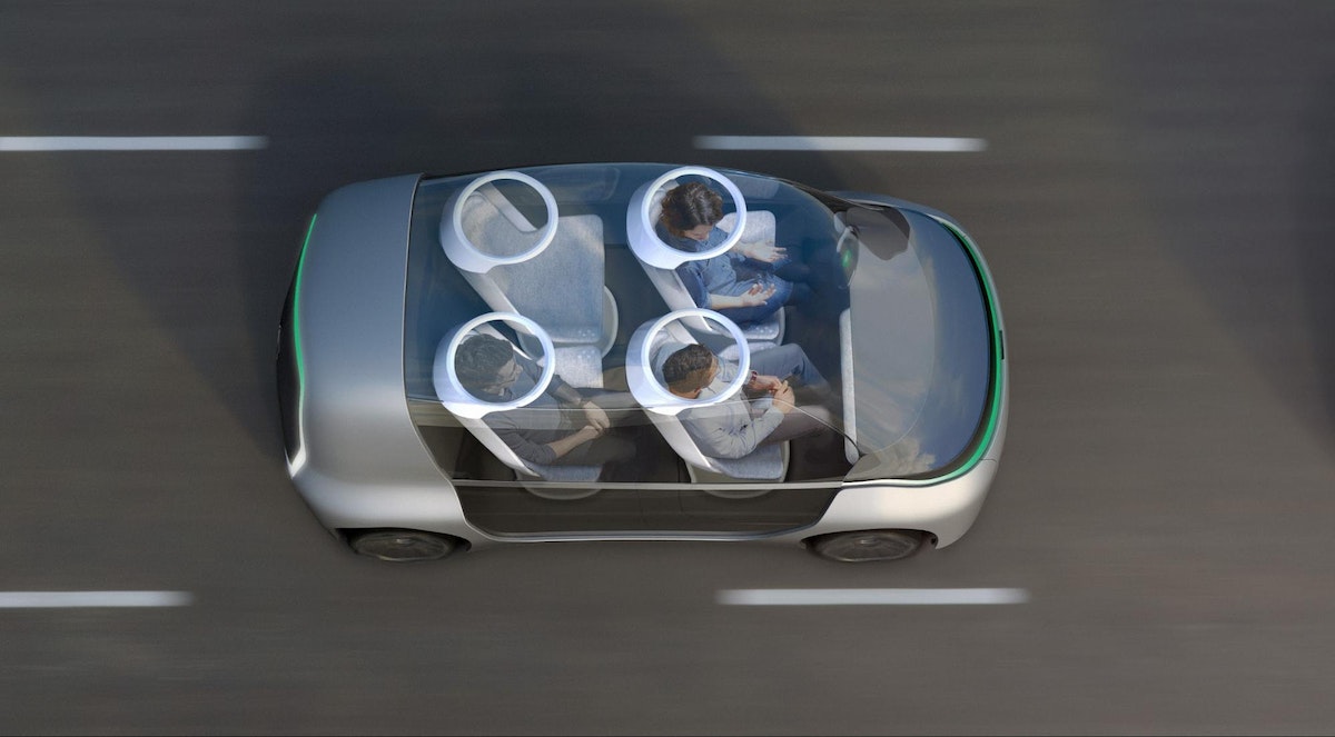
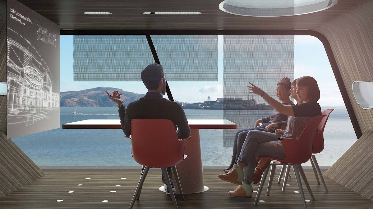
The Future of Automobility is an online visualization of how life with driverless cars might really look and feel. It considers four scenarios: “Moving People,” which looks at how commutes will change when we can look away from the road; “Moving Things,” where we examine automated package-delivery fleets; “Moving Spaces,” where we envision mobile offices meeting people where they live and parking in underused areas of our cities; and “Moving Together,” which explores how the interior of future vehicles will be customized to meet our personal needs during ride-sharing.
The experience is as emotionally compelling as it is feasible, combining radical innovation in transportation concepts with immersive storytelling. It expresses not just our vision of the future, but also how we work, how we think, and what we value.
Want More?
IDEO alum Jonah Houston continues the conversation in a Medium article on how the horse can provide inspiration on designing modern driving interfaces.
Press
A Fascinating Glimpse at How We'll Carpool in 2027, WIRED
Imagining A Future Where Autonomous Cars Let Everyone Carpool, Fast Company
IDEO envisions ride-sharing car concept for 'the future of moving together', designboom
IDEO Visualizes the Role of Autonomous Vehicles and Ride Sharing, Core77
Awards
Once our hands are off the steering wheel and more vehicles are shared rather than owned, what will change in our lives?

Lindsey Turner
I’m passionate about building brands, products, and experiences that help organizations show up with meaning and momentum.
I help organizations cut through complexity by shaping how they show up, through brand strategy, identity, and storytelling.
Working at the intersection of brand and business, I bring an editorial eye and a bias toward making—turning ideas into tangible experiences that people can understand, trust, and believe in.
My work spans government, healthcare, financial services, media, and consumer goods, from launching Gen Z-focused ventures to building innovation labs and reimagining legacy brands. I relish moments of ambiguity and enjoy translating across teams, perspectives, and priorities to move ideas forward.
I started my career in editorial and digital design, shaping cross-platform experiences and identity systems in publishing and agency environments. That foundation still shapes how I work today: I’m detail-oriented, collaborative, and overreliant on the Oxford comma. I hold a BFA in Visual Communication from the School of the Art Institute of Chicago.

Rachel Young
My work helps organizations see who their products aren't working for—and build the will and the tools to do something about it
For 25 years, I've asked the same question: Who does this design exclude—and what are we going to do about it?
My work spans human-centered strategy, inclusive design, and qualitative research, with clients ranging from Microsoft, Google, and Verizon to the National Science Foundation, and San Francisco Unified School District.
Before IDEO, I taught elementary school in East Palo Alto and spent a decade doing design work with social service organizations—where I learned firsthand what it costs people when systems are built without them in mind.
I am currently writing User Error, a nonfiction book about digital access and the design decisions behind it. I live in Oakland, California.

Brian Pelsoh
I lead with craft, ensuring our work is creatively excellent: rooted in deep human insight and imagination, while also grounded in the realities of business and technology.
My expertise spans brand, communication, and product design across tech, education, the arts, and social impact.
I believe great work demands both high-level vision and obsessive attention to detail, and only happens through collaboration.
I bring an inclusive, hands-on approach and a deep understanding of business, which enables me to consistently deliver excellence while always asking why.
Before joining IDEO, I worked at the brand firms Pentagram and VSA Partners. I began my career as a designer, leading teams at the School of the Art Institute of Chicago and the Milwaukee Art Museum. I hold an MFA in graphic design from Maryland Institute College of Art and a BFA in communication design from the Milwaukee Institute of Art & Design, and have taught at some of the best design schools in the US.

Tony Wong
I am responsible for IDEO’s long-term success in China and working with clients to use design as a tool to enable growth.
I am responsible for IDEO’s long-term success in China and working with clients to use design as a tool to enable growth. Specifically, I have helped Chinese companies design holistic brand solutions through the development of their products, communication, services, and innovation teams, and I have helped multinationals expand their presence and influence in China.
I advise global leaders on developing China-led innovation and capabilities.
In over 15 years in IDEO Shanghai, I have worked on projects that use design to elevate the quality of the experience of healthcare products and services, streamline processes that increase productivity, create spaces and programs that promote and enable inclusive communities, and build next generation mobility solutions that are planet-positive.
Before joining IDEO, I worked at Philips Electronics and the Electrolux Group in Italy, the Netherlands, and Singapore on a number of breakthrough commercial products. I am a member of the Young President Organization in Shanghai.

Building a personal AI for the messiness of life: Sida Li
Most AI products today are built for work—a space with clear problems and established systems. One founder noticed a gap: personal life is messier, harder to systematize, and mostly left behind by the AI boom. So she built Cue, a personal AI that lives inside iMessage and group chats, to go where the other tools haven't.
In this episode, Becca Carroll, IDEO's Chief Strategy Officer, talks with Sida Li, co-founder and CEO of Shared Context Lab, about staying anchored to a human need while the technology around her keeps changing shape, why she treats her business model with the same rigor she'd bring to a product, and what it feels like to build a company at this particular, disorienting moment in AI.
The conversation also gets into how Sida makes design decisions: the language Cue uses to describe itself, the tradeoffs behind building inside iMessage instead of a new app, and a real story about a business idea that didn’t pan out.
This is the second in a two-part series profiling founders from IDEO's Startups-in-Residence program. The first conversation is with Johannes Seemann, founder of Sooner, on designing GenAI for the emotional side of money.

Designing GenAI for the emotional side of money: Johannes Seemann
Most personal financial tools are built to run the numbers and optimize towards a budget. While that works for some, most people experience money as a lived relationship that does not neatly fit into a spreadsheet. Johannes Seemann and Becca Carroll discuss why money is emotional before it is mathematical, and what a human-centered approach to building a generative AI financial product looks like in practice.

The curious leader's edge in uncertainty: Scott Shigeoka
Mina Seetharaman talks with Scott Shigeoka, author of Seek and Head of Curiosity Cultivation at the Eames Institute, about what distinguishes genuinely curious leadership from performative curiosity, how power dynamics shape curiosity, and why practicing curiosity can restore energy rather than drain it.

How constraints make us more creative: David Epstein
Mina Seetharaman talks with David Epstein, author of Inside the Box and Range, about why total freedom often produces average work, how leaders can design useful limits on purpose, and what organizations such as General Magic and Pixar reveal about the relationship between boundaries and creativity.
Looks like you might be in search of something very specific?
Or reset the filters above and try another angle.
Here’s some random inspiration

Podcasts about creative leadership

Articles about the power of prototyping
