
.svg)


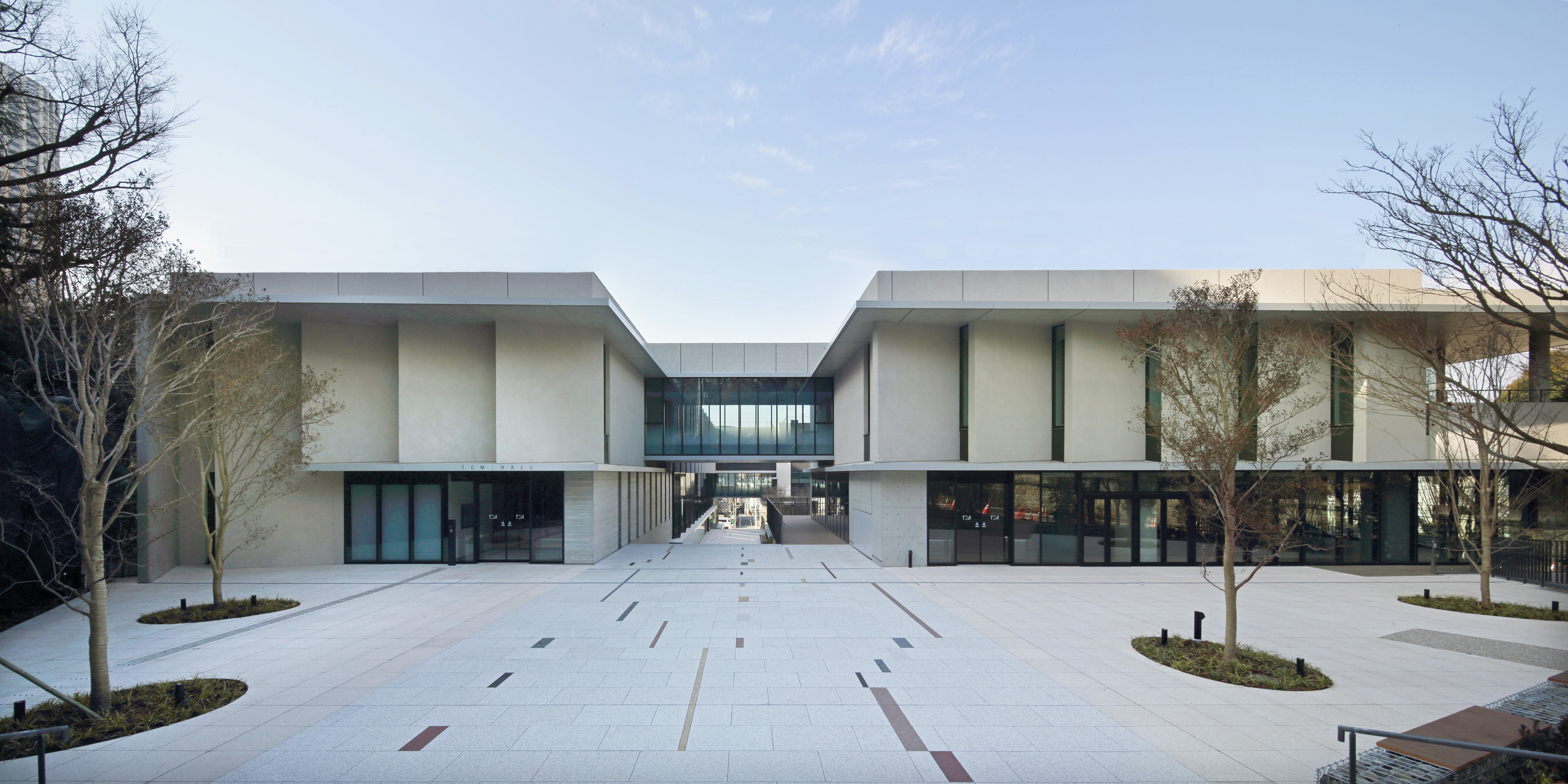

Transforming a historic music college into a collaborative learning platform
A new campus concept and student experience for Tokyo College of Music.
Since its founding over a century ago, Tokyo College of Music (TCM) has trained countless world-class musicians. Despite its well-established reputation, however, the school was feeling a pressing need to reconsider its role in order to remain relevant in a changing world.
The college had plans to build a second campus in Daikanyama, a prominent area of Tokyo known for being a hotbed for new global trends. Taking advantage of this opportunity, TCM leaders asked IDEO to help them develop a new concept for the school, and to redesign the learning experience while preserving a focus on classical music.
To kick off the research phases of the project, IDEO designers interviewed TCM students, and traveled to London, New York, and Boston visiting educational institutions, music schools, and arts facilities.
The team observed that students at music colleges outside of Japan were giving serious consideration to their career plans at an early stage in their studies, acquiring a variety of skills and mindsets through a well-rounded education. By contrast, TCM students were focused on learning and performing classical music, but tended not to have a clear image of future career opportunities.
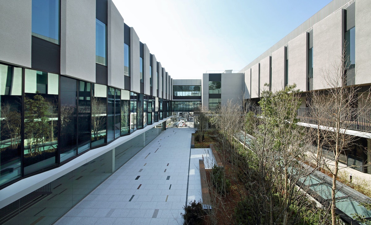
IDEO proposed four specific directions for TCM’s new campus, based on an overarching theme of “culture, fields, and people collaborating across boundaries.” The first aim was to foster a business mindset and entrepreneurial spirit among the students that surpassed their classical music training. Next was to increase opportunities for actual performances, collaborations with professionals outside the school, and joint projects. The third aim was to position the college as a platform that would encourage the spontaneous creation of communities within and outside the school. The final aim was to develop students who were digitally savvy and fluent in new technologies, enabling them to continue evolving in response to developments in the real world. These goals are reflected in the various spaces of the school, as well as in the design of the experiences that occur in those spaces.
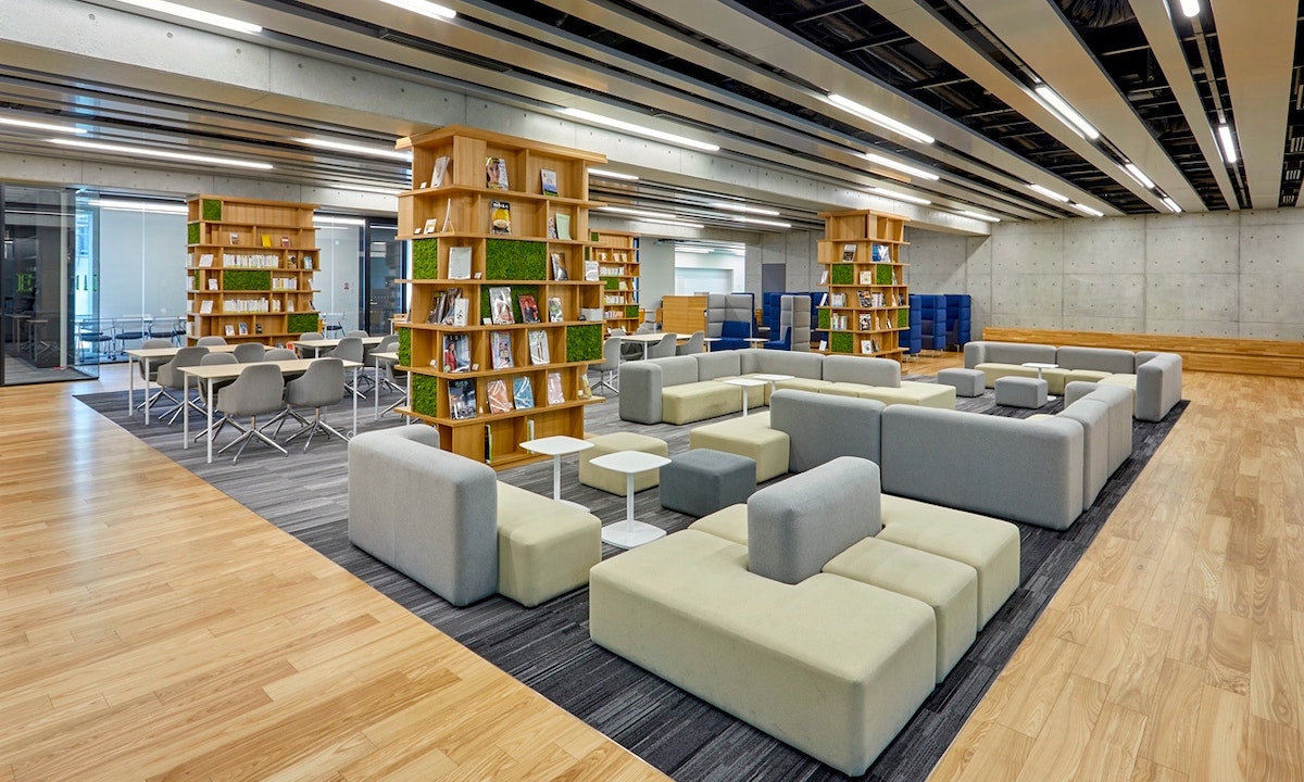
The most symbolic of these spaces is the Creative Lab. Originally intended as a library, the space now functions as a platform where people from within and outside the school community can collaborate and generate innovative ideas. The open layout, which encloses a cafeteria for students and faculty, can be altered depending on programming needs. The Creative Lab provides a venue not only for live performances in which the students can polish their improvisational skills, but for holding workshops and other events on topics such as cultural exchange, business, and new technologies.
New furniture and objects were carefully selected to inspire spontaneous encounters and conversation between students from different departments and staff, creating a flow of activity.
Even the landings on the staircases, which tend to be dead space, were designed with this concept in mind. One student commented that the space facilitates meeting new people and creates “opportunities for deeper interaction with students from other departments.” This intentional, open design has transformed the space into a hub within the school and the local community.
Through the new environment and educational opportunities at TCM's Daikanyama campus, students now have stronger opportunities to apply their creative talents in numerous fields worldwide, creating impact informed by the various perspectives, skills, and relationships they have developed at TCM.
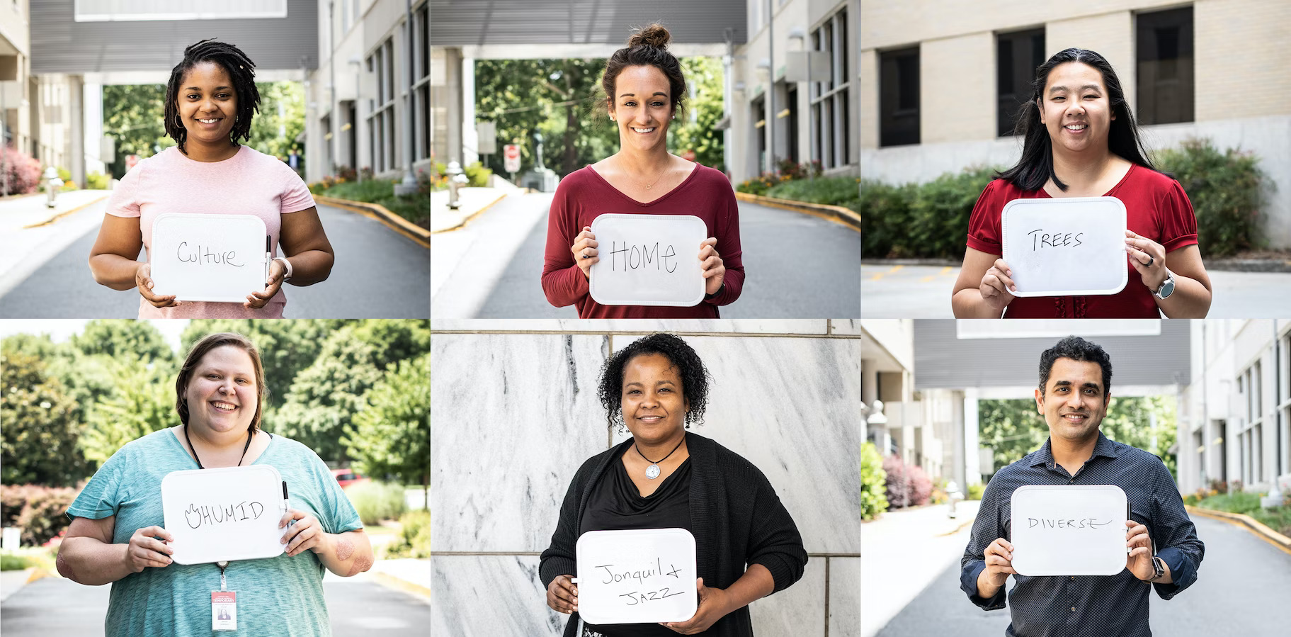
Designing a modern digital platform for the constituents of Georgia
Building a more efficient, trustworthy service for Georgia's residents.
Georgia is among the most populous states in the American South. It’s a place with a storied past and promising future—on the rise economically, and continuing its powerful cultural impact on music, TV, cuisine, and tourism. Over 10.4 million people call Georgia home, and nearly all of these people will at some point navigate the state’s websites for securing everyday services. Ideally, this online platform would provide unifying and accessible government resources for everyone, whether they’re renewing their vehicle registration, seeking a fishing license, or looking up tax law updates.

Georgia’s Office of Digital Services (DSGA), part of the Georgia Technology Authority, was challenged with designing a platform to modernize the collective and individual online presence of 80+ state agencies, many of which used visually disconnected formats and color palettes that could leave the public feeling confused. DSGA recognized that they could provide more efficient and higher quality service to the public if they simplified the language, designed the site from the user's point of view, and created a more cohesive look and feel across agencies.
IDEO worked with the DSGA to identify the priorities of Georgia residents who use the various agency websites. On a road trip from Savannah to Atlanta, with stops in Macon and Dublin, the IDEO team immersed themselves in the rich culture of Georgia, connecting with social workers, low-income residents, state agency leadership and civic organizations to learn how Georgia’s digital properties could better address their disparate needs.
The design research underscored that there isn’t just one Georgia—it’s a tapestry of people, geographies and political orientations. Yet several common themes emerged, including:
Georgians want their government to “give it to them straight.” On the redesigned Georgia.gov platform, the people of Georgia can easily search popular topics to get the information they need. This includes learning how to apply for food stamps, renewing a business license, or simply finding out the location of a local office in their area. If a user has remaining questions, they can connect directly with a real human for further assistance, balancing direct information with warmth and a personal touch. User feedback on the site provides the opportunity for continuous design improvement.
Georgians want to take pride in the legacy and the future of their state. IDEO developed an entirely new design system with new navigational elements, fonts, and a color palette inspired by Georgia’s landscapes, all of which can be modified for individual agencies while remaining consistent with the state brand.
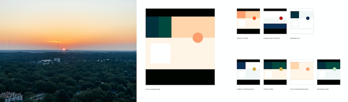
A distillation of the original Georgia seal adds authority, and new icons anchor the site’s menus and bring more clarity to the search function. The platform was designed to be Section 508 and WCAG 2.0 AA compliant, providing clear and accessible page content that adheres to federal laws and international web standards. To instill trust in Georgia’s online presence, each page also has a header that indicates it’s an official Georgia State website and outlines the uniform features constituents can use to identify this.

With improved navigation and easy-to-access prioritized content, Georgia.gov is a much more efficient platform for addressing requests from citizens. The site projects a happy-to-help, citizen-centered approach that aims to empower all Georgians so that they feel confident, informed, and prepared.
A holistic, human-centered approach to managing diabetes care
A digital-first diabetes management system that helped patients get the support they needed when they needed it.
According to the Centers for Disease Control and Prevention, nearly 30 million Americans have diabetes, almost 10% of the population. The vast majority of these diagnoses are type 2, which is commonly treated through a combination of medicine, diet, and exercise. Today, one of the major barriers to better outcomes is access to trusted information. As little as 15 percent of people with diabetes receive adequate education from their healthcare providers on managing their disease and making recommended lifestyle changes.
Ascensia Diabetes Care, a global healthcare company, has been a leader in diabetes treatment for over 70 years, known primarily for producing blood glucose meters. IDEO has worked with Ascensia for more than a decade, helping develop and design their CONTOUR NEXT ONE meter in 2016. In 2017, Ascensia engaged IDEO with a new goal of moving the company beyond physical devices. Ascensia envisioned a first-of-its-kind approach to educating and monitoring diabetes patients. In partnership with IDEO, they wanted to build a comprehensive solution—one that would not simply take glucose readings and document food intake, but would consider all factors that impact a person's health.
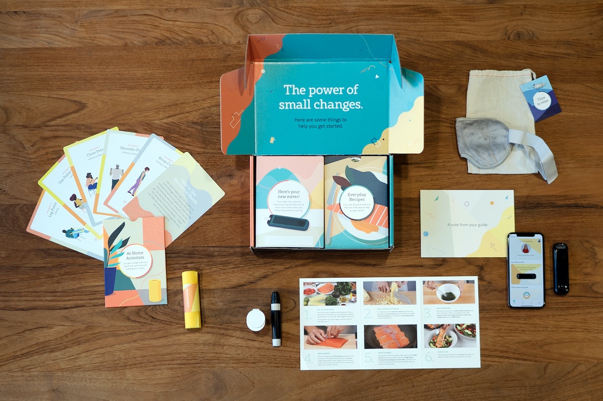
Through deep collaboration, Ascensia and IDEO built a powerful app-based service. The project began with a strategic vision for the experience and ended with the delivery of an all-encompassing health offering, including training of providers, packaging, app design, content creation, and visual design.
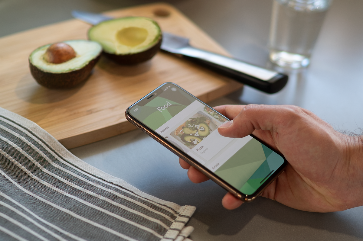
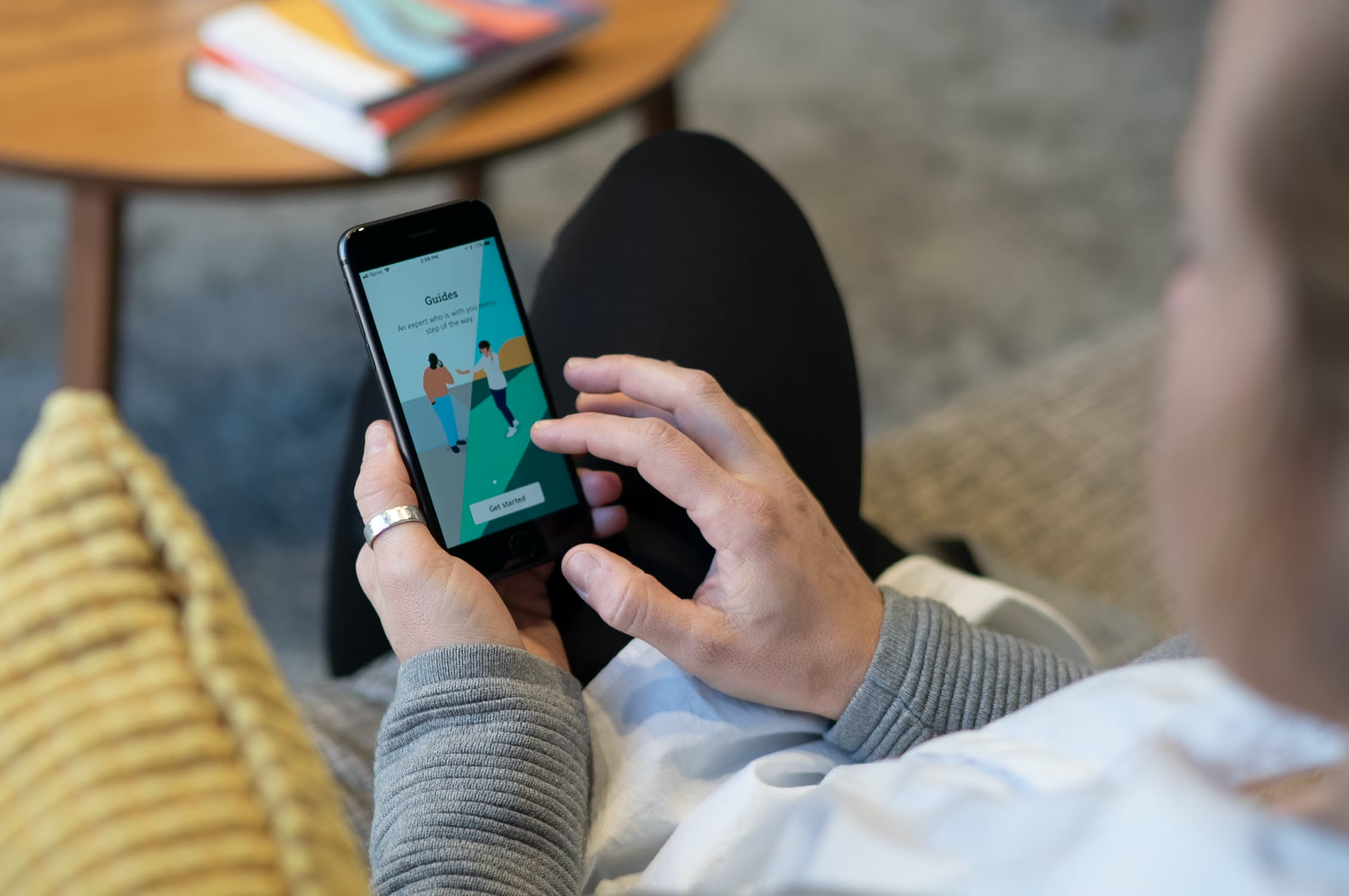
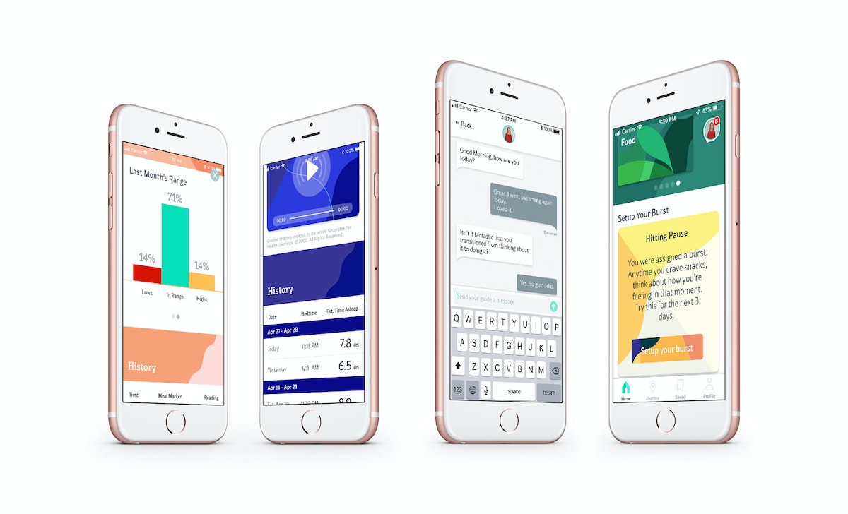
The patient experience married data and tracking, real-life mentorship, and personalized content. When a patient signed up, they were paired with a Certified Diabetes Educator (CDE) who created a tailored program based on their needs and linked them to relevant articles on topics like cooking, mental wellbeing, and sexual health. The IDEO team led the charge in hiring and training guides, crafting the educational content, and even designing the content management hub.
The data engine behind the app is another one of the program's stand-out qualities. The app pulled data from multiple data sources—exercise bands and glucose meters—to provide constant feedback, track progress, and continually refine the experience. To generate empathy, as well as build the app's initial data set, IDEO's data scientists tested the product on themselves. One designer wore a wrist full of exercise monitors around the office and tracked her blood sugar after every meal.
The app-based service was tested with 60 people and demonstrated remarkable early results. Only two participants failed to complete the study—a stunning success rate when adherence to therapy for chronic illnesses in developed countries averages around 50%. Additionally, participants reported drastic improvements in both physical and mental health. One recently widowed 70-year-old woman emerged from depression, returned to swimming, and started having regular blood sugar readings.
The project required Ascensia to embrace new ways of working internally, adopt a broader view of their offering, and ultimately expand the way they serve people with diabetes.

Creating an out-of-this-world STEM learning experience
Aboard the Verizon Explorer Lab, students can travel to Mars and learn engineering basics along the way.
When Mr. Gordon told his fifth grade students they were taking a field trip on a bus, many of them envisioned the city bus that they ride each day to school. But when they saw the Verizon Explorer Lab pull into the school parking lot, they realized a unique experience awaited them. Painted in bright colors, this bus promised something very different from their daily commute.
“Climb aboard, explorers!” says the Lead Explorer. The students walk through the bus’ sliding doors and inside, where instead of rows of seats, they find a sleek research lab. Suddenly, the lights dim. The bus makes a rumbling noise as though it’s about to lift off. And on a large screen, a vision of Earth from space appears. The students listen and point as the video narrator briefs them on NASA’s ongoing search for life in space.
Science education isn’t always this fun. Some kids have a chance to learn through interactive games, immersive experiences, or engaging field trips; but many lack access to rich educational experiences in science, technology, engineering, and math (STEM). As a result, they can be less likely to pursue careers in STEM, though many future jobs will demand mastery of these subjects. This not only impacts a student’s potential and future, but reduces the diversity and number of qualified STEM job applicants.
In under-resourced schools, students are often limited to the scarce tools available for STEM learning in their classrooms. Many kids rarely have a chance to leave their neighborhoods. For these kids, mobile learning experiences that come to their school offer unparalleled exposure to cutting-edge, technologically advanced, and—most importantly—inspiring gateways into these critical academic subjects.
As part of its focus on digital inclusion, Verizon partnered with IDEO to share the excitement of STEM learning with middle schoolers. To facilitate access and discovery of STEM, the team designed a learning experience that takes place on a coach bus and can be scaled to reach kids across the nation.
The team set out to transform the bus into the Verizon Explorer Lab: a futuristic research lab that transports kids to new environments, from outer space to under the sea. As part of the larger Verizon Innovative Learning program, the Verizon Explorer Lab offers delightful and rigorous content that meets national science standards.
A multidisciplinary team comprised of designers across interaction, communication, environments, games, and software partnered with Verizon to bring the Verizon Explorer Lab to life.
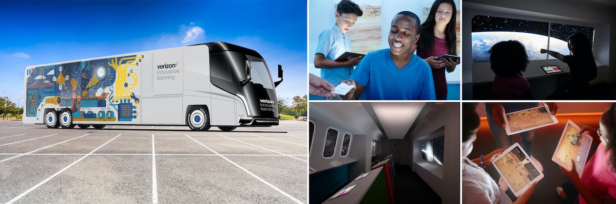
To keep the student at the center of the experience, the team designed alongside kids. Their gravitation toward play, interaction, and technology inspired the digital game that students play onboard the bus. When developing the game’s narrative, the designers turned to popular kids’ books and movies. What began as a card game prototype eventually became a 360-degree video and virtual reality expedition to Mars—complete with a custom musical score—that introduces middle schoolers to engineering basics.
After stepping through the bus doors and taking a tour of the solar system, Mr. Gordon’s students receive an emergency call from NASA: They must rescue the missing Curiosity rover, which is dedicated to collecting evidence of life on Mars. Eager to save Curiosity, the students become immersed in the adventure at hand. And through the adventure, they become immersed in science.
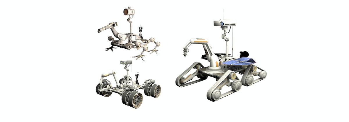
Students use tablets to design their own Mars rover. Each rover appears on a large screen and traverses the planet’s extreme terrain. The goal is to collect data that suggests life on Mars, including ice deposits, photos, and more. Students iterate on their rover’s design—wheels, power sources, and sensors—to test if it can stand up against dust storms and craters. The team consulted a NASA planetary scientist to ensure accuracy, as well as educators to establish cohesion with classroom curricula.
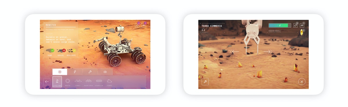
During the game, students are encouraged to compare designs and learn from each other: One rover may be able to travel long distances and take various photos, while another can carry large quantities of ice and sediment samples but can’t go far because of its size. At the end of the mission, the group finds Curiosity and sends all of the evidence they’ve collectively gathered back to NASA to aid the search for life beyond Earth. Before departing the bus, students watch an animated video that explains various jobs in STEM and encourages kids to pursue one of these careers.
The Verizon Explorer Lab teaches students the engineering design loop, the value of collaboration and teamwork, and what a career in STEM might look like. The mission to Mars game is just one of many potential STEM learning opportunities for students and integrated, customizable learning modules for teachers.
Since launch, the Verizon Explorer Lab has traveled to various parts of the United States and reached thousands of kids. It continues to be managed by Learning Undefeated, Verizon’s nonprofit partner. By designing for and with students, it’s possible to create educational experiences that facilitate meaningful learning and genuine fun. The Verizon Explorer Lab represents progress towards a more inclusive future for employers and the STEM field.
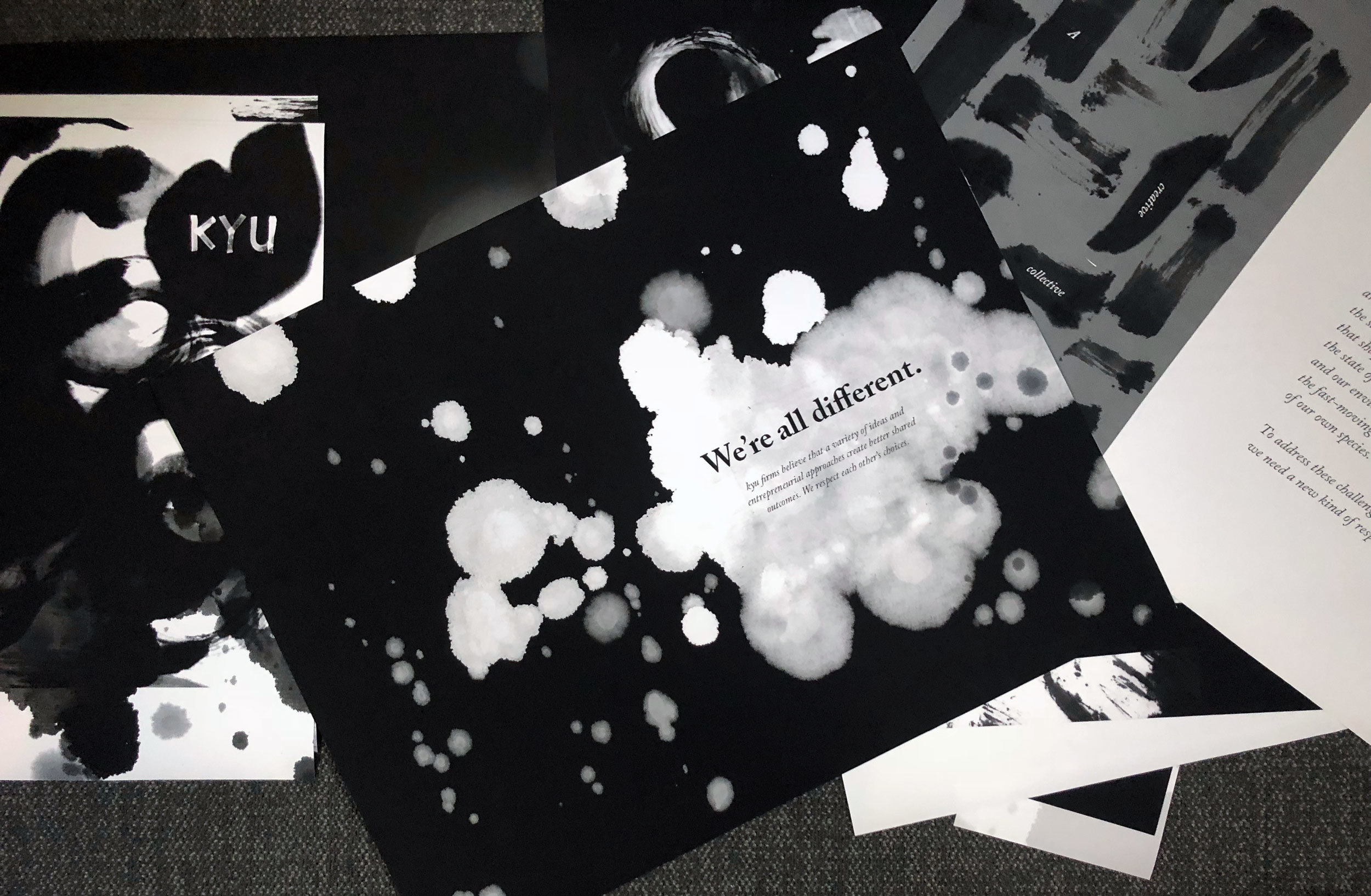
Design like you can hear the page
Tools of visual storytelling: Music and Calligraphy
I had been asked to create a newspaper for kyu, the design collective of which IDEO is a member, and I was ready to perform.
My desire to explore the world using rhythm and sound on one hand and ink and paper on the other started when I was young. I was very quiet as a child. Instead of playing with friends, I created my own playground in a sketchbook. I listened to stories on a cassette player as I drew.
My mom, a violinist who played in an orchestra, taught me how each sound communicates a different feeling. Together, the instruments create a pleasing harmony.
I chose to play the cello, as its sounds comforted me. When I felt sad, I could play and the sadness was transformed into something beautiful. When I felt alone, the cello's mid-tones communicating with and supporting the other instruments made me feel less isolated.
I went to high school in New Zealand and focused on photography, art, and music. Playing in orchestra, string quartet, chamber orchestra, and musical show orchestra required rigorous practice, and I discovered that it was only with disciplined repetition that the ear could learn to hear the subtle distinctions between an almost perfect note and an imperfect one, between good enough harmonizing and exquisite music. Constant practice not only created perfect harmony, it also trained the soul.
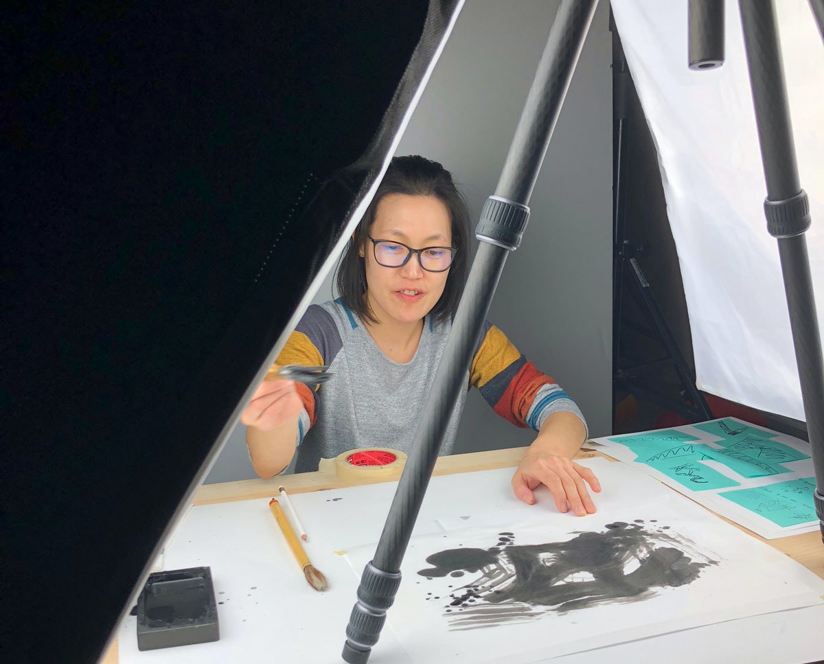
Like music, calligraphy embodies many feelings. That was my father’s gift to me. He guided my hand, drawing with me. At first, I stood in his shadow, but I gained confidence over time. The calligraphic technique I now use involves moving very fast, every stroke following right after the one before, never taking time to look back.
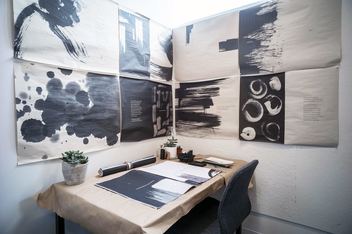
The companies that make up kyu share a belief that creative collaboration will yield new solutions. To visualize the collective, I drew the first dot directly with the brush and then started to draw circles. Dots and lines, the basis of musical notation, helped me orchestrate the story visually. Rough strokes conveyed complexity and sometimes chaos, while the diffusion of ink into paper illustrated the calm conclusion of a journey. When the magazine reached a crescendo, the dots began to jump around wildly. The combination of ink and water unified sense and sense, and the story of the newspaper came to its happy end.
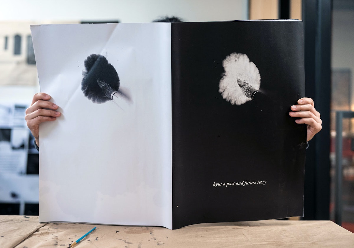
Just as each calligraphic mark and each musical instrument is unique, so too is each company in the kyu collective. Independent, but also located within the same “circle.” Sometimes the music of a page is the message.
“Music is the ultimate teacher.” ― Wassily Kandinsky
The day I got the assignment, I ran to the art store and bought brushes, ink, and a grindstone. I set the tools on my desk, which became the stage. I was the conductor, interpreting the text like a musical score.
How to make cinemagraphs with your iPhone
How to master the art of the moving image
The secret is in iOS 11 Live Photo Effects. To make your own, access this feature, take a live photo, then, in the photos app, swipe up to reveal the Live Photo Effects.
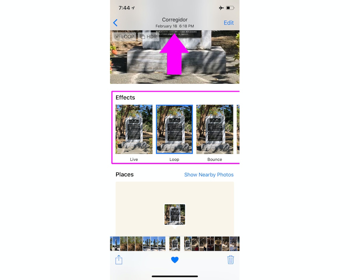
Easy, right? Yes and no.
Creating a live loop is easy, but creating a cinemagraph requires a bit more planning. The difference is in the framing—too much movement, and you’ll just get a live loop. Here are a few tips to ensure you nail the combination of still photo and limited motion:
- Find the shot: To create a beautiful cinemagraph, find a shot where most of the image will be still, and only a piece is in motion—perhaps a tree blowing in the wind, or raindrops on a puddle. If there’s too much movement in the frame, the shot will feel chaotic.
- Plan it out: While it’s possible to pull off a clean loop without a tripod, don’t just point and shoot. I like to turn on the grid in my photo settings—these lines help me see if I’m holding still or wobbling slightly (I always use the grid to help create a level horizon or position subjects, anyway). Try to lock your body by leaning on something, or even by putting the camera on a table to keep it as still as possible.
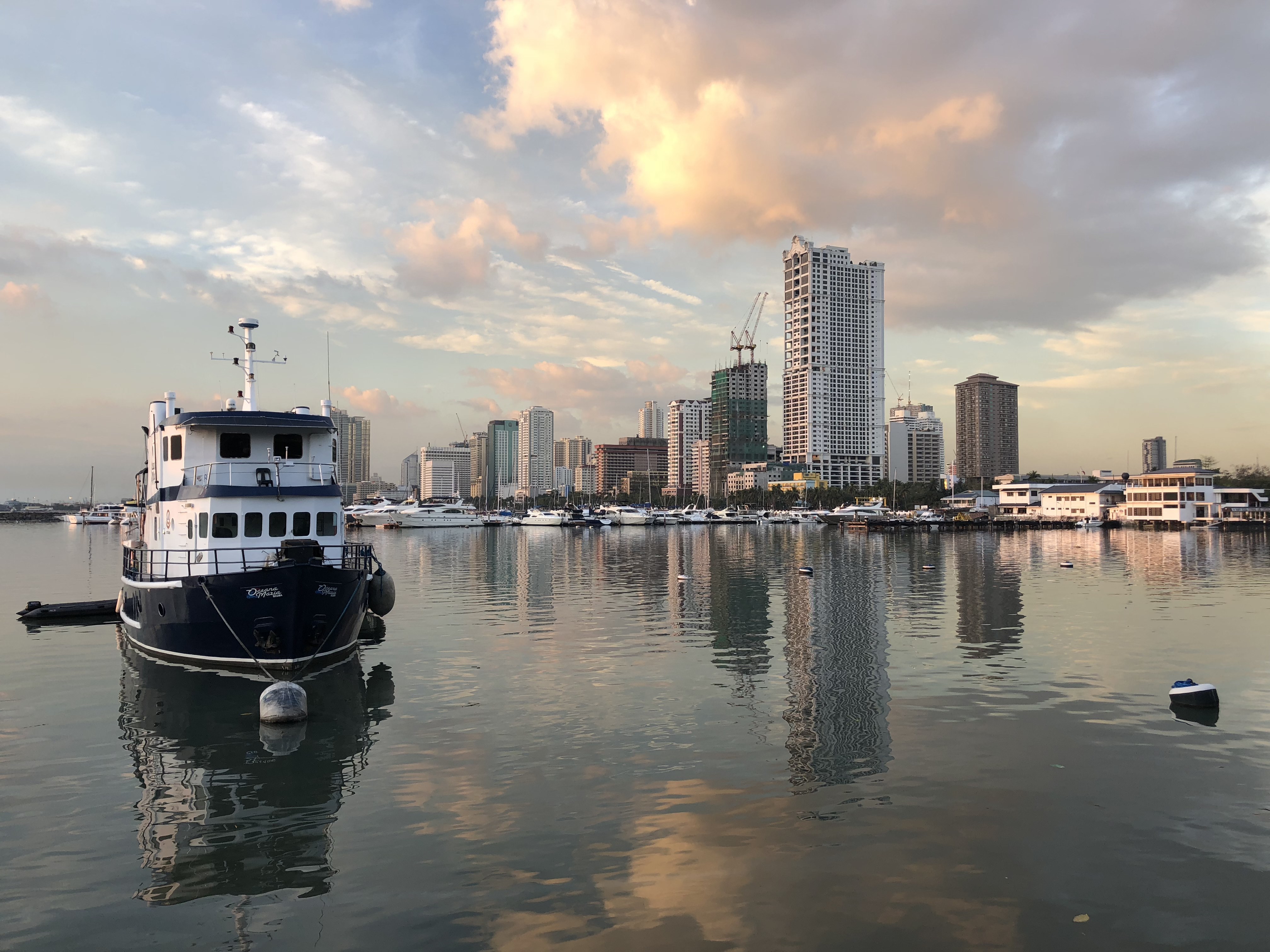
- Stage it: Don’t leave it to chance! When you can, control the shot. The pool shot below took a few tries, and it really helps that there were no other people wandering through.
Sharing the live loop
So you’ve perfected your technique and have a gorgeous loop to share! The problem is, iOS doesn’t exactly make it easy.
If you try to share natively to Instagram, it’ll tell you the loop needs to be three seconds or longer. And iOS doesn’t offer a lot of options to help—there’s no easy way to export your Live Loop into a format that’s shareable for Instagram. I found this out the hard way while I was traveling in the Philippines, and since I didn’t have my computer with me, I had to figure out a way to solve for this using only my phone.
One of my goals was to use only free apps—buying a bunch of apps I wasn’t sure were going to work didn’t sound very fun. After much Googling, trial, and error I created the workflow below. The first time through might take you a few minutes, but now that I’ve done it a few times, I can go from live loop to Instagram in less than two minutes.
Get the apps
First, download these three free apps:
- Lively: Exports your Live Loop as a video
- Splice: A free video editor that lets you extend the length of the loop to meet Instagram’s minimum requirements
- Video Crop: Removes any letterboxing (black bars) in the video export
1. Lively
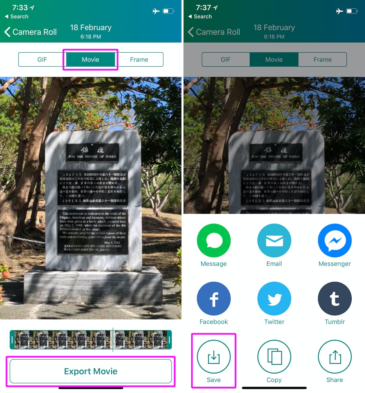
Start by using Lively to open the loop you want to export. In the top of the export panel select “Movie” and then tap “Export”, then save the movie.
2. Splice
In Splice, tap the + icon on the top right to create a new project and select the video you exported from Lively. Click “Add (1)” on the top right to add it to your project.
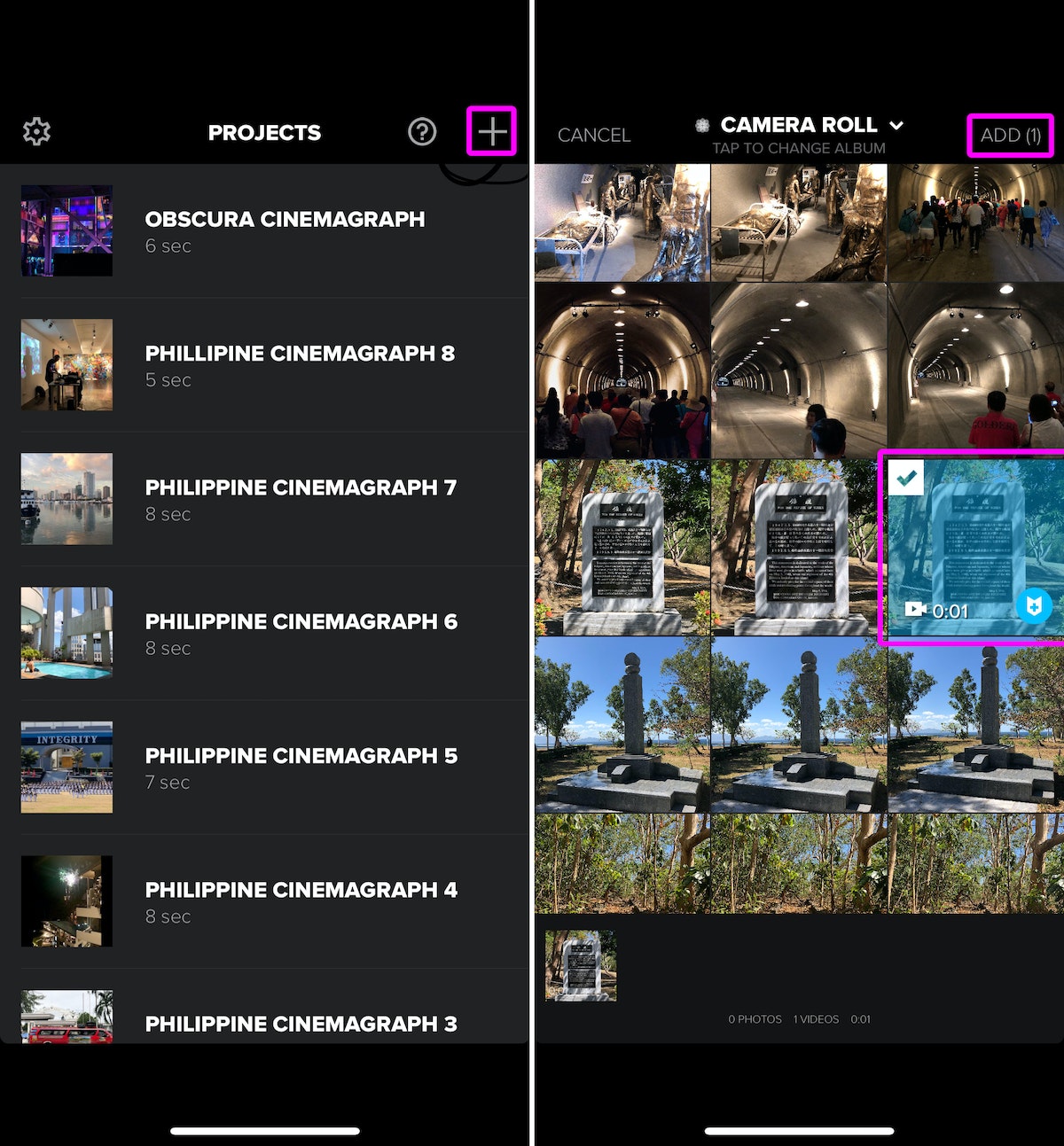
On the Add Audio screen, tap “Skip” on the top right.
Name it however you like, and use these settings:
- Format: Select Landscape for wide photos or Portrait for tall ones
- Default transition: set to “None”
- Outro: set to “Off”
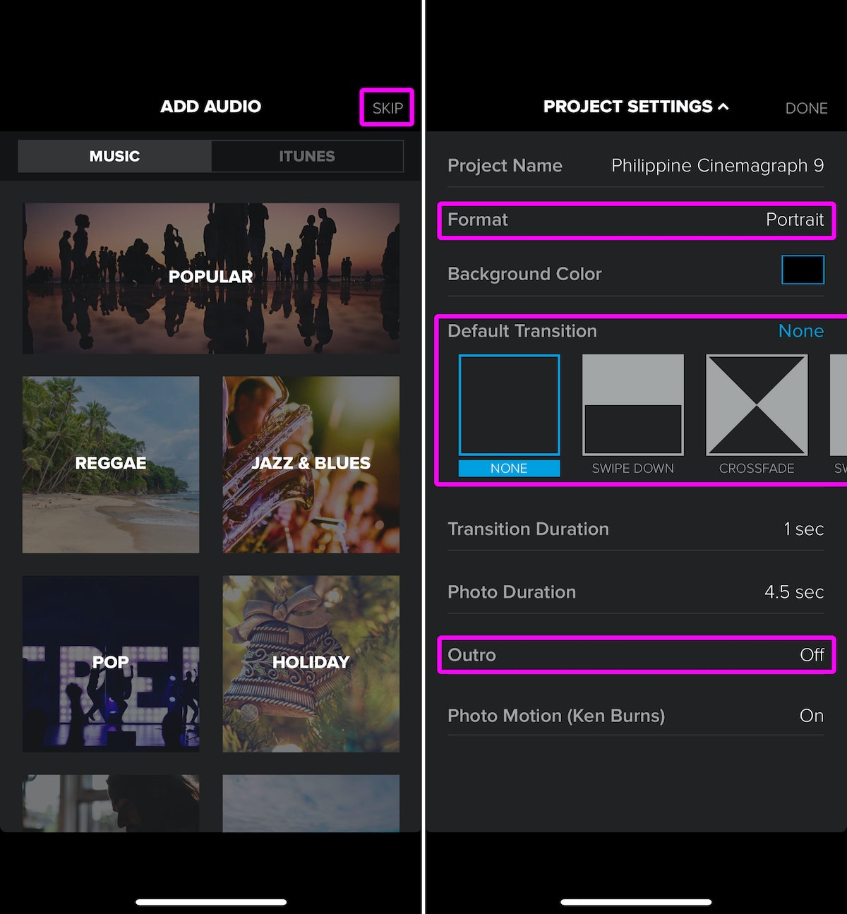
Now you should be in the editing screen; all you have to do is tap your video and select “Duplicate.” Do this three or four times until your video duration is at least 0:05 or longer.
Lastly, tap the “Export” button on the top right and select “Save.” I always pick 1080p HD for the best quality.
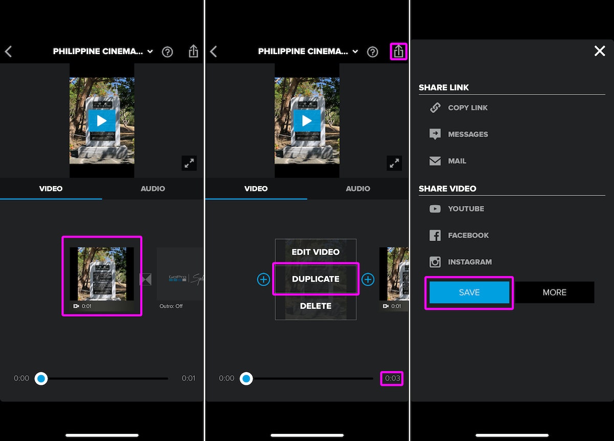
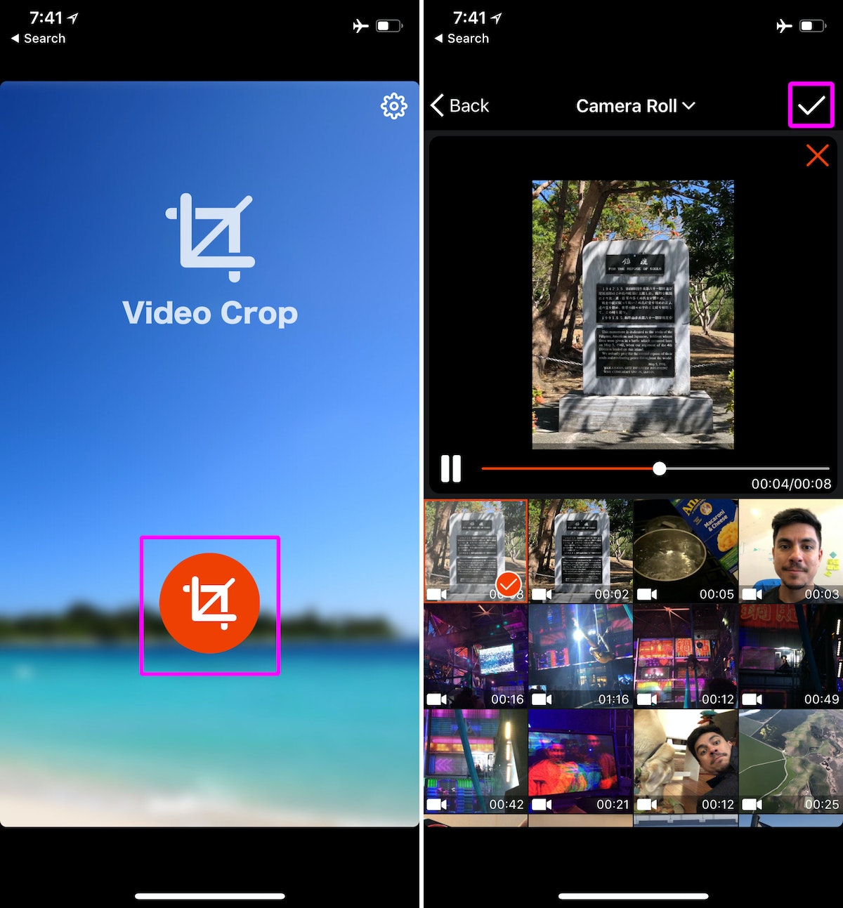
3. Video Crop
One last step: Remove the letterbox (those pesky black bars) on the side of the exported video. Open “Video Crop,” tap the big red button, select your video, and tap the check mark on the top right.
Now use the crop tool to trim off the black bars, then tap the export button on the top right. When it’s done processing, tap “Save.”
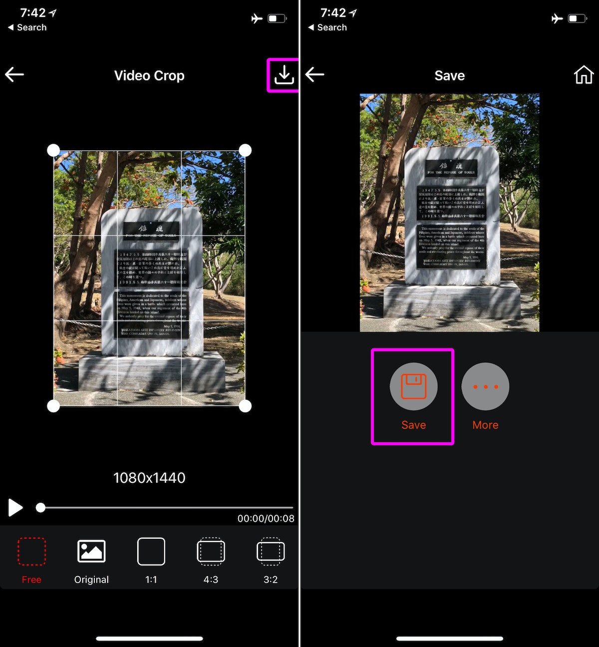
Very Instagrammable
Cinemagraph loops look amazing on Instagram or Facebook, and they give you a unique way to share your experiences (Let’s be real—we’ve all seen enough Boomerangs.)
It takes a few steps, but once you get the hang of it, the process is quick and easy. And when your friends ask how you did it, you can point them this way.
I’ve always loved cinemagraphs—those endless, hypnotizing loops where part of the frame is still while some areas are gently in motion. When I discovered that I could create these loops natively with iOS 11 (iPhone 6S or newer), I couldn’t wait to try it out.
How Sweden is sparking a mobility movement
3 design lessons from Sweden's sustainable mobility initiative
Through the Swedish Energy Agency and its partners, the nation is focusing on reducing pollution from the transportation sector. It plans to reduce (but not entirely eliminate) the need for private car ownership by improving alternative travel options for people in everyday life.
In more wonky language, the focus is on sustainable mobility as a service, an approach that brings all means of travel together. It combines options from different transport providers into a single mobile service, removing the hassle of planning and one-off payments. It’s an environmentally sound alternative to owning a car, and an approach to mobility now being propelled by urbanization, economic shifts, artificial intelligence—and the social and economic impacts of climate change.
Through its initiative, A Challenge from Sweden, the Swedish Energy Agency invited IDEO to join the effort. Here are three lessons we learned along the way through working alongside our Swedish counterparts.
1. Get outside
Swedes live for fresh air and natural landscapes. Even the most committed Swedish city slickers retreat to a cabin at the weekend, or dream of an escape to the countryside. The natural world is imagined and felt as replenishment—as a valuable resource to be respected and enjoyed.
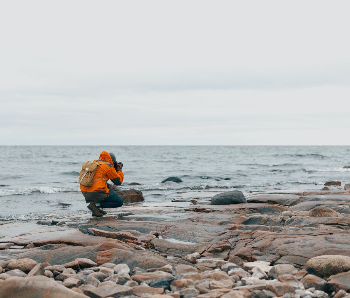
For our design team, it was a reminder to take our research far beyond Stockholm or Gothenburg, especially as we considered designing for a nation of travelers. We took long train rides to meet people in smaller towns, and walked as much as we could. It felt good, and it was necessary.
Going outside also means seeking out inspiration from beyond your own context. We were inspired by examples of civic and societal change from around the world, and brought them into the project, almost as if we’d discovered precious acorns on the forest floor.
2. Engage tradition
Cultural traditions and norms might seem strange or twee to outside eyes. But they almost always hint at a deep societal agreement. We discovered that in Sweden, for sure. Fika is not merely a coffee break during the day: it’s an invitation to pause, to reflect, to reconnect with one’s thoughts or emotions, and to restart.
We introduced fika in our project space, and observed it when we were with the team from Sweden. It added a note of calm and confidence to our work and to our individual energies, even as the work accelerated in intensity towards the end.
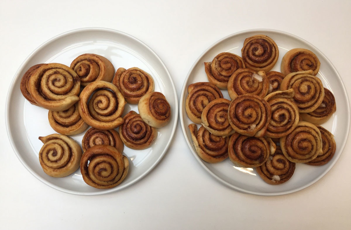
Similarly, we drew on Nordic storytelling tradition to share the story of our research in Sweden. Instead of using dry descriptions to describe the different ways Swedes might be triggered to make new transportation choices, we told a three-dimensional fable that told the story of a mythic waterfall, and the different paths that four people took to find it and use it.
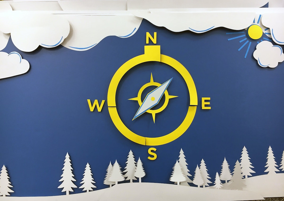
The fable allowed us to invite our collaborators into a instinctive understanding of what we’d all learned together, as well as a logical one. The story resonated, it brought joy into an otherwise serious, complex topic, and it was easy to repeat.
3. Be brave
The scale of Sweden’s ambition is remarkable, but—in Sweden itself—commonplace.
Swedes recognize that their country is small, their population tiny, and their contributions to global climate change negligible. But they also understand that, by leading with bravery, they have earned outsized influence in the world. Other countries look to them as an example of how to set goals and make change in service of healthy, sustainable growth.
Sweden has set a goal of achieving a fossil neutral transportation sector before 2030. That’s a big ambition, and an exciting one.
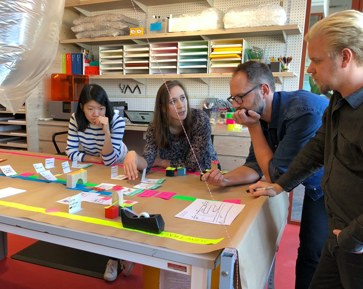
Through a global innovation challenge, Sweden is now inviting engaged political leaders and some of the world’s most capable companies to help make sustainable mobility as a service a reality.
In other words, Sweden is going places fast.
Find out more about Mission Innovation 3 and A Challenge from Sweden.
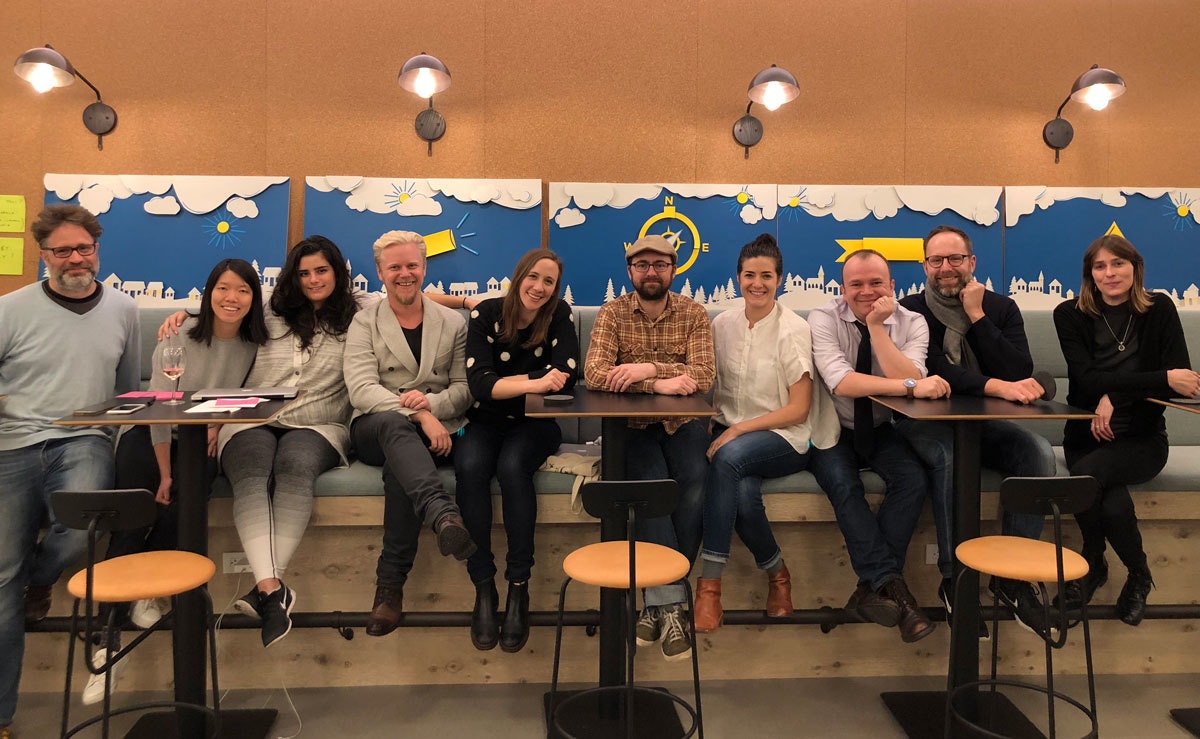
Through IKEA, Sweden has already transformed the world of contemporary furniture and home furnishing. Now Sweden is taking on an arguably even more ambitious goal: leading the world in tackling some of the thorniest causes of global climate change.
Designing for blockchain: Three ways to get started
3 design challenges to explore the future of blockchain
Here are three juicy ones to get started thinking more deeply about blockchain, the unique experiences the technology enables, and how it could be integrated into our everyday lives.
1. Designing for ownership
The beauty of cryptocurrency is that it’s possible for you, and only you, to have access to your crypto wallet and assets. That means you get to have true ownership; your “account” information isn’t stored by a bank or central authority that can use or take away your assets at will (think of governments seizing funds, for example). Instead, the data is stored in a universal ledger across a distributed network that can independently verify who owns what—so it’s much more transparent than most of today’s banking systems.
Of course, that power also comes with great responsibility. There is no password or account recovery if you lose or reveal your private key (sometimes expressed in the form of a 24-word phrase), which is used to “unlock” your wallet. Giving that away is like dropping cash on the street—you likely won’t get it back.
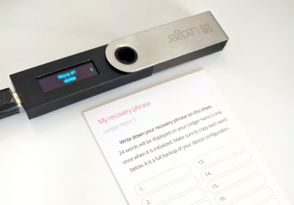
Challenge: Design secure and user-friendly ways to store private keys.
A few questions to get you started:
- How might we design better ways to securely store private keys that balance security (keys cannot be easily copied or stolen) and ease of use?
- What are some digital and physical features for secure storage that we could utilize?
- How might we design ways to securely transfer ownership of private keys in case of loss or death?
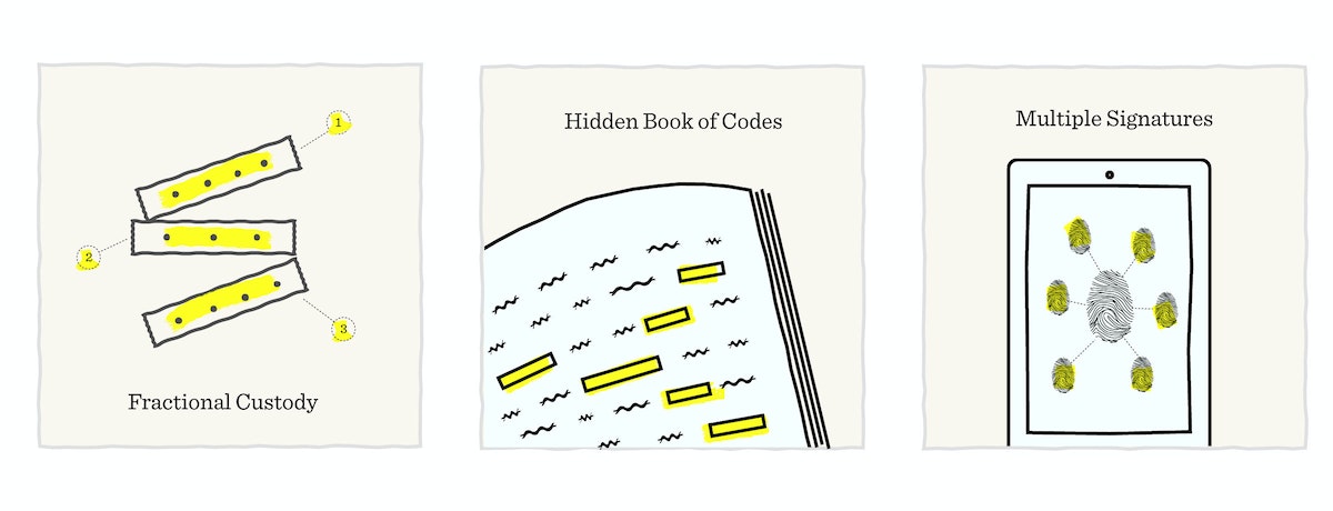
Some inspiration:
- Fractional Custody: What are some ways you could divide up and distribute private keys among five of your most trusted friends and family members?
- Book of Codes: Inspired by Jonathan Safran Foer’s Tree of Codes, what if custom die-cut cards could reveal your passphrase when placed over the right book?
- Multiple Points of Verification: Could you have a mobile app that verifies your identity through multiple social networks before revealing the passphrase?
2. Designing transparency in network transactions
Every time you transact in Ethereum, a platform for blockchain applications, you have to set your gas price—the amount you are willing to pay for the computation needed for your transaction be confirmed. An easy analog is paying more for expedited shipping to get your package mailed there sooner.
Those prices and speeds are not determined by any one party (like FedEx, for instance), but by how busy the network is, how many other transactions are waiting to be confirmed, and what gas price those other transactions are using. But information about current network state is rarely communicated to the user—adding frustration and confusion when setting your best guess at gas price. Too low? Your transaction might not go through for a long time (or ever). Set it too high, and you risk paying more than you need to.
Remember the early days of eBay, before they included shipping rates in transactions? You had to wait for a day or so until the seller got back to you with the actual shipping costs. Sometimes it was what you’d expected, sometimes it bit you in the butt.
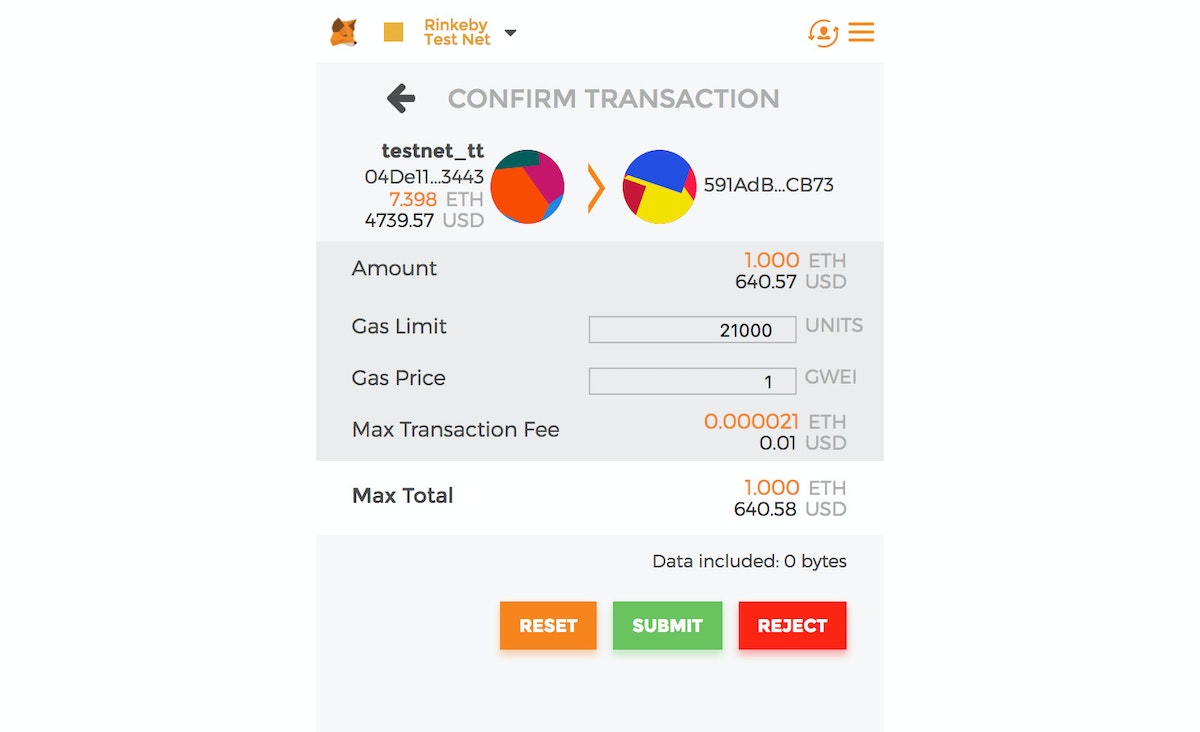
Challenge: Design better ways to help users make a decision about transaction costs, or find ways to abstract it away all together.
A few questions to get you started:
- How might we make transaction costs and prices more transparent to the user?
- How might we reveal high-level and useful data on network status?
- How might we better automate gas estimates to remove friction from decision-making?
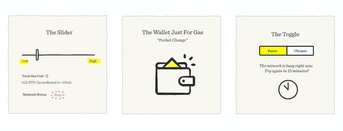
Some inspiration:
- The Slider: Could the user first select their desired transaction speed to reveal its implied cost?
- The Wallet Just for Gas: Could there be a separate wallet just for transaction costs, which gets topped off at regular intervals?
- The Toggle: Could you offer the user be a simple choice—speed vs. value?
3. Designing for readability
Crypto wallet addresses currently look something like this: 0x04De111196aCE9764b6eCAcC4f849b6b59193443—a string of 40 characters, which serve the function of being cryptographically unique (i.e. impossible to guess). While there are experiments like ENS, a human-readable domain system for blockchain addresses, they aren’t widely adopted yet. Sending a crypto transaction today means checking and double-checking 40 characters that look like gobble-de-gook. And you need to get it right the first time, since there are no refunds or rollbacks for crypto transactions.
That’s like having to type in the bank account number of every merchant or person you’d like to transact with, every single time. If it’s off by one digit—cue instant regret.
The challenge: Design ways to display blockchain addresses in a more readable or recognizable format.
A few questions to get you started:
- How might we use algorithmically-generated images or symbols to create visual recognizability?
- Are there industry standards (like checksums) that could help reduce errors in address entry?
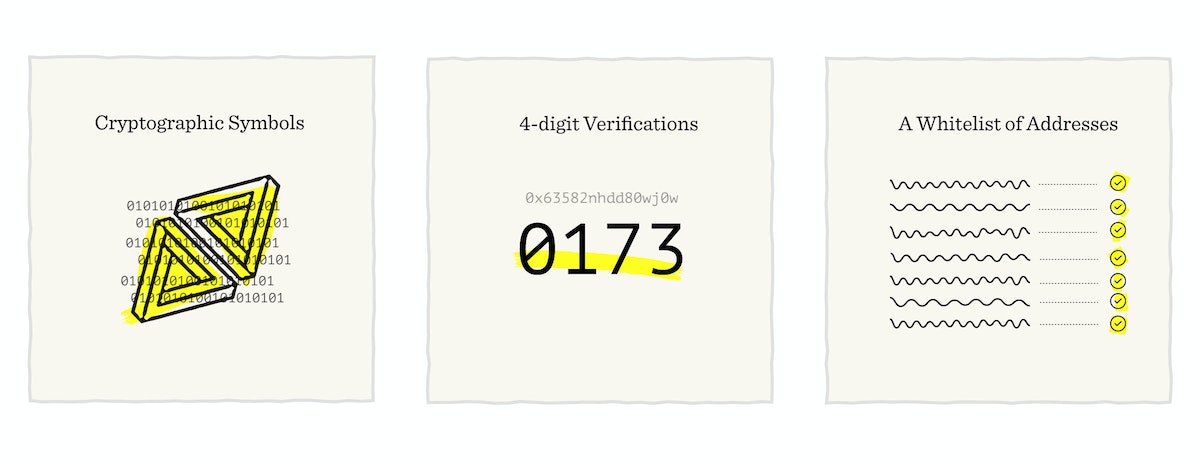
Some inspiration:
- Cryptographic Visual Tags: How might we use unique color codes or symbols to tag address typologies or to verify addresses?
- 4-Digit Verifications: What are some industry standards that financial institutions use that could be relevant for these addresses? One such example is typing in the last 4 digits of a credit card number to verify ownership.
- Whitelist of Verified Addresses: Are there ways to maintain a registry of trusted addresses without relying on a central authority?
These are just three challenges (ahem, opportunities) that blockchain offers designers—there are (and will continue to be) many more. Have an idea? We’d love to hear it! Tweet your thoughts to @ideocolab.
Interested in collaborating with us on a future project, or got another blockchain-based design challenge you want to talk about? Reach out to IDEO CoLab, IDEO’s collaborative platform for emerging technologies, here or on Twitter!
Despite all the media hype about the rise and fall of cryptocurrencies, blockchain technology is still in its infancy, meaning it’s an ideal time for designers to step in and help build new systems. There’s no shortage of challenges to address.

Lindsey Turner
I’m passionate about building brands, products, and experiences that help organizations show up with meaning and momentum.
I help organizations cut through complexity by shaping how they show up, through brand strategy, identity, and storytelling.
Working at the intersection of brand and business, I bring an editorial eye and a bias toward making—turning ideas into tangible experiences that people can understand, trust, and believe in.
My work spans government, healthcare, financial services, media, and consumer goods, from launching Gen Z-focused ventures to building innovation labs and reimagining legacy brands. I relish moments of ambiguity and enjoy translating across teams, perspectives, and priorities to move ideas forward.
I started my career in editorial and digital design, shaping cross-platform experiences and identity systems in publishing and agency environments. That foundation still shapes how I work today: I’m detail-oriented, collaborative, and overreliant on the Oxford comma. I hold a BFA in Visual Communication from the School of the Art Institute of Chicago.

Rachel Young
My work helps organizations see who their products aren't working for—and build the will and the tools to do something about it
For 25 years, I've asked the same question: Who does this design exclude—and what are we going to do about it?
My work spans human-centered strategy, inclusive design, and qualitative research, with clients ranging from Microsoft, Google, and Verizon to the National Science Foundation, and San Francisco Unified School District.
Before IDEO, I taught elementary school in East Palo Alto and spent a decade doing design work with social service organizations—where I learned firsthand what it costs people when systems are built without them in mind.
I am currently writing User Error, a nonfiction book about digital access and the design decisions behind it. I live in Oakland, California.

Brian Pelsoh
I lead with craft, ensuring our work is creatively excellent: rooted in deep human insight and imagination, while also grounded in the realities of business and technology.
My expertise spans brand, communication, and product design across tech, education, the arts, and social impact.
I believe great work demands both high-level vision and obsessive attention to detail, and only happens through collaboration.
I bring an inclusive, hands-on approach and a deep understanding of business, which enables me to consistently deliver excellence while always asking why.
Before joining IDEO, I worked at the brand firms Pentagram and VSA Partners. I began my career as a designer, leading teams at the School of the Art Institute of Chicago and the Milwaukee Art Museum. I hold an MFA in graphic design from Maryland Institute College of Art and a BFA in communication design from the Milwaukee Institute of Art & Design, and have taught at some of the best design schools in the US.

Tony Wong
I am responsible for IDEO’s long-term success in China and working with clients to use design as a tool to enable growth.
I am responsible for IDEO’s long-term success in China and working with clients to use design as a tool to enable growth. Specifically, I have helped Chinese companies design holistic brand solutions through the development of their products, communication, services, and innovation teams, and I have helped multinationals expand their presence and influence in China.
I advise global leaders on developing China-led innovation and capabilities.
In over 15 years in IDEO Shanghai, I have worked on projects that use design to elevate the quality of the experience of healthcare products and services, streamline processes that increase productivity, create spaces and programs that promote and enable inclusive communities, and build next generation mobility solutions that are planet-positive.
Before joining IDEO, I worked at Philips Electronics and the Electrolux Group in Italy, the Netherlands, and Singapore on a number of breakthrough commercial products. I am a member of the Young President Organization in Shanghai.

Building a personal AI for the messiness of life: Sida Li
Most AI products today are built for work—a space with clear problems and established systems. One founder noticed a gap: personal life is messier, harder to systematize, and mostly left behind by the AI boom. So she built Cue, a personal AI that lives inside iMessage and group chats, to go where the other tools haven't.
In this episode, Becca Carroll, IDEO's Chief Strategy Officer, talks with Sida Li, co-founder and CEO of Shared Context Lab, about staying anchored to a human need while the technology around her keeps changing shape, why she treats her business model with the same rigor she'd bring to a product, and what it feels like to build a company at this particular, disorienting moment in AI.
The conversation also gets into how Sida makes design decisions: the language Cue uses to describe itself, the tradeoffs behind building inside iMessage instead of a new app, and a real story about a business idea that didn’t pan out.
This is the second in a two-part series profiling founders from IDEO's Startups-in-Residence program. The first conversation is with Johannes Seemann, founder of Sooner, on designing GenAI for the emotional side of money.

Designing GenAI for the emotional side of money: Johannes Seemann
Most personal financial tools are built to run the numbers and optimize towards a budget. While that works for some, most people experience money as a lived relationship that does not neatly fit into a spreadsheet. Johannes Seemann and Becca Carroll discuss why money is emotional before it is mathematical, and what a human-centered approach to building a generative AI financial product looks like in practice.

The curious leader's edge in uncertainty: Scott Shigeoka
Mina Seetharaman talks with Scott Shigeoka, author of Seek and Head of Curiosity Cultivation at the Eames Institute, about what distinguishes genuinely curious leadership from performative curiosity, how power dynamics shape curiosity, and why practicing curiosity can restore energy rather than drain it.

How constraints make us more creative: David Epstein
Mina Seetharaman talks with David Epstein, author of Inside the Box and Range, about why total freedom often produces average work, how leaders can design useful limits on purpose, and what organizations such as General Magic and Pixar reveal about the relationship between boundaries and creativity.
Looks like you might be in search of something very specific?
Or reset the filters above and try another angle.
Here’s some random inspiration

Podcasts about creative leadership

Articles about the power of prototyping
