
.svg)


3 Rules for Making a Government Site Work for the People
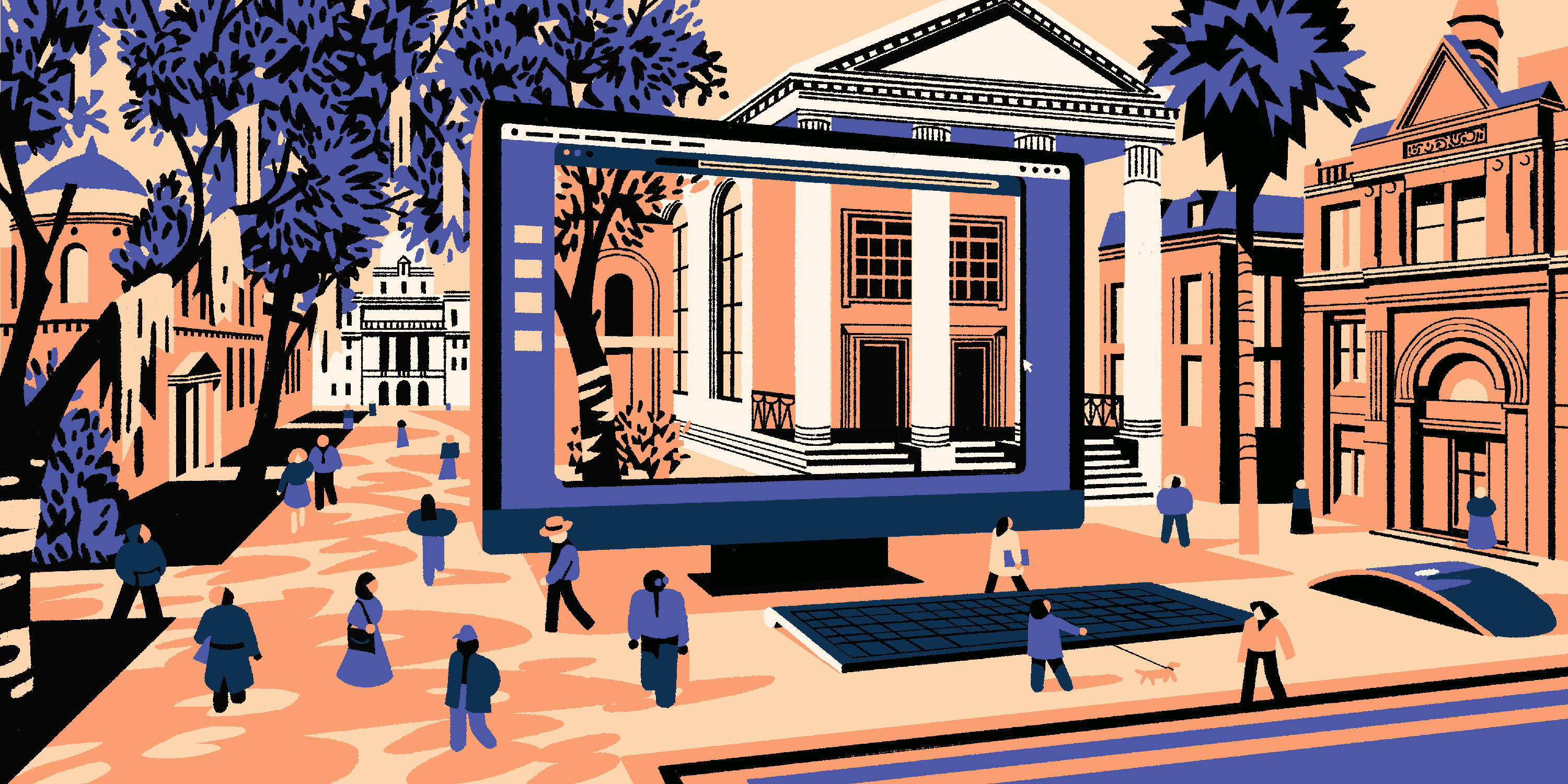
There’s a reason government sites don’t have a reputation for great user experiences. They rarely have the budget or staffing even for digital updates, much less innovation. But the state of Georgia wanted to change that.
Inspired by the recent overhauls of government sites like gov.uk and boston.gov, Georgia tapped IDEO to explore how it could give more than 80 state agencies flexibility in the look and feel of their websites, while also preserving a uniform branding experience that residents could recognize and trust.
To get acquainted with the state, we took a road trip, wandering around the historic streets of Savannah, getting to know the resilient spirit of Macon, and soaking up the innovative energy of Atlanta. We learned a lot about what Georgians would like from their government, and took a strong look at how the look, feel, and content of a digital experience might impact delivery of services. But we also learned a lot about the difficulties of accessing—and providing—government services. Soon, we realized that this project could be more than just an identity exercise.
The state of Georgia’s population has grown 25 percent over the past decade while the size of its government has decreased by 25 percent. These diverging trends have put a strain on government staff, adding even more pressure to the promises of efficiency that come with civic tech. The transition to digital delivery is not easy, and governments around the world are working to define digital best practices. Because the work is still in progress, service delivery is a serious challenge. Our project wasn’t just about identity, but about how changes in CSS, information, and color schemes could fix the concerns residents had about trust and access to information and services.
During our journey through Georgia, residents told us they felt that government was removed from their lives, monolithic, opaque, and solemn. While it plays a necessary and—in some cases—critical role in their lives, their relationship to it was transactional. Armed with that feedback, our goal was to leverage Georgia.gov to make that relationship feel more collaborative from both a functional and emotional perspective. Thanks to conversations with many people from the great state of Georgia, we synthesized the shortcomings of government websites, explored the needs of the people, and came up with a list of three rules for anyone looking to create a better digital link between a government and its people.
1. Empower users to make an impact
When there are limits to what government can do, give constituents a clear role in how they can work with government to solve problems together. In our research, we chatted with civic technology expert Cliff Lampe, a professor at the University of Michigan School of Information Studies. In one project, Professor Lampe and his students developed a technology that allowed residents to flag the presence of rats in their neighborhoods. Though the technology empowered residents to report health and safety issues, the staff in Ferndale, Michigan didn’t actually have the capacity to keep up with them. They started replying to requests for support with information about what residents could do to help mitigate the rat population, like getting rid of clutter in the backyard or keeping pet food inside. Instead of ignoring work it couldn’t get to, the government brought the people into a collaborative relationship, so that they could fight the rodent population together.

2. Leverage UI to let residents know that government is on their side
People on both sides of the conversation called interacting with the government “a necessary pain.” Government staff recognize that if you’re coming to a website to pay taxes, you’re probably not in the greatest mood. Residents often mentioned that the look and feel of the websites didn’t give them the sense that they were welcome to reach out and call agency staff for help.
Our testing of early prototypes revealed that shifts in language and color schemes could change how both government staff and residents felt about their experiences. When we changed the color scheme from a traditional red, white, and blue to more approachable and ownable peaches and greens, residents used words like “warm” and “welcoming” to describe the look and feel. Adding language that invites people to call if they needed help also lead to a much better reception.
One resident told us that these changes gave her the feeling that the government services actually wanted to help her, rather than giving a feeling of what in the past felt like reluctant support.
3. Give constituents insider knowledge
When we visited Atlanta, we spoke to Tara, a program manager at a nonprofit that connects low-income individuals to state financial and educational resources. As an intermediary, Tara knows that state workers are stretched thin, so she advises her clients to do what they can to help move the process along. To this end, she has developed a series of strategies that make the process a little bit easier for everyone involved. Tara, like other superuser intermediaries we spoke to, relies on these strategies to empower herself in her work, helping to move the process along more efficiently.
Sharing tips on how to best navigate the application process brings residents into a collaborative relationship with agency staff, helping them understand obstacles and needs. Some of the tips that Tara shares with her clients include scheduling periodic check-in times to get updates on applications, keeping a file on previous conversations, and having key information on hand before making a call. Following her example, we provided step-by-step application instructions as well as advice from agency staff. Articulating these strategies on the agency website allows constituents to have smoother and more efficient conversations with agency staff without doing a deep dive overhaul of the service model.
Supporting collaboration between government and constituents doesn’t have to mean an overhaul of services. You can make things better with seemingly surface-level changes, like changes to tone, color schemes, and the way information is shared. Though they may appear to be band-aid fixes compared to solving larger systemic challenges, they really can change the way people see and experience their relationship with the government.
Special thanks to the residents of Georgia who shared their experiences with us, and to the IDEO design team of Tom Kershaw, Lindsey Turner, and Emma Baker that shared in this journey. See the state of Georgia's new website at pilot.georgia.gov.
Illustrations by Matteo Berton
Words and art

Subscribe