
.svg)


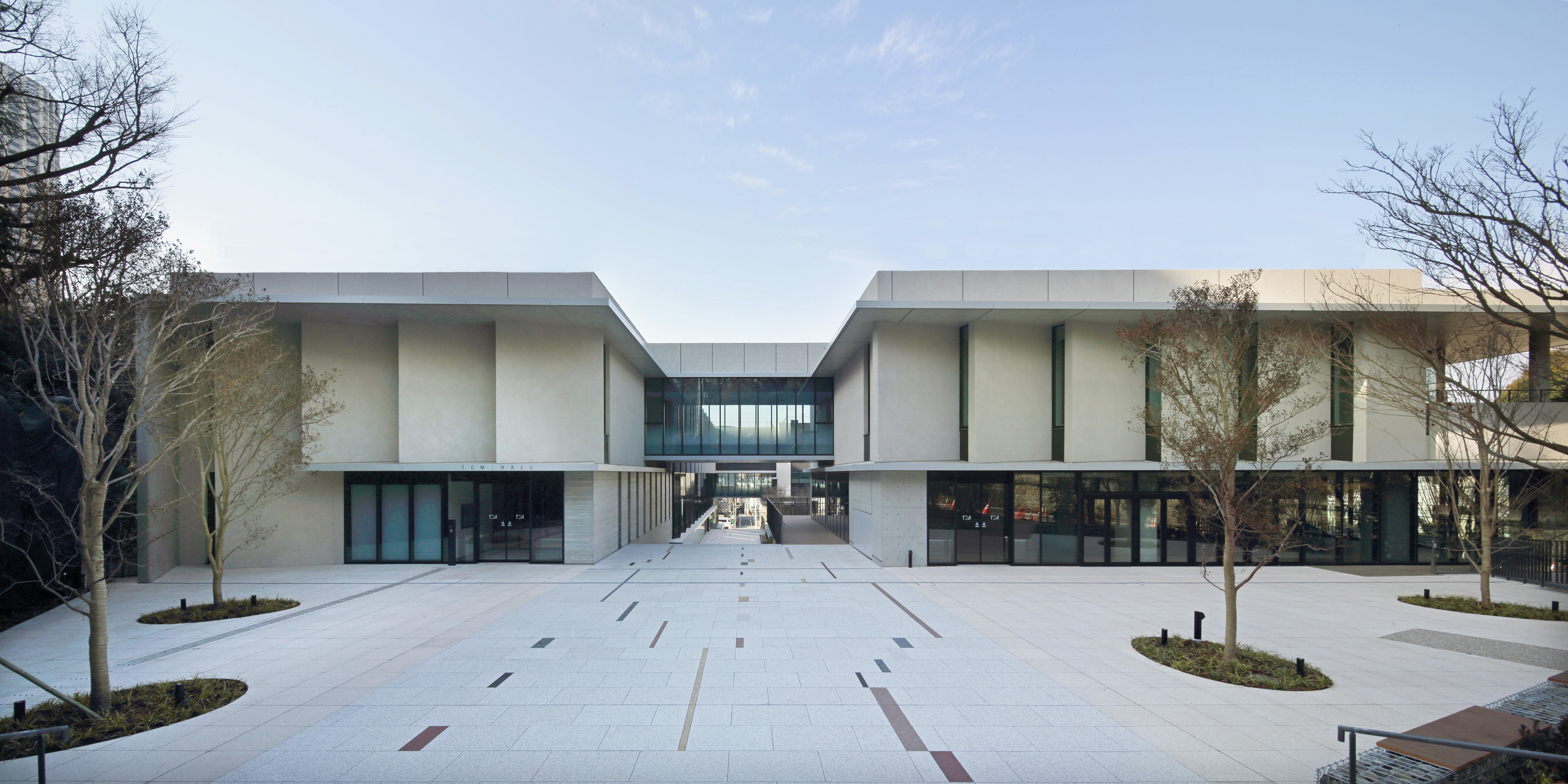

Transforming a historic music college into a collaborative learning platform
A new campus concept and student experience for Tokyo College of Music.
Since its founding over a century ago, Tokyo College of Music (TCM) has trained countless world-class musicians. Despite its well-established reputation, however, the school was feeling a pressing need to reconsider its role in order to remain relevant in a changing world.
The college had plans to build a second campus in Daikanyama, a prominent area of Tokyo known for being a hotbed for new global trends. Taking advantage of this opportunity, TCM leaders asked IDEO to help them develop a new concept for the school, and to redesign the learning experience while preserving a focus on classical music.
To kick off the research phases of the project, IDEO designers interviewed TCM students, and traveled to London, New York, and Boston visiting educational institutions, music schools, and arts facilities.
The team observed that students at music colleges outside of Japan were giving serious consideration to their career plans at an early stage in their studies, acquiring a variety of skills and mindsets through a well-rounded education. By contrast, TCM students were focused on learning and performing classical music, but tended not to have a clear image of future career opportunities.
IDEO proposed four specific directions for TCM’s new campus, based on an overarching theme of “culture, fields, and people collaborating across boundaries.” The first aim was to foster a business mindset and entrepreneurial spirit among the students that surpassed their classical music training. Next was to increase opportunities for actual performances, collaborations with professionals outside the school, and joint projects. The third aim was to position the college as a platform that would encourage the spontaneous creation of communities within and outside the school. The final aim was to develop students who were digitally savvy and fluent in new technologies, enabling them to continue evolving in response to developments in the real world. These goals are reflected in the various spaces of the school, as well as in the design of the experiences that occur in those spaces.
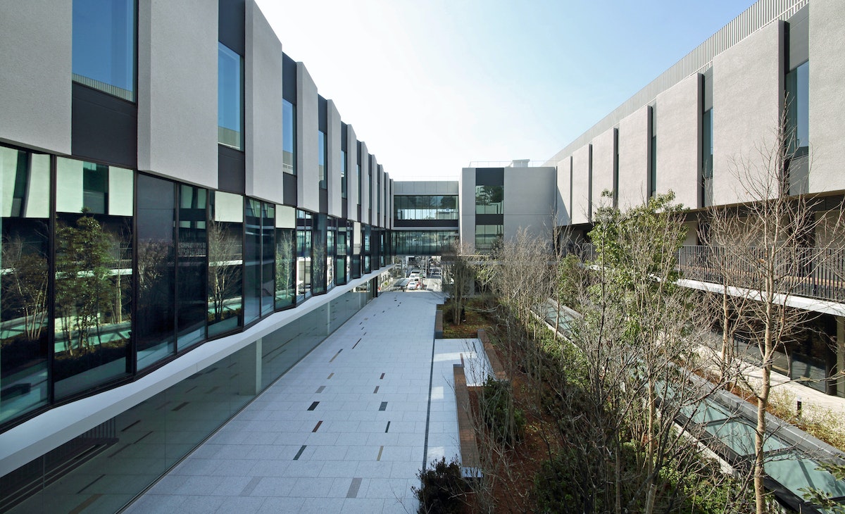
The most symbolic of these spaces is the Creative Lab. Originally intended as a library, the space now functions as a platform where people from within and outside the school community can collaborate and generate innovative ideas. The open layout, which encloses a cafeteria for students and faculty, can be altered depending on programming needs. The Creative Lab provides a venue not only for live performances in which the students can polish their improvisational skills, but for holding workshops and other events on topics such as cultural exchange, business, and new technologies.
New furniture and objects were carefully selected to inspire spontaneous encounters and conversation between students from different departments and staff, creating a flow of activity.
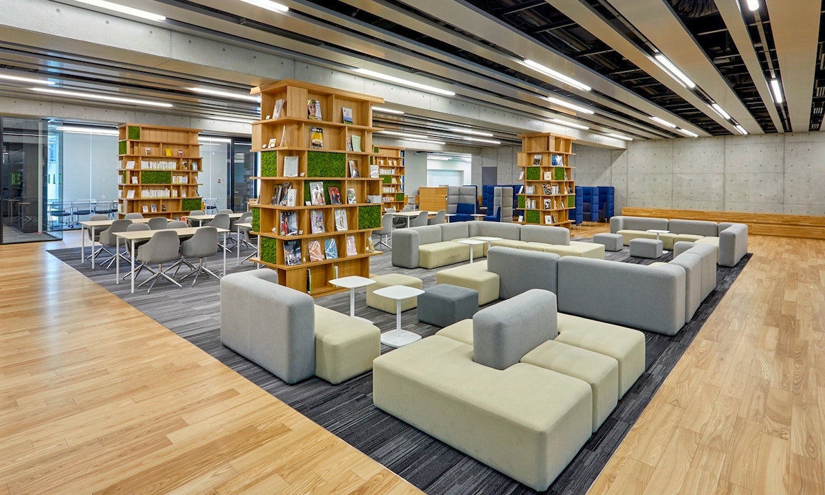
Even the landings on the staircases, which tend to be dead space, were designed with this concept in mind. One student commented that the space facilitates meeting new people and creates “opportunities for deeper interaction with students from other departments.” This intentional, open design has transformed the space into a hub within the school and the local community.
Through the new environment and educational opportunities at TCM's Daikanyama campus, students now have stronger opportunities to apply their creative talents in numerous fields worldwide, creating impact informed by the various perspectives, skills, and relationships they have developed at TCM.
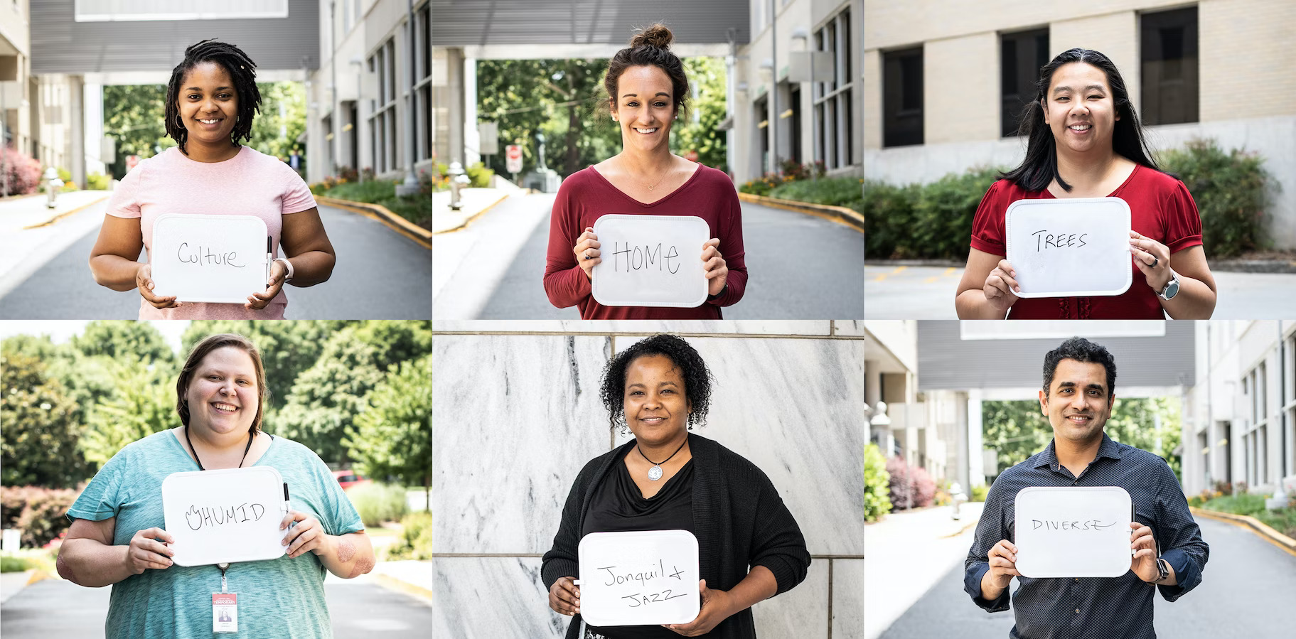
Designing a modern digital platform for the constituents of Georgia
Building a more efficient, trustworthy service for Georgia's residents.
Georgia is among the most populous states in the American South. It’s a place with a storied past and promising future—on the rise economically, and continuing its powerful cultural impact on music, TV, cuisine, and tourism. Over 10.4 million people call Georgia home, and nearly all of these people will at some point navigate the state’s websites for securing everyday services. Ideally, this online platform would provide unifying and accessible government resources for everyone, whether they’re renewing their vehicle registration, seeking a fishing license, or looking up tax law updates.

Georgia’s Office of Digital Services (DSGA), part of the Georgia Technology Authority, was challenged with designing a platform to modernize the collective and individual online presence of 80+ state agencies, many of which used visually disconnected formats and color palettes that could leave the public feeling confused. DSGA recognized that they could provide more efficient and higher quality service to the public if they simplified the language, designed the site from the user's point of view, and created a more cohesive look and feel across agencies.
IDEO worked with the DSGA to identify the priorities of Georgia residents who use the various agency websites. On a road trip from Savannah to Atlanta, with stops in Macon and Dublin, the IDEO team immersed themselves in the rich culture of Georgia, connecting with social workers, low-income residents, state agency leadership and civic organizations to learn how Georgia’s digital properties could better address their disparate needs.
The design research underscored that there isn’t just one Georgia—it’s a tapestry of people, geographies and political orientations. Yet several common themes emerged, including:
Georgians want their government to “give it to them straight.” On the redesigned Georgia.gov platform, the people of Georgia can easily search popular topics to get the information they need. This includes learning how to apply for food stamps, renewing a business license, or simply finding out the location of a local office in their area. If a user has remaining questions, they can connect directly with a real human for further assistance, balancing direct information with warmth and a personal touch. User feedback on the site provides the opportunity for continuous design improvement.
Georgians want to take pride in the legacy and the future of their state. IDEO developed an entirely new design system with new navigational elements, fonts, and a color palette inspired by Georgia’s landscapes, all of which can be modified for individual agencies while remaining consistent with the state brand.
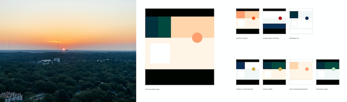
A distillation of the original Georgia seal adds authority, and new icons anchor the site’s menus and bring more clarity to the search function. The platform was designed to be Section 508 and WCAG 2.0 AA compliant, providing clear and accessible page content that adheres to federal laws and international web standards. To instill trust in Georgia’s online presence, each page also has a header that indicates it’s an official Georgia State website and outlines the uniform features constituents can use to identify this.

With improved navigation and easy-to-access prioritized content, Georgia.gov is a much more efficient platform for addressing requests from citizens. The site projects a happy-to-help, citizen-centered approach that aims to empower all Georgians so that they feel confident, informed, and prepared.
A holistic, human-centered approach to managing diabetes care
A digital-first diabetes management system that helped patients get the support they needed when they needed it.
According to the Centers for Disease Control and Prevention, nearly 30 million Americans have diabetes, almost 10% of the population. The vast majority of these diagnoses are type 2, which is commonly treated through a combination of medicine, diet, and exercise. Today, one of the major barriers to better outcomes is access to trusted information. As little as 15 percent of people with diabetes receive adequate education from their healthcare providers on managing their disease and making recommended lifestyle changes.
Ascensia Diabetes Care, a global healthcare company, has been a leader in diabetes treatment for over 70 years, known primarily for producing blood glucose meters. IDEO has worked with Ascensia for more than a decade, helping develop and design their CONTOUR NEXT ONE meter in 2016. In 2017, Ascensia engaged IDEO with a new goal of moving the company beyond physical devices. Ascensia envisioned a first-of-its-kind approach to educating and monitoring diabetes patients. In partnership with IDEO, they wanted to build a comprehensive solution—one that would not simply take glucose readings and document food intake, but would consider all factors that impact a person's health.
Through deep collaboration, Ascensia and IDEO built a powerful app-based service. The project began with a strategic vision for the experience and ended with the delivery of an all-encompassing health offering, including training of providers, packaging, app design, content creation, and visual design.
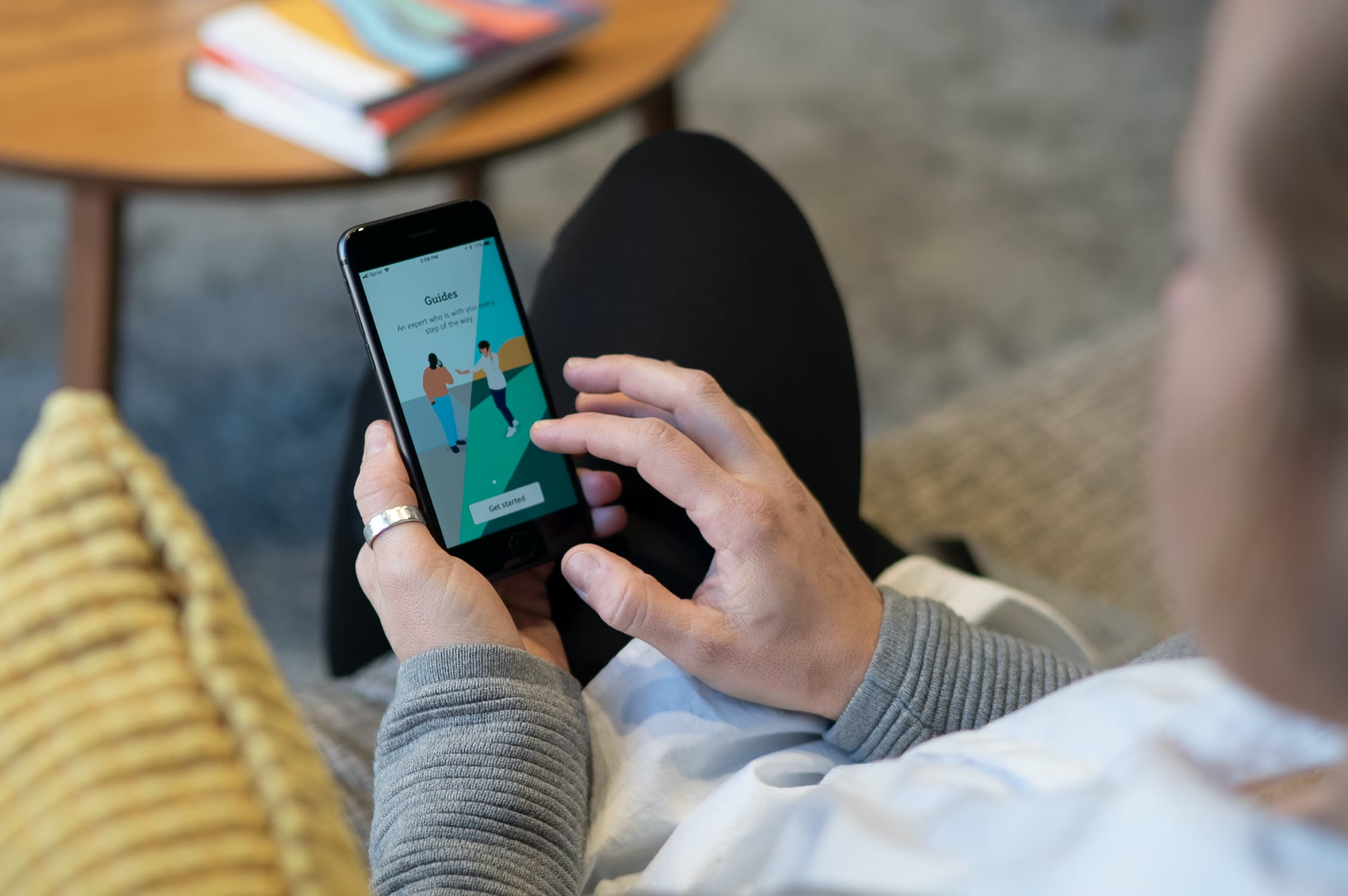
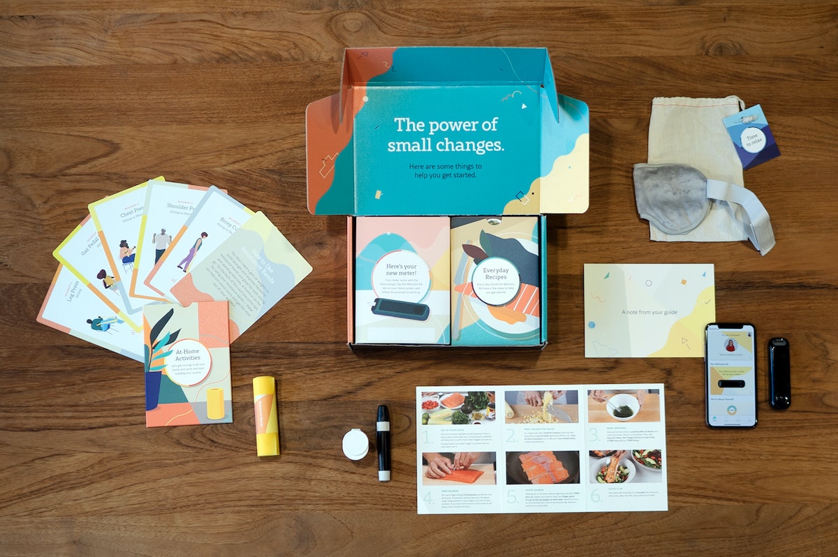
The patient experience married data and tracking, real-life mentorship, and personalized content. When a patient signed up, they were paired with a Certified Diabetes Educator (CDE) who created a tailored program based on their needs and linked them to relevant articles on topics like cooking, mental wellbeing, and sexual health. The IDEO team led the charge in hiring and training guides, crafting the educational content, and even designing the content management hub.
The data engine behind the app is another one of the program's stand-out qualities. The app pulled data from multiple data sources—exercise bands and glucose meters—to provide constant feedback, track progress, and continually refine the experience. To generate empathy, as well as build the app's initial data set, IDEO's data scientists tested the product on themselves. One designer wore a wrist full of exercise monitors around the office and tracked her blood sugar after every meal.
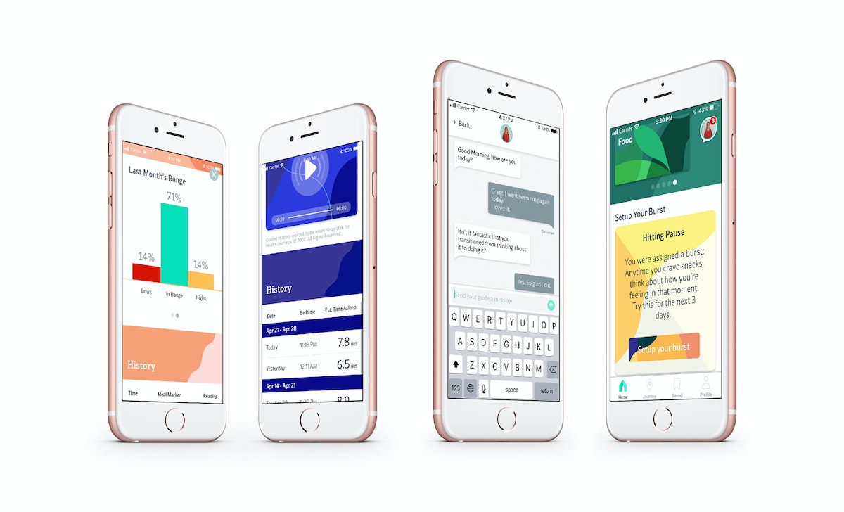
The app-based service was tested with 60 people and demonstrated remarkable early results. Only two participants failed to complete the study—a stunning success rate when adherence to therapy for chronic illnesses in developed countries averages around 50%. Additionally, participants reported drastic improvements in both physical and mental health. One recently widowed 70-year-old woman emerged from depression, returned to swimming, and started having regular blood sugar readings.
The project required Ascensia to embrace new ways of working internally, adopt a broader view of their offering, and ultimately expand the way they serve people with diabetes.

Creating an out-of-this-world STEM learning experience
Aboard the Verizon Explorer Lab, students can travel to Mars and learn engineering basics along the way.
When Mr. Gordon told his fifth grade students they were taking a field trip on a bus, many of them envisioned the city bus that they ride each day to school. But when they saw the Verizon Explorer Lab pull into the school parking lot, they realized a unique experience awaited them. Painted in bright colors, this bus promised something very different from their daily commute.
“Climb aboard, explorers!” says the Lead Explorer. The students walk through the bus’ sliding doors and inside, where instead of rows of seats, they find a sleek research lab. Suddenly, the lights dim. The bus makes a rumbling noise as though it’s about to lift off. And on a large screen, a vision of Earth from space appears. The students listen and point as the video narrator briefs them on NASA’s ongoing search for life in space.
Science education isn’t always this fun. Some kids have a chance to learn through interactive games, immersive experiences, or engaging field trips; but many lack access to rich educational experiences in science, technology, engineering, and math (STEM). As a result, they can be less likely to pursue careers in STEM, though many future jobs will demand mastery of these subjects. This not only impacts a student’s potential and future, but reduces the diversity and number of qualified STEM job applicants.
In under-resourced schools, students are often limited to the scarce tools available for STEM learning in their classrooms. Many kids rarely have a chance to leave their neighborhoods. For these kids, mobile learning experiences that come to their school offer unparalleled exposure to cutting-edge, technologically advanced, and—most importantly—inspiring gateways into these critical academic subjects.
As part of its focus on digital inclusion, Verizon partnered with IDEO to share the excitement of STEM learning with middle schoolers. To facilitate access and discovery of STEM, the team designed a learning experience that takes place on a coach bus and can be scaled to reach kids across the nation.
The team set out to transform the bus into the Verizon Explorer Lab: a futuristic research lab that transports kids to new environments, from outer space to under the sea. As part of the larger Verizon Innovative Learning program, the Verizon Explorer Lab offers delightful and rigorous content that meets national science standards.
A multidisciplinary team comprised of designers across interaction, communication, environments, games, and software partnered with Verizon to bring the Verizon Explorer Lab to life.
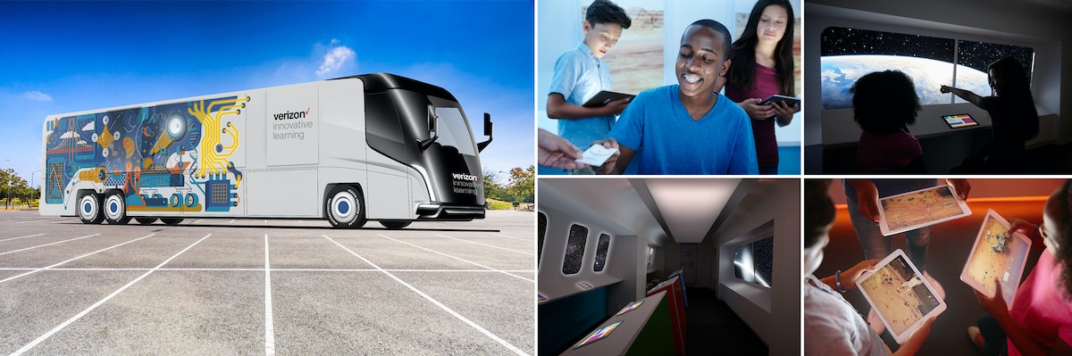
To keep the student at the center of the experience, the team designed alongside kids. Their gravitation toward play, interaction, and technology inspired the digital game that students play onboard the bus. When developing the game’s narrative, the designers turned to popular kids’ books and movies. What began as a card game prototype eventually became a 360-degree video and virtual reality expedition to Mars—complete with a custom musical score—that introduces middle schoolers to engineering basics.
After stepping through the bus doors and taking a tour of the solar system, Mr. Gordon’s students receive an emergency call from NASA: They must rescue the missing Curiosity rover, which is dedicated to collecting evidence of life on Mars. Eager to save Curiosity, the students become immersed in the adventure at hand. And through the adventure, they become immersed in science.
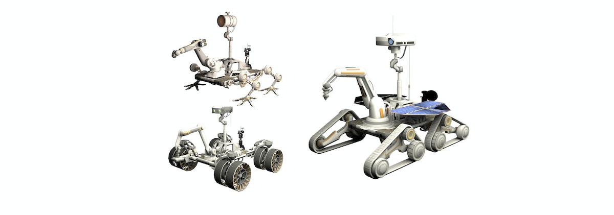
Students use tablets to design their own Mars rover. Each rover appears on a large screen and traverses the planet’s extreme terrain. The goal is to collect data that suggests life on Mars, including ice deposits, photos, and more. Students iterate on their rover’s design—wheels, power sources, and sensors—to test if it can stand up against dust storms and craters. The team consulted a NASA planetary scientist to ensure accuracy, as well as educators to establish cohesion with classroom curricula.
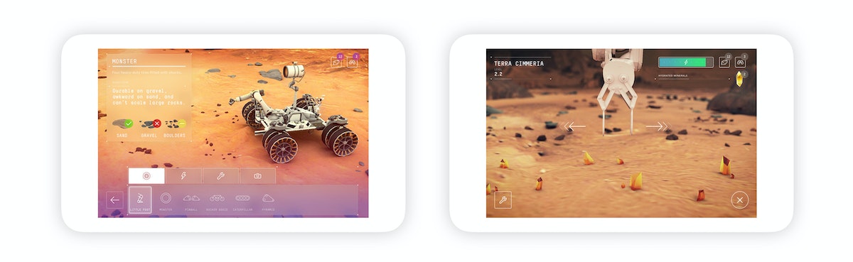
During the game, students are encouraged to compare designs and learn from each other: One rover may be able to travel long distances and take various photos, while another can carry large quantities of ice and sediment samples but can’t go far because of its size. At the end of the mission, the group finds Curiosity and sends all of the evidence they’ve collectively gathered back to NASA to aid the search for life beyond Earth. Before departing the bus, students watch an animated video that explains various jobs in STEM and encourages kids to pursue one of these careers.
The Verizon Explorer Lab teaches students the engineering design loop, the value of collaboration and teamwork, and what a career in STEM might look like. The mission to Mars game is just one of many potential STEM learning opportunities for students and integrated, customizable learning modules for teachers.
Since launch, the Verizon Explorer Lab has traveled to various parts of the United States and reached thousands of kids. It continues to be managed by Learning Undefeated, Verizon’s nonprofit partner. By designing for and with students, it’s possible to create educational experiences that facilitate meaningful learning and genuine fun. The Verizon Explorer Lab represents progress towards a more inclusive future for employers and the STEM field.
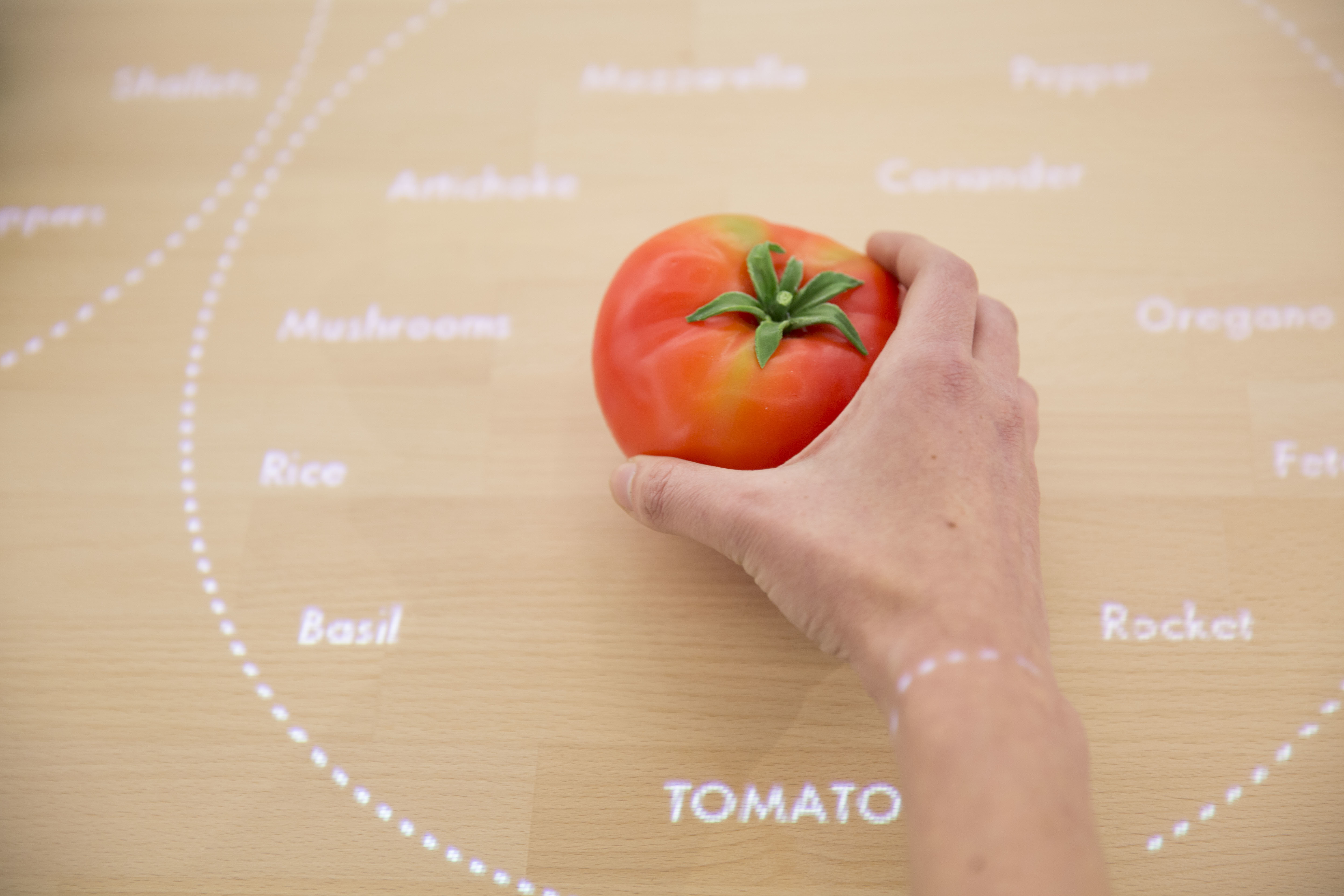
Veggie Vision: Designing the Kitchen of the Future
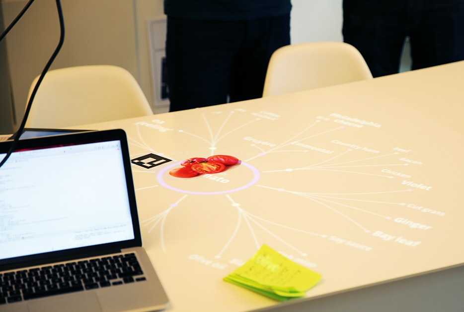
An interactive table recognizes foods on its surface
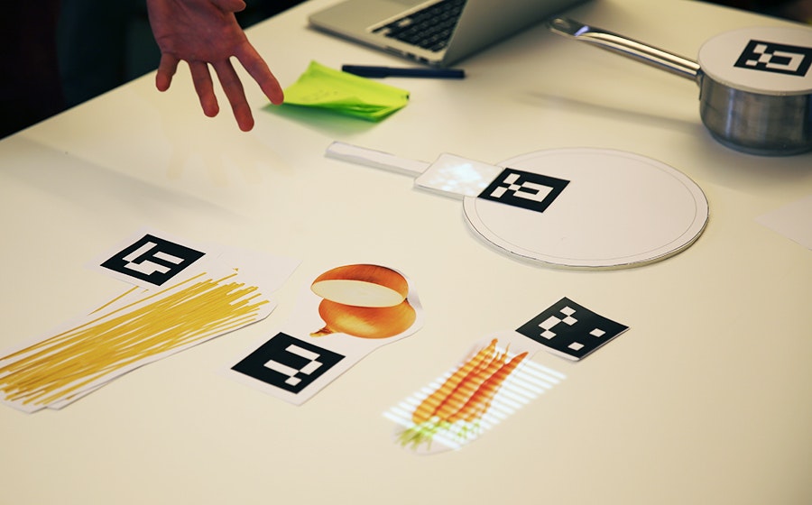
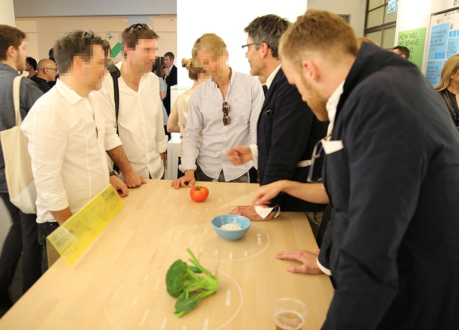
Taking this 2025 appliance from concept video to functional prototype meant creating a realistic experience of technologies that won’t exist for many years. Designers had to come up with a way for the system to see and recognize foods on table’s surface and respond accordingly—and they had to make it work reliably for more than six months while some 250,000 visitors tried it out at pop-up exhibitions at the Salone del Mobile and EXPO Milan.
To find out how they did it, I talked to IDEO London interaction designer Siri Johansson and developers David Brody and Kalyn Nakano of IDEO Palo Alto, who built custom software that borrows techniques from computer vision.
How did the need to build a prototype for real use affect the interaction design?
Siri: As soon you put something in a public setting, people are always going to try to break it, especially if they’re really excited about it. They don’t mean to break it, of course, but they want to play with it and see what it can do. We had to focus on a few key functions and figure out how to make them work well enough that it would be feasible for people to play freely with the installation. A key design principle was to keep the technology low-key and in the background, to preserve the warmth and tactility of the kitchen, so we focused on functions that demonstrate that intention and show how the table uses digital to free up your mind so you can engage with physical things. The table knows what I’m cooking and gently guides me through the process, so I don’t have to keep going back to my iPad to browse a recipe. I can focus more on my ingredients—how they feel, how they smell.
How did it affect the software design?
Kalyn: Knowing this was going to be a live prototype forced us to consider every scenario. With on-screen prototypes, predicting how a user might interact with the screen is a lot more straightforward. But here, adding another dimension and more objects to the mix challenged us to consider all the different ways people could position and interact with the items on the table. Once we started building, it became clear that the concept video for the design was really just a starting point. Testing all the different arrangements and permutations challenged some of our initial designs and software implementation methods, especially when we started thinking about transitions. Tracking objects while they were moved around on the table forced us to implement things more formulaically to achieve a display with smoother transitions between states.
How did people’s interactions with early versions of the table change the software?
Kalyn: With a live prototype like this, you give up control over the experience. You can’t send everyone down the path you want them to take. We started building and testing our software based on the interactions shown in concept video, but those interactions are choreographed, and when people in the office started playing with the prototype, we realized the behavior in the video—putting the veggies down on the table and sliding them from place to place—wasn’t natural for everyone. Some people would hold the vegetables in their hands or lift them off the table while deciding where to put them. These interactions weren’t wrong, but we hadn’t accounted for them in our initial designs. The need to accommodate for this forced us to reconsider our image processing techniques to make sure we could still recognize the objects no matter how they were being handled.
How did you adapt the CV software to the specific needs of the project?
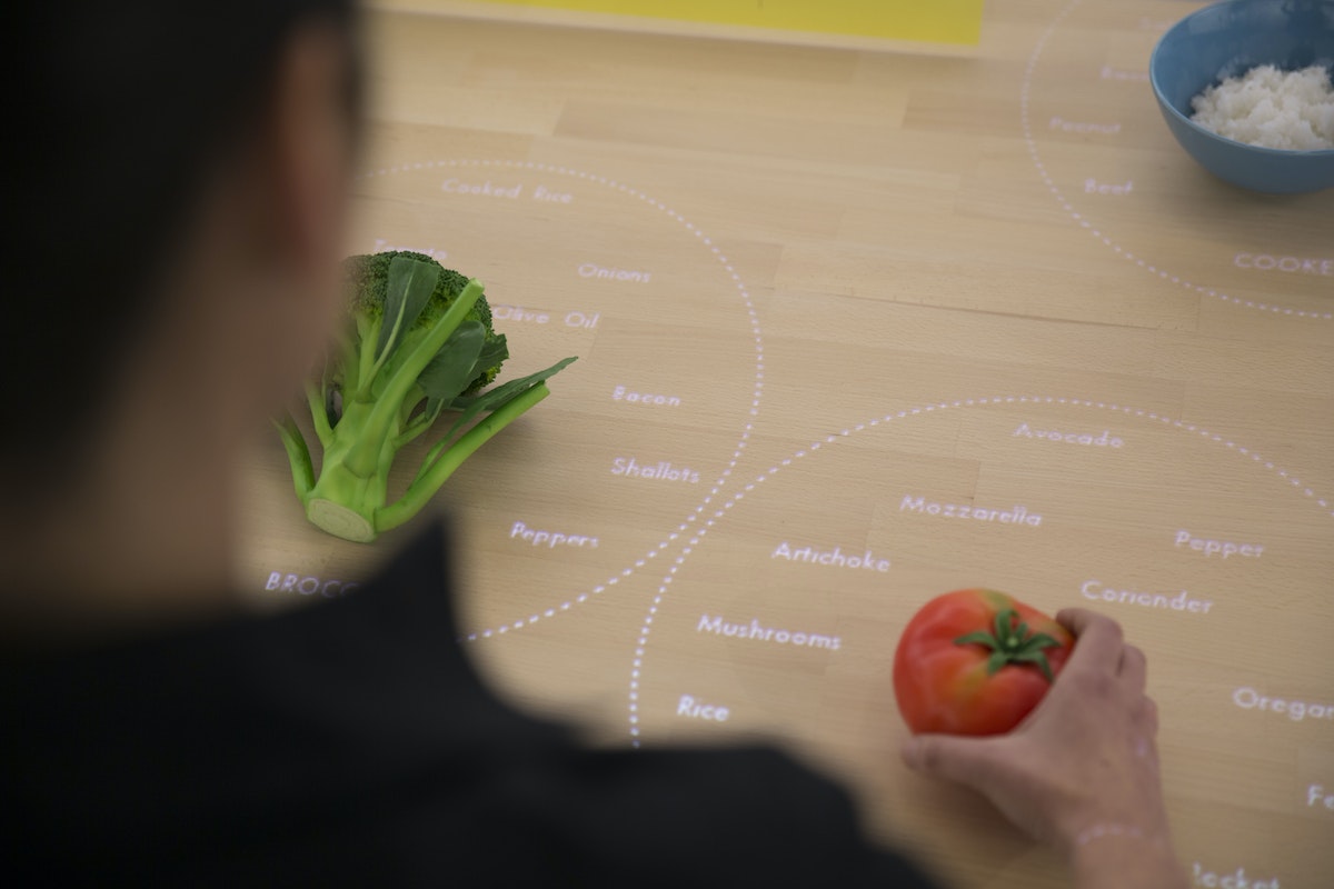
David: Our approach wasn’t to make CV that could be used for anything, in any situation. The better route was to take advantage of our constraints for the exhibition and build a simplified version of CV (written with openFrameworks and OpenCV) that we knew could be tractable and provable in the time we had. The table has to consistently recognize three ingredients—broccoli, tomatoes, and rice—so that people can experience how it works. While more complex CV might create models of what generic broccoli looks like, our solution uses examples of broccoli that it has already seen, along with shape and color distribution. It compares those factors with what it’s seeing in order to distinguish between objects. The distribution of color helps it distinguish between broccoli and a blue bowl of rice, while comparing with previously seen examples help it distinguish between broccoli and a green shirt sleeve.
Why was this an efficient strategy?
David: A lot of conventional CV uses a “sliding window” approach: The computer identifies an aspect of an object, like its shape, and looks for that object within a larger image by sliding the window of vision until it recognizes something that matches what it’s looking for. The hard part is making it work in real time, because the computer compares every possible “window” that contains the criteria it’s looking to match, and each comparison takes time. Since our software is only looking at colors, it’s easier to identify which windows on the table might contain the objects it’s seeking. So the first thing it does is look for the points on the table where the intensities of color are the highest, and it says, “these might be objects.” It sends that information down the pipeline to the next step, and that’s where the color-recognition algorithm comes into play: It compares the histogram of a potential object with the histograms for broccoli, tomatoes, and rice, and determines which object it’s looking at.
What was it that excited you about this project?
Kalyn: This was a great example of building to learn. Creating a live prototype introduced a lot of interesting interaction design questions into the software development process, and it got us to solve technical challenges that wouldn’t normally come up during a screen-based prototype. It generated a new excitement for designing dynamic and thoughtful off-screen experiences, and watching people’s reaction to it was inspiring. When we set the table up in Milan, we came in the next morning and found construction workers playing with it, saying, “bellissima!”
The IKEA Concept Kitchen 2025 was on display at IKEA Temporary, a pop-up exhibition at Salone del Mobile in Milan, Italy, April 14-19, 2015 and can be seen at EXPO Milan, May 1-October 31, 2015.
Read more about Veggie Vision and the entire Concept Kitchen on Tech Insider and at IDEO.com.
What will kitchens be like a decade from now? IDEO recently helped IKEA envision some wild ideas that will likely be entirely plausible—someday. Usually, predictions like this exist only on screens, as concept videos and digital renderings. But this time, IKEA asked IDEO to build a working prototype of one future concept: the Table for Living, a cooking and work surface that recognizes the foods you place on it and projects customized recipes and cooking tips right onto the tabletop.
Dispatch from the Toy Lab: Monster Moves
IDEO is a global design company. We believe a better future is for all of us to design.
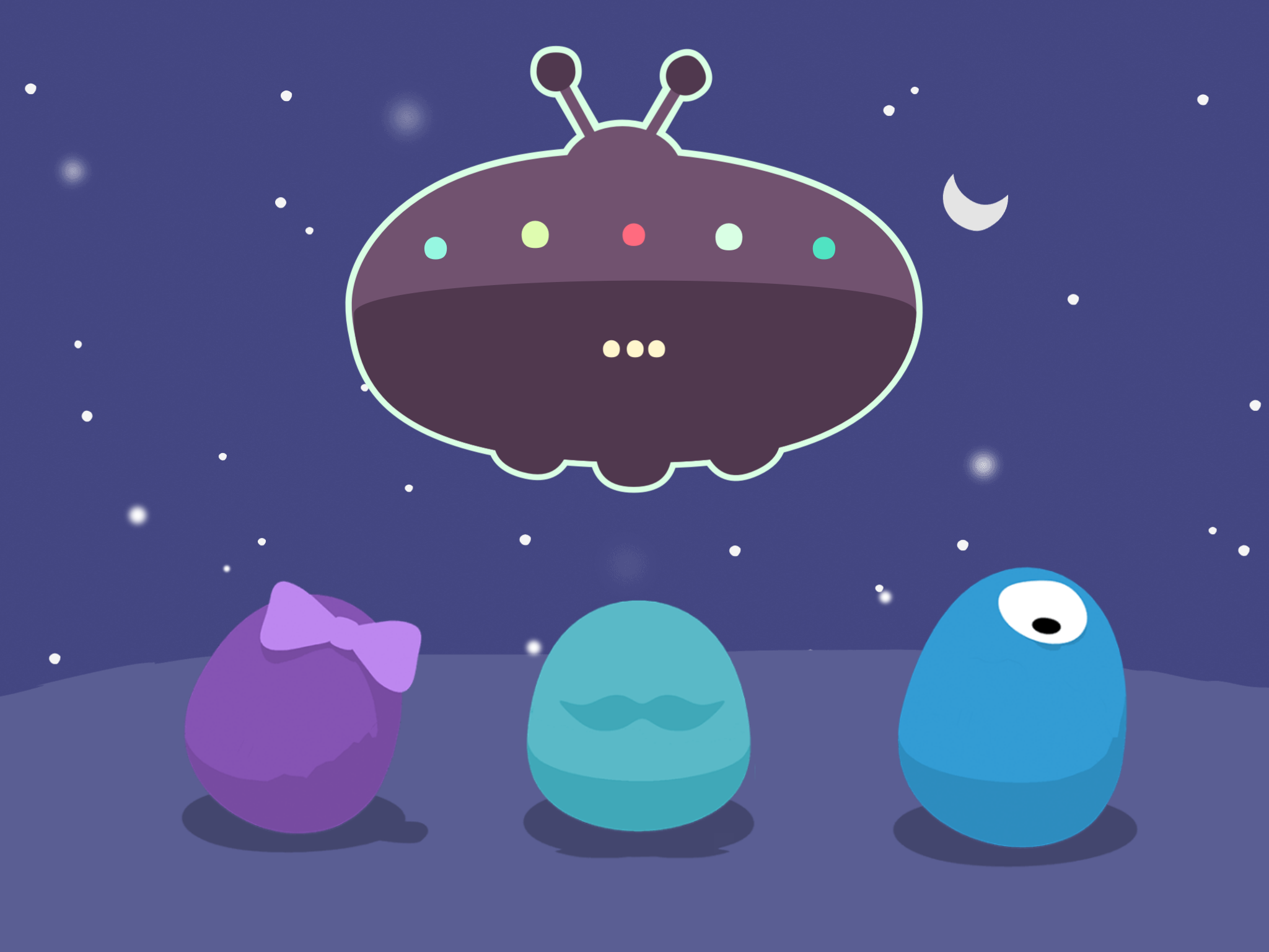
On a recent visit to the lab, I got an early look at Monster Moves, a new app that lets kids choreograph moves for a team of dance-happy monsters. If that conjures images of elaborate 3D creatures, think again: At first glance, Monster Moves appears to be completely flat. Any single frame of the game looks just like a simple 2D illustration.
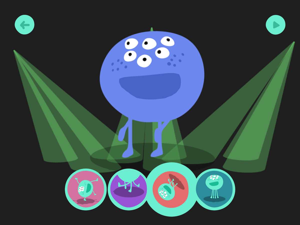
But when one of those 2D monsters does a twirl or flip, suddenly (and pretty magically), you see that each one has a complete three-dimensional physiology, from the top of his head to the booty he’s shaking.
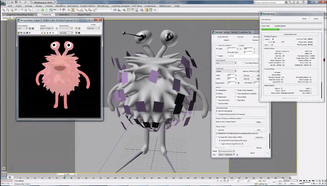
It might seem hardly noticeable, but think about it: if the image was truly two dimensional, there would be no top or bottom, no back or sides. To make the monsters look flat, but still have the ability to rotate 360°, the team used 3D modeling to create the characters, and then stripped down the art to make the monsters look two dimensional. Even though they appear flat, all the monsters have skeletons and skins, and they can turn to any angle.
So why bother making them look flat?
Toy Lab’s Michelle Lee explains that the 2D look of the game is crucial to its function. The mission of Monster Moves is to help kids understand that they are the choreographer, and that there is a direct connection between their choices and the monsters’ dance steps, which develops an awareness of creative control. The designers wanted kids to focus on the dance moves, so it was important that the art not distract them with too much 3D detail. That’s why they stripped away all the fancy shadows and shiny curves and kept the monsters as simple as possible.
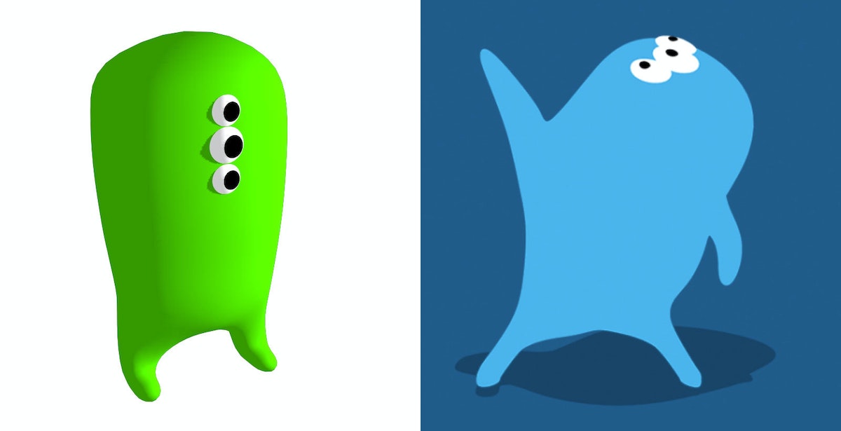
The early version (left) has a 3D look, which the designers thought was still "too much." They chose to eliminate all shadows except for the drop shadow beneath the character (right).
Curious to check out the monsters for yourself? Learn more about Monster Moves and the entire portfolio of IDEO Toy Lab apps at IDEOToyLab.com.
Just like the rest of IDEO, the Toy Lab is dedicated to building creative confidence. Admittedly, they have a bit of an edge when making kids’ products—children have natural creative confidence, so the Toy Lab’s job is to encourage them to preserve it and show them new ways to apply their innate creativity.
Build Your Own Light Pipe
A step-by-step guide
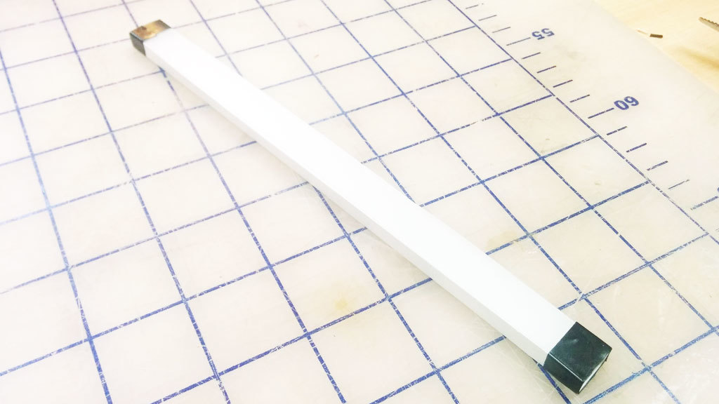
We built a light pipe, which, in principle, can be viewed as a fiber optic cable. All the sides are polished to a clear finish so that the light can be reflected internally inside the pipe. If the light hits a section of pipe where the surface is not perfectly reflective, like if it’s gouged or scratched, it will use that section as an "emitter" and attempt to escape the pipe. We take advantage of this by covering the bottom surface of the pipe with dimples. To make the path consistently bright, we arranged the dimples in a gradient with fewer dimples closer to the source, where the light from LEDs is brightest, and more dimples to catch the light farther along the light path (where the light is dimmest).
This step-by-step guide describes our process of quick experimentation and prototyping to achieve good illumination without having to run extensive light bouncing simulations. The design is created in Illustrator using blend modes, and the light pipe is manufactured with a laser cutter on 1/4" thick clear acrylic.
Please note that results will vary depending on many factors. The optical design, LED brightness, and beam angle are important factors to consider.
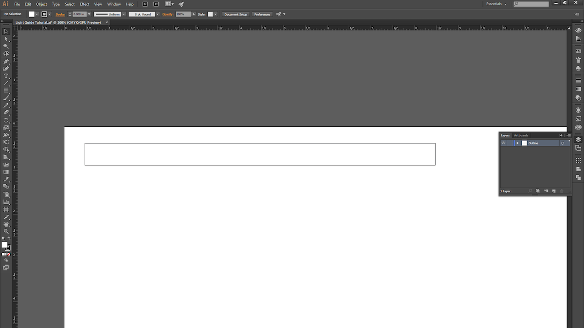
1. Open a new Illustrator document and draw a rectangle. We chose 8" x .5".
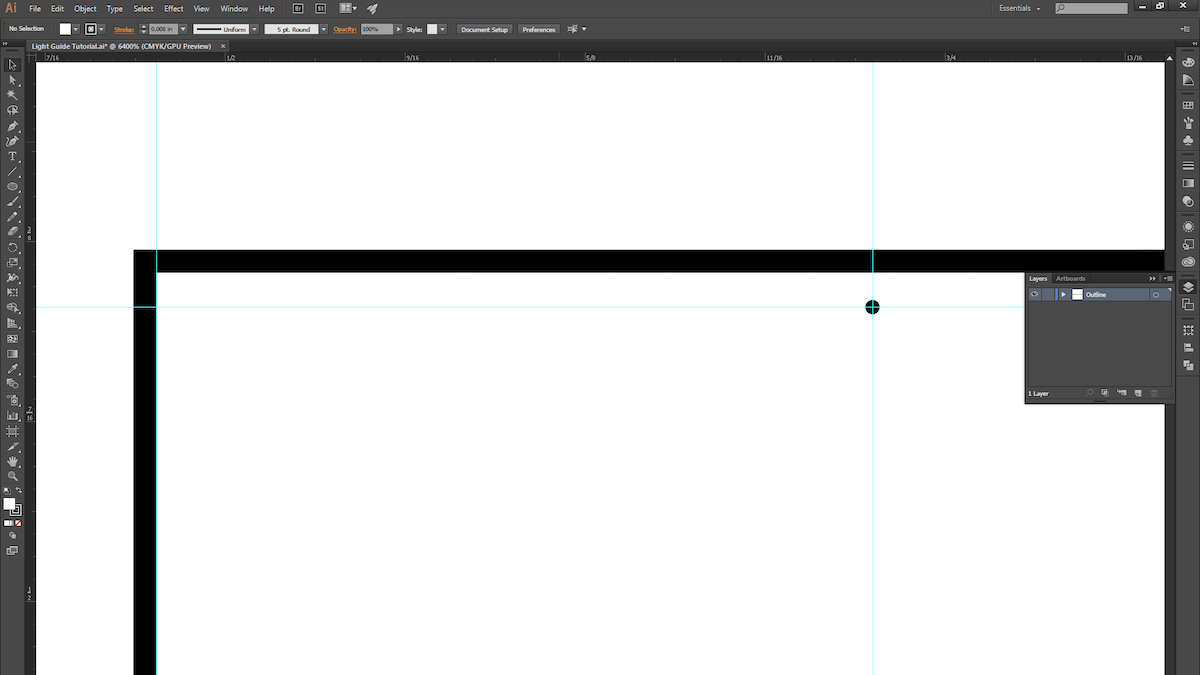
2. Make a guide and space it roughly 1/4" away from the edge of the rectangle. This is where the dimple pattern will begin. (Leaving a 1/4” margin allows us to later mask off the area to prevent seeing excessive LED brightness near the source in the light pipe.) Now draw a circle with a .005" diameter.
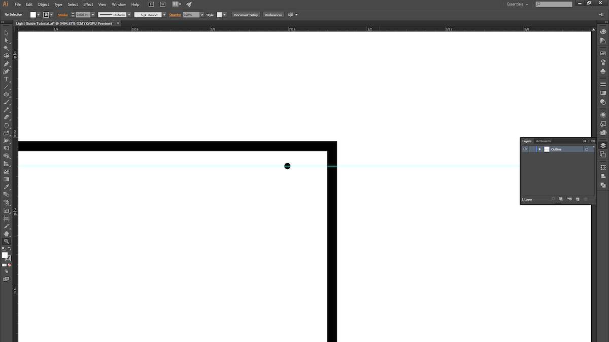
3. ALT + Click and drag the circle to duplicate it, and move it to the other side of the rectangle. The two circles mark the two ends of the dimple pattern.
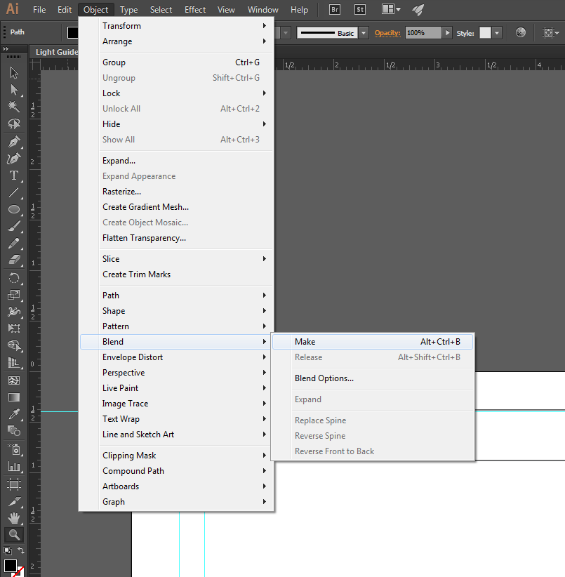
4. Select both circles and create a blend.
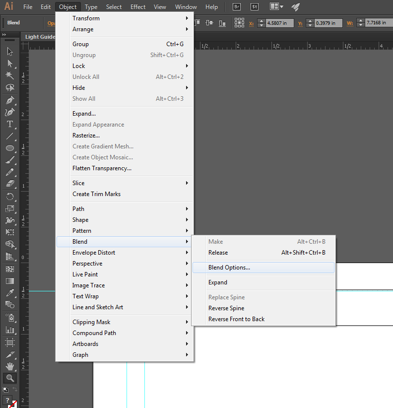
5. Open up the blend options to fine-tune the blend.
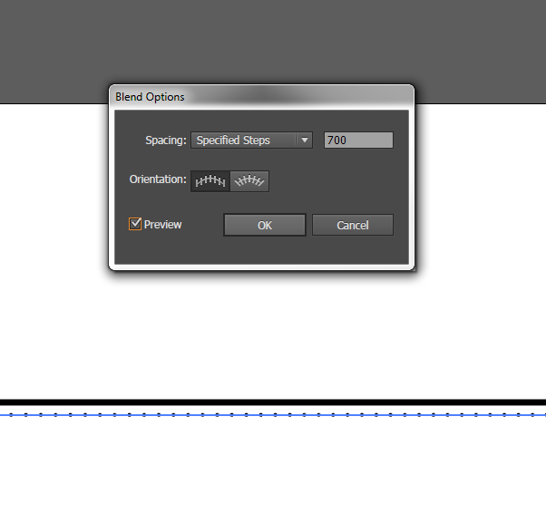
6. Change the spacing to "Specified Steps" and set the number to 700.
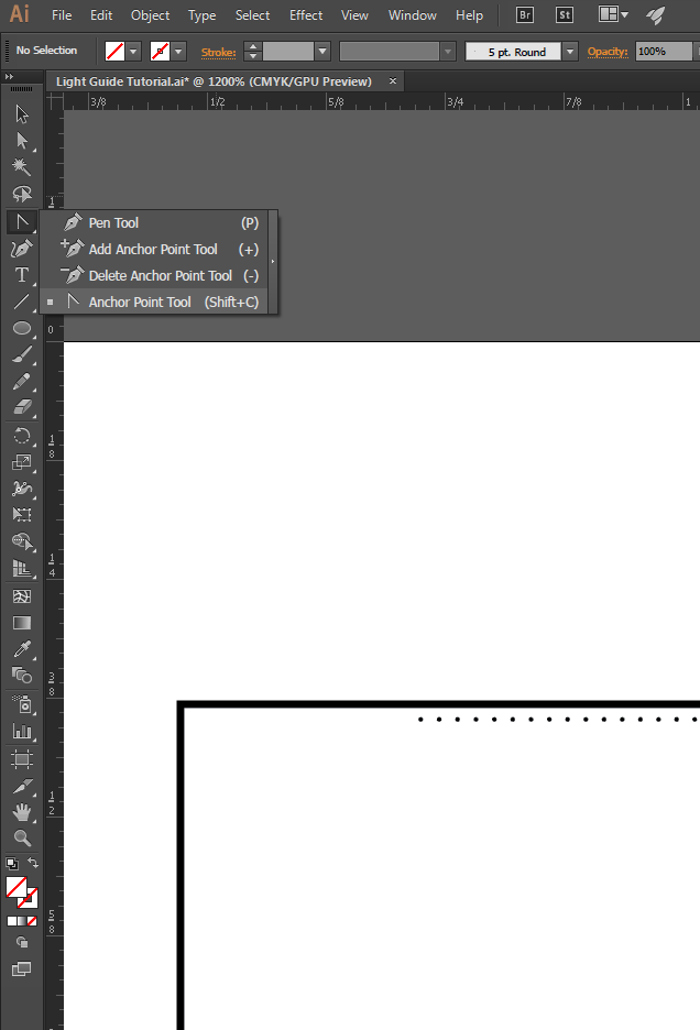
7. You should see 700 evenly spaced dots! In order to get them to start off sparsely spaced and then get closer together, we'll modify the path of the blend. Select the Anchor Point Tool (Shift + C).
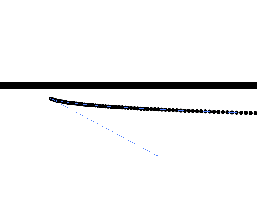
8. Use the white arrow to select the first point and drag it until you see the spacing start to change.
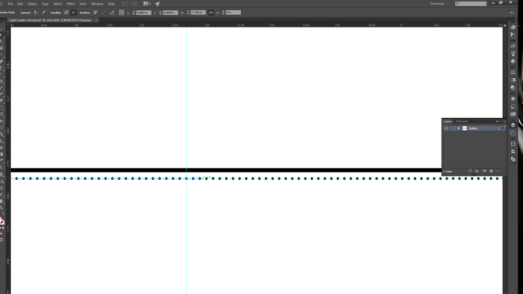
9. Create another guide halfway along the path, and then drag the anchor point (with the white arrow selection tool) just past the guide. Repeat the same process with the last circle, but move its anchor point about half an inch to the right.
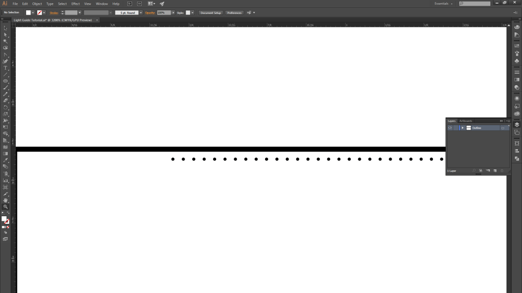
10. You should now have a gradient spacing of 700 circles becoming more closely spaced as you move from left…
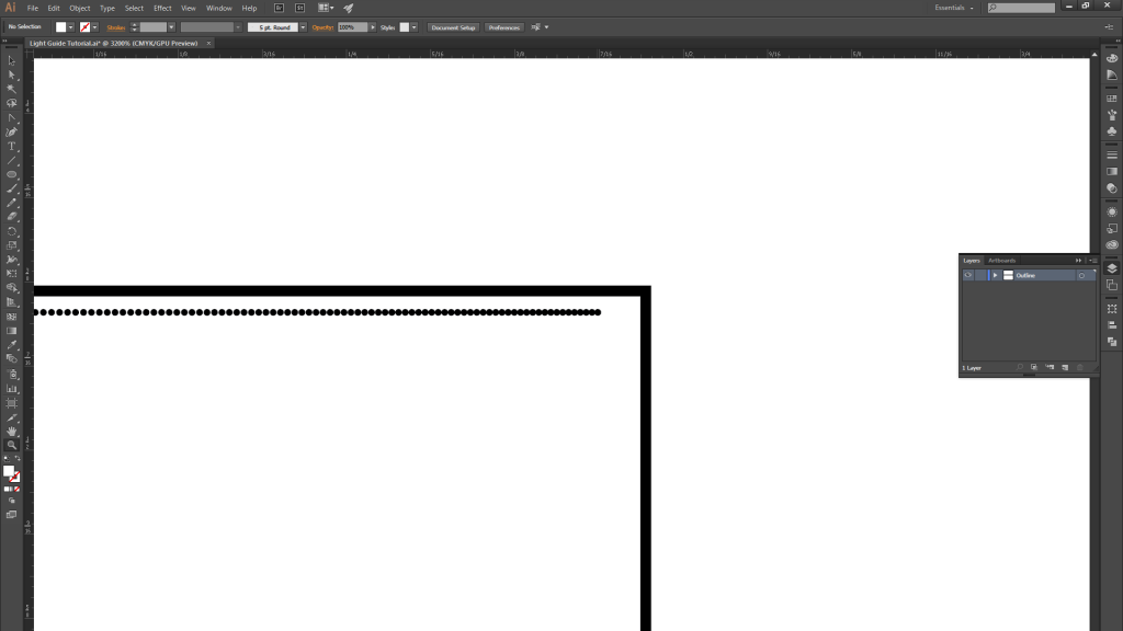
11. …to right.
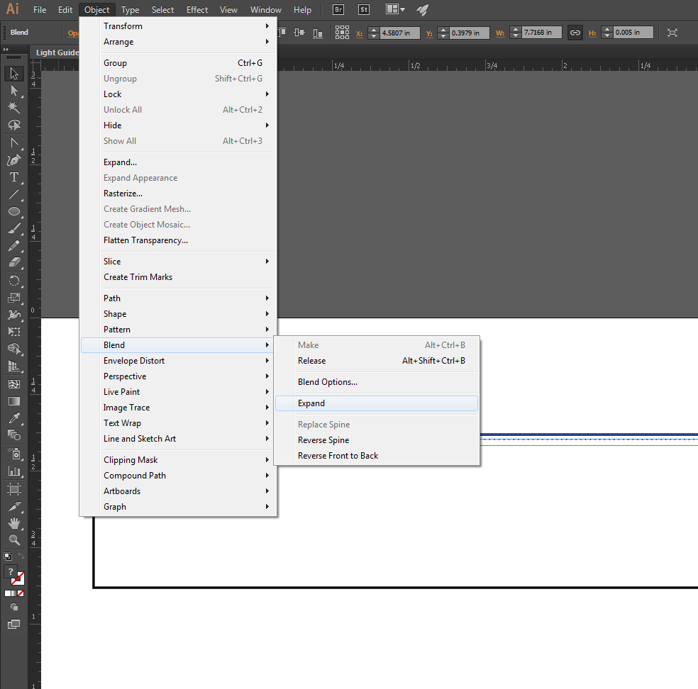
12. Once you are satisfied with the blend, expand it.
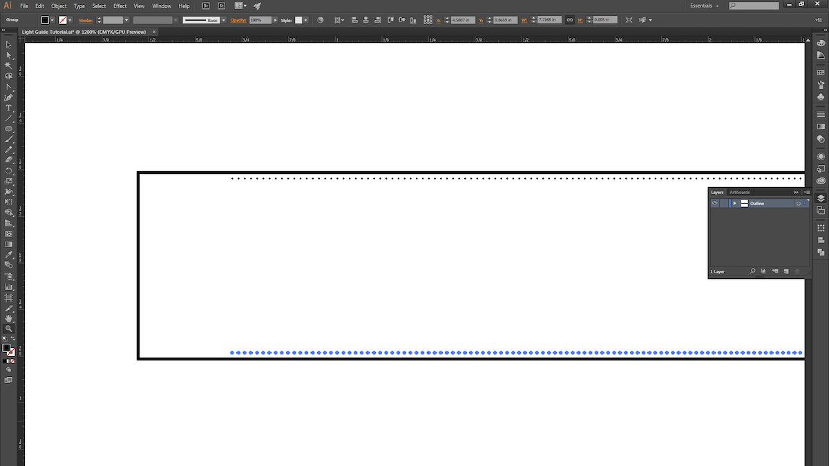
13. ALT+Click and drag the blend to copy it, and place it at the bottom of the rectangle.
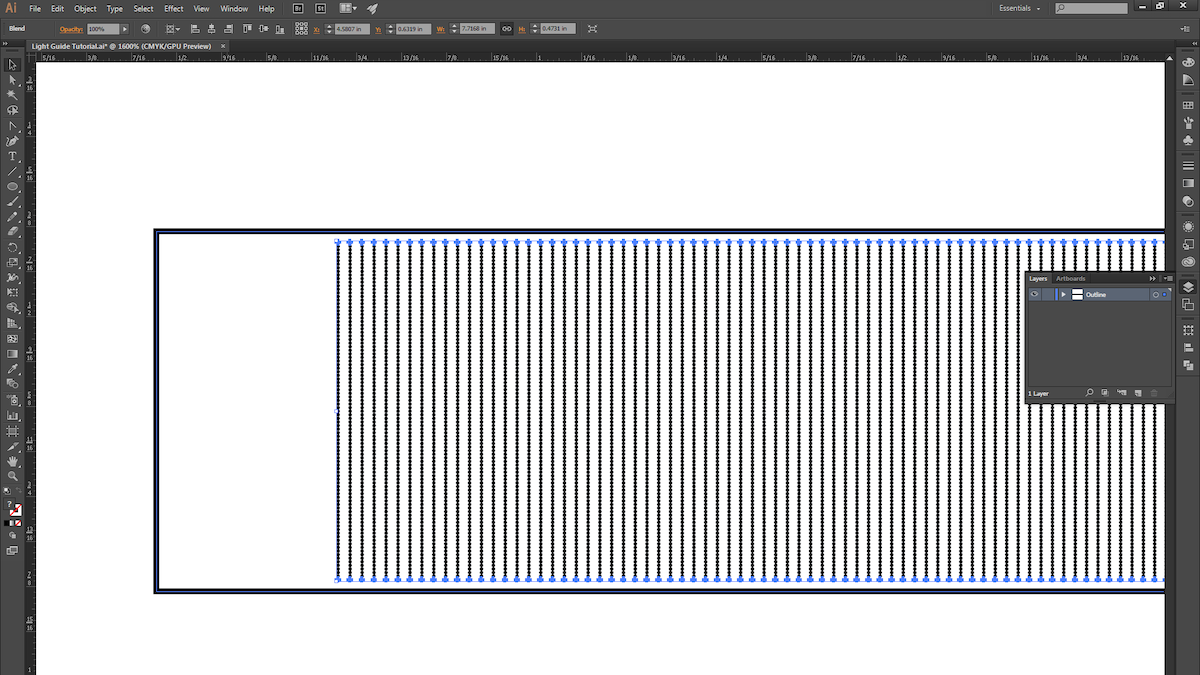
14. Select both blends and then use the instructions from Step 4 to create another blend.
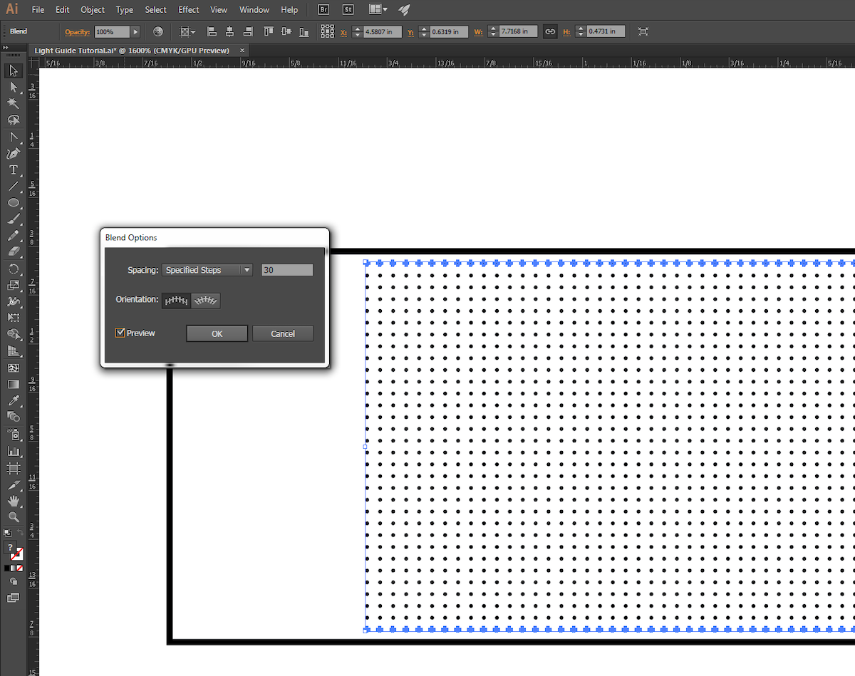
15. Use the instructions from Step 5 to fine-tune the new blend.

16. We chose to give our pattern a little bit of randomness, so we ALT+Click-ed and dragged the blend down and to the right ever so slightly.
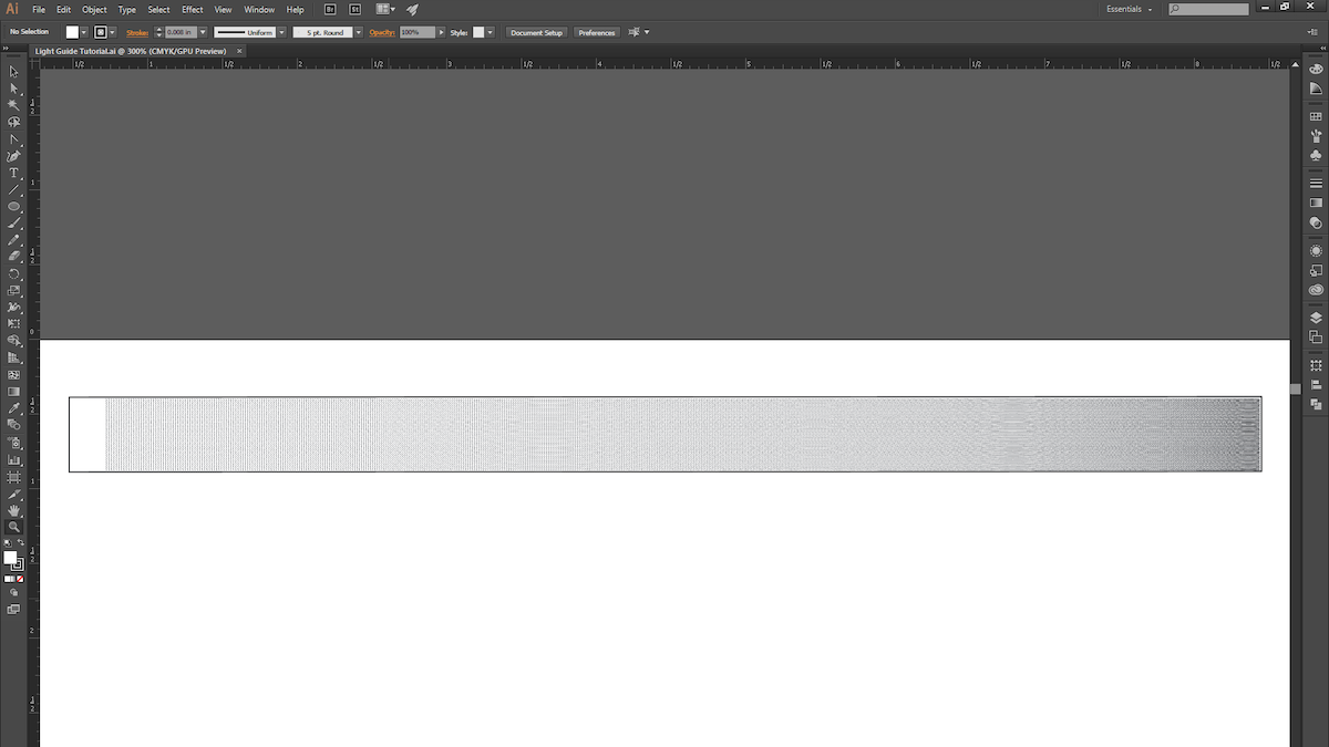
17. With that, we’re ready for the laser cutter! This process is pretty quick to prototype (roughly 15 minutes from start to finish), so explore different gradient patterns and techniques, and try light pipes that are curved or bent (just keep in mind the critical angle).
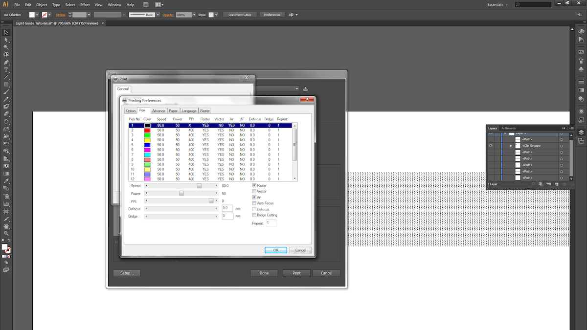
18. Next, we raster the dot pattern on 1/4″ thick acrylic. Be sure the acrylic surface is clean and scratch-free.

19. Different laser cutters have different settings for varying materials and thicknesses, so keep that in mind when choosing your settings. We used a speed of 80, power of 50 and maximum PPI for the raster. For the vector cuts, we took 4 cuts at speed of 4, power of 95, and maximum PPI.
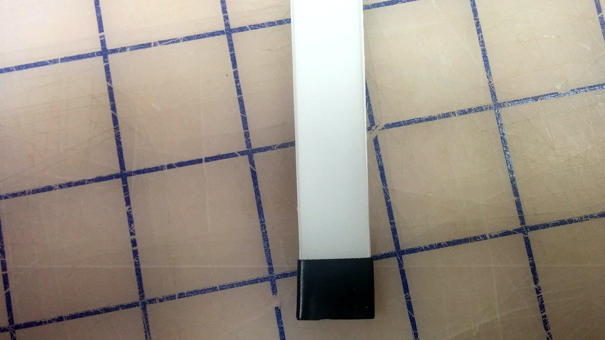
20. Now take your light guide and examine the edges. Make sure the material is transparent; otherwise you’ll need to do some hand-polishing.
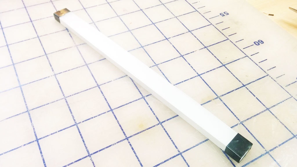
21. The slightly bumpy yet clear finish the laser leaves after a cut works great for our purposes. You’ll want to surround all clear surfaces with white reflective paper or tape, and mask off the quarter inch where the light first enters the pipe.
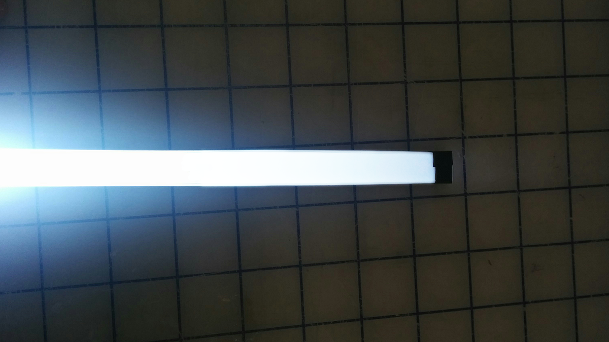
22. Here are the results with a super-bright LED! You can see that the light starts to drop off a little toward the end of the pipe.
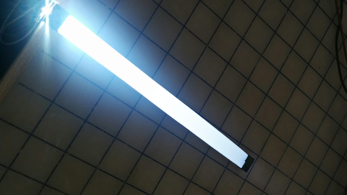
23. We could come back to tweak the blend pattern (reducing the number of dots at the beginning of the light pipe and increasing it toward the end).
Light guides are physical tools that transmit light along a path from an illumination source while maintaining constant brightness. They’re often used in products to create a line of light that is consistently bright and dynamic-looking, even when it comes from a single source. Unfortunately, there is no simple how-to guide available for making them. The process is kept tightly guarded by optical engineering companies. We came up with a quick process to make our own light guides, and now you can too.
Future of automobility
We’re on the cusp of a revolution in transportation. What will streets teeming with self-driving cars really mean?
IDEO has decades of experience with automotive work, which has brought keen insight into the trends and technologies that will define the vehicles of the future. This presents an important design opportunity: If we visualize today the way we’ll live in decades to come, we’ll be better prepared to make smart decisions when the age of autonomous vehicles arrives.
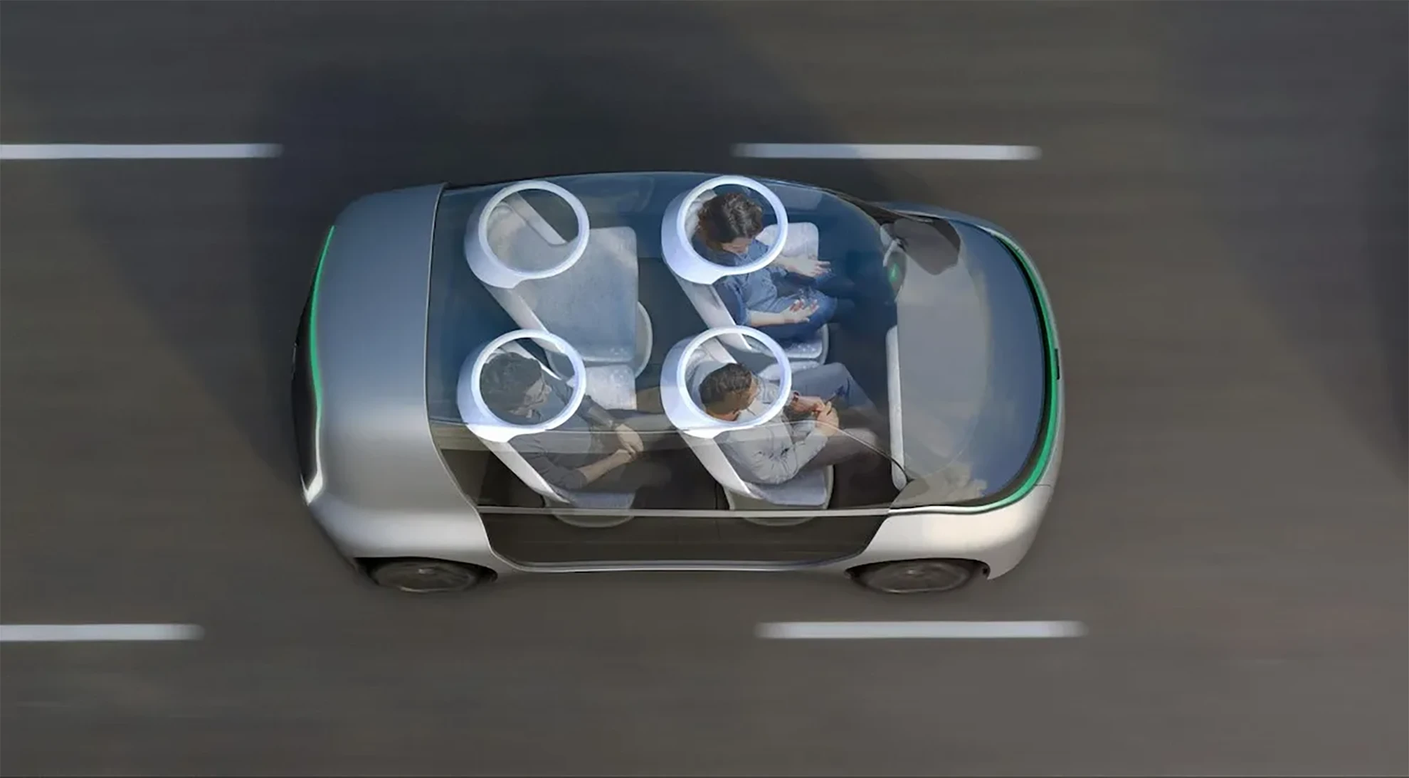
The Future of Automobility is an online visualization of how life with driverless cars might really look and feel. It considers four scenarios: “Moving People,” which looks at how commutes will change when we can look away from the road; “Moving Things,” where we examine automated package-delivery fleets; “Moving Spaces,” where we envision mobile offices meeting people where they live and parking in underused areas of our cities; and “Moving Together,” which explores how the interior of future vehicles will be customized to meet our personal needs during ride-sharing.
The experience is as emotionally compelling as it is feasible, combining radical innovation in transportation concepts with immersive storytelling. It expresses not just our vision of the future, but also how we work, how we think, and what we value.
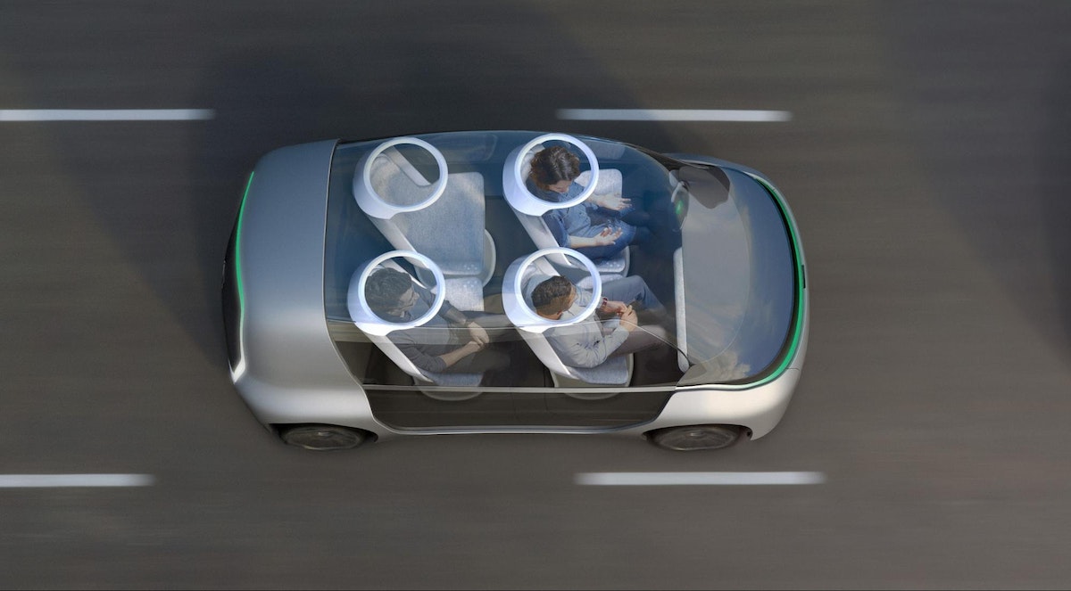
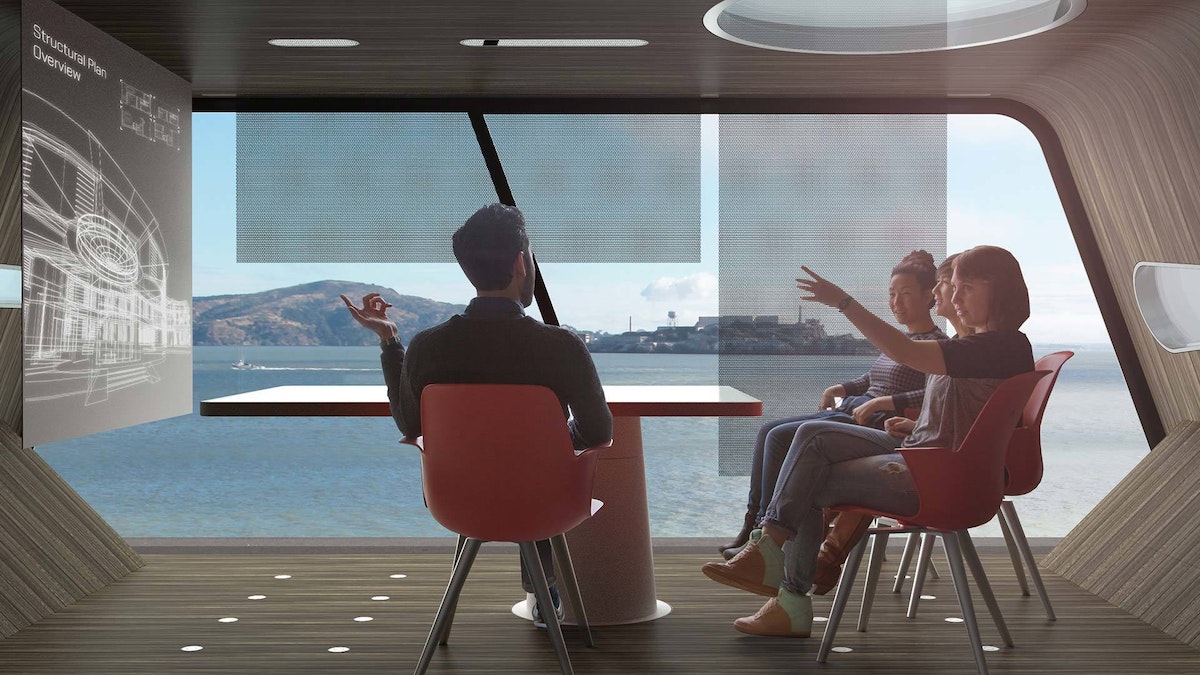
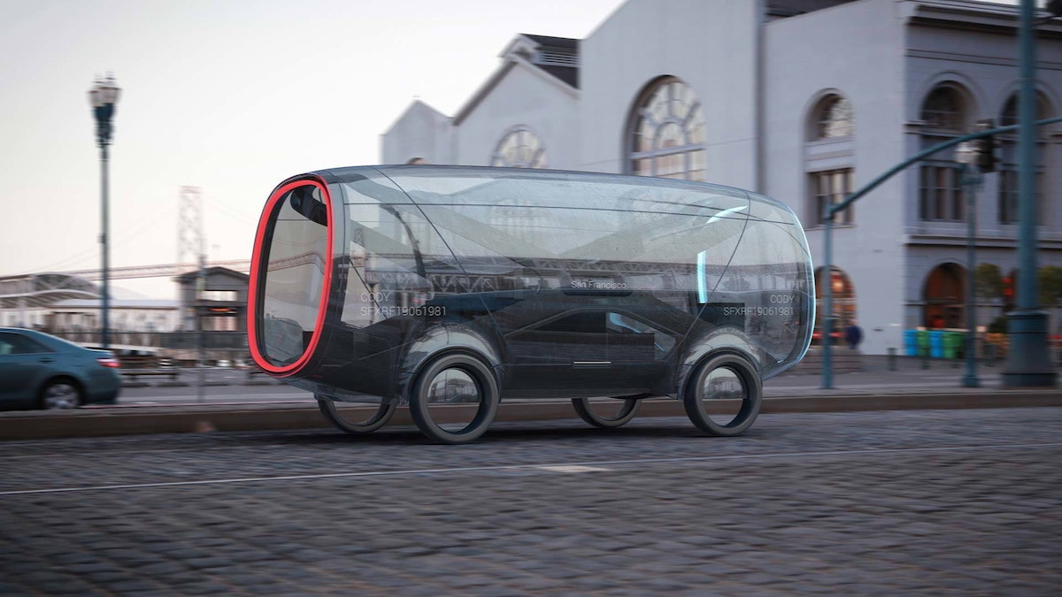
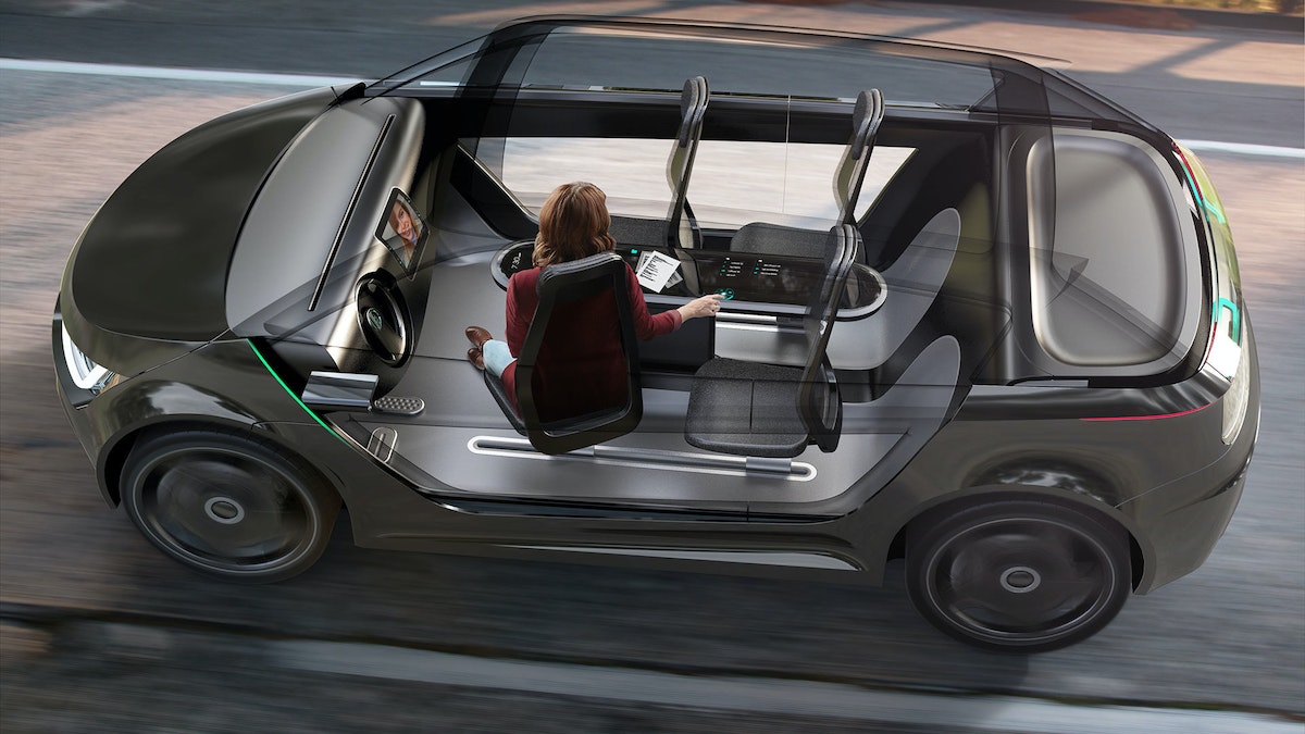
Want More?
IDEO alum Jonah Houston continues the conversation in a Medium article on how the horse can provide inspiration on designing modern driving interfaces.
Press
A Fascinating Glimpse at How We'll Carpool in 2027, WIRED
Imagining A Future Where Autonomous Cars Let Everyone Carpool, Fast Company
IDEO envisions ride-sharing car concept for 'the future of moving together', designboom
IDEO Visualizes the Role of Autonomous Vehicles and Ride Sharing, Core77
Awards
Once our hands are off the steering wheel and more vehicles are shared rather than owned, what will change in our lives?

Lindsey Turner
I’m passionate about building brands, products, and experiences that help organizations show up with meaning and momentum.
I help organizations cut through complexity by shaping how they show up, through brand strategy, identity, and storytelling.
Working at the intersection of brand and business, I bring an editorial eye and a bias toward making—turning ideas into tangible experiences that people can understand, trust, and believe in.
My work spans government, healthcare, financial services, media, and consumer goods, from launching Gen Z-focused ventures to building innovation labs and reimagining legacy brands. I relish moments of ambiguity and enjoy translating across teams, perspectives, and priorities to move ideas forward.
I started my career in editorial and digital design, shaping cross-platform experiences and identity systems in publishing and agency environments. That foundation still shapes how I work today: I’m detail-oriented, collaborative, and overreliant on the Oxford comma. I hold a BFA in Visual Communication from the School of the Art Institute of Chicago.

Rachel Young
My work helps organizations see who their products aren't working for—and build the will and the tools to do something about it
For 25 years, I've asked the same question: Who does this design exclude—and what are we going to do about it?
My work spans human-centered strategy, inclusive design, and qualitative research, with clients ranging from Microsoft, Google, and Verizon to the National Science Foundation, and San Francisco Unified School District.
Before IDEO, I taught elementary school in East Palo Alto and spent a decade doing design work with social service organizations—where I learned firsthand what it costs people when systems are built without them in mind.
I am currently writing User Error, a nonfiction book about digital access and the design decisions behind it. I live in Oakland, California.

Brian Pelsoh
I lead with craft, ensuring our work is creatively excellent: rooted in deep human insight and imagination, while also grounded in the realities of business and technology.
My expertise spans brand, communication, and product design across tech, education, the arts, and social impact.
I believe great work demands both high-level vision and obsessive attention to detail, and only happens through collaboration.
I bring an inclusive, hands-on approach and a deep understanding of business, which enables me to consistently deliver excellence while always asking why.
Before joining IDEO, I worked at the brand firms Pentagram and VSA Partners. I began my career as a designer, leading teams at the School of the Art Institute of Chicago and the Milwaukee Art Museum. I hold an MFA in graphic design from Maryland Institute College of Art and a BFA in communication design from the Milwaukee Institute of Art & Design, and have taught at some of the best design schools in the US.

Tony Wong
I am responsible for IDEO’s long-term success in China and working with clients to use design as a tool to enable growth.
I am responsible for IDEO’s long-term success in China and working with clients to use design as a tool to enable growth. Specifically, I have helped Chinese companies design holistic brand solutions through the development of their products, communication, services, and innovation teams, and I have helped multinationals expand their presence and influence in China.
I advise global leaders on developing China-led innovation and capabilities.
In over 15 years in IDEO Shanghai, I have worked on projects that use design to elevate the quality of the experience of healthcare products and services, streamline processes that increase productivity, create spaces and programs that promote and enable inclusive communities, and build next generation mobility solutions that are planet-positive.
Before joining IDEO, I worked at Philips Electronics and the Electrolux Group in Italy, the Netherlands, and Singapore on a number of breakthrough commercial products. I am a member of the Young President Organization in Shanghai.

Building a personal AI for the messiness of life: Sida Li
Most AI products today are built for work—a space with clear problems and established systems. One founder noticed a gap: personal life is messier, harder to systematize, and mostly left behind by the AI boom. So she built Cue, a personal AI that lives inside iMessage and group chats, to go where the other tools haven't.
In this episode, Becca Carroll, IDEO's Chief Strategy Officer, talks with Sida Li, co-founder and CEO of Shared Context Lab, about staying anchored to a human need while the technology around her keeps changing shape, why she treats her business model with the same rigor she'd bring to a product, and what it feels like to build a company at this particular, disorienting moment in AI.
The conversation also gets into how Sida makes design decisions: the language Cue uses to describe itself, the tradeoffs behind building inside iMessage instead of a new app, and a real story about a business idea that didn’t pan out.
This is the second in a two-part series profiling founders from IDEO's Startups-in-Residence program. The first conversation is with Johannes Seemann, founder of Sooner, on designing GenAI for the emotional side of money.

Designing GenAI for the emotional side of money: Johannes Seemann
Most personal financial tools are built to run the numbers and optimize towards a budget. While that works for some, most people experience money as a lived relationship that does not neatly fit into a spreadsheet. Johannes Seemann and Becca Carroll discuss why money is emotional before it is mathematical, and what a human-centered approach to building a generative AI financial product looks like in practice.

The curious leader's edge in uncertainty: Scott Shigeoka
Mina Seetharaman talks with Scott Shigeoka, author of Seek and Head of Curiosity Cultivation at the Eames Institute, about what distinguishes genuinely curious leadership from performative curiosity, how power dynamics shape curiosity, and why practicing curiosity can restore energy rather than drain it.

How constraints make us more creative: David Epstein
Mina Seetharaman talks with David Epstein, author of Inside the Box and Range, about why total freedom often produces average work, how leaders can design useful limits on purpose, and what organizations such as General Magic and Pixar reveal about the relationship between boundaries and creativity.
Looks like you might be in search of something very specific?
Or reset the filters above and try another angle.
Here’s some random inspiration

Podcasts about creative leadership

Articles about the power of prototyping
