
.svg)



Designing a better onboarding experience for an AI symptom checker at clinics
Enabling doctors to spend less time on paperwork and more on patient care.
D4V is a Tokyo-based early stage Venture Capital in partnership with IDEO. Two years ago, D4V invested in healthcare startup Ubie, which develops a service called AI Monshin Ubie. The digital service was created with the goal of reducing the burden on healthcare professionals working long hours, under harsh conditions. AI Monshin Ubie automates a number of patient registration and documentation processes through digital tools, enabling doctors to spend less of their time on manual paperwork, and to dedicate their valuable skills and attention to the patients themselves. Currently, the service is installed in 200 medical institutions in 41 prefectures across Japan.
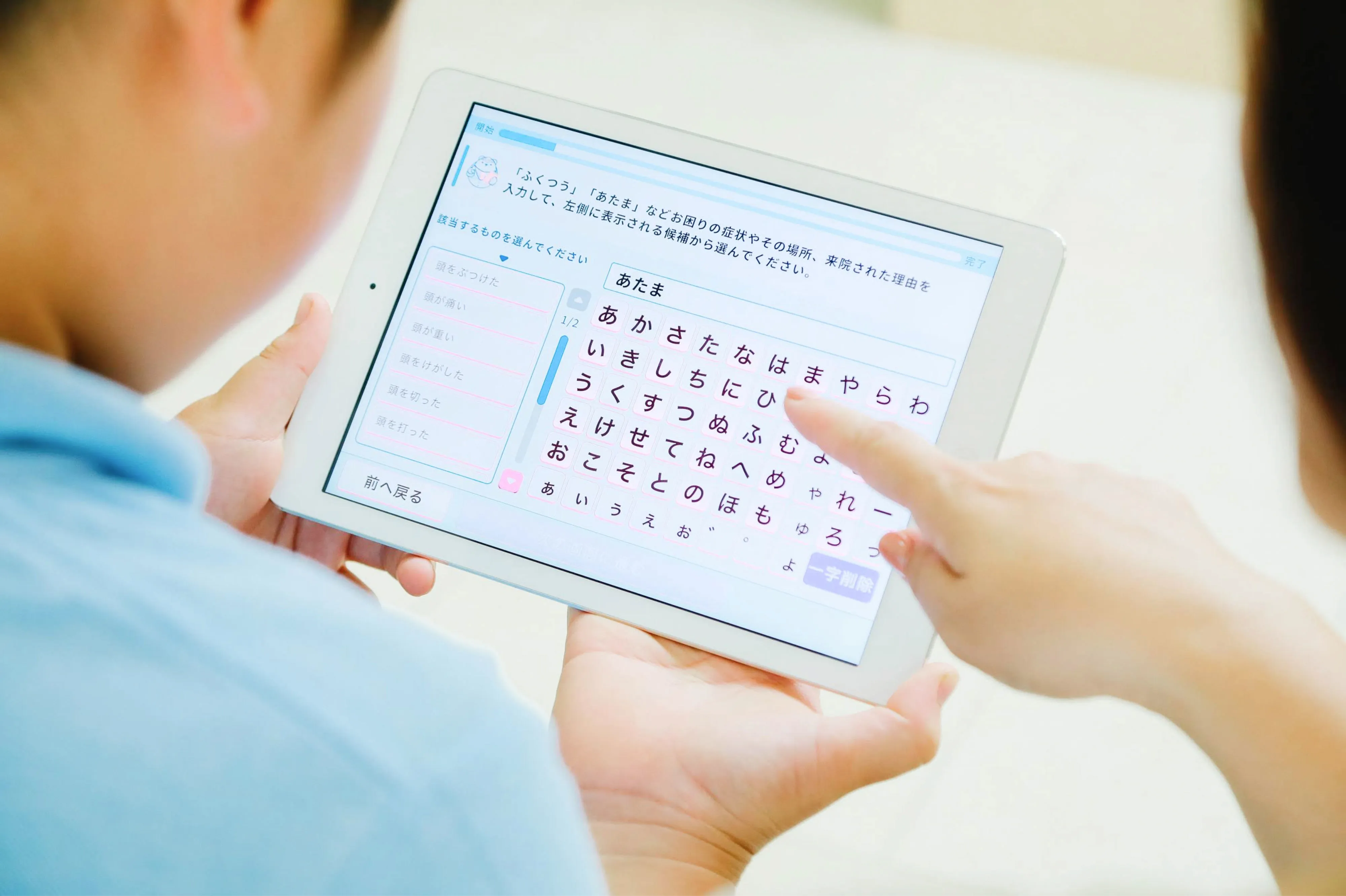
With AI Monshin Ubie, patients fill out preliminary forms on a tablet, rather than paper, entering information about their health history and current symptoms directly into their digital medical record. As patients fill out the questionnaire, the Ubie AI generates questions in real-time according to patients’ responses, which results in more appropriate and accurate data. The patient’s responses are automatically formatted for the doctor to review prior to and during the consultation. As a result, doctor consultation times and facility operation times are drastically reduced.
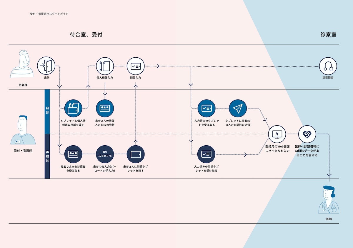
With the Coronavirus raising fears of a possible health system breakdown, Ubie has made improvements to anticipate and possibly prevent in-hospital infections. Until recently, Ubie’s services have been primarily used by large hospitals; but in light of the global health crisis, Ubie approached D4V—who partners with IDEO—to help rethink the onboarding experience and quickly facilitate the introduction of AI Monshin Ubie in regional clinics across Japan. D4V and IDEO have been working with Ubie for many years to collaborate in various areas, including UX, rebranding, international research, and more. Therefore, they had a foundation of knowledge from which to build these new features.
Typically, AI Monshin Ubie has been introduced to new hospital clients through direct, in-depth instructional visits from Ubie sales staff. This approach has worked well for rolling out the product to Japan’s 8,000 large hospitals; but for the 100,000 smaller clinics, Ubie needed a more efficient onboarding method to enable staff to get set up smoothly and independently.
During research, D4V and IDEO team members engaged with many different clinic staff members, including full-time doctors, part-time doctors, nurses and receptionists. The researchers found that staff tend to react skeptically to new tools and services, with a common preconception that they will add to their workload. One clinic director’s first impression of AI Monshin Ubie was, “It looks complicated.” But once he actually used the service, he realized that it was very user-friendly.
The team quickly understood that it was important to remove preconceptions by clearly communicating Ubie’s benefits and ease of use. They created a two-minute animation and designed three separate guidebooks. The animation adopted a friendly tone and expressed empathy for doctors, staff members and patients, highlighting how Ubie can bring benefits to each of them. The animation showed how Ubie fits into the existing workflow and explained complex systems in a straightforward and accessible way.
WATCH: A short video clip explains the benefit of their product and service to avoid the users’ concerns in advance.
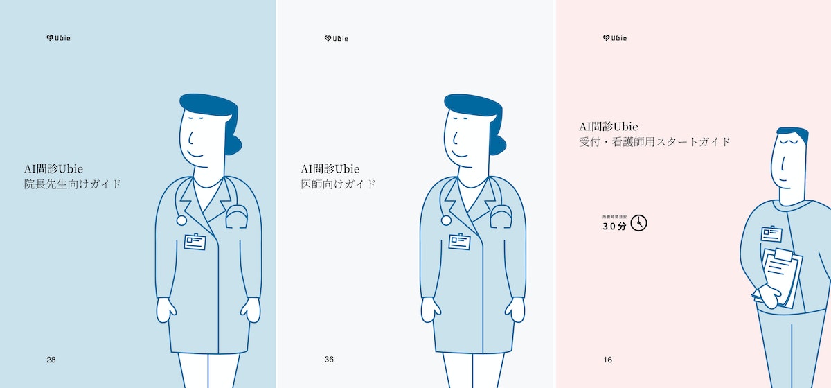
The guidebook for doctors and directors explains how Ubie’s AI smooths the patient consultation experience and greatly improves the quality of medical care. It also introduces concrete how-tos around set-up, implementation, and ideal workflow. FAQs were also included, addressing concerns about whether or not elderly people would be able to use it.
Ubie business development leader Kenji Yamada says, “D4V and IDEO have a deep understanding not only of design, but of our entire business. They provide inspiration by bringing experience and knowledge that comes from working with other industries and clients outside of healthcare. We appreciate that they can share the knowledge that they’ve obtained with our business.”
Read the Japanese-language version of the Ubie case study here.
When You Feel Unwell, Ask Ubie: Check your symptoms for free
Learn more about Ubie: Global Company Website
An improved airway intubation system that helps physicians save more lives
The GlideScope Core offers elevated visibility and a seamless workflow for intubation, allowing doctors to better conduct routine procedures and respond to health crises.
In the emergency room, an intervention that’s administered too slowly could cost a patient their life. With COVID-19 fueling a surge in acute respiratory conditions, intubation—a procedure that involves inserting a tube through the mouth or nose and into the airway—is more common than ever. For patients struggling to breathe, the tube can be connected to a ventilator that pumps oxygen to the lungs, keeping them alive.
While a laser-focus on the present is critical for successful patient outcomes, hospitals and physicians often don’t have time to look ahead and anticipate the future of the operating room experience. As technology rapidly improves, there is a ripe opportunity and pressing need to evolve medical equipment to be more innovative and intuitive. Verathon Medical, a global medical device manufacturer, is supporting health care providers at the cutting-edge of care.
Verathon approached IDEO to redesign the existing product system for laryngoscopies and bronchoscopies—procedures that examine parts of the throat through intubation. During these examinations, a tube with a camera embedded in the tip is inserted through the patient’s nose or mouth. The doctor can then see inside the throat on a video monitor, and therefore more easily and quickly intubate and perform the exam.
To create a groundbreaking device, the team observed over a dozen laryngoscopies, bronchoscopies, and intubations. They noticed that many anesthesiologists relied on fixed equipment during the procedures. For example, some had grown accustomed to looking over their shoulder—away from the patient—to view the monitor.
During interviews, physicians and residents expressed difficulties with the current technology, sharing that the small screens aren’t conducive to team viewing or student instruction, and they must often use a separate computer to record patient notes. Others reported frustrating workflows, needing to constantly divert their attention and move their hands between the patient, prep tray, monitor, sterile bin, and disposal bin. These inconveniences and inefficiencies are not only cumbersome, but can increase the risk of infection and fatality.
The team relied on these insights to start designing a next-generation product. Through sketching, storyboarding, and building in real-time alongside doctors and clinic staff, designers quickly teased out additional findings and validated concepts.
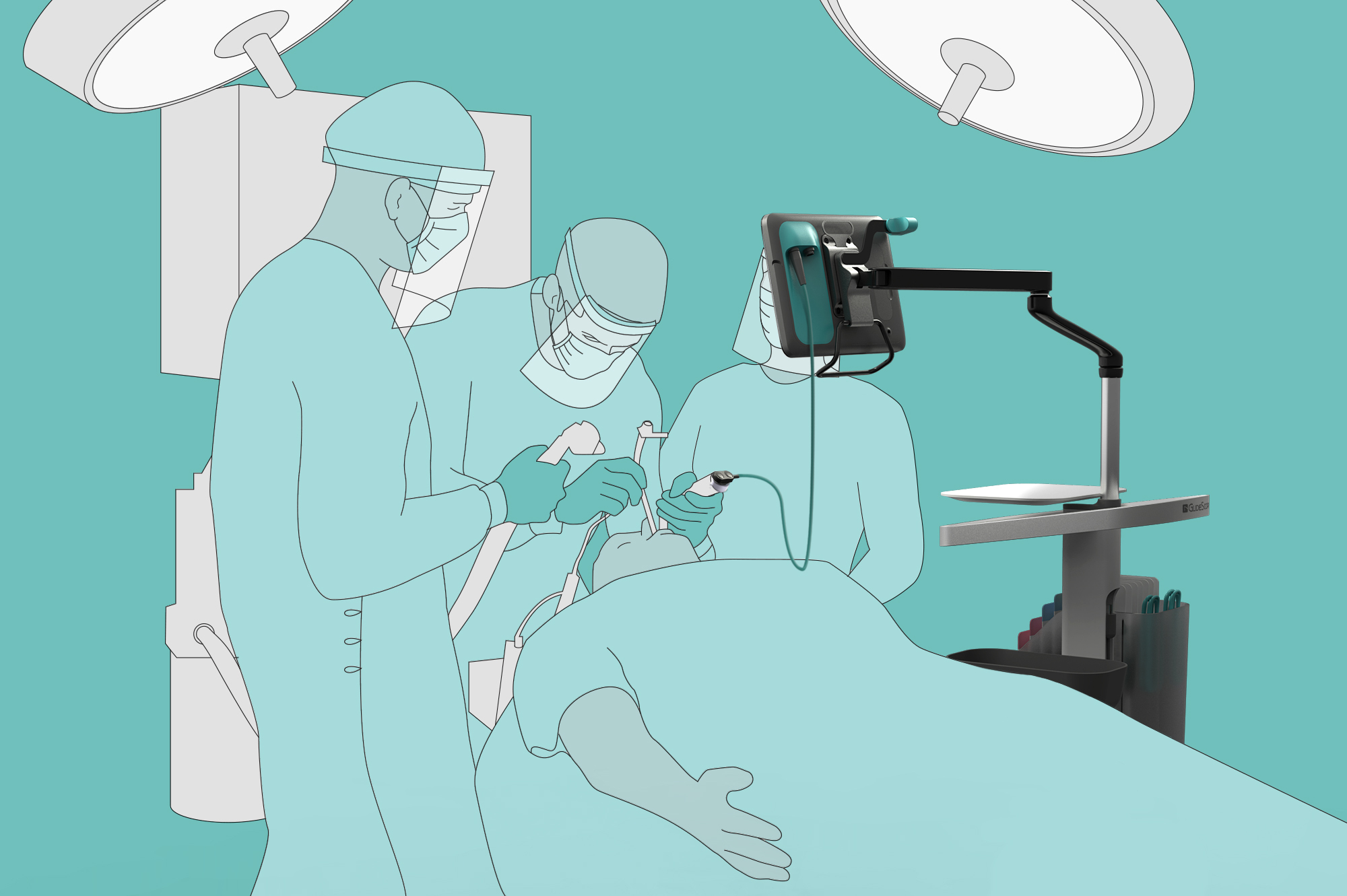
This work led to the creation of the GlideScope Core: an all-in-one, portable product system that supports both video laryngoscopies and bronchoscopies. The base of the device—a wheeled cart—has built-in storage units for tools and a disposal bin, offering more mobility and accessibility for medical professionals.
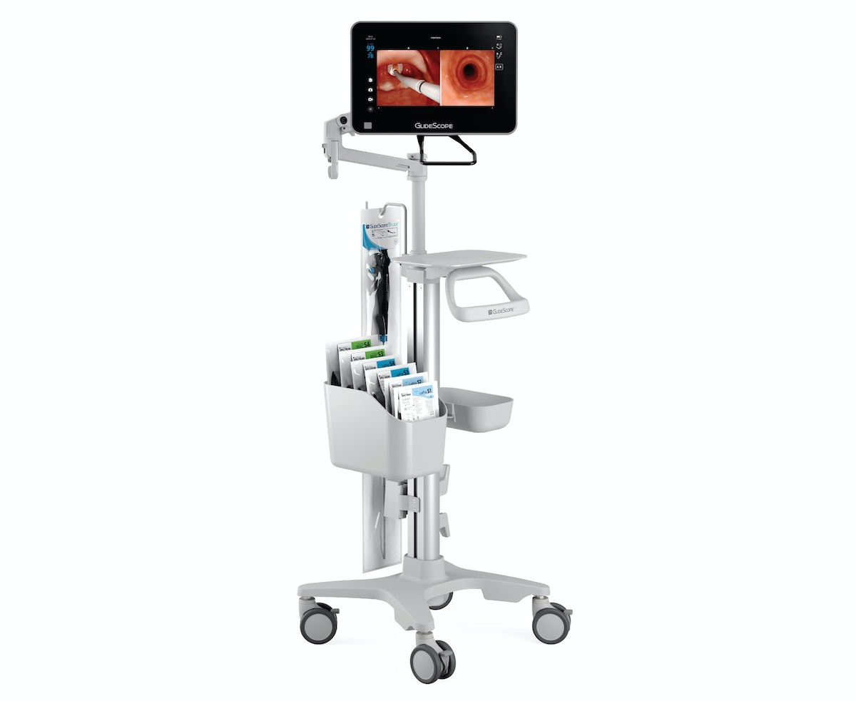
The product’s tagline, “see more, do more,” points to the improvements made to the video system, including a large 10- or 15-inch high-definition touch screen monitor. Displayed images can be enlarged and rotated 180 degrees for improved visualization, team viewing, resident training, and classroom demonstration. To help doctors keep both the patient and monitor in their line of sight, the detachable screen can be secured to an adjustable arm that can be positioned directly over the patient. Additionally, the monitor’s patient annotation feature gives staff access to more of what they need in one device.
The product has been especially valuable for providers and patients during the coronavirus pandemic, when it’s imperative for doctors to keep their distance from patients’ mouths and noses. The GlideScope Core’s movable, detachable, and large, high-definition monitor makes it easier to take this precaution and intubate more quickly. This usefulness is reflected in the 5-fold increase in cart-based device orders for Verathon. While most providers typically order anywhere from 1 to 20 devices for airway procedures, one hospital system requested 600 GlideScope Core systems to meet current intubation demands.
Through modern technology and a focus on human needs, the GlideScope Core supports improved patient outcomes and creates a more seamless operating experience for medical professionals. The product underlines the key but often overlooked fact that often, in order to ensure the healthcare industry is patient-centered, medical device manufacturers and hospitals must also focus on improving the experience of providers.
Transforming a community hospital from the inside out
Designing for caregivers to create world-class care for patients.
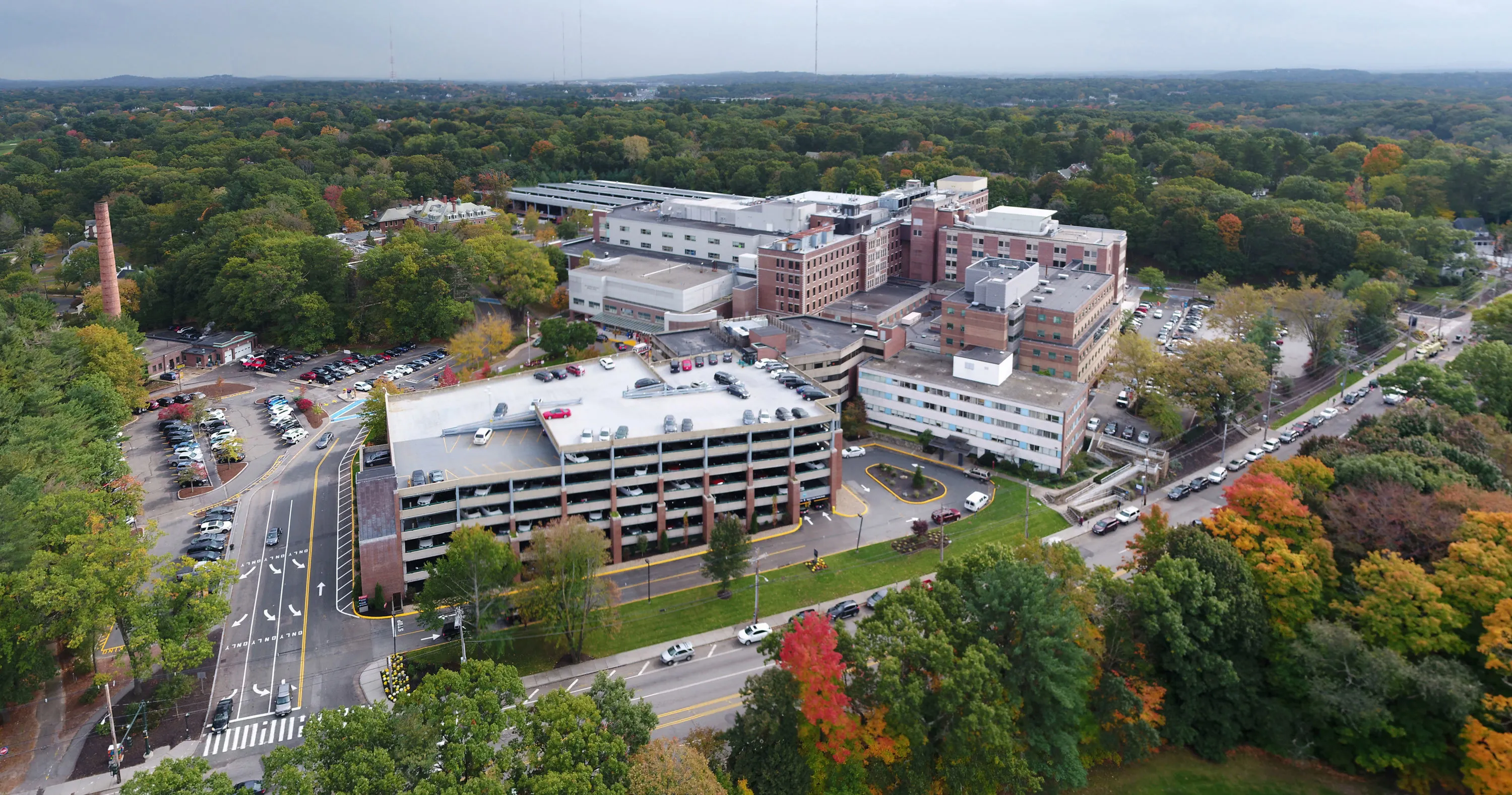
Healthcare is notoriously difficult to change. Rules and regulations present complex barriers; health practitioners and organizations often have entrenched ways of working; and lives are literally on the line. Despite these significant barriers, the leaders at Newton-Wellesley Hospital (NWH) boldly committed to improving patient care through a new approach.
NWH is a community teaching medical center in Newton, Massachusetts. Because of its proximity to Boston—a city known for world-class healthcare institutions—NWH needed to differentiate itself. The hospital's new president, Dr. Michael R. Jaff, reached out to IDEO for help: "I knew that providing an unparalleled patient experience would set us apart from our competitors." But, Dr. Jaff’s particular approach was unique. He and Dr. Jodi Larson, Chief Quality and Experience Offer (CQXO), saw an opportunity to drive better patient outcomes through cultural and organizational change.
"You cannot learn any more than when you get to listen to your potential patients say why they would never walk into your place." —Dr. Michael R. Jaff
IDEO partnered with NWH for a year of work together, kicked off by defining the vision for NWH and ramping up to in-hospital prototyping and the launch of several new initiatives. A pilot project with the Women's Imaging Center (WIC) focused on solving departmental and employee challenges to provide a better experience for women getting mammograms.
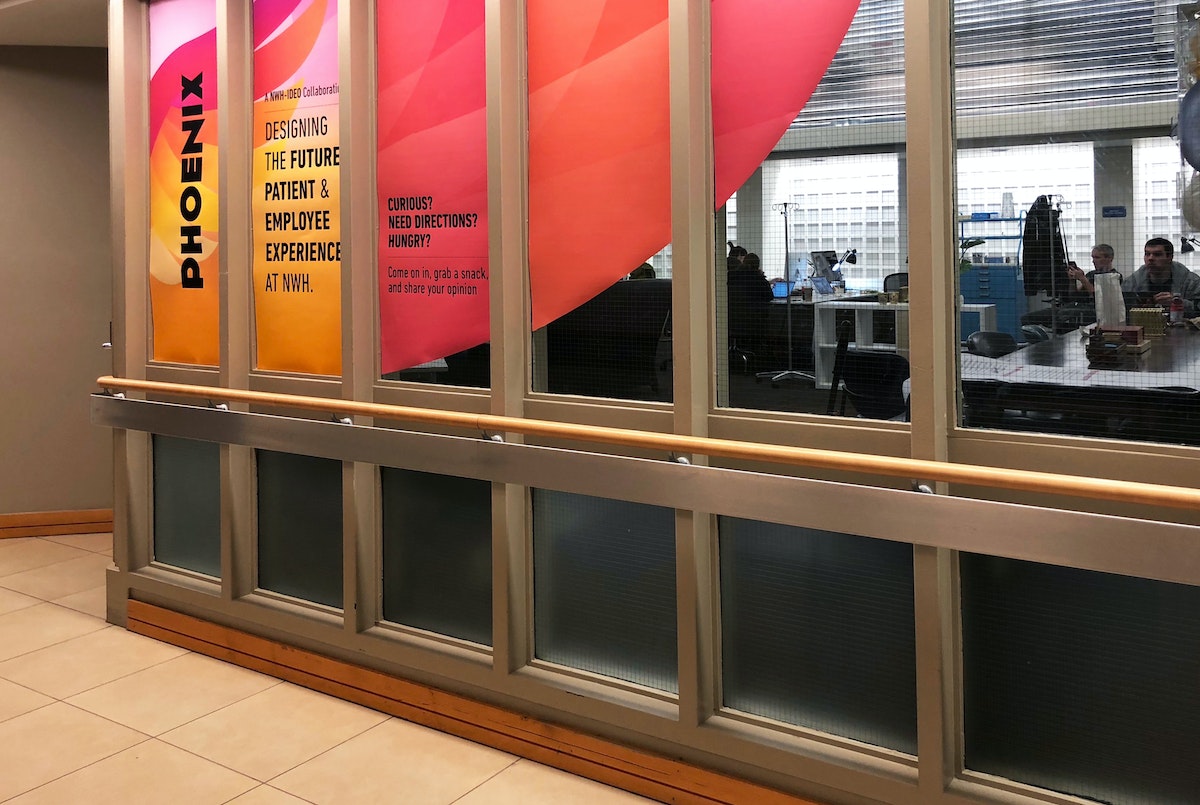
Fueled by this potential, the WIC team redesigned key work processes and created a set of experience principles that inspired new service prototypes. Guided by principles like "Express mutual gratitude" and "Honor every voice," the WIC team tested ways for patients to acknowledge outstanding caregivers and created tools to gather better feedback from patients and adjust quickly. The experience of designing better services inspired the WIC staff to become ambassadors for the power of design thinking across other departments inside NWH and they continue to build on the work through new prototypes and experiments.
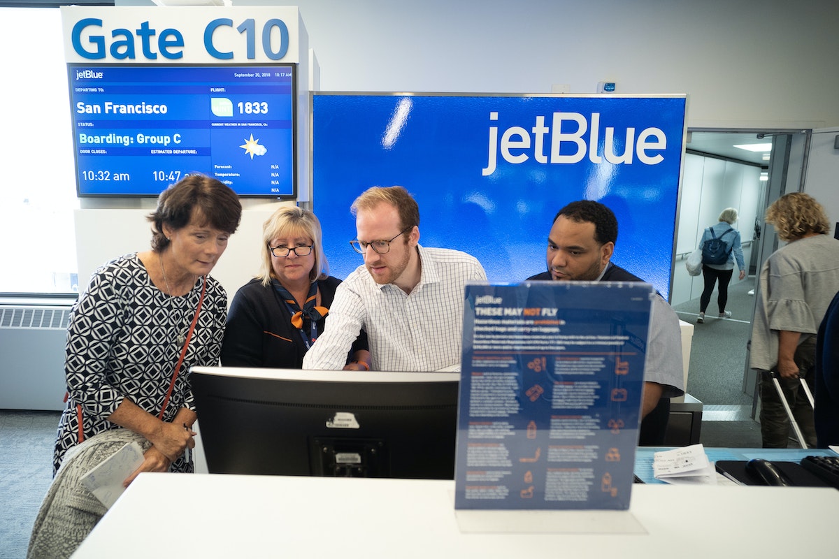
Next, IDEO partnered with NWH’s ambulatory surgery group. They took an analogous research trip to Boston’s Logan airport to see with fresh eyes how other high-touch customer service organizations provide customer value in a complex setting. Insights from the trip were applied through live prototyping of several new experiences inside the hospital, including a pre-surgery visit summary and pre-operation care carts.
Analogous research helped us realize that we can learn from other industries and incorporate some (cool) best practices if we allow ourselves to get over the ‘that would never work in the hospital’ mentality. - Dr. Jodi Larson
One of the most impactful prototypes was Care Modes, a tool to empower the NWH care teams to tailor their approach and interaction with patients based on the patients’ unique needs, beyond simply their clinical requirements. Four distinct approaches were identified for engaging a patient before surgery—Explain, Partner, Embrace, and Encourage. The Care Mode is determined based on the provider's understanding of a patient's degree of self-advocacy and their confidence that surgery is the best solution to their issue.
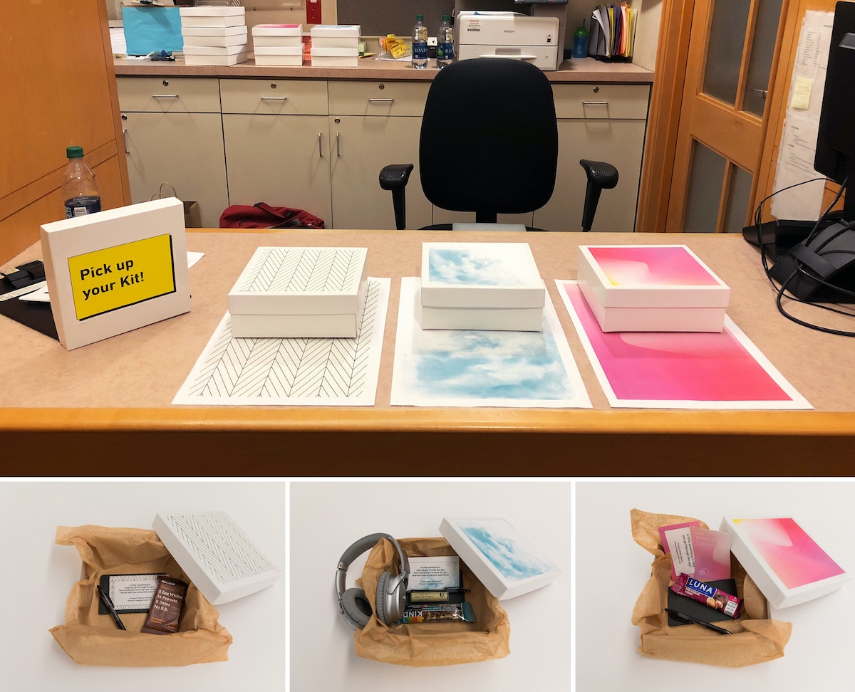
Historically, care providers have been trained to deliver consistent care above all else. However, Care Modes powerfully acknowledge that patients respond differently to different types of care. The Care Modes empower the team—from surgeon to nurse to anesthesiologist—with a clear framework for how to interact with and provide care for patients so they feel most comfortable. Based on the prototype's success with patients and impact on the staff culture, NWH has incorporated Care Modes into EPIC, the hospital's electronic medical record.
The importance of being patient-centered has been central to the healthcare conversation over the past thirty years; but new explorations reveal that there’s far more potential for innovation and improvement when the provider experience is considered in tandem with the patient’s. Each enables the other, and design for both together yields stronger solutions and better outcomes. IDEO's work with NWH demonstrates this vital shift in user-centered healthcare—one can't design services and experiences for patients without designing for their providers’ culture as well. When these go hand-in-hand, meaningful institutional change in healthcare is more than possible.
Helping a historic museum prepare for the future
Using design thinking to improve access, experience, and culture.
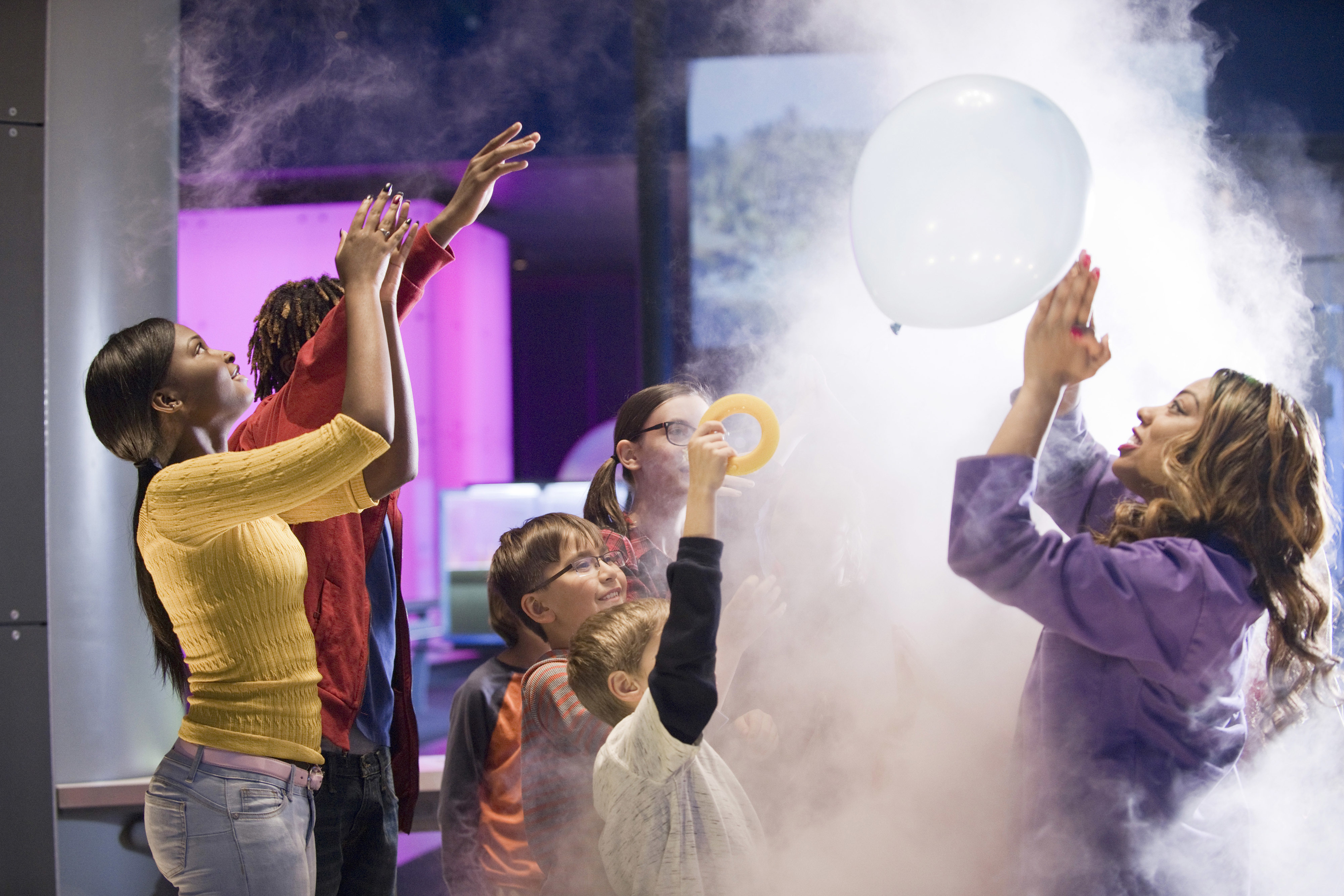
The mission of Chicago's Museum of Science and Industry (MSI) is to inspire children to achieve their full potential in the fields of science, technology, medicine, and engineering. Leaders at MSI realized they needed to drive day-to-day operations and maintain historic exhibits while focusing on where to go next. To prepare for its next decade, MSI worked with IDEO to create a new business focus to support the museum’s aspirations for the future. The plan would allow MSI to respond to the demands of the marketplace and raise the funds to get there.
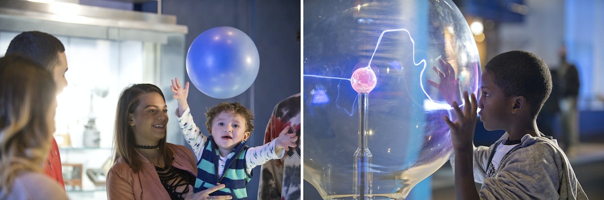
At the beginning of the project, MSI laid out its priorities: improve equity of access, enhance the museum experience, and create a more innovative culture. To dive into each of these areas, IDEO conducted immersive research with families, teachers, donors, and staff.
IDEO brought together 60-plus donors, board members, and staff members to engage in a design thinking exercise to unpack and address the tensions that come with choosing a new strategic trajectory. Instead of having a standard ballot vote, the IDEO team encouraged participants to get up and vote with their feet, helping the group of stakeholders physically align on the museum’s new direction.
At the end of the research and prototyping phases, MSI and IDEO developed a vision called Provoking Minds, Inspiring Futures, creating six detailed design briefs to equip MSI teams to bring initiatives forward. The briefs laid out everything from recommending a new Department of Next, dedicated to ensuring that the future is at the heart of everything the MSI does, to MSI Runway, a place for experimental, small-scale, and limited-run exhibits. The ideas were brought to life with an interactive exhibit, built quickly with everyday materials like plywood and circuit boards, to demonstrate that creating an inspiring vision of the future doesn’t have to be an expensive endeavor.
The team also focused on insights that highlighted accessibility issues some families brought up early in the design process—travel across the city via public transportation can be lengthy, and the cost of admission to special exhibits could be prohibitive. To address these concerns, IDEO came up with the Mission Accessible brief: Inspired by casino buses, MSI bus stop signs would be posted in various low-income neighborhoods, signaling a way to take kids and families to the museum for free.
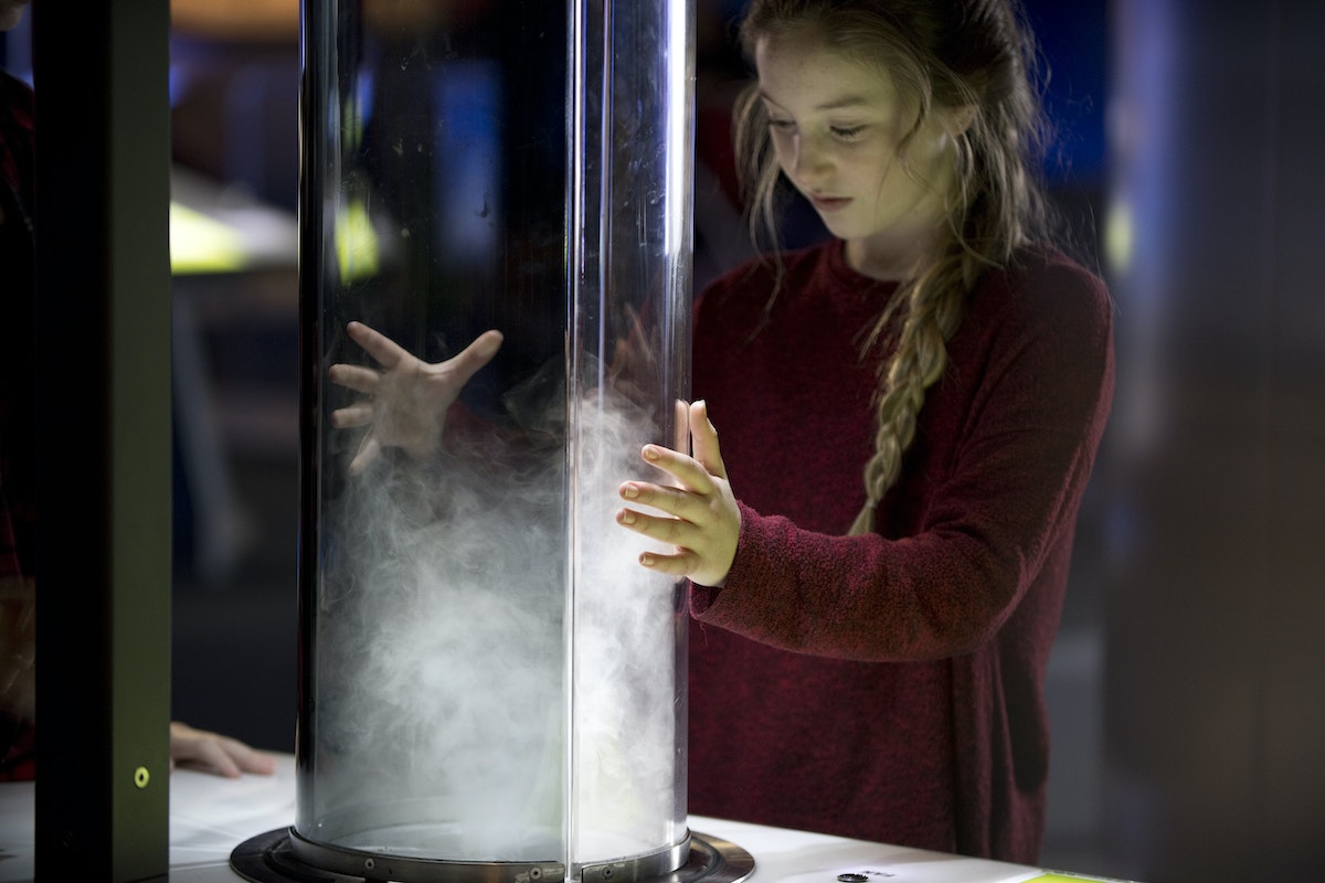
During the project, the IDEO team identified some low-hanging fruit, like rethinking ticketing and improving the student field trip experience, and helped the museum create cross-functional innovation teams to apply design thinking skills towards solving those challenges. They researched, brainstormed, and pushed forward new concepts, meeting weekly to share and build on ideas. At the end of the four week period, each team prototyped their ideas—new outdoor programming, software tools for visiting tour groups—and pitched them to each other.
In 2019, two years after the conclusion of the project, the collaboration paid off. With its new strategic plan and additional resources, the museum has renewed its commitment to serving youth, and MSI’s team, including donors, are aligned on a collective vision of the future. MSI raised more funds than in any previous year, including the single largest gift in its history—$125 million, nearly half of its $380 million fundraising goal—that will help ensure the years ahead.

Quick + Dirty Design Tips: Animation in After Effects
Animation tips from an After Effects power user
For this method of animation, make sure to use only lines in your Illustrator file. The idea is to animate the lines across their own path, so the way you design them will play a big part on how elaborate your animation will be.
Watch this video for a quick step-by-step guide to animating lines in After Effects:
- When your Illustrator file is ready, import it to After Effects. You can simply drag your Illustrator file to the Project area or go to File > Import > File.
- Drag the imported file to the Timeline. It will automatically create a Composition.
- Now you must turn your Illustrator file into Outlines that After Effects can control. On the timeline, right click on the layer and select "Create Shapes from Vector Layer.
- The next step is to animate your outlines. For that, you will need to add a Trim Paths feature to your new layer.
- On Trim Paths, use keyframes for Start/End to change when and where you want your paths to animate. If your file has multiple lines, you can choose to animate them simultaneously or individually.
This technique is a simple and effective way to create powerful motion graphics for storytelling, user interface behaviors, or even a simple animated gif. Hope you enjoyed it!
Adobe After Effects is one of my favorite tools for prototyping user interfaces, creating video scenarios to communicate a context of use, or simply crafting stories through animation. It's a tool that allows you to explore and visualize ideas, and there's no right or wrong way to use it. Here are a few tips for using After Effects to animate vector lines imported from Adobe Illustrator.
Why You Should Keep Making Stuff By Hand
Don't let technology stop you from getting your hands dirty
So, when the opportunity comes up, I like to turn off the computer and focus on creating artifacts. While an object is just a thing that serves its purpose until it’s tossed out, an artifact sparks an invisible conversation, a connection between the human who made it and the human experiencing it. Even something that people don’t think twice about, like an event name tag, deserves to be well designed.
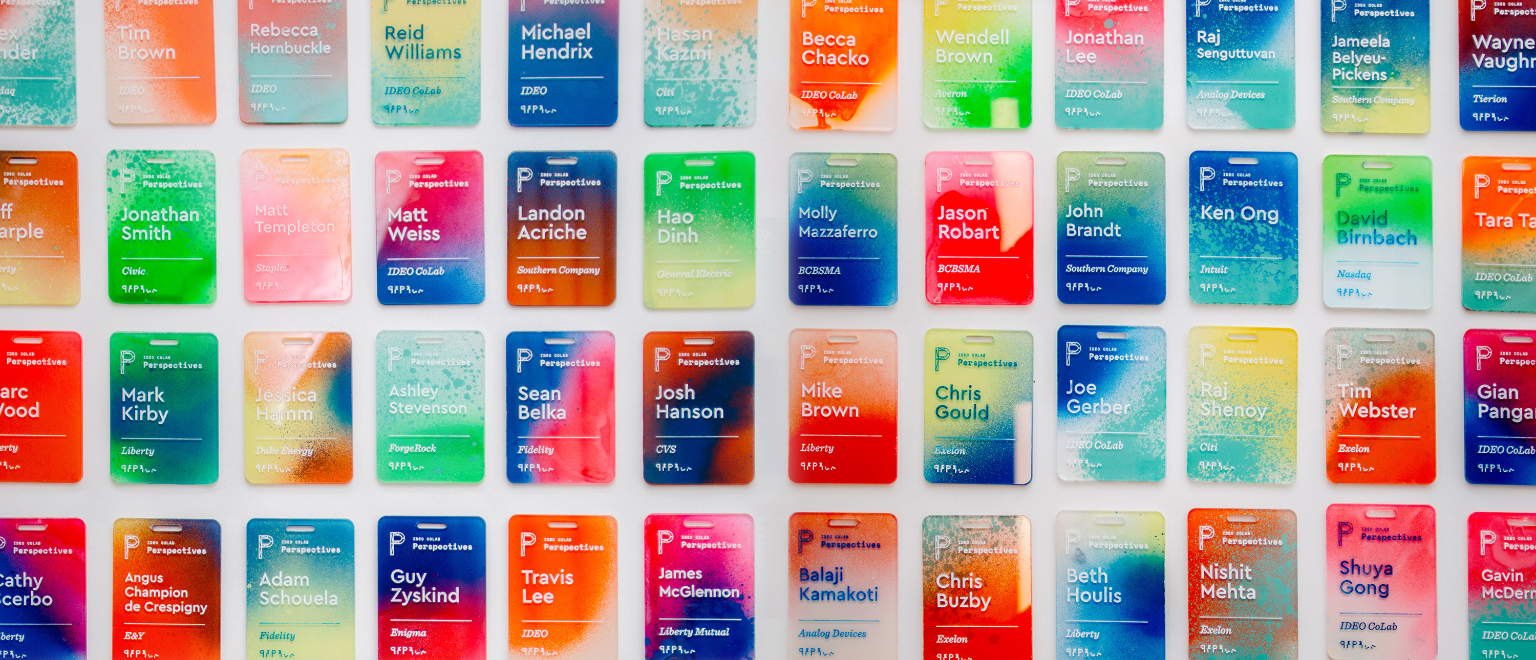
That belief drove me to create a collection of one-of-a-kind name tags for a CoLab event. I wanted to make something with my hands that would bring a level of craft to our content. The tags served as the icebreaker for more than a few conversations, and reminded people at the tech-focused event that there's a human element to everything. Many attendees we reached out to a month later said that they still had the tag on their desks.
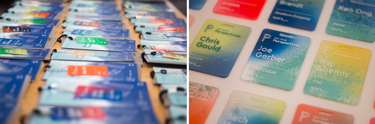
The process was simple, but arduous: I laser cut blanks, etched the names, spray painted each tag using unique colors and angles, and finished it off with acrylic screen printing ink to make the names readable.
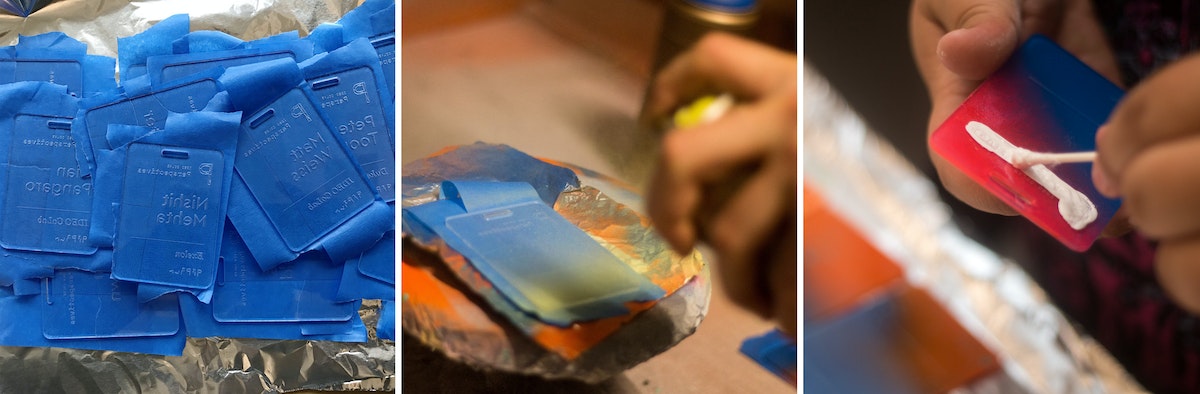
Here's how I did it, step by step:
1. Creating the blanks
I designed the negative of the template so that I could later use it as a jig. I used 18 x 24 inch sheets of 3mm acrylic, so that with the name tags at 2.5 inches x 3.5 inches, I could fit about 32 comfortably in each batch (as opposed to 38 if I used all available space and threw away the negative).
Acrylic sheets tend to melt and then cool quickly in the laser cutter, leading to possible sticking, so I usually add about .2mm to my thickness settings to compensate (i.e. I was using 3mm acrylic, but put 3.2mm in the settings). There are two benefits: One, you guarantee that you actually cut through the sheet. Two, it also gives you a little bit of wiggle room so you don’t end up with hard to pick out joints.
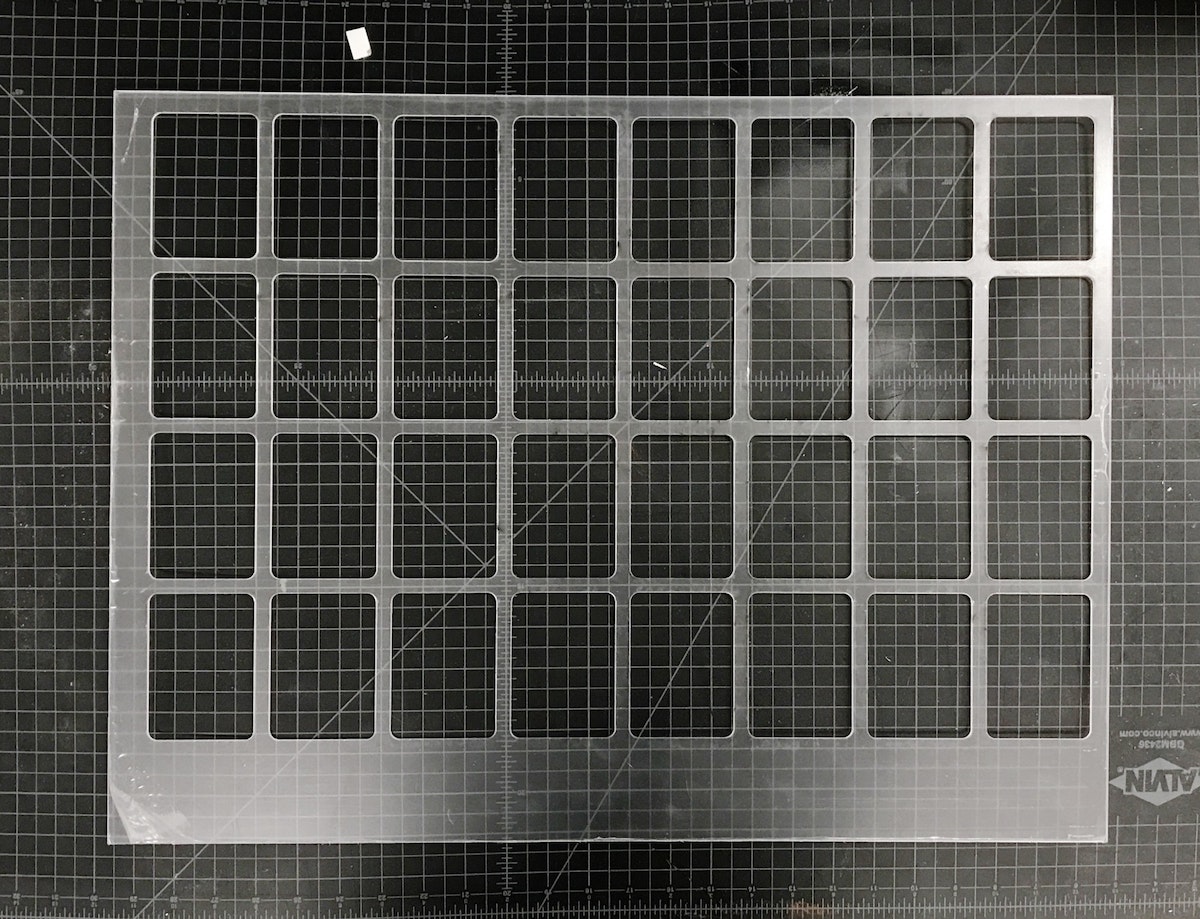
Pro tip: The key to making the most of your acrylic is to leave space for future cuts on the same piece. Instead of designing my reusable jig with all the name tags in the center, I threw them to one side so that I could use the other end again. After I cut the jig, I could get 38 tags out of each subsequent batch because I could simply throw away the negative. Another bonus: When there’s excess acrylic on one end, you can always tell which side goes in which direction.
2. Etching the blanks
Once the blanks were cut, I needed to take the protective plastic off of one side, so that I had a clean surface to etch onto. I peeled the tags, slipped my template jig back into the cutter, and dropped the blanks into place.
The etch file is the same as the template jig, just with a red cut box around the perimeter of the file denoting the edge of the acrylic.
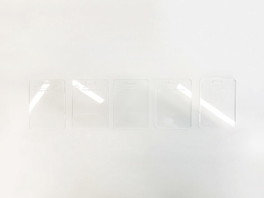
Once I had an etch file ready to go, all I had to do was push the file to the top left of the cutting area and check the focus points of the laser on the first tags on the first and second rows. Since the etch file is in the same grid form as the old cut file, everything is already spaced for me. The etch settings held ink best at around 74 to 76 percent power at 100 percent speed.
One final thing to note: We don’t want to cut anything (we’re just etching), so after setting my etch power, I set the cutting lines to 0 percent power and 100 percent speed, so we just blow right past them.
3. Taping the etched tags*
Once the blanks were etched, I peeled the plastic off of the back of the tags, then covered the etched side of each in painters tape to keep them clean.
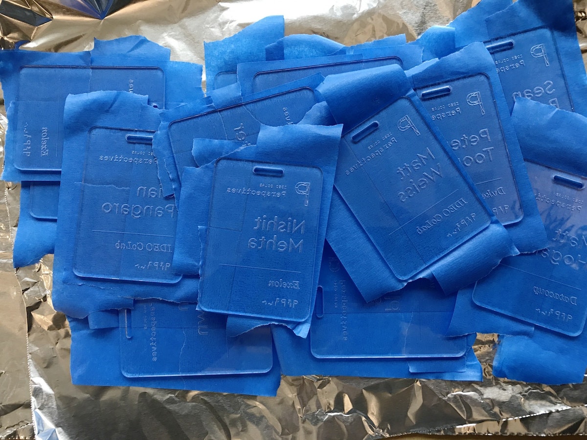
4. Spraying the tags
After everything was taped, I slapped some aluminum foil in the vent hood and got to work spraying each tag. The process allowed me to bring out some of the old airbrush tricks my dad showed me as a kid, like holding a tongue depressor at a 60 degree angle in front of the nozzle to create thicker splatter. I used two to three colors for each tag, at varying angles.
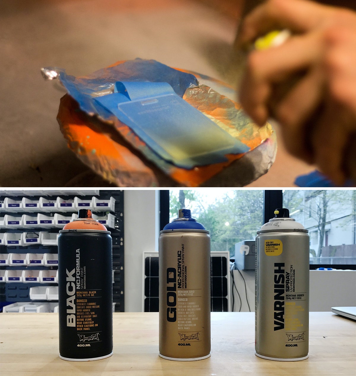
I used Montana brand spray paints, and I definitely recommend using the BLACK formula. Over the course of the project, it dried on the acrylic within four and-a-half minutes, which is pretty insane. The GOLD formula was comparable, but my run of the mill Krylon paints took much longer, so it’s worth the extra bucks to buy Montana.
Pro tip: If you’re spraying a bunch of parts in a hood, aluminum foil is actually a great material for coverage as it tends to not stick to your parts like paper.
5. Sealing the tags and revealing the beauty
After the sprayed tags had dried, I hit the painted side with a couple quick coats of the Montana clear matte varnish so that they wouldn’t stick to each other. When everything had dried, I peeled off the painter’s tape—my favorite part of the project.
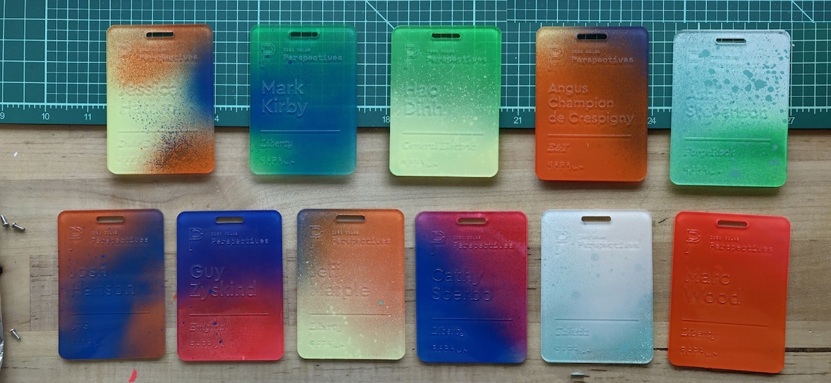
6. Applying the ink inlay
Next came the most time-consuming part: the ink inlay. I used speedball acrylic screen printing ink for its fast drying time, and how easily it wipes off acrylic. I liberally brushed and swabbed the ink into the etch using a Q-tip, then quickly wiped the excess off with a paper towel. Once dry, they were ready to go.
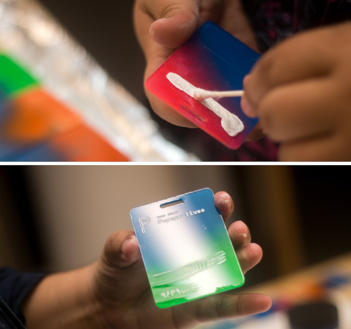
That's it!
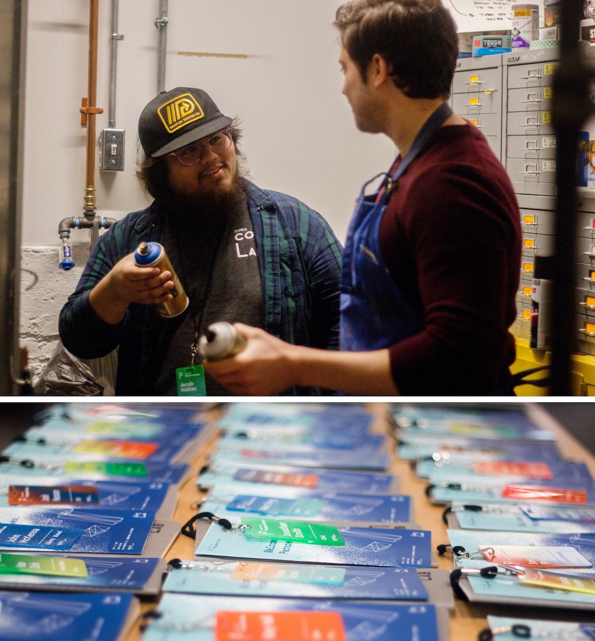
*Imperfect process: I know what you’re thinking—why didn’t you just remove one side of the plastic before etching, spray that side, then remove it from the other side, then etch that? I did! After a few batches, I added the taping step because I noticed the spray paint was eating away the plastic coating that kept the paint off the front of the tags.
I work with CoLab, IDEO’s tech-focused R&D group. I’m also someone who’s committed most of my life to craft. Luckily, my day job allows me to bring the two together. But the minute you start making a living from your craft, problems start to surface. You get burnt out. You compromise your vision to deliver things on time. At that point, you're no longer transforming objects—you’re just pushing matter around.
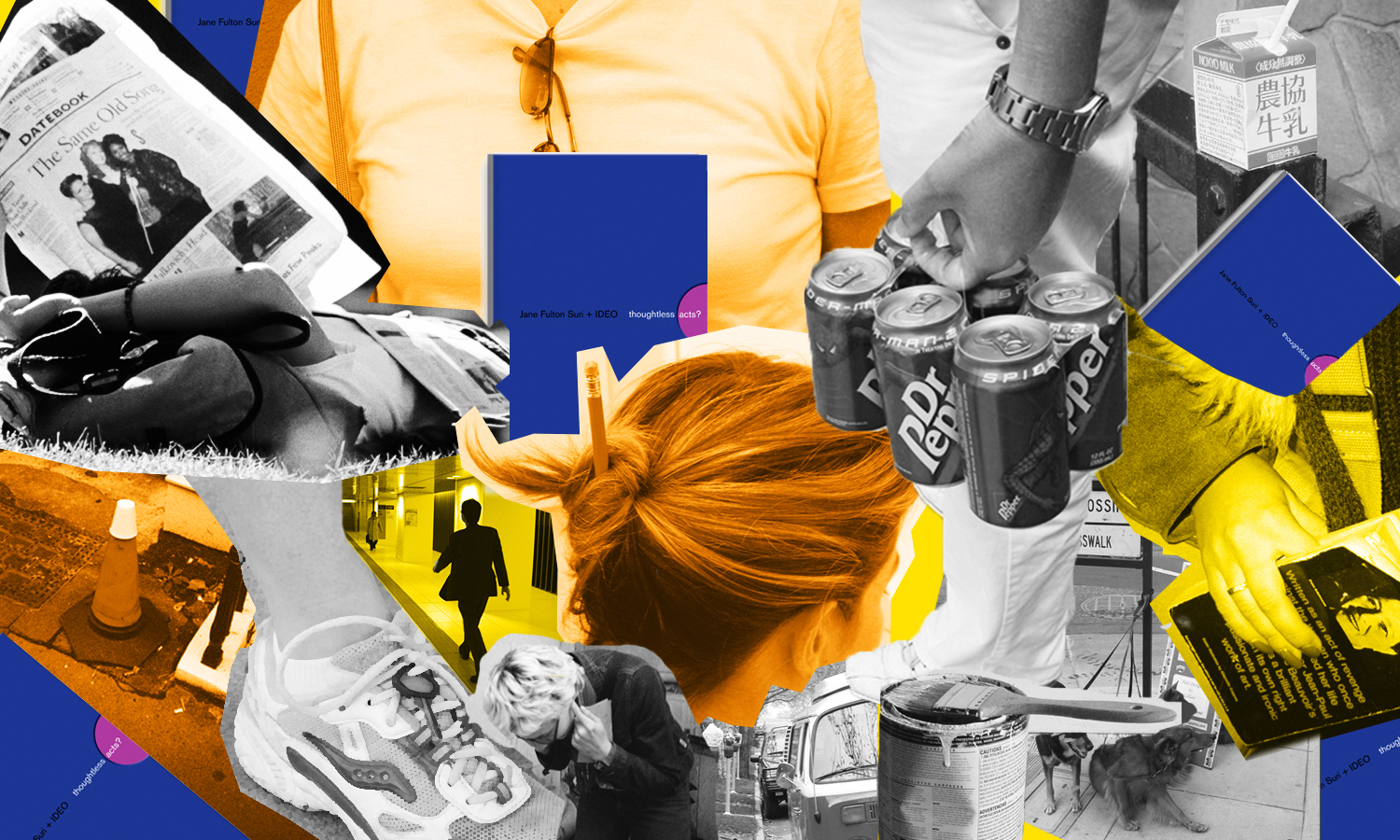
Thoughtless Acts: Single-Serve Medicine
Thoughtless Acts: Single-Serve Medicine. The intuitive ways we adapt and react to things in our environments
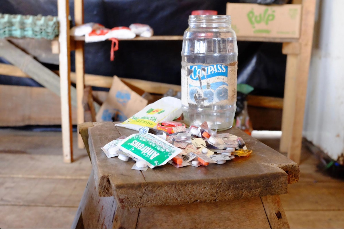
I snapped this photo in the Amazon jungle town of Iquitos, Peru. A jar full of individually cut blister packs sat in the corner of a general store set up in front of a family’s home. By making individual doses available—not even a daily dose, but a single, one-time dose—more families were able to afford treatment for their ailments. In a community where money is very scarce, this family was filling a very real, pressing need that wasn't being addressed by local stores.
Human-centered design requires us to observe human behavior with beginner's eyes, so that we can spot the innate ways people interact with the world around them. We call these intuitive and unconscious reactions Thoughtless Acts, and IDEO designers collect photos of them to inspire their work.
A Day in the Life of an Environments Designer
Ever wondered what an environments designer does all day?
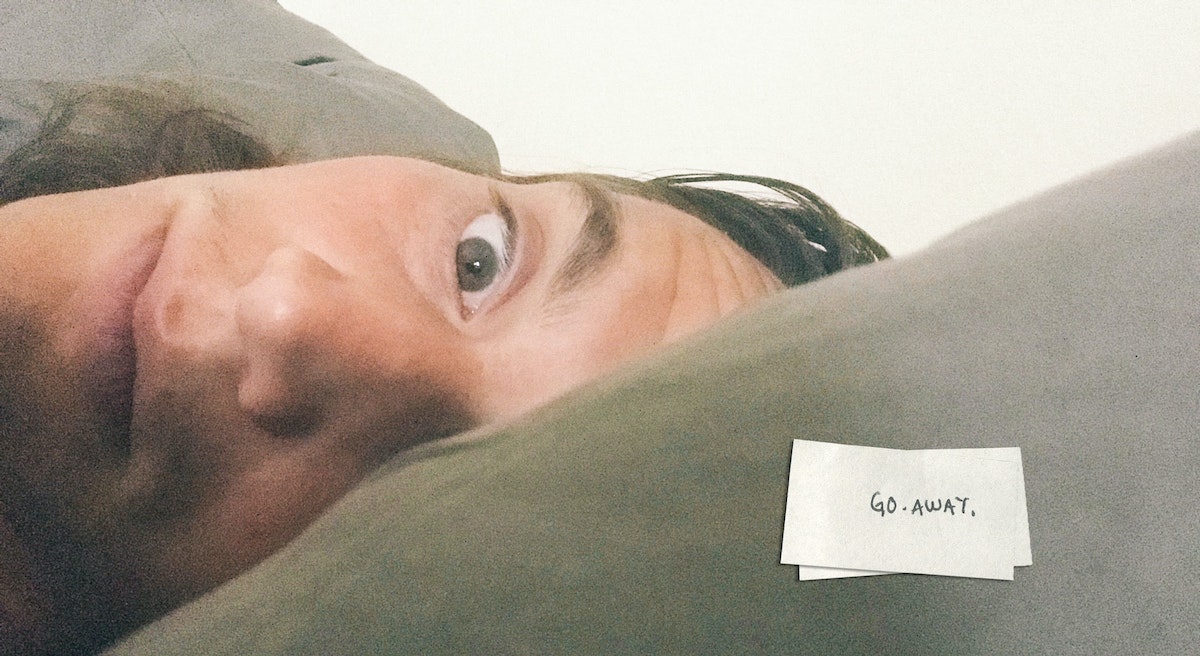
6:20 AM: Snooze
6:30 AM: Sweep
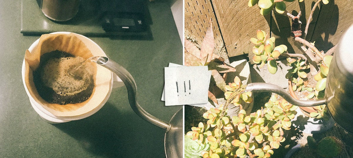
Sweep. Make the coffee, water the succulents, check out a few new product curation apps and services the team has been talking about. While riding the bus across the Bay, I read about immigration patterns and how they affect consumers in North America. Staying inspired is part of our job, so I try to start each day with a healthy dose.
9:00 AM: Birthday shenanigans
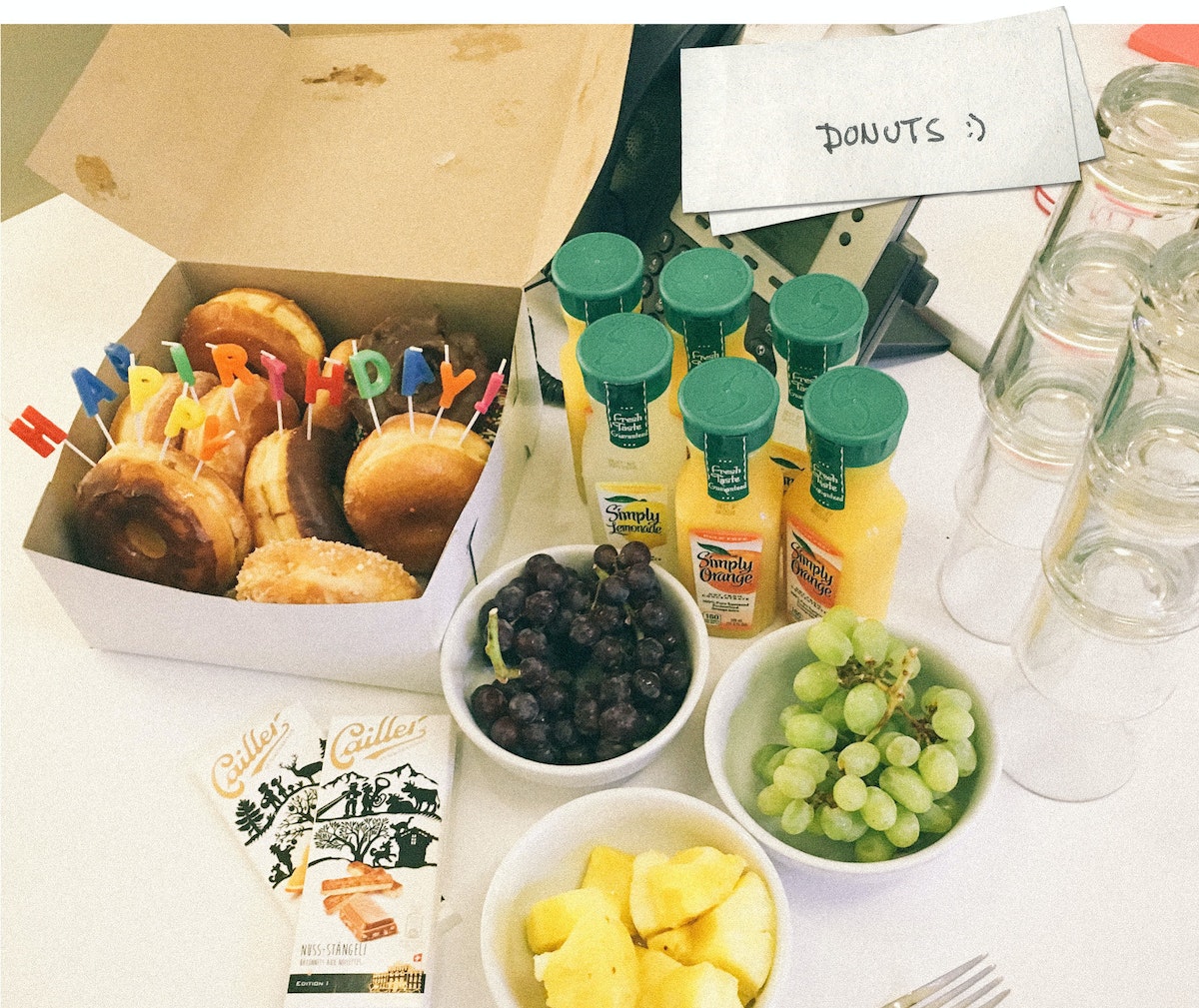
Today is my teammate Julian’s birthday, so we surprised him with donuts and orange juice—his morning elixir of choice!
9:30 AM: Sketching and 3D modeling
My team’s current project is to reimagine the shopping experience for a large retailer. To prepare for a review with the team, I do some sketching and 3D modeling of in-store display concepts. We are a diverse and interdisciplinary bunch, so it helps to bring everyone’s ideas together through visualization.

10:30 AM: Design review with the team
We do team check-ins throughout the day, talking through our ideas to make sure we’re meeting user needs and pushing the integration of digital behaviors and physical environments. Today, we’re critiquing a bunch of sketches of critical shopping moments that we’ll prototype later. We’re considering how digital projection can add ambient information and subtle interaction to a physical display layout.
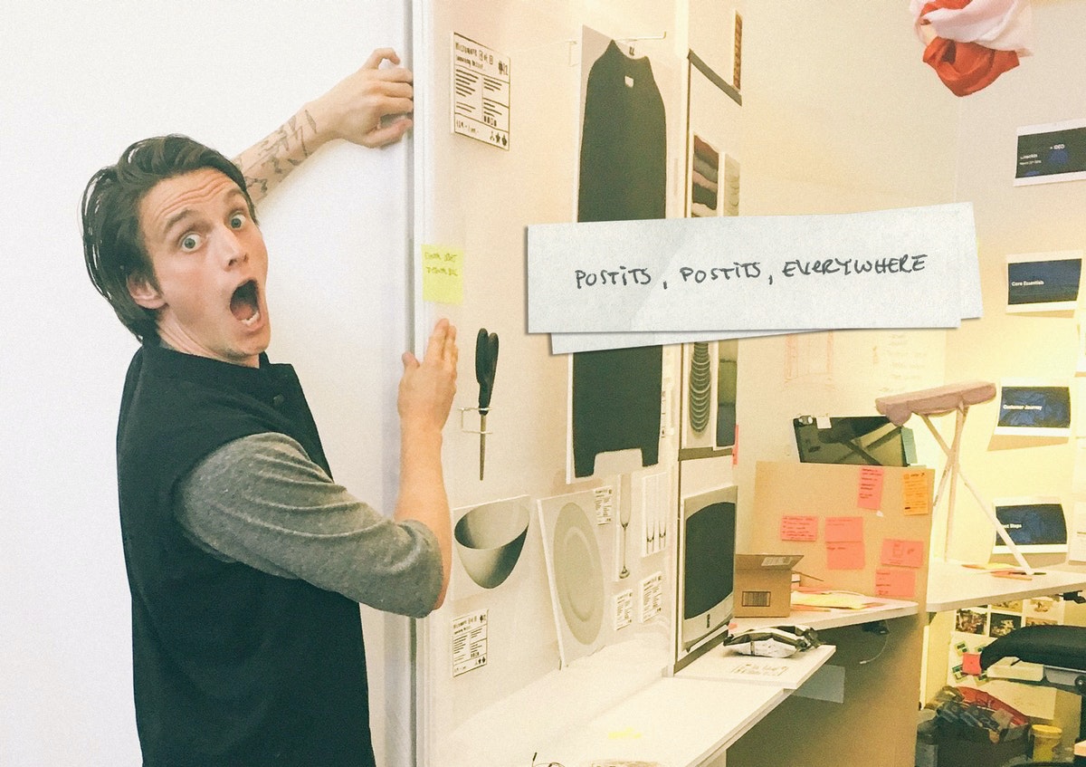
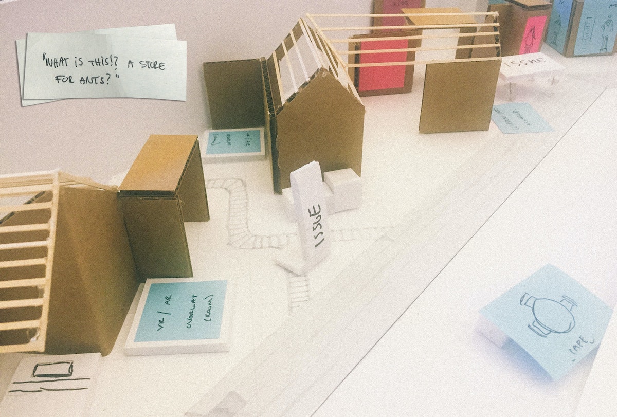
11:30 AM: Creating a physical study model
In preparation for our prototyping session in the IDEO Shop, we use a rough physical model to map out the experience of the future retail environment. A small-scale model lets us discuss all the ways shoppers might interact with a brick and mortar store—from browsing to comparison shopping, saving for later or checking out and having things shipped home. It’s helpful to keep our work quick and dirty, so that we have a model that lets the entire team walk through design points together.
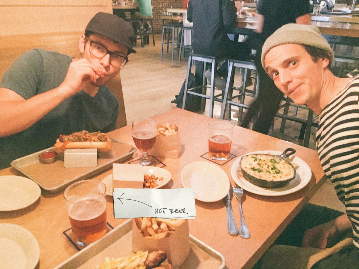
12:00 PM: Julian’s birthday lunch
Continuing the festivities, we pop out of the office to get a bite of Scandinavian-inspired eats.
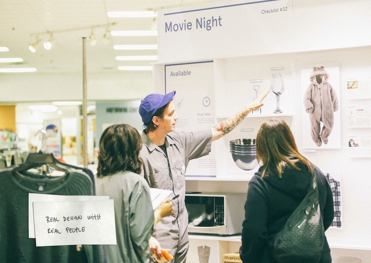
1:30 PM: Field testing and 1:1 prototyping
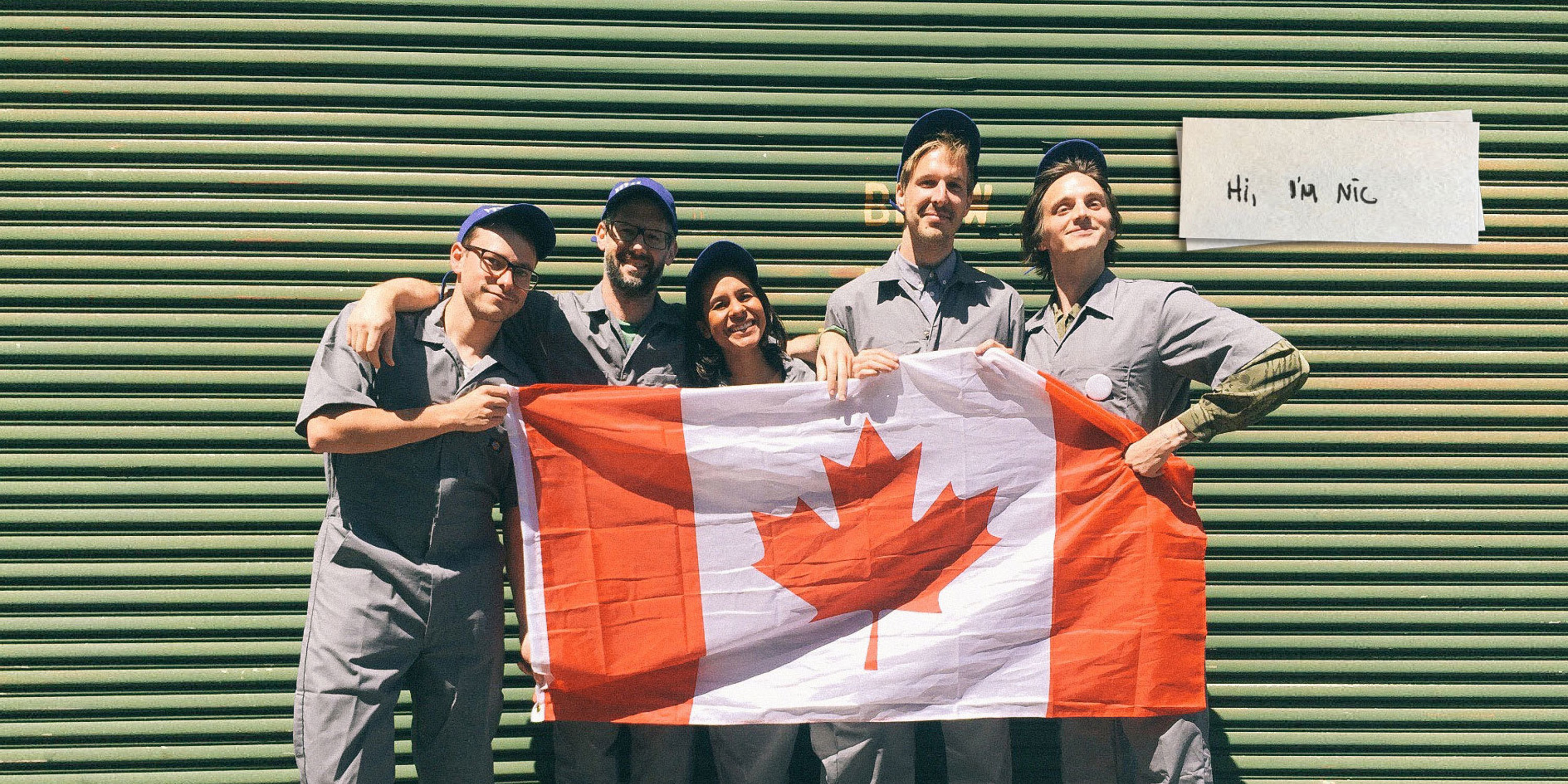
Time to refine the rough mock-up made in the office and rebuild it in a live retail environment. We wear jumpsuits to suggest how we want the client’s brand to evolve (and because jumpsuits are cool).
The prototype begins outside the store with a simulated mobile shopping experience that ushers shoppers directly to our redesigned displays. The point of the prototype is to test a store layout that could feel like an extension of a mobile shopping experience. Think curated themes, minimal options, and intuitive product comparison interactions. Turns out, some things they hate, some things they love, and a few things don’t make sense to them at all! All of that is great feedback for moving forward, by the rock-and-roll rules of prototyping. Achieving a realistic level of physical interaction while keeping the design at a prototypical level is key to getting honest feedback. We draw our insights from watching how users interact with the space, as well as their answers to directed prompts.
7:30 PM: Teach
My nightcap is heading to California College of the Arts, where I teach a class about physical space and digital interaction titled “Objects & Space.” We work with sensors, hack projectors, control motors, glue, and foamcore, and build our way through code, all in the spirit of figuring out what the environments designers of tomorrow might do.

When people ask me what I do for a living, I say, “I use space to explore design solutions.” It might sound like I work for NASA, but what we environments designers actually do is consider how physical space influences human behavior. Much of my time is spent sketching, making models, building walls out of foamcore, miming, turning off the lights, rendering, and doing my best to break feng shui. Here's a breakdown of a typical day:

Lindsey Turner
I’m passionate about building brands, products, and experiences that help organizations show up with meaning and momentum.
I help organizations cut through complexity by shaping how they show up, through brand strategy, identity, and storytelling.
Working at the intersection of brand and business, I bring an editorial eye and a bias toward making—turning ideas into tangible experiences that people can understand, trust, and believe in.
My work spans government, healthcare, financial services, media, and consumer goods, from launching Gen Z-focused ventures to building innovation labs and reimagining legacy brands. I relish moments of ambiguity and enjoy translating across teams, perspectives, and priorities to move ideas forward.
I started my career in editorial and digital design, shaping cross-platform experiences and identity systems in publishing and agency environments. That foundation still shapes how I work today: I’m detail-oriented, collaborative, and overreliant on the Oxford comma. I hold a BFA in Visual Communication from the School of the Art Institute of Chicago.

Rachel Young
My work helps organizations see who their products aren't working for—and build the will and the tools to do something about it
For 25 years, I've asked the same question: Who does this design exclude—and what are we going to do about it?
My work spans human-centered strategy, inclusive design, and qualitative research, with clients ranging from Microsoft, Google, and Verizon to the National Science Foundation, and San Francisco Unified School District.
Before IDEO, I taught elementary school in East Palo Alto and spent a decade doing design work with social service organizations—where I learned firsthand what it costs people when systems are built without them in mind.
I am currently writing User Error, a nonfiction book about digital access and the design decisions behind it. I live in Oakland, California.

Brian Pelsoh
I lead with craft, ensuring our work is creatively excellent: rooted in deep human insight and imagination, while also grounded in the realities of business and technology.
My expertise spans brand, communication, and product design across tech, education, the arts, and social impact.
I believe great work demands both high-level vision and obsessive attention to detail, and only happens through collaboration.
I bring an inclusive, hands-on approach and a deep understanding of business, which enables me to consistently deliver excellence while always asking why.
Before joining IDEO, I worked at the brand firms Pentagram and VSA Partners. I began my career as a designer, leading teams at the School of the Art Institute of Chicago and the Milwaukee Art Museum. I hold an MFA in graphic design from Maryland Institute College of Art and a BFA in communication design from the Milwaukee Institute of Art & Design, and have taught at some of the best design schools in the US.

Tony Wong
I am responsible for IDEO’s long-term success in China and working with clients to use design as a tool to enable growth.
I am responsible for IDEO’s long-term success in China and working with clients to use design as a tool to enable growth. Specifically, I have helped Chinese companies design holistic brand solutions through the development of their products, communication, services, and innovation teams, and I have helped multinationals expand their presence and influence in China.
I advise global leaders on developing China-led innovation and capabilities.
In over 15 years in IDEO Shanghai, I have worked on projects that use design to elevate the quality of the experience of healthcare products and services, streamline processes that increase productivity, create spaces and programs that promote and enable inclusive communities, and build next generation mobility solutions that are planet-positive.
Before joining IDEO, I worked at Philips Electronics and the Electrolux Group in Italy, the Netherlands, and Singapore on a number of breakthrough commercial products. I am a member of the Young President Organization in Shanghai.

Building a personal AI for the messiness of life: Sida Li
Most AI products today are built for work—a space with clear problems and established systems. One founder noticed a gap: personal life is messier, harder to systematize, and mostly left behind by the AI boom. So she built Cue, a personal AI that lives inside iMessage and group chats, to go where the other tools haven't.
In this episode, Becca Carroll, IDEO's Chief Strategy Officer, talks with Sida Li, co-founder and CEO of Shared Context Lab, about staying anchored to a human need while the technology around her keeps changing shape, why she treats her business model with the same rigor she'd bring to a product, and what it feels like to build a company at this particular, disorienting moment in AI.
The conversation also gets into how Sida makes design decisions: the language Cue uses to describe itself, the tradeoffs behind building inside iMessage instead of a new app, and a real story about a business idea that didn’t pan out.
This is the second in a two-part series profiling founders from IDEO's Startups-in-Residence program. The first conversation is with Johannes Seemann, founder of Sooner, on designing GenAI for the emotional side of money.

Designing GenAI for the emotional side of money: Johannes Seemann
Most personal financial tools are built to run the numbers and optimize towards a budget. While that works for some, most people experience money as a lived relationship that does not neatly fit into a spreadsheet. Johannes Seemann and Becca Carroll discuss why money is emotional before it is mathematical, and what a human-centered approach to building a generative AI financial product looks like in practice.

The curious leader's edge in uncertainty: Scott Shigeoka
Mina Seetharaman talks with Scott Shigeoka, author of Seek and Head of Curiosity Cultivation at the Eames Institute, about what distinguishes genuinely curious leadership from performative curiosity, how power dynamics shape curiosity, and why practicing curiosity can restore energy rather than drain it.

How constraints make us more creative: David Epstein
Mina Seetharaman talks with David Epstein, author of Inside the Box and Range, about why total freedom often produces average work, how leaders can design useful limits on purpose, and what organizations such as General Magic and Pixar reveal about the relationship between boundaries and creativity.
Looks like you might be in search of something very specific?
Or reset the filters above and try another angle.
Here’s some random inspiration

Podcasts about creative leadership

Articles about the power of prototyping
