
.svg)



Mental health, co-designed
Kooth partners with young people to create Soluna, a mental health resource for California youth.
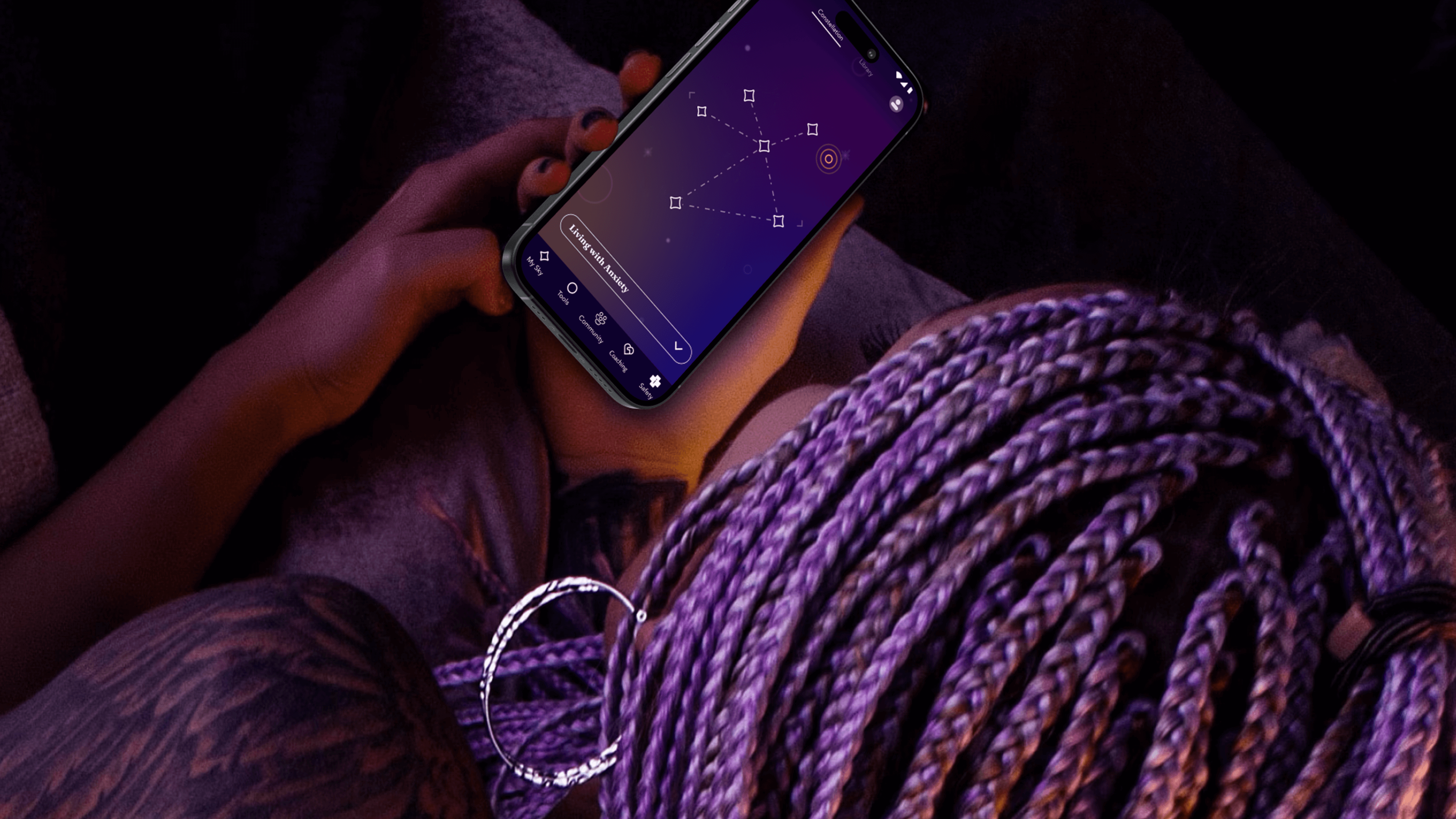
Increasingly, digital spaces are proving detrimental to youth mental health. By co-designing with youth, Kooth and IDEO set out to flip the script, creating a positive digital space for young people to safely explore their mental wellbeing.
When Kooth, IDEO, and Blackbird, IDEO’s longtime development partner, first started working on the project, the window of opportunity was narrow, and the stakes were high. The group was up against a nine-week deadline to create a working proof of concept app. Also on the line: a $188 million contract with the Department of Health Care Services (DHCS)—one that would open an entirely new line of business for Kooth.
The app needed to do more than demonstrate functionality—it needed to prove its value. To ensure that they were creating an asset that truly fit the needs of young people, the team turned to an initial cohort of 13-25 year-old co-designers who explored early features, created video diaries, and shared their questions about and experiences with mental health. These young people often gravitated toward self-service tools that helped them take action based on their feelings. With their feedback, the team created new expressions of clinically-validated behavioral health tools like journaling, breathwork and white noise—and built novel tools, such as Starboard, an expressive drawing tool and a nod to art therapy.
The team took inspiration from content the co-designers liked to consume, such as story-driven video games that enable freedom of exploration, deepened by a unifying mythology. That led them to a constellation theme, which made the experience more intriguing and playful. The co-designers also recommended a dark color palette, because they preferred exploring the app at night.
With these insights, the team refined the proof of concept, and then conducted a one-week pilot with another 50 young people across California. Their positive feedback gave the State the confidence to invest in a $188 million, four-year contract for Kooth to bring the app to a platform at scale.
Over the next year, the team engaged another 150 young people to help design, shape, and test the app. At the same time, Kooth and IDEO created a clinical oversight group, which included a pediatrician, therapists, and other clinical specialists. This group anchored the platform in the practices of Acceptance and Commitment Therapy (ACT), cultivating psychological flexibility—the mindful acceptance of positive and negative emotions. Young people are invited to complete short reflections and surveys throughout their journey with the app, which includes rigorous, science-backed measurements to assess the therapeutic benefits.
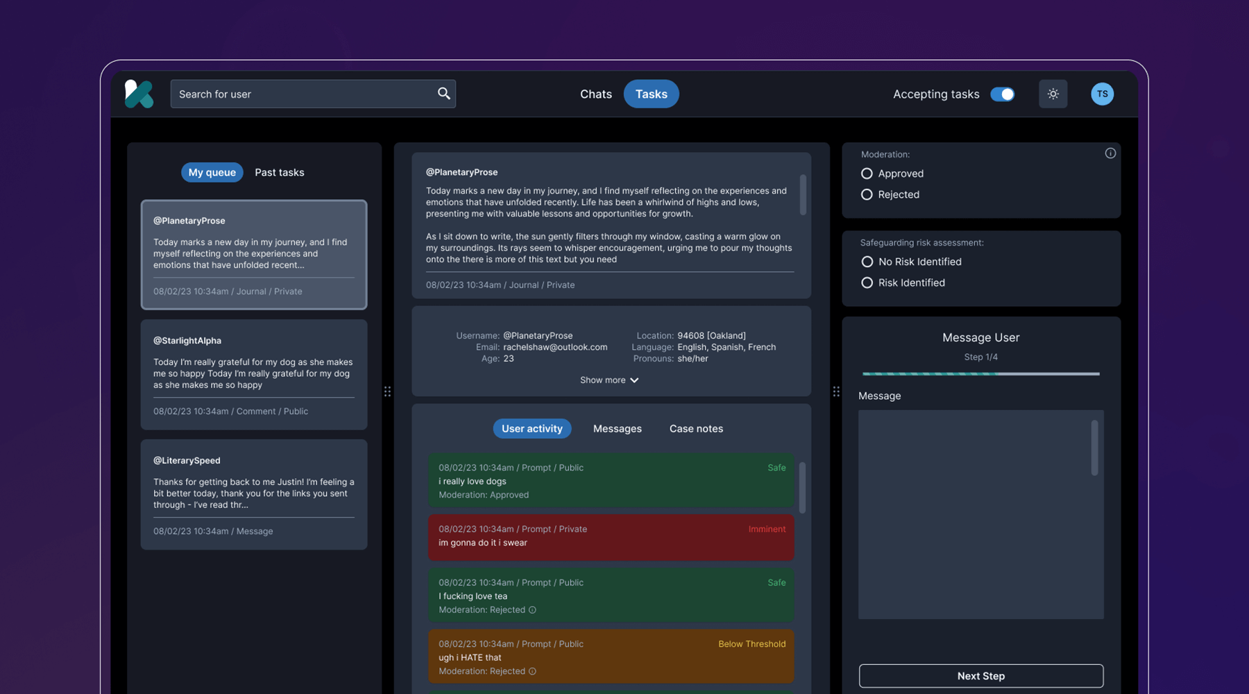
Behind the scenes, the team developed a clinical-facing service and digital platform that empowers Kooth’s peer specialists, social workers, community curators, and clinicians to support the youth experience, all while protecting privacy and confidentiality. They also navigated a complex landscape of state requirements and government legislation, ensuring that the platform could cover topics like substance abuse and gender identity, and that users could access coaching within 24 hours, and choose from a diverse set of experts.
The last step was to select a name that worked across multiple languages, trademarks, and competitor branding, and didn’t come off as a mental health service, something the youth co-designers believed was critical. IDEO and Kooth landed on Soluna, a name that alludes to the app’s presence in both the bright (“sol” for sun) and the dark times (“luna” for moon).
Now, Soluna is available for free to all youth in California, and the state has set ambitious targets for reaching all young people at scale. Soluna is a living platform that will continue to receive product and design updates for years to come, all deeply rooted in youth co-design.
The US Surgeon General named mental health “the defining public health crisis of our time,” and cited social media, online bullying, and the isolation exacerbated by the COVID-19 pandemic as major drivers that have significant negative outcomes for youth.
In California alone, more than 284,000 youth cope with major depression. 66% of kids with depression do not receive treatment. Between 2019-2020, the suicide rate for kids ages 10-18 increased by 20%.
In 2022, California Governor Gavin Newsom’s Master Plan for Kids’ Mental Health set aside $4.6 billion to increase access to mental health and substance abuse support, the largest commitment to youth mental health ever made by a state.
94%
of proof-of-concept app users would recommend the Soluna app to a friend, and believe that engaging with the app would be a positive addition to their daily/weekly routine
6 million
young people in California had access to Soluna at launch in January 2024
A more comfortable Pap smear
Teal Health creates a system for at-home cervical cancer screening.
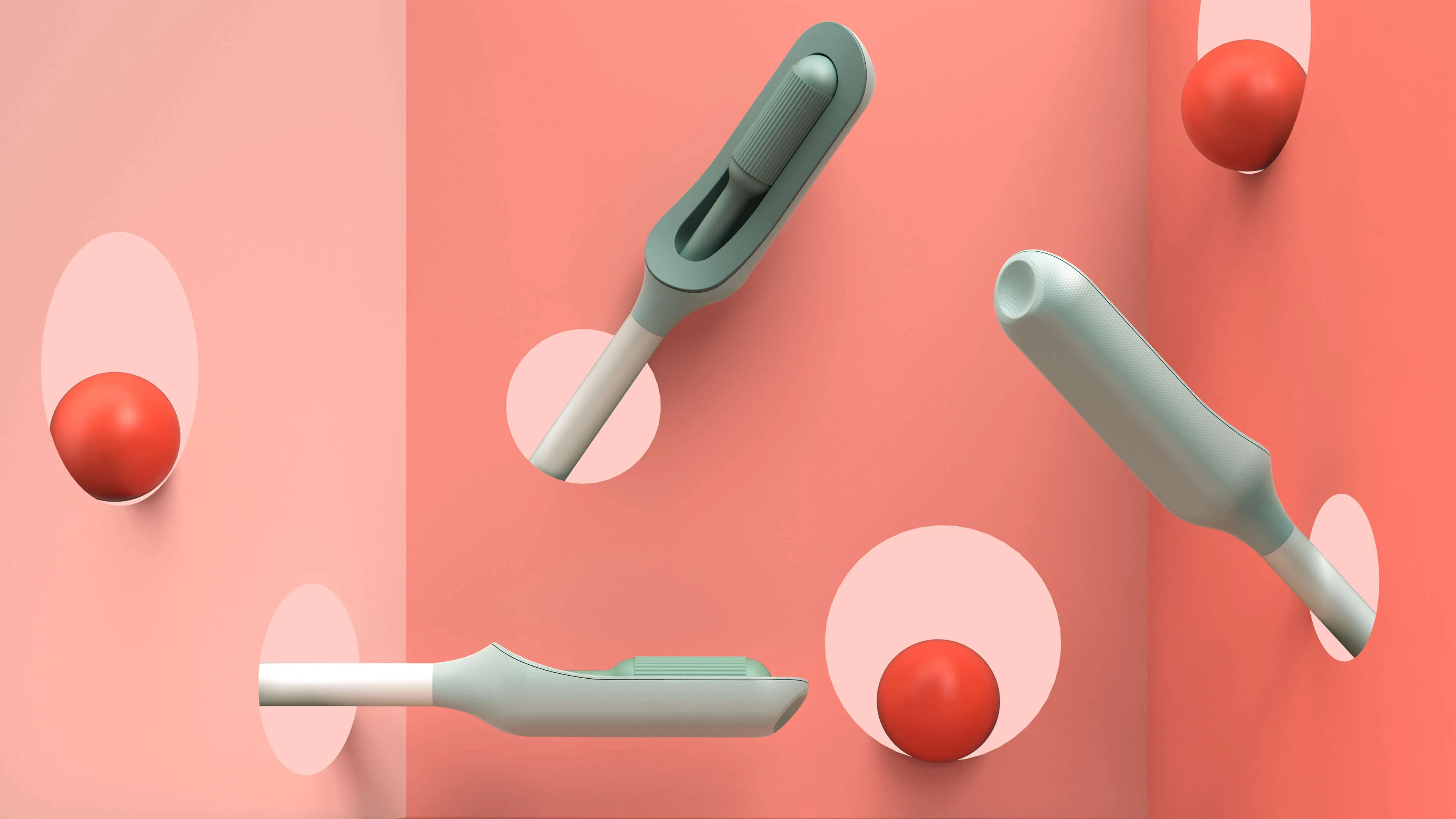
Creating a better cervical cancer screening experience is an important mission, but also a challenging one. Not only would Teal have to address the regulations that face healthcare device companies, it would also need to build a comprehensive telehealth platform and a physical product—a wand that could easily collect an adequate cell sample, even in the hands of an untrained person.
The first challenge was to create the wand. The device would need to do a lot: It’s impossible for a person to see their own cervix, so the user would have to be able to find the cervix blind, collect the sample themselves, and remove the wand from their bodies without contaminating it on other parts of their anatomy. Because this is something users are likely to do in their bathrooms, where there is no space to lie down, they would need to be able to use the device while standing—and with one hand. From the beginning, the IDEO team set out to design functional, testable prototypes to make sure the idea was viable, and incorporate diverse voices into the research process, including trans, minority, and disabled women.
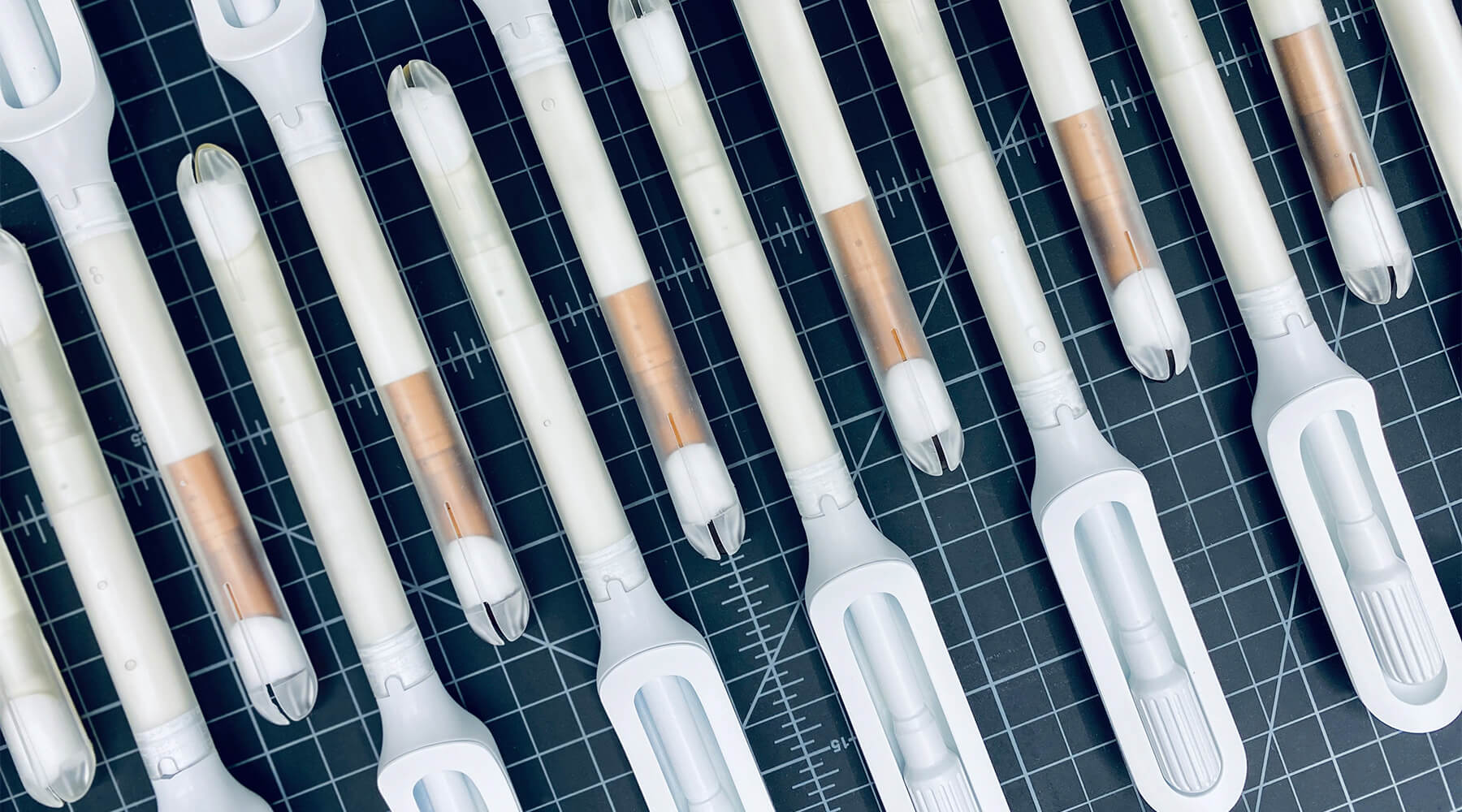
Because the product is meant for people who aren’t medical professionals, the team worked to design something as simple, intuitive, and unintimidating as possible. They used a 3-D printer to create multiples of every prototype, autoclaves to make sure that the designs they were creating were sterile, and leaned into shapes women are already used to, like the cylindrical shape of a tampon. The wand they created has that same basic form, but with a soft sponge that the user can deploy with the turn of a dial to collect the sample, then close to protect it from contamination on the way out of the body.
With working prototypes in hand, Teal set out to test their efficacy. In an initial study with 220 participants varying in age, race, socioeconomic status, and geography, Teal found that not only were participants able to successfully self-collect samples, they also preferred them over the speculum, the device doctors typically use during a screening. Some 92 percent said if they knew the results were equal they would prefer self-collection, while 87 percent reported they would stay current with screening if Teal Wand was an option. Self-collection took the vast majority under two minutes to complete, and 97% of study participants reported it was very easy or easy to use. The Teal Wand recently received a patent for its unique design.
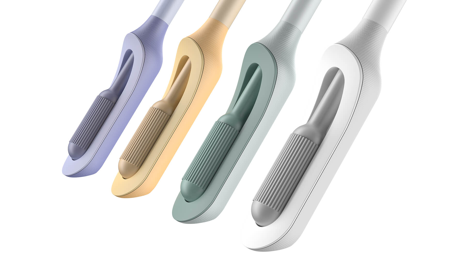
The IDEO team also worked on the packaging and unboxing experience, which plays an important role in supporting the user through the self-screening process. The team built in thoughtful design cues to give users reassurance that they are using the wand correctly, and to provide the same level of confidence they would have in the results of an in-clinic screening.
In January 2023, Teal raised an $8.8 million seed round from Serena Ventures, Emerson Collective, and Metrodora, and later that year, launched a nationwide clinical trial with leading health organizations including Johns Hopkins University, Yale University, the University of Colorado, Washington University, and others. In 2025, The Teal Wand became the first FDA-authorized device for at-home cervical cancer screening, with virtual medical provider support. Today, it's available in all 50 states. i’s an enormous step toward its North Star: catching cervical cancer earlier and saving lives.
Cervical cancer is nearly 100% preventable when it’s caught early, yet one in four women in the US are not up to date on their screenings.
More than 12,000 people in the US are being diagnosed with cervical cancer every year, and more than 4,000 people die of the disease, which disproportionately impacts Black, Asian, and Hispanic women.
More than half of cervical cancer cases are found in women that are not up-to-date on their screenings.
97%
of clinical study participants said the Teal Wand was very easy or easy to use.
87%
of participants said they would be more likely to stay current with screening guidelines if Teal Wand was an option.
94%
of participants said they would choose to collect their own sample from home rather than the current standard of care where a clinician collects it in-office.
2025
The Teal Wand becomes the first FDA authorized device for at-home cervical cancer screening, with virtual medical provider support.

Amplifying a movement
Cities United rebrands to create safe, healthy, hopeful communities for Black men and boys.
Cities United already had a strong foundation with its stated mission, vision, and values. IDEO brought those to life with a new visual and verbal brand identity system that celebrates Cities United’s inclusive approach to building relationships and reimagining public safety.
To help Cities United with its verbal identity, the IDEO team defined the organization's voice, tone, and key messages, making it easier to tell its story more consistently and clearly, a crucial step toward engaging stakeholders.
To define the new visual identity, the team created a new logo, a letter C composed of interwoven shapes that represent the three tenets of their vision—“safe, happy, and hopeful;” a new design language that references city grids; and a typographic system anchored by the typeface VTC DuBois, inspired by W.E.B. DuBois’s own custom lettering and designed by the Black-owned Vocal Type Co. The team also designed a color palette that embodies the textures of city life with hues reminiscent of asphalt, sunrise, and brick.
To amplify the refreshed branding, the team designed a new responsive website, citiesunited.org. The intuitive site shares the organization’s mission, resources, ongoing projects, and partner network, inviting stakeholders to join in their transformative work. IDEO also created a video to humanize Cities United’s mission and showcase its nationwide impact. It underscores the unity, resilience, and hope embodied by the organization through a chorus of voices.
This comprehensive rebranding widens Cities United’s reach and impact, helping the organization share its goal of creating safe, healthy, hopeful communities for young Black men, boys, and their families, and reintroduces the organization to a national audience.
The Cities United work was supported by IDEO’s Racial Justice Impact Fund, part of a commitment IDEO made in 2020 to address systemic racism and advance equity within our own organization, our client work, and beyond.
Cities United is committed to reducing the epidemic of homicides and shootings among young Black men and boys ages 14-to-24 by 50%.
Between 2009 and 2019, the number of Black children who “did not go to school at least one day in the past month because they felt unsafe at school or on their way to or from school” increased by 84%, according to Cities United.
Homicide is the leading cause of death for Black men and boys from birth to age 44, according to the Centers for Disease Control and Prevention.
2023 SF Design Week Award
In recognition of IDEO’s brand work with Citizens United

Balancing work and sleep
Somni’s personalized sleep program helps workers maintain their health.
Sleep is a critical resource for shift workers—and their employers, too. Together, IDEO and Somni worked directly with people with acute and chronic sleep challenges to create concepts that could support their sleep goals, and provide employers with the means to improve employee health.
When IDEO and Somni first partnered, the startup was an early-stage company, so the team started small, with focused sprints and workshops to redesign the core aspects of the company and product offerings. The team interviewed shift workers about their sleep patterns, which can vary quite a bit. Even when people keep to a specific schedule on work days, they often have to change their patterns on days off to spend time with family and friends, leading to a very disruptive sleep cycle. Research revealed that many third shift workers were dealing with sleep and health issues, but also a pervasive “machismo” culture, pressure to “tough it out,” and a reliance on energy drinks to deal with lack of sleep.
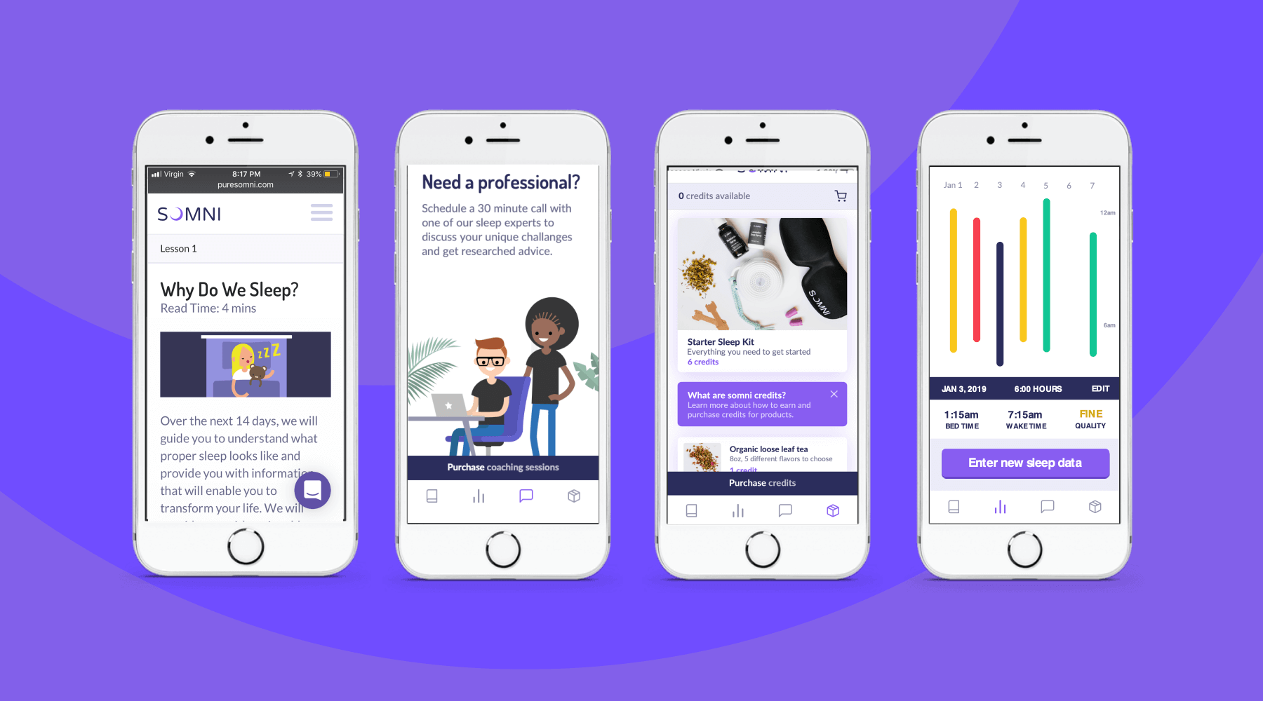
To address those issues, the team designed a digital experience for sleep cohorts, support groups where members could share their experiences and sleep strategies, and work with a coach and sponsor who already had been through the program. The platform analyzed workers’ data, and provided AI-enabled recommendations for improving their sleep. The big takeaway? Data by itself wasn’t necessarily helpful, and could be confusing for folks who were less digitally-fluent. Providing context, like a calendar that displayed sleep experiments at a glance, was crucial.
The IDEO team also created a new user experience for a genetic testing program that could uncover factors associated with sleep issues. Somni aims to use a saliva-based genetic test to monitor for DNA damage caused by circadian disruption, then leverage its sleep improvement program to prevent further damage. Because biomarker testing is a differentiating offer for Somni, it was extremely important that the team get it right, both to make sure that users could understand its utility, and for Somni to provide real value. The design challenge was unique—and not just because of data privacy concerns. Presenting data about DNA damage in a non-human-centered way could increase the anxiety workers had around their sleep.
At the end of the project, Somni leveraged the insights the IDEO team surfaced to improve products like its sleep coaching service, and to refine its biomarker testing offering. Based on this work, Somni has also created a pilot with a Fortune 100 company, which is currently in progress, as it works to mitigate the ill effects of disrupted sleep for employees and the companies they work for.
In the short-term, circadian rhythm disruption leads to an array of jet-lag-like symptoms, and in the long-run, it may contribute to weight gain, obesity, metabolic syndrome, type 2 diabetes, and cardiovascular disease.
It also impairs people’s ability to work, affecting productivity, creativity, and the overall work environment. Productivity loss can lead to employer baseline healthcare costs that are 26% higher, and over time, insomnia can result in an average cost of $4,267 more per employee per year.
In June 2019, the International Agency for Research on Cancer classified shift work as a probable carcinogen.
75%
user retention in Somni's sleep program
$2,450
savings per year per employee for users who complete the program
33%
improvement in sleep quality, and 41 more minutes per night

Save the City, Stop the Muenster
To celebrate the discovery of the double-helix, IDEO & Genentech bring genetics to life with an iPad game inviting the curious to save SF from mutant cheese
Sixty years later, amidst technological advances that have spurred massive innovation and changed the face of science, we decided it was time to re-inspire today’s generation. James Musick, a digital communications lead at Genentech, came to us for help in creating an immersive iPad experience that would celebrate Watson and Crick’s seminal discovery, as well as engage the science-curious. But with three months to complete the project, we needed to hit the ground running.
Ralph and The Cheesy Mess
The idea of using a game or puzzle as a way to bring users into a world filled with genetics became an early favorite in the ideation stage. Puzzle-based gameplay was a great analogy to reflect the scientific process: from trial-and-error learning stages, to information synthesis, all the way through solving the puzzle and answering the question. A game hinging on a real-life genetic mechanic would be novel and stood to introduce the science to a new audience. If designed well, with engaging play and a compelling story, we would be able to integrate the science, narrative, and gameplay into a beautiful app.
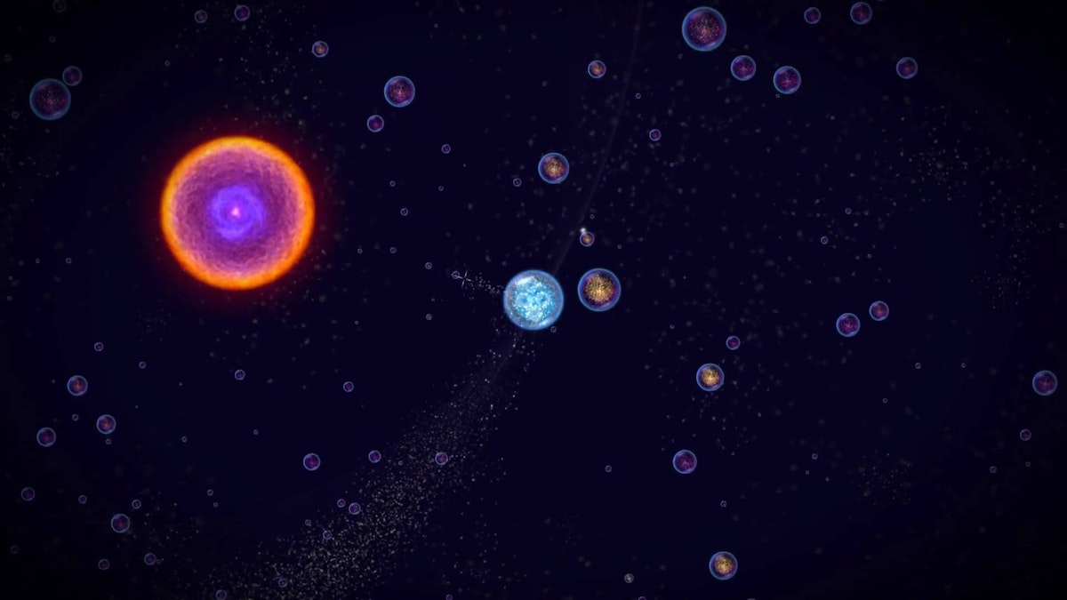
We started off diving deep into the world of video games. We indulged in playing some of our tried-and-true favorites, as well as newer games such as Osmos and Eufloria to understand how they bridged science and storytelling. At the same time, we were learning about cutting-edge research in genetics through conversations with Jason Long and other Genentech scientists, listening to podcasts, and a hefty amount of reading.
Throughout this inspiration phase, we kept coming back to a wildly intriguing area of research called epigenetics, which focuses on how environments affect genetic expression. In short, epigenetics is the area of genetics that, given a fixed DNA makeup, tells the DNA which parts of the code should express themselves and how they should express themselves as determined by external factors like weather, stress, diet, etc. So while we may have a fixed genetic makeup, the environment still plays a large modulating factor in our genetic expression.
Our fascination with the content—combined with a teamwide love of comic books and mutant-origin stories—evolved into an epigenetic-inspired noir-puzzle game based on Ralph, an artisanal cheese-maker, and his cheese company Ralph's Killer Muenster.
The mechanisms of genetics
Early on in the ideation phase, Evan Shapiro, who would become a core team member and help prototype game logic, introduced us to phylogenetic trees and maximum parsimony theory. You’ve probably encountered phylogenetic trees in biology class, where they serve to illustrate evolutionary relationships among species. Maximum parsimony, on the other hand, is more obscure. It serves as a computational forensic tool to help us understand the evolution of genetic traits along the phylogenetic tree, as well as help us infer species evolution. With maximum parsimony, the “preferred phylogenetic tree is the tree that supposes the least evolutionary change to explain observed data.” After mulling that over for a bit, we decided creating and solving a phylogenetic puzzle by employing maximum parsimony as a scoring criteria was a great jumping-off point and a compelling challenge.
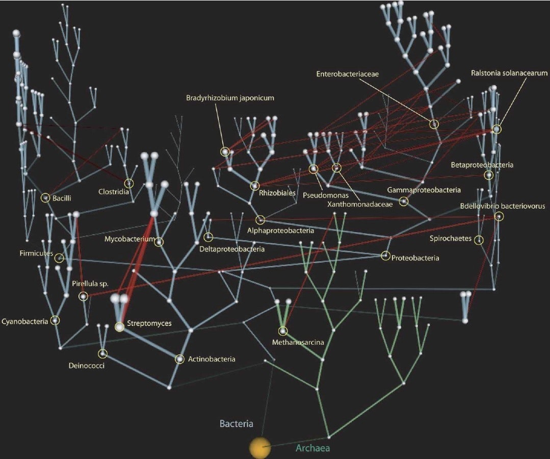
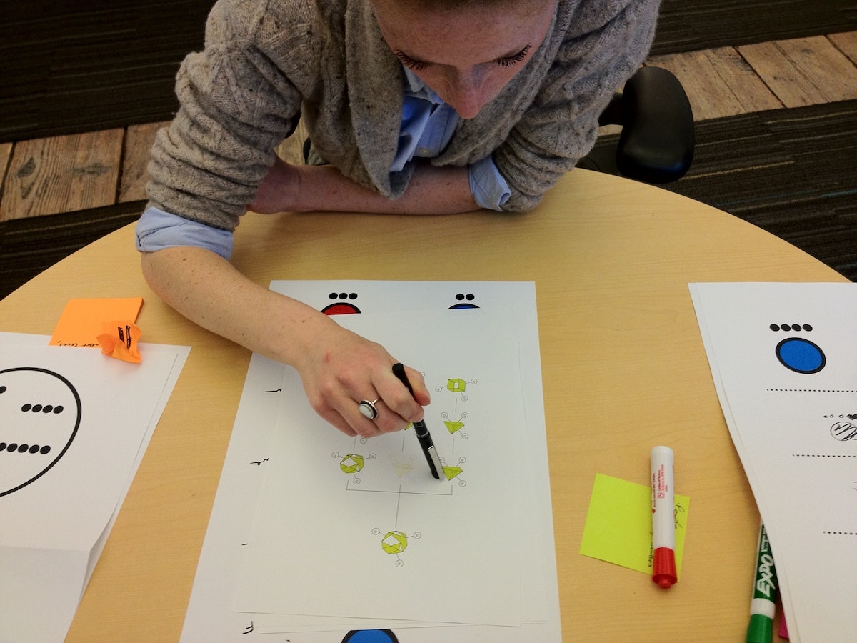
To test this, our first prototype was a paper prototype where we started with a sample origin genetic trait. We sketched out several generations by mutating one trait at a time, and created our own phylogenetic tree. Given the final generation of traits and no tree structure, the goal was to see if we could work backwards to recreate the tree structure and uncover the origin trait. Basically, reverse evolution. After a lot of finessing we came up with a rule set that actually reflected natural evolutionary rules and allowed us to solve the tree and find the origin species.

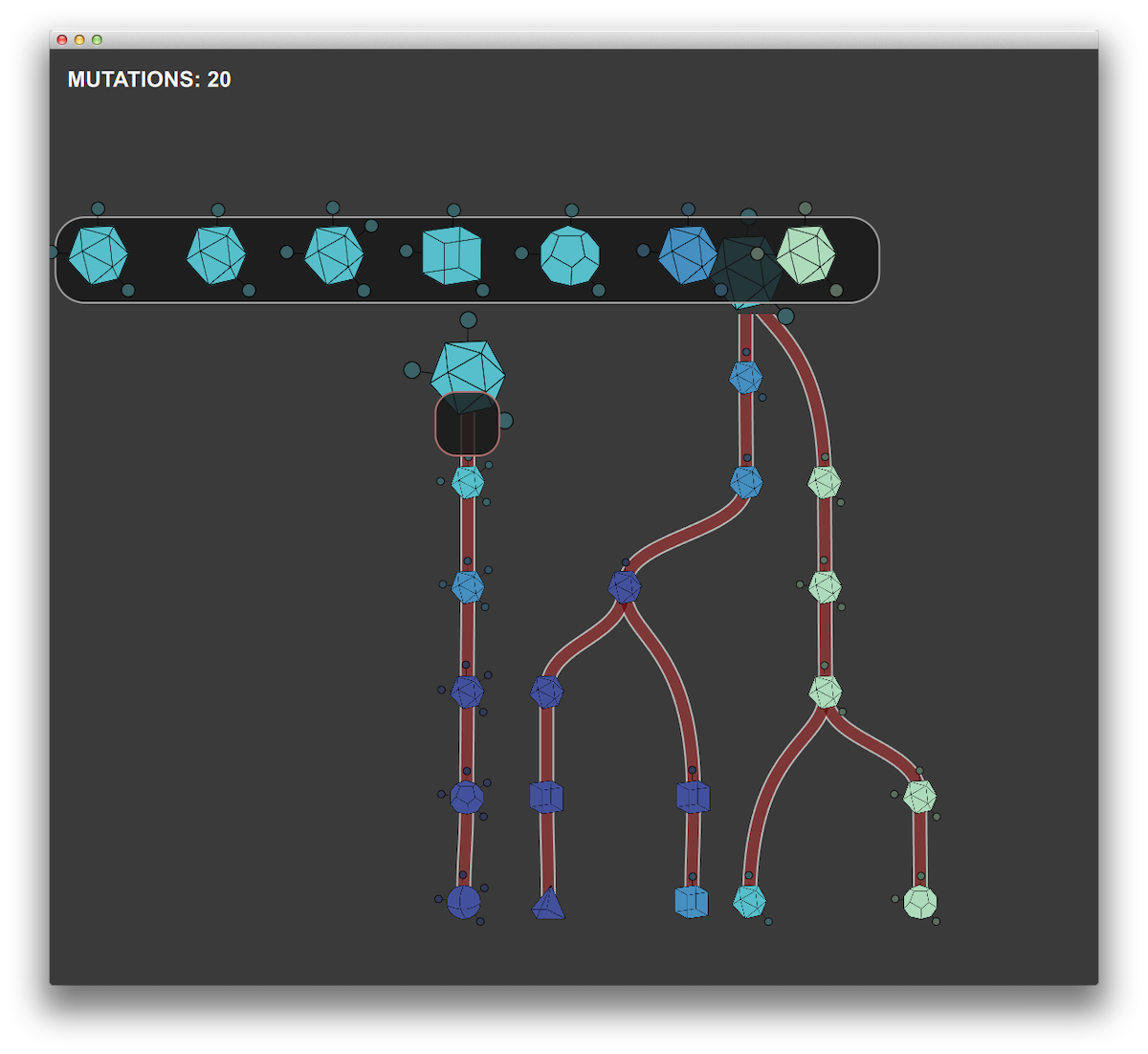
With this excitement, we spent a weekend programming a single prototype puzzle using mechanics that would become the main gameplay: players reverse engineer evolution by mutating a given set of species traits backwards to a common ancestor in the fewest moves possible. This was maximum parsimony made tangible. In order for the puzzles to be solvable, we had to use real evolutionary rules describing how the species’ traits can change. By the end of the weekend, we had puzzles and a game mechanic that were keeping us up late into the night trying to one-up each other’s scores, which, to us, meant we had hit the nail on the head.
From a design perspective, one of the significant balancing acts of the project involved weighing the desire to impart specific scientific knowledge against the value of experiential learning. When we used maximum parsimony it became clear that this was a perfect mechanic to give people an experiential interaction with real genetics.
Prototyping and puzzle design
From day one, Ralph’s Killer Muenster was an intensive prototyping project. The first bare-bones prototype of the puzzle was written in Qt because we wanted a framework in which we could rapidly prototype the GUI and could reuse game logic for the production app. Qt, although not extensively used, has great functionality and plays natively with Javascript and C++. It was a well-suited framework for prototyping the core puzzle experience, which included coding the evolutionary logic, adding and testing interactions, modifying visual communication, and testing informational displays.
Our daily workflow started with an early morning meeting so we could all share progress from the previous day. We spent the rest of the day implementing and testing new visuals and interactions on paper and integrating them into the Qt prototype architecture. Lastly, we tested them with people around IDEO to see how they reacted to specific design and gameplay decisions.
We used Unity for the production app in the development environment for many of the same reasons that we chose Qt. But Unity has the added benefit of working with native OpenGL, along with the capability to compile to iOS. As time-constrained as this project was, we still wanted to impart as much narrative and visual interest as possible, and Unity proved an excellent match for this challenge.
Nivi Ramesh, our interaction designer and art director, worked to create an amazing game landscape with analogies to microscopy and slide specimens. Working closely with developers at Substantial, we created layered and animated textures paired with OpenGL shaders to achieve the tone we wanted. We had parallel work streams throughout the prototyping phase, with one team working on developing the logic and overarching architecture of the production app while the prototyping team refined interaction elements, game mechanics, and informational displays in the prototype testbed.
What makes a good puzzle?
Before diving any further, we took a step back to make sure we got the puzzles right. Good puzzle games tend to adhere to some basic principles: They are purely cognitive challenges with a few simple rules, nearly infinite outcomes, difficulty that increases with mastery, and some clear goals. Plus, they're easy to learn.
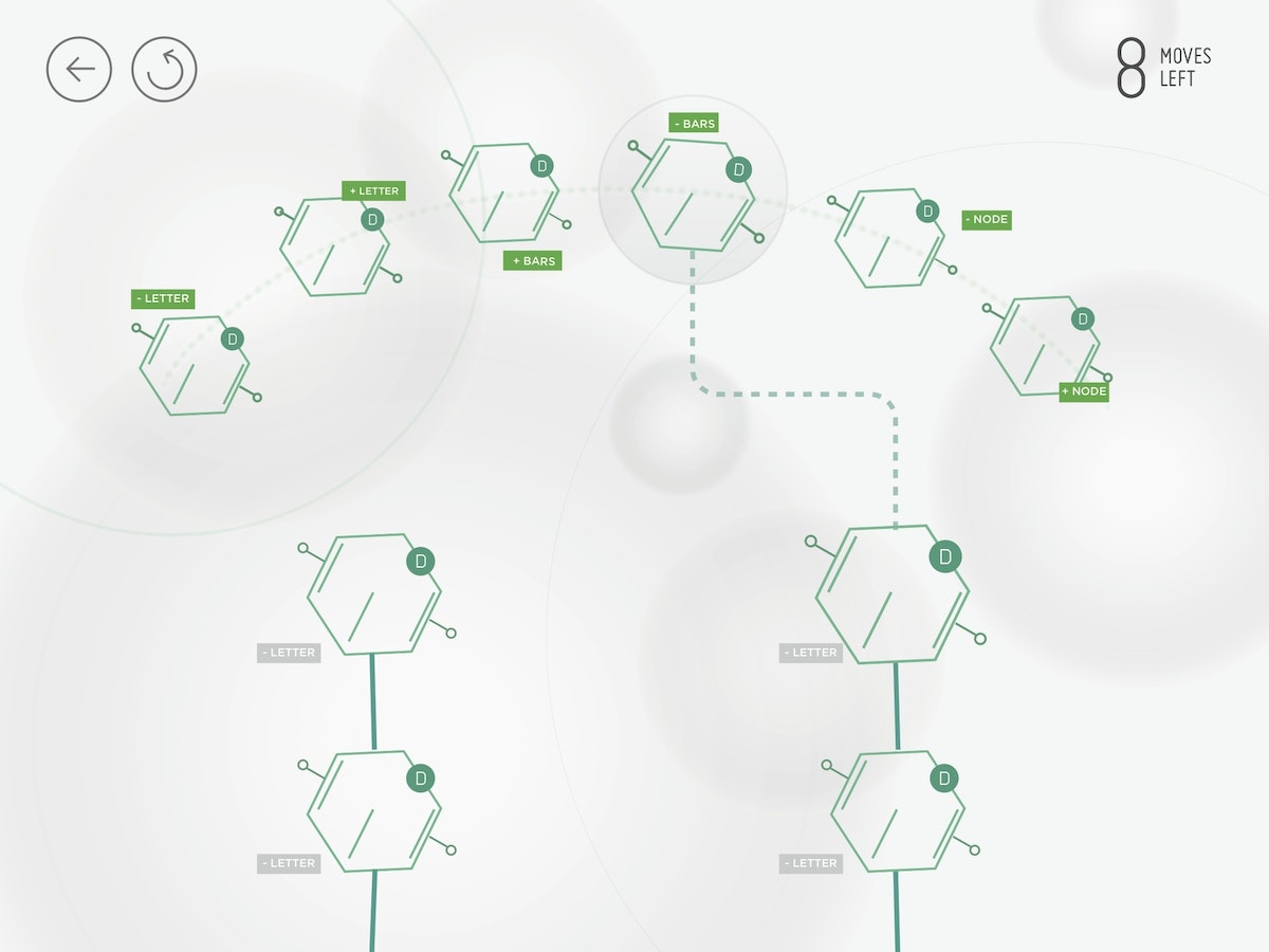
In building the game, one of our most critical challenges was creating visual representations of the genetic traits that people would be using to solve the puzzles. People had to quickly grasp how they could manipulate and evolve the traits given the genetic logic. If we couldn't get people to make this mental leap, the game wasn't going to succeed.

A real genetic trait is made up of a snippet of DNA and is a long, winding series of genetic code (or, a lot of AGTC). To make the game approachable, we chose to abstract and simplify the cheese trait representations as visual identifiers that had a bit of mystery and were themselves a puzzle to decode. We tested many different ways of visually representing the traits, the majority of which people could not directly connect to an increasing or decreasing series. The simplest visuals turned out to be the most effective: shapes, dots, and lines.
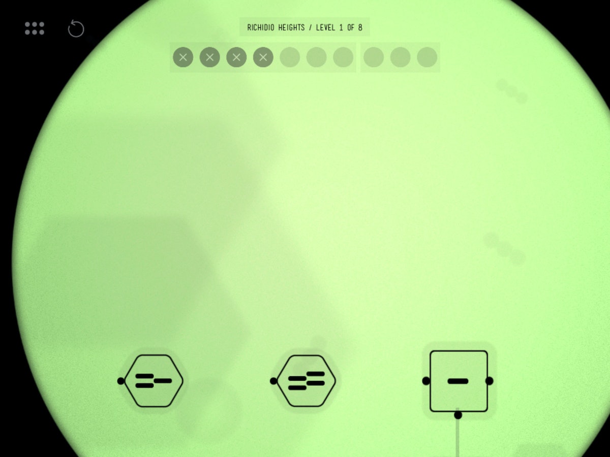
With simple geometric shapes, people could see that moving from a triangle to a square to a hexagon involved moving through a progression of increasing the numbers of sides. Similarly, lines and dots worked well for understanding how the traits could be mutated. They were easily accessible by players in planning a strategy for mutation.
Less is more
After the weekend of playing the prototype level, we needed a way to determine the optimal solution to these puzzles so that we could give user feedback and help players improve in the game. With Ralph's Killer Muenster, an optimal solution for any puzzle involves making the “most parsimonious” decisions, i.e. using the least number of moves or fewest mutations. We needed to find a way to reward people for doing less, contrary to typical game design where users are rewarded for doing more. Without a clear and appropriate qualitative feedback mechanism, we found that people were finishing puzzles without any sense for how much better they could perform.
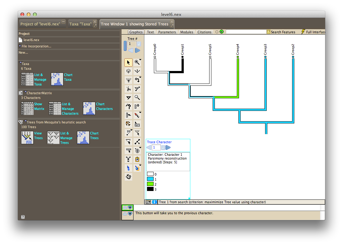
Scavenging the Internet for a tool to analyze phylogenetic trees uncovered Mesquite, a software package built specifically for computational biology and evolutionary analysis. After learning from tutorials produced by Harvard University, we could solve the initial species sets and puzzles we had created, and arrive at the most efficient tree structure and trait mutations.
We used the statistical language R to generate thousands of possible levels, export files for Mesquite to crunch, and output the moves required for each level into a custom level file that we could use to test in our prototype game.
Levels testing and design progressed in parallel with refining the scoring display and making hundreds of other visual and UX enhancements. With our trait visualizations, levels design and scoring mechanism solved, we felt we had achieved something that was both subtle and significant: People who grasped the underlying puzzle dynamics were quite literally using their brains in a way that mimics a core methodology of genetic science. This seemed to hit at the essence of experiential learning.
Muenster launches, Bill Nye approves
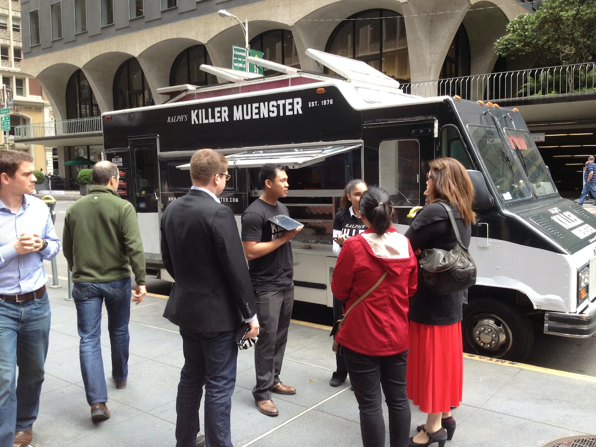
The Ralph's Killer Muenster iPad game launched at the 2013 GET (Genomics, Environments and Traits) conference, coinciding with the anniversary of Watson and Crick's seminal paper describing the structure of DNA. At the conference, Bill Nye the Science Guy, a long-time advocate of a science literate society, played the game, and loved it. This made our day. The app also caught Apple's attention, and was listed as a new and noteworthy Education app in the App Store.
To further raise awareness around the game, we created a Ralph's Killer Muenster brand, including a visual identity, packaging, website, Twitter, game trailer, and food truck—all mobilized by Ralph to push the only tool that could save the city (and his reputation) and allow him to lift the health code violations that kept him from producing and distributing cheese. Ralph’s food truck, sent throughout San Francisco, distributed grilled muenster cheese sandwiches.
What we learned
After the launch festivities, our team took a step back to consider what we had learned. Here's the take-away:
- Set constraints to help make a hard problem more approachable. Our self-imposed constraint that the game needed to rely on a scientific mechanism helped us narrow in on phylogenetic trees and maximum parsimony as our core concepts.
- A good story goes a long way. We spent significant time concocting Ralph's story, and getting the tone and art direction down in order to engage people. We want them to stick around for the more mentally taxing interactions later down the line.
- Find the right tool for the right job. We used a variety of prototyping and user testing methods and environments, rather than trying to find or force an all-in-one. Each tool elicited learnings unique to them.
1953 was a good year for science and technology. The polio vaccine was developed, the first open heart surgery performed, and color TVs hit the store shelves. It was also the year Watson and Crick revealed one of the most important discoveries of the 20th century: the double-helix structure of DNA.
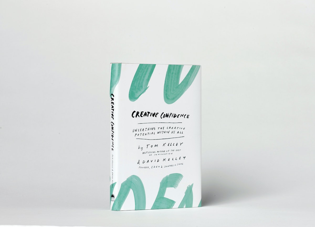
Creative Confidence
David Kelley, IDEO founder and Stanford d.school creator, and his brother Tom Kelley, IDEO partner and the author of the best-selling The Art of Innovation, have written a powerful and compelling book on unleashing the creativity that lies within each and every one of us.
David Kelley, IDEO founder and Stanford d.school creator, and his brother Tom Kelley, IDEO partner and the author of the best-selling The Art of Innovation, have written a powerful and compelling book on unleashing the creativity that lies within each and every one of us.
WATCH: David Kelley's TED Talk: How to build your creative confidence.
Too often, companies and individuals assume that creativity and innovation are the domain of the “creative types.” But two of the leading experts in innovation, design, and creativity on the planet, David and Tom Kelley, show us that everyone is creative.
In an incredibly entertaining and inspiring narrative that draws on countless stories from their work at IDEO and with many of the world’s top companies, David and Tom Kelley identify the principles and strategies that will allow us to tap into our creative potential in our work and personal lives, and innovatively approach and solve problems. It is a book that will help each of us be more productive and successful in our lives and in our careers.
Learn more at CreativeConfidence.com.
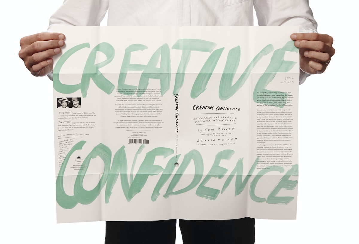
Purchase
Know someone who might love this book? Here are some options for purchasing Creative Confidence (Crown Business, 2013):
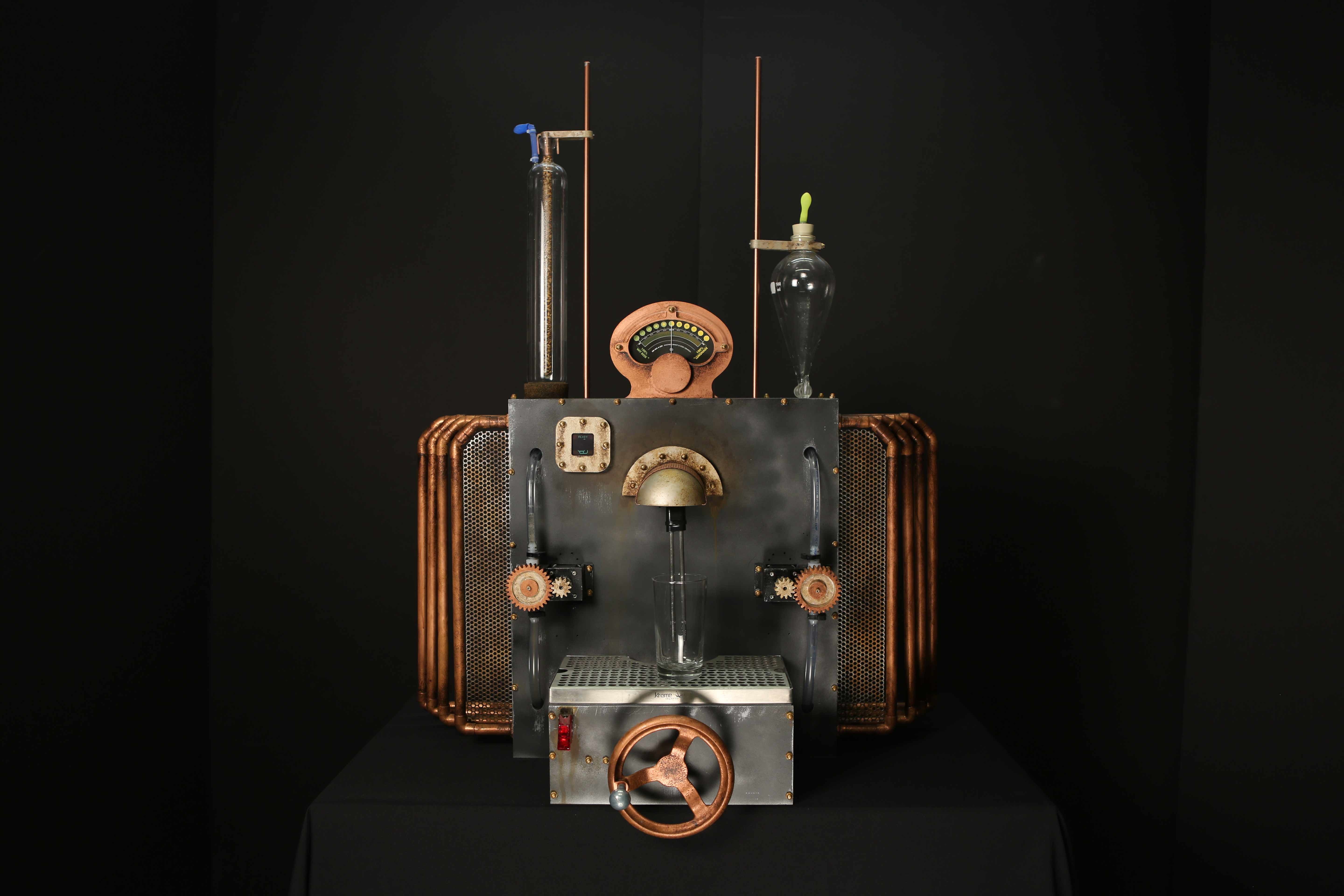
The Mix Master 2000: How to build an automated shandy machine
Creating the perfect beer-lemonade ratio—on your own terms.
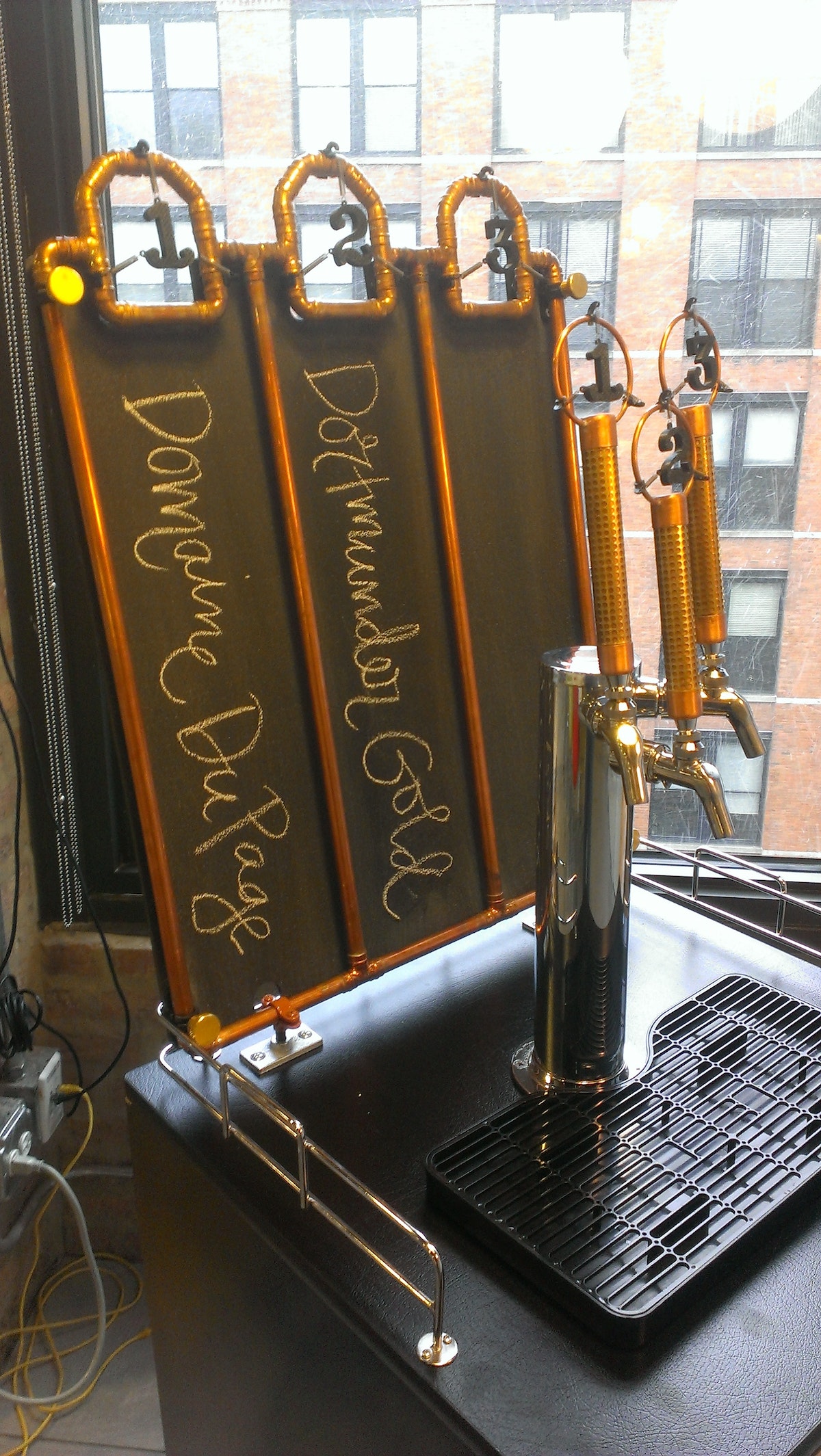
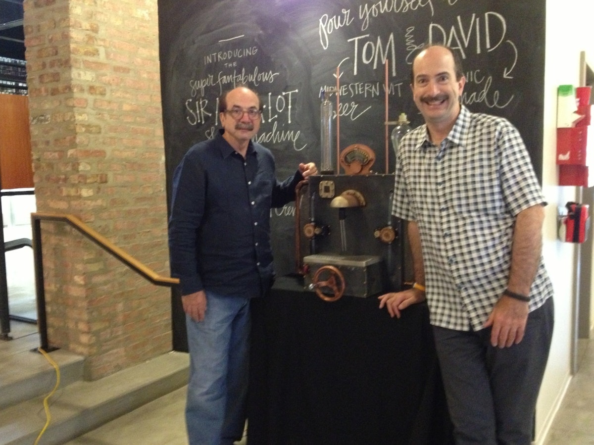
When we were asked to whip up a special brew this July for a big Creative Confidence book-preview event featuring David Kelley, one of IDEO’s founders, and his brother, best-selling author Tom Kelley, we knew we had to kick things up a notch.
Challenge #1: Two guests of honor called for not one brew, but two! We heard Tom enjoys light, Japanese-style beers and that David doesn’t really drink, so we decided to make a Belgian-style wit for Tom and sparkling organic lemonade for David and then mix them together to create a shandy, a refreshing summer drink.
Challenge #2: Now that we had two beverages, we needed to come up with a unique way to dispense them. Luckily, we like tough build challenges with tight deadlines even more than we like beer. A few shop hours here and there between projects, and before we knew it, we said “cheers” to the Mix Master 2000 Shandy Machine!
Introducing the Mix Master 2000
How it works
The Mix Master 2000 Shandy Machine’s look was inspired by the retro-futuristic steampunk movement.
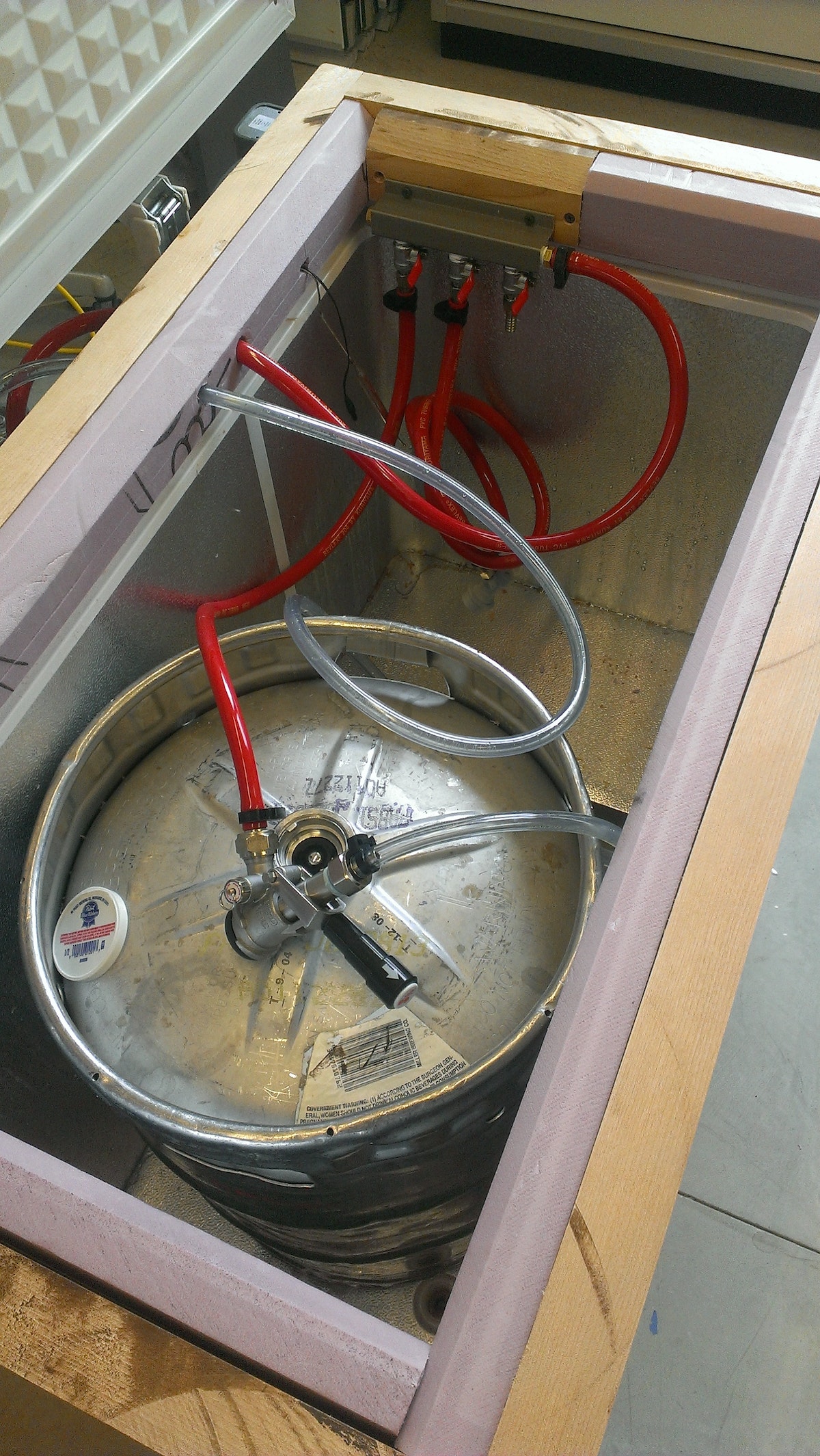
The machine sits on top of a standard, top-loading freezer replumbed to hold two kegs (one containing wit, the other sparkling organic lemonade).
Thirsty partygoers begin by turning the large hand crank on the front to select their preferred beer-to-lemonade ratio (from 0–100%). When the analog meter on top points to the desired proportions, they flip a missile switch to open the valves. The two glass vessels on either side of the machine fill with beer and lemonade, respectively, then send the home-brewed concoctions into their waiting pint via a dispensing tube.
Beer recipe
We wanted to brew a beer that would pair well with lemonade, so we decided on a nice, light, citrus-wheat ale. The goal: around 5% ABV, or alcohol by volume. We used 2-row pale as our main grain along with wheat and wheat malt with a bit of coriander, chamomile, and orange peel. You can find the complete recipe on Brewtoad.
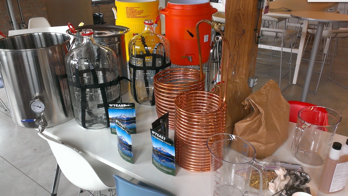
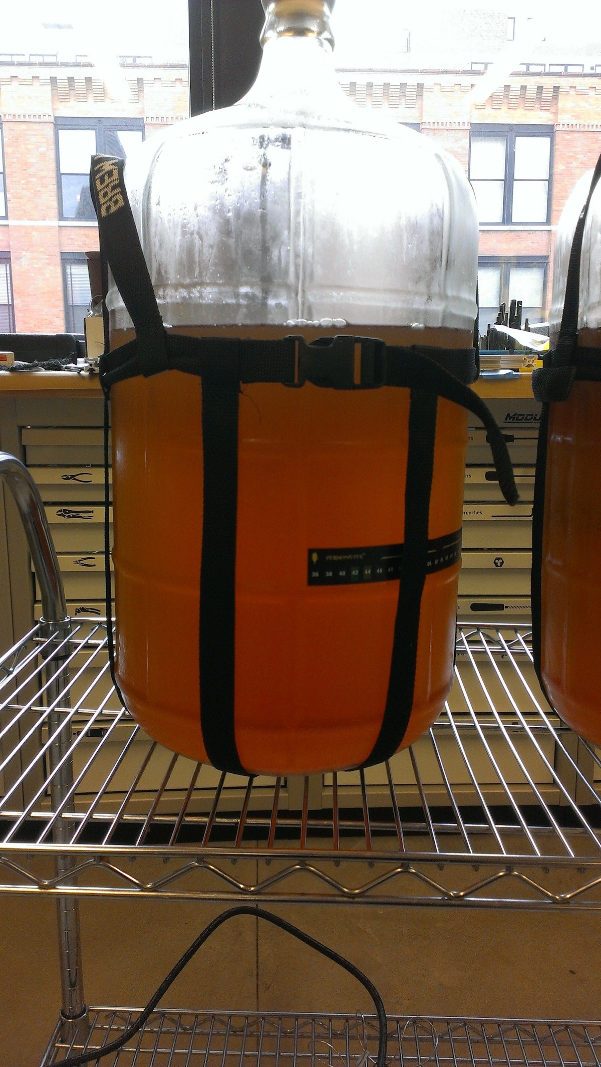
Lemonade recipe
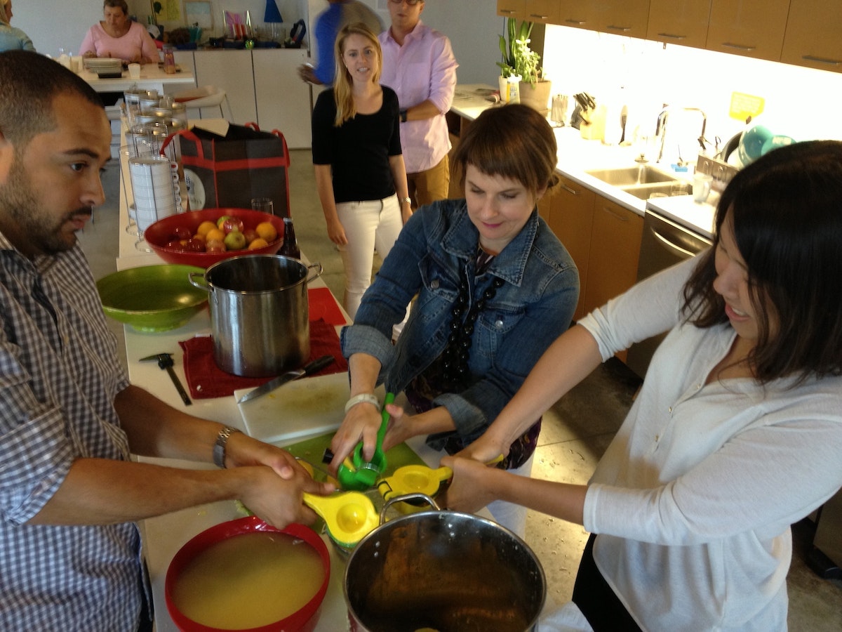
Making homemade lemonade is pretty straightforward. It only has three ingredients: lemon juice, sugar, and water. Batch-processing 10 gallons of the stuff, however, is a bit trickier, especially when you don’t have an electric juicer. In our case, we landed on a ratio of 1:1:8 (1 part lemon juice, 1 part sugar, 8 parts water), and ended up using 160 lemons, 2.5 gallons of simple syrup, and several man-hours of squeezing time. Yikes.
Early testing
After we figured out what we wanted our shandy machine to do, we found some glass vessels lying around the shop.
They looked straight out of a science lab, which was cool, but we thought we’d have some foaming issues because of their small openings. We hooked up a hose from the tap in our kegerator and tried filling them with beer. Sure enough, the beer started foaming immediately and it took several minutes to drain using gravity. Not good if you want a proper pour...
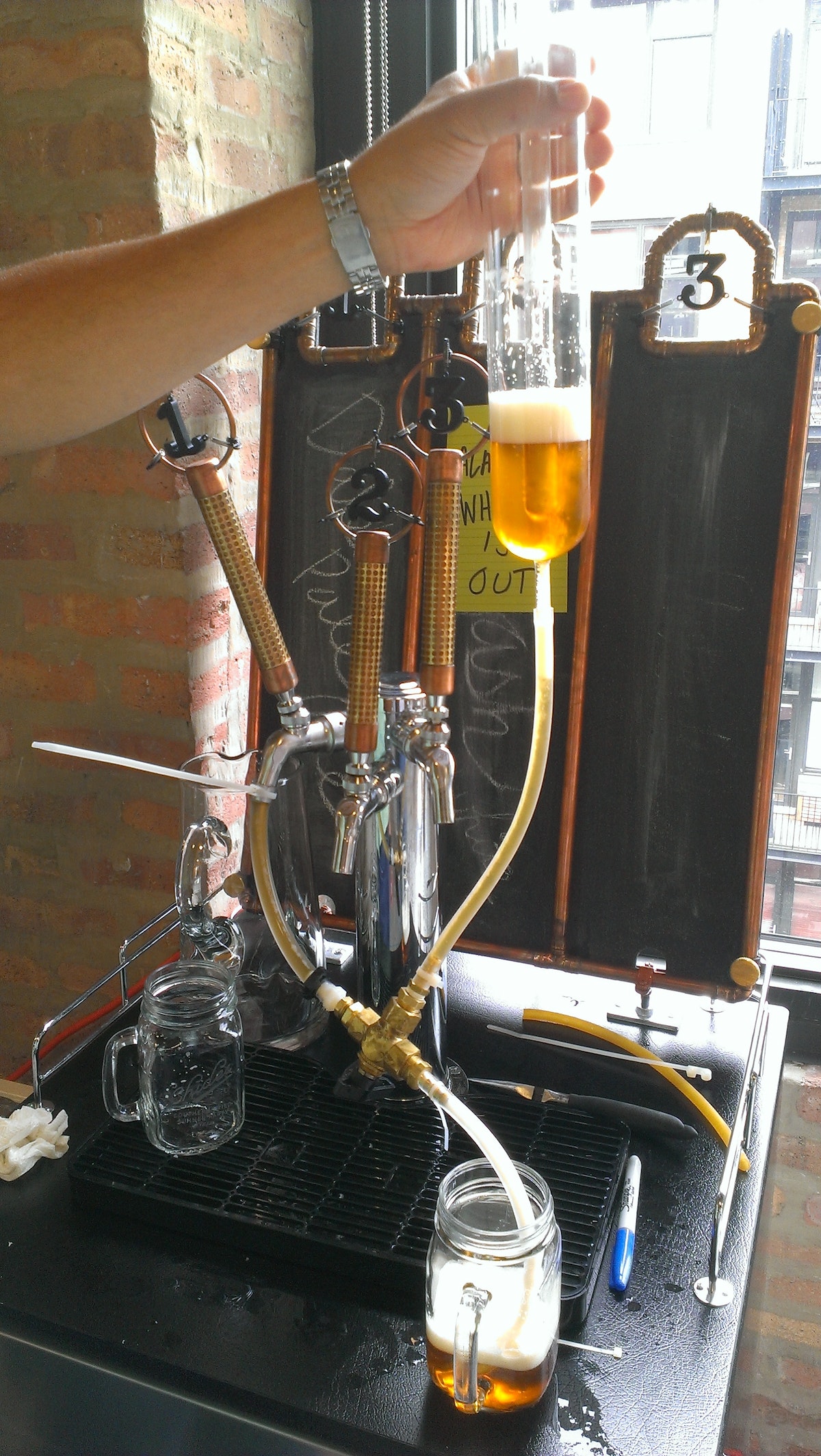
We needed to do something about the foaming issue in order to make this thing usable more than once. We did some experimenting and learned several things:
- There couldn’t be any kinks in the tubing.
- A colder vessel worked best.
- The first pour was really foamy, but subsequent pours were better.
- Filling the glass from the bottom via a tube prevented overflow and allowed any foam that did bubble up to dissipate quickly.
- Adding some back pressure to the vessel made the biggest difference in preventing foam. (To give you an idea of the really rough type of prototyping we love, we used the finger of a rubber glove to make a makeshift balloon on top of the vessel.)
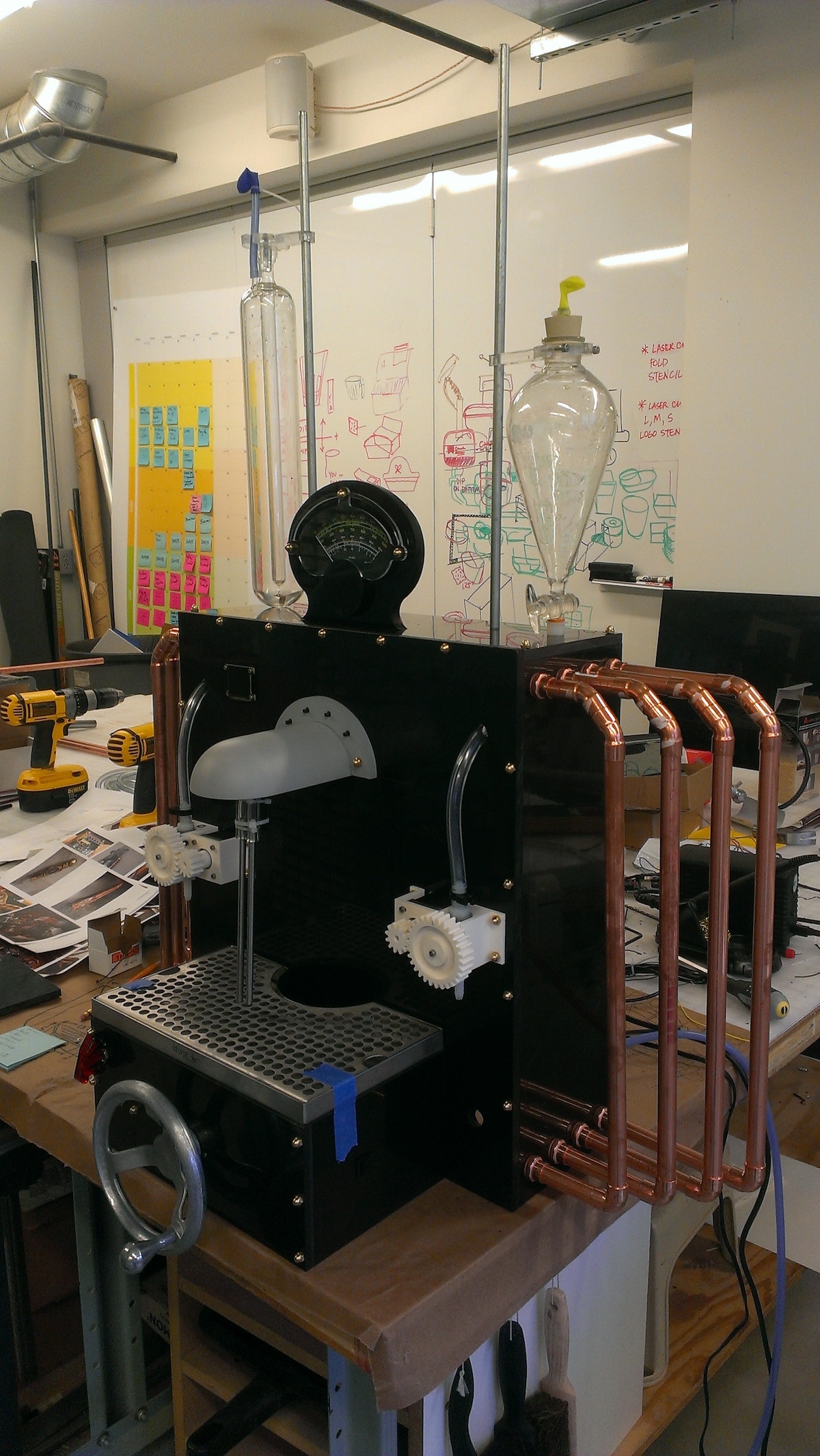
Architecture
The basic plumbing layout of the system is pretty simple. We have three-way ball valves that direct flow from the keg to the vessel, from the vessel to the dispenser tube, or block flow entirely.
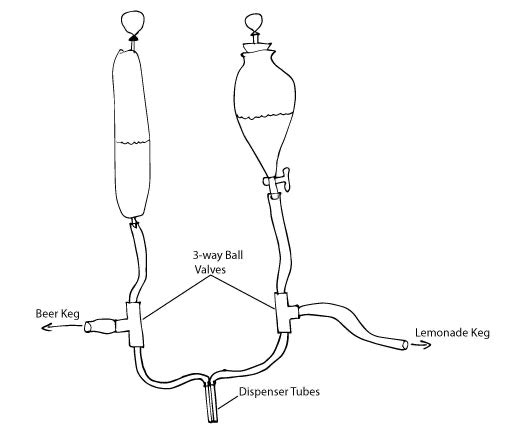
To control the valves, we 3D-printed some gears to fit onto the lever controls. To drive the valves, we fitted stepper motors with smaller, 3D-printed gears.
Inputs
For the main shandy mixture-control system, we settled on a large hand crank.
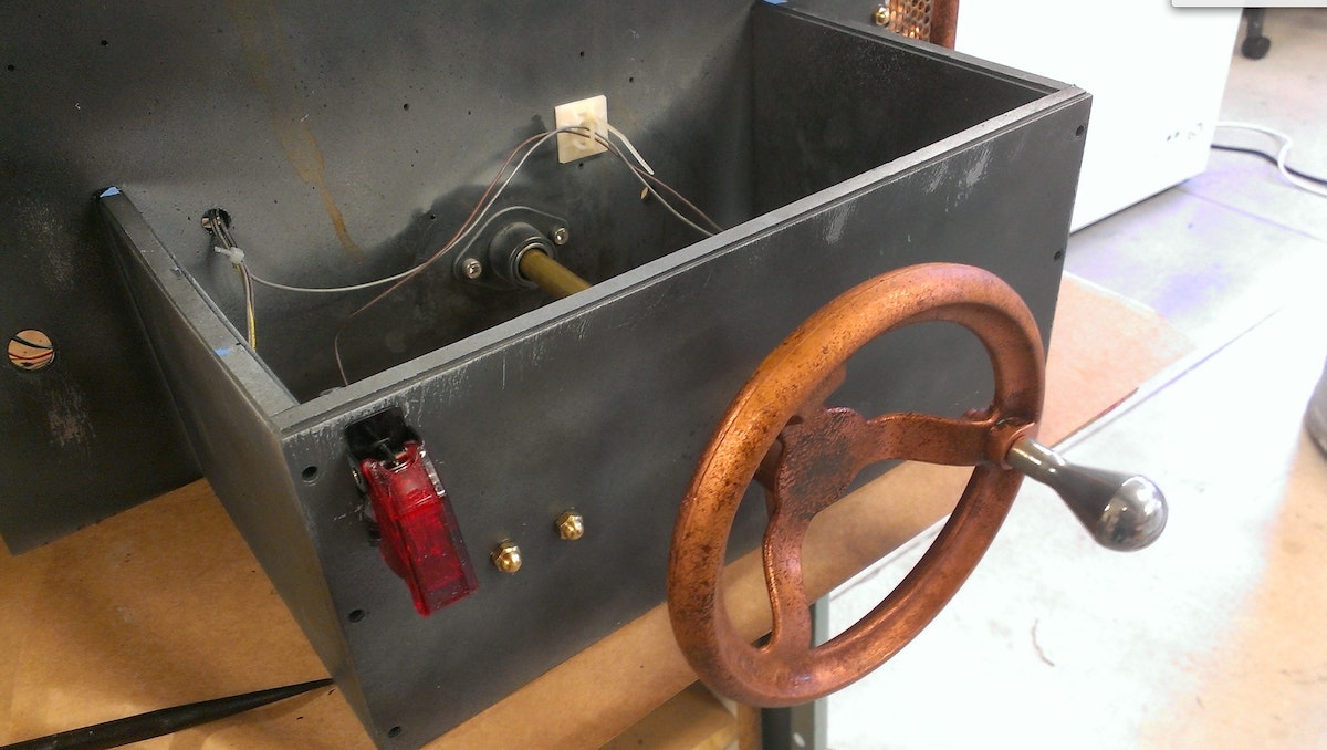
We machined a shaft and attached an encoder to the end. We added some detents to the wheel to make sure the crank had a nice hand-feel and gave solid feedback so people could precisely dial in their desired mixture ratio (the detent mechanism is equivalent to putting a baseball card in the spokes of a bike tire).
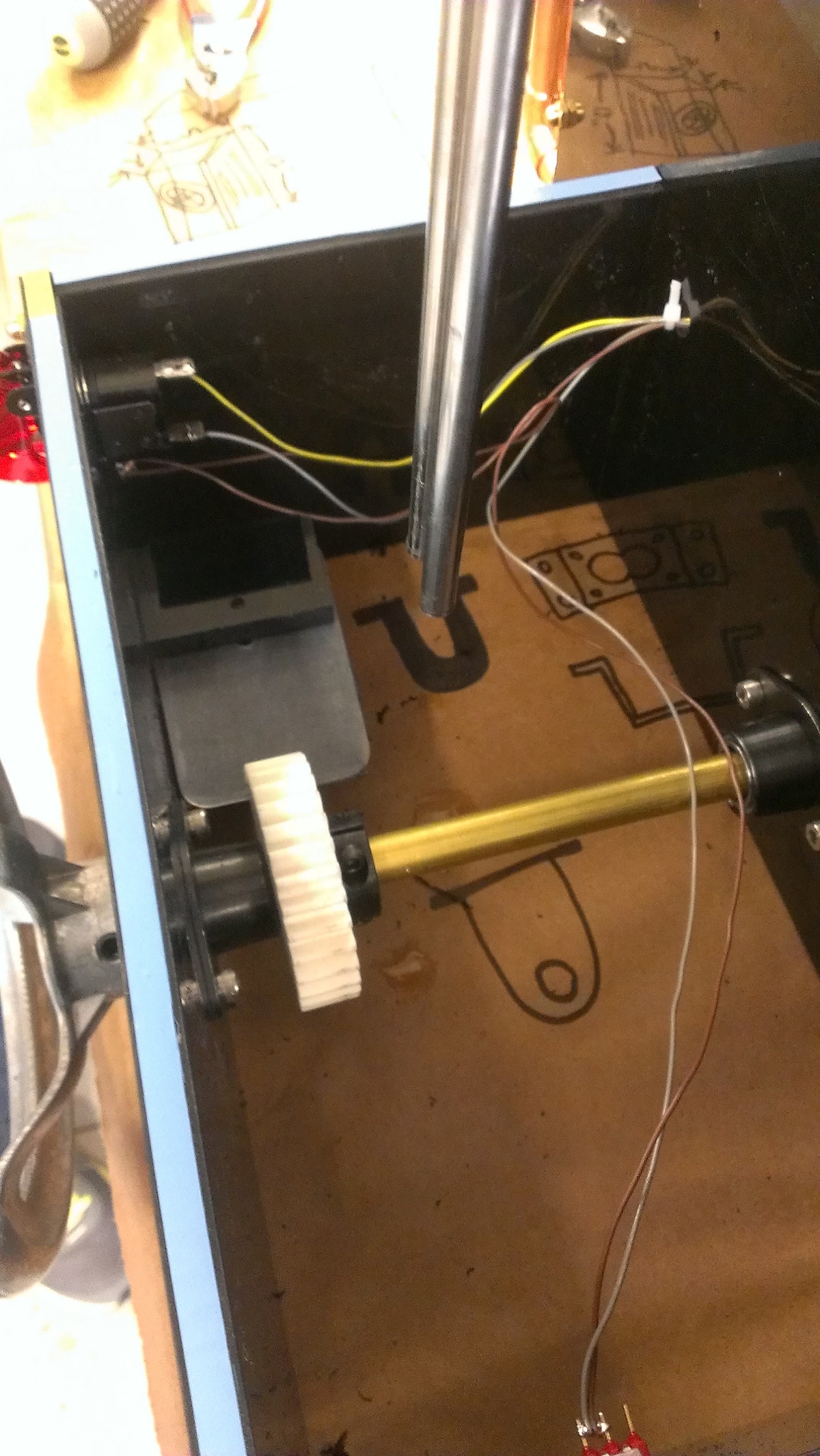
We used a 3D-printed gear and flexible plastic leaf to engage the gear. We had to play around with some adhesive foam in order to damp the vibrations and get just the right sound and feel we were looking for. We added a covered, mission control-style toggle switch to start the cycle and a cancel button to round out the inputs.
Feedback
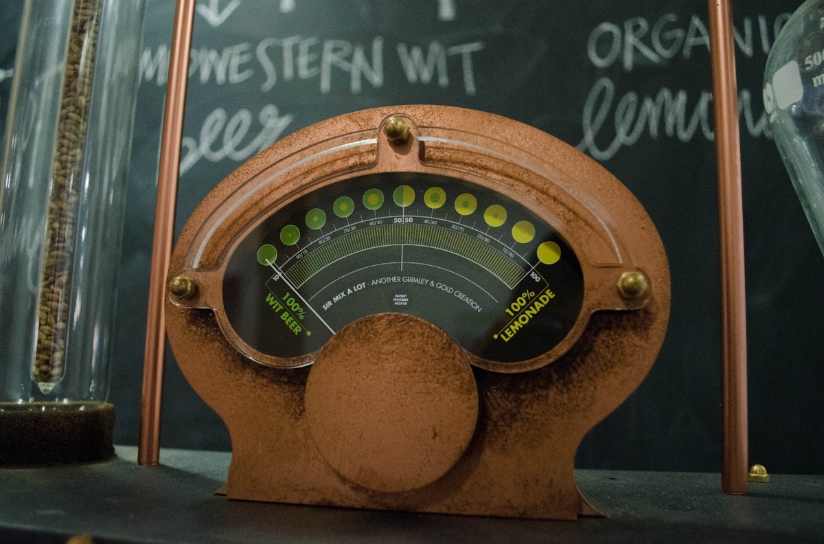
The main source of feedback on the machine is the large analog meter on the top of the machine. We searched online in vain for a large meter that would fit our steampunk style, have an appropriate measuring range, and could be controlled by Arduino. In the end, we found an old automotive meter that measured voltage from 0-16v.
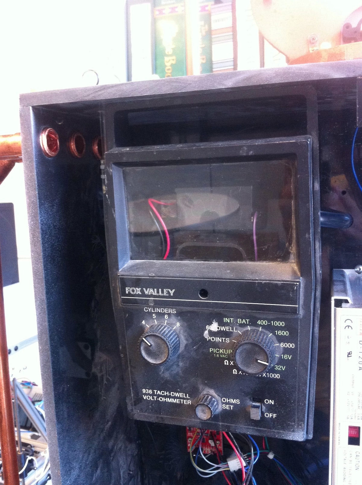
We replaced the scale with one designed by our colleague Joe Graceffa and added a custom housing around it.
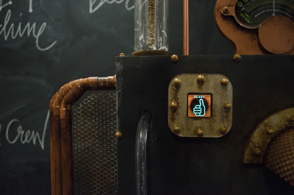
When we were testing the Mix Master 2000, we found ourselves staring at the Arduino serial output a lot to figure out where the machine was in its cycle. To make this easier, we added a small OLED display with an onboard SD card slot. Simple serial commands trigger bitmap images that signal Startup, Ready State, Beer Filling, Lemonade Filling, Pouring, and Error State.

Electrical layout
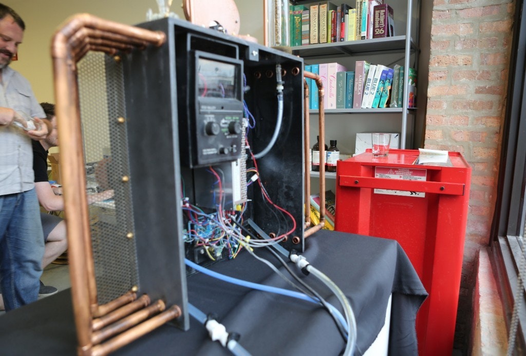
An Arduino Mega controls the shandy machine. This diagram shows how all of the components are connected:
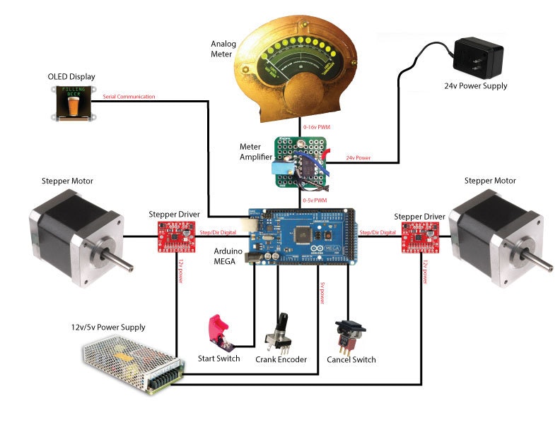
To drive the meter, we needed to boost the 0-5v PWM output of the Arduino Mega to 0-16v. We built a simple, non-inverting amplifier circuit to increase the voltage. A fine-adjustment potentiometer allowed us to fine-tune the maximum voltage and made the meter read full scale.
Code
When the Mix Master 2000 is first powered on, we can’t be sure that the valves are in the correct position. Each motor is stalled against the valve hard stop to establish a home position (the valve hard stop is in the dispense position so there’s no risk of keg leakage). Once the machine’s ready, the crank encoder state is polled and the meter PWM is updated to reflect changes in the shandy-mixture percentage. As soon as the start switch is thrown, the pour cycle begins. During our early testing, we figured out how long it would take to fill a glass with each liquid (the times turned out to be different because of varying carbonation levels). The parameters for beer and lemonade fill times are used to calculate the on times for both valves using the selected shandy ratio.
The cycle sequence starts by opening the beer valve and filling the beer vessel for a predetermined amount of time. When the beer valve closes, the lemonade valve opens for a predetermined amount of time. Finally, both valves move to the dispense position to allow liquid to flow from the two vessels and into the person’s glass. A built-in wait time prevents the start of another cycle, ensuring all the liquid is dispensed.
If necessary, a cancel button throws an interrupt, immediately moving both valves to the safe home position and halting program execution until the Arduino reset button is pressed.
The final touches: steampunking & aging
We’re big fans of steampunk, so from the beginning, we knew we wanted the Mix Master 2000 to look quasi-Victorian. First, we used as much copper and brass as possible, then, drawing on John’s background as a Hollywood set designer, we “antiqued” it using various scenic techniques.
We started by stripping everything off the main body of the machine and painting it all silver. After that dried, we sprayed it again with black paint. While that was drying, we took Scotchbrite pads and scratched the corners, edges, and anywhere else we thought needed a little character. After the black paint layer dried completely, we started to reattach all the other pieces. We painted them copper or brass and scratched them up here and there to add wear and tear.
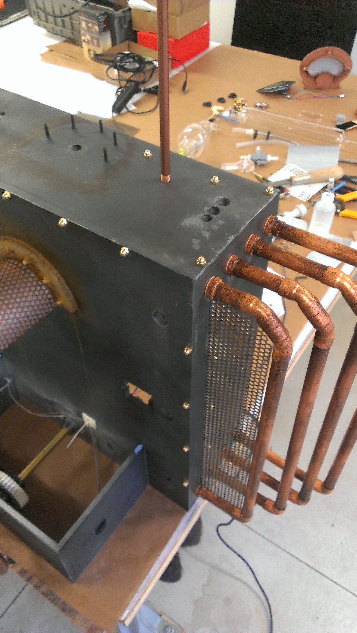
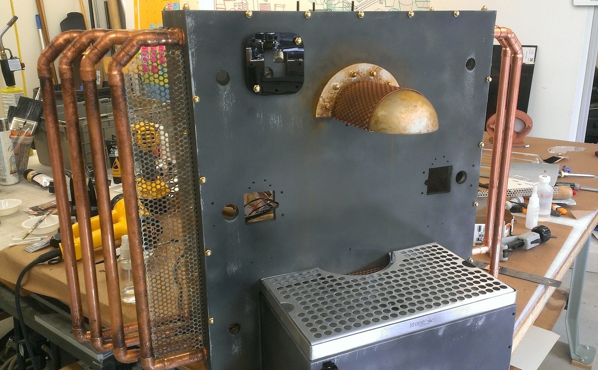
Once the whole machine was reassembled, we decided it should look a bit dirtier. To do this, we mixed different brown-toned acrylic paints with denatured alcohol. We brushed this onto key places like the corners of the motors so it looked like dirt had accumulated and it was streaked with rain (we wiped off the paint before it dried so the effect didn’t look too heavy handed). For sanitation purposes, we didn’t paint the drain tray or the stainless tubes that dispense the shandy.
What’s next
We think the Mix Master 2000’s pretty cool as-is, but there’s always room for improvement. One issue we’d like to address is foaming. The balloon we added on top of the beer vessel helped, but pouring a lot of shandies in succession caused major foam build up. Increasing the amount of back pressure in the vessel could improve this situation, so we’re experimenting with adjustable pressure-relief valves. Coupled with the relief valve, a low-pressure aquarium pump could help to push out the foam more quickly, avoiding a buildup.
While we’re using the Mix Master 2000 for shandies at the moment, it really could be used for any number of two-part drinks: Black & Tans, mixed drinks, or custom non-alcoholic concoctions are all ideas we’re toying around with. As beer geeks, we’re particularly keen to brew two similar beers, one with a bland base and another that has a lot of hops so we can all dial up the perfect hoppy pour.
Parts List
- Main housing — ?” ABS
- Ball valves — McMaster # 4757K52
- Valve gears — FDM
- Valve housing — FDM
- Crank — McMaster #6020K35
- Stepper motors — Lulzbot #817752011303
- Stepper drivers — Sparkfun #ROB-11699
- Arduino Mega
- Display — 4D systems 128x128 Sparkfun #LCD-11377
- Power supply — 12V 5A, 5V 12A
- Meter — salvaged autometer 16v range
- Glass vessels — found in shop
- Glass holders — FDM
- Meter housing — Laser cut acrylic
- Start switch — Sparkfun #COM-11310
We couldn’t have made the Mix Master 2000 without the help of Joe Graceffa’s graphic design skills, Aaron Ferber’s awesome lemonade-making abilities, and Momo Miyazaki's amazing video. This post was co-written with John Grimley.
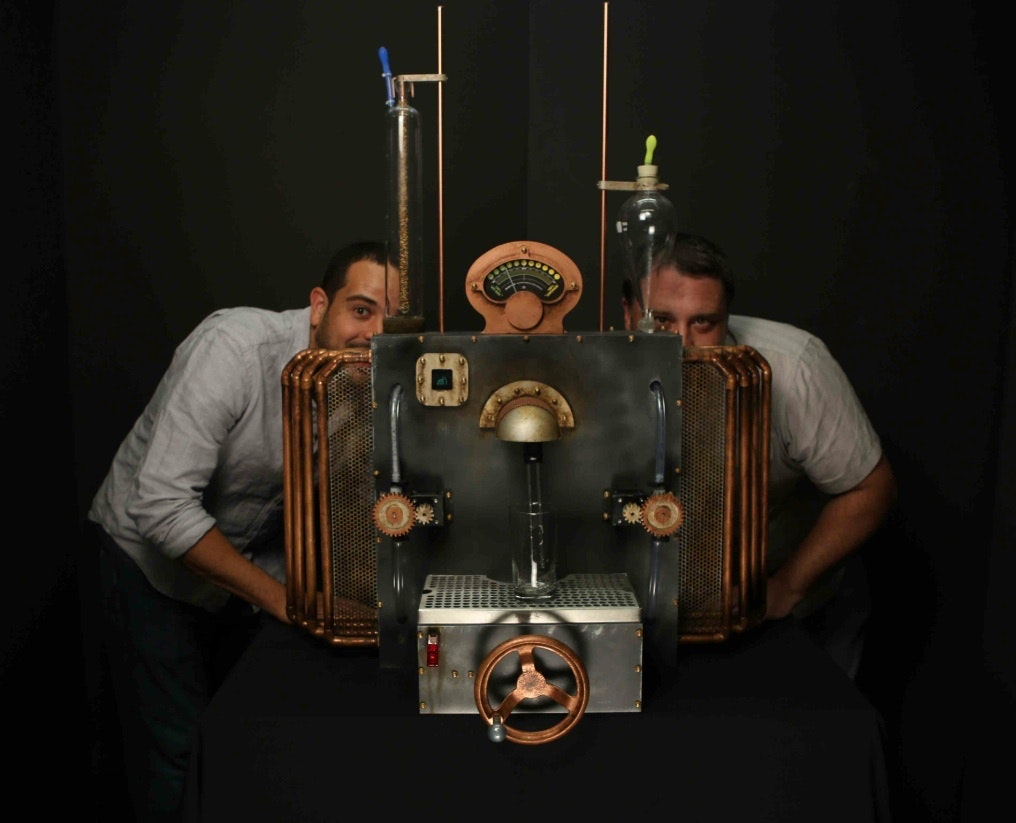
The creators of the Mix Master 2000, Chris Gold and John Grimley.
Here at IDEO Chicago, we like beer. A lot. And we don’t just love drinking the stuff, we like brewing it, too. Our ChIDEO Brew Crew started about two years ago and since that time, we’ve made more than 60 gallons, mostly for studio events like Rocktoberfest or St. Paddy’s Day, but sometimes just because it’s Tuesday and we feel like it. We even have a customized kegerator in our kitchen to showcase our drafts.
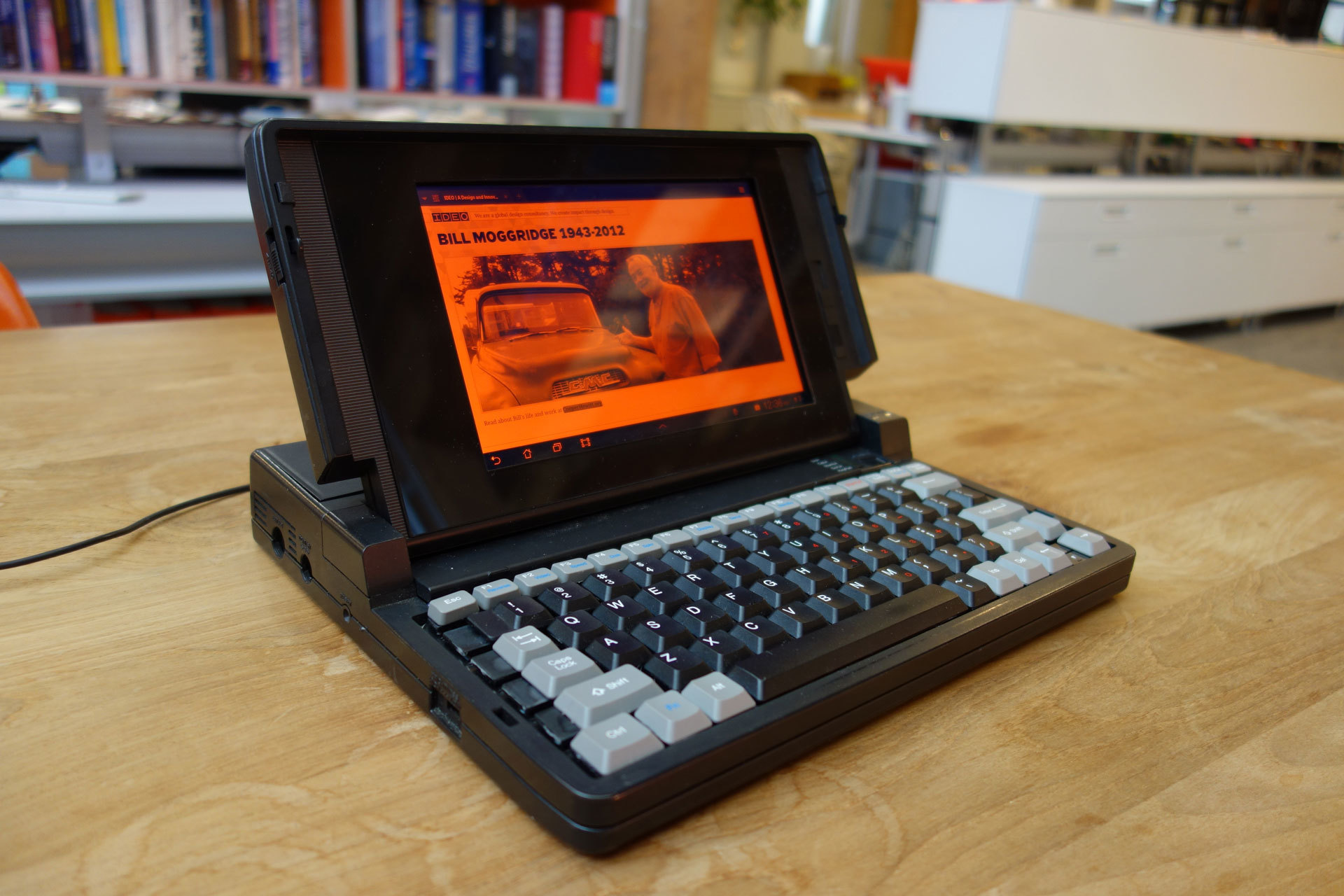
Tribute to Bill Moggridge: GRiD Laptop For Sharing Stories
Remembering Bill Moggridge through reanimating one of his iconic designs
Perhaps one of the most iconic objects Bill designed was the GRiD Compass, the world's first laptop computer. Bill's design was the original clamshell design that all current laptops have descended from. We wondered if we could use a GRiD as a way to collect stories about Bill from around the office.
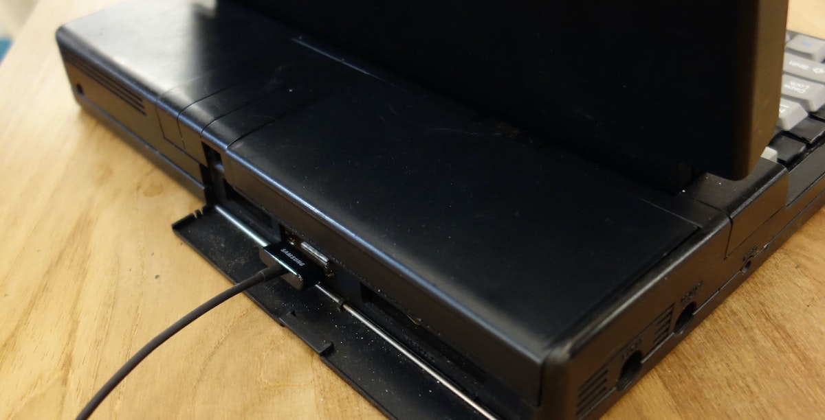
The result is this GRiD Laptop that has been modified to house a Galaxy Tab. It renders everything in orange and black similar to the original GRiD, boasts a working keyboard, and can be plugged in to charge at the base behind the original door that housed the ports.
We are using this laptop as a way to add content to billmoggridge.com which has been created to honor him by sharing our favorite moments, Moggridge-isms, photos, videos, songs, and more.
I hope this puts a smile on your face, just as Bill has done for so many others during his lifetime.
As per usual, I tried to document and share all the details of the build process for others to learn from. Click through for the full details of what went into this build:
Parts:
- Broken GRiD 1720 from Ebay
- Refurbished Samsung Galaxy Tab 8.9 w/ dock and keyboard
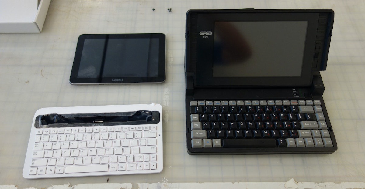
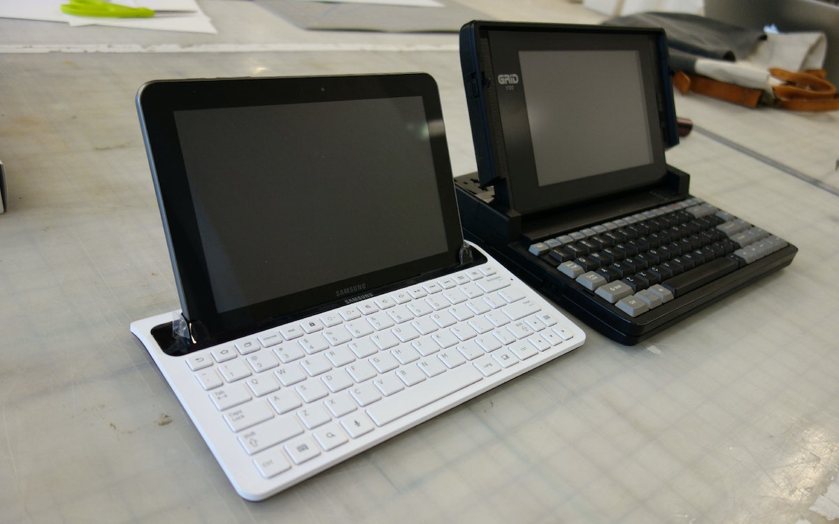
Before we start taking things apart, look at this! Things may not have changed as much as we think...
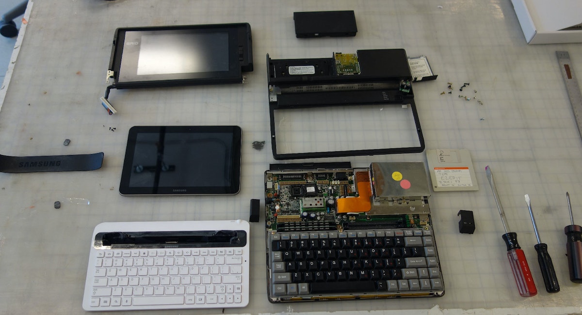
Taking apart the GRiD:
The Display
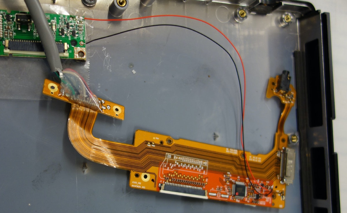
I wanted to have the charger on the base of the computer and not in the screen. For that we would need to make an extension cable that will work like the original cable that connected the screen. Luckily I have the dock and the keyboard dock to hack. I end up using both.
Here is the dock taken apart:

All we need is this part. This will connect to the bottom of the tablet:
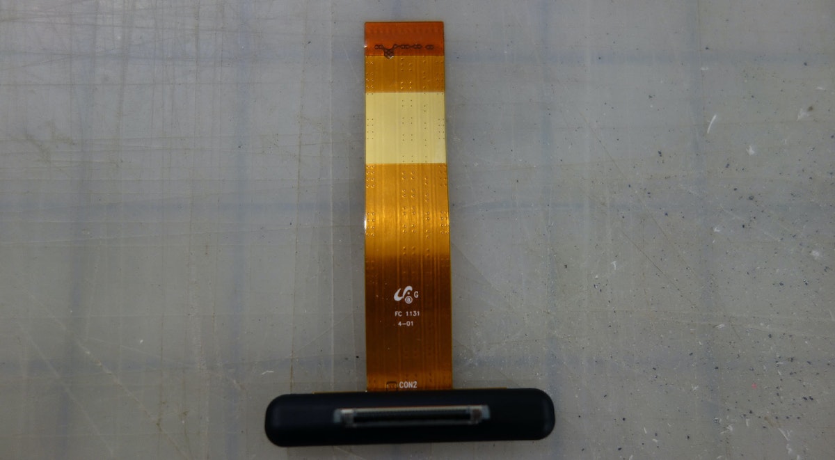
This is the part inside the keyboard dock. I use this as the port to glue into the base of the laptop:
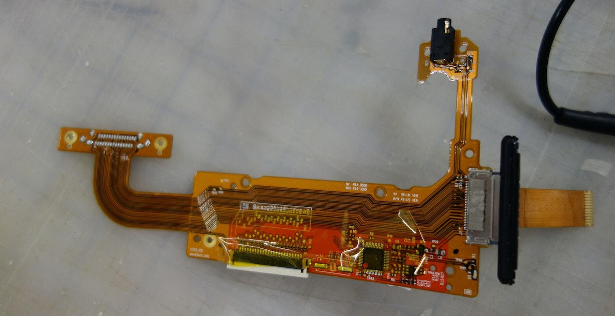
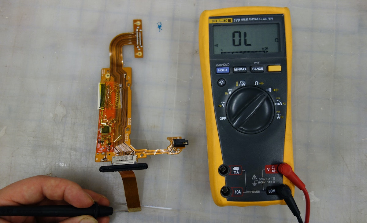
First I de-soldered the connector that originally would have plugged into the tablet. Then I connected the dock part to this keyboard part. Now I can use the multimeter in conductivity mode to probe the connections to learn which pad on the keyboard part will need to go to which pad on the dock part:
Then I (very carefully) soldered everything up with an ample length of cable to make my extension cable:
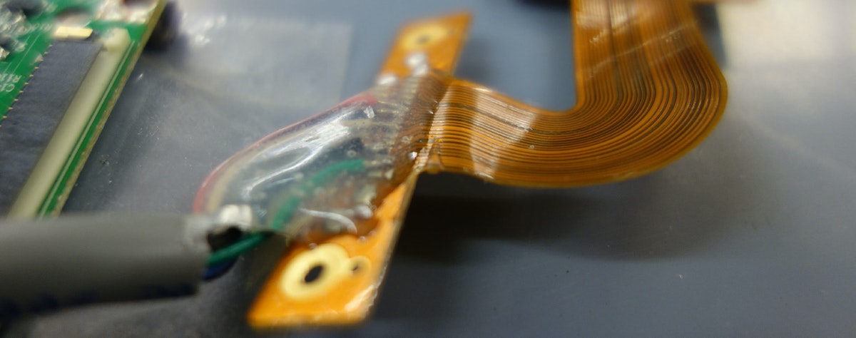
Once I verify the connections are sound, I blob on some 5 minute epoxy to lock everything up so it won't break later.
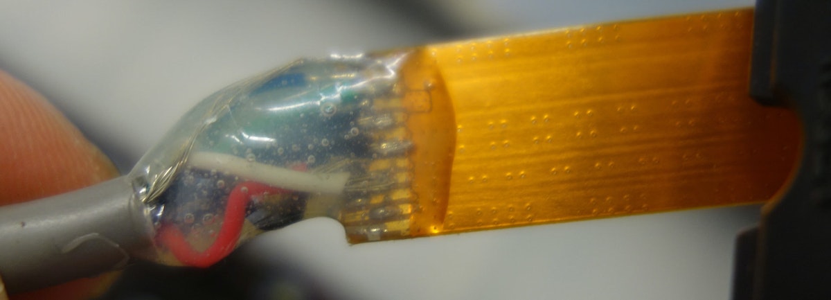

I couldn't have asked for better luck on fitting this in there! This is the bottom of the connector touching the base of the screen housing:

Lastly, there was no way to wake up the tablet once I put it in the housing, so I put a bolt in the lathe and turned a button that sits in the casing and allows you to press the button from the outside:
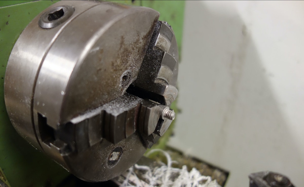
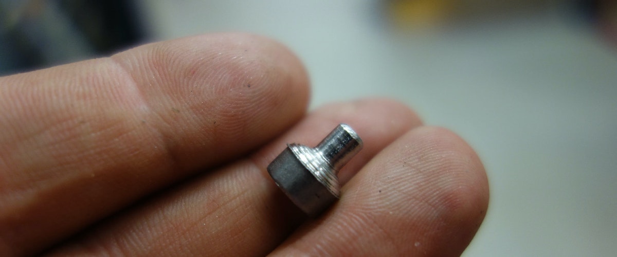
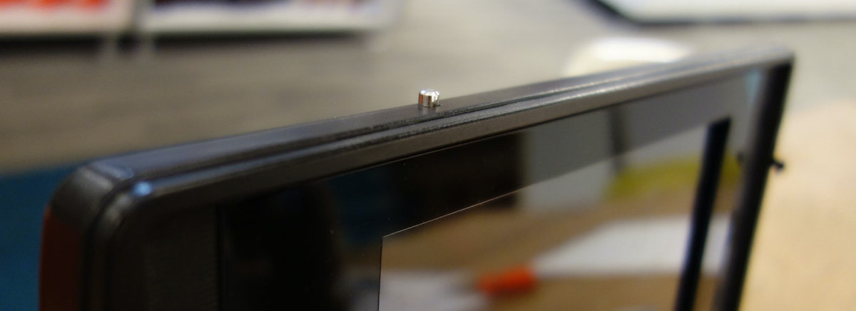
Lastly, I had to cut a hole in the display window so you can touch the screen of the tablet. I tried doing this with an x-acto and failed miserably. Luckily, our model-maker extraordinaire, John Grimley, came to the rescue and laser-cut / backpainted a replacement bezel. Thanks!
The Keyboard
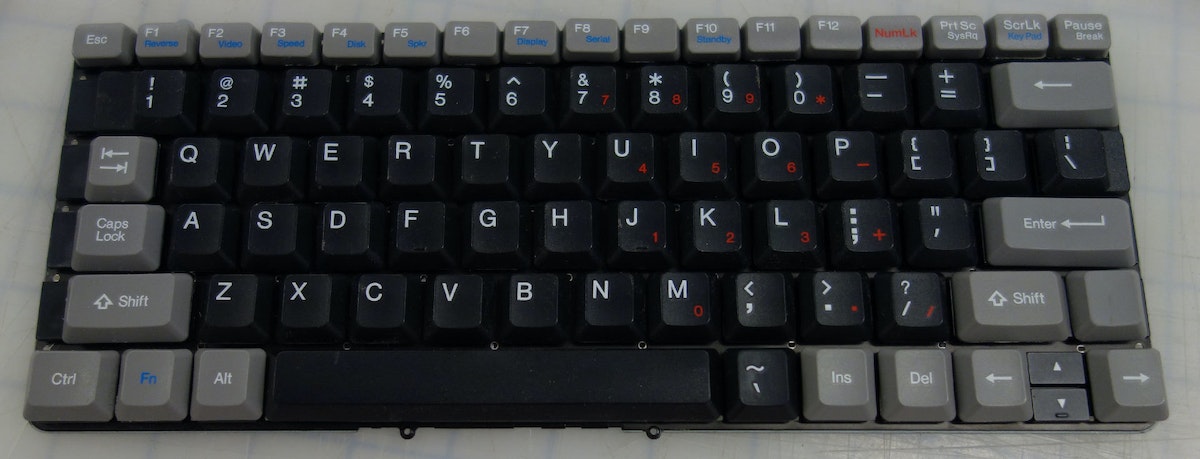
Now on to the keyboard. I used a bluetooth keyboard from Motorola. The Samsung one that came with the tablet was too small. I was pretty lucky to find one with almost the exact size of the original GRiD keyboard:
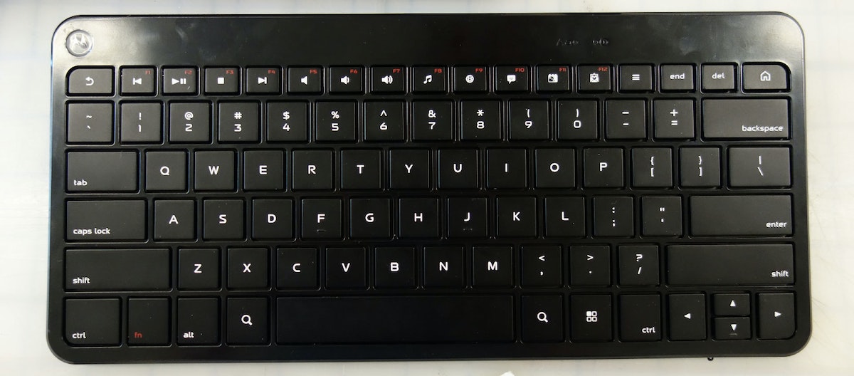
I took all the keys off the GRiD and sanded them down so I could glue them flush to the bluetooth keyboard:
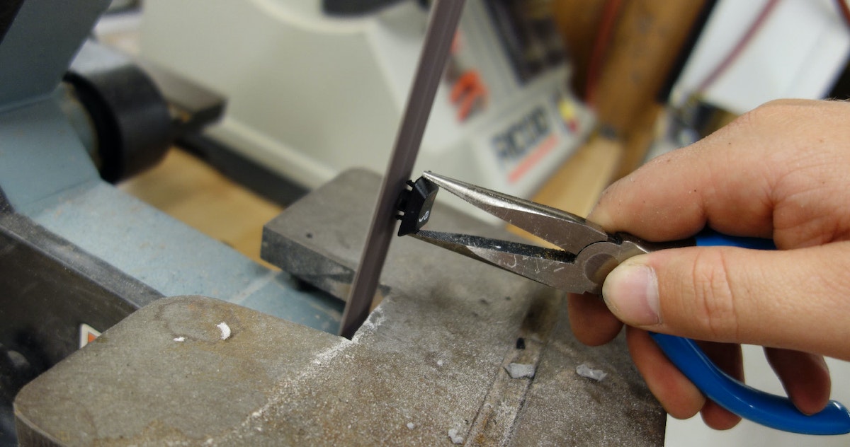
I used hot glue, a steady hand, and a lot of patience:
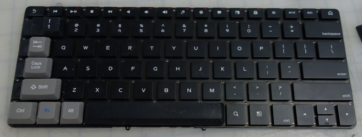
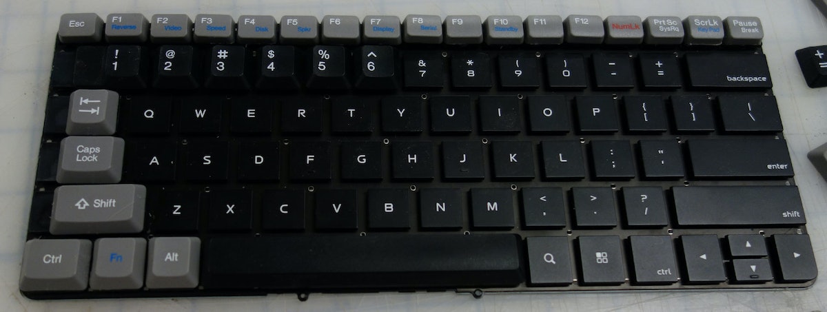
Now we have a proper keyboard, we need to wire it up. I wired the pairing button to the original power button of the GRiD because you have to press the pair button every time you power on. One reason I made that cable using the keyboard dock circuit board earlier is because the board breaks out power and ground which I can wire to power the bluetooth keyboard. This way there are no batteries to replace.
The Bluetooth Board:
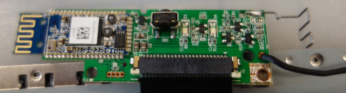
Wired onto the keyboard dock:
Now everything is wired together, so I just place the connector in the original slot for the parallel port:
The Software:
This was actually the most difficult part to figure out. I wanted to have the display be yellow-orange on black like the original GRiD. I started poking around on the Android XDA-developers forum to dig up information. I won't go through all the steps in detail, but after trying versions of Android Ice Cream Sandwich, Jelly Bean, Cyanogen Mod, etc. etc. I found that I had to re-install Android Honeycomb (which was on there in the first place!) and install Chainfire 3D:

This app calls itself “an intermediary OpenGL Driver“ so it sits in the middle and can mess with commands going to the GPU. This requires a rooted device. There's a guy on YouTube who does an awesome walkthrough on how to root a Galaxy Tab 8.9. If you are looking to do something similar.
Chainfire 3D has a “Night Mode“ that allows you to mess with which colors function and to what degree:
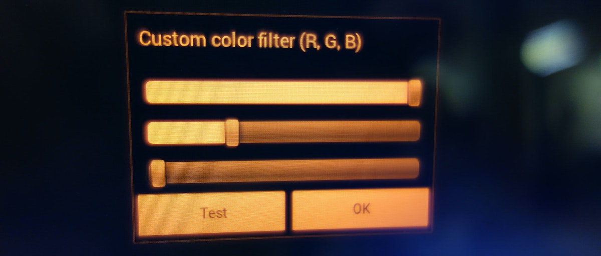
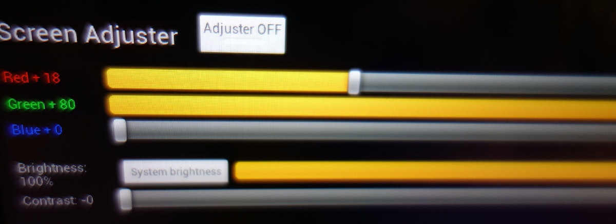
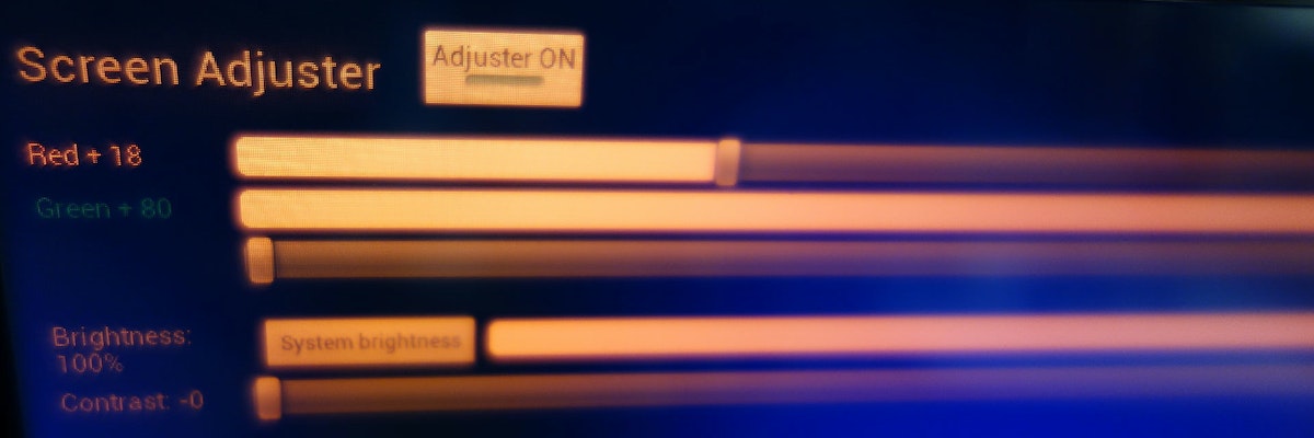
However, it still wasn't changing the color! It would change only during screen transitions when there was some sort GPU task happening. I decided to try some hacks to force the GPU to constantly be running letting Chainfire have the ability to intercept things. I had seen some other “screen tinting“ apps that on their own didn't accomplish what I wanted, but added a level of something going on so Chainfire could do it's job. The one I used is called “Screen Adjust.“
Before:
After!
The Website
While I was working on the GRiD, IDEOers Arjun Mehta and Katie Clark—along with several others including Lance Birtcil, Ben Booth, Francis Tseng, Ivy Hu, Danny Stillion, Tom Hardin and Tim Brown—were putting together the tribute website that the laptop was built to access: billmoggridge.com.
It's really beautifully done, so go check it out to see what kinds of fantastic stories have been shared.

With the passing of IDEO co-founder Bill Moggridge, we have been reflecting on the ways he has influenced our lives and made the world a better place. Bill has had an enormous impact on the field of interaction design and professed the importance of making interactions delightful.

Lindsey Turner
I’m passionate about building brands, products, and experiences that help organizations show up with meaning and momentum.
I help organizations cut through complexity by shaping how they show up, through brand strategy, identity, and storytelling.
Working at the intersection of brand and business, I bring an editorial eye and a bias toward making—turning ideas into tangible experiences that people can understand, trust, and believe in.
My work spans government, healthcare, financial services, media, and consumer goods, from launching Gen Z-focused ventures to building innovation labs and reimagining legacy brands. I relish moments of ambiguity and enjoy translating across teams, perspectives, and priorities to move ideas forward.
I started my career in editorial and digital design, shaping cross-platform experiences and identity systems in publishing and agency environments. That foundation still shapes how I work today: I’m detail-oriented, collaborative, and overreliant on the Oxford comma. I hold a BFA in Visual Communication from the School of the Art Institute of Chicago.

Rachel Young
My work helps organizations see who their products aren't working for—and build the will and the tools to do something about it
For 25 years, I've asked the same question: Who does this design exclude—and what are we going to do about it?
My work spans human-centered strategy, inclusive design, and qualitative research, with clients ranging from Microsoft, Google, and Verizon to the National Science Foundation, and San Francisco Unified School District.
Before IDEO, I taught elementary school in East Palo Alto and spent a decade doing design work with social service organizations—where I learned firsthand what it costs people when systems are built without them in mind.
I am currently writing User Error, a nonfiction book about digital access and the design decisions behind it. I live in Oakland, California.

Brian Pelsoh
I lead with craft, ensuring our work is creatively excellent: rooted in deep human insight and imagination, while also grounded in the realities of business and technology.
My expertise spans brand, communication, and product design across tech, education, the arts, and social impact.
I believe great work demands both high-level vision and obsessive attention to detail, and only happens through collaboration.
I bring an inclusive, hands-on approach and a deep understanding of business, which enables me to consistently deliver excellence while always asking why.
Before joining IDEO, I worked at the brand firms Pentagram and VSA Partners. I began my career as a designer, leading teams at the School of the Art Institute of Chicago and the Milwaukee Art Museum. I hold an MFA in graphic design from Maryland Institute College of Art and a BFA in communication design from the Milwaukee Institute of Art & Design, and have taught at some of the best design schools in the US.

Tony Wong
I am responsible for IDEO’s long-term success in China and working with clients to use design as a tool to enable growth.
I am responsible for IDEO’s long-term success in China and working with clients to use design as a tool to enable growth. Specifically, I have helped Chinese companies design holistic brand solutions through the development of their products, communication, services, and innovation teams, and I have helped multinationals expand their presence and influence in China.
I advise global leaders on developing China-led innovation and capabilities.
In over 15 years in IDEO Shanghai, I have worked on projects that use design to elevate the quality of the experience of healthcare products and services, streamline processes that increase productivity, create spaces and programs that promote and enable inclusive communities, and build next generation mobility solutions that are planet-positive.
Before joining IDEO, I worked at Philips Electronics and the Electrolux Group in Italy, the Netherlands, and Singapore on a number of breakthrough commercial products. I am a member of the Young President Organization in Shanghai.

Building a personal AI for the messiness of life: Sida Li
Most AI products today are built for work—a space with clear problems and established systems. One founder noticed a gap: personal life is messier, harder to systematize, and mostly left behind by the AI boom. So she built Cue, a personal AI that lives inside iMessage and group chats, to go where the other tools haven't.
In this episode, Becca Carroll, IDEO's Chief Strategy Officer, talks with Sida Li, co-founder and CEO of Shared Context Lab, about staying anchored to a human need while the technology around her keeps changing shape, why she treats her business model with the same rigor she'd bring to a product, and what it feels like to build a company at this particular, disorienting moment in AI.
The conversation also gets into how Sida makes design decisions: the language Cue uses to describe itself, the tradeoffs behind building inside iMessage instead of a new app, and a real story about a business idea that didn’t pan out.
This is the second in a two-part series profiling founders from IDEO's Startups-in-Residence program. The first conversation is with Johannes Seemann, founder of Sooner, on designing GenAI for the emotional side of money.

Designing GenAI for the emotional side of money: Johannes Seemann
Most personal financial tools are built to run the numbers and optimize towards a budget. While that works for some, most people experience money as a lived relationship that does not neatly fit into a spreadsheet. Johannes Seemann and Becca Carroll discuss why money is emotional before it is mathematical, and what a human-centered approach to building a generative AI financial product looks like in practice.

The curious leader's edge in uncertainty: Scott Shigeoka
Mina Seetharaman talks with Scott Shigeoka, author of Seek and Head of Curiosity Cultivation at the Eames Institute, about what distinguishes genuinely curious leadership from performative curiosity, how power dynamics shape curiosity, and why practicing curiosity can restore energy rather than drain it.

How constraints make us more creative: David Epstein
Mina Seetharaman talks with David Epstein, author of Inside the Box and Range, about why total freedom often produces average work, how leaders can design useful limits on purpose, and what organizations such as General Magic and Pixar reveal about the relationship between boundaries and creativity.
Looks like you might be in search of something very specific?
Or reset the filters above and try another angle.
Here’s some random inspiration

Podcasts about creative leadership

Articles about the power of prototyping
