
.svg)


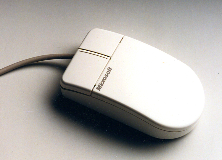

A hand-friendly, precisely controlled mouse
Ergonomic mouse design for better control and performance.
In 1987, the three companies that would later form IDEO worked together with Microsoft to create the world’s first ergonomically designed mouse. IDEO’s human factors research suggested a small but significant change: Moving the location of the mouse ball forward, from under the palm to under the fingertips, enabled more precise control and resulted in measurable performance differences compared with earlier models.
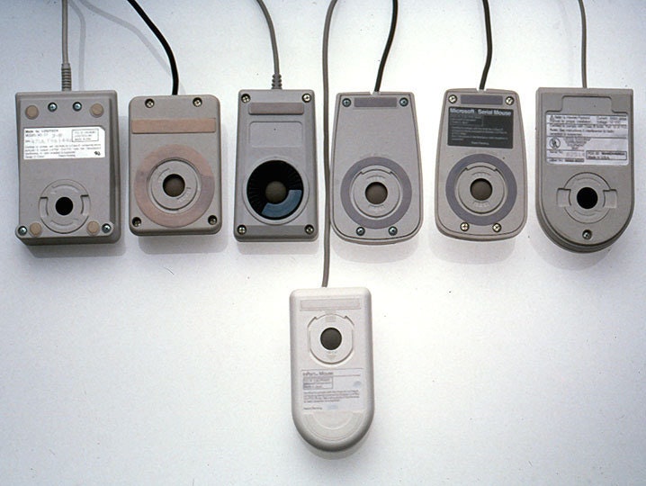
The industrial design effort examined and tested dozens of shapes in comfort and aesthetic studies that led to the famous “Dove Bar” form, a significant advance over the boxy mouses prevalent at the time. The resulting clean appearance, enhanced control, and improved reliability created enormous consumer appeal that replaced all earlier versions, and Microsoft sold more than 2 million units in its first two years.
A high-tech kidney delivery system
A new standard in organ transport systems delivers kidneys in improved condition.
With approximately 55,000 Americans waiting to receive kidneys and a list that could double in the next 10 years, there is an acute and urgent need for new technology to increase the quality and number of organs available for transplant. Using the conventional method of organ storage and transportation—a cooler filled with ice—doctors and nurses needed to accompany the organ to ensure proper handling.
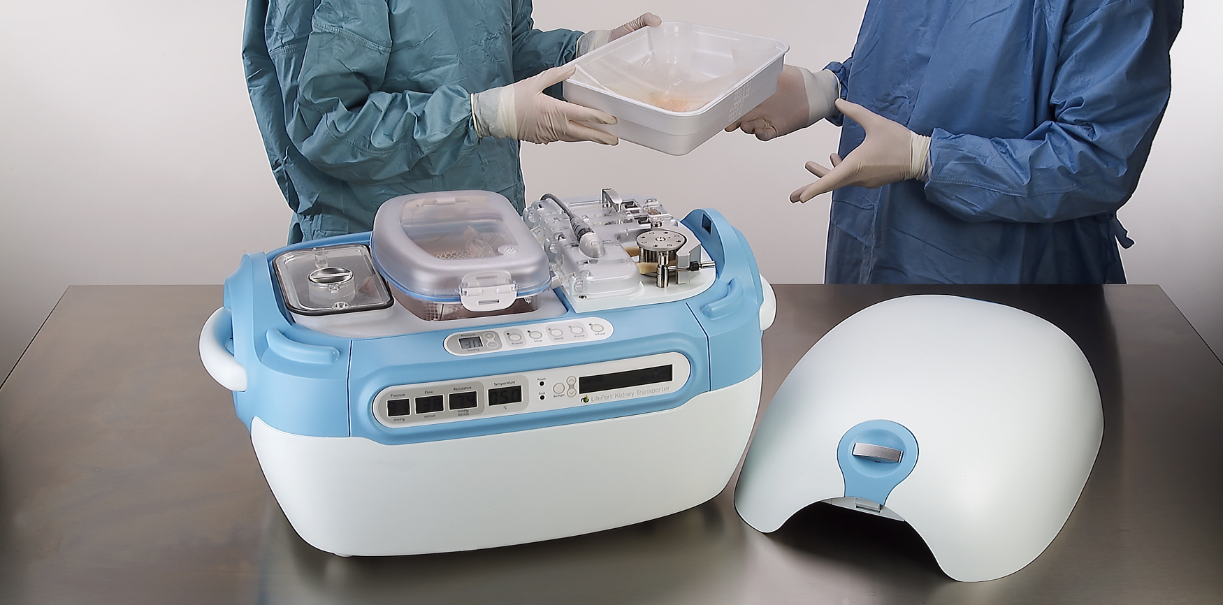
IDEO and Organ Recovery Systems created the LifePort Kidney Transporter to provide a new high-tech alternative. The LifePort gently perfuses, or pumps, the kidney with a cold liquid solution to improve its condition before transplantation, which can nearly double storage time and may increase the number of usable kidneys and improve patient outcomes. The device also provides critical data to monitor and evaluate kidneys during transport.
Organ Recovery Systems believes that perfusion has the potential to remove tens of thousands of patients from the waiting list and dialysis, and save the healthcare system more than $1 billion annually. In 2006, the LifePort Kidney Transporter was used to transport 350 kidneys per month in 12 countries, and was included in the permanent architecture and design collection at the Museum of Modern Art in New York City.
A hospital centered on the patient experience
Designing a pediatric hospital for children and parents.
Pediatric healthcare system Nemours provides primary, hospital, and clinic-based specialty care, prevention and health information services, and medical education programs in Delaware, Florida, New Jersey, and Pennsylvania. When Nemours wanted to strengthen its brand, it faced two challenges: Empowered patients had more access to information and choice than ever before, and new players—alternative-care centers, retail-based care clinics, and urgent-care centers—were entering the marketplace, diverting market share.
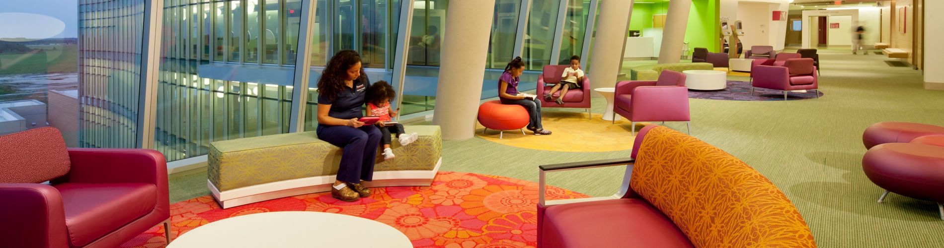
Nemours approached IDEO for help in creating an innovative, differentiated, and patient-centric experience for a new hospital in Orlando, with the goal of establishing Nemours as a destination care provider and industry leader. Together, they identified and clarified both family needs and key experience touchpoints in the patient journey, resulting in the state-of-the-art-designed, 60-acre, $400 million Nemours Children’s Hospital in Lake Nona Medical City, Florida. “The design team’s approach to defining key moments in the patient journey was highly instructive,” said Dr. David Milov, chief of clinical informatics at Nemours. “They captured insights otherwise unavailable to us.”
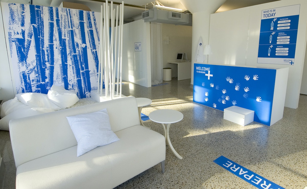
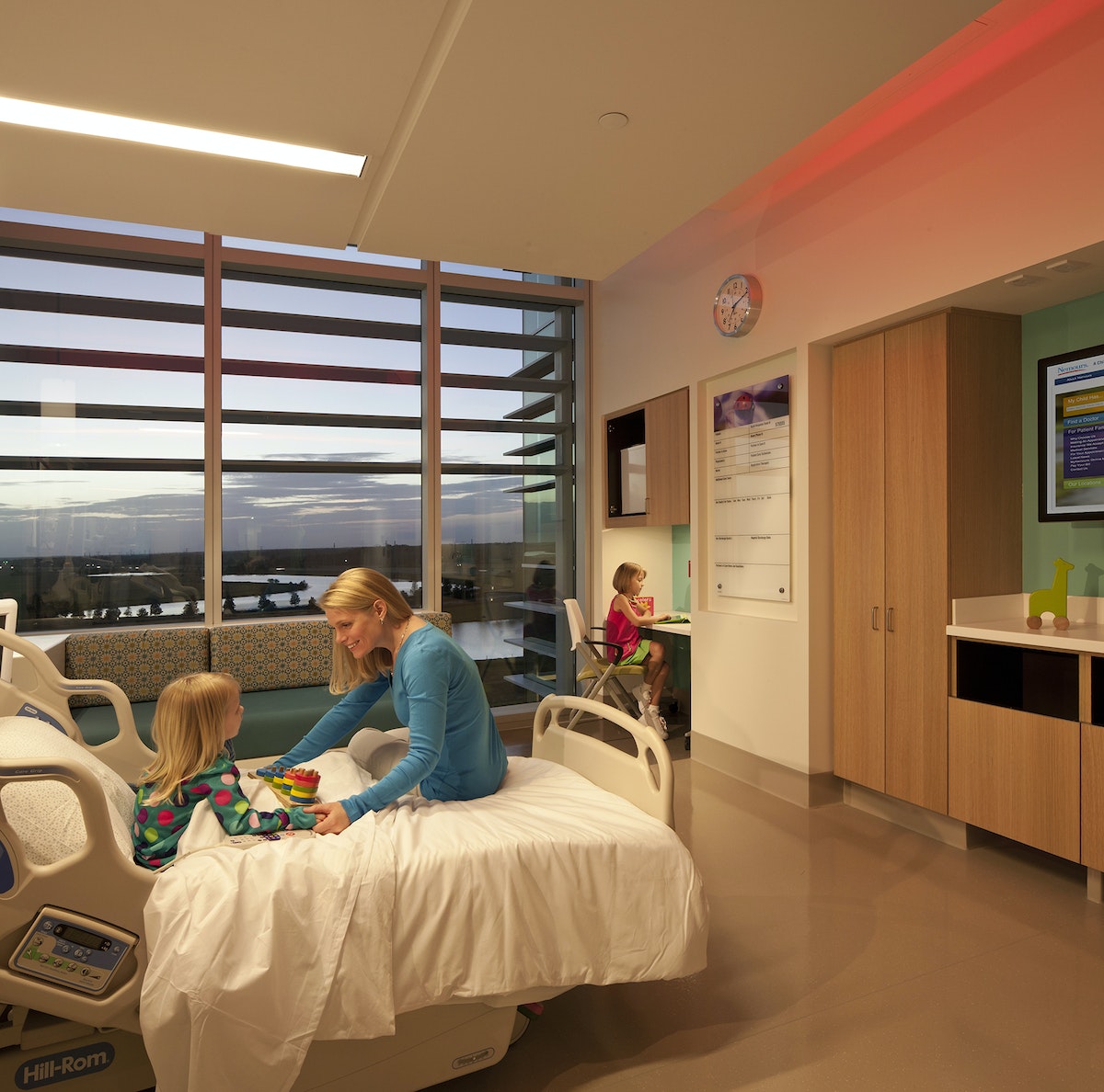
Concepts that were realized in the hospital’s final design include:
- Care Team Room ID: Patients and families are introduced to each member of their care team to ensure continuity of care.
- Floor Greeters: Concierge-like greeters welcome and orient families and answer questions.
- Family Lounges: Private dining rooms have kitchenettes, so families can cook and eat together.
- Emergency Department: Patients are greeted, sorted by medical condition, and immediately checked into rooms.
- Patient Information Screens: Doctors and nurses can access patient information prior to entering an exam room to enable informed conversations and build trust.
- Smart Bracelets: Personalized RFID-enabled bracelets keep track of the care team.
- Smart Rooms: Triggered by the Smart Bracelet, Smart Rooms “welcome” the patient upon entry.
To arrive at these designs, IDEO sought inspiration via analogous kid-friendly environments, such as museums, schools, toy stores, and zoos. Designers also conducted in-context interviews with patients, parents, families, doctors, nurses, support staff, and outside physicians. One key insight that led to the final design: Patients and families came to Nemours with varied levels of experience—first-timers, occasional visitors, and those who were chronically ill—but the hospital treated them all the same.
To address these needs, the team created an experience blueprint focused on welcoming, guiding, and supporting patients and families through unique environments, integrated service moments, and market-differentiating spaces and tools. To test the look, feel, and value of the designs, designers built full-scale foam core prototypes of welcome stations, waiting lounges, and exam rooms.

The results appeal to patients, families, and caregivers. According to Dr. Lane Donnelly, Nemours chief medical officer, “all the amenities at Nemours focus not only on the child but their parents and families as well.”
The hospital won two awards at the International Interior Design Association’s 2013 Best of the Best Gala (Georgia Chapter), one for the Healthcare Design category and one for best overall out of all 11 categories. Parenting.com writer Shawn Bean noted, “Set amidst a wooded expanse of central Florida, with theme park roller coasters peppering the horizon, Nemours Children’s Hospital is arguably the new high water mark for pediatric care in the United States.”
A global design movement led by children
A contest that teaches design-thinking skills to millions of kids across the globe.
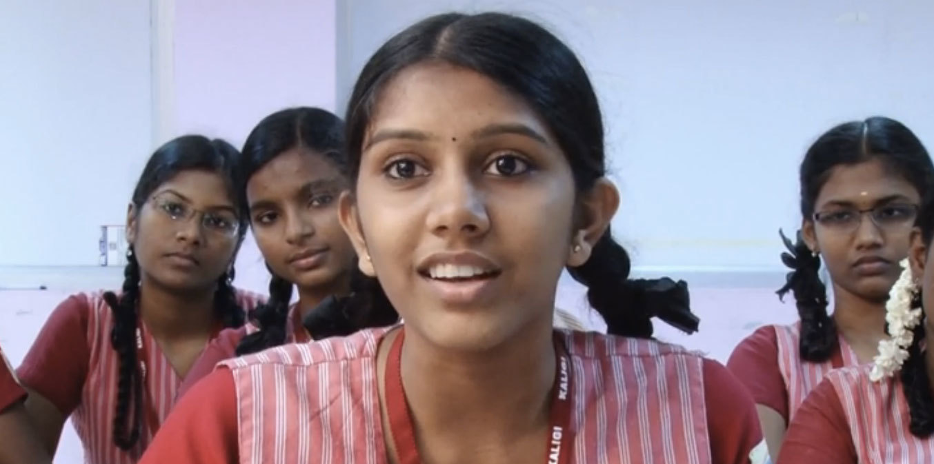
Designer turned educator Kiran Bir Sethi wanted to blur the boundaries between school and life to help young students become aware, enabled, and empowered to effect change in the world. In aiming to spread her message to millions of children across India , Sethi tapped IDEO and the d.school at Stanford to help create a design contest for youth that would show them that they could make a difference in their community.
Together with the d.school, IDEO designed a competition for middle school students called the Design for Change Contest. Adapting the human-centered design approach into a simple process that 10- to 13-year-old kids could follow on their own, the contest included rules, tools, and platforms that would be accessible to children and teachers throughout India regardless of their previous exposure to design.
The team shaped the rules so that students could learn core design-thinking skills such as empathy, brainstorming, collaboration, and reflection through the process of participating in the contest. And together, the group developed a toolkit to walk students through the simple four-step process.
The biggest challenges to the contest were overcoming the lack of infrastructure, language barriers, and a discrepancy in school resources. There was no national database of schools for easy outreach, so Riverside built relationships with NGOs across India to distribute the contest toolkit to more than 30,000 schools.
The contest receives about 2,000 entries from groups of youth in India each year. They have been addressing challenges such as illiteracy, pollution, traffic safety, care for the elderly, alcoholism, and the environment.
As of 2015, the Design for Change Contest has scaled far beyond India, and is being run in 30-plus countries, with millions of children participating. Each contest entry shows that kids really can make a big difference in the world.
Designing a kitchen-leftovers spy cam
An experimental office prototype makes sure we never miss out on a snack.
So why not have a camera provide a live feed of the spot where food is left when it’s up for grabs, so everybody can know when it’s time to raid the kitchen? Having recently worked on a project that explored embedding sensors and technology into living and working spaces, I was inspired by the Food Cam. I was also itching to learn how to prototype using a Raspberry Pi, so when I returned to IDEO Chicago, I hacked together a very similar version to install in our kitchen, with the addition of a fun little twist to make it our own.
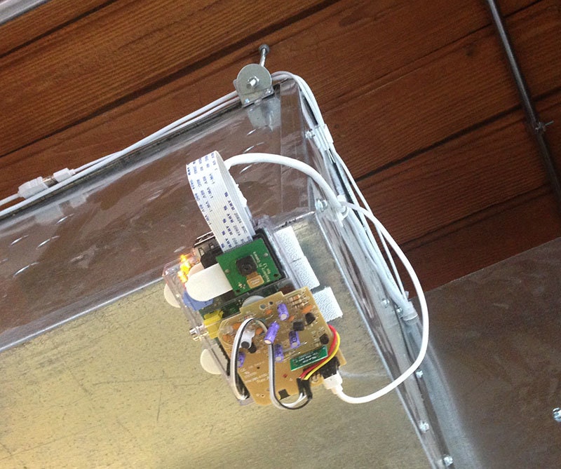
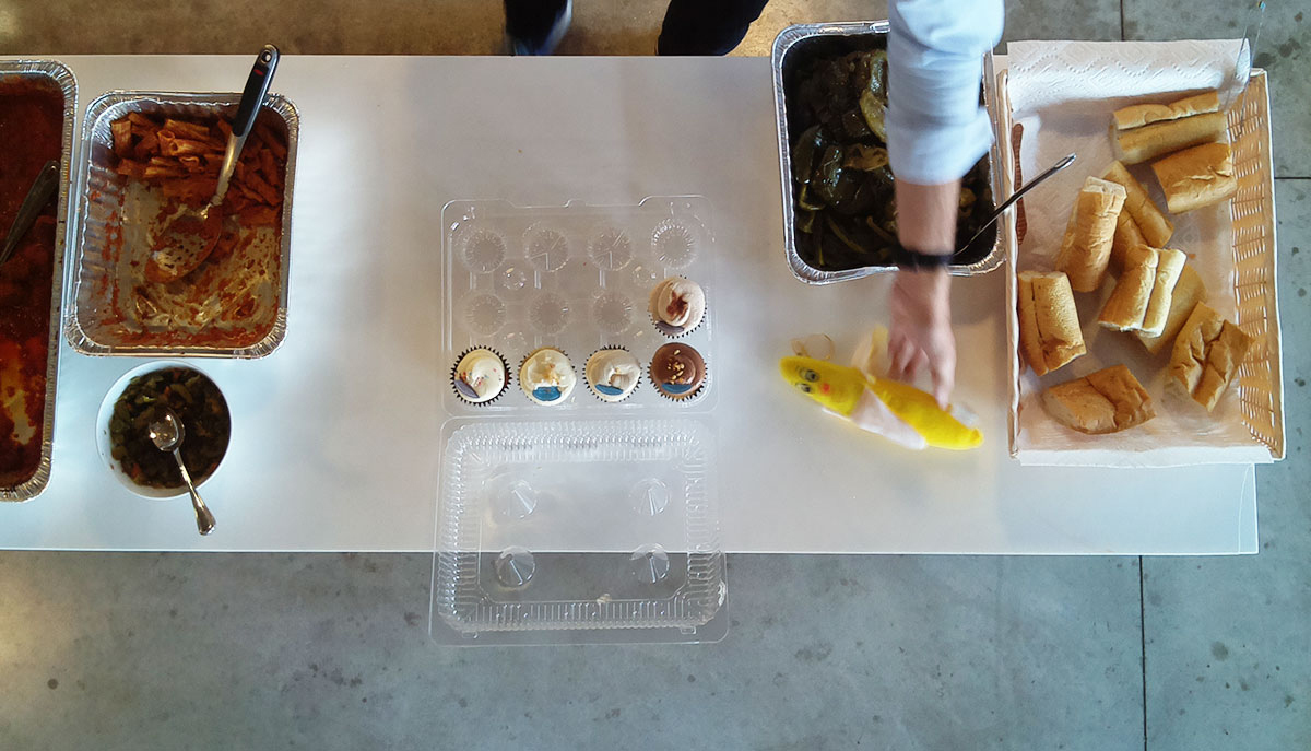
I took a Raspberry Pi with a camera module and Velcro-ed it right above the kitchen counter where we typically put leftover food. I cobbled together some Python code from various examples I found online so that with the push of a button, the camera takes an image of whatever is on the counter and emails the photo to the whole office.
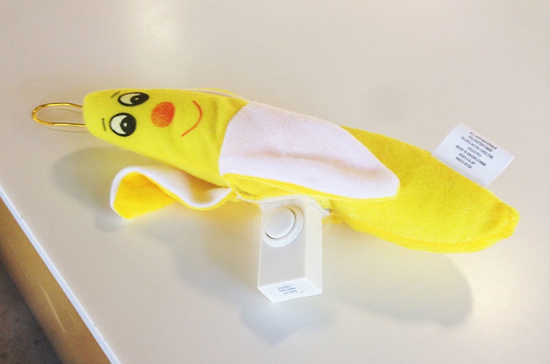
The signature twist was making the button wireless by hacking a remote doorbell chime I picked up at the hardware store. Then, in order to give this prototype some personality, I bought a stuffed banana and sewed the remote doorbell button into it. Behold, the BananaCam! Now, whenever someone leaves leftovers out in the kitchen, they can just squeeze the banana and let the office know exactly what’s on offer. It’s our version of ringing the dinner bell.
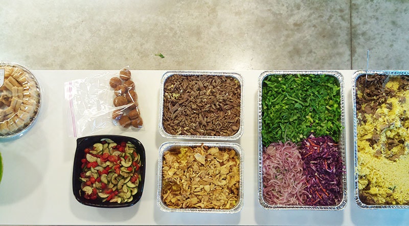

The best part about this was building something in the office just for fun, to see if people would like it enough to use it. As with any prototype, if people like using it, it will stick around. If it’s not that interesting or useful, it will collect dust, parts of it will get lost, and eventually, it will be taken down. We’ll see what happens with the BananaCam.
Everyone here likes to build things, and it's important that we don't see the office environment as too precious to tinker with. That's why we're always experimenting with new technologies and encouraging people to play around and see how they work.
Thanks to my BananaCam collaborators Garrett Winther, Emily Lam, and Julia Nacsa!
On a recent recruiting trip to MIT, I took a tour of the Media Lab. There’s no shortage of cool things to see there, but what caught my eye was their Food Cam. The idea is simple: there are leftovers in the kitchen all the time, but people only notice them if they happen to wander past or if they see a colleague eating something tasty.
The Best Way to Complain is to Make Things
How my unwavering insistence upon Internet privacy led me to create my first Chrome extension
To guard against tracking and malvertising, I use quite a few Chrome extensions:
- uBlock
- Collusion for Chrome
- Disconnect
- Facebook AdBlock
- Facebook Ads Remover
- HTTPS Everywhere
- IBA Opt-out (by Google)
- Keep My Opt-Outs
- Privacy Badger
- ScrewAds Plus for YouTube
The issue with many of these extensions, however, is that they tend to be a touch overzealous about what they block webpages from serving. For the average user, this can be a regular nuisance; as a developer, it's anathema to your workflow.
An interim resolution, hardly a solution
Unless explicitly specified in chrome://extensions/ via the “allow in incognito” option, extensions are, by default, disabled in Chrome's incognito mode. As a result, a series of five key commands had become nothing short of a reflex action for me whenever it appeared as though content might be missing from a page:
- ⌘ + L (highlight the current URL in the omnibar)
- ⌘ + C (copy URL to clipboard)
- ⌘ + shift + N (open new incognito window)
- ⌘ + V (paste URL from clipboard)
- enter (load URL in incognito window)
As a developer and no stranger to the command line, I use keyboard commands and shortcuts whenever possible. Because of this, I had become pretty quick at performing the above sequence. But when you've clicked within a video or any such action that shifts keyboard focus from the browser to a plugin, the sequence can no longer be quickly performed.
Moreover, as a product designer, I knew I wanted a better user experience for this set of actions; specifically, I wanted a one-step process. As my desire for a solution mounted, so did the frequency with which I complained about this broken workflow to my colleagues.
Stop critiquing, start creating
Recently, my wonderfully talented colleague and friend, Simon King, wrote a piece with the above title about an iOS app he created called News Now. In the article, he explains how his frustration with the irregular listening experience of the official NPR app led him to create News Now. He also includes a quote from LCD Soundsystem's venerable frontman, which every designer should take on as a personal mantra:
The best way to complain is to make things.
James Murphy
With the above mantra in mind, along with a suggestion from Simon himself that I might explore a browser extension as a solution, I set out to solve my problem. A quick perusal of the developer documentation for Chrome extensions led me to chrome.window.create—a method that accepts an optional incognito parameter — and I knew I was good to go.
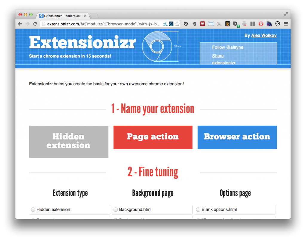
Next step: How to create an extension? My research immediately led me to the excellent Extensionizr, an open-source boilerplate generator for Chrome extensions. Through helpful tooltips for each of the many options, I learned I needed a browser action, background.js event page, permissions to access the browser's open tabs, and no options, overrides, content scripts, or add-ons.
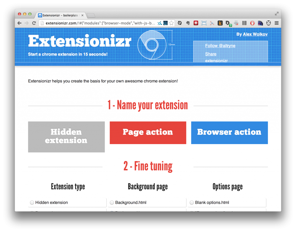
A press of the “Download it!“ button and a few lines of JavaScript later, my issue was solved and I had written my first Chrome extension. All that was left was to follow Google's instructions on packaging and uploading, and a few minutes later, my work was live in the Chrome Web Store:

A happy accident
As it turns out, opening a page in incognito mode initiates a new browser session in which you are logged out of every account. This enables you to quickly browse a site outside of your filter bubble and compare it to the page you see when logged in.
Shoutouts
It goes without saying that I owe a huge thanks to Simon both for his inspiration and his suggestions.
Thanks also to Alex Wolkov, the developer behind the awesome Extensionizr. If ever you're writing a Chrome extension, this boilerplate generator will save you quite a lot of time.
In need of an icon for my extension, I turned to the excellent Noun Project. I knew I wanted to use a mask icon to visually reference Chrome's incognito mode, and the Noun Project has no shortage of options. But when I saw Jason Voorhees of Friday the 13th franchise fame, the choice was an instant and obvious one. Jason comes from the amazing Icons8.
Open In Incognito is available on the chrome web store here. The project's source code is available on GitHub.
The issue of Internet privacy is a challenging one. No one wants their every click and page view tracked, catalogued and shared across countless databases of the thousands of advertising partners working to serve the most targeted marketing efforts that have ever existed.
How We Did It: Project Edison
A dynamic lighting installation captures the spirit of Silicon Valley
The process culminated with the creation of Edison, a dynamic, interactive lighting installation for the hotel’s entrance. It’s a permanent architectural element that physically represents the networking and trafficking of data that’s happening all around us, especially in Silicon Valley—the hidden stuff that makes this place what it is.
Edison is a moving sculpture controlled by open-source code in which 100 light bulbs continually change position and brightness to visualize different data flows. The idea started half-jokingly: we were kidding around about the idea of attaching a light bulb to a system of pulleys so it would follow you through the lobby and alight above your head, glowing like a bright idea—the Epiphany, get it? After the cheesiness of that idea subsided, it led to a more serious exploration of the possibilities of the light bulb and ways to modernize the old, inefficient technology with hyper-efficient LEDs. The re-engineered bulbs would represent the idea of Silicon Valley standing on the shoulders of past inventors, and would also simply be beautiful to look at. From there, we mapped out how to make the bulbs live, move, and respond to the space.
Once we had all agreed on the concept, we launched into an entirely atypical design and engineering process, which I would loosely describe as, “OK… go!” We needed to make certain elements: a bulb that hung on a wire, a spool that rotated to move the bulb up and down, a motor to power the spool. But the design specifications of each of those elements were interconnected: for example, the weight of the bulb would dictate how powerful the motor would have to be, the motor would dictate the spool design, the spool design would dictate the motor controller needed to achieve the motion, and the motor controller would dictate the power supply we would need. But the design of the light bulb, and likewise every other part, was pretty nebulous at the beginning.
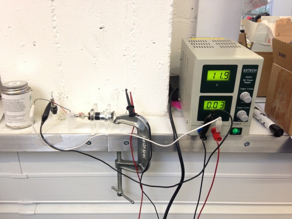
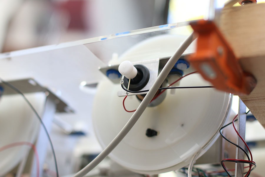
So we separated out what we did know: we’d have to transfer power from the spool to the wire, which is constantly rotating, in order to illuminate the bulb. We could begin to solve that problem (slideshow above), but we had to design the solution to be adaptable to integrate with a constantly evolving spool design. Likewise, we specified capabilities for the spool (slideshow below), knowing that whatever we created would have to be able to adapt to different motors and different bulb designs, depending on what kind of bulb we ended up using and how fast we wanted it to move.
The same went for the software and electrical elements. We didn’t know what exact motor controller we were going to use, but we knew it was going to have to process position and velocity commands and acceleration rates (slideshow below). From these basic starting points, the entire team began working in parallel, keeping each element as modular as possible so elements and features could be switched out as needed while still being able to integrate with one another.
This kind of parallel process is not all that unusual with software development, which is why we have version control software like GitHub, which lets you continually push the most recent iteration to a central place so everyone stays updated. Unfortunately, there is no equivalent system for a process that spans electrical, mechanical, and software engineering, three totally unique domains, each with its own tools and protocols. So our interface was literally face-to-face: “I think this thing I made will work; will it work with the thing you made?” We would make sure whatever we were making would integrate with the current state of what everyone else was making, and then we’d all go off and figure out a few more things. Every time one piece of the puzzle was locked into place, other elements became more defined.
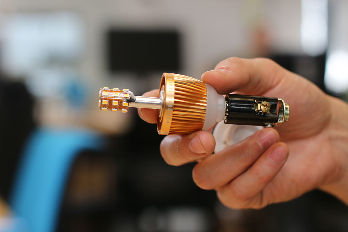
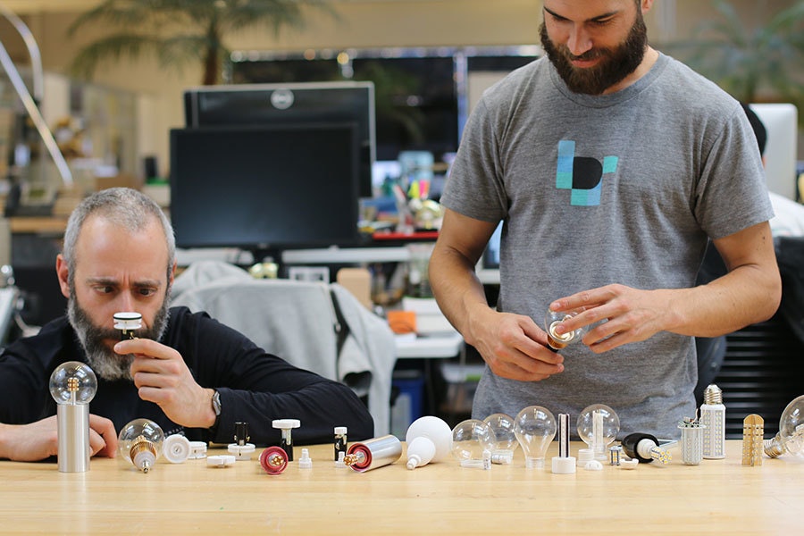
Central to the aesthetic and effect of Edison is the bulb, which was both a technical and visual challenge. We wanted to give a nod to the original Edison bulbs but use modern LED technology. We tried—and scrapped—countless prototypes made by repurposing off-the-shelf components (bulbs rummaged from Marine supply stores, bulbs imported from Europe and Australia, even a ready-made glass shell in which we placed our own custom-designed PCB, which used a clear solder mask to create the warm copper color of the original Edison filament bulb). Fortunately, we were introduced to EfficientNow, a local LED startup that worked with us to co-design a variant of their AC bulb that operates on DC power, which is a less expensive and more efficient choice for programmatically controlled dimming. As a finishing touch, we dressed the bulb assembly in a machined aluminum housing that reflects the other lights around it and helps create the warmth and effect we wanted.
Edison’s defining feature is its ability to dynamically respond, meaning the movements and the animations do not need to be preset but can be generated on the fly.
This lets people engage with the installation on different levels. You can understand and appreciate that it moves in response to data, or you can simply enjoy it on a purely visual level, without knowing anything else about it. Eventually you’ll even be able to direct its motion by typing in a few lines of code. We designed Edison to be able to respond to you and change the tone of the room, to make the space feel alive. I’m hesitant to use the word “magical” because it sounds cliche, but it describes a really meaningful experience of seeing something captivating and knowing that even though it looks effortless, there must be a world of complexity behind it, and yet the captivation halts your brain from diving into the “how” of it. That’s the experience I hope we achieved with Edison. You don’t really want to pick apart how it’s done; you just want to experience it.
Read more about Project Edison here.
It’s easy to rely on cliche and buzzwords when describing Silicon Valley, but expressing an authentic sense of place is a much more nuanced task. IDEO began working with Joie de Vivre hotels on their new Silicon Valley location before the building was even constructed, figuring out how to communicate the innovation and idealism of the valley through the building’s architecture
.jpeg)
Planting an Interactive Flower Garden in the Middle of the Desert
Or, as we liked to call it, botanical engineering
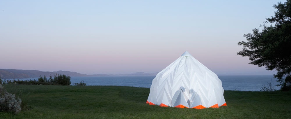
The Ha-Ori shelter was inspired by the folded leaves of the Hornbeam tree, which are lightweight and strong. People kept telling me that it was perfect for Burning Man, in both look and function. But what they didn’t know was that I hadn’t figured out how to add a good ventilation system for hot climates, so the shelter would actually have been way too hot for the desert. I vowed that I would only go to Burning Man if I brought a new iteration of the shelter with me, specifically designed for the desert weather. It took me a few years, but eventually I got together with a few other IDEO designers and we built a cool, shady Burning Man yurt. We’ve since brought the yurt to three “burns” and it still stands like a rock and is fully functional.
The idea for Blumen Lumen came up during one of those trips to the Black Rock desert. For most of the year, the Burning Man site is lifeless. The soil is dry and alkaline, so nothing grows there, and in the arid summer season, no animals ever cross it. It occurred to us that bringing flowers out there would bring a little bit of life, beauty, and love to the desert, which is a big part of what people are looking for at Burning Man. And we could use the same lightweight, folded construction that we had proven to be efficient and durable with the yurt.
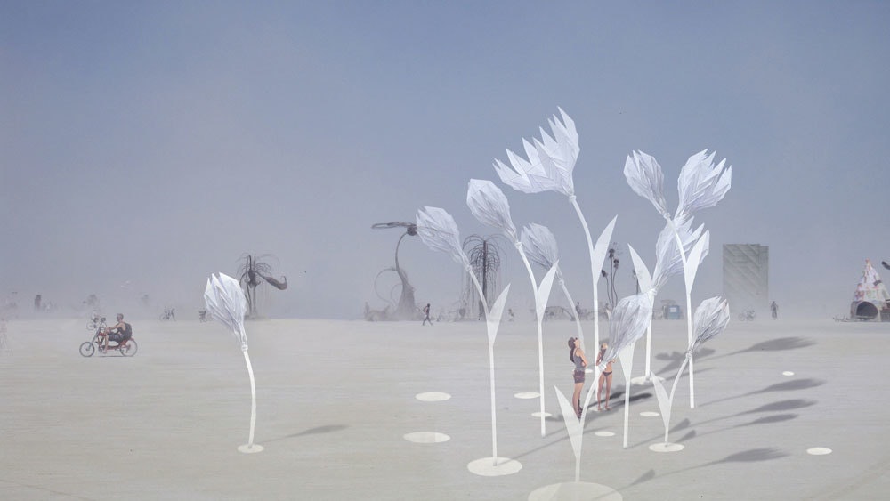
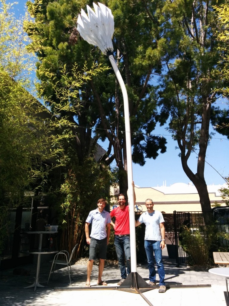
The idea is for the installation to appear like a mirage in the barren, hostile desert. Seeing the flowers on the horizon, you’ll have little idea of their scale, but as you get closer, you’ll realize that it’s a true oasis: a gigantic garden of flowers up to 20 feet tall.
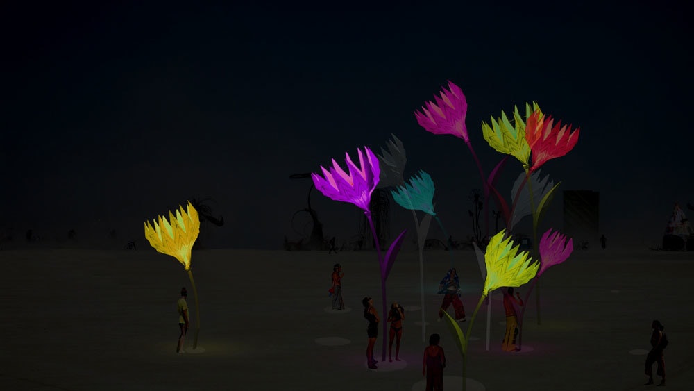
And then you’ll see that the flowers are discovering you as well: The blossoms open and close when they sense that people are nearby, and Arduino-controlled LED strips hidden inside the flower buds change color and intensity in response to movement and sound. The flowers contain infrared and ultrasonic sensors that detect a person’s approach, and a central computer parses inputs from the sensors and wirelessly controls and coordinates the individual blooms.
The opening and closing of the flowers is not only a beautiful motion, it is also an essential safety measure so the flowers can withstand the high winds in the desert, which can reach more than 60 miles an hour. Making the flower strong enough has been one of the biggest engineering challenges of the project.
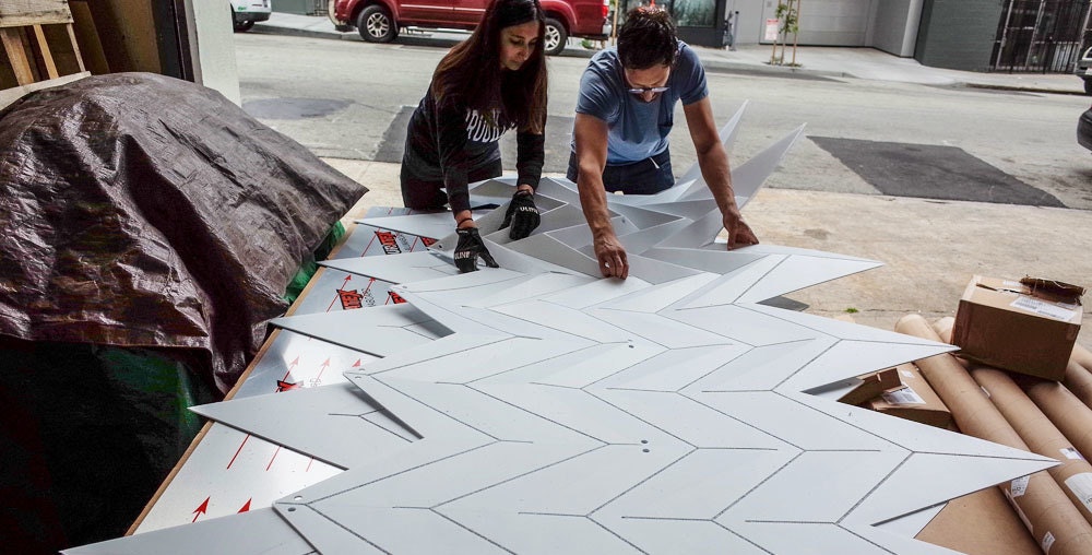
The flower buds are made from two sheets of 5-by-10-foot corrugated polypropylene, which is very strong for its weight. We rout out lines on both sides of the sheet to create fold guides that determine where and in which direction the sheet should fold. (We learned when building the yurt that this process is very time-intensive when done by hand, so this time we outsourced it.) The sheets are then folded and welded together on both sides.
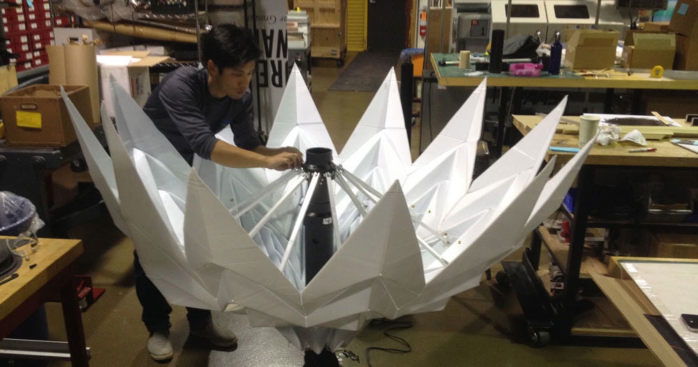
For the opening and closing mechanism, we built a telescoping “stamen” out of PVC pipe and connected it to 12 aluminum struts, which are then attached to the origami structure of the petals. The mechanism works like an upside-down parasol, which is lovely, but it means that we are fighting gravity, so we had to create a lot of force in order to close the flower. We experimented with pneumatic pistons, but bringing compressed air to the desert seemed impractical, and we felt we wouldn’t achieve an elegant enough motion. We’ve since gone through three different iterations of actuators, and we ended up with a 150lb, 18-inch linear actuator with a worm drive. It’s a lot slower than other actuators we tried, but it’s also cheaper, and it provides a lot of force in a small package. Best of all, it cannot be back-driven, which means we don’t need any electricity to keep the flowers shut.
The stem is made from a 4-inch PVC pipe, which slides over a 10-foot-long steel pipe that is screwed into a base in the ground. The base is also made of steel and is dug three feet into the earth, with four 4-foot outriggers that reach out horizontally and are also buried underground. We wanted the stem to have a graceful, natural curve, but we found out that bending 4” PVC pipes is not easy. We ended up using a weed burner to soften the PVC and then bending it over a curved wooden template. To make sure the tube doesn’t collapse, we capped it on both sides and slightly pressurized it.
The diverse challenges of this project required a whole team of industrial and interaction designers as well as mechanical and digital engineers, all passionate (crazy?) enough to spend many nights and nearly every weekend for months making this surreal flower garden a reality. As you might have guessed, every person on the team either works at IDEO now or has in the past. Where else would you find such talented wackos?
You’ll be able to check out Blumen Lumen even if you don’t make it out to Burning Man—we received an initial grant of $6,000 from the Black Rock Art Foundation to show the piece in public spaces around San Francisco. The grant facilitated the exploration and prototyping phase, but to fulfill our complete vision of the project, we are now trying to raise $10,000 on Kickstarter to build the rest of the flowers and buy four solar panels, batteries, and a small generator. Chip in, and come see us in the desert!
The core team for Blumen Lumen includes Beau Trincia, Jesse Silver, Jimmy Chion, Remy Pieron, Nivi Ramesh, and Joerg Student; we had big contributions from Chris Glaister, Steve Moore, and Marco Triverio.
When I moved to the Bay Area to join IDEO, I had never even heard of Burning Man. But once I got here, it came up almost every time I showed someone my Ha-Ori shelter, a collapsible origami structure I designed and built while studying at the Royal College of Art in London.

Lindsey Turner
I’m passionate about building brands, products, and experiences that help organizations show up with meaning and momentum.
I help organizations cut through complexity by shaping how they show up, through brand strategy, identity, and storytelling.
Working at the intersection of brand and business, I bring an editorial eye and a bias toward making—turning ideas into tangible experiences that people can understand, trust, and believe in.
My work spans government, healthcare, financial services, media, and consumer goods, from launching Gen Z-focused ventures to building innovation labs and reimagining legacy brands. I relish moments of ambiguity and enjoy translating across teams, perspectives, and priorities to move ideas forward.
I started my career in editorial and digital design, shaping cross-platform experiences and identity systems in publishing and agency environments. That foundation still shapes how I work today: I’m detail-oriented, collaborative, and overreliant on the Oxford comma. I hold a BFA in Visual Communication from the School of the Art Institute of Chicago.

Rachel Young
My work helps organizations see who their products aren't working for—and build the will and the tools to do something about it
For 25 years, I've asked the same question: Who does this design exclude—and what are we going to do about it?
My work spans human-centered strategy, inclusive design, and qualitative research, with clients ranging from Microsoft, Google, and Verizon to the National Science Foundation, and San Francisco Unified School District.
Before IDEO, I taught elementary school in East Palo Alto and spent a decade doing design work with social service organizations—where I learned firsthand what it costs people when systems are built without them in mind.
I am currently writing User Error, a nonfiction book about digital access and the design decisions behind it. I live in Oakland, California.

Brian Pelsoh
I lead with craft, ensuring our work is creatively excellent: rooted in deep human insight and imagination, while also grounded in the realities of business and technology.
My expertise spans brand, communication, and product design across tech, education, the arts, and social impact.
I believe great work demands both high-level vision and obsessive attention to detail, and only happens through collaboration.
I bring an inclusive, hands-on approach and a deep understanding of business, which enables me to consistently deliver excellence while always asking why.
Before joining IDEO, I worked at the brand firms Pentagram and VSA Partners. I began my career as a designer, leading teams at the School of the Art Institute of Chicago and the Milwaukee Art Museum. I hold an MFA in graphic design from Maryland Institute College of Art and a BFA in communication design from the Milwaukee Institute of Art & Design, and have taught at some of the best design schools in the US.

Tony Wong
I am responsible for IDEO’s long-term success in China and working with clients to use design as a tool to enable growth.
I am responsible for IDEO’s long-term success in China and working with clients to use design as a tool to enable growth. Specifically, I have helped Chinese companies design holistic brand solutions through the development of their products, communication, services, and innovation teams, and I have helped multinationals expand their presence and influence in China.
I advise global leaders on developing China-led innovation and capabilities.
In over 15 years in IDEO Shanghai, I have worked on projects that use design to elevate the quality of the experience of healthcare products and services, streamline processes that increase productivity, create spaces and programs that promote and enable inclusive communities, and build next generation mobility solutions that are planet-positive.
Before joining IDEO, I worked at Philips Electronics and the Electrolux Group in Italy, the Netherlands, and Singapore on a number of breakthrough commercial products. I am a member of the Young President Organization in Shanghai.

How to use AI as an editor, not a writer
Ed White has a rule he's tested on his own writing: hold yourself as the writer, and let AI be your editor. Ed is a Senior Design Director at IDEO's London studio, where he co-leads the firm's AI portfolio across Europe. Before IDEO, he spent 12 years as a writer and editor at the Financial Times, Wired, and Contagious. So when he talks about when to use AI for storytelling and when not to, it comes from two decades of crafting his storytelling skills.
In this episode, Mina Seetharaman talks with Ed about two specific tools he uses to keep AI in an editor's seat: a "roasting agent" prompted to critique his drafts without any sugarcoating, and a simulated audience he rehearses pitches on before the real thing. They also get into what Ed is hearing from design leaders at Anthropic, Lovable, Shopify, and Google Creative Lab about how creative work is changing, and why he thinks the friction of writing something yourself is worth protecting rather than automating away.

Building a personal AI for the messiness of life: Sida Li
Most AI products today are built for work—a space with clear problems and established systems. One founder noticed a gap: personal life is messier, harder to systematize, and mostly left behind by the AI boom. So she built Cue, a personal AI that lives inside iMessage and group chats, to go where the other tools haven't.
In this episode, Becca Carroll, IDEO's Chief Strategy Officer, talks with Sida Li, co-founder and CEO of Shared Context Lab, about staying anchored to a human need while the technology around her keeps changing shape, why she treats her business model with the same rigor she'd bring to a product, and what it feels like to build a company at this particular, disorienting moment in AI.
The conversation also gets into how Sida makes design decisions: the language Cue uses to describe itself, the tradeoffs behind building inside iMessage instead of a new app, and a real story about a business idea that didn’t pan out.
This is the second in a two-part series profiling founders from IDEO's Startups-in-Residence program. The first conversation is with Johannes Seemann, founder of Sooner, on designing GenAI for the emotional side of money.

Designing GenAI for the emotional side of money: Johannes Seemann
Most personal financial tools are built to run the numbers and optimize towards a budget. While that works for some, most people experience money as a lived relationship that does not neatly fit into a spreadsheet. Johannes Seemann and Becca Carroll discuss why money is emotional before it is mathematical, and what a human-centered approach to building a generative AI financial product looks like in practice.

The curious leader's edge in uncertainty: Scott Shigeoka
Mina Seetharaman talks with Scott Shigeoka, author of Seek and Head of Curiosity Cultivation at the Eames Institute, about what distinguishes genuinely curious leadership from performative curiosity, how power dynamics shape curiosity, and why practicing curiosity can restore energy rather than drain it.
Looks like you might be in search of something very specific?
Or reset the filters above and try another angle.
Here’s some random inspiration

Podcasts about creative leadership

Articles about the power of prototyping
