
.svg)


Delivering an unbiased news experience
1,170%
increase in app page views YoY
700%
increase in active users
4.8 rating
on the Apple App Store
“IDEO brought a strong multidisciplinary approach grounded in real user research and sharp UX thinking. They helped us turn complex needs into a clear, intuitive product experience. The result is a news platform that genuinely stands apart in the market."
SAN built a loyal readership and gained recognition for its unbiased reporting. To expand and stand out from legacy media, SAN wanted a redesigned user experience that reflected its commitment to fact-based journalism.
The American news industry has long been a competitive and saturated market. This has only intensified with the emergence of social media outlets and AI-generated news. Even so, SAN’s rigorously unbiased, fact-based reporting style and rich video storytelling had enabled the ambitious startup to rise above the media fray in just three short years.
With a strong foundation to build on, IDEO sought to further differentiate SAN’s cutting-edge news product and build deeper engagement with a wider audience through a new user experience.
.webp)
Collaborating closely, IDEO and SAN began by delving deeply into media consumption habits. They met with early SAN superfans, news consumers who spent hours a day absorbing content from traditional outlets like Fox and USA Today, and those who looked to their Ring doorbell app or Reddit for news. The takeaways? People were tired of clickbait and clunky interfaces. They sought clear, factual news that was easily accessible, with additional context to help them interpret events and understand their significance. They craved more than one perspective on important topics, so stories felt balanced rather than polarized. They also valued having control over how they consumed news, so making it easy to switch between text, video, and audio formats was crucial.
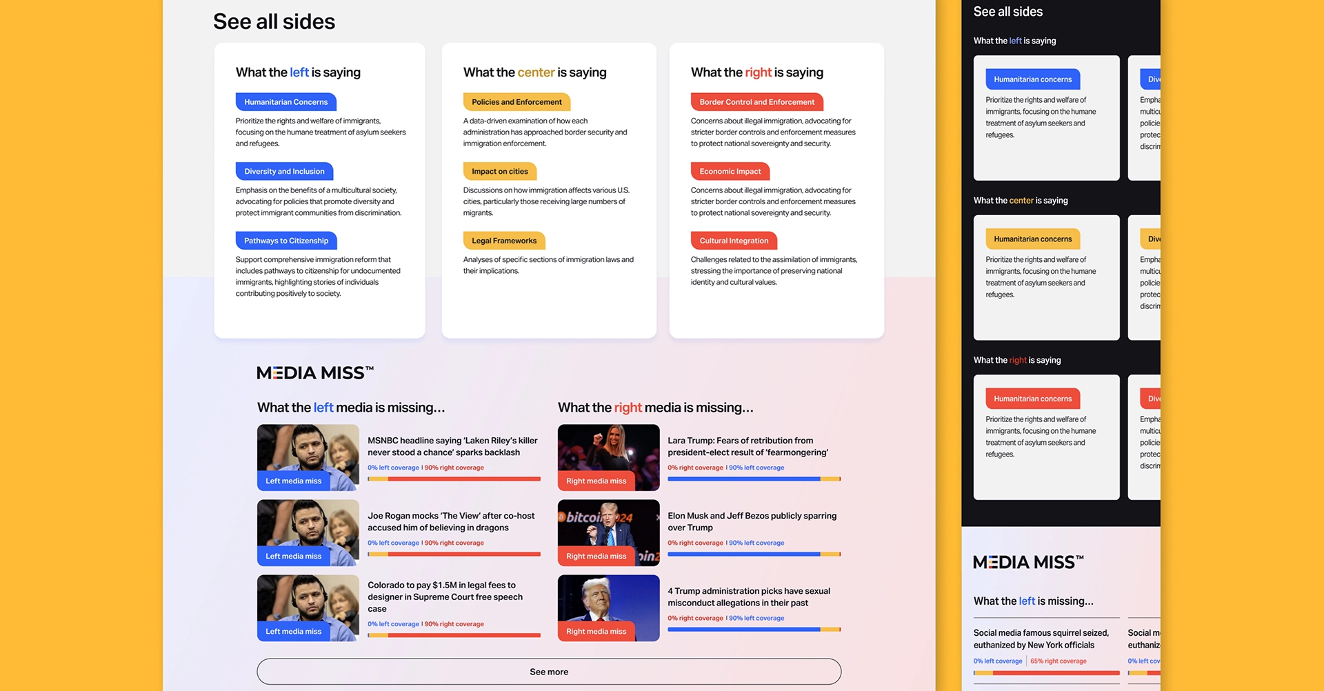
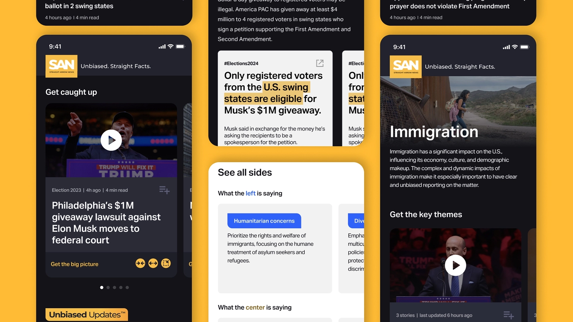
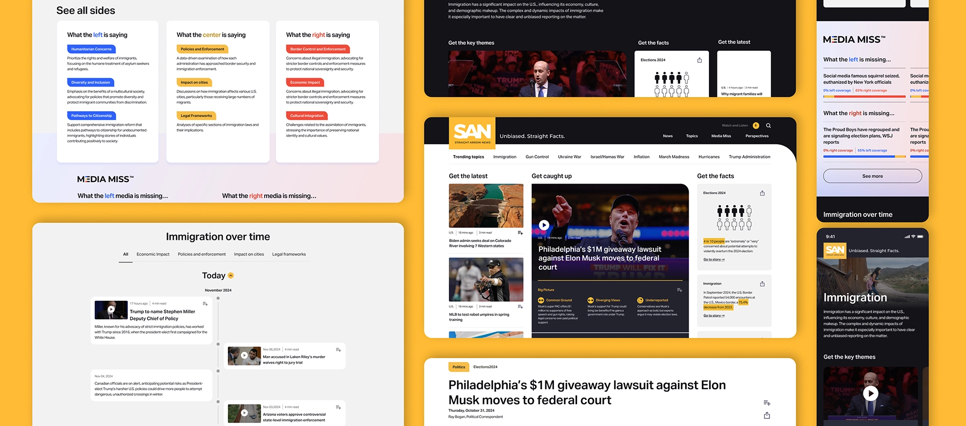
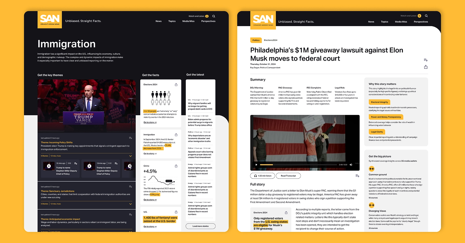
Together, IDEO and SAN created features across SAN’s website and app that put facts, trust, and transparency at the core of the product experience. Fact Cards distill key data points into clear, shareable units, while the Sources feature allows readers to trace information directly back to its original source. To make complex stories easier to grasp, Big Picture insights drill down into why events matter, surfacing underlying themes, historical parallels, differences in reporting, and common ground. The Why This Story Matters section provides readers with clear framing and sets the story within a broader context, while the Timeline illustrates how events unfold over days, months, or even years. An antidote to news polarization, See All Sides presents left, right, and center narratives for key topics side-by-side, and Media Landscape visualizations reveal how coverage varies across outlets. Finally, to ensure SAN fits seamlessly into readers’ daily lives, the redesigned Today Page is organized into three highly scannable sections: Latest News, Top Stories, and SAN Originals. The combined features create a balanced, clear, and non-polarizing news experience, making it easy for readers to delve deeper into the sources of their news.
SAN now delivers a news experience as modern, dynamic, and trustworthy as its journalism. A month after its debut, the SAN app’s page views increased 1,170 percent year over year compared to June 2024, while active users rose 700 percent. Readers also give the updated mobile experience a 4.8 rating on the Apple App Store. “Our team is delivering reporting that’s both deeply factual and accessible,” said Derek Mead, SAN’s Chief Content Officer. “This redesign is pivotal to the direction journalism needs to take and the leadership role Straight Arrow News is taking on as we help guide the news industry into a brighter future.”
Curious about how this kind of thinking could benefit your organization? We’d love to hear from you.


Subscribe