
.svg)


Amplifying a movement
2023 SF Design Week Award
In recognition of IDEO’s brand work with Citizens United
“From the beginning of our relationship, the team at IDEO has been thoughtful and intentional in all of the ways that we have engaged and supported us in actualizing our work and our network. We now have the tools and resources to take our work to the next level.”
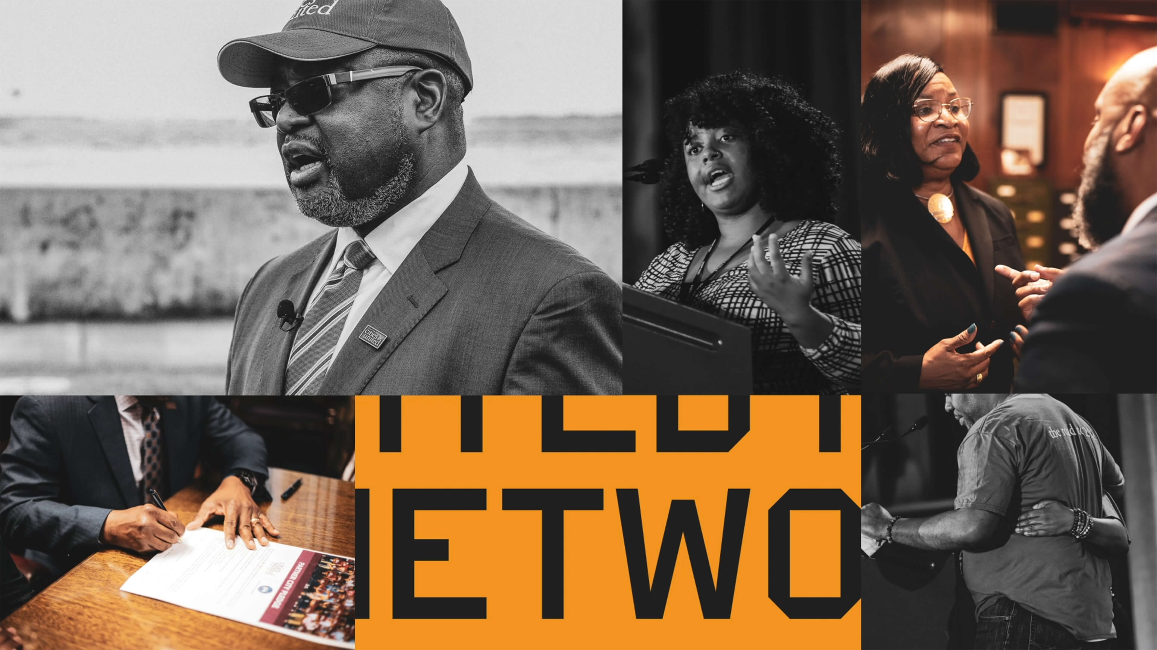
Cities United is committed to reducing the epidemic of homicides and shootings among young Black men and boys ages 14-to-24 by 50%.
Between 2009 and 2019, the number of Black children who “did not go to school at least one day in the past month because they felt unsafe at school or on their way to or from school” increased by 84%, according to Cities United.
Homicide is the leading cause of death for Black men and boys from birth to age 44, according to the Centers for Disease Control and Prevention.
Cities United already had a strong foundation with its stated mission, vision, and values. IDEO brought those to life with a new visual and verbal brand identity system that celebrates Cities United’s inclusive approach to building relationships and reimagining public safety.
To help Cities United with its verbal identity, the IDEO team defined the organization's voice, tone, and key messages, making it easier to tell its story more consistently and clearly, a crucial step toward engaging stakeholders.
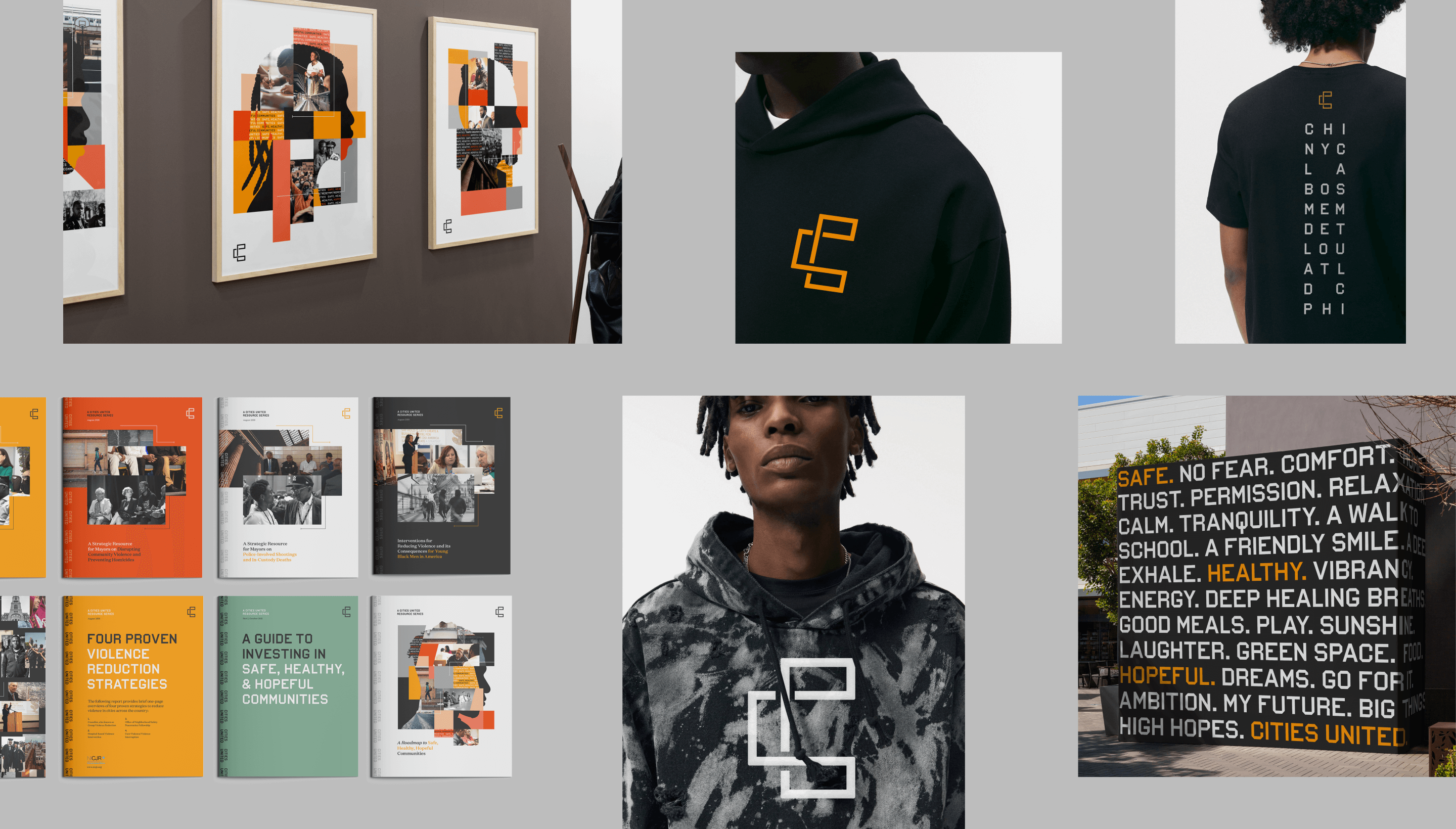
To define the new visual identity, the team created a new logo, a letter C composed of interwoven shapes that represent the three tenets of their vision—“safe, happy, and hopeful;” a new design language that references city grids; and a typographic system anchored by the typeface VTC DuBois, inspired by W.E.B. DuBois’s own custom lettering and designed by the Black-owned Vocal Type Co. The team also designed a color palette that embodies the textures of city life with hues reminiscent of asphalt, sunrise, and brick.
To amplify the refreshed branding, the team designed a new responsive website, citiesunited.org. The intuitive site shares the organization’s mission, resources, ongoing projects, and partner network, inviting stakeholders to join in their transformative work. IDEO also created a video to humanize Cities United’s mission and showcase its nationwide impact. It underscores the unity, resilience, and hope embodied by the organization through a chorus of voices.
This comprehensive rebranding widens Cities United’s reach and impact, helping the organization share its goal of creating safe, healthy, hopeful communities for young Black men, boys, and their families, and reintroduces the organization to a national audience.
The Cities United work was supported by IDEO’s Racial Justice Impact Fund, part of a commitment IDEO made in 2020 to address systemic racism and advance equity within our own organization, our client work, and beyond.
Press stories
Curious about how this kind of thinking could benefit your organization? We’d love to hear from you.

Subscribe