
.svg)


A Cartography Nerd's Guide to Custom Map-Making
My wife and I are city people, and our only family car is a Vespa that is much too slow to cross any bridges. So most weekends, if it’s nice out, we’ll chart an urban hike through San Francisco, targeting a different neighborhood and a different park. This has kept us occupied for the last few years. But they don’t call it the 7x7 for nothing—San Francisco is actually a small city. So my wife and I have started to play tennis.
Sure the game is fun (although neither of us is very good), but what interested us more were the distributed locations of the courts around the city. Spread out across the city like sprinkles on a hipster cupcake, these tennis courts would be a great new way to explore San Francisco. And it would keep us busy for at least the next couple of years of Saturdays.
There was only one problem. I couldn’t find a decent tennis map of San Francisco. I wanted a map that was useful, of course, but also one that was well designed. So I decided to make one myself and give it to my wife as a birthday gift, with the goal of making it attractive enough that she would agree to hang it on our wall, but also useful enough that we would actually make it a centerpiece of our new Saturday hobby. And lastly, I wanted to visualize the MUNI bus routes to each court (since—oddly—riding the bus is another avocation that my wife enjoys).
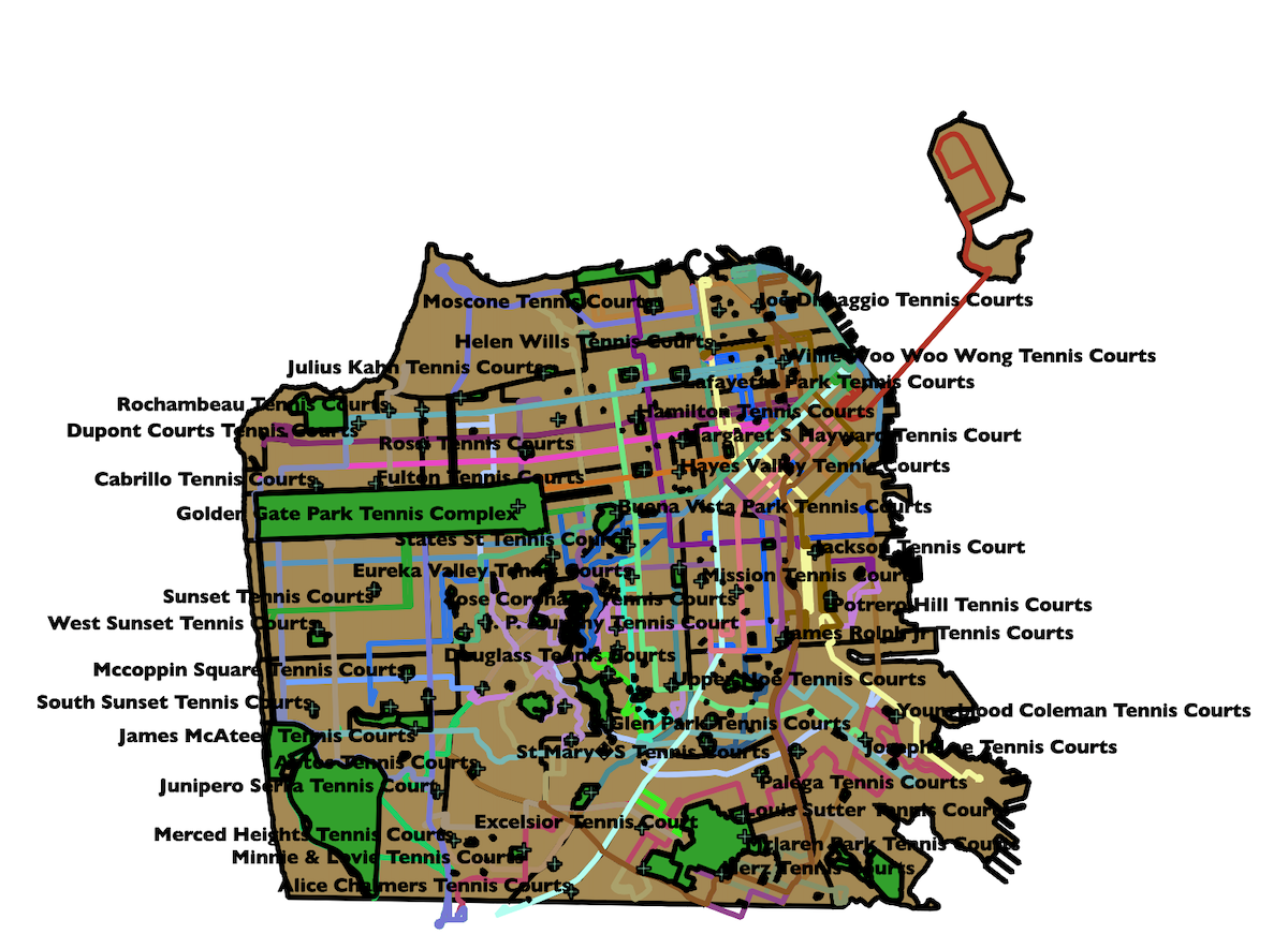
My starting point was the only map I could find—a fantastically unattractive google map that shows the tennis courts of San Francisco in 2003 graphic design glory.
A tennis map of San Francisco in all its 2003 graphic design glory.
But this was a start! I downloaded it as a KML file. What’s a KML file? It stands for “Keyhole Markup Language” (I have no idea what this means), but what it does is important. With a KML file of the tennis courts, I could manipulate the data file in ArcGIS or QGIS, two enormously powerful pieces of cartography software. For anyone looking to get into amateur cartography, I strongly recommend GQIS. It works on a Mac (which ArcGIS doesn’t) and its cost (zero dollars!) outweighs its bugginess.
My next stop was DataSF.org, which has lots of great open source data, including maps of the city. What I was looking for here was something called a Shapefile, a geospatial data format that nerdy geographers use. I found one corresponding to San Francisco neighborhoods and another for San Francisco parks. Lastly, I found one for the MUNI bus routes of San Francisco.
Next it was off to QGIS to combine my various datasets into a single map.
First there were neighborhoods, then tennis courts, then parks, then bus lines.
With a couple of tweaks, I was able to label the tennis courts and isolate the MUNI bus lines according to route number, so that it looked less like a giant red spider web.
There are many a professional cartographer out there who would have kept playing in QGIS to make their map a bit prettier. But I’m a designer, and the sooner I’m able to get out out of QGIS and into the Adobe Creative Suite, the happier I feel (and the higher likelihood that the final design of the map will be something that someone is willing to hang on a wall). Luckily, QGIS has an option to export a file as an SVG file (a vector format that can be opened by Illustrator).
Post-export, the file looked like this.
You wouldn't hang this baby on the wall?
Wait, what? Why does it look worse? Totally natural and easily fixable. I isolated each layer (parks, tennis courts, MUNI Lines, neighborhoods) and then got to work playing around with colors and stroke weight and other good stuff, all of it so much easier because I was working with a piece of software most designers are familiar with.
At some point during this process, my day job at IDEO led me to Amsterdam. While there, I was inspired by the fantastically-designed Dutch train maps and a pro tip from my graphic designer colleague (Anthony Stimola) that the Dutch font of choice is DIN. Back in front of my computer, I created a look and feel for the map inspired by my travels.
A trip to Amsterdam inspired the look and feel for the finished map.
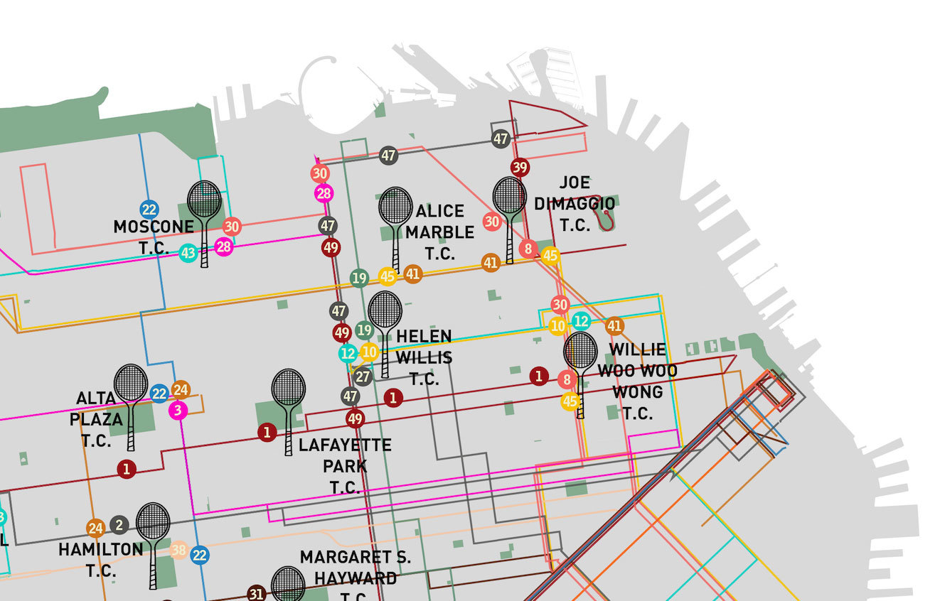
Next up was the laborious process of determining which bus lines one could actually take to each tennis court. My approach was 100% analog, starting from the top of the alphabetical list of tennis courts (Alamo Square) and marching straight through to the end (Youngblood Coleman), noting all of the bus lines that had a stop within reasonable walking distance to a court. I discovered that Helen Wills court in North Beach takes the prize as most MUNI-accessible tennis court (it's served by nine bus lines!), while five tennis courts around the city are served only by a single bus line.
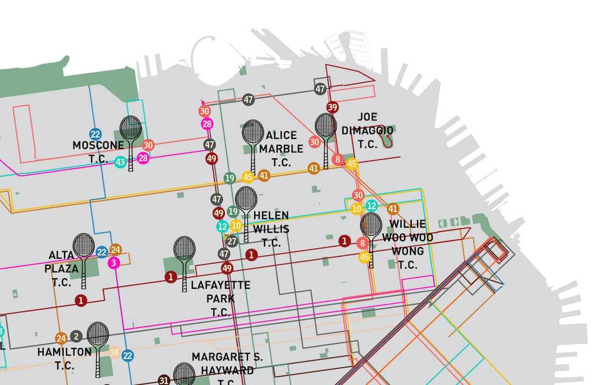
The painstaking work of manually matching tennis courts to nearby bus lines.
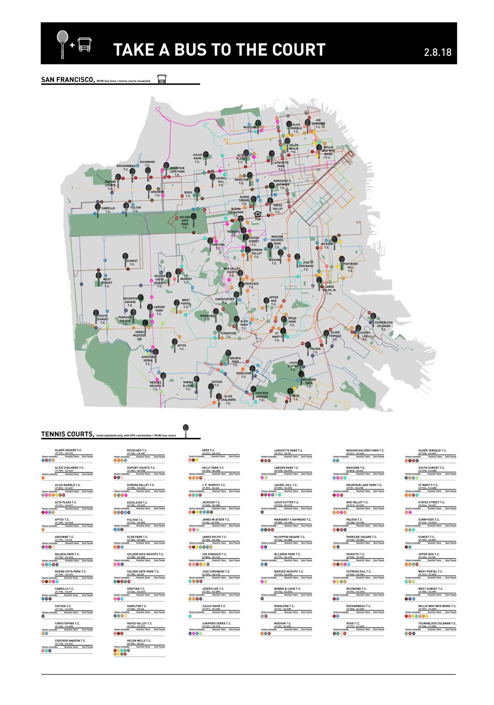
Lastly, I considered how this map would be used. Of course I was hoping that my wife (and others) would find it attractive enough to hang on a wall in full analog glory. But this is 2018, and in order to be useful, the map also needed some connection back to the digital world. I added GPS coordinates and a clickable URL link to a Google Maps location for each tennis court.

A detailed view of the court's location and the corresponding bus routes
That’s it! My wife was happy with her birthday gift, and agreed to hang it on our wall. This past weekend, we used our new map to find the McCoppin Square court in the Sunset neighborhood. A few minutes after we started playing, two women arrived. Unfortunately, they would need to wait until our 30 minute time limit had elapsed. Eager to play, they asked us if we knew of any other tennis courts in the area. In fact, we did. I texted her a PDF of my new map and off they went to a nearby court. Hooray for the power of a good map!
Words and art
Subscribe