
.svg)


7 Tips for Seamless, Sexy Typography

Typography can be expressive, informational, or abstract. But sometimes it just wants to be invisible, allowing the content to take center stage. In this first installment of our Type Talks series—where IDEO designers nerd out about all things typographical—we offer tips for seamless, sexy typesetting (that you hardly notice).
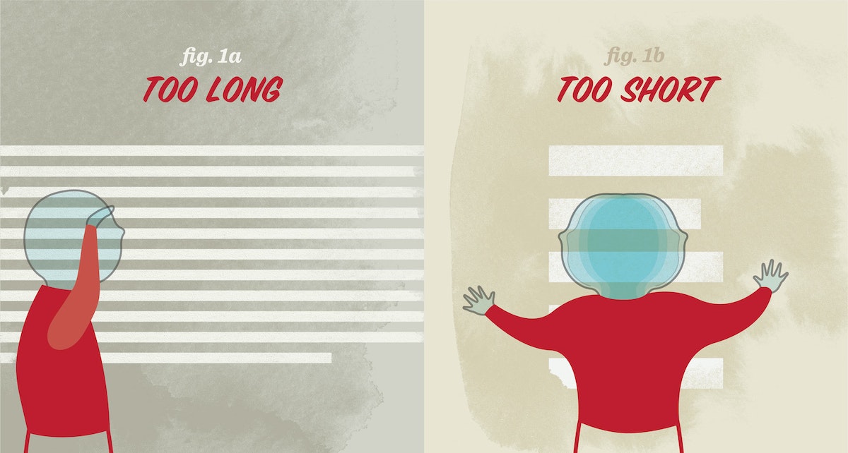
1. Keep a steady rhythm with ideal line lengths
The length of a line determines how much distance the reader’s eyes must cover to read it from left to right. Long line lengths make the text seem never-ending. Short line lengths make the reading experience erratic, and can cause the reader to miss important words. An ideal line length is 66 characters (including letters and spaces). For one column of text, aim for 45–75 characters per line; for two columns of text, 40–50 characters per line.
2. Use the right kind of dash
Dashes, such as hyphens, vary in length depending on the typeface.
The em dash (—) is a long dash, the length of the uppercase “M.” It can be used as an alternate for commas, parentheses, or colons, and is an incredibly versatile way to create emphasis in your writing. When used in multiples, the em dash also indicates missing portions of a word (s——t).
The en dash (–) is half the length of the upper case “M”—shorter than the em dash, but longer than the hyphen. It is used to separate a range or span of numbers, and is sometimes used to connect a prefix to a proper noun.
Keyboard Shortcuts
Em dash (—): shift + option + hyphen
En dash (–): option + hyphen
3. Don't put hyphenation in auto-drive
In the digital age, we often take hyphenation for granted, opting to use the “auto-hyphenate” setting, but there are some best practices to keep in mind when typesetting with hyphens.
If you are breaking a word between two lines, keep at least two characters in the first line and at least three characters on the second line. Try not to hyphenate consecutive lines. To “un-break” a word between lines, use a soft return (shift + return) at the beginning of the word to force it onto the second line.
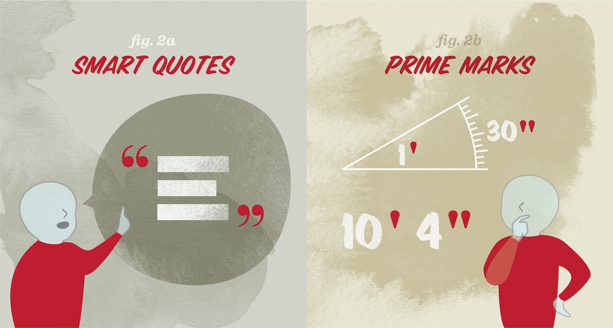
4. Know the difference between smart quotes and prime marks
Prime marks ( ' ), also known as straight quotes or dumb quotes, are often accidentally used in place of smart quotes ( ‘ ), also known as curly quotes. Prime marks are a remnant of the typewriter, which only had prime marks to save space on the keyboard. So what’s the difference? Prime marks are used for units of measure (feet, inches, seconds, and minutes); smart quotes are used to indicate something someone has said.
Keyboard shortcuts
Left single quote ( ‘ ): option + ]
Right single quote ( ’ ): shift + option + ]
Left double quote ( “ ): option + [
Right double quote ( ” ): shift + option + [
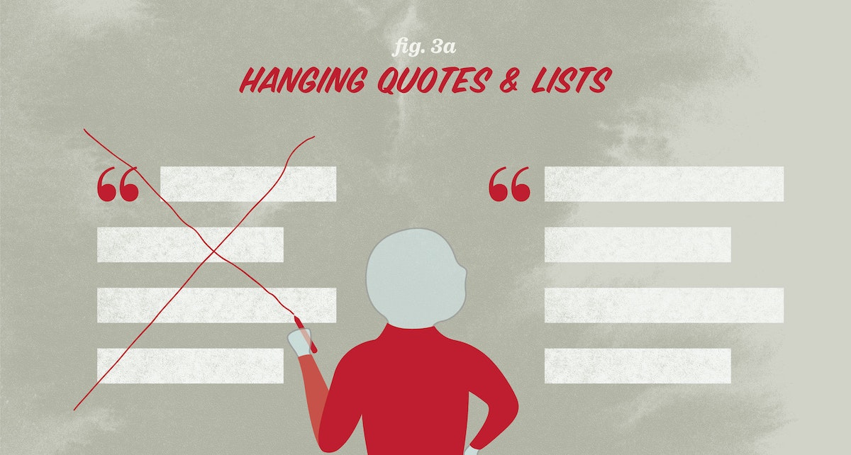
5. Maintain a strong vertical axis
Hanging text, or outdenting, means moving typographic elements into the left margin. You do this to create a consistent vertical axis along the left end of the text. Quotes, bullets, and dashes do not take up as much visual space as a letter, so a list or quote that has not been hung, or outdented, can sometimes be mistaken for a new paragraph and cause unintended breaks in the reading rhythm.
6. Be on the lookout for widows and orphans
Try to avoid widows and orphans in your text. Widows and orphans are one or two words at the end of a sentence that are pushed to a new column or page; widows are at the end of a column, orphans are at the top of a page. They create very short lines and gaping holes of white space that can be visually disruptive for the reader. Maintain the flow of each sentence by using a soft return to eliminate stray words.
7. Track out all-caps text and use all-caps sparingly
When designing fonts, typographers must determine the amount of space around each letter so that letters of different sizes appear evenly spaced. The spacing around uppercase letters is often a little tighter, so that they can sit closer to the lowercase letters in a mixed-case word. When you typeset a word in all-caps, the letters will appear very close together. Remedy this by tracking out, or letter-spacing, all-caps words by about 10% of the point size height. For more details and examples on tracking (and how it’s different from kerning), take a look at Ellen Lupton’s book Thinking with Type, also available digitally here.
If your writing uses a lot of acronyms, consider selecting a typeface with a small caps font. Small caps are all-caps fonts designed within a typeface so that each letterform is only slightly taller than a lowercase letter. Small caps are automatically letter-spaced, and should not need any additional tracking.
Hungry for more on typesetting? Below are a couple of my favorite tried-and-true typesetting references:
A Type Primer by John Kane
The Elements of Typographic Style by Robert Bringhurst
Practical Typography by Matthew Butterick
Words and art

Subscribe